#how did they manage to make such a visually and artistically appealing dragon
Explore tagged Tumblr posts
Visit Tumblr Blog
Explore Tumblr blogs with no restrictions, modern design and the best experience.
Last Seen Tumblr Blogs


Fun Fact
BuzzFeed published a report claiming that Tumblr was utilized as a distribution channel for Russian agents to influence American voting habits during the 2016 presidential election in Feb 2018.
Note

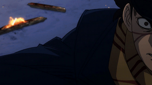
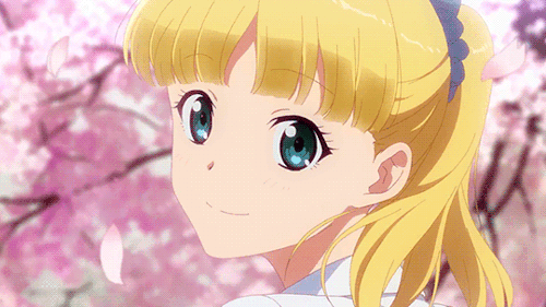
First of all, I have to say that I absolutely LOVE your HTTYD drawings. I also found this gif while trying to find an appropriate reaction image and found it fitting to send it. Also, if it’s not too much to ask, I was wondering if you could please draw some interactions between Astrid and Toothless please and thank you? Hope this reaches you in good health. Have a nice day!!! 😄

Thank you so much!! :)
and ABSOLUTELY. These two are such an underrated duo honestly. Both are fed up with everyone at all times and I can just imagine them shit talking together.
They 100% talk about Hiccup. Not anything horrible just when he’s being extra extra… adventurous
“Oh my fucking Odin above what is with this guy and jumping off cliffs???”
IMAGINE THE DOUBLE DEATH STARES SIJDHIUEHDIUEHD
#also btw I absolutely love drawing Toothless like look how flowy and cat like he is what#how did they manage to make such a visually and artistically appealing dragon#I love him#httyd#how to train your dragon#httyd hiccup#httyd rtte#rtte#toothless#toothless and Astrid#astrid#buff astrid#astrid httyd#httyd astrid#astrid hofferson#toothless httyd#httyd toothless#art#my art#my artwork#digital art#artwork#artist#artists on tumblr
151 notes
·
View notes
Text
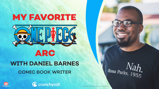
FEATURE SERIES: My Favorite One Piece Arc with Daniel Barnes

I love One Piece and I love talking to people who love One Piece. And with the series going on 23 years now, there is a whole lot to talk about. As the series is about to publish its 1000th chapter, a true feat in and of itself, we thought we should reflect upon the high-seas adventure and sit down with some notable names in the One Piece fan community and chat about the arcs they found to be especially important, or just ones they really, really liked.
Welcome to the next article in the series "My Favorite One Piece Arc!"
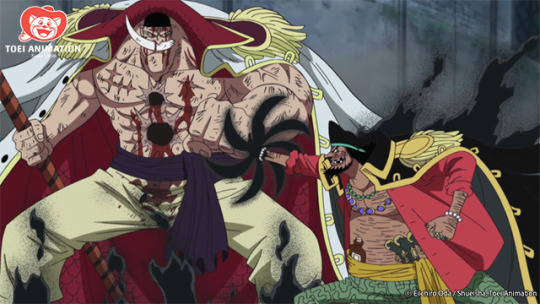
My next guest in this series is Daniel Barnes, writer for the Aggretsuko comic, and his original graphic novel The Black Mage. For my chat with him, he chose the Marineford arc, in which Luffy drops into a World Government headquarters in a desperate race against time to save his "brother" Ace from execution.
A note on spoilers: If you haven't seen the Marineford arc yet, this interview does contain major plot points. Watch the Marineford arc starting RIGHT HERE if you'd like to catch up or rewatch!
Dan Dockery: Let’s say that for some reason, I get to the end of Impel Down, just before Luffy & Co. drop into Marineford, and I’m like “I’m done. This is it. I can’t handle any more One Piece.” In one sentence, what do you tell me to keep me going?
Daniel Barnes: Why are you stopping before you reach the payoff of everything you’ve read so far?
I like that! How long have you been into One Piece?
When I first started consuming One Piece in earnest, ironically enough, I was in the Navy at the time. It was 2014, and up until that point, my only exposure had been the 4Kids dub on FoxBox.
Nice. I love a good FoxBox reference. Was it recommended to you? Because I know that, when a lot of people start One Piece, it’s like “FINE. I’ll watch One Piece. You’ve convinced me.”
I don’t consume anime as voraciously as I did back then. Back then, I was an anime vacuum, but I was also in this weird spot where I was semi-depressed. But someone told me, “You gotta try One Piece, it’s the best.” And my first reaction was “Umm, the art style’s kinda weird, though.” But they told me “You’ll get over it,” and the thing that made me finally take that leap was Gurren Lagann, which also had an unusual art style and then became one of my favorite things ever. So I figured I should at least give it a shot.
That’s something I’ve heard a few times. Because in other big series like Naruto and Bleach, the character designs are much more proportionate and straightforward. And I felt the same way...until I watched it, and realized the art style is PERFECT for what it is. So, Marineford is pretty much the halfway point of the series, with characters returning from all over the place. Were there any that you were excited to see come back?
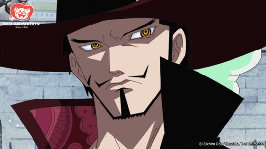
There’s a few of them. I always love it when Mihawk shows up, but I think the big one is Whitebeard. Because up until this point, he’s just sitting around and you know he’s a big deal but you’re always wondering why he’s a big deal. And then you find out in Marineford. I enjoy seeing characters that are kind of defined as the “power ceiling” in an anime universe get to do stuff, and it was cool to see him make the entire world quake.
I think I called it in an article a “Be Quiet, The Parents Are Talking” character. You’ll go through Luffy getting new power-ups and increasingly strong villains and these seemingly insurmountable admirals with their elemental powers and then Whitebeard comes in, and he’s leaps and bounds above everyone. And like you said, for the most part, he’s just sitting down beforehand.
Yeah, he’s sitting down drinking a giant gourd of sake. His name is Whitebeard, but he doesn’t have a beard. Got a real Hulk Hogan vibe to him. Who is this guy? But then you finally see him after all this time, and that’s the magic of One Piece. You see all of these things over the years and you wonder what part they’ll play and then it finally hits you and their role and strength becomes clear.
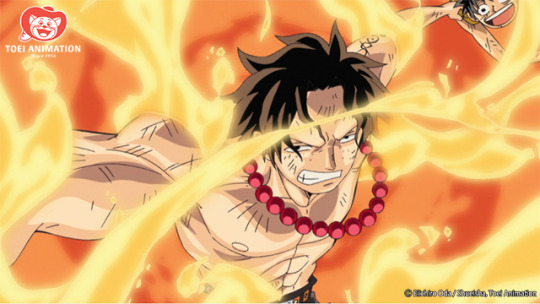
Marineford, obviously, is all built around Ace. And what you get out of the arc probably depends on how much you enjoy Ace’s character. How did you feel about him? Did it make you emotional at all? I know he has the one scene with Garp where they talk about finding your purpose in life, and that really got to me, even though I’m not the biggest fan of Ace.
Okay, I think Ace looks cool and I think he has good powers, but I didn’t really care that much when he died. I didn’t really know him enough.
Were there any characters that you did get attached to or like a lot in Marineford? I know you said you liked Whitebeard and Mihawk, but who was your Marineford MVP? Who shines brightest among all those crazy diamonds?
Okay, so the cop-out answer is probably Luffy. He’s one of the weakest characters there and he manages to survive and he plays such a big role by rallying everyone despite being constantly outmatched. So, objectively, Luffy. But maybe I give it to Coby, because Coby stands his ground against Akainu. He gives you hope that maybe the Marines can change their ways one day and when he refuses to move in front of an Admiral, I thought that was a real stand-out, awesome moment.
So Ace dies, Whitebeard just wrecks Akainu and throws him into a pit, and then, out of nowhere, Blackbeard shows up. Whitebeard beats up Blackbeard and Blackbeard’s forces kill Whitebeard. What do you think about Blackbeard as a villain? Because he’s so unlikeable. He’s underhanded, he whines whenever he gets hurt, he’s super pompous. He has cool powers, but there’s nothing cool about who he is.
He’s super interesting, to me. He has a mystery around him with his two Devil Fruit powers, and he doesn’t really fit into any shonen villain stereotype. He’s an inverse of Luffy, but not in all of the super obvious ways. When you first see him in Jaya, you see him start with basically nothing, and you watch him work through the system and the powers that be, just like Luffy. They’re both trying to achieve the same thing and reach the same goal. But Blackbeard’s methods are different.
Yeah, Luffy will punch you in the face, while Blackbeard will stab you in the back.
And getting to see that evolution is great, because they easily could’ve just said, boom, here’s the next big bad guy and given him to you without context. But it’s like I said about One Piece earlier, where it shows you stuff over time and gets you to look forward to what will happen with it later. That’s Blackbeard’s whole appeal.
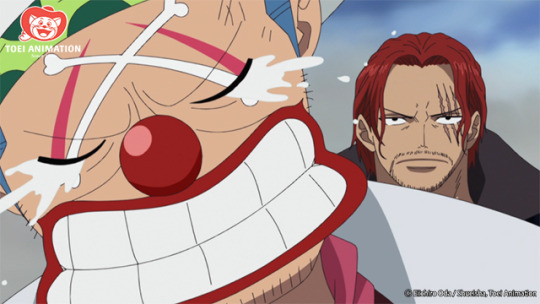
You talked earlier about Coby standing up to Akainu, ready to die for his beliefs. And then Shanks comes and stops the war. How did you feel about that? Because we’re all still waiting to see what his deal is (which as you said is a big part of the continuing appeal of One Piece,) but were you hyped to see him show up?
I thought it was cool, because One Piece has done a good job of establishing him as an awesome guy. He’s a lot like Zero from Mega Man X, where he shows up at the beginning, they imply how powerful he is, they make the main character want to be as strong as him, and then they take him away and only show him sparingly. So whenever Shanks drops by, he's been handled so well that you’re just on the edge of your seat wondering what he’s gonna do.
So, after the war is over, Jimbei has to remind Luffy that he still has things worth fighting for. And then, the timeskip. Were you aware that a timeskip was coming?
Oh yeah. It’s kind of hard to exist on social media and not get a bunch of these little hints about what’s gonna happen. But that was my goal with One Piece for a little while: I’m gonna get to the timeskip. I have to get there. It’s coming, I know it’s coming, I don’t know when it’s coming, but I just have to reach it.
There are so many big moments in this arc, but looking back at it, are there any moments that stand out as prime One Piece to you?
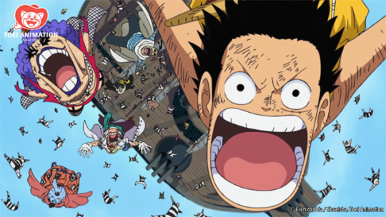
The obvious one, for me, is when Luffy goes Third Gear and punches the giant out of the way. That’s so cool and such quintessential One Piece. A giant on an arena made of ice and a rubbery kid inflates his fist to make it huge and knocks him around. It’s so weird and it works.
ONE PIECE LIGHTNING ROUND!
Favorite One Piece character?
Usopp.
Favorite One Piece villain?
Crocodile.
Favorite One Piece arc?
Sabaody Archipelago.
Which Devil Fruit would you eat if you had the choice?
Bellamy’s Spring Spring fruit.
If you had to live on any island in the One Piece universe, which would you choose?
Does the Gran Tesoro from the Film: Gold movie count? That one’s pretty dope.
Favorite One Piece fight?
Luffy vs Blueno, when he first reveals the Second Gear.
One Piece moment that made you cry the hardest?
When the Franky Gang beats up Usopp and Nami finds him and Usopp is like “I’m useless. I can’t do anything.” Whenever Usopp gets beaten up, his nose gets all crooked and he loses teeth. There’s so many cartoon-ey visual indicators for Usopp in pain. It got me.
One Piece moment that made you cheer the loudest?
When Luffy punches the Celestial Dragon in the face. It’s so cathartic.
Stay tuned for the next installment of "My Favorite One Piece Arc" as we speak with One Piece Podcast Co-Host and storyboard artist Steve Yurko about his favorite One Piece arc: Baratie!!


Daniel Dockery is a Senior Staff Writer for Crunchyroll. Follow him on Twitter!
Do you love writing? Do you love anime? If you have an idea for a features story, pitch it to Crunchyroll Features.
By: Daniel Dockery
2 notes
·
View notes
Text
The Aesthetics of Physical Scars in the Marvel Netflix Shows

(...As opposed to psychological scars, which could be a whole post on its own.)
This is a slightly random post, but it’s something we’ve been thinking about for a while now and thus seemed worth mentioning. We’re not going to be covering all of the countless scars these characters have acquired so far (though we will take a minute to salute the consistency of Matt’s scarring between DD seasons-- which we discussed when the Season 2 trailers came out). Rather, we’re going to talk about how these shows have adapted big deal, character-significant scars: specifically, Matt’s eyes and Danny’s dragon brand.
When the Daredevil show was first announced, we were very excited-- for all the obvious reasons, but also because it was another chance for us to see some details that had previously been lacking in the comics and/or other adaptations possibly integrated into this new thing. Some of these were physical attributes (hey, we’re allowed to be shallow sometimes). In particular, we were hoping to finally get a redheaded Matt, and we were hoping for some realistic eye scarring. While Charlie Cox has ended up being a very nice Matt, neither of these hopes were met-- and though the hair color doesn’t bother us too much (well... we’re sure we’ll get over it eventually), we continue to be disappointed by the eye situation.
Depictions of Matt’s eyes vary quite a bit in the comics, from looking pretty much undamaged...

Daredevil vol. 1 #229, art by David Mazzucchelli and Christie Scheele
...to various versions of pale, pupil-less blue/grey...

Daredevil vol. 2 #49, art by Alex Maleev and Matt Hollingsworth
...to pure white.

Daredevil vol. 1 #374, art by Ariel Olivetti and Ed Lazarelli
While this isn’t bad, it does downplay a basic element of Matt’s origin story. Obviously, not all visually impaired people have eyes that appear outwardly damaged. But not all visually impaired people were blinded by getting radioactive waste dumped in their face. The extreme nature of Matt’s accident means that realistically, he should have some pretty heavy scarring-- at least on his eyes, if not the rest of his face. As DD scholar Christine Hanefalk points out, “it’s pretty unrealistic that he could have made it through a chemical accident bad enough to blind him almost instantly and walk away without fairly obvious visible reminders of the ordeal”, and she has posited that one reason Matt may wear dark glasses is because he is self-conscious about having abnormal-looking eyes. Despite all this, DD artists usually opt for-- at most-- extremely stylized cataract shorthands (e.g. the plain white eyes in the example above), which communicate the damage but don’t risk marring his pretty face. And yes, we like Matt’s pretty face just fine-- but in this respect, we prioritize realism. The last thing we want to see in DD are any extra attempts at handwaving away inconvenient aspects of Matt’s blindness. There’s already too much of that.
But since illustrations are simplified translations of images anyway, and thus lack all the detail of the real world, this shortcoming in the comics is noticeable but not blatant. Live action, however, is a different story-- which is why we were hoping for some semi-realistic injuries in the Netflix show. The movie did a fairly decent job, with some noticeable scarring around Matt’s eyes and at least an attempt at something vaguely resembling cataracts (though still non-offensive, aesthetically pleasing ones):


But in the Netflix show they didn’t even bother. It’s actually distracting how un-injured MCU Matt’s eyes look, particularly after having seen firsthand the severity of his accident. We don’t know the behind-the-scenes conversations that went into this decision, but all we can hear is “yes okay, he was blinded in this horrible way, but we’re ignoring that so he can still be conventionally attractive,” which is an attitude we don’t really appreciate.


One of us seems to remember Charlie Cox mentioning that he tried to wear cloudy contacts, but couldn’t manage it. To which we say: toughen up, Charlie. Come on, man. Ben Affleck and Scott Glenn managed just fine.

[Source]
The exact opposite happened with Iron Fist; our hopes were surpassed, but to a degree that only partly works in the context of the show. They actually hugged the dragon a little too hard, which we didn’t think was possible.
A signature part of Danny’s look-- and the look of all Iron Fists down through the centuries-- is the dragon brand, which is gained by killing Shou-Lao the Undying. Shou-Lao’s heart is kept outside of their body, and the only way for an Iron Fist candidate to defeat them is to block the chi connection between dragon and heart with their own body.

Caption: “--You hurled yourself boldly at the strangely-shaped scar upon the dragon-lord’s breast-- for it was thru this scar that Shou-Lao’s heart was taken-- thru this scar that the Undying One received the mystic emanations that eternally sustained him-- and if those emanations were to be blocked off [...] then who could say what might occur? The heat pouring from the scar was almost unimaginable and though you could feel the flesh blistering on your chest... still you maintained your hold-- until unconsciousness had creeped almost upon you--”
Marvel Premiere #16 by Len Wein, Dick Giordano, and Glynis Wein
This unpleasant procedure ends with the shape of the hole getting burned onto the new Iron Fist’s skin. And that’s all well and good, but the only way to make that look cool, from a design perspective, is to make the hole some wildly illogical shape, like a dragon... which makes no sense. Due to the weakness of this worldbuilding detail, we were assuming it would be scrapped in the show, and that the brand would be translated into a ceremonial tattoo of some sort; not nearly as dramatic, but far more realistic. We maintained that belief for most of the show. Colleen even refers to it as a tattoo in Episode 7:

However, in the beginning of Episode 11 we finally got a flashback to Danny’s fight with Shou-Lao... and guess what!

It turns out that MCU Danny’s dragon brand is an actual brand-- which, from a geeky perspective, is amazing. We never dreamed they would remain that loyal to the source material. And not only that, but they granted our desperate pre-show wish and made it look nasty. In the flashback, the scar looks just as raw and crispy and painful as you’d expect a dragon chi burn would look. It’s believable-- a degree of realism that is invaluable for grounding and strengthening fantasy narratives like this.
Due to special effects budget constraints we didn’t get to see Danny’s actual fight with Shou-Lao (*sigh* maybe someday...) and-- possibly to avoid poking the weak worldbuilding too hard-- he never describes the actual process he went through to get the brand. In light of this lack of information, we assume it’s the same procedure as in the comics. And that’s fine. The problem is that they tried to have a scar that looked like a scar initially, but then looked nice and tattoo-ish later.

This is gorgeous. We love this revamp of the design (which has varied quite a bit over the years, though the show’s version might actually be our favorite). And this is, texture-wise, exactly what it looks like in the comics.

Civil War: Choosing Sides, art by David Aja and Matt Hollingsworth
But it’s another case of stylization for design appeal, and another symptom of illustrations operating as visual shorthand. We’d love for the brand to look more gnarly and burn-like in the comics, but we get why it isn't depicted that way. But live action is far less forgiving. It doesn’t look like a brand for most of the show, and you can’t have both: It can either be clean and pretty, or it can be a scar, and there is no way that someone should ever mistake a massive burn mark for a tattoo-- particularly one that looks the way it did in the flashback. This isn’t as upsetting for us as Matt’s unblemished eyes, but it’s still a sacrifice of realism for aesthetics that we find a little distracting.
62 notes
·
View notes
Text
Onward, 2020 - ★★★★½

I know I'm jumping the gun with my Disney/Ghibli/Pixar in release order stint, but I'd missed Onward in the cinema, assuming by the trailer, that this would be a Good Dinosaur-level, forgettable and cliche, hokey-Disney Animation's Zootopia-level cut-and-shut animation pushed out of the door to make financial and awards deadlines.
Thankfully, I was very wrong. The central conceit of a magical world that had decided to move on to simpler technology and forgotten its roots, is a carefully applied one, it makes the trials and tribulations feel potent, and the fantasy-references more like Tabletop RPGs like Dungeons & Dragons than Lotd of the Rings. In fact, this has to be the most loving, revential and knowing nod towards Dungeons & Dragons style fantasy roleplaying games I've ever seen, in the way that almost all video game adaptations have none of the spirit, knowledge or passion or understanding of its fanbase, terminology, references etc. Onward absolutely has been made by people that understand the inside appeal of D&D, and have also managed to frame it in a way that has mainstream appeal.
When I watch Pixar films I always try and think: What are they trying to say? Beyond the obvious. In the obvious bracket it's about brothers; surrogate parenting; loss; capitalism etc. But beneath the surface I enjoyed some nods towards accepting, understanding and living with someone after an accident, and the way it pulls away from some of the more obvious ideas for the ending and the way it balances both lead characters is refreshing.
So it's authentic to its community, it's about who is there, not who is not there, it's about a changing world. As someone who's lost a parent, I did cry my eyes out, but often more about how sweet it was, how remaining family can sometimes galvanise together, and how people can sacrifice for others without needing to let it be known. (Underrated) Monsters University director here has made a really solid artistic frame to hang the themes on here, Onward is one of my favourites from Pixars to be sure; full of expression, hilarious slapstick and visual gags.
I was tired and low before I put this on. I didn't know that I needed it. I wanted it. And I'm glad it exists.
source https://letterboxd.com/offworldcolony/film/onward-2020/
0 notes
Text
Pan (2015)
Directed by Joe Wright. Family/fantasy movie.
Okay, so this is the type of movie that I feel I will come to disagree with my own opinion in a few years. I’ll explain why. I think I speak for all of us when I say that nowadays it’s quite hard to watch a movie without having ANY preconceived ideas of it. Either we’ve watched the trailer (one of those here-is-the-whole-plot-of-the-movie-except-for-maybe-the-last-two-minutes kind of trailers), or perhaps one of our friends has watched it and talked about it heatedly, or maybe we’ve gotten 5,839,286 GIFs of the movie on our feed and already know most of the whole plot.
My point is that, by the point when we sit down to watch a movie, many times, we have already formed an opinion about it. Sometimes, the movie has been so hyped up by our friends that when we watch it, our expectations are not met and we end up not like the movie, period. Or, on the contrary, the media has been so harsh with the movie, that when it’s anything more than a catastrophe, you actually end up enjoying it.
When I walked into Pan, I did NOT have a good image of the movie. I had read somewhere (and this is a bit of information that I have NOT managed to confirm since then), that although the story of Peter Pan has become public domain, people who use the story still pay the copyrights to the owner. Why, you ask? Because the actual “owner” of the story, writer J.M. Barrie transferred the copyright to the Great Ormond Street Hospital , which is a children’s hospital in London. In fact, in the strongly-worded article I had read at the time, the article’s writer had specified how important that source of income was for the hospital, and how it helped a lot of children (a good writer always appeals to the heart of its readers, right?). Now, it was said (and this is the part I have failed to confirm, please let me know if you find an article about it) that this iteration of Peter Pan chose NOT to pay the copyrights. I mean, no one is actually obliged to do it… but it does seem like the right thing to do, particularly when you think of today’s movie stars’ salaries (which can go up to millions of dollars), donating part of the revenue of your million-dollar movie to a hospital of children, doesn’t seem like such a hard thing to do.
In other words, this movie was already not looking good to me as a person (I am the type of person who can’t fully separate the artist from the art, and although I won’t go on about it here, I will say that I preferred not to buy this movie, and only watched it when it came to Netflix). In addition to that whole internal debate about watching the movie or not, I also found a lot of reviews about this movie when I was trying to confirm the information in the paragraph above. And they were all extremely negative, with scores going from 0 stars out of 5, to 23%, to “YOU SHOULD JUST NOT WATCH THIS” kind of reviews.
So, when I sat down to watch this movie and I first met the main character, I was astounded to realize that I quite liked him. Played by Levi Miller, he was easily one of the best parts of the movie. But even more surprisingly, I was FLOORED when I noticed I was actually enjoying myself! I almost felt ashamed by that point. “How can you like a movie that might be STEALING money from sick CHILDREN????” my heart would scream. But then my eyes and my ears and my love for art started to speak louder and I realized that some aspects of this movie were truly worth talking about.
I’ll start by the easy one: the soundtrack by John Powell. If the first thought in your head after reading those words is, “Who the hell is John Powell?”, don’t worry, that’s normal. I do have a very soft spot for soundtracks and one of my favourite of all times is from How to Train Your Dragon (2010) by (you guessed it!) John Powell. The way he layers different instruments together is breathtaking and clearly resembles the rush of feelings you might get when you’re flying — a theme that is very relevant to both movies might I add. I listened to this soundtrack after having watched the movie, and even individually, these songs are wonderfully crafted. The first few chords of the “Opening Overture” pulled at my heartstrings, and “Kidnapped/Galleon Dog Fight” had me excited for everything this movie promised. Even the song, “Smells like Teen Spirit” (or how I call it, “Hello, Hello, How Low”) is so wonderfully dark, I had chills at the power of hundreds of voices singing it together; and then Hugh Jackman’s evil voice joins in and the all is deliciously creepy. Unfortunately, it was intercut with unnecessary jokes and the movie’s tone doesn’t live up to the song. Nevertheless, if anything positive should be coming out of the movie, the soundtrack is definitely the one.
Now, if you’ll allow me a second positive element to take out of this movie, I’d say that the circus elements were visually stunning. I wouldn’t go as far as saying that all of the art directing was brilliant, because the indigenous section of the movie was very weak on that front. (In almost all fronts really, but I’ll get to that later.) However, the circus-themed aspects of the movie were pretty enticing -- and had this style been consistent throughout the movie, it could have been one of my favourite art directing in a while. However, it wasn’t. We only had a few glimpses of it, such as when we first see the pirates of Neverland: in an otherwise dark room, one yellow spotlight lit up, a pirate dropped from the ceiling, with an elastic clearly wrapped around his waist, snatched something up, and slipped back up out of view. The snappy timing of the situation, the comically elaborate costumes and the whole theatricality of the sequence made it all very surreal and visually intriguing. Again, I wish this circus theme had stayed throughout the movie, because the rest of it simply did not live up to it.
This leads me to the next point which is where I will shift into negative gear. Now, from the beginning of this review, you probably thought I was going to say this movie was genius, but fear not; those reviews online had good reason to criticize this movie. And my reason for joining them is because the aspects that this movie gets wrong, it gets really wrong.
The first aspect that bothered me was the inconsistency in tone. The beginning of this movie is quite delightful in my opinion -- a sort of “Home Alone” vibe, as my friend called it. Adults are quite simply caricatures of adults, and the children are the real heroes of the story. That in itself was a tiny movie that begins with (**tiny spoiler**) Peter at the orphanage and ends with him and Nibs finding something they were not looking for (**end of spoiler**). Then, the second movie begins: an action movie where Peter is forced into a dark, adult world where death, slavery and capitalism are ever present; this, by far is the strongest part of the movie in my opinion. The conversation between Peter and Blackbeard in the Captain’s Cabin is one of the most chilling sequences I have ever seen. Their age difference is so obvious displayed, thanks to the difference in the complexity of their dialogue and interests. I was very positively impressed by the scene’s depth, and particularly by Hugh Jackman’s acting.
From then on, the movie goes downhill. It becomes your usual very-bad-adaptation of a story, with corny costumes, weird character development and quite frankly, racism left to right. I’m not one to hammer on socially inadequate problems, because I’m afraid of joining in today’s abuse of the term “politically correct”. However, this movie really did some very poor decisions on that front. I mean, the most violent character is the only prominent dark-skinned character; the only traitor is the Indian-looking character; the only character that can barely speak English is Asian; and the only strong indigenous character is played by a white actress. I mean. It’s hard to defend casting decisions like that.
Apart from that, although the special effects were pretty good, the integration between them and the characters was a bit… jarring. By that, I mean that sometimes we would see an extreme long shot (shot from very far) of a CGI battle taking place, then suddenly cut to a close-up of the character’s reaction to the battle... and not for one second did I believe that those two shots were taking place at the same at the same time and space. My movie-geek mind could just see the actors standing in front of a green screen and some director yelling at them “PRETEND TO REACT TO THIS!! REMEMBER THIS IS ALL VEEEERY SCARY!!” The soundtrack and quality of the actors themselves almost fixed this feeling, but I couldn’t quite shake it off. This CG oddness got considerably more relevant whenever flying characters were involved; it was very difficult for me to believe that they were part of the same world as the non-flying characters, which took me away from the story in numerous occasions.
Finally, one of my biggest problems was the character of Hook. I won’t say much about him in respect for those who want to watch the movie spoiler free, but let’s just say that as an origin story, it felt quite thrown together and poorly developed. His motivations were nebulous to say to least and it’s difficult to see how he and the Captain Hook we know turn out to be the same person. And if they truly do, then I would love to see that happening, because what I saw so far did not sell me on that story point.
Not only that, but it felt like a wasted opportunity to make something incredible. Imagine if (** Spoilers ahead till the end of this paragraph**) after Peter gets taken to Neverland, Peter’s best friend, Nibs actually grows up and becomes bitter. And suppose, that when Peter does come back for him, Nibs has become a self-reliant old man, whose life was so sad and lonely, that his only drive to live was to hate that “blasted Peter Pan” who left him rotting in that orphanage. Now suppose that at some point in the movie, you find out that Nibs’ last name is actually Hook. I mean, wouldn’t you have lost your mind a tiny little bit? Wouldn’t it have been superb if Peter turned out to be the originator of his own nemesis? Wouldn’t it be tragic if, child-minded Peter doesn’t see the bitterness in Nibs-turned-Hook, and continues to play hero-versus-villain with his best friend for the rest of his days? Meanwhile, Nibs-Hook is actually trying to get to Peter, but can’t quite bring himself to kill him because they were best friends once? (**End of Spoiler**) Now that would have been true to the creepy, deep tone that the movie had established in the beginning, and could have actually done justice to the great character of Captain Hook.
In fact, as ridiculous as this might sound, I believe that the lack of time was part of this movie’s problem. “Wait, you’re saying you wanted more of this??” I hear you rage. Well, sort of, yes. I think this movie had a lot of rich material they could have explored, particularly in the dark aspects, like the slavery and war. The contrast between innocent children and truly infamous world is a hard sell, but a very possible one, if Stranger Things (2016) has taught me anything.
The indigenous people also felt thrown into the story for me, and even seemed unnecessary the way they were presented. Their fighting style didn’t seem particularly unique (or effective), their costumes were not particularly rich, and their intentions seemed to come from a glorified past we didn’t get to see. I feel like they had to be there because they were in the original story, but their necessity in this movie was questionable.
Now, if the movie had had more time, say, (**Spoilers ahead**) if the first movie had focused simply on Blackbeard’s exploitation of pixum and Peter’s escape from the compound, then the second one could have been about Peter discovering Neverland and its inhabitants (the tribe, the fairies, the mermaids), and the third movie could be the climax where Peter rises up against Blackbeard and the Pirates (**end of spoilers**).
Again, I know this would all never happen, because producers don’t like investing in something they’re not sure will sell. They would hardly invest in three Peter Pan origin movies, particularly if the first one did as badly as Pan did. But as usual, I am speaking from a story standpoint. And although I understand that people claim that the world has simply “moved on” from the notion of Peter Pan, the boy who never grew up, I think that if we had had the time to explore a new, original Neverland, we could have been sold into loving Peter again. This movie could have reawaken the joys of being a child into many viewers’ hearts. But instead, it settled for being a rushed movie, with clashing themes, and brilliant aspects just begging to be explored. Now, it’s true that, as I said in the beginning, my expectations for this movie might have been so low, I ended up finding too many redeeming points about it, and maybe one day I’ll come to disagree with myself about all this. But for now, I honestly feel that this is one of the only bad movies I wish they had done more of.
#movies#review#mediareviewer#pan#joe wright#levi miller#hugh jackman#adaptation#frustration#j m barrie#john powell
2 notes
·
View notes
Text
Final evaluation
The context for my second year final major project was to create a self-lead project relating to the idea of curiosity. The brief itself had no set theme so I could go anywhere with the project as long as it could be linked back to curiosity. The problem faced by a self-lead project was that everything needed to be done independently with considerably less support than in past projects. This meant that I had to create work using the skills I had learnt over the past two years and do all my own independently source research. Then with the research collected, create work in response and relate it back to the overarching brief about Curiosity.
My initial thoughts upon reading the brief was that I could go anywhere with this project. I started thinking about what I was curious about which lead to the objects I brought in that would later become my display box. After mind mapping my assortment of curiosities, I then decided that I wanted to create something relating to video games.
I had chosen to pursue illustration and animation as my specialisms for this final major project as I believe they were my strongest areas of work in the past projects. I feel my animation and illustration skills have evolved since the first year and I wanted to use this final project to create a well-rounded final outcome incorporating elements of both of my key skills.
The purpose of my project was to create my own video game concept consisting of a unique character design and environment. I decided to relate my final project to video games because I am quite passionate and knowledgeable about them. I planned to investigate the design and development of iconic characters and levels from classic video games to see what makes them so iconic and timeless and hopefully gain a better understanding so I can implement that into my own work.
My research for my project began after visiting the design Museum in London. During the trip I took photographs of everything that I believe was curious and interesting to me that could possibly be relevant to my ideas. After the trip I created sketches based on the photos I took and collaged them together in a piece based on the work from Michael Craig-Martin. This is where my research began. Michael Craig-Martin was an artist who would always create his art in the same way. There was a consistency that meant you couldn’t tell if the piece was newly made of from multiple years back. This gave his work a somewhat timeless quality which is something I aimed to achieve with my own designs. His work used very bright and bold block colours which would usually be unrelated to the originally associated colour of the object. This created a sense of intrigue which I took inspiration from when I designed my background from my final outcome.
The photos I took from the Design Museum were of items such as a headset, old fashion TV and original Playstation and a fruit juicer made by Philippe Starck called the Juicy Salif. The TV and console reminded me of video games and the Juicy Salif inspired the villains for my concept as the juicer looked like a UFO from Men in Black and War of the Worlds.
Early on into my research I took various stills from some of the video games I thought were most visually appealing and decided to attempt recreating the scenes using various different media. I took stills from The Last of Us, The Witness and Journey all for the Playstation 4. I recreated these scenes via dry point etching and then used the pieces to create projection-based paintings. I did this so that I could look in-depth into the worlds and their landscapes/environments to see what makes them so appealing. I began to consider how these environments could look if they were retro based graphics and that started my investigation into classic game designs.
During the project I researched Tomohiro Nishikado who was the original creator of Space Invader which inspired me to go for a retro look with my final design outcome. I also looked into Susan Kare and how she expressed emotion through her icon design. This made me consider how I could potentially convey emotion in its simplest form. What initially got me interested in retro game designers was my curiosity into the creation of Jak and Daxter and other similar games. Charles Zembillas was the original art director for popular video game icons Spyro the Dragon and Crash Bandicoot. These characters are what inspired me to what to create my own for this project.
The retro appearance of the original space invaders had that timeless look which I planned to replicate with my design. I wanted to create something simple and stylised so that it can be recognisable as my own work. Incorporating elements that make a character and environment iconic.
When it came to my final design I went out and collected primary images of environments that I could possibly translate over into pixel backgrounds. This was relevant as video games environments are most commonly based on concept art that was sketched up based on real locations. Mario and Sonic for example have aspects of their worlds that link to our own, which contains that link to reality when you’re immersed in the virtual world. I collated all the images I have taken over the years of interesting views and landscapes and selected some for use in this experiment. The experimentation consisted of Dry point, inking, projection-based art and digital pixel media. This allowed me to see real locations in different styles and decided moving forward which was most successful and interesting. These processes were chosen because they all produce interesting outcomes and were some of my favorites during the first year. For example, dry point in a process that requires you to etch over the top of the piece you intend to ink. Then when inked and printed the outcome is a mirror of the original piece. This gives a new perspective on the environment and helps with considering what an outcome could look like if it were inverted.
When showing research, I display each piece of my work in my production file showing the research compared with the piece I created alongside it. I also compare the research to the work I create on my college blog. Analysing what worked and what needs improvement. The primary research was more beneficial when it came to design my own environment as I used my photos as a template for my ideas. Whereas the secondary research was more beneficial when it came to design the character as I needed to look into other designers and their designs only to understand how they created their characters.
At the start of the project I began experimenting with collaging, screen and block printing. These pieces were originally typography based and formed the start of my curiosity work and acted as a basis for ideas. This got me thinking about what might interest someone else, and how can I make my work appeal to others. The typeface I originally created went towards the cover for my project and from that formed the title for the project.
Moving on I creating pieces based on environmental research which lead me back to the print room where I returned to the dry point process used in the first year. This was one of the first pieces of independent workshop I had done, and this gave me an insight into landscape design and from this I began thinking about scale and manmade cityscapes vs natural environments.
A natural progression from this was projecting the dry point pieces onto the wall, enlarging them giving me an opportunity to further study them in closer detail with an enlarged view. Recreating these landscapes A2 was a lengthy process that I ultimately realised was too complex for my ideas, I wanted to create something more basic as a starting point so I went out and took some primary research photos of environments in my local area to try and transition into digital graphics.
Returning to a pixel-based workshop I had looked at the previous year, I created my own characters inspired by Tomohiro Nishikado’s 1978 ‘Space Invaders’ I created two simple designs to test animate and a larger head to focus on more detailed facial animation. Digitally recreate these on Illustrator was essential to ensure a high quality, as it would be created from digital blocks which could be resized and maintain quality. I also created environments based on the primary photos I took and then created a looping animation. This was an important piece for deciding if I wanted my character stationary with the background moving or vice versa.
What I proposed was to create my own character design and environment and after these workshops I felt I was confident in creating my own unique design concept that I could create final animation and illustration based on. Alongside workshops there are also sketched potential ideas and mind maps in my sketchbook to help keep a consistent vision for my idea. Effectively managing my time during lesson help me to create a body of work that could be developed on after lessons. After lesson development was imperative to improve and make more pieces before making a final design.
The main strengths from these workshops was being able to develop and refine preexisting skills such as dry point was less messy and more concise, and the projection pieces had a better quality of line when adding water to spread out the ink. Additionally, having a dry brush with thicker ink gave the trees income pieces a sharper look early on in the paint process. Most of the pieces I experimented had trees in which solidified the idea of a more natural style of environment for my piece.
The pixel characters design was defined multiple times to make it less symmetrical and the final design ended with using a shield and Sword. The idea was conceived from the sonic screwdrivers in my display box inspiring the idea of a character and their associated tools or weapons. This then led into the environment being designed as a war-torn world design. During the refinement process I learnt how to properly use illustrator and all its features such as pen tool and snap-to-grid.
Building of the finished designs I moved them into Photoshop and made one of my most intricate Photoshop animations including multiple moving objects on each layer for over one hundred layers. This was by far my most sophisticated animation and took the longest to create. Using the knowledge I had gained from past projects such as ‘Glitch’ I was able to create multiple frames and move each object on each individual layer without changing every frame in the animation. This was a problem back in the past projects but now is easy to fix because I have learnt from the past experience.
The aim for this final major project was to create my own video game concept and I believe I have achieved this. I have created a character with an iconic look and an alternative version of the character to interact with each other, along with creating 2 different backgrounds with 2 variations of each. The piece shows its own unique world with its own set war torn theme. Creating a sense of conflict with the characters clashing over the burning environment.
I believe the choice to use digital media was the right one as the finished outcome more accurately resembles iconic video games of the 80s and 90s. After experimenting with more traditional processes compared with that of the digital final outcomes, I believe the digital pieces was more effective. The use of snap-to-grid on Illustrator insured that all pixels of the character and background were all perfectly inline and were easy to line up when combining the finished pieces. They worked appropriately and looking visually engaging during the final animation. Vectorising my original design was beneficial when moving and resizing as the vector version maintained the high quality whereas the original pixel would stretch and blur.
Reflecting back, I think it would have been more beneficial to focus more on sketching out ideas and creating more pixel variations using analog processes on pixel paper. I could have been more efficient with my time management using digital workshops to priorities digital experimentation opposed to the analog processes I worked on.
The most successful aspects of the final design were the character and environments use of colour. The alternative version of the main characters design was made using negative colours, inverting the standard colour pallet using light blue and white. Reminiscent of the character design of Jak from Jak 3. One of my inspirations for designing my own character. Improvements to my development of the final outcome could have been to create a higher resolution non-pixelated design for a comparison with more traditional high-resolution character designs.
The background colours adhere to the rule of three. With the sky being a standard yellow transitioning into orange then red. The landscape in the piece made with a thick black and a second layer to add detail in a darker grey. I believe this worked quite well as the sky isn’t normally these colours. The closest to this would be during sunset which is what I based my piece on for my first year final outcome. Taking what didn’t work about last years design helped create a more cohesive and well-rounded final outcome for this year.
Overall I believe I achieved my goal and created two iconic pixel characters of my own along with a successful environmental piece that had a range of different uses from looped animation to experiment with movement to the final piece with it being stationary and the focus being on the movement of the characters. the final animation accurately captures my vision of a world on fire with a character fighting against a hostile invading force.
Tutor feedback has helped me realises there needs to be more of an emphasis on research. Previous projects have been slightly lacking so for this final project I have aimed to have a range of primary research and artists to look at and draw inspiration from. Peer feedback has assisted in finalising designs. With classmates giving feedback on what needed to be improved with my original pixel designs and when they were translated into digital pieces.
If I could change anything I would change the final animation and the amount of assets moving on screen. I would add additional animations to the main character including the sword equipping animation and the swinging of the sword. I would also add the animation of the guns firing. This would be on the larger designs and not the smaller ones as they wouldn’t be big enough to see.
0 notes
Text
Final Thoughts - Spring 2018
Oh, I am so very late on this one, but in my defense, I did warn that I had too much to watch during the spring, so much so that I actually have to have MAL open in another tab while I’m writing this just to remember everything.
I’ll start with what I skipped.
* Tokyo Ghoul:re, FLCL Alternative, Hozuki’s Coolheadedness Season 2 and High School DxD Hero because I have neither watched the previous seasons nor read the manga.
* Cutie Honey Universe and Gurazeni because by the time I would have gotten to them, I had only heard bad things.
* Dragon Pilot: Hisone to Masotan because Netflix picked it up and we’ll have to wait until September for it.
* Gegege no Kitaro because I didn’t hear any buzz about it and frequently forget that it even exists, I’ll get around to it if enough people ask me to.
* Full Metal Panic! Invisible Victory because Funimation has inexplicably removed the dub from VRV and that’s how I want to experience it.
* Kakuriyo: Bed and Breakfast for Spirits because I already watched Konohana Kitan and didn’t see much of a difference.
* Captain Tsubasa because Viz licensed it and then just kinda sat on it everywhere except the Philippines.
* Inazuma Eleven because it just went completely unlicensed/unloved.
So, with those out of the way, from the bottom to the top, here’s everything I did manage this season.
Worst of the Season: Fist of the Blue Sky Re:Genesis (2/10)
Oh my god, it’s just the ugliest thing this side of Berserk. I don’t remember a damn thing about this one, and I’d bet that most people who watched it are with me on this one, because I was just distracted by how astoundingly awful the CG production in this show is.
Butlers x Battlers (3/10)
Ugh, what a boring slog of a premiere. I still pretty vividly remember this one, if only because it’s so painfully generic that it swung all the way around to be memorable again. Butlers spent almost its entire first episode on absolutely nothing before remembering in the last five minutes that it was supposed to have a plot and smash-cutting to it in the middle of a scene.
Caligula (3/10)
Where to start? After one of the most interesting premieres of the season, this adaptation pretty immediately sank into complete nonsense, and it’s such a massive waste of potential that this was the work of the writers behind the original Persona titles. Caligula is a show where the main characters literally forget the plot is happening and decide to go to a theme park while they’re trapped in a virtual world with a bunch of digi-zombies trying to murder them. Are you kidding me?
Devils’ Line (3/10)
I just did my write-up for this, so it’s a little fresher in my mind, but honestly, it’s just Twilight with adults and the edge factor turned up, and it looks damn silly trying to be as serious as it is. Sentai needs to choose a little more carefully than this if they want to promote their new service.
Libra of Nil Admirari (3/10)
This one was just so boring to look at that I don’t remember anything except that books were evil and it was a visual novel adaptation.
Dances With the Dragons (4/10)
I’m aware that I use the word “generic” an awful lot, but this season’s worst had quite a lot of that quality, and it applies here, too. Trying its hardest to be a mid-aughts grimdark action piece, it just does almost nothing interesting in its premiere, aside from giving the protagonist an already-existing girlfriend, which may have just been an attempt to quell any yaoi-baiting the two main dudes have going for them, because her only qualities demonstrated were “can’t cook” and “looks hot”.
Real Girl (4/10)
As I said in my write-up, I wanted so badly to like this one, but you need a budget of more than fifty cents to make an anime, and nearly every shot betrays just how little the studio was working with. We’re talking about the kind of show where the main cast goes to a summer festival, and appear to be the only people there. The story and writing just aren’t enough to make me put up with it.
Gundam Build Divers (4/10)
What a total letdown from this franchise. Fighters was an incredibly well-written show that was aimed at kids but could appeal to all Gundam fans, Try was divisive but the people that liked it (like me) got a lot out of it, but Divers just flounders. A relatively decent first episode gives way to episode after episode of Villain of the Week shenanigans that I cannot bring myself to care about because the main cast just aren’t interesting; they’re pretty much just generic shonen cardboard cutouts. This was one case where I was almost hoping for a sudden death game turnaround, because the idea of a bunch of kids being trapped in a game with lots of adults and giant robots would at least be a workable plot, but just fighting Team Rocket over and over again is boring schlock.
Magical Girl Ore (4/10)
I held out hope for too long on this one, but I had an inkling from the beginning that the humor was just going to turn me way, way off, and I was right. This one just carried too many bad implications if you thought about it, and they all piled up and crashed down on me the more I tried to keep going.
Magical Girl Site (4/10)
This show just couldn’t stay above water. The writing only got dumber as the plot carried on, and the fact that I was still watching became embarrassing, because most of the community watched one episode of this and dropped it like a hot rock. Hopefully I’ve learned my lesson.
Darling in the FRANXX (5/10)
What total bull, huh? I’ve never seen public opinion on a show turn around as fast as the community ripped Darling to shreds. While it’s visually gorgeous (most of the time), the writing in the second half of the show is just humiliating to everyone involved, as the script becomes a child Godzilla-stomping through a carefully-constructed castle of wood blocks. Once again, I yearn for Inferno Cop.
Persona 5 the Animation (5/10)
I said for the longest time during the lead-up to P5A that I didn’t really see the point of it. Persona 5 is the fastest-selling game in the franchise, and ultimately an adaptation would only serve to recap the plot, because that’s all it would have time to do in only six months. I actually enjoyed Persona 4 The Golden Animation, because it sold itself as a companion piece to the existing plot rather than a retread of it, and seeing the Scooby Gang just hanging out more was precisely what I wanted from it. A-1 Pictures just didn’t learn enough from the sins of Ace Attorney, because while this is better, it’s still not worth watching if you’ve played the game.
Last Period (5/10)
This one got some early buzz for halfway-decent production work and a skewering of gacha-based RPGs, but ultimately ended up repeating itself so often that it became boring, and sidelining the highlight of the show (the villain trio Wiseman) into having barely a few lines per episode. Just goes to show what happens when repeated gags get stale.
Now that those are out of the way, we can get to the stuff I actually finished!
Legend of the Galactic Heroes: Die Neue These (6/10)
Barely worth watching for how badly condensed the plot is, and barely worth talking about until the movies happen. That’s assuming we actually get them stateside, but I won’t hold my breath on that one. I coulodn’t even find a decent GIF for this one.
Crossing Time (6/10)
A fun, yet not especially memorable set of vignettes about people waiting for the train to go by. Some of the episodes were less enjoyable than others, but still worth a watch if only because it’ll only take you half an hour and anything you don’t like will probably be over quickly.
Golden Kamuy (6/10)
The last thing I finished for the season, Golden Kamuy’s failure to live up to high expectations lies in its inability to focus on its serious tone, constantly inserting dick jokes into its brutal fight scenes and dragging a poop joke on for entirely too long throughout the show, but it’s still good-looking enough to be worth watching, and it was the only decent show this season to pull out the announcement of a continuation in its last episode, without which it probably wouldn’t have gotten a pass from me.
Umamusume: Pretty Derby (7/10)
I still am amazed by the legwork that went into this silly little mobile game adaptation. While parts of it remain half-assed and unnecessary (the random idol performances being at the top of that list), it’s still a competently-written story about a protagonist who won’t let anything stop her from being The Very Best Like No One Ever Was, and I never get tired of that. The constant timeskips do get a little hard to keep track of, though.
Wotakoi: Love is Hard for Otaku (7/10)
This one could have been improved by just tweaking a few things. While the characters were endearing and the comedy on-point, the story needed a little interference just so that we didn’t end the final episode in pretty much the same place as the second, because I didn’t get any sense of progress in the main relationship. Still, totally worth a watch if you were disappointed by the news that Recovery of an MMO Junkie was directed by a Nazi.
Comic Girls (7/10)

A very cute story of four artists living together and sharing their passion for manga. This one grew on me a lot over its run, and while I had been pretty certain it would be a 6, a satisfying ending and unnecessarily pretty production elevated it, and I’m glad I wound up finishing it.
Sword Art Online Alternative: Gun Gale Online (8/10)
This one has the distinction of being the first review I got hate mail for, because I said that Sigsawa was a far better writer than Kawahara and that the female characters in Alternative actually had agency, and boy are those things true. As it turns out, without Kirito-sama, Sword Art Online can actually be decent, or even great. A solid buildup, well-defined characters (that don’t want to bang the main character!) and a spectacular climax lead up to the best story in the franchise. Can’t wait for Alicization to bring SAO crashing back down to mediocrity-at-best.
Tada-kun Never Falls in Love (8/10)
The only HIDIVE show I finished this season! And the best of three romantic comedies we got this spring, because it gave us the progression and satisfaction that Monthly Girls’ Nozaki-kun wasn’t able to. While it hit a few stumbling blocks, Tada-kun was brought up at least two full points by its fantastic ending, and that was a great surprise since I was really skeptical going into the final few episodes, as they are a big shift in tone and setting from the rest of the show, but the story pulled it off brilliantly.
Hinamatsuri (8/10)
The funniest show of the season, hands-down, Hinamatsuri is the strange tale of a girl with psychic powers from another dimension coming to live with her new yakuza dad, and the hilarity that ensues. Hina herself is a great character, as her dimwittedness is the basis for a lot of the comedy in this show, but the real heart is Anzu, and the coming-of-age journey she takes over the course of the story. This series shows a great and uncommon sympathy to the downtrodden members of Japanese society, and ultimately is able to bring every character’s arc to a meaningful and satisfying conclusion...except for one. Shame about that final episode.
Food Wars: The Third Plate (9/10)
I’m surprised at the lack of heat I’ve gotten about my opinion on Food Wars, and maybe it’s because I’ve been too subtle about my feelings, so I’ll spell them out clearly now: Food Wars is better than My Hero Academia, and you should be watching it.
Lostorage Conflated WIXOSS (9/10)

Man, was this a satisfying turnaround from the disappointment that was incited. The decision to bring the original cast back for a Massive Multiplayer Team-Up was a great one, and meant that almost every character, but especially Midoriko, got the conclusion they really needed. I’m hoping that this is the end for this franchise, if only so it can go out on its highest note. Oh, also, the soundtrack is still awesome.
Best of the Season:...
...
...
MEGALOBOX (10/10)
This shouldn’t surprise anyone, because MEGALOBOX was perfect from beginning to end and anybody who watched it is well aware of that fact. The sleeper hit of the season was everything the first episode promised; a gritty, 90′s-flavored story of one man’s journey to prove himself the best, and damn the consequences. MEGALOBOX is so great that it’s difficult to pick out individual elements of its awesomeness, but special mention should go to the music, because it is amazing. The OST of this one should go down in history along with that of Bebop as the best that anime has to offer.
0 notes
Text
Modder to Developer - muppetpuppet
Today we have a special treat. We caught up with Tomas Sala, a.k.a. the esteemed Skyrim modder muppetpuppet, about his upcoming game release and his history in modding. For those unfamiliar with his work, muppetpuppet created one of the first "new world" mods for Skyrim back in 2012 - Moonpath to Elsweyr. [b][b]Thank you for joining us for this interview Tomas (aka [url=https://www.nexusmods.com/users/3232189]muppetpuppet[/url]). [/b]So, going back to the very start, when and how did you first get into gaming?[/b] I actually started straight out of art school in 2001, we started a studio in Amsterdam, the Netherlands. But at that time there was no self-publishing, I think Steam wasn't live yet and iPhones would be years away. So we rolled into educational and advertising work for hire, making games for anyone and everyone, it took many years to progress into entertainment games properly eventually creating PSVR exclusives for Playstation as games for the Wii, Switch and mobile. [b]How long have you been working in the gaming industry and what roles have you taken up during that time?[/b] I've been working there since 2001 and have always been a multirole person. I'm a 3D artist by trade, but I'm more than handy with a scripting language and nowadays C#. I've also been creative director and game designer over the years. I think that diversity is now coming into its own with The Falconeer. [b] Tomas is the sole developer of the upcoming game "[url=https://store.steampowered.com/app/1135260/The_Falconeer/]The Falconeer[/url]". From the screenshots and gameplay videos, it looks fantastic. For our readers who've not heard of the game, how would you describe it?[/b] Well, it's a throwback to the games I loved as a kid, [url=https://en.wikipedia.org/wiki/Freelancer_(video_game)]Freelancer[/url], [url=https://en.wikipedia.org/wiki/Star_Wars:_TIE_Fighter]Tie Fighter[/url] even [url=https://en.wikipedia.org/wiki/Crimson_Skies_(video_game)]Crimson Skies[/url], and - of course - a good dose of open-world love inherited from Skyrim thrown in. So basically, you are a pilot or rider of a giant Falcon and you serve as a mounted warrior for your faction, doing air -combat missions as well as open-world exploration. Someone online described it as "what would happen if Gandalf had ridden into Mordor on a giant eagle..... but with lasers", which is a fair description. The actual combat gameplay is very WWI-WWII style close up dogfighting but with giant falcons, dragons and other fantastical creatures. [center][youtube]3viT_KoZ538[/youtube][/center] [b]It's not just the game itself you created. I've been reading the [url=https://www.thefalconeer.com/world/]extensive lore and set-dressing[/url] you've meticulously written to create a cohesive world for your story to unfold in. What can you tell us about the setting of The Falconeer?[/b] Well, I love lore-heavy worlds, for me, it makes exploring an open world so much better if the setting makes sense and has depth. The world of the Falconeer is called the Ursee and it's a bleak yet beautiful icy ocean world. Mankind has always had a hard time surviving on it, and societies have been founded and collapsing for millennia, leaving the seafloor scattered with wrecks and ancient relics. One major faction steering these societies are the Mancer Order, an organisation that has access to a wide array of technologies hidden away in their massive vaults. They manipulate and organise the other factions by doling out these technologies through permits and grants. If a king has the Mancer's favour he'll get steam engines, if he loses it, he might find his competitor suddenly has machine guns. The Mancer order doesn't involve themselves with the daily politics of factions such as the empire in which most of the game takes place, they have a hidden agenda with a long term goal. Part of the different campaigns you'll participate in, inside this world, is to figure the true goal and history of the Mancer Order, and with it the Ursee. [b]In a [url=https://www.youtube.com/watch?v=a0VJAaZpkfM]video by Digital Foundry[/url] covering The Falconeer, they mentioned that the entire game is created without using any conventional textures, is that true? If so, what made you choose this approach to game design?[/b] Indeed, it's better described as no pre-made textures. So I don't work with a painting or material editor or even something like photoshop to create the material expression of my world. Rather I use procedural tricks and fairly abstracted shaders to do the heavy lifting. So, for instance, the snow on objects is a [url=https://en.wikipedia.org/wiki/Perlin_noise]Perlin noise[/url] I generate in the game, and I then also use that for lava and water foam. The same goes for the colouring of the world, It's all done with gradients based on lighting and atmospheric parameters and values. It basically means I can create models and paint them fairly simple and have the game itself add a lot of detail and environmental colouring. I've had comments saying this must be because I'm lazy, and I certainly like an efficient art pipeline. But it isn't 100% the case - the effort I put in to create certain effects would be many times less if I'd simply use a texture. Take the clouds, creating those without textures was a crazy endeavour iterated over months. The same goes for the ocean another very advanced effect, stuff that certainly wouldn't have been possible a generation or so ago. The reason I do it is mostly twofold. One, it forces me to adhere to a very strict esthetic, and it keeps everything I make very, very compatible and unified. Giving the game a very clean and stark look while having radically different objects, buildings, vehicles and so forth in it. I both love how that looks and how "together" it makes everything feel. Secondly, it forces me to find novel and original solutions to visual designs, I cannot use "out of the box" clouds, water or lighting, so I have to take a different path to get there. Both the journey of that as well as the end result are usually novel and interesting, which is what appeals to me. [b]The Falconeer uses Unity at its core. What did you consider when choosing the engine for your game?[/b] I've used Unity through my work, so I was familiar with it, which is a huge boon because knowing what you are capable off is quite a good thing to have, especially alone. You don't always want to dive off the deep end. That said I'm quite attracted by Unreal's blueprints and after the Falconeer is done, I aim to dive into that for a bit as well. [center][img]https://staticdelivery.nexusmods.com/mods/2295/images/26/26-1581950089-410859194.jpeg[/img] [img]https://staticdelivery.nexusmods.com/mods/2295/images/26/26-1581950095-1401396009.jpeg[/img][/center] [b]Some Unity games allow mods (or can be modded with tools like Harmony), will The Falconeer have any scope for user-created content? [/b] It's something under consideration, but modding and even game development are very distinct from enabling the creation of mods for your game. So basically because I'm working by myself it's quite a daunting task, but it is very much on my mind. It's also one of the few aspects I'd consider having external help with, as it's just such a specialisation to create adequate tooling and an open framework from the ground up for your game. [b]In terms of modding, your biggest achievement has to be [url=https://www.nexusmods.com/skyrim/mods/9782]Moonpath to Elsweyr[/url]. When you released it in 2012, it was one of the only true "new world" mods. That must have been quite an undertaking, considering the Creation Kit had only been out for just over a week at the time. What can you remember about the process of putting it all together?[/b] Well, I remember getting into a bit of a creative frenzy after diving into a few tutorials. At my work, we had just wrapped up a kid-friendly RPG for a local dutch theme park ("[url=https://en.wikipedia.org/wiki/Raveleijn]Raveleijn[/url]"), so there was lots of curiosity on how the big games did certain things. I think there was already a group of people trying to use the existing NIF tools and update them for Skyrim. Being a 3D artist grasping some of the odd quirks and oddities of that format and the tools seemed less of an issue. And within a very short while I had some [url=https://www.nexusmods.com/skyrim/mods/10312]trees and foliage[/url] imported. I think those were the palm trees and other greeneries uncommon to Skyrim. [center][img]https://staticdelivery.nexusmods.com/mods/2295/images/26/26-1581947917-582928013.jpeg[/img] [img]https://staticdelivery.nexusmods.com/mods/2295/images/26/26-1581947923-1718214276.jpeg[/img][/center] From there I just went crazy, first with adjusting some of the material properties of default Skyrim objects, such as turning the snow into green moss (just fiddling got pretty good results fast). I think I then set about exploring the library of atmospheric fog and light FX and tweaking those to create a tropical vibe. So initially I released a player home really quick, it's actually a really simple and manageable mod type to start with. What then happened is that the community just jumped on board and started offering voice acting, pointing out bugs and even assisting with my horrible spelling. That in itself was a ridiculous driver to continue, the player base (and other modders) was always waiting at the Moonpath Nexus page, ready with more feedback, more requests and more general helpfulness. I think up to that point I had never had such a direct audience engagement, and it was a complete trip that burned away every free hour I had for about six months until most of what is now the Moonpath was there. [b]I noticed that both The Falconeer and Moonpath to Elsweyr feature airships, would you say that's something a staple in your creative works? [/b] I think the need to fly away and escape has a very literal form in much of the art and games I create, so I'd say that's something that's just a part of me. I'm also a huge fan of tall ships and historic sailing ships in general, so visually I'm always drawn to ships and airships. [b]For Skyrim Special Edition, you entrusted the development of Moonpath to Elsweyr to [url=https://www.nexusmods.com/users/1240951]Illiani[/url] was this a difficult decision for you?[/b] No not at all, there was a point where I realized I needed to focus on other things and long before Special Edition, I opened up the Moonpath and all its assets to any modder that wanted to use them. The [url=https://www.nexusmods.com/skyrimspecialedition/mods/24587]Dev Aveza[/url] already showed what sharing things could lead to (I think it might actually still use my base airship model underneath all their epic expanding they did to it). So no the community was part of creating the Moonpath and happy to see other modders take it onwards to new places. And improving it in many places I might add. [b]How do you feel modding Skyrim helped (or hindered!) your career as a game developer?[/b] It has been an incredible boon because the direct contact with the community is a unique perspective which is hard to get when doing a more classical game dev project. I've also met plenty of people in the industry that played the Moonpath and it's opened many cool conversations over the years. I even met some people from Bethesda who knew it (I guess they kept close tabs on the modding scene in the early days). [b]If you were to work on an Elder Scrolls title with everything you know now, is there anything you'd do differently?[/b] I have nothing but admiration for how Skyrim was made. I've made my own educated guesses on why certain choices were made and understand the lineage of the creation kit, and I think it delivered an unparalleled game world and modding environment. I wouldn't presume to be able to improve on that. I do really like the more "out there" aspects of the TES lore and would love to see that remain centre stage in a new iteration. [center][img]https://staticdelivery.nexusmods.com/mods/2295/images/26/26-1581951105-1941102210.jpeg[/img][/center] [b]Important question - when do you expect we can get our hands on The Falconeer?[/b] Hahaha. Definitely later this year, working as hard as I can. ;) It'll be playable at [url=https://east.paxsite.com/]PAX East[/url] (Feb 27 - Mar 1) for those wanting a gameplay taste. [b]Do you have any final words of wisdom for aspiring game devs in the Nexus Mods community? [/b] I think for those who want to use modding as a stepping stone it's good to keep realizing how much a part of the wider game industry modding has become. It's part of game development. And there might be moments where people showing off their mods can get apologetic because it's "just" a mod and they fear people might still see it as something derivative or adapted from something original. But I've never met anyone in the games industry who isn't a huge fan of mods. Mods are such creative original works of art by themselves. So if you make something don't be afraid to show it to any game developer or artist you might meet, good chance they love mods, are gamers themselves or have even modded in the past. [b]Thank you for joining us Tomas, we wish you the best of luck with the release![/b] [line] A big thank you to Tomas for taking the time to speak to us! If there's an author or mod project you'd like to know more about, send your suggestions to [b][url=https://www.nexusmods.com/users/64597]BigBizkit[/url][/b] or [b][url=https://www.nexusmods.com/users/31179975]Pickysaurus[/url][/b]. [center][url=https://store.steampowered.com/app/1135260/The_Falconeer/] Add The Falconeer to your Steam wishlist to get notified when it releases. [img]https://staticdelivery.nexusmods.com/mods/2295/images/26/26-1581950708-1759106569.png[/img][/url][/center] Published first at Modder to Developer - muppetpuppet
0 notes
Text
Reflective log
WEEK 1
For the start of this final major project I have been mainly making amends to the last project as I recently found that there were a few mistakes and some things were missing, but outside of college I was planning on my final major project and trying to establish a theme that would be appropriate for what I’m passionate about. I really wanted to take this freedom in the final project to express myself with what i like and work on the visuals that i think look the best and most unqiue. I then went on and made my plan for my Statement of Intent and began to write up my first draft.
WEEK 2
In these last 2 weeks I have learnt about multiple new artists and how to construct a SOI. Also, I have decided on basing my final project on the theme of ‘Reclaimed Clothing’, looking deeply into how elements of past styles and movements are borrowed from and interpreted by subsequent youth movements, and what makes clothing authentic or original. To help adapt my ideas, I also created a mood board of high end clothes and accessories with brands that I enjoy alongside.
WEEK 3
This week I have mainly focused on finishing my SOI and researching specific artists. Midway through my week I started to respond to Martin Margiela by using the facilities at college and painting with acrylic paint. I wanted to base my design on the logo of my brand, which is just an abstract ‘F’, and I began by painting the shape of the F with white acrylic paint onto black fabric, then using red paint to add a blood-like overlay to the design as I decided this would be a successful way of conveying visuals of old and new”. Whilst looking at his work I discovered that he obviously has an interest in ensuring that his garments express visuals of authenticity, by incorporating techniques that expose the flaws of the clothing. This is something I have achieved within my response and want to take forward when producing my finals.
WEEK 4
This week I conducted some in-depth targeted research on selected historical and contemporary fashion artists/designers and graphic designs to expose their techniques and intertwine them within my own work by extracting the most successful and relevant aspects and experimenting with them to establish the best visuals for my final(s).
WEEK 5
In response to my research I found on Demna Gvasalia an old sweater in my wardrobe which was oversized, and an old ‘Umbro’ hoodie, which had embroidered stripes down each arm. From looking at the result I feel like this experimentation has been successful as it has shown me that combining these two selected visuals can create a piece of ‘reclaimed’ garment that appeals to the correct audience, which in this cause is either ‘street fashion’ or ‘high-end runway fashion’. And from this I am going to continue to distress my garments and leave some oversized to fit my theme of ‘reclaimed’ by bringing back theme two trends.
WEEK 6
This week I took a step back from developments and decided to do some extra targeted research
I wanted to conduct some research on what recent events/trends involve ‘reclaimed’ or ‘reworked’ clothing to give me an insight on todays version of reclaimed clothing, to discover what aspects of historical fashion they have recycled and why it appeals to their selected audiences. I went to these three places and added them to my bibliography.
ASOS RECLAIMED VINTAGE ONLINE STORE
THE BASE PROJECT
URBAN OUTFITTERS URBAN RENEWAL
WEEK 7 & 8
Now that I have conducted some relevant, in-depth research on my theme subject of ‘Reclaimed Clothing’, I felt it was time to incorporate the techniques, processes & inspiration I gained within some of my own creations. I aimed to experiment with embroidery, printing techniques, imagery and visuals to see which aspects I should include in my final(s) as I want them to convey the correct visuals clearly with anything clashing. On reflection, by creating each one in the way I did, I feel like I was successful in choosing the correct visuals for each one and this has shown me a various amount of things when it comes to deciding on which imagery, colour and materials to include within my final and what fashion group I want It to appeal to.
Additionally, I went out with a friend of mine and we borrowed a DSLR from college to take some pictures at an abandoned building, as I felt this was the right scene to shoot at because the aspects of debris and chaos will fit well with youth/street theme. We captured many angles and different lighting whilst there and covered all the designs on the hoodie and jacket, we also took some pictures of the building to allow the audience to see the scene of the shoot, and to make the audience more aware of the theme. I then arranged the images and added a vhs overlay so that they had the visuals of a ‘Lookbook’, (which is a short visual book brands release early as a teaser for their audience) and so that they match the scene of the shoot as it looks old an run down, just like a vhs. I feel like our images match that perfectly and now know what aspects I need to incorporate within my final to appeal to the correct audience and to convey the correct message/theme, So this has been some successful experimentation and I will now move onto creating my final and deciding on what to include.
WEEK 9
As I felt like I didn’t have enough research to back up what I’m trying to achieve with m finals I opted to do some extra research on Historic Asian Art and the high end brand Gucci. Before starting on my finals I wanted to conduct some in-depth historical research, on a form of ancient art that has been reclaimed in modern fashion so that I could gain inspiration and extract aspects that I could intertwine with my finals. And I found that The most used animals are snakes and dragons as they’re believed to bring luck, and these are the two that I want to incorporate within my finals as the inspiration gained from the ancient Asian art that I researched has had a huge impact and shaped todays high-end fashion, as the brand ‘Gucci’ has recently brought to light.
WEEK 10
Now that I’ve finally conducted enough relevant in-depth historical and contemporary research and responded to it, this has aided me in establishing my ideas for the final(s), as well as giving me an insight of what I can achieve, allowing me to look back and extract the most successful techniques/processes to incorporate within my finals. Looking back on my creations, I feel like I rushed the sewing too much and this causes the outcomes to look unprofessional, but then I thought that this links in with the authenticity of ‘Reclaiming’ clothes, and the rawness behind the beauty in a sense, as it shows the progress through loose threads etc. Overall, I am happy with the outcome and will now continue to see if there are any other possible outcomes before displaying my finalsWEEK 11So far this week I’ve written my Artist statement and I’ve been displaying any work I need to. There’s still a few things I need to add to my folder but the main thing I need to finish is my evaluation. After successfully completing my finals I am extremely happy with how they turned out and how I’ve managed to use skills that I wasn’t familiar originally familiar with and created a piece that am I am very pleased with
0 notes
Text
The Peaceful Desolation of Post-Apocalyptic Worlds

This year is shaping up to be one of the best in gaming history. Not only is Persona 5 almost out, but a metric ton of other great games like Ni No Kuni 2, Super Mario Odyssey, and Deep Strange Journey are slated for this year, and a bunch of great games have already released; the worst part is, I haven’t even played half of them yet, and it’s not even close to E3. But during the summer I’m looking forward to diving into games like The Legend of Zelda: Breath of the Wild, Horizon: Zero Dawn, Resident Evil 7, and more in my attempt to catch up. As for the games I’m actually managing to play now: Dragon Quest VIII: Journey of the Cursed King and NieR: Automata, they’re both absolutely fantastic. While Dragon Quest VIII is undoubtedly a classic from an earlier time period (and holds up remarkably well), NieR: Automata is a game I could comfortably call a modern classic, and I know there are a lot of people who agree with that sentiment, regardless of whether they played the first game or not (I never did).
There’s a number of reasons for that. Even though I’ve only gotten endings A, B, and D at the time of writing this, I’ve really enjoyed what I’ve played, and I can’t wait to see how it concludes itself. The game is such an amazing collaboration between cult-famous writer and director Yoko Taro, the masters of action-gameplay at Platinum Games, and the resources and talent of Square Enix. It’s kind of like the Revolutionary Girl Utena of videogames, in that it’s an awesome product created by a combined effort from very talented individuals and organizations without diluting itself for mass market appeal.
But there’s one aspect of the game in particular that has grabbed my attention completely, and it’s the beautifully desolate world it’s managed to create. I suppose in a way, NieR: Automata’s setting isn’t particularly desolate. In addition to the massive army of machines you need to destroy, there’s a camp of them of them practicing pacifism, as well as a small camp of androids with vendors and sidequests in addition to the populated command center in space. There are buildings everywhere. But nature, no longer inhibited by mankind’s follies, is slowly taking back the planet and any evidence of humanity’s existence. The center area is full of buildings aggressively overrun by nature. Moss, thick tree roots, and trees themselves suffocate the once proud but now empty structures (this may have been a technical limitation rather than artistic choice, but hey, it works). There are also buildings being drowned in progressing ocean or being buried in an environment suffering from tremendous desertification. A secluded and worn-down castle is surrounded by a sea of trees. The exception to this is the eerie amusement park, but there's no doubt that in a few thousand years it will give way to nature like the other areas. Although the areas are teeming with machines, they don't negate the feelings of overbearing loneliness these environments present to the player. The world of NieR: Automata is peculiarly sincere.
But although I really like traversing NieR: Automata’s landscapes, they remind me of a game with an even more beautiful post-apocalyptic world: Fragile Dreams: Farewell Ruins of the Moon. Despite being for the Wii, the game’s beautiful sound design and artistic vision shone through the 480p visuals. Amusingly enough, it has a lot in common with NieR: Automata in terms of world design, even if the combat systems couldn't possibly be more different. Combat design was not its strong point by any stretch of the imagination, and I remember several encounters that required me to come up with clever strategies (cheese), which looking back, were amusing. But it's still a very playable game, and the world it creates is well worth experiencing for anyone with a Wii or Wii U and a tolerance for subpar combat. Seriously, go play it. Don't read on and spoil yourself if you haven't.

The way Fragile Dreams opens up is nothing short of amazing, and the low-key nature of the game allows it to immerse the player slowly without distracting the player with tense combat situations like NieR: Automata does. This isn’t necessarily a failing on NieR: Automata’s part; the focus of the game is a story about androids and machines, and the post-apocalyptic world is somewhat insignificant as far as its design goes. Whereas in Fragile Dreams, the post-apocalyptic world is the focus. The main character, a young boy named Seto, decides to leave his small home after his grandpa, the other human he’s ever known, dies of old age. It’s nighttime, and the Seto wanders into a deserted subway station as he begins his search for other survivors. Like NieR: Automata’s environments, Fragile Dream’s has enemies, but combat isn’t the focus, and the encounters are over quickly. The enemies aren’t as talkative as the machines as well, so it’s easier to ignore their presence, whether by ending combat quickly or avoiding it altogether. This allows the player to play to really become immersed in the environment. Even though Seto comes across a companion, a small walkie-talkie-like robot named PF (short for Personal Frame), the abandoned subway still has a dark, lonely, and oppressive atmosphere. After some time, Seto leaves the subway station, and it’s at this moment that one of the greatest moments in the game occurs: the sunrise. After being trapped in the station for so long, the player is treated with a fading starry sky painted with a beautiful palette of orange and purple. Despite the Wii’s lack of power, it’s a jaw-dropping scene. Shortly afterwards, your electronic companion’s battery dies, ending the first third of the game on a profoundly sad note, returning the player to the loneliness they felt at the very start.
The rest of the game is filled with similarly lonely and creepy settings as well. There’s a shopping mall, amusement park, hotel, hospital, sewer system complete with a giant man-eating mole, a dam, and Tokyo Tower. Although every area is abandoned, they still do something to make themselves stand, using a combination of time and/or companions. For example, Seto traverses the amusement park at night. With no one to mow the grass it’s almost as tall as Seto, and being able to do things you would never be able to do in real life, like walk the track of a roller coaster, give the familiar setting and alien feeling. The hotel and hospital are visited during the day, but even the daylight doesn’t stop them from being any less unsettling. When you finally come across another human body, it’s unfortunately a corpse, possibly having committed suicide only moments before you arrive. Her ghost becomes your newest friend, and it’s at this point that the game’s story starts to get a little weirder as it begins to shed light on what caused the game’s world to become what it is.
But even so, the game’s post-apocalyptic environments never stop being interesting. As the player climbs Tokyo Tower, the unlit buildings below are so dark they form a blob-like silhouette, forming a stark contrast with the glowing tower. It’s a fitting ending for a great game like Fragile Dreams. So much more goes into designing a game’s world than a system’s power, and this Wii gem is proof of that.
0 notes
Text
Character Animation Portfolio
All Artworks drawn by Artemis Joanna Rundager.
E-Mail: [email protected]
My name is Artemis. I am 21 years old. I believe I started drawing, when I was 3 years old. I started animating, when I was 11 years old using primitive software like MS Paint and Windows Movie Maker.
I wish to apply to the 'Character Animation' line at The Animation Workshop.
I read through all the details on each line carefully and the 'Character Animation' line was the one that struck me as where I would belong the most. In all my creative projects, while I do enjoy creating atmospheres, landscapes, and environments, my heart has always been with the characters and more importantly making them come alive. Although a lot of my previous work has been with comics and concept art, I have always been drawn to the idea of moving characters. That is also the reason why I decided not to go with ‘Graphic Storytelling’, which was also up for debate in my mind. Even when I am creating a comic, I always see the movements in my drawings rather than the still panels. With most of my longer projects I even create video versions of the comic, adding music to make the action seem more alive. I've been working mostly with comics and stand-alone pieces because those had the most success/popularity on my DeviantArt account but I always use every chance I get to squeeze in some aspect of moving parts.
Two years ago, I applied for the Animation line at the National Film School of Denmark. Weeks after applying I was one of the lucky few to be called in for an interview, where I got the chance to present myself as a person and as an artist. After the interview I was called in for the final part of admission, which consisted of 3 trials and a final interview, where I got to meet the school headmaster as well as a final-year-student of the education I was applying for. The entire process had been amazing and at the point of that interview I figured no matter what was going to happen here, I felt so blessed to have gotten this far. Unfortunately, it was also in this moment I came to realize something I wish I had discovered sooner. In this very last interview one of the teachers, who had been my 'judges' in this entire process, asked me: “What is your dream job? Where do you see yourself end up after finishing the education?”. I immediately replied without hesitation; “I want to be an animator and hopefully one day get to work overseas at one of the big companies.” To this I was met with a response that annihilated everything I had believed in so far in the process: “Well, here we don't teach you to animate, we teach you how to be a director in the field of animation”. In the moment I of course tried to play it cool and acted like I was fully aware of that but I think the teachers saw right through me at that point. After all, they had been spending a decent amount of time with me and listened to me blabbering about animation for 3 days straight, so one of them said “If you want to animate, then you have to go to Viborg”.
That is essentially the reason I am here. After the interview I did not get accepted, which I was somehow disappointed about but also relieved because I never wanted to be a film director, I want to be an animator! In all honesty, I am quite proud I got that far in the application process despite ultimately having applied for the wrong education. I am glad I applied though, it was still a really incredible experience that pushed me out of my comfort zone and challenged me in ways I could never have done on my own.
As far as my experience go, I took a traditional drawing course at Korsoer Ungdomsskole, which lasted for about 2 months. Other than that I am pretty much self-taught in everything I do. Years and years of practice and determination as well as advice from several of my followers overseas have helped me to find flaws in my work and correct them in order to improve. Being open-minded for constructive criticism has been a valuable aspect in improving my abilities.
I work mostly in Photoshop CS5 and have been doing so for about 5 years. I constantly learn new aspects of the program but I would say my current abilities are close to master-level.
I used to use a custom-made, Danish animation program called 'Animations-klubbens animations program'. It was a private program for a group on the long deceased social website 'Skum'. It was a very basic program in which you imported all your frames and was able to set centiseconds-seconds count on each frame, and then you could preview it, change the order, and add some colors. It was simple but gave me a basic understanding of how frames can have slightly different run times and some needs to be faster than others etc.
Currently, I mostly make my animations using movie-editing software. My current tool of the trade is Filmora Wondershare. A very nice editing software which I also use for other videos. It allows me to add music and some effects on my animations. My level of skill in this program is master without a doubt.
When I was studying media in high-school, I used Final Cut Pro to edit our film projects. This is a very huge program with many features. I managed to tame it somewhat and produced a few successful short-films. I have a basic understanding of some of the features. However, the program has incredibly many options, so I would consider my level of expertise to be lower intermediate.
As mentioned beforehand, my goal in life is to be able to create big-scale movies, series and perhaps even game projects. I would love to enrich the world with my creativity because I know I have a lot to give. Where I see myself post-education is hard to tell, but I definitely think I would try and make my way overseas. I don't have any necessary preferences in terms of where I will end up. While working at Dreamworks Animation Studios or likely could be an extraordinary thing, I don't feel the need to aim that high. In all honesty if I could make my life go around animating, I wouldn't care for who or where I would be, because I would be doing what I love.
Despite the fact that I love the characteristics of 2D animation, I must confess that I believe it is eventually going to die out. Japan is still going pretty strong with their Anime, so perhaps it will stay alive there. I believe 2D has a charm that 3D can't get close to depicting. With that said, 3D opens up a whole new frontier and makes film making a lot faster than it used to be just 10 years ago. I wish to work with 3D as much as 2D, so while I would hate to see 2D completely die out I am ready to embrace 3D as well. I think the demand for good animators will be on the rise since the cinematic world is constantly expanding as well as the gaming world. So I am confident that animation is going to stay as a viable part of human culture in the western world for many centuries to come.
As a child I used to watch a Japanese anime called “Ginga Nagareboshi Gin” or the translated version “Silver Fang”. I loved that show more than anything. It was about domesticated dogs, who returned to the wild to form huge packs and fight bears. It even had a sequel about the lead-dog's son which I also feel in love with. They were based on a manga series by author and artist Yoshihiro Takahashi. The books were never translated from Japanese but still I had them all. Silver Fang had 10 books & the sequel “Ginga Densetsu Weed” had 60. I would look through these books almost daily and enjoy the illustrations despite not being able to read the Japanese. Yoshihiro Takahashi is who ultimately got me into serious drawing. I used to draw the dogs all day every day. Eventually with the knowledge I had gained from drawing so many dogs, I could move on to other creatures and eventually started practising humans, background etc.
One of my favourite cinematic pieces is How to train your Dragon (2010). It will always hold a special place in my heart for its memorable characters, compelling plot line, and beautiful animation. It has a spirit and relatability that speaks to me in a unique way and ultimately it is my favourite animated work.
I have spent many hours playing The Elder Scrolls V: Skyrim (2011). While it now is an older game, it still holds up with its vast landscapes, memorable characters, and magnificent soundtrack. I still believe to this day that it is one of the best role-playing games out there, because of its wonderful open world structure that works so well with the idea of being 'Dragon-born' and having to save the world from the threat of dragons. The visuals are outstanding, the voice-acting is incredible and the many different paths you can take in the game, whether being a thief or a wizard, are truly memorable.
I feel like I will have to mention James Cameron's Avatar (2009) here as well. Not for its plot-line, which is seen many times before in both Literature and films, but rather for its unquestionably ground-breaking visuals and imaginative environment. It truly comes to show that the world of Pandora is a place that took years to develop and it paid off since it is so enticingly beautiful and original. I am especially stunned by the creature called 'Thanator', which seems so unique compared to anything we've seen before. 6 limbs, several ears with long antenna like tentacles, retractable mouth flaps, that expose pitch black teeth, as well as armoured skin down it's back. A truly memorable and beautiful creation born out of human imagination.
My least favourite works would include Trolls (2016); a movie that has some aspects of appeal in its fluffy and cuddly appearing world, but ultimately falls flat, because I feel the visuals have been squandered to meet a notion of famous voice-actors and hit songs selling the tickets. The plot is petty and the characters are hollow as they try to sing and dance to create a facade of happiness but ultimately makes it even more empty.
I also do not appreciate any continuous seasons of Pokemon (1997) since it has long lost its charm and is at this point only running to cash in on a beloved franchise. Animation is an art-form and it should be aimed at success but not at the cost of losing its soul.
Furthermore, I want to mention Trove (2015); a game similar to the highly popular Minecraft. While the game advertises as 'Free to play' it quickly throws offers at your face and encourages you to pay money to progress faster in the game. The so called 'Pay to win' is strong with this one and Trove is but one of the many games that take advantage of people, who expects a free game and plays it for long enough to be hooked and then makes several unplanned payments.
Speaking of payment, I plan on being able to fund my living conditions with SU. Since I am a Danish citizen I won't have the tuition expense. Additionally, I have a channel on Youtube with currently 37,538 subscribers. This gives me a steady income each month that will be more than enough to cover the materials. I've done careful planning and made sure that my financial situation will be stable.
1. Drama & Acting
1a. " Am I not Human?"

2a. "Lies"
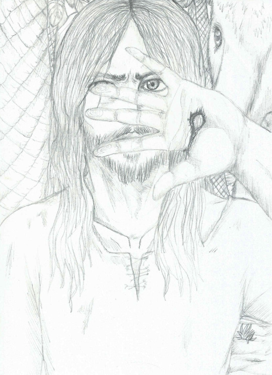
3a. "Brief Existence"
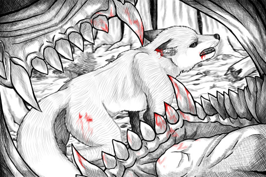
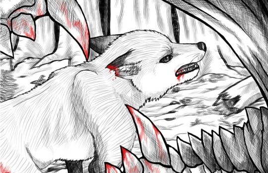
4a. “Want some Tail?”
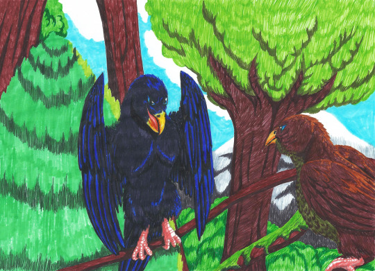
5a. “Tranquil”

6a. “Defiant”

7a. “When you leave.”

8a. “Ravenous Reptile”

2. Movement
1b. “Woodland Strut”

2b. “Lair of the Behemoth”
3b. “Cold-blooded Hunt”
4b. “Powerful Elegance”
5b. “Breaching”

6b.”Dangerous Thieving”
3. Storytelling
1c.”The Claws of War”
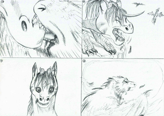
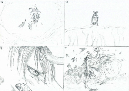
(Video version available HERE for better details on each panel)
4. Life Drawings
1d.” Curious Soul” (Charlie, Male, Maine Coon, 1 year.)
2d.”Old Faithful” (Riki,Male, Labrador Retriever, 8 years)
3d. “Croquis”
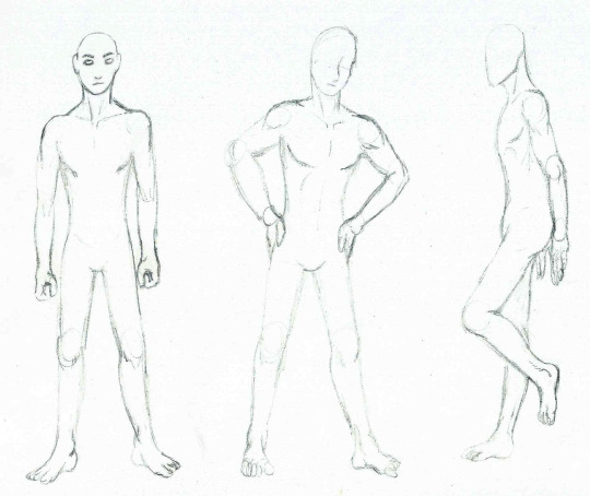
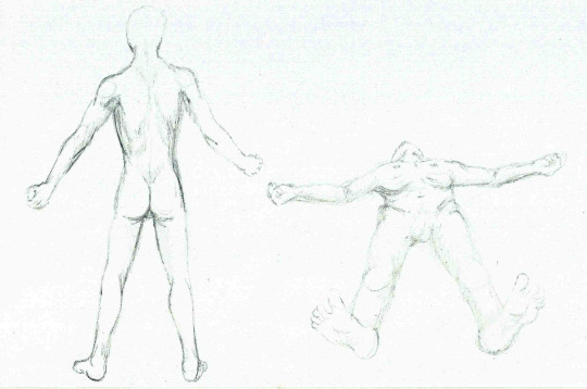
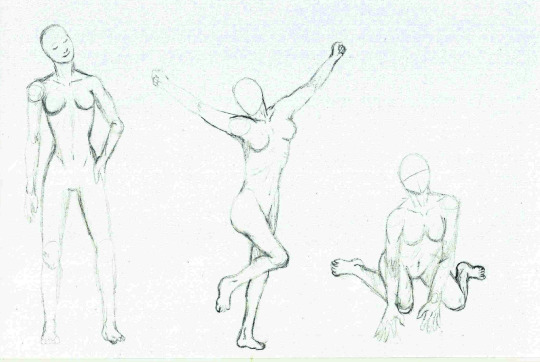
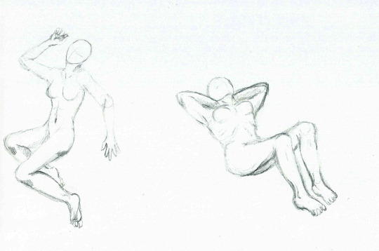
5. Perspective
1e.”Brace for Impact.”

2e. “Stranger in a Strange Land”
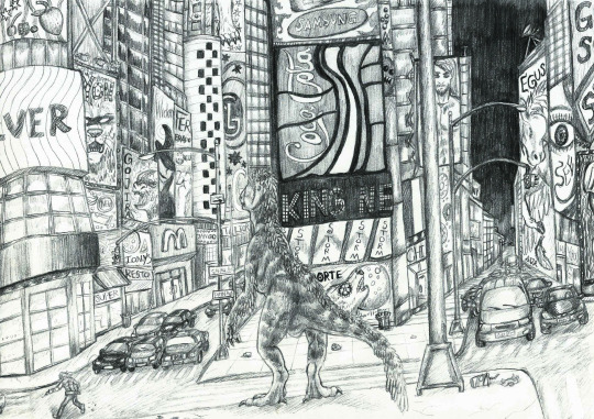
3e. “Arctic Wings”
4e. “Unburied”
6. Freestyle
1f. “Diseased Devil”
2f. “Malibu the Fox”
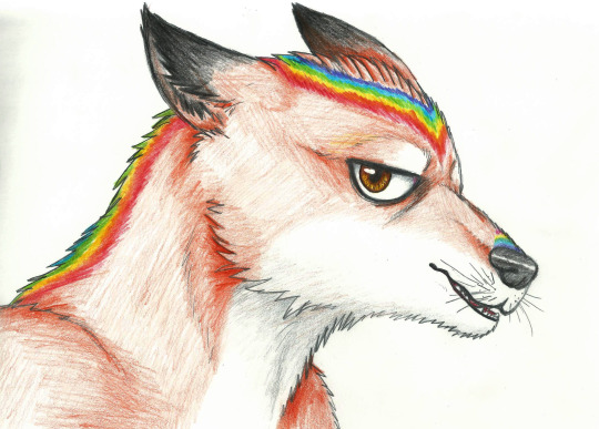
3f. Kurama Sage-mode (Original concept based on official character)
4f. “Roar of Devastation” (Excerpt from fan-comic based on ‘Naruto’ *READ RIGHT TO LEFT*)


5f.”Tropical Deathbeak”
6f.”Pomegranate Gryphon”
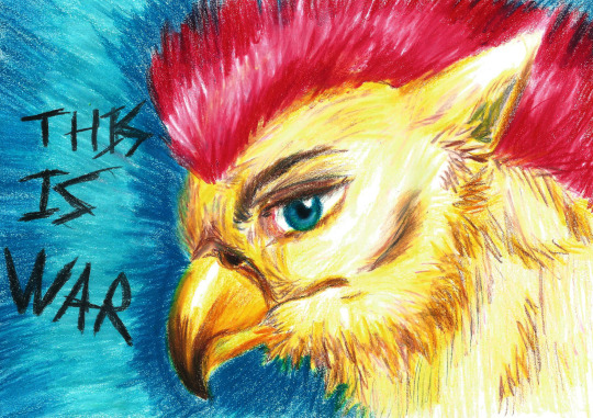
7f. “The Smiling Dog”

7. Optional

“A Day in Jared’s Pants” is a series of 4 animated short-films, written & directed by myself and my friend Iris. All animations and visuals are made by me.”
Full playlist of all episodes HERE
0 notes