#hiogh key
Explore tagged Tumblr posts
Text
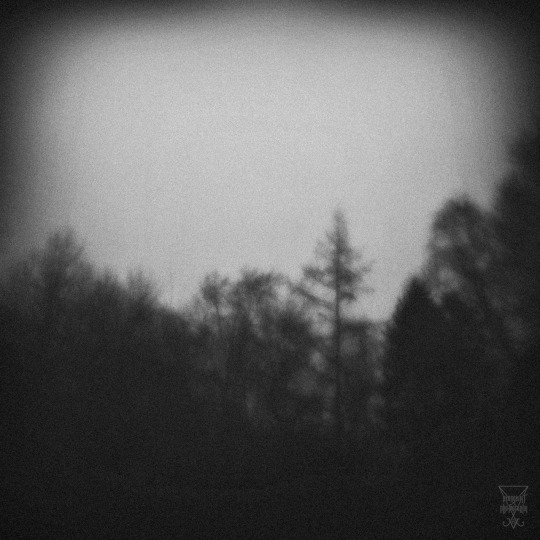
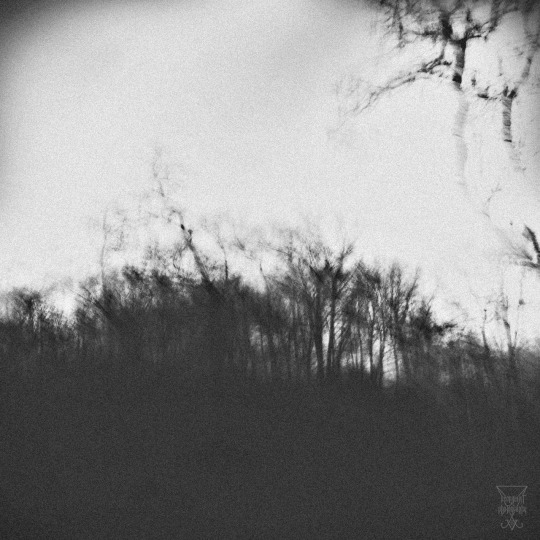
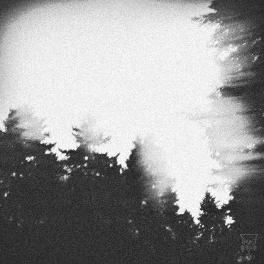
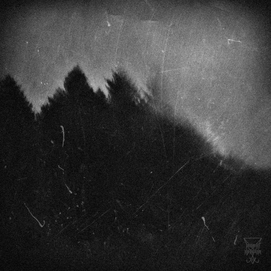
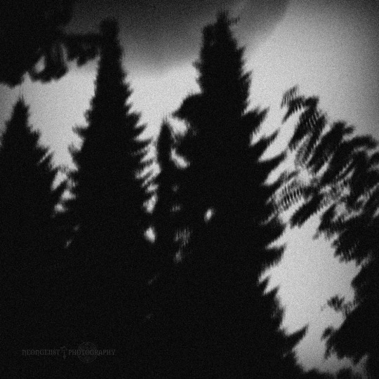
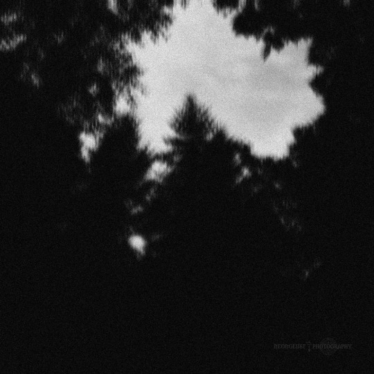
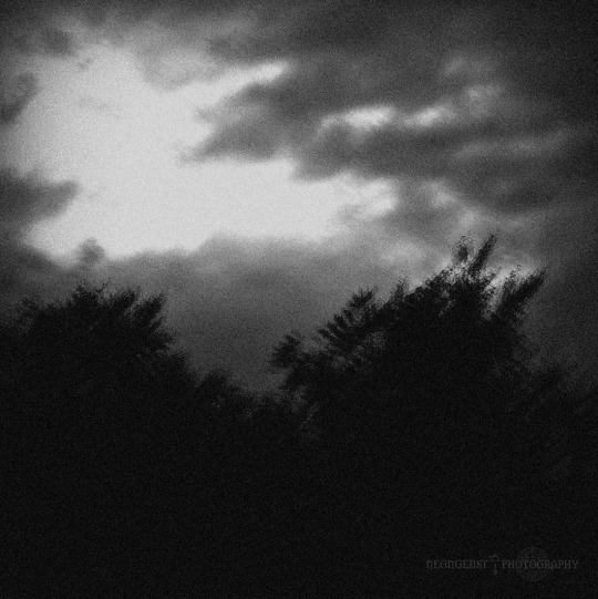
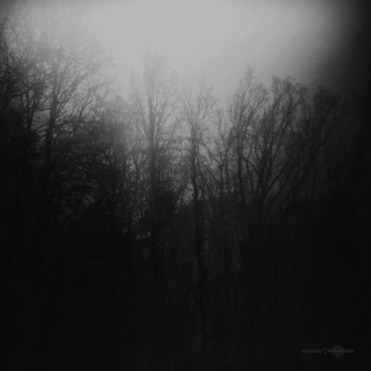
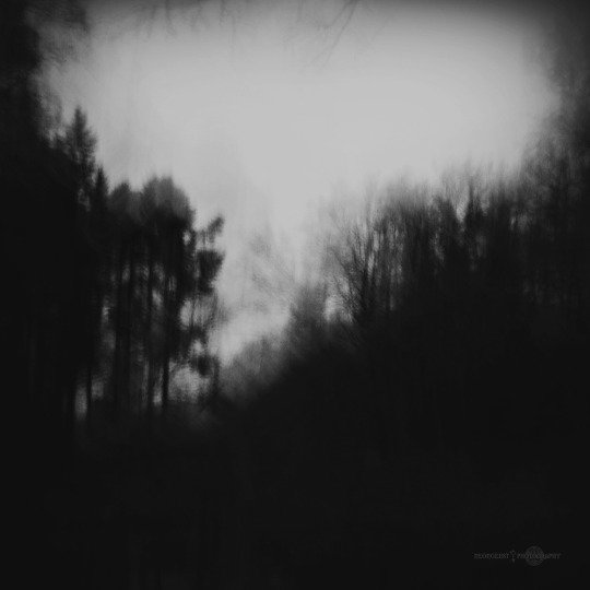
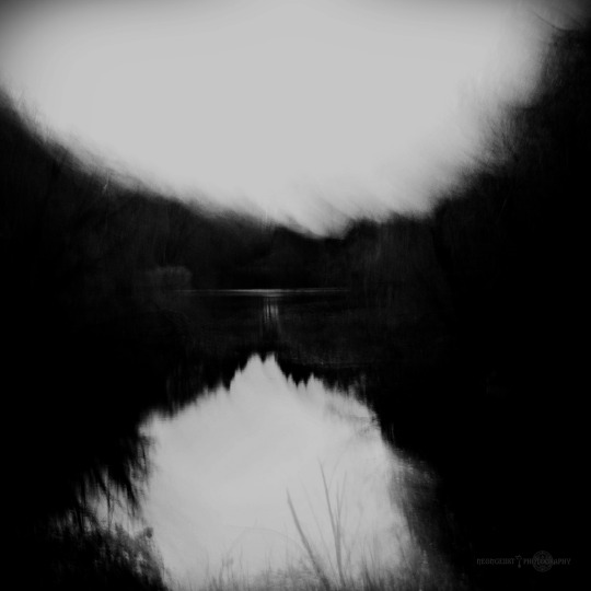
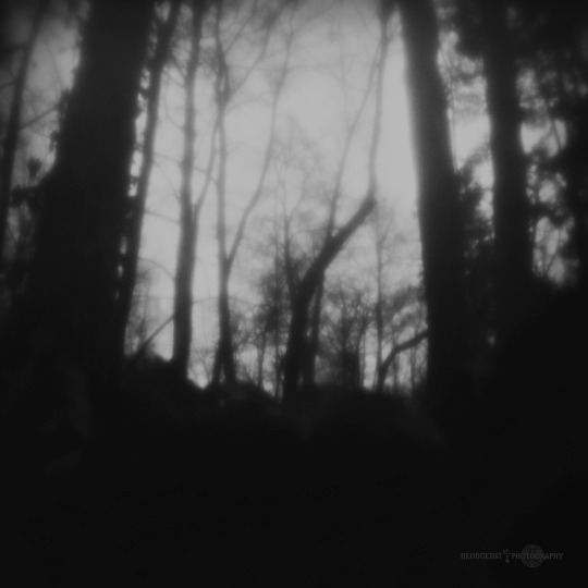
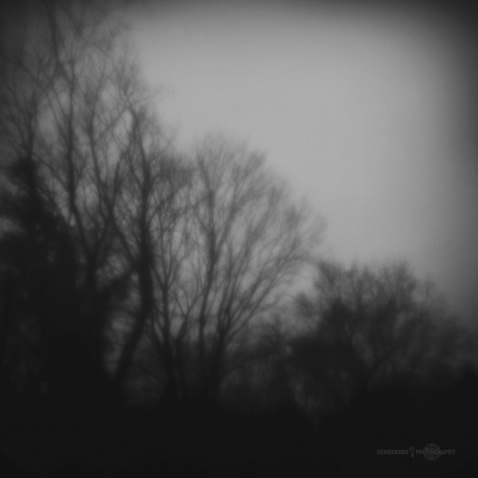
[ - ■■■■■■ / 07:2024 - 03 - ]
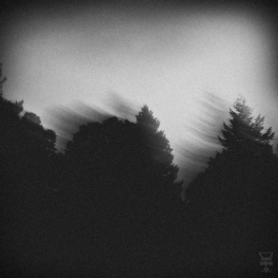
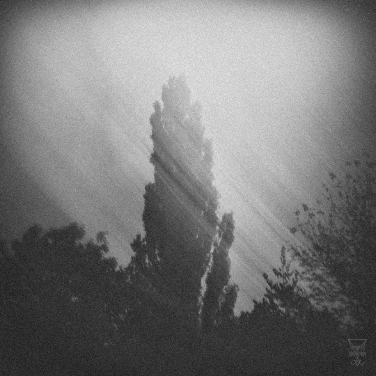
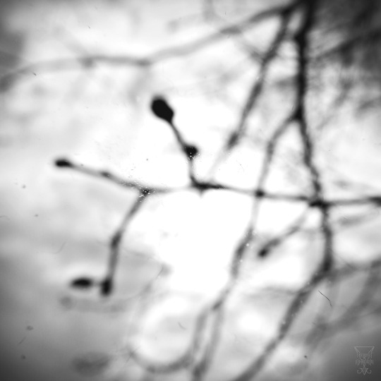
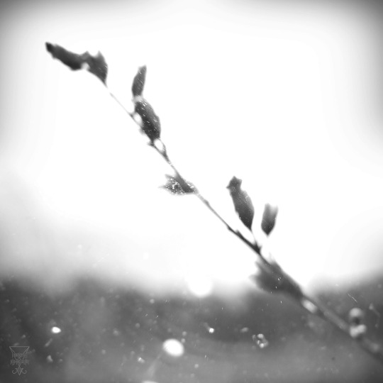
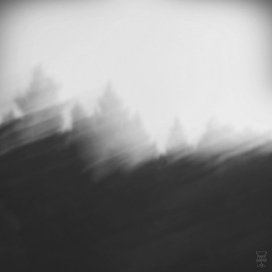
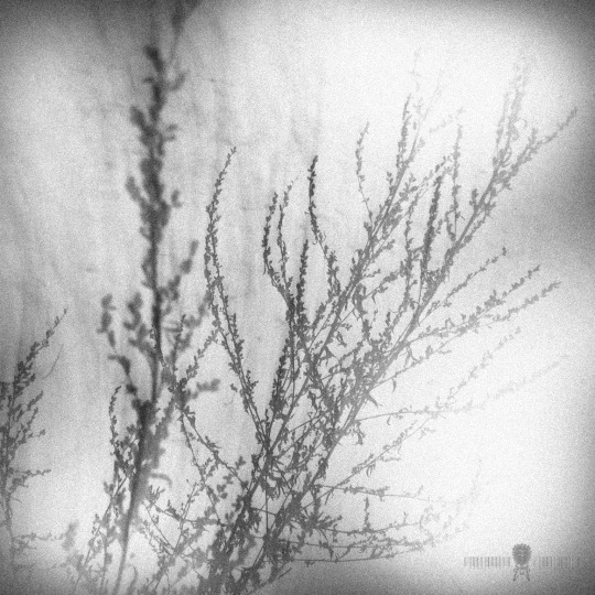
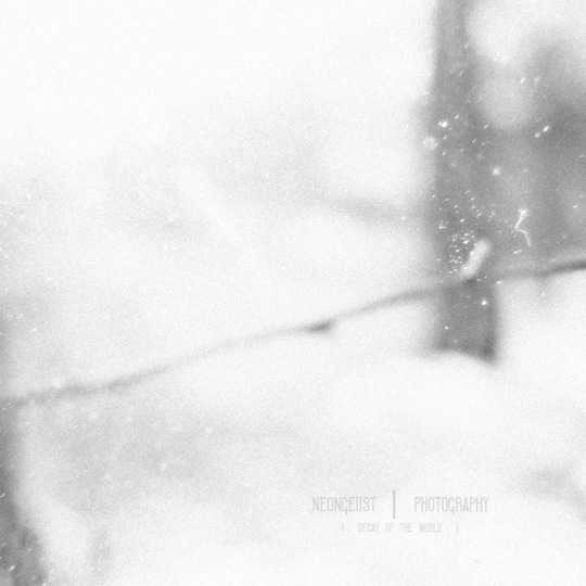
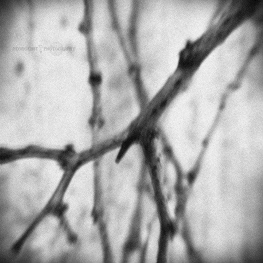
[ - Lange Schatten und kleine Dinge des Waldes - ]
.... [ - Långa Skuggor och småsaker i Skogen - ] ....
Original Nature Photos between 2014 and 2018 from my Archive with no retouch.
Photos | Artwork | © by ■■■■■■
#germany#photography#berlin#photographers on tumblr#black and white photography#original photographers#atmospheric photography#black and white photo#time exposure photography#high key photography#hiogh key#low key photography#low key#macro photography#super macro photography#nature photography#nature inspired photography#silhouette#silhouette photography#film grain photography#blurry#blurry photography#outdoor#outdoor photography#forest#tree branch#trees#depressive photography#melancholic photography#atmosphere
27 notes
·
View notes
Text
Re-painting the sky (again)

I started completely from scracth this time. I wanted it to be a white canvas so that I had a lot more freedom rather that trying to use the same colours as I had previously. I wanted a lot more richer colours and recently I took a photo of yet another sunset. This time the colours were a lot brighter and saturated which was prefect for what I needed. I still wanted to keep the themes of having a darker side on the left and a lighter on the left I want to tone it down a little and not have too much of a difference in values. I also wanted to have the body of the clouds a lot fatter or larger as before it was essentially a series of extremely thin clouds and not really any sky. It didnt necessarily look like a sky as such. In this screenshot above I tried to map where I wanted things and to simply place down the colours and position of where roughly I wanted things although I had a vague idea in my head of what I wanted.
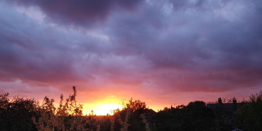

Here you can see me start to flesh out the original starting points that I had placed. At least on the left side which I wanted to focus on mainly. You can see the inspiration taken from the photo and how I used it as reference. Although I didnt specifically want a sun in the image, I did acknowledge that I already have a lighting scheme on the character so that changing it would ruin what I already have. Meaning that I would have to roughly follow the lighting from the character and use that almost as reference as to where the darker elements can go. I wanted to start with the darker elements for this reason.

The main idea was that I would have two main clouds. This is the best way that I can show that there is two sides, a lighter and a darker rather than simply using that with only colour. I wanted to keep this idea consistent, so I thought why not have simply two main clouds that are almost fighting each other.

I also wanted to make the darker cloud closer. this is because the character is closest to the screen and is in a combat pose. I wanted to infer that she is fighting the darker side/ the Europeans, so making the darker cloud closer would show that she is close to them. As you can see I was trying to make it so the lighter cloud was a lot further back. I also didnt want the screen to be only two clouds and no sky which was a mistake in the previous background. I tried doing this by making the part below only sky. I am exteremely happy with the colour choices although technically I cheated by grabbing colours from not only the original image, but also from a website that gave me direct contrasting colours.
https://www.sessions.edu/color-calculator/
This website allowed me to key in the colour code number and it would find direct contrasting colours for me. This ended up being extremely useful as it found me the rich orange that you can see here. I really like this colour as it not only works really well with the skin tones, it ‘feels’ native american and allows people to perhaps deduct that the cloud represents the native american people fighting off the invaders of purple. I discovered the saturated blue from this website as well. I really like this colour as it brings the piece together. It not only allows the character to stand out a little, but feels like a pleasant sky to look at. It is something that is inviting which is good for my target audience as my audience enjoys environments that are a lot more bubbly and bold which I think the colour choices reflect well.

Here you can now see hopefully what I envisioned. I think I did a good job in applying the change perspective that I was aiming to achieve. I decided to add the area next to the lighter cloud a lot lighter blue to not only allow the cloud to stand out a bit but to emphasise the perspective a bit, just to be on the safe side to make abundantly clear that this is further back than the darker cloud. I also did this to distinguish the cloud from the actual sky and to add some blue to illustrate that this is indeed the sky. I understand that at this point i am repeating myself but i was constantly worrying that i was making the same mistake that I had done previously so i really tried to avoid that. I think the colour choices was a lot better this time round however so I dont think I had to worry as much as I think this is what carried the background. As you can see there are still aome thinner clouds that I wanted to keep as they looked nice and allowed me to fade the clouds outwards, not making it just a puffball. This is something that the painter turner did and I thought was particularly effective.

Finally to finish off the sky I added some white clouds. Before on the previous background I had a white on the bottom to de-saturated it and have it fade out to a much more saturated top half. This time I wanted to keep that theme but ultimately decided to add some clouds instead. This I think not only looked better but inferred that the character is quite high up. To do this I simply googled for cloud png and changed the setting to search for ones at hiogh resolution so that it would not pixelate. I downloaded the image directly from the website rather than copy and pasting it as therte would be a black background and wouldnt have the same effect as there is often a little bit of black outline when I remove it. I also adjusted the opacity and altered the shape of the clouds so that it didnt stand out too much and curved around the rock.
2 notes
·
View notes