#hes really square and round shapes really fun to draw
Explore tagged Tumblr posts
Visit Tumblr Blog
Explore Tumblr blogs with no restrictions, modern design and the best experience.
Last Seen Tumblr Blogs


Fun Fact
28.6 is the average number of monthly visits per US mobile user.
Text
Learning shape theory was so great for my art
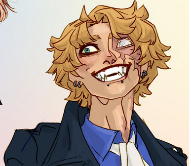
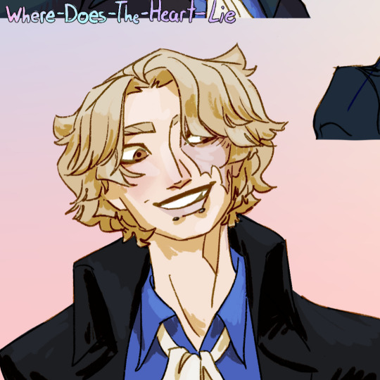
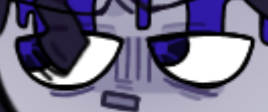
I was able to make body types for my characters, I found out why I hated Alan's glasses so damn much, I made a cool gargoyle today who is truly the gargoyle of all time someone said he looked like the minion from clash royale, which I suppose is better than old man?
Edit: the moment I doodled over the oval glasses and decided he needed a change of shape

#alan's glasses were sorta oval#a half moon/ rounded kinda deal#it looked weird#and shit#HE NEEDED RECTANGLES#it was such a game changer#and it fits his personality so well#he's such a square#but he just wants somebody to love him#🥺#parental affection who#✌️#the gargoyle went from a guy who was visibly older and I could see being a distinguished scholar.he's a mage so the designwas in character#so from that to big hulking monster-y guy who is indisputably a gargoyle#cuz as much as I wanted him to look like a gentleman he didn't really scream gargoyle#what's the point#if he ain't look like a monster and he the definition of don't judge a book by its cover?#all about shape#those cheekbones#the horns!! and ears!! so fun to draw#the body types thing? it's just a standard set of shapes I need to create each character#they've all got their own shapes. even for the eyes#it helps me#create a consistent way of drawing them each time#e.g. stormy is extremely composed of ovals but she's got some sharp triangles in there#feminine and alluring but dangerous~#oh man we're not gonna be the same age in like two months#my asg characters are gonna become my little siblings#they were several years older than me when I first created them#that's wild
1 note
·
View note
Note
Do you know have any tips on how to draw a comic? As in simple style and easy to draw and consistent in redraw? I love your style and I can't help but wonder how you got here and if you could help. Thank you
okay sorry i left this in the inbox for a bit because. where to start lol! there's a lot of thought that can go into making comics i think. but i believe you're specifically asking about having a consistent art style and being able to draw the same character a lot over and over again, so i'll try to focus on that
i think a lot of consistency is just playing around with character designs and getting something you feel comfortable with. ill use grian as a good example because it took me a while to come up with a grian design that i liked. once i liked it, i was able to draw my grian a lot & very consistently. every time you draw a character, even if it's a little doodle, you gain that muscle memory for ur lines a little better, so you should doodle always as much as you can and never be afraid to try something new and experiment with your style
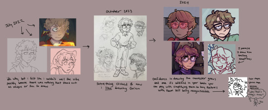
the pipeline
i think a good way to establish a character design that you really like to draw & can familiarize yourself with is by defining some key features about them. like in this image for example, my older grian designs don't really have anything about them that stands out to me. he wasn't rlly that fun to draw. but nowadays i think i have a distinct hairstyle & expression & glasses shape i give him, which are fun to draw. even if it's a tiny doodle with like, 15 strokes, you can still identify it as my grian design i think
something that i noticed (i didn't consciously do this but it just sort of happened as i was trying to make them all look different from one another) is that i assign different shapes to grian, cub and scar. these guys are good examples because 1. they're the three characters in my hotguy comics part and 2. they're the three guys i draw the most often
grian i tend to go for more rounded shapes, cub more squares/rectangles, and scar is more pointy and triangular. little things like this can help them stand out from one another and makes them fun to draw in my opinion. when i draw grian's hair i always have the hair come to a rounded point and is more neat/tidy. when i draw scar the hair is more spiky and wild. cub is sort of in the middle where his hair is more pointy, but is kept neat, which gives it those straight lines and right angles
TL;DR how i draw characters easily and consistently is make key features & shapes that make them fun to both draw & look at. and then draw them a lot
i hope that makes any sense, i like yapping about character design so hope you don't mind the long response lol ^_^
214 notes
·
View notes
Text
When I say the character designs for Gaslight District "tickle the autism in the best way" I mean stuff like
Mel: The lines of her mummy cloth style outfit just look really fun to draw. Or the fun wibble wobbles of her hair. The dangly parts over the front of her face, I forget if those count as bangs or if that is another thing. Apologies I'm very stoned and tired.
Mud: You got the sharp pointy bits of a skeleton with the blobby green goop. 10 outta 10. You could have a lot of fun just drawing the parts of goop around his mouth
Breadhead: I love that he doesn't have any sharp teeth. They're all very small flat teeth and god I wanna draw just his loooooooong rows of teeth.
Ken: MY BOY HAS ALL OF THE FUN SHAPES IN HIS DESIGN. SO MANY JUST BIG SQUARE OR ROUND SHAPES. YOU AIN'T GOTTA PLAN NO SMALL DETAILS. JUST BIG CIRCLES FOR FAT AND MUSCLE. SO FUN.
#The Gaslight District#Don't even get me started on the Virtue Corps#i just wanted to gush about Ken's design but didn't wanna exclude the others
42 notes
·
View notes
Note
Hey Smiles!
Its me again... sorry if I yap a lot or ask too many questions or get too annoying (tell me if I do)
BUT my real question is:
I don't really know how to do the side-of-the-face portrait whats-it-called (if that made sense), so I'm wondering, since yours are always good, (and our styles are kinda alike)
How do you do the side portraits? I can never get the hair, the nose, or the mouth right!
- @link-to-the-random
You’re good! And aww thanks! I’m glad my side profiles are good, they’re actually fun to draw for me but are for sure difficult to get down 😅 so here’s some notes here:

I always start with a simple sketch here. It doesn’t have to be perfect and I usually make it messy. I go in later to chisel the features so the sketch is usually quick and simple! And important note is that the circle, which represents the cranial bones, is a long oval

That’s kinda how our heads are shaped, and it’s very important for how the neck will be placed! Many people say to not use a circle to draw because it leads to perfectionism, but I’ve been doing it for so long and it gets the shape down so if it works it works 😅 those are some important notes on the general head. Another important thing to keep in mind is the neck

It’s best to avoid straight lines that are loosely placed on the head. You can do this, but if you’re going for a realistic or semi realistic look, it’s best to add some curves and lines that lead to skull naturally
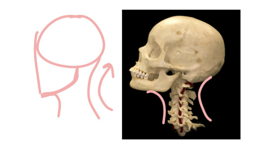
It makes the neck look more natural, and it makes sense in terms of the skill. The spine goes to the back of the neck as you can see in the picture (I didn’t trace over it accurately but my point still stands lol), so making sure that the back of the neck leads into the back of the skull is very important. But there’s usually a little bump from the occipital bone so it’s not straight. I hope that makes sense 😅 but yeah, those are some notes on the neck!

Then you start chiseling in the features and adding placeholders. I add the ears in the middle of the head but it doesn’t super matter, as long as it’s not too high or too low. And our eyes usually aline with our ears so i out a line to find where I’ll place the eyes which is usually in the middle of the ears. Now ear sizes usually go from the eyebrows to the bottom of the nose on most faces, but I don’t really focus on that.

This part will change depending on facial features. On a more feminine, softer European face, the side profile may look like this, but some people don’t have hard brow ridges, small noses, and small/ big lips, so this will change from person to person! Chins as well! Some chins are pointy, square, or round, but generally the face will have a shape kinda like this. But where there’s no bumps there’s probably very small and subtle curves. I know this especially changes for different races and I am a white woman so I’m mostly speaking from white people standards 😅 but yeah it changes for everyone so there’s no right or wrong way to do the nose, lips, brows, and chin. The best part is that if you’re too stressed to do different brow ridges, jaws, and lips, you can always just focus on distinct noses which do WONDERS for character designs. I don’t typically play with jaws very much cuz it’s a lot to focus on but I do try to keep them in mind

I quickly did this but eyes have this odd triangle shape from the side as you can see, and the pupils are holes so they’re up against the edge of the iris. I don’t do the triangle shape for eyes very much but they do a good job at showing cheeks there and the depth of the eyes! And I try to keep the mouth at the edge of the eye, cuz mouths don’t typically go that far (but some mouths do!)
Some examples here:

Wars has a softer brow ridge and a straight, smooth nose. It curves slightly and he has softer features. As you can see, his mouth doesn’t go past his eye.
Leon has a similar nose but it’s slightly more pointy at the end, and he has a square chin so I try to make it more distinct. Admittedly it’s probably not anatomically correct but it’s how I do it.
Louis has a bumpy nose and a strong brow line (he’s also frowning which would make it more obvious.)
And me! I don’t have a strong brow line and my nose is kinda hooked (not really but it’s curved)
As you can see, I try to keep the eye from getting too far and too close to the nose. On real faces, it changes and eyes can look super close to the nose, but I still try to avoid it with my art. But you can still do that! I’m not completely accurate with my art haha. But I usually keep like… an eye or half an eye’s length away from the nose. And yeah! This is how I do the side profiles but I’m sure it’s different from others. I didn’t talk about hair but that definitely requires a lot of practice, but I hope this at least gets you started in the right direction!
36 notes
·
View notes
Note
Hello! I hope you’re doing well!
I’ve been watching Monk for the first time and have LOVED seeing your Monk fanart! The way you draw him is so fun and cool, I haven’t seen anyone draw him in a way that captures his likeness and still retains a creative style! I’ve been trying to draw him for weeks now and have had a lot of trouble nailing his features, any tips?
Hope you have a great one, and thank you for blessing my fyp with your blog! 💜
WAAH thank you !! I'm very glad you enjoy my Monk art! <3
I am shit at explaining myself and half the time I myself don't know what I did to get where I am. So I doodled him a bunch to try and feel out how i draw him.
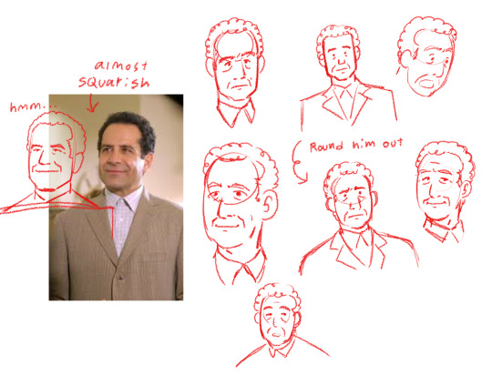
Right of the bat I think I draw Monk a little rounder than he actually is? When figuring out how to draw someone I usually quickly trace over a photo to get a feel for the person and try to break them down into basic shapes first and build from there, and Tony Shalhoub can be a Very Square man in my eyes.
But I look at Monk and I see a softness that I must get across in my art, so I add some softness. Round his squares out a bit. Sometimes the vibes must be accounted for as well.
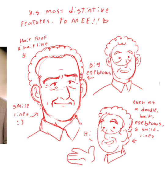
To me some of his most important features are his eyebrows, hairline, and most importantly and kinda ironically seeing as how sad his character is, his smile lines.
And you know, sometimes I DO draw him a little squarer, and sometimes I draw him a little rounder, consistency is also... Sometimes... Not as vital as it may seem... As long as the shapes FEEL right. Wish I could tell you my process more but I feel like I draw like that "draw the rest of the fucking owl" meme!
Your style is really cool btw! I love that columbo collection(one day I'll watch Columbo...). sorry if this isn't helpful at all lmao you have a wonderful day and/or night as well ! ^-^
#I simply open a canvas black out and suddenly Monk is there! /j#I think having a simple more cartoony style does help me hide when I bend anatomy around a bit tho#talk#adrian monk#monk#lekko's art#it's all about shapes and posing and having fun with it#if theres spelling errors in the art no there isn't <3#i'm not good at WRITING#THANKS FOR THE ASK THOOO very sweet#anyway it is way past my bedtime
45 notes
·
View notes
Note
Can we have a deeper analysis in Sabo's shape language study please? It's amazing how you make him give different vibes with just his hair and I like to understand how does that work.
Oh. I'm SO glad you asked.
(The Post In Question)
Okay so this isnt the first post ive made about shape language,
Here are the others:
ASL Shapes Strawhats Shapes
i'm just gonna copy and paste the definition i have for shape language from those posts here so i dont have to write it all again.
Shape language is defined as “a concept used in art and animation to communicate meaning based on shapes we are familiar with” (source). This concept uses circles, triangles, and squares to convey an idea of the “personality” of the design without using any words.
In designs, using circles and rounded edges in your silhouette and detailing gives the design a soft and squishy look. They tend to be harmless, approachable, or changeable.
Designs using squares gives the design a solid, sturdy, and strong look. They are supportive, reliable, and inflexible
Lastly, triangle designs are sharp and directional. They are dynamic, dangerous, and unpredictable.
That's base level but here's more in depth description of each design for ya:
this one is up first!
You may notice how in this design, his hair isnt in large clumps like the others are. His hair falls delicately and waves gently with little to no hard angles.
In this design, i was trying to convey the idea of "he wasnt born to fight, but he's molded himself into someone who will." I tried to depict that by making his hair all light and feathery, his facial features soft and rounded, but also showing how he's modified his body in a pointy and aggressive way.
I didn't want to only go hard edges with the piercings though because much like he's strayed from his mold of being delicate, he's also strayed from his mold of being a cruel noble. so some of his piercings are rings, AKA: Circles.
You may also notice the different in how I've drawn the collars of these guys. the collar of this Babo's black coat falls softly, and its' arc is rounded. The shoulders don't have any padding and it rounds at the corner.
This Man Is Round.
Next up is this Freak
This is supposed to be Triangle Him.
His hair is in larger, hard angled clumps. Indicating that he probably cut his hair himself. He did... greattt. I already headcannon him as someone who cuts his own hair, but i dont think this one ever gets any better at it.
The hard angles on his teeth, his scar, his jaw, his collar, that line i forgot to erase on the left, and his coat all give indication that this guy is Dangerous and you probably shouldnt mess with him.
I didn't have any real deeper meaning to this version, I just wanted to make him look as opposing as I could. this guy is "what you see is pretty much what you get."
Even though he doesn't have a lot of deeper meaning, I think this one is my favorite of the designs. I really love these colors on him and his hair was really fun to draw. I think I wanna draw him again at some point. I think this version of him would be very funny paired with Koala. I'm chuckling thinking about it:
Koala and her Armed and On Fire kindergartener
And lastly this guy
Sabo's base design is very rectangle coded. From his Hat, to his face shape, to his coat. So this version was very easy to make as I didn't actually need to change that much!
I think maybe I could've made his design a little more complex? But also I think there is a beauty in simplicity for this one. He looks straightforward, reliable, and kind. He seems like the kind of guy who gets his hands dirty, not because he likes doing it, but because he does what he must for the greater good.
I really love his hazel eyes, too. I think it brings a nice warmth to his design that is really nice.
Additional comments:
I love talking about this stuff. I love designing. I love art. I love drawing so much it's so fun
Everytime I get to sit down and make some funky doodles my brain feels like 🧠🤸🧘🧜🧚🙋♀️🙋♀️🧚💃💃💃💃💃💃
If you got this far thanks for reading :)
I usually have a description for my designs and my choices and stuff and I forgot to do one for this post, it makes me happy to see that it was missed :)
213 notes
·
View notes
Note
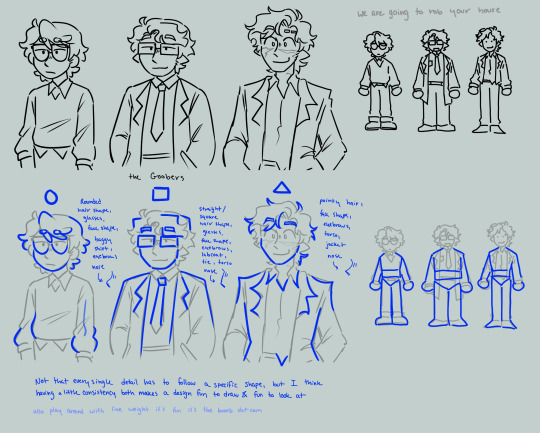
what are your like essentials/you have to put in accessories or traits for drawing the bad kids?
BOY OH BOY DO I HAVE A LIST FOR YOU PAL
i have so many designs for these guys but there are certain cornerstones that MUST be upheld.
for Adaine, i love giving her huge round glasses, more often than not with some cute glasses chains or dangly accessories with them. im my heart she's also very tall and lanky, perfect awkward teen girl build. i like to keep her facian features very oval shaped, a sharp chin with a rounded jawline and a straight and thin nose.
for Kristen, I like to make her hair curly and cover her in freckles. she was the chosen of helio!!! she's kissed by the sun!!!! she's always looking sunburnt and tan in my heart. I also love making her rather stocky, just a stout girl with a big smile. i like to give her very rounded and robust facial features, chubby cheeks, a big button nose, and very expressive eyes.
for Fabian, his design is the one that changes the most imo. i could put him in one million different hairstyles and one million different outfits. i think his cornerstone design aspect that cements him as Fabian is his eternal smirk and general prettyboy aura. also the eyepatch is a pretty big tell. i like to give him sharp rectangular features, a strong jawline, defined cheekbones, and a straight nose, occasionally dropping in some cheeky dimples.
for Gorgug, i really like to give him a longer haircut, as well as part his bangs to sort of cover one eye. he's very rectangular to me and has a very long but toned build. i like to keep his face very rectanguler but rounded and soft, a square jaw and defined cheekbones, but soft brows and eyes with a large downturned nose.
for Fig, her design is also one that changes a lot, but that in and of itself is a huge part of her character!!! she's spontaneous and rebellious, and I always make sure her design reflects that. her hairstyle hats lots of subtle changes, but i like to stick to alternative microbangs a lot and making her horns curve inwards slightly. a little demon tail is optional for her, but always fun. i like to give her very heart shaped features, with a pointed chin and round defines cheeks, as well as a pointed button nose and expressive but sharp eyes.
for Riz, i really like to lean into the feral/animalistic side of goblins that we see in fh. sharp teeth, big sharp catlike eyes, and large expressive ears. im also a huge fab of giving him digitigrade legs and paws and a fuzzy tail. in my heart he's sharp and scratchy and covered in fuzz. i like to keep his face sharp but round and cute, he's got round cheeks but a sharp jawline, a small downturned nose, and wild expressive eyebrows.
#dimension 20#fantasy high#d20#riz gukgak#fabian aramais seacaster#fig faeth#adaine abernant#gorgug thistlespring#kristen applebees
106 notes
·
View notes
Text
Public domain designs for the narrator and the Sphere from Flatland: A Romance of Many Dimensions, which is public domain and can be read and watched and listened to in many formats for free.
All of the art and designs on this post are public domain. This means they have no copyright, and can be used by anyone for anything. Including making art you then sell. You can repost any you like to shorter posts, just please include the image description that goes along with it.
Image descriptions are in summary, the equivalent of subtitles for blind people.
Here is a link to a masterpost for Flatland: A Romance of Many Dimensions.
And now for the public domain designs. I made all of these last week and kept forgetting to post.
The narrator first. There's two sets of lineart I was using and I only remembered to make one of them glow.
Batesian mimicry:
Where Flatlanders appear to be completely different creatures when seen above, with eyes that seem to stare directly at you...but it's really just incredibly detailed coloration on their internal organs, evolved to ward off predation from 3D predators that Flatlanders aren't even aware of.

[ID: A digital drawing of a square against a dark grey background, with a thick black border. Inside the square is a squiggly pink shape like an alien fish, with a single purple eye staring upward. Around it are green and orange squiggles, with white triangles around the edges, one of which is the Flatlander's real eye and mouth. End ID.]
Valentines card:

[ID: A digital drawing of a square against a light grey background. He has a black outline that glows white, with a single eye at the upper right corner. His insides are dark purple-red, with brighter red inside a zig-zagging bordern, with five pinks hearts inside the red section, with the largest in the middle. End ID.]
Basic organs:

[ID: A square with a glowing border, with a simple cartoony oval eye on one corner with a narrow pupil like a cat. His inside is light blue, with two large rounded blobs stretching back from his eye to represent a lung and stomach, in pink and purple. Around these are smaller blobby organs in orange, red, and darker red-purple. End ID.]
Same lineart as above, but with patterns for fun:

[ID: The same lineart as directly above, but rather than solid colors, his insides are striped blue and ice blue, and the organs are pale pink with darker pink polka dots. End ID.]
based on very fuzzy memories of a quilt from my Nana Jana's house...

[ID: A glowing square against the grey background, still with the simple oval eye in one corner. This time his inside is colored teal, with many almost symmetrical shapes inside forming a random pattern,each with gaps between them. These shapes are in pale red, orange, yellow, pink, and purple, with a large section in blue filled in with some of them. End ID.]
pretty pattern 1:

[ID: The glowing square, now colored monochrome blue, with a pattern of overlapping lines forming many curved diamonds filled in with blue-black, dark blue, ice blue, and almost white. End ID.]
Needs More Glow:

[ID: The glowing square, now colored in dark brown, with a large pane orange eye and large round pupil,creating a gap at the corner that is filled in with glowing white. His insides are in tan directly behind the eye, with other blogs for organs leading off to the sides in different shades of yellow, brown, and red, including a small heart shape. End ID.]
Geode dude:

[ID: The glowing square, now with his insides dark red on two corners, and the rest filled in with squiggles of ever-lightening blue. On top of this are thin white lines showing the forms of a brain, heart, and organs. The brain is connected by many small tendrils to the line that comes in from the upper corner that is both his eye and mouth. End ID.]
the same but now with squiggles:

[ID: The same white lineart as above for the organs, but filled in solid black, with the backgroud of the square in different shades of blue wavy lines like water. End ID.]
This one should have been brighter but my phone lies to me about colors and I'm too lazy to fix it now.

[ID: The glowing square, now with a simple cartoon eye at the top right corner, with a large white zig-zag crossing the body behind it. One side is pink with purple spots, the other is purple with pink spots. The spots are connected to eachother with simple wavy lines like springs. End ID.]
Fiery rose:

[ID: A square with thick black outlines on a grey backround. The inside is colored in different shades of overlapping pink and red swirls, forming a pattern like flower petals, or fire. End ID.]
sunshine swirl:

[ID: The square with thick outlines, now colored in orange, with a paler yellow orange symmetrical spiral on the inside forming a swirly sun shape in the center. End ID.]
simpler...

[ID: The square with the thick outline, now colored in orange, with a large oval eye, a large purple heart shape, and two small purple circle shapes on either side. End ID.]
simplerer...

[ID: The square with thick outlines, now colored in sea-foam green, with a simple black spiral at the upper right corner for the mouth and eye. End ID.]
Now for The Sphere:
Starlight eyes, with pattern.


[ID: Three digital drawings. The first shows an original design for the Sphere from Flatland, drawn against a light grey background. The Sphere is light pink, with a swirling floral design in purple. He has two large eyes, whose pupils are black and covered in specks of white, like stars. The second image is just the circle with the pattern, and the last image is the pattern itself filling out the whole image. It is symmetrical four ways, with four swirls and points in a cross between a flower and a star. End ID.]
Cyclops with noodly arm-legs


[ID: Two drawings of a sphere against a grey background. He is medium blue, with darker blue, thick swirling stripes, like a mackerel tabby cat. He has a single large oval eye on his face, and from his top rear extend two long limbs, which he holds at his sides in the first drawing showing him from the side, then folds under him like a cat in the second, when he is shown from the front. End ID.]
Stained glass at night:

[ID: An original design for the Sphere, seen from the front. He is covered in an intricate pattern of dark purple, magenta, orange, gold, teal, and royal blue. His eyes are shaped like narrow, upside down teardrops, with dark grey sclera, black iris, and a white, four-pointed star pupil. End ID.]
Froggisphere + lineart for recoloring


[ID: Two images. The first is the sphere drawn as a frog-like creature with a dark orange and yellow spherical body, with dark red eyes with horizontal bar pupils, with dark red thick front legs with yellow webbing, and blue back legs.The second image is the black and white lineart by itself. End ID.]
and last for now:

[ID: MS Paint art from four angles showing an original design for the Sphere. He is monochrome green, with a pale yellow-green face with a greener triangle shaped marking, then a deep green belly and hood. Above and between his eyes are yellow-green swirls, and his mouth is a simple line. His eyes are the same yellow-green as the markings around them, and inside his mouth is lime green. A purple hand filled with white sparkles is scribbled next to him, labeled, "telekinesis". End ID.]
these characters are public domain. You can make any design for them you want instead of doing free advertising for the infamously racist conservative Ladd Ehlinger, who created the 2007 film.
#eye contact#public domain characters#Rjalker reads Flatland a Romance of Many Dimensions#Flatland#Flatlandaromanceofmanydimensions#A Square#A. Square#The Sphere#long post#public domain art#public domain
22 notes
·
View notes
Note
Hi Ridia-San~
So Gakuen K AU, The students have to raise an egg for a week and since Yata/Fushimi did it in MS, they decide to partner up again (Hello Tamagohiko the Third). Basically they go through the same thing, but with a few differences.
Yata notes how Fushimi says he doesn’t care, but is found redrawing the glasses to a rectangular shape instead of circular (‘I think Saru wants Tamagohiko to look like him’), Yata keeps seeing one of the other pairings almost destroying their eggs and uses the log to be a CPS, Fushimi ends up eggnapping a Green pairings egg bc of reasons, Yata takes this as a sign and eggnaps another pairings’ egg that he has reported the most (Fushimi happened to buy three purple outfits that suspiciously fit the ‘triplets’), Yata notes that Fushimi uses the eggs to read off/find errors in code (YK like how real coders use rubber ducks) (‘Saruhiko is the Best Mom, he wants them to be smart :D)
I’m more curious on how all the Clubs/Teachers react to them, what happens to the Triplets afterwards, and just for fun how everyone reacts when a few of the logs have to be read. THANK YOU.
Maybe this is like Yata trying to teach Fushimi that he can have permanent things, by promising him their egg child won’t break again XD Imagine this at a point in Gakuen K where they’ve basically made up and are friends again, and their teacher announces everyone is going to be adopting an egg for a class exercise. They have to pair up and Fushimi is all gloomy clicking his tongue because he hates group work, but Yata pokes him and is like hey, you wanna team up again. They did this in middle school and probably had to sneakily switch out eggs after Niki broke their first one and there were bad memories there but Yata thinks this could be a good way of re-establishing their bond and showing Fushimi that he can trust in their friendship again. Fushimi hesitates but finally he shrugs like well if you want to, Yata grins and is like cool I’ll go up for our group and get Tamagohiko, Fushimi is like you’re not calling it that again.
Despite Fushimi’s protests Tamagohiko the Third is adopted, Yata even draws a pair of glasses on him (and is secretly pleased when he spots Fushimi changing the glasses to be more square instead of rounded). Yata decides now will be the time he shows Fushimi that Fushimi can really be a good dad, and part of this is making sure that Fushimi doesn’t get bad vibes seeing other people almost destroying their ‘children.’ Fushimi rolls his eyes and tells Yata not to be annoying but then one day Yata walks into class and there are three eggs in the carrying basket, Yata’s like wait did you give birth to triplets suddenly and Fushimi scowls all I didn’t give birth to them idiot. He won’t say where he got them but later Yata hears another student complaining that he was trying to see if you could throw an egg at the wall without breaking it and someone stole their egg. Yata smiles, figuring Saruhiko’s getting the hang of it after all.
For the rest of the week Yata encourages Fushimi to take good care of ‘the triplets,’ Fushimi keeps calling Yata an idiot but then Fushimi is also spotted like wrapping them up in scarves when it’s cold and at one point he falls asleep with the basket containing the egg trio in his arms and Yata starts taking pictures to tease him with later. The teachers are probably very impressed, everyone assumed Yata and Fushimi’s egg would end up broken pretty quickly during one of their usual squabbles but Fushimi especially is being surprisingly careful with them. Munakata praises him for being such a splendid ‘dad’ and Fushimi rolls his eyes all not you too, meanwhile Munakata is introducing himself to the eggs as ‘uncle’ (and then Fushimi complains about this to Yata and Yata’s immediately like what the hell, Fushimi says exactly and Yata’s like if anyone’s gonna be uncle to our kids it’s Mikoto-san, come on we’re going to the bar).
When they turn in their logs for the week the teacher is very impressed, imagine Yata even included some of the pictures he took of Fushimi being a good egg mom. The teacher reads even a few out loud including the ones Yata and Fushimi wrote, Fushimi looks all irritated and embarrassed while Yata beams because he made a good wife out of Fushimi. Later he joins Fushimi for lunch like see, we did a great job, you’ll be a great parent. Fushimi shrugs and says maybe, slowly eating his omelette. Yata suddenly realizes that the ‘kids’ are missing and starts to panic like wait you ate our sons, Fushimi gives him a flat look and then picks up the egg basket from under the table and shoves it at Yata. Yata’s relieved to see their children are okay, Fushimi rolls his eyes and says these are not our children, get rid of them. Yata is scandalized that Fushimi would throw their children away so easily, Fushimi says they’re going to go rotten eventually. Yata probably tries to hold onto them for a couple weeks until they start to smell and Fushimi makes him throw them away, Yata wonders if they should have a funeral and then go to the store to ‘adopt’ a new set and Fushimi throws a pen at him.
#sarumi#Talking K#I don't think Fushimi gets quite that attached#but he does find himself being slightly more solicitous of his eggs#like well maybe if these don't break it means not everything will break#meanwhile Yata's all should we name them let's take them on vacation
8 notes
·
View notes
Text
So a bit of an out of character post here. I have a ton of stuff written about this character. I really want to share them here. So I figured I would start today. Hermit's story is a tragic one (what VtM character doesn't have a tragic background).
Chapter 1: Sacred Heart Methodist Church
The wafting, warm smell of bacon cooking on the skillet crawled about the small two bedroom home. The Missouri sunrise, through the nature of light itself, had beaten the race to the small child’s bedroom. Where a 7 year old boy slept soundly despite the rude intrusion of the Sunday morning sunrise and the smell of frying pigs from the kitchen. It would take the loud knocking of the door, covered in crayon drawings of trains, to finally rouse the child. “Trigger! Time to get up! I need to be at the choir practice on time!” a motherly voice shouted with the forceful grace of a still waking parent. The blankets, from the local Dollar General, were thrown off the bed and Trigger rose from his slumber. Compared to his appearance 16 years later, this child was unrecognizable as the one who will be known as Hermit. His short black hair, greyish eyes, and a rounded face reflected off of a nearby mirror. After a stretch and a yawn to take in the morning sunrise from his small bedroom window, Trigger leapt out of bed with his favorite Thomas the Tank Engine pajamas and rushed toward the kitchen. There his mother had already set a plate for him. 3 bacon strips, 1 fried egg, and a glass of orange juice. His mother was already dressed for church in her summer dress and modest buttoned blouse. Her black hair was tied back and bounced as she moved about putting away the utensils from the making of the breakfast. She noticed Trigger step in and motioned to his place at the table. “Come on now, sleepyhead.” She teased with an affectionate smile. Hungry, Trigger got into his seat and devoured the food.
The Sacred Heart Methodist Church was not too far away from Trigger’s home. It was close enough that they could have easily walked to it, but with Trigger’s mother needing to be there for the choir they drove as a family. Hermit’s father was missing during breakfast, but it appeared he was just a bit behind getting ready as well. They all arrived at the church in their 2000 Honda Civic. Trigger’s mother rushed from the shotgun seat to get in the church. It would be still some time before the congregation would all arrive for the service. So the remaining two stayed in the car. Trigger’s father was a mostly clean shaven man. Never really liked a beard but let a little bit of fuzz grow into a light mustache. His hair was more of a deep brown, but in certain light one could have seen it for black. “Are you excited for 2nd grade? School is only a few more weeks away.” His father’s voice was never grumbly, but always seemed to have this energetic energy to anything he said. “Sure! Though it has been more fun to be with you and mom. I am really excited for what we will get to do in art! This year we get to make pots!” Trigger’s father flashed his classic dad smile. “Maybe if you like that we can get some of that clay and make some more. I am sure mom won’t mind us making a mess of the kitchen.” Stars in Trigger’s illuminated more than the summer night sky. “Oooh we will be in so much trouble.” Trigger thought about all the strange shapes he might make. His school pot would obviously be more “normal” but maybe one could be made to be more spherical! What about a square pot? Would that work? Could it hold water? The endless possibilities poured into the child’s mind. Much in the same way the imaginary water filled his imaginary pots. His bout of daydreaming was interrupted by the clanging of bells signaling the congregation to head to church.
The church was a modest one. Only having room for three members of the choir, sermon leader, and a single pianist at the front. There were only about 8 rows of aged old pews, each had a copy of the bible and hymnals. Trigger struggled to understand all of the words, but the music was nice and sometimes this quant space felt like another home to him. Looking at the gathered congregation, Trigger was looking for a familiar face. One of his friends from school and one of the sons of the other choir members. Maximilian; or Max, had been one of the kids in his first grade class. When the two found that they were from the same church they would try to sit as close as they could. Scanning, with hand upon brow, Trigger looked carefully but did finally spot Max. He was sitting at a filling row, so Trigger sat behind him. The boy had a red-blondish color to his hair, something Trigger had never really seen before. Max’s curly hair peeked over the back of the pew he sat at. “Psst! Max!” Trigger whispered over the settling congregation. The boy’s head whipped around as if finally finding something. “Trigger! I tried to save you a seat, but I didn’t find you.” Max whispered back. “Eh it’s fine. My dad and I should have come in sooner. Do you want to play today after the sermon? We could set up the sprinkler again!” Max’s eyes widened in excitement “Yeah! We should totally do it! I’ll ask mom after!” Beaming with childlike energy, Max smiled at Trigger. Without realizing it, Trigger found that his hand was holding the back of the pew ahead of him and Max touched his hand. Like the spark in a dark night, Trigger was startled by this strange feeling. It was like excitement, but different. It felt nice, much like most of the time that he spent with Max. Max appeared to have the same feeling as they kinda stared at each other for what felt like a minute. Quickly this all melted away and they laughed before settling down for the start of the service.
3 notes
·
View notes
Note
Hey, Hey! I wanted to draw some stuff for your fic, but I had a question. Do you have more details on how Michael, Gabriel, and Raphael look? I know Gabriel has some fem-characteristics and Michael seems to be the largest of the angels. No pressure tho!
Okok, I’ve actually had someone ask me about their appearances before so I’ll just post my response to them to give you a guideline, and if you had anymore questions just let me know duckling. The format of this is: there will be a number w/ a question they asked, and below that I answer it. (The questions came from @the-stress-express if you wanna check out their WIP)
Anyway, here u are:
1. Are Micheal, Gabriel, and Raphael kind of like copy-paste versions of Lucifer? Like, do they have Lucifer’s red cheek spots? Do they all have white ass skin like Lucifer?
- I imagine they all have white skin, and that Rals has the cheek spots, but Micheal and Gabriel do not. They’re kinds copy and pasted, but with a bit of variation in body structure (Rals being more rounded, Micheal a tad bit more square). And also while I’m here, I’ll say that Raphael is a little bit taller than Luci (probably just under Charlie’s height) and that Gabriel and Micheal are the same height, and quite a bit taller than their two brothers.
2. What kind of hairstyles, textures, and hair colours do they have? I’ll probably take some creative liberty, so don’t feel too pressured for detailed explanations, but I want to hear your designs so I can make it accurate to your vision. Also, I’ve heard theories that Micheal’s hair is a lot like Lucifer’s but idk if you are having that there.
Okay, we’ll go through this character by character.
Micheal - Same blondness as Lucifer, but perhaps a little shorter. Maybe a little fluffier at the top? Idk. No real big picture ideas.
Gabriel - Long, silky, straight dark brown hair. It comes down to about his mid-back/chest area, and it’s all like flowy and elegant and pretty well maintained. Shiny probably too
Raphael - Pretty much a mix between the others. Kinda like Lucifer’s style, but curlier, and with a similar brown hue to Gabriel’s (tho a little bit lighter). Again, no real preference other than that, go wild!
3. Eye colour. I remember you stated that Micheal has gold eyes, but what about Gabriel and Raphael? I feel like you mentioned it at some point but I forgot.
I honestly can’t remember what I said either, but I’ve been picturing Raphael with green eyes, and Gabriel with something more greyish-blue hued? I think. Idk if that reflects in what I’ve written but that’s what my brain had decided they look like now.
4. Did you have specific designs for the 3 angels’ robes? Or does it matter what they look like? If it doesn’t matter to you I’ll just let creativity take over there.
Not really. Just that Micheal’s are white/gold, Gabriel’s are a pretty pale blue, and Raphy’s are a pale, rich green (with the green being more on the blue side than the yellow). I struggle w/ outfits so I usually just don’t put much thought into them.
5. I will obviously include Raphael’s beautiful hummingbird wings. So do Micheal and Gabriel have specific wing styles? And furthermore, we know Lucifer had 6 wings bc he’s a former seraphim. I forget but, in this fic, are his brothers seraphims too? I feel dumb for asking but whatever lmao.
Yeah, they def all have six wings. I imagine Micheal’s looking more eagle-like, and… idk about Gabriel. It might be cool if he had more of a “pigeon-y” shape to them as a fun little correlation to his messenger status, but idrc. Do what you think looks best
#hazbin hotel lucifer#lucifer hazbin hotel#fanfic#hazbin hotel fanfiction#lucifer fanfiction#fanfic content#i love luci#lucifer#fanfiction#hazbin hotel#what time is it
19 notes
·
View notes
Note
What is Sparrows daily routine?
i wanted to draw stuff for this but ough that's so much, so-
[a day is divided into 30 units of time (aka their "hours") instead of 24 like with us for the sake of a rounded number like that]
[05:40] - wake up through the mist of "ugh five more minutes", throw a middle finger to the alarm clock and start the process of becoming a conscious member of the society by running into the closet doors face first and dressing up, getting that "hair" contained...
[06:00] - make either breakfast or lunch. if breakfast is done, get some stretching exercises in before eating. if lunch is done, just get the exercises done. pack some cash, documents like an ID since ID drones aren't a thing yet, tools for today's planned workload, don't forget the annoying golden mask
[~06:45 - 07:00] - enter the restaurant/fast food place ya visit every day and get either breakfast or lunch for later, ignore the barista who somehow managed to develop a crush on ya, eat up if it's breakfast order, maybe take a walk around the town square
[08:00] - clock in for work at the Mechanic's main entrance into the Caper of Euros structure. make the way to the puppet chamber to check Euros' statistics, see if smth fucked up during the night that would need the help with getting fixed up and of course, tell him good morning. if he's on his puppet and scoops ya up, kiss him a good morning too
[08:15] - leave the chamber and the backpack with lunch behind (he'll look after it, probably strap it to the umbilical arm, maybe go through it - he's allowed to. one of these days she really needs to pack a little notebook, pencil and an eraser so he can have some fun with that) and start the shift. Mechanic's job mainly revolves around catching the mistakes that slipped by before an Iterator was turned on besides the maintance. so basically bringing them as close to perfection as possible. so she looks for lil fuck ups in the design + works on the ones already noted on the pearl she has from Euros' first Mechanic
[14:00 - 14:20] - lunch break!!! come back to the puppet chamber and sit with Euros while snacking. get to talk with him a little, catch up on what he's up to in his research and iterations, answer him in kind when he asks you about your day outside of him. "so how'd you sleep? any dreams? how was breakfast? is the barista still eyeing you? i still think you should go on a date with them and be absolutely obnoxiously out of character so they'd stop. oh! what about the town square? what did the kids play today?" "oh slow down, will you! i still have noodles left."
[14:20 - 20:45] - rest of the shift! the last hour or so is dedicated to mostly going around the sector she dedicated the day to and checking over her work and the Hivemind members. with the nature of her and Euros' relationship this often times results with the Inspectors yoinking her to play or cuddle with
[20:45 - 27:00] - free time! she Can be hailed by the Houses for updates on Euros' condition and to get her opinion on some changes they'd want to implement that would affect Euros during this time. she Hates these kind of meetings because she sucks at social interaction n everything, but if she has to defend her charge(/lover) against stupid ass ideas, she Will do her best. but generally this time is filled with hanging out with Euros properly as a friend or as a romantic partner, go out for beer or smth if she feels like it, calling her family to ask how they are doing once she gets home- ask if they need any money and such since the job pays INCREDIBLY well- strength and such exercises to keep in shape, read up on some additional info on Iterators that wasn't necessarily addressed back in school or some fictional stuff, play games (with Euros if he will be down or calls first), make dinner, watch a movie...
[~27:00 - 05:40] - sleeby time <3
23 notes
·
View notes
Note
So I'm taking this logic class and we're going over true, false, and nonsense statements. So now I have some "scary" questions for your Sundrop:)
1, What's his response to "this sentence is false"? Would it put him in a loop?
2, How does he respond to nonsense statements? (i.e. the round square sweetly kicked the blue yesterday.)
3, Does he respond differently depending on if an adult is telling him a nonsense statement vs. a child? because a child may say something nonsensical while fully believing it makes sense, while an adult is probably just messing with him.
Ok, that's all. I hope you're having a nice day!<3
Oooh those are super fun!
Sundrop's programming purposely takes the simplest approach to questions like that, to avoid any loops or snags. To him, those are very easy questions! He thinks humans only make them complicated by overthinking what is a very simple answer.
It is indeed false. You told him it was false, and he believes you! No need to think about that one any harder.
He would perceive that as [person] kicked [person/object] yesterday. Very rude! Kicking is not allowed in the daycare, he hopes Round Square went to time out for that. The fact that an shape cannot be both round and square and a color cannot be kicked wouldn't matter or even occur to him. He could even draw a round square if you asked him to, though the result wouldn't necessarily be something that made sense. Nonsense in, nonsense out.
He might respond a little differently since he might want to use simpler language when talking to a child, but that's about it. Children try to mess with him all the time as well, and he has gotten very good at telling "The game I'm playing is testing your reactions to nonsense" apart from "From my perspective, this genuinely makes sense." Either way, he does his best to respond! All is well as long as everyone is having fun!
Two makes me think of a really interesting glitch that happened in one of my favorite games, Sky COTL. In early beta, there was a certain situation where your view would get sort of flipped upside down and bugged out. Later I found out that the bug was caused by a coding error that accidentally instructed the game's camera to display a view wider than 360 degrees.
A human knows that 360 degrees is all there is, you can't show more than that. A human would get caught up on that. But a computer? The instructions said display more, so the game said "On it, boss!" And that resulted in a really buggy, weird view. Computer are like that. They do exactly as instructed, even when those instructions are nonsensical or even impossible.
I used that general idea for inspiration when it came to how Sundrop thinks of nonsense statements. It doesn't matter if it makes sense or not, he treats it all the same when it comes to thinking through the problem.
Bonus: The more than 360 degrees (according to a computer) view:

16 notes
·
View notes
Text
Gather round children it’s time for a Ted Talk about FEH and how I go about drawing these characters.
When making art for this game, I have found immense satisfaction in attempting to meet FEH on its level and remain fairly loyal to the Intelligence System’s approved content we have. This is remarkably challenging. For me, at least. I find this game’s design sensibilities run very counter to my own. That’s not a critique of any in game art of the characters (although I do think they improve greatly over time) as they fulfill their purpose really well. They are meant to be drawn 4 times max which means they can go pretty crazy on the details. But hahahaha I’m not doing that. Clearly. I’m drawing these guys by hand at different angles and posses fairly consistently, which is just not what they were built for. Don’t think when someone designed Kiran they thought of the person who’d be drawing them chilling ontop of a fridge with a bottle of mustard in their hand, you know?
So naturally I got to do some translating! And that’s the really fun part >:]
There are many things I had to find creative answers for, like Kiran’s face and Alfonse’s stupid haircut. But the one rotating rapidly in my brain atm is the Askr quartet in combat. I wanted lean hard into the fact that these four are, well, very human in comparison to every other combatant that enters Askr. They aren’t exactly helpless nor unskilled. If any of the trio raised their blade at Kiran, they’d start digging their own grave themselves. But the group are regular soldiers fighting against straight up warriors of legend. As individuals, Anna, Sharena, Alfonse, and Kiran are not that strong in comparison. No merges for these bitches they gotta work with what they got. However, they all know that. So they make up for their weaknesses through terrifyingly effective teamwork. Through the power of trauma bonding- I MEAN FRIENDSHIP they become a fucking terrifying force of nature. It’s like pissing off an ant hill or a wasps nest. A lancer goes for Alfonse and suddenly theres a swarm of five level 1 heroes making such a distraction that they don’t see Anna’s axe sweep through their Achilles heels or Sharena’s follow up shield bash.
So this means I get to convey their team composition through their body shapes and give them clear strengths and weakness for the others to cover. Which is just so god damn FUN. Like we all know Kiran is the squishiest of the squishy, so it’s really fun to show just HOW squishy they are through the immediate comparison Alfonse and Sharena. I gave those two sturdier square shapes, and thus making them shorter yet stocky. This makes it look like they could fucking launch Kiran’s bony ass to the moon and back. However, that’s on the condition that either of them could catch Kiran, as their tall slim build implies the lightweight speed they move with. Which is so!!!! Fun!!!! Aughhh big love. Kiran could literal use Sharena as cover to snipe enemies from. Meanwhile Anna and Alfonse are a bit ahead using reposition to let Anna provide swift dps without getting too beat up herself. And by reposition, I mean Alfonse using his shield as a jump pad to launch Anna at the enemy with. You know. Just bro things. Anna’s triangle shapes make her both just hearty and lean enough to pull it off, might as well go for it. Just make sure she’s properly supported and safe by the time the enemy phase rolls around you know?
And I swear, the combos just write themselves too. Like between Sharena and Alfonse, a poor soul gets caught in the worst version of ping pong as Alfonse captain America’s his shield between the two of them. Kiran could then use that same shield like Link does and surf out of enemy range, shooting at the enemy the whole way. It’s fun! These guys have the potential to really sync up during combat and be emblematic of their bonds with one another.
Example, Alfonse. Alfonse could TECHNICALLY be a stronger solo fighter if he ditched the shield. He has the constitution and skill to not actually need the extra protection, and if he decided to two hand his weapon (haha there’s a joke there) the damage he could do would be devastating. However, the shield isn’t for his protection, but to be better help to his closest friends. The shield isn’t taking as many hits for him as it is for Kiran and Anna, who can’t afford to carry shields without compromising their own effectiveness. Plus through creative (and probably not intentional) uses it helps better position them on the battlefield. It’s for THEM. The only time he’s going to stop using the shield is when they aren’t there fighting along side him.
Enter Líf.
He hasn’t had a shield for a long time now.
#These ideas have been living in my brain for too long they needed a way out#feh Ted Talk#Man I wish animating these characters wouldn’t be an actual living hell#I have so many brain animatics#fights against Líf and Thasir would be so INTERESTING with this in mind#He KNOWS their tricks#Fighting him would be TERRIFYING#feh#fire emblem heroes#kiran#alfonse#feh kiran#feh alfonse#feh summoner#feh anna#feh sharena
26 notes
·
View notes
Text
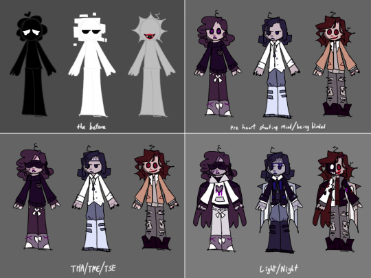
I’ve been seeing ppl when making their HMS designs usually point out design details and I didn’t initially do that w mine when I posted them so uh better late than never ig!
Gonna repost the designs here just for reference:
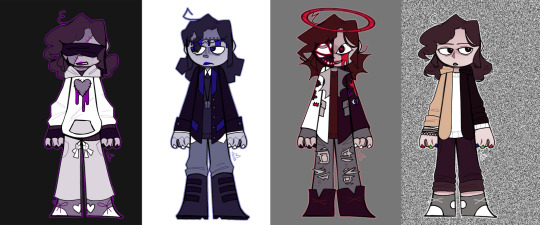

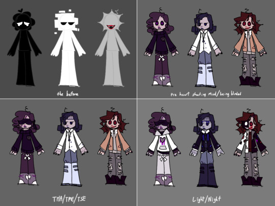
Ok on to the notes!:
Heart:
-circles/round shapes
-fluffy/poofy hair
-more casual/comfy clothes (almost like a pajama look?)
-black as a accent color to act as a call back to that originally being his color
-lots of heart shapes (the sides of his shoes, shoe laces being loopy rather than the X shape I usually do to make a heart style shape, the tie on his sweatpants etc etc)
-stitches/rag doll aesthetic (nod to the “tore me at the seams” line, also just because I personally associate stitches with hearts?? No reason idk just an unconscious thing ? Maybe it can be seen as a foil to mind being robotic and heart being “soft”? Idk there’s definitely symbolism to it I’m just too stupid to articulate it sorry lol
-blindfold is expressive/works as an emoter/has sonic eyes logic, just bc I think it’s really fun to draw, he can be cartoony, as a treat.
-eyes start like the others (white w black/dark iris) but after going blind the colors inverse (black with white iris) (OMG LIKE IN FNAF!???!?🤯)
-purple heart shaped pupils
-wings optional I’m still debating on them BUT I’m definitely making it be so him and mind get a angel and devil on the shoulder theme (plus the added thing about heart playing the victim “perfect little angel who can do no wrong” and how he vilifies and (quite literally in this case) demonizes Mind)
-bleed from chest
Mind:
-square shapes
-hair slicked back rather than in his face like the others
-collared shirt under sweater to give a more presentable vibe
-platform boots to make him taller/give him the superiority complex (plus they look cool that too lol)
-necklace is a brain because …you know…. mind (made my designs before the Q&A revealed what the necklace actually was, so jus’ took creative liberty, plus so him being the representation of the mind was more visually shown considering how heavily I plastered hearts and eyes on Heart and Soul lol (I’m just gonna say the irl/drum stick necklace can be part of my CJ/Whole design instead))
-YOU UNDERSTAND MECHANICAL HANDS ARE THE RULER OF EVERYTHING ok but seriously: robotic design just in general, I really like his split on the top head I’m proud of that idea lol (actually if it’s not obvious but I tried to give all of them some form of… something going on with their faces!! So hearts stitches minds bolts and souls half and half you get it)
-blue square pupils, it’s hard to make out unless you zoom in but I give him android style eyes (those lines going from the corners of his pupil to his iris, kinda like how portal does it?? I don’t remember oof but that almost like— camera zooming in kind of look? That, I was going for that))
-like heart, his old color (white) acts as an accent color
-would have bat wings as previously mentioned to insinuate demon motif
-bleed from head
Soul:
-triangles/sharp/pointed shapes
-combo of both half and half and gray colors
-almost like?? Punk style clothing?
-patches on jacket (a crown, upside down cross, eye, eclipse, trident, and heart respectively) (the cross was semi a nod to hokum all ye faithful just bc I like that cover a lot personally lol)
-messier hair
-halo intended to resemble rope/noose but idk how obvious I made it idk ??
-shadow half of face to reference the CCCC cover art and their appearance in light/night
-the extra eyes are optional/at will
-more a lore thing but I HC the “shadowy form” was originally an at will thing when he became mad, but after some particularly bad day it ends up getting stuck like that
-gets a more biblically accurate angle style appearance (eye motif/body horror/halo etc) Soul is the god to Heart and Minds shoulder angel and devil if you get what I mean (both to nod to the general concept of the soul being rooted heavily in religion as well as two wuv and the soul electric)
-red ring shaped pupil to insinuate a halo shape
-half and half wings
-bleed from eye (eyes are the windows to the soul/angle motif/soul always watching and having to keep an eye on H&M)
Whole:
Wasn��t going to mention him considering I literally just… drew Chonny from TMR and that’s it lmao?? But eh might as well mention him while I’m here
-regular shaped pupils (static colored)
-tally hall color nail polish (nod to the CCCC cover art)
-hair is more naturally drawn rather than stylized/shaped
-white sweater to act as an inverse to HMS all having black/dark colored sweaters
-similar shoes to Heart, half and half jacket to match Soul, necklace to match Mind (not in ref but will be added later probably)
Extra/general stuff/small details:
-Their hair frizz bits are all matching their previously mentioned shape language (and lack there of in Whole’s case)

-eyes:


-the before (haha get it) they fully formed/gained consciousness designs keep to same general shape language idea, and gray specifically has a mouth as a nod to how Soul was the first one properly shown/we were shown their lips while the other two still were kept as the white and black heads for a bit before they inevitably got shown properly in TME
-the pre night/light designs I also don’t really feel the need to mention just bc they are pretty straight forward n snagged from TME/just their regular designs but missing the added layers n jackets n stuff ? Plus ig the added detail they are much more humanoid at the start I think is neat :3
uhhhh ig that’s it ?? Yeah sorry idk how to end this post just wanted an excuse to talk about my designs lol
37 notes
·
View notes
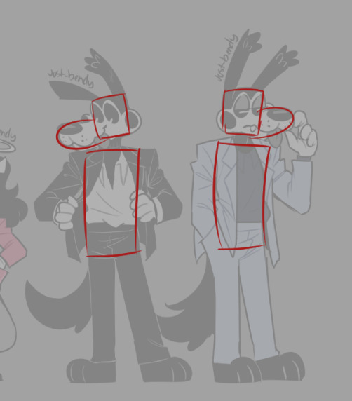
Note
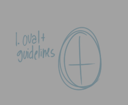
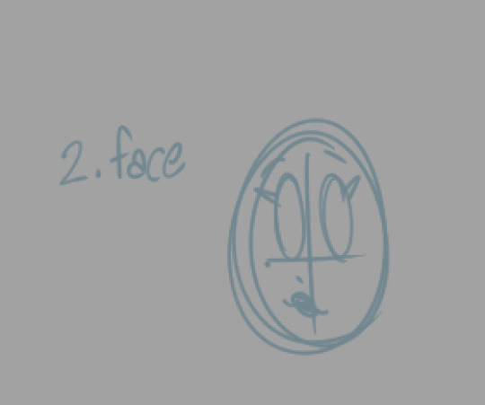
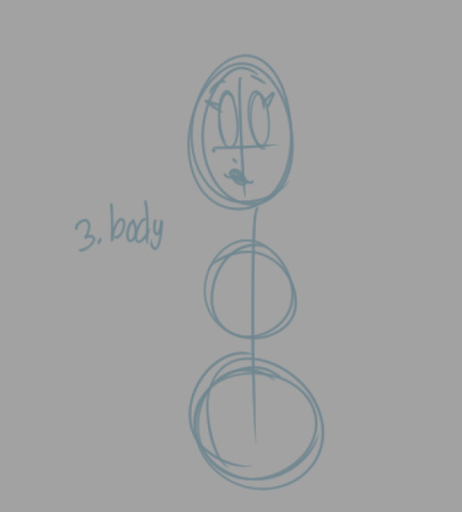
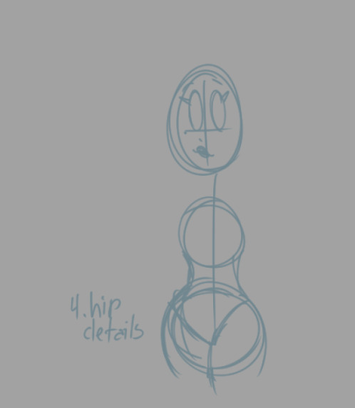
just saw asks were back open! question to the artist: this might sound weird, but could you please show how you go about drawing the cast? mainly bendy and alice i guess (honestly i would prefer simple shapes or sketches-- but i want to know how you do the proportions and all because your artstyle is really nice looking haha)
(( sure! sorry this gets very long so i put the rest under read more, hope its helpful to you! i'm not really a teacher tho but i'll do my best
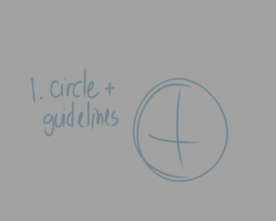
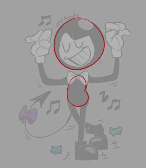
first i like to start with a simple circle and guidelines for where i'll put his eyes
then i add his cute face
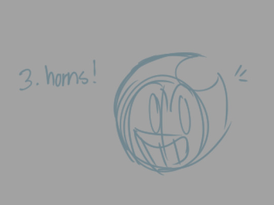
and his pointy horns! ( i struggle a lot with his horns tho 😓 )
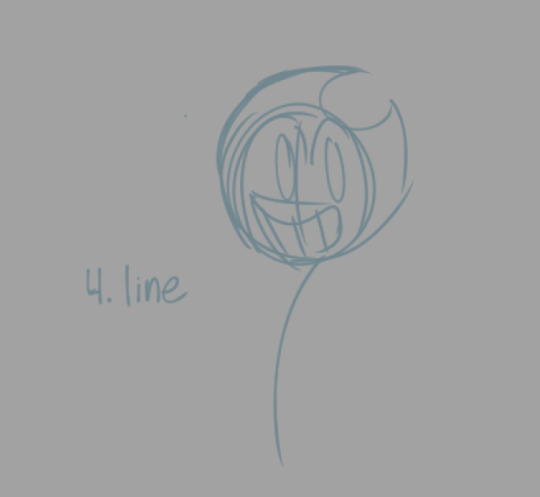
i add a line for his body to follow
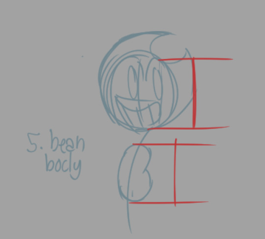
and i place his lil bean body somewhere below. i like to make it the same length as his chin to eyebrow. i use this measurement for nearly everything else
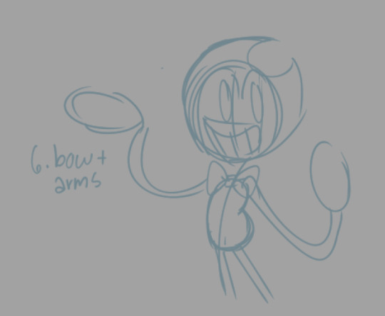
then comes his legs, his bow using a square and rounded triangle shapes, and his noodly arms and oval shape for his hands
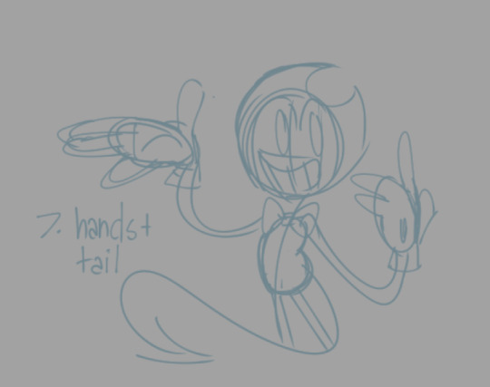
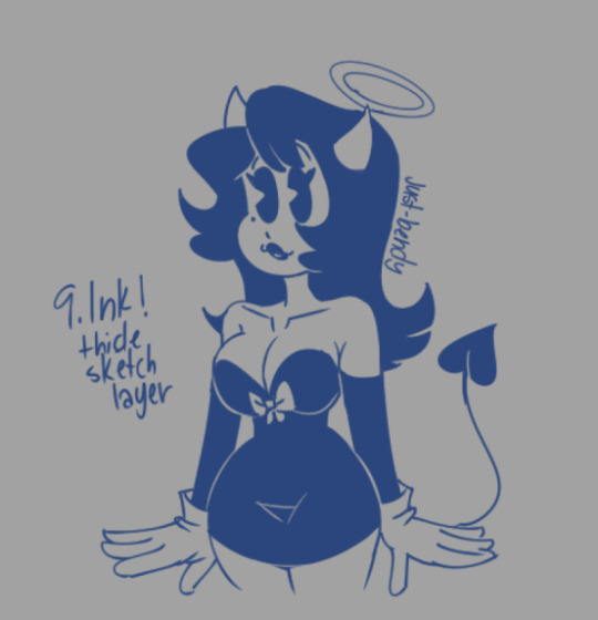
then i add his fingers, gloves, and his tail
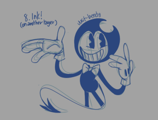
on a separate layer, i ink the bendy! making some corrections, details, and adjustments from the initial sketch
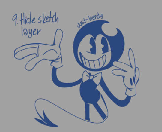
i hide the sketch layer
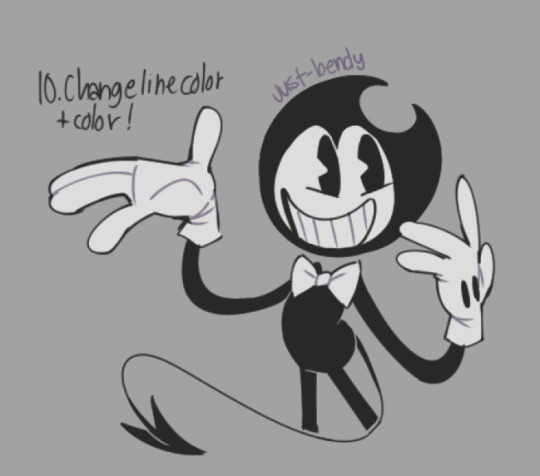
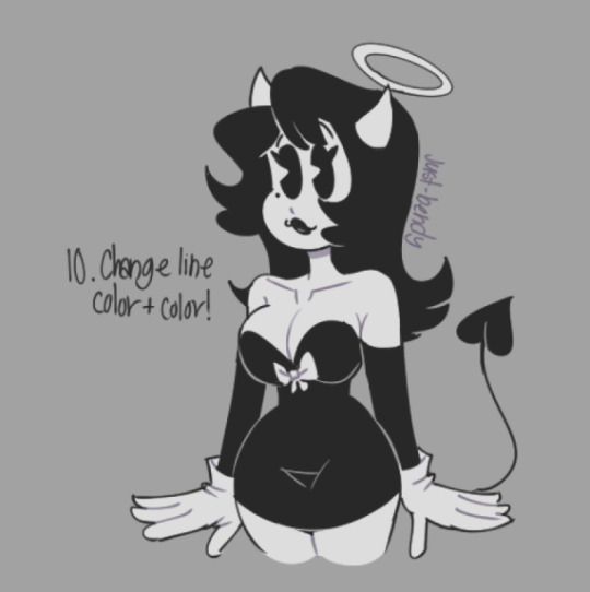
then i change the line color to black and start coloring him (on another layer)! i also like to color the lines to make it look a little more interesting
and bendy is done! i love how simple he is to draw, it makes it fun giving him expressions 🥰 i'm still perfecting the way i draw him, so he will always be changing.
i'm not sure what kind of pose this is... the first step to drawing a bendy is to always visualize what pose you want him in 🤣
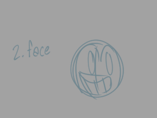
now it's alice's turn!
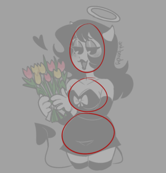
i start similar to how i draw bendy, but with an oval shape
add her lil face
then i draw the lines again and two circles for her body, with the bottom one being larger
i draw her hips, similar to a bikini look, then her waist
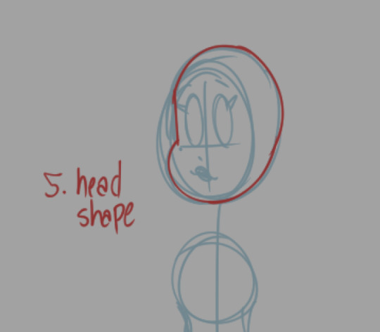
i draw her head shape, outlined in red to make it easier to see for this tutorial
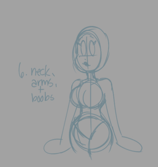
then i finish her body by drawing her boobas, her neck, arms and oval shape for hands
( i just eyeball her boob size so the sizes could be inconsistent from drawing to drawing 🤣🤣)
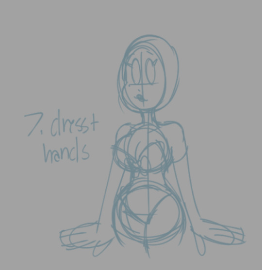
and then i draw her dress and finish her hands
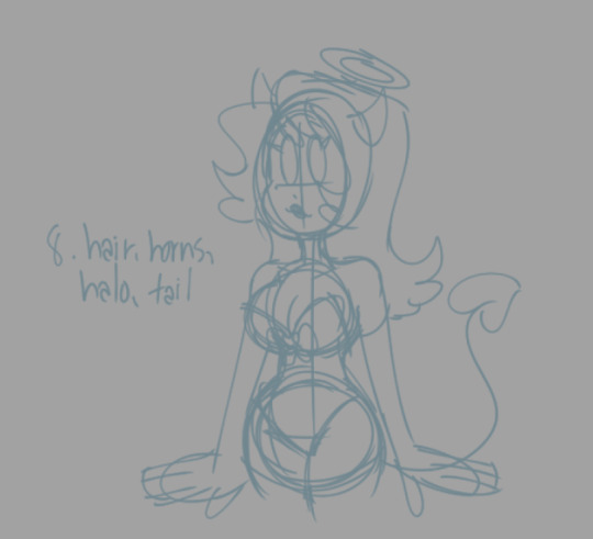
add her hair, horns, halo, and tail and we're done with the sketch
ink alice on another layer adding details and other adjustments
and finish the drawing by changing the color of the line and coloring her! alice is finished and she looks really cute
these are from an old tutorial but i thought it'd be helpful here! this is to help with the shapes i use for the characters
and another tutorial here which could also help if you still need it! its a bit old but its better at showing proportions? i think
thank you so much! 🥰💜💜✨i'm glad you think it looks nice! really appreciate it! 🥰 sorry this got so long but i hope you got something out of it!
if you wanna check out the older tutorials i made, you can go through the "art tut" tag on my blog ))
41 notes
·
View notes