Tumgik
#hermann eidenbenz
garadinervi · 2 months
Text
Tumblr media
Hermann Eidenbenz Typographic Prints, ca. 1945 [Display, Graphic Design Collection]
Tumblr media Tumblr media Tumblr media Tumblr media
41 notes · View notes
gacougnol · 2 years
Text
Tumblr media
Hermann Eidenbenz
Luxembourg Garden
Paris, 1936
119 notes · View notes
domusinluna · 1 year
Photo
Tumblr media
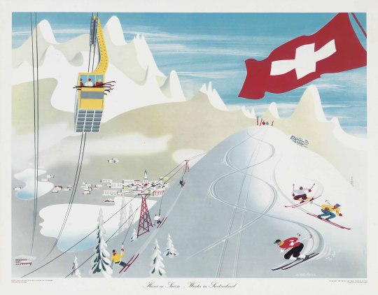
A beautiful snowy portrait of Switzerland by Hermann Eidenbenz, c. 1950
Like this? Subscribe to The Attic, my monthly mid-century newsletter for more!
24 notes · View notes
details2decern · 2 years
Photo
Tumblr media
Hermann Eidenbenz
Luxembourg Garden
Paris, 1936
Source: gacougnol
12 notes · View notes
uwmspeccoll · 7 months
Text
Tumblr media Tumblr media Tumblr media Tumblr media Tumblr media Tumblr media Tumblr media Tumblr media Tumblr media Tumblr media
Typography Tuesday
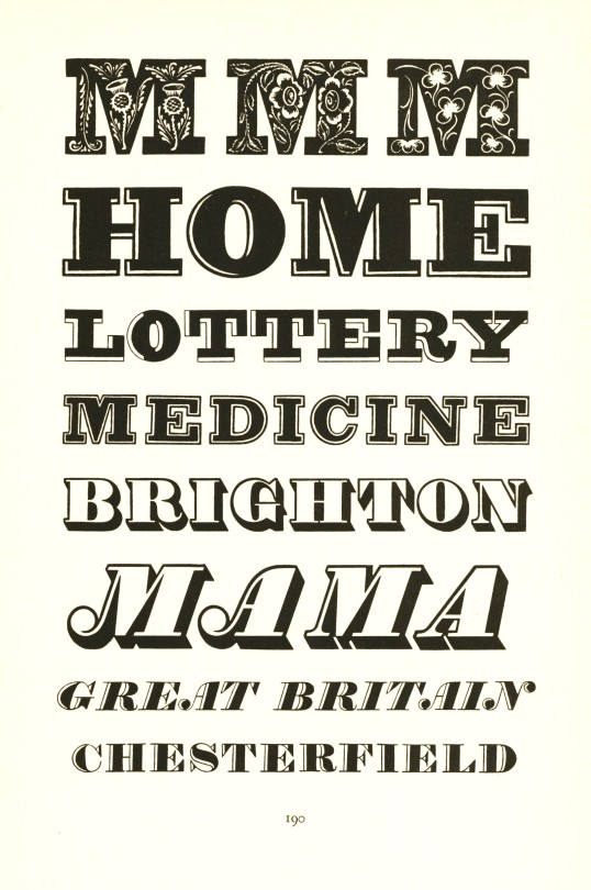
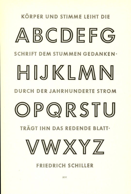
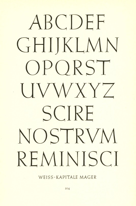
Meisterbuch der Schrift is German-Swiss book and type designer Jan Tschichold's 1952 textbook on historical and contemporary type design published in Ravensburg, Germany by Otto Maier Verlag. From top to bottom:
Type samples from early 19th-century English fashion publications.
Playbill from Stephenson Blake & Co., Sheffield, England.
Futura by German designer Paul Renner, 1927.
Futura Light, also by Renner.
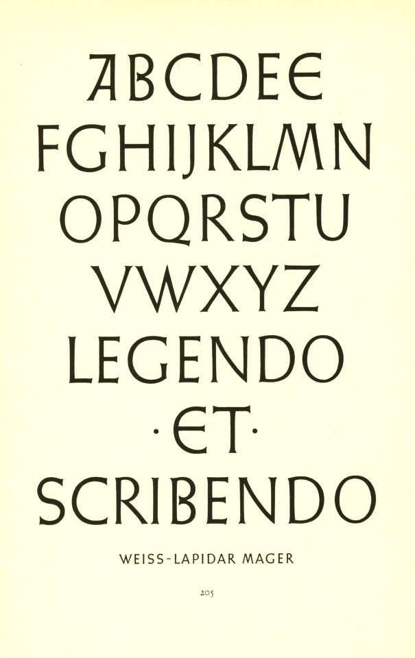
Two sets of capitals by Emil Rudolf Weiss for the Bauer Type Foundry.
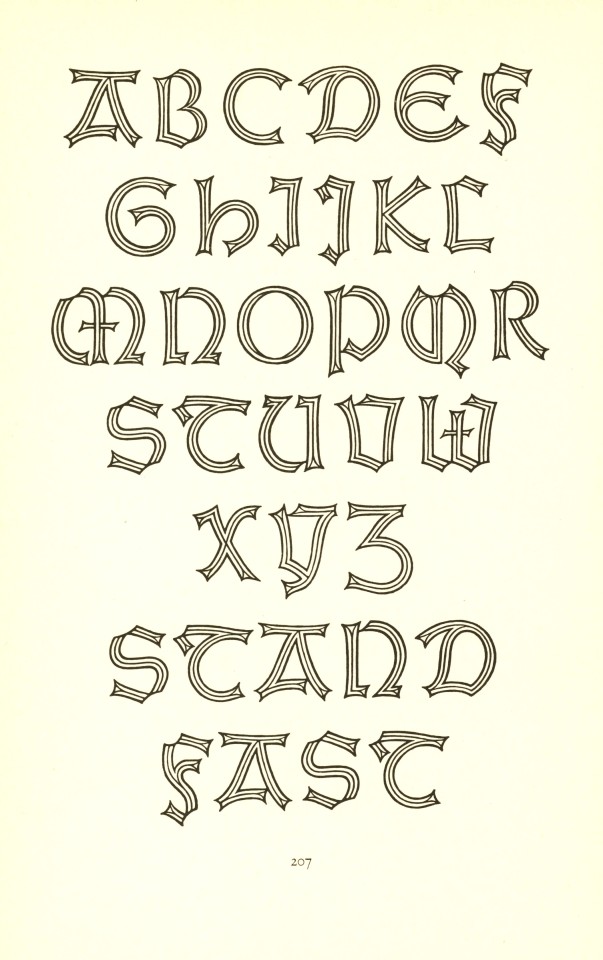
A shadowed Weiss Gothic by Emil Rudolf Weiss.
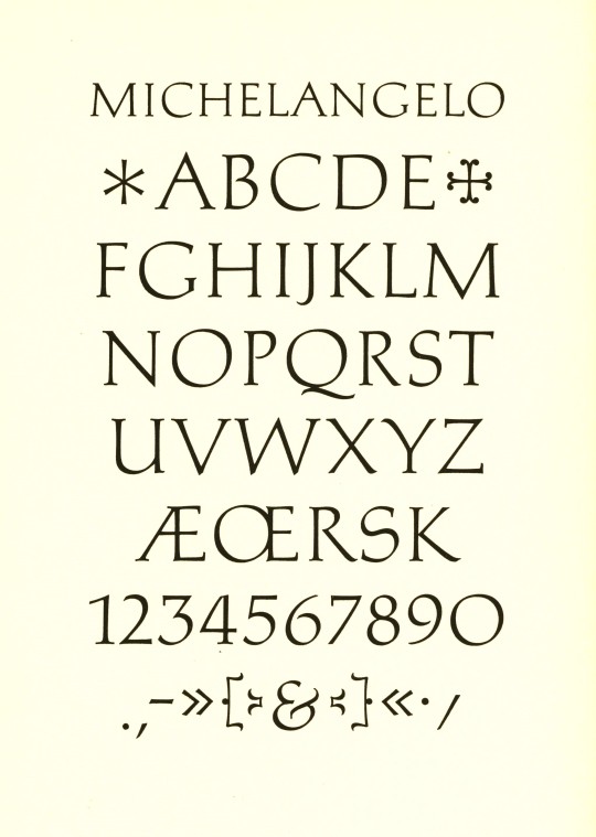
Michelangelo by Hermann Zapf for the Stempel Type Foundry, 1950.
Sistina by Hermann Zapf, also for Stempel, 1951.
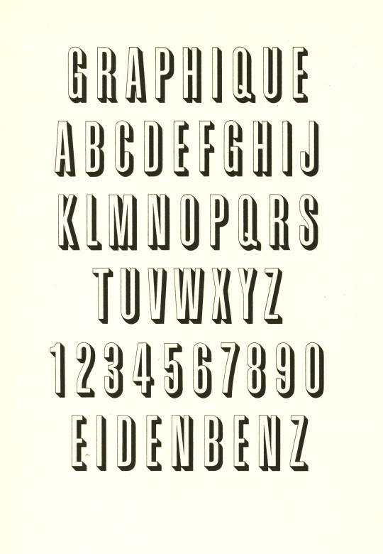
Graphique by Hermann Eidenbenz for the Haas Type Foundry, 1945.
Jan Tschichold (1902-1974) was one of the most noted type and book designers of the 20th century. He is remembered most for his two-year stint with Penguin Books (1947-1949), during which he established Penguin’s characteristic design identity, and for his typefaces Transit (1931), Saskia (1931/1932), Zeus (1931) and Sabon (1966/1967).
View more posts with work by Jan Tschichold.
View more Typography Tuesday posts.
41 notes · View notes
threetreetrois · 1 year
Text
Tumblr media
Hermann Eidenbenz
4 notes · View notes
doppoggi · 5 days
Photo
Tumblr media
Grafik. Eidenbenz, Hermann 1902 - 1993. Lithograph 1943
1 note · View note
ffffffwht000000blk · 1 year
Photo
Tumblr media
Stettler Radio designed by Hermann Eidenbenz, 1946 image via MoMA The Museum of Modern Art
0 notes
chimiiichanga · 1 year
Text
basel: ernst keller, hermann eidenbenz, armin hofmann, karl gerstner, fridolin müller, robert büchler, ruth pfalzberger, markus kutter
zürich: josef müller-brockmann, richard paul lohse, ernst hiestand, hans neuburg, carlo vivarelli, nelly rudin, gottfried honegger, aldo calabresi, rosmarie tessi
0 notes
fragrantblossoms · 5 years
Photo
Tumblr media
Hermann Eidenbenz (1903-1993), Untitled.    
348 notes · View notes
graphicbooks · 6 years
Photo
Tumblr media
Hermann Eidenbenz (1902-1993) Documente 1926-1955 by @ecal_ch / Design by François Rappo & Sarah Klein / Published by @triestverlag * * * * * #hermann #eidenbenz #françoisrappo #ECAL #swiss #switzerland #swissdesign #design #graphicdesign #graphicdesigner #graphicbooks #books #book #bookdesign #booksondesign #graphicbooks #type #typography #typographic #typedesign #typeface #logo #logodesign #publication #publishing #grid #layout #designstudent #designstudio https://www.instagram.com/p/BsD_6emh8t0/?utm_source=ig_tumblr_share&igshid=1dz40vs3a98eh
2 notes · View notes
garadinervi · 2 months
Text
Tumblr media
Hermann Eidenbenz / Atelier Eidenbenz, Ba Pla Ku, 1933 [Museum für Gestaltung Zürich]
17 notes · View notes
gacougnol · 2 years
Text
Tumblr media
Hermann Eidenbenz
Paris
1930
83 notes · View notes
gdbot · 4 years
Photo
Tumblr media
garadinervi: Hermann Eidenbenz, [Buchstabenkomposition,... https://ift.tt/3f6zIGQ Telegram Design Bot > https://t.me/gdesignbot
65 notes · View notes
drawdownbooks · 5 years
Photo
Tumblr media
Hermann Eidenbenz: ⁣ Teaching Graphic Design⁣ Available at www.draw-down.com ⁣ ⁣ Swiss graphic designer Hermann Eidenbenz (1902-1993) was one of the first people in Switzerland to describe himself as a graphic designer. From the first half of the 20th century into the 1950s, he was involved with graphic design education in Zurich, Magdeburg, Basel, and Brunswick—first as a student and then returning as a teacher.⁣ ⁣ The didactic material from Eidenbenz’s time as a teacher of graphic design, published in this book for the first time, throws light on this discipline at a time before graphic design in Switzerland had achieved international recognition. With contributions by Roland Früh, Sarah Klein (who also edited the book); and François Rappo. This volume is the first entry in the Visual Archives series undertaken by ECAL/University of Art and Design Lausanne. Devoted to spotlighting unresearched material left by designers, authors, and brands, the project aims to bring together documents and visual material from archives and present them along with critical essays which put them into historical and disciplinary context. ⁣ ⁣ #graphicdesign #HermannEidenbenz #TeachingGraphicDesign (at Switzerland) https://www.instagram.com/p/B0gCVRzHdlW/?igshid=7xarvpkhc2hu
26 notes · View notes
2-draw-2 · 5 years
Text
GRAPHISME/maude
Tumblr media
Herbert Leupin est né à Beinwil (Suisse) en 1916. Il a passé la plupart de son enfance à Augst, un village près de Bâle. Sa passion pour le dessin commence très tôt, et suivant les conseils de son professeur, il entre à la Gewerbeschule (école professionnelle) à Bâle en 1931. Son talent y est reconnu et encouragé par Paul Kammüller (affichiste) et Theo Eble (l'artiste fondateur du Gruppe 33, un groupe d'artiste bâlois). Le talent du jeune homme a également été reconnu par Hermann Eidenbenz, dans l'atelier duquel il a commence à travailler comme graphiste. C'est là qu'il va acquérir une expérience précieuse en matière de publicité et de photographie.
Entre 1935 et 1936, Leupin poursuit ses études en France, il suit entre autres les cours du célèbre affichiste Paul Colin. Malgré cette influence française, Leupin est resté fidèle au style suisse.
En 1937, Herbert Leupin est de retour en Suisse et travaille brièvement pour Donald Brun - dont le studio graphique est l'un des plus connu de l'époque. Fin 1937, il prend son indépendance.
Tumblr media
La typographie commence à émerger au Moyen-Âge tandis que l’humanité commence à étendre ses horizons esthétiques au monde de la lettre et des mots. Parce que les textes étaient à l’époque produits et reproduits à la main, les originalités artistiques permettaient d’ajouter de la valeur à l’œuvre et de se démarquer des autres. Dans les cultures islamiques, la typographie était bien évidemment centrale étant donné que l’art figuratif était perçu comme un sacrilège. La typographie était donc l’une des seules formes d’expression artistique autorisées.on origine est, dans les manuscrits anciens, la première lettre d’un texte ou d’un paragraphe, mise en valeur pour signaler au lecteur le début du texte ou du paragraphe.
1 note · View note