#head full of static no writing no serious meta posts just
Explore tagged Tumblr posts
Text

sexualizing, romanticizing, woobyfying my muse rn as a treat. look at him
#yall ever just do that like#head full of static no writing no serious meta posts just#picturing ur muse smiling and having great tits???#cw suggestive#no no ill write. I GUESS ILL WRITE
5 notes
·
View notes
Text
Where's this thing gonna end?
So I've changed my answer a few times when people have asked how much is left in the fic -- here's the behind-the-scenes.
Originally it was going to be a one-shot -- just that first chapter, a static portrait of depression and alcoholism. The ending of it caught people off-guard, because we expect change and progress in our narratives, so it's disconcerting to reach the end and get neither. It begins with Robert miserable and hungover, alone in the dark except for Betsy, and it ends with him miserable and drunk, alone in the dark except for Betsy, no improvement, not even any cause for hope. It’s a rude thing to do to readers, but that’s what alcoholism and depression is.
And then the bake sale chapter came to me; I don't recall the inspiration, and initially I was apprehensive of the reception it would get because it was so very different in tone from the first chapter. But hey, it turns out people like seeing Robert have a good day too, and together those two stories didn't form any real meta structure, but I could live with that.
And then, Scheherazade-like, the same night I posted “The Zara Shirt," my brain furnished me with the complete plot for “This House Just Sings (This House Just Screams).” And suddenly the chapters started getting harder to write, because suddenly they mattered more. It wasn't just about Robert's depression anymore, or his fluffy escapist romance with Gene, it was also really, really important to me that people understood just how fucking terrible Joseph is, that there is nothing sexy about psychological abuse, and goddamn this fucking fandom and their hard-on for shipping Robert with Joseph. Usually I don't care if people like a pairing that I'm not into -- Steve/Tony? Sure, you do you, bro -- but this... christ almighty.
At best, Joseph is a manipulative serial adulterer who took advantage of someone mentally ill and grieving. At worst, you're shipping Robert with his rapist. If you like Robert, you shouldn't want him anywhere near Joseph, and I could write a thousand words of meta on the subject -- or I could write a fic that delivers the same message.
Anyway, after that installment, the series had developed enough that I felt it deserved some closure before I stopped. As I was working on “This House,” I was also kicking around some ideas for the next chapter to be something more lighthearted, as a palate cleanser -- a romp in which Robert and Mary scheme to trick Gene into getting a dog. Then after that, I thought, would be the closing chapter, featuring some important conversations between Robert and Gene, showing what lasting change looks like for someone like Robert, and ending on a note that is not without complications, but hopeful. (Kind of like the ending of the game.) Five chapters in all, three serious installments with two lighter interludes.
Except it didn't happen that way, because after "This House" my brain was like "lol okay but what if you wrote a sex comedy about Gene and Alex and Craig and Smashley having a foursome instead?" And after that my ideas started wandering more toward Gene's angle (*cough* and Alex) and we got three Gene-centric chapters in a row -- “The In-Laws,” “Her Dad's Dumb Crush,” and Gene's remix of “The Zara Shirt.” And with each chapter, Alex became more and more integral to Gene's world, and rightfully so -- you don't love and live with someone for fifteen years without shaping each other. Gene's history is so deeply wrapped up in Alex, all the major touchstones of his life have involved Alex, all his beliefs about what relationships should be and how to make them work were formed by his experiences with Alex.
And it was while I was writing the foursome chapter that it stopped being a coincidence that Robert and Gene hadn't had sex yet, and crystallized as yet another thing that Robert had issues about -- which is why the chapter that wound up coming out next was the morning-after coda, “After the Storm,” when they finally acknowledge the existence of those issues. And it meant that the ending wasn't simply a matter of getting around to writing a sex scene (and addressing the alcoholism, and addressing the depression), it also needed to work through the intimacy issues that Robert's Joseph-related PTSD had left him with.
(That's part of what delayed the sex comedy -- that in the original version, it was Robert who prompted it, and Gene told the story to him, not Mary. But halfway through, it became blindingly clear that this is not a story Gene can tell Robert. Not at this point in their relationship; Robert is already wildly insecure about his worth as a partner and how he measures up to Alex's memory, and struggling with his hangups about sex. Listening to a story about how much Gene adored Alex (and all the crazy awesome uninhibited sex they had) would have gutted him. So it got overhauled, and Robert got swapped out for Mary and her more neutral, prurient curiosity.)
And that means the ending isn't just addressing the romance, and the substance abuse, and the depression, and the PTSD, Robert also needs to reconcile himself to the memory of Alex and the place that he's always going to hold in Gene's heart.
So yeah, I admit, I keep moving the goalposts.
But what makes an ending satisfying is whether it provides proper closure and forms symmetry with the rest of the story. And as the story evolves, so too does the ending need to, or you're going to wind up with a Harry Potter epilogue situation -- a jarring return to primary colors after the story has broadened into shades of gray. Delving deeper into Robert's character and his myriad issues has meant reassessing where the finish line needs to be -- and for Robert, the finish line has never been about sex, or even romance, really. They show that in the game -- that his good ending isn't about getting to shag the Dadsona, it's about finding the will to change and finding someone who cares about him enough to support him in that endeavor.
So I wouldn't say that I have a plan for the ending exactly -- I'm still playing it by ear and letting the story unfold as it wants to -- but I do know what it needs to accomplish and I am building toward that resolution, not just meandering around pointlessly. It'll probably cap out around 100k~120k, because novel-length is the only way I know how to tell a story.
Now if I could just get over this fucking writer's block that leaves my head full of stories but without the words to tell them.
13 notes
·
View notes
Text
20 Best New Portfolios, December 2018

It’s December, which means it’s officially carol season. Oh well. Whether you’re a curmudgeon about these things like myself, or are even now feeling the heat rise in your elf ears and Santa hat, we can all agree that portfolio sites are cool, right? Let’s see what those wacky designers have come up with now. There are quite a few modern, as in pre-post-modern designs here. You know, classic, business-friendly minimalist sites. I must say, sometimes my writer and designer sides clash, and I worry about what design trends make me do to the English language. (Also, I’d like to take a moment to thank Hubert Gałczyński from the previously-featured K2. He has directed me towards Wappalyzer which is a tool that’s helping me more accurately figure out what platforms and CMS everybody is using.) Note: I’m judging these sites by how good they look to me. If they’re creative and original, or classic but really well-done, it’s all good to me. Sometimes, UX and accessibility suffer. For example, many of these sites depend on JavaScript to display their content at all; this is a Bad Idea

, kids. If you find an idea you like and want to adapt to your own site, remember to implement it responsibly.
TJ Dhillon
TJ Dhillon’s portfolio starts as the rest of this article will probably go on. It’s simple, it’s clean, it works. It’s got some nice little drop shadows on hovering over certain elements, and is it weird that I’ve actually missed those? They were never a bad thing in moderation. Moderation might be the key to this whole site design. There are frills, but they’re not overdone. Platform: Static Site

Matt Kevan
Matt Kevan’s portfolio looks a little bit like a prototype, though it’s obviously polished. As he is a UX designer, the aesthetic certainly works thematically. He’s also elected to put his writing front and center, rather than his more visual work. It’s certainly one way to demonstrate your expertise, but I wish I had some kind of analytics Platform: Jekyll

Daniel Spatzek
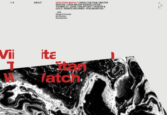
Daniel Spatzek’s portfolio will take us, just for a moment, to the world of the ultra-modern. You know how I feel about sites that are this JS-heavy, but I’m still a sucker for that grid-based aesthetic, especially when it’s properly using the full width of my desktop screen like this. Platform: Static Site
Undersight
Undersight has that clean-and-modern look, but with a little bit of artistic flair provided by the work itself. It feels like the portfolio pieces are almost as much apart of the overall aesthetic as any other element of the site. In a world where so very often the design and content almost feel like separate parts of a website, this is an improvement. Platform: React

Sei Yamazaki
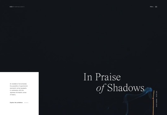
Sei Yamazaki’s portfolio is focused on art. With this comes the classic “art gallery style” which includes lots of white space, and text that’s perhaps a bit too small at times. Still, the layouts themselves are beautiful, and the featured installation has some of the finest video presentation I’ve seen in a while. Platform: WordPress
4POR4
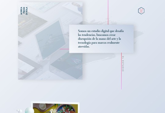
4POR4 is a rare breed indeed. Normally websites that use this much space-related imagery have darker layouts. But here we have lots of literal white space mixed with astronaut imagery, illustration, and photomontages. It’s a bit bandwidth-heavy, perhaps, but the overall effect is stunning. Platform: Static Site

Your Creative Copywriter
Your Creative Copywriter is, as a website, the very picture of business-friendliness. The layout has elements of post-modern asymmetry while maintaining a clearly businesslike look. The illustrations are classic, and even the stock photo of the hand holding the pencil is perfect for the market. Sure it’s a little cheesy, perhaps, but far from the cheesiest stock photo we’ve ever seen. It’s always interesting to see a site so clearly made with modern tech that feels like something from another era. It doesn’t hurt that this is probably exactly what their clients are looking for. Platform: Static Site

Niccolò Miranda
Niccolò Miranda’s portfolio is one of the most “presentational” sites I’ve ever seen. It’s dark, it’s got animated illustrations, and even the blog is animated to an extent. This is only possible because every blog post is a YouTube video tutorial, with accompanying practice files. It’s not the most accessible site I’ve seen, but it is beautiful, and it takes an interesting approach to ongoing content. Platform: Custom CMS (I think)

Pixavio
Pixavio is another highly presentational site with a “modern” look so old it reminds me of old fashion magazines and, weirdly enough, a lot of the barber shops I went into as a kid. It’s something about the typography and gradient use. The site shows off the flexibility of this aesthetic by using a different color scheme for each portfolio page. It feels like a blast from the past, but it still works today. Platform: Static Site
Eleken
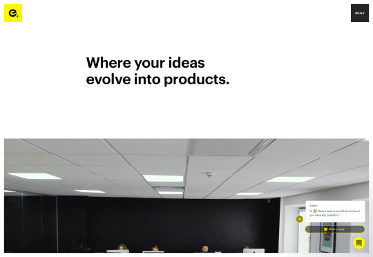
Eleken brings me back to a time when everyone was doing design “like Apple but with thicker headings”. It’s pretty classic minimalism, mixed with a little background video, and workplace photography. Platform: Gatsby
Kobu
Kobu is a rare beauty. It’s sleek, stylish, and makes wonderful use of curves in its illustration and animation. The animations run smoothly, and aren’t altogether too distracting. The color palette is strong, and the headings are thick. And it does all of this without scroll-jacking. Can you even believe it? A fancy site that performs well and lets me scroll normally. I’m in love. Being a bit more serious, it’s a lovely looking site. Just wish they had more fallbacks in place for all of the JS stuff. Platform: WordPress
MOXY
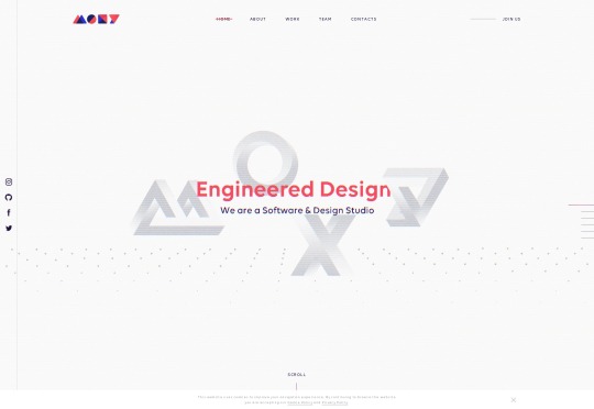
And we’re back to the scroll-jacking. But I can forgive MOXY for this because it’s just that pretty. It’s sites like this that remind me why—even though I dislike how JavaScript has become the new Flash—web animation is a discipline and an art form all its own. It’s an art form worth exploring, and MOXY does that beautifully. Platform: React App/Static Site
Trajectory
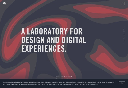
Trajectory is doing it all wrong! If you’re going to use a monospaced font, your site either has to be an ironic brutalist meta-commentary on web design or a post-modernist artsy design. None of this pleasant, business-friendly stuff with smooth illustrations and gorgeous gradient use. Using monospaced type for all the body text might be a bit much, but it certainly does stand out when combined with everything else. Platform: Craft CMS

Soap Media
Soap Media is hitting all the right buttons for me, personally. It’s bright with bold colors, it’s playful, and it’s got a huge rubber ducky. This is an entirely subjective point, but I just like rubber duckies. The whole site feels creative and whimsical in that “we’ll playfully make you a lot of money” sort of way. It’s genius. Platform: Static Site

Nate Denton
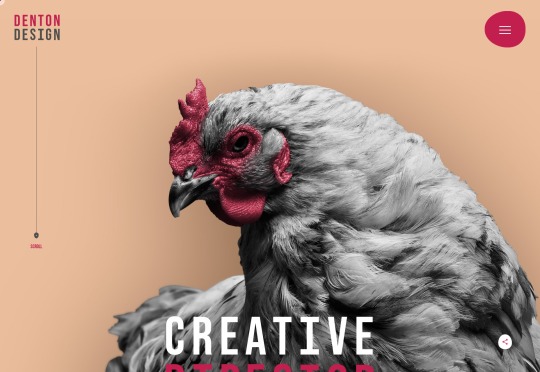
Random chickens are equal to rubber duckies if you want to be silly and playful. Nate Denton’s portfolio went with a big one, contrasted by a relatively soft and warm color palette. The resulting aesthetic is a combination of professional and artsy that is overall pleasing to the eye, but less likely to scare away the more straight-laced potential clients. Platform: Static Site
Crema
Crema is this month’s site that isn’t mind-blowingly experimental or anything, but is here because I admire the craftsmanship. Plus rounded corners. We don’t seem them as much as we thought we would, do we? Platform: Custom CMS (I Think)

NoBears
The amusingly-named NoBears agency goes with wackiness, combining striking photomontages and background video with a comparatively subdued dark design. I’m still a sucker for those semi-visible grids as part of the design, so of course this one’s on the list. Platform: Silverstripe

BAUNFIRE
While many other sites are going for bold and bright aesthetics, BAUNFIRE keeps it soft and pleasant with a pastel-infused, and fairly minimalist design. It’s a calming and soothing experience from an agency that presents itself as easy to work with. Platform: Craft CMS

Friends
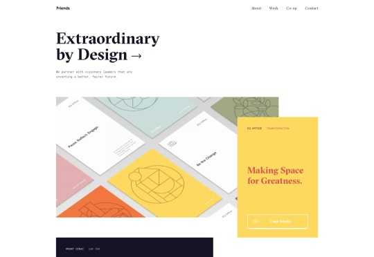
Friends’ website presents a fusion of that near-postmodern, element-overlapping aesthetic with some more classic-feeling minimalism and typography. That fusion works quite well. Platform: Craft CMS
Daniel Kusaka
Daniel Kusaka’s portfolio gives me some of that good old magazine feel that designers wanted to do for years. Well now we can, and I can’t get enough of it. God bless Flexbox and CSS Grid. Platform: WordPress

Add Realistic Chalk and Sketch Lettering Effects with Sketch’it – only $5!

Source p img {display:inline-block; margin-right:10px;} .alignleft {float:left;} p.showcase {clear:both;} body#browserfriendly p, body#podcast p, div#emailbody p{margin:0;}

Read the full article
0 notes
Text
20 Best New Portfolios, December 2018
It’s December, which means it’s officially carol season. Oh well. Whether you’re a curmudgeon about these things like myself, or are even now feeling the heat rise in your elf ears and Santa hat, we can all agree that portfolio sites are cool, right? Let’s see what those wacky designers have come up with now.
There are quite a few modern, as in pre-post-modern designs here. You know, classic, business-friendly minimalist sites. I must say, sometimes my writer and designer sides clash, and I worry about what design trends make me do to the English language.
(Also, I’d like to take a moment to thank Hubert Gałczyński from the previously-featured K2. He has directed me towards Wappalyzer which is a tool that’s helping me more accurately figure out what platforms and CMS everybody is using.)
Note: I’m judging these sites by how good they look to me. If they’re creative and original, or classic but really well-done, it’s all good to me. Sometimes, UX and accessibility suffer. For example, many of these sites depend on JavaScript to display their content at all; this is a Bad Idea, kids. If you find an idea you like and want to adapt to your own site, remember to implement it responsibly.
TJ Dhillon
TJ Dhillon’s portfolio starts as the rest of this article will probably go on. It’s simple, it’s clean, it works. It’s got some nice little drop shadows on hovering over certain elements, and is it weird that I’ve actually missed those?
They were never a bad thing in moderation. Moderation might be the key to this whole site design. There are frills, but they’re not overdone.
Platform: Static Site
Matt Kevan
Matt Kevan’s portfolio looks a little bit like a prototype, though it’s obviously polished. As he is a UX designer, the aesthetic certainly works thematically.
He’s also elected to put his writing front and center, rather than his more visual work. It’s certainly one way to demonstrate your expertise, but I wish I had some kind of analytics
Platform: Jekyll
Daniel Spatzek
Daniel Spatzek’s portfolio will take us, just for a moment, to the world of the ultra-modern. You know how I feel about sites that are this JS-heavy, but I’m still a sucker for that grid-based aesthetic, especially when it’s properly using the full width of my desktop screen like this.
Platform: Static Site
Undersight
Undersight has that clean-and-modern look, but with a little bit of artistic flair provided by the work itself. It feels like the portfolio pieces are almost as much apart of the overall aesthetic as any other element of the site. In a world where so very often the design and content almost feel like separate parts of a website, this is an improvement.
Platform: React
Sei Yamazaki
Sei Yamazaki’s portfolio is focused on art. With this comes the classic “art gallery style” which includes lots of white space, and text that’s perhaps a bit too small at times. Still, the layouts themselves are beautiful, and the featured installation has some of the finest video presentation I’ve seen in a while.
Platform: WordPress
4POR4
4POR4 is a rare breed indeed. Normally websites that use this much space-related imagery have darker layouts. But here we have lots of literal white space mixed with astronaut imagery, illustration, and photomontages. It’s a bit bandwidth-heavy, perhaps, but the overall effect is stunning.
Platform: Static Site
Your Creative Copywriter
Your Creative Copywriter is, as a website, the very picture of business-friendliness. The layout has elements of post-modern asymmetry while maintaining a clearly businesslike look. The illustrations are classic, and even the stock photo of the hand holding the pencil is perfect for the market.
Sure it’s a little cheesy, perhaps, but far from the cheesiest stock photo we’ve ever seen. It’s always interesting to see a site so clearly made with modern tech that feels like something from another era. It doesn’t hurt that this is probably exactly what their clients are looking for.
Platform: Static Site
Niccolò Miranda
Niccolò Miranda’s portfolio is one of the most “presentational” sites I’ve ever seen. It’s dark, it’s got animated illustrations, and even the blog is animated to an extent.
This is only possible because every blog post is a YouTube video tutorial, with accompanying practice files. It’s not the most accessible site I’ve seen, but it is beautiful, and it takes an interesting approach to ongoing content.
Platform: Custom CMS (I think)
Pixavio
Pixavio is another highly presentational site with a “modern” look so old it reminds me of old fashion magazines and, weirdly enough, a lot of the barber shops I went into as a kid. It’s something about the typography and gradient use.
The site shows off the flexibility of this aesthetic by using a different color scheme for each portfolio page. It feels like a blast from the past, but it still works today.
Platform: Static Site
Eleken
Eleken brings me back to a time when everyone was doing design “like Apple but with thicker headings”. It’s pretty classic minimalism, mixed with a little background video, and workplace photography.
Platform: Gatsby
Kobu
Kobu is a rare beauty. It’s sleek, stylish, and makes wonderful use of curves in its illustration and animation. The animations run smoothly, and aren’t altogether too distracting. The color palette is strong, and the headings are thick.
And it does all of this without scroll-jacking. Can you even believe it? A fancy site that performs well and lets me scroll normally. I’m in love.
Being a bit more serious, it’s a lovely looking site. Just wish they had more fallbacks in place for all of the JS stuff.
Platform: WordPress
MOXY
And we’re back to the scroll-jacking. But I can forgive MOXY for this because it’s just that pretty. It’s sites like this that remind me why—even though I dislike how JavaScript has become the new Flash—web animation is a discipline and an art form all its own. It’s an art form worth exploring, and MOXY does that beautifully.
Platform: React App/Static Site
Trajectory
Trajectory is doing it all wrong! If you’re going to use a monospaced font, your site either has to be an ironic brutalist meta-commentary on web design or a post-modernist artsy design. None of this pleasant, business-friendly stuff with smooth illustrations and gorgeous gradient use. [/sarcasm]
Using monospaced type for all the body text might be a bit much, but it certainly does stand out when combined with everything else.
Platform: Craft CMS
Soap Media
Soap Media is hitting all the right buttons for me, personally. It’s bright with bold colors, it’s playful, and it’s got a huge rubber ducky. This is an entirely subjective point, but I just like rubber duckies. The whole site feels creative and whimsical in that “we’ll playfully make you a lot of money” sort of way. It’s genius.
Platform: Static Site
Nate Denton
Random chickens are equal to rubber duckies if you want to be silly and playful. Nate Denton’s portfolio went with a big one, contrasted by a relatively soft and warm color palette. The resulting aesthetic is a combination of professional and artsy that is overall pleasing to the eye, but less likely to scare away the more straight-laced potential clients.
Platform: Static Site
Crema
Crema is this month’s site that isn’t mind-blowingly experimental or anything, but is here because I admire the craftsmanship. Plus rounded corners. We don’t seem them as much as we thought we would, do we?
Platform: Custom CMS (I Think)
NoBears
The amusingly-named NoBears agency goes with wackiness, combining striking photomontages and background video with a comparatively subdued dark design. I’m still a sucker for those semi-visible grids as part of the design, so of course this one’s on the list.
Platform: Silverstripe
BAUNFIRE
While many other sites are going for bold and bright aesthetics, BAUNFIRE keeps it soft and pleasant with a pastel-infused, and fairly minimalist design. It’s a calming and soothing experience from an agency that presents itself as easy to work with.
Platform: Craft CMS
Friends
Friends’ website presents a fusion of that near-postmodern, element-overlapping aesthetic with some more classic-feeling minimalism and typography. That fusion works quite well.
Platform: Craft CMS
Daniel Kusaka
Daniel Kusaka’s portfolio gives me some of that good old magazine feel that designers wanted to do for years. Well now we can, and I can’t get enough of it. God bless Flexbox and CSS Grid.
Platform: WordPress
Add Realistic Chalk and Sketch Lettering Effects with Sketch’it – only $5!
Source from Webdesigner Depot https://ift.tt/2PueS7u from Blogger https://ift.tt/2rw7XBk
0 notes