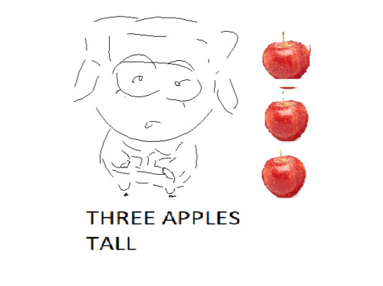
#he was this little thing in like a 3000 by 3000 pixel canvas for some reason
Explore tagged Tumblr posts
Text

he
#south park#kyle broflovski#southpark#eggeater art#sp#sp kyle#art#he was this little thing in like a 3000 by 3000 pixel canvas for some reason
54 notes
·
View notes
Text
Hello!
I'm going to try and go through as many of your concerns as possible, so this might be a LONG post. Feel free to ask me any questions at any point.
My credentials: I did graphic design as a freelancer and got paid for it!
Which programs do you use?
I have used Canva before and I find it's pretty good. I personally use photopea because I am familiar with photoshop and it is essentially a free online photoshop.
And do you have any tips? Anything about formatting and such?
Design tips:
design is essentially the process of guiding your viewer's/reader's eyes using the different principles of design that exist. this video explains it really well in 5 minutes
youtube
(you can absolutely ask me for clarification, more info <3 etc)
more about contrast in the context of text: it's important for there to be enough contrast between the text and its surrounding so that it's easily legible.
the contrast in color ought to be comfortable and clear. notice how dark mode tumblr isn't white on black, but more of a white on very dark gray. to make it even more comfortable it would be a very light gray on a very dark gray. Here's a contrast checker to help you out with picking your colors and making sure they read well
this next video is on composition grids, so formatting, I have linked specifically to when he starts talking about grids, you're mostly going to be working in column grids (he explains some terminology here), maybe modular grids, however you can watch it through the end, it's 14 minutes altogether, and the parts I'm recommending start at around 2:21 and end at around 5:37
youtube
now this next video is about creating guides in canva specifically. This will help you with mapping out your layout and making sure things are aligned. guides exist in most software, photopea included.
youtube
This next video is about typography, and it will help a lot and explain a lot about fonts and picking them. So you'll understand kerning, tracking, serif, sans-serif, how to pick fonts, and how to pair them too it's 6:23 minutes long and a little over 3 if you play it on 2x speed.
youtube
to help with font pairings I found this site to get you started. It depends on your own preferences and how things look in the end.
Any websites you would recommand for intructions, templates, or images?
images: pngs with transparent backgrounds freepik make sure to use the filters to find the free stuff!
vectors are amazing, they're often flat (think sleek and clean), the designers often have a png format for downloading, and they can come black and white which means you can do modifications to them!
Tutorials For Software:
This is a short video with the basics for photopea she has more tutorials in this playlist. I recommend the gradient and clipping mask tutorials. Removing the background of a photo is also really nice, but not necessary.
youtube
this guy is giving the basics of layers in 2 minutes. layers are super important and you can do a lot with them. they're part of the ABSOLUTE BASICS and if you can get them, you're set for a lot of things in my opinion.
youtube
this video is about selection tools, which are so so so handy, its one way you can change the black and white graphics into something not black and white.
youtube
this video is about changing colors of objects and it's 2 minutes and introduces you to the idea of clipping masks and adjustment layers.
youtube
Templates, Dimensions, and dpi:
canva has a tumblr banner template that is under their social media category.
Canva Tumblr Banner Dimensions: 3000 x 1055 pixels press the purple " + create a design button" and then type in tumblr it's the one that's 3000 x 1055


lemme help with dpi really quick:
dpi = dots per inch 144 dpi is more than enough for tumblr in my opinion 300 dpi is like semi-professional grade
you can set a higher dpi and then go lower, but the reverse can bring you problems (if I'm remembering things correctly)
higher dpi = larger file size
Things looking unclear / not great
there are multiple culprits:
your color profile: your stuff is meant to be viewed on the web/on screens so you need to use the sRGB (or RGB) color profile, or color space. This is the generally the default? so long as you don't specify that this is for print.
changing your color profile is easy in photopea: image > mode > RGB
CMYK stans for cyan, magenta, yellow, black and is for print materials
Canva...probably has these settings good to go in its template
another thing is when you export, it could be your compression settings. I go for "visually lossless" generally
for quality percentage sliders I think 80% and above generally is okay, depends on you
Working files vs final exports
a working file is the original file with layer and adjustment data. things like .psd, .clip, .gimp, .tiff .ae to list a few. if you're on canva, don't worry about it.
save a copy of your working files when using things like photopea. It has a save to .psd feature, make sure you do, that way if you want to make changes you can.
.tiff files preserve the layer data for you if you don't want to save as a .psd
NOTE: font files aren't saved with the tiff/psd
a final export, is the .png or .jpeg image that you export out as a final product.
.jpegs have smaller sizes but don't have transparency (great for web)
.pngs have larger sizes and transparency! (they work for web too, might take longer to load - it's okay)
Final Tips
you can use more than one software! we do this all the time in graphic design. I could be using illustrator to make my graphics, photoshop to modify some photos, and inDesign to arrange them all into a layout. so you can use photopea to make graphics and then canva to arrange them all.
web searches are great ie: how to change color profile photopea how to create guides canva / canva how to create guides
I am open to answering questions and helping out! Happy designing!
Banners
Shoutout to anyone that has virtually any knowledge whatsoever of making banners for fics!
Hey, guys! I've decided to try making banners for my fics but I've never been much of a digital artist... Which programs do you use? And do you have any tips? Any websites you would recommand for intructions, templates, or images? Anything about formating and such?
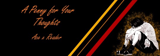
I've made 2 (update: 3) so far. Made the one for Electric Blue (and the new one for A Penny for Your Thoughts) with the free version of Canva, and the (old) one for A Penny for Your Thoughts with Krita. Krita has a gazillion of options and settings - like, I am sooooo overwhelmed. Trying to get the image up has been hell since either the colour or the clarity kept disappearing. Had to drag it through Paint to settle it more or less... Still not quite happy with it if I'm being honest... As far as the effects and such go, I'm sure that's just a matter of practice. But there's also tons of settings about graphics, colouring, sizing, etc. and I don't even know where to start to be honest...
Canva:

Canva:

Krita (& Paint):

Any help would be greately apprecited!
4 notes
·
View notes