#he srsly looks so goofy i love this guy sm
Explore tagged Tumblr posts
Text

i want you to stop what your doing and just look at this picture i took of snorpy while i was goofing around on bugsnax
he looks so friendly...🥺
#bugsnax#snorpy fizzlebean#bugsnax snorpy#he srsly looks so goofy i love this guy sm#also i just remembered that bugsnaxs are parasites and he is full of them#i am sooo sorry snorby...
98 notes
·
View notes
Text
alr now that my s1 era is over (miss u bb) i’m gonna keep ALGAMATION (FOR s2e1) but do it a lil differently? so yeah!! for anyone who cares that’s the plan lol.
s2 is controversial so how about a rating for each ep?? why not lol. this one’s gonna b short cus i gotta get to bed but also
TYSM for people who watched my animatic and thank you for the kind words if ur reading this <3 still yet to put it on yt and make an official post. someday.
also sorry this is a mess i’m trying to get into my groove for this season and i want to try something new.
rating: 9/10
nine cigarettes out of ten!! (sissy ur an icon)
explanation:
i think this episode has similar vibes to s1 in introducing the hargreeves in their new situation, although it def has a mood change from before. less of a drama yk?
i LOVE the s2 characters more than i could ever explain with words. lila? ray? sissy? elliot? god i wish they treated u guys better oml.
the setting and the clothes are amazing, because 60s fashions and all that jazz.
THE MUSIC HOLY SHIT. they srsly never miss here istg. it 100% has those summer vibes i’ve heard people (one person <3) talk abt. i need to add all of these to my playlists RN!!!!!
ben ily this is ur season to shine too. goddddd he’s so fucking tragic. i’m gonna enjoy him while he’s here
while the vibes are definitely different from s1, i don’t think it would’ve necessarily been a problem if not for s3 (/neg). it has goofy sitcom vibes, lots of shenanigans.
the cinematography stays top tier as always, those shots at the end where they’re showing where everyone is and then they cut to the BEAUTIFUL STUNNING SHOT of viktor and sissy smoking in the barn and they’re looking at the STARS and the SKY and the MOON omg
god all of the character is where this season shines. lila howling??? i love her sm. ray is so tender with his WIFE bro. sissy is this tired exasperated mom but she’s also got this spark and sass and she’s got dreams too. i forgot how much i loved vissy.
too tired to make any witty posts :((.
gn <3 sleep tight don’t let the bedbugs bit
3 notes
·
View notes
Text
OHHHH MEEE FRIEIKCING GODDDDDDDDDDDDDDDDDDDDDD
YOU!!! YOU DID IT!!! YOU CAPTURED THE SCENE SO WELLL WAHGGHAHA I LOVE THAT SCENE SO MUCH AND U DID IT SOOOO MUCH JUSTICE GAHHH!!! You used screentones sooo well in every panel, it really enhanced the look of the whole thing so much!!! I especially love how the screen tones look in page 4,,, arueghghe. I know we collectively bemoaned over how hard it was to adapt fics, but when Gyro writes
"Warm and content"

I FEEL THAT EXPRESsED SO CLEARLY AND SO WELL THAT IT STRIKES MY SOUL WITH ALL THE LOVE IN THE WORLD. AND ALSO I CAN FEEL HOW MUCH ZORO LVOVES LUFFY IN THIS PANEL CAUSE ITS FROM HIS POV. LIKE. OMFG LUFFY LOOKS POSITIVELY DREAMY!!!
nono Im getting ahead of myself let me go in order u _ u
first of all, brilliant open. when trying to adapt a scene, its sooo hard sometimes to pick where to start drawing!! cause like,,, omg i wanna draw this entire scene but i wud literally die... I think u not only chose a great part to start this whole comic off with, but the whole mystique behind the line
“I never ask you for anything, you know,” he says, not taking his eyes off the barren valley below. It’s easier that way.
is conveyed really well with how u paneled zoro's eyes outta sight! (pretty ironic with how zoros eyes are the only things described XD) << but srsly, artistically what a great decision >:3c AND ALSO you're so good at drawing luffy being the most unserious goofy lil guy ever even in the most serious of situations and I'm so glad that u never stop delivering thanku sm OTL

I wud love to squish his cheeks he looks so stupid!!!!
I actually rlly like how u layout the second panel too, with how u position the speechbubbles? IDK I get really nervous sometimes with putting speech bubbles in places cause I hate covering things up and also gahhh you also need to consider the best way to position things so people read em in orderrr,,, but u did a real gud job there, all that important action is definitely very visible in frame >:) GET SMACKED

oh and yeah, to save time so this doesnt become 2 monstrous of a cute lil adaption project, ofc ya gotta cut out some small tid bits like luffy humming thoughtfully or him snickering against zoro's palm, but all of that personality of goofy luffy is translated so well with,,, how goofy loofy u draw him XD So what im sayin is, i think u were real efficient and thoughtful with how you adapted these things :)))

and GAHHH THE ATMOSPHERE CHANGE !!! AND THE WAY U DREW ZOROS HAND LOWERING TO HIS LAP HERE, IT LOOKS SO GENTLE LIKE HES CARESSING LUFFYS FACE TOO. GAHHHH!!! I just, I ADORE THE FRAMING OF THOSE 3 PAGES!!! it really feels like its just the two of them in this vast world, nothing else to disturb em. its very calming.
Luffy stills, anyway, though—because of course he understands. And when Zoro lowers his hands to his lap, Luffy has chewed and swallowed, quieted to listen. Content to lean against his shoulder in the sunshine, staring out at the horizon to wait while Zoro straightens out the pieces of what he wants to say into something like order. Because even though they can talk without speaking, sometimes the important things need to be said out loud—made just a little more real.
Its true, that these types of lengthy paragraph descriptions cant be translated over to an art adaption without losing the explanations behind it all, but the way you captured the atmosphere of it all, is really, really breathtaking.

AHAHHAHA THE OUR DREAMS AT DUSK HAPPY MEMORY BUBBLES!!!!! Thats actually such a clever way to incorporate them into the fic I ADORE how you used them here!!! GAHHH
Zoro leans back on his palms—curls his fingers in the grass and imagines it’s Sunny’s deck against his skin. For a moment, he misses home.
IM ACTUALLY FREAKING OUTTT WAHHH THATS SOOOO CLEVER!!! I CANT THINK OF A BETTER WAY YOU COULDVE ADAPTED THIS WOWOWOWWW!!! UHFDSUHFGSDFSADFRASDFGSDFSDUHFSD IM GOING TO GO EXPLODE INTO A BAJILLION HAPPY BUBBLES RN GAHHHH
my heart actually physically clenched- and it still clenches every time i read over pages 3 and 4,,, i think i had to put down my phone for a bit and like,,,, cover my mouth with a hand cause it was just too cute for my soul,,, omfg,,,,, ahahah u trlly did just dedicate a whole page FULL of panels, methodically showing luffy falling back and stretching zoro into a real goofy smile XD I love how you paced this, because page 4 hits so much harder with all that gentle set up!! Seeing luffy lay all cutely on zoros lap,,,
and Zoro can’t help it—he snorts out a tender kind of laugh
Yeah I wouldnt be able to help it either man!!!
Anyways, its actually really interesting to see how you paced this comic because like, its a great adaption of course!! BRILLIANT!!! but it works sooo well as a stand alone comic too, even if you havent read the source material. The line about luffy beaming isn't super emphasized in Gyro's writing, it's more of a one off comment backed up by all the other lines of luffy being cute in this scene. But the way you've paced it out, the reader has to really get HIT IN THE FACE by the energy friggin BLASTED OUT FROM HIS SUNSHINE BOY SMILE.
In the original fic, Gyro doesn't need to necessarily emphasize that cause we've been seeing how much zoro treasures luffy from all the way at the start of the fic!!! but I feel like just as a standalone comic, you establish just how precious luffy is from the impact of those panels on the fourth page. and this allows for the final heartbreaking lines that zoro says on the last page to really really stand out and hit just that much harder...

no notes here... this is a good zoro ^^^

And Luffy goes utterly still while Zoro breathes.
YO I SEE HOW THE SECOND PANEL DARKENS THERE. AHHHHHHH ATMOSPHERE CHANGE!!!! ahahah, but I would just like to stop again and say that oughghgh this comic is so so dreamy!!! I love the lil sparks that you put across all the panels on this page, it makes all the panels flow together even more smoothly. It like,,, quickens up the pace of reading I feel? I could draw an entire lil Sin Cos lookin ass chart with how well I feel you control the reading pace in this comic man. gahhh anyways this is a funny stupid exciting moment, FAST READ, and then we slow down the pace again as zoro finally expresses the words weighed on his chest...
QUICK SIDENOTE, the font u use for the LICK sfx conveys just how positively disgusting zoro is i love it. omfg.
-
-
-
osfsfjfajdsfsdfiaiwfjfsfsdksijisggfdsfdsgdfgie. i dont. i dont think i can convey how lovely i think the last page is in proper words. i just. im tearing up just looking at it. When I read that scene in Gyro's fic, my heart broke, and the fact that you've done such an amazing job of adapting it,,, MY HEART IS BURSTING WITH JOY!!! AND ITS NOT EVEN MY FIC XD!!!!
Amazing job man :))) you knocked it outta the park!!!! (seriously tho I think u've peaked with ur screentone usage in this comic cause woaawhhhh it looks so stunning,,,)

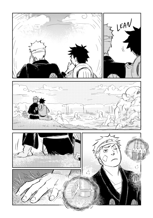
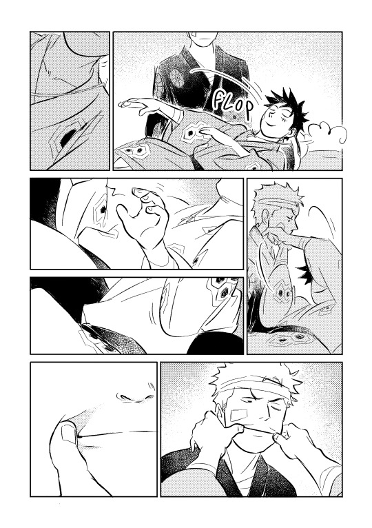
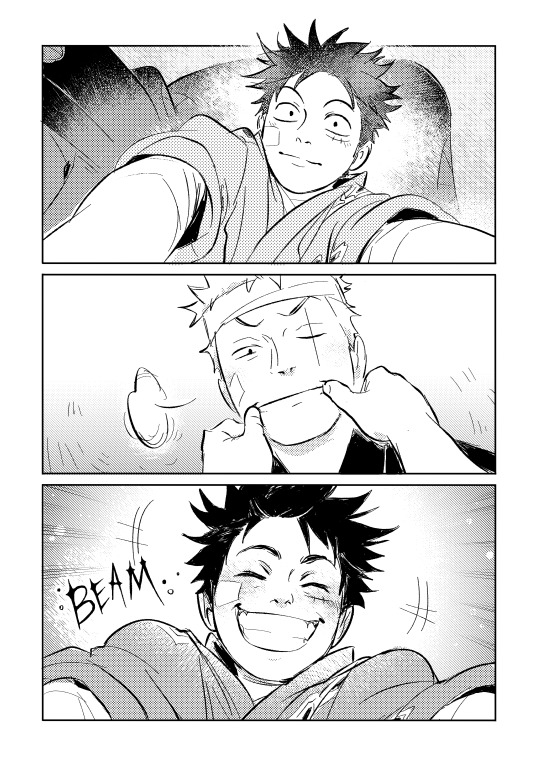
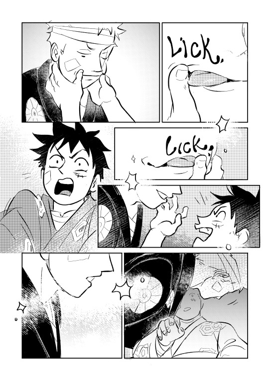
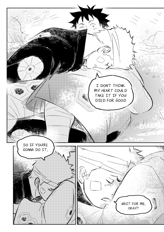
Fanart for a snippet of my most favorite heartbreaking moment from swordsmans's fic bone-breaker ospreys mate for life (rated E)
6K notes
·
View notes