#he gives me peter pan(2003) vibes
Explore tagged Tumblr posts
Text
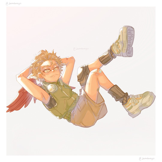
he should've been loitering at the mall
#bnha#mha#my hero academia#hawks#takami keigo#anime#myart#teen keigo u r everything to me#he gives me peter pan(2003) vibes#im going to chomp on his round cheeks#i cant believe he got all ugly in the future smhhhhhh
161 notes
·
View notes
Note
Hi. I'd like to request any thoughts you are willing to give about your mermaid dalpony. Please?
demon-witch05
Omaigah where can I start?🫣.
This is a personal project I've been working on since the past year and has passed through many drafts and discarded ideas. Only recently has begun to take shape.
The current state of the story is one where pony got bitten by a mermaid when he was a kid.
My concept of mermaids is divided in three categories at the moment. Idk how to call them, but it's basically the original species (which to me have the uncanny creepy appearance as the mermaids from the 2003 peter pan movie), the half human half fish mermaid we all know (ponyboy falls in this category) and the merpeople's descendants, who are basically humans that inherited the ability to breathe under water but don't shape shift like the second category.
Leaving the tiny word building aside, for now all I have are just scenes between dallas and ponyboy since dallas finds out pony's nature to how they start dating✨.
I have other things in between like pony starring the classic trope where he has to be hidden and keep his secret, how the family dynamic changed from canon and the struggles since protecting him is the priority and two sibling ocs I created to explain the third mermaid category.
Some things might stay, others could be discarded, but for now the few things I've been working on are for chill and to have fun with the concept and the vibes🌈✨.
#dalpony#the outsiders#there's a lot of backstory and how i got into this concept#but i didn't want to make it longer#thanks for asking!#this beloved unfinished project is everything to me💖#demon-witch05#mermaid au tag
7 notes
·
View notes
Note
The parallel between Kaylor and Peter Pan. After watching the Amsterdam movie poster of Taylor.
My first thought was, why she is giving Peter Pan vibes?
(Peter Pan is a fictional character created by Scottish novelist and playwright J. M. Barrie. A free-spirited and mischievous young boy who can fly and “never grows up”, Peter Pan spends his never-ending childhood having adventures on the mythical island of Neverland)
There are lyric from the cardigan song, “tried to change the ending Peter losing Wendy”.
And “Chasin' shadows in the grocery line”
Peter loses his shadow that's how he met wendy.
“I tapped on your window on your darkest night” by song renegade.
We know Peter always came for wendy through her window.
Peter was a boy who never wanted to grow up.
In the song the archer lyrics, Taylor says “ I never grew up it getting so old”
Also in “ibytam” mv Taylor sitting at the table with kids giving the same vibe.
It is hinted that Wendy have romantic feelings for Peter, but unrequited because of his inability to love but In the 2003 film Peter Pan, the feeling is mutual. In the end, wendy and Peter had to part ways. She always wanted to be a mother herself and I think that leaving Peter was not a choice she made lightly. But Peter cannot move on and grow older with her, and Peter was not ready to leave never land. In champagne problems Taylor said “ I never was ready to watch you go” and in the “afterglow” song Taylor blaming herself. ( correct me if I'm wrong, but I read somewhere Taylor afraid of making commitments) so Wendy had to leave Peter behind. In the movie Hook, an older Wendy have feelings for Peter, saying that she was shocked that Peter did not prevent her wedding day. Now we remember the post of Taylor about ibytam mv that “the bride was willing to risk it all” and “tried to change the ending”.
(And Wendy's name means friend) “it's nice to have a friend”.
In the sequel to the 1953 Disney film, Return to Neverland, Peter and a grown-up Wendy are briefly, but happily, reunited after many years and continue to show feelings for each other. Last year Taylor release a song “this love” from 1989 which has lyrics like “this love came back to me.”
And “This love is alive back from the dead”
At “tiff” Taylor wore earrings that stand for bringing sunshine or sunlight to life.
(at this moment I have a test on me to learn so I can't go in-depth)
But there are m so many connections because Taylor is throwing easter eggs everywhere. If these connections are valid we going to see the Kaylor reunion very soon. Fingers crossed.
.
11 notes
·
View notes
Note
hey so i dont really like face claims cuz well it's easier to imagine a character with specific details other than an actual human being but i was rewatching the 2003 peter pan recently and realized jeremy sumpter (probably a bit younger) reminds me a lot of boomer what're your thoughts on it?

I never watched that Peter Pan but maybe vibe wise? for Jeremy sumpter he has a really cute face and his hair looks like boomers too. Peter Pan in general hmmm I think he’s not dumb enough to give me boomer lol I think Peter pans whole thing is that hes like a traditional leader in a sense and he’s like really smart and convincing and he knows what to do but I think he’s playful and fun because he’s a kid boomers fun and cute because he’s stupid.
15 notes
·
View notes
Photo

Touching the Void.
Searching for cinema that soothes? Ella Kemp suggests it could be as simple as looking for a film poster with a white background.
How many weeks has it been? When did any of us last go blindly into a cinema and take a chance on something new? Film-watching in the time of Covid-19 has changed. The immediate and never-ending news of the world is frightening. Is it still, and more than ever, okay for me to sink into movies to alleviate my mood, just for a bit? How is that even possible when the world has come to a standstill?
We are forced to adapt, and it has taken some time for my attention span and emotional capacity to adjust. But I think I might have found a solution, and I have the meticulous list-makers of Letterboxd to thank. It was Izzy’s list of comfort movies that first lit the fuse. Specifically, the second, third and fourth row; films including Billy Elliot, Clueless, School of Rock.
Fifteen stark posters, speaking one truth: We are vulnerable and nervous. What we need is a film poster with a white background to assure us the movie exists entirely to serve and soothe us.

Part of Izzy’s ‘comfort movies’ list.
List-making on Letterboxd has never been more prolific. Pandemic movies, overdue filmography catch-ups, comfort movies galore. Everyone categorizes and logs their watches differently, but Izzy’s pattern speaks to me with an epiphanic answer. I’ve always admired successful color-coding, but now I see its crucial function.
As I scroll for distraction, for something guaranteed to be good (because I cannot and will not be subject to any uncertainty I can avoid), I see the rainbow. The pale blues of Studio Ghibli, Wong Kar-wai’s passionate reds, the pastels of Netflix Original breezy romances. Like some kind of cinematic ikebana, countless Letterboxd members have mastered the art of arranging film posters. There are standouts: the staggering oeuvre that is Gordon’s chromatic roundup of favorite posters; the comprehensive color-graded history of women directors via their best posters, courtesy of Vanessa; and the penchant for beige in the year 2015, as spotted by Letterboxd co-founder Matthew Buchanan.
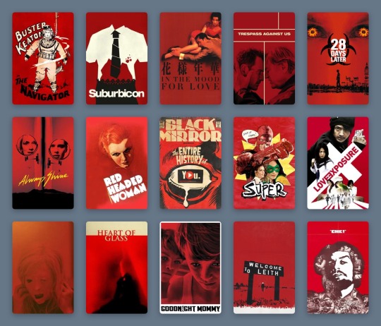
A selection of Gordon’s favorite movie posters.
But when I see these 300 examples, color-coded by typography and accents by Sera Ash, I recognize that white movie posters are the ones most likely, in this very strange time, to take care of me. I see it in three distinct filmmaking periods: Disney animations from the 1940s and 50s, the video marketing for cult comedies of the 1980s and 90s, and the alternative marketing materials of my favorite films of the 2010s. Each poster is straightforward and inoffensive. It captures the story, but never dares to impress or intimidate beyond basic description.
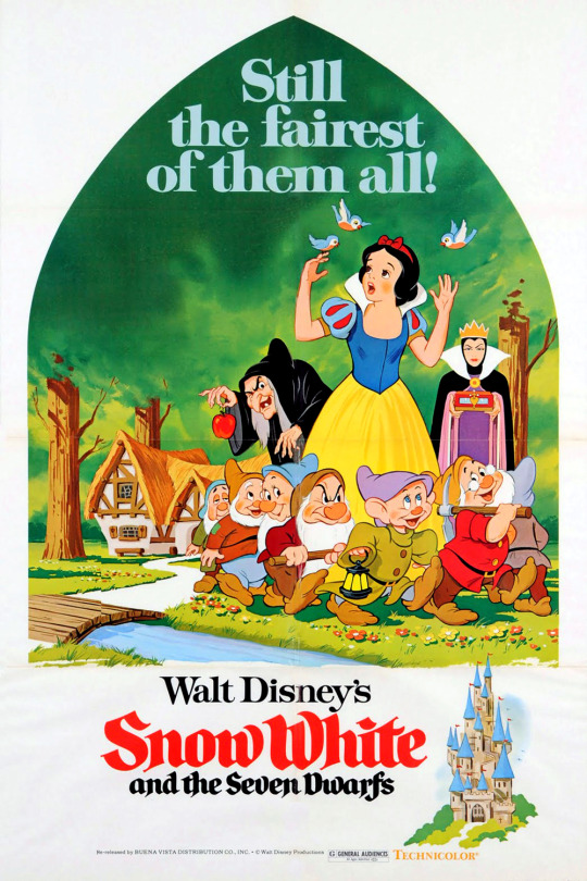
A 1975 re-release poster for ‘Snow White and the Seven Dwarfs’ (1937).
In 1937, Snow White and the Seven Dwarfs announced the birth of Walt Disney’s feature-length empire. While its original theatrical poster is also mostly white, it is represented on Letterboxd by a 1975 re-release poster depicting a peek through the keyhole: a curved triangle framing Snow White, the dwarves, and the two sides of the jealous queen, against a vivid green forest. In the bottom corner, a castle. To the left, the title—her name in red cursive, theirs in black. These simple images come together to present an elementary summary of the ingredients within. The white frame showcases the seminal animation craft without suggesting the viewer diverts their eye anywhere else.
This technique was common across other animated titles, collected in lists like dantebk’s Disney animated classics. Pinocchio toys with the hyperreal relationships between characters alive and wooden, human and animal—but does so on a plain canvas, so that the magic remains within reach. Dumbo, Bambi, Cinderella, Peter Pan—each follows suit. Whether with the mustard yellow of a circus tent, the faint sketches of grass tufts, the gold dust of an enchanted fairy godmother or the ink blue of a midnight starry sky, these colors (indicative of each defining scene-setter or mood-maker) only pepper a blank background, and so make their significance ever greater with the most sporadic touches.

A selection from dantebk’s list of Disney animated classics.
Live-action knockouts from these decades—films like The Shop Around The Corner and The Red Shoes—embrace painted recreations of their protagonists (Margaret Sullivan and James Stewart as festive lovers in the former, Moira Shearer as a tortured ballerina in the latter) and use the color red as a signifier of romance, against a plain white page, to set the mood. Slashes and splashes of red have been used to create a vibe in genre cinema for many decades—a trend deftly chronicled in this list by Rocks.
As far as we know, the underpinnings of digital photography began in the 1950s, and the first published color digital photograph dates back to 1972, when Michael Francis Tompsett shot a photo of his wife Margaret for the cover of Electronics magazine. Consumers got their hands on the gear in the late 1990s, but movie studios really started to make the most of sharp digital photography and stark white backgrounds for their striking posters from the late 1980s onwards. Because, never mind the multiplex, the video store is where you wanted your comfort fare to stand out in the 1980s and 90s.
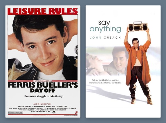
Ferris Bueller’s Day Off (1986) and Say Anything… (1989) form a handsome, trend-setting 1980s pair. While the theatrical poster for Cameron Crowe’s Say Anything… deigned to include John Cusack’s co-star, Ione Skye, by the time of the film’s video release, the focus is clearly on pre-High Fidelity Cusack, as proud underachiever Lloyd Dobler, smouldering lopsidedly under the weight of a boombox. It’s the singular image of the film to this day.
Meanwhile, Matthew Broderick as Ferris-slacking-Bueller is making the most of his title activity, arms behind his head, a proud smirk on his face. Nothing else matters except that these charismatic young stars are stepping up to leading-man status. The white background accentuates the star power of these new boys in town, embracing the limelight in one fell swoop.
Star power is everything: beautiful people doing simple things against empty backdrops, because what could be more important than the regularity of symmetrical bone structure, of familiar charm? The trend boomed in the 1990s and 2000s, in films widely embraced by casual moviegoers. The sort who list “watching Netflix” as a Sunday activity on dating profiles and use the Christmas holidays to rewatch comedies they have memorized over dozens of half-attentive viewings (absolutely zero judgement here!).
The vast majority of these films have white posters. Who is your soothing cup of charm: Tom Hanks on a bench, nothing more nothing less, from 1994’s Forrest Gump? Or Heath Ledger, effortlessly cool, leaning on the brown corduroy armchair Julia Stiles sits in for the 10 Things I Hate About You poster from 1999? (The 90s harnessed the increased appeal of having two lookers just sitting and posing against a plain background, as demonstrated in this chilling list by Ashley.)
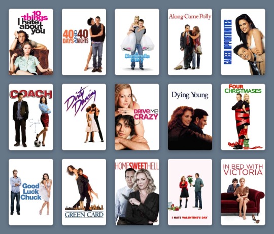
Ashley’s list of couples posing in front of a white background.
Will Ferrell had been earning his stripes as an actor for years, but he changed the movie comedy game as Buddy the Elf in 2003. There’s plenty of visual humour in Elf, but Ferrell’s coat-stand posture bedecked in festive green velvet and those tights is… enough. A white background lets the ridicule slide, just.
How many Disney series really deserve a whole movie—and one that stands the test of time? Lizzie McGuire, resting on her tiptoes with a swinging suitcase in hand, sells The Lizzie McGuire Movie like no idyllic views of Rome ever could. It’s reaching out to an audience loyal to the character, one who will follow her to the ends of the Earth, or at least to another continent. Hilary Duff could be doing almost anything on this poster and it would achieve the same effect—so long as the white background remains plain enough to keep eagle-eyed fans on the main event at all times.
It’s surprising that the star-making system only let Meryl Streep appear in a tiny box, one of four character tiles, on the poster for The Devil Wears Prada in 2006. But the design here taps into 1940s animated sensibilities, giving prominence to a devilish red Macguffin larger than the humans. It still achieves the same function—a glossy, glamorous design with the accessible sell of a quotable, star-fuelled comedy.
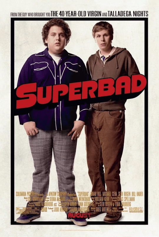
Red may be the color of romance and the devil; it’s also the color of comedy. Exhibit A: the 2007 gross-out comedy Superbad, whose star power—marking the emergence of Jonah Hill and Michael Cera—is used to an opposite and impressive effect on its poster. The awkwardness of these teen boys—lanky, unkempt, insecure—is what cinches the comedy. The simplicity of the poster design, with their uncomfortable posture against, well, nothing at all, further anchors their incapability of facing the world in any confident way, shape or form.
There are countless more examples, like Marley & Me, Bridesmaids, 27 Dresses (notice how the red type is replaced by pink when the film’s plot veers toward the altar). But to understand the curious and timeless appeal of the white movie poster, what happened to it in the 2010s cements its adaptable strength.
As the art of graphic design has continued to bloom, the aesthetic argument for the colorless color-block movie poster has shifted to embrace a film’s context. Consider Danny Boyle’s Steve Jobs, the enjoyable 2015 drama that provided Michael Fassbender one of the most under-celebrated roles of his career, playing the late Apple co-founder. The poster turns the canvas into a blank screen: the title is typed, the text insertion point poised, waiting for the next key press. As Jobs, Fassbender occupies the bottom right corner, in profile, thinking.
This starkness makes sense: what’s next, Steve? It offers a rare example of a poster from the past decade that fully leans into the monochrome aesthetic entirely on purpose—to serve the restrained and unequivocal need for white. (And it’s interesting to compare with the marketing narrative for an earlier film about another tech leader: observe how Jesse Eisenberg’s Mark Zuckerberg eyeballs us from The Social Network’s dark-mode poster.)

Comfort movies don’t own the white poster, of course. Jordan Peele’s Get Out toys, both in its marketing and its delivery, with the binaries of black and white. It’s deployed on-screen with sophisticated horror, and this extends to its two most graphic poster variants.
While one poster sees Daniel Kaluuya’s character, Chris, sat on a chair split vertically between black and white, the all-white poster allows only a center-frame letterbox to reveal Chris’s enormous eyes, accompanied by an all-caps type treatment. The vast expanse of white only makes the image more menacing, framing the claustrophobia so effectively. The landscape crop is a device that defines stern dramas as much as arthouse comedies, as documented by Haji Abdul Karim in their expansive list.
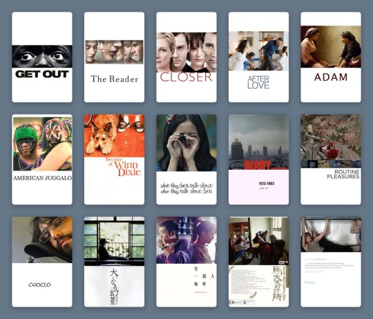
Haji Abdul Karim’s list of white-with-landscape-image posters.
But back in the ‘comfort’ realm, we’re seeing more and more that the marketing wants to have it both ways—the negative with the positive; the art house audience and the multiplex crowd. As genres blend, demographics collapse and audiences become more fluid, a film’s advertising needs to speak more languages.
Two ultra-comfort films from last year demonstrate this idea well. The poster for Judy sees a backlit Renée Zellweger finding her light, receiving her applause. Black is the key color, right down to the classic little black dress; the eye is drawn to the title, spelled out in red sequins. It’s showbiz, it’s drama. Though the film itself fudges a few of the more uncomfortable facts of the star’s story, it’s still honest about her addictions.
In the white-background version, which was more widely distributed, Zellweger, in a floral dress, turns away from the light. The name still sparkles, but in softened gold. There’s no less glamor, the stakes in the film are just as high, but she’s perhaps more accessible like this. The focus, as it was in the 90s, 80s, 40s, returns to the main event.
Greta Gerwig’s Little Women, too, played with dark and light. The indie queen released her previous film, Lady Bird, via design-conscious distributor A24, and Gerwig’s singular aesthetics promised that her Little Women remake would be worlds away from all the others. But when the first images for the film were released, the marketing campaign was questioned by die-hard Gerwig fans.

Both of the group posters are curiously stripped back, freezing Louisa May Alcott’s beloved March sisters in a moment. In the darker image, they gaze out a window, secure in their festive domestic bubble, but set on what’s beyond. There’s more to life, and the film, than this room. It feels more lush, painterly, certainly more dramatic.
Whereas the white poster, at first, seemed like a mistake. It took one of the first images teased from the film and just... dropped it onto a poster. The March sisters look as if solidified by clay, entirely undynamic and at odds with the fluidity and warm soul Gerwig had made herself known for in her filmmaking.
And yet, nothing matters more than these characters. Beth, Jo, Meg and Amy are holding each other, happy, each in their own favourite color, and there is nothing more to fight over. The white-poster alternative lets the 2010s viewer stay attached to the most important part of the film.
The lessons here? A white poster is a vital sign that you’re safe here. You’ve made the correct choice. Attention spans are dwindling, options are expanding, focus is difficult. The promise of a white frame tells me what matters, what is good, where I should place my time and my value. For now.
#movie poster art#poster design#film poster#film poster design#movie marketing#movie design#white posters#comfort movies#comfort films#letterboxd lists#Letterboxd#little women#judy#ferris bueller#disney#graphic design
12 notes
·
View notes
Text
REALLY LONG CHARACTER SURVEY. RULES. repost, don’t reblog ! tag 10 ! good luck ! TAGGED. no one. I stole it TAGGING. @twisted-but-pretty

BASICS. FULL NAME : Killian Jones NICKNAME : Captain, pirate, Hook AGE : 32 in main verse BIRTHDAY : March 21, 1685 ETHNIC GROUP : White/Caucasian NATIONALITY : Irish LANGUAGE / S : English, Gaelic, Latin, Greek, bits of Spanish SEXUAL ORIENTATION : Bisexual ROMANTIC ORIENTATION : Demiromantic RELATIONSHIP STATUS : usually involved with either Milah or Guy. Verses vary. Other than that - hes just a flirt CLASS : a bastard born of an English lord in English society, a Captain of suitable rank in the King’s Navy, pariah once he becomes a pirate HOME TOWN / AREA : Was born in Waterford, Ireland - went to school at Eton in Berkshire, England near Windsor. CURRENT HOME : On board the Jolly Roger, or in Nottingham with Guy of Gisborne, or Storybrooke. Verse dependent PROFESSION : Pirate Captain ( though verse dependent)
PHYSICAL. HAIR : black, tends to curl ever so slightly along the nape of his neck. EYES : Blue eyes that harbor a sort of melancholic look, but also an aura of danger. Average size. Excessively expressive eyebrows NOSE : slightly pointed, turns up ever so slightly at the end FACE : Soft and slightly round, charming smile, unremarkable chin. Considered by most to be quite handsome LIPS : more on the thinner side, often chapped from the salt of the ocean and chewed extensively. COMPLEXION : fairly flawless BLEMISHES : n/a SCARS : A fairly generous and horrid one across his left wrist, one right under his right eye and a fairly large one across the expanse of his back TATTOOS : None HEIGHT : 5′11″. WEIGHT : 180ish lbs. BUILD : Lanky. Wiry. FEATURES : handsome features ALLERGIES : None. USUAL HAIR STYLE : can be messy and disheveled from the wind, but more often than not its styled. He takes great care in making sure his appearance is more than acceptable. It comes from his upbringing USUAL FACE LOOK : He appears fairly jovial, though on occasion he can be quite intimidating. USUAL CLOTHING : leather pants, some form of leather jacket. Usually loose fitting tunic style shirts under a vest. Prefers the colors red and/or black
PSYCHOLOGY. FEAR / S : fading out of all knowledge, death, his own blood (back to the death thing), failure, rejection ASPIRATION / S : to never die, to be the most infamous and well known pirate in the history of the world POSITIVE TRAITS : witty, charming, strong leader, clever, knowledgable NEGATIVE TRAITS : jealous, arrogant, vain, manipulative, abusive, violent, impulsive MBTI : istp ZODIAC : aries TEMPERAMENT : choleric SOUL TYPE / S : Performer / Leader ANIMALS : eagle VICE HABIT / S : drinking, impulsively giving in to emotions FAITH : catholic, but hardly pays attention to such things. GHOSTS ? : no AFTERLIFE ? : doesn’t care REINCARNATION ? : no. ALIENS ? : no POLITICAL ALIGNMENT : in a more modern verse, if pressed, Killian is most often fiscally conservative and socially liberal. In canon, Hook is very anarchist ECONOMIC PREFERENCE : In canon he comes from the household of a British Lord, but is considered a bastard. In most modern verses, he and his family are incredibly low on the socioeconomic ladder SOCIOPOLITICAL POSITION : wanted criminal EDUCATION LEVEL : in canon, he attended both Eton and Bailol. He was a part of the King’s navy before defecting.
FAMILY. FATHER : Patrick David Jones (Lord in canon) MOTHER : Eveline Jones SIBLINGS : Liam Jones (legitimate child of his father) EXTENDED FAMILY : N/A NAME MEANING / S : strife/battle/small/fierce HISTORICAL CONNECTION ? : in canon he was the boatswain to edward teach (Blackbeard)
FAVOURITES. BOOKS : In modern he likes Treasure Island and The Old Man and the Sea. In canon he will read anything he can get his hands on. MOVIE : likes adventure movies such as Indiana Jones. Likes Bridge over the River Kwai. Also a fan of campy horror films 5 SONGS : Hotel California, The Immigrant Song, Hurt, I’ll be Good, Into the Jungle DEITY : God HOLIDAY : not a fan of holidays. Though if he had to pick, Christmas. Especially in modern times when he is spending it with Guy MONTH : March SEASON : Summer PLACE : The Jolly Roger WEATHER : clear skies and smooth seas. SOUND : waves crashing, steel against steel, clanking of tankards, low murmur of a tavern crowd, seagulls. snapping of the masts SCENT / S : salt spray, leather, spices TASTE / S : apples, rum, salt, roasted chicken FEEL / S : sun on bare skin, salt water sting in the eyes, hands running along rough wood, curved steel sliding on to wrist, curling fingers through the hair along the nape of Guy’s neck ANIMAL / S : not particularly fond of any animals unless pressed NUMBER : 3 COLOUR : black or red
EXTRA. TALENTS : leadership, manipulation, seduction, fencing, navigation, swimming, drinking ( ;) ), sailing, BAD AT : controlling emotions, patience, staying out of danger, maintaining civility, science TURN ONS : humor, wit, appearance, experience, cockiness, danger, secrecy TURN OFFS : dullness, not aesthetically pleasing, disloyal, ignorance, short stature HOBBIES : drinking, sailing, fencing TROPES : Aloof Ally, Bold Explorer, Adaptation Personality Change, Descent into Addiction, Functional Addict, Misery Builds Character, Just a stupid accent, AESTHETIC TAGS : N/A GPOY QUOTES : the ocean - poem by nathaniel hawthorne
FC INFO. MAIN FC / S : Colin O’Donoghue ALT FC / S : None. OLDER FC / S : None. YOUNGER FC / S : Logan Lerman/ Jordan Bennie VOICE CLAIM / S : Colin O’Donoghue GENDERBENT FC / S : None.
MUN QUESTIONS. Q1 : if you could write your character your way in their own movie , what would it be called , what style would it be filmed in , and what would it be about ? A1 : Oh, crap ... is it cheating to say Peter Pan? I think it would follow the same premise of that movie but focus more on Hook than Peter. I would focus more on what led Hook to be the man he was, where that residual anger and those good manners came from ... what led him down the path to becoming a man both obsessed and terrified of death Q2 : what would their soundtrack / score sound like ? A2 : A lot of the darker elements of the potc soundtrack combined with a lot of hanz zimmer. I would probably include some of the songs from the titanic soundtrack and definitely some nox arcana. Q3 : why did you start writing this character ? A3 : He literally just popped into my head one day and I guess he’s here to stay seeing as how its been over three years now. I love the mess out of Captain Hook, I always have, and the elements of the character that Colin O’Donoghue brought to the table really nailed it down for me. While I am not OUAT based, I love the wit and charm that Colin exudes and I think its really fun to play off of. Hook is this character whose motivations always change, who can be selfish and a bully but who also can be romantic and a great drinking partner ... its just two halves of the same coin that I really appreciate Q4 : what first attracted you to this character ? A4 : His cocky attitude. I loved his ego, that ‘better than thou’ vibe he gives off. I think I recognized a lot of that in myself along with a few other things. I have a lot more in common with Hook than I would ever admit and being able to play on those negative traits we share in a place where its not me actually hurting anyone or breaking social ties .. it is pretty freeing. Q5 : describe the biggest thing you dislike about your muse. A5 : The facade he constantly puts up. There are so many plot ideas and things I have with so many different muses but sometimes none of them ever come to fruition because Hook just never trusts the other character enough to be open with them. It also makes it hard to do these great ‘ we ride together, we die together’ type of friendships etc because its so rare for him to find anyone he feels that strongly about. He is very in it for himself except in very specific circumstances like with Amy’s Guy. Q6 : what do you have in common with your muse ? A6 : SO MUCH. I think we can both be huge ego freaks, we both like to try and manipulate people to our own purpose. We both like travel and have a sense of adventure and enjoy a good drink/joke. We even have some of the same mannerisms Q7 : how does your muse feel about you ? A7 : He thinks im too hung up on social constraints haha Q8 : what characters does your muse have interesting interactions with ? A8 : literally everyone. But some of my favorites are with Guy of Gisborne just because that relationship has really forced my muse into a place he’s never been before and I absolutely love that. I also really like interacting with Jack Sparrow because that relationship sort of pushes Hook to be more aware of himself. He is jealous of Jack and he hates that he recognizes that fact so I’m a bit hopeful that maybe it ends up with Hook reevaluating himself a bit and adopting those qualities he envies rather than just pretending to hate them. I also love Hook and Vane. I dont even know how that started but their brotp thing they’ve got going on is always a good laugh for me.. Q9 : what gives you inspiration to write your muse ? A9 : listening to classical music, watching Peter Pan 2003, sometimes reading. Q10 : how long did this take you to complete ? A10 : literal days. Maybe even more than a week hahah
#☠ ; ᴀʙᴏᴜᴛ ᴛʜᴇ ᴄᴀᴘᴛᴀɪɴ#long post for ts#| i did this for you amy#| call it an early birthday present hahaah
1 note
·
View note