#graphic design nerdery
Explore tagged Tumblr posts
Photo

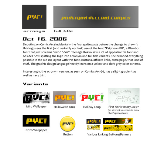

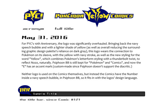
This is something I felt I’d do for fun, given it’s PYC anniversary today!
Yes, as a graphic design nerd this kind of thing is fun lol. By the way, the “DD” referred to is Drunkduck, PYC’s original host (it’s called “The Duck Webcomics” now).
Transcript after the break for Screen Reader/other uses of non-image text:
PYC Logo History
[[Image: Pokémon Yellow Comics's first logo, on a red backdrop.]] May 31, 2006 PYC debuts, and so does this logo, adorning the Comic in all its rough glory. It's basically just an edit & reshuffling of the source game's logo. The font for "Comics" is Dotum.
[[Image: PYC's second logo, on a red backdrop.]] Jun 21, 2006 As early as Comic #4, the logo already begins evolving. The yellow pixel artifacts have been cleaned up, and the space between "Pokémon" and the speech bubble was made yellow to separate the elements more.
[[Image: PYC's third logo, on a gray gradient backdrop.]] Oct 4, 2006 A very short-lived logo. It only appears on Comic #13, which itself has a graphic design style unique to that Comic only. This logo is the previous one but with an emboss effect, which has the unfortunate side effect of making the word "Yellow" undicipherable.
[[Image: PYC's fourth logo, acronym version.]] [[Image: PYC's fourth logo, full title version.]] Oct 16, 2006 Debuting on Comic #14 (incidentally the final sprite page before the change to drawn), this logo sees the first (and certainly not last) use of the font "Psiphoon BB", a Blambot font that just screams "mid-2000s". Teenage Rokko saw a lot of appeal in this font and besides now splitting the logo into acronym and full title variants, she branded everything possible in the old DD layout with this font. Buttons, affiliate links, extra page, that kind of stuff. The graphic design language heavily leans on a yellow-and-dark gray color scheme.
Interestingly, the acronym version, as seen on Comics #14-66, has a slight gradient as well as navy trim.
Variants
[[Image: Clip of the acronym logo in a black-and-white style.]] Miru Wallpaper [[Image: Acronym logo in an orange cloudy style.]] Halloween 2007 [[Image: Acronym logo in alternating red & green colors, with a snowstorm effect.]] Holiday 2009 [[Image: A hand-drawn version of the logo, with "Happy Birthday" added.]] First Anniversary, 2007 (an attempt was made to draw the Psiphoon font) [[Image: Acronym logo with a gradient and slight glow.]] Nozo Wallpaper [[Image: The acronym logo in gray, over a yellow glossy button.]] Button [[Images: Four examples of buttons and banners intended for affiliate linking.]] Various Linking Buttons/Banners
[[Image: PYC's fourth logo, acronym version, but with flat styling.]] From Comic #67-120, the acronym version of the logo was rendered in flat yellow, like this but also very small. (The title bar at the time was tiny.)
[[Image: PYC's fourth logo, full title version, with a heavy glow effect.]] DD title logo, from all I can gather, was after 2006 but before 2010. [[Image: PYC's fourth logo, with a glow but also 3-D effect.]] 2010-2016 DD logo
Weird Sidetrack Nov 6, 2006 [[Image: A very different logo for PYC, it's rendered as the full title: "Pokémon Yellow Comics".]] This logo appears on a piece of promotional artwork for PYC on Rokko's DeviantArt.
It's bizarre in the fact that it's artifacted to heck, and uses the official Pokémon logo, right down to retaining the Registered Trademark symbol, and the font useage isn't Psiphoon BB but rather, Lowrider BB, and with an unflattering stroke weight to boot. What is interesting is the use of the navy speech bubble, which featured in the original PYC logo but would also make a grand return with the 2016 logo. Speaking of which...
[[Image: PYC's 2016 logo, acronym version. The letter "Y" has a thunderbolt styling and is on a navy speech bubble.]] [[Image: PYC's 2016 logo, full title version.]] May 31, 2016 For PYC's 10th anniversary, the logo was significantly overhauled. Bringing back the nacy speech bubble and with a lighter shade of yellow (as well as overall reducing the surrounding graphic design palette's reliance on dark gray), this logo wears the connection to Pokémon on its sleeve, with the yellow with navy stroke, as well as the new styling for the word "Yellow", which combines Pokémon's letterform styling with a thunderbolt twist, to relfect Nozo, naturally. Psiphoon BB is still kept for the "Pokémon" and "Comics", and now the "E" has an accent mark (custom-made since Psiphoon doesn't support the diacritic.)
Neither logo is used on the Comics themselves, but instead the Comics have the Number inside a navy speech bubble, in Psiphoon BB, so it fits in with the logos' design language.
[[Image: A Sample version of the title bar in newer PYC Comic Pages.]]
6 notes
·
View notes
Text

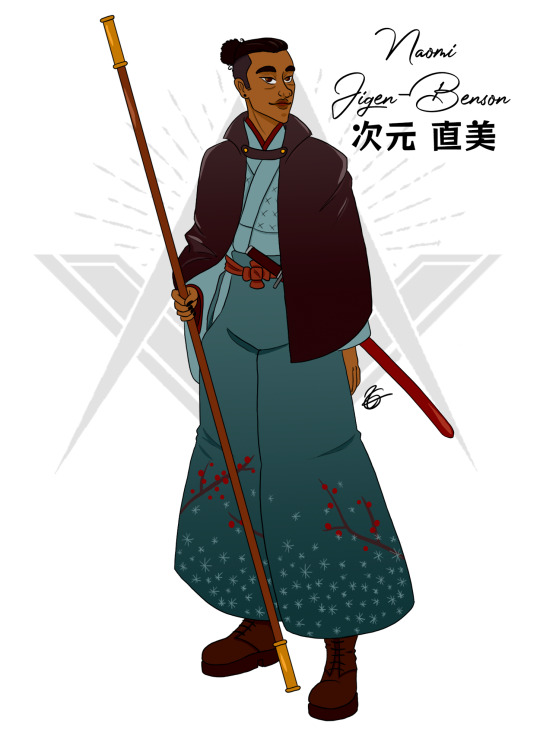
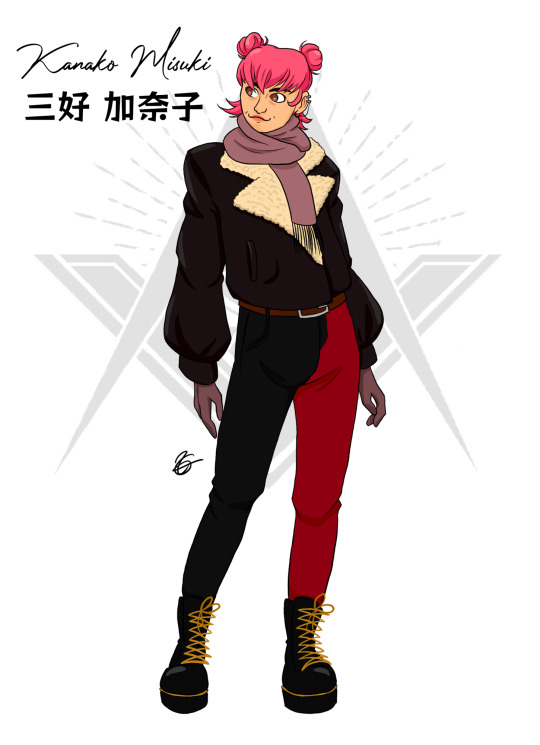

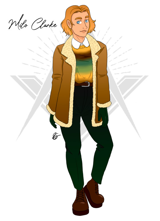
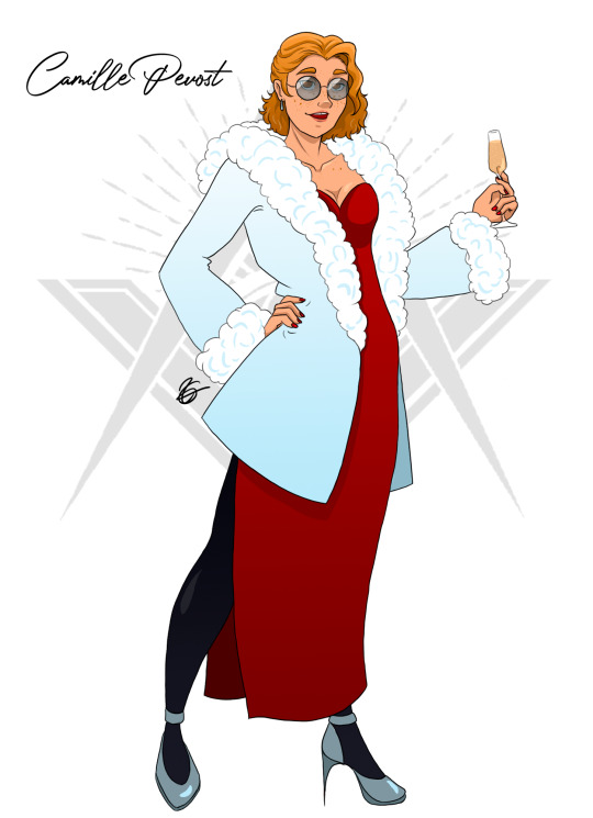

Current level of nerdery: inventing a fake movie about my Lupin III OCs
Meiwaku - The Geneva Conspiracy
After stealing a fake painting from an auction in Switzerland, the Meiwaku gang is dragged into the search for a mysterious treasure sought-out by the Free-Masons. They uncover forgery after forgery, as the ghost of a mad painter hovers over them all.
💥This movie involves a genius art forger, a chase on skis, a painting made in blood, and canon gays!
(Character intros and bonus images under the cut)
Naomi Jigen-Benson, aka Naomi Motosuki: samurai and master thief, former student of Goemon Ishikawa, leader of the Meiwaku Gang; hides a chaotic personality behind her special interest for bushido (more info here)
Kanako Misuki: explosives expert, Naomi's girlfriend; short and full of spite, loves causing mayhem (more info here)
Hiro Kimura: ninja and hacker, Kanako's best friend, co-leader of the gang; pretty chill and also loves causing mayhem (more info here)
Milo Clarke: medic and getaway driver, Hiro's boyfriend; a golden retriever of a man, holder of the braincells (more info here) (Milo belongs to @whosayscrimedoesntpay)
Camille Prevost: art restorer and dealer, secretly a forger; very flirty, self-serving and loves to have fun at other's expanses (more info here)
Free-Mason Grandmaster: he's the antagonist. That's all I've got about him.
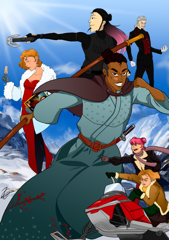
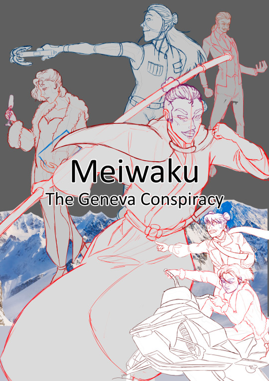
Graphic Design Is My Passion 👌
#lupin the third#lupin iii#lupin iii ocs#my ocs#blorbo from my brain#meiwaku#meiwaku gang#naomi jigen benson#kanako misuki#hiro kimura#milo clarke#camille prevost#meiwaku : the geneva conspiracy#digital art#movie poster#anime
18 notes
·
View notes
Text
The Anti-Froggie
In 7th grade I had this mortal frenemy named Jason.
We did not like each other.
At all.
He was an insufferable nerd.
I was an affable nerd.
If you need proof of that, we were placed side-by-side in our Kirby Junior High yearbook and it looks like a personality yin-yang.

I rest my case.
Our nerdery was not compatible but for some reason we ended up hanging out with each other most of that year. I suspect it was because I was new to public school after going to Catholic grade school. I was pretty messed up from all the bullying and that trauma kept my personality and humor buried deep. Even though I was no longer being bullied, it still took a while for the "real me" to resurface. I didn't even know I was funny at that point. So I didn't make any friends (that I enjoyed spending time with) until 8th grade.
Which meant for 7th grade... I was stuck with Jason.
I think part of us enjoyed the challenge of debating various nerdy topics. We were constantly trying to find ways to one-up each other when justifying our subjective opinions. I couldn't stand him. I hated his opinions. But I loved winning the arguments I had with him—which I did with great frequency.
I mean, he was stubborn and never officially conceded on anything... but when I won he’d get all quiet and change the subject.
He’s probably a Republican now.
*checks Facebook real quick*
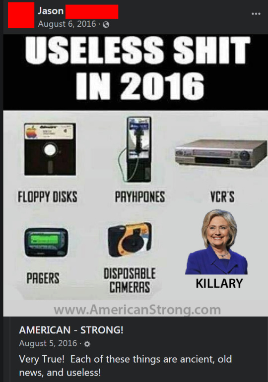
Holy shit... I was right! I swear I didn’t know this before I wrote that Republican joke. I’m feeling very validated for my 7th grade hatred of Jason.
What was I saying?
Oh right... winning arguments.
Because of the thrill of verbal victory, I couldn't quit him until I became a much more mature 8th grader who was above petty bickering. I transitioned to Very Serious Discourse™ which is completely different.
Our biggest point of contention was the OG console war. It’s a tale as old as time.
I had a Super Nintendo.
Jason had the Sega Genesis.
So, of course, we constantly argued over which console was superior. And it got *very* ugly. His mother had to tell us to shush because our yelling scared their cat.
We'd alternate going to each other's homes to play video games. As we played, we’d point out when our consoles did something better or worse. It was ridiculous, but we were obnoxious tweens with nothing else to do. (Though Jason was orders of magnitude more obnoxious than I was. And I could round up at least a dozen people to corroborate that claim if challenged in court.)
I would say something like, “Super Mario World is much more fun than Sonic. It has better level design. You can shoot fireballs and fly and dive bomb and do all kinds of creative moves. Plus, you get to ride a frickin’ dinosaur. Sonic just runs fast through loop-de-loops.”
And then Jason would just brag that Sonic used “blast processing” to make him go super fast. But his most favored argument for why the Sega was better was mostly a marketing gimmick.
But he’d constantly tell me how the SNES was slow as balls and I was like, "Do you want to go fast or have fun?" Not to mention, SNES had Bubsy which was just as fast as it was on the Genesis. And it was more fun than Sonic. Collecting yarn balls was way better than golden rings. Plus Bubsy actually spoke in the game and said funny things. Sonic was still a mute hedgehog in those days. When Bubsy talked on the Genesis it sounded like he had one of those yarn balls stuck in his throat.
The SNES had much better graphics with thousands more colors available. It had better sound. It had mode 7 which allowed for the first Mario Kart style games. And the controller was much more comfortable to use. If you played the same game on both systems, the Sega version always looked like trash. I don't know quite how to describe it, but the Genesis looked like the pixels were all angry at each other. Just muddy and murky like a JPEG that has been saved way too many times.
Our biggest and most contentious fight happened after the first Mortal Kombat was released for both systems. The Genesis had a simple code you could enter to enable blood and the goriest finishing moves. The SNES version replaced all of the blood with stupid looking gray sweat. Every attack led to an inordinate amount of gray droplets fleeing the person. I guess you were supposed to dehydrate your opponent to death by punching all of the moisture out of their bodies.
Again, the SNES looked better. It sounded better. The controls were better. But the entire fun of Mortal Kombat was the over-the-top gore. It made Nintendo seem like it was meant for little kids and Sega was for the cool rebellious kids.
Every argument I had to defend my precious SNES was disingenuous on my part because I was constantly making excuses for why we should play at Jason's house so I could see that wonderful oversaturated red human juice fly out of all the characters.
I became obsessed with the blood and I couldn’t have enough digital carnage. Then I read in a video game magazine the Game Genie had a "blood code" for the SNES.
SALVATION!
I thought this was my way to gain back console superiority. I was so disheartened and embarrassed by my lame gray perspiration. But If I could get blood working on Mortal Kombat, then the better graphics, sound, and controls would put me over the top in imaginary cool points. I was already picturing Jason’s face turning sour with disappointment.
The Game Genie was this weird device that let you enter special codes and it would manipulate variables in the game. Mostly it let you cheat. More lives. More health. Greater damage. But it also allowed for minor tweaks to graphical elements.
One problem... I couldn't afford the Game Genie. Thankfully it could be rented from Blockbuster. I figured I’d try out the blood code and if it was as awesome as I hoped, I’d save up for one of my own. So I handed my allowance over to the Buster of Blocks and rented the Genie for a weekend.
The time had come. I put in Mortal Kombat, typed in the alphanumeric code, and was gleefully anticipating my bloody gaming experience.
I threw the first punch and my smile transformed into an angry frown.
The Game Genie tinted the gray sweat pixels into pinkish-red sweat pixels.
It looked *terrible*.
It was nothing like the giant gloopy puddles of blood on the Genesis. It looked more like I was knocking dirt off of people. “Enjoy your fist shower, Raiden!” And none of it glooped on the ground. It just disintegrated into the air. I had been bragging to Jason all week at school that I was going to have my own blood. Instead, I got ugly pink mist.
When I went back to school on Monday I tried not to bring it up and hoped Jason wouldn't either. But it was the first thing that turd asked about when we saw each other. I had to admit that Mortal Kombat was officially better on the Genesis and it pained me to do so. And that obnoxious dweeb didn’t let me forget it for the rest of the time we hung out together. He was unrelenting.
The very next year Nintendo released Mortal Kombat II for the SNES with full-fat blood and gore. No restrictions. No lame gray sweat.
It. Was. Glorious.
(As long as you could convince your mom to buy it for you at Toys “R” Us.)
It really was a beautiful game. Not just the blood. It had some of the best graphics of any fighter game you could play at home. And it was just super fun to play. I think I would have loved it even if they pulled that gray sweat crap again. And it was, without question, better on the SNES.
Unfortunately, I was no longer speaking to Jason at that point and had no way to lord it over him.
On the upside, I had a bunch of new friends that I liked a lot and never argued with and none of them ended up being Republicans. And we had a ton of fun playing Mortal Kombat II with each other.
So I guess it’s okay that Jason maintained that one victory over me.
But I’m going to put an asterisk next to it in the history books like they did with Roger Maris.
87 notes
·
View notes
Text
Typography tutorials and best practices
Typography forms a large part of any designer’s learning curve.
Thanks to the internet all available information is at your fingertips.
There are a lot of tutorials available that are easy to follow and relevant to learning typography skills. Learning from these tutorials can make almost any student to produce high quality pieces of typographical art.
Whatever your field of expertise is, the skill of typeface design is a challenge.
The tutorials here represent an easy and enjoyable way to use and improve your typographical skills.
Below you will see that the tutorials are split in four categories: Things that you should read first (the basics of typography), web typography, Photoshop typography tutorials and Illustrator typography tutorials.
You need this before anything else
Making Sense Of Type Classification
Everyone knows their serifs and sans, slabs and scripts, but most classifications go much deeper than that. Type classification, while helpful, is often convoluted, confusing and even controversial.
This article, distilling some of the complexities into a more understandable format, lands somewhere in the middle between the basics and genuine type nerdery — the perfect level for a practicing designer.
The Basics of Type
Typography could be considered the most important part of any design. It’s definitely among the most important elements of any design project. And yet it’s often the part of a design that’s left for last, or barely considered at all.
Designers are often intimidated by typography, which can result in bland typographical design or a designer always using one or two “reliable” typefaces in their designs.
Paragraphs and Special Characters
Body copy makes up the majority of many websites. Headlines and other bits of typography are often considered more fun to design, or more artistic, but without a good design for your body copy, your overall project will suffer.
Principles for Combining Typefaces
When combining typefaces, there are a couple of important principles you’ll need to keep in mind, namely contrast and mood. Effectively combining typefaces is a skill best learned through practice, and trial-and-error. Once you’ve mastered the principles covered here, you’ll have the tools you need to try out combinations while making educated guesses about what will and won’t work together.
Pulling It All Together
In this article, there are guidelines for combining fonts for paragraphs and headlines, as well as for other common type elements, like pull quotes and by-lines.
Font creation has become incredibly popular in recent times and has become more accessible to those who wish to get involved with the creation process. This is thanks to a number of font creation programs which are now available across many desktop computer systems.
So you want to create a font. Part 1
So you’re a brilliant designer, a master calligrapher, and you’ve learned all about serifs, side-bearings, and kerning. Now you want to create your own font.
So you want to create a font. Part 2
The sheer number of fonts out there is a testament to the fact that there are nearly an infinitude of creative choices that can be made when designing a font.
Understanding The Difference Between Type And Lettering
Unfortunately, as with any popularity surge, there have come with it a lot of misunderstandings of some of the terms and concepts that we use. This article will help you gain a clearer understanding of what typography is and isn’t, and why.
Font hinting
Hinting, or screen optimising, is the process by which TrueType or PostScript fonts are adjusted for maximum readability on computer monitors. This text compares different ways of hinting (black & white, grey-scale, ClearType, DirectWrite), and explains the behaviour of fonts under different rasterisers.
Four techniques for combining fonts
Is there a way to know what fonts will work together? Building a palette is an intuitive process, but expanding a typographic duet to three, four, or even five voices can be daunting. Here are four tips for navigating the typographic ocean, all built around H&FJ’s Highly Scientific First Principle of Combining Fonts: keep one thing consistent, and let one thing vary.
Beginners Guide to OpenType
OpenType (OT) is a cross-platform type format that includes expert layout features to provide richer linguistic support and advanced typographic control. Using OT technology you can substitute your characters for different glyphs1 using many different methods; Ligatures, Small Caps, Oldstyle Figures, Fractions, Superscript/Subscript, Ordinals, Alternates, Titling Characters and many more.
Making Geometric Type Work
For graphic designers beginning to experiment in type design, a geometric or modular typeface is a natural starting point. Illustrator and other programs offer a simple collection of elements such as circles, squares, and triangles which can be combined to create a passable alphabet.
This is the same route the author took when dissatisfied with the limits of commercial fonts at the time. Ian twisted and distorted each character to fit into a few simple, incredibly strict rules of construction. Invariably this produced a wide range of exotic letterforms, some more legible that others.
Web typography
A guide to Web typography
Typography for the Web has come a long way since Tim Berners-Lee flipped the switch in 1991. Back in the days of IE 1.0, good web typography was something of an oxymoron. Today things are different. Not only do we have browsers that support images (gasp!), but we have the opportunity to make our web pages come to life through great typography.
Avoiding Faux Weights And Styles With Google Web Fonts
If you’re using Google Web Fonts on your websites, then there’s a very good chance that 1 in 5 visitors are seeing faux bold and italic versions of your fonts — even if you correctly selected and used all of the weights and styles.
That’s because the implementation method recommended by Google Web Fonts doesn’t work with Internet Explorer 7 or 8.
Legibility And Readability – Principles That Shouldn’t Be Ignored When Designing
Readability is an important aspect of web design usability and that is not a secret.
If readability is done correctly, it will allow the users to assimilate easier the information given in the text. This will depend on a few factors like the content structure, style and design.
Legibility, on the other hand, is a measure of how easy you can distinguish a letter from another in a typeface. While making a text readable is doable, making every font legible is impossible, because not all fonts are designed to be legible.
How To Pick The Right Font For Your Design
Typography continues to be overlooked by many designers yet it is a very important aspect of the design process as choosing the right typeface can make a real difference to the effectiveness of the design. Typefaces are just as important to the visual effect of the webpage as images.
Responsive Typography: The Basics
The body text definition dictates how wide your main column is, the rest used to follow almost by itself. Used to. Until recently, screen resolution was more or less homogeneous. Today we deal with a variety of screen sizes and resolutions. This makes things much more complicated.
Typographic Contrast and Flow
Designers create typographic contrast and flow by emphasizing certain text. Contrast is important because not all the content within a page have the same value, some have greater significance than the others.
By creating contrast, you can direct the reader’s attention to the important messages and at the same time enhance the visual appearance. Here are seven basic methods on how you can create typographic contrast.
8 Simple Ways to Improve Typography In Your Designs
Many people, designers included, think that typography consists of only selecting a typeface, choosing a font size and whether it should be regular or bold. For most people it ends there. But there is much more to achieving good typography and it’s in the details that designers often neglect.
Photoshop tutorials
An Awesome Collection Of 80 Photoshop Typography Tutorials
Finding them all in one place is a little bit tricky… unless you find this article where you have almost all the cool and interesting Photoshop typography tutorials.
How to Create Candy Cane Typography with Photoshop and Illustrator
Awesome Milk Typography Effect in Photoshop
Playing with Inflate in Repoussé in Photoshop CS5 Extended
Create an Ice Cream Type Treatment in Photoshop
Create Awesome Particle Flame Text Effect in Photoshop
Create a Dream Design with 3D Typography
Create an awesome broken plate typography effect
Banana style text effect
Create Gold Ornamental Text in Photoshop
Honey leaking effect on the delicious pancake
Cool Text Effect with the Puppet Warp Tool in Photoshop CS5
3D Ribbon Wrapped Text Effect
Master 3D type effects
Create a Tasty 3D Typographic Illustration in Photoshop
Dramatic Text on Fire Effect in Photoshop
Create Abstract Shining Text Effect with Groovy Font in Photoshop
Add Fantastic Color to 3D Text – Part II
Honey bubbles text effect
Create Stunning 3D Text in a Grungy Landscape
Creating Retro Folded Typography Using Photoshop
Smoke Type in Photoshop in 10 Steps
Create a Spectacular Grass Text Effect in Photoshop
Glossy Snow Globe Text Effect
Design Soft Stylized 3D Type
Super Easy Pewter Style Metal Text Effect in Photoshop
Create Cool Typography Using Paths in Photoshop
Illustrator typography tutorials
Useful Typography Tips For Adobe Illustrator
Old School Type – Line Gradients
Create a Furry Calligram in Illustrator
Create a Variety of 3D Lettering Effects for Poster Design
Getting Carried Away with Balloon Lettering
Create a Mummy Text Effect
Create a Grimy Text Treatment with a Pen Tablet
How to Build Letter Art From Bricks In Illustrator
How to Create a Neon Text Effect in Adobe Illustrator
How to Create a Fun 3D Plastic Text Effect
Create a Chalkboard Type Treatment
Create a Glassy Text Effect Filled with a Green, Acidic Substance
Create a Zombie Style Typo using the Blob Brush in Illustrator
from Web Development & Designing http://www.designyourway.net/blog/resources/tutorials-to-learn-how-to-create-typography-based-designs/
0 notes
Text
Want to ensure that visitors will exit your website almost immediately after landing there? Be sure to make it difficult for them to find what it is they are looking for. Want to get people to stay on your website longer and click on or buy stuff? Follow these 13 Web design tips.
1. Have a polished, professional logo-- and link it to your home page. "Your logo is an important part of your brand, so make sure it's located prominently on your site," says Tiffany Monhollon, senior content marketing manager at online marketer ReachLocal. "Use a high-resolution image and feature it in the upper left corner of each of your pages," she advises. "Also, it's a good rule of thumb to link your logo back to your home page so that visitors can easily navigate to it."
Check our professional web design agency in Toronto.
2. Use intuitive navigation. "Primary navigation options are typically deployed in a horizontal bar along the top of the site," says Brian Gatti, a partner with Inspire Business Concepts, a digital marketing company. Provide "secondary navigation options underneath the primary navigation bar, or in the margin of the site, known as the sidebar."
Why is intuitive navigation so important? "Confusing navigation layouts will result in people quitting a page rather than trying to figure it out," Gatti says. Instead of putting links to less important pages-- that detract from your call to action or primary information-- at the top of your home or landing pages, put "less important links or pieces of information at the bottom of a page in the footer."
3. Get rid of clutter. "It's very easy these days to be visually overloaded with images, to the point where our brains stop processing information when confronted with too many options," explains Paolo Vidali, senior digital marketing strategist, DragonSearch, a digital marketing agency.
To keep visitors on your site, "make sure pages do not have competing calls to action or visual clutter that would draw the visitor's eyes away from the most important part of the page." To further keep clutter down on landing pages, "consider limiting the links and options in the header and footer to narrow the focus even further," he says.
Another tip to streamlining pages: "Keep paragraphs short," says Ian Lurie, CEO of internet marketing company Portent, Inc. "On most Web sites, a single paragraph should be no more than five to six lines."
" Controlling white space through layout will keep users focused on the content and control user flow," adds Paul Novoa, founder and CEO at Novoa Media. "With a lot of visual competition taking place on the Web and on mobile, less is more. Controlling white space will improve user experience, increasing returns from the website."
Security lessons learned in 2016 BrandPost Sponsored by AT&T Security lessons learned in 2016 By Dwight Davis There were thousands of cybersecurity breaches during 2016, some large, many small, some well publicized, others still undiscovered. The vast majority of these attacks shared a primary objective: economic ... 4. Give visitors breathing room. "Create enough space between your paragraphs and images so the viewer has space to breathe and is more able to absorb all of the features your site and business have to offer," says Hannah Spencer, graphic designer, Coalition Technologies, a Web design and online marketing agency.
5. Use color strategically. Using "a mostly neutral color palette can help your site project an elegant, clean and modern appearance," says Mark Hoben, the head of Web design at Egencia, the business travel division of the Expedia group, who is also a believer in using color wisely. "Employing small dashes of color-- for headlines or key graphics-- helps guide visitors to your most important content," he explains.
It is also important to use a color palette that complements your logo and is consistent with your other marketing materials.
6. Invest in good, professional photography. "Website visitors can sniff out generic photos in a second-- and they'll be left with a generic impression of your company," warns Zane Schwarzlose, community relations director, Fahrenheit Marketing. "Your company isn't generic. Show your visitors that by investing in professional photography."
Bonus photography tip: "If you want to draw attention to a particular piece of content or a signup button, include a photo of a person looking at the content," suggests Elie Khoury, cofounder and CEO of Woopra, which provides real-time customer and visitor analytics. "We are immediately drawn to faces of other humans-- and when we see that face looking' at something, our eyes are instinctively drawn there as well."
" We strongly recommend that our clients invest in professional photography or purchase professional stock photos," says Gatti. Good photographs "draw the eye, providing an emotional connection to the written content." Poor quality photographs or photographs that have nothing to do with your message, on the other hand, are worse than having no photographs.
7. Choose fonts that are easy to read across devices and browsers. When choosing fonts, keep in mind that people will be looking at your website not just on a laptop but on mobile devices. "Some large-scaled fonts may read well on a computer monitor, but not scale or render well on mobile, losing the desired look and feel," explains Novoa. He advises using a universal font.
" If you're using a fixed-width design, use a font size that allows a maximum of 15 to 20 words per line," adds Lurie. "If you're using a fluid design, use a font size that allows 15 to 20 words per line at 900 to 1000 pixels wide."
" Pick a typeface that can be easily read and size it no less than 11pt," says Ethan Giffin, CEO, Groove Commerce. "If you're using Web fonts, try to use no more than two font families in order to ensure fast load times," he says.
8. Design every page as a landing page. "Most websites have a design that assumes a user enters through the home page and navigates into the site," says Michael Freeman, senior manager, Search & Analytics, ShoreTel, Inc., which provides hosted VoIP, cloud PBX service and business phone systems. "The reality, though, is that the majority of visits for most sites begin on a page that is not the home page," he says. You need to design the site in such a way that whatever page a visitor lands on, key information is there.
9. Respect the fold. When asked for their top design tips, almost all the Web designers CIO.com queried immediately said: Put your call to action in the upper portion of your website, along with your phone number and/or email address (if you want customers to call or email you). Regarding home page images, "I recommend going against full-width sliders and encourage sliders or set images that cover two-thirds of the width allowing for a contact form to be above the fold," says Aaron Watters, director, Leadhub, a website design and SEO company.
10. Use responsive design-- that automatically adapts to how the site is being viewed. "Rather than developing a site for each device, a responsive site is designed to adapt to the browser size," making for a better user experience, says Jayme Pretzloff, online marketing director, Wixon Jewelers. And a better user experience typically translates into more time spent on your site and higher conversion rates.
Related: 7 Tools to Build Websites Using Responsive Design 11. Forget Flash. "Thanks in part to the ongoing dispute between Adobe and Apple, the days of Flash as an Internet standard are slowly coming to a close, so why stay on the bandwagon when there are other options that are much more Web and user friendly?" asks Darrell Benatar, CEO of UserTesting.com. Instead, use HTML5, he says. "HTML5 is gaining more support on the Web, with search-engine friendly text and the ability to function on many of the popular mobile operating systems without requiring a plug-in. The same can't be said for Flash."
12. Don't forget about buttons "The 'Submit' or 'Send' button at the bottom of a Web form can be the ugliest part of a website," says Watters. He encourages designers to make form submission buttons "so appealing visitors can't help themselves. They just have to click it." In addition, "when a visitor hovers over your submit button, it should change color, gradient, opacity or font treatment," he says.
13. Test your design. "Whether you are trying different placements for a call to action or even testing different shades of a color, website optimization can make a big impact to your bottom line," states Lindsey Marshall, production director, Red Clay Interactive, an Atlanta-based interactive marketing agency. "A user experience manager at Bing once remarked that Microsoft generated an additional $80 million in annual revenue just by testing and implementing a specific shade of blue!"
"Create enough space between your paragraphs and images so the viewer has space to breathe and is more able to absorb all of the features your site and business have to offer," says Hannah Spencer, graphic designer, Coalition Technologies, a Web design and online marketing agency.
B Testing " Every design decision is just a hypothesis," adds Mike Johnson, director of User Experience at The Nerdery, an interactive production company. "User testing, A/B testing and simple analytics can help you continuously improve your designs feedback from real people."
Using "a mostly neutral color palette can help your site project an elegant, clean and modern appearance," says Mark Hoben, the head of Web design at Egencia, the business travel division of the Expedia group, who is also a believer in using color wisely. "Most websites have a design that assumes a user enters through the home page and navigates into the site," says Michael Freeman, senior manager, Search & Analytics, ShoreTel, Inc., which provides hosted VoIP, cloud PBX service and business phone systems. When asked for their top design tips, almost all the Web designers CIO.com queried immediately said: Put your call to action in the upper portion of your website, along with your phone number and/or email address (if you want customers to call or email you). Regarding home page images, "I recommend going against full-width sliders and encourage sliders or set images that cover two-thirds of the width allowing for a contact form to be above the fold," says Aaron Watters, director, Leadhub, a website design and SEO company.
0 notes