#gposeguide
Explore tagged Tumblr posts
Text
GPose Guide: Dark-skinned characters
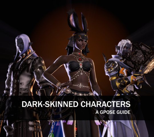
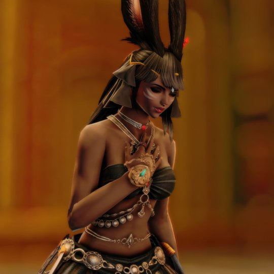
I got some questions about how to work with dark-skinned characters - and also heard some comments on how hard it is to gpose them. So here's a compilation of use cases, some techniques, and setups!
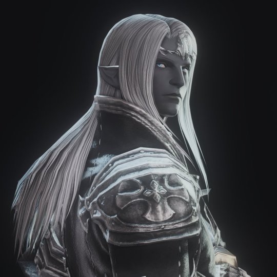
Posing in dark settings
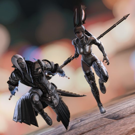
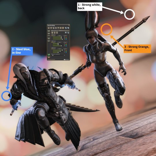
This is where dark-skinned characters shine, pun intended. Point lights give a lot of flexibility, and character/environment lights are great tools to give volume and detach characters from the background.
In this example, 3-point sources are used to provide volume to the characters, without relying on character brightness at all. The Neneko Nikuman preset gives excellent brightness, contrast, and depth of field (DoF) options.
Posing in bright settings
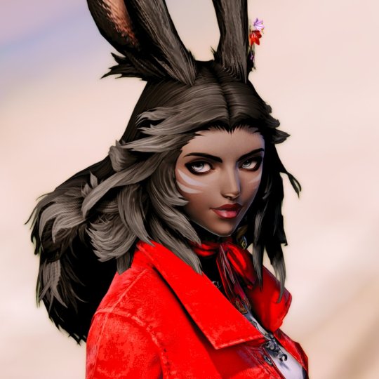
Contrast is a powerful tool, and dark-skinned (and dark-clad) characters can use that to their great advantage.
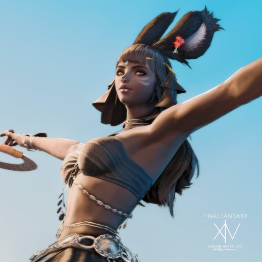
In the following example, a hard white light is positioned to create a strong rim light for volume, with a support gold source for tone and a light purple point to bring up the character's face. The Neneko Cocktail preset gives rich metal tones and excellent contrast.
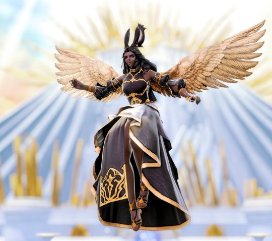
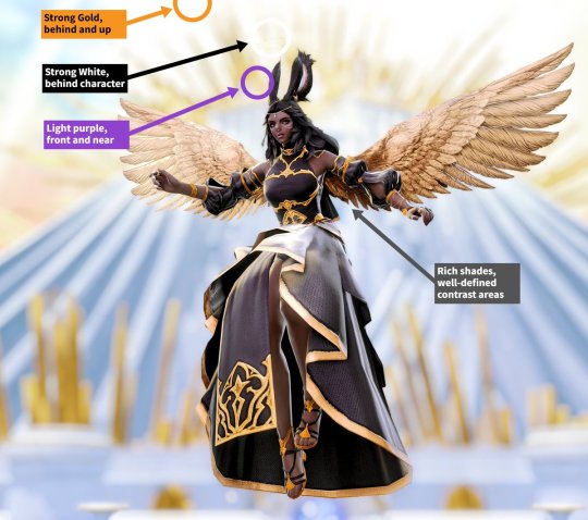
The second example is about color. The same preset (Neneko Cocktail) is used, with ADOF+BOKEH and ADOF+BLUR enabled to give a dreamy quality to the background. Light sources emulate the sky.
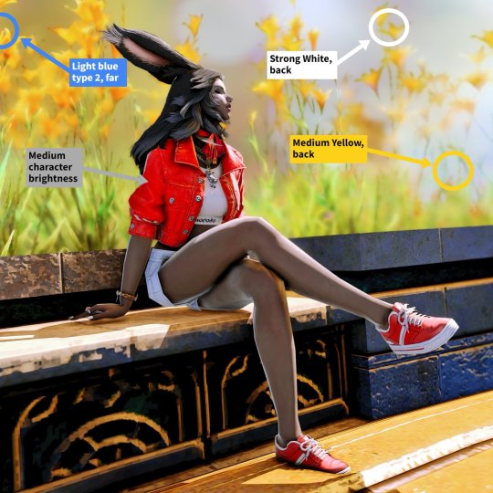
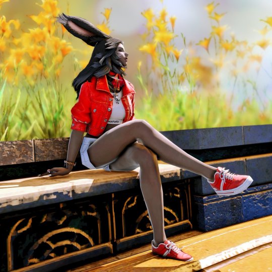
Colorful/Pastel clothing/scenario
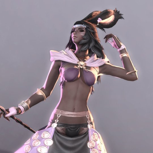
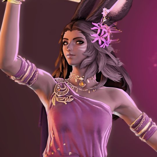
You may have heard that dark-skinned characters don't go well with certain colors, like pink or white. That is not true: Dark skin palettes have as much width as pale ones, just in a different range - and light sources can bring them up.
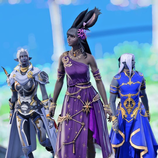
The first example uses a very colorful background, with Neneko Lux driving the hue and brightness up. Instead of fighting it, we use the scenario colors to our advantage by projecting them around the character.
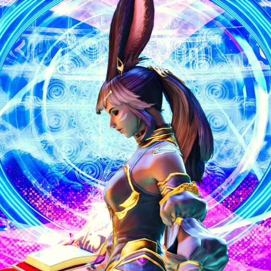
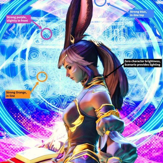
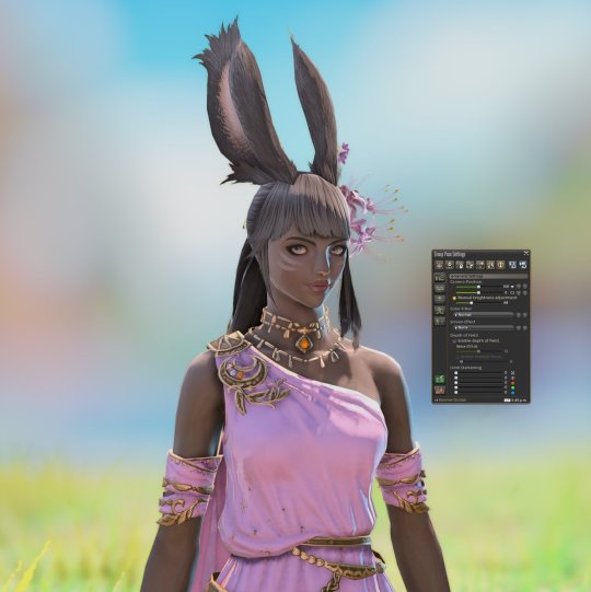
The second example is a portrait where we again use the scenario to provide hints about the light sources. Neneko Melonpan gives an excellent, smooth pastel treatment. Let's see the step-by-step from the original state to the final result.
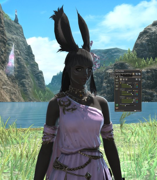
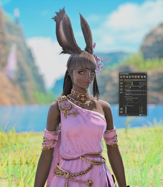
The first light is placed to emulate a cyan reflection from the water. The second emulates the bluish reflection from the sky, and The third is pretty near and creates a sunny rim light.
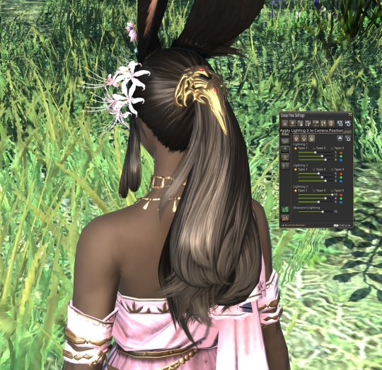
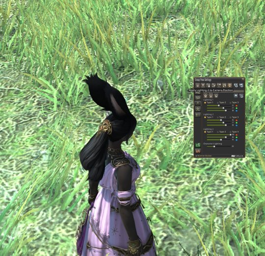
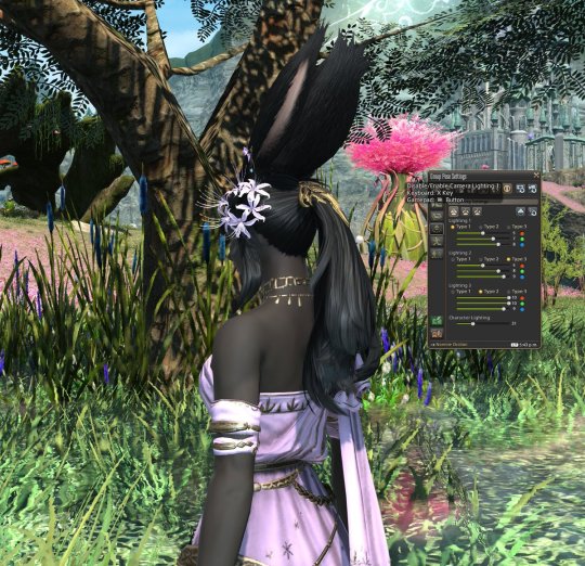
With everything in place, we can enable the preset - and play around with DoF to decide how much we want to detach it from the scenario, taking away attention from the background and popping the character.
Posing together with fair-skinned characters
We can borrow some practices from real-life photography. The most important: position your light sources around the dark-skinned character. This will give you enough contrast to play with, and lessen the amount that reaches the other.
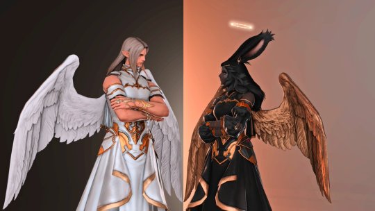
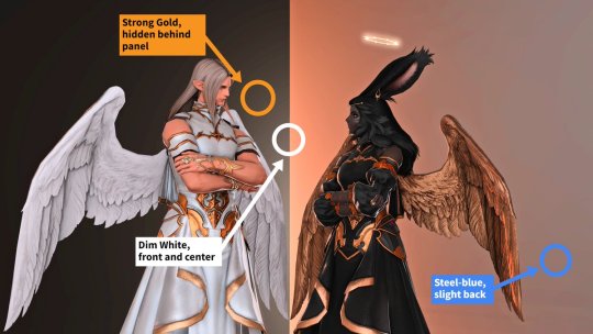
Composition (Extreme)
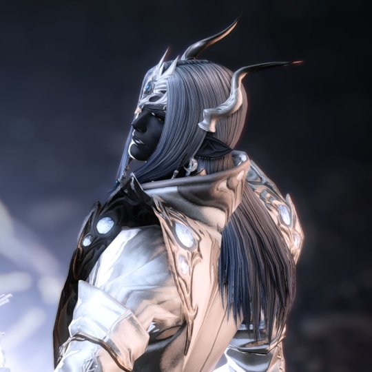
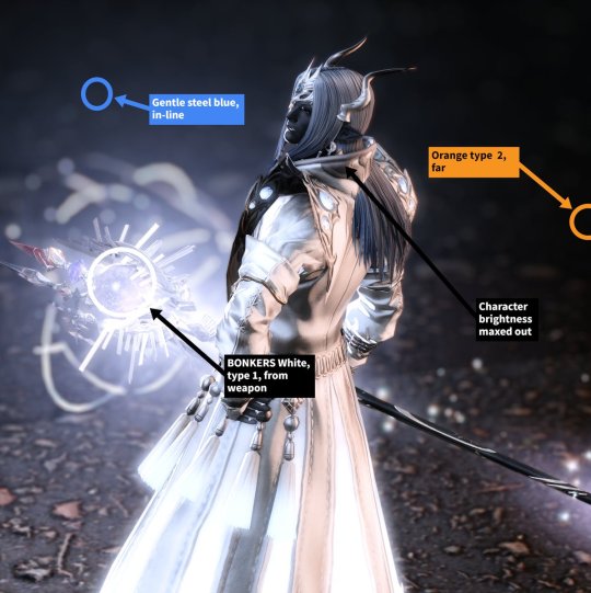
Compositions with lots of glow elements make it hard to pop the character features: since armor and weapons don't emit real light, everything needs to be compensated with the three-point lights, plus character and manual scene brightness.
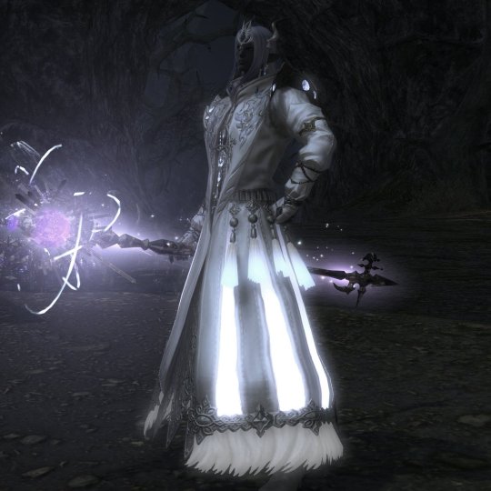
In this case, the character is positioned in such a way as to hide frontal reflections while still bringing his expression out a bit with well-defined rim lights.
Comment: The default in-game lighting leaves much to be desired
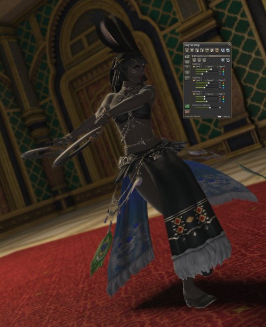
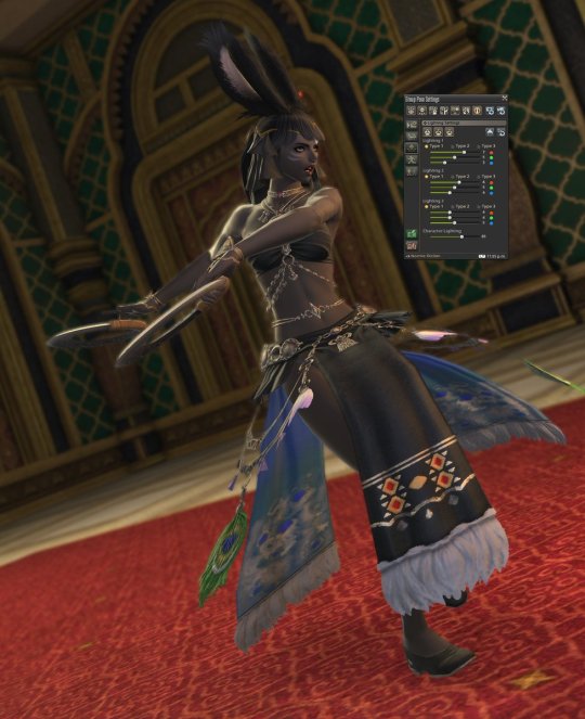
This is certainly true to an extent. The in-game settings are apparently tuned towards a common denominator between wildly different form factors (i.e. PC, Playstation 3-5), so a muted palette is used.
This results in ashen colors and small gradient differences between dark tones in certain situations; keep that in mind if you're looking for locations. Again, lighting can be used to remediate - but not eliminate - these limitations.
Final Thoughts
This isn't, by any means, a comprehensive guide. Dark-skinned characters come in a glorious amount of shades and tones, so I tried to keep it simple and discuss some basic aspects.
If you have any questions, feel free to ask! It'll help others that may stumble over this thread.
And thank you for your patience!
1K notes
·
View notes
Text
Some FFXIV G-Posing Tutorials I Found Helpful!
For those who don't know, FFXIV has a feature called /gpose, which is a lovely tool for taking pictures of your character in very stunning ways!
Rosa’s Most-Basic-of-Basic Gpose Tutorial by @rhotano-rose
Starter GPose: Lighting 102- Outdoors by @leonaquitaine
Tips: Player Portraits by @leonaquitaine
Hopefully those found guides help other Eorzeans create stunning images and self-portraits!
5 notes
·
View notes
Text
How-To: Budget Studio Mk.III
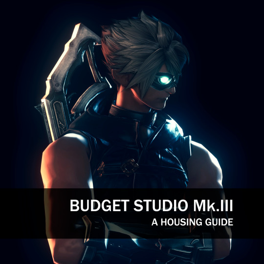
We've all been there: 50M gil burning white hot in your pocket when a set of Fallen Angel Wings pop in the market board, its siren's call luring you. Now you're utterly fashionable, but regrettably with barely half a mil Gil to your name. What to do?
Well, do not give to despair, my glamorous friend! You can actually build a perfect black background studio to show off your feathery acquisition.
You'll need:
1 x FC Room, or an Apartment
3 x White Screens
1-2 x platforms of your choice
4-5 Soot Black dyes
1 - Setup
Place your White Screens in parallel, in order to completely cover a wall. (This will give you some leeway with angles and point light placement.)
Make sure you leave a considerable gap, of maybe half the length of the base of a White Screen. This is important, as you'll see very soon.
Place the objects you'll use as platforms in front and center of the white panel line, making sure it overlaps with the middle panel. This is where you'll stand: In the example below I floated two Combed Wool Rugs, but any contiguous platform will do (think tables, half-partitions, etc.)
Dye all the objects with Soot Black. No need for the expensive stuff.


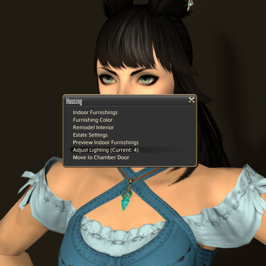
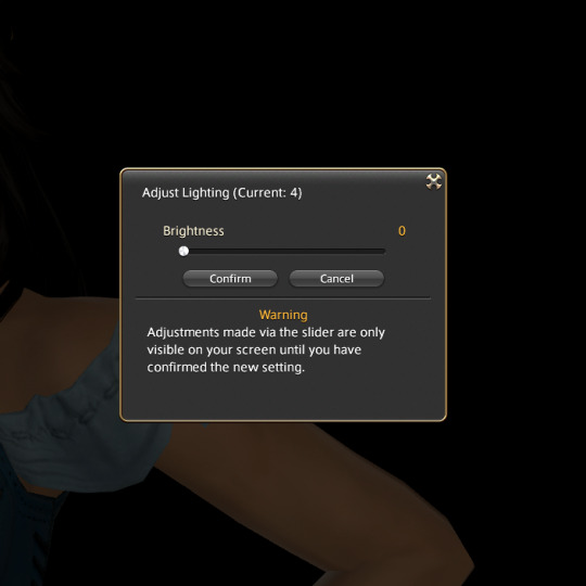
Now let's reduce the ambient light, setting it to zero; we'll use only GPose lighting for shots.
2 - What's the catch?
Well, you see - most partitions, like the Blank Riviera partition, have a collision box set around them. If a camera touches it, its path is altered so it doesn't go behind the partition.
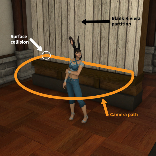
White Screens, however, do NOT have a collision box - so you can move your camera behind the partitions, and place your light sources there.
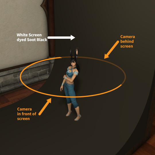
Here's how it looks in gpose - notice how the camera just goes through the partition:
Amazing, right? So the trick is to place light sources behind the panels, in the gap between the back of the panels and the wall; this way, the light won't hit the front surfaces.


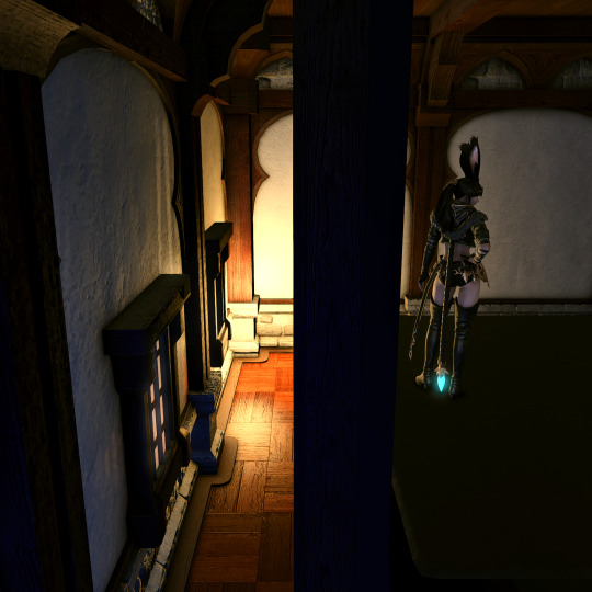
The final result is a shot with a perfect pitch-black background, where rim lights can be applied with very intense results:

You can also place Type-1 light points in front, so they offer a very gentle illumination while not hitting the background panels:
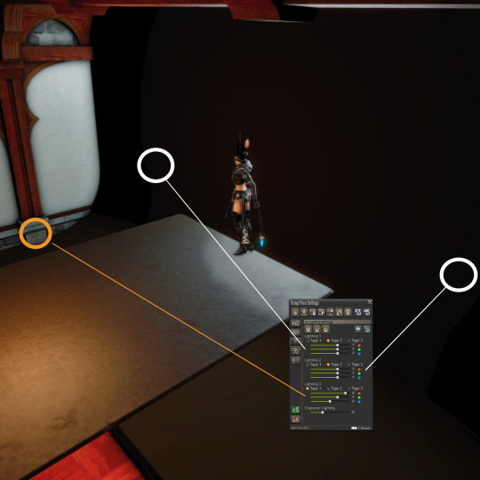
Another possible setup: move the character away from the background, and place the light sources around it.
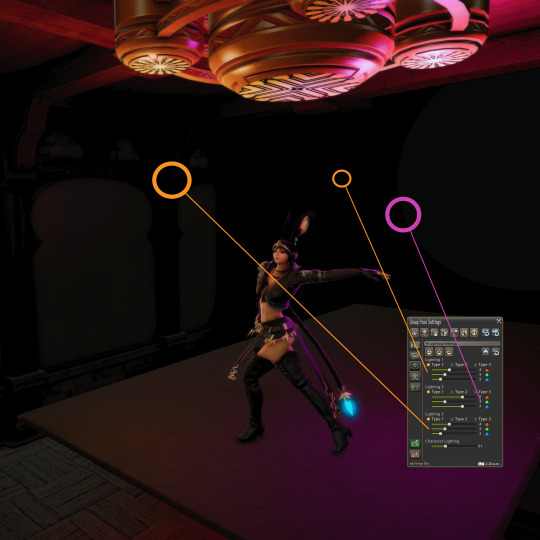
That'll result in shots like this one:
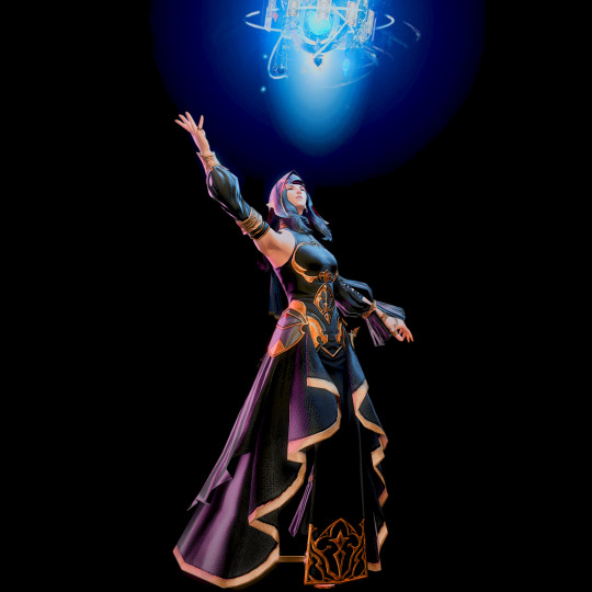
You can also place a point light between the character and the background, to create a halo effect:

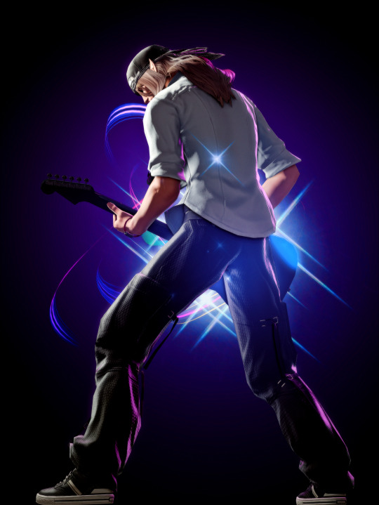
The opportunities for dramatic lighting are endless.


Go on, give it a try!
1K notes
·
View notes
Text
Starter GPose: Lighting 102- Outdoors
Now that we know some basic lighting techniques, it's time to wander into the wild!
There's a lot that's out of your control, like weather and natural light. But let's use those to our advantage!
Supplemental Lighting
Remember: you can use the 3-point light sources and the Character lighting settings to bring attention to the subject, making it pop from the background.

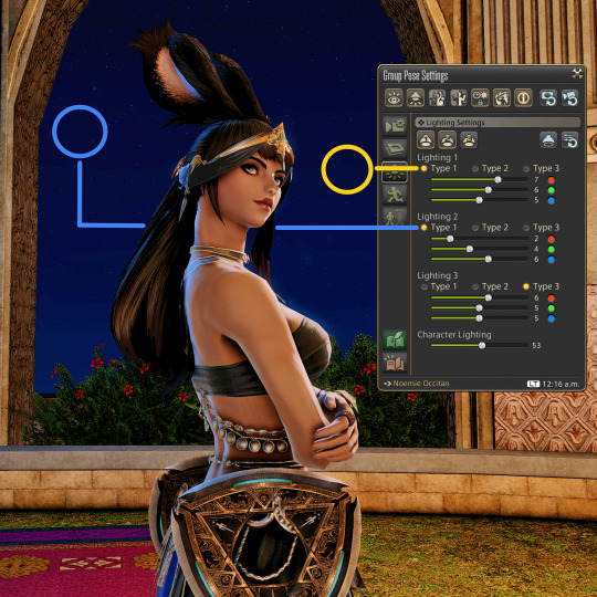
In the example below, Freya is pretty dim against the background; so we position a yellow source to reinforce the torch light and a blue source to suggest moonlight.


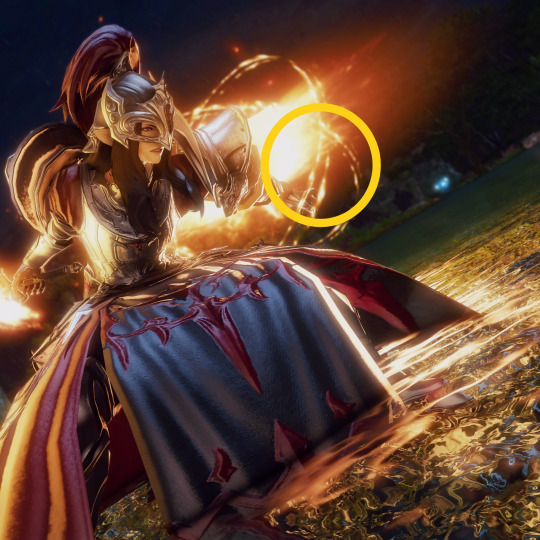
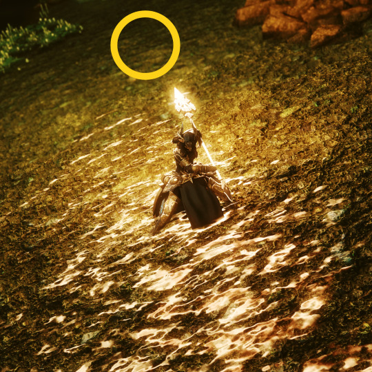
Oh, one interesting thing about water surfaces: while point lights can't cast shadows...
...it can reflect over water surfaces!
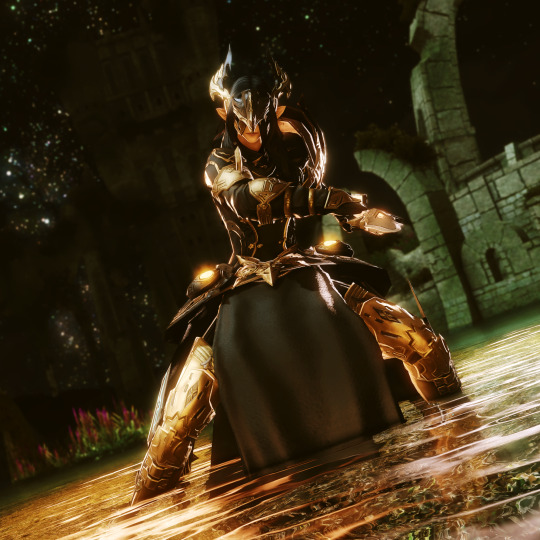
The principle of using a point light to enhance, reinforce or suggest a source can be used anywhere: fixtures, skybox sources, armor, weapons... the sky (well, and the count of 3) is the limit.
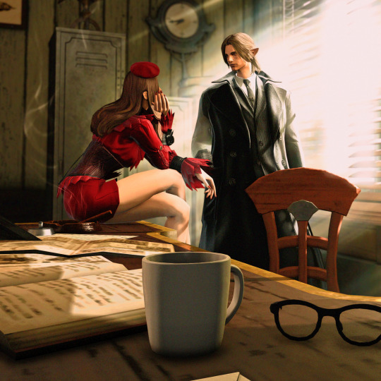
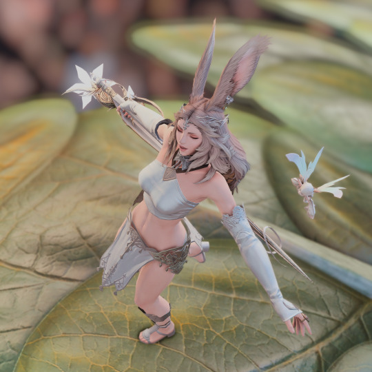
Less is more
Simplify your shots. Visual elements draw attention away from the subject. By using Depth of Field (DoF) you can force background elements to lose focus.


Alternatively, you can look for parts of the background with fewer elements (like the sky, a cave wall, or a dark patch of a forest.)

Weather
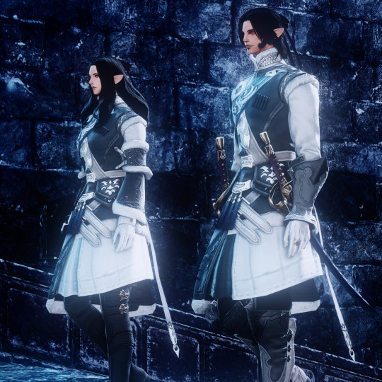
Dungeons and open areas have wildly different lighting patterns. Don't fight it: instead, try to adjust your sources to enhance the feeling. Overcast weather gives less contrast, the same as night shots. On the other hand, Some instances can give very harsh light. Use it to your advantage.

Environment
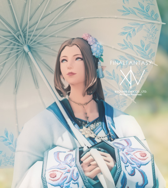
Use it. The fact that you're not locked into place means that you can have better action shots, using the environment to help tell a story.
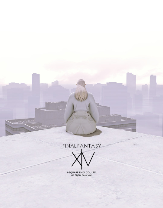
Also, the Golden Hour is real. Sunrises and sunsets give amazing opportunities for shots.
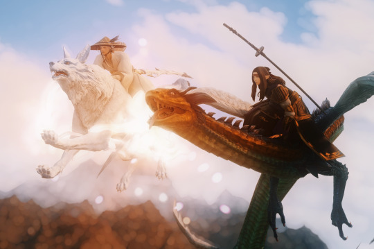

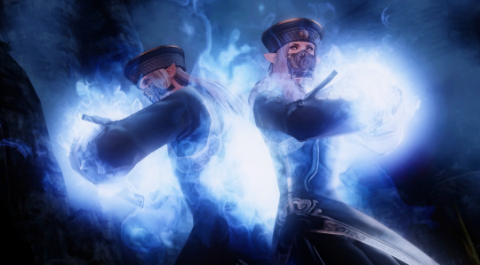
Night shots have their own characteristics, but they're basically similar to studio shots. So rim lights and key lights can bring subjects to the foreground, even if they're wearing dark clothing.

Sometimes the environment is the focus. Draw your character away, and let the beauty of Etheirys sink in.

Framing
Look out for structures that can help isolate your character from the background.
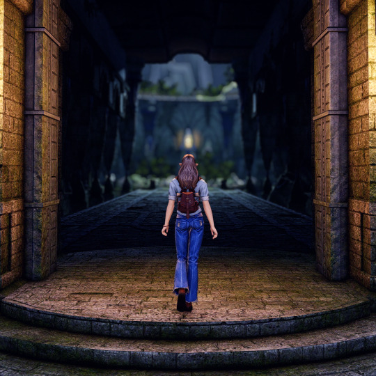


Now that I mentioned these points, let's see how (and why) some shots were taken!
Low contrast, DoF isolating from the noisy background, orange point light to Noemie's right, white-bluish point light to the top left.
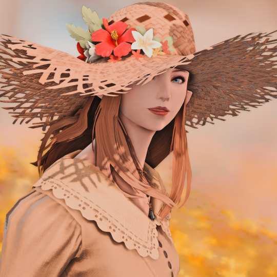
High contrast, strong orange point light to the right of Louise, and a white point far to the left.

Here the scenario is totally irrelevant (apart from the general grey tone), So ADoF+Bubble, ADoF + Bokeh, a single white point from the sun's direction, and a high Character lighting.
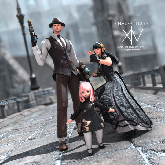
This guide is way less technique-heavy than the previous one, but I hope it helped illustrate some ways to benefit from outdoor shots; please share your experiments, and let me know if you have any questions!
#ffxiv#gpose#gposeguide#ffxiv tutorial#gpose tutorial#nenekocolors#long post#leon aquitaine#aquitaine studio
760 notes
·
View notes
Text
GPose Guide - Facial Expressions

Let's continue exploring the true endgame! Here's a quick guide that'll help you take more expressive facial screenshots.
The default behavior on gpose is a direct gaze facing front. It may look a bit doll-like, so we can breathe new life into it by modifying the direction the character is facing. You can toggle Face Camera by tapping Space or the Y button - the character will look straight at you (if allowed by the neck angle.)


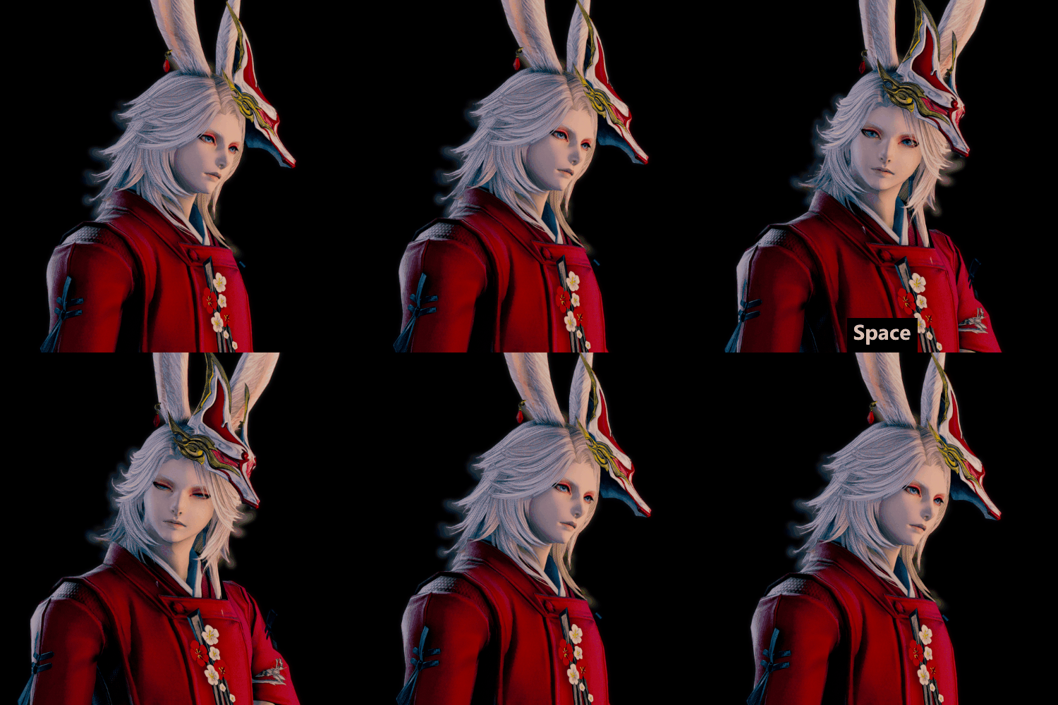
This is good, but still somewhat lifeless. So let's modify the direction Zoltan is gazing at: you can do this by rotating the camera a bit and toggling Track Camera under Motion Settings.
Now his eyes are following the camera's position; toggle Target Motion (2) to freeze the gaze in the direction the camera is.

Now let's modify his expression! Under Motion Settings, open the Emotes list by clicking the Emotes button, and select one of the available expressions. Throw in a Lip Movement for good measure, too.

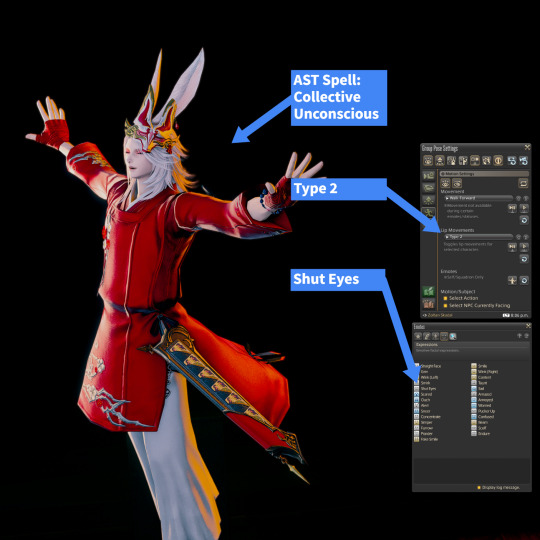
You can stack several different types of animation together, like Skill + Expression or Full Body Emote + Expression + Lip Movements:
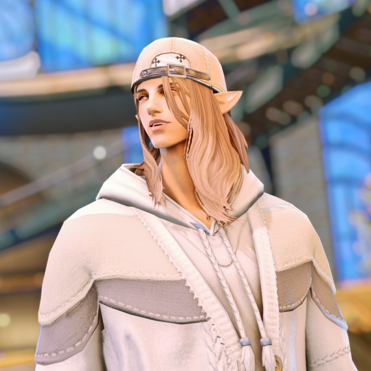
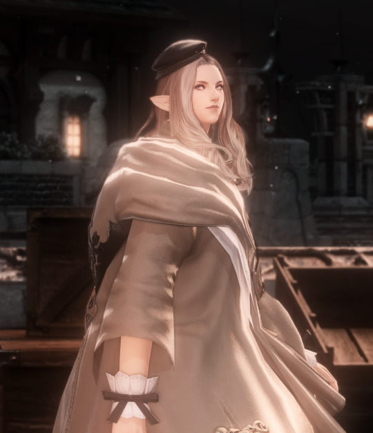
The possibilities are endless. Here are some examples of this technique in use, with different combinations of body pose, expression, gaze and lip movements:


#ffxiv#gpose#gposeguide#ffxiv tutorial#gpose tutorial#nenekocolors#long post#leon aquitaine#aquitaine studio
702 notes
·
View notes
Text
Starter GPose: Lighting 101 - GPose controls
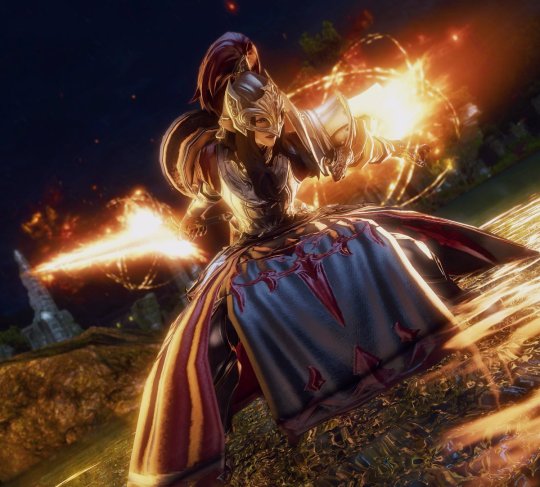
It's hard to overstate how important lighting is for photography in general- and the same applies to gpose shots.
This is a huge topic, so let's start with the basics!
GPose Controls
There are 3 different kinds of lighting control available when in gpose: Global, Character, and Points.
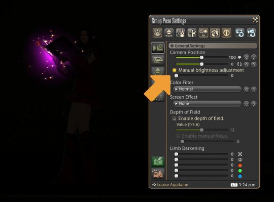
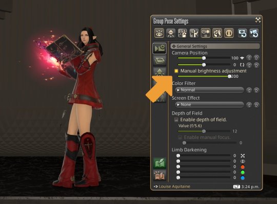
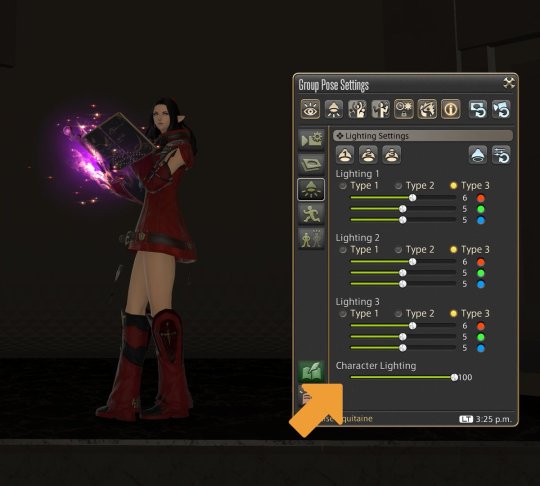
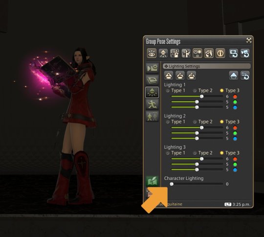
Global illumination is controlled by the manual brightness adjustment slider. This is equivalent, in real-life photography, to exposure. Character lightning has no real-life equivalent, but may be thought of as a brightness control that only influences characters and similar entities (minions, NPCs, and enemies, for example.)
GPose also gives you 3 point light sources that can be used to emulate the 3-point lighting traditional method for illuminating a subject.
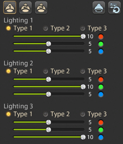
Positioning a source isn't exactly intuitive: A source is placed exactly where the camera is at the moment it is toggled. So to place it you need to move the camera to the desired position, and then enable it by toggling its button.
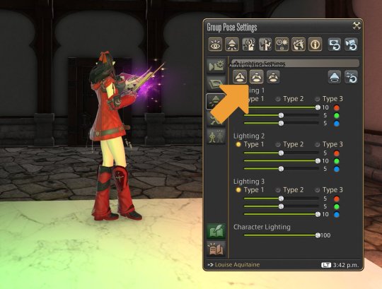
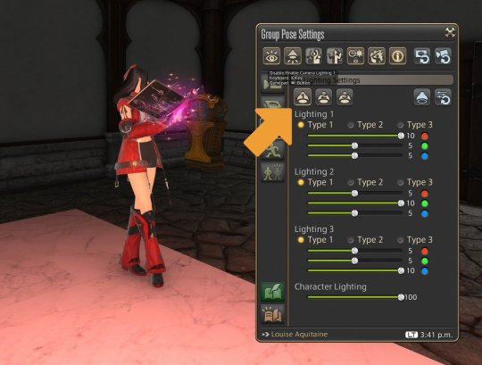
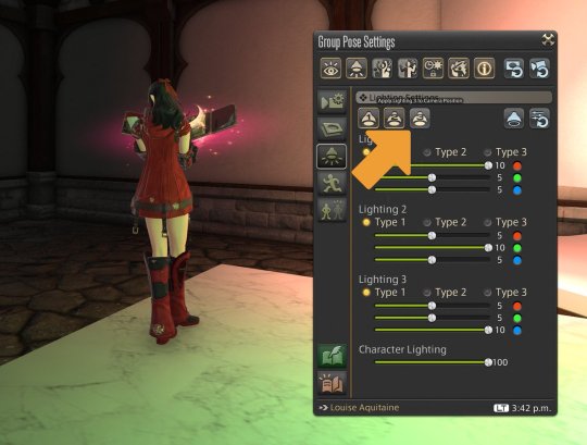
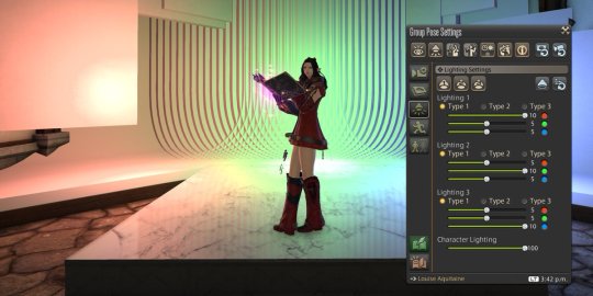
Oddly enough, these points do NOT project shadows. (in fact, a great deal of 'glowy' elements don't, like weapons and armor.) But you can use this fact for great effects!
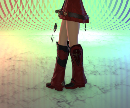
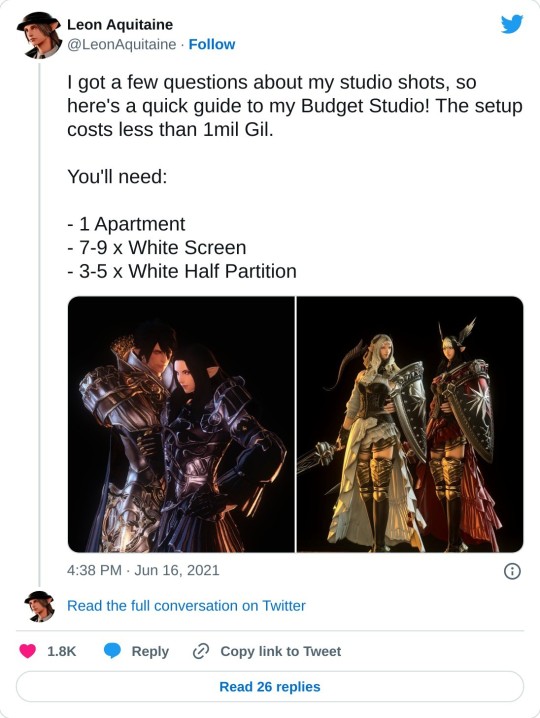
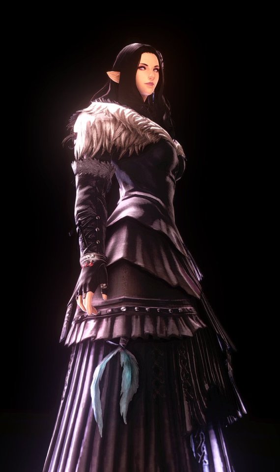
You can, for example, create shots with perfect dark backgrounds by strategically placing gpose light points behind objects that do not block the emitted light. You can learn more about this technique here:
Ok, so where was I? Oh, right- lighting!
Let's play around with what we just learned then. Here's a default setup for a scene: Notice that the ceiling light *do* project shadows, but it's kinda low-res. So let's set ambient light to zero and control the shades ourselves.
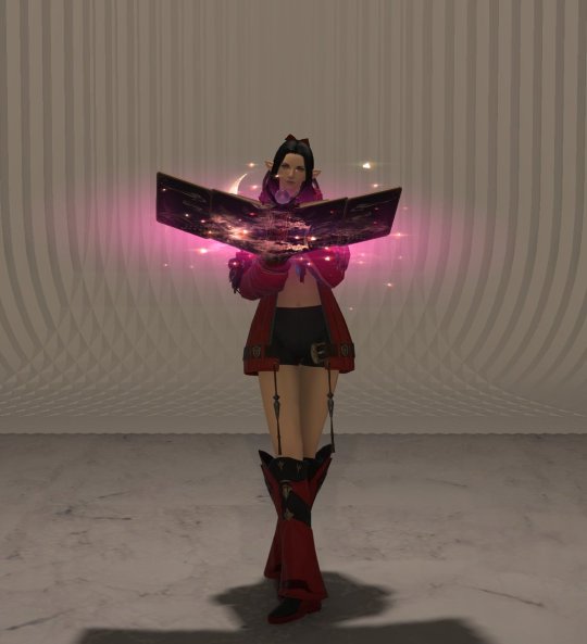
Some rotation and gshade filters from Neneko Colors for better luminance, color, and model shades. It's better - but still looks pretty flat.
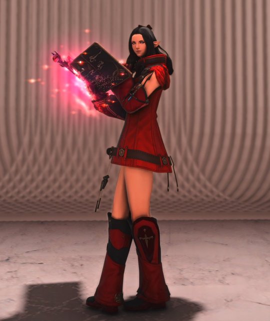
We want to pop the character out, so let's add some highlights and rim lights. First, the hair: let's give it a lustrous shine. Camera up top and a slightly bluish point.
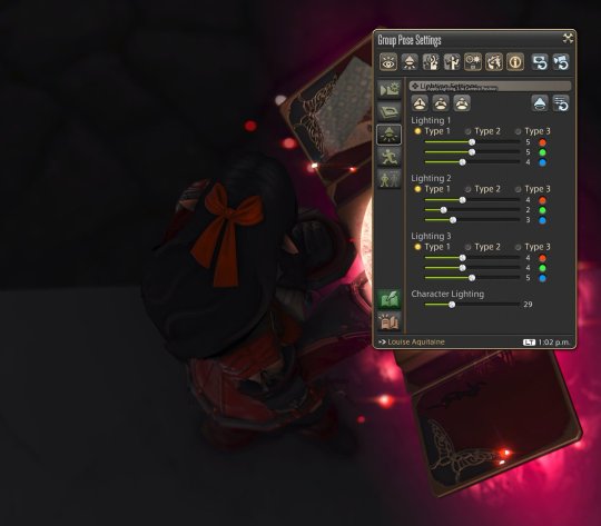
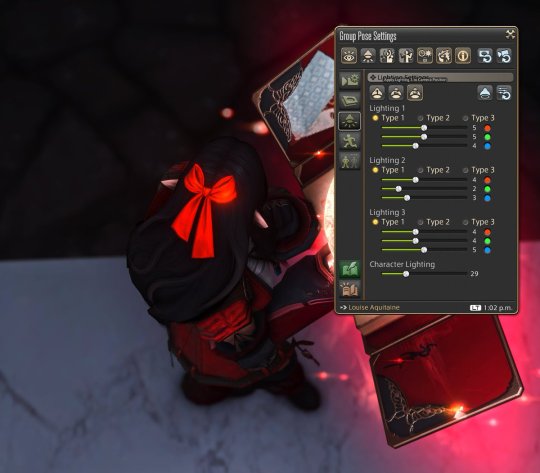
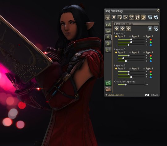
Now the weapon. Remember that the item itself doesn't emit light? so let's place another point with the same tone as the weapon to illuminate Louise. To her left and behind her, slightly distant so as to project on her legs as well.
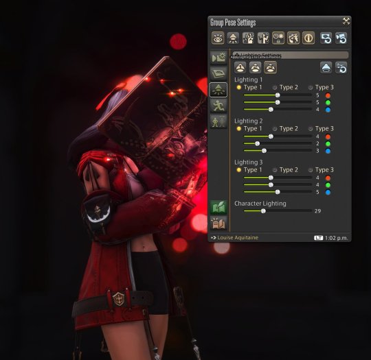
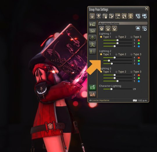
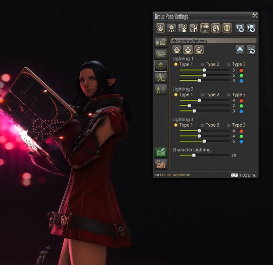
And finally, a directional key light to help illuminate her face.
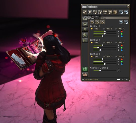
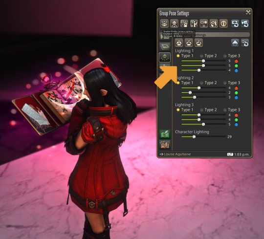
Her model is still too dark, so let's use the character lighting control to help with that.
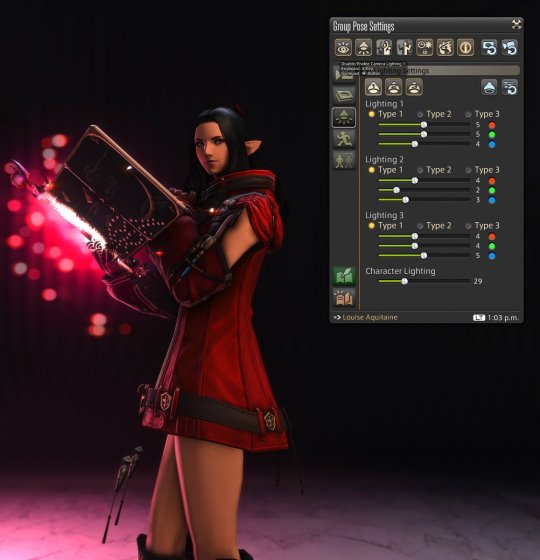
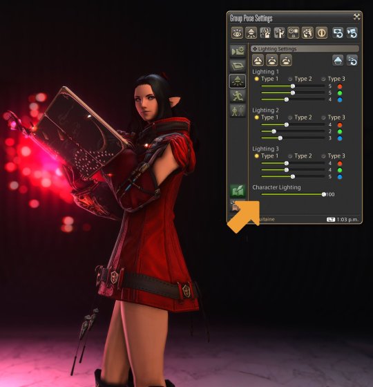
Now let's make the whole scene a bit brighter. Change the brightness adjustment slider to manual mode, and bring it up as needed.
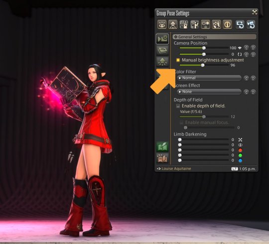
This should be a good point to compare the initial setup with our results so far, showing how much basic gpose lighting can enhance a shot.
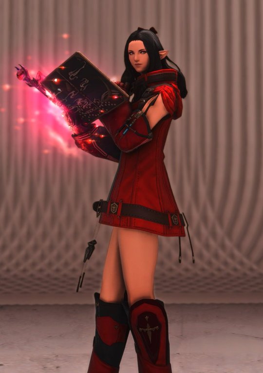
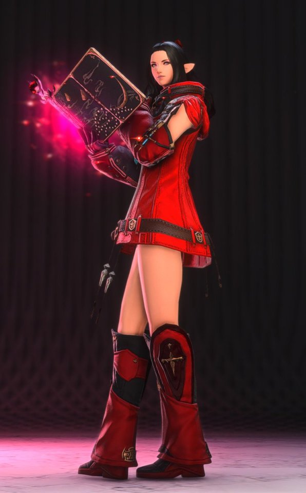
Now that you know how it's done, it's easy to see how some of my poses were set up! Here's one with a yellow source top-right, an orange source bottom-right, and a dim white source to the left of Louise:
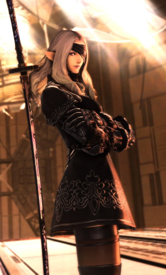
Or this one: A very bright white source to the left (and a bit to the front), and a dim bluish/purplish source to the bottom right. Notice how much Louise pops out of the scene.
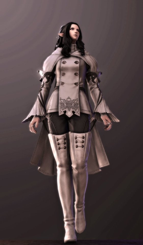
Next, I'll talk about exterior shots, fixture light sources, and other neat things.
(This guide is part of a series that I'm migrating from Twitter since Tumblr offers much better options for formatting and editing, and taking the opportunity to also update images and references. Let me know if you have any questions!)
894 notes
·
View notes
Text
Starter GPose: Lighting 103 - Instances
In a previous lighting guide, we talked about gpose controls, and how to use them in a controlled setting. But dungeons and other instances offer amazing places for scenario composition, and it would be a shame to ignore so much potential! So grab your backpack - we're hitting the Duty Finder!

Access
One thing that may escape our collective attention when planning for solo shots is that it's very easy to use dungeons as backdrop: Newer dungeons benefit from Explorer Mode, while older dungeons can be entered solo by selecting Unrestricted Party. Both can be found under Settings.


Raids, on the other hand, can be finicky. There's no Explorer Mode, but regular 8-people raids can be accessed with Unrestricted Party.
Some (I'm looking at you, NiER raids) have access points that you can use to jump into an empty copy of the raid instances.


Lighting
Some things to keep in mind while scouting for locations in dungeons: Lighting can be a bit inconsistent, with point sources placed in odd locations or light fixtures emitting no light at all.
You'll even find some circumstances where shadows go in the wrong direction!


So don't rely on hints: check how the environment lights interact with your character. Extreme cases may include very harsh sources, and because of the naive way the 10+ years old engine handles shadowed surfaces (hint: it doesn't), you may end up with monstrosities like this:


One way to fix this specific issue is to move the character away from the source, enough so all facial structures are shadowed according to the engine. Then, use profile point lights to fix the setup.

So all these issues are, in the end, easily handled. and there's a lot to look out for: Some sources have effects, like flickering torches, an excellent resource if you're planning for an animated GIF capture.

Others even have custom light maps, like Haukke Manor and that gorgeous stained glass illumination.


Some areas have mixed illumination sources, like The Wanderer's Palace, another gorgeous place that comes up early in the game.


You can also look out for reflection effects, like polished marble floors - or this water mirror, again in Wanderer's Palace:

So give instances a try. There's a veritable treasure trove of scenarios available that can greatly enhance your shots!

515 notes
·
View notes
Text
GPose Tips: Portrait Photography

Let's put our Warriors of Light front and center by borrowing some IRL photograph techniques, and adapting them to gpose!
From Wikipedia: "Portrait photography, or portraiture, is a type of photography aimed toward capturing the personality of a person or group of people by using effective lighting, backdrops, and poses."
Given the nature of this theme, we'll be relying heavily on facial expressions. If you want to learn more about how to use the gpose tools for that, check out this guide on Facial Expressions.
Subject Focus
While backgrounds can help tell the tale, we want minimal distractions.
We can do this by choosing neutral backgrounds or negating a rich background by diffusing it.


We can also draw attention to the subject by creating strong contrast zones that detach the focus from the background. In this example, the soft blue and the medium yellow sources contribute to the contrast with rim light zones:


Being the focus of portrait shots, the subject's expression is front and center. And no element brings more attention than the eyes:


Three-Point Lighting
We'll touch on the concept to explain one of the most commonly used composition setups. We'll use the three Point Lights available under Lighting Settings.
Key Light: gives shape to and emphasizes features;
Fill Light: placed opposite the key light, creates a counterpart to it;
Back Light: helps delineate hair and headpieces.

Keep in mind that the Three-Point Lighting setup is not a mandatory rule. Feel free to play around with placement and intensity; I often use the 3 Point Lights to enhance environmental light sources, for example:


Butterfly Lighting
Another option I often use is the Butterfly setup. With two light sources (a key light placed top-front, and a fill light placed bottom-front) it creates a very clear delineation with sharp features.


Slight variations in camera angle can bring completely different shadow areas and focus; give it a try, and you may land in unexpectedly nice shots:


With these hints in mind, let's pick some compositions apart!
This one, for example - Strong DoF negates details, and environmental light gives emphasis to the character's face:

DoF again, with two layers of diffusion (the bookshelf and the background), with environmental light providing contrast zones:

Did I mention DoF? Yes, let's use some strong DoF to detach the character, and enhanced natural light to pop the features.


By now you may have noticed that I use these tips a lot: for example, most of my 'poster' and Eorzea Collection shots rely heavily on these tips.


Give it a try, and share your results!
#ffxiv#gpose#gposeguide#gpose guide#ffxiv tutorial#gpose tutorial#nenekocolors#long post#leon aquitaine#aquitaine studio
397 notes
·
View notes
Text
Gpose Guide: Keyframes

FFXIV has amazingly detailed animations, but it takes skills (that I don't have) to grab that perfect frame that'll make your pose shine.
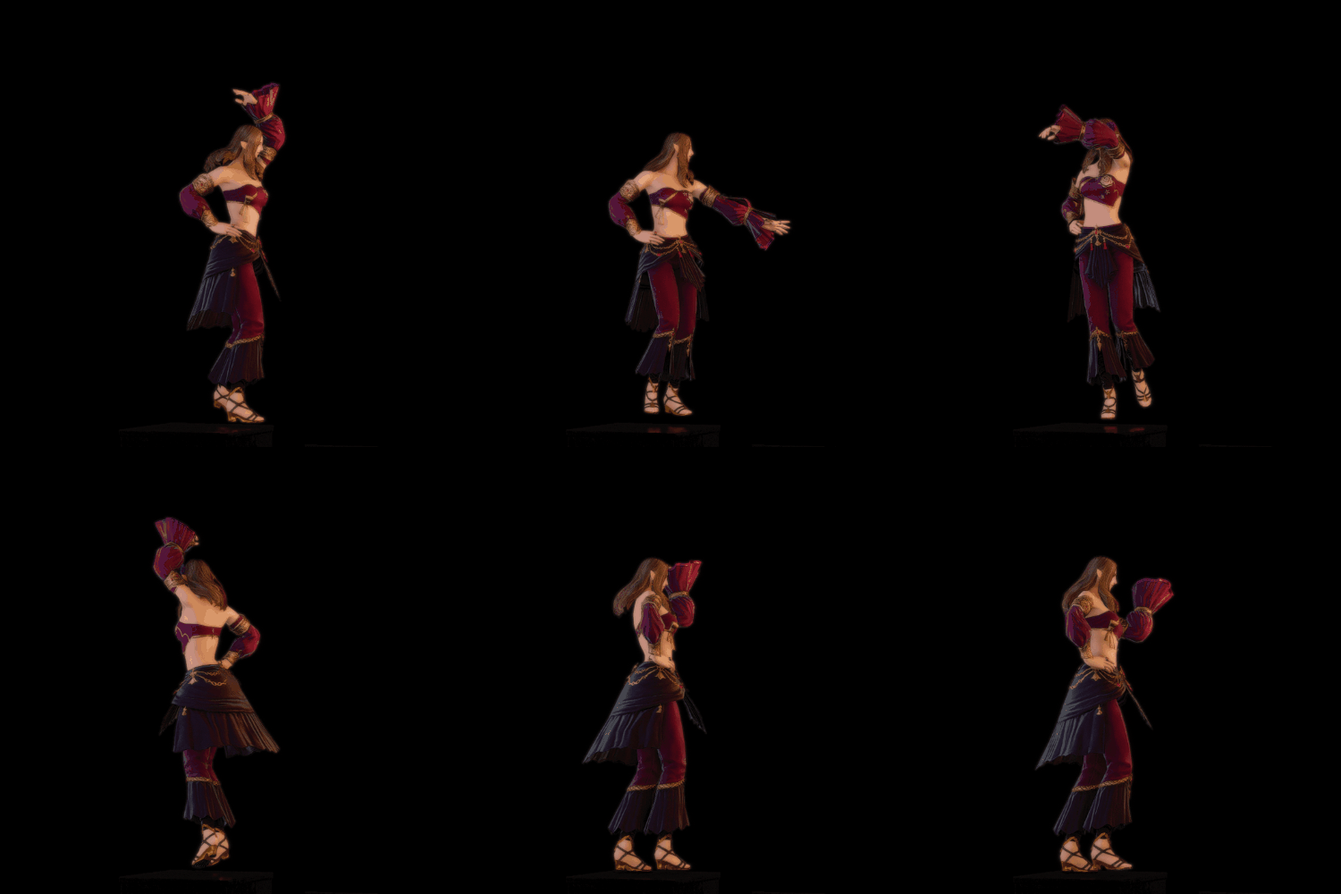
Luckily, there's a way to slow down animations: you can use the Enable All Motion / Enable Target Motion keys (1 / 2 for you, keyboard users; LT/RT buttons in console) in quick succession.
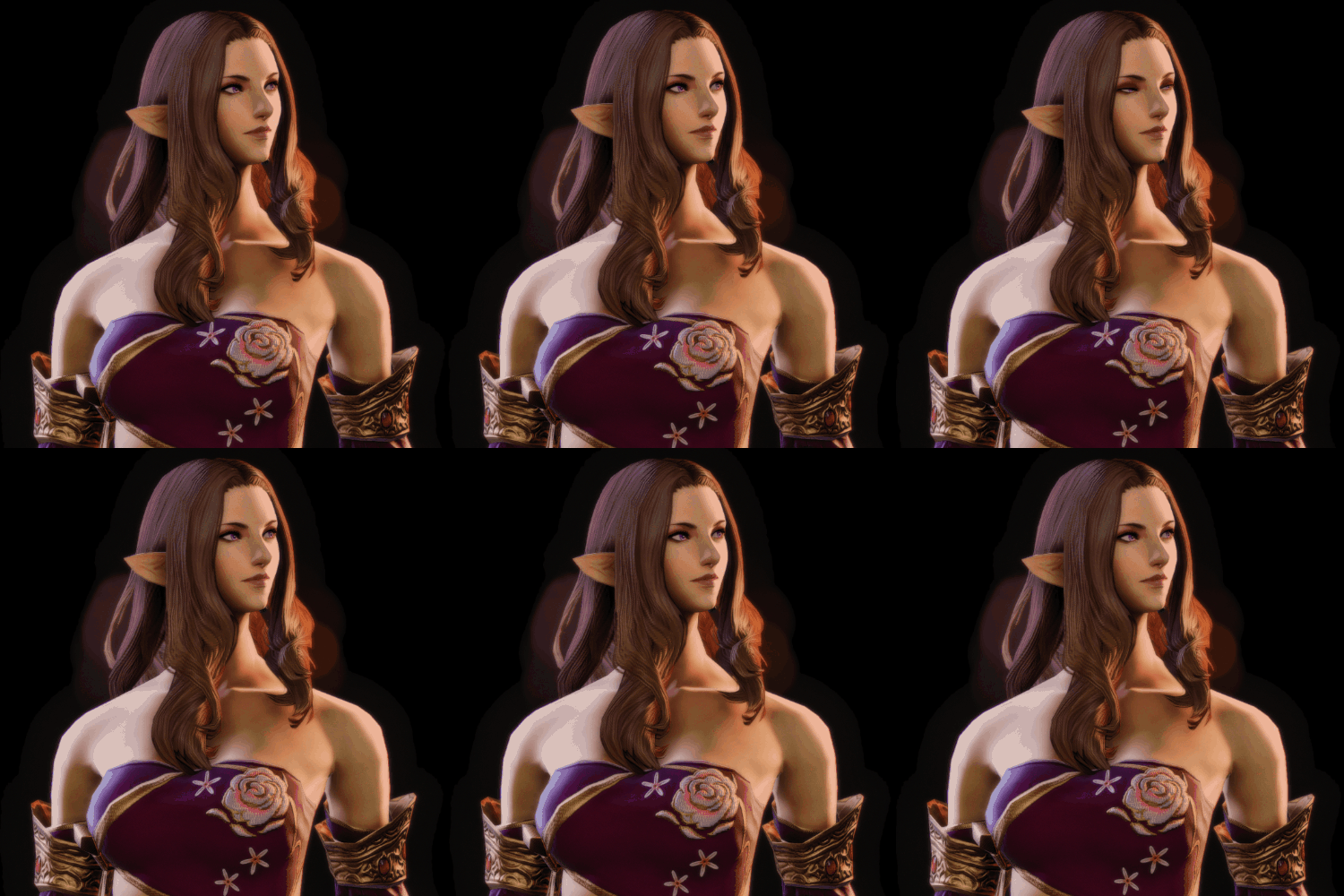
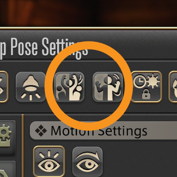
Here's how it works: first, you freeze your character with 2 (Enable Target Motion) then, in rapid sequence, tap 1 then 2. Use this to navigate the animation frames.
This method applies to all animations, Lip Movement included - which makes for very nice, mid-speech stills:


Here's a still-frame from this experiment:

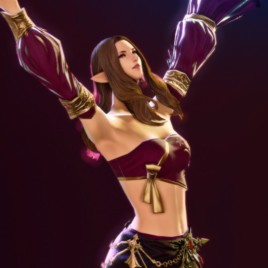
Throw in some composition, and we land on results like this:

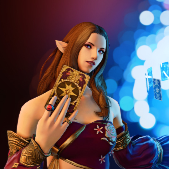
#ffxiv#gpose#gposeguide#ffxiv tutorial#gpose tutorial#nenekocolors#long post#leon aquitaine#aquitaine studio
372 notes
·
View notes