#goudy ornate
Explore tagged Tumblr posts
Visit Tumblr Blog
Explore Tumblr blogs with no restrictions, modern design and the best experience.
Last Seen Tumblr Blogs


Fun Fact
28.6 is the average number of monthly visits per US mobile user.
Photo


It’s Fine Press Friday!
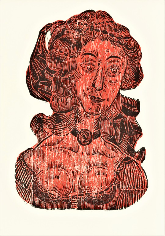
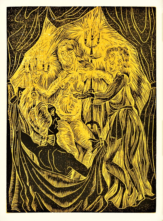
Special Collections just keeps on giving. Every time I find a book with amazing original prints I think for sure its the last, but there are more!
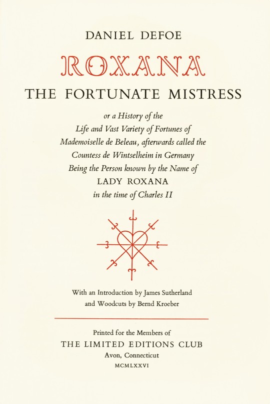
This week we bring you Roxana, The Fortunate Mistress, by English writer Daniel Defoe (1660-1731) with woodcuts by Austrian printmaker, Bernd Kroeber (B.1942), printed in 1976 at The Stinehour Press in Lunenburg, Vermont for the members of The Limited Editions Club in an edition of 2000 copies signed by the artist. It was first printed for Thomas Warner at the Black-Boy in Paternoster Row, London in 1724.
Bernd Kroeber cut twelve full page two-color woodcuts and fourteen smaller black-and-white woodcuts to illustrate this text. The prints embrace the grain of the wood blocks and the expressive cuts and figures seem to reference back to German Expressionist printmakers, like Ernst Ludwig Kirchner.
Roxana could be considered a proto-feminist character, as she raises concerns over sexual freedom and women’s right to own their own estate. Roxana is quoted saying “the Marriage Contract is...nothing but giving up Liberty, Estate, Authority, and everything, to the Man.”
Book designer Adrian Wilson (1923-1988) designed this book using Bembo type and larger sizes of Bembo and Goudy Ornate for display lines. Wilson also designed the crossed-sword heart motif. The paper was specially made for this edition by Monadnock Mill in Bennington, New Hampshire and the book was bound by Tapley-Rutter Company of Moonachie, New Jersey.
For the colophon, a print of characters reading Roxana. Too Funny!

View more Limited Edition Club posts.
View more Fine Press Friday posts.
-- Teddy, Special Collections Graduate Intern
#Fine Press Friday#Limited Editions Club#LEC#Roxana#Daniel Defoe#Roxana The Fortunate Mistress#bernd kroeber#English Literature#Fine Press Books#Adrian Wilson#Stinehour Press#Monadock mill#woodcuts#color woodcuts#illustration#book illustration#letterpress#bembo#goudy ornate#black and white illustrations#relief printmaking#relief prints#austrian art#austrian artists#teddy
26 notes
·
View notes
Text
Blog #17 — Jan. 20, 2025
Au Revoir & Adios, Mediterranean!
Reflecting on Spain and the South of France
My favorite structure in the Mediterranean was Gaudi’s Casa Batyo. While we saw many amazing structures in both Spain and France (a special shout-out to all of Goudi’s creations), Casa Batyo is the one that stands out most. Innovative and beautiful architecture for simple, everyday structures often strikes me more than grand cathedrals or weekly-use structures. I love taking in the beauty of a structure while imagining an everyday use with a life there. I also am someone who gravitates towards color and drama in design. With Gaudi’s Casa Batyo—which I‘ve also gotten to see the inside of, I’m struck by the way its bright colors and ornate details brings it to life, both on the outside and inside. Every single part of it is vibrant and dramatic and seems to be telling a story of its own. I also love its imagery of the exterior being a dragon and how this tells stories of the structure as a whole. As I’m writing this, I realize this comes down to my love for fantasy books and movies. I love magical worlds and tales full of wonder and the impossible. Casa Batyo makes me feel like I’m in one of those worlds.
I truly do not have a favorite city, but if I had to choose a favorite based off where I could see myself living, I’d say Nice. As you already know I’m a fan of drama, I’m sure you could guess my appreciation of Baroch architecture. I love how Baroch architecture transports me to a different world with its dramatic ornateness. I also love how I always find new details when I look at it. I loved the many Baroch structures in Nice as well as the great amount of color within the city. Additionally, I love being near a coastline and feeling water’s physiological calming effects on me. It always makes life feel simpler and more beautiful, and gives me a stronger sense gratitude for life. Finally, I loved Nice’s slowness, which I felt at the outdoor market as well as on the streets. I was struck by the way my one was rushing and how people would slowly stroll with their flowers or groceries to wherever their destination was. In some other universe in Nice, I could see myself going to the market to pick up flowers and groceries and mindfully taking a stroll with loved ones. Nice’s dramatic architectural design, beautiful coastline, and general feeling of slowness creates an environment I wish to live in.
Through our time in the Mediterranean, I learned the importance of accessibility in urban design—being able to reach your needs within a quick enough walk. Being able to reach where you need to go without excessive travel time creates happier lives as people’s days are not overrun by travel and errands. As I think about the type of built environment I want to live in, this (alongside geography with water) comes top of mind. I want to live my life with time for simple pleasures and mindfulness, so thoughtful urban design that prioritizes people is important for that.
0 notes
Text
Specific Fonts for Specific Movie Genres
Movie sequence typography is a powerful design element that can hint at the story of the movie, the genre and the general atmosphere of the movie. It is seen that specific fonts have been identified with specific movie genres.
1. Goudy Text is one of the old British style fonts in handwriting form and it has been used more in title sequences of movies about ancient European history.

2. Bold square serif fonts like Playbill have been identified with western movies.

3. Science fiction genre often use the typeface Futura because it has the simplicity and uniformity that attribute the efficiency of AI or other technologically advanced society. It also a simple sans serif font that don’t have overtly ornate characteristics which may become dated.

Ozden Pektas Turgut. (2012) Kinetic Typography In Movie Title Sequences. Elsevier Ltd. Available at: https://www-sciencedirect-com.ezproxy.herts.ac.uk/science/article/pii/S1877042812033472 [Accessed 20 December 2018]
Boone, J. (2017) 8 Fonts From Iconic Sci-Fi Films (and How to Choose Your Own). Frame.io Insider. Available at: https://blog.frame.io/2017/12/11/8-sci-fi-fonts/ [Accessed 20 December 2018]
Playbill (2018) Playbill. Available at: http://www.playbill.com/ [Accessed 20 December 2018]
Lanston Type Company (2005) Goudy Text. MyFonts. Available at: https://www.myfonts.com/fonts/lanston/ltc-goudy-text/ [Accessed 20 December 2018]
0 notes