#got to download a whole bunch of fonts for this
Explore tagged Tumblr posts
Visit Tumblr Blog
Explore Tumblr blogs with no restrictions, modern design and the best experience.
Last Seen Tumblr Blogs


Fun Fact
When “GIF” was named word of the year in 2012, Oxford Dictionaries U.S.A. credited Tumblr for pushing the word.
Text

welcome to the big leagues, boy
(prints here)
#this was initially inspired by the weird ways hockey news describes aspects of players#and then spiraled#so fun to draw really out of my usual style#got to download a whole bunch of fonts for this#also please pretend theres a secret extra attribute#that's just 'dump truck ass'#did you know the athletic wrote a whole article about how in the NFL#that is in fact something gm's look for in the draftees?#the ass quotient#wild#hockey#art#hockey art#nhl#nhl draft#my art
289 notes
·
View notes
Note
hii! i absolutely love your work. i've been getting into trying to make borders myself, and i was wondering if you had any tips on where to find good pngs or do you create everything yourself? i feel like my luck so far hasn't been great but maybe i just don't know how to search for it correctly!
Hello, nonnie! I'm so glad you enjoy my work; thank you for your kind words. ( ˶ˆᗜˆ˵ ) And oh my gosh, it's so nice to see a new GFX creator in the making! One of us, one of us, one us. ~ Welcome to the wonderful world of editing, hehe!
I've compiled a list of websites that I use for my graphics, but please do let me know if you need anything else and I'll be happy to assist!
For general assets, as well as inspiration, I generally use these websites: behance (which is pretty much the industry standard when it comes to graphic design in general, they have cool studios or experienced designers that post their works and/or assets), booth (an independent japanese resources hub with many free and paid assets), huanban (an independent chinese resources hub, same proposal as booth), abdz (mostly focused on typography and branding), dribble (more focused on web applications and design) and envato (templates).
Since I'm colourblind, I'm not always confident about how to compose colours together. So whenever I'm in doubt, I use coolors (to get palettes from images and browse through palette ideas) and colorhunt (which gives ideas for palette themes and motifs).
I love typography a whole bunch, but sometimes it's hard to find that one right font for your project. Whenever I need to look for something else, I always run to these websites: google fonts (when I'm on a budget and want to use 100% free fonts, including for commercial use), 1001fonts (to quickly find fonts based on themes, it has a great tag system), dafont (a big classic huge dabatase of custom fonts), befonts (for more industry standard-leaning fonts) and kerismaker (for those magazine looks). When I want to identify a font used on an image and where I can download/purchase it, I use myfonts and font squirrel. They even give you similar options for free, too!
Suppose I'm specifically searching for illustrations/PNGs I can use on my upcoming project. In that case, I'll either go to flat icons (for websites, applications or presentations), vertex (for 3d icons and/or general vectors), graphic burger (for logo making), cleanpng (for I want a tree PNG and do not want to clean it myself, for example), pngtree (same idea as the previous one, you just search for a word and will see all PNGs related to it) and pngall (self explanatory).
Regarding backgrounds, textures, and photography in general, I rely on websites like pixabay, vecteezy, 3d ocean, morguefile, freepik and isorepublic. They have high-quality photos and videos that you can use on your projects. However, if I specifically need mockups or patterns, I turn to unblast, pacage and ava.
Besides those, you can always search for things on Deviantart and Twitter! Though I do not use those much, I think Instagram and Threads also have pages dedicated to sharing resources. Discord can be a nice place to search for graphic design servers, too.
However, if I cannot find specific resources for a commission/project for whatever reason, then I will make them myself. Be it through photography, drawing or anything else I can get my little hands on.
For the more technical/applications side, the programs I use for my graphics and edits are Adobe PhotoShop 2020, Adobe After Effects 2020, Adobe Illustrator 2020, Clip Studio Paint (for when I need to draw or polish something for specific projects/commissions), and HandBrake (for when I need to make screencaps). My drawing tablet is an oldie, Wacom One.
Hopefully, this can be a nice starting point for you! Please feel free to reblog and/or like this post if you'd like to save it for whatever purpose. ~ I hope you enjoy this journey ahead, and if you need anything else, let me know! You got this! ദ്ദി ˉ͈̀꒳ˉ͈́ )✧
#♡: answered! *#graphic resources#gfx resources#roleplay resources#rph#rp resources#editing resources#carrd resources#editing
85 notes
·
View notes
Text


Northern & Southern European Dyes Palette(s)
It's been almost exactly two years since I made my Iron Age Palette. To celebrate that anniversary... No, you know what, actually not, it's a total coincidence 😅 I was working on a new thing and started wondering about this and that; to not bore you with the details, let's just say that one thing let to another and of course I ended up revisiting the very basics. So here it is! Not one, but TWO new colour palettes for our oldtime-y sims. Based on the lives of my Britons at some point in 1st century CE, shortly before the Roman conquest.
An important note: the southern palette is actually rather an add-on than a separate palette. As in, Romans would surely have access to the dyes from the northern palette as well. But as stated above, I made this whole thing from the viewpoint of a British Celt, hence we have two palettes: one with dyes which he could just obtain from native plants and the other with those he'd have to import. The southerners were more blessed in this aspect :]
You can download PDF files for both of those palettes and .txt files to be used in Paint.net (put them in Documents\paint.net User Files\Palettes). EDIT: the amazing @kyrassimhoard went ahead and made the .aco version of the palettes for all the Photoshop users! Thank you so much Kyra (also, special thanks to @aheathen-conceivably for double checking them for me 💗)
DOWNLOAD them on my Patreon! (always free, no early access etc.)
Apart from a bunch of visual changes (maybe the font will actually be readable this time? Gasp!), there's some new stuff in the palettes themselves (duh). Let's take a quick look, shall we?
undyed wool - hard to call it a dye, lol, but ofc it had to be here. The so-called primitive sheep of the Brittonic era looked quite different from what we imagine when we think 'sheep', and they most certainly came not only in white, but also in many shades of brown or even black. Perfect for making a colourful garment even without any dyes;
birch leaves - easy to obtain, easy to dye; almost no changes here, other than one added shade which used to be under 'mixed ingredients' before;
birch bark - OK, I don't remember where I took the old colours from, but I'm afraid I was being too optimistic. Birch bark gives rather pinkish than reddish shades; actually, it needs a looooooong soak and proper pH to turn anything but very bright, subtle pink. But it seems you can get them and they don't wash out that easily, so - there you go;
elderberry - here I was for sure being too optimistic, especially with that one pretty, saturated blue shade which got thrown away. From what I've read (and seen in photos...), elderberry is a very tricky dye, not particularly water- and lightfast. 'Not particularly' is mildly put - it just washes out in no time, leaving you either with a very pale or very greyish shade of the once vibrant colour. Adjusted accordingly (and they're still too pretty tbh);
apple leaves/twigs - that's a bit of a tricky point, because the Internet claims it was only Romans who brought apples to Britain. But at the same time apple cider was Britain's national drink allegedly already during the Celtic times. Heck, Welsh mythical island of Avalon literally means 'isle of apples', and mythology tends to be... you know... old. Huh? After a bit of research on the topic I'm inclined to believe that what Romans really brought with them were big, sweet apples and their organised cultivation; but small, tart, 'untasty' varieties did exist in Britain even before, growing in the wild. Perfect for making cider - or dyes 😉;
nettle - no changes here. Easy, cheap, grows everywhere, just that the colours are probably not something you'd wear to a party;
hedge bedstraw - seems it's growing everywhere in Britain, so it's plausible the ancients would've made use of it;
lichen - aaaaalriiight, now, that is a big discovery! Beautiful shades and absolutely possible to obtain from the varieties growing on the British Isles. One of the most crucial omissions from my old palette, here finally in its full glory.
That was it for the northern palette. And the southern? Glad you asked:
weld - previously called 'dyer's rocket', but no one in the whole wide natural dyeing Internet calls it that. Beautiful, vibrant, very steady yellow; won't give away even if you overdye it with indigo or woad. It's native to the Mediterranean and while it was cultivated in Britain in later centuries, I have no reason to believe that was also the case in 1 c. CE. I dub it imported;
madder - I keep reading that it's giving saturated red shades, but I have yet to see anyone dye a skein of yarn deep red with madder only. All that keeps popping up in pictures are gentle, pinkish reds, so that's what I included in my palette too. The orange comes from changed pH of the water;
woad - OK, that's my most epic fail of all. To make a Celtic palette and not include woad?! Putting aside the whole matter of Britons possibly maybe but actually maybe not using it to paint their faces (a very controversial matter, let's not go there 😅), woad was the blue dye in those times. Indigo was far away and while it was being imported to Rome, afaik it was used mostly for painting, not cloth dyeing; and besides, as crazy as it may sound, woad seems to do the job better. Seriously. Higher water and light fastness. The question is, was it cultivated in Britain or imported? Just like weld, it's native to the Mediterraean. There is a British find of a bunch of woad seeds, from 1 c. BCE - but then again, it's just one find. So... Mostly imported but slowly being introduced to the Isles? Maybe?
mixed ingredients - the ingredients specified in the PDFs are given in the order they're used - that makes a difference! My biggest discovery of this whole natural dyeing research is that, surprisingly, vibrant green is the absolutely most difficult colour to obtain. That dark green you see at the bottom - so-called Lincoln green - requires super high levels of both weld and woad, and you must put your yellow skein in the blue dye asap - if you're too slow, you get a lighter shade, e.g. like the one above it. The Hightowers surely knew how to show they're rich, huh...?
and last but not least, the luxury dyes! Some imported from far away (turmeric), some from nearby lands (Tyrian purple), some even grown locally (there were saffron plantations on Sicily. True story), but nevertheless, all super duper expensive. Tyrian purple was actually legally reserved for the emperor only - even if you could, by some miracle, afford it, you'd probably get arrested if you dared to dress in that particular shade of purple. Good that lichens could always come to the rescue!
Guess that's enough of behind-the-scenes trivia, isn't it? Props to you if you managed to get to this point, lol. Have fun with the palettes and happy recolouring!
***
Sources:
dzikiebarwy.com - in Polish, but the pictures should speak for themselves. Here you've got a post about dyeing with summer plants, including birch leaves, here - elderberry, here - apple leaves and twigs, here - nettle;
https://woolandpalette.com/blogs/news/making-vibrant-green-with-natural-dyes was my first step in finding out how to obtain a proper green shade with natural dyes;
wooltribulations.blogspot.com - dyeing with birch bark (here), another failed elderberry experiment (here) and overdyeing weld with woad for a deep Lincoln green shade (here);
www.jennydean.co.uk - an absolute godsend, especially two posts: 'Dyes of the Celts' (here) and 'Colours of the Romans' (here);
https://craftinvaders.co.uk/making-dye-from-lichen/
https://earlychurchhistory.org/fashion/colors-dyes-for-clothing-in-ancient-rome/ - on the posh dyes for the rich;
https://www.butserancientfarm.co.uk/gallery - except for the general vibe (*chef's kiss*), the 'animals and nature' section of the gallery has pictures of the 'primitive' sheep which they keep at the farm;
...and a bunch of others which I didn't save in my bookmarks 🙃
56 notes
·
View notes
Text
it's fascinating to me how there can be huge difference of experience even within a generation. Like I'm a millennial and i was definitely a tech/nerd kid with pretty much unfettered access to the early internet (my dad was really into tech kind of early so maybe that makes me a little bit of an anomaly but my partner's parents definitely weren't tech people and he had a similar experience). So it was interesting to listen to this podcast about enya and have other millennials say things like "oh it was the 90s so we couldn't download music yet". and i'm sitting here like, "maybe for you, but i was sitting tidy on my absolute HOARD of midi files" (most of which were enya or clannad songs tbqh like i remember "lothlorien" and "bard dance" being absolute gets) . Like what else would you have as the background music in your geocities page?!? also sometimes i'd just sit around and listen to them, tinny sound quality be damned, i was a happy little dragon*. we were all so proud of ourselves when we figured out how to embed those midi players so you couldn't see them when you loaded into the page (which could be a little bit of a curse if you chose your bg music poorly so it got annoying on loop and it could not be actively stopped by the end user) . i'm sure part of it is privilege/access (my homelife kinda sucked but my parents did give me pretty free access to tech things so i was able to escape into fantasy worlds) and the ability to connect to the internet for sure- that podcast has an irish host so their experience is probably a little different from mine in the US but still. it's interesting to hear from i guess? more mainstream millennials who apparently weren't trying to get their grubby little hands on every bit of code to improve their dragons of pern/petz fanpage so they could be one of the "cool" kids...
as a further aside, sentimental garbage is generally pretty enjoyable and i rec it (the host has the most infectious laugh i've ever heard, i think i might like it partially just for her cackle) but i really disagree with the guest in the enya episode's that enya is only music to fall asleep to (i definitely spent many hours drawing to it). I also appreciate that enya just used her money to be elusive and buy a castle w/her cats , like wish more successful artists would do this instead of being public shitheads on social media/etc, like ideally they'd not be shitty humans and do good with their fame but the neutral quiet enya option is always open to you.
*tbh i think the early days of the internet were kind of formative to my habits, like i absolutely love assembling a library of cool things and the early internet was very much like that where you'd need to assemble a bunch of resources to piece together your cool geocities page (and later your own website that you'd hand coded in html. and there was a whole aspect to creating a library of knowledge you learned from other users like css/javascript to get a cool looking cursor or a cool fire effect. Which I realize seems cringe-y now but was the hotness at the time lol). the evolution of the geocities fan ring pages was livejournal and it was the same sort of things but with better music quality files, etc (tho there was a less of a drive towards displaying your individuality as a person with how your page looked since it was more like tumblr where a lot of the backend was done alread) . i'm still like this with fonts and brushes. def miss the sense of community those sites gave me tho (you get a bit here on tumblr still but it's def not the same intensity)
#text post#personal#musings#millennial experience#enya#sentimental garbage#clannad#geocities#the old internet#i was so deep into the petz and creatures fandoms#also dragons of pern was big#like there were those collectible pet sprites and irl plush makers making the coolest things#it was very ren faire-ish in vibes?#yes i like bardcore now why do you ask#q
3 notes
·
View notes
Note
heyo, i've been following your works for a long time now and i genuinely love your creations, you put so much effort into them - they're so brilliant and polished, it's remarkable and inspiring.
i edit often but i am more used to working with gifs of live action media — comics is a whole new territory for me but i would still like to get into it. could i please ask for your tips and recs on how i can get started?
it's alright if not! thank you for what you do and have a nice day. x
Aw, thank you very much! <3 I'll make a list of some different tips I think might be useful (but as with all things, experimenting is the best experience!), and also some links to different resources I often use for edits. Some of these you'll probably be familiar from gifs, but others will hopefully be new!
Gifmaking is a really good basis for making graphics; most of the same principals apply, particularly with colouring and playing with light with art! One of the best ways to make edits work together imo is having consistent colour themes to make all the edits look related and to work with one another, and those elements mirror in graphics and gifs.
The main thing that I think is different is the use of art. A lot of the time with art, you have to cut it out of panels by yourself, and sometimes colour something in yourself, if it's a sketch or something. You can use the subject selection tool in Photoshop/Photopea, but this really only works if there's a very clear background and subject; something more detailed or with multiple subjects doesn't work so well. I like to select using either the lasso tool or the polygonal tool, and then create a layer mask once my subject is fully selected! It's timeconsuming, but worth it to have those sharp and detailed pieces.
Using large pieces of art I think is really important for making sure edits are sharp. I generally try to only use stuff above 1000px, but generally anything below 700px is really difficult to use, especially if you're colouring in a sketch by hand.
Hand-colouring is another thing that's real difficult and time-consuming, but is worth it! Multiply and soft light are your best friends. Multiply for the blocks of colour, and soft light I like to use for adding a bit more depth for things like hair, or blush, etc. But play around with the different layer styles, you can get some interesting affects!
It's also useful to build up a little catelogue of styles or designs you like to incorporate into your work. A lot of graphic designers post their work to Pinterest, for example. Here's my own pinterest board of graphics I like!
And here are some of the resources/websites I use. Behance for general PSDs, fonts, textures. Search 'freebie' in the search bar to get those free resources! Dafont and freefonts.io are the two websites I use most to find fonts! Texturelabs is a great resource of free textures to use; white images generally go on multiply level, dark ones go on screen. Resource Boy has a bunch of free textures and pngs on there that you can use, I recently downloaded 70 different chain pngs from here. Designsyndrome is mostly paid stuff, but they do have a number of free pngs and effects that are cool to use. Comicartfans is a really handly website where a lot of people upload art from professionals. It works as a buying and selling site, but I use it often to find art by searching a character name in the searchbar. Unfortunately, not all of these are high quality, but generally you can use these to find larger resolutions by finding an artist's personal website.
As always, feel free to ask if you want something explained, or if you want to find out how I did a certain affect! I'll always be happy to share where I got stuff, most of this hobby functions via word of mouth :3
9 notes
·
View notes
Text
...Oh my god, that's RIGHT.
I custom-made a whole bunch of assets for that group on dA, personally crafting buttons based on Teen Titans designs, coded my own journal skin, downloaded custom fonts and everything.
I'm Damn Proud of this one. I'm so glad I kept these, because dA took away a ton of custom layout options, and of course the place is dead now anyways... but gods. I put so much work and love into designing that page. Coding custom widgets for the home page and everything. (So yes, I paid for the group to be a Premium Group^tm to get those features.)
This was just the messy mockup, the final version was a lot more refined. But I based the design of my custom navigation widget on this Teen Titans thing on the Cartoon Network website:

And I coded a widget to look like this, though the final version was a lot cleaner.

Gods, I wish I had screenshots of what that group's page looked like when it was finished. There were widgets to spotlight someone's OC every... week I think? It was either every week or every month. I made a widget for each contest we had going on. There was a widget listing our Current Themes for our Recurring Events (the Weekly Drawing Challenge, which I think was where we featured an OC for others to draw, and Monthly Mission, and the Character Developement Challenge which was prompts/questions about the OC...)
I was even in the process of making a new avatar for the group with volunteers' OCs silhouetted behind the group name, but when I Asked other mods for feedback, the only feedback I got was "I don't like it :/"
And to think, some people still had the nerve to tell me I wasn't doing anything for the group. It sure wasn't our "Activities Coordinator" doing all that...
#I'm still really bitter about the fact that the Activities Coordinator didn't coordinate any activities and complained/called names#when I asked her to help out because I didn't have internet. It's almost funny at this point. Ironic too. Bitterly ironic.
0 notes
Text
Okay so you know how I'm constitutionally incapable of letting things go?
I'm still on about the Jake Parker Alphonso Dunn thing and I finally cracked and created a pacer account and downloaded the initial filing of the lawsuit. Here's my favorite quote from it:
"Pen and ink drawing, however, is not as inviting a drawing medium as pencil, especially for beginners or anyone new to drawing, for several reasons [...] This explains why there is a drastically limited number of comprehensive ink drawing instruction books and learning resources available today as compared to the hundreds, if not thousands, of pencil drawing books.
Upon information and belief, there are less than 10 widely known comprehensive ink drawing instruction books in the art community."
Every single link in that quote is a link to a comprehensive ink drawing book that is/was widely available. Even if you don't count the ones that are out of print (but are in libraries, art classrooms, and are available online) you're still looking at *at least* ten, one of which has been in continuous publication for 100 years and two of which are different books written by one author. Also I own two books that aren't even directly linked here (both about cartooning) that include comprehensive pen and ink techniques as part of a larger whole and cover materials materially similar to what Dunn is saying was plagiarized, and that's not even getting into the really specific and narrow "pen and ink animals" "drawing in ballpoint pen" "pen and ink landscape" "pen and ink for comics" "pen and ink and watercolor" "pen and ink and charcoal" books that are out there that also cover basic pen and ink technique in a pretty comprehensive way. There are so many pen and ink instruction books that attempting to open links to all of them in the various places that I found them crashed my browser.
He also really, really doubles down on "there is no functional difference between these sections and the layouts are identical" when A) there is a functional difference because Dunn wrote a technical instruction guide and Parker wrote a low-key how-to book for casuals that is primarily about motivation and mindset and B) Dunn's book has a strong vertical layout and Parker's is square.
It is making me bugfuck crazy that he's claiming these two layouts are duplicates.


One of these pages is twice as tall as the other. One has a centered brushstroke font as the header with descriptions under each of four tools; One has left-aligned text with a sans serif header and single-word descriptions next to nine tools. One has tools that are presented illustrated at an angle that points to the gutter of the layout, one has tools that point to the center of the page. We are, literally, not the same.
My second favorite quote from the lawsuit is this:
"Dunn has found many supporters online, who believe that Parker has committed plagiarism and infringed on Dunn's copyrighted works."
Friend, what your twitter followers think isn't legally actionable.
The suit claims that the uses of Dunn's work were numerous and far reaching, but looking at the images used in the filing it kind of looks like Dunn hasn't gotten a copy of the book and is still screencapping from the ten images on Amazon. Shoutout to this absolute maniac on Pinterest who not only did a side-by-side comparison of Inktober All Year and Pen & Ink Drawing but also compared Pen & Ink Drawing to a bunch of other ink illustration books. Also I'm pretty sure Inktober All Year Long is unreleased and the lawsuit is based on sales continuing until December 2020 but I can't find the book anywhere new or used and the few people who have reviewed it have claimed they got it because Amazon sent it to them on accident after delivery was cancelled and every seller that I can find that had links to it lists it as backordered or now has a 404 error for the book.
Here's another pertinent quote from the suit:
Authors instruct on pen and ink drawings in multiple ways. Dunn's work, however, is not the result of restating standard methods or formulae, but is his original expression born from his creativity.
I do continue to feel really, really bad for Alphonso Dunn, because it really seems like he spent a lot of time reinventing the wheel and is upset that a similarly popular artist is also making a wheel. Like, in the original video he REALLY fixates on the idea of "varying" strokes, and insists that the use of the word "varied" or "variable" must be plagiarized from him because he spent so long coming up with the right word to use for that technique - but the 100-year-old pen and ink instruction book I discussed earlier has a multi-page layout about varied strokes.
Anyway the lawsuit was filed in September of 2021 and so far it's been just a shitload of extensions to serve papers and motions to dismiss and motions to extend the time to respond to the motion to dismiss.
I don't think that Parker is perfect (I actually find him pretty annoying and I do agree that it is very questionable to claim exclusive ownership of an event that became popular because of millions of participants) and I don't think that Dunn is malicious, but in this case I do think that Dunn is wrong. This guy has a take on it that pretty much aligns with my opinion.
And I'm interested in the outcome of the case because a lot of the claims that Dunn made in his video and appears to reiterate in the case have to do with attempting to claim exclusive rights to teach art fundamentals using extant language, so that's actually pretty important!
Anyway I am going to continue to Be Weird about it.
252 notes
·
View notes
Note
Hi ma’am sorry to bother but you do the most beautiful art and I think you said you use paint tool sai, I just got it and feel kinda lost, do you have some basic advice on how to use that?
I completely transitioned to clip studio last year but I used Sai for many years.
First "tip" if that's not already the case and if you can somehow afford it, buy the program! I had a pirated version for many years as a baby artist (and I know a lot of people still do) but bought it when I could, it's only one guy making and maintaining it, also one time pay! (it should be somewhere around 40$)
Then, in case you also didn't know that, I'd suggest downloading Paint tool sai2, if you have/buy the normal pts license, you can also activate pts2 with it, no extra cost! I believe it still runs as a "beta", but I used pts2 as my only art program for 2-3 years probably, so it's fully functional and has a whole bunch of new helpful features that pts1 does not have.( fonts, rulers, perspective tools, more layer modes, advanced brush settings and more)
I know that's probably not the kinda advice you were looking for so far, but I'm not sure if there's any general advice I can give you rn (unless you ask me anything specific), it just takes some getting used to like with any new program. Also looking up videos will probably be more helpful than written text.
And on a different note, even though Sai used to be my art program for many many years and I love it dearly, if you have some money you want to spare I'd almost recommend getting clip studio instead at this point. they have a 50% sale every couple months, which makes clip studio a 25$~ one time pay program. For that price it's simply unbeatable and an absolute behemoth of a program compared to sai. It can do so so many different things. Something like sai, which is a small program mainly focused on drawing and has very limited editing options, simply can't keep up anymore.
42 notes
·
View notes
Text
I’m deleting my tiktok...
After months of being nagged by my friends, I finally downloaded TikTok a few weeks ago. I never had anything against tiktok…at least I didn’t before.
I honestly ended up liking the app way more than I thought I would and finally learned first-hand how addictive it could be. It quickly became part of my morning routine, just mindlessly scrolling through videos before starting the day.
Overall things were normal with the app until one day I suddenly got a notification telling me I got a new follower. I didn’t think anything of it…until I saw myself smiling back at me. Not only was the profile picture a picture of me but it was also a selfie I had taken the night before and decided not to post.
I immediately froze, feeling dread start to form in the pit of my stomach. I stared at the screen for what felt like ages. It was almost as if my mind couldn’t process what I was looking at, as if I was looking for a hidden solution that would make this all go away, something that would make this all make sense – but nothing ever came. In fact, somehow things only got worse.
Looking back, I should have deleted the app then and there…but I didn’t. At the time it strangely felt scarier to not check the account. So, my morbid curiosity got the better of me and I clicked on account name: “EUN-EYCON-EHOB-VES”.
The account’s description was just a bunch of random letters: “AINÓINCICI” with a smiley face at the end, somehow that small detail just made the whole thing more unsettling for me. I decided to take a screenshot in case I needed it as evidence for something later.
Again, I know I should have stopped then and there but I didn’t, I just couldn’t.
There were just three videos on the account. Each of the tiktoks had a black screen and were labeled from 1-3 in the preview, what was even weirder were that the numbers were a bright sparkly pink font. I started with “1”, though my thumb hovered over the screen for a few seconds, I mentally fought myself before finally giving in.
The first one was only a few seconds long; a shaky first-person view of someone walking through some woods at night, using a flashlight to light their way. If that wasn’t ominous enough, whomever was filming was either breathing heavily or loudly shivering, I couldn’t tell, and it made my skin crawl. Everything about the video felt off, despite it showing nothing, it felt as if I had just watched some sort of snuff film I wasn’t supposed to see.
I then felt my hands start to slightly tremble, my anxiety starting to rise as I reluctantly kept going. The second video was in the same perspective but this time the person was filming a small apartment complex, releasing a shaky breath while zooming in on a certain balcony. it took me a few seconds but once I realized what I was staring at my heart skipped a beat.
It was my balcony, my apartment building and that’s when I connected that the woods from previous video was in fact, the trail near my place. To say that my heart was racing would be an understatement, I was starting to feel lightheaded and fucking terrified. My mind screamed at me to run, to do something, anything! But my body was frozen in place. I didn’t know what I was more afraid of, what I had watched so far or what remained for me in the final tiktok.
I don’t remember clicking it but suddenly “Part 3” was playing and what I saw still haunts me to this day.
I immediately saw myself, wearing the same outfit from earlier. I’m cooking dinner, completely unaware as someone films me through my balcony’s glass door. The person zooms in on me, the camera much shakier this time around as their breathing suddenly gets more aggressive…it’s as if they’re excited. The violent camera shakes only adds to nauseum I feel, I feel like I need to hold back the bile starting to rise in the back of my throat.
They then point a gloved finger in my direction, breathing ragged when I notice them holding a photograph of me, one I’ve never seen before in the same hand. Finally, then, I hear something that makes something in me click; they quietly sing my name in an eerily high voice. I immediately closed my phone then and there, never watching the end of that god forsaken video.
The room feels completely off kilter, like I can’t stand straight, and I could throw up at any minute. But I somehow managed to call mom in my panicked state. Thankfully she’s on her way over and she’s called 911 but I can’t stop shaking you guys. I know my front door and balcony are locked but what if it’s not enough? What if they get in?
6 notes
·
View notes
Text
What are the cheaper, better alternatives to Mailchimp?
I was looking for free or cheapest alternatives and the first one I started using was Mailchimp but it’s not the best one for me.
Then I try GetResponse and find it the best and cheaper email marketing software. I am still using it. GetResponse is one of the most popular email marketing services.
With the addition of Autofunnel (now known as Conversion Funnel), GetResponse has become a great tool for building sales funnel as well.
GetResponse is a perfect tool for both beginners and professional marketers. It has tools to become an email marketing service, build a sales funnel, become a checkout software, or you can create social media ads using it.
It’s like a complete tool for internet marketers. Even if you require tools like drip automation, retargeting, and tagging for e-commerce, GetResponse has everything. You get a 100+ email template to match your brand and niche.
I’ve been a GetResponse user for a long time. I keep testing to multiple tools, but GetResponse is the best I’ve ever used. Not just me, but people that I’ve referred GetResponse, a bunch of clients, have never had any issues with it.
GetResponse allows you to build automation workflow, create autoresponders, retarget website visitors with drip campaigns, and more. You can even set up an e-commerce store using an in-built payment processor.
All in all, it does everything an internet marketer, blogger, small business owner, or e-course seller would ask for.
Here are some of it’s best features:
·
One of the best email marketing software that is beginner-friendly and equally powerful for scaling businesses.
·Conversion Funnel allows you to build sales funnels.
Webinar software integrated with GetResponse’s marketing platform.
·A checkout page with a payment processor already integrated.
Landing page builder with 50+ templates.
Marketing automation.
Opt-in form builder and integration with popular lead generation tools.
Retargeting automation workflow.
Drip campaigns.
Custom workflow builder with the visual editor.
·150+ email templates for various niches and industries
Facebook Ads integration and builder.
Unlimited email autoresponders.
GetResponse Email Marketing
The biggest challenge for any beginner is to setup automation workflows with email autoresponders. Most of the tools have a cluttered dashboard and a block-based automation builder.
GetResponse, on the other hand, has a visual automation builder.
Using the visual editor, you can create custom automation without much trouble. It’s easy, and with the help of pre-made templates, you can create autoresponder emails quickly and save tons of time.
The visual editor is fairly simple to use. GetResponse allows you to create autoresponder emails and use them in marketing automation.
You can set autoresponder cycles. A cycle will define how many days should pass after a subscriber is added to your email list.
You can choose which days the autoresponder is active. It could be active the whole week, only on weekends, and so on.
Well written emails should also look good, and based on your industry, how your emails look and feel will make a difference in conversions.
Take the pets niche, for example. Pet owners are extremely devoted and caring. They don’t compromise on quality. Emails that look basic won’t generate high conversions in such a niche.
What would work is an email written in a professional tone and looks like a pet lover sent it. And GetResponse has templates that’ll help you convert your emails in such a beautiful and personalized format.
GetResponse has email templates specifically curated for hundreds of niches and the purpose of your email.
You can choose from email templates designed for:
Selling products.
·Promoting services.
Educate subscribers.
·Welcome leads.
·Celebration.
Custom email templates are also a possibility. You can create a new HTML template using the CSS block-based drag n drop editor and save it for future purposes and repetitive use.
Speaking about templates, GetResponse has a landing page builder too. It’s not just a basic page builder. Just like emails, you have landing page templates too.
These landing page templates are also optimized for a high conversion rate. Host your landing pages on a custom domain or on a GetResponse URL. It’s your choice.
The pages connect with your funnels and email lists instantly.
You can upload media files straight to GetResponse to add them to your emails quickly. You get 2 GB of file storage.
Most of the time, you’ll send your email according to your regional timing. But your subscribers will receive your emails at their regional timing.
This situation results in a lower open rate and an even lower clickthrough rate. GetResponse has a feature called Perfect Timing.
Perfect Timing is a feature that allows you to send emails at the time that each subscriber is more likely to open and read your email. Perfect Timing is based on data collected by GetResponse.
When you use Perfect Timing, even when you click on send, the email isn’t sent instantly. GetResponse analyzes each subscriber, then according to the generated data, emails are sent when the response rate is recorded at the highest.
Their email marketing software is robust. GetResponse looks very clean and the dashboard is well organized.
In fact, it is the best looking and put-together email marketing dashboard.
You will easily find mailing list sats, email reports, automation insights, sales numbers, and other settings right on the dashboard.
There are two versions of API offered by GetResponse V2 and V3. The API V3 gives you slightly more control and access to commands over the connection at GetResponse.
If you’re looking to survey your audience, you can create survey forms to collect leads using GetResponse.
You can create multiple email lists inside your GetResponse account. Multiple lists can be interconnected using segments inside automation workflows.
Each list allows you to tag individual subscribers. This tagging function works on two things:
·Automation
Lead generation tools/Manually
Firstly, you can tag subscribers by creating an automation workflow. I’ll show you how to in the tutorial below.
Secondly, you can use a lead generation tool like Privy or Thrive Leads to tag subscribers based on the opt-in form they signup from. Or you can also tag them manually.
Unlike other email marketing services, GetResponse allows you to send a double-optin confirmation email twice. Suppose someone subscribes to your list but forgets to confirm the double-optin.
In such a case, you can resend the confirmation email by going to your mailing list. To resend a confirmation email, go to your mailing list.
Then click on the list name and click on the “Unconfirmed” link. This will open a new page where everyone who hasn’t confirmed their subscription will appear. Click on the three dots and select “Re-send.”
You get tons of options for optimizing your email marketing campaigns. GetResponse has an active A/B testing feature. Using A/B testing, you can compare two different emails and identify which one got more open rate and clicks.
A/B testing is a good way to measure the success of email templates, colors, text font, writing style, etc. It shows you what your subscribers are really loving and what’s not working.
I actively use A/B testing to check the difference between multiple subject variations. This one practice has helped to increase the open rate of my RSS digest emails. I highly recommend you to test two subjects every time you send an email broadcast.
To automate things up a little bit, there is an option to use a blog RSS feed to automatically send emails to your subscribers. Every time you publish a blog post, your RSS feeds get’s updated as well. Utilizing your feeds, GetResponse prepares an email and automatically sends it to your subscribers.
Set how the email looks, whether it will be sent immediately when a post is published or weekly as a digest. I use it for sending a weekly digest to my subscribers.
Transactional emails are triggered by emails. Emails such as account creation details, password recovery, cart recovery, checkout assistance are all known as transactional emails. Since these emails are sent to individual subscribers, they are not considered as a typical marketing email sent to bulk email subscribers in a list.
It runs a spam check every time you write an email. If it doesn’t pass the spam score check, you’ll have to edit the email content.
You can send a test message to check how your email will look when it’s sent to your subscribers.
GetResponse also shows you the global preview where you can see your emails getting accessed live by different devices. This will help you to identify any HTML or CSS issues within your template before they get sent.
All in all, GetResponse has tons of features. It might sound overwhelming, but the platform is very well optimized for ease of access, and it makes managing your email marketing campaigns swift.
GetResponse also has a mobile application to help you manage your email marketing and sales funnels on the go. The app is supported on both Android and iOS.
The GetResponse smartphone app lets you:
·Send emails and track statistics.
Keep in touch with new contacts.
Manage your mailing list
Get marketing insights
You can also create social media ads using their Social Ads creator. You’ll get the app download link once you register for a GetResponse account.
GetResponse Conversion Funnel
Conversion Funnel basically helps you to create a sales funnel, with no prior knowledge required. Unlike other sales funnel software, GetResponse Conversion Funnel is built for beginners and small businesses.
It consisted of beginner-friendly sales funnel templates and a shop listing platform. The sales funnel templates are what make Conversion Funnel so much interesting and popular.
Using the sales funnel template, you can build a complete lead-to-sale funnel optimized for high conversion in a few clicks.
You can choose from a bunch of templates depending on your need and industry.
There are three categories of sales funnel inside the GetResponse conversion funnel:
That means you won’t have to bother building a sales funnel from scratch if you are going to sell a product, promote a webinar, or looking to build your email list.
Beginners will highly appreciate the pre-built sales funnels offered by Conversion Funnel. It eliminates the guesswork, which is why most beginners fail at creating a highly successful sales funnel.
Using the pre-built funnels, you’ll slightly ensure the success of your sales funnel. Because these templates are built by successful email marketers and CROs. If your product/service and customer onboarding system is solid, these sales funnels will not fail.
All GetResponse Conversion Funnel templates are optimized for higher customer retention and high sales. You just have to fill in the blank and edit the sales funnel templates with your product information, services, and other stuff. It’s that easy.
GetResponse has over 30 conversion-optimized scenarios created by professional marketers.
That’s just not it. Conversion Funnel is a combination of additional features such as:
Social Ads creator
Lead generation form builder including exit-intent popup forms
·Product manager and listing – both physical and digital (you can use the product listed directly in your emails)
·Sales page optimized for a higher click-through rate.
Perfectly timed emails to recover cart abandonment (automatic setup)
For example, if you choose to build a sales funnel to sell products, the default settings will:
·Automatically retarget your email subscribers and online store visitors.
·Send autoresponders to create specifically for selling products.
·Automatically send confirmation emails (you don’t have to pay for transactional email)
Process credit card, stripe, and PayPal payments
·Automatically display and send upsell offers.
Automatically recommend new products based on past transactions.
If your goal is to generate more leads, use the lead magnet funnel. Prepare a checklist, an eBook, or a free PDF report and offer it on your website as an incentive in exchange for an email.
Using GetResponse lead magnet funnel, you can deliver the lead agent and nurture the subscriber.
GetResponse Support
When it comes to supporting, GetResponse is not the best.
Their platform is good, so I haven’t’ had any frequent issues. But I’m an online marketer, so I can tackle most of the issues on the front-end myself.
However, not everyone using GetResponse will be a professional.
GetResponse says they are the world’s easiest email marketing platform, and yes, they are. Most of the issues are solved quickly.
There is live chat support, 24×7 accessible. You can send an email for ticket support in over 8 languages.
Resolutions come pretty fast for normal, day to day issues. You won’t have any delays in getting an answer as well as done-for-you support.
But GetResponse support is quite weak at resolving complex issues. Their support staff is knowledgeable just enough to answer and solve front-end software issues and errors.
GetRespone Integrations
One of the many reasons people are afraid to migrate to a new email marketing service is integrating their current software with the new platform.
Many times, the only reason you might not shift to a more powerful tool could be as simple as this:
You are afraid to lose control and disrupt the sync among the software you’re using. You don’t want the hassle of adding a new tool and changing the way you operate.
Well, that’s not an issue with GetResponse. It integrates with 120+ software, cloud-apps, and web services. It also connects with Zapier to further integrate with over 1300+ apps.
It integrates with all popular and not-so-popular landing page builders, funnels and pipeline software, CRM, and chatbot software, just to name a few.
You can also connect it with a custom app using the newer version of the GetResponse API key.
GetResponse Pricing & Plans Basic $15 plus $49 professional $99
GetResponse Pros
Things that I liked about GetResponse are:
Intuitive dashboard, quick navigation across all marketing software and apps.
Powerful email marketing templates for various niches. This makes it easy to generate more conversion, even if you are a novice.
Marketing automation to personalize and automate your email communication based on your audience habits and preferences.
Straight forward sales funnel builder. Sales funnel templates are possibly the biggest advantage over its competitors.
Ecommerce store platform built-in. You can list physical and digital products right inside GetResponse and sell using the integrated funnel and email marketing automation.
Allows affiliate marketers to send raw affiliate links.
The landing page builder is quite powerful and has the qualities of a full-fledged page builder.
Integrates with PayPal and other payment processors. You get a built-in high performing checkout page as standard.
Social Ads creator to publish Facebook and Instagram Ads. It’s much easier to use GetResponse Ads creator than Facebook.
GetResponse Cons
Here are the things I didn’t like about it:
The support is decent, but if you need solutions to complex marketing requirements, you’d better be buying the enterprise or Professional plan.
Deleted emails are still counted towards the invoice for the month.
The form builder is quite basic
GetResponse Review: The Conclusion
Overall, GetResponse is a complete marketing solution, but at the core, it is one of the best email marketing services.
It is a beginner-friendly, has tons of powerful features, and allows you to create complex marketing automation workflow with ease.
With its Autofunnel Conversion Funnel software, building sales funnels and lead pipelines are easy as it gets.
If you’re a beginner or small business, GetResponse seems to be the perfect tool for you.
But, if you’re looking for something to scale your e-commerce store or a tool that allows you to customize content for your customers, you might want to consider Drip or Keap.
Start a 30 days free trial.
1 note
·
View note
Text
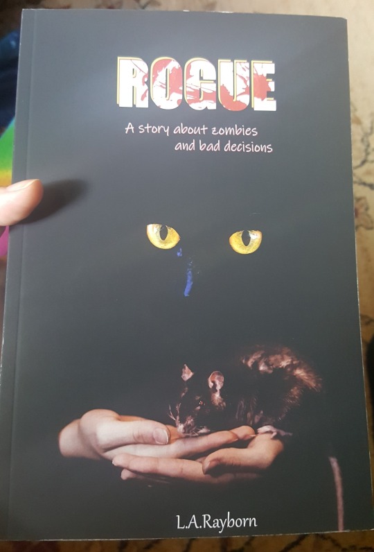
About the process of creating a book (the not-writing part)
I was asked recently about if making a book was easy or tedious or whatever, and I realized that was actually something I’d like to talk about. I’d never done it before (and still I only have a little experience), but I’ve been teaching myself and it’s been... fun? Behind the cut (that’s still a thing, right?), I ramble about formatting, PDFs, fonts, and some other stuff. (Also pictures, though most of them are the same as the ones I posted yesterday.)
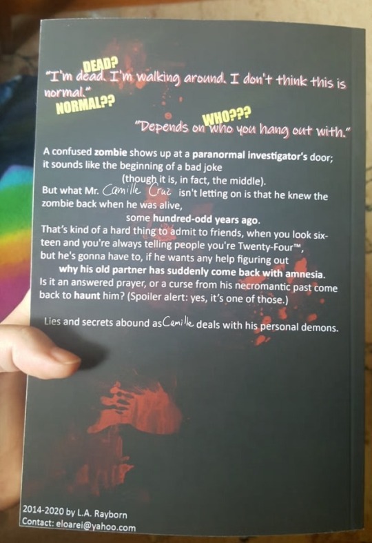
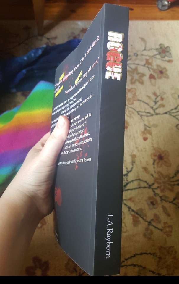
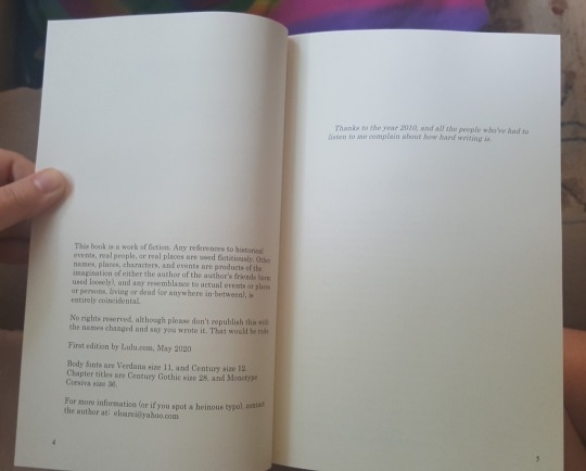
First of all, I had to pick a Print-On-Demand (POD) website. That was easy for me, because finding the website was actually what made me want to make the book. I used Lulu.com, which has worked very well for me the two times I’ve used it. (It has a bunch of bad reviews, but honestly I got just what I paid for both times. They apparently offer editing and marketing services; I can’t vouch for those because I only used the POD service. But personally I wouldn’t trust anyone to edit or market my book, let alone some randos on some website. They’re a POD site. That’s what they’re good at, so that’s what I use.) It would have been almost too easy if they just let me copy-paste the text to them, but understandably they wanted a PDF. PDFs are kind of the bane of my existence, but I downloaded a template from them (for a 6x9 inch novel, with appropriate margins) and then copy-pasted my fic into it using LibreOffice. (I’m so-so about LibreOffice, but it does create PDFs reasonably well.) From there... well, then I had to go through the process of reformatting it. I’d copied the text from my AO3, and that meant that it had spaces between every paragraph and no indents, which is how AO3 fics are typically formatted. It was a lot of Tab-Left-Down-Down-Down-Backspace-Backspace-Enter-Repeat. For 140k words, it took a few casual days. After the bulk of that was done, I realized the indents/tabs looked... weird? They were too big. ^^; Luckily there was a setting in LibreOffice to change them all automatically. I almost cried at the thought of having to do it manually haha. Adding data to the headers and footers came next. I chose to only add the page number to the footer, and nothing to the header. Normally people will have the author’s name on one side, and the book’s title on the other, but I skipped that for the time being. Not sure if I’ll do it for the ‘official’ release. (Somehow my footer ended up being too small, so that’s something I need to look into.) Next I had to pick a font and a font size. I decided to do something a little gimmicky: I have alternating chapters that take place in modern and historical times, so I chose different fonts to represent those chapters. For the historical chapters I chose “Century”, which is a serif font (meaning that it has little embellishments, like “Times New Roman”), while for the modern chapters I chose “Verdana”, a sans-serif font (meaning that it is sans/without the embellishments, like whatever font Tumblr uses). It’s typically agreed that novels are best in serif fonts, because it’s easier to read them for a long session. The embellishments make the letters blend together into visually recognizable words, which is apparently how we read, as opposed to looking at every letter individually. However, because I wanted to be quirky, more than half of my book is in sans-serif, which I’m just hoping doesn’t annoy people. I used Verdana size 11 and Century size 12. Even so, the Verdana still looks too large to my eye, so I’ll probably change it again. After that was mostly aesthetic formatting, which was the actual fun part. I tabbed down I think about 10 spaces at the start of every chapter, then went back up a space or two, increased the font size and changed the font to something slightly fancier and wrote the chapter title (which for me were just “Chapter Five”, etc). (UPON FURTHER SCRUTINY, apparently not all of my first chapter pages are tabbed down the same amount. ugh. ^^; They’re close but not identical. How messy.) Under the chapter titles, I simulated “drop caps” on the first phrase of the chapter, because I didn’t have a good drop caps font. I just did this by retyping the whole phrase in caps, and then changing the first letter to a slightly larger font size. Next were a few easy things: a title page, a few silly “praise for” pages of reviews I got from online readers (these probably won’t be in the “official” version; they just make me smile), a mock-up copyright page (mock-up because I don’t actually have a copyright or anything yet), a short dedications page (mine was just one sentence), and then an empty page so that the story text starts on the right, which is standard. I have bought another self-published book which otherwise looks pretty good, but it starts the story on the left page and it’s just so jarring. At that point, the PDF was pretty much done. I added a few other little touches, like some little fancy dagger icons during in-chapter scene transitions. I ended up with the “the end” page being on the left, which, again, is really awkward, so I found a chapter that only had like two lines on the last page, and went back in and deleted a handful of words in the chapter so that it would end on the previous page instead. THEN came the fun but agonizing part, as I’m not as much of a graphic designer as I sometimes wish. I had to make a cover. The other self-published book I bought looks really nice with a beautiful illustration on the front, but the spine and back had just tiny white text, and didn’t even include a synopsis. So I downloaded a template for a 6x9inch wrap-around cover, tossed it up in Photoshop, paint-bucketed it black, and went to work. I pasted in my synopsis in off-white sans-serif font about the same as my internal font, and bolded some of the key words for... ease of skimming and/or funsies? At the top I added a short dialogue exchange from the first chapter that I thought represented the story as a whole, chose a different font that stood out, and gave it a red shadow so it would stand out more. For fun I added some faint red blood-splatters behind the text. For the front I chose a big bold block-letter font in off-white, then gave it a red and a yellow shadow so it would stand out. I rasterized the font (turning it into a picture), and then used the tool to highlight the letters, and splashed some red blood-splatters on them. I did the same for the spine. (Though really what I should have done was copy the logo from the front and resize it. Silly me. Now the two logos don’t match.) I used Unsplash.com for a few free photos that I quickly manipulated into a passable cover art. Ultimately, I would like to have something either professionally photographed, edited, or drawn, but what I found was vaguely similar enough to what I wanted that I figured it’d do for now. Maybe the last thing I had to do (besides uploading it all to Lulu) was decide on a pen-name! I ended up going with L.A.Rayborn, instead of my legal name. I used my legal first two initials, but chose my birth surname (which is twice removed from my legal name, since I was first adopted and then married). To be perfectly honest, the reason I chose not to use my legal name is mostly because I don’t want to associate my in-laws with possibly-sensitive content that they probably wouldn’t like. SO. Then it was done, and I uploaded it to Lulu, and chose a few options on the site, such as cream pages instead of white, and matte exterior finish instead of gloss. (I highly suggest the cream for novels, but the matte is really just personal preference.) I paid them (I ended up getting it printed and shipped to me for under $20), and then about 2 weeks later I had the 400 page darling in my hands, ready to be eviscerated with a set of neon hi-lighters! After this current round of edits, I already know there’s a ton of stuff I’m going to have to fix (and this is to say nothing of the story). 1. The font is slightly too large, but could probably use a 1.5 or maybe 1.2 spacing between lines. I’ll have to fiddle with it, and see what others do. 2. The back cover text is too close to the edges to really look good. 3. The page numbering just looks odd for some reason. 4. Figure out how to get the page numbers to stay off the copyright and dedications page, etc. 5. MORE THAN ANYTHING, I need to change the... I’m not even sure what to call it? I need to make the text space out evenly so that it creates a block on each page, rather than creating messy ridges on the right margins. I didn’t even think of this until I got the book and started comparing it to professional books I’ve read and enjoyed. It seems like a very rookie mistake.
(lol I’m in the process of changing the main character’s name, which is why the crappy MS Paint edits.) PHEW, that was long. But hopefully my journey was at least a little insightful. Please do let me know if you have any thoughts, questions, or suggestions about how I could better format the book for the “real” printing!
2 notes
·
View notes
Text
Version 375
youtube
windows
zip
exe
macOS
app
linux
tar.gz
source
tar.gz
I had a great week. There are a bunch more Qt fixes, and a few other things as well.
Qt
I have fixed a bunch more bugs in the Qt code. We are getting to the end now--this is mostly smaller stuff like an unusual dialog button not working, but I have fixed another important memory leak that was causing some backend not to be deleted correctly when a media viewer closed on a video. This should radically reduce memory use for some heavily used clients.
Some windows that were large, or could expand to be, like the options dialog on some pages, were sizing off the edge of the screen. This should be fixed now, and a variety of child-window initial size calculations should be a bit more accurate--Qt manages window size a little differently than wx, and the additional buffer represented by the window title frame and border was not being taken into account.
The menubar menus should work a little snappier this week. Things like the rapid 'pending (xxx)' menu updates when a downloader is importing files with tags. The whole UI should get a little latency benefit from this during these high-traffic times.
I also gave the layout and scaling another go on clients that use UI scaling (when you tell your OS to display UI at >100% on a monitor) on high dpi displays. The experiment from last week did not go how I wanted, with pixelly scaled-up thumbnails, so I have reworked that and fixed the taglist, which was crunching tags together on these displays.
the rest
For users who have been trying to download from unreliable or tight servers, the network engine now handles connection errors and 'server was busy due to low bandwidth' errors separately, and has separate delay time options for both of these under options->connection.
There's a new danbooru login script. They apparently changed their cookies a little. If you use a danbooru login and have had trouble, please make sure your credentials carried over to the new script and give it another go.
For users who have complicated file storage failures and need some specific recovery options, there are now new jobs under the file maintenance system to quietly delete bad files from storage without affecting the db file record, and also to re-download files that are missing or broken if they have known urls. These jobs are experimental and only useful for certain file recovery scenarios, but if you have been waiting on something like this, please give them a careful go and feel free to ask for help.
full list
qt:
disabled the failed legacy high dpi scaling mode experiment (which was scaling up thumbnails and media in an ugly way) and returned to font-size-based natural ui scaling as set by the OS. a couple of non-font things like bitmap buttons and various layout margins are too small on >100% UI scale, and the splash screen is borked again, but it looks clear again. I'll keep working on this
fixed the custom taglist at >100% UI scale, which was spacing its tags at the wrong text height. this should survive changing ui scale while the program is open and environments with multiple monitors at different ui scale
re-fixed a critical old media-viewer-close-on-video memory leak from wx code to qt code. this was also a cause for some child ffmpeg processes not being terminated
fixed the media viewer not redrawing correctly when the media size completely exceeds the canvas window size
fixed the loading of the shortcut edit panel when the shortcut set a tag
fixed some url class edit path component ui
fixed and cleaned up some 'safe window size/position' calculations that were missing out the total frame geometry, meaning some dialogs were not moving up and left enough to show entirely on screen, and dialogs with parent-dimension gravity were not calculating initial size accurately
fixed focusing on the already-open manage tags text input when you hit 'manage tags' on a canvas with a manage tags dialog already open
fixed the html formula rule edit ui actually rendering html tag labels, lmao
updated boot-password entry to use the normal hydrus text entry dialog, and fixed a hydrus password cancel not setting a 'clean' exit for the next boot
fixed page layout splitter sash positions not resetting nicely from the menu command
fixed keyboard delete in the manage urls dialog
popup message titles are now in bold
popup message titles should now multiline correctly and fill available width
the popup messages manager should now set its min/fixed width more sensibly
subscription popups now will be wider if space is available
wrote a new class to manage better asynchronous updates for future Qt ui presentation
the file, pages, and pending menubar menus, which all require a db hit to generate, now operate on this new update class. all three should update faster when able and more politely and smoothly wait when the db is busy
reduced some accidental blocking in an old ui-update routine that kicked in when it was running hard
if the media_viewer frame type is set not to remember its 'last size', it will now instantiate with a small min size
when pasting new queries into a sub, if there are more than 5 or 50 that are already in or new, they will be rendered in a more compact way in order to stop the notification dialog growing too tall
improved stability of page update, splash screen update, and perhaps pubsub update
.
new file maintenance jobs:
added a new 'check for missing files' file maintenance job, where if the file is missing and has urls, those urls will be queued up in a new url downloader for redownload. the file record is not removed, preserving archive/inbox and import time
added a new 'check for invalid files' file maintenance job that does the same deal as above with an additional expensive byte-for-byte content check if the file is not missing
added a new 'check for invalid files' file maintenance job that only cares about invalidity--if the file is present and invalid, it is moved out but the file record is not removed
.
the rest:
network jobs that receive low-bandwidth error codes from the server now use a separate wait routine (previously, they piggybacked on the connection fail retry system). they have a separate cog-menu action to override these waits
the time delay multiple for connection errors and serverside bandwidth problems are now editable under options->connection. old default was 10 seconds base, now 15 and 60 seconds respectively
updated the danbooru login script
improved the precision of the thumbnail size estimate in database migration
the alphabetisation of a url class's GET paramaters on normalise is now optional. it is a new checkbox on the url class edit panel
when a default object fails to load from a png path, a simple error is now written to the log
misc cleanup
next week
I got hit by some IRL stuff right at the end of this week, including some Thanksgiving surprises, so I couldn't fit in the new downloaders I wanted to, but I have some fixes for pixiv tag search and twitter video download waiting to be added. I also couldn't get to Qt theming again, nor macOS tab DnD! So, I'll focus on those first thing so they definitely get done.
Otherwise, next week is scheduled to be a 'medium size' job week. I would like to get a long-planned overhaul of subscription data handling done. Subs are getting huge and clunky for many users, and I'd like to have them load into their dialog and do their normal work much faster, with much less CPU and HDD involved.
Happy Thanksgiving!
1 note
·
View note
Text
Best WordPress WooCommerce Themes for Building an Online Store
New Post has been published on https://www.templified.com/best-wordpress-woocommerce-themes/
Best WordPress WooCommerce Themes for Building an Online Store
Running your own online business can be a huge challenge, but a rewarding one if you have the right WordPress theme to help out. WordPress has quickly become the content management system of choice for many online retailers and WooCommerce is most often the shopping cart that people use to run incredible online stores. Now, all you need is the perfect WordPress WooCommerce theme to really make your business work.
But where to begin? With thousands and thousands of themes out there, it’s tough to find the right one. You’ll need a theme that’s responsive, has every feature you need to make a really successful online store. You’ll want a theme from a reputable developer so you get great support and documentation, probably even a one click demo data import file so you can get started quickly. You’ll also want integration with all the popular plugins that make running your business easier, like Contact Form 7, Jetpack and others. You’ll want a theme that’s incredible user-friendly and simple to run on a daily basis, giving you more time away from the computer. Finally, you’ll want a theme with a really great design, one that frames your products in the best possible light and makes your site look trustworthy and professional.
That’s a lot to ask but every single theme in this collection is a shining example of the best WooCommerce WordPress themes around.
Massive Dynamic Premium WooCommerce Portfolio Theme
Massive Dynamic is among the very best themes on ThemeForest, in my opinion. This theme can really do it all. It’s part portfolio, part blog, part eCommerce store. It’s great for a variety of businesses and can make just about any content look great. This is a fast loading, high performance theme too, which is wonderful for SEO. The developer of Massive Dynamic, Pixflow, keeps updating this theme so that it stays fresh and functional. The most recent update is to v6.0, which has made the page building aspect of the theme even more streamlined and functional. Packed with well over $100 worth of extensions, like Go Pricing, Slider Revolution and Master Slider, Ninja Popups as well as Visual Composer, Massive Dynamic has every tool you could imagine to build a powerful web presence. If you’re selling products, the performance of your website is very important and Massive Dynamic loads up as fast as any theme I’ve seen. There are over 60 premade demo sites to choose from too, so your style is only limited by your imagination.
DemoMore Information Get Hosting
Divi WordPress WooCommerce Themes
Elegant Themes most powerful and popular theme is Divi and it’s a great choice for building a strong eCommerce site using WooCommerce. Divi uses it’s own proprietary page builder, Divi Builder, to allow you to create an infinite number of layouts, each one beautiful and fast loading. Divi has extensive documentation and a fast, friendly support team to help guide you through any issues that you might have when customizing this theme to suit your needs. Divi allows you to visually build your website from the ground up. It’s blazingly fast, it’s intuitive and unlike any other page builder plugin on the market. That means you get real time design, you just click on the page and type your content, no more messing around in the Admin panel with Divi. Almost everything can be customized and the editing process is totally responsive. There are dozens of content elements, almost no loading and if you want, there are over 20 pre-made templates to get you started.
Demo More Information Get Hosting
Float WordPress Parallax WooCommerce Theme
Float is a fantastic parallax WooCommerce theme from Themify, one of the best developers on the planet. This is actually among my favorite of their themes, thanks to the cool parallax scrolling, the seemingly unlimited features and the bold, trendy design. Float is completely responsive, despite being a parallax theme. Some themes tend to struggle with that aspect, but Float does the job right. You get a boatload of different design options from headers, menu styles and you also get a whole bunch of nice looking pre-made demo sites to get you started or to get you thinking about how you might want your website to look. Buy Float right now and you actually get a free bonus theme, as well as a 30 day money back guarantee. This theme is licensed GPL, so you can use it on as many sites as you want to and you get a year of solid support from Themify. It’s really a pretty solid deal overall.
DemoMore Information Get Hosting
Oshine WordPress WooCommerce and Portfolio Theme
Oshine combines tons of features with just as many premade demo sites to produce what is one of the best selling themes on all of ThemeForest. Oshine is all about creativity and with well over 20,000 customers so far, they’re doing a lot right. Developed by BrandExponents, Oshine has a high quality design, a completely intuitive page builder, dozens of demo sites and hundreds of pre-built sample pages to choose from. There’s a one click demo data installer to get yourself started fast, excellent quality support and documentation and more. You get complete control over layouts and there are also unlimited ways to showcase your portfolio or your products. For agencies, blogs, businesses and freelancers who also want the ability to sell products with WooCommerce, Oshine is a wonderful choice.
Demo More Information Get Hosting
CoupShop Minimal WooCommerce WordPress Theme
ThemesKingdom’s CoupShop WordPress theme is a modern classic. This theme has a design that’s reminiscent of a magazine, it’s slick, it’s got plenty of white space and all of that helps make your products look amazing. I love this theme for a high end store selling watches or jewelry, maybe a sleek clothing line or European shoes. Something along those lines. With the CoupShop WordPress theme and WooCommerce, your online store is going to get rave reviews. Here’s our full collection of minimalist WordPress themes, I think you’ll like it.
There are multiple layout options with CoupShop, set up a grid with as few as 2 and as many as 5 columns to organize your products. The shopping cart is located in a handy place, right on the sidebar for easy access. CoupShop has an attractive, slim and trim blog bundled with it as well as multiple portfolio options. As for typography, there are over 800 Google fonts supported and Google keeps adding new, fresh fonts to keep folks happy. It’s a really nice setup and changing out fonts is very simple. Jetpack Optimized with a white label admin panel and including the PhotoShop files are all nice value adds from ThemesKingdom.
DemoMore Information Get Hosting
Hestia Pro Minimalist WordPress Portfolio Theme
Hestia Pro is a premium theme from ThemeIsle, it’s got a bold material design style, it’s buit for startups, eCommerce, portfolios and business websites. The design is one page, which may throw some people off. If you’ve got a ton of products, this theme might not be a great fit, but the overall number and quality of features means I pretty much had to include it in this collection. So, with ThemeIsle you get a very simple to use theme, it’s very easy to create a tailor-made look to your website. The WooCommerce shop is clean, well designed and well organized. I really like themes with live editing and Hestia Pro has that real-time editing effect. Adjust colors, fonts, padding…you get the idea, and never have to wait for the changes to be made. You get to see them in real time before you commit. It’s a nice touch. Hestia Pro was made to work with every page builder too, from beaver Builder to Divi to Visual Composer. Hestia Pro is translation ready, SEO and page load speed optimized, it sets up fast and looks amazing on all size screens. This is a real winner. If Hestia Pro isn’t what you had in mind, we’ve made a big collection of WordPress portfolio themes you might enjoy.
DemoMore Information Get Hosting
Wright Minimalist WordPress WooCommerce Themes
Wright is a very simple, clean, minimal and professional WooCommerce theme that should be considered for anybody who wants a very neat and tidy WooCommerce based shop. You’ll be hard pressed to find a theme that’s more simple than Wright. Made by Minimal has removed every unnecessary feature with the Wright theme and it’s all down to the clean, minimalist style that forces all the attention to your products. If you also want to blog, Wright has you covered again, there’s a very simple and clean blog included, not to mention the portfolio system. If you have a ton of products, this might not be the theme for you, but for small shops or selling downloadable goods or offering services like SaaS, it could be a great fit.
More Information More Information Get Hosting
Studio 8 WooCommerce and Creative Agency Theme
Elegant and flexible, simple and well coded, Studio 8 expertly blends every feature you could want in a high quality digital agency website with WooCommerce, so you can set up a stylish shop to go with whatever products you’re promoting. Studio 8 is aimed at agencies, web designers, photographers and other creative professionals. Architects and videomakers have also gotten a lot out of the Studio 8 theme. Whether you’re selling tangible goods or digital downloads, Studio 8 helps make the right first impression with a clean, professional and well organized shopping experience. The worst thing is to have a messy look on your site, it just doesn’t look professional and Studio 8 deftly avoids those problems. Studio 8’s fast load times and beautiful design are perfect for just about any sort of product. No matter what you do, you want a clean and eye-catching website, which is precisely what Studio 8 provides. For more WordPress video themes, check out this collection.
DemoMore Information Get Hosting
Highfill, Feminine WooCommerce and Blog Theme
Highfill is, simply put, one of the most elegant, graceful and delightful feminine magazine themes on the market and if you want to blog about fashion of lifestyle, food or products marketed toward women, this theme could be a great choice. I think that Highfill is the perfect fashion blog, lifestyle blog or maybe even a travel blog. The style is well though-out, with simple and effective typography, a layout that’s interesting and simple enough, with clear navigation and plenty of ways for you to highlight the posts and pages you want to call the most attention to. Highfill didn’t scrimp on social networking either, it’s very easy to integrate sites like Facebook, Twitter and Pinterest, which is critical to the success of any fashion or lifestyle blog. Tell your story in a creative, unique and fun way with the responsive, well designed and well supported theme called Highfill.
UPDATE – This theme is now WooCommerce ready, so you can add a shop to your site, if you’d like to sell your own products. That really makes a big difference since so many fashion bloggers want to offer their own products for sale.
Demo More Information Get Hosting
Composition Best WordPress eCommerce and Portfolio Theme
Composition was built to help you sell digitally downloadable products. With WooCommerce or Easy Digital Downloads, or even the Sell Media plugin, you can set up a shop that looks great and performs well on any device. That’s because Composition is totally responsive; it looks fantastic on all devices. Graph Paper Press takes a lot of pride in their theme designs and they support them well too, so if you’re concerned about spending money on a theme only to get little to no support, I think you’ll be fine. My interactions with Graph Paper Press has always been great. For blogs and portfolios, this flexible business theme just keeps getting better and since they update the Composition WordPress theme, that features list keeps growing and growing.
DemoMore Information Get Hosting
Kleanity Minimalist WordPress WooCommerce Template
Kleanity is as clean as themes can get. This minimal style gem is perfect for creative portfolios and blogs, for brand building and social media interaction. This theme means business too, it’s powerful and functional as any theme I’ve seen in the last few years. Kleanity is the type of minimalist theme that can really set your work apart. With this theme, you’ll get to know the true beauty behind a simple and minimal style template, it’s great for a agents and artists, corporate and creative websites alike, graphic designers can get the most out of it, as can photographers. In short, anyone who wants a great-looking portfolio and once a minimalist style can really benefit from Kleanity. This theme is by one of my favorite developers, Goodlayers. I’ve used Goodlayers themes in the past and found them to be very simple to use and the support was always great. This template offers demo content import, it works great on all devices and the admin panel is very intuitive and easy-to-use.
DemoMore Information Get Hosting
Ad-Sense, AdSense Ready WooCommerce Theme
Ever asked yourself, what’s the best AdSense friendly WordPress magazine theme with WooCommerce? I believe I’ve found a strong candidate, created by MyThemeShop. It’s called Ad-Sense, and it’s got a fantastic looking boxed layout with user-friendly layout, navigation and customzation options. you’re going to love it. Ad-Sense makes it simple to monetize your website, whether it’s advertising your own products or products from someplace like Amazon or other online retailers. With Ad-Sense, you’ll have several layouts from which to choose, multiple page and post layouts, a gorgeous custom carousel and more. Of course, it wouldn’t be on this list if Ad-Sense wasn’t great with eCommerce and it is, the shopping cart page is particularly dynamic. Fast loading, great SEO, AdSense optimization, great documentaion and fast, friendly support, this theme really has it all.
Demo More Information Get Hosting
Arnold Simple, Professional WooCommerce WordPress Theme
Simple and professional, well styled and full of great features, Arnold is a clean and minimal WooCommerce theme that’s proven to be popular and easy to use for nearly everyone who has purchased it. This is a theme for creatives who want a full featured theme, rich and challenging design and a very easy way to customize your site to fit your brand. I think that Arnold is equally comfortable as an eCommerce shop as it is as a portfolio, so combining those two things is a great idea. Sometimes, great looking portfolio themes don’t offer WooCommerce and WooCommerce themes don’t have an attractive enough portfolio to engage with your readers. With Arnold, you definitely get both. This theme is modern, flat in style and creative. The design is natively responsive, it’s compatible with all the major page builder plugins, including Gutenberg and I think it’s a theme you can grow with. It’s proven to be popular, well supported and it allows you to deliver a great user experience as well.
DemoMore Information Get Hosting
Hermes eCommerce Handbags WordPress Theme
Hermes is a fantastic WooCommerce WordPress theme with a clean, minimal design and plenty of flexibility and functionality. This theme is clean, creative and powerful, the colors and layout can be adjusted to fit what your website needs to be. The developer includes multiple homepage layouts, product pages and more, it’s great for businesses, news, corporate websites, but it’s best for eCommerce. This theme is responsive, SEO optimized and flexible. With a user-friendly design, this theme works well without any sort of coding knowledge, so you’re going to be able to establish a site quickly and efficiently. Speaking of fast, the one click demo data import allows your site to be online within moments of installing your website. Visual Composer is included, as is Revolution Slider and Mega Main Menu. Those plugins have combined valie of over $60, which can save you a bunch of money if you’re looking to add that functionality. All things considered, this theme is a really great value and super simple to use.
DemoMore Information Get Hosting
Zerif Pro Creative One Page WooCommerce Theme
Zerif Pro is a clean, simple WordPress theme with a really unique design, it’s a one page theme. A lot of times, people don’t consider one page themes, but there are probably more websites that could use a one page theme than there are pages that actually do take advantage of a one page theme. One of the benefits is load speeds. Once the page is loaded up, that’s it, it’s over. There’s no constant loading from page to page, you can display everything from a blog to portfolio, even an eCommerce shop, all on one page. It’s a great way to make a website really work, assuming you want a simple, minimal style site. And let’s face it, if you’re looking at this theme collection, that’s probably why you’re here.
DemoMore Information Get Hosting
Create Premium Quality Portfolio WordPress Theme
Create has always been a powerful on flexible theme, but now it’s been redesigned from the ground up. Create 2.0 is built using the page builder plugin from site origin. Is an open-source page builder that gives you maximum amount of control over your page layouts and content creation. It’s a really neat way to design your website from the ground-up to fit your needs. Create offers a year of support and updates, it comes with the slider Revolution plug-in to attract attention above the fold. There’s one click demo import to get you started with any of the beautiful layouts that are included in the demo site. You’ve got portfolios and video backgrounds, a responsive design it looks great on all devices and Powerful typography customization options as well. Woocommerce is fully supported, I feel like woocommerce is the number one e-commerce plugin for WordPress for good reason, it’s powerful and flexible and there are so many extensions that you can add to it too pull off anything you want.
Demo More Information Get Hosting
Ultra Portfolio WordPress Theme for Creative Websites
DemoMore Information Get Hosting
Shoppe, Powerful WordPress WooCommerce Theme
One of the best things about WooCommerce is its ability to allow you to become Your Own Boss. When confronted by all of the different challenges of running your own business, it’s important to have as many tools at your disposal that can help ease the burden and make things a little bit simpler. I think that this WordPress theme can be one of those tools. Shoppe is a Simple and Clean Ecommerce theme that can really get the job done of making your content stand out without being too intrusive. It’s got a simple design that is professional and attractive, but the features are just as powerful as any. Shoppe allows you to build a professional e-commerce site and just a few minutes, it comes equipped with themify Builder, a handy and Powerful drag-and-drop page builder, not to mention plenty of other eCommerce features like Ajax cart, wish lists, quick look light boxes, Ajax quick search and plenty of shop layout options. There are multiple different theme skins and instant demo import to get you started even faster than before.
DemoMore Information Get Hosting
Notio, Minimal Style WooCommerce Theme with Portfolio
Want a fun theme with grid layout and easy to grasp, minimalist style to make a really memorable first impression on the folks who come to your website? Yeah? Me too! Well, Notio is a theme that might be a fit for what you need. Notio is a high end portfolio theme which also allows for WooCommerce sales of any kind of products, from digitally downloaded files to stuff you normally find in a brick and mortar store. Notio is easy to use too, simple enough for beginners but fluid and dynamic enough for expert web designers. I think you’ll find that it’s simple to get started and there are plenty of options to make the site look like you want it without being too arcane. Tweak the settings, give it a try. We think you’ll love what you find.
Installation is a cool and easy process, thanks in large part to Notio’s single click installer. Yeppers, it is what it is. One click gets the job done. Get started now, not in a few minutes. Pretty, pretty, pretty cool. Visual Composer, which allows you to change up the layout rapidly, is what powers this theme. Lots of the very best templates on the market are using this powerful tool and it has no limits to what can be build. No fences. Notio looks great on any device thanks to retina ready display and that means your WooCommerce driven store with grid layout is going to look amazing and behave even better.
Demo More Information Get Hosting
Inverto WordPress Minimal Theme for Bloggers
Inverto has a simple and crisp style that puts all the attention on your products. If you’d like to integrate a high-quality WordPress blog on your shop website, Inverto is a great this team is a little bit different than many of the others in this collection, it’s got a very Stark black and white design, it really allows your content to shine through. It’s sort of the monochrome look that may not be for everyone, but if you’ve got modern products to sell, I think that it does a pretty good job of presenting them in a clean and clear way. It certainly focuses all the attention on your content and there are relatively few distractions. This theme also comes with a high-quality portfolio and personal blog setup, a crucial detail that many e-commerce themes overlook. This responsive theme has one click demo data import, a dedicated support for him and it supports all the most popular plugins to help make your blogging life easier..
DemoMore Information Get Hosting
We’ve reached the end of another collection, but we’ll be updating it quite often to keep you up to speed with the best WooCommerce themes around. If you didn’t see what you wanted to see in this collection, let us know and we’ll be sure to add your favorite themes in the near future. Stay tuned!
2 notes
·
View notes
Text
Adobe acrobat installer

Note: If you would like to download the latest version of Adobe Acrobat Reader, kindly visit the Adobe Acrobat Reader DC page.
A feature only available in the paid up version, Adobe Reader X now lets you highlight and add notes to text.
There is less clutter, giving a easier way of viewing the content of PDF files.
The new Read Mode is used when a PDF document is opened within a browser.
The program is given limited access, so if a virus strikes the program, the possible damage is reduced. Download and install apps, share files, find fonts and Adobe Stock assets, set preferences, and more all from the Creative Cloud desktop app.
Reader X has now a new security feature called sand-boxing.
And while hitting version 10 might be a milestone, calling it reader X is bound to confuse users who are not so technically minded.Ĭynicism aside, Adobe have take some steps to improve the security of Reader X. But then again, they said the same things about version 9. According to Adobe, Acrobat Reader 10 also improves scrolling and zooming for the rendering of CAD and 3D graphics, plus it fixes a whole bunch of bugs and security flaws encountered in version 10. It lets you view, print, search and share Adobe Portable Document Format (PDF) files using a variety of platforms and devices. Please do not respond to this message for customer service issues.Adobe’s Acrobat Reader 10 (Acrobat Reader X) is the latest release of this PDF viewing tool. The guidelines for the use of the artwork can be found atĪdobe also offers valuable tools and resources to facilitate the deployment of Adobe Reader in your organization. To download high resolution versions of the "Includes Adobe Reader" button, please visit the following URL which points to a zip file containing the button in eps, bmp and jpg formats. To download Updates to the version of Adobe Reader that are licensed to you in accordance with the Adobe Reader Software License Distribution Agreement, click here: You may direct others to to request distribution rights. The information contained on this site is meant for your use only in accordance with the Adobe Reader Distribution License Agreement you accepted. You may not share the above link, share information with others, or publish the above link on websites, blogs, or by any other means that can be publicly accessed. To download the English language version of Adobe Reader 9 with in compressed. The agreement is valid for one year, after that one year you can renew the distribution license agreement by following the same process.īelow you will find the necessary details and download links for the product(s) that you have been approved. Internet Explorer 8, 9, or 10 (Windows 8 minimum), 11 Firefox Extended Support Release.
Your request has been approved, and you may now distribute the Adobe® Software listed below, subject to the terms and conditions set forth in the Adobe Reader and Runtime Software Distribution License Agreement.Īttached is an Adobe Portable Document Format (PDF) file of the distribution license agreement. Thank you for submitting a request to distribute Adobe® Software.
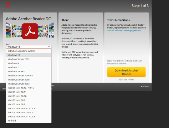
" Adobe Reader 9" suggest that those automatic emails are quite outdated now, can anyone help? Which is the generic page asking me to apply to distribute Reader, which I just did. exe format, click here." redirects to this address: Sadly the URL in " To download the English language version of Adobe Reader 9 with in compressed. Fair enough, I requested access to the Reader, got one email to confirm my details, then another one which should contain link to the. Latest version forces me to register for distribution of Adobe software. It used to be simple and last version I got was 11.02. I'm trying to download offline installer of latest Adobe Reader for bulk installations on PCs in my company.
0 notes
Text
Uxtheme patcher for windows 10

Install Third Party Themes in Windows 10 Fall Creators Update.
UltraUXThemePatcher 4.2.0 Dirilis, Hadirkan Dukungan Untuk Windows 11.
UXTheme Multi-Patcher - Free download and software reviews.
Universal Theme Patcher causing bootloop, need to get working - Windows.
Download Universal UXTheme Patcher 2.1.
Jarvis 10 For Windows.
Macos for windows 10 uxtheme patcher.
UXTheme patch for Windows 8 - Windows - Neowin.
Uxstyle, uxtheme patch/custom themes for Windows 10 10240?.
Jarvis for Windows 10 - UXTehemPatcher.
UXThemePatcher - SkinPack.
New Mac OS X Cursor Pack - UXTehemPatcher.
UltraUXThemePatcher - Download.
Install Third Party Themes in Windows 10 Fall Creators Update.
You need to copy theme files in "C:\\Windows\\Resources\\Themes" and then select it from Personalization Note: For using this theme first you need to Patch Uxtheme from here: UXTheme Patcher Also for (…) 1 and Windows 7 After receiving updates to Windows 10 Build 1803, I tried the Mac OS X Theme from Cleodesktop and it takes me back to the. Using utilities like UltraUXThemePatcher in Windows 10 is a really bad idea, every day on Community we have people who have a corrupted operating system by using a theming utility and other people who tried to remove the theming utility and could not get back to normal Windows 10 because part of the UI was not rendering correctly.
UltraUXThemePatcher 4.2.0 Dirilis, Hadirkan Dukungan Untuk Windows 11.
MacOS Transformation Pack applied to Windows 11. The MacOS Transformation Pack includes Mac themes, wallpapers, fonts, sounds, Dock, Launchpad, and much more. It also brings MacOS default applications to the Windows environment, such as Safari, Finder, etc. It gives the fill Mac experience while providing the functionality of a Windows machine. UX Theme Patcher. The Newest theme patcher version 4.1.2 breaks DWM and a whole bunch of UI elements, including mouse cursor offset in Photoshop and Explorer UI freezing on screen after closing it. I've also seen if you minimize any window and then close it, UI won't be frozen on screen. This is for the latest Windows 10 Dev builds including. The latest version of UltraUXThemePatcher is 3.8.2, released on 08/31/2020. It was initially added to our database on 03/26/2009. UltraUXThemePatcher runs on the following operating systems: Windows. Users of UltraUXThemePatcher gave it a rating of 5 out of 5 stars. Write a review for UltraUXThemePatcher!.
UXTheme Multi-Patcher - Free download and software reviews.
Jul 18, 2022 · Choose a Windows 11 theme in the left box and click Patch and apply button. Step 6: Download 7TSP GUI 2019 Edition from and unzip it. Open the folder and you will find a 7TSP file. Please rename "ee" to "exe" and then run this program. Step 7: Go to Windows 11 Icons Theme > 7TSP Themes for Windows 10 1903 and higher folder.
Universal Theme Patcher causing bootloop, need to get working - Windows.
UXTheme Multi-Patcher for PC - UXTheme Multi-Patcher is a Customization apps that you can running into your Windows 10 PC. This free app was developed by DarkMindZ Inc. This free app was developed by DarkMindZ Inc. Oct 11, 2014 After finishing Windows 10 stuff, here's an update for UXTheme Multi-Patcher that supports Windows 10. UxthemePatcher For Windows 10 2004- Download. This breaks the UXTheme patcher for now. Once it has located all the artwork it needs, it will then prompt you to download the images or videos you would like to add to your theme. For more information have a look at detailed tutorial. macOS-style dock for Windows 10. Download UXTheme Patcher For Windows 8.1.
Download Universal UXTheme Patcher 2.1.
I tried to change my windows theme into theme glass,here is the website that I got ( windows 7 glass themeD - YouTube). It said when I got black theme,i should use universal theme patcher,but things didn't go right.When I view my folder,especially computer,it turned all white. I can't see any.
Jarvis 10 For Windows.
Jun 12, 2022 · We have covered a lot of custom themes for Windows 10 including custom ones. The uxtheme patch files will replace the unwanted components with new versions. Seamless installation and uninstallation giving users safe transformation. This theme changes every element of the Windows 11 theme like it adds a high-quality bottom dock, icons.
Macos for windows 10 uxtheme patcher.
Select a theme, click Download and run the theme pack to activate the theme. Download Mac Os Transformation Pack. Turn Windows 10 Into Mac. Note: It is advised to create a System Restore Point before installing this theme pack.Find out how. How to get Mac Theme on Windows 10 PC or Laptop. It's effortless to install this theme pack on your. OS: Windows 7 Enterprise 64 bit retail. CPU: Intel Q9300 Core 2 Quad. Motherboard: Acer EQ45M. Memory: 8 GB. Graphics Card: nVidia 260 GTX. Screen Resolution: 1920*1080 and 1440*900. PSU: Corsair HX 520 Watt. Case: Coolermaster Storm Sniper. Hard Drives: 2x 500 GB SATA @ 7200 RPM. So, since Windows 8 is on the edge, or even better, installed and running happy on my PC. I'm a huge modder, a fan of custom made visual styles (themes). Prev. in win7 i have a bunch, but now I.
UXTheme patch for Windows 8 - Windows - Neowin.
UXTheme Patcher For Windows 10 Published: Feb 2, 2016. By. protheme. Watch. 158 Favourites. 81 Comments. 80K Views. 10 patcher uxtheme windows. Description. This uxtheme patcher is easy and auto so you just need. Here is the new theme for Windows 10 users. This is realy awsome theme, enjoy it and have fun! Operating System Support: Windows 10 1607 , (Not tested on older and new builds) Author sagorpirbd Note First it is recommended you make a System Restore point before continuing. How To Use: 1- to use this theme first you need to install UXTheme.
Uxstyle, uxtheme patch/custom themes for Windows 10 10240?.
No file system changes are made. (First introduced on March 19, 2009.) UxStyle was recently rebranded to UxStyle Community Edition and published to GitHub under the GPL license. For Windows 10 Technical Preview latest version (0.2.4.2): UxStyle. Attachment 16580.
Jarvis for Windows 10 - UXTehemPatcher.
Download UxTheme Patch For Windows XP SP3 Crack+ Activator Free This patch updates U to the latest 3.x version, ensuring that the digital signature check is passed, thus allowing you to install any theme of your choice. Several configurations will be applied including the option to restore the original. Jun 09, 2022 · UXTheme Multi-Patcher Custom theme patch for Windows XP. UXTheme Patcher for Windows 10 1903, 1909, 20H1, 20H2Patcher is a software that patch W. Feb 02, 2016 10 patcher uxtheme windows. This uxtheme patcher is easy and auto so you just need to download and install it, then restart your OS and enjoy new themes!.
UXThemePatcher - SkinPack.
UltraUXThemePatcher 3.8.2. Manuel Hoefs - Open Source -. UltraUXThemePatcher, a simple and intuitive in use application that allows users to quickly and effectively change the appearance of your Windows 8 and Windows 8.1 running computer. more info. Nirwradsoft UxTheme Patcher is extremely small in size and supports almost all windows operating system but only 32-bit. Download Nirwradsoft UxTheme Patcher 1.0 for Windows 7, XP & Vista. Source: Webtrickz. RELATED: New Mac OS X Yosemite Transformation Pack For Windows.
New Mac OS X Cursor Pack - UXTehemPatcher.
Uxtheme Multi-Patcher is a very useful tool that you can use to install third-party Windows 10, 8.1 themes on your computer. 8/10 (18 votes) - Download UXTheme Multi-Patcher Free. Transform the appearance of Windows XP and Windows Server 2003 by downloading UXTheme Multi-Patcher for free. Customize Windows with UXTheme Multi-Patcher. The installation of a theme that totally changes the operating system is something. Hello! Is anyone using custom themes on Windows 10 10240? I'm interested in changing the following things: Window caption buttons and titlebar (including text color) Window frame/border. Same for "Modern" apps. If you're using a custom theme on Windows 10, please post a screenshot. The name of the theme would also be appreciated. Thanks!.
UltraUXThemePatcher - Download.
Sep 07, 2017 · For Windows 8/8.1/10, UXTheme Multi-Patcher comes with WinaeroGlass from installed enabling Glass theme support. If you have any issue related to UxStyle, please report to UxStyle's. Windows 10 x86 and x64 Editions Windows Server 2016 x86 and x64 Editions For Windows 8/8.1/10, UXTheme Multi-Patcher comes with WinaeroGlass from installed enabling Glass theme support. If you have any issue related to UxStyle, please report to UxStyle’s GitHub. Changelog Version 15.0 -Added Windows 10 Anniversary Edition support.
See also:
Windows 3.11 Emulator Free Download
College Hoops 2K8 Pc Download
Choirsx Vst Free Download
1 note
·
View note
Text
Macbook Offline Netflix

Macbook Offline Netflix Review
Netflix Offline On Macbook
Inspire your students with thousands of free teaching resources including videos, lesson plans, and games aligned to state and national standards. Netflix is a video on demand we site which was put up on August 29, 1997, by Marc Randolph and Reed Hastings in California. Netflix is pretty much the online version of a local theater. People go there to watch movies, anime all over again, without having any restrictions on snacks not being allowed and chill.
Macbook Offline Netflix Review
Best apps live in Setapp
Replace Mac defaults and discover new gems in one suite.
If you use a MacBook, MacBook Air, or MacBook Pro for work, you’ve certainly thought about getting an external monitor at some point. Which is a 100% correct idea. Spending eight-plus hours every day hunched over the laptop on your desk won’t do your health any good long term. So a high-quality monitor is a must.
Naturally, the first thing that comes to mind here is the iconic Apple Cinema Display, which embellished the desks of most creatives for nearly over a decade. This Mac monitor was, however, updated in 2011 with the now ubiquitous Apple Thunderbolt Display.
Apple’s first Thunderbolt monitor was a beautiful and sturdy 27-inch LED screen. But after a few weak updates, it too, unfortunately, got discontinued in 2016 without any immediate successor. Although it’s possible to buy an Apple Thunderbolt Display secondhand today, it’s not a really good idea, since its specifications are quite outdated. Finally, in 2019, Apple released its brand new Thunderbolt 3 monitor — Apple Pro Display XDR.
Enhance your design with Setapp
Installing PIP on Linux Operating system is a bit different as compared to Mac and Windows. You need to check first if the Python is already installed or not. But if your Linux distro came with Python already installed, you should be able to install PIP using your system’s package manager. Before we start with how to install pip for Python on macOS, let’s first go through the basic introduction to Python. Python is a widely-used general-purpose, high-level programming language. Python is a programming language that lets you work quickly and integrate systems more efficiently. Modern Mac systems come with Python and PIP already installed. However, this version of Python tends to be outdated and not the best choice for serious Python development. It's highly recommended that you install a more current version of Python and PIP. Follow the instructions on the page and then after successfully downloading Pip3, run python3 get-pip.py in your terminal This will install pip3 into your laptop and then you can check the. Install python and pip mac.
Install a bunch of best design apps — all in one. Setapp will help you create, edit, and share visuals at little cost.
What’s Good And Bad About Apple Pro Display XDR
Unlike all previous Apple monitors, Apple Pro Display XDR is positioned as the ultimate creative machine in the top price bracket, starting at $4,999 for the base model. Wow.
What do you get for that price? The specs are truly outstanding. Let’s start with the 32-inch Retina 6K display, delivering up to 1600 nits of brightness (compared to about 300 in regular monitors), a 1,000,000:1 contrast ratio, and close to a billion colors. The dynamic range of this Apple screen is so broad that it far surpasses HDR (high dynamic range) and reaches XDR (extreme dynamic range).
Overall, Apple Pro Display XDR is stunning and can not only be used for Mac Pro but also be a great companion MacBook Pro display or even an extra iMac external monitor. The only downside is, of course, the price. While, $4,999 is what you start with, you could pay $5,999 for a model with nano-textured glass and $999 more for a Pro stand.
The top-tier cost of the Apple monitor 2019 model makes sense for professionals who rely on accurate color representation in their daily work, but seems to be overkill for almost everyone else. Luckily, there are lots of non-Apple displays on the market today as well. Why not explore some more options?
Close competitor: Dell UltraSharp 32-inch 8K Monitor
Those who really like Apple Display Pro but wished for a higher resolution at just a bit of a lower price would really love Dell’s 8K monitor. The same 32 inches here deliver a breathtaking 7,680 x 4,320 resolution. Although the contrast ratio is only 1,300:1 compared to Mac display’s 1,000,000:1.
While MSRP on Dell’s monitor is set at $4,999, most retailers sell them for somewhere between $3,499 and $3,899. Thus the screen fits in the niche between Apple 5K monitor that iMac has and Apple Display Pro XDR, and is also targeted at creative professionals.
Ultrawide: LG 34-inch 5K Nano LED Monitor
Free tetris for mac downloads. If you don’t need an 8K monitor (there’s in fact not much content yet made for 8K) and really enjoy having lots of screen real estate, why not take a look at LG’s 34-inch UltraWide 5K display.
This Thunderbolt 3 monitor features two HDMI, two USB-As, and one DisplayPort ports, as well as a headphone jack to make a perfect MacBook Pro display. The screen has an impressive 60 Hz refresh rate and 600 nits of brightness. All in all, a good investment at $1,499 MSRP.
Workhorse: LG 24-inch UltraFine 4K Monitor
Download word 2019 cracked. When you just need a monitor that does its job really well, look no further than LG’s 24” UltraFine 4K.
Besides giving you a beautiful 4K picture, this screen features three USB-C ports for all your external devices and 85 W power supply to become the perfect Mac display for any need. The price is reasonable too, somewhere around $700–800.
On budget: BenQ 27-inch GW Series Monitor
Some of you will see the prices above and go into shock mode — after all, you just wanted something simple to get the job done, not spend a laptop-worthy sum on a Mac monitor.
In this case, what you need is a BenQ GW Series display. Its 27-inch LED screen has a 2560 x 1440 resolution that gives you 77% more working space than regular HD monitors — certainly good enough for all everyday needs. The most impressive part, however, is the price. BenQ GW Series is one of the most affordable Mac displays and retails for just about $280.
So, here you go, the choice is yours, whether you’re ready to go all in with the Apple screen, take it down a notch with Dell, embrace the UltraWide with 34-inch LG, get to work with UltraFine 24-inch LG, or save some money and settle for 27-inch BenQ.
But since you’re interested in great Apple displays intended mostly for designers and creative professionals, it might be that you could benefit from a few essential apps that any designer would go crazy about.

Essential creative apps for every designer
It’s no secret that all designers cherish the typography on their Macs. Sadly, the built-in Font Book utility comes up short a lot. The absence of a customizable display of fonts and live comparisons make it hard to choose the perfect font. That’s where designers should try Typeface.
Typeface is a simple app that does a lot — giving you full control over how your collection of fonts is displayed. Mix system and custom fonts together, write any phrase to test the one you need, and group the best ones to use in a client project, all with ease.
Netflix Offline On Macbook
Aquarelo is another tool every designer needs, but not every designer knows exist. When beginning work on any project, it’s not too hard to come up with two primary colors. What’s much more difficult is to create a full palette out of them. Aquarelo does exactly that, giving you an easy way to generate up to 15 gradations between any colors, which you can input directly with HEX codes or using a color picker.
Goldie App is a must for those obsessed with grids. This tiny menu bar utility lets you create designs that follow the most perfect golden ratio. You can use presets or calculate your own grids in seconds, and Goldie always remains just a click away.
Luminar Flex helps those who would like to spend less time fine-tuning every photo in Photoshop or Apple Photos. It’s an essential plugin that leverages the power of AI to make perfect edits, beautiful filters, and automated workflows. Just a few quick steps and your whole day of shooting is perfectly corrected for exposure, contrast, and color.
Finally, Folio is the cornerstone of every design process — offering detailed version control in one place. No more multiple files saved on different Macs across the whole team. With Folio, everyone knows the exact workflow, can resolve conflicts quickly, and save the precious files that would otherwise be lost.
Simply keeping these five apps on your Mac will considerably simplify your working life: fonts in one place, grid tools handy, colors made for you, photographs edited, and everything version controlled.
Best of all, you can try Typeface, Goldie App, Aquarelo, Luminar Flex, and Folio absolutely free for seven days via Setapp, a platform with more than 200 apps that every Mac user would find incredibly helpful, whether it’s related to design, writing, managing, or even optimizing your own Mac. Just visit Setapp’s website and see for yourself!
Setapp lives on Mac and iOS. Please come back from another device.
Meantime, prepare for all the awesome things you can do with Setapp.
Read on
Sign Up
Setapp uses cookies to personalize your experience on our website. By continuing to use this site, you agree to our cookie policy.
0 notes