#glowy :0
Explore tagged Tumblr posts
Text
moth on a lamppost being silly
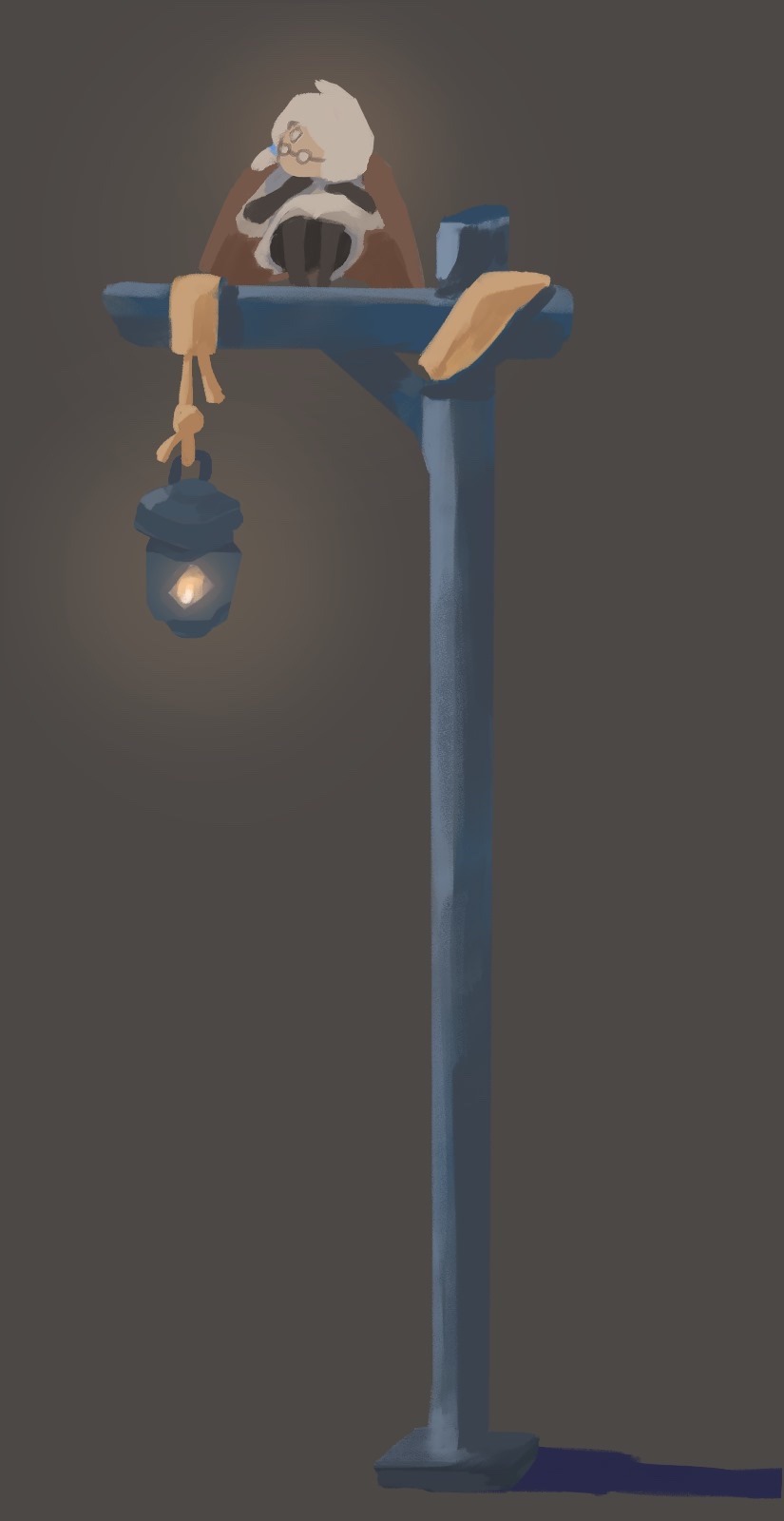
#OPEN FOR BETTER QUALITY#sky#sky children fanart#sky game#thatgamecompany#sky children of the light#artists on tumblr#sky cotl#children of the light#pov that one pigeon that stares at you menacingly from the lamppost as it prepares to shit right as you walk underneath it#glowy :0#heheh so silly
450 notes
·
View notes
Text
czuje sie jakbym byl narysowany na kartce papieru
7 notes
·
View notes
Text
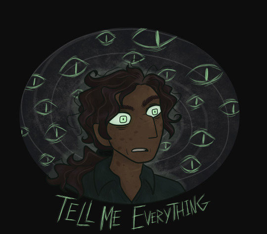
Season 3 now. Things are getting interesting 👀
transparent version under the cut

#i've had previous encounters with fanart of this podcast featuring a glowy green eyes guy. now assuming that was jon and his eye powers#anyway I love the green eyes thing. very cool :0#so this doodle was inspired by that ehehehe#art#my art#fanart#tma fanart#the magnus archives#tma#jonathan sims#tma jon#digital art#2023#turtlemurmurs#tw multiple eyes#tw scopophobia#tma spoilers#the magnus archives spoilers#magnus archives spoilers#queue've got this
51 notes
·
View notes
Text
I'm not sure if decorative little nightlights count, but the only time I fall asleep with an entire lamp on in the room is if I was too tired to turn it off.
42K notes
·
View notes
Text
On "smol bean McCarthyism"
I try to avoid politics discourse on my blog, but godDAMN, the latest wave of discourse makes me want to fucking puke. You know the one, where some shitlips liberal with zero(0) credible links to any major disabilities activism movement starts scolding and concern-trolling communists they've never actually met about how the big, mean, nawsty revolution will be soooooo unfair to disabled people, so you should just be quiet and not cause twouble uwu.
At least the OG McCarthy had the balls to admit what he stood for. When he stood up and said that white, Christian civilisation needed to be defended against the godless alien Bolshevik, you know he actually believed in it. Now all we get are some cynical, unprincipled glowie motherfuckers, posting on Tumblr dot com about "uwu, my Langley Handwer says that da wevolution is ableist ^~^. The only way to improve a disabled person's life is to buy them Amazon prime". This smol bean McCarthyism can suck the fucking week-old smegma off an unwashed donkey dick.
570 notes
·
View notes
Text
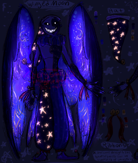
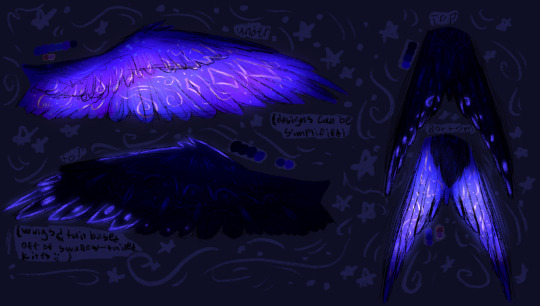
Winged moon reference :0
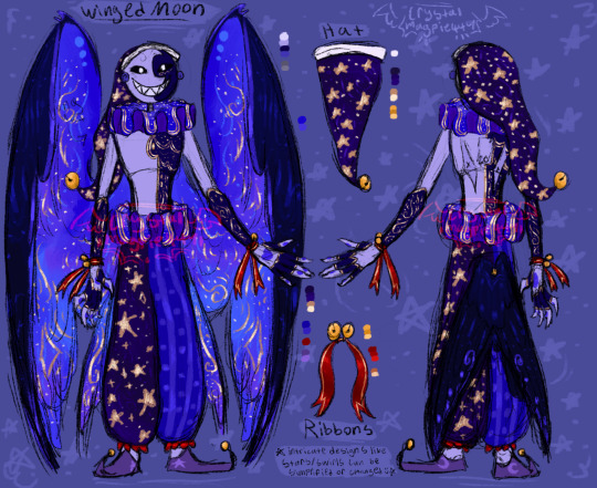
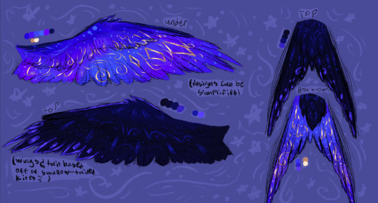
YAAYAYAYAYY I love Doing reference pages actually very proud of this >:) ook uhhm Feel free to use this if you want to draw him :00 Just make sure to tag me!! idk explodes
EDIT: I completely forgot to put the darkversion (glowy parts) BEHNJWDJUNHX
Winged sun reference
#Myart#winged dca au#winged dca moon#fnaf moon#moondrop#fnaf sb au#dca au#dca fandom#dca fanart#fnaf daycare attendant#fnaf moon x reader#id in alt text
1K notes
·
View notes
Note
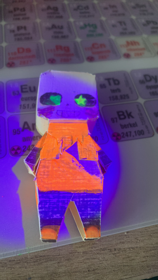
Glowy slash 0-0
GOSHHH MY SON IS GLOWYYYY 😭😭🤲🤲 AWWWWWWWW !!
498 notes
·
View notes
Text
@cooketch
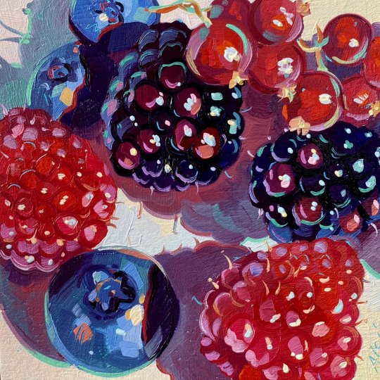
#posts i can smell#posts i can taste#red#blue :]#mmm tasty purple#woah :0#insp#food#lighting#fav#nostalgia inducing#🫐#geometric#posts i can feel#fluffy#texture#posts i can hear#foreshortening#reddish purple#glowy :]
223 notes
·
View notes
Note
pspspspspsps hi uhhh first time requesting umumumumum
Sagau but reader have played WonderEnd 0 (my current hyperfixation aaaaaaaaa), favorite/chosen ending is the bad ending. NULLan and the phantasmas will not hesitate to not only help reader escape, but also torment reader's tormentors psyche. NULLan may or may not turn half of the population into phantasmas lmao (can also include entities from the abyss and the hilichurls :3 ).
I watched some gameplay of WonderEnd 0 prior to this (here's a link to a playlist of no commentary gameplay), and, uh...
Damn the game is messed up, I won't spoil anything but the protagonist is highly tormented in the series, with one of the endings leading to downright su!c!de (if you can decipher that word)
Thankfully, this individual is focusing on the other ending. Which is better for our protagonist (he gets to live), but probably bad for everyone else...
Anyways, onwards!
Warning: Torture

You never knew you would ever see this place.
Teyvat, despite its lack of technological advances compared to the current era, resembled a dream world with its depictions of bygone eras of human history mixed with unnatural forces compared to the drab, destruction-plagued era Earth underwent in the past few centuries.
Genshin Impact, for its luck-intensive gacha game nature, obtained a spot in your mind as a game for reprisal. When you required space to get away from the necessities of life, the game helped you escape responsibilities for a little bit longer.
Then you decided to explore the fandom via the internet and descended upon a relatively unknown branch of Genshin, known as SAGAU. Delving into the primarily Tumblr-centralized works, you found it interesting to become the average Isekai protagonist among Teyvat.
Maybe you would tell everyone to stop calling you 'Your Grace' or some other holy title like that. You are but a regular human after all. Aside from that, maybe it wouldn't be so bad to play the role of a divine god capable of creating Teyvat.
And you did get a chance to play that role...
But you never expected it to be like this.
You don't recall how much time has passed ever since you arrived.
Upon stepping foot into Mondstadt, the nation of freedom, you were branded an impostor, a fraud, a heretic, any term for one pretending to be another just like in those Impostor AU Tumblr works.
Everyone was against you; the Knights of Favonius, Diluc, Mona, they just apparently decided that you're a fucking con artist for simply existing. If you knew this would come to you before, you would have deleted the game and moved on with your life.
Unfortunately, those were past events and you needed to run at that moment. Never in your life had you run like an athlete, hell you never required such a physical-minded body. But anything less would result in cuts by a sword or an arrow landing in your back, so you ran.
Thankfully, not all sought to see you dead; Hilichurls, Abyssal beings, and animals assisted you throughout the rampaging hunt. From bringing you food or resuscitating your stamina to providing you weapons, you found unlikely companionship among these normally hostile enemies.
Their efforts helped you reach Liyue, although unfortunately they too decided that you were a fraud attempting to deceive Teyvat for their own gain. Having the Millelith, the Liyue Qixing, and the Adepti all working together against you was definitely not fun for you. However, it was here that someone or something else decided to help you.
One time, a few Millelith guards had you cornered in Liyue Harbor, and Ningguang herself approached you.
"I must say you are very persistent in your perseverance against our efforts to capture you. But alas, I believe your journey ends here. Don't make this any harder than we want now."
And then it happened.
You saw your vision glitch like a computer suffering errors for a split second. And then, a figure dressed in black clothing stood between you and your pursuers. They pulled out a glowing and glitching yellow slip of paper.
They let it go and it floated above them, before glowing brighter and glitching your vision again for another second. After that, the figure still stood in its position, but everyone else lay on the floor. You blinked once in that moment and the figure disappeared. Wasting no more time, you escaped, surviving to live another day.
The same thing occurred in all the other nations. In Inazuma, the figure saved you from the Raiden Shogun's Musou no Hitotachi. However, this time the sky's color changed from night blue to blood red, with what appeared to be a giant eye with even smaller eyes surrounding it, with a ring of geometric shapes surrounding them. Akin to the encounter in Liyue, the abnormalities dissipated as quickly as they appeared.
In Sumeru, it was what appeared to be a stringed puppet with the appearance of a woman. She stood before you, holding you akin to a mother with her child. Her eyes were devoid of features, yet her lips formed a smile that radiated sweet dreams.
Fontaine and Natlan were the same; in Fontaine, the figure was accompanied by a group of strange spider-like creatures with a body akin to a bee, while in Natlan they were accompanied by a tall, lanky humanoid figure. Said figure had red eyes, a larger head, black holes with white dots covering the said head, and an unnerving grin that held no hostility to you.
You didn't even bother with Snezhnaya, since the nation wasn't even released yet and you didn't want to bother risking trekking into unknown territory. Thus, after all the chasing and abnormal encounters, you decided to simply rest at a Hilichurl camp in a forest and head to sleep.

"Hey, can you hear me?"
A soft male voice woke you from your slumber, and you immediately noticed something wrong with your environment.
It's not a forest at all, hell you doubt this is even Teyvat anymore. Instead, you awoke in a dark environment surrounded by dark figures with glowing white dots for eyes. Others had a singular, multicolored eye with bunny-like bodies.
And above all of them was a seriously massive black eye with red markings, angel wings, and a binary halo.
You also noticed something about your positioning.
You are upright in someone's lap. A very very comfortable lap at that.
Looking up, you saw a familiar face with black hair, a black halo, and two purple eyes, the left one glowing.
"...Holy shit Alan??" You said, mostly bewildered but also slightly exhausted (you just woke up after all). Alan simply smiled in response.
He chuckled a little before gently stroking your hair. "Hi again, graceful player. I never thought I'd see you again after you... got lost in this world, but it didn't take me too much work to end up here."
You picked up WonderEnd 0 a few days before the moment you were involuntarily thrust into Teyvat. Safe to say, you could tell that Alan was a cinnamon roll that the game just likes to fuck over in every single way possible. The "good ending" horrified you, and the "bad ending" made you a little uneasy. You definitely preferred the latter ending a lot more though.
The Alan you're seeing here is clearly the bad ending one, although his expression isn't one of cold-heartedness and snark, but rather a gentle one you saw akin to that of the puppet.
You had to ask him something. "Are you the one who-"
"Before you ask, yes. I was the one who assisted you along with the Phantasmas. I will not stand by while the one who guided me in times of distress is subjected to unjust subjugation by religious fanatics."
"Yeah, as if you could do it by yourself, Alan."
Someone else then appeared beside you two. They looked like Alan before the bad ending but with a halo, and their voice was deeper than Alan's.
"Is that Null?" You asked, and they responded. "Yes, you're right, player. I am Null, AKA the computer virus that helped Alan ascend to my level."
"Shut up Null, you are cringe," Alan responded with a smirk. Null's face then morphed into one of agitation.
"I AM NOT CRINGE!!!" Null yelled, but Alan kept going. "Says the one who requires a human body to even use their full power. Couldn't be me."
"GRRRRRRRR ALAN I AM GOING TO KILL YOU AND KILL YOU FOR THAT!"
You laughed a little at the little discourse between the two, and both of them turned to you. "What?" You asked, slightly clueless to your actions.
"...Protect the cinnamon roll of a player?"
"Protect the cinnamon roll of a player, Null."
Meanwhile, oblivious to you, your tormentors have become the tormented.
Everyone who dared even possess the mere thought of attacking or killing you suffered terrible nightmares, ranging from wandering in a long hallway with featureless human-like figures to attempting to dodge monsters filled with devices no one understood.
The Knights of Favonius frantically attempt to utilize a box-like device and are slaughtered by a disfigured blue mass.
The Millelith, Qixing, and Adepti painfully attempt to navigate the never-ending hallways while being chased down by a pale-skinned man in a suit with a black, featureless head.
The Raiden Shogun and her Shogunate army must painfully stand still akin to mannequins under the watchful and menacing gaze of the Eye.
The Akademiya struggle to play a never-ending song for a stringed woman who never suffers any form of physical abuse.
The Maison Gardiennage question their motives of justice as they are slaughtered by four-legged bee-like creatures, only to be revived once again to endure further suffering.
And the champions of war are merciless to a being with the grip strength of the moon's density as it crushes their skulls.
Teyvat had tried to deprive both Alan and Null of their player, and it will burn, bleed, but most importantly, suffer.
General Headcanons
Alan and Null bicker on the frequent, and it's funny to hear them do so when they decide to explore humanity's current slang.
"I HAVE MORE SKIBIDI RIZZ THAN YOU ALAN!" - Null
"Shut up Null, your looks are so downright atrocious that even Ohio wouldn't permit you entry" - Alan
"Both of you SHUT UP-" - You
One day, Alan decided to try something new with his nightmares.
"Hey [Name!] Want to see my idea for a nightmare?"
"Huh? Sure!"
So Alan opens up a little portal and...
"SKIBIDI DOP DOP DOP YES YES"
"WHAT THE FUCK ALAN"
When you're not in the dreamscape with the two, you simply hang around with the wild creatures of Teyvat.
Eventually, Alan decided to manifest himself in your world, and thankfully you managed to convince everyone that Alan was friendly you let him lay on your lap to prove it
He and Null help enhance the strength and intimidation factor of Hilichurls, Abyss Mages, and Abyss Lectors. All of a sudden, aside from the constant nightmares plaguing the lands, Teyvat suddenly finds itself encountering stronger and stronger enemies by the day.
They also get creepier designs too. Hilichurls now have soulless fake eyes, Abyss Mages wear disfigured costumes, etc.
However, when it's just you three, and Alan and Null aren't bickering, it's just a relaxing time.
You have not one, but two cinnamon rolls that you just get to cuddle akin to teddy bears. With smiles of contentment.
Overall, you're in heaven, and Teyvat is in hell :)
@a-star-intheabyss enjoy watching everyone suffer nightmares
And also sorry for the last part lmfao
#sagau#genshin impact#genshin sagau#genshin x reader#crossover#impostor au#impostor sagau#sagau impostor au#wonderend#wonderend 0
57 notes
·
View notes
Text
a very unserious aurora something or other
1: don't bring a sword to a knife fight
2: I see trees of green...
3: hard to be a people person when you aren't a person or have been isolated for a long ass time
4-7: really said "it's erin time" and erined all over the place
8-10: angsty catboy vs doctor malpractice
11: sleep is for the week. the week you have been ALIVE. please sleep
12: rulers who care more about their rules than their people suck
13 & 14: acab
15-18: ALL the glowy effects
19: the consequences of one's actions (it's pain the consequence is pain)
20-22: we put the yaoi Under The Ground
0: teehee
1: old friend time!
2: ocean time!
3: "the paragons are fightingggg"
#comic aurora#this is kinda shitposty and not comprehensive and doesn't reflect all of my real and true aurora opinions
80 notes
·
View notes
Note
Hi, someone asked u what it’s like to be at 0 and I saw your previous posts where u said "I feel like a glowy floating ball in a white room", or when u talked about the sweetness post transcendence and about the ecstasy, euphoria and peace that comes. So u mean everything u mentioned is already here and I just think it’s not ??
Yes yes yes exactly
Beyond and before the mind, this “experience” is always here, always now
And the mind is just another expression of Self, there’s nothing wrong with it at all;the same way you don’t put much thought into a car on the road is the same way you should deal with the mind
They’re both equal nothings in Consciousness
But dwell in your innate being, bask in it
See it for what it is and anything else to just be an expression of it
You literally can’t go wrong
35 notes
·
View notes
Text
@infamous-if i just thought youd find it funny to know the Infamous-brain-rot is so strong it now has made me go "SEVEN-CORE ♡" while watching my favorite tv show lmao rip
The fact that Ryan thinks Min’s shirt not fitting him would be worse than getting booed off stage. I know what you are.
#context: Ryan (brown jacket) and Min (grat jacket) grew up together and made a band together called Chicken Choice Judy. Min made shirts#Min got stage-fright basically and ran off and didnt go on stage with Ryan even after having made the shirts. Ryan went to go do penniless#gigs and a tour by himself basically? as Min tried to be responsible and stay with his family and do college. this all takes place in the#80s if i recall accurately. anyway. Ryan comes back and tricks Min to going on a train with him BASICALLY#and they up both running onto ✨️The Infinity Train✨️ (show is called Infinity Train. every season focuses on a new passenger protag. you ge#on the train by Making The Wrong Choice During A Crossroads In Your Life and then you get a glowy number on your hand that#you have to get to 0 in order to get off the train. time passes in real time while you are gone. s1 had a little girl gone for MONTHS. s3#had two kids become older teens by the end of the season. people put missing posters up. its crazy)#(train is hellish btw. very unsafe. characters can and do die. its also v fantasy sci-fi bc like.. you get a talking corgi thats a king on#this train. but yeah. it gets into Kid Horror. like Gravity Falls or Rats Of NIMH levels. this was on Cartoon Network and you can buy s1 an#s2 on dvd but s3 and s4 wERE ONLY AVAILABLE ON STREAMING FOR HBO MAX. EXCEPT THEY GOT KICKED OFF JUST LIKE OVER THE GARDEN WALL DID.#anyway. show has crazy good world-building and amazing writing. it was supposed to have 8 seasons (bc haha 8 is infinity on its side hahaha#but it got cancelled without warning right after s4 so the showrunners didnt write a send-off bc S4 JUST AIRED HOW COULD THEY)#anyway Min and Ryan have vibes (i forever hc theyre in love bC CMON). Chicken Choice Judy rules. anyway pre-break-up Seven. Ryan. can#you see my vision#im so right#infamous#seven lawless#Infinity train#ryan akagi#rymin#min gi park#(someone stop me from making an Infinity Train au of my mc and her Seven. the break-up night now ending with them both on THE train)
126 notes
·
View notes
Note
Hehehe this mayyyy be an unexpected one. A Deoxys board more on the petre side w/ chew toys n teethers in it? I rlly like collars with cute patterns, bows, or bells.
Some colors I like: orange, blue, yellow, forest brown, sage green, pink, purple
Kinda clothes: Androgynous with subtle masc lean, looks like it’d be easy on sensory issues
Stuffs I like: sparkly, glowy, jingly sounds, plushies, any animals (bugs, mammals, marine animals, reptiles, birds, u name it), easy on the eyes
Once I did a rp involving Arven and he named me “Tiramisu”, maybe u could see what kind of energy u get from that :0? Rember u don’t hav to include everything! Jus hav fun „^^„ n remember to take breaks

i hope this is close to what you wanted! super fun request!
#age dreaming#age regression#sfw agedre#agere moodboard#agere outfits#agere#age regressor#agere blog#sfw agere#agere outfit#request#no pacifier#pet regression#sfw petre#pet regressor#sfw pet regression#pokemon agere#pokemon
54 notes
·
View notes
Text
“[X]es are sooo easy to spot, you can see them from a mile away” is a sentiment that should immediately ring alarm bells whenever [X]es are characterised partly by trying to conceal the fact they are [X]es (e.g. spies): you can no longer import the standard heuristic of checking whether all the [X]es you’ve noticed have the property (viz. being easily detectable), bc you are very obviously biased in yr sample to just instances you have identified. That is to say, to unsuccessful instances. Obvious when you put it like that but somehow this simple point eludes a lot of ppl across a lot of domains
This post is brought to you by: me reading about the extent to which feds utterly penetrated revolutionary maoist orgs with informants in the 60s/70s from practically Day 0, mentally comparing this to the standard cope about glowies sticking out like a sore thumb
556 notes
·
View notes
Text
FAIR WARNING: Oversharing thoughts about lusting over how Adam would taste like somehow turns into a ramble about how Angels ACTUALLY taste like. Messy brainless drabble.
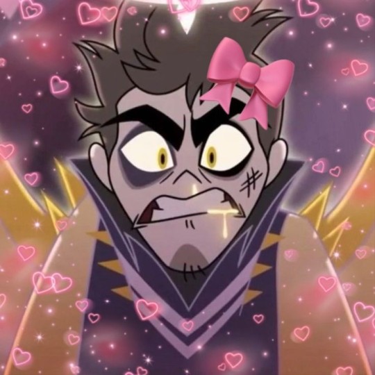
(I am legimately mentally ill and an oversharer if you're squeamish I advise you not to interact with me cuz I always say weird shit, I am absolutely shameless and unconcerned by backlash and I associated borderline cannibalism with pure adoration so bear with me😭)
You know when someone is so cute, you go "you're so cute, I could eat you" yes? No? Either way I legimately could take a bite out of someone I adore. I know people get this urge with animals, so perhaps it's more normal than I think
So I was thinking about Adam's cock, and what his cum would be and what it would taste like,(I came heh to the conclusion it would probably be alot, so thick, hard to swallow and salty asf due to his diet) then if that couldn't get any worse I started thinking "What if I bit his 40 inch dick off the moment he starts boasting and saying demeaning stuff", AND then that somehow went into even more unhinged territory and turned into what if I bit and swallowed his dick too?
Then I came back to my senses and I was like wow, that would be kinda gross and cruel huh?
Then I also thought meh it's gonna grow back in like 3 seconds cuz he ain't human and he'd probably be all scared or incredibly mad, and I dont mind either of those options so it's a win-win no matter what, he could either fuck me with pure rage or scramble away leave me a edged mess.
Then I stopped thinking horny and my thoughts went to "AH I love him so much I could bite a piece of his arm off T- T" to "Hold on a second what do angels taste like.."
You know what guys? The cannibals were kinda based in Hazbin Hotel?
Like honestly I myself, kinda wanna know what Angel's wings taste like? I feel like they'd be like huge chicken wings, and also Angels bleed glowy GOLD? That can't taste like blood, what does that taste like? Their blood looks like shiny sweetsour sauce, what if fried angels taste like chicken tenders marinated in sweet n sour sauce. Adam is 11 feet tall and fat ast he'd be literally delicious and he could feed whole cannibal town for a week.
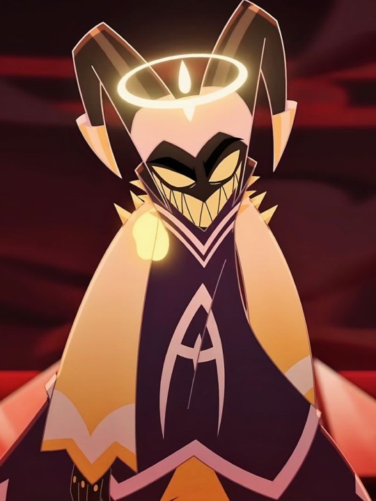
..I guess this means Adam isn't a dick, he's a cock heh.
No seriously what if I took a bite out of him? Then what? Who's gonna stop me? Salmonella? Nuh-huh. Is (fictional)cannibalism a love language? Can it be actively practiced? Should I take my pills? Should I stop thinking about eating men I like? What sin do these thoughts represent? Lust? Gluttony? Even if there's 0 malice in my words? Is this what they call girl thoughts? Should i stop? Should I go dry my hair? I think I should go dry my hair.
This will get me on some sort of blacklist and blocked by alot of people I think
#i say this while i smell like strawberries and cotton candies#Literally in a babygirl nightgown with my facemask on and a lil pink bow holding my fringe out of my face#what kind of love is this#is this cute aggression#this all stemmed from craving sushi and adam's cock#this turned into craving Adam's cock#to thinking of Adam as a cock#i think this is a sign i need to take my pills#does this mean Adam is literally a girldinner#girl dinner#heh#someone needs to take away my phone#i can't be the only one#im just a girl#just girly thoughts#babygirl#babygirl thoughts#cannibal love#cannibalisticthoughts#hazbin hotel adam#hazbin hotel#adam hazbin hotel#hazbin adam#adam x reader#hazbin hotel adam x reader#my little mysoginist </3#dickmaster#adam#hazbin adam x reader#adam x reader smut
80 notes
·
View notes
Text

When you were just practicing drawing and somehow that little doodle turned into this 0 o
But wait is that glowy ninpo stuff? Yes, yes it is. It only appears when she is in clear focus, especially in a fight.

#rottmnt#rise of the tmnt#tmnt 2018#rottmnt fanart#tmnt oc#rise of the teenage mutant ninja turtles#Toby sparrow#rise oc#rottmnt original character
20 notes
·
View notes