#gives me some ideas for how to add detail to my comic without shading tho
Explore tagged Tumblr posts
Text
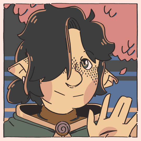
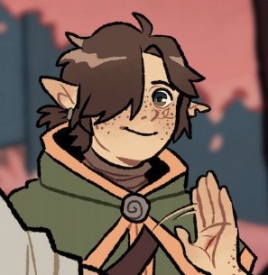
little redraw of hyrule from @linked-maze ^^
#legend of zelda#linked maze#lm hyrule#this was meant to just be hyrule#but i was referencing this one panel so much i just turned it into a redraw#unsure how i feel abt the way i used the colors#oh well#gives me some ideas for how to add detail to my comic without shading tho#all in all a good time
156 notes
·
View notes
Text


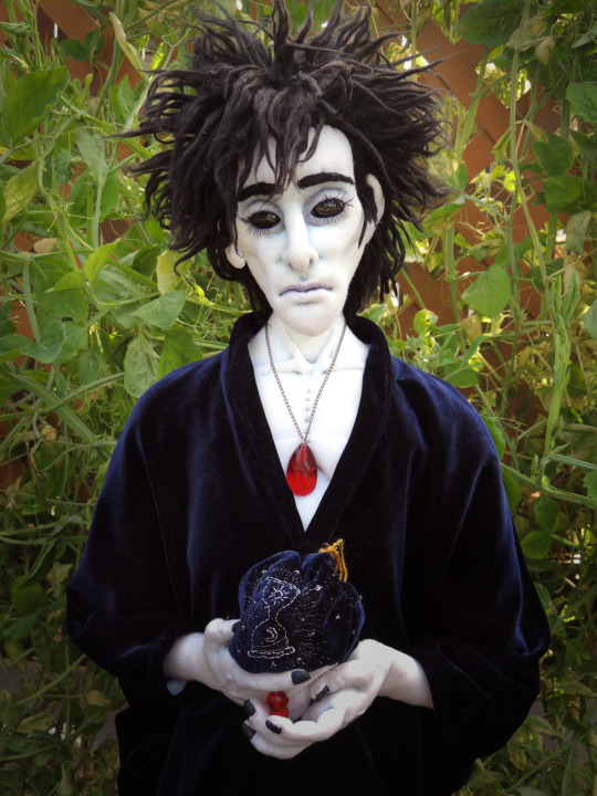
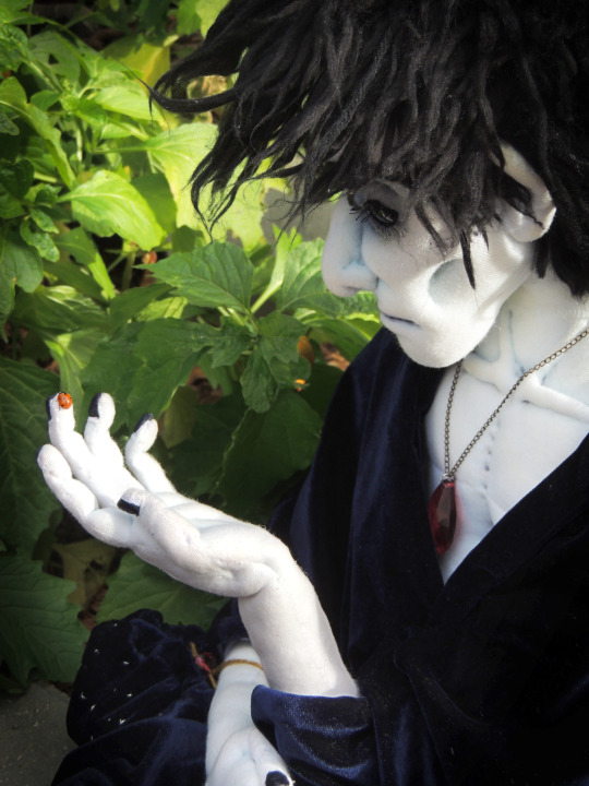

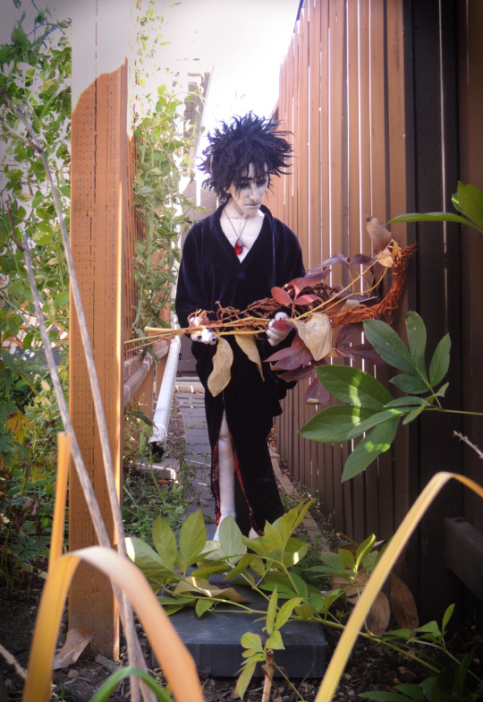
Part 2: A Dream of an Autumn Garden
A few more photos of Mr. Morpheus, continuing from my post here!
As I said on the other photoset, I'm very happy & proud of him! I'm happy I decided to take my time to get him just how I wanted & edit the photos I took nicely. I hope you all love him too. Sweet dreams~
I have included a bunch of Cool Facts about how I made him under the cut if you are so inclined!
Started: Late Jan 2022 / Finished: Dec 30 2022
Approx work hours- 273 hours (worked on average every 3rd day out of 274 days; averaged 3h/session)
Times I remade something because I messed it up/wasn't happy with it: Hands- 2; Feet- 2; Head- 2.5; Body- 1; Clothes: 3
Pattern: trial, error & determination
Height: 3ft tall
Materials:
stretch jersey knit (body)
polyfill (stuffing)
brushed out acrylic yarn (hair)
star sapphire x2 (eyes)
pipe cleaner (hand armature)
wooden dowels/18 gauge wire (elbow/arm skeleton that keeps snapping I may add)
acrylic paint/pastels (shading & details)
acrylic thread (body sculpting & upper eyelashes)
stretch velvet/velvet burnout, cotton (clothes)
Fun facts:
his look was inspired by his overall appearance in the comics; I particularily like the depictions done by Jill Thompson, Mike Dringenberg & Marc Hempel!
his arms and legs are jointed in the same way as many teddy bears are: you use a washer, nut & bolt to butt-up the limb against the body internally and it gives the limbs full rotation. First time I have tried the method and it's definitely something I'll try again!
I had no idea how I was going to do the inset eyes, but I was determined to have them as some sort of stone. I had to redo his first head completely because I cut too far in! Eventually I got it to work by creating a "backcushion" with clay for the stones, and then closed and sculpted the eyelids overtop to secure them in.
You can't see in most of my photos but his eyes are star sapphire: when light hits them correctly, it causes a ✨to appear just like his eyes in the comics~!
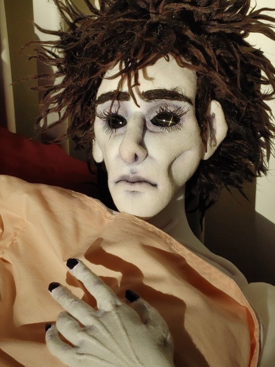
making his hand & feet were a challenge, especially thinking about where to put the needle through to sculpt tendons, nails, etc (and also deciding how detailed to get without looking strange). I think I learned a lot tho and I'm very proud of the hands
my favorite sculpted parts are the collar bone/chest, the right hand & the nose~
because the skin is white, he gets very dirty with his black clothes, so I had to line all of them in white. He also has to soak in bleach once in a while to maintain his complexion (LOL)
A signature somehwere on his person xD
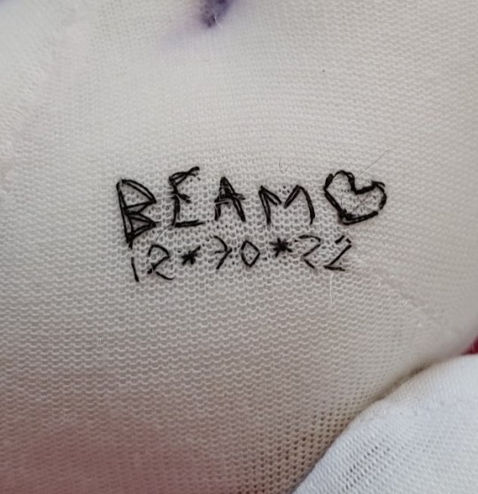
Thank you all again for your nice tags & comments so far on my work. If you guys would like for me to share some behind the scenes photos of this photoshoot, or WIP photos of me making him, let me know and if there's enough interest maybe I'll make a post down the road!
#the sandman#dream of the endless#dolls#beamies buddies#thank you all so much again for viewing him with your eyeballs! i can now rest#cloth dolls#custom dolls#crafts#also if you happen to have any questions about how i made anything feel free to send an ask!
184 notes
·
View notes
Text
Can we talk about art for a second?
I’m pretty sure none of you are following me for art content because that’s just not what I do normally, but I’ve been working on some stuff and I just wanted to share. Here’s my current WIP:
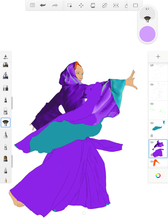
I’m using sketchbook on my iPad Pro, and...can we just talk about process for a second? I’m gonna put this behind a cut just in case it gets long and because this isn’t my normal content.
So I’ve been drawing almost my entire life, but I didn’t really start teaching myself anything good until around 9th grade (which is like...14 years old.). I started by copying Disney characters and then I was introduced to comic books and I copied those. I was in college when digital art start making its way into the art world. People would color their pencil drawings (this was shortly before tablets, so...with a mouse.). I grew into an artist around the time people like Aimee Major and Stephanie Lostimolo were really starting to stand out. And I don’t know about other fandoms, but I was in the gargoyles fandom and from what I can tell...a LOT of modern digital art has its genesis in that fandom. Anyway, what I’m trying to say here is that I started using photoshop with version 3.0 and I’ve had a Wacom tablet almost since the day they came out (gen one graphire tablet represent!).
I’ve never, in all that time, gotten the hang of digital painting. I have a hard time with tablets because you can’t tilt them like you can tilt a paper and it takes a weird sort of hand-eye-screen coordination that I just never mastered. But digital art is so beautiful that I’ve always WANTED to be able to do it. I can make graphics and edit photos but I have a hard time with painting. I have seen the million myriad ways of doing it, and most of them start with the same idea: lay down flats and then lighten or darken as necessary. And this never worked for me because a, the airbrush tool isn’t painterly enough for me and b, it takes for goddamned EVER. For. Ever. And I’m a fast artist! I can spit out a whole line drawing in like a half hour-45 mins with traditional media. But I have adhd, and so finishing long term large scale detailed projects is often not in the cards for me. So dumping like 48 hours of work time into a painting isn’t going to work for me.
But recently I’ve gotten back into art again and I’ve been watching the sky artist of the year and I decided I was curious about oil painting and, well, one hyperfixation later, here we are. I don’t have the money or space for actual oil painting, so I went to sketchbook to see if there was an alternative, and there is! So because I wanted to learn how to oil paint I finally figured out how to digitally paint and I’m gonna share that with you in case you, like me, struggle with the time input and focus required to do digital art.
First, I started practicing poses by drawing an outline over any image that caught my fancy. I have a good understanding of human anatomy because of my science background, but my poses aren’t creative and I especially struggle with perspective and multiple figures in an image. So I started to do line drawings over an image. Here’s the stock image I used for the WIP:
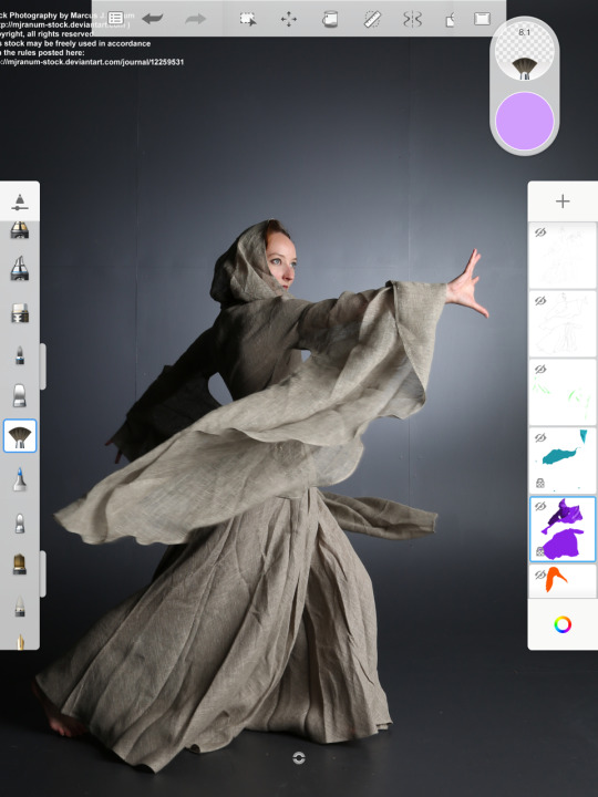
Look at all that fabric! Look at the movement! I love it. So I traced it:
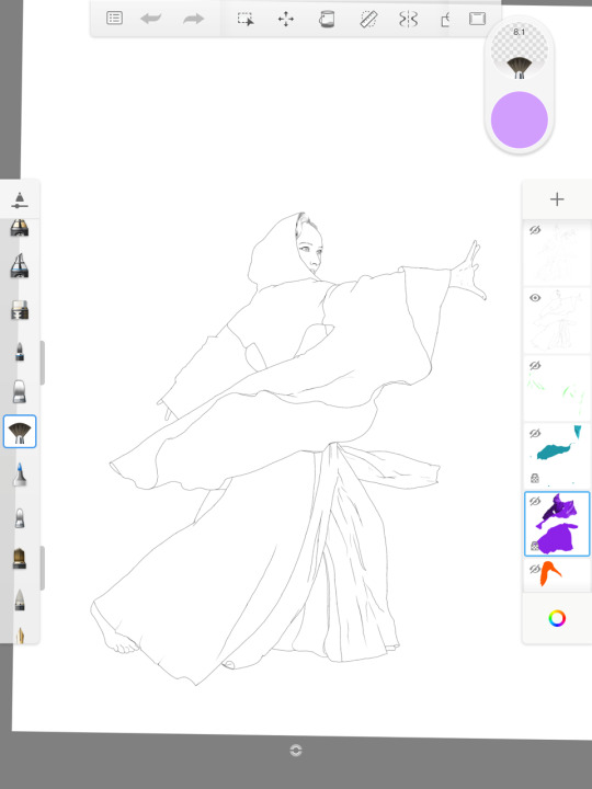
Yes, TRACED, because tracing is a tool like anything else.
Then I choose colors. I pick 5: a midtone (the color you want the thing to be perceived as. In my case, you can see it in the WIP at the top.), a slight dark, a slight light, a blackened tone for deep shadow, and a very light tone for highlights. I always default to white light when choosing these colors, and I’ll get to my reasoning further down. The palette for the robe looks like this:

(Ignore the tan and blue, they’re for another project)
Then you start to lay down flats. Now, I do this with the synthetic oil brush in sketchbook because I like the texture (this image though I’d laid down the flats with the airbrush months ago and didn’t want to redo it, hence the lack of texture and the 100% opacity.), and as with oils, my approach to digital now is to layer rather than cover. Staying in the lines isn’t important. In fact, you should go outside of the lines because it will help you get shadows and highlights along the edges later. What IS important is putting everything on different layers. When in doubt, new layer. I work from back to front, which means that the base layer is the background. In front of that is the skin, in front of that is the robe, in front of that is the teal inside of the robe, in front of that is accessories. Hair varies depending on what’s going on with the image. Here I’ll probably put it between the skin and robe. Ask yourself: what is this covered by? And the use that to decide layer placement. Special effects are a whole other thing, as are highlights. I’ll get to that in a second tho.
The next step is to create an oversketch. This serves much the same function as an undersketch in oil painting, only in reverse because your reference photo is under - and covered - by your work. I started doing it because as I was painting I was flicking the layer on and off, making it transparent, whatever just to see where the shadows are on the reference image. It was a real pain in the rear. So I started making the blobs and borders of the highlights and shadows with an oversketch. You don’t need a method for telling which boundaries are for shadows and which are highlights because for that you can just turn the layer on and off. Just mark where the General shapes are. Here’s the oversketch for this drawing:
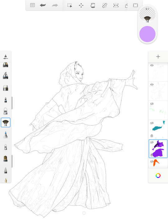
See? Blobs of General Area. When you’re painting, use them to lay down color and then turn them off when you’re blending because they’re not part of the final image and you don’t want to end up with gaps that were covered by the over sketch. To do this, I use the 9b pencil tool and black, but tbh just se whatever you like. That’s just my preference.
Now, for the shading. I started by trying a bunch of different natural media brushes but I eventually ended up sticking on a kind of weird choice: the fan brush. I keep the flow around 20%, which gives me these nice textured marks to lay down color, but then if I don’t lift the pencil up it stops laying down color and instead starts to blend. This means a, I can make it as smooth or painterly as I like with one tool and b, I can paint and blend with the same tool. No more muddying up my drawings by over-blending with the smudge. No losing the texture while blending because it blends with the texture. And the shape of the fan brush allows me to be smudgy with I like, but also will do hard edges. Plus the blending thins out the colors so I can get neat effects by laying down colors on top of each other because it stays a little transparent. You end up needing to lay down a lot of “paint” to get opacity but that’s ok because it allows you to make more complex colors. That’s good, because things like skin aren’t a color. They’re chemical: they’re melanin in cells over blood vessels and muscle and skin is transparent. Even very dark skinned people have undertones. So when you build up paint this way you can capture undertones without ruining your painting. Which, I’m pretty sure, is how it works in oils. But it translates well to digital.
So at this point, painting your image is basically a calming adult coloring book. You lay down color, blend, check your reference, repeat. But a few things to keep in mind:
- Take note of the darkest and lightest areas of the image. Nothing should be lighter or darker than these areas. Nothing in the drawing above will be darker than her back because that’s the darkest area of the painting.
- See the trees and the forest. Sometimes a detail doesn’t make any sense until you’ve seen it in context. Trust your guide and your photo reference. But also make sure that you don’t get so stuck in the details that you can’t relate one area to another. A fold that goes through two areas should be consistent across those two areas, even if you painted them separately. An area might seem dark in comparison to what’s next to it, but it isn’t as dark as the darkest area of the image so don’t go whole hog. Keep it in context.
- Folds in clothing aren’t nonsensical. They are a result of the movement and weight of the fabric. Ergo, the shadows and highlights that create them should also make sense.
- If you’re having a hard time figuring out where the highlights and shadows are, make a copy of the reference image layer and desaturate in, then turn off the colored reference layer.
Lastly, I’m finding it helpful to keep the highlights from colored light on its own layer. I didn’t used to do this, I used to use the colored light as one of my highlight colors. But the truth is that most objects are shaded by more than one light source, and so I’ve decided to do all the shading as white light and then the green (which will eventually be from some kind of green magic.) is on a different layer. My reasoning for this is that it helps keep the integrity of the shading and it prevents the colors from bending too much and getting muddy. So if I add a green highlight and I don’t like it then it’s easy to remove. I don’t have a highlight and shading that’s now ruined by green because I’ve been using light flow brushes. So colored light on its own layer. How much of a highlight you give it entirely depends on how strong your light sources is and whatnot. So far I’m satisfied with just hitting the high points, but I may change that later on.
When you’re done painting the area, go ahead and erase all of the excess paint around the edges of it and clean it up. I like to leave the black outline as part of the image, but if you don’t want to do that you should turn it on and off as necessary while painting so you can make sure to fill in gaps and get clean lines between the areas of color.
So if you made it all the way down here, thanks for reading my ramble. :)
#art#images#painting#digital art#digital painting#method#how to#reference image#sketchbook#ipad painting#ipad#hobbies#drawing#art help
8 notes
·
View notes