#geometric nail designs
Explore tagged Tumblr posts
Text
The Beauty Of Geometric Nail Art Made Easy
Geometric nail art is a popular trend that is perfect for those who want to add a touch of sophistication and elegance to their nails. It can also be a fun and stylish way to add personality to your manicure. This type of nail art uses geometric shapes, such as triangles, squares, and circles, to create unique and eye-catching designs. They can be as simple or as complex as you like, and there…

View On WordPress
#nailaddict#nailartist#nailbusiness#nailbusinessbranding#nailbusinesscards#nailbusinesscommunity#nailbusinessideas#nailcare#naildesigns#Best Nail Designs#geometric nail art#geometric nail art design ideas#geometric nail art designs#geometric nail design ideas#geometric nail designs#geometric nails#Nails
1 note
·
View note
Text

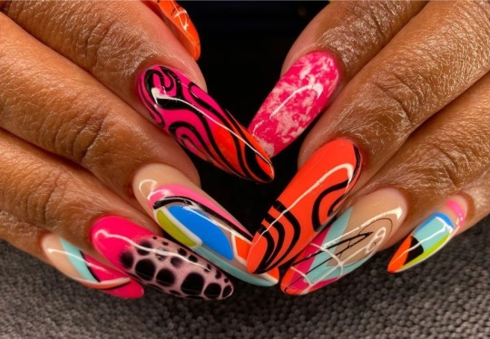
@studiosixty12
#@studiosixty12#uploads#round shape#multi design#pink#red#orange#black#blue#green#geometric#abstract#blooming gel#skin tone#nails
24 notes
·
View notes
Text
how each skz member would do their nails - hyung line


pairing: ot8 hyung line x reader
summary: how skz hyung line would do their nails
genre: ...
a/n: should i do the maknaes ?

bang chan ♡
sleek, short nails with a glossy finish
minimalist designs featuring simple lines or dots
soft pastel colors like baby blue or mint green
occasional graphic designs that showcase his creativity
nail art inspired by his favorite music or quotes
a touch of silver or gold foil for a hint of glam
maybe even matching nails with his close friends
well-groomed but low-maintenance to fit his busy lifestyle
lee know ♡
sharp, medium-length nails with a smooth black finish
edgy designs like geometric patterns or spikes
bold colors like deep red or dark purple to reflect his fierce side
maybe some nail art inspired by cats, as he loves them
a bit of nail art with star motifs or glitter for a touch of flair
matte finish on some nails for contrast
intricate designs that showcase his attention to detail
layered designs that represent his layered personality
changbin ♡
sturdy, well-kept nails with a sporty vibe
bright, energetic colors like neon green or vibrant orange
bold designs inspired by his rap style, such as graffiti
maybe some nail art with music notes or sound waves
occasional use of stickers or decals to express his playful side
clean and polished to reflect his strong work ethic
a mix of shiny and matte finishes for variety
short and practical, perfect for his active lifestyle
hyunjin ♡
we already did hyunjin's, but i think elegant nails with a glossy finish
soft, romantic colors like lavender or pink mixed with black accents
intricate, dark designs or delicate lace patterns
possibly some holographic or iridescent accents
nail art that highlights his artistic nature, like brushstroke designs
minimalist and chic, reflecting his fashion sense
maybe a touch of gold or silver for added sophistication
well-maintained and perfect for stage performances

a/n: ...yea i think i'll do the maknaes
#a/n: comment for the maknae line version ♡#skz#stray kids x reader#skz x reader#stray kids fluff#skz scenarios#stray kids fanfiction#stray kids minho#skz minho#skz leeknow#stray kids leeknow#stray kids bang chan#skz bangchan#stray kids bangchan#changbin#skz changbin#stray kids changbin#skz hyunjin#stray kids hyunjin#skz imagines#stray kids fanfic#stray kids scenarios
32 notes
·
View notes
Text
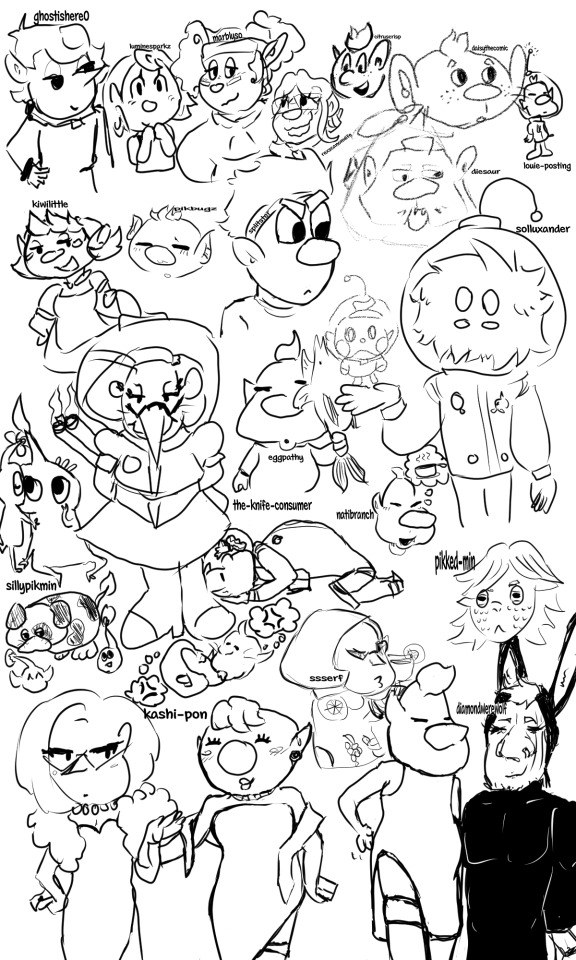
Art practice by trying some other artist's styles that I'm a huge fan of!
From Top Left to Bottom Right:
@ghostishere0 - the original reason I started this doodle, as I wanted to draw a "shepherd lovers squad" and their OC (who I don't know the name of F) was the perfect fit for it.
@luminesparkz - the best interpretation of Pom pikmin. If I were Mr. Nitendo, I would make them the official comic creator along with the manga comics.
@marblyso - If I was a little more unhinged and made a shrine to Erma Shepherd, it would be mostly marblyso's art of her, it's my absolute favorite Erma depiction <3
@rexscanonwife - another OC that I don't know the name of, but she makes such a cute pair with Shepherd and has such cute art that why not, let Shepherd have multiple canon wives at this point.
@citruscrisp - I think this is secretly Alph in an alternate universe where he makes comics about himself, because citrus has Alph's character SPOT ON, and also loves to put that boy in a situation (which I am happy for, I enjoy seeing that boy in a situation)
@daisythecomic - oooaaaaaaaaaa they look like little mice people they look so soft and sweet I love them so muuuuuuuuuccchhhhhhhhh
@louie-posting - I can't not include actual Louie Pikmin on this list.
@kiwilittle - the soft, the sweet, the one who makes the best family style art, really making me wish I was an inch tall so I could go to holidays with the olimar family, also their wife design is so cute that if Olimar didn't already get it I would shoot my shot for her m a a m
@pikbugz - really nails the soft aesthetic that makes pikmin such a calming series, and their coloring style is so soft and good that it gives me the ratatouille nostalgia flashback moment.
@splitster - more than just the wraith au guy, they are the one who makes incredible and funny comics; I've seen so many fics with the rescue corps where I can pick up that yes, this trait came from a splitster comic, and that's a GOOD thing. Made me actually LIKE Dingo, the nerve.
@diesaur - I can't do diesaur's incredible, unique art justice, they are amazing at using geometrics and have the best charlie (his little teefs...)
@solluxander - Cars, one of my favorite pikmin Ocs I've ever seen! Collin deserves a slightly unhinged sentient fluffball boyfriend, and I always love seeing the new ways Cars will interact with him.
@sillypikmin - all hail the best pikposter, who I'm still convinced is an actual leafling living on actual pnf-404, literally every time I have a bad day I look at drawings of Moss and feel better.
@eggpathy - thank goodness they came back to give us old man yaoi. I keep their drawing of olimar kissing the pikmin good night on my phone and look at it before I go to sleep and so far I have yet to have a single nightmare.
@the-knife-consumer - the only person I trust with Louittany, toxic yuri my beloved, I just adore their beasty brittany design so so much, I wish I could have a small brittany to live in my house...
anyway they have the best headcanons for our beloved blorbo hamster people
@natibranch - there's a voice line of Louie going "wa-ha!" in this really cute sing-song voice and every time I see any art by natibranch I hear that sound in my head as a little burst of serotonin, they just nail that exact feeling so so well.
@pikked-min - Another of my favorite Pikmin OCs, Yuva! A really interesting and unique character concept with a lot of thought put into the worldbuilding, followed by a strong unusual personality that had me looking at the pikmin world through a new perspective entirely. Please, someone, give them some sunglasses. Read the fic it's so good
@ssserf - artistic and deep while still somehow looking like official nintendo tm art, genuinely the best at the pikmin proportions, how could I resist trying my hand at the classic amazing beautiful Brittany Fruit Sweater moment, literally SO iconic
@kashi-pon - while I was working on the part of this that was just kashi's various highlife dresses there was a part of me that wanted to dedicate the rest of the space to paying homage to the joke comic of Louie lifting his skirt to show Olimar that he's wearing shorts, except this dress....well......
@diamondwerewolf - the reason we got louie in a little bunny outfit anyway, and thus why we got kashi's dress version. you single-handedly turned Louie into a tumblr sexyman, how could you
81 notes
·
View notes
Text
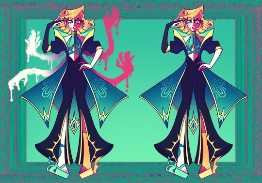
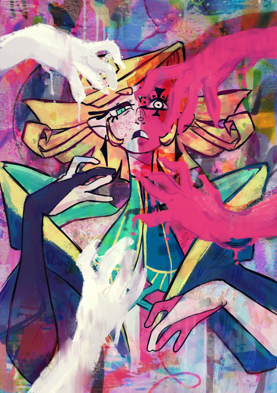

Debating on posting this for a while, since I don't really use tumblr all that often. Here's sort of a AU slash OCfied version of Eve.
Eden's Paradise. When co working on their design with a friend [@/thewalkingbaka ] [ The others arts are made by @/cometshaper @/cryyon on twitter!] We really wanted to nail in more of the abstract arty vibe with this AU Throughout Eve's design and boss battle the theme's of escapism through the medium of art really struck and inspired me for a lot of this design. Escape reality embrace the abstract and be free from the retraints that is your mind. Artist use art to create idealistic worlds, scenes and images and then the theme of EDEN came up. With EVE being the name of the first woman in the garden of EDEN it just made sense,. The usage of wet and fluid elements in her design contrasted by the sharp / pointed geometric shapes are the perfect balance of framed freedom. Her extra arms are made of paint and appear smudge and very abstract, something that inhuman and strange. The eyes are themes of the phrase "Beauty is in the eye of the beholder' She see's beauty in everything, the bad and the good. The ugly and the so called beautiful, kinda why I have one of her eyes covered with the funky paint eye. To escape the chains of reality, that bound us to the conforms of society. The restrictions that suffocate of our freedom and individuality, to paint is to be free Freedom to express one's self, freedom to make the life you want your own. to be who you were always meant to be. To paint is to mold and shape into your desires. forever changing, forever free For that is paradise and the frames that behold these pictures of gates to paradise, her very own garden of EDEN. That's pretty much my thought process and lore kind of with this take? IG? I'll have more outfits with designs featuring more garden and nature elements as of right now this is her main look. I don't see them as someone who follows the binary at all, when it comes to looks and gender expression. A very all pronoun, Non binary artist that bends and breaks whatever society deems the norm- I'll go on about them in full detail in another post this is already longenough
#I'll be drawing some art for them soon cuz I love this au I made for them a lot lmao#no straight roads#nsr#nsr eve#maybe i'll post my 1010 and neon au designs as well
163 notes
·
View notes
Text


We are thrilled to announce the release of the official Foetus VEIN shirt! Celebrating the Foetus album from 2007, the shirt is adapted from the geometric VEIN artwork. The striking design, by JG Thirlwell, is printed in black, white and red on an athletic gray shirt. It’s printed on a Bella Canvas brand soft lightweight 100% cotton shirt, and is available in small, medium, large, XL, 2XL, 3XL and babydoll.
Foetus THAW and NAIL + Wiseblood Dirtdish shirts also available!
Grab it at the Foetus Shoppe or JG Thirlwell Bandcamp Page
15 notes
·
View notes
Text
This one, contrary to that cat paw I've posted previously, really felt like I was just sort of tossing things together. But even despite that, I really enjoyed the heck out of the process of this mend, bit by bit making art out of something that's been bothering me.

Step one: get those holes to hole-d still! Threw some whip-stitches onto the fabric to get these three little cat-pokes to no longer expand through the fabric. Did this with some leftover scraps of light-purple thread from an earlier project we've seen around here, the finger guns mask! We don't quite know it at this point, but that color choice is going to make a lot of fuss later.

After a bit of digging around in RSN Stitchbank, I found an interesting pattern that I thought would be super fun to execute here, called the wild goose chase stitch: https://rsnstitchbank.org/stitch/wild-goose-chase-stitch So, following the pattern, we first lay down the blue stitching (counting rows of stitches in the tshirt instead of canvas openings).


Then, after a good little bit of fuss to get all those stitches to align Just So^tm over the hole, (seriously, it was a lot of wrangling horizontal stitches where they'd fit as anchoring points, knotting the vertical stitches in place so they'd fit right, etc, etc) since they didn't really have fabric to anchor in for a little bit there, we wound up with the purple stitching looking like so (quite good, I'd say, given I was improvising this while waiting in line at the DMV!), not quite perfectly saving that arrowed effect for one batch, but not half bad either.

Lastly but certainly not leastly for the wild goose chase here, we've got a third set of stitches, in a lovely pink color this time! But, trouble abounds, I measured completely wrong when setting this stitch up, there's still two more holes that need covering! Whatever shall I do?

Enter a very useful new tool we'll be seeing a lot of in future mends: dissolvable backing! This simply self-adheres to the fabric, and washes away quite easily with nothing more than water. The longer I was looking at the wild-goose chase stitch, wondering what I could put over the two holes, I honestly felt that the texture would fit right in along the border in a tetris arcade game.

So, I landed on a design that looks like a t-piece from everyone's favorite falling block game! First up, some simple black outline stitches, to make sure that the form makes sense as a tetris piece to the passing eye. Much, MUCH easier with the drawn-on guidelines here, even despite the pleasing geometric shape of tetrominos, I'm not sure that I could have nailed the stitch placement quite so nicely without the help of the dissolvable backing.

With the addition of some dark purple satin stitching, we've got a T tetromino! I haven't grabbed a good shot of this after it went into the wash, but I promise, the backing dissolved just fine after heading into the laundry. We'll be seeing a lot of that backing for future mends, it's super handy, especially for sashiko prep!
#Solarpunk#visible mending#clothing repair#mending#hand sewing#fiber arts#fabric arts#crafts#diy craft#Ecopunk#sustainable fashion#slow fashion#tetris#wild goose chase stitch#embroidery#traditional embroidery#queue.queue#a thousand words#nesterian lifestylings#this was SUCH a hard one to type because the n key on my keyboard has been misbehaving#I gotta fuss with the switch under there#very VERY fun mend though
21 notes
·
View notes
Text


UB-08 Echo and UB-09 Cling have evolved! Full 'Dex entries and thought process below the cut.
If you're wondering why the first-sighting details are so specific... I'm working on some AU stuff. I'll post the details once I get the info sheet done. But for now, let's just say I missed the train by about 8 years. Better late than never >:3c


I had a rough idea of what UB-08 Resonance looked like since I first conceptualized the line years ago, but it was after finalizing Echo's design that this one really came together. The face could easily be adapted to look like both long ears and cool shades, and the cloak transitions nicely into a full-on bell. (Said bell was fairly difficult, being geometric and all, but I think it turned out alright.) I wanted to go for a vibe like ancient and mysterious space tech, in keeping with the alien tropes the Ultra Beasts have in their designs. I imagine it being physically tanky, but mainly using special attacks.


UB-09 Snare's line went through a bunch of iterations, none of which seemed to stick (*rimshot*) until very recently. I knew from the beginning that it was gonna be a sundew. They're just really freaky and cool. Most of my attempts looked way too "alien" for a hypothetical starter, until I added the reptilian alien trope to the mix. I also decided to give it markings that suggest a snazzy space-explorer uniform. And with Naganadel having a bit of Xenomorph vibes in its design, I thought it'd be neat to throw a bit of Predator into one of its counterparts. I'm really happy with the result. It's so satisfying to nail a design that you've been stuck on for a hot minute. Anyway, this one's more of a glass cannon, with good Speed and decent offenses on both sides (leaning towards physical).
#pokemon#fakemon#fake pokemon#ultra beasts#ultra beast fakemon#alien#bat#bell#gargoyle#chameleon#lizard#predator#reptilian#sundew#ultra beast au#ub au#i've seen a few AUs like the one i'm planning#but those didn't have fakemon#more beasts to play with >:3c#also it only makes sense that there'd be more ultra beast species than are currently known
20 notes
·
View notes
Text
ASMO CHARACTER DESIGN JUDGING
@ewesless You ask for more, you get more. PLEASE REMEMBER EVERYONE IS ENTITLED TO THEIR OWN OPINION AND I'M NOT HATING ON THE CREATOR, THESE ARE JUST THINGS I DONT LIKE.
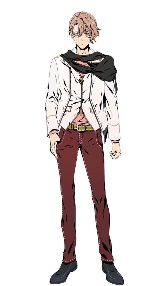
First, the classic. I didn't realize the stitching on his pants till now but it is BAAAD. The belt is a weird shit-green? I think they were leaning to gold but it is NOT giving gold. I cant tell if he's wearing a weird vest under his jacket or if it's part of it- The scarf is cute and I like the shirt.
LETS DO SOME TWEAKING HM??
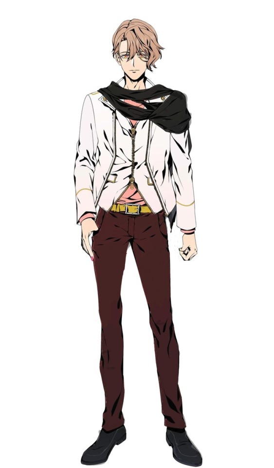
I took the seams off the pants but without them, the pants clashed really badly with the shirt so I made the pants a bit darker. I made the scarf and shoes a bit darker too because as much as the scarf looked fine against the jacket, the shoes looked gray against the pants and I wanted them to match the way they did before. I made the belt a more orange/yellow color so it would hopefully look more gold than the shit green belt from before. As much as I don't know what the jacket/vest is it IS cute so I left it alone and I didn't touch the shirt.
NEXT
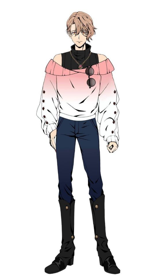
I actually like this outfit a lot- Its comfy and cute. The shoes are kinda weird- And I think the pants blend into the boots too well, I can't tell them apart (I'm also blind as hell so this is probably a me problem)
LETS DO IT
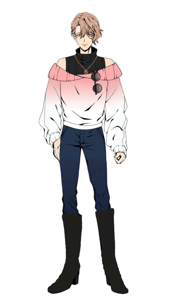
I made the boots a little bigger and took away ALL the buttons from the outfit because I personally didn't like it. It felt like he was modeling and wearing a specific collection, instead of wearing something he liked. I made the pants a smidge lighter and that's it!
NEXT
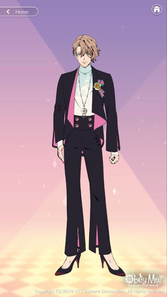
Please don't kill me over this PLEASE. I love him but the little thing on his jacket(I FORGOT THE NAME) is very...Interesting. I dont like how the shoes are red and the rest of the outfit is pink/light blue/gold and green 😭 And those heels look small on him- The necklace is gorgeous but the fact the necklace is silver, the buttons on his pants are bronze and the rose is gold is so awful to me. The pattern on the sweater is also weird-
LETS "FIX" IT
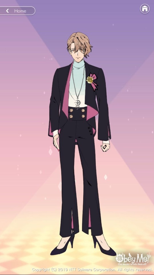
First, I took the red off the shoes and made them look like they got a little better. I took away the pattern on his sweater but I liked the kinda gradient affect so I kept that. I made his buttons match his rose, I made the color of the ribbon match the rest of the pink in the outfit because we can only have so many colors before we start looking weird-
NEXT
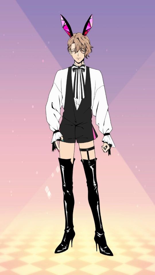
I'm sorry they ate these the FUCK up. But because this is about what I think I'll change it up a little-
WEEEEEE
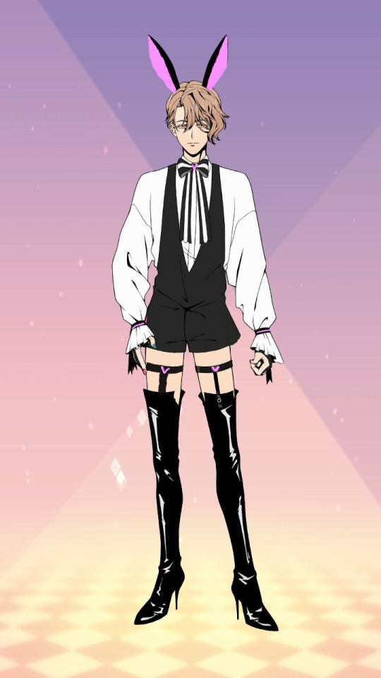
BAM. Since the boys bunny uniforms feel very based on their sin and personality I gave Asmo some hearts for his sin and as a pop of pink since he is ALWAYS seen in pink. When I think of bunnies, I think more "soft and cute" so I took the geometric shapes out of the ears.
LAST
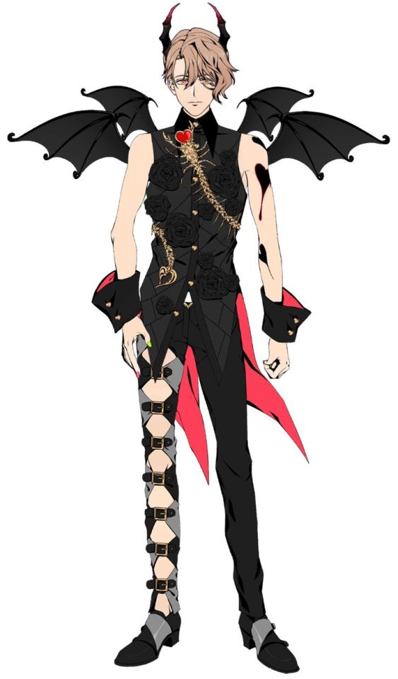
I actually love his demon form so I wont change much
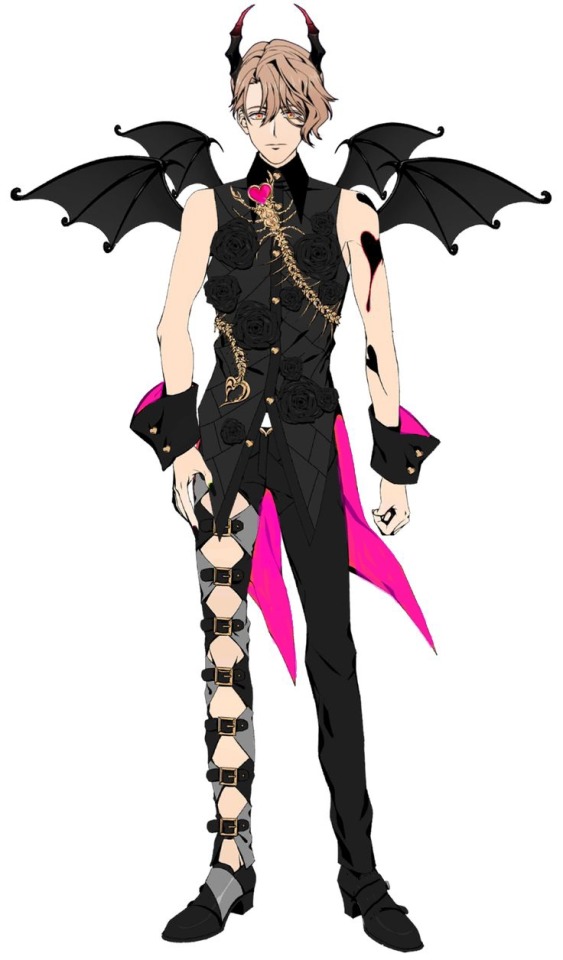
I took the gray off his left shoe because there isn't any gray on the other side and I know it's a dumb reason but it makes sense in my brain. I made the pink a little more cool toned and made his nails black because ooooo spooky demon
-
Asmo has a few other outfits but these are really the only ones I could think of that I had a problem with or just wanted to mess with. Asmo has an amazing character design and his outfits are cute! These are just things I would've done differently!
21 notes
·
View notes
Text
Urban Fashion Show 2024

It is that time again.
Time to show appreciation to the amazing urban fashion designers. For the month of February, the Night Life Series story will be on break. Follow the tag #nightlifeseriesfashion for all looks. Enjoy the show or catch up on the story to be ready for the return! Happy Black History Month ❤️


Model CC:
MIRA FITS/ KYLIE KNEE HIGH BOOTS Outfit by @dorificsims Here
Nightingalesims Geometric Acrylic Handbad V1 & V2 Here
Maloni UpDown Pony Hair by @xxblacksims Here
Aesthetics Posepack Pose by @afrosimtricsims Here
Nails - Nail It! Set 2.0 by Joliebean by @joliebean Here
LUXE LIP GLASS by @cocoelleansims Here
Youtube
#nightlifeseriesfashion#ts4#sims 4 story#sims 4#black simblr#showusyoursims#sims 4 screenshots#nightlifeseries#blacksimstagram#gaming#tzr#showusyourdecor#urban sims 4#urban simmer#the sims 4 cc#maxis match cc#sims 4 cc#black history month#black history matters#sims 4 lookbook#ts4 lookbook
28 notes
·
View notes
Text
Tfp gijinkas (2/4) The besties :]
Prev post
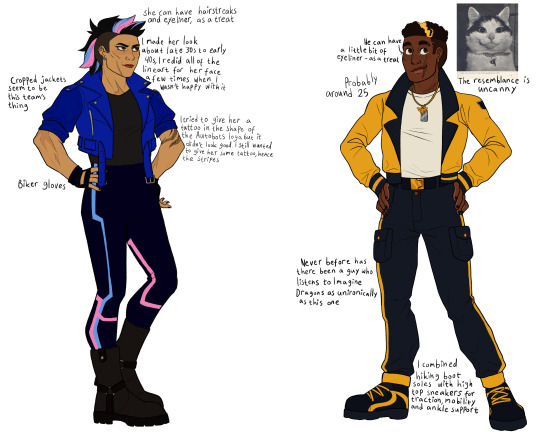
[Image ID: A character sheet with two characters on it. On the left side is a human version of Arcee from Transformers Prime, who is drawn as a middle-aged asian woman. She is muscular and has a haircut that is somewhere between a mullet and a mohawk, with shaved sides. Her hair is black with blue and pink streaks. Her eyes are brown and she has some eyeliner and lipstick, but not a lot. Her face is scarred, as are her arms and upper chest. She's standing with her hands on her hips with a determined but smiling expression. She has simple metal earrings and is wearing a blue cropped leather jacket with rolled up sleeves and the autobots logo on the left shoulder, a dark gray shirt, black biker gloves, black trousers with blue and pink geometric stripes and black boots. Her right arm has a tattoo in the shape of abstract stripes. The design notes placed around her read as follows: "Biker gloves", "cropped jackets seem to be this team's thing", "she can have hairstreaks and eyeliner, as a treat" "I made her look about late 30s to early 40s, I redid all the lineart for her face a few times when I wasn't happy with it", "I tried to give her a tattoo in the shape of the Autobots logo but it didn't look good. I still wanted to give her some tattoos, hence the stripes". On the right side of the page is a human version of Bumblebee from the same franchise, who is drawn as a young black man. He's also standing with his hands on his hips and smiling pleasantly. The sides of his head are also shaved, and he has a single dyed yellow streak in his hair. His eyes are brown and he has a little bit of gold eyeliner. There are two distinctive scars by the side of his mouth, and one surgical scar on his throat. He's wearing a yellow bomber jacket with black lapels and the autobots logo on the left shoulder, a white shirt, a black belt with a gold buckle, black cargo trousers with yellow stripes running down each side and black shoes with yellow stripes and shoelaces. The shoes are somewhere between high-top sneakers and hiking shoes. His nails are painted black and he has a silver dog tag and a necklace in the shape of a bumblebee. The design notes placed around him read as follows: "He can have a little bit of eyeliner - as a treat", "probably around 25", "never before has there been a guy who listens to Imagine Dragons as unironically as this one", "I combined hiking boot soles with high-top sneakers for traction, mobility and ankle support". Placed next to him is a picture of Buffins, the cat with the most appealing expression. Below the picture is the text "The resemblance is uncanny". / End ID]
#fanart#transformers prime#tfp#tfp arcee#tfp bumblebee#gijinkas#For the record I don't actually know whether those shoes would work#Also I want to talk about this show with people so badly#I'm trying to get my friends to watch it but none are taking my anglerfish bait#I want to look at fan content but due to my unique combination of brain weirdness I am unreasonably afraid of interacting with new things#so I need to kind of ease myself into it I suppose#It happens with every new interest I acquire#All the communities I've joined have been literally so nice#but the irrational fear persists#anyways we're halfway through the designs that I've planned so far#If people are interested I'll make more
35 notes
·
View notes
Text
Neon Dreams: How to Decorate Your Space with Indie Sleaze Aesthetics 🌙


Hey babe! Ready to transform your space into the ultimate indie sleaze sanctuary? 🖤✨ We’re talking neon lights, vintage posters, and all the grungy vibes that make you feel like you’ve stepped right into a 2000s house party or an underground gig. Whether you’re sprucing up your room or going all out on your entire apartment, I’ve got the tips you need to nail that effortlessly cool, lived-in look that screams indie sleaze. Let’s dive in and get your space looking as iconic as you are! 🎸
1. Neon Lights: The Glow-Up Your Space Needs
First things first, neon lights are an absolute must. They’re the ultimate statement piece that instantly gives your room that edgy, retro vibe. Think neon pinks, electric blues, and bright purples that make your space feel like a moody club or a cool dive bar.
How to Use Them: String them up along your walls, frame your bed, or create a focal point above your desk. For a more dramatic effect, mix and match colors to create a neon oasis that feels both chaotic and cozy.
Pro Tip: If you want to keep things extra nostalgic, opt for neon signs with phrases or symbols that capture the essence of indie sleaze—like a heart, lightning bolt, or a cheeky “open late” sign.
2. Vintage Posters: A Time Machine for Your Walls
Nothing says indie sleaze like a wall covered in vintage band posters and old-school art prints. These are the perfect way to pay homage to the era and showcase your music taste.
How to Style Them: Go for a collage look by mixing different sizes, colors, and textures. Layer posters of your favorite 2000s bands, grungy movie posters, and abstract art prints to create a visually chaotic but totally intentional wall display.
Where to Find Them: Hit up thrift stores, online vintage shops, or even print out high-res images and DIY your own posters. The more eclectic, the better!
3. Grungy Décor: Embrace the Messy, Lived-In Look
Indie sleaze is all about that perfectly imperfect vibe, so don’t be afraid to let your space feel a little messy and lived-in. Think worn-out furniture, scattered records, and cozy textiles that feel like they’ve been collected over time.
Furniture: Look for distressed leather chairs, velvet couches, and vintage coffee tables. Mix and match different styles and eras to create a space that feels authentically yours.
Accessories: Throw in some mismatched pillows, cozy blankets, and a record player with your favorite vinyls stacked nearby. The goal is to make your space feel like a creative haven where anything goes.
4. DIY Elements: Add Your Personal Touch
One of the coolest things about indie sleaze is how DIY it feels. Get crafty and add some personal touches to your space with DIY décor that reflects your style.
Ideas: Try painting an old mirror with neon accents, creating your own art with spray paint and stencils, or even making a wall hanging from thrifted fabrics. The possibilities are endless, and it’s all about making your space feel like an extension of your personality.
Pro Tip: Use washi tape to create geometric designs on your walls, or to frame your posters for an extra pop of color. It’s easy, affordable, and totally customizable!
5. Lighting: Set the Mood with Layers
Lighting is everything when it comes to capturing that indie sleaze vibe. Beyond neon lights, you’ll want to layer different types of lighting to create a moody, intimate atmosphere.
Ideas: String lights, lava lamps, and old-school lampshades are perfect for adding that grungy glow to your space. Drape string lights around your bed or hang them above your window for that dreamy, low-lit effect.
Pro Tip: Mix warm and cool tones to create depth and make your space feel cozy yet edgy. The key is to keep things a little dim and mysterious, like the after-hours vibe of a dive bar.
6. Textures & Layers: Cozy Meets Cool
To truly nail the indie sleaze aesthetic, it’s all about layering different textures and materials. Think leather, velvet, faux fur, and distressed wood—all working together to create a space that’s as cozy as it is cool.
How to Style: Layer a faux fur throw over a velvet chair, or toss some leather pillows on a worn-out sofa. Add a shag rug or a vintage Persian carpet to bring everything together. The goal is to create a space that’s inviting but also has that rock-and-roll edge.
Pro Tip: Don’t be afraid to mix and match patterns and textures. Indie sleaze is all about breaking the rules, so go wild with your décor choices!
7. Finishing Touches: The Devil’s in the Details
Finally, it’s all about those little details that bring the whole look together. Think quirky knick-knacks, old cameras, stacks of vinyl records, and ashtrays full of faux cigarette butts for that authentic grunge feel (without the smell, of course).
Ideas: Add some polaroid pictures on the wall, scatter some vintage magazines on the coffee table, or even display your favorite old sneakers as part of the décor. It’s all about making the space feel lived-in and loved.
Pro Tip: Incorporate elements that reflect your hobbies and passions—like a guitar in the corner, a stack of your favorite books, or a shelf full of vinyl records. Make your space a true reflection of who you are.
Final Vibes, Babe: Your Indie Sleaze Haven Awaits
And there you have it, your ultimate guide to transforming your space into an indie sleaze paradise! 🌙 Whether you’re going all out or just adding a few key pieces, the goal is to create a space that feels authentic, cool, and full of personality. So go ahead, get creative, and let your inner indie sleaze queen shine through your décor.
What’s the first thing you’re going to add to your space? Let me know in the comments, and don’t forget to share pics of your indie sleaze-inspired rooms! Happy decorating, babe! ✨
#2014 grunge#2014 nostalgia#2014 tumblr#brat summer#2014 aesthetic#2014 revival#indie music#indie pop#indie rock#tumblr stuff#indie sleaze#soft grunge#bring back 2014#2014core
9 notes
·
View notes
Text


Did a simple geometric design for my nails for my trip!
10 notes
·
View notes
Text
Summer Nail Designs to Try Right Now! ☀️
Hey nail art lovers! 💅✨
Summer is here, and it's time to bring some sunshine to your nails. Whether you love bright colors or fun patterns, I've got some awesome ideas to make your nails pop this season. Let's dive in!
Bright and Bold 🌈
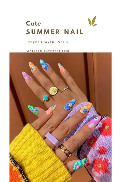
Summer is all about vibrant, eye-catching colors. Think neon pinks, electric blues, and sunny yellows. These shades are perfect for making a statement. Add some fun patterns like stripes, polka dots, or even some tropical designs to really stand out.
Beachy Vibes 🌊
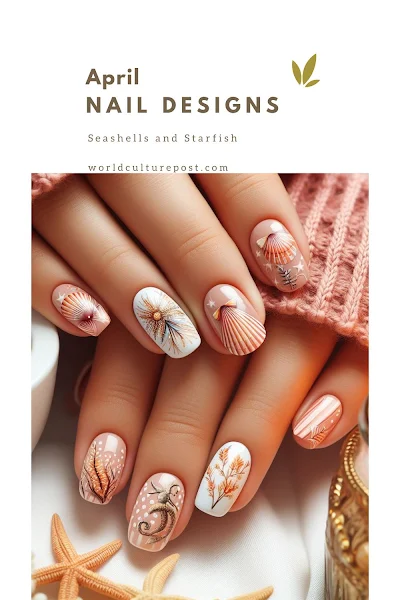
Bring the beach to your nails with ocean-inspired designs. Go for shades of blue, turquoise, and sandy beige. Add some cute seashells, starfish, or wave patterns to complete the look. Perfect for those beach days or just dreaming of the sea!
Fruit Fun 🍉
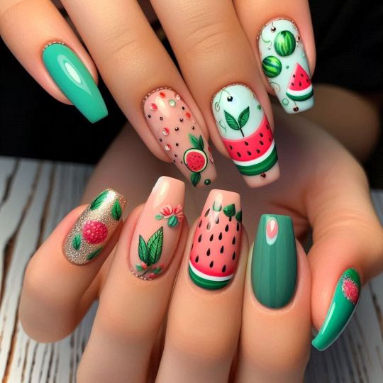
Nothing says summer like fresh fruit! Try out some fruity designs with watermelon, pineapple, or citrus patterns. These playful designs are sure to bring a smile to your face and are perfect for a fun, casual look.
Floral Fantasy 🌸
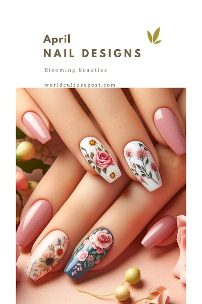
Flowers are always in style, especially in summer. Go for bright, colorful floral designs or keep it simple with delicate, pastel flowers. Either way, your nails will look fresh and fabulous.
Minimalist Magic ✨
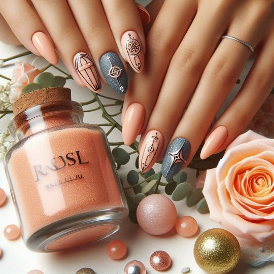
If you prefer a more understated look, minimalist designs are perfect. Stick to neutral colors like white, nude, or soft pastels and add simple geometric patterns or tiny accents. Chic and sophisticated!
No matter your style, there's a summer nail design out there for you. Experiment with different colors, patterns, and textures to find what you love. Happy painting! 🎨💖
Full ideas: https://nailarts.worldculturepost.com/2024/07/summer-nail-designs.html
8 notes
·
View notes
Note
As someone else who wants to build a retrofuturism setting, do you have any tips on how you approach the visual design for technology? I find it hard to extrapolate sci-fi tech from the aesthetics of the period without just copying the stuff I use as reference.
Sci-fi of any period is just people being in love with whatever technology is newest at the time. Right now everyone loves irregular abstract shapes (because now we can manufacture them), non-metallic materials (cause we have strong light plastics, carbon fiber and dreams of graphene), anything simulated and holographic (because we have realistic digital graphics), all kinds of colorful glowy stuff (because we're surrounded by screens all the time) and so on. Sci-fi isn't about the future at all - it's just the present but with all remnants of previous decades removed. The future will never look like what we think is futuristic.
Sci-fi before any specific period will be mostly or completely rid of that specific technology. Unless you want to nail a specific period, you don't even really have to try - just abandon any sci-fi visuals from the last 20-30 years and you'll get retrofuturism.
Sci-fi without LCDs, glossy plastic and color-coded glowing energy will feel 90s. Without fancy digital computers and irregular non-geometric shapes, it will feel 80s. Without much plastic at all, rounded trapezoid shapes or greebles you get 70s and 60s and so on. Unless you want a campy look, you don't need to emphasize technology of that period, those things will come naturally when you can't use modern tech.
I'd need to see your stuff to give you any advice beyond that.
70 notes
·
View notes
Text

LADY GAGA AT THE CHROMATICA BALL PREMIERE
Lady Gaga joined her little monsters at the screen premiere of her highly-anticipated HBO "Chromatica Ball" Tour Film last night which took place at the Nya Studios in Los Angeles.
Styling by Nicola Formichetti and Hunter Clem with assistance by Erica Valle and Frankie Benkovic. Hair by Frederic Aspiras, glam by Sarah Tanno-Stewart and nails by Miho Okawara, respectively.
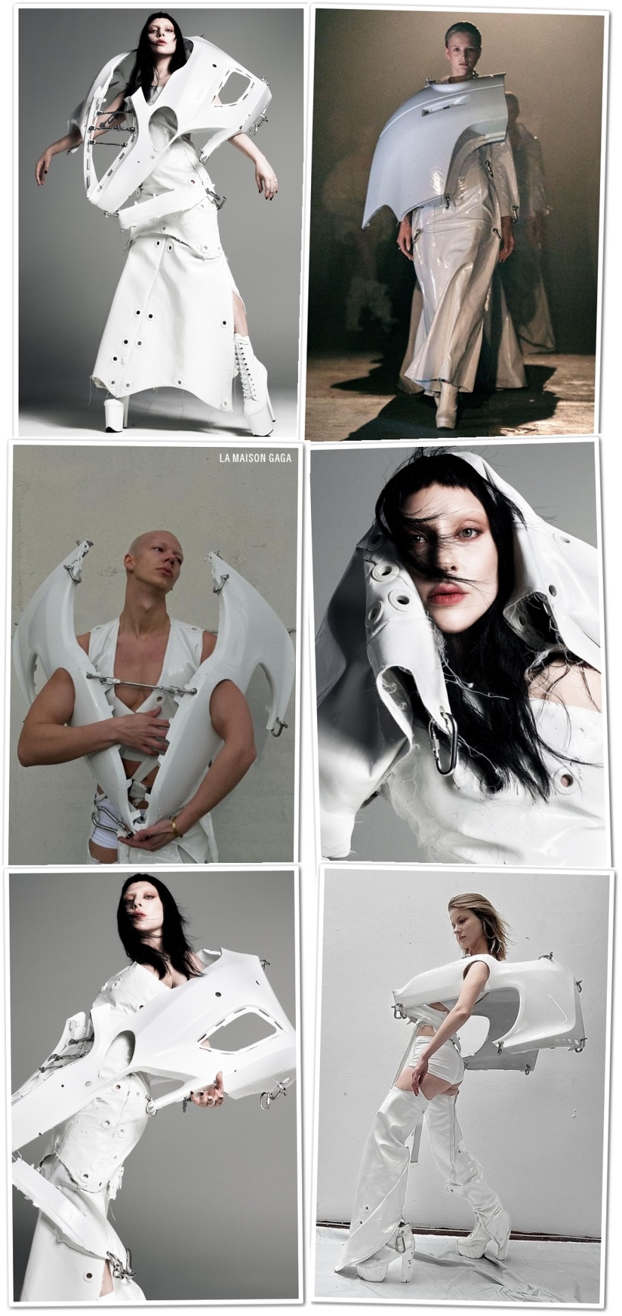
Gaga turned up in Argentinian Berlin-based emerging designer SELVA which was based on his "[603.628]km²" collection.
Her look featured a laminated white muslin calico cotton one-shoulder jacket and matching corset dress cut in the memory of an apron, stenced with holes for multiple sterling silver hooks and chains. A white lacquered shoulder sculpture made of discarded car parts pulled the whole look together. It was created in only two days!

Cristian 'Selva' Huygens started by developing and creating costumes for performances he produces, as well as for exhibitions inside ATM banks and interventions in public spaces around Berlin. The collection was inspired by his last trip to Kyiv, Ukraine where he also presented a collection of designs at a local metro station.
He mainly focuses on using discarded materials, all kinds of fabrics, metal connectors, and car parts as armatures. Conceptually, he describes his brand in one word: Brutalism. Every construction detail and mistake is shown. When it happens, he makes them even more visible. As the designer calls it, he develops 'honest clothes,' following the Brutalism concept.
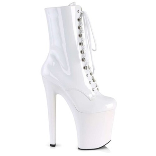
She completed her look with the Pleaser Xtreme-1020 white vinyl platform ankle boots with lace-up front.
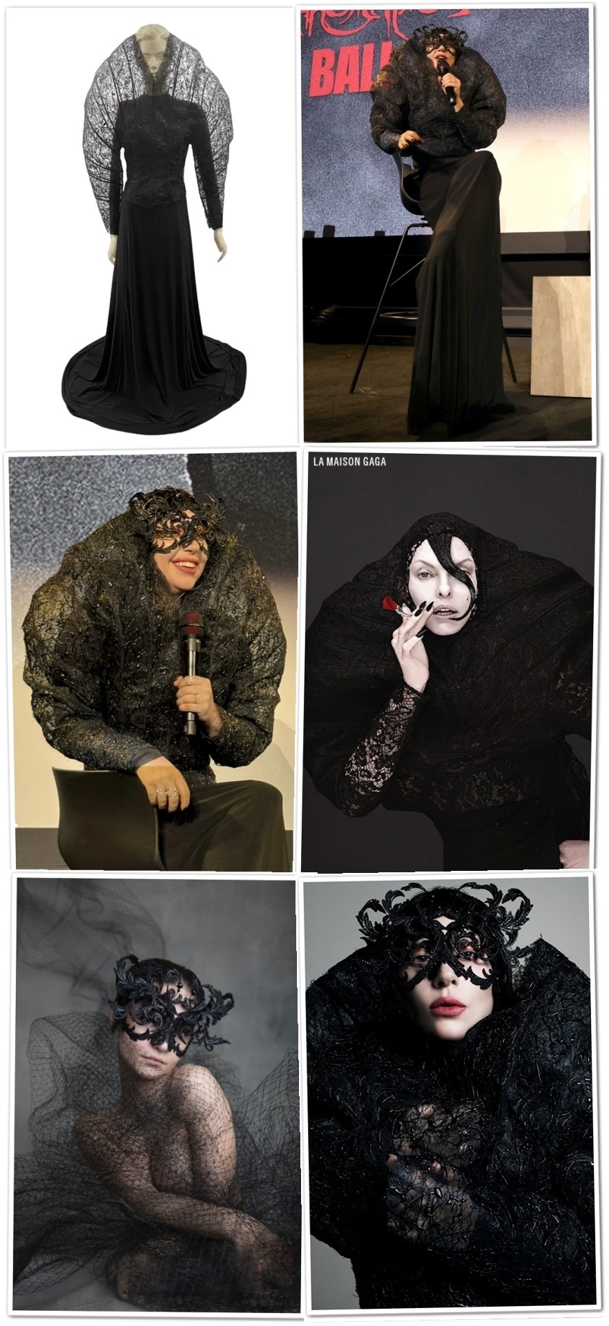
Gaga then sat down for a Q&A session, wearing another Germany-based emerging designer: AZIZ, who she previously introduced to us by rocking his designs both on-stage and on-screen at the tour!
This time, he crafted her a custom look which comprised a black stretch jersey long-sleeved elongated dress with a silicone drip-covered stiffened mesh cocoon structure with peek-a-boo slit for the head to come through, and matching gloves.
She crowned the look with a Philip Treacy Fall/Winter 2018 intricate black lace mask.
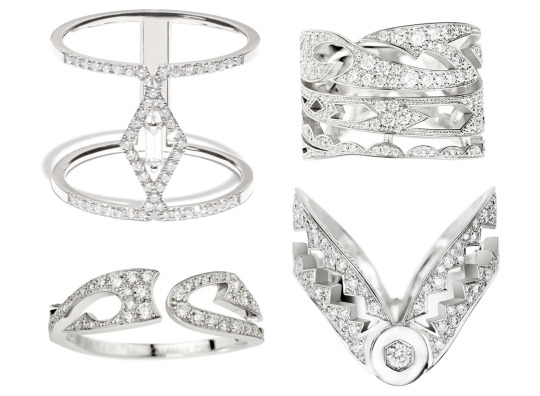
Our girl also rocked a bunch of white-gold and diamond rings by two French labels. The first ring is Djula's Délicatesse geometric lines large ring (€2,700).
The three other rings are all signed by AKILLIS and included the Tattoo large ring (€8,500), the Tattoo slim ring (€2,900) and the Capture Me ring (€5,250).
I couldn't help but notice how much the last ring resembles a bear trap, which is also depicted on the single cover for the first "Chromatica" single "Stupid Love", creating a great full circle moment.
Shop:
Djula "Délicatesse" Ring (€2,700.00)
AKILLIS "Tattoo" Large Ring (€8,500.00)
AKILLIS "Tattoo" Slim Ring (€2,900.00)
AKILLIS "Capture Me" Ring (€5,250.00)
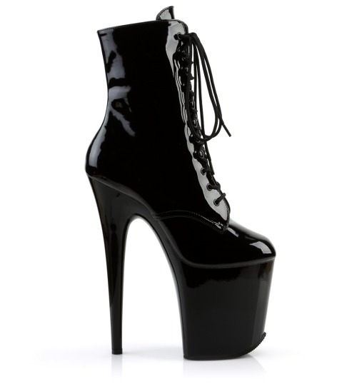
Gaga rocked her signature sky-high Flamingo-1020 black vinyl platform boots from Pleaser.
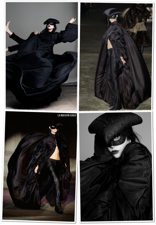
The final look of the evening saw Gaga channeling her CBT "Sonnet" interlude by re-wearing her Alexander McQueen Fall/Winter 2002 "Supercalifragilisticexpialidocious" collection parachute coat which features a mandarin collar, eye-hook closure and exaggerated bishop sleeves, bubble back and train.
In McQueen's words: "This collection was inspired by Tim Burton. It started off dark and then got more romantic as it went along."
This coat was given to her by Daphne Guinness personally!
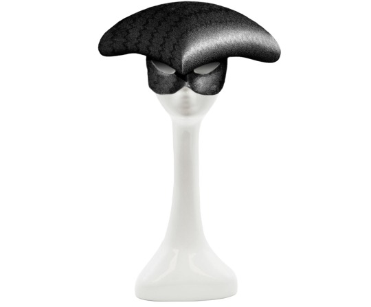
She also wore the matador-inspired black jacquard silk mask headpiece Philip Treacy created for Lee's collection.

For the short and black nails, Miho used the Aprés Gel Couleur in "Birnam Wood". Both the base and top coats are by Presto.
#May 2024#outerwear#Alexander McQueen#jackets#SELVA#dresses#gloves#AZIZ#hats#Philip Treacy#jewelry#AKILLIS#Djula#boots#Pleaser#nails#Aprés#Presto
9 notes
·
View notes