#genshin x bts layout
Explore tagged Tumblr posts
Text
hu tao [胡桃]- wangsheng funeral parlor director
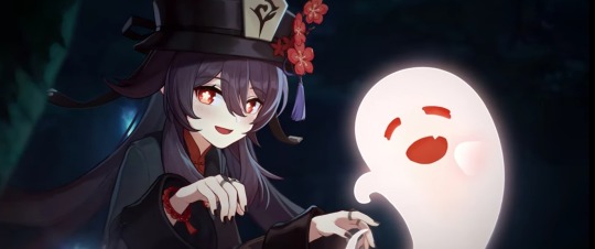


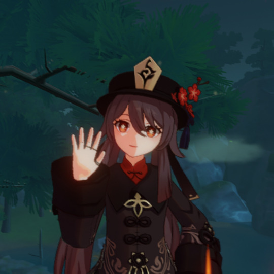
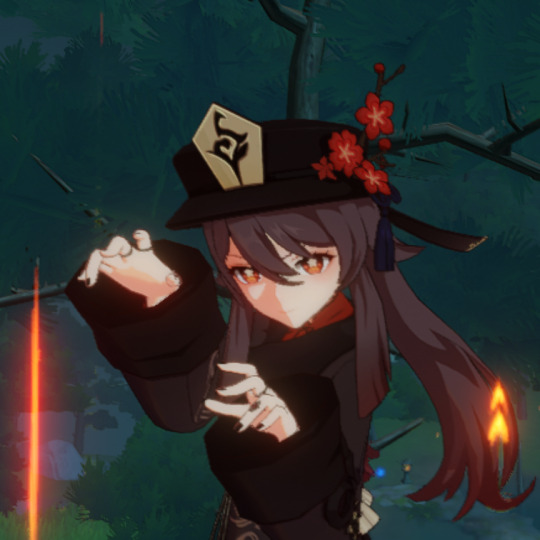
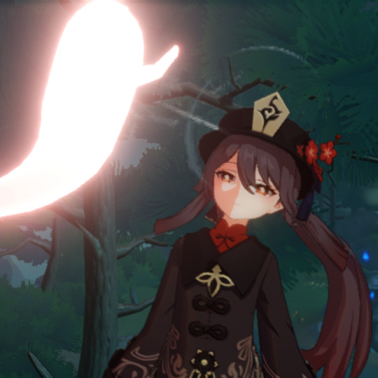
pls like or reblog if saved <3
#hu tao#genshin impact pfp#genshin impact#hu tao edit#hu tao rerun#hu tao layout#hu tao pfp#hu tao icons#genshin impact x reader#genshin impact icons#genshin impact edit#anime#manga#yanfei x hu tao#hu tao x reader#zhongli#bts#genshin icons#kpop#genshin impact hu tao#hu tao genshin impact#genshin impact matching icons#matching pfps#matching icons#anime icons#anime edit#vocaloid#kim seokjin#tbhk#genshin impact manga
169 notes
·
View notes
Text



#pack tt#pack twitter#pack anime#headers#red aesthetic#blue eyes#haikyuu!!#genshin impact#genshin zhongli#photographers on tumblr#bts bios#bts layouts#animes#boku no hero academia#haikyu x reader#anime otaku#wallpaper#water#icons anime#girls icons#dark aesthetic#dabi todoroki
432 notes
·
View notes
Note
hi! any bts x genshin/eula layouts?, tysm<3


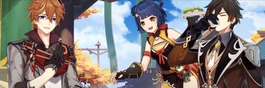
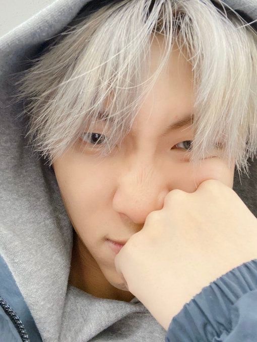

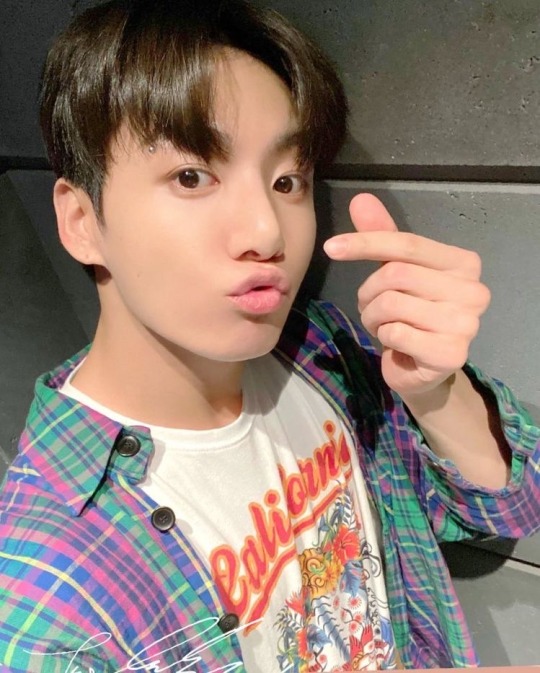
like or reblog if you save/use
#namjoon layouts#eula layouts#jungkook layouts#taehyung layouts#jimin layouts#childe layout#xiangling layouts#zhongli layouts#twitter headers#twitter layouts#messy layouts#messy headers#twitter icons#messy twitter layouts#bts messy layouts#genshin layouts
157 notes
·
View notes
Text
diluc birthday 2022 gfx (process work)

since i had so much fun making my diluc birthday 2022 edit (and jumped through numerous hoops to finalize the design,,,) i wanted to share the process!
this is not a tutorial! i will not be going over how i made every graphic. instead, this post shows all of my jumbled thoughts and decisions when putting everything together!
details under the cut! (initial thoughts / rough brainstorming + inspiration / final layout / colours / motifs / concluding thoughts)
cw: tons of rambling! i attached a couple of images too! no moving images or flashing.
i. initial thoughts
let's be honest every thought i had going into this was about diluc and how FINE he looked in his birthday art,,
a majority of my edits are 800 x 1000, and this one was originally going to be 800 x 1000 too. but! i have a bad habit of overfilling smaller documents and not using negative space properly. so, i tried to use an 800 x 800 document for this edit instead!
choosing to work with a square base instead of a rectangular base meant i had to use the smaller space more effectively.
ii. rough brainstorming + inspiration
initially, i was aiming to do an editorial style of graphic where diluc was meant to be presented as a model in vogue (or any high-fashion magazine). some of the inspiration i had:

i was going to focus mainly on typography and experiment with different editorial layouts!

i knew i wanted a combination of text and images in this post (which is why i played around with two boards at once). i really wanted to keep this monochrome and use one red (sampled from diluc's hair) as an emphasis colour.
but then i thought... wait.. diluc looks SO GOOD in his art.. why would i relegate him to the background????? and make it black and white?? fool behaviour,, so! i scratched everything and started from the very beginning! but now i wanted to focus on diluc's figure and his character instead!
so... now what? i was so ready to give up— i had spent the first two hours going back and forth between different layouts and different monochrome colourings and to lose all the progress was just. defeating, really. :<
iii. final layout
after mourning the loss of my model!diluc dreams, i wanted to create an edit in a style that i was more comfortable with. usually i create vectors or lineart in my edits, but this time, i wanted to go back to my roots and experiment with textures! before being on tumblr, i made numerous edits that looked like this:
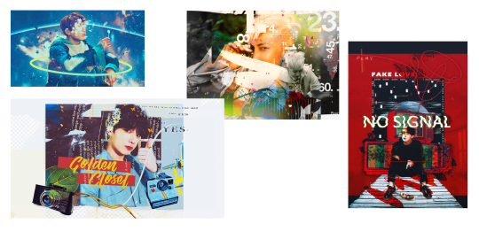
(i was still, and continue to be a bts fan haha)
i really, really enjoy this style of editing and i really missed it when i started creating for genshin! but it's hard to mix real-life elements with 2D characters, which is why i tried to stray from it... but i always had so much fun making these that i was like,,, hey,,, why not???
so! using my past self as inspiration, i began gathering images and making elements to create a diluc-piece that focused on layering textures + manipulating them!
iv. colours
okay. preface: i really fricking love using colours. i don't know what i was thinking when i tried to make this entire thing black and white, but i was wrong!
i sampled a bunch of colours from diluc's birthday art and came up with something like this:

buuut it looks a little bit... flat? so i took the green from the background and added that to the palette too! this really helped the red pop, since they're complimentary colours. after i finished making the edit, i went back and altered some of the colours to make them pop out!

v. motifs
my favourite, favourite part that i can talk about for ages!!!!! here's where i obsessively read up on diluc and brainstormed the things i wanted to symbolize in my edit! some stuff i included / took into consideration:
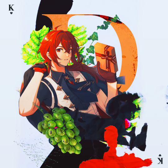
grapes + vines. hints at his status as a wine tycoon. also symbolizes fertility, wealth, inner transformation. similar to the process of fruit becoming wine, diluc has grown to become a respected man.
the king of hearts. i emphasized diluc's title as the uncrowned king of monstadt by directly referencing him as a king. the king of hearts symbolizes honesty and is often regarded as a kind-hearted man. so... diluc.
splatters. it's not blood! diluc is alive and well!!! the red is supposed to mimic spilled wine (a play on the saying "no use crying over spilled milk) but... legal.
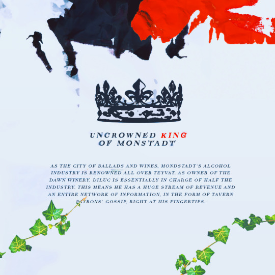
a crown. another reference to the uncrowned king title. diluc deserves a crown and i will personally place it on his head.

the sun. references his title the dark side of dawn. bright, scorching, unrelenting—a very diluc symbol.
the golden halo. symbolizes royalty and glory. can i highlight his status anymore in this edit?
black feathers. a reference to his title the darknight hero. black feathers also symbolize protection and are considered good omens. it's kinda like a silent thank you to diluc for always protecting monstadt!
golden wine. shh, it's apple juice! but also.. diluc as king midas who has the power to turn anything into gold. references his wealth and his adeptness as a businessman. i think there's also a beer called liquid gold... funny!
some stuff i didn't end up using:
burnt paper. i was going to make it look like one of the pictures were burnt. for the obvious: diluc's a pyro character, duh. but (on a sadder note) the burning of bridges and the past as nothing but a pile of ashes. bonus points: i was going to burn a picture of diluc and kaeya haha. in the end, i didn't do it b/c it looked out of place.
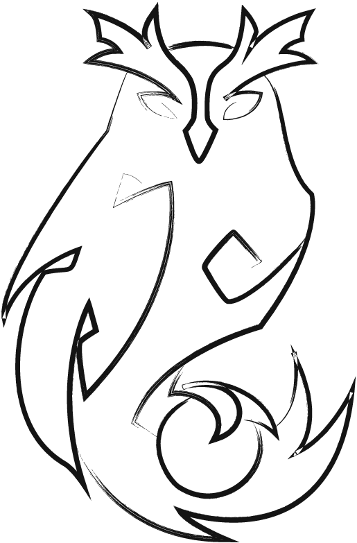
an owl. references his constellation. okay it's supposed to be a "night bird" but. owl. whoo! i made it and tried my best to fit it somewhere, but it made everything too crowded... so it had to be scrapped from the final design.
vi. concluding thoughts.
honestly, i really do love this edit. it came out a lot better than what i had in mind initially... haha... i'm proud of how it looks, and it was really fun to make! i haven't had this much fun making something since my long kazuha & tomo edit... rip.
i think i'll continue sprinkling in this style of editing more often since i really enjoy doing it! it really reminds me of myself from the past it's kinda.. bittersweet, i guess? to still prefer my old editing style after everything that i've created? shrugs.
anyway! if you read through this entire thing, thank you for reading! i really enjoyed laying out all of my ideas and showing my (messy) thought process throughout the whole thing. i would love to make more of these in the future and babble on and on about editing,,, sighs dreamily,,
#koriyue.txt#*gfx process#*tut#this post is so.... long...#gr grrr... if anyone wants to learn about my process + what goes on inside my head!! :DD#the bounce back of the century honestly#rip my owl vector :< /whoos but sadly/#i wuv you for reading this! and for <3 supporting my silly little edits haha#THIS ENTIRE THING IS 1K WORDS SKF;SFJ;S I AM SO SORRY
37 notes
·
View notes
Text
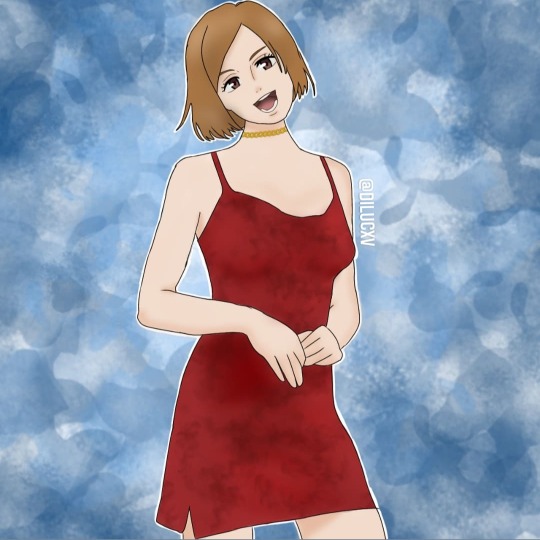
Nobara Kugisaki
#nobara supremacy#animes#icons anime#art#anime fanart#jujutsu icons#jujutsu kaisen#itadori yūji#megumifushiguro#nobara x maki#nobara fanart#wallpaper#soft layouts#nobara layouts#snk hange#fanart#anime otaku#genshin impact#girls icons#bts layouts#bts bios#saturo gojo
24 notes
·
View notes