#forgot to mention it here
Explore tagged Tumblr posts
Text
almost forgot to mention this...im doing artfight this year!!
2 notes
·
View notes
Text
So, there's this stuff called Multi-Vite which is a cat vitamin product. It's called "cat paw gel" and is really more of a mushy nutrient paste, but you're supposed to put it on their paw so they'll lick it off and get the goods.
My cat, for the record, would gladly slaughter an entire tube of the stuff if I allowed her to. She loves it.
ANYWAY, though, I would like to submit the mental image of SENDAK with Multi-Vite. Go ahead; picture it! Big bastard bitey man licking his hand clean of nutrient goo.
#not rp#ooc#i posted about this on my main blog because i was too amused#forgot to mention it here#i really can't stop giggling at the mental image of sendak going all mlem on vitamin paste
1 note
·
View note
Text
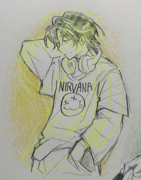
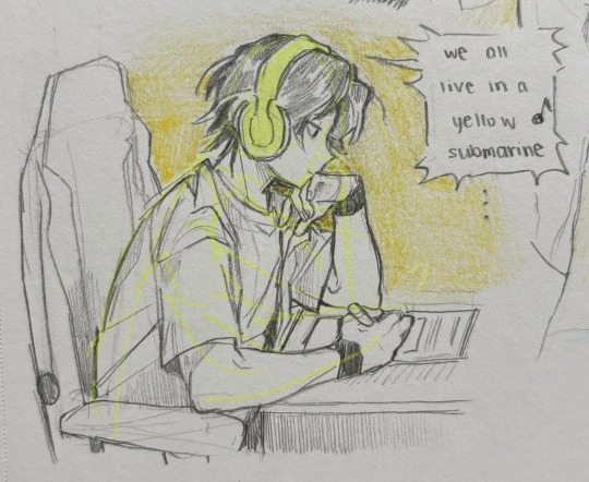
casual tim sketchbook doodles!!
#tim drake#dc#quick little doodle#I GOT THE COMPENDIUM btw <3333#i mean i had it since my bday but i forgot to mention it on here
4K notes
·
View notes
Text
class cancelled. see you online - professor!simon riley x professor!reader

In the early years when he first started, Simon didn't cancel class. It was kind of well known at that point. He'd rather spend the class chattering about his wife than cancel class, so imagine everyone's surprise when he sent out the collective email detailing that he was canceling class because his wife was in labor.
What.
He sent them the slides for the day and a previous recording from a while back, letting them know that class on Thursday would be on zoom — a link that he will post onto the class canvas eventually.
He signs off the email with a photo of the baby locked by a password hidden in the slides, and he replies to everyone's congratulations once you're back in the home. He ends up staying back to teach the rest of the term from home because he was taking care of the baby
It was something briefly mentioned on his rate my professor, detailing how Professor Riley had "Moved the rest of our semester online because he wanted to stay home and take care of his wife. How did the school allow this?" and "I for one loved the online classes and congrats to him for finally being a father — 5/5 for my semester tbh" but truth was while the rate my professors ratted him out, his students didn't mention that class was moved online at the time.
So, when he lets his class know that he'll be out for a couple of weeks and moving class online, everyone sends in their congratulations early, earning a furrow of his brows and a laugh from your lips as he reads his emails to you.
"They really read their RMP reviews huh?"
"Sure did. I didn't even mention it this time. I barely talk about our daughter." He hums, hand on your bump as the second kicks at it.
"Well, I think I walked in once or twice." You hum. "Besides, they like it online."
"I do too." He mumbles, pinching at his daughter's cheeks as she giggles. "But most people don't pick up enough when you teach online."
"That's true." You take the berry from your daughter's hand as she hands one to you and presses another to Simon's lips.
"Thank you, sweetheart."
She nods, eyes glued back onto the screen as you glance at the recent check-up results.
"You bet Johnny's gonna cancel class too?"
"Heard he already told his students."
"Crazy."

#i had to do mental prep to put the x reader tag for this one#☾.professor ghost#☾.blurbs#simon riley x reader#send an ask in if you wanna see the fake rmp i made for this. im not elaborating but I will show you#me casually dropping fic lore or smth#OH oh oh i forgot to mention. i read a blurb abt ghoap and prof soap by ghcstao3 abt johnny taking a day off for simon's bday n here we r
768 notes
·
View notes
Text

HAPPY HOLIDAYS from precinct 41!!!! They got hidden talent!!! Wish it stayed hidden!!! 🗣️‼️‼️🔥🎉🎉🎉
#mine#disco elysium#harry du bois#kim kitsuragi#chester mclaine#jean vicquemare#FORGOT TO POST THIS YESTERDAYYYYYY </3 i wont be here for xmas so#also someone mentiones that this was a triple/quadruple failed drama check they were so real for that
700 notes
·
View notes
Text
Let's talk about the 21st century and queer rights
Sometimes I see a post and wonder what kind of world people live in, how ignorant and hateful they are of the community they claim to be part of, and even the most recent history of that community.
I saw this post with this line in it: "Its the 21th century, are we still suppose to justify people who lie at their partners in order to protect their reputation?" And I'm not reblogging because I don't want to have it on my blog.
So, let's talk about the 21st century and queer rights in the US, shall we, @queershits?
Did you know that same-sex marriage in the US as a whole has only been legal since the Supreme Court decision on Obergefell v. Hodges on June 26, 2015? Prior to that, the first state to grant same-sex marriage was Massachusetts in 2004, while the first civil unions for gay and lesbian couples became legal in 2000. But at the same time, 28 states had banned same-sex marriage and the recognition of those marriages from other jurisdictions until 2015. In fact, the federal government had been banned from recognizing same-sex marriages by the Defense of Marriage Act in 1996, which had been voided by the Supreme Court decision in 2015 but has only been fully repealed by the Respect of Marriage Act in 2022. That's all the 21st century. And very recent 21st century!
When Hen and Karen adopted Denny in 2011, they weren't married. Because at that point in time, they weren't allowed to in California.
Did you know that until the Supreme Court ruling on Lawrence v. Texas on June 26, 2003, same-sex sexual activity was illegal in 14 US states? And that even with that ruling 12 of these states have not changed their state's constitution, so that these laws aren't executable but still on the book and regularly used to harass queer people? (And didn't the current Supreme Court just say after overthrowing Roe v. Wade they'd like to take a good long look at Lawrence v. Texas, too? People might lose their rights again in those 12 states if the worst comes to pass here.) That's all the 21st century.
Did you know that "Don't Ask, Don't Tell" came into effect in 1994, allowing gay and bi people to serve in the US military as long as no one found out about their sexual orientation? If they were found out, they could face dishonorable discharges or even prison time. Either would be a permanent burden on their records for the rest of their lives. DADT was repelled in 2011 after a long and hard debate. That's well into the 21st century.
Karen explicitely states that DADT is part of the reason she didn't become an astronaut. (Though, NASA was never truly subjected to the rule as it is not a military organisation. But on the other hand, many of the astronatus are active or former military.)
Tommy was at the 118 in 2005. We know he was in the Army prior to joining the LAFD. That means Tommy served under the rule of DADT, which would have been an immense burden on him.
Do you know that there is a defense called "LGBTQ+ panic" often used in combination with a defense of insanity, provocation, or self-defense? This defense tactic is only banned in 21 US states, and most of those bans are very recent. In 2018, only three states had banned this defense. In 29 US states people are allowed to say "this person is gay/trans/queer/etc and I felt threated by that fact alone so I saw myself with no other choice but to hurt them" in a court of a law and the jury has to consider that argument. That's the 21st century.
Let's take a look at the kind of world Josh, Michael, and Tommy would have been children and teenagers in. That's not quite the 21st century, but it's near enough.
Tha aids epemedic started in the 1980s, and is — for the record! — still ongoing. But in the 1980s it was very much deemed a problem of the gay community only. And many, many people claimed outrageous things like "they're getting what they deserve". Josh and Tommy are both 80s children, Michael was a teenager in the 80s. We know Tommy grew up with a bigoted and hateful man like Gerrard as a father. He probably heard the above quote and worse regularly.
Have you ever heard the name Mathew Shepard, @queershits? (If not, go and educate yourself!) Mathew Shepard was a young gay man tortured and murdered in October 1998. Josh and Tommy would have been teenagers or maybe young adults (as we don't know the exact age of either of them) when that happened. It was all over the news and there were, again, people not shying away from saying he got what he deserved. I've no doubt Tommy's father (and Gerrard) was one of those people.
That's the world Josh, Michael, and Tommy grew up in as gay men that Josh talked about. They didn't hide to protect their reputation, as it was put in the quote above. They hid to protect their life and well-being. Finding the confidence and security to let go of that kind of learned behavior to protect yourself is so hard. But all three did it!
There are still people today who have to hide like this in the US. Because they're born into the wrong family or the wrong neighborhood or the wrong religious community where being queer is still seen as a ground to hate them, to exclude them, to hurt them, to kill them.
The number of hate crimes is rising again. The hard-won rights and freedom of queer people are threatened again. It's the 21st century, but that doesn't mean we are always safe or that we don't sometimes have to do shady things to protect ourselves or that we can lean back and enjoy the rights we have. Because many of us all over the world either don't have any rights or are facing the very real danger of losing the rights again that those who came before us fought so hard for.
#911 abc#tommy kinard#josh russo#michael grant#karen wilson#hen wilson#evan buckley#lgbtq#lgbtqia+#queer community#I bet the person I adressed here forgot all about Michael until I mentioned him#because the other queer rep on this show is always only remembered if they can use it as a weapon
437 notes
·
View notes
Text

Welcome interruption during training. You know... because the waterfall meditation thing...
#espio the chameleon#sonic series#fanart#his proportions are more like his sonic heroes model here#mystic ruins chao garden-ish#was feeling nostalgic while playing SADX with Espio model swap mod#this actually took longer then if I painted it because of how outside of my comfort zone it was#but it was still fun#oh and the espio chao design is so cute#i forgot to mention that#i gave it black wings like his backspikes though because chao without wings bother me
472 notes
·
View notes
Text
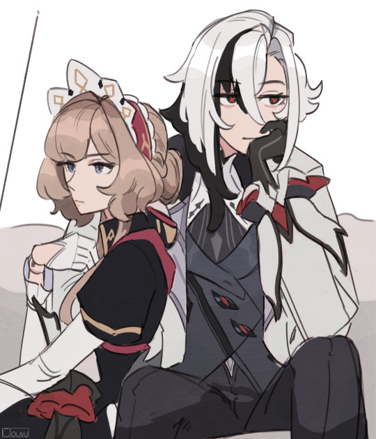
Save me french yuri... Save me
#genshin impact#arledrone#sandrone#arlecchino#haha remember when we all thought that sandrone and arlecchino would both show up in fontaine and be gay together?#good times.... good times#jk i'm ready to end it all actually#I KNOW WE HAVE LIKE ONE LAST MAJOR FRENCH PATCH BEFORE NATLAN BUT IVE JUST ABOUT LOST ALL HOPE#the way that literally every wlw arle pairing got fed so well following arle's drip marketing EXCEPT for arledrn... hate it here so bad#anyways shipping aside HOW is it possible that the frenchiest of french harbingers with heavy ties to machinery#and like two major world quests tied to specifically to her lore and is even MENTIONED of being present in fontaine#also being one of the first harbingers ever mentioned dating back all the way to the description of chode's teaser trailer#just???? doesnt show up??????#Sandy enjoyers are stronger than any us marine because my GOD are we struggling out here#anyways ignore the fact that I completely forgot to draw sandy's wind up key it was hard drawing through the tears#(actually it was cause i half-assed this doodle but we dont talk about that)
2K notes
·
View notes
Text
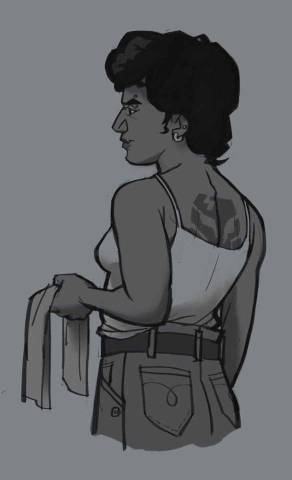
Butch Fem!Boba Fett…
#don’t wanna mention modern AU in the caption so I’m putting that here ❤️#this is my wife btw so HANDS OFF#also I forgot to watermark so be nice#boba fett#star wars#star wars au
591 notes
·
View notes
Text

#limbus company#project moon#kasane teto#tried style matching limbus company sprites#sinner teto... i don't think ive posted the original on here but!!#also she has a tail whip#chimera#utauloid#(edit) FORGOT TO MENTION but shes a bloodfiend teehee
696 notes
·
View notes
Text
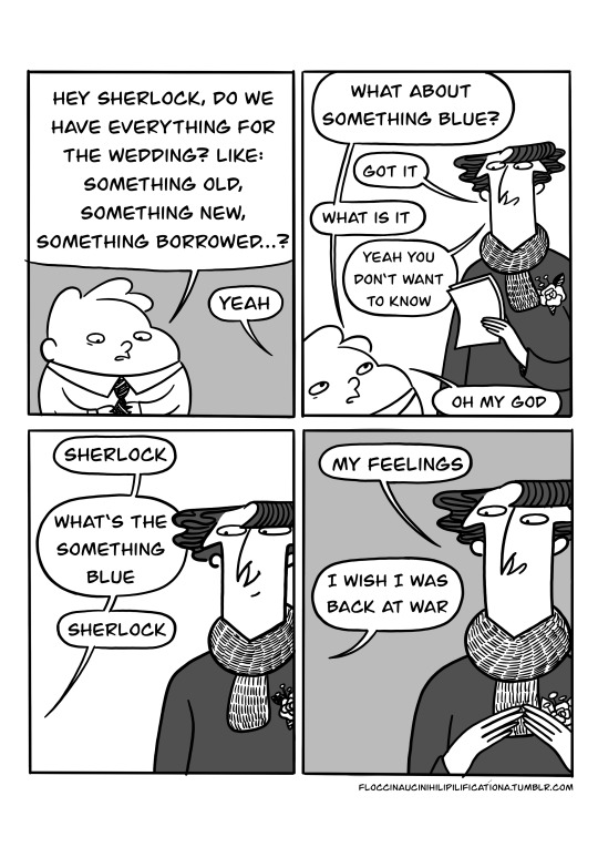
#sherlock#it might be the cough medicine but I'm really feeling the bbc sherlock wedding episode today#a good feeling ₍՞◌′ᵕ‵ू◌₎♡#like finding an old block of cheese in the back of the fridge you forgot about and its gotten super hard and chewy#i currently have half a block of gouda curating in the vegetable cupboard#waiting#how are you doing friends!! C:#I'm good! I still have the cough but I also got a new scarf#I'm still thinking about buying window colors as well but I am waiting if that is also just because of the cough medicine#I can't believe it's already been a year since I have moved! last year I was doing everything here for the first time#and now everything is happening for a second time! that year was both very long and also happened very fast#our floor in the “office” my father wanted to install still is not completly done but he threw up last time he tried#he did not threw up because of the floor but because every time he does a home renovation project he drinks 3 liters of Cherry Coca Cola#we are trying to not make him drink 3 liters of Cherry Coca Cola but he doesn't want anyone else to finish the floor I think so we just do#not mention the hole in the floor#have a nice autumn day friends!! I hope you're doing well! ( ´͈ ◡ `͈ )#♥
3K notes
·
View notes
Text
If Castorice is cursed to kill whoever she touches and Mydei is cursed to be immortal, do you think Mydei ever goes to Castorice on a really bad day and is like, hey can you put me down for a bit please? I'm having these phantom pains from fatal wounds and injuries that don't exist anymore and they're keeping me up, I want a nap.
And obviously at first Castorice is like "L-lord Mydei, please rethink this, death is not something to be trifled with! Even with your condition, I cannot guarantee your safe return..." and Mydei takes the time to reassure her that, no, he's sure about this, and yes he is willing to bear the risks, no he doesn't care if it will hurt, please euthanize him. It takes a bit of convincing but eventually she agrees to risk it, and, fear in her heart, gently places a hand on his shoulder.
Mydei wobbles and collapses dead on the spot. Castorice lets go and starts fretting internally, stepping back and circling around, frantically searching for any sign of life. How long does it usually take for Mydei to come back? Will he come back at all? Her own curse is clearly effective on him after all... To her relief, it only takes a few seconds for Mydei's eyes to flutter open again to find himself supine, with limbs bent at various awkward angles from the way he ragdolled.
It was a very peaceful few seconds, no pain, no blood, just an pleasant floating sensation as the familiar dark waves of the Styx rocked him side to side gently, before a bright guiding light forcibly pulled him right back. If not for the uncomfortable position he came to in, he'd even say the experience did some old aches a lot of good. The slight relieved smile that comes across her face as he explains this belies how many years of uncertainty and grief she's experienced over the many deaths she had enacted prior. She must have had no way of knowing for sure, until now, whether or not the deaths she delivered were as gentle as she hoped, Mydei realized.
It takes slightly less convincing to have Castorice try again. This time, they arrange more comfortably, Mydei sitting down against a wall, Castorice taking his offered hand in hers. As his hand goes limp in hers, his skin slowly cooling, she draws comforting circles on it with her thumb, more for herself than for his unfeeling body. After several minutes this time, each feeling longer than the last, she lets go and backs away once more, waiting with bated breath for the moment he shudders back to life, taking air back into empty lungs, eyes bright again, fierce, lively and visibly well-rested.
They agree to never exceed 15 minutes, Castorice explaining he would likely not enjoy coming back to the discomfort of gravity having caused all of his stilled blood to pool and settle inside of his body, let alone his body having cooled. Mydei agrees easily and assures her that he will keep his requests for deathly repose infrequent.
Castorice often passes the time Mydei spends dead trying to occupy her hands, the nerves never quite leaving her alone. Knowing logically that Mydei will come back and fearing that maybe he won't come back this time are two separate things after all. She tries many things, from bringing a scroll to read, to embroidery, shoulder pressed to his, trying to ignore how much bolder the red tattoos look against the pallor of a dead man. When Mydei wakes to Castorice's fingers pricked and bleeding for the third time, he frowns and offers for her to braid his hair next time if she wishes.
The next time, a month later, they arrange slightly differently, Castorice sitting on a bench, Mydei lowering his head into her lap, his hair an offering she wills herself to accept. Having assisted with many a funeral rite, Castorice is able to lose herself in the process of carefully weaving the messy soft locks into shape. The texture is strangely soothing, despite how unnaturally still Mydei remains, and Castorice imagines that this must be similar to what it feels like to pet a lion's fluffy mane. When the sand stops flowing, Castorice moves Mydei's head out of her lap to walk five places away once more. He comes to, gasping for breath as usual, and reaches up to feel at the new braids he sensed in his hair. A ghost of a smile graces his face when he finds them to be satisfactory, and he wears them for the rest of the day as a sign of appreciation. Castorice fiddling with his hair while he is dead quickly becomes the standard for their little meetings. Sometimes he wakes up with no new braids, but he doesn't question it so long as Castorice doesn't appear to be in any distress.
The first time Phainon spotted Mydei with his head in Castorice's lap, Castorice gently running her fingers through his hair as if he were a very large cat, Phainon almost passed them by with how peaceful they looked...
Then did a double take and panicked.
Anyway, that's my headcanon at least for how Castorice can say that the death she brings with her touch is peaceful. I think discovering that killing Mydei with her touch grants him what is essentially a banger nap from his perspective, probably helped her find an amount of peace in those early years. Truly putting the rest in "putting to rest"with this one.
Obviously she'd still prefer to be able to touch people and creatures without having them die, but at least she has learned that it isn't painful when she kills this way.
Additionally I like to imagine that while being killed by Castorice feels soothing, getting killed normal ways feels like shit, painful the whole way through, and then you get dunked violently into the Styx. And for Mydei specifically, it's more like he gets dunked into the Styx only to get yoinked right out, soul still sopping wet and cold, and forced back into a body that is fully repaired but it's happened so fast to him that his nerves have him feeling the aftershocks of the injuries that are already gone.
#honkai star rail#hsr#mydei#castorice#hsr mydei#hsr castorice#phainon#hsr phainon#nearly forgot i mentioned him in here#the visual of him doing a double take and freaking out is just so funny to me#followed directly by Mydei being annoyed that his out of body hardcore nap was interrupted#hsr 3.0#sometimes instead of napping *cough*being dead*cough* Mydei comes to just hang out and chill#Castorice appreciates the quiet Alive company#Phainon has to be the yapper around here because these two can sit for an hour in silence no problem just doing their own thing#these are the besties we didn't get to see
266 notes
·
View notes
Note
Hello! Many people have said this but ill say it too, I LOVE YOUR COMIC SO MUCH ( ´ ▽ ` ).。o♡
I really wanted to ask you about how you do the backgrounds? (Something i struggle with) whats the process? Like from start to finish, also, to do the rise backgrounds do you use reference from the show and generally real photo of ny? Or do you come up with them? And last question- The shadow and light on the background- Like HOW
i know it’s a lot of questions but i’m just so curious qwq and wanna learn to be better, thank you again in case you read this and respond, in case you don’t, i hope you have a nice day and a wonderful life uwu keep up the great work! (≧◡≦) ♡
Backgrounds are a really broad subject and I'm always a little overwhelmed when asked this question. Just like drawing the human body, backgrounds take time, repetition, and practice!
My answer got a bit long, so it's going under a read more :) but if you digest info better in video format I found this on youtube
youtube
It pretty much goes over everything I wanted to say, but in a much better way. I wish I had found it before writing all this out lol
ok, first of all, I'm not a teacher nor was I built to be one of those cool helpful art tutorial people who do a full coloured tutorial filled with illustrations. This is just going to be a messy "how I do backgrounds / environment layouts from start to finish." kinda thing.
... lets start with a sight tangent.
Sketch from Life!!!
If you want to get better at backgrounds I recommend doing some sketching out in the real world!
When I was first getting into doing backgrounds I went to cafes and parks to just sketch the buildings and objects. Sketch rocks, flowers, clumps of grass, garbage cans, bottles, tables, street signs, etc. If you are drawing a tree observe how the trunks twist, how the bark flows, or how the leaves are bunched.
If you can't leave the house the same still applies! Sketch the interiors of your house, the walls, or common objects like chairs and bookshelves. How are objects stacked? items on the floor?
If you aren't comfortable with drawing outside or in public you can take some photos to draw from! They are good for practice and you can use them again as references later. Alternatively you can find pictures online of buildings and objects to sketch as practice.
All spaces have objects in them, it becomes easier to draw those kinds of spaces when you already have spent time observing and sketching them.
ALSO! They don't have to be good sketches! It's just to build out your mental catalogue and strengthen your perception of perspective.
now the actual thing...
BACKGROUNDS
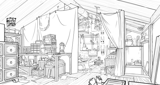
(the pictures used for this are my own. I dug them out of my 2022 folder)
Backgrounds have slightly different rules based on what you are making them for. Videogame Environment Concept Art vs Animation Layouts vs Comic Backgrounds vs Illustration backgrounds.
They all follow the same basics, which I will go over here, but the intention and function of those designs are going to be different. It's all about how you set up the scene and what it's purpose is!
Brainstorming and Thumbnailing
I like to think about a location as though it is a character. An abandoned old house with creaky sagging floorboards is very different from a futuristic space ship with sharp metal floor panels. A gas station has a very different feeling from a library.
I usually start by asking what is this location's story? Why was it built and for what purpose? What kinds of things does this room need to fulfill that purpose? You don’t need solid answers, but its good to be thinking about it while you are working.
Next, sketch some ideas for how this place is going to look. For me, this usually involves drawing the idea from multiple angles and then making lists & small sketches of the objects I think should be filling the space.
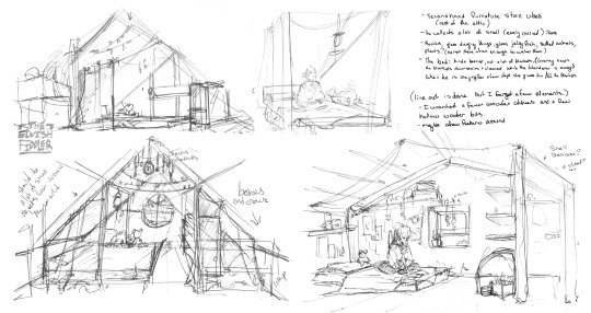
Example: The main character of my original work is a Wanderer. They collect a lot of things on their travels, but those items have to be small enough to be easily carried in a backpack. I wanted his room to be in the corner of an attic, walled off by curtains, and filled with trinkets. You can see some of my brainstorming above.
References
I only look for references after I've done some sketching and planning; this is to solidify my idea first so that I don't accidentally copy anyone else's work. I will make a moodboard with pictures of lighting, colours, items, rooms with specific ceiling beams, old chairs, etc. basically whatever I feel fits the vibe.
Honestly, I don't use references as much as I should. For ROTTMNT fanart I look at backgrounds and screenshots from the series to study the style. I also reference actual photos of NYC to get a feel for how Rise condenses the visual information.
In general, it's good to have references of real life objects/locations, because there are so many details like cracks in pavement, stickers on polls, crowning on buildings, fancy fencing, weird chair legs, etc. that you might not think of. It's the imperfect details that can make a location feel more alive.
Perspective
Once you have your chosen sketch we move to.... the infamous perspective boxes. Doing backgrounds is just learning to be comfortable drawing So Many boxes and carving items out of them.
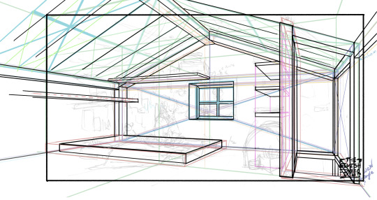
Many better artists than myself have made videos on perspective, vanishing points, and all the technical bits. Videos like THIS ONE and THIS ONE are helpful (this post is great too!!). There are probably a lot of classes to be found on Skillshare or Schoolism. I learned a lot of this in my college art course, so I can't give you a specific video which helped me.
You can get by and be a good artist without learning this stuff. There are quite a few successful artists who have admitted they never bothered to learn perspective (one of these people even made a whole graphic novel series).
I personally avoided properly learning this stuff until I was in my 20s because I thought it would be boring and difficult to do. tbh I really wish I had learned it earlier because it's so much fun to make those silly little boxes imo. It looks scary and complicated but, just like drawing humans, it just takes time, repetition, and practice to develop the knowledge and skills.
Cleanup
You have your boxes and lines! Cool! Now to make a scene out of it. Fill in the details, get everything placed were you want it! Generally, the lines of each item will point back towards the horizon line, but they can have different perspective points.
Generally you would want to clean it up and get your room completely sketched before doing the lineart. I tend to combine the steps (not recommended)
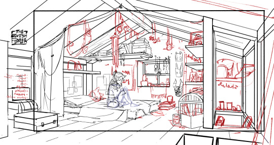
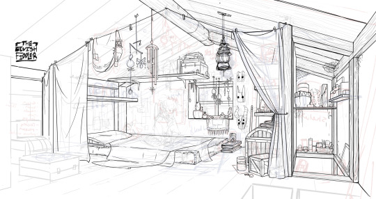
Lineart
I've mentioned how I do this before. Closer objects have thicker lines and more detailed inside. Further objects have thinner lines and less detail. I didn't quite achieve that balance with the image below, but it's close enough.
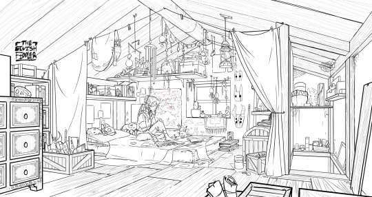
Colours and Shading will have to be a separate post. In the meantime, I highly recommend the book "Color and Light" by James Gurney. I used to borrow it from my local library and a good chunk of my knowledge was learned from it :)
#Artist's Comic Rambles#asks#art related asks#thank you for the ask!! I'm glad to hear you enjoy the comc :D#i hope this was somewhat helpful...#i get overwhelmed by broad questions very easily haha#if you would me to elaborate on something specific I mentioned feel free to ask#i wrote this all out weeks ago and then forgot about it... I just added a link or two but yeah here it is
307 notes
·
View notes
Text
I know a lot of people on qsmpblr use Tumblr mobile, but if you do use browser Tumblr then I would recommend the Simple Translate extension. Because Tumblr doesn't have built in translation like Twitter, there's less fans posting in their native language, instead most people just use English.
Simple Translate is an extension that allows you to translate text that you highlight into a target language. (It uses Google Translate API, but so does Twitter so the translation quality is pretty much the same).
Firefox Extension | Chrome Extension

When you highlight text in another language, a translate icon appears, when you click on it a panel containing the translation of the text appears.

You can also change the settings of the extension so that the translation panel automatically appears when you highlight text in another language.

Here's some more examples using the official QSMP Twitter accounts, you do not need to change the settings of the extension to translate from different languages into your target language.
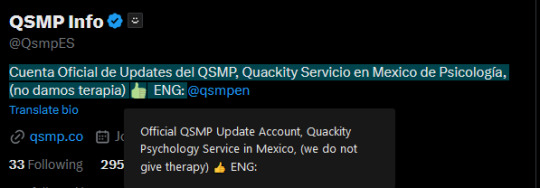
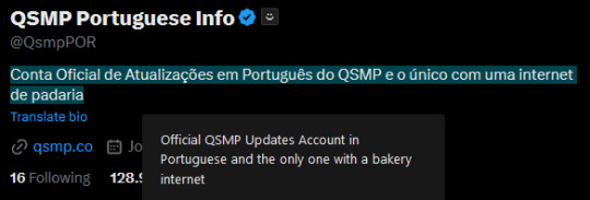

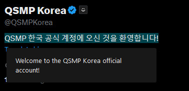
(All of these match the translations given when using the "translate bio" button on Twitter directly.)
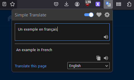
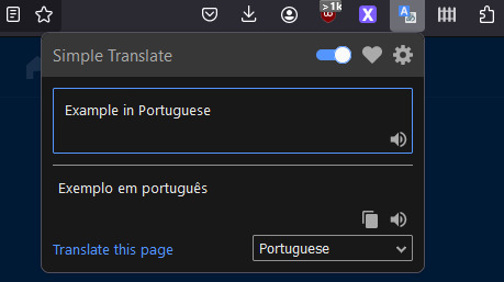
You can also access a translation box using the icon in the toolbar, any text you enter can be translated to the language selected in the drop-down menu (meaning you don't need to open a new tab to use Google Translate).
Some settings explanation and other stuff under the cut. Not super important but I figured I'd add it anyways.

There is an option to use DeepL API as opposed to Google Translate (it's another translation tool, there is free access to the API with a limit of 500,000 characters/month, and a pro version for unlimited access).
Whatever the target language is set as is what text you highlight will be translated into. There is another option for a second target language, I'll explain that further down.
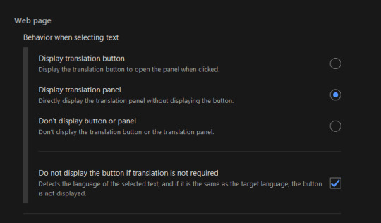
This option changes how you view the translation panel, the first option (default) has the icon appear when you highlight text (as seen in the first image of the post), the second option has the translation panel appear automatically when you highlight text, and the for third option the panel and icon won't automatically appear, but can still be accessed by right-clicking the highlighted text and selecting "translate selected text".
The checkbox below these options means that if the text you're highlighting is already in your target language, the translation icon and panel will not appear, it can again still be accessed by right-clicking what you've highlighted and selecting translate.

This option appears twice, in both the Web-page section (for translating selected text) and the Toolbar Popup section (for the translation box in the toolbar popup).
The web page option, when toggled on, means that when you select text that is in your target language, the translation panel will translate into the second target language that has been selected. If the checkbox for "do not display if translation is not required" is toggled on, you can only view the translation from Target -> 2nd Target by right-clicking to translate selected text.
The toolbar popup version of this option is used to automatically switch the language in the toolbar translation box when you input something in your main target. (ie. second target set to French means that when you input English text in the translation box it will switch the translation setting from "(detect language) -> English" to "English -> French").
There are also settings to change the style and size of the translation button and panel.
Side note: Mixed language messages (not containing your target language) will only translate one of the languages, you can work around this by highlighting the different languages separately.
Links again if you don't want to scroll all the way back up
Firefox Extension | Chrome Extension
#if you use twitter and want to crosspost this feel free#but please link to this post and perhaps paste the post text into the alt text of the screenshot#so people can translate the post text from english to their own language (or honestly feel free to translate it yourself and post that too)#qsmp#qsmpblr#qsmptwt#i think this could also maybe be useful for tweets that arent detected as another language so the translate option doesnt appear?#idk i dont use twt much#idk if anything like this has been posted before tbh#i just enjoy seeing people speaking in their native languages over on qsmptwt and when it occasionally happens here too#and i think itd be pretty cool to see it more on qsmpblr#tiggady tags#also i figure it could be useful translating from english into ur native lang!!! forgot to mention that in the post
790 notes
·
View notes
Text
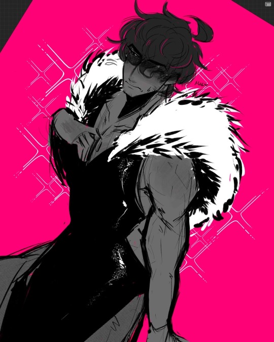


🖤
#trigun#trigun stampede#nicholas d. wolfwood#nicholas d wolfwood#wolfwood#da gallery#tristamp#ok y’all decided i should upload it so here it is#i forgot to mention this was based off of a friend’s roblox avatar lmao#i still feel extremely shy about this despite it being the most tame thing ever#i guess it’s probably cuz i never usually draw stuff like this with my favs and usually with just my ocs……….. that could be it……….#plus also uploading it for ppl to see. hmmmm. much to think about
474 notes
·
View notes
