#for character design
Explore tagged Tumblr posts
Text
Miscellaneous character design tips (that everyone could find useful)
- Feathers in hair, behind the ear, on the head, in some headress ect? Just don't. Unless you're indigenous I strongly, strongly advise against it, bc native people have criticized this design trope time and time again. Accessories and clothing like this can be very difficult to get right if you don't know what you're doing.
• Also! W*ndigos. Don't. If you wanna design a character that "looks like" (or is what you imagine when you think of a) W*ndigo, just. Design a character that looks like that and call it some other monster (Disclaimer: I'm mainly talking about things like those skull headed monsters with antlers ykno). These creatures have alot of deep meaning to the cultures they're from, and people are tired of them being appropriated and misrepresented. It will cost you nothing to just make a generic monster rather than butcher something from a marginalized culture. (Also, I've censored the word because in the past I've been told that using it's name is bad luck/harmful, so I'm doing this to be respectful)
(Natives/indigenous people are welcome to add on discussion about this if you feel like there's anything I could've said differently)
- Unless your character design is meant to be flexible, up to artist interpretation, or just messy, place patterns and decorative characteristics on distinct, memorable places. For example if your character has spots, put the most notable ones on places that're easy to remember and replicate, like on particular body parts. I'd also advise to make just a bit less of these patterns. Generally, if you're not aiming for a cluttered looking design, prioritize quality over quantity, when it comes to patterns.
- A character design's intent is just as important as the actual character design. You'll see me mentioning this on the previous point as well. Unless we're talking about offensive caricatures, there's teeechnically no such thing as a "bad" character design. Just rather a failed or unsuccessful one. What I mean by that, is that if your design is meant to look cliche, tacky, messy, or just plain unappealing, and it looks like such, that is a successful design! If you designed a character just to be something fun for you to draw, that's a successful design! I often see this point applied more professionally by other art advisors, to mean more like "You should be able to tell what kind of character it is based on the design", which is also true! But intent and purpose matters in storytelling. Obviously, not all aspects of a design need to be there for some very specific reason (looking at the people who ask "Why was this character made fat/gnc/black/poc?" and so on.) just keep in mind what this character is supposed to be. I think it's better to worry about if the character design does what it's supposed to, rather than if it's ""Good""
(And yeah, there are still things that just objectively don't look very good together, according to human perspective and color theory and whatnot, but again, if you're aiming for that, you go buddy!)
- Sorta coinciding with the previous point: Don't be afraid to use "ugly" traits when designing. I think the reason why is obvious (beauty standards can go suck a dick), but there's more to it than just radical acceptance! By giving more unique, weird, or "ugly" traits to your characters, you make them more memorable and distinct from one another. If there's a billion smooth faced perfect pretty characters who are the exact same kind of flavorless vanilla sexy, it gets boring, and they blend together! And please don't limit these traits to just villains or characters who are supposed to be disliked!! My other advice on this point, is, pllllease don't design villains "ugly" and heroes "pretty", I feel like that should be a given, but alot of people may be doing it without even realizing. And that's understandable, but I heartily recommend taking a second to think about it more deeply. Why is this visual trait "Bad", or "Evil"? I just feel like so many artists are deathly afraid of having their characters look the least bit unappealing or challenging. I could go on about this but I'll stop here to keep it concise. Don't beauty police your oc is all I'm sayin
- Reference! I don't necessarily mean take inspiration from other existing character designs, although that can also be helpful. I mean that look around you, think broadly! If you have a certain theme for your design, try to round up all the little things (items, concepts, colors, animals, traits) that could be associated with it! And try to reflect that in your character design. You can get a little wacky and experimental. You can literally just broaden your inspiration to things like everyday objects, a specific fabric texture, an element, or a fungi that lives in moldy houses. Anything! My main point is to try to think outside the box and consider more unconventional things to reference for your character design, you'll never know what might work and look really interesting. Often, a bland design is worse than a weird one. (Disclaimer: Unless you're aiming for bland ofc, per my prev points, but ykno). You can also just go by "Hmm, I'm making a character who is X, what does that remind me of?" or, what I also recommend "Hmm, so X kinds of characters remind me of these things. Let's ditch that and think what one usually wouldn't associate with X kinds of characters!". Ykno, defy convention, think about things you might not usually do. I know it can be easier said than done but once you get into a habit of trying to think more broadly, it'll come to you easier. Don't be afraid to get odd and unusual
- While I don't condemn designing a character in a way that just, is that way, because you designed it like that, I also recommend thinking about how and why the character is like that in-story. Might seem like an obvious tip, but I'll elaborate. I for example, have a pair of bug demon characters who grew up on the streets and didn't have the normal amount of nourishment for their age, so, due to that their mouth pincers and other buggy parts were left much smaller and more "plain" looking than others of their species. They never developed to their appropriate adult size. Things like this will reflect on a character design! And that's just one example. If your character has a habit of nervous picking, or sensory problems, or live in an area where certain resources for clothing aren't available, all of this will reflect on the design! Of course, you can also work backwards from a design and think "Hmm, what justification will I think of for the character having these traits (especially if they're uncommon for their story setting)?"
I may do a part 2 sometime later, I just had some thoughts I wanted to compile for now! Obviously you can have your own design principles but these are ones I consistently use (also the first one being as specific as it is, is just something I particularly wanted to say).
#Character design#for character design#Character design tips#character design ideas#Cultural appropriation#Ask to tag#design tips#Design ideas#Artists on Tumblr#monster design#Artblr#Important
255 notes
·
View notes
Text


dipper and mabel bad end where they end up like ford and stan
103K notes
·
View notes
Text
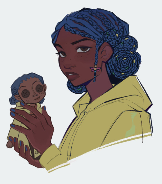
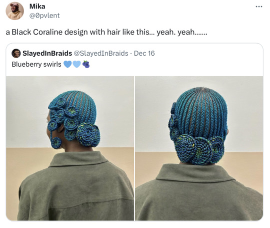
New Coraline design drop
254K notes
·
View notes
Text
Mystery Inc. but it’s the 1890s
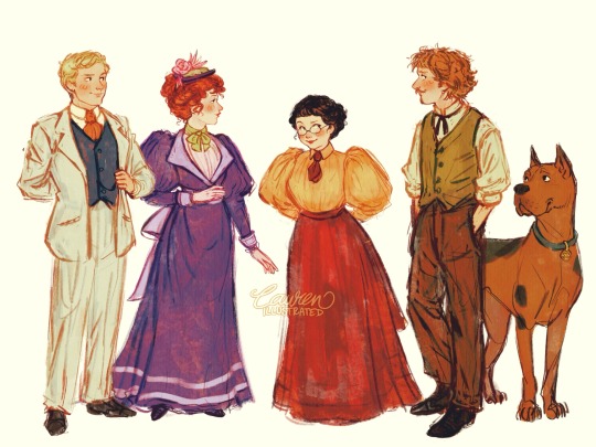
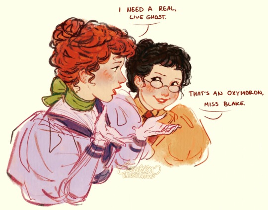
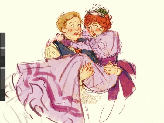
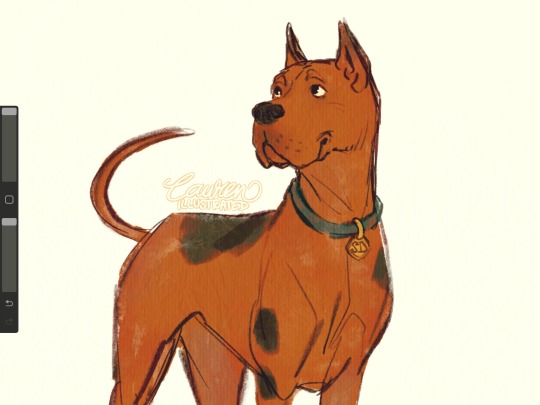
Who had late Victorian Scooby Doo on their 2024 bingo card? Hmm?
The idea came to me when I was thinking about Sherlock Holmes and then remembered the iconic mystery solving gang hehe
#scooby doo#scooby gang#shaggy and scooby#velma dinkley#fred jones#daphne blake#fred and daphne#scooby doo art#victorian#victorian fashion#au#scooby doo au#character designs#victorian era#character sketch#shaggy rogers
122K notes
·
View notes
Text

i don't have a cool culture to draw her in for the trend but uhh. hatsu-knight miku
edit: @hanaa-yousef has asked me to include the link to her fundraiser; please donate or share to help her and her family to safety! (this is a vetted gofundme, you can check for yourself)
#aka transfem miku#art#my art#character design#artists on tumblr#digital art#hatsune miku#vocaloid#illustration
66K notes
·
View notes
Text

Original design by molenaide
African American Miku! There's a trend on Twitter where people are drawing Miku from different countries and in cultural clothing, and of course, I had to jump on this cute design. 🇺🇸🦅🩵
#art#digital art#drawing#black art#fanart#original character#character design#hatsune miku#miku#vocaloid
66K notes
·
View notes
Text
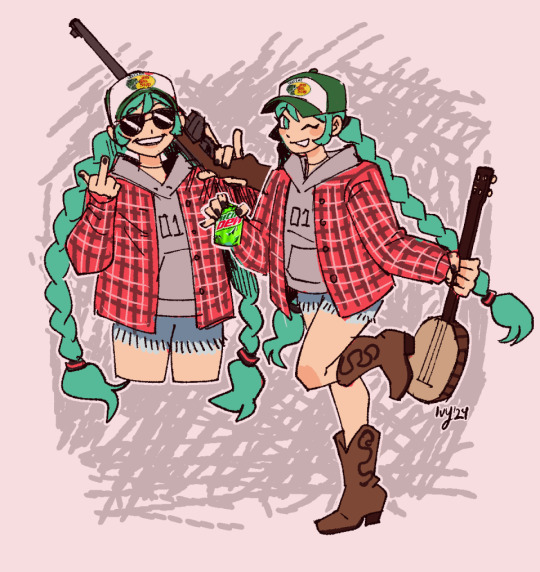
Appalachian Miku
#digital art#character design#my art#digital drawing#clip studio paint#hatsune miku#miku#jumping on the Brazilian Miku train#miku fanart#west virginia
67K notes
·
View notes
Text
I drew cats from stardew valley :D

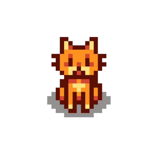
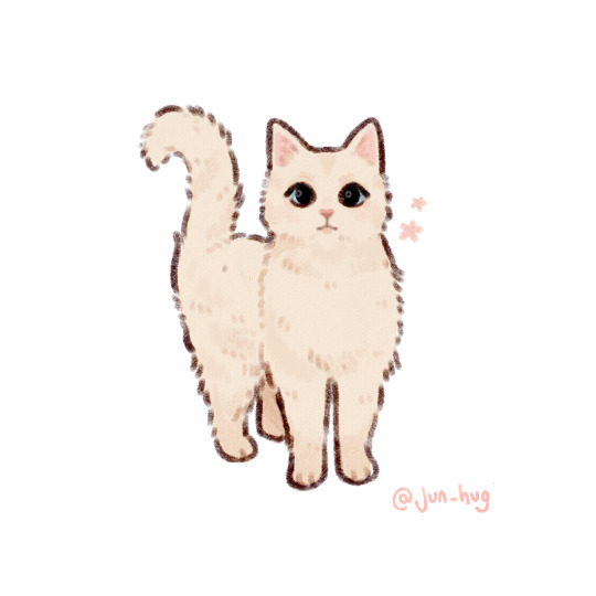

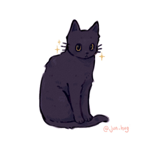
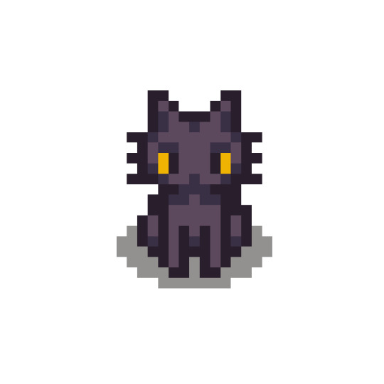
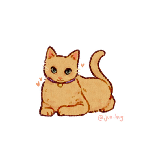
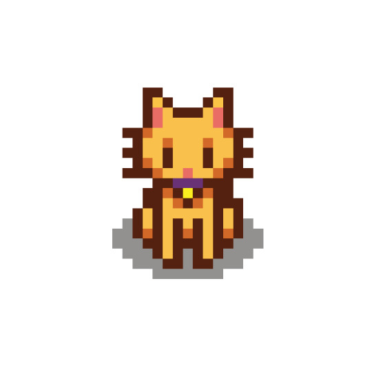
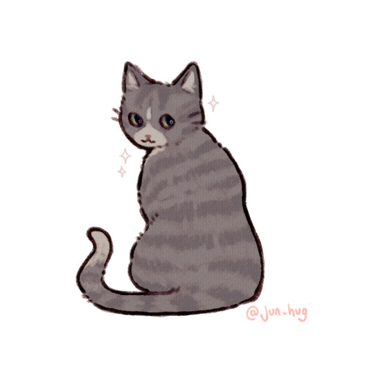

kofi | commissions | instagram
❗Do not reupload anywhere❗
#stardew valley#jun hug art#stardew valley cats#cat illustration#stardew valley fanart#jun arts#stardew fanart#stardew art#stv fanart#artists on tumblr#cat art#character design#art#digital art#cats#cute art#sdv fanart#sdv
130K notes
·
View notes
Text


It’s the season of mushroom🍂
38K notes
·
View notes
Text

The magpie who fishes stars
#my art#artists on tumblr#character design#my designs#furry art#furry#custom design#commission#this magpie pierces the skies and fishes for stars and meteorites#collects and sells them. wanted in the heavens for disturbing the star gardens.
49K notes
·
View notes
Text

caitlyn's garden of violets
#arcane#caitlyn kiramman#caitlyn#caitvi#character design#character art#the redemption arc is gonna be so good#go back to your love darling#explodes into 1982948 pieces thinking of them
41K notes
·
View notes
Text
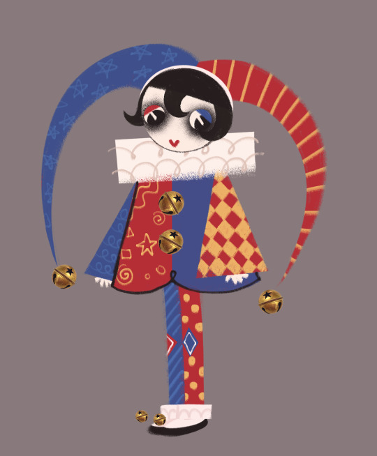
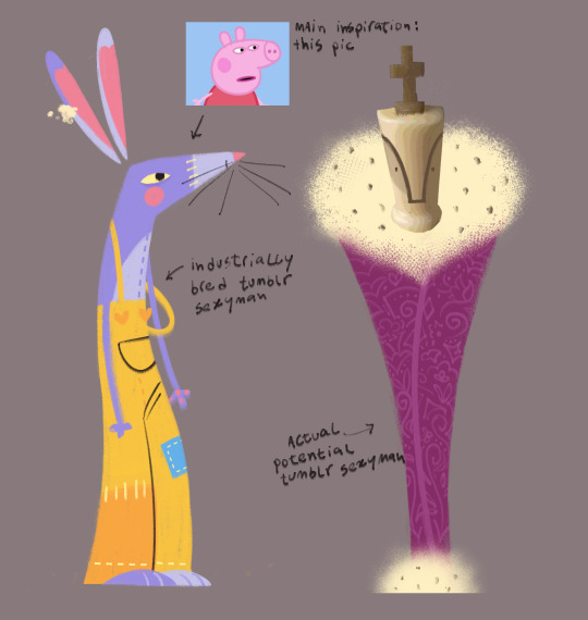
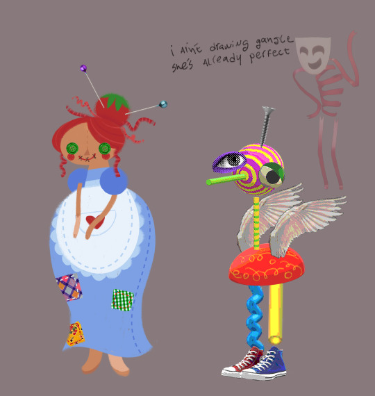
my name is caine i am your bitch
#fanart#tadc#pomni tadc#ragatha tacd#zooble tadc#jax tadc#kinger tadc#idk#the amazing digital circus#redesign#character design
27K notes
·
View notes
Text


26K notes
·
View notes
Text

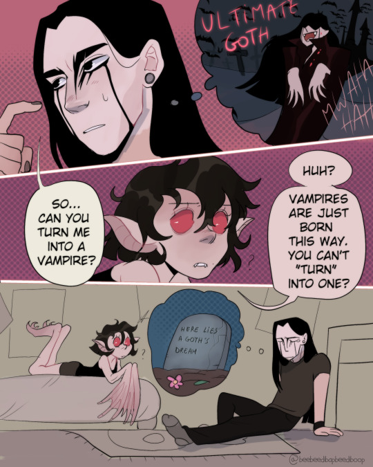
More of Matheo and Lily :) life is hard for a goth
#artists on tumblr#illustration#halloween#oc#original#character design#vampire#goth#matheo#lily#goth and vampire couple#digital art
31K notes
·
View notes
Text

"I should draw Māori Miku!" I said to myself. "Just a fun sketch, it shouldn't take me long" I said to myself. Six hours later I come to with this in front of me and a wrist begging for mercy but holy fuck worth it. I love this trend this was so much fun
PLEASE DON'T REPOST ON OTHER SITES!!! ASK ME FIRST!!!!!
DISCLAIMERS AND NOTES ETC.... I'm Pākehā, meaning I am not of Māori descent. I hold so much respect for Māori people, for their values and traditions, and for the fierce pride with which kapa haka is performed. I thought if I was going to design a Māori Miku, it makes sense to dress her in a kapa haka kākahu, as her whole thing is singing and dancing!!! The moko kauae is not based off any real person's. I referenced the temporary moko kauae a lot of kapa haka performers wear!! Was tricky finding out whether or not depicting her with a moko kauae was a good idea, so I went the safe route- showing an aspect of Māori culture without stepping over any boundaries!! Brown eyed Miku is everything to me shout out brown eyed Miku.... I referenced like seven different outfits to put hers together!! I really hope this looks accurate or at least passable. Thanks to adorkastock for the pose ref!!
#international miku#miku#māori#māori miku#miku trend#hatsune miku#international hatsune miku#miku fanart#artists on tumblr#character design#I think this is the longest I've spent on any drawing this year#six hours was not. an exaggeration#save me from myself. help!!!!#miku in your culture#<- not my culture. but thats the tag#described art#hhoooly fuck I can't believe I finished this#aotearoa
33K notes
·
View notes