#fluttericons
Explore tagged Tumblr posts
Visit Tumblr Blog
Explore Tumblr blogs with no restrictions, modern design and the best experience.
Last Seen Tumblr Blogs


Fun Fact
In 2020, Tumblr had 29.4 million users in the US.
Text
Flutter Buttons with example

Hello, Flutter Dev’s today we will discuss Flutter Buttons with example. As everybody knows that Button is the basic and famous element in building any application. Buttons are the most useful and powerful element used in every application. Jumping from one page to another, submitting the user information, performing actions and functionality are the basic functions that button does. Here Flutter Buttons have the same functions with different types. Flutter has introduced different types of buttons with amazing UI and their specific uses.
Following are the Flutter Button types:
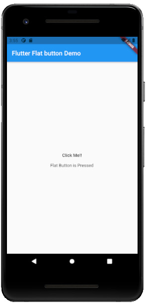
Flutter Flat Button:
It is a basic level button in a Flutter. The flat word itself says that it’s a flat button without any kind of decoration. This makes it really very basic. Generally, a flat button is used in a dialog box or toolbar where it can be used with some other widgets. In addition, it has two important and required properties. One property is the child property and another is onPressed(). Where the child property shows that the flat button contains another widget or component in it. And onPressed() property lets the user know what action is processed. Talking about the decoration Flat buttons has no color and the text in it has black color. The button color can be changed as per the requirement of the application. import 'package:flutter/material.dart'; void main() { runApp(MyApp()); } class MyApp extends StatelessWidget { @override Widget build(BuildContext context) { return MaterialApp( title: 'Flutter Demo', theme: ThemeData( primarySwatch: Colors.blue, ), home: MyHomePage(title: 'Flutter Flat button Demo'), ); } } class MyHomePage extends StatefulWidget { MyHomePage({Key key, this.title}) : super(key: key); final String title; @override _MyHomePageState createState() => _MyHomePageState(); } class _MyHomePageState extends State { String _value=""; @override Widget build(BuildContext context) { return Scaffold( appBar: AppBar( title: Text(widget.title), ), body: Center( child: Column( mainAxisAlignment: MainAxisAlignment.center, children: , ), ), ); } }
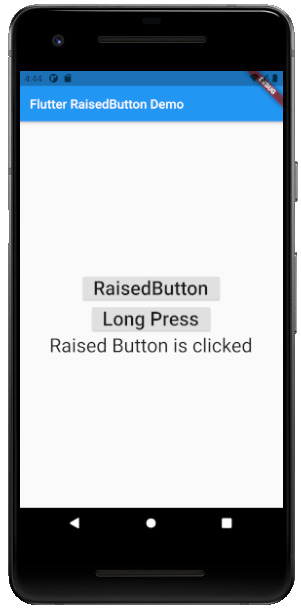
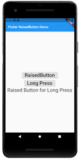
Flutter Raised Buttons:
Raised Button is a material-designed button that is rich in its looks. It is nothing but the same as the Flat button but has many differences. It has an elevation that increases when the button is in action. However it is rich in looks, we can change its color, shape, behavior, the color of the button. In addition, we can change it when it is in disabled mode and the animation time for the button. The most important thing for the Raised button is that if we do not specify any callback function then the button is in a disabled state. It has following callback functions: - onPressed(): When the button is pressed the onPressed() comes in action. - onLongPress(): This function fires the event after holding the button for several seconds. In short, after a long press. 3) import 'package:flutter/cupertino.dart'; import 'package:flutter/material.dart'; void main() { runApp(MyApp()); } class MyApp extends StatelessWidget { // This widget is the root of your application. @override Widget build(BuildContext context) { return MaterialApp( title: 'Flutter Demo', theme: ThemeData( primarySwatch: Colors.blue, ), home: MyHomePage(title: 'Flutter RaisedButton Demo'), ); } } class MyHomePage extends StatefulWidget { MyHomePage({Key key, this.title}) : super(key: key); final String title; @override _MyHomePageState createState() => _MyHomePageState(); } class _MyHomePageState extends State { String _value=''; @override Widget build(BuildContext context) { return Scaffold( appBar: AppBar( title: Text(widget.title), ), body: Center( child: Column( mainAxisAlignment: MainAxisAlignment.center, children: , ), ), ); } }
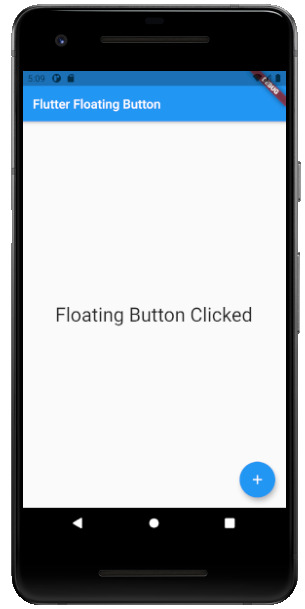
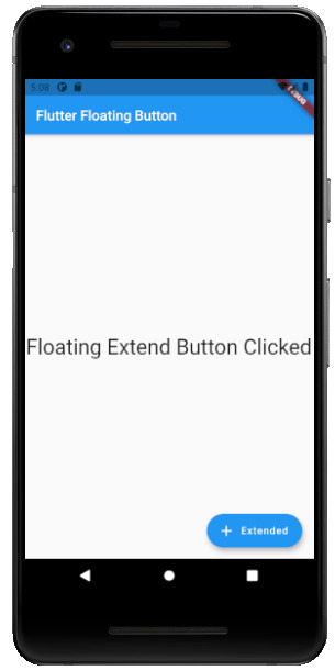
Flutter Floating Buttons:
Float Buttons are the circular buttons at the bottom of the screen in any application. The floating button is also famous as the Floating Action Button. This button is much popular among applications. Floating buttons contain Icons that express the behavior of the action that the button will fire. For example, the Floating button can act as a navigator like a google Maps navigation button. Another instance is the adding and subtracting button on the screen. Flutter says to have at least one Floating Action button on a single page. Following are the types of Floating Action Button: - FloatingActionButton: It is the basic Floating action button with one child widget inside it. It is a must to have the child widget. - FloatingActionButton.extended: As the name suggests that it is an extended version of the Floating Action Button. It is extended due to extra parameters like label with the child widget. In addition, this makes the Floating Action button more attractive. 3) import 'package:flutter/material.dart'; void main() { runApp(MyApp()); } class MyApp extends StatelessWidget { @override Widget build(BuildContext context) { return MaterialApp( title: 'Flutter Demo', theme: ThemeData( primarySwatch: Colors.blue, ), home: MyHomePage(title: 'Flutter Floating Button'), ); } } class MyHomePage extends StatefulWidget { MyHomePage({Key key, this.title}) : super(key: key); final String title; @override _MyHomePageState createState() => _MyHomePageState(); } class _MyHomePageState extends State { String _value=''; @override Widget build(BuildContext context) { return Scaffold( appBar: AppBar( title: Text(widget.title), ), body: Center( child: Column( mainAxisAlignment: MainAxisAlignment.center, children: , ), ), floatingActionButton: FloatingActionButton( onPressed: (){ setState(() { _value = "Floating Button Clicked"; }); }, tooltip: 'Demo Floating Button', child: Icon(Icons.add), ), // floatingActionButton: FloatingActionButton.extended( // onPressed: (){ // setState(() { // _value = "Floating Extend Button Clicked"; // }); // }, label: Text('Extended'),icon: Icon(Icons.add_outlined),) ); } }
Flutter Drop Down Button:
The dropdown button works as simple as a dropdown widget in Flutter. It creates a great visual appearance on the screen, where the user can select the element from the given dropdown. Flutter uses a material design that gives an awesome look and feel of widgets. So for dropdown, this material design for a dropdown button contains a dropdown box showing the selected item from the dropdown list and an arrow button. This arrow button will open the dropdown list on its click event. import 'package:flutter/material.dart'; void main() => runApp(MaterialApp( home: MyApp(), )); class MyApp extends StatefulWidget { @override _MyAppState createState() => _MyAppState(); } class _MyAppState extends State { List _colorItems = ; List _dropdownMenuItems; ListItem _itemSelected; void initState() { super.initState(); _dropdownMenuItems = buildDropDownMenuItems(_colorItems); _itemSelected = _dropdownMenuItems.value; } List buildDropDownMenuItems(List listItems) { List items = List(); for (ListItem listItem in listItems) { items.add( DropdownMenuItem( child: Text(listItem.name), value: listItem, ), ); } return items; } @override Widget build(BuildContext context) { return Scaffold( appBar: AppBar( title: Text("Dropdown Button"), ), body: Column( children: , ), ); } } class ListItem { int value; String name; ListItem(this.value, this.name); }

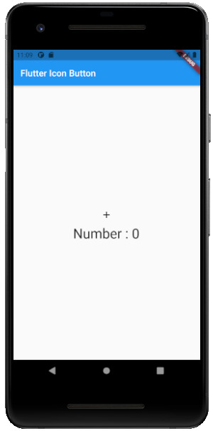
Flutter Icon Button:
Icon buttons are simply the material-designed button. Which has the picture printed on them. As designed by material, so it has a cool look and feel. This button is simple like an Icon widget. But the icon is on the top of the button. That is why a user can click on it to perform an action. import 'package:flutter/material.dart'; void main() { runApp(MyApp()); } class MyApp extends StatelessWidget { // This widget is the root of your application. @override Widget build(BuildContext context) { return MaterialApp( title: 'Flutter Demo', theme: ThemeData( primarySwatch: Colors.blue, ), home: MyHomePage(title: 'Flutter Icon Button'), ); } } class MyHomePage extends StatefulWidget { MyHomePage({Key key, this.title}) : super(key: key); final String title; @override _MyHomePageState createState() => _MyHomePageState(); } class _MyHomePageState extends State { int countNumber = 0; @override Widget build(BuildContext context) { return Scaffold( appBar: AppBar( title: Text(widget.title), ), body: Center( child: Column( mainAxisAlignment: MainAxisAlignment.center, children: , ), ), ); } }
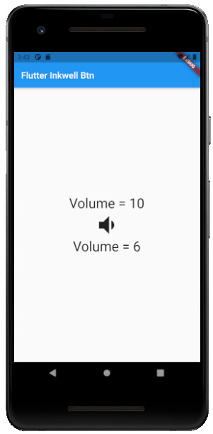
Flutter Inkwell Button:
This material-designed button is specially designed for the touch response of the user. Inkwell button is generally used for adding splash ripple effect. This creates a great look and feel. Even the gesture feedback is so good. import 'package:flutter/material.dart'; void main() { runApp(MyApp()); } class MyApp extends StatelessWidget { @override Widget build(BuildContext context) { return MaterialApp( title: 'Flutter Demo', theme: ThemeData( primarySwatch: Colors.blue, ), home: MyHomePage(title: 'Flutter Inkwell Btn'), ); } } class MyHomePage extends StatefulWidget { MyHomePage({Key key, this.title}) : super(key: key); final String title; @override _MyHomePageState createState() => _MyHomePageState(); } class _MyHomePageState extends State { int _volNumber = 10; @override Widget build(BuildContext context) { return Scaffold( appBar: AppBar( title: Text(widget.title), ), body: Center( child: Column( mainAxisAlignment: MainAxisAlignment.center, children: , ), ), ); } }
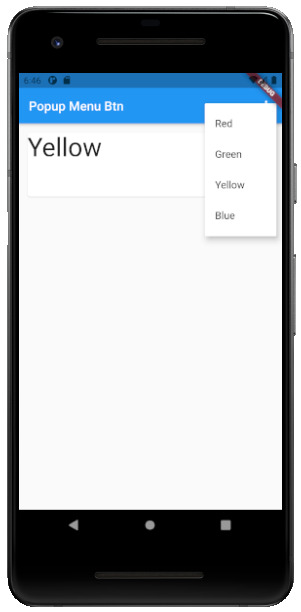
Flutter PopupMenu Button:
This button is on the Menu Bar of the screen. It is also designed my material which shows the pop-up list after clicking the three dots at the corner of the menu bar. This button contains text and an image. And about behavior, the list disappears as soon as you select an option from the list. import 'package:flutter/material.dart'; void main() { runApp(MyApp());} class MyApp extends StatefulWidget { @override _MyAppState createState() => _MyAppState(); } class _MyAppState extends State { ColorList _selectedOption = options; void _select(ColorList option) { setState(() { _selectedOption = option; }); } @override Widget build(BuildContext context) { return MaterialApp( home: Scaffold( appBar: AppBar( title: const Text('Popup Menu Btn'), actions: , ), body: Padding( padding: const EdgeInsets.all(10.0), child: ColorCard(option: _selectedOption), ), ), ); } } class ColorList { const ColorList({this.code, this.value}); final int code; final String value; } const List options = const ; class ColorCard extends StatelessWidget { const ColorCard({Key key, this.option}) : super(key: key); final ColorList option; @override Widget build(BuildContext context) { return Card( child: Container( width: 400, height: 100, child:Text(option.value, style: TextStyle(fontSize: 40)), ), ); } }
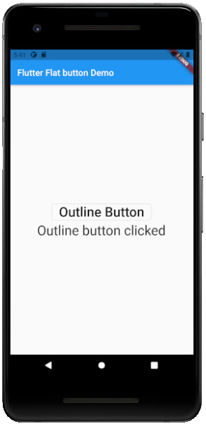
Flutter Outline Button:
The outline button is as same as the flat button of flutter. But the difference is the border that the Outline button has. The border of This button is completely dependent on the shape property of the button. It can be either a rounded rectangle, square, circle, or any other shape that is customized. import 'package:flutter/cupertino.dart'; import 'package:flutter/material.dart'; void main() { runApp(MyApp()); } class MyApp extends StatelessWidget { @override Widget build(BuildContext context) { return MaterialApp( title: 'Flutter Demo', theme: ThemeData( primarySwatch: Colors.blue, ), home: MyHomePage(title: 'Flutter Flat button Demo'), ); } } class MyHomePage extends StatefulWidget { MyHomePage({Key key, this.title}) : super(key: key); final String title; @override _MyHomePageState createState() => _MyHomePageState(); } class _MyHomePageState extends State { String _value=""; @override Widget build(BuildContext context) { return Scaffold( appBar: AppBar( title: Text(widget.title), ), body: Center( child: Column( mainAxisAlignment: MainAxisAlignment.center, children: , ), ), ); } }
Read the full article
#buttons#buttonsinflutter#dropdownbutton#extendedfloatingbutton#flatbutton#floatingbutton#flutter#flutteranimationtutorial#flutterbutton#flutterbuttons#flutterdropdownbutton#flutterflatbutton#flutterfloatingbutton#flutterforbeginners#fluttericon#fluttericonbutton#fluttericons#flutterinkwellbutton#flutteroutlinebutton#flutterpopupmenu#flutterpopupmenubutton#flutterraisedbutton#fluttersdk#fluttertutorial#fluttertutorialandroidstudio#fluttertutorialandroidstudioforbeginners#fluttertutorialfirebase#fluttertutorialforbeginners#fluttertutorialforios#fluttertutorialfromscratch
0 notes
Text
How to Add Custom Icons to Your Flutter Application

When you want to add some style to your application, you likely look for ways to make your User Interface stand out.
Whether it is using a specific font or a different color palate, you want to make the user feel attracted to your UI.
One way to customize is to update your icons. If you are a mobile developer, regardless of the platform you develop for, there is a straightforward process for adding icons to your application.
In Flutter, it’s not that complicated, but there are some things you should be aware of so that you don’t make time-consuming mistakes.
How to Customize the Application Launcher Icon
Instead of using the generic application icon Flutter provides, you can create your own. To do that, we will need to use a package called Flutter Launcher Icons. We’ll go through creating one step by step.
This is how your launcher icon looks by default:
Let’s assume we want this image to be our application launcher icon:
First, add the image you would like to use as that icon inside your project under the assets folder (if you don’t have an assets folder, create one):
Then add the dependency to your pubspec.yaml file under dev_dependencies:
Add this configuration inside your pubspec.yaml file:
The flutter_icons configuration has several keys to alter what is going to be rendered and for which platform.
There are more configurations available, but we won’t delve into them here. You can find out more by going here.
Now, run flutter pub get in the terminal or click Pub get inside the IDE.
Run the command below in the terminal:
Run your application and you should see that the launcher icon has changed.
How to Generate Custom Icons in Flutter
We will be able to generate custom icons through FlutterIcon.com. It allows us to either:
☝️ There is a package called FlutterIcon that has all of the icons shown, but due to it’s heavy size, I recommended only choosing the icons that you need and not using it.
Let’s demonstrate how to import custom icons into your application using this website.
Imagine we have the following form in our application:
You can see that we used icons for each TextFormField. Below is the code for the first TextFormField:
How about we change the first TextFormField’s icon into something more relevant?
On FlutterIcon.com:
In the .zip folder that you downloaded, there are several files:
Inside your project, import the .ttf file into a folder called fonts under the root directory. It should look like this:
Place the .dart class inside your lib folder. If you take a look inside the dart file, you will see something similar (you might see more IconData objects if you chose more than one icon to download):
Add the following to your pubspec.yaml file:
Run flutter pub get in the terminal or click Pub get inside the IDE.
Go to the place where you want to use your custom icons and use it like this:
Troubleshooting Custom Icons in Flutter
If your custom icons are showing up as squares with X’s in them, something is not right. You might also see in the logger the following warnings:
This could be for several reasons:
This content was originally published here.
0 notes