#dropdownbutton
Explore tagged Tumblr posts
Visit Tumblr Blog
Explore Tumblr blogs with no restrictions, modern design and the best experience.
Last Seen Tumblr Blogs


Fun Fact
Tumblr posted its first advertisements in May 2012 and subsequently earned $13M in revenue.
Text
Flutter Widget Catalog: An In-Depth Exploration of Flutter Widgets

Flutter, Google's open-source UI toolkit, has gained immense popularity among developers for its cross-platform capabilities and extensive widget library. The widget library is one of the key strengths of Flutter, offering a wide range of ready-to-use components that enable developers to create stunning and interactive user interfaces. In this blog post, we will take a deep dive into the Flutter widget catalog, exploring some of the most commonly used widgets and their functionalities.
What are Flutter Widgets? Flutter widgets are the building blocks of a Flutter application's user interface. They are reusable UI elements that can be combined and customized to create visually appealing and interactive interfaces. Widgets can be classified into two main categories: Stateless and Stateful widgets.
Stateless Widgets: Stateless widgets are immutable and do not change their appearance based on user interactions or external data. They are ideal for representing static UI components. Some commonly used stateless widgets include Text, Image, Icon, and Button.
Stateful Widgets: Stateful widgets, on the other hand, can change their appearance or behavior based on user interactions or external data. They maintain their state and update their UI whenever the state changes. Examples of stateful widgets include Checkbox, TextField, Slider, and DropdownButton.
Layout Widgets: Layout widgets in Flutter help in organizing and positioning other widgets within the user interface. They provide a way to structure the UI elements in a specific layout pattern. Some popular layout widgets include Row, Column, Stack, Container, and ListView.
Material Design Widgets: Flutter provides a set of widgets that follow the Material Design guidelines, enabling developers to create visually consistent and aesthetically pleasing UIs. These widgets include AppBar, FloatingActionButton, BottomNavigationBar, Card, and Snackbar.
Cupertino Widgets: Cupertino widgets are designed to mimic the iOS-style interface, providing a native look and feel for iOS applications developed using Flutter. They include widgets like CupertinoNavigationBar, CupertinoButton, CupertinoTextField, and CupertinoDatePicker.
Animation and Gesture Widgets: Flutter offers a rich set of animation and gesture widgets that allow developers to create engaging and interactive user experiences. Some notable widgets in this category are AnimatedContainer, Hero, GestureDetector, and DragTarget.
Custom Widgets: In addition to the built-in widgets, Flutter allows developers to create their own custom widgets tailored to their specific needs. Custom widgets provide flexibility and reusability, allowing developers to encapsulate complex UI components into a single widget.
Testing and Debugging Widgets: Flutter provides a range of widgets specifically designed for testing and debugging purposes. These widgets assist in identifying and resolving UI-related issues during development. Widgets like Semantics, TestWidgetsFlutterBinding, and MediaQuery are commonly used for testing and debugging purposes.
Conclusion: In this blog post, we have explored the Flutter widget catalog, highlighting the different types of widgets available and their functionalities. Flutter's extensive widget library empowers developers to create visually stunning and highly interactive user interfaces for their applications. Whether you are building a simple static UI or a complex custom widget, Flutter offers a wide range of tools and components to meet your needs. By leveraging the power of Flutter widgets, developers can save time and effort while delivering top-notch user experiences.
0 notes
Text
Flutter Buttons with example

Hello, Flutter Dev’s today we will discuss Flutter Buttons with example. As everybody knows that Button is the basic and famous element in building any application. Buttons are the most useful and powerful element used in every application. Jumping from one page to another, submitting the user information, performing actions and functionality are the basic functions that button does. Here Flutter Buttons have the same functions with different types. Flutter has introduced different types of buttons with amazing UI and their specific uses.
Following are the Flutter Button types:
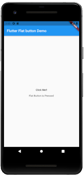
Flutter Flat Button:
It is a basic level button in a Flutter. The flat word itself says that it’s a flat button without any kind of decoration. This makes it really very basic. Generally, a flat button is used in a dialog box or toolbar where it can be used with some other widgets. In addition, it has two important and required properties. One property is the child property and another is onPressed(). Where the child property shows that the flat button contains another widget or component in it. And onPressed() property lets the user know what action is processed. Talking about the decoration Flat buttons has no color and the text in it has black color. The button color can be changed as per the requirement of the application. import 'package:flutter/material.dart'; void main() { runApp(MyApp()); } class MyApp extends StatelessWidget { @override Widget build(BuildContext context) { return MaterialApp( title: 'Flutter Demo', theme: ThemeData( primarySwatch: Colors.blue, ), home: MyHomePage(title: 'Flutter Flat button Demo'), ); } } class MyHomePage extends StatefulWidget { MyHomePage({Key key, this.title}) : super(key: key); final String title; @override _MyHomePageState createState() => _MyHomePageState(); } class _MyHomePageState extends State { String _value=""; @override Widget build(BuildContext context) { return Scaffold( appBar: AppBar( title: Text(widget.title), ), body: Center( child: Column( mainAxisAlignment: MainAxisAlignment.center, children: , ), ), ); } }
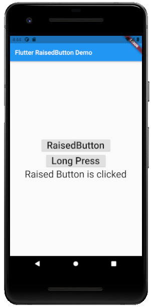
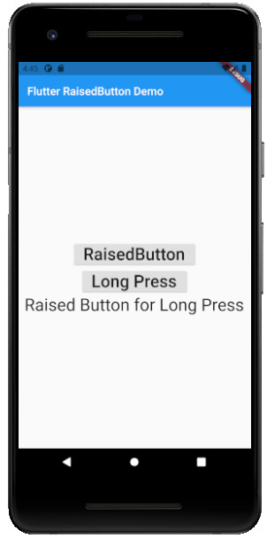
Flutter Raised Buttons:
Raised Button is a material-designed button that is rich in its looks. It is nothing but the same as the Flat button but has many differences. It has an elevation that increases when the button is in action. However it is rich in looks, we can change its color, shape, behavior, the color of the button. In addition, we can change it when it is in disabled mode and the animation time for the button. The most important thing for the Raised button is that if we do not specify any callback function then the button is in a disabled state. It has following callback functions: - onPressed(): When the button is pressed the onPressed() comes in action. - onLongPress(): This function fires the event after holding the button for several seconds. In short, after a long press. 3) import 'package:flutter/cupertino.dart'; import 'package:flutter/material.dart'; void main() { runApp(MyApp()); } class MyApp extends StatelessWidget { // This widget is the root of your application. @override Widget build(BuildContext context) { return MaterialApp( title: 'Flutter Demo', theme: ThemeData( primarySwatch: Colors.blue, ), home: MyHomePage(title: 'Flutter RaisedButton Demo'), ); } } class MyHomePage extends StatefulWidget { MyHomePage({Key key, this.title}) : super(key: key); final String title; @override _MyHomePageState createState() => _MyHomePageState(); } class _MyHomePageState extends State { String _value=''; @override Widget build(BuildContext context) { return Scaffold( appBar: AppBar( title: Text(widget.title), ), body: Center( child: Column( mainAxisAlignment: MainAxisAlignment.center, children: , ), ), ); } }
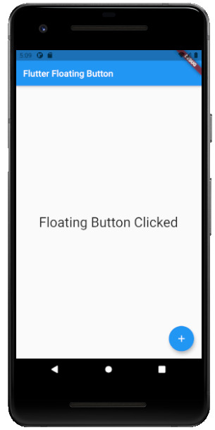
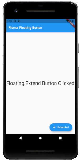
Flutter Floating Buttons:
Float Buttons are the circular buttons at the bottom of the screen in any application. The floating button is also famous as the Floating Action Button. This button is much popular among applications. Floating buttons contain Icons that express the behavior of the action that the button will fire. For example, the Floating button can act as a navigator like a google Maps navigation button. Another instance is the adding and subtracting button on the screen. Flutter says to have at least one Floating Action button on a single page. Following are the types of Floating Action Button: - FloatingActionButton: It is the basic Floating action button with one child widget inside it. It is a must to have the child widget. - FloatingActionButton.extended: As the name suggests that it is an extended version of the Floating Action Button. It is extended due to extra parameters like label with the child widget. In addition, this makes the Floating Action button more attractive. 3) import 'package:flutter/material.dart'; void main() { runApp(MyApp()); } class MyApp extends StatelessWidget { @override Widget build(BuildContext context) { return MaterialApp( title: 'Flutter Demo', theme: ThemeData( primarySwatch: Colors.blue, ), home: MyHomePage(title: 'Flutter Floating Button'), ); } } class MyHomePage extends StatefulWidget { MyHomePage({Key key, this.title}) : super(key: key); final String title; @override _MyHomePageState createState() => _MyHomePageState(); } class _MyHomePageState extends State { String _value=''; @override Widget build(BuildContext context) { return Scaffold( appBar: AppBar( title: Text(widget.title), ), body: Center( child: Column( mainAxisAlignment: MainAxisAlignment.center, children: , ), ), floatingActionButton: FloatingActionButton( onPressed: (){ setState(() { _value = "Floating Button Clicked"; }); }, tooltip: 'Demo Floating Button', child: Icon(Icons.add), ), // floatingActionButton: FloatingActionButton.extended( // onPressed: (){ // setState(() { // _value = "Floating Extend Button Clicked"; // }); // }, label: Text('Extended'),icon: Icon(Icons.add_outlined),) ); } }
Flutter Drop Down Button:
The dropdown button works as simple as a dropdown widget in Flutter. It creates a great visual appearance on the screen, where the user can select the element from the given dropdown. Flutter uses a material design that gives an awesome look and feel of widgets. So for dropdown, this material design for a dropdown button contains a dropdown box showing the selected item from the dropdown list and an arrow button. This arrow button will open the dropdown list on its click event. import 'package:flutter/material.dart'; void main() => runApp(MaterialApp( home: MyApp(), )); class MyApp extends StatefulWidget { @override _MyAppState createState() => _MyAppState(); } class _MyAppState extends State { List _colorItems = ; List _dropdownMenuItems; ListItem _itemSelected; void initState() { super.initState(); _dropdownMenuItems = buildDropDownMenuItems(_colorItems); _itemSelected = _dropdownMenuItems.value; } List buildDropDownMenuItems(List listItems) { List items = List(); for (ListItem listItem in listItems) { items.add( DropdownMenuItem( child: Text(listItem.name), value: listItem, ), ); } return items; } @override Widget build(BuildContext context) { return Scaffold( appBar: AppBar( title: Text("Dropdown Button"), ), body: Column( children: , ), ); } } class ListItem { int value; String name; ListItem(this.value, this.name); }

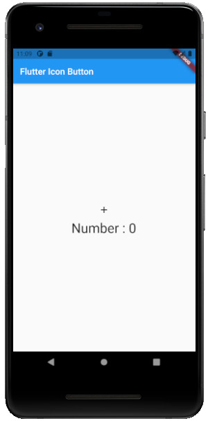
Flutter Icon Button:
Icon buttons are simply the material-designed button. Which has the picture printed on them. As designed by material, so it has a cool look and feel. This button is simple like an Icon widget. But the icon is on the top of the button. That is why a user can click on it to perform an action. import 'package:flutter/material.dart'; void main() { runApp(MyApp()); } class MyApp extends StatelessWidget { // This widget is the root of your application. @override Widget build(BuildContext context) { return MaterialApp( title: 'Flutter Demo', theme: ThemeData( primarySwatch: Colors.blue, ), home: MyHomePage(title: 'Flutter Icon Button'), ); } } class MyHomePage extends StatefulWidget { MyHomePage({Key key, this.title}) : super(key: key); final String title; @override _MyHomePageState createState() => _MyHomePageState(); } class _MyHomePageState extends State { int countNumber = 0; @override Widget build(BuildContext context) { return Scaffold( appBar: AppBar( title: Text(widget.title), ), body: Center( child: Column( mainAxisAlignment: MainAxisAlignment.center, children: , ), ), ); } }
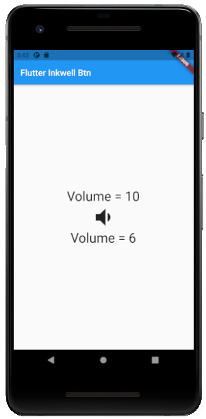
Flutter Inkwell Button:
This material-designed button is specially designed for the touch response of the user. Inkwell button is generally used for adding splash ripple effect. This creates a great look and feel. Even the gesture feedback is so good. import 'package:flutter/material.dart'; void main() { runApp(MyApp()); } class MyApp extends StatelessWidget { @override Widget build(BuildContext context) { return MaterialApp( title: 'Flutter Demo', theme: ThemeData( primarySwatch: Colors.blue, ), home: MyHomePage(title: 'Flutter Inkwell Btn'), ); } } class MyHomePage extends StatefulWidget { MyHomePage({Key key, this.title}) : super(key: key); final String title; @override _MyHomePageState createState() => _MyHomePageState(); } class _MyHomePageState extends State { int _volNumber = 10; @override Widget build(BuildContext context) { return Scaffold( appBar: AppBar( title: Text(widget.title), ), body: Center( child: Column( mainAxisAlignment: MainAxisAlignment.center, children: , ), ), ); } }
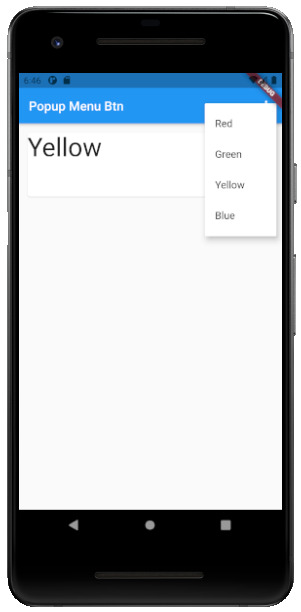
Flutter PopupMenu Button:
This button is on the Menu Bar of the screen. It is also designed my material which shows the pop-up list after clicking the three dots at the corner of the menu bar. This button contains text and an image. And about behavior, the list disappears as soon as you select an option from the list. import 'package:flutter/material.dart'; void main() { runApp(MyApp());} class MyApp extends StatefulWidget { @override _MyAppState createState() => _MyAppState(); } class _MyAppState extends State { ColorList _selectedOption = options; void _select(ColorList option) { setState(() { _selectedOption = option; }); } @override Widget build(BuildContext context) { return MaterialApp( home: Scaffold( appBar: AppBar( title: const Text('Popup Menu Btn'), actions: , ), body: Padding( padding: const EdgeInsets.all(10.0), child: ColorCard(option: _selectedOption), ), ), ); } } class ColorList { const ColorList({this.code, this.value}); final int code; final String value; } const List options = const ; class ColorCard extends StatelessWidget { const ColorCard({Key key, this.option}) : super(key: key); final ColorList option; @override Widget build(BuildContext context) { return Card( child: Container( width: 400, height: 100, child:Text(option.value, style: TextStyle(fontSize: 40)), ), ); } }
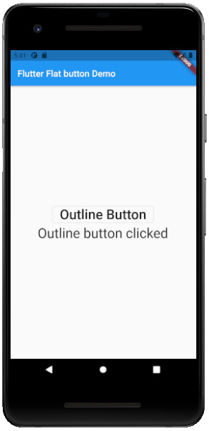
Flutter Outline Button:
The outline button is as same as the flat button of flutter. But the difference is the border that the Outline button has. The border of This button is completely dependent on the shape property of the button. It can be either a rounded rectangle, square, circle, or any other shape that is customized. import 'package:flutter/cupertino.dart'; import 'package:flutter/material.dart'; void main() { runApp(MyApp()); } class MyApp extends StatelessWidget { @override Widget build(BuildContext context) { return MaterialApp( title: 'Flutter Demo', theme: ThemeData( primarySwatch: Colors.blue, ), home: MyHomePage(title: 'Flutter Flat button Demo'), ); } } class MyHomePage extends StatefulWidget { MyHomePage({Key key, this.title}) : super(key: key); final String title; @override _MyHomePageState createState() => _MyHomePageState(); } class _MyHomePageState extends State { String _value=""; @override Widget build(BuildContext context) { return Scaffold( appBar: AppBar( title: Text(widget.title), ), body: Center( child: Column( mainAxisAlignment: MainAxisAlignment.center, children: , ), ), ); } }
Read the full article
#buttons#buttonsinflutter#dropdownbutton#extendedfloatingbutton#flatbutton#floatingbutton#flutter#flutteranimationtutorial#flutterbutton#flutterbuttons#flutterdropdownbutton#flutterflatbutton#flutterfloatingbutton#flutterforbeginners#fluttericon#fluttericonbutton#fluttericons#flutterinkwellbutton#flutteroutlinebutton#flutterpopupmenu#flutterpopupmenubutton#flutterraisedbutton#fluttersdk#fluttertutorial#fluttertutorialandroidstudio#fluttertutorialandroidstudioforbeginners#fluttertutorialfirebase#fluttertutorialforbeginners#fluttertutorialforios#fluttertutorialfromscratch
0 notes
Text
Complete Flutter and Dart Roadmap 2020
Mohammad Ali Shuvo
Oct 30, 2020·4 min read
DART ROADMAP
Basics
Arrays, Maps
Classes
Play On Dart Compiler
String Interpolation
VARIABLES
var
dynamic
int
String
double
bool
runes
symbols
FINAL AND CONST
differences
const value and const variable
NUMBERS
hex
exponent
parse methods
num methods
math library
STRINGS
methods
interpolation
multi-line string
raw string
LISTS
List (Fixed and Growable)
methods
MAPS
Map (Fixed and Growable)
methods
SETS
Set ((Fixed and Growable)
methods
FUNCTIONS
Function as a variabl
optional and required parameters
fat arrow
named parameters
@required keyword
positional parameters
default parameter values
Function as first-class objects
Anonymous functions
lexical scopes
Lexical closures
OPERATORS
unary postfix expr++ expr — () [] . ?.
unary prefix -expr !expr ~expr ++expr — expr await expr
multiplicative * / % ~/
additive + -
shift << >> >>>
bitwise AND &
bitwise XOR ^
bitwise OR |
relational and type test >= > <= < as is is!
equality == !=
logical AND &&
logical OR ||
if null ??
conditional expr1 ? expr2 : expr3
cascade ..
assignment = *= /= += -= &= ^= etc.
CONTROL FLOW STATEMENTS
if and else
for loops
while and do-while
break and continue
switch and case
assert
EXCEPTIONS (ALL ARE UNCHECKED)
Throw
Catch
on
rethrow
finally
CLASSES
Class members
Constructors
Getting object type
instance variables
getters and setters
Named constructors
Initializer lists
Constant constructors
Redirecting constructors
Factory constructors
instance methods
abstract methods
abstract classes
Inheritance
Overriding
Overriding operators
noSuchMethod()
Extension methods
Enums
Mixins (on keyword in mixins)
Static keyword, static variables and methods
GENERICS
Restricting the parameterized type
Using generic methods
LIBRARIES AND VISIBILITY
import
as
show
hide
deferred
ASYNCHRONY SUPPORT
Futures
await
async
Streams
Stream methods
OTHER TOPICS
Generators
Callable classes
Isolates
Typedefs
Metadata
Custom annotation
Comments, Single-line comments, Multi-line comments, Documentation comments
OTHER KEYWORDS FUNCTIONS
covariant
export
external
part
sync
yield
FLUTTER ROADMAP
Flutter Installation (First App)
Flutter Installation
Basic Structure
Android Directory Structure
iOS Directory Structure
BASICS
MaterialApp
Scaffold
AppBar
Container
Icon
Image
PlaceHolder
RaisedButton
Text
RichText
STATELESS AND STATEFULWIDGETS
Differences
When To Use?
How To Use?
Add Some Functionality
INPUT
Form
Form Field
Text Field
TextEditing Controller
Focus Node
LAYOUTS
Align
Aspect Ratio
Baseline
Center
Constrained Box
Container
Expanded
Fitted Box
FractionallySizedBox
Intrinsic Height
Intrinsic Width
Limited Box
Overflow Box
Padding
Sized Box
SizedOverflowBox
Transform
Column
Flow
Grid View
Indexed Stack
Layout Builder
List Body
List View
Row
Stack
Table
Wrap
Safe Area
MATERIAL COMPONENTS
App bar
Bottom Navigation Bar
Drawer
Material App
Scaffold
SliverAppBar
TabBar
TabBarView
WidgetsApp
NAVIGATOR
pop
Routes
Bottom Navigation
Drawer
Create Multipage App
popUntil
canPop
push
pushNamed
popAndPushNamed
replace
pushAndRemoveUntil
NavigatorObserver
MaterialRouteBuilder
BUTTONS
ButtonBar
DropdownButton
FlatButton
FloatingActionButton
IconButton
OutlineButton
PopupMenuButton
RaisedButton
INPUT AND SELECTIONS
Checkbox
Date & Time Pickers
Radio
Slider
Switch
DIALOGS, ALERTS, AND PANELS
AlertDialog
BottomSheet
ExpansionPanel
SimpleDialog
SnackBar
INFORMATION DISPLAYS
Card
Chip
CircularProgressIndicator
DataTable
LinearProgressIndicator
Tooltip
LAYOUT
Divider
ListTile
Stepper
SCROLLING
CustomScrollView
NestedScrollView
NotificationListener
PageView
RefreshIndicator
ScrollConfiguration
Scrollable
Scrollbar
SingleChildScrollView
Theory …
Flutter -Inside View
Dart
Skia Engine
Performance
Comparison
App Built In Flutter
OTHER USEFUL WIDGETS
MediaQuery
LayoutBuilder
OrientationBuilder
FutureBuilder
StreamBuilder
DraggableScrollableSheet
Learn How to Use Third Party Plugins
CUPERTINO (IOS-STYLE) WIDGETS
CupertinoActionSheet
CupertinoActivityIndicator
CupertinoAlertDialog
CupertinoButton
CupertinoContextMenu
CupertinoDatePicker
CupertinoDialog
CupertinoDialogAction
CupertinoNavigationBar
CupertinoPageScaffold
CupertinoPicker
CupertinoPageTransition
CupertinoScrollbar
CupertinoSegmentedControl
CupertinoSlider
CupertinoSlidingSegmentedControl
CupertinoSwitch
CupertinoTabBar
CupertinoTabScaffold
CupertinoTabView
CupertinoTextField
CupertinoTimerPicker
ANIMATIONS
Ticker
Animation
AnimationController
Tween animation
Physics-based animation
AnimatedWidget
AnimatedBuilder
AnimatedContainer
AnimatedOpacity
AnimatedSize
FadeTransition
Hero
RotationTransition
ScaleTransition
SizeTransition
SlideTransition
NETWORKING
http, dio libraries
json parsing
Local Persistent Storage
SQFLITE
Shared Preferences
Hive
JSON
JSON- PARSING
INTERNATIONALI ZING FLUTTER APPS
Locale
AppLocalization
json files
STATE MANAGEMENT
setState
InheritedWidget
ScopedModel
Provider
Redux
BLOC
OTHER IMPORTANT TOPICS
Widget Tree, Element Tree and Render Tree
App Lifecycle
Dynamic Theming
Flare
Overlay widget
Visibility Widget
Spacer Widget
Universal error
Search Layout
CustomPainter
WidgetsBindingObserver
RouteObserver
SystemChrome
Internet connectivity
Http Interceptor
Google Map
Firebase Auth
Cloud FireStore DB
Real time DB
File/Image Upload
Firebase database
Firestore
Semantic versioning
Finding size and position of widget using RenderObject
Building release APK
Publishing APK on Play Store
RxDart
USEFUL TOOLS
Dev Tools
Observatory
Git and GitHub
Basics
Add ,Commit
Push
Pull
Github,Gitlab And Bitbucket
Learn How to Become UI Pro
Recreate Apps
Animations
Dribble -App Ui
Make Custom Widgets
Native Components
Native Share
Permissions
Local Storage
Bluetooth
WIFI
IR Sensor
API -REST/GRAPH
Consume API
Basics of Web Dev
Server
TESTING AND DEBUGGING
Debugging
Unit Testing
UI (Widget) Testing
Integration Testing
WRITING CUSTOM PLATFORM-SPECIFIC CODE
Platform Channel
Conclusion: There are some courses out there but I believe self-learning is the best. However, you can take help whenever you feel like it. Continue Your Journey By making Apps and also You can clone the existing apps for learning the concept more clearly like Ecommerce , Instagram , Expense Manager , Messenger ,bla bla …….
Most important thing to remember that don’t depend on others too much , when you face any problem just google it and a large flutter community is always with you.
Best of luck for your Flutter journey
Get Ready and Go………..
1 note
·
View note
Photo

Day 43 of 100DaysOfCode Flutter Edition
TIP: DropdownButton class is a material design button for selecting from a list of items.
A dropdown button lets the user select from a number of items.
0 notes
Text
【 Flutter 】Flutter を 基礎 から 学習 ( Material ComponentsとiOS-Style ) part136 Material Components
【 Flutter 】Flutter を 基礎 から 学習 ( Material ComponentsとiOS-Style ) part136 Material Components
「 基礎 から 学ぶ Flutter 」という書籍で 学習 したことを ブログでアウトプットしていこうと思います。今回は Material ComponentsとiOS-Style ( part136 )です。 ��回 【 Flutter 】Flutter を 基礎 から 学習 ( Material ComponentsとiOS-Style ) part135 Material Components 引き続き、Material Componentsについて学びます。 DropdownButton DropdownButtonは押下すると選択肢が表示されるボタンです。 DropdownListというのはよく聞くのですがボタンですか😎 import 'package:flutter/material.dart'; void main() { runApp(new…

View On WordPress
0 notes
Text
[Flutter]ドロップダウンボタン(DropdownButton)の下線の色を設定する方法
どうも、ちょげ(@chogetarou)です。 ドロップダウンボタンの下線の色を設定する方法を紹介します。 方法 ドロップダウンの下線の色を設定するには、まず、DropDownButtonの引数「underline」にContainerやSizedBox、Dividerなどのウェジェットを指定します。 そして、指定したウェジェットで、色を設定します。 child: DropdownButton( underline: Container( height: 4, color:…

View On WordPress
0 notes
Text
¿Qué es MaterialApp en Flutter?
¿Qué es MaterialApp en Flutter?
El uso del widget MaterialApp es completamente opcional, pero es una buena práctica. MaterialApp es una clase predefinida en flutter, Es probable que sea el componente principal o central de nueatra aplicación de flutter. Podemos acceder a todos los demás componentes y widgets proporcionados por Flutter SDK. Text widget, Dropdownbutton widget, AppBar widget, Scaffold widget, ListView widget,…

View On WordPress
0 notes
Link
0 notes
Text
[Flutter]ドロップダウンボタン(DropdownButton)のアイコンを削除する方法
どうも、ちょげ(@chogetarou)です。 ドロップダウンボタンの右側に表示されるアイコンを削除する方法を紹介します。 方法 ドロップダウンボタンのアイコンを削除する方法は、2つあります。 iconSize 1つは、引数「iconSize」に「0」を設定する方法です。 DropdownButton( iconSize: 0, value: _value, onChanged: (value) {}, items: [ ・・・ ], ) Visibility もう1つは、Visibilityを使う方法です。 まず、「Visibility」を引数「icon」に指定します。 そして、Visibilityの引数「visible」に「false」、「child」にアイコンを指定します。 DropdownButton( icon: Visibility( visible:…

View On WordPress
0 notes
Text
[Flutter]ドロップダウンボタン(DropdownButton)の下線を無くすには?
どうも、ちょげ(@chogetarou)です。 ドロップダウンボタンの下線を無くす方法を紹介します。 方法 ドロップダウンボタンの下線を無くすには、引数「underline」を使います。 引数「underline」に何も設定しないContainerやSizedBoxなどを指定することで、下線を無くすことが出来ます。 以下は、Containerウェジェットを使った例です。 child: DropdownButton( underline:…

View On WordPress
0 notes
Text
[Flutter]ドロップダウンボタン(DropdownButton)の下線の太さを変えるには?
どうも、ちょげ(@chogetarou)です。 ドロップダウンボタンの下線の太さを変える方法を紹介します。 方法 ドロップダウンの下線の太さを変えるには、引数「underline」を使います。 引数「underline」にContainerやSizedBox、Dividerなどを指定し、その高さ・太さを設定します。 以下は、Containerウェジェットを使った例です。 child: DropdownButton( underline: Container( color: Colors.red, height:…

View On WordPress
0 notes
Text
[Flutter]ドロップダウンボタン(DropdownButton)のアイコンを変更するには?
どうも、ちょげ(@chogetarou)です。 ドロップダウンボタンの選択アイコンを変更する方法を紹介します。 方法 ドロップダウンボタンの選択アイコンを変更するには、引数「icon」を使います。 「icon」に、使用したいアイコンを指定します。 child: DropdownButton( icon : icon: Icon(Icons.arrow_downward), ・・・ ) オススメの記事 [Flutter]ドロップダウンボタン(DropDownButton)にプレースホルダーを設定する方法 [Flutter]ドロップダウンボタン(DropdownButton)を無効にする方法 [Flutter]AppBarにドロップダウンメニューを表示するには?

View On WordPress
0 notes
Text
[Flutter]ドロップダウンボタン(DropdownButton)のアイコンのサイズを変更するには?
どうも、ちょげ(@chogetarou)です。 ドロップダウンボタンの選択する時に使うアイコンのサイズを変更する方法を紹介します。 方法 ドロップダウンボタンのアイコンのサイズを変更するには、DropdownButtonの引数「iconSize」を使います。 「iconSize」に設定したいサイズを指定します。 child: DropdownButton( iconSize: 60, ・・・・ )), オススメの記事 [Flutter]ドロップダウンボタン(DropDownButton)にプレースホルダーを設定する方法 [Flutter]ドロップダウンボタン(DropdownButton)を無効にする方法 [Flutter]AppBarにドロップダウンメニューを表示するには?

View On WordPress
0 notes
Text
[Flutter]ドロップダウンボタン(DropDownButton)にプレースホルダーを設定する方法
どうも、ちょげ(@chogetarou)です。 ドロップダウンボタンにプレースホルダーを設定する方法を紹介します。 方法 ドロップダウンボタンにプレースホルダーを設定するには、引数「hint」を使います。 引数「hint」には、ウェジェットを指定できます。 この引数に、プレースホルダーを設定します。 child: DropdownButton( items: [], hint: Text('Select'), //プレースホルダー ) 「hint」は「Widget?」型なので、Text以外のウェジェットも使用することが出来ます。 DropdownButton( items: [], hint:…

View On WordPress
0 notes