#first time actually rendering something in blender :^)
Explore tagged Tumblr posts
Text

Wait I should post my elphelts lol


plus alts with my favorite elphie palettes
#first time actually rendering something in blender :^)#model and shaders from arcsys blender discord idk how to do the strive shader LOLLLL im not smart enough for that uet#i forgot if I had a blender tag whateverrrrr#ily white womannnnnn
17 notes
·
View notes
Text
IVE DONE IT
I TRIED TO MAKE A BLENDER MODEL
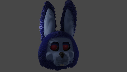
#literally first model I made besides a pizzeria map I’m working on#in which it looks like something out of Roblox or something lmao#but first actual model#he kinda looks like a fucked up sheep but whatever#His one ear looks a little weird but it might be the angle#my computer crashed like 3 times making this#yes it’s based on the vhs rubberface looking models/animatronics#yes it’s just a head so far#but I’m still proud#fnaf#modeled with eevee rendered with circles#blender#Bonnie
3 notes
·
View notes
Text
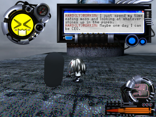
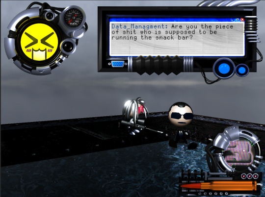
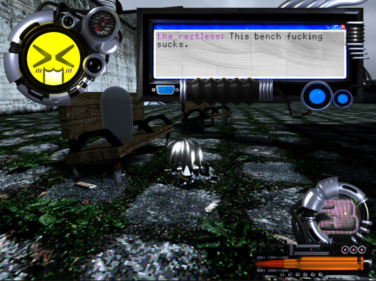

500 CALIBER CONTRACTZ Post #12
Dialogue!!!11:
The main thing I did over the past week or so was put together this dialogue system. The system itself was fairly easily to implement, and I think the only interesting part of the process to share is how I went about making the UI. As per usual, I wanted to have a cool mechanical feeling ui, but at the same time a friend of mine suggested an AOL instant messenger inspired chat window. I loved both of these ideas so I decided to combine them into a screen that pops up and contains the aim-like window. The modeling process for the screen was similar to how I went about making the other two bits of ui that are on screen in the above photos, but I decided to include a VGA port.
VGA PORT:
I didn't originally plan to include a VGA port, but I was in the middle of researching monitors and accidentally left a window open on my computer that just had a big photo of one and I went "wait a minute.". With my final two braincells I suddenly decided to slap together a model for the port which I ended up being proud enough of to, for some reason, make an entire section for it.
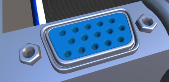
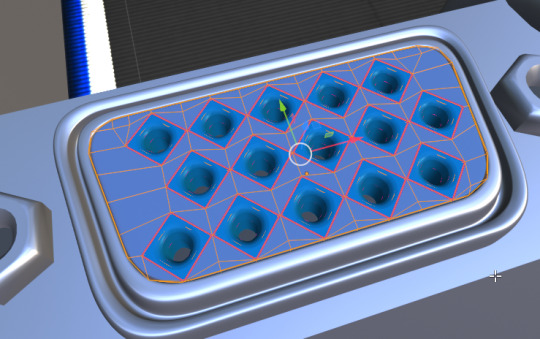
Sorry if any of the above sentences read horribly. I am going to need a third braincell if you want this stuff to be coherent. Anyway, Blender is so cool. Using the array modifier to make all these lil squares for the holes in the port is just such a satisfying process. I've come to really like makin pre-rendered assets like this.
New Movez:
This is actually a pretty big inclusion, and I probably should've ranked it in my mind above the VGA port. I added some new movement options to the game!
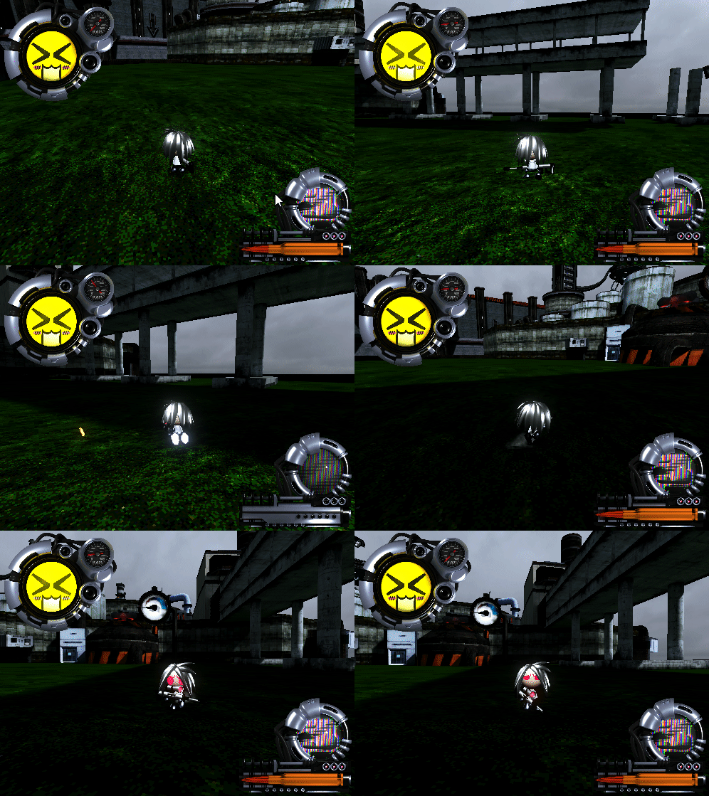
Firstly, I added this melee move where you swing the back of the sniper forwards to propel yourself a bit. It is mainly useful as a bunnyhop that allows you to conserve momentum.
Next up I added this kick that happens if you melee while in the air. It's basically just the one from mario64. It lets you gain a little bit more height and distance. It also becomes way more effective if you have a lot of momentum. A good tool for correcting jumps and reaching new heights.

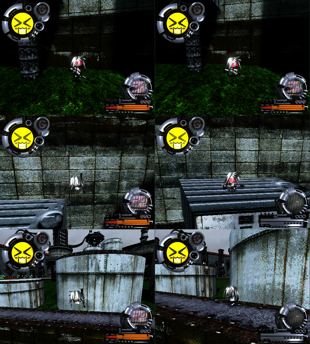
Finally, we have the big schmovement slide. This slide gives you a huge burst of speed that you can jump out of in order to send your self flyin. Surprisingly, it didn't really break any of the level design and ended up being a really fun addition imo. In order to perform it, you have to do a ground pound and then melee as you hit the ground. Also, I feel like I basically stole this from pseudoregalia. Played through that recently and it has been a good source of inspiration.
Nova!!!!!!!!!!!!!!!!!!!:
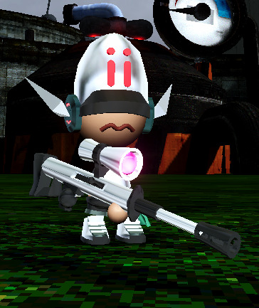
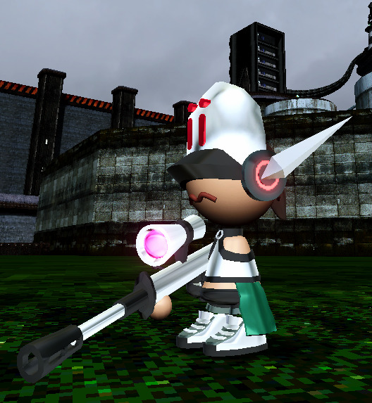

This is a cameo skin I've been really excited to finally make myself put in the game. Anodyne 2 is a really important game to me, and I love it much. I'm really happy tha folks at analgesic let me put her in here, and I'm p happy with how her model came together. If you haven't peeped the Anodyne games I highly recommend them. The first one was a major inspiration for parts of Fatum Betula.
Conclusion:
Lately I've been playing this game way too much. It has made it impossible for me to tell if it is fun or well designed. Some problems cropped up during playtesting that ima need to address, and I hope that it all comes together into something that one could say is "fun and cool". I think takin this weekend off is gonna do my brain good. Oh yeah also I feel like I should advertise that I'm still doing commissions if anyone is interested. Anyway, have a good 1 and enjoy urself.
#screenshotsaturday#indiegamedev#gamedev#indiedev#game development#indiegames#lowpoly#y2k#y2k aesthetic#indie game#3d platformer#3dplatformer#sniper rifle#50 caliber 3d platformer#500 caliber contractz#50 cal#anodyne#anodyne 2
410 notes
·
View notes
Text
George's 1/10th scale Mata Nui Tour
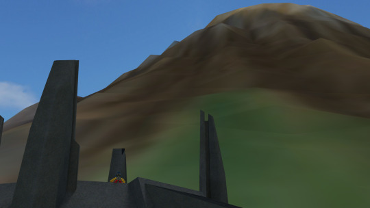
This is a follow up to my previous post about a piece of concept art that depicts the island of Mata Nui as being 1/10th size it is officially listed as in most later maps.
I must first say that I was blown away with the positive reception that post received! I did see some concern that it was now too small, but I believe that's mainly down to how absolutely MASSIVE the final size is. A 90% reduction in size by no means makes Mata Nui small.
But I know not everyone has spent as much time obsessing over the size of Mata Nui as I have, so I decided to enlist everyone's favourite Ta-Koronan George to help illustrate how large this "small" Mata Nui really is.
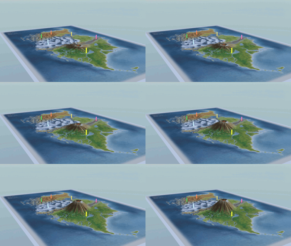
I scaled the image of Mata Nui so that it matches the measurements on the side, so it is roughly 35km long and 17km wide. I also made a simple height map to get the Mangai volcano the appropriate 2km high.
I started out with just some simple pegs at the locations of the villages to first illustrate the basic distances.
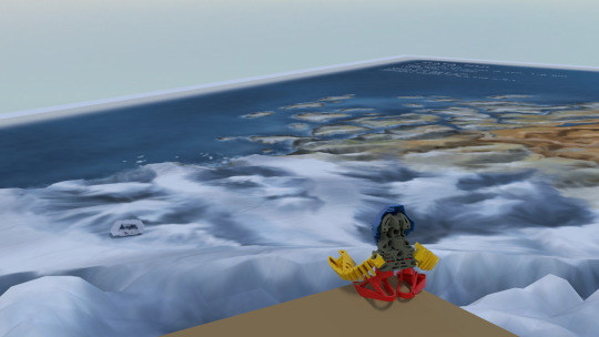
George here starts out at the location of the iconic beach from MNOG and the end of QFTT
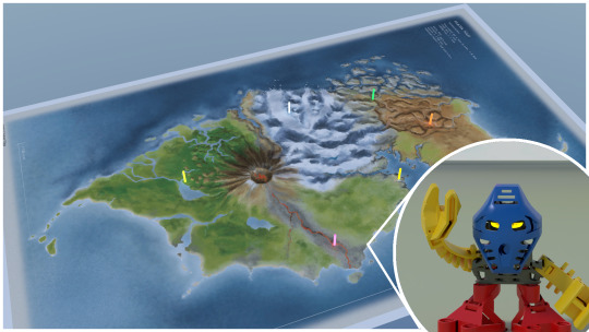
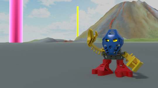
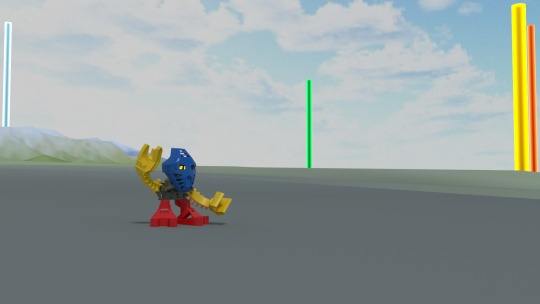
The beach is actually shockingly equidistant from most of the villages, Ta-Koro is closest at 2km, Ga-Koro is second closest at 6km, but the other 4 are all between 11 and 13km from the beach!
Here's a little animation to show the size of the pins, they're by no means small.
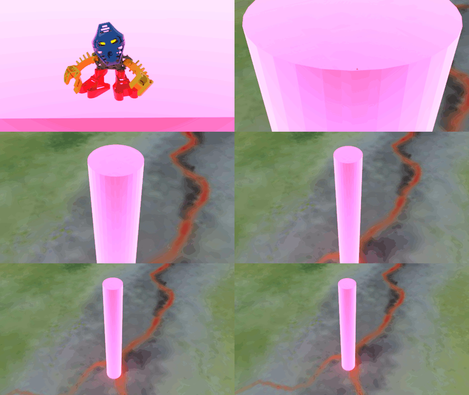
They had to be this big to be visible at all, which just goes to show how large the island still is even at 1/10th scale.
I did several shots of George standing on the edge of the Mangai's caldera. I extracted the villages from Bionicle the Legend of Mata Nui and scaled them accordingly, placing each of them where the village should be. See if you can spot them!
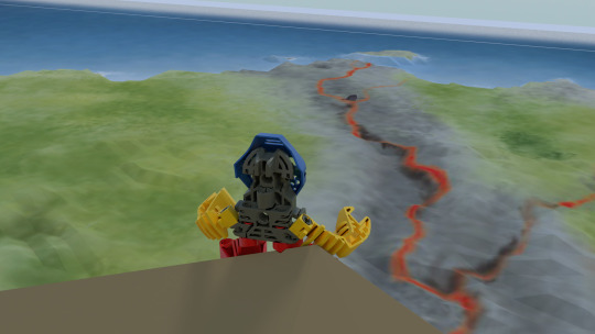
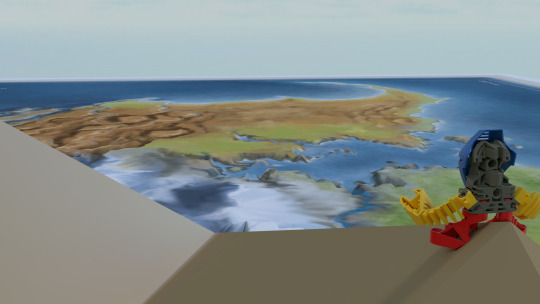
From the top of Mangai its 20km to the tiny islands at the very tip of Po-Wahi.
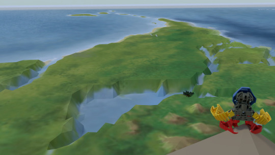
And 13km to the end of the chain of islands in southern Le-Wahi
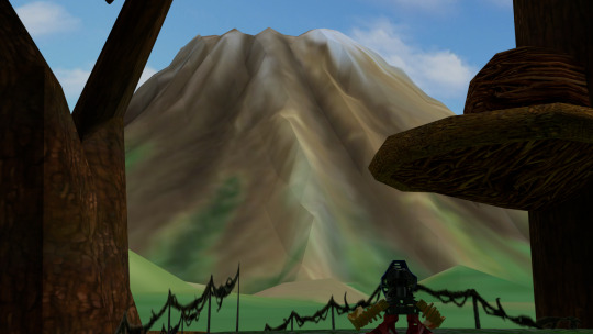
The view of the Mangai volcano is quite impressive from the villages too. Even at this 2km height its still around 2/3rds the height of Mt Fuji or half the height of Mt Kilimanjaro.
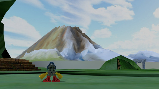
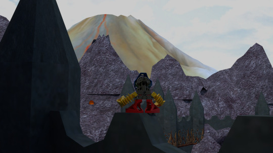
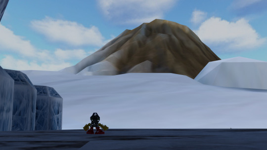
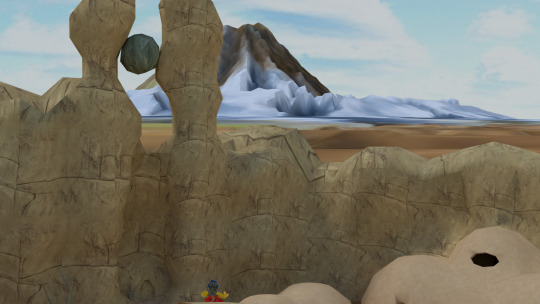
My heightmap could use more work, the Ihu mountain range isn't really apparent, I was mainly focused on getting the Mangai at the right height.
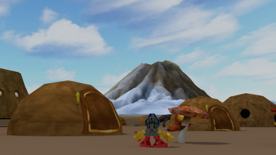
Here's what it would look like if Onu-Koro wasn't underground.
I hope these visuals helped to show the size of the 1/10th scale Mata Nui. I really do feel it is more in line with what we see from most media and fits well with the story.
Even with this size there's one thing to remember: Raw size isn't everything. Terrain matters a lot. Its easy enough for someone now to walk a kilometre or two over straight paved roads, but considering that Mata Nui is a lush volcanic island, half the place is covered in a jungle full of massive trees and swamps, much of it is very hilly and steep, this isn't an easy place to get around in.
I'll leave you with two things: first is an old animation I made of a zoom out from Tahu on top of the full final scale Mata Nui:
youtube
This is the most I can really do with an island that scale, blender doesn't appreciate having a view distance in the hundreds of kilometres while also rendering something human scaled.
Second is a comparison between the island I've just shown you overlaid on top of the full scale.
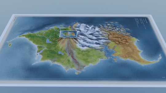
The whole island itself has a footprint roughly the same as the full scale Mangai volcano!
Hope you all enjoyed George's vacation photos. Good night and/or happy May :^)
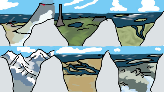
Slight addendum: A while ago I made this little sketch of what a view from the top of Ihu might look like, looking at all the regions. Just wanted to include it. good night
117 notes
·
View notes
Text
The current state of AI discourse is baffling to me because I swear to god some people are just developing collective amnesia and dismissing AI art as "not actually being that bad" when the problems with it are significantly deeper than whether or not it's "real art". It being "real art" is irrelevant to it causing tangible harm. Like yeah I don't think someone AI generating an image to use as a reference is some massive evil, but in the greater scheme of things:
AI art is being used to spread actual real-world misinformation. Propaganda.
Ai art is being used to spread CSEM and other forms of revenge porn. It is also threatening the livelihoods of sex workers to some degree.
People are putting their favorite artists' works through a blender, without their consent, instead of paying them, because image generation is instant dopamine.
Big corps are trying to use AI instead of paying artists/writers because they're greedy fucks.
Most AI programs (with few exceptions) are scraping from existing works without the consent of the original artists.
AI voices are doing the same.
A common argument I've seen is comparing these things to like... digital art, photo editing*, voice splicing. You have to understand that the merit of these things isn't that "they take more time/effort". Effort is not an inherent facet of art. Plenty of tools exist to make art easier that we take for granted now-- many forget the discourse that kicked up when digital art was first gaining popularity. The issue is and always will be consent. Most artists do not want their works or voices to be put into AI databanks. The fact that most AI programs do not care for this, and that a lot of companies are trying to swindle their way into getting artist consent under the pretense of "well they didn't say no", is the main issue. We completely lost the plot when we started focusing more on "is AI art real art?" and "is it bad to use AI for any purpose?", because those are both irrelevant to the question of "is AI harmful?", wherein the answer is yes. This is also failing to consider that "real art" can also cause harm for similar reasons: sexual harassment/revenge porn, defamation, propaganda, etc.
*As a note, this is also ignoring the fact that a lot of people DON'T want their art to be edited or even heavily referenced. It's been commonplace in art usage terms for ages now. This is important to note in the context of AI discourse and copyright law. I also believe there is a difference between voice splicing and AI voices since splicing is more limited and way less likely to get someone actually defamed or 'replaced' as a voice actor, and is just a manipulation of existing voice clips mostly for silly shitposts.
AI CAN be helpful. AI can be used to create references, or make smoother rendering, or even just for fun. A lot of people used AI programs in their baby stages without thinking about how the images were generated or the actual consent of the artists involved, because it was a fun shiny new toy. I also like to think most people who have the means to pay an artist ultimately would. But the issue is not and never has been AI making art easier, or people using it for silly shit, or even people using it for serious art refs. The issue is AI mass-scraping existing artwork, being used to facilitate misinformation, and screwing artists out of jobs. Don't even get me started on AI fucking generating CSEM, or revenge porn, and additionally how it impacts the careers of sex workers.
AI is an issue in its current state. Yes, the panic about it taking over art as a whole was overblown, even if the fears were valid. The capacities of AI art is almost always slightly below the capacities of human-made art, and it's something that will quickly fall in popularity once it stops being the shiny new thing. People using AI to make art easier aren't the enemy either, especially since this can be beneficial for people who do it as a job-- shortening the labor time and all. That doesn't mean AI isn't an issue and that everyone critiquing it is actually just an elitist ableist cuck or whatever. None of this really would've been a problem if not for the mass scraping, resulting in both violations of artist consent, and also it picking up genuinely illegal/nasty content. That's what we should be focusing on. None of this "real art" bullshit.
All that said: I personally would say that using most AI programs-- no matter the purpose-- is unethical because of how most of them function. The only exceptions would be for programs that specifically use consensually obtained data. On this front, I would highly recommend keeping tabs on Adobe Firefly, since it's one of the very very few models out there that has stated a clear commitment to not violating the copyright and consent of artists or persons (it operates off of stock footage and public domain).
#this is a little all over the place so sorry lmao#but seeing the discussion shift on AI has been fucking BIZARRE to say the least#like. collective amnesia bizarre.#ai art discourse#ai discourse#anti ai#tw csem
64 notes
·
View notes
Text
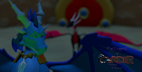
Ok so the saga with my old PC continues and is only fueling my desire to get back into fanfiction lol because I found all of the files from my attempt at making a legend of spyro fan-game! I honestly thought they were lost, I'm so excited to see all this stuff again! This was the "logo" for the game (I know its nearly unreadable lol, so it says "The Legend of Cynder, Shadows of The Past". 14/15 year old me didn't seem to care much for readability, I think I'd just discovered photoshop's layer effects lol)
Here's a bunch of random stuff I found.
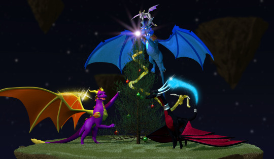
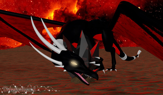
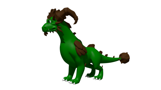

I'm defiantly going to do a redraw of that last one at some point. That was like, THE thing I remember being super proud of when I first did it. I think it was going to be part of the trailer my now-partner was putting together for the game lol.
Actually, a lot of these were actually just frames from animations, but either the files are either just corrupted, or high school me didn't know how to set fps and resolution properly in the output so I got a headache trying to watch them lol. It's probably the second one honestly. Also I remember my old laptop wasn't able to play back the animation because it would lag so much, so I just had to kind of...guess at timing, and that went about as well as you'd expect. It didn't help that blender used to have this bug where your audio would move around your timeline so it really was just random guessing. I'm amazed anything got done at all, let alone how far we actually got (that is to say, not far at all but we had something playable at least).
I also found the demo files and footage of the "game" running (running at 12fps but running)! I'm curious if they still work, I'll have to download an older version of blender to test them out!
There's actually a lot more but actually finding it is proving to be quite a challenge since this laptop seems to be the digital equivalent of an ADHD "doom box" - meaning nothing is sorted into folders that make even a remote lick of sense to me, it's all just kind of thrown in together lmao.
I wanted to post these though because even though I don't really do 3D stuff anymore, It still made me really happy to see how much progress I've made over the years and how far I've come. Also a few folks who worked on this project with me back on Deviantart have started finding me lol, so in case there's anyone else out there, hello! I'm not dead, I'm still around, I'm just a lot more (openly) queer now lmao.
Image descriptions:
[ID 1: A game title that reads "The Legend of Cynder, Shadows of the Past". The two lines, "the legend of" and "shadows of the past" are written in dark purple text. The purple material is supposed to look like liquid, but instead just looks hard to read. "Cynder" is writen in black, 3D text with red outlines, with the exception of the C. The "c" is modeled as a black tube instead of in a blocky style like the rest of the letters. The inside of the C has a red underbelly, and the bottom of the C ends in a tail, resembling Cynder's from the Legend of Spyro Series. There are 3 white spikes at the top of the C. /end ID]
[ID 2: a 3d render of 4 dragons around a christmas tree. A black dragon at the front, Cynder, is using her tail to hang tinsel, a pruple dragon, Spyro, on the left is reaching up into the branches of the tree. A blue dragon, Ignitus, is hovering behind the tree, his paws outstretched, implying he is placing the glowing star at the top. On his head is a silver dragon, Zerali, balancing on his horns. behind them is a series of floating islands. /End ID]
[ID 3: A render of Cynder with a darker colour pallet than the previous image and glowing yellow eyes, snarling at the camera, guarding a black gem. The sky in the background is blood red and the terrain is flat and barren. /End ID]
[ID 4: A render of an incomplete model of Terrador, a green dragon with brown horns and rocky shoulder decorations. He has no underbelly or wings. /end ID]
[ID 5: A render of a fan character named ekkosel, a blue, anthropomorphic dragonfly with an unsettling, uncanny face and green wings, T-posing. Her green wings are a blur /End ID]
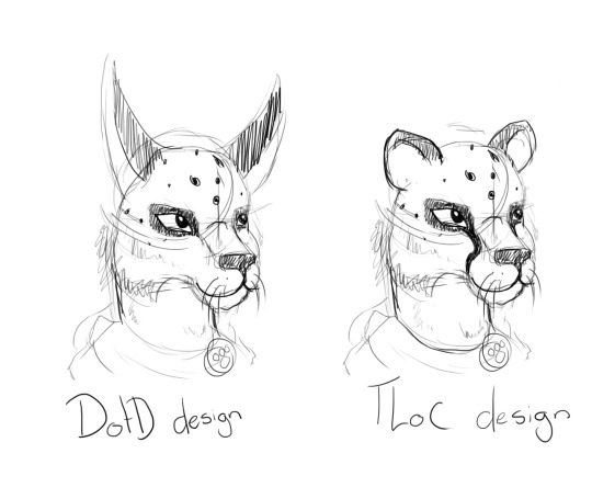
[ID 6: two sketches of a anthropomorphic cheetah heads. One has long ears like a lynx and is labeled DotD design, the other has small, rounded ears like a cheetah usually has, labled TLoC design. /end ID]
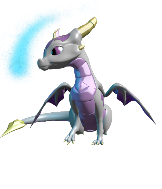
[ID 7: A render of Zerali, the silver dragon from the second image, and ekkosel, from the 5th, playing together. In this image, we can see Zerali has a pinky-purple underbelly and shiny gold horns.]
[ID 8: A rendered scene showing a close up of blue ignitus with his eyes closed. He appears to be talking to Cynder, who is in the background, but blurry. The game's logo is visible in the bottom left of the image. /end ID]
#nostalgia#old art#image descriptions#Spyro#The Legend of Spyro#tlos#cynder#spyro the dragon#spyro fanart#cynder fanart#queer artist#old projects#Blender#Blender Game Engine#I had no idea what I was doing but I had a blast!#tlos spyro#spyro oc#legend of spyro#old ocs
66 notes
·
View notes
Text
Hello! In this post I will describe the details of making a render of Apex Legends stuff (namely the video you're watching) so you can make a photo / video to your liking! Even if you don't wanna render things, I think you might still find the process interesting, OR, especially, the tools useful in you future work.
Why am I doing this? Because I'm taking a train and I'm bored. Also there's too little Bloodhound content here. Maybe someone will actually do some cool rendering of them after this.
Idea
Do you know in training mode, Bloodhound will wait for you indefinitely like a puppy with their cute little look-around motion?
Precious footage of Houndy on Youtube
I want them to be my background. So the most important requirements are:
3 Bloodhounds looking around and waiting like that of training mode. (why only 1 if you can have 3?)
Firing range background.
Looks overall good or something (e.g., lighting, motion not synchronized, 1920x1080 for my computer, etc.)
Let's get started.
Model
Well, there won't be multiple Bloodhounds waiting for me in the firing range in-game. I am also not intended to mod R5Reloaded just for this. So we'll use Blender to pose them.
First we need the model. The details of how to use Apex Legends model in blender can be found in this tutorial I found. Basically you just need Blender, semodel + seanim loader, Legion+, and the game itself. You COULD find archives of some models on the web, but manually extracting will guarentee that you can get everything you need.
Reddit Apex Legends model tutorial
Apex File Archive (by Biast12)
Model name list (may be incomplete)
I made an auto shading addon btw
There are a lot of tutorials of how to use Blender. I will not include the details here.
We need:
Models of 3 Bloodhounds (pilot_medium_bloodhound, bloodhound_v21_pilot_level03_w, bloodhound_v21_heroknight_w)
Animation of them waiting indefinitely (mp_pt_medium_training_blood_idle_A_0.seanim)
The names are a bit weird. You can just try to import all the models / animations to find what you want.
Background
Map files are large and hard to load. In my case I never even imported any map in Blender successfully. Fortunately we are looking for a still image background.
I used R5Reloaded's photo mode (or something like that) to get a clean picture. Quite a lot of steps to get a background picture, I know. I used R5Reloaded for other things at that time so this was the most convenient way for me ironically.
R5Reloaded does has a lot of potential, though. Maybe you can use it on other stuff afterwards.
R5Reloaded official page
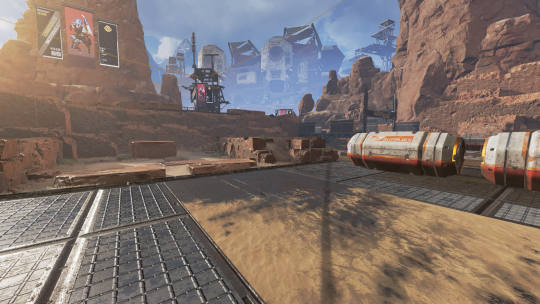
But if we just make a render in Blender and composite the result with this background, the perspective will certainly not be aligned and the result will look very weird. Probably need a disgusting amount of time just to adjust this stuff.
Thankfully, by the theory of perspective and projective geometry, we can calculate the focal length, the height and the angle of camera all from a single image by your favorite subject: math!
...I mean, by fSpy. We have computers. We don't do the math that others already did for us.
fSpy official page
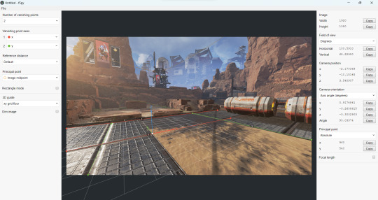
After getting the parameters of the camera, you can import them into blender directly. The camera from fSpy already has the background image composited so you won't need to do much else in Blender.
Posing & Lighting
We have almost everything we need. So just:
Import all models and camera (from fSpy)
Shade the models and adjust size / position / orientation so it looks good on camera
Import animations on model and adjust the keyframes s.t. they don't do the exact same motion every frame.
We are using the existing animations so posing won't be a problem. If you want to make your own pose you might need some more proper rigging. Not expert on this so that's all I will say.

Now we need the lighting. The lighting environment in the firing range is not really available to us if we don't have the skybox or the map file. Maybe you can find the skybox in Legion+ or archive, but I use lights in Blender instead.
Namely, a sun light to simulate the light from the sun, and a plane light at front for overall light adjusting (probably also simulates reflection from the ground and the environment).

And wait for like half an hour for Blender to spit out all 285 frames and we're done! I let Blender store each and every frame as an image and use ffmpeg to composite them all into a video because I thought I need the high resolution images for something else. Blender does have a setting to just output a video without the intermediate result if I recall correctly.
Conclusion
This is definitely not a complete guide on how to do rendering pieces of work with Blender. I myself am not even well experienced in this kind of stuff. But I think the process is fun and the result is rewarding, especially when seeing your favorite character moving on your background.
I hope you do check out the reference of tools and tutorials above. After all, as an artist (kind of), having the model is like possessing THE absolute reference for a character. Very recommended for every artist to learn how to use Blender and search for models. In 2024 a lot of games are in 3D and there WILL be someone on the web sharing how to extract models from the game or simply gives out the entire archive. You name it! Apex Legends, Titanfall, Destiny, even Ultrakill has like a 1GB blender file for high quality models, if you just google for that ever so slightly.
...Welp actually you can just treat this post as a huge Bloodhound advertisement. The end.
#ask for details if you're interested i guess#this took 2 hours and it just so happens that my train took 2 hours lol#perfect timing#blender#rendering#apex legends#apex bloodhound#bloodhound#bloodhound apex#apex legends bloodhound#my art#(kind of)#(i alreadly posted this video in the pinned post but whatever)
26 notes
·
View notes
Text
Eggtober 14th 2023
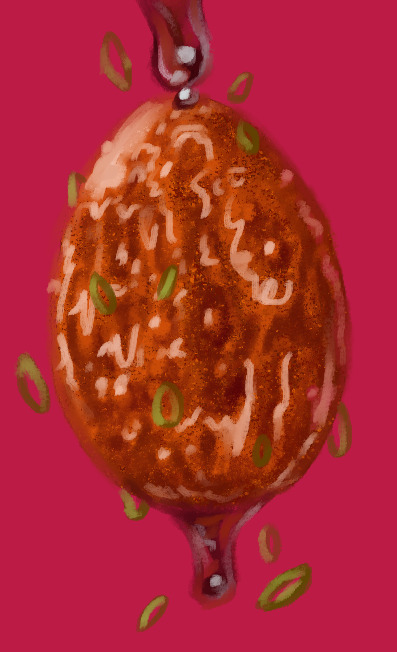
"Sticky": Tiger Skin Egg with Sauce.
(Clip Studio Paint, Gouache Brush, Gouache Blender, Airbrush tool. 10 colors, 45 minutes.)
Cripes, I almost forgot to post this one. Been a busy bee the last few days.
The first time I made this dish it was all going perfectly until it came time to caramelize the sauce. It goes from runny and thin to thick in what feels like 30 minutes and then from thick to CHARRED AND AWFUL in 0.5 seconds. I'm not a stranger to syrups and sugary sauces! Maybe it's the soy sauce that's dangerous because the color can't indicate early signs of caramelization that I can see? But I make brown sugar glazes for fruit all the time. And my standard stir fry sauce has soy, brown sugar, and gochujang in it, which are all dark, and I've never burnt those things. Anyway, first time I made these was a disaster. The eggs were overcooked because the sauce took too long to thicken and then I burnt it so it tasted terribly perfumey. But I remade the sauce by itself much more carefully later and it really is tasty! I just had an awful first attempt. Speaking of which, I need to do a proper study of craggly, crackly fried things. I can get away with a lot here because the rendering is a bit stylized and it's a shiny sauced egg, but trying to replicate that almost-breaded looking fried exterior from my reference was hard. I think we've established I'm fairly effective at drawing smooth things with all my shiny eggies of late but I need to learn how to draw coarser, rougher textures. Maybe more pencil tool next time.
Anyway, here's the speedpaint and the shoutouts. @lady-quen, Another gravity defying eggy for you to draw your precious brebbugs on. Take your time of course. The breadbugs need time to eat all the eggs they stole already!
Thanks as always to @quezify for all the inspiring fried eggy art.
Despite the unfamiliar textures being a challenge, it was fun. And of course I got to make it deliciously shiny. The speedpaint makes it all look so competent and deliberate and my ass is sitting here like "Past me has the competence of a god, or at least seems like it, but I know that bitch personally and I know for a fact there was internal screaming for part of it. "It's bumpy in the reference! There's texture there! But how do I do that? AUGH!" And then it turned out fine anyway, despite faffing around. Gotta get better at trusting my process and actually treating these as LEARNING experiences like last year. Self mantra of "It doesn't need to be perfect. It needs to be an egg. If it's hard, that mean's you're learning." Actively squash that little voice in my brain that doubts. Making art is about the making. The art is just a coincidence. It can be a product later if I decide so, but that's not the objective. The objective is to turn 1s and 0s and funny little lights on a funny little screen into things that look like eggs and manifest something that didn't exist anywhere before except my brain. No doubts, no stress. Only eggy. Plus at the end I can stare at past me making egg very fast like magic. I do like that part. Bless CSP for having a native timelapse capture feature. I just get to click a button and share with you all my magical process.
41 notes
·
View notes
Text
OLD BULLSHIT DUMP
its time to dump a bunch of stuff i have no other place for but i want online somewhere! its a total fucking shitshow wahoo
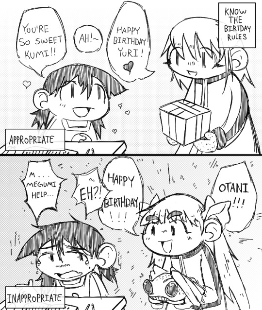
first is an alien nine fan comic (its read right to left if it wasnt obvious, oops). this was made as a for an alien nine discord i lurk in. they had missed yuris birthday, and some discussion was had about what present is best to get her. most of the options were aliens?? anyways take this as the anti-kasumi propaganda that it is.
next is two separate love web doodles. uh for anyone who doesnt know i have a half joke love web AU where cybermare and manon just fucking hate each other, and its just sad and awful for no good reason. im sorry shadok, i am physically unable to let blorbos be happy. second image is more of a doodle but i like it. and the first image i thiiiink was made when i was planning out a little one shot comic i never finished. for the 1 of you (oretal) who are maybe curious, i had a bunch of dialogue written out, the comic would have been a really tense conversion that culminates in a shouting match, i had this really cool idea where the comics color palette gets darker and darker as the sun goes down and their little apartment becomes so dark that its hard to see but neither of them want to bother turning on a light (many such cases). i care about these two way more than i probably should, uh thank you silly deer lady for the blorbos.
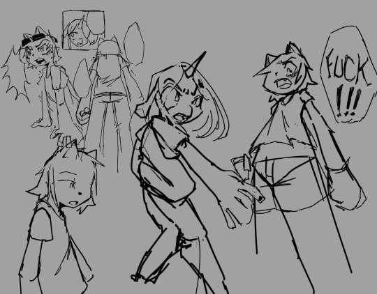
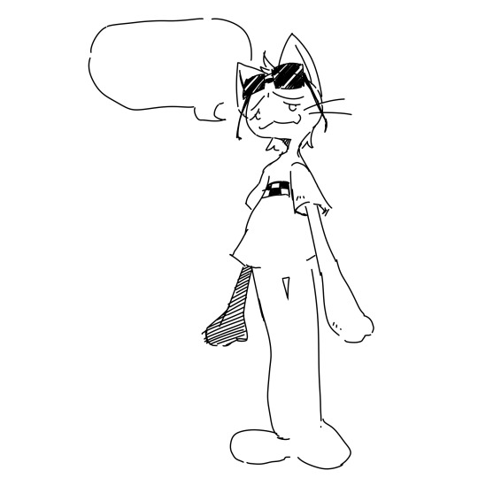
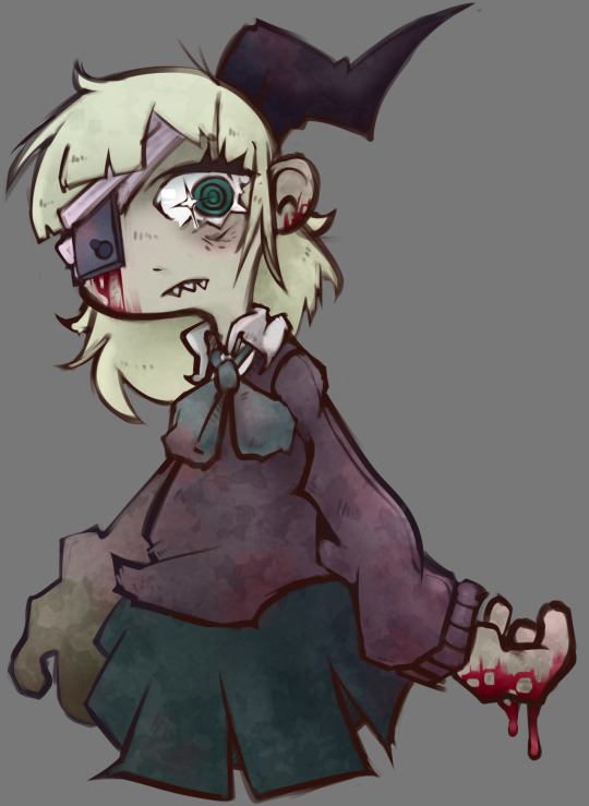
the next one is a drawing ruru chan (you saw the alien nine bit of this post, you know what kind of fucking blog this is) i keep forgetting i made forever ago. i ended up hating it and never finishing it. i still dont want to bother finishing it but i like it enough now to post it. shinsei kamattechan is one of my favorite bands and i really like this dumb melodramatic song a lot. noko is one of the realest ones going and i hope i can draw something i actually really like one of these days to express my love properly.
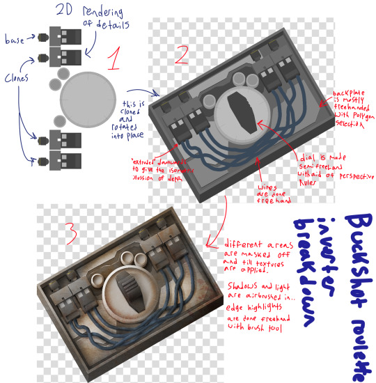
lastly i wanted to post this absolute dumb bullshit fuck ass stupid technique. i was commissioned by a friend to make some custom buckshot roulette cards (he is paying me in sandwiches), and i decided that i liked the idea enough to go whole hog at least a little bit. this is just showing the process for the rendering technique im using in krita. i will be posting the final images once theyre all done (my deadline is fucking thursday, pray for me girlie). this method of rendering is super janky but its fucking worked so far! to any aspiring item key artists, please just render shit in blender, save yourselves. looks kinda nice tho once its on a card.
thats it, please listen to "all my little words" by magnetic fields and "cant run away" by brave little abacus. GOODBYEEE ill post my drawmegle drawings next maybe?
#alien nine#doodle#buckshot roulette#shinsei kamattechan#loveweb#im so sorry shadok#if my AU bullshit makes you uncomfortable please LMK seriously i know making stuff like this for indie series is bigly weird sometimes#also listen to ajj
17 notes
·
View notes
Note
came for the juicy and rare prowl posts discussing things in his perspective, all the shit done to him, the unfairness done to his characterization (they are beautiful i LOVE it op). stayed for the 3d things. as an aspiring 3d artist and wanting to be a game developer too, should i try to practice in blender first? i mean, i did have 3ds max but the free one i got is only for a 1-year student plan thing, and i am gonna graduate so, is like blender the safe way to practice? i don't know if i make sense op but i just wanna know if investing my time in learning blender would go somewhere 😭 because i kept hearing that companies don't use blender that often? idk huhuhu
Glad you like the Prowl posts! They've definitely become something of a staple on my blog, lol.
As far as 3D goes, my perspective is that as long as you're learning modeling (or rigging, or animation, or whatever) and not just learning a program, it really doesn't matter what you use. Yeah, different programs have different strengths, and some are more widely used than others, but most of what you need to learn as a 3D artist has nothing to do with software.
Like, you could just learn some basic tools and then make whatever you want. It might not be easy, but you could do it. But if you just jumped in and started moving vertices around, it would be a mess. You need to take the time to learn good topology so you can make models that are easy to edit, deform properly when they're animated, and look right when they're rendered. And the more you learn, the more you realize good topology is hard. But it's also a skill you only need to learn once: once you know what good topology looks like and how to achieve it, learning to model in a new program is just figuring out a different path to the same results.
In your case, 3ds Max is up there with Maya as far as being used by a lot of AAA studios, so if you still have it, I would definitely say use it while you can. It doesn't hurt to get a head start on learning how it works. But you can also absolutely use Blender to learn skills that are applicable regardless of the program. Plus, a lot of small studios use Blender, so if you're interested in joining indie teams or doing freelance work, you actually could end up using it on a project.
A couple tips and suggestions, since modeling for game dev is also one of my end goals:
Not everything you can do in Blender can be exported into a game engine. You're probably fine with basic models and rigs, and you can create animations in Blender and export those, but engines handle stuff like textures and shaders differently. It's a good idea to export models periodically while you're working on them and see how they behave in your engine of choice. Bendy bones are also a Blender exclusive and can't be used in other programs - you might see people say the same about geometry nodes, but there are now ways to convert them to mesh so they can be exported (although when I tried this with Godot, the objects were untextured. This may or may not have been because of my export settings).
You might also see people say that whatever gets you the results you want is the right way to do things: I would suggest ignoring that advice unless you know what rule you're breaking and why you're breaking it. For example, N-gons (faces with 5 or more sides) are generally something you want to avoid, but sometimes you need them.
People also say that computers have gotten powerful enough that poly count doesn't matter anymore. It's still a good idea to use as few polys as you can, both to make models easier to work with and as a kindness to those of us who don't own a gaming computer.
Basically, if someone suggests taking the easy way out and their reasoning amounts to "don't worry about it", they probably don't know what they're talking about.
#Blender#I'm by no means an expert so other thoughts on the matter are welcome#But as long as you focus on transferable skills Blender can teach you a lot#even if you switch to something else later
2 notes
·
View notes
Text
l'aventure de canmom à annecy épisode DEUX - lundi 2 - cats and pigs
So this one's going to be a little chaotic in terms of order of events but hey. Let's gooo.
First up! I saw Flow, as mentioned earlier. Director Gints Zilbalodis from Latvia was the very first person to win the Contrechamp award at Annecy in 2019 for his solo-animated movie Away. Now he has a team, and they decided to make a totally wordless movie about a cat. Honestly I could leave it at that - this is a movie which you should watch unspoiled and just let it take you on a ride - but for a more detailed summary...
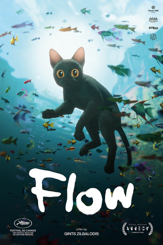
Our adorable little cat is living alone in the forest, surrounded by statues left by their former owner, when the world abruptly gets flooded, sending the cat on a journey to try to find higher ground and survive. The cat falls in with a group of other animals - over the course of the film, this group grows to include a capybara, a ring-tailed lemur, a secretarybird and a dog. It's the story of the struggles of these animals as they try to navigate the rising water towards higher ground, dealing with both outside threats and conflict within the group. I won't tell you where they end up but things get a tad mystical.
The thing is this film is totally wordless. The animation has to do absolutely everything. And it does so with aplomb. This is hands down some of the best character animation I've ever seen in a CG movie. Every animal moves naturally and expressively, their relationships shown with humour and clear expression. I honestly don't know how they did it so well.
It's also gorgeous on a rendering level. I'm not entirely sold on the posterisation effect used on the animals, but their environments are so vivid and richly detailed, looking natural even as they enter stranger architectural zones. Under water, over water, in storms... it looks absolutely great. It makes me so happy that this was done in Blender, it's like, that's what we dreamed of back in the day on the blenderartists forums.
The film already got a Cannes nom, which is wild for animation, and honestly while I haven't seen the other features yet, this is gonna be a tough act to follow and I think it has a pretty good shot at winning. I have no insight into the mind of the annecy jurors though! Regardless, spectacular film, makes me really want to make shit in blender lol.
I got some photos of the team getting a standing ovation at the end but it's super late so I'll have to upload them later lol.
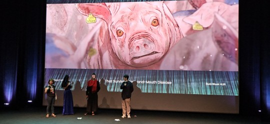
Later I saw the premiere of The Pig That Survived Foot and Mouth Disease, a new Korean film which makes a much better case for using mocap in an animated horror movie, also in the midnight specials slot. Impressively all the roles of around 30 characters were played by one mocap actor, which is wild. It's a classic Korean style of film - a spiral of death and trauma rooted in social violence, particularly military hazing and animal agriculture.
A pig, surviving the mass slaughter of pigs during the foot and mouth epidemic, eats the body of the farmer who raised him and transforms to become more human and becomes something of a cult leader for wild boars; a military deserter becomes a yeti-like creature but finds new hope when he rescues a girl from her suicide attempt, but is she even real?
It calls to mind films like King of Pigs and The Fake, and it's no less uncompromisingly bleak in its view of society - but by comparison to those films, it's shot very stylishly, with a cool nonphotorealistic shader and a frequently gorgeous forest setting. It's not as fancy as something like Flow, the models looking a little videogamey at times, but it's definitely solid - the rigs detailed enough to capture the acting. The style works very well for the film, and there's a couple of really standout stylised sequences, playing with religious iconography or dream sequences.
The film it reminded me most of is actually Unicorn Wars, another violent story of transformation and people going a bit nuts in the woods. But it also gets a bit Shakespearean with all the stabbings by the end.
Whatever you compare it to, it's a compelling drama, unblinkingly facing the cruelty of society. The two directions of escape - the human who wants to live like the animals, free from social cruelty, and the animal who wants to live as a human, free from the imminent threat of death, present a strong contrast and a good pincer movement on the theme of what it means to be human.
Sadly it didn't have nearly the turnout as WSDIB, but I did get to tell the director and mocap actor I liked the film - unfortunately I don't know enough Korean to really ask the questions I wanted to (though I learned they used Unreal for rendering) but the director did very kindly run over to his friend to give me a little postcard with some art.
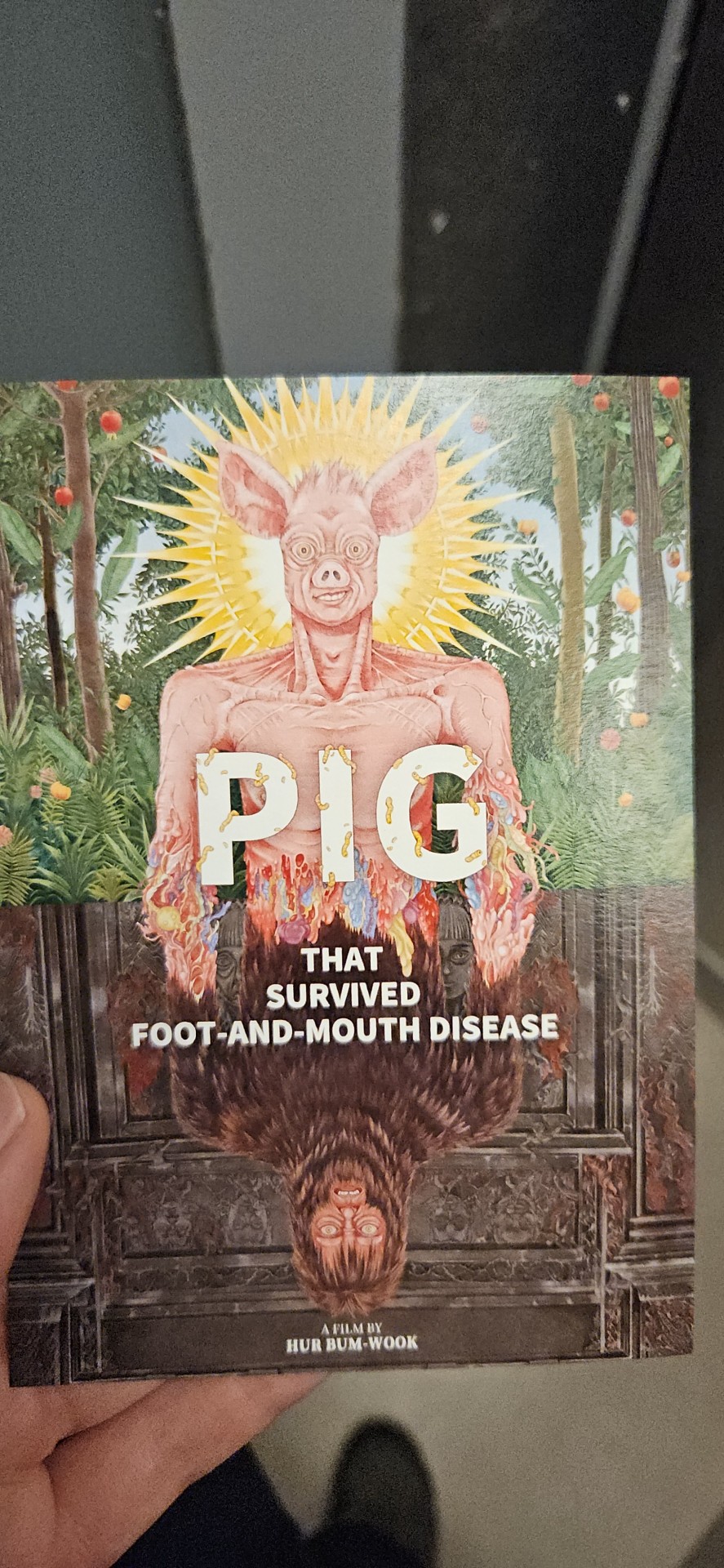
I wish the crowd had been more enthusiastic tbh, this was a good movie!
I also watched a bunch of XR stuff today, and another WIP panel for Canadian film Death Does Not Exist which is looking real cool, more on that in a mo... and I met Malaysian director Suresh Eriyat in a comic book shop and bought his art book direct from him which he fully signed for me, bless him...
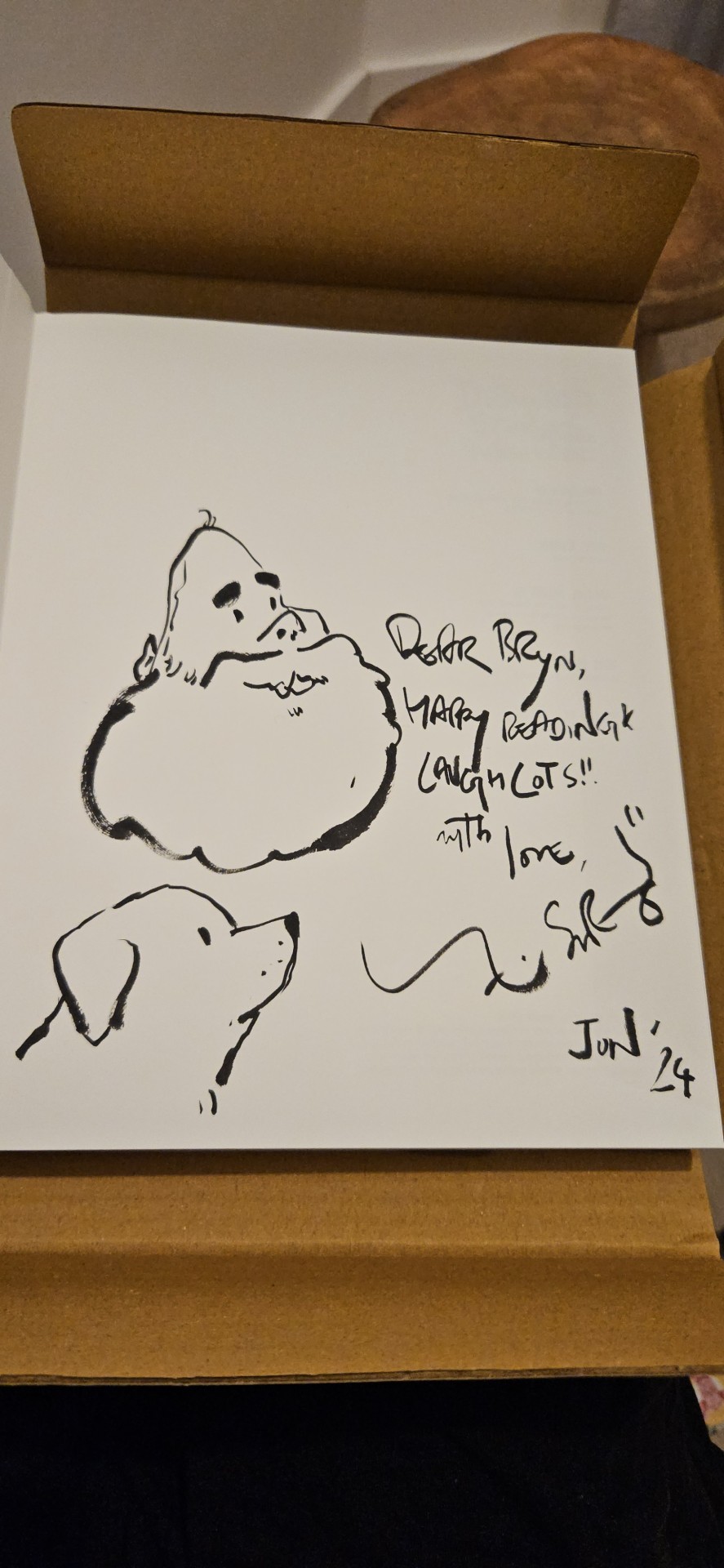
seriously how adorable is this?
12 notes
·
View notes
Note
📩 Simblr question of the day: What are some of your favorite behind-the-scene screenshots? I'm throwing this out to gameplayers, storytellers, renderers and the like :)
thank you anon!! 🫶🫶
this question is from the @simblr-question-of-the-day blog, check em out if you haven't :)
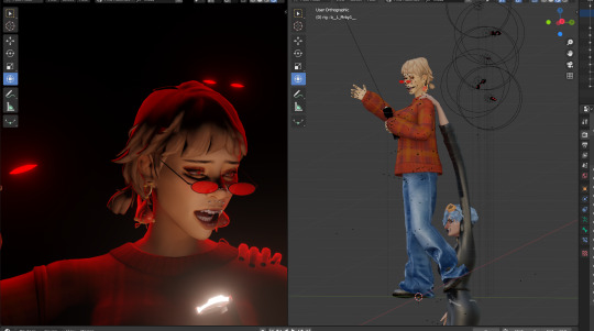
I'm gonna throw in mostly blender (and GIMP) BTS screenshots cuz i dont really have anymore BTS screenshots from sims 4 LMAO (I also ended up throwing outtakes in at the end :))
putting them under the cut cuz theres A LOT 😭
the full body (and prototype) pose of the Nirvana x Vanella post
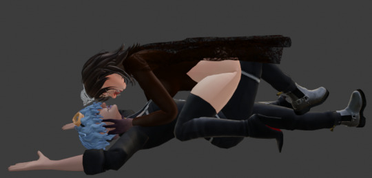
- -
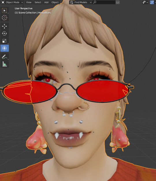
"you got any games on yo phone"
- -
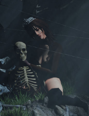
A wip that i never finished,,, but nirvana being hot and seggsy as always (I wish i was that skeleton...)
- -
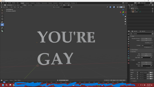
I learned how to do text in blender for the first time
- -
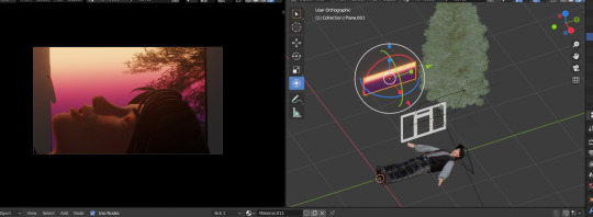
If you ever wanted to know what the BTS for that last scene in the Wake up Roo post looked like, here you go LMAOO
- -
not much to say about this one, i think it speaks for itself
- -
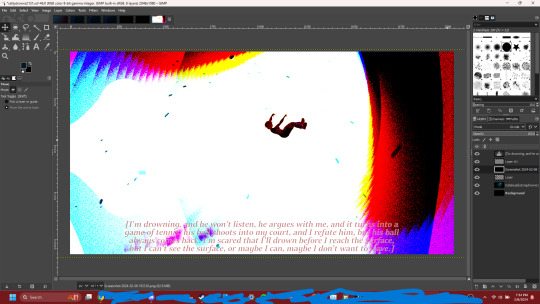
whenever I'm doing stuff on GIMP that involves layer modes, I like to go thru pretty much every single mode to see what looks good and sometimes i get fucking flashbanged 😐 (i also usually edit in the dark... so its literally like a flashbang for me)
- -
And for funsies, here's some outtakes that I rendered and may have edited that I never shared :D
- -
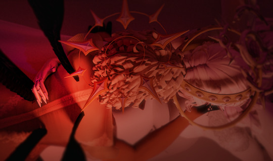
if you remember my international womens day post, there was this scene, and while it looks similar, this one is actually darker and is supposed to focus more on Nanel's hand placement :) I didnt go with it cuz iirc it didnt look right next to the other panels, but it is very pretty!
- -
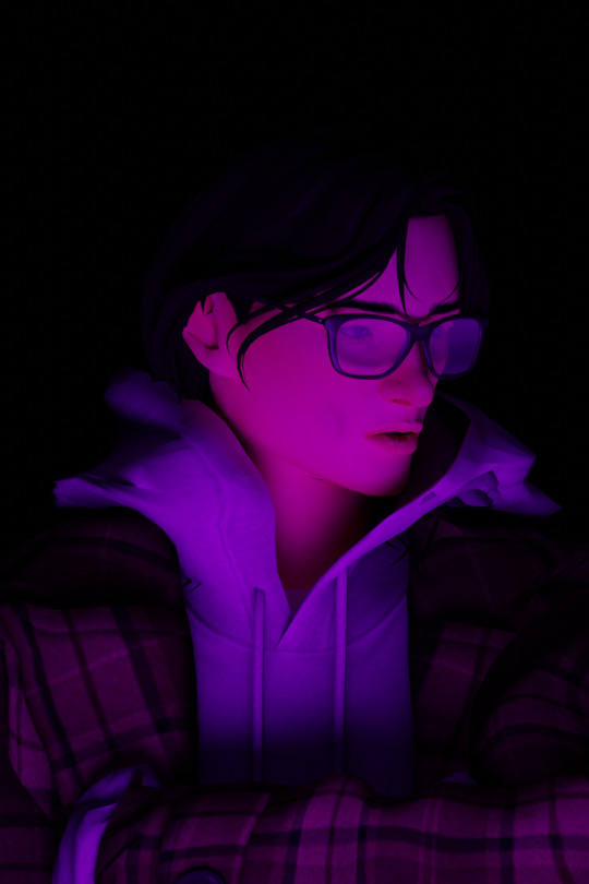
From my emotions/feelings post, this was gonna be the one I used for Roo, but because of the lighting it looks like his mouth is open and not him just showing his teeth in frustration (which was the intent), so I changed it to be closed
- -
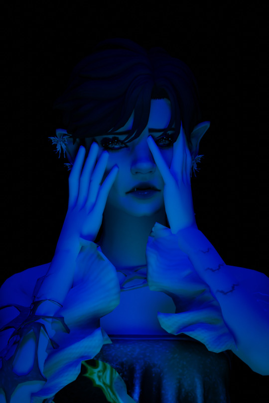
I think you can instantly see something is off with Kyneva's eyes... 😭😭 The lighting made her eyelashes look weird so I had to adjust the lighting to be more central (lots of lighting issues with these panels...)
- -
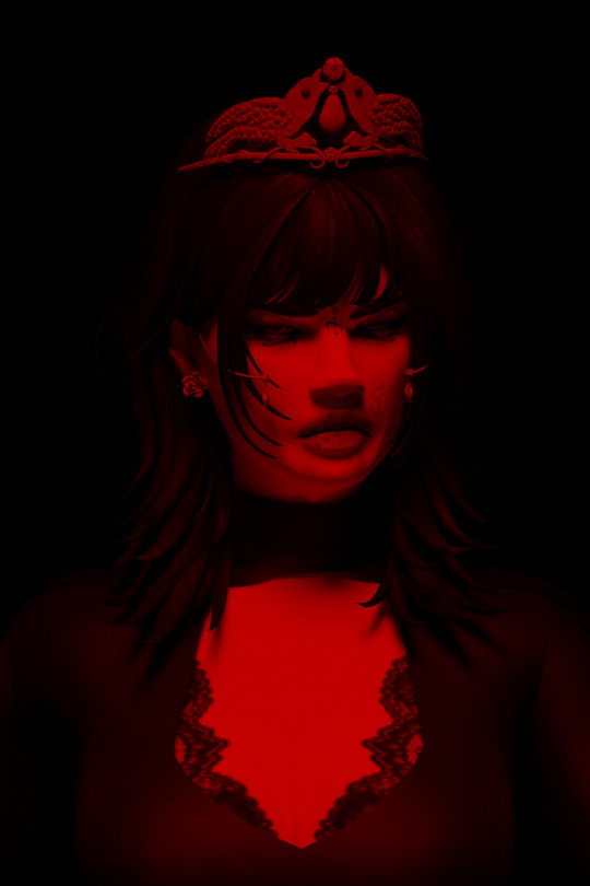
So like the others, the lighting was just too dark and I had to add a brighter light 🙃
- -
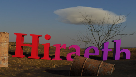
As an introduction of the "story" name for Roo and Leo, I was gonna do a post (which is why I learned to make text in blender) where Roo talks about the significance of the word "Hiraeth" in his life, which is that uhhh he learned Hiraeth from Leo lmao. But now he feels "Hiraeth" for Leo essentially. I still like the idea but for some reason I just haven't vibed with the scene and just haven't been motivated to go back and make that scene now esp. since I've introduced the story name now
- -
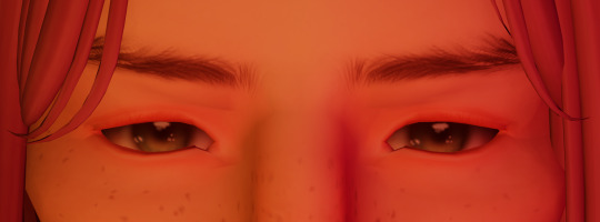
I was gonna do a short sequence in the Obsession Desperation post where Leo checks his phone and sees the notifs of Roo texting him, but figured it didn't fit the rest of the post and veto'd it :) But I'm planning/thinking of doing a post where it's Leo's POV/Side-of-things
- -
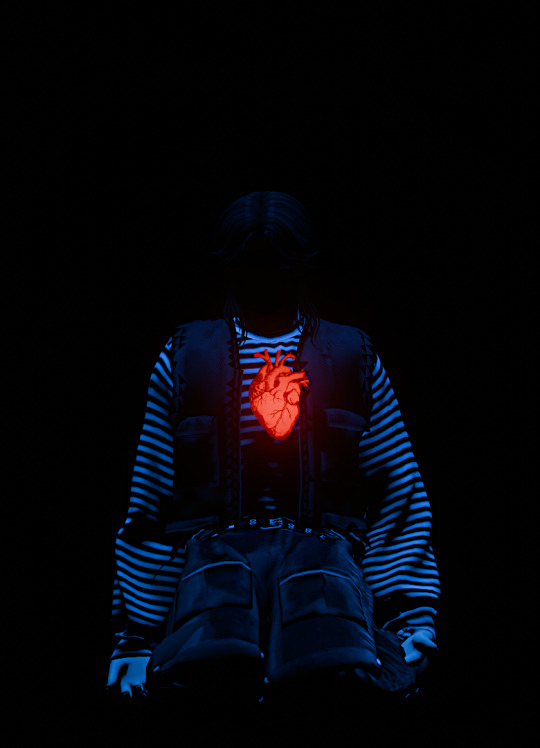
OKAYY finally the last one LMAOO This one i've shared before and is still an outtake, but i just love it so much I wish i could just shove it into peoples faces like its a cake. Only reason I didnt use this is bc I didn't have any dialogue that fit this panel and it didnt really fit in with the rest of the panels (this was for the Inner Child post btw), maybe I'll use it in a diff post one day <:P
#VanellaBW#Nirvana#HeroLB#MGC : HeroLB#Roo#KynevaHW#Hiraeth : Leo#[IAW]:Ithanel#[IAW]:Ithuriel#[IAW]:Nanel#[IAW]#whewwwww lots of pics LMAO#i love some of those BTS pics 😭😭 the hero one might be my favorite#the Roo laying down one is def one where im like “I cant believe the before and after of this...” where its just a rlly scuffed scene#and then a cinematic masterpiece as the after LMAOO#Anonymous#yapping
9 notes
·
View notes
Text
📩 @simblr-question-of-the-day : What is your favorite part of Rendering? What's your least favorite part? (Include your favorite and least favorite renders in your reply if you'd like to)
---
First of all, I'll answer the least favourite part: the fact I can't render anymore because no matter how many times I redownload/ reinstall TS4SimRipper or repair my game, my Sims always have this bugged face that no matter what I can't managed to fix, even in Blender.
Now, I love every part of rendering (OK, waiting for it to render is actually dull, and should have been my answer to the least favourite part).
But, if I had to choose, I think I'd say setting the scene. I mean, I love super simple renders that include only Sims and a plain background, but I adore those with plenty of objects. I especially love making editorial renders, and some of my favourite renders are those of the Camaïeu series, which most of them are a perfect example of what I was saying about accumulation of objects.
Editing stuff in Blender (changing materials of clothes, frankenmeshing objects/accessories/whatever, sculpting,...) is also something I came to really enjoy (thanks, because I needed to do so A LOT for my Black & Gold series).
Now, for my favourite and least favourite renders:
Fav (that is very difficult to choose, btw, so here is a selection of 9 that I love for various reasons):


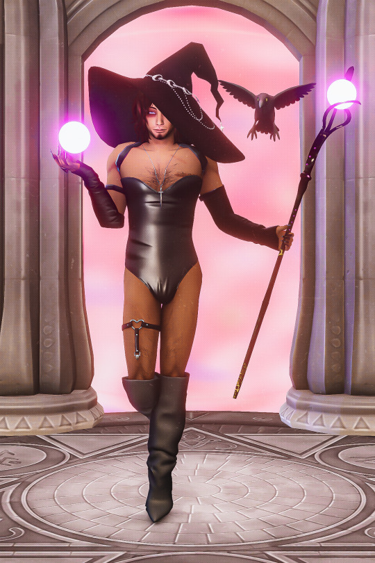
Least fav: (under cut, 'cause I NEVER want to see that thing on my dash ever again)
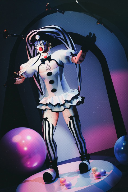
8 notes
·
View notes
Text


[ID: Two gifs of a 3D rendered wooden dragon toy rolling in place in a tan void, its four legs walking and wings flapping, driven by wheel movement, while its hinged tail swings gently side to side. The toy is mostly made of a pale yellow wood, similar to a light cherry or pine, with some of the thinner pieces and the dowels darker and greyer with a denser grain, similar to walnut. The first image is from the dragon's front right corner and a higher quality render with raytraced shadows. The second is from the back right corner, showing more unique variations in the wood textures and a small knot in the torso piece behind the back right leg; this render only uses screen space ambient occlusion, which looks flatter and leads to some flickering in the shadows as the wings obscure and reveal different portions of the mesh. It is also only 12 frames per second instead of the previous gif's 24. End ID] What's this? Was I working on something this year before actually useful work with real deadlines took over? I was! I was texturing a celebration for 2024 Year of the Wood Dragon in Substance Painter in fact! And then while I was distracted my student license to the Substance suite expired, and Adobe declined to accept the same proof of studenthood they'd accepted before. Which is good actually, because Blender is way better (faster and higher quality) for spacial textures like wood grain that you want to carry around curves and corners. Not relying on janky baked position maps and/or dozens of fill layer directional gradients for a base to be painstakingly handpainted into warps and knots meant even with the periodic pauses to bake before adding more layers, I got further in one week with Blender only than I did in a month with Painter. Substance does some things amazingly well but wood outside a flat plank context is not it. Blender, unfortunately, is not super thrilled about me trying to handpaint on UDIMs. That might be an issue with my specific build--I hadn't had reason to paint at all in 4.0.2 yet--or just too many tiles for my graphics card to deal with in their still-being-overhauled painting system. Or maybe there's a setting to ignore all but one tile that would give it the break it needs? I first hit the roadblock of instant crashes as soon as I tried to paint while aiming for something that could be replaced with AO and some empty-based gradient masks to get what I needed through baking instead, but I'll poke around more before giving up on the simpler option for choosing points of more patina or paint speckles. Even when going ahead to paint in a 2D program it's usually a time and brain saver to quickly scribble over the area in a black and white mask to reference.
#cj gladback#dragon roll#3d texturing#3d wip#wip animation#gif#(i actually haven't touched the animation since taking a break from this--that tail is still just two keys per joint no offset or anything)#ramblings
4 notes
·
View notes
Note
Character ask game: Cayde-6 7, 22, & 26 For 26: Stick Cayde, Eris & the Drifter temporarily and accidentally locked in an elevator (pre Excision for continuity reasons). What happens?
*cracks knuckles*
7. What's something the fandom does when it comes to this character that you like?
❤️:I like a lot of the art that people make when it comes to Cayde (and Destiny in general).Some people are so,so talented.Drawings,cosplay,props,figures,blender renderings,what have you,I love it. The more love I see for one of my favorite characters,the better.Cayde deserves all of that love. I've also adored seeing New Lights get to meet Cayde for the first time in The Final Shape and fall in love with his character. It's something special.A whole new generation of Cayde fans.❤️
22. If you're a fic reader, what's something you like in fics when it comes to this character? Something you don't like?
♠️:I'm honestly not as big of a fanfic reader as I used to be.Although,I do like it when people send me fanfics they've written,and I do read those (and if anyone ever wants to recommend fics,feel free and I'll take a look.❤️)
Something I like:
❤️:In the few fanfics I have read involving Cayde,I like it when he gets to go on a quick adventure outside of the Tower,getting into some shenanigans and gets back in one piece. I also enjoy it if any of the Hunter gang are involved (or at least referenced) in said shenanigans,or if it makes me feel something,a good story should always make you feel something. Whether it makes you laugh or tugs on your heartstrings.
Some things I don't like:
-When people write Cayde where he uses slang like "rizz","babygirl","sigma"or "skibbity" casually in a sentence (yes, I've seen people write him like this,"babygirl" in the romantic sense?Maybe,but in the slang sense,no.I can't see him saying that.),if he were human (and not a centuries old Guardian 😅),I'm fairly certain based on his personality in the game, he'd be somewhere between his mid/late 30's-mid forties (Also basing this a little on both of his V.As who are currently in their 50's,but during most of Cayde's screentime throughout the games,they were in their 40's), he'd have no idea what those words meant.Even if he spent time around younger Guardians,it'd be like your dad using slang to sound cool and failing miserably at it,not to mention literally none of the characters talk like that in the game,which makes it even harder to imagine. (I personally couldn't take a character seriously, if they did.)
-When people write him like he wouldn't know what any real life current pop culture would be.Yes,Destiny takes place hundreds of years in the future,but he literally makes a reference to watching Firefly,a show that came out in 2002,and was cancelled after one season.(Also one of my favorite shows btw.😘)Cayde references it because his V.A is Nathan Fillion,who played the main character,Malcom Reynolds,on the show. It's an Easter egg,but it's still canon. He references it in idle dialogue in D1.
Here's a video I found, if anyone wants to hear him say it.
youtube
"Look, I'd love to stand here with you all day, but, um... *tut* I got a... a show I like to binge-watch... it was... cancelled early. Still love it."
So saying he wouldn't at least know what something more popular and super ingrained in our current culture, like Star Trek or Star Wars is, would be a little far fetched in my opinion. Not to mention the people at Bungie are a bunch of nerds and there are literally hundreds of pop culture references throughout the actual games. (This has nothing to do with Cayde,but just further proving my point,one of the ornaments for Malfeasance itself is a Firefly reference. "Aim to misbehave"? Yeah,that line is a direct reference to Firefly.I also kinda wanted an excuse to use one of my favorite gifs of Mal. 👀)

I also understand that not everyone is a massive kriffing nerd like I am,and the likelihood of that being common knowledge is slim,so I at least understand why some people might not know that,but it's just a preference of mine. (Also historically,in real life, we know a lot about events,customs,and trends from hundreds of years ago,so saying the same of the Destiny-verse,which takes place in the future, isn't a stretch. Even if all historical records were destroyed,there would still be word of mouth stories handed down through the centuries.)

Needless to say, people can write and interpret Cayde however they want,I couldn't give a cotton sock,I'm an adult and I'm just answering the question and giving my opinions and preferences.Take them with a grain of salt. 😄
You do you, kiddos. 👈👈😎
Nothing but love.❤️
Go wild, and have fun.😘
26. Freebie Question:
♠️:I know Cayde and Drifter have history, so they would probably be reminiscing the old days,throwing snark at each other,trying to come up with some crazy scheme to get out of the elevator (or y'know,all three at the same time)much to Eris' chagrin. Eris would probably suggest using some kind of magic to get out of the elevator (like how she's pulled the Guardian out of situations before). Any way you go about it,I think Cayde and Drifter would be driving Eris a little nuts. 😅
Thank you so much for the ask! ❤️♠️
If you read this far, you get a gold star sticker. ⭐
#baede-6#This was a long one phew! 😂❤️#Love getting asks!#destiny#destiny 2#destiny the game#personal baede 6 business#cayde-6#ask baede-6#Just my opinions take them with a grain of salt kiddos.#I like that show...a lot.#Every time I find a reference in Destiny I'm like “I understood that reference!”#Can't wait for the Firefly thing to be a can of Hive worms I opened up...#“I knew that the whole time!” Did you though?#Either that or people start watching Firefly specifically because of Cayde.#It's on Hulu btw.#Ikora and Sagira are also voiced by main cast members of Firefly#Something something man with the Golden Gun...#When I say I don't care how people interpret Cayde I mean it.#Write him however you want. It doesn't affect me. It's just personal preference and I do not care.#As long as y'all are having fun.#I'm also not judging in any way if you write Cayde like that. I'm an adult ao when I say don't care just know that I mean it.#Whatever floats your boat.#The movie Reign of Fire ruined any kind of sci-fi future where they wouldn't know what Star Wars is. They were reinacting the entire thing.#Good movie.#Should probably stop talking now and go run a strike or something...#You read all of the tags too? Ramen's on me kiddo. You've earned it.🍜
5 notes
·
View notes
Text
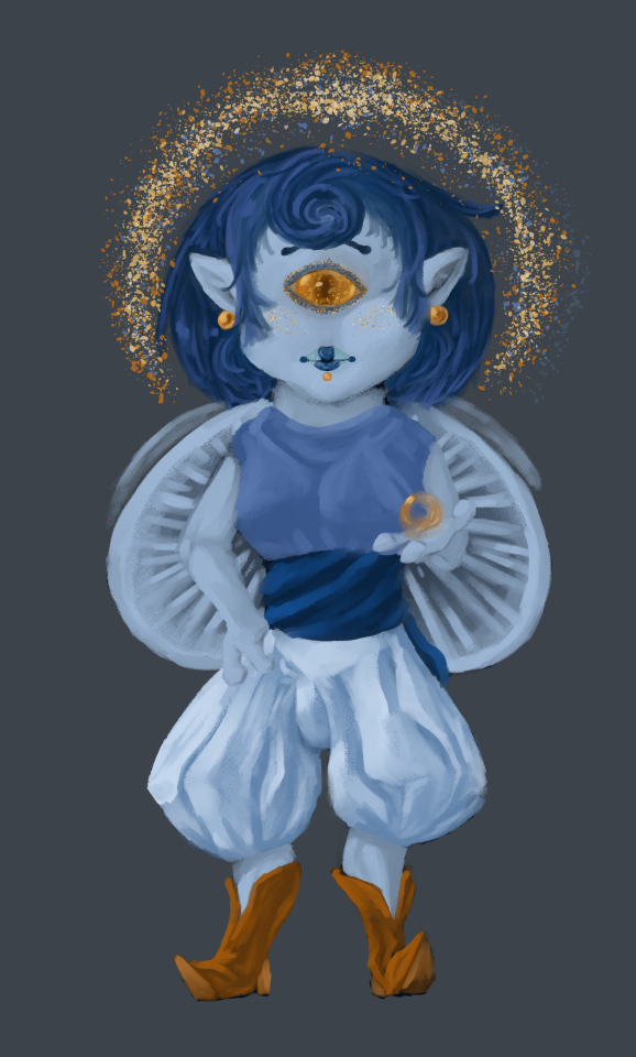
Funguary #1 Mycena Subcyanocephala
Very casually dropping in an entry I did as a warm up. My brain is all fuzzy lately and I took a break from a bigger project for a week to take care of my sack of meat body IRL because my hormones are shit and I fell off the face of the earth for, like, a week, and then I couldn't get started on my larger project again. So I smashed my brain with a stick until art fell out so I could prove to myself that I still have art muscles. Coincidentally enough, I also pulverized the part of my brain that forgot how to draw humanoids until it remembered how to do that again. Percussive maintenance, if you will. (I am not actually injuring myself IRL, this is hyperbole, I promise.) So yeah, I'm probably going to be doing this super casually and probably outside of February since I have more IRL meatspace obligations that I am juggling. I may try to do one entry for each of the 4 themes to start or I may take it extra slow and do all of them at some point or other as warmups and do all the different mushrooms with their themes as I feel like it. Not officially back online yet, but I am browsing around Tumblr when I have time, so... Yeah! Cherub-inspired character to fit the theme of celestial for the mushroom Mycena Subcyanocephala. All the references I looked at showed this TINY mushroom with a singe fruiting body in the frame so I drew a cherubic sort of cyclops fairy/angel/cherub creature. Selected the mushroom because it was the first on the list so why not? The colors in the reference photos were nice enough so I figured why not? Might just draw the mushroom itself at some other time! Speedpaint here, so I can remember how I did it if I ever have to stop making art again for another 10 years. XD
I drew some concepts on notebook paper, and honestly the lips/lipstick I doodled out was a big main design element from the start, which is unfortunate because they're small in the grand scheme of the piece. The sort of digitigrade, faun-like legs were a whim, and I had my heart set on puffy pants to match that fat stem body on the mushroom, so I think a different pose might have been better because once the actual color and rendering goes down, you don't see much, if any, of the initial shape I set down. Maybe slightly more distinct colors between the skin and clothes too since that hand disappears into the pants a bit. But for something I smacked out in a couple hours, it's not bad. Especially for my first real attempt at drawing humanoids from imagination in a good, long while. (Clip Studio Paint, Gouache Brush, Airbrush, Gouache Blender, and Pencil Brush. 2 ish hours.)
8 notes
·
View notes