#ffxiv dawntrail benchmark
Explore tagged Tumblr posts
Text
very important from the benchmark
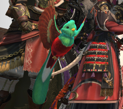
I need them.
#ffxiv#LOOK IT'S A LITTLE QUETZAL BIRD#ffxiv dawntrail#dawntrail#ffxiv benchmark#ffxiv dawntrail benchmark
265 notes
·
View notes
Text

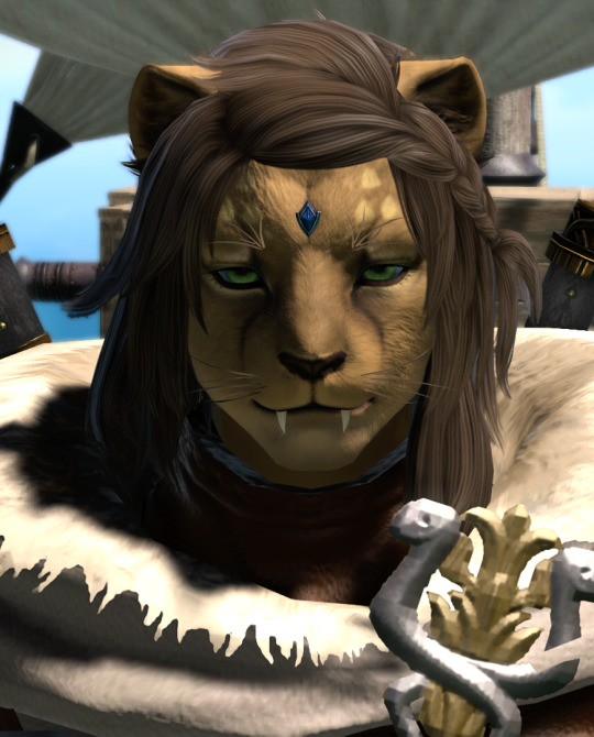
Excuse me, but
CATMOM CATMOM
#ffxiv#grumpy-limsan-customs-cat#final fantasy 14#FFXIV Dawntrail Benchmark#screenshots#Sipha#It's not perfect I'd prefer a better long hair option and wider snoot#but I'm glad how close I got to her original idea#Can't wait to see her in caster gear
21 notes
·
View notes
Text
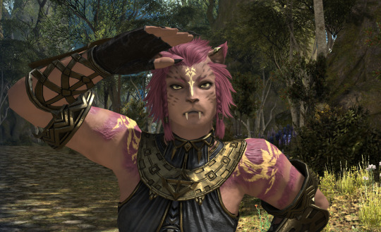
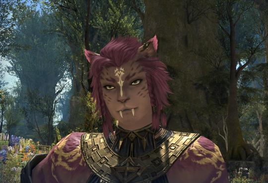
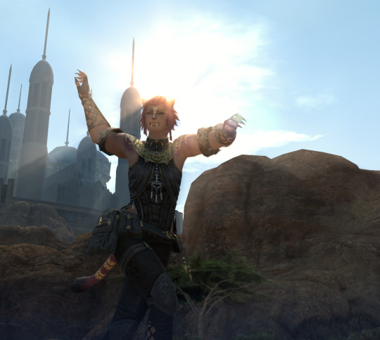
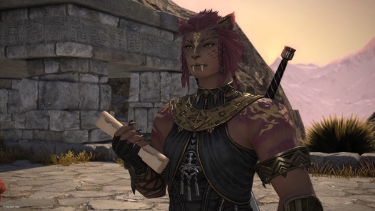
Thank you Square Enix for my new dress-up game
#introducing Her#first hrothgal I made that I was happy with#probably not my main cause the colours arent very me but i still love her#hrothgal#female hrothgar#hrothgar#ffxiv#ffxiv dawntrail benchmark#ffxiv character creator#my hrothgals
17 notes
·
View notes
Text
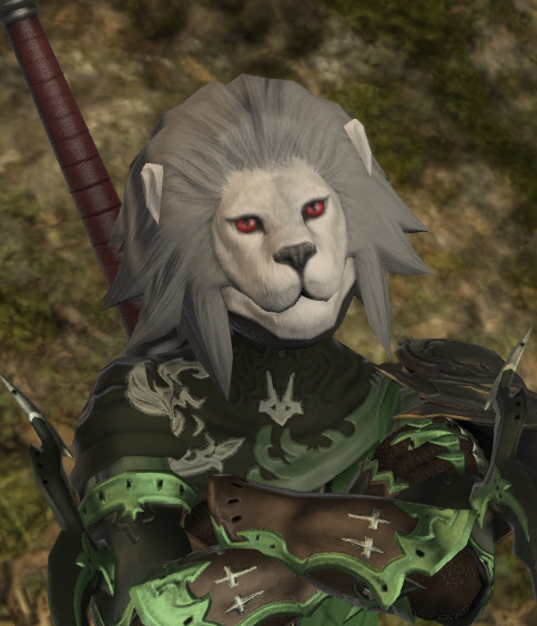
DT benchmark rd 2 - Hroth-Lnyan
Currently still undecided on Hrothgal but maybe as alt form
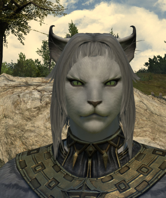
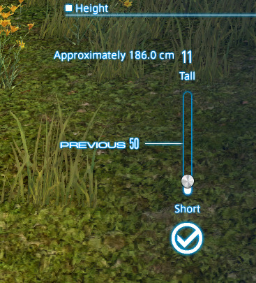
The Lost has grey tones skins THIS!!!!! in metric thanks! Height - Min is already 8-10cm taller than her OC eyes - 126, 161, 88 Face decide ear shapes so lynx ears. Three fang length Voice 1
Fur patterns!!!!! Meowdy!!
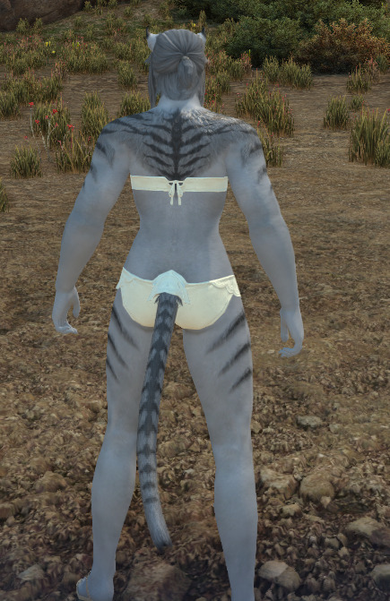
Night time. the pale fuzz on her mouth and eyebrows
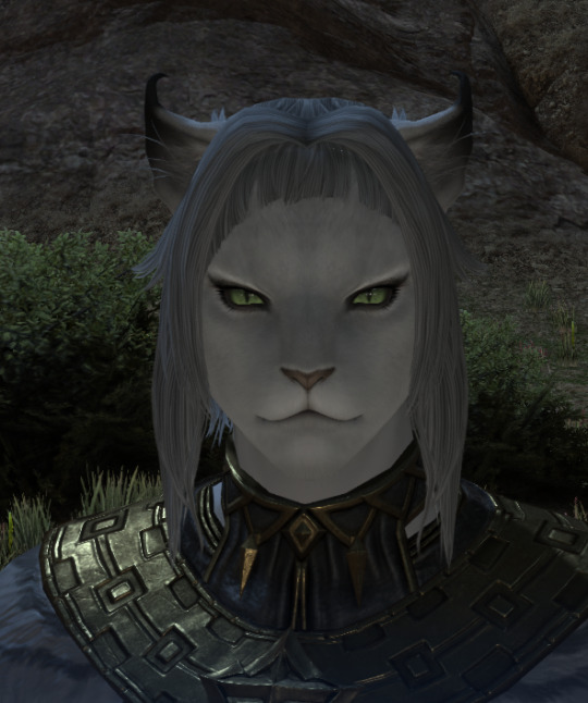
Extras
that whole Azem create Coeurl thing I had
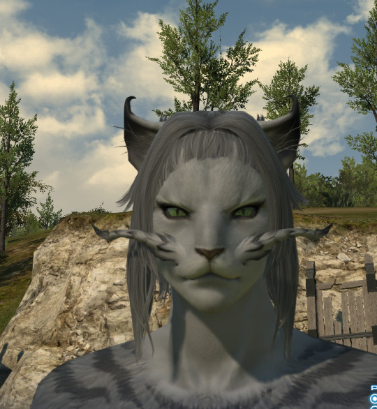
Hello Kitteh
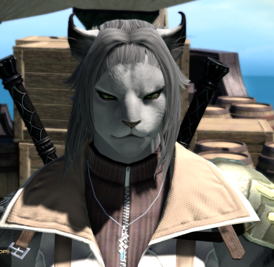
Lightning's outfit shows off stripes
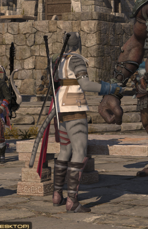
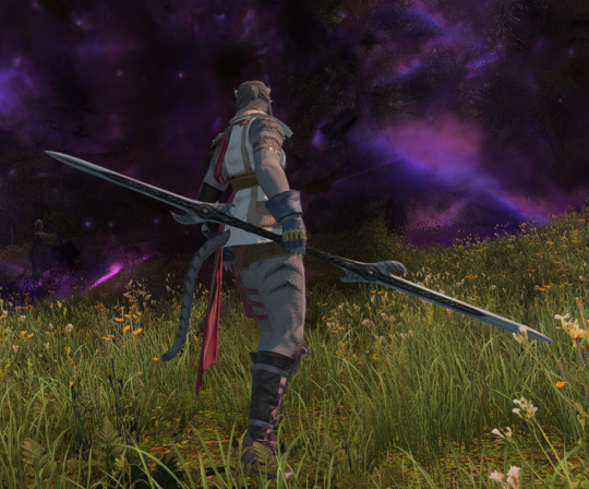
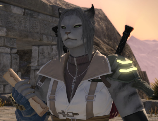
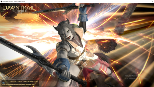
Kitteh smile
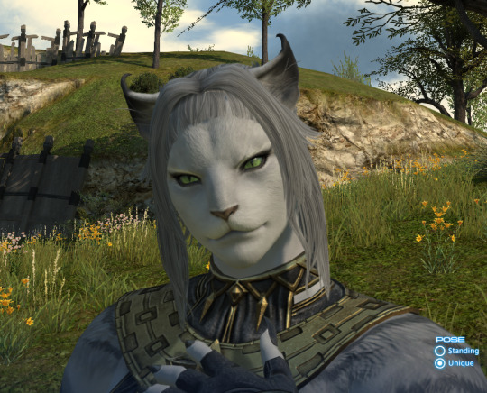
short fangs

wyvernskin mane... Ignore regular Hylnyan messing around
#Hrothgal#female Hrothgar#FFXIV Dawntrail benchmark#FFXIV - Dawntrail#Tracking Hylnyan#Hrothgar#Azem created coeurls on account of wanting to blast fish out of water
9 notes
·
View notes
Text
DT Benchmark
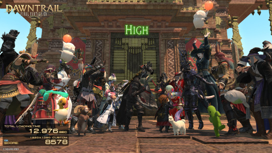
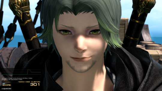
Can't use my hair which is rude but! Ready for Dawntrail.
#ffxiv#final fantasy xiv#final fantasy 14#ff14#ffxiv oc#ffxiv viera#ffxiv benchmark#ffxiv dawntrail#ffxiv dawntrail benchmark#dawntrail benchmark
10 notes
·
View notes
Text
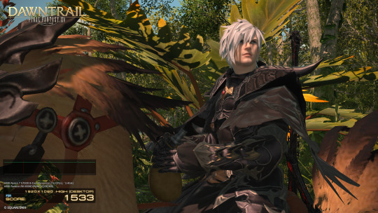
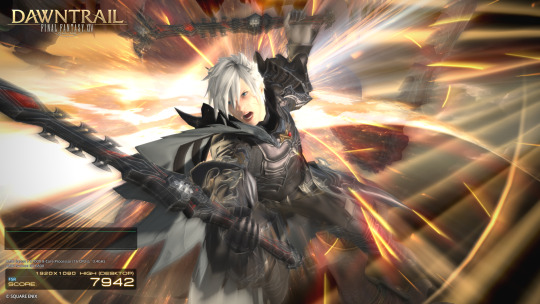


Dawntrail benchmark screenshots for the upcoming expansion. I'm surprised how much more I like this version of him in comparison to the old one. His eye color is also matching more to what he is supposed to have as well.
#ffxiv rp#crystal data center#garleans#mateus#Arcuris Rilanox#ffxiv dawntrail benchmark#screenshots#He's starting to look the age he's supposed to be finally#he's got a dante vibe going for sure
4 notes
·
View notes
Text
i started benchmarking today to check how the shader changes would affect my characters' looks. some initial notes...
the main concern was how the au ra limbal rings would be affected. bad news: her current settings don't work with the benchmark. good news: there are settings i can use that give a very similar feel, enhance her limbal ring glow, and additionally soften her rbf a little. i really like how the light limbal rings emit light that scatters across the undereye skin area. it really makes the limbal ring glow fit in better.
one thing i noticed is darker limbal rings don't blend that well against lighter iris colors. even mid-tone limbal rings against the lightest white iris doesn't blend well and has the same issues that the live game has with the limbal rings looking like they're pasted on. in general, it seems like limbal rings dominate the eye color, unless there's a clear contrast between limbal and iris color.
edit: seems like the limbal dominating iris color is because the pupil size in general is larger then in 6.58. 7.0 is using a new texture for the eye as a whole, so there's less space for the iris color but the limbal ring width hasn't changed.
au ra horns look acceptable, but the scale textures seems a bit too high contrast for my taste. won't be an big issue for my main though since it's rarely visible.
the miqos looks quite nice. the only complaint is that it seems like the eyeliner got really heavy on the female miqo eyes. her eyelashes look really heavy and the only way to change it to change her eye shape entirely, which i'm not inclined to do.
the bunnies look ok, but i noticed a number of makeup changes on the default faces. even after removing lip color entirely, the lip tone is darker than i expected. not to mention the hard nose shadow on the male vieras. that nose shadow has a clear line between the top of the nose and underside of the nose, so i will comment about it on in the forums.
i will check the other characters later, but overall from what i've seen, pretty happy with the changes, especially the light scattering on skin textures.
3 notes
·
View notes
Text
Hira "Sunfur" Araja


2 notes
·
View notes
Text
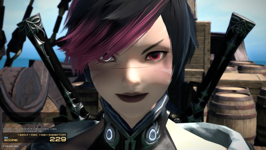
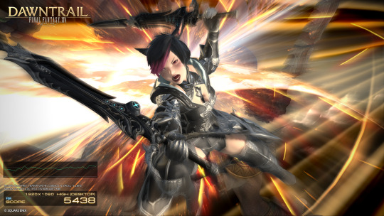
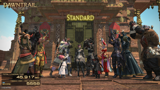
Finally got the Benchmark to work (I was trying to extract it to the wrong place...), and tried it first with Mhu in her original hairstyle!
She looks so good in the improved graphics omg, and honestly my potato computer did better than I expected it to. Standard is the lowest I've ever gotten on one of the benchmarks, but my computer is also barely hanging on by a thread sooo.. better than anticipated.
5 notes
·
View notes
Text

left: the first released benchmark for DT on max settings; middle: the updated version that came out today on max settings; right: the updated version using my imported settings
#ffxiv dawntrail benchmark#THE graphics update#looking sharp#my wol don't steal him?#not like i can stop it kek#no spoilers#ffxiv
0 notes
Text
Re: The Benchmark
There's a few things I hope they fix with it, and from the sound of the post that went up on socials, they are.
Midlander muscle slider does not look updated at all when compared to other muscle sliders in the benchmark, and makes the character look worse whereas the definition or lack thereof has a good look to it on both highlanders and roegadyns
Femhroths have black teeth but only sometimes. I don't mind them having black teeth, but the sometimes leads me to believe this is a bug.
The extra horn haircuts for femra have the horns use the old lighting IIRC. this one I'm not too sure about because it's one of the least used haircuts in the game. the sheen looked off in the benchmark though.
One of the tattoo/face options for Femhroth looks like piercings. May be intentional, but they do look like they're not applying correctly to the skin instead of extruding properly.
All in all they did a great job though. The most important thing to me is the muscle slider because Kell kinda needs that to work proper. How can people confuse him for a highlander without it?
1 note
·
View note
Text
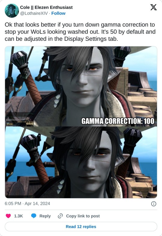
THIS IS ALSO IMPORTANT IF YOU'RE DOING THE BENCHMARK
116 notes
·
View notes
Text

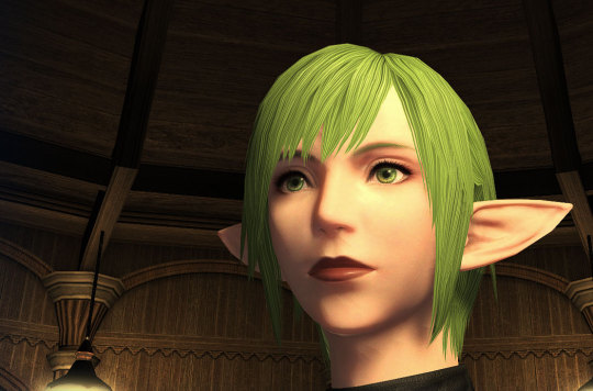
I have a feeling that a lot more people are going to use my eyes now that they've fixed the lighting jank for Dawntrail. I mean, just look at them. Wowza.
Almost NO ONE uses the same eyes and face model as Fyx because it looks pretty awful in character creation.
Below are two screenshots I took to demonstrate the jank to my friends on discord. These are fairly recent. On the left below, any light source reflecting upward makes my character's face look... so bad. Just ugh. And that's how it looks from many angles in character creation. But when I step out of it, like on the right below...That's how I see my character 90% of the time. I get compliments from strangers a lot because they think she's pretty. And I think she's pretty, too, but I never see her face in the wild! Hardly any NPCs have this face.
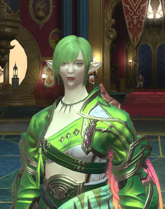
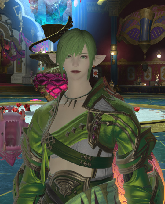
So, I'm pretty stoked that my inner eyelids aren't showing anymore. Finally.
1 note
·
View note
Text
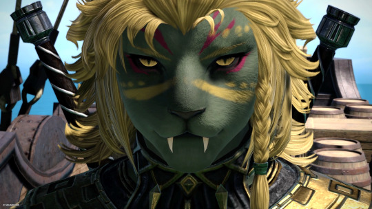

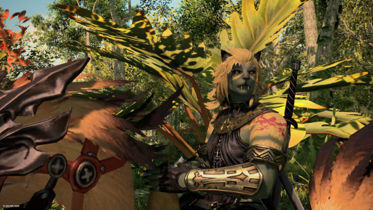
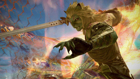
Introducing the Hrothgal that I will fantasia my main into. She needs a name but I love her already!
#im love her#spent so long trying to get the green to work with the limited colour pallet we get#probably wont be a viper but i dont get a choice in the benchmark#hrothgal#female hrothgar#hrothgar#ffxiv#ffxiv dawntrail benchmark#ffxiv character creator#my hrothgals#Malinalli Tonayolia
9 notes
·
View notes
Text
DT benchmark rd 1 - Hylnyan Default and Alter
She reminds me of a bjd.... oh wait...

Hylnyan 6.0 What do you mean she was Face shape 3?" eye color - 126, 16, 88 skintone - 204, 176, 160 Leonhart outfit is closest to gaganaskin aiming jacket
***edit - With ingame 6.5 for just because
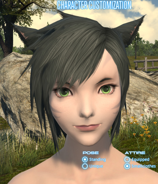
From Character creation screen
Aside for her mouth looking oddish(lighting?) during custscene, she's about as derpy and cute as she normally is?
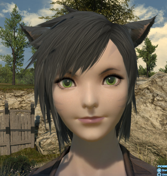
Hairstyles are limited so this is one of her usual hairstyles that don't completely cover her eyes
She looks like a doll? And I may or may not go for a darker green eye color
(edit - I checked her OC's various selves, they all have around the same shade whether painted or acrylic eyes)
--------------
This part is on Loop
that weird lighting reminds me of In from the cold Mean kitteh is mean.
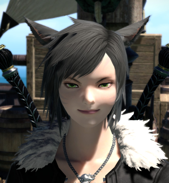
Please excuse loop for giving random costume. Ode to Yuna.

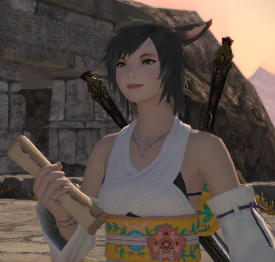
Devs been taking lessons from Hildy quests adding all those super moves closeup scenes. This reminds me of Street Fighter 5. Are we going to see more of this?

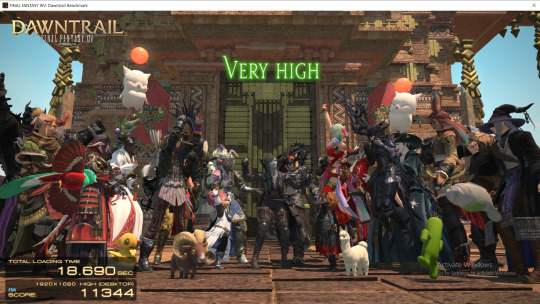
---------------
Hylnyan Alter the grey skin test
skintone 115, 128, 138

Mean Kitteh smirk
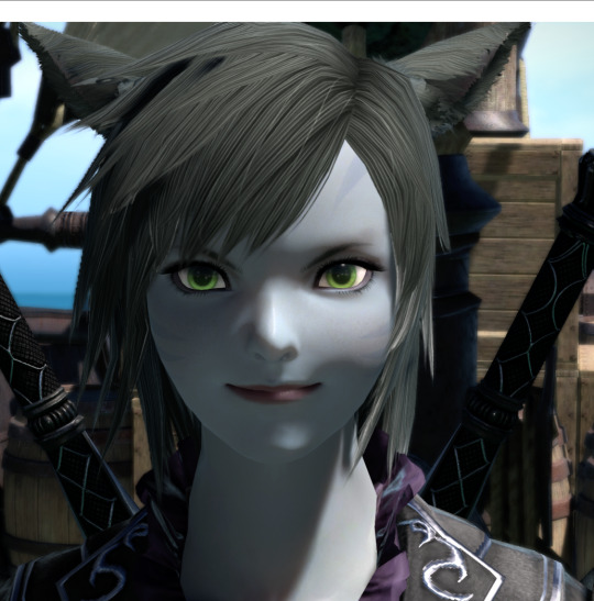
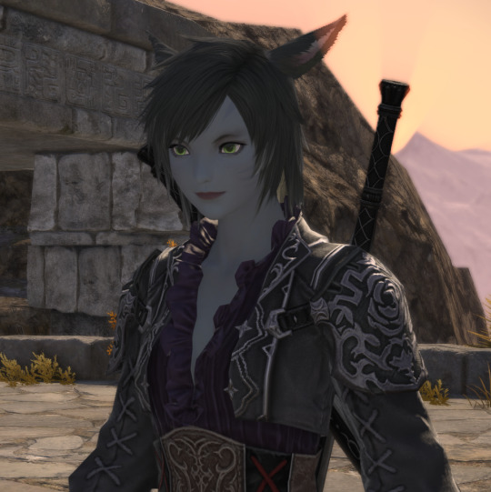


6 notes
·
View notes
Text

big furry women....... hot............
#my art#oc art#artists on tumblr#ffxiv#ffxiv art#final fantasy xiv#ff14#hrothgar#hrothgal#fem hrothgar#femhroth#ffxiv hrothgar#ffxiv benchmark#ffxiv dawntrail#dawntrail benchmark#anthro#furry art
3K notes
·
View notes