#fantastic use of composition+limited colours
Explore tagged Tumblr posts
Text
Graphic Design 2
Hello you jazzy jams!
Today we explored the medium of collage in expressing our ideas. We started out with a quick mindmap, practically explaining our project. We then swapped our mindmaps with someone else and cut out pictures/colours/textures that we felt would go well with their project from magazines.
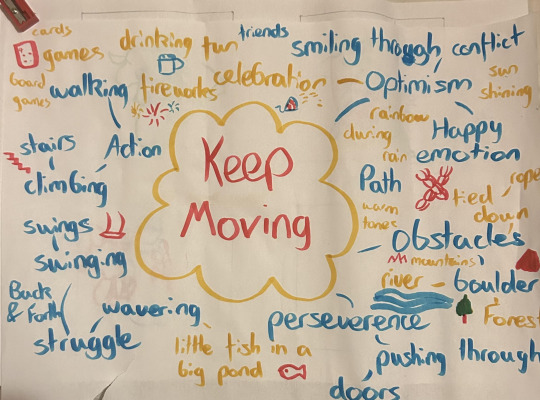
We then used these pieces of cut out paper to create thumbnails sketches where we figured out compositions to assemble them in. The pieces of cut outs wouldn't have been images I would've chosen but I still found it interesting how other perceived my concept and what they thought would suit well.
Firstly, I tried mashing all the images I liked together which turned out messy but funny. I didn't feel like they explained my project clearly as I would've liked though.
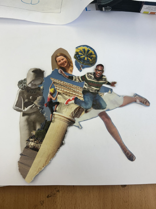
I liked being playful with my images and tried to create a nice silhouette of a shape to draw the eye. Once again though I found it got messy and tried other ideas I had.
This time I limited the amount of photos I used. We keep being told that "Less is More" and we should be trying to take away rather than add to our pieces and keep it visually simple.
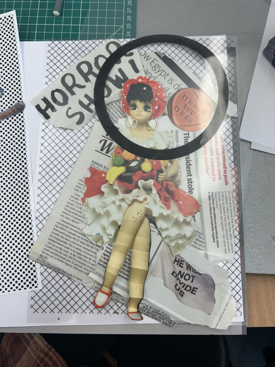
I used two of my images, some ripped up newspapers and some patterned sheets to add to my design. I felt there wasn't really a focal point to draw the eye in despite trying to circle in on the face so I added some cut out yellow paper to contrast the grey and white surroundings.

I felt this pop of colour was much needed. The concept was this girl who is surrounded by hate and the controversy that we find in everyday life, but can find happiness in what she does and who she is. This is why I used yellow around the head to add emphasis and represent that she's sort of blocking out all this pessimistic noise with positivity. The heart stamp "IT'S NOT YOU IT'S ME" explains that she's the reason she's happy not her surroundings.
I also wanted to add a swing as the original image looked as if she was sitting down and it seemed perfect. I used a simple block of black paper to use as a seat but was unsure for a bit of what I could use as a rope. After talking to Sharon about it she recommended that I use strips of paper as there wasn't any available string. She also felt that the textured design was too busy and that I should try a softer one and that I should cover the bigger headlines so as not to distract the viewer. She also suggested I add a block of coloured paper at the bottom so the piece looks more grounded but I personally like the floaty nature of it, as if her head is up in the clouds and she's on an imaginary fantastical swing in the skies.
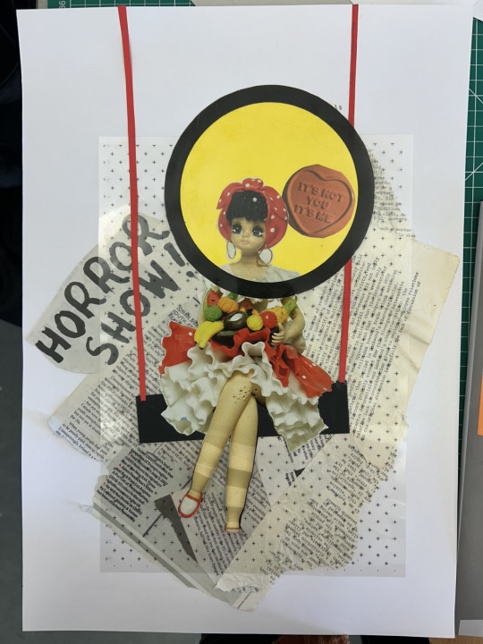
This is what I wounded up with. I added the swing ropes using red as I feel it added cohesion to the dolls clothing. I also tilted the swing just to make the piece look more dynamic and draw the eye up and down. I kept the words HORROR SHOW as that's the main idea behind the news headlines and society sometimes feeling like one.
I also changed the textured sheet where it's no longer like a thick grid but composed of lots of + signs. This feeds into the idea of positivity and optimism in my work. I also folded the legs to try and create depth as if the legs are swinging towards the viewer. I originally did it to make it seem like her legs were mangled and she could only sit down, showing how harsh life can be yet she remains optimistic.
I really enjoyed this workshop and it make me think a lot about composition, different ways of displaying my ideas and some of the design principles which I'll discuss in my research.
3 notes
·
View notes
Text
Elastic Laces for Shoes and Red Elastic Shoe Laces Adventures
Imagine never having to tie your shoes once more. Elastic Laces For Shoes provides for many people a basic but transforming convenience. Elastic laces give a safe fit without continual tying and re-tying, regardless of your level of busyness—that of an athlete, a parent, or someone trying to simplify footwear care. This essay will discuss the rising trend of elastic laces, with particular attention to the vivid and fashionable Red Elastic Shoe Laces and their several uses.
The Convenience of Elastic Laces For Shoes
One ground-breaking substitute for conventional shoes is Elastic Laces For Shoes. Because of their elastic, stretchy composition, these laces let shoes slide on and off without requiring tying. The design guarantees a close fit, thereby offering comfort and protection without the trouble of lace adjustment all through the day. Elastic laces simplify shoe wear for adults and children alike, particularly for individuals with limited dexterity or hectic schedules.
Style Meets Function with Red Elastic Shoe Laces
Red Elastic Shoe Laces are the ideal option for anyone wishing to give their shoes some color. Apart from providing the same ease as conventional elastic laces, these laces improve the appearance of any pair of shoes. The strong red hue distinguishes shoes and increases their fashion ability by using elastic laces' advantages. These vivid laces modernize shoes whether worn with sneakers, casual shoes, or even dress shoes.
Comfort Benefits of Elastic Laces For Shoes
One of the main causes individuals select Elastic Laces For Shoes is comfort. Elastic laces provide a consistent, pleasant fit unlike conventional laces that could become either too tight or too loose. The elastic material softly presses the foot to fit it, so avoiding irritation. This especially helps those with foot problems like bunions or those who participate in vigorous activities like jogging or sports where a safe fit is absolutely essential.
The durability of Red Elastic Shoe Laces
Red Elastic Shoe Laces have one of the best durability among others. Designed from premium elastic materials, these laces resist wear and tear significantly better than conventional fabric laces. Red Elastic Shoe Laces are a long-lasting investment for any wardrobe since they keep their form and elasticity over time whether used for daily wear or vigorous sports. Their color stays vivid even after several washings, thereby guaranteeing that the shoes always look new and fashionable.
Elastic Laces For Shoes for Kids
Particularly among parents of young children, elastic laces for shoes are rather trendy. Children especially benefit much from the simplicity of putting shoes on and off without tying them. Children adore their independence in being able to put on their shoes by themselves; parents no longer have to assist their children continually with laces. Elastic laces are a better option for active children as this also reduces the possibility of tripping over untied laces.
Where to Buy Red Elastic Shoe Laces
Finding a trustworthy source is crucial when wanting to update shoes with Red Elastic Shoe Laces. For a large selection of elastic laces, including striking and eye-catching red choices, is a fantastic site to browse. The website guarantees a great fit for every sort of shoe by including many colours and sizes. Whether for daily shoes or athletic wear, it offers premium, handy laces that will simplify shoe-wearing and boost style.
All things considered, Elastic Laces For Shoes and Red Elastic Shoe Laces provide comfort, convenience, and flair. From working parents to energetic people, everyone trying to enhance their footwear experience will find great value in these laces. Visit u-lace.com to choose from a large range of premium elastic laces the ideal fit for any shoe. Elastic laces are a footwear game-changer with their elegant appearance and long-lasting strength.
Our website is a great place to find answers to your questions.
Mark Cuban Laces
Elastic Boot Laces
0 notes
Text
Books from Moyes Hall
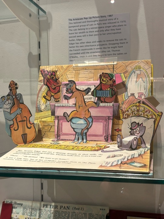
Most of these book covers lean into the illustration style, as they are directed towards children. They make this evident by effectively planning the style, subject, and layout they decide to use.
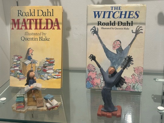
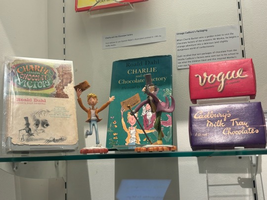
These two books are written by Roald Dahl, a children’s book author. Quentin Blake is an illustrator, who is known for his work as a cartoonist.
Both of them are stories written for children, so the style of the book covers are simplistic and easy to read. Quentin Blake creates his works readable shapes and colours, being easier for younger audiences to understand. The colour palettes will also appeal to them, as psychologically, children are more drawn to brighter palettes.
The style is also quite different, being cartoony and unrealistic. Children are more interested in their imaginations rather than reality. Additionally, Quentin Blake’s style is very unique. He has a hand drawn charm, which may suggest that these books aren’t for younger children (age ~5), but maybe ages 8-10. Books for particularly young children are much more shape focused and are more often than not quite simple, with clean lines. But Quentin Blake’s style, while being simple by some standards, has a messy and imperfect look. Along with this, his style is very recognisable. As a child, I could immediately tell who a book was written by if I knew they had Quentin Blake as their illustrator. Roald Dahl and David Walliams were two I could recognise from the style alone. I feel this is quite important as an artist, as even children can recognise your works with the illustration style.
The covers make a good use of type and titles, with both of them having large titles in solid colour. This immediately makes them visible to the viewer. As well as this, using bright and bold colours for the titles makes them stand out against a light coloured background. However their choice of colour is also noteworthy as they used colours that compliment the palette of the whole cover, rather than any colour that would stand out such as green. The cover for Matilda, is written in red. This fits with the more warm tone leaning palette. However the cover for the Witches, is blue. Because the palette is mostly cool toned.
On the cover of The Witches, the witch herself is a much different tone to the rest of the people on the page. This enhances the idea that she is a witch, and she doesn’t fit in with humans. Also, her pose compliments this, being dynamic and taking up most of the page (composition wise, her arms also lead the viewer’s eyes to the title).
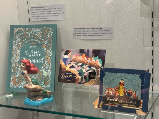
For The Little Mermaid, the cover is a hardback fabric with gold foil stamping and illustrated endpapers. I didn’t get to see inside the book, so I didn’t get to see the endpapers unfortunately. The gold foil stampings add a nice visual effect to the cover. I also like the colour palette it creates, the coral colour compliments the light blue. The design on he cover is interesting, with the gold foil having the underwater inspired illustrations and the white having the sea itself. I think this cover is really beautiful, however I wouldn’t recognise it immediately as The Little Mermaid if it weren’t for the title. This is why I think the title placement is really important this time. as a viewer might not be able to tell what the book is if he type wasn’t so big.
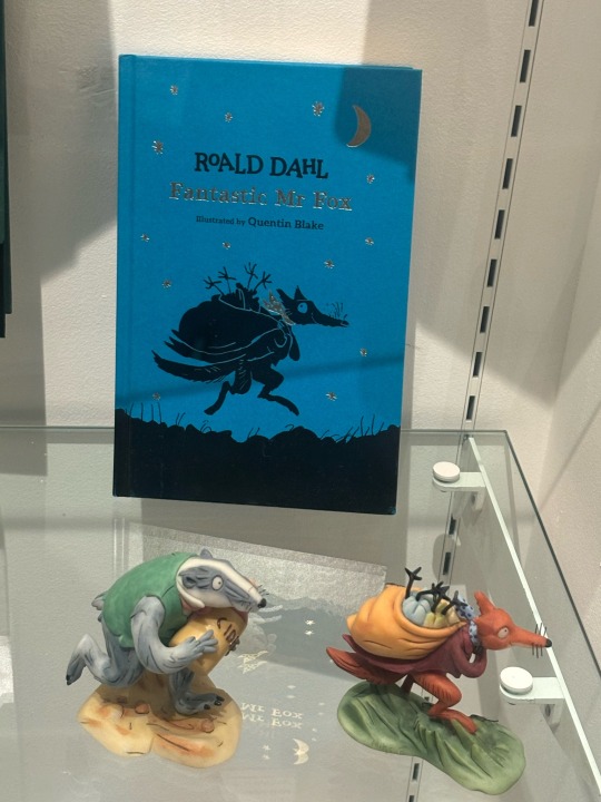
This cover for Fantastic Mr Fox by Roald Dahl was illustrated again by Quentin Blake. This cover is very different from the others he as illustrated for Roald Dahl, as there is very limited use of colour this time. Blake uses a silhouette of the fox character to highlight the darkness of the scene, enhancing the contrast between the background and the character. Silhouettes need to be readable, as well as eye catching, to have an effect on the viewer. This is because the silhouette is supposed to lack detail, as the character is emerged in darkness, so the shape language used by Quentin Blake is very important and it is done well. I also really enjoy the silver highlights, it adds a nice aesthetic touch.
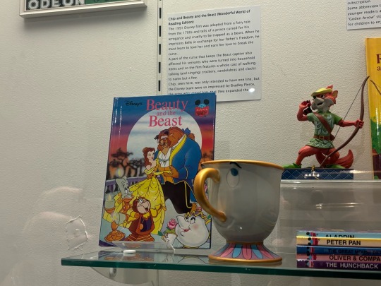
This cover for Beauty and the Beast is arguably the least detailed. It uses the least artistic techniques to sell the story with the cover. It shows off all the characters which is good, and shows their emotion well. I also think the background is good, but it looks less like a forest and more like a desert from the shape of the trees. I think this book is the most obviously directed towards children, since its very simplistic design is easy to understand.
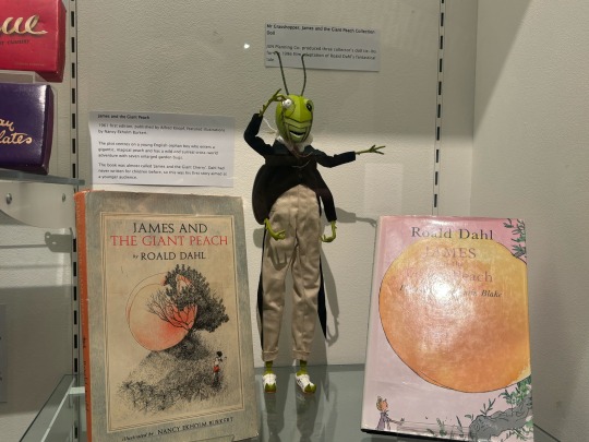
The cover on the left for James and the Giant Peach by Roald Dahl is illustrated by Nancy Ekholm Burkett. I really enjoy the style used here and I think it fits the theme. he story of James and the Giant Peach is quite uncanny, and this cover is somewhat mysterious. You cannot see the character’s face, therefore you cannot gauge their emotions. The Peach is also hidden, behind a tree, indicating intrigue. The peach is also a very bright colour compared to the dull palette, making it stand out. I really enjoy this lineart style, its very intricate and illustrative. It has a nice feeling of depth, light and shadow through the subtle lineart differences. I really like this art style.
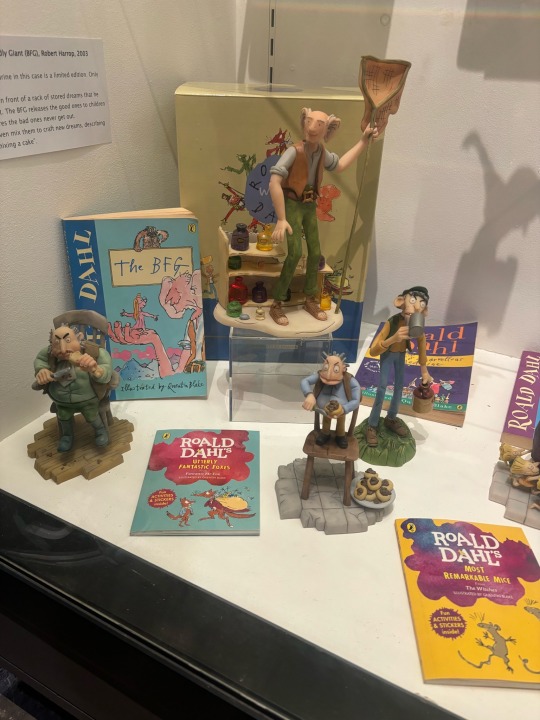
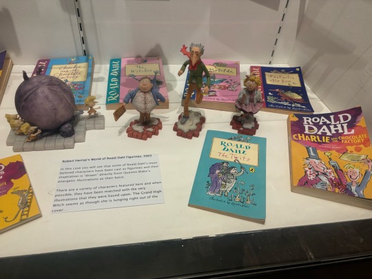
These covers have some of the same stories as mentioned before, but the covers are laid out very differently compared to the former. I think these covers are neither better or worse, I think theyre more simplistic, as they are directed towards children. In my opinion, they are less artistic and more focused on showing the story through graphic design(?) techniques, rather than artistic methods such as colour, composition, line and contrast. The characters are the main focus, and the title is shown behind a title box on a relatively bright coloured background. This makes the cover much easier to read and recognise, which is suitable for children. I also like that the covers have the characters almost fully on display, but it doesn’t show off the story. It creates more intrigue through showing the designs.
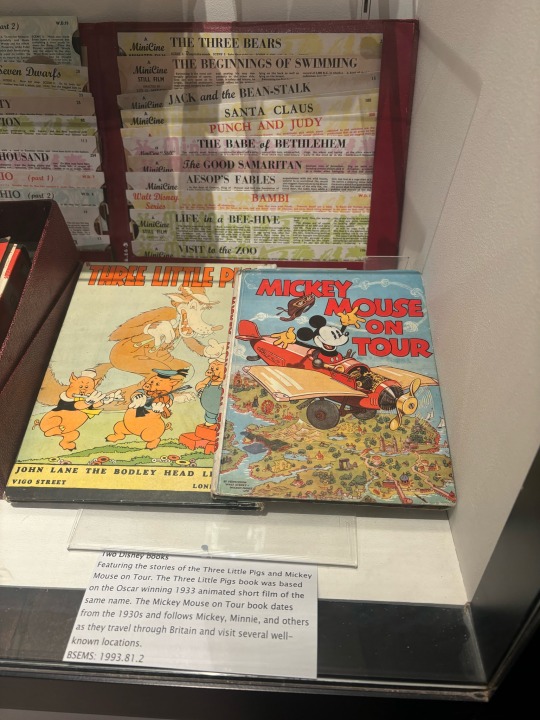
All of these covers are much more stylised illustration leaning, being clearly directed towards children. However there were a couple of other covers that weren’t in a light and childish style.
0 notes
Text
Week 7 - Context, concept, and content - the work of Karen Jerzyk
This week, for SDL, I took a look at Karen Jerzyk's work. She has an extensive portfolio of a wide range of projects. I like how, as it says on her website, she blends surrealism with raw emotion, creating a truly distinct style. Her pieces feel slightly eerie and creepy but also full of human emotion. I like how experimental and world-bending her work is. I feel like it takes me to another realm, which is cinematic and theatrical. I can see her influences from film directors such as Tim Burton, Stanley Kubrick and Wes Anderson. Her use of colour is also worth noting as it brings life to her designs and is also an element of surrealism. Something that looks too perfect but also believable in a way. I want to take inspiration from the imaginative exploration of her designs. As well as the portrayal of raw emotions within her dreamscapes.
I really like how her work uses practical effects, and this inspires me to do a lot of practical effects of my own instead of post-proposing. That being said, there are limitations and my limited ability in terms of SFX makeup and props.
Favourite compositions (Source: https://karenjerzykphoto.zenfolio.com/):
The images I chose of interest were subject-focused, tying into my project. I really like the first three images' use of flora and fauna as framing devices, drawing you into the subject. Each of the images I chose has a distinct colour story that gives each image elements of fantasy and emotions. Each uses lighting and shadow to create interesting framing and atmosphere.

I choose this image for multiple reasons, the first being its use of branches as a framing device around the subject. It makes the image feel claustrophobic and creepy. This is heightened by the colour pallet, which feels ghostly, frosty and isolating. The subject holding the mallet? Adds to this spooky feeling, and their distressed facial expression and sickly makeup adds thematic depth. Their placement in the centre brings attention to them but also makes them more unnerving.

This image is just a joy to look at; there are so many beautiful elements. The use of colour is cohesive and ties the subject to the other elements of the image. The flora acts as a frame for the subject and feels like the flowers are blooming around her. Therefore, the image feels full of life. Which is contrasted by her white eyes and dead expression. The insect is a point of interest as you look closer. The costuming with the insect feels like an ode to Victorian paintings.

The final image is fantastical and full of a sense of reconnection with nature but also isolation. It feels alive with life and a sense of contentment. The plants seem to be blooming out of the subjects, attracting the butterflies. In a way, the subject looks like they're beckoning the butterflies to them. The use of the butterflies to frame the subject brings attention to the emergence of the flowers. Guiding the eye nicely and the use of negative space allows a much-needed break in the business.
0 notes
Text
Say Goodbye to Imperfections: Veneers Geneva for a Stunning Smile
A beautiful smile can significantly enhance your confidence and overall appearance. For those looking to perfect their smile, veneers offer a fantastic solution. In this guide, we’ll explore everything you need to know about getting veneers Geneva, from what they are to how to care for them.

What are Veneers?
Veneers are thin, custom-made shells designed to cover the front surface of your teeth. They are typically made from porcelain or resin composite materials. Veneers can address various dental issues, such as discolouration, chipped or broken teeth, and gaps between teeth.
Benefits of Veneers
Natural Appearance: Veneers mimic the light-reflecting properties of natural teeth.
Stain-Resistant: Porcelain veneers resist stains better than resin veneers.
Durability: With proper care, veneers can last for many years.
Customisation: Veneers are tailored to match the shape and colour of your teeth, providing a perfect fit.
The Veneer Process in Geneva
Finding a Dentist in Geneva
To start your journey to a dazzling smile, you need to find a reputable dentist in Geneva. Look for a dentist with extensive experience in cosmetic dentistry and positive patient reviews.
Initial Consultation
During your first visit, the dentist will assess your teeth to determine if veneers are suitable for you. They will discuss your goals, explain the procedure, and take X-rays or impressions of your mouth.
Preparation and Application
Tooth Preparation: The dentist will remove a small amount of enamel from the tooth surface to make room for the veneer.
Impressions: Impressions of your teeth are taken to create a custom veneer.
Temporary Veneers: While your permanent veneers are being made, temporary ones may be placed.
Bonding: Once the permanent veneers are ready, the dentist will bond them to your teeth using a special adhesive.
Aftercare and Maintenance
Proper care is essential to maintain your veneers. Here are some tips:
Oral Hygiene: Brush and floss regularly to keep your teeth and gums healthy.
Avoid Stain-Causing Foods: Limit consumption of coffee, tea, and red wine.
Regular Check-Ups: Visit your dentist regularly for professional cleanings and check-ups.
Veneers vs. Implants in Geneva
While veneers are excellent for cosmetic improvements, dental implants Geneva are a better option for replacing missing teeth. Implants involve placing a metal post into the jawbone to support a replacement tooth. Discuss with your dentist which option suits your needs best.

Achieving a dazzling smile with veneers in Geneva is a straightforward and rewarding process. By choosing an experienced dentist geneva and following proper aftercare, you can enjoy a beautiful, confident smile for years to come. Whether you’re looking to fix minor imperfections or seeking a complete smile makeover, veneers can provide the stunning results you desire.
0 notes
Text
Photography Made Easy: Learn To Take Fantastic Photographs

Photography can be both a rewarding and profitable hobby or profession. Anyone with an artistic eye and creative mindset can become a photographer with hard work. Use this article's advice as your starting point on your path toward artistry!
video production services near me
One of the best ways to learn photography is by studying examples of how others hold and use their camera during photo shoots. Furthermore, speaking to someone experienced in photography can give invaluable advice regarding your craft.
When selecting images to showcase or show off, limit yourself to only showing off your best shots. Only display some or too many on one topic at one time, as this can become tedious for viewers and doesn't do justice to your photography abilities. Instead, keep what's on display fresh and exciting by showing different kinds of photographs.
Keep your camera batteries charged; you never know when a fantastic photo opportunity will arise. Digital camera LCD screens use your batteries quickly, so always ensure your battery is fully charged before leaving home. Another good tip would be to bring extra camera batteries if any unexpected photo ops arise.
One helpful photography tip that can assist you is taking multiple shots of the same subject. Doing this forces you to become more creative, trying out various compositions until you find a unique photo every time.
Purchase a large enough memory card to accommodate all the photographs you will take to become a better photographer. While larger cards can be more costly, investing in one will ensure you always have room for essential shots and provide RAW format options that give greater post-production flexibility.
Unleash your creative vision. By adopting a unique viewpoint, you can make everyday objects seem intriguingly intriguing. Use your imagination to show ordinary items in novel settings; take another perspective when observing life around you. Look at life from another viewpoint!
Do not stop taking outdoor pictures when the sun begins to set - there are plenty of opportunities for great low-light shots if you have a tripod handy with your camera! A tripod provides excellent low-light photography, whether the sun is up or not.
Purchase a DSLR (Digital Single-Lens Reflex) camera if you want professional-looking photographs. When shopping for cameras, please don't focus on their megapixel count; instead, focus on their image sensor. Most professional photographers invest in full-frame DSLR cameras that capture clear pictures of whatever subject matter may be present.
Consider framing when creating a shot - not with traditional picture frames in mind, but one that occurs naturally within your frame of reference. By searching out items within your shot that create a natural frame, you can help improve composition.
colour grading software
Change the focus settings on your camera to achieve different effects in your photographs. If you wish to keep the subject of your photograph front-and-center without their background becoming the focus, use a smaller f-stop number, otherwise known as the depth of field technique. This works excellent when photographing portraits as the subject is much closer; more significant depth of field photos make great landscape photos!
As you prepare to share all of the photographs you have taken with other people, ensure that only your best shots are shown and shared. Not everyone will respond kindly if they see practice shots among otherwise great photos, so give only your finest ones when showing them to people.
Learn to tilt your camera. If the subject you photograph is taller than it is wide, use your camera to make more room for it in the frame by listing your camera on its side and taking vertical pictures instead of traditional horizontal ones.
Acclimatize to new backdrops and surroundings by taking practice shots to understand how your camera reacts to its environment. Practice shots will give you the confidence to capture great shots even in unfamiliar settings; lighting may change often, so take as many practice photos between shots as needed to ensure your settings are correct.
Adjusting the camera settings, changing lighting, or altering the shot angle are all ways of making any subject appear more captivating. Before shooting, play around with these options so you know exactly how they affect the final shot.
Get some creative photography inspiration by looking at other photographers' pictures. You may learn a lot about capturing images that suit your vision - not that this means copying their work, but you will likely pick up valuable lessons from it!
Try bracketing the exposure on your camera when shooting landscapes to get additional lighting. Simply shoot, stop up, then stop down from your first to the last shot; some cameras even provide automatic bracketing of three shots!
Photography can be enjoyed as a hobby, profession, or artistic expression. No special skills are needed to become a photographer; all it requires is a passion for media and an eagerness to learn new techniques. With these tips in this article, you should soon be on your way to mastering this great activity!
1 note
·
View note
Text
Ideas for Painting on a Black Canvas to Unleash Your Creativity

In the world of art, painters can express their creativity on a wide variety of canvases, each of which offers a different starting point. Although black canvases are increasingly popular in the art world, classic white canvases have long been the norm. Such an uncommon decision has a number of benefits, enabling artists to explore new realms and let their imaginations run wild. Black canvases offer an intriguing and distinctive background for unleashing creativity, allowing hues to pop and ideas to come to life. You feel driven to experiment and push yourself when working on a black canvas. We’ll explore some mind-blowing painting concepts for black canvas painting in this blog, which will inspire you and challenge the limits of your creative ability.
The background of your artwork will differ if it is painted on a black canvas compared to a white canvas. It is possible to use light and shadow to your advantage in order to create a dramatic effect that will make your painting stand out from the rest. To paint on black canvas using a number of different methods, such as using vivid colours that stand out against the dark background of the canvas. The other alternative is to use paler hues so that the effect is more ethereal and faint. A black canvas’ attraction comes from its capacity to highlight colour brightness and produce a stunning contrast. Your artistic expression gets a stage in the darkness, which increases the impact of your creation.
So let’s get started with some intricate painting suggestions that will make your creations pop on a black canvas.
Abstract Painting:
Explore the world of abstract painting by playing with strong lines and brilliant colours on a black canvas in the style of abstract expressionism. As you create dynamic and emotive compositions, allow your emotions to lead your brush. Bring your distinct vision to life by combining clashing colours, adding texture with a variety of tools, and embracing spontaneity. The fire and drama of your abstract creation will be amplified by the black background.
Pop-Art:
Adopting the popular style of pop art on a black canvas will give your artwork a lively, energetic feel. Employ vibrant, contrasting colours to create eye-catching, colourful faces, objects, or symbols. You should experiment with patterns, repetition, and visual components of your design to convey a sense of motion and vitality. By creating a black background for your pop art-inspired piece, you will be able to increase its visual impact, which will help make the colours stand out even more.
Monochromatic Mastery:
Use a black canvas as a blank slate to explore the power of monochromatic compositions. To produce a piece with striking visual appeal, choose one colour and all of its variations. Try experimenting with various values and tones to achieve depth and dimension. On the black canvas, the lack of colour other than the selected shade will highlight the elegance of simplicity and the richness of a single colour.
Celestial Splendour:
Paint a celestial masterpiece on a black canvas to allow your imagination to soar beyond the stars. Swirls of vivid blues, purples, and pinks can be used to depict a stunning galaxy. Incorporate glistening stars and far-off nebulas to convey the size of the universe. A mesmerising visual effect will be produced by the contrast between the dark background and the brilliant heavenly components.
Dreamy Sceneries:
By using a black canvas, you may give typical landscapes a surreal twist. Use gleaming silver and vivid greens to simulate a dusk woodland. Mythical animals or floating islands can be incorporated to create a fantastical theme. The dark background will create a fascinating and fantastical scene, enhancing the ethereal feeling.
Benefits of Using a Black Canvas
Amplifying Contrast and Vibrancy:
Painting on a black canvas amplifies contrast and vibrancy, making colours appear more vivid and striking. The juxtaposition of bright hues against the black background creates a visually captivating effect, drawing the viewer’s attention and adding depth to the artwork.
Playing with Shadows and Light:
Painting on a black canvas allows artists to experiment with light and shadows in unconventional ways, creating dramatic effects that emphasise specific elements. By strategically adding highlights and shadows, artists can sculpt their subjects and add a three-dimensional quality to their artwork, making it visually captivating and thought-provoking.
Encouraging Expression and Creativity:
Working on a black canvas inspires artists to think creatively beyond the box and venture into uncharted territory. The restrictions of the typical white canvas are absent, allowing artists to explore novel methods, materials, and aesthetics. Working on a black canvas forces artists to step outside of their comfort zones and adopt a more experimental style, resulting in creative and one-of-a-kind artwork. This gives artists a venue for unlimited self-expression, enabling them to express their ideas, feelings, and narratives in forms that are visually appealing and leave room for interpretation.
Take advantage of the appeal of dark canvases to explore your creative potential. You can open up a whole new universe of artistic possibilities by painting on a black canvas. The black canvas provides the ideal setting, whether you are drawn to heavenly wonders, abstract expressions, lucid landscapes, vivid pop art, or monochrome minimalism. Grab your brushes, accept the gloom, and let your imagination soar as you set off on an amazing voyage to paint on a black canvas.
Are you sick of painting on the same old white canvases? Why not experiment and let your imagination run wild on a blank canvas? It’s an interesting and fun technique to express yourself and make beautiful artwork. It’s simple to purchase a black canvas to paint on. If you simply Google “buy painting canvas online in India,” you will get a tonne of alternatives. Depending on your needs and budget, you can choose the canvas’ size and quality. It’s time to let your creativity soar once you have your black canvas in hand! For your creation, you can use acrylic or oil paints. At last, using a black canvas to paint on is a great method to let your creativity run wild and elevate your artwork. And don’t worry if you make mistakes because you can simply paint over them and start over.
#black canvas painting#painting on black canvas#acrylic painting canvas#buy painting canvas online india
0 notes
Text


Here is one of my chosen inspirational photographers for week 4.
Erwin Bluemenfeld is mostly thought of as a fashion photographer. He played around with mirrors and kaleidoscopes which inspired me, as I enjoy using refection in my photography and thought of some of his work when trying to take interesting portraits using reflection.
"It is remarkable that his fashion aesthetic is mirrored in a mirror that he held at the age of thirteen, in 1909, when he shot a self portrait dressed up as Pierrot." - I find this so amazing and clever. The second image of his that I have selected out of the three is this shot. It has made me want to push the limits and see what I can achieve with mirrors for my shoots in the future. It is a remarkable shot with it's colour, texture and composition and the fact that he was 13 when he took this blows my mind.
After observing his work, I am going to see what else I can achieve with glass, mirrors and any form of reflection really. He was also said to be skilled with double exposuring and that is something I too want to improve on. To me his images look like paintings and his choices of colour are fantastic. It has made me realise how important or how effective a colour palette really is when shooting.
1 note
·
View note
Text
Week 1, Sept 6 - 13
I wanted to summarize what I have been working both this past week and over the summer, as well. I have given my fourth year film a lot of thought, so I hope that over the course of this semester that is reflected!
This week I want to give an overview of what my project is about in terms of its plot, significance-slash-importance to me, and a breakdown of how I will go about attempting to achieve my planned goals this year. I also want to show some images of my current progress and talk about where I'm going next.
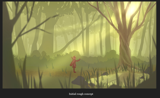
My project’s narrative actually came about as an accident when I was brainstorming ideas for my film. This summer, I went on a personal journey to understand more about my indigenous heritage. I found it both terrifying and exciting to learn more details about a culture that is my own but have no real connection to. A narrative began to develop unconsciously in my mind about a metaphorical journey of self discovery, and what it feels like to uncover a hidden part of yourself.
I wanted this to be the central idea for my film. I plan to show this narrative through body language and symbolism, not necessarily of indigenous culture, but of a more fantastical and universally relatable lexicon. Use of colour in costume design and the environment will be critical components of storytelling by way of texturing and lighting. And I want to use cinematography and composition to support these big ideas.
I wasn’t sure how much I should share right off the bat, so these are just some of the bigger ideas I would like to investigate with the project, and I can perhaps expand on them in the future as I build my assets.
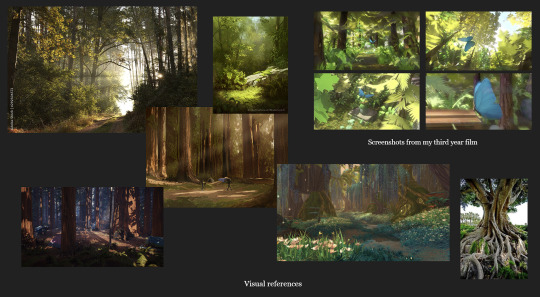
These are some visual references I have gathered. I have more, but these are some of the ones I used the most while planning my ideas, and also included some screenshots from my 3rd year film for reference because I liked the way that turned out.
I would like to push the limits of my skills this year. I planned on doing this in a few ways, one: by developing my understood abilities, and two, by slowly introducing new skill sets that I want to include in my film. Some of the new, and some of my weaker, areas of knowledge are:
Using Dynamic Curves for rigging characters and costumes
Attempting to achieve more accurate nCloth simulations for clothing
More realism, or naturalism, in character animations
Animated textures
Attempt to use Bifrost to add simple bodies of water to my forested environments
Of course, if there is one thing I have learned about working on projects like this, things don't always go according to plan, even when following a structured schedule. There is a risk involved with developing new skills on projects with strict deadlines. I feel like I can safely push myself to my limits with my concept while taking what I see as “calculated” risks. But, just in case, I am also developing backup plans or alternative means of creation if I begin to struggle too much with learning these new skills.
This way I will still achieve my desired result, but still allow myself to take risks that will ultimately help me improve. I will also initially conduct a short testing period to see if these goals can be reached in a timely manner before committing to shots or assets that require these new skills to be applied.
Some examples of "backup plans" could include:
Swapping Dynamic Curve rigging for strictly nCloth simulation
Simplifying the character costume to avoid complex nCloth calculations
If unable to learn Bifrost during the testing period, avoiding shots that include water and instead use audio to help create a more believable, immersive environment
Editing shots in post production in lieu of animating textures
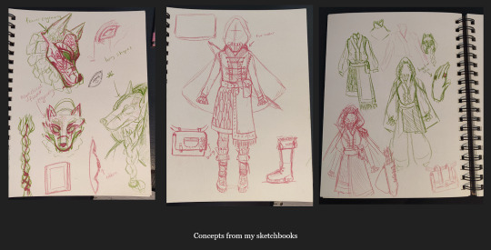
Here are some concepts from my sketchbook for the basic character design I have been thinking of. I like to start with a considerable amount of detail, as I tend to simplify the design over time when I redraw it over and over again. It’s also easier for me to simplify the clothing if necessary from an elaborate design instead of trying to add detail after the fact.
As I begin to finalize the design and make notes about clothing texture, I will determine the final level of detail, so to speak.
I also found some really great resources to help me improve my clothing textures that I will include when I finalize the design.
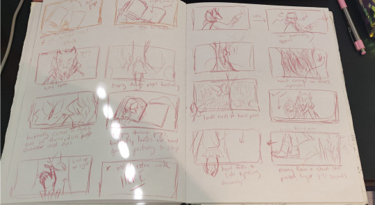
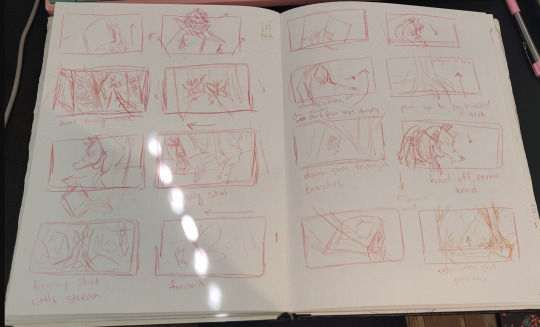
And here’s just a few photos of my storyboarding process, which is almost complete. I have much more success with this process on paper.
I’m also working on my asset list simultaneously so I can add the details to my production schedule.
To-do for next week:
Finish storyboarding process on paper
Begin animatic
Finish asset list
Finalize production schedule
Begin testing period for Bifrost
For next week, I am aiming to finish my storyboards so I can begin redrawing my animatic on my computer. This should be a relatively quick process for me I think because I'm familiar with the drawing process and I can do it efficiently. I will also be finalizing my asset list so I can complete my production schedule and I can start building my assets. A short testing period will begin this week to determine how many of these new skills I will be able to accomplish reasonably considering the project deadline.
0 notes
Text
Analysis
On October 23, 1966, Chanie Wenjack, a boy taken from his family because of who he was and who they are, died trying to return home. His is a story that deserves to be told and should be told, certainly by one more skilled than me, his among many others. But can these stories be told accurately? And if so, what obstacles might stand in the way?
Within Philosophical Investigations, philosopher Ludwig Wittgenstein suggests that individual words, or even sentences, only have meaning because of what he called “language-games” because, similar to “normal” games, language-games have a set of rules. It is from the application of these rules that words obtain a meaning. A meaning, singular, because rules and their resulting meanings for a particular word can change between games due to communication’s constant evolution. As an example, Wittgenstein uses the word “water”. Even used in isolation from any other words, “water” could be a command to be brought some for drinking, an alert to a leak or spill, or even as a code word. Meanings aren’t even fixed within a particular language-game; they can be fluid in use, like water.
Wittgenstein didn’t limit the idea of language-games to only word-based communication by using the example of a builder instructing where their assistant should place stones via pointing. Though he applied this to only objective communication, I believe he could have with good reason.
Human communication can be split into two groups: cross-cultural and intercultural. Cross-cultural communications are methods that everyone should be able to recognize, a set of universal rules for every language-game such as weeping being recognized as emotional distress regardless of the audience. These sorts of indicators are instinctual and vague, unlike intercultural communication which is taught and precise. Intercultural communication is everything else: rules that are not seen in every culture, community, or scenario. These rules can range from widely recognized gestures such as pointing to natural languages such as English or French, to regional dialects, to slang, or to location-specific references.
This is the first problem with telling the story of Wenjack: particularly to a wide audience, using intercultural communication isn’t intrinsically more precise. Using words or interpretations that are too specific to a demographic will leave many unaccommodated. Generally, the broadest and most widely understood yet precise game is a natural language which dictionaries attempt to define and upon mediums such as encyclopedias rely. The Canadian Encyclopedia’s article for Wenjack uses no local slang and only terms that could be easily found in a dictionary. If there was any ambiguity, as for the term “Residential School”, or for a local term such as the place-name “Kenora”, then there is a link provided leading to an exposition. Though all word-based communication is intercultural, not all intercultural communication is word-based. Many cultures, including construction, have some form of “pointing”, but there can be important variations, sometimes within a single system, each form possessing its own meaning.
Wittgenstein only mentioned Intercultural communication but didn’t include all forms within: abstract symbolism was omitted. Some symbolism does only represent words, such as the octagonal “stop” sign, some also objective indicators: “x marks the spot”. The digital information particularly has worked best with icons, such as the reload, save, like, and go-back symbols that have become intuitive without being fixed to a natural language. However, abstract symbols have abstract meanings. Ravens are a popular animal for symbolism. Their scavenging habits have led many cultures to see them as representing death, not “death”, but the idea of death. Native cultures in North America instead saw their resourcefulness and intelligence as the signs of a prolific trickster; a character rather than a trait. In both the lyrical and illustrational aspects of Secret Path, a project directed by Gord Downie to tell Wenjack’s story, a raven accompanies Wenjack. As the story nears its end and Wenjack his death, the raven becomes more prominent. In the third last track of the album, the raven begins to speak to Wenjack saying “I know a way that I can help you.” Whether what follows are honest proposals with honest intentions I am still not sure.
The bases of all communication can be described by a model derived by C.E. Simmons which includes 8 steps through which information passes. In order, the steps are Inspiration, composition, encoding, transmission, noise, reception, decoding, then interpretation. However, for our purposes, we can boil it down to just encoding and decoding. As with any game (except maybe hunting and fishing) all participants should understand what game is being played and what the rules are. The presenter, the one who is encoding, needs to understand which “game”, or set of rules, the context calls for and how to effectively use those rules. The audience, those who are decoding, should also understand the set of rules that should be used and reverse engineer the meaning effectively. For anything that can be observed by both speaker and audience, perfect encoding and decoding can result in exact communication for the subject. However, this is only true for what is observable by both parties.
Language games were not Wittgenstein’s only contribution to language theory. To describe subjectivity and limitations in language, he proposed a thought experiment. Suppose everyone each had a box hovering above their head which contains… something. Importantly, only the person to whom the box belongs knows what is inside and everyone calls what is in their box a “beetle”. Wittgenstein uses this idea to show individual perceptions aren’t verifiable and how language can fail to communicate these experiences. We all experience something called pain, but we fail to know and communicate exactly how everyone else experiences pain. We all just call it “pain”. While we don’t know how others feel pain, we can still recognize the signs of cursing, crying, and holding the injured part using empathy. The reaction to pain is instinctual, while pain isn’t cross-culturally or interculturally, the reaction is.
We don’t know how Wenjack felt when he was home, confined to the school, or on the run. However, we can use empathy to make a strong guess as to what he felt. This is his story and he is at the centre of it. His perspective is integral.
The question then becomes, which reactions, similar to grasping a stubbed toe, are rooted deeply enough in the human psyche that the subjective experiences of Wenjack or anyone else can be communicated, or even better, felt. Intuition is key, shared intuition is better. The methods of communication that result are generally labelled as art. Artists hone their craft, gain and enhance their intuition as a result, and apply it to various degrees of success. I referenced Secret Path earlier. Secret Path is certainly an art project meant to convey more than objective information; whether it be through phonetic lyrics and musical key choices on the album, or through the colour scheme and movement in the graphic novel and animation. I think the colour choice for the illustrations was particularly fantastic.
What fascinates me is that while this use of colour is largely a form of cross-cultural communication it is still easy to see how it applies to the theory of language-game because right from the beginning it breaks a rule: if it isn’t only black and white, colour is to be used accurately. Secret Path uses only blue in addition to black and white; panning from the sky down to a forest without any green or brown. This breaking of the rule sets up a new rule: only blue, black, and white are used. This sets up a question; why blue?
Blue occurs relatively rarely in nature, in the sky and in large bodies of water that mostly just reflect the sky, to see blue and only blue on land is a bit disconcerting. People also usually associate blue with sadness or cold, possibly due to blues prominence during winter. This new rule of blue, black, and white also gets broken when Wenjack is remembering his home: portrayed using the full visible colour spectrum but focusing on the warmer colours of yellow and red. The final set of rules relating to colour is that blue represents foreignness, but warm colouring indicates home and security.
Downie stated that he wanted to get across “the idea of trying to get home.” Given that verbal key, it becomes easier to find that theme in the telling of the story. The last shot of the film is Wenjack’s consciousness walking away from the blue landscape towards a vibrant homestead. However, this is not what I was thinking of when I first heard Wenjack’s story. Though it has been a while since the first reception, I believe my initial thoughts are the same as my current: Wenjack’s forced choice between losing his life or personhood. I do not think that I got the wrong impression, nor do I think Downie failed. There is a dichotomy in communication: that objective encoding and decoding can be accurate, but no matter how some concepts are encoded they will never result in a message unaffected by the audience save by chance. Downie and I could have both had a beetle in our box (trying to get home), but I happen to call mine an apple (forced choice). For cases such as this, I believe there is no right answer because the answer is unknowable. Works Cited
Carley, Georgia. "Chanie Wenjack". The Canadian Encyclopedia, 01 November 2016, Historica Canada. https://www.thecanadianencyclopedia.ca/en/article/charlie-wenjack. Accessed 02 January 2021.
Cherry, Kendra. “The Color Psychology of Blue.” Verywell Mind, Verywellmind, 24 Nov. 2005, www.verywellmind.com/the-color-psychology-of-blue-2795815.
“Gord Downie’s The Secret Path - YouTube.” Www.Youtube.com, 23 Oct. 2016, www.youtube.com/watch?v=yGd764YU9yc&t=2357s. Accessed 2 Jan.
2021.Ludwig Wittgenstein, and G E M Anscombe. Philosophical Investigations : The English Text of the Third Edition. Englewood Cliffs, N.J. Prentice Hall [Ca, 2000.
1 note
·
View note
Text
Unveiling the Art of Photoshop Manipulation: A Creative Journey
In the era of digitalization, where visual content is king, the art of Photoshop manipulation photo has become an indispensable skill for photographers and graphic designers alike. This transformative technique allows artists to push the boundaries of reality, creating stunning and surreal images that captivate audiences. Let's delve into the world of photo manipulation in Photoshop and explore the creative possibilities it offers.
The Basics of Photoshop Manipulation
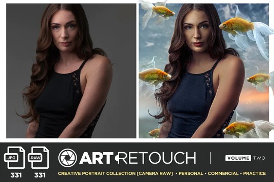
At its core, Photoshop manipulation involves altering and enhancing photographs through digital means. This can include combining multiple images, adjusting colours, manipulating textures, and employing various filters to achieve the desired effect. The procedure calls for acute attention to detail and a mastery of Photoshop tools, enabling artists to seamlessly blend elements and create visually striking compositions.
Creating Surreal Landscapes
One famous avenue for photo manipulation in Photoshop is the creation of surreal landscapes. Artists can transport viewers to fantastical realms by merging disparate images of nature, architecture, and fantasy elements. Through careful blending and manipulation, a mundane landscape can be transformed into a breathtaking scene that sparks the imagination. The possibilities are limited only by the artist's creativity and skill.
Enhancing Portraits with Artistic Flair
Beyond landscapes, Photoshop manipulation and photo techniques are frequently employed to enhance portraits with an artistic flair. From subtle retouching to more elaborate transformations, artists can manipulate facial features, add or remove elements, and play with lighting to achieve a desired mood or style. This opens up new possibilities for photographers looking to elevate their portraits to the realm of fine art.
The Ethical Considerations of Photo Manipulation
While Photoshop manipulation offers a canvas for creative expression, it also raises ethical considerations. The line between enhancing reality and distorting it can be thin, prompting discussions about the authenticity of images. It is crucial for artists to navigate this terrain responsibly, ensuring transparency when their work involves altering the truth. Finding a middle ground between creative freedom and moral integrity is key in the world of photo manipulation.
The Evolution of Photo Manipulation in the Digital Age
Digital technology's introduction has had a significant impact on the evolution of photo manipulation. With the rise of advanced software like Adobe Photoshop, artists now have powerful tools at their fingertips. The accessibility of these tools has democratized the art form, allowing aspiring creatives to explore and hone their skills. As a result, the digital landscape is brimming with a diverse array of manipulated images, each telling a unique visual story.
Pushing the Boundaries of Imagination
Photo manipulation in Photoshop has become a playground for pushing the boundaries of imagination. From mind-bending distortions to dreamlike compositions, artists continually challenge the conventions of reality. This form of artistic expression not only holds the attention of spectators but also acts as evidence of the limitless possibilities afforded by digital technology. It is a celebration of creativity unencumbered by the constraints of the physical world.
Conclusion:
In conclusion, it has transformed the way they perceive and interact with visual content. As creators persist in pushing the limits of creativity, the world of photo manipulation in Photoshop evolves and expands. For individuals looking for motivation and a venue to display their work, photomanipulation.com stands as a dedicated space for enthusiasts to connect, learn, and celebrate the artistry of photo manipulation. Take advantage of the possibilities, use your creativity freely, and let photomanipulation be your guide in this captivating journey of visual storytelling.
Blog Source URL:
0 notes
Text
Week 11 - Movie Analysis
Coco - 2017
1. Background:
When: On the Day of the Dead (Mexican Festival)
What: Celebrate the return of the dead to earth and guide their ancestors home
Where: In the village of Santa Cecilla in Mexico
Who: Miguel and his family
2. Trailer
youtube
3. Shot Analysis

The opening shot shows us someone lighting a candle at an ofenda (offering made for the Mexican Celebration) This establishes/tells us when, where and what.

This limited space helps us focus on the decoration in the space, the conversation between the characters also is about the celebration. It establishes the story.
The colour is bright and refers to festival vibes.

This long take shows Miguel passes through a town and he drums the table covered in a LaBrie case, these are more details that filmmakers learned on their Mexico trip, celebre Hays are colourful, handmade paper mache wood carvings of fantastical animals. This tells us who, when, where and what.
I am also amazed by how animators bring a life to these paper carvings as spirit animals of the dead.

This movement shows Miguel practices his guitar while watching movies of his hero, the great Mexican singer/actor Ernesto de la Cruz (Benjamin Bratt).
The shot is a medium shot, in my opinion, this is a perfect size to show the relationship/position of Miguel, guitar, and his hero on the TV, and builds a triangle composition between them.

This reflection frame is the movement that Miguel interprets he should take control of his life and follow his heart when he is watching his hero.

This wide shot shows us a shiny emerald city in Miguel’s journey from the land of the dead to earth.

This over shoulder shot draws our attention on this wizard, who’s later revealved to ba a conman. in the shape of square, which is opposite from lovely shapes

The shape of guitar is the same shape as an upside down skull. A visual storytelling that conveys Miguel’s pursuit of guitar as one that will lead him into the land of the dead, and he will have to join his dead family members to give his passion and music real meaning.

Group shot creats family solidarity through rituals.
The lighting over body acknowledges the afterlife, having a passion for life, and tells us where they are at, the land of dead.
1 note
·
View note
Text
Anonymous asked: You are one of the rare intelligent traditionalist blogs that appreciates high culture of art, music, and aesthetics. I don’ consider myself racist and people can call me an old stick in the mud but I love high culture as it is central to our European identity. I have been concerned how classical music especially concert hall performances are in terminal decline. Do you think this is because diversity killing classical music?
Classical music concerts are in decline. That’s the bad news.
Classical music is thriving. That’s the good news.
Classical music attendance for concert performances have been generally low especially when compared to pre-1945 levels in Europe and the US. It’s also true if sales of CDs etc are an indicator too.
Like you, as a believer in the heritage of tradition of western civilisation I find this deeply troubling. Western classical music is an achievement of high culture and more importantly an integral and unique to the DNA of Western civilisation. The questions as to why is a tricky one because it’s not just one thing. Is it the music being performed that’s old hat? Is the audience or the lack of one thereof?
It’s painfully obvious that audiences are not there to support it. Why?
I think part of the blame can be laid at the foot of the producers of classical music concerts. The largest contributors to keeping today's orchestras alive and functioning are usually old, rich, white, conservative people who enjoy their Beethoven and Brahms. They don't care about any music post late 19th century.
Firstly, I would take issue with where they think classical music begins and ends. Classical music is not music trapped in amber for all time. It can and must move forwards. This is why - despite some truly stinkers in 20th Century classical music composition - music composed in the 20th Century is given short thrift and met with sniffy indifference.
The paradox here is that they say there is no demand for such contemporary pieces because the audience isn’t there. But if they don’t show the courage to showcase new works then how will they grow an audience? It’s a sticky wicket to say the least.
Secondly, in being such stiff shirts, there has been a stunning failure to educate and entertain the next younger generation of the value of classical music. The decline of classical music has been a tragic failure of handing down tradition from one generation to the next. Its root cause has everything to do with the material corruption and spiritual laziness of its own native European people - young and old.
But I don’t want to lay the blame too much on the older generation despite the above criticism. This is because at least they invest money into classical music. The younger generation can’t - because they need to make a living - or won’t - because they are not emotionally invested in it.
This nicely leads me to another crucial part of my answer.
I think blame can also be laid at the feet of us, the audience.
With each passing generation our Western society is nurturing its own people to be musically illiterate. By that I mean millennials have no real grasp of appreciation of classical music, let alone learning a music instrument or going to attend a classical music concert. Like Latin in school, we don’t teach children how to be musically literate and enjoy the wonders of Peter and the Wolf or Holst’s The Planets as a starting point on a life long journey of cultural enrichment. This enrichment is a unique inheritance of their Western civilisation unlike any other culture or society.
This isn’t an either/or argument i.e. less Taylor Swift and more Schubert. It’s a false choice.
Why limit your musical palate?
Is diversity the reason for decline of classical music?
No. Not in the way you might think.
In my humble opinion the decline of classical music in the concert hall has precious little to do with the controversial topic of diversity. Diversity is not the cause of it but a symptom of it.
Today's classical orchestras are quite diverse. Classical music will always be considered as stuffy museum music by the general population. Being sensitive to diversity of today's classical composers won't fix things.
Any classical composer writing music these days, regardless of ethnicity, gender or skin colour, is doomed to failure because of the economics of the business. So giving preference to today's composers by gender, skin colour or ethnicity won't help revive it.
Diversity within orchestras is wonderful - and I have seen some virtuoso performers across the globe, especially in Japan and China where they have a genuine love for classical music which is inspiring to witness. But ‘diversity’ within classical music itself is muddle headed.
'Diversity' is a concern of disintegrating societies in malaise that have lost contact with their heritage and identity.
The honest truth is that Western classical music was the creation of aristocratic Europe. It should not be forced into something it isn't. The foundation of classical music was created by White, European, males of a Christian background - after all classical music began in the church.
Without taking a thing away from some very talented and wondrously creative African, Asian and female composers, the music simply didn't include Africa and Asia - or America, for that matter! - as part of its origins.
It would be as if one were to insist that any forum that highlights the many fantastic forms of American music that was started by African-American people - Gospel, Ragtime, Jazz, Blues, Rock, Hip-Hop, Rap - should have to include a fair sampling of non-Blacks that contributed.
As for the dying of classical music, it is not dead or even on life support.
It has simply moved, though, from the church to the concert hall to electronic and digital media.
As far back as the 1960s, the pianist, Glenn Gould stopped touring and began recording exclusively in the studio. His final recording from the 1980s included his conducting debut (Wagner's "Siegfried Idyll"), and if not for his untimely death, his next step was to record piano concertos with himself as both conductor and soloist; able to use technology for the purpose of editing and dubbing every aspect to his own specifications.
People will continue to attend concerts. I try to attend when I can. Indeed not too far from my place of work I can attend lunch time recitals and concerts in an old church and it’s heavenly to feel uplifted to such sonorous heights.
But such is the pace of modern life it’s not always possible. But my thirst for live classical music means, like for many others, the technology has made it so much easier to enjoy what ever music you like without being economically and geographically inconvenienced.
I look at films (another love of mine) and accept that even this most modern of mediums is changing with the viewing habits of people through digital online technology. Going to the cinema is really going to see big blockbusters and watching your artsy niche films increasingly on laptops and phones through streaming services simply because of economics of the film industry.
To me not watching a film - any film - on the big screen loses not just the romance of the occasion but also the bonding of diverse people into one room. Going to the cinema was like a social glue to bond community of people who lived in the shared neighbourhood. It’s also changed the nature of film itself in the way we tell stories - think of the decline of episodic television to more serial arc based stories to - what we have now - binge watching series in one sitting.
Likewise the challenge for classical music is learning how to adapt with the times without compromising the rich tradition it carries....too much. How it continues to meet that challenge will be fascinating to watch.
Thanks for your question
54 notes
·
View notes
Text
Alien Anatomy
I’ve kinda been thinking about alien anatomy and here’s some vague conclusions I can come up with.
Insect: so there’s the idea of insect type aliens and if they’re anything like earth insects then their size would be limited by the amount of oxygen (or whatever they breathe) is around. So larger bug aliens could only exist with high breathable concentrations so their planets atmosphere must be a minimum of 30% of their preferred breathing gas. Also, exoskeletons can only be thick to a certain extent before they can’t breathe so larger sized insect aliens would have a thin (compared to smaller insects) exoskeleton; but that doesn’t mean that they can’t have the biological equivalent of steel making up their exoskeleton, they’d still need support if they’re on the larger size, flight could also get a little tricky if they’re on the larger size (basically they might have to go into different methods of it but idk, I’m not a professor on insect flight)
Reptile: so like insects their size would also be limited, but not by air/atmosphere composition but by temperature. The closer to the equator (on earth) the hotter the temperature, and, if you haven’t noticed, the bigger the reptile species. Only the largest reptiles live in the hottest places, you don’t exactly see a saltwater crocodile in Norway. To put it simply, it’s because of their heat regulation; they’re ectothermic. If they live/ evolved on a world with similar temperatures to ours then largest they could be would be a large monitor lizard. And don’t ask “what about dinosaurs? They were lizards”; taxonomically yes but their living descendants (birds) are exothermic, suggesting some sort of transition along the evolutionary line.
Mammalian: size can obviously stay the same maybe bigger/smaller than what we know (for mammals it’s mostly gravity and pregnancy limiting our size) whether they evolved on a planet with more/less gravitational pull. Mammal variations such as marsupials might get around the pregnancy issue since their young are born around the size of a jellybean and monotremes just lay eggs (btw the pregnancy issue is basically that the bigger the mammal the longer the pregnancy and the longer the pregnancy the more time you’re vulnerable to predators) though if you’re a pack hunter, pregnancy might be less of an issue since you are the predator and those in your pack could bring you food so that you wouldn’t be in any danger by hunting (the prey could choose to attack as a form of defense).
Birds: now you can bring in your dinosaur anatomy since they’re technically one in the same (though velociraptors were likely not unnaturally intelligent). This isn’t a rule based off of fact but if you base the bird/dinosaur design off of Jurassic park dinos then you’re out (THE THERAPODS (carnivorous bipeds: velociraptor etc) SHOULD’VE HAD FEATHERS! T. rex might’ve been the exception as they could’ve been big enough to regulate their temperature without insulation but I digress) they would also be able to get around mammals size issues as they don’t have to worry about since they typically lay eggs and have a lighter structure meaning larger size (have you ever held a bird? They’re strangely light, as if they’re constantly inhaling helium instead of oxygen)
Fish: all I know of their physiological limits is that it’s a little similar to the insects limits as oxygen concentrations (or any gas really) is almost always in higher concentrations in the atmosphere than it is diffused in the oceans. As long as they have some sort of propulsion and streamlining to a degree there would be less rules with this one ¯\_(ツ)_/¯
Amphibians: they would have to be heavily reliant on the liquid they evolved from and their skin would be weak to infection (at least ones they haven’t evolved against) they might be able to metamorphose like bugs through their life too.
Mollusks: for those who don’t know mollusks include things like octopuses (yes its octopuses not octopi) and snails. Due to the lack of set bones you could have as many appendages as you please, ones around the mouth are likely as it would help with eating. Early in their evolution basically all mollusks had shells so it wouldn’t be unheard of for your alien to have one too though they could also have lost them (like squid or octopuses) or chosen to adapt them into a bone like structure (like cuttlefish) though that would prevent their awesome ability to squeeze into anywhere. Their skin could also be used to communicate or camouflage as they’re notoriously good at changing their colour and even shape to fit their surroundings.
Plant based life: by this I basically mean a moving plant. If they regularly photosynthesise then their need lots of leaves or their equivalent, they’d likely have a bark like exoskeleton to keep them from flopping about as they move, if they don’t, they’d likely stay small; like bowtruckles from fantastic beasts. If active then they would get rid of rooting into the ground as a method of nutrient extraction for something else, they could have a mouthpiece to transfer water directly to a xylem and have some sort of digestive system equivalent for minerals etc.
Planet: I need to put this in because it sorta affects all creatures. If they evolved on a planet with less gravity then they could potentially become space faring sooner as they wouldn’t have as much of a problem reaching escape velocity. There’s also more potential for flight and bigger “mammals” on these planets. Their orbiting star can affect them too; if they’re around a red dwarf then they’d have more time to develop but their planet could be tidally locked meaning there could be limited habitability on their planet, either too hot on one side and too cold on the other but there’s a small line between the two where liquids could exist and life could evolve, it would also bring in the fun concept of them being like “WOAH, NIGHT AND DAY? WHAT IS THIS?!” Since all the time it would look like twilight/dawn on their planet. If they’re orbiting a supergiant star then they’d have to evolve quickly since supergiant stars don’t live that long before going supernova; this could suggest that they’d have super short lifespans, a year (for us) might be super old to them and they could think were immortal since we live so long (even by our standards) their planet would also have to be much further away to be in the habitable zone so their star may be dimmer from their perspective and, as a result might not evolve eyes. Life on a planet orbiting a supergiant star could also survive with less of a magnetic field (they’d still need one though, but life could still exist with a weak one) so life on their planet could have less geographic activity, therefore less volcanoes and less earthquakes. Other mainstream stars like our own might not differ much when it comes to development and lifespans, it just matters how long they’ve been there/ how long through the stars life it is.
Blood: the colour of an animals blood depends on its needs. Since all animals we know of use oxygen I’m basing the colour on what we know of oxygen breathing life. Hemocyanin (blue blood) would be better used in cold climates so if your creature evolved on an icy planet it’s blood would likely be blue. It gets its blue colour from copper instead of iron. Remember, evolution works as survival of the good enough so if the planet was extremely cold in life’s early emergence then they’ll likely gain this colour and stick with it regardless of whether their planet is cold later in its life. Haemoglobin (red blood) is overall more efficient so if the planet isn’t that cold then red would be more likely to occur. Hemerythin (violet blood) is a simpler structure compared to the first two; going along with the rule of ‘survival of the good enough’ a lot of creatures could possibly have violet blood due to its simplicity. Biliverdin (green blood) is a pigment, it doesn’t carry oxygen and occurs when haemoglobin breaks down but makes animal more resistant to disease meaning that it would be more likely to occur if they evolved in a disease infested environment, likely as a result of lack of predators since disease would replace them in culling their population.
Limbs and organs: limbs such as arms and legs have no real set boundaries though it’s a good idea to make sure that they keep the same amount of limbs or less of them based on the creature they and other creatures on their planet have evolved from (e.g. we have four limbs in total because the first terrestrial vertebrates had four, animals like snakes etc have lost theirs over time but none have gained any limbs because you’d need to have severe evolutionary stress to specifically gain limbs or die: otherwise it’s too much effort for extra limbs). Organs you can go crazy with, you can have as many eyes as you want and in insect like aliens you could even forgo the need of a heart (or heart equivalent) due to their different respiratory system (you could get rid of lungs then too :P) you can have as many sensory organs as you want though you should take into account their planetary surroundings to make sure each organ is necessary (e.g. little to no constant light could mean no eyes/eyes that detect different wavelengths than us)
This has been an unnaturally long 1:30 am shitpost but I felt like I had to say something. Thanks for reading, laters.
#humans are space orcs#space austrailia#earth is space austrailia#aliens#alien#plant aliens#insect aliens#mammal aliens#reptile aliens#amphibian aliens#planets#life#deathworld
92 notes
·
View notes
Text
Robyn Hood Annual 2021: The Swarm

Robyn Hood Annual 2021: The Swarm Zenescope Entertainment 2021 Written by Joe Brusha Illustrated by Ismael Canales & Juan Francisco Mota Coloured by Maxflan Araujo & Walter Pereyra Lettered by Taylor Esposito of Ghost Glyph Studios The Spider Queen, Lord of Flies, King of Serpents and the Scorpion Queen have all tested their mettle against earth's greatest heroes and come up short. Now with their powers combined to form the SWARM they are ready to take their revenge and destroy anyone who stands in their way. I’ve been wanting to see the characters coming together more and it looks like that is finally happening. With so few heroes in the Zenescope Universe it’s nice to see how the bonds of friendship with Peyton, Liesel, Belle and Robyn are finally starting to bear fruit. So the next thing I need to ask and wonder about is will all these continue to happen in these one-shots or will there be a team book, one title designated for the combined adventures, while their solo adventures continue. I’m also way past ready for more than single issue stories, it’s time for the limited series to come back and I mean six issue runs. Every now and then as a filler issue it’s okay but this is getting out of hand and there’s no sense of regularity. This story would benefit from that extended format in how this could be told. The story & plot development that we see through how the sequence of events unfold as well as how the reader learns information is tad compressed but overall still easy to understand. The character development we see through the dialogue, the character interaction as well as how they act and react to the situations and circumstances which they encounter is a bit squashed and needs to be extended more. The pacing suffers a bit with so much crammed into this, this comes with the last ¼ of the book at least that’s where it is most noticeable. How we see this structured and how the layers within the story emerge and grow start off strong but at some point it starts to feel rushed. That moment when a third dimensional Robyn was shown made me feel like i missed a whole chapter that really needs at least eight more pages for that whole section where the big mama jama talks about how she conquered earth. I will say I like seeing Robyn doing her research though and that expands her intelligence gathering and makes her a better detective. The interiors here are really rather nice. The linework is clean, crisp and strong and how we see the varying weights and techniques being utilised to create the detail work throughout the issue is fantastic. I would like to see more backgrounds being utilised but with the composition within the panels we see the depth perception, sense of scale and the overall sense of size and scope to the story flourish. The utilisation of the page layouts and how we see the angles and perspective in the panels show a remarkable eye for storytelling. The various hues and tones within the colours being utilised to create the shading, highlights and shadow work shows a great understanding for how colour works. There are a lot of exciting things to take away from this. The way the group is able to work together is one of those and the set up for Robyn’s next solo story. It is a good recap of what Robyn’s been through lately and for someone that is interested in seeing what she’s about it’s a good starting point. It catches the reader up on what she’s been through and does expand on her skill set nicely. So overall while there are moments that made me scratch my head it is a good solid story idea and brings us what promises to be an exciting future for Robyn and her friends.

1 note
·
View note
Text
5 THINGS TO LOOK FOR IN A QUALITY KITCHEN SINK.
The kitchen is usually where people unknowingly spend a lot of time when they are at home and a good kitchen sink is absolutely crucial to keep your kitchen functioning optimally. You must ensure that your kitchen sink is fantastic and ideally suited for your kitchen in order to clean huge pots and prepare food. If you’re looking for a new kitchen sink, you’ve certainly noticed there are many options available. perhaps too many. But this blog is here to assist you in your quest for the perfect sink! The material, installation type, configuration, bowl depth, size, and location are among the five factors to be taken into account when selecting a quality kitchen sink.
1 Sink Material:
Numerous aspects need to be taken into account when choosing the ideal sink material for your kitchen. Budget, durability, and simplicity of washing should also be considered in addition to aesthetics, of course. Sinks are frequently made of stainless steel, but composite granite is becoming more and more popular because of its sturdiness, cleanliness, and attractiveness. Materials like copper, quartz, natural stone, and coloured stainless steel are available for those looking for a sink that makes a statement. When choosing the material for your sink, consider the cost, and functionality as well. Stainless steel is by far the most popular material for kitchen sinks. It is heat and stain resistant and comes in a range of varieties, designs, and sizes. A brushed or satin finish is advised over a mirror finish since water stains and scratches will show less on the former. Stainless steel sinks range widely in price, but you can obtain one of decent quality for not a lot of money, making it a popular option for people on a limited budget.
2 Installation Type:
Your choice of sink installation will have an impact on the surrounding countertop and cabinetry in your kitchen. Undermount, drop-in, integrated, and apron-front installations are among the configuration choices. The latter can also be installed as a drop-in type, as seen in this instance, or as an undermount type. Each type has benefits and drawbacks. Because it is the simplest to install on the lot and can be fitted in less expensive laminate countertops, a drop-in sink is the most cost-effective option.
An integrated sink, which is built from the same material as the countertop and is fabricated to look seamless with it, is at the upper end of the price spectrum.
3 Sink Configuration:
How many bowls (or sinks) you require is another crucial factor. You probably prefer a double- or triple-bowl sink if you wash dishes by hand the majority of the time. But keep in mind that a sizable single-bowl sink makes it simpler to wash bulkier items. Multiple sinks may be useful if you frequently cook for a big family. However, adding additional sinks and the necessary plumbing will increase the cost of installation. A large kitchen is also necessary to prevent overcrowding and to guarantee that there is still enough countertop space for cooking operations.
4 Bowl Depth:
When it comes to your kitchen sink, you might believe deeper is better, but that isn’t always the case.
For instance, if a food waste disposal is installed, a super-deep sink requires additional cabinet space. Additionally, working for extended periods of time over a really deep sink may be difficult for people who are exceptionally tall or short. However, other people might find that a deep sink works best for concealing dirty dishes.
5 Sink Size:
When choosing a sink, the width should also be taken into account. The normal range for width, which is measured from left to right, is 24 to 36 inches. The obvious approach is to size the sink to meet your budget, but you need also need to think about the size of your kitchen, your utensils, and if you want to place it close to a window or another fixed object. In other words, the sink should be sized appropriately for a kitchen.
6 A BONUS TIP! — Location of your sink:
Location is crucial in your sink-finding process. A person should ideally be facing a pleasant view, such as a nice view out a window or of the rest of the room while standing at the kitchen sink.
Try to center your kitchen sink under the window unit or one of the panes if the window has many panes while installing it under a window. The dishwasher must be close by; ideally, it should be placed right next to the sink, with enough space for the door to open completely without obstructing foot traffic.
Finding the best quality kitchen sink for your needs might seem like a daunting task but use the tips mentioned above to make the process a little easier and to ensure you are happy with your purchase! Happy shopping!
#kitchen sink#quartz kitchen sinks#quality kitchen sink#stainless steel kitchen sink#double bowl kitchen sink#best kitchen sinks
0 notes