#fanette mellier
Explore tagged Tumblr posts
Photo

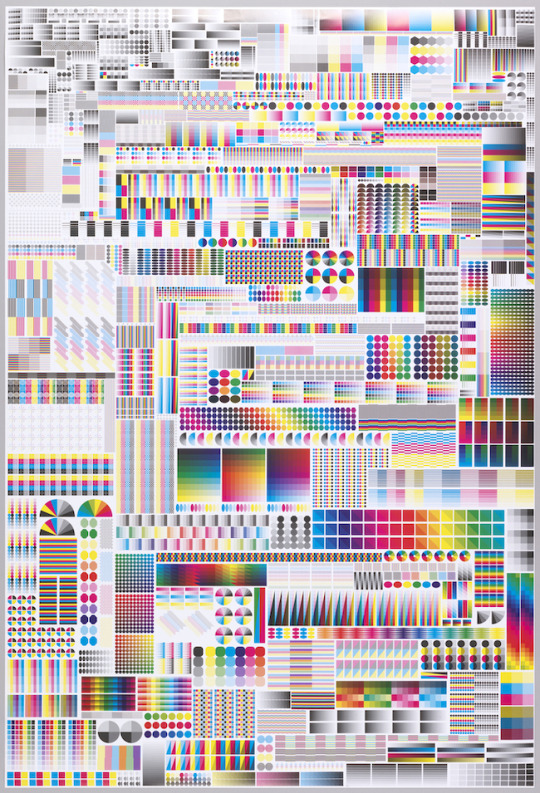
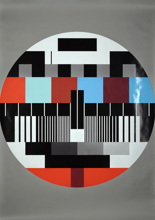
Specimen, Fanette Mellier Context: Pôle graphisme de Chaumont, 2009
Printed by: Imprimerie du Petit-Cloître
Description: 120 × 176 cm
This poster, announcing a series of “graphic design and publishing” themed shows, isn’t a conventional image. It’s more of a printed object linked to its subject. The front, fully saturated with color and technical elements related to printing (scale 1), is offset printed with a very thin raster. This space saturation, like an obsessive canvas, presents graphical tools that are a common vocabulary for books makers. The title and info are printed on the back. The fold lets the title appear: the poster becomes informative and evokes at the same time the delicate materiality of a page.
14K notes
·
View notes
Text

fanette mellier - specimen (lithograph on paper, 2008)
3 notes
·
View notes
Text

3 notes
·
View notes
Text


ARTIST BOOKS FEBRUARY 2025
Donated to the Collection by Derek Beaulieu
Poetry Can Inspire You: du Poetier Vol. 1. Ariel Brinks. [Don Mills, ON] : Du Poetier, Unknown.
Old Sea. Rean Stearne. [Calgary, Alberta] : The Blasted Tree, 2022.
Keyboards : 14 poems for Tom Jenks. Catherine Vilder. [Calgary, Alberta] : The Blasted Tree, 2019.
Turns: zimZalla 059. Phillip Terry. [UK] : zimZalla, 2020.
Calligramms. S.J. Fowler. [Oswestry, England] : Penteract Press, 2019.
The Sims in Real Life. Ben Robinson. [Calgary, Alberta] : The Blasted Tree, 2019.
Un Rectangle Quelconque. Les Editions du Quelconque. [Unknown] : N° 1, 2019
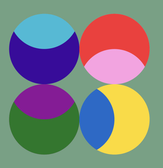
Dans la Lune. Fanette Mellier. [Strasbourg] : Éd. du Livre, 2013.
Ashenfolk. Joseph Mosconi. [Los Angeles] : Make Now Books, 2019.
(marée). Natalie Lauchlan. [Calgary] : Unknown, Unknown.
Job Site. Zane Koss. [Calgary, Alberta] : The Blasted Tree, 2018.
107 notes
·
View notes
Text
Fanette Mellier

In this post, Fanette talks about the creation of her picturebook Panorama, an ingenious visual feast in which layers of ink reveal the subtle yet intricate changes which occur over the course of one particular spring day.
Visit Fanette Mellier’s website

Fanette: My book Panorama was conceived in a unique way. It reflects an event in my personal life: the acquisition, along with my husband Clément, of a small chalet not far from Paris, where we live. To us, this place represents a "dream location" nestled in the heart of "no man’s land", the one and only we own.

I wanted to build Panorama around what this place represents, both materially as well as metaphorically. For a long time, I wanted to create a truthful and exclusive colourful narrative. In reality, the story of the book isn’t really about the chalet, it’s about the colour.

As with my other works, I began by sending a letter of intent to my publisher Alexandre Chaize. This letter referred to the definition of the word panorama:
�� A circular picture painted in optical illusion. • A vast landscape that can be seen from all sides. • A succession of images perceived by the mind as one complete visual experience.
It also included the following intentions: The book follows in the footsteps already explored at Éditions du livre (cycle, colour, temporality, composition in sections, title volatility, absence of words...). But the project takes on a slightly more illustrative dimension, providing a pretext for exploring the form (unchanging) through the colour (whereas in Matryoshka, the form also evolves). So it’s a more detailed and narrative experiment, but also a more radical one. The overall form (shaping) is simple, but reverses the reading, in a vertical dimension.
On the publisher’s website, you’ll find this text, which sums up the book’s intentions in retrospect: “Panorama invites us to contemplate the same landscape, printed 24 times. Page after page, the colour variations reveal the passing of the hours and micro-periods of life. From the gentle warmth of a spring afternoon to the frost of night, nature awakens and then falls asleep. Observing the details becomes a child’s play: a chalet, a clock, a cat, a balloon, a glistening green... Fanette Mellier creates a world where ink layers draw a subtle and dizzying horizon.”


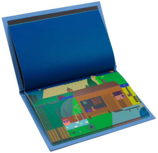

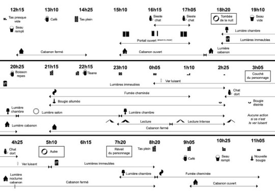
While I was working on the drawing, which took several weeks, I made progress on the synopsis of the book by writing all the narrative passages in advance, hour by hour and page by page. These passages correspond to the colour changes of the various elements, which are described in detail in my notes.

This synopsis was the subject of many discussions with Alexandre, who went so far as to create illustrations in order to check that the narrative flow was consistent.

Then, once the layout of the book had been completed (which was a very tedious phase!), I was involved in the final layer setting at the Art et Caractère printing house in Lavaur. Printing the book, which was supposed to take a day, took more than three, and I thought we’d never get to the end of the final layer setting... to the point where it seems to me that it would be out of the question to reprint the book one day.
Panorama is printed in a special way, as it is a mixture of four-colours and direct shades. The four-colours, in their "standardised" aspect, are used as a realistic coloured canvas.
The entire landscape was coloured beforehand in CMY, to form a chromatic base. The CMY inks were therefore printed first during the layer setting.

The 3 Pantones, black and white were then printed in stages. The Pantones correspond to the narrative: PMS 807 brings light, PMS Green intensifies and nuances the presence of green, and PMS 072 brings the night and refreshes the landscape.
Black is only used on 6 pages, between 12.05am and 5.10am, to vividly draw in the night shadows. White takes over from black. Between 6.15am and 11.20am, it brings the colours to life with a morning frost that gets lighter over the pages.
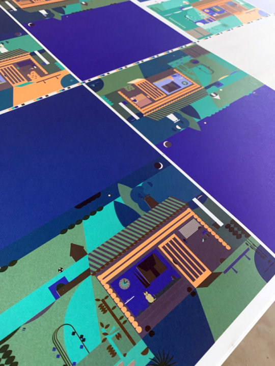

The complexity in terms of printing comes from the intersections and overlapping of the colour zones, because printing in several steps causes the paper fibres to move and makes it difficult to reproduce these mixtures of colours on a very fine scale...

To me, the result of this book is halfway between the impressionism of Water Lilies and In Search of Lost Time on the one hand — and the pop art of Maya the Bee and Où est Charlie? (Where’s Wally?) on the other...

The book has become such an integral part of my life that I often feel like I’m walking around “in my book” when I’m at the chalet.
And a strange thing to mention is the presence of animals. The main character in the book, the cat, was completely fictional when I wrote the book. After the book was published, he arrived and settled down overnight in the same place as in the book, in front of the window. This cat, who’s called Austin and belongs to the neighbours, always comes by when we spend time in the chalet. The frog and the glow-worm have also appeared over time, in the same place as in the book. It gave us goosebumps!
This permeability between the real world and the book has a mystical resonance to me.

Illustrations © Fanette Mellier. Post translated by Gengo and edited by dPICTUS.

Buy this picturebook
Panorama
Fanette Mellier
Éditions du livre, France, 2022
Panorama is the contemplation of a single landscape printed 24 times, once for each hour of the day. Page after page, the changing colours reveal the passing hours and the little miracles that are part of any given day in a life.

0 notes
Text

Fanette Mellier
12 notes
·
View notes
Photo

FANETTE MELLIER /
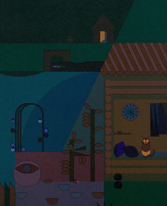
Panorama, 2022
48 pages, 24 x 17 cm Quadrichromie + 4 tons directs Couverture cartonnée, dorure brillante Éditions du livre
“Panorama propose la contemplation d’un même paysage, imprimé 24 fois. Page après page, les variations colorées révèlent le passage des heures et les micro-péripéties du vivant. De la douce chaleur d’un d’après-midi de printemps au givre nocturne, la nature s’éveille puis s’endort. Observer les détails devient un jeu d’enfant : un chalet, une horloge, un chat, un ballon, un vert luisant… Fanette Mellier crée un monde où les strates d’encres dessinent un horizon subtil et vertigineux.” _ Plus d’informations par ici
13 notes
·
View notes
Photo
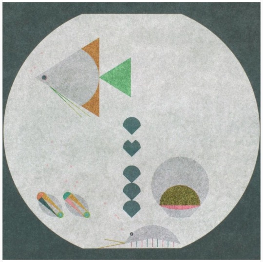
fanette mellier (2018)
7 notes
·
View notes
Text


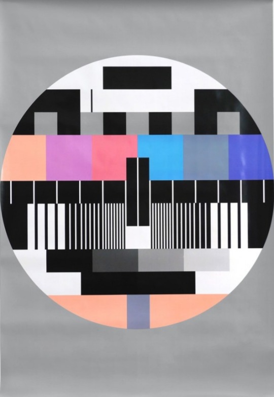
Fanette Mellier (2015) • The Averty Show Poster
3 notes
·
View notes
Photo

Poster, Specimen, 2008 Fanette Mellier
Cooper Hewitt: Source
1 note
·
View note
Photo
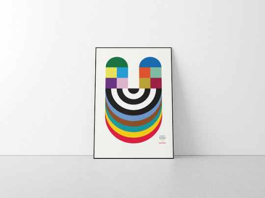
#SF Design Week#rainbow#graphic#graphic design#abstract#U#glyph#poster#print#geometric#Fanette Mellier
17 notes
·
View notes
Photo


Fannette Mellier (France) ∙ Interview
Specimen, 2008
“Graphic designer Fanette Mellier (French, b. 1977) has a contemporary practice that frequently highlights process in the printed medium. Her stunning poster, Specimen, initially appears abstract. Dominated by repeated patterns of bright colors and black, grey, and white shapes, almost the entire surface area of the poster is filled. As if taking in a mosaic, the eye is overwhelmed, darting between saturated hues, and the poster’s imposing height (approaching 6 feet tall) adds to the effect. Upon closer examination, and perhaps immediately to those in graphic design and publishing fields, the poster’s dense imagery is quite familiar: it is made up entirely of color bars, a type of printers’ control marks. Used to check color accuracy, density and consistency across multiple pages, the bars are printed in various shapes alongside the edge of a proofing document. At once essential and banal in their role within the print process, these eclectic strips of color are given center stage in Specimen.” —Caroline O’Connell, “Micro Macro Marks”
#Fanette Mellier#women of graphic design#graphic design#typography#poster design#female designer#female graphic designer#interview#French designer
364 notes
·
View notes
