#faceshadow
Text
Gacha Nebula Extended Update v1.4 Download for Android / Windows PC

youtube
Download Gacha Nebula Latest Version 1.4
🔗 Gacha Nebula Download 🔗
After updating, please close and reopen the app to activate the new extra slots. Initially, they might appear as "undefined," but applying a preset will return them to normal.
Gacha Nebula - Update Highlights
38 New Assets
15 New Backgrounds
20 New Scale Values
X and Y coordinates now go up to 10,000
New pages for Blushes, Faceshadows, and Headshapes
Adjustments for Scarves, Skirts, and Shoes
10 Pages of Extra Slots
Additional Heights and Head Sizes
Stay tuned for more exciting updates!
#gachanebula#gacha nebula#gacha nebula update#gacha nebula v1.4#gacha nebula download#gacha nebula apk#gacha nebula android#gacha nebula for windows pc#gacha#gacha apps#gacha nebula latest version download free#gacha nebula free#Youtube
3 notes
·
View notes
Photo
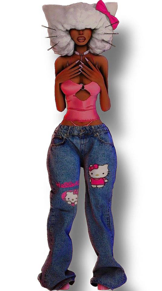
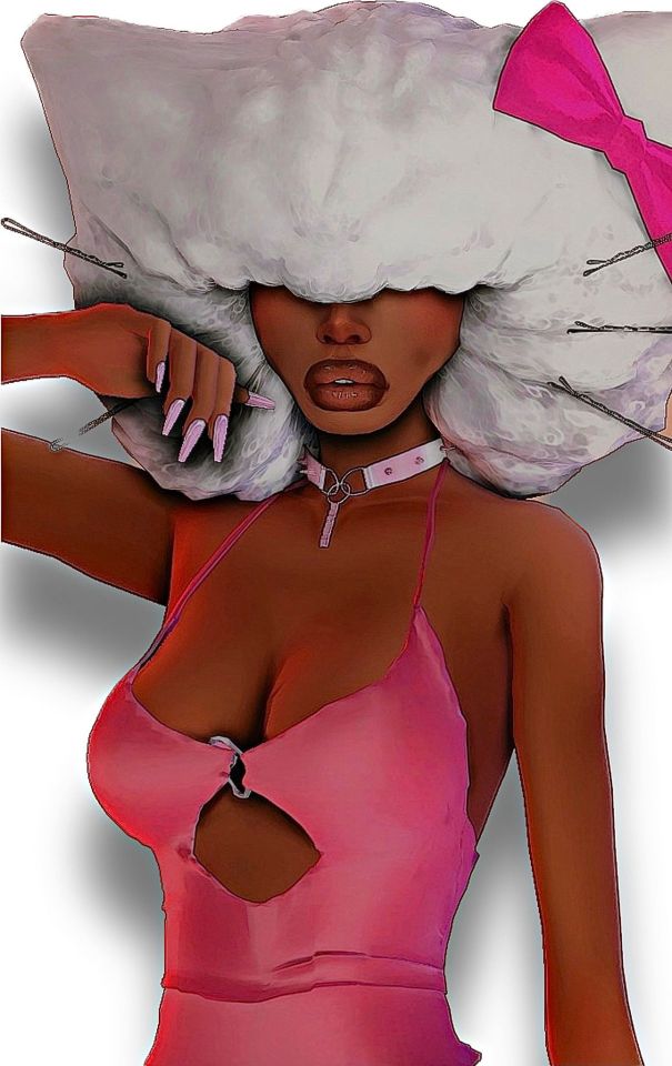
'*•.¸♡ 𝒦𝐼𝒯𝒯𝒴♡¸.•*'
˚ ༘♡ ⋆。˚ ▾ 𝙖𝙡𝙡 𝙘𝙘 𝙡𝙞𝙣𝙠𝙨 𝙗𝙚𝙡𝙤𝙬 ▾ ˚ ༘♡ ⋆。˚
𝙋𝙍𝙀𝙎𝙀𝙏𝙎
eyes // nose // lips // body // chin // jaw //
𝙎𝙆𝙄𝙉 𝘿𝙀𝙏𝘼𝙄𝙇𝙎
overlay // faceshadow // skinkit // collarbones // skintone //
𝙈𝘼𝙆𝙀𝙐𝙋
lipgloss // lipliner // blush //
𝙃𝘼𝙄𝙍
hair // hair accessories //
𝘾𝙇𝙊𝙏𝙃𝙀𝙎
top // jeans // heels // thongs
𝘼𝘾𝘾𝙀𝙎𝙎𝙊𝙍𝙄𝙀𝙎
necklace // nails
𝙍𝙀𝙎𝙃𝘼𝘿𝙀
celestial //
⋆·˚ ༘ * 𝘿𝙄𝙎𝘾𝙇𝘼𝙄𝙈𝙀𝙍!!
𝙄 𝘿𝙄𝘿 𝙉𝙊𝙏 𝙘𝙧𝙚𝙖𝙩𝙚 𝙖𝙣𝙮 𝙘𝙘 𝙪𝙨𝙚𝙙!!
𝙩𝙝𝙚 𝘾𝘾 𝙡𝙞𝙣𝙠𝙨 𝙬𝙞𝙡𝙡 𝙩𝙖𝙠𝙚 𝙮𝙤𝙪 𝙩𝙤 𝙩𝙝𝙚 𝙘𝙧𝙚𝙖𝙩𝙤𝙧<3
⋆·˚ ༘ *
#thesims4#sims4cc#hellokitty#hellokittysim#ccfinds#ccfindz#maximatch#maxismatchcc#maxismatch#maxismix#ts4#ts4cc#lookbook#sims4lookbook#thesims4maximatch#alphacc#customcontent#cc#cclist#simscclist#alrsims#ccsims
61 notes
·
View notes
Text

Herb Bride


faceshadow: @joshseoh
dress: @bluerose-sims
8 notes
·
View notes
Photo

I tried this new poncho and when I looked in the mirror my face had the shadow that Picasso used to paint. . . . . . . #picassoface #faceshadow #blueponcho #handmadeponcho #bohcro #bohcrogiftidea (bij Nová Stráž, Nitriansky, Slovakia) https://www.instagram.com/p/CJlfWUslNW1/?igshid=qdory6r7e69n
0 notes
Photo

Day 128 Waiting to watch the fireworks with my grandmother #selfie #selfiee #basicselfie #shadow #shadowonface #faceshadow #nodragonsplz #365challenge #365days #365daychallenge https://www.instagram.com/p/BzhLhzCDLc8/?igshid=11h0i1vx9wxnw
#selfie#selfiee#basicselfie#shadow#shadowonface#faceshadow#nodragonsplz#365challenge#365days#365daychallenge
0 notes
Text


if no one else will give me content for this movie i will fucking make it myself
please ignore that one fornicus looks lame and has eyebrows and the other looks sad for some reason lmao
#the cabin in the woods#cabin in the woods#fornicus#sugar-plum fairy#merman#the bride#ngl im pretty proud of these lmao#pls like/reblog djfjxjdj#also pls tell me if u know theres a fandom for this somewhere i really really need content and my drawing skills fuckig suck#also you can barely see sad!fornicus' badass faceshadows :(#i also tried drawing the actual human characters but they look horrible lmao
3 notes
·
View notes
Text
Hey, if you’re interested in downloading my base sims from the gallery I’m putting links to the cc I used on my base sim :) My sims 4 account is “blkhulk” go ahead and check out my sims ^^


Eyes
Nose(sim1)
Nose(sim2)
Lipslider
faceslider
skinoverlay
skindetails
faceshadow
ears
body
shoulderslider
eyebrows(sim1)
eyebrows(sim2)
faceshine
cleavage
#sims 4 custom content#simblr#sims 4#custom content#maxis match cc#cc links#base sim#sim download#simandy#pyxis#miikocc#pralinesims#download#cc download#the sims cc#thesimsresource#the sims 4#patreon#pinterest
25 notes
·
View notes
Note
Came for the venom art, but now I'm obssessed with the way you draw Ethan Winters and his permanent faceshadow 😆
amaze 👌
lmao there's just something missing if his face isn't covered/obscured by a permanent shadow ^^
46 notes
·
View notes
Photo
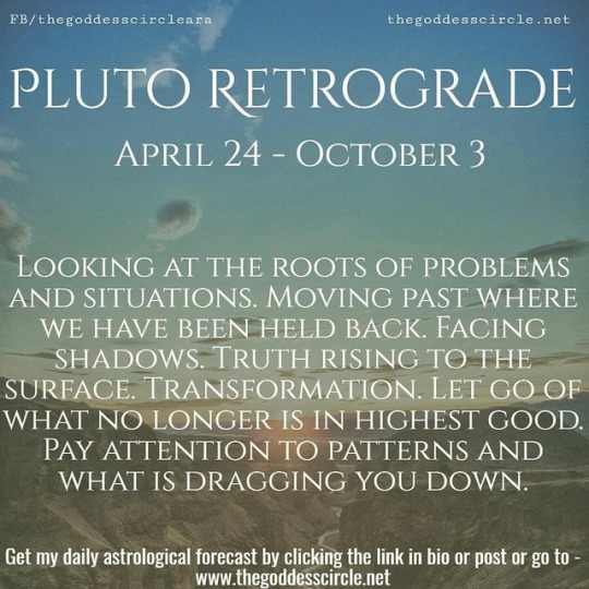
#Repost from @the_goddess_circle_ara : PLUTO RETROGRADE: APRIL 24 - OCTOBER 3 : : "Pluto is also Retrograde in Capricorn from April 24 to October 3. This energy is causing us to look at the roots of the problems going on in our world in order to challenge and shift the energy moving forward. We are feeling in a big way where we have been held back and we are ready to face the shadows in order to move things ahead. Pluto, Lord of the Underworld, loves to show us the shadows, and when we face them we are able to transform them and integrate their wisdom. There can be a lot rising to the surface during this energy, but what is being shown needs to be seen. Pluto Retrograde in Capricorn can cause a great deal of change and transformation to occur, which can influence our relationships, work or projects. We are being asked to let go during this time, release what is no longer serving our highest good. Pay attention to what recurring patterns or situations keep coming up. This is the time to deal with them and get rid of what is dragging us down. Get my complete daily astrological forecast by clicking the link in my bio." ~Ara #pluto #plutoretrograde #dealwithproblems #issues #conflicts #solveproblems #faceshadows #moveahead #truth #transformation #letgo #payattention #whatisdraggingyoudown #astrology #astrologymemes #astrologyposts #ara #thegoddesscircle #caracampbell #theastroforecast #thegoddesscircle #mysticsofinstagram #writersofinstagram #poetsofinstagram #mysticmessenger #astrologyofinstagram #plutoincapricorn https://www.instagram.com/p/BwtfkEsHoSN/?utm_source=ig_tumblr_share&igshid=1hsydzt2ccswv
#repost#pluto#plutoretrograde#dealwithproblems#issues#conflicts#solveproblems#faceshadows#moveahead#truth#transformation#letgo#payattention#whatisdraggingyoudown#astrology#astrologymemes#astrologyposts#ara#thegoddesscircle#caracampbell#theastroforecast#mysticsofinstagram#writersofinstagram#poetsofinstagram#mysticmessenger#astrologyofinstagram#plutoincapricorn
0 notes
Photo


This is Connor Frio, who I made-over for a Pixelated Puddings challenge several months ago. I have decided to share him in the hope it will raise awareness of @sims3hasstoppedworking‘s fundraising efforts so her mum can have a bit of dignity and comfort.
Sadly, Ewa’s mum has been diagnosed with terminal cancer and is very ill. You can read her post HERE (which has a link to her Paypal) and if you click the link to the Crowdfunding site you can see that she has provided the appropriate documentation to prove credibility of her situation. If you check her blog you will also see that it is more or less a relentless list of hospital admissions and prescriptions and posts about how Ewa and her mum are repeatedly let down by the brutal Polish health system.
Any donation, no matter how small, would be greatly appreciated! Thank you 💜
CC LIST (click on the BOLD worlds or right click and open in new tab if clicking doesn’t work):
SKIN by Mamyrocker // HAIR (OS1113) retextured by Ifcasims // BEARD by OnyxIrony // EYEBROWS (the first ones) by Pixelore // EYES (Number 31) contacts by Sims3melancholic // BLUSH (Swoop) by Ladyfrontbum // FACESHADOW by Synestesi // NOSE DEFINITION by Modernlover // UNDERLIP SHADOW by Hellohow-low // FACE SHINE by Ephemera (scroll down to the make-up section of the post - click on the download - then click on the button with [768Kb] next to it) // EYESHADOW by Simtanico
(CC not included: TORSO by VenusPrincess)
The file size is large because I have zipped the Sim File, Sims3pack and a package version together so you need to open it and choose the version you want. The package file would need to go in your Mods -> Packages folder and will include the CC I have used as well as ensure that Connor appears exactly as he should in your game. It’s up to you.
CONNOR FRIO (SFS) DOWNLOAD HERE
#TS3#Sims 3#s3cc#sims 3 cc#ts3 cc#Connor Frio#I love redheads collection#Male sim#sims 3 male#ts3 male sim#CC for S3HSW#Sims3hasstoppedworking
274 notes
·
View notes
Photo

Lunch break sketch from #Sktchyapp 4x6” #sktchy #watercolorsketch #watercolorportrait #colormixing #playwithpaint #faceshadow #shading #artistsoninstagram #artnerd #swatches #kuretakegansaitambi #kuretakewatercolors #kuretakewatercolors
#sktchyapp#sktchy#watercolorsketch#watercolorportrait#colormixing#playwithpaint#faceshadow#shading#artistsoninstagram#artnerd#swatches#kuretakegansaitambi#kuretakewatercolors
0 notes
Photo

Zombie
Hey guys! At the Haloween time (so now) I want to share some Haloween themed Lookbooks and that´s the first one.This Sim should represent a Zombie. Thanks a lot to @pyxiidis for this awesome supernatural skins and more!
Hair (by @simpliciaty-cc )
Fishnet Tight
Bodysuit (by @puresims )
Shoes
Faceshadow (by @notanotheranimesimblr )
Skirt don´t forget to grab the mesh!
And don´t forget to look at @pyxiidis tumblr for the awesome skins etc.!
#lookbook#ts4lookbook#the sims 4 lookbook#s4lookbook#s4cc#sims 4 cc#ts4cc#the sims 4 cc#custom content#cc#sims 4 custom content#haloween#haloween 2018#zombie
23 notes
·
View notes
Link
I couldn’t find a place to reblog, but here’s a really great-looking non-default skinblend!
1 note
·
View note
Photo

Title: The Imp Stick
Redesigned Nameless because I wanted to make him more self indulgent [I like horns, imp tails and faceshadows alot].
Used my usual method of exporting each frame as a image and then throwing them into ezgif, I think I should learn how to use clips built in animation abilities.
Character[s]:
Nameless/MewMew [Sona]
————————————
Like my work? Consider supporting me if you do!
Reblogs > likes
[ Redbubble ] [ Ko-fi ] [Etsy]
#Nameless Creates#Stickman#Stickfigure#Imp#Pink#Bright Colours#Tw Bright Colours#Bright Colours Tw#Eyestrain#tw eyestrain#eyestrain tw#bright colors#eyebleed#gif
0 notes
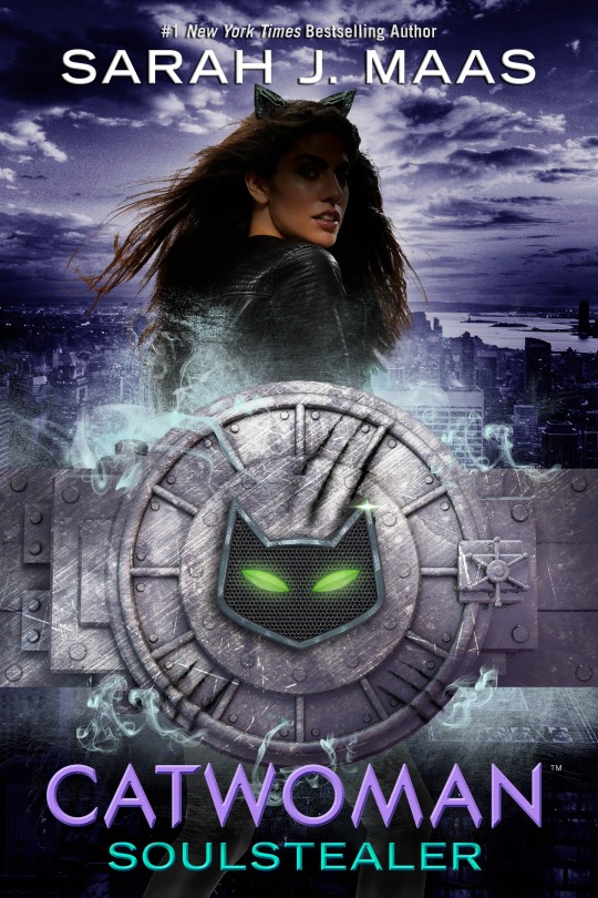
Photo


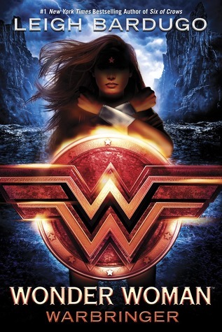
Despite having the askbox closed, multiple people still found ways to request that I cover the abomination that is CATWOMAN: SOULSTEALER by Sarah Maas, and who am I to deny such determination?
So the DC ya novels, as we can see, all abide by this Formula of BIGASS GRITTY DIMENSIONAL LOGO over the figure themselves, with their face in shadow, author up top, and title and needlessly dramatic subtitle down below. It’s not a good formula! The centrality is static and dull, the shadowed faces of the figures as a requirement is hard to pull off, and the logos and the figures are competing for hierarchical dominance.
Let’s talk first about these two versions of the batman and wonder woman covers, first, because they illustrate some of the, uh, flaws with this system.
The ones on the left are the paperback versions, and the Batman one is, almost, making the formula work: the gold accents of the batsymbol make the logo take visual precedence, the perspective lines are giving it some needed depth and dynamism, and the shadow on his face doesn’t look..... too awful, I guess. And most importantly, the type isn’t getting in anyone’s way: it’s a flat sans-serif, appropriately batman-ey but inoffensive. It’s actually, intentionally, Marie Lu’s signature author font from the Young Elites covers, but it works.
So i have no idea why the middle version, the hardcover/ebook, was like “no no, the type needs to look like a class full of fourth-graders learning to use word art in powerpoint did it.” It’s so, so ugly.

I also don’t know why they felt the need to oversaturate the background with blue, scale up the figure, and actually reduce the shadow on his face but like weirdly, but whatever. The paperback cover is better all around.
The Wonder Woman covers are worse all around, both of them. The paperback’s title type is better by merit of being Not Hideous but where Lu’s “signature” typeface was a naturally good fit, Barduo’s are a little more decorative, and letterforms used to evoke Magic Imperial Russia aren’t so great for Wonder Woman. Also, on the paperback, her legs sticking out of the shield logo like an M&Ms mascot is a DEEPLY unfortunate look.

So the type is either fine but ill-fitting or word-art hideousness, and the imagery is bad on both: murky dramatic ambiguity, a VERY fakebad faceshadow, (she’s being lit from below, it seems like from her shield; we instinctively know it should illuminate her facial features the same way) a static, symmetrical pose with no expression, backlighting that clearly doesn’t belong there, and I don’t know if her bracelets were superimposed or what, but they look STRANGELY fake and ugly.
SO.
This brings us to the worst of the bunch.
Here it is again in case you forgot because I can’t write short posts:
Honestly I only talked about the others to procrastinate bc i don’t even wanna get into this. It’s ugly and I hate it. BUT WE CAME THIS FAR, SO.
This is so bad I gotta break it down: we’re gonna talk about each element, first, and then about how they fit together (or fail to). 1) The symbol lockup/ “logo.”
I didn’t really talk about the “logos” themselves on the BM and WW covers, just how they worked within the design, but both of those were fine by themselves, as three-dimensional rendered items go. Which makes sense, as both those heroes have a long history of classic symbology to go with them.
Catwoman does not. So i have SOME (NOT A LOT. BUT SOME.) sympathy for this weird..... cat..... vault... thing. On the others I called it a logo, but because this is less abstract and more literal, doesn’t feel like one here; it just feels like a misguided imagery choice. Was the best conceptual way to express “SHE STEALS THINGS” really to make her whole thing a literal bank vault? Was it? Why is the cat symbol so small within it? why the heavy crosshatching texture? Why visually imply that this is an Actual Physical Thing To Scale when the scratch marks vs the size of the door handle make no sense? Why do the cat eyes look like the green fairy’s lips? Why the ghostbusters-ectoplasm-looking teal smoke?
Thing 2: the type.
I try to avoid low hanging snark/ hyperbole, but all i got for this is that between the beveling effect and the teal/purple combo, it’s hideous and it makes me want to die. moving on.
(Note: as of yet, there isn’t a paperback cover out, and based on what was done with the other two, we may have a version of this with Maas’s signature fonts to look forward to, whatever the fuck those are.)
3) The model.
So. Ugh. First of all, i saw some “OMG SHE’S WHITEWASHED” stuff flying around, and if you feel like that, that’s valid, (and god knows Maas has issues with it; I’m still not over the whole Illyrians debacle in ACOMAF/ ACOWAR, seriously, nevermind the messy “SURPRISE, LUCIEN HAS BEEN A MOC THIS WHOLE TIME, NO IT’S NOT JUST BECAUSE BLOOMSBURY SAID I NEEDED MORE DIVERSITY″ thing) but this looks like a brown girl to me. One styled to within an inch of her life and subjected to some truly heinous photoshopping, and one who will be doubtless be written with Maas’s deepest discomfort on full display amongst variations of the phrase “golden-tanned skin”, but I would still say that’s a WOC. YMMV, of course.
ANYWAY. This is a really goofy shot. Wonder Woman’s looked bad, but her arm-crossed thing is still her Iconic Move, and her hair could ostensibly have been blowing in the wind. Catwoman here is straight from a CW photoshoot for one of their teen dramas, w a wind machine on her and cat ears photoshopped badly onto her head. (Pretty sure it’s just the same ear, duplicated, too.) As with WW, there is an attempt at backlighting that doesn’t work and the face shadow is real, real bad.
Also, lol @ the fact that you can still see her legs poking out at the bottom. At this point just cut her off behind the logo thing? No one’s actually checking to see if she continues for that last inch behind it except me because that’s what I do?
4) The background! It’s! A City! because GOTHAM. I assume. I don’t know if the story actually takes place in gotham. Whatever. So here’s the thing: obviously, Figures on covers needn’t plausibly physically exist in what their background image is. That would be very limiting. So it’s not the fact that she isn’t actually standing miles above a city that bothers me, it’s that she’s close enough to sort of imply that she is, so instead of a deliberately unreal effect, we get one that’s just Off. It doesn’t help that the other two covers’ heroes definitely are supposed to physically exist in their background. Also the purple treatment is silly and the lighting is totally contradictory to what’s on the model.
OK BEAR WITH ME WE’RE ALMOST THROUGH. THE NIGHTMARE IS ALMOST OVER.
So we’ve talked about why the Series Cover System Overall does not work: static, boring, bad hierarchy, necessitated ugly effects and type. But Catwoman specifically does this the worst of all of them: the background is overemphasized, making the figure and the background compete, and the cover’s split straight down the middle between the logo lockup thing and the figure, making those compete, and the text is such painfully bright, undiluted colors that it steals focus from the logo lockup (which is weirdly lacking contrast) despite placement and the precedence of the other covers indicating it should be secondary in the hierarchy. Then there’s the tense, tight placement: the cat ears run into the author name and the lockup runs into the title, neither a deliberate overlap but an awkward lack of space.
This cover hates itself as much as I hate it, all the elements glaring at each other and fighting futilely in the backseat while the book threatens to TURN THIS THING AROUND.
I wish it would.
281 notes
·
View notes
Last Seen Blogs

ididntknowshe
Chasing My Thoughts Before It Eats Me 💭

nomorethanbeauty
Sin título

tvoi-belyashik
Забегай ко мне

mousegamerclub
mousegamer.club

ivanramosdemelo
Ivan Ramos de Melo