#faber castell classic
Explore tagged Tumblr posts
Text


Did a little sketching to take a break from the project I’m working on (which also involves drawing but somehow they feel like two different activities where one is relaxing and the other is stressful, I can’t explain it). Anyway, I bought some old cartoon collections from a bookstore near our house and decided to sketch from them. One is by Peter Arno and is copyrighted 1949 and the other is by Syd Hoff and is copyrighted 1945. The Hoff book is interesting because all of the cartoons are about soldiers and sailors coming home from World War Two. That means that there was enough call from magazines and other media to justify enough cartoons about the subject to fill an entire book. I like the style of these cartoons with the thick black lines and washes. These guys were definitely masters of brushwork. Also, the Arno beauty pageant contestant is a real mutant lol.
#doodles handlon#www.deadcatcomix.com#artists on tumblr#little doodles#comics#illustration#syd Hoff#Peter Arno#classic#gag panels#sketching#moleskine#blackwing pencils#faber castell
5 notes
·
View notes
Text
big ask post

i wear a lot of black, but no :(

VALIS by PKD, Cat's Cradle by Vonnegut, Dawn by Octavia Butler, Ada or Ardor by Nabokov, the Breath of the Sun by Isaac Fellman. thank you!
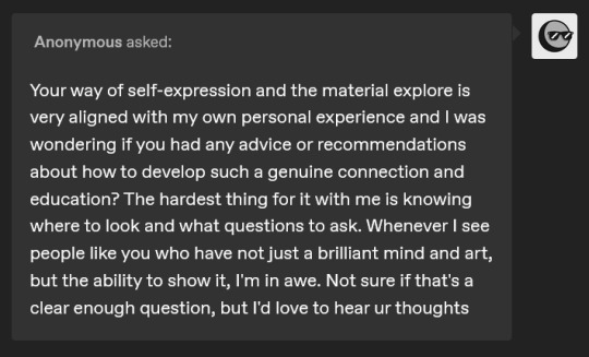
this is a v sweet ask, thank you. i think i'm still clumsy at expression, which is why i've stopped posting as many short comics. i want to force myself to express something through a larger narrative, something that you can't just turn to the viewer & explain in 4 panels. but all that aside,
try to read a lot, not just genre fiction! read stuff that's weird and hard and outside your wheelhouse. history, classics, psychoanalysis, whatever. and after you do you should process it somehow, whether that's by writing or talking or seeing what other ppl think about it. after i read Blood Meridian i listened to the YaleCourses lecture on it while i made dinner and i was arguing out loud with the professor the whole time. i think that's the only real advice that i have, not just to seek out new art but to take the time to process it and develop opinions on it. (same goes for film, paintings, plays, etc)

ty! by sheer volume it's detroit house... progressive techno... aphex twin. & i've been on a west coast hip hop kick bc of kung fu kenny

i've just been using bigcartel, it's really simple to set up & they don't take a cut. (stripe/paypal still does but that's unavoidable.)

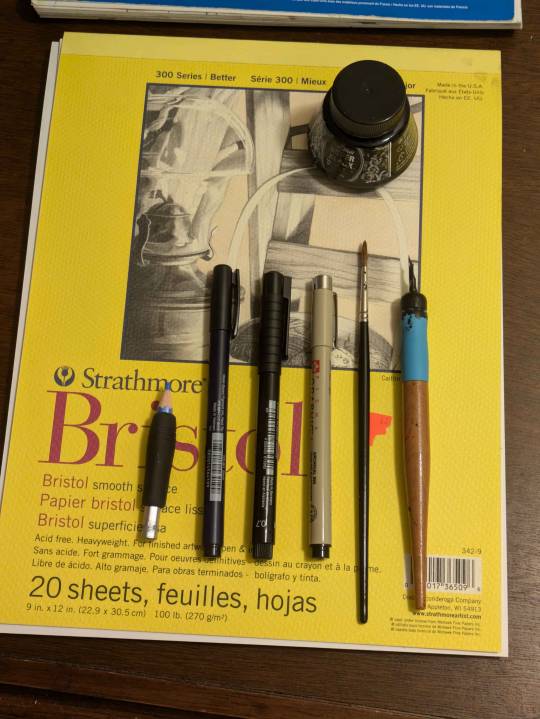
ty! i mostly draw in Canson XL Mixed Media sketchbooks. for sketching: staedtler non-photo blue pencils, tombow fudenosuke brush pens, faber-castell pitt artist pens, micron graphic pens (they don't last though!!!!!!). for inking it's the classics: winsor newton series 7 size 2 & a tachikawa nib holder w/ hunt 102 nib. the nib doesn't actually fit so i have to wrap tape around the base. don't be like me.
i've recently started buying winsor-newton watercolors but tbh the sakura koi field palette is cheap and vibrant and i still use it all the time!

whatever's on my mind, which is usually little guys being existential. welcome!
75 notes
·
View notes
Text
Thanks for the tag, @missameliep ❤️
Tagging: @sazanes @lizzybeth1986 @rosesnink @princess-geek @havenroyals
10 notes
·
View notes
Text

Continuing on my mission to keep drawing and inking cats this month. The classic cat loaf, demonstrated by my friend's cat. I enjoy when I can pull off the highlights on the eyes. Here with the faber castell art pen outline again and finer details with the micron pens.
7 notes
·
View notes
Text
I drew the Reliant Crew
And as a challenge for myself, everyone after Sys-Zero was drawn with some variation of the GEARS houses uniform based on headcanons from @high-voltage-rat
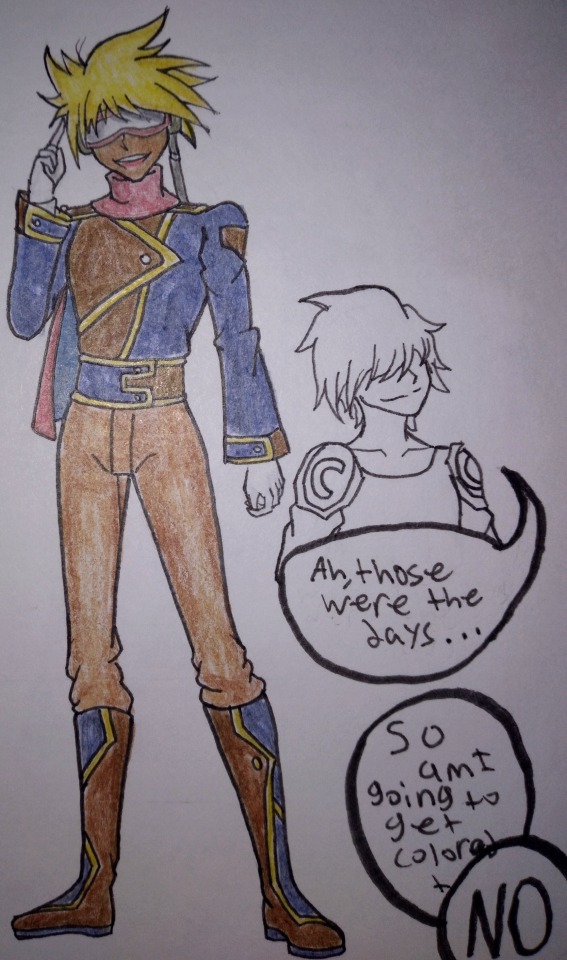
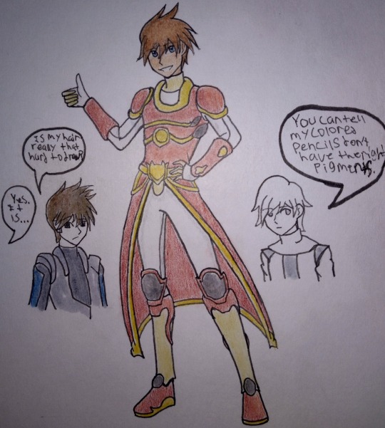
For the first two, we have the Captain, Sys-Zero and Starbuck!
Sys-Zero's outfit is a pain to draw in all honesty and a part of that could honestly be because of my art style. I would've colored Cysero but the space in which I drew the bust left little wrist room and just adding the bust was a bit of a chore.
I hated drawing Starbuck's hair and that's mainly because I had to figure out how to draw it at a different angle. Was I successful? I don't think so. If you can't read my shitty handwriting, it goes like this
Starbuck: "Is my hair really that hard to draw?" "Yes. It is."
Me: "You can tell my colored pencils don't have the right pigments." For context, these were all colored using Faber Castell Classic Colored Pencils (48 pack). Unfortunately, there were quite a few details in the references that I couldn't quite nail down with the colors I had. That's why Starbuck looks kinda off in my drawing
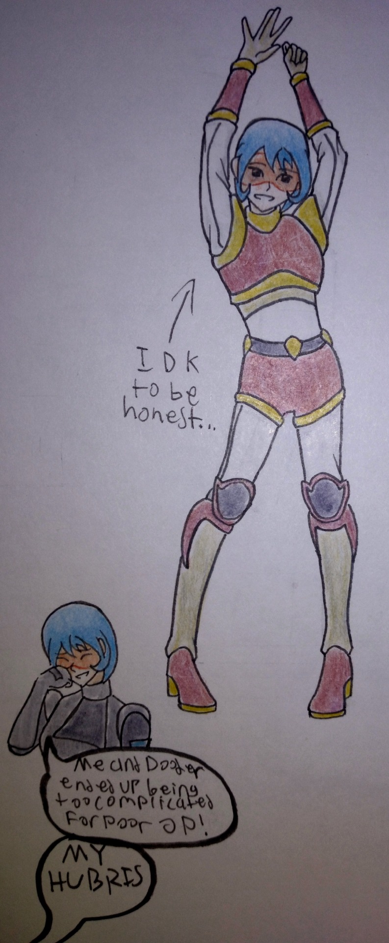
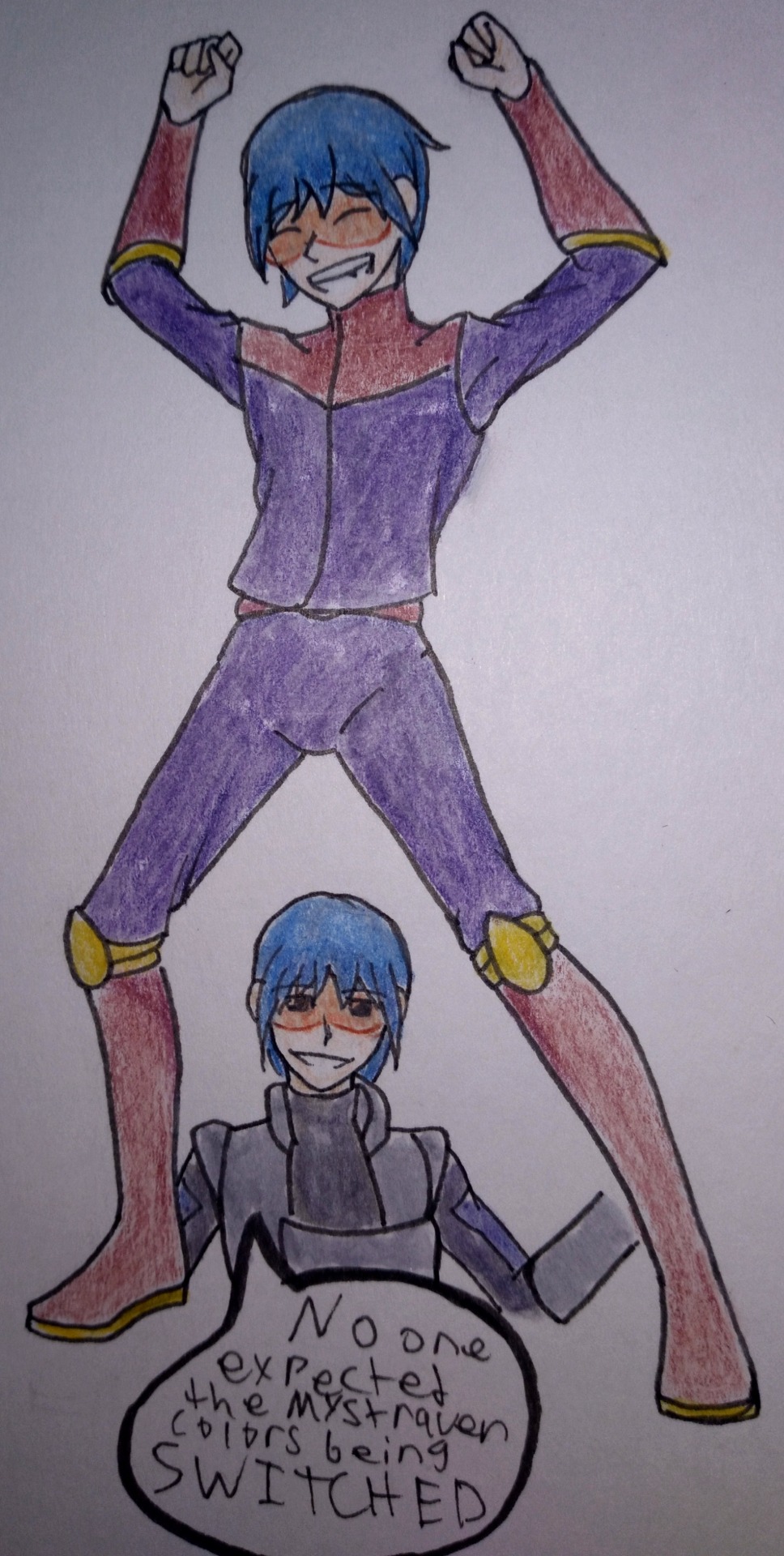
Sally and Dooder were the last ones drawn and my god the poses I chose were a mistake for my skill level. I have only myself to blame for this.
Obviously Sally's Wolfblade outfit is more in line with the SnuggleMech outfit for the Student class in Dragonfable. Because the idea that everyone else other than Starbuck having little personalized uniforms felt right for some reason. Unfortunately, Sally's looks off because of the pose.
Sally: "Me and Dooder ended up being too complicated for poor OP!" "MY HUBRIS"
Dooder's uniform is the most lax of the crew because he would do that tbh. "No one expected the Mystraven colors being switched!" (His pose is supposed to be the Hakari/Bully Maguire dance)
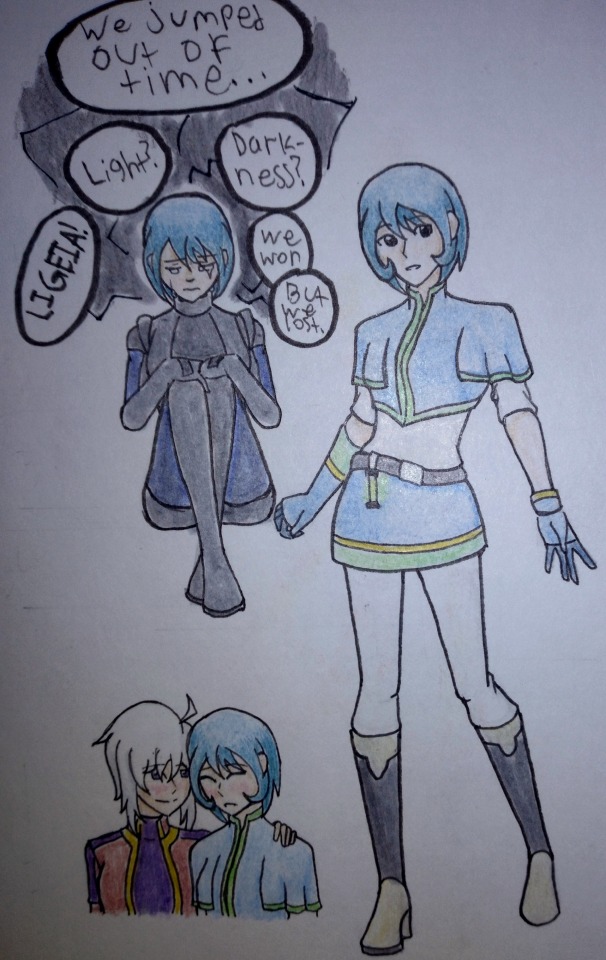
And lastly, we have River. Technically speaking I drew her third, but for the sake of the post she's last. She also gets the special privilege of having two different pose drawings, because Eveline held me at gunpoint. I'm also doing what the Friday the 13th events did for River and removing the visor to help separate her from Sally, even by just a little bit.
Featuring a cute little moment between Eveline and River. I have an agenda to maintain
#mechquest#Sys-Zero#sally mechquest#river mechquest#dooder mechquest#starbuck mechquest#Have you ever noticed that Starbuck's skin tone changes between appearances?#When you first meet him in the Entrance Exam his skin has more of a deep yellow tint to it#but when we see him again on the Reliant it looks more like a tanned peached#if that makes sense#I only noticed because I was debating with myself on whether or not I wanted to re-draw Starbuck
5 notes
·
View notes
Text
I wish I had more money to explore Faber Castell bc I’ve tried a ton of their standard stuff and their sketching set is classically and reliably good. I hear wonderful things about their colored pencils but I don’t think I’ll ever need em bc I already have prismacolors.
6 notes
·
View notes
Text
self love as drawing greek gods, part 3! Chucked off a mountain by his own mother for being ugly, explanation for most volcanic activity, god of fire and blacksmiths, and crafty husband of aphrodite, it's Hephaestus!

Made using Faber-Castell Pitt Artist pens (0.1 & 0.3), Ohuhu alcohol markers, and a classic white Gelly Roll pen, on Bristol trading card paper.
masterpost with all parts
#i feel like a lot of people sleep on the fact that this guy is married to aphrodite#like yeah she has ares on the side but shes married to hephaestus#and shame on hera for just chucking a newborn baby#artists of tumblr#greek mythology#greek god#hephaestus
7 notes
·
View notes
Text


2023 / 1 / 10 I recently (and finally) got myself a new phone and, within it, a new camera to take better quality photos of my art! Needless to say, but it's been well-worth the money and I feel a lot less embarrassed to share my traditional art now. Be prepared to see more WIPs this year. Here's progress on the blue eastern dragon I featured in a previous sketchblog post. I work on him every other day to keep up with the art-making habit. I'm hoping to get him done by the end of the month so I can move on to yet another dragon piece. Maybe even by the end of the week if I'm feeling particularly ambitious. I've got a few art-related new year resolutions in mind, but one of them is to use up most, if not all, of my old colored pencils before splurging on newer and nicer materials. Tools for those who are curious: Faber-Castell Classic Colour pencils - 344, 351 Color Peps - Marina Blue Dong-A Fine-Tech 0.2 - Blue Dong-A My Metal 0.7 - Gold Strathmore Bristol smooth paper
35 notes
·
View notes
Note
Wow! I love your drawings so much! 💕They’re very soft and peaceful. 😊
I have a few questions!: what kind of sketchbook to do use? What are some of the colored pencils do you utilize? And I would love it if you could share with me some of your drawing tips! 😁
thank you so much! 🤗💙
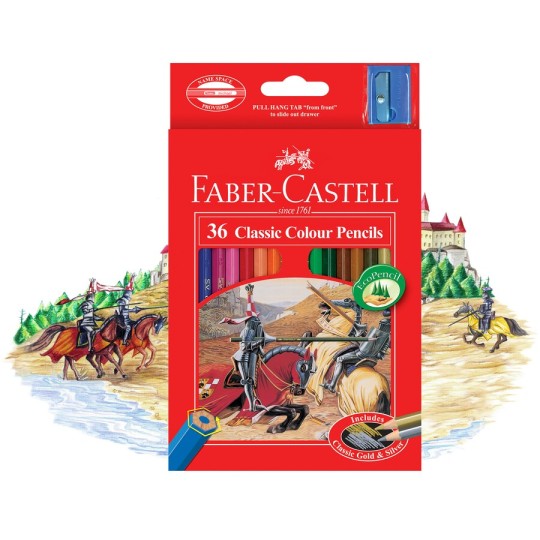
I use a Chinese sketchbook (it's one of those brandless affordable ones, but you can probably find similar ones on ebay). as for colour pencils, I use Faber-Castell Classic Colour Pencils
2 notes
·
View notes
Text

Something old, something new, something borrowed, something blue. 💙
In another world, Dorothy may have become Mrs Jean Havoc.
(Something old: she borrowed and altered Trisha's wedding dress)
(Something new: her aunt and sisters chipped in to buy a new pair of shoes)
(Something borrowed: the jewellery is from her aunt's jewellery box. Pearls are classic and timeless.)
(Something blue: a sash, one of the few pieces of fabric she could get in Resembool.)
drawn in pencil and fineliner, with faber castell coloured pencils I got for school like six years ago
reference photos all from pinterest, found below, under the cut.


#fullmetal alchemist#fma#fmab#au#dorothy mustang#jean havoc#fma fanart#wedding art#jeanorothy? dorean? need to figure a ship name for them#dorothy mustang x jean havoc#oc art
4 notes
·
View notes
Text
@0461's blog reminds me of when I was a little kid, before my dad got cable [so until I was like 7 years old), when we had only two TV channels (if I messed with the antennae, I'd sometimes get a grainy, black and white signal from nearby Bahrain or Kuwait--Saudi Channels 1 and 2. Saudi Channel 2 was (it no longer exists) for the American and British ex-pats in Aramco and had TV shows in English, but it was mostly old stuff, like English-dubbed Kimba, Mr. Bean, 50's shows, some 80's-90's toons.
The Arabic Saudi Channel 1 (which still exists) had Maruko, Doraemon, fairy tale anime, and aired a lot of the same classic cartoons as the English channel did (... but with cuts and a bit less respect for child viewers, imaging we won't notice if they cut away mid-episode and then put on a different cartoon afterwards... which put me off and made me a little original-language-purist at a young age. ^^;;; )
That said, I still have very fond memories of watching those shows, especially as Maruko-chan, Doraemon, and many fairy tale anime never saw an English dub release, so the Arabic dub was the only way I could've seen them as a kid!
... also reminded of all those cute and colourful, but very cheap, pens, highlighters, markers, stationary, etc., with cute Sanrio characters or other cute mascot characters that... well, didn't work very well for art, so I knew to buy something of higher quality like something from Faber-Castell or Crayola, but they were so cute or sometimes had pleasant smells, so you couldn't fully regret buying them once... they're just cute to look at.
(Looking it up, looks like there are higher quality art markers and such that's Sanrio-branded, but I only meant the cheap, schoolkid-geared stationary, sometimes not even officially licensed products, but Sanrio's too huge to care...)
Mostly Japanese stationary on that blog, we also had some really cute Korean stationary like Orange Story sold here... those characters were so cute.
@tamatoch it's a blog like yours, you'd like it, I think! ^^ If you didn't already know it...
... one of my little lined notepads I used as a sketchpad as a kid seems to be a knock-off of Orange Story, even.
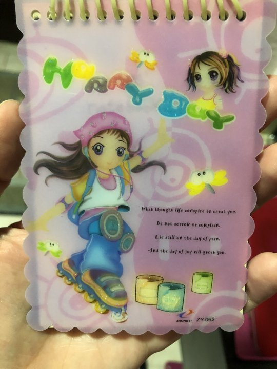
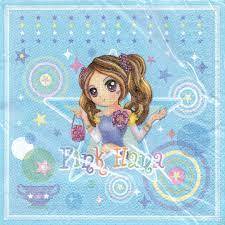
Top right's a knock-off of Pink Hana, but with some effort to change the hair and outfit up, so kind of creative for a knock-off! Bottom left looks like it's mixing a Cherry-like face with this White outfit, but with jeans? (This picture is from this page collecting Orange Story images.)

#basically nostalgia for kodomo anime and cute East Asian stationary and mascot characters#my childhood#kidcore#stationary#breathe in that early 2000's outfit though#I wore a pink shirt like that with a generic anime-esque girl design my dad lovingly bought
3 notes
·
View notes
Photo

Fighty-Nighty-Ninjas. Design for animation project. This fighter morphed into something more feminine throughout the process. I think the character did start as female. These sketches were informed by classic movies, specifically Dragon Inn 1967, with a formidable female fighter protagonist. Go find this movie. I'm sure many western movies have cheekily swiped a few ideas from this. Have you seen it? See it! I ended up designing the backgrounds and scenes- which I'll post later if I can. None of that mattered if the character isn't going to work as an animated, living person. A black crayon Faber-Castell is my weapon of choice. Something soft-ish. I'm looking to capture dynamic movment, energy and a certain mania ; I'll need to grind and carve out the lines on cartridge paper- so it makes sense to find a soft pencil. I'm not sure you can do that on an i-Pad. A flash of a hand, a swish of the arm require some tension, as if the muscles are flexing. Anyway, you be the judge. After I have a stack of mad scribbles, I scan them, give them a tiny bit of contrast to erase the paper texture- a slight adjustment to the levels to crush the black and take out the highlights, and then I send them to the marvelous director who will sort out what works. #barepsldn #sketchbook #drawing #celynbrazier #celyn https://www.instagram.com/p/CrAwuc8tC0Z/?igshid=NGJjMDIxMWI=
13 notes
·
View notes
Text
Old Tech is fascinating, though the exposed moving blades on a couple of them is slightly alarming.
I still remember the pleasant smell of an entire class's pencils being sharpened before the start of a lesson, with one of these.

In a classic example of "If It Works, Don't Change It", that picture is of a 1950s-60s model, while this one is brand spanking new.

This little Faber-Castell gadget cost me about €6,00, is enough for my limited needs and still (depending on the pencil) produces that new-sharpened smell, just not as much of it.

But anyone who Must Have a more expensive sharpener can always source a mint-condition antique like this:

It's also a Faber-Castell, and yours for just €770,00 plus shipping.
Um. Nope?
Old Pencil Sharpener in Action
22K notes
·
View notes
Text
Crayons have long been a favorite art supply for children and adults alike, but one group of creatures in particular are gaining attention for their unique use of these colorful tools: kelpies.
Kelpies are mythical creatures from Scottish folklore, often depicted as shape-shifting water spirits with the ability to transform into horses. These creatures have recently gained popularity in fantasy circles, with many artists and writers incorporating them into their work.
One aspect of kelpies that sets them apart from other mythical creatures is their affinity for color. Kelpies are often described as being able to change their appearance to match their surroundings, meaning they can blend into any environment seamlessly. This ability likely stems from their time spent living in and around water, where light and color are constantly changing.
Kelpies' love for color naturally lends itself to their use of crayons. These versatile drawing tools allow kelpies to create stunning, detailed designs that can shift and change as they do. The ability to blend and layer colors also allows kelpies to create intricate patterns and textures, adding depth and dimension to their artwork.
Additionally, crayons are a practical choice for kelpies who spend much of their time in the water. Unlike other art supplies, crayons are waterproof and can withstand the elements, making them the perfect medium for these water-dwelling creatures.
But it's not just about practicality for kelpies. The act of coloring and creating art is a beloved pastime for these fantastical creatures. It provides a sense of calm and focus, allowing them to express their creativity and bring beauty to their surroundings.
As kelpies gain more recognition in popular culture, the demand for crayons that complement these creatures' unique abilities and interests is sure to grow. Companies like Crayola and Faber-Castell may have to start thinking outside the box (or in this case, the crayon box) to keep up with the demand for colors and shades that are perfect for kelpies.
In a world where imagination and fantasy reign supreme, the possibilities for crayons and kelpies are endless. With their love for color and creativity, these elusive creatures are sure to continue mesmerizing us with their unique use of this classic art supply.
0 notes
Text
part 5 of drawing the greek pantheon! today we have the maiden of spring, queen of the underworld, goddess who was initially kidnapped by her husband and then part of the most functional relationship in greek myth, and the goddess who has been worshipped longer and more fiercely than her husband; its Persephone!

Made with Faber-Castell Pitt Artist pens (0.1 & 0.3), Ohuhu alcohol markers, and a classic white Gelly Roll on Bristol trading card paper.
masterpost with all parts
#it is obvious i love persephone#researching her shes been worshipped for centuries longer than hades even existed#and they almost always used codewords instead of her real name#something usually done when a diety is terrifying and you dont want to attract their attention#so shes been a badass underworld queen forever#artists on tumblr#greek mythology#greek goddess#persephone
3 notes
·
View notes
Text
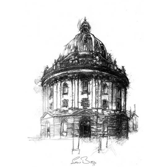
Oxford Radcliffe camera | Limited edition fine art print from an original drawing. The Radcliffe Camera is a building of Oxford University, England, designed by James Gibbs in neo-classical style and built in 1737–49 to house the Radcliffe Science Library. My sketches start life as hand-drawn graphite images made on cartridge paper. I often work on these with charcoal, oil pastel or Caran d'Ache to create the look I'm after. The artwork is then scanned and finessed digitally ready for fine art printing. This process often referred to as Giclée printing uses the highest standard of printing methods to give gallery quality results that maintain all the details of the original sketch. The graphite pencils I use are Faber-Castel, the oil pastels are Sennelier and the china-graph is Caran d’Ache. The inks are pigment based archive quality (100years+). The heavyweight specialist papers I use are of the best professional quality having a wonderful surface designed specifically for fine art drawings and illustrations. Very limited editions with only ten per size printed. All artwork is signed and includes a certificate of authenticity. The A5 are 5.8" x 8.25" (14.8cm x 21cm) The A4 are 8.25" x 11.7" (21cm x 29.8cm) The A3 are 11.7" x 16.5" (29.8 cm x 42cm) The A2 are 16.5" x 23.4" (42 cm x 59.4cm) Originals are A3 11.7" x 16.5" (29.8 cm x 42cm) Frames not included in price. Free shipping on artwork to all destinations. https://www.seanbriggs.co.uk/product/oxford/?feed_id=2680&_unique_id=65aa25d28ff49
0 notes