#eye strain if darkmode
Explore tagged Tumblr posts
Visit Tumblr Blog
Explore Tumblr blogs with no restrictions, modern design and the best experience.
Last Seen Tumblr Blogs


Fun Fact
BuzzFeed published a report claiming that Tumblr was utilized as a distribution channel for Russian agents to influence American voting habits during the 2016 presidential election in Feb 2018.
Text
No sooner had the mooring been tied off then Anne was ashore, darting past the last of the pre-dawn watch and back into the streets of her beloved Nassau. Despite all the tragedy of the last few years, even of the last few months she’d spent here!, Anne finds excitement and purpose back in this city. Founding spot and capital of the Republic of fucking Pirates, the last port she’d called home in years and the start of the woman she is today, Nassau (indeed, all of New Providence!) feels holy in her irreligious heart.
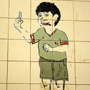
She winds through alleys and roads with their slipshod paving stones, following her feet as muscle memory alone carries her towards her destination. She stops only once on her journey, at a public posting board. It was a source of great amusement among the locals, hanging wanted posters of infamous pirates and guessing what the crown was paying for them, or what they would pay after this or that misadventure. A reviled image hangs on the board now, one that stopped Anne every time she looked on its familiar, ugly face. She plucks it from the board, shaking a bit at the sight of it. A bland, generic face stares up from the page, dark curls held back by a strangely angled hat. The image features a pistol in hand, as if that had ever been her favored weapon! If it weren’t for the hair, the hat, the trousers, the naked breasts—well. Anne is right in saying that any redhead with a pistol in hand could be taken for Anne Bonny.* She’s never felt so giddy before in all her life!
Anne stuffs the wanted poster into her coat and makes the mistake of glancing up. She’d thought to make sure there’s nobody else around—imagine the laughingstock of a pirate taking down their own poster in Nassau, of all places!—but in so doing sees the second to last face she expected to be staring at her from the board. She’s slow to straighten up under the unseeing stare of his surprisingly accurate eyes. The rest of him looks just a touch…wrong—which is as surprising as her own poster’s mismatch, given how memorably attractive he is. Really, more people could probably describe Tryck from memory than could describe Anne, and certainly more did Jack, given the uncanny nature of the sketch on his posters. So how is Tryck’s so…only passingly like him? Except around the eyes. (Eerily like his, really.) It’s a shame. Or maybe a blessing.
She could feel bad about the decision she’d made for him, but there’s no point in that. With nothing to gain in sharing it and her own freedom on the line, making it for him had made more sense than asking. Risking input on an iffy-at-best plan. There isn’t time to come up with a second idea!
And there’s no going back now even if there was. Not when the morning sun is well and truly upon Nassau, not after she’d slipped out at the dawn change. The captain had expressed his disinterest in cutting Anne loose of her contract so early, and so Anne had needed to slip off—there and then!—without anyone to see her after her chat with the captain. So long as she disappeared while Tryck was among witnesses, there’d be no holding him in contempt, allowing him to break his contract the natural way, if he so wished. Being free of her made a free man of him, so long as his eyes never clapped her after they settled down to sleep on the borrowed mattress in the hold. Even if that was found and forced out, she’d been seen long after that, ducking into the captain’s quarters. Just leaving the note had been risky enough, but she’d expected no less from the moment she’d realized the captain’s intent.
Whatever Tryck did now, he did on his own accord. And as long as Anne’s disappearance couldn’t be linked to him, it stayed that way. His contract was at its conclusion, and there was no legal contempt to find him in as long as Anne stayed out of it until it was done.
…besides, she couldn’t guarantee Jackie would feel the same charity for her if she had Tryck at her side. The next few hours would determine Anne’s fate, and a lot of it depended on Spanish Jackie feeling the same charity that she did a few years ago, though in a slightly different way. That and a few sacks of twice-stolen loot are all Anne has to barter with, and Spanish Jackie isn’t famous for her charity work.
Anne forces herself to look away from the poster, to figure her way again. She holds the side of the board, never realizing it’s the name half of her own poster tickling her palm before she walks off. Left, left…right…right! Because the side alley’s blocked the other way, and if she “ever need that favor returned, knock on my private door, and fucking wait,” in the words of the woman herself. Hopefully that holds water all these years later.
*OOC infodumping and image below.
I headcanon that this was her wanted poster (it probably wasn’t) because it cracks me up to think of this publicly available, romanticized image of her making approximately zero use of her more obvious features in favor of being 18th century misogynists about it. I know I have mentioned this before, but I refuse to shut up about it.

@neverhangd
The handwriting is neat and tidy to a surprising degree, an elegant cursive script that should have no place on the torn and yellowed paper.
When we reach our next destination, I intend to leave—with or without the captain’s approval. I can’t ask you to come with me. There’s no coin to be made there. But this last adventure has taught me a few things, like that my heart isn’t as dead as I thought it to be. That there are people out there capable of treating others kindly, even me. That there are even some poor fucks who can look at me find beauty there. Thank you for teaching me those things. I think I love you. I’m all out of parchment now, so I suppose I just get to live with that. Good-bye and good luck. Signed, A Friend
Tryck had found the letter waiting for him on his hammock as they were making port in Nassau. He had recognized her script even if she didn't properly sign it. He'd seen it enough times, when she was writing in the ledgers during the times they were left alone on the ship.
He honestly has no idea how to feel as he reads the words over and over again, except that he doesn't want her to go. He doesn't want her to leave him on the ship with the rest of the crew that could care less about him except as a place to plug their pegs. He serves no loyalty to the Captain, only on the ship to avoid arrest in certain ports.
In Nassau, there are no bounties or warrants on him, and he knows Anne knows that, so he wonders... why would she say her goodbyes, rather than ask him to come along?
It's a question he needs answered, and so he packs what little belongings he actually has (violin, a few clothes, a couple of books) and carries them off the ship without a word to the crew.
How far has she gone, how long will he have to look for her? He doesn't much care, he'll search the entire port and beyond if he has to.
There's not a chance he's going to let his Fiery Lass get away.
3 notes
·
View notes
Video
youtube
Darkmode Word Setup: A Step-by-Step Tutorial
This video is a step-by-step tutorial on how to set up darkmode in Word. Darkmode is a popular feature that changes the background of your document to a dark color, making it easier on the eyes and reducing eye strain. This tutorial will show you how to enable darkmode in Word, as well as how to customize the settings to fit your needs. Whether you're new to Word or a seasoned user, this tutorial will help you switch to darkmode with ease. By the end of this video, you'll be able to comfortably use Word with darkmode enabled. So, if you're looking to reduce eye strain, increase productivity and make your work experience more comfortable, be sure to watch this tutorial on how to set up Darkmode in Word.
#youtube#DarkmodeWord DarkmodeTutorial WordDarkmode DarkmodeSetup DarkmodeGuide DarkmodeTips DarkmodeTricks DarkWord Eyesaver ProductivityBoost tutor
0 notes
Text
#aFactADay2021
#135: dark Mode used to be default for computers, when screens were first invented, because of the whole cathode ray thing. it was just easier in general to have the majority of it dark, and similar with LCD. lately, darkmode had become trendy and most are unsure why, although many experts say that it originated in coding or cyber security or something because you often sit there for long periods of time with a huge screen and too much light puts strain on your eyes (or smth). it's also a bit of nostalgia back to when computers were forced into dark Mode... looking around I think coders have been using darkmode UIs pretty much since the first computer screens lol
let's create a new middle ground to compete with darkmode and lightmode: greymode! instead of white text on black background or black on white, it's grey text on indistinguishably darker grey background :) no strain, and everything's illegible!!
0 notes
Text
ok now that im DONE with school and can have tumbler app again. debating using the pride theme just like ironically or whatever
#.txt#the eye strain though. she tests me.#WISH the goth/rave theme wasnt somehow DARKER than darkmode i cant see SHIT with it
6 notes
·
View notes
Text
i have a theory that if i used darkmode on everything, i’ll fall into a depression from the lack of brightness on my screen. discord can stay dark like that tho, that's just what looks right to me. same with twitter being bright white
#i have facebook on darkmode but im not sure about it#but i don't use facebook enough to care#also note that i use flux#which regulates my screen brightness so as to lessen eye strain
1 note
·
View note
Text
A Quick History of Dark Mode
Today we are continuing a series with taking a look at Dark Mode and all its glory. #darkmode #darkness
What is something that could save the battery on your phone, reduce eye strain, and have potential health benefits? Dark Mode of course. This article is a continuation of my short mini-series, On Darkness, which started with our exit from DST (Daylight Savings Time). Today we are taking a quick look at Dark Mode. Dark Mode. A great controversial topic when it comes to computers and technology.…

View On WordPress
2 notes
·
View notes
Video
youtube
HOW TO ENABLE DARK MODE IN WINDOWS 10 {2020}
#techpradhumn #darkmode #windows #How #to #Use a #Dark #Theme in #Windows #10 #HOW #TO #ENABLE #DARK #MODE IN #WINDOWS #10 #Does #Windows #10 #have a #dark #mode? #How #do I #enable #Dark #Mode in #Windows? #How #do I #make #my #screen #black #Windows #10? #How #do I #activate #dark #mode? #Is #Dark #mode #better #for #eyes? #How to #Enable #Dark #Mode in #Windows #10 #Windows #10 #dark #mode is #here. #Turn it #on #now# How to #turn on #Dark #Mode #on #your #Windows 10 #computer to #reduce #eye #strain #and #give the #computer a #sleek #look #windows 10 #dark #theme #download #chrome #dark #mode #windows #10 #dark #mode #notepad #windows #10 #internet #explorer #dark #mode #technologies #technology #tech #technews #techworld #engineering #technologynews #innovation #gadgets #techno #techy #techlover #techgeek #techie #techies #instatech #technologie #technologythesedays #futuretech #newtechnology #technologyrocks #gadget #electronics #techgadgets #iphone #techlife #engineers #design #instatechnology #apple #smartphone #futuretechnology #science #techtrends #newtech #pro #digital #mobile #robotics #gadgetlover #techupdates #techwear #engineer #innovations #artificialintelligence #business #gadgetshop #it #technolovers #technologysolutions #tecnolog #techblog #ai #instagood #samsung #android #india #techaddict #dolphin #systems #software #scientificmethod #transhumanism #electronics #digital #tech #printingpress #devices #tools #applications #computers #capabilities #expertise #biomedical #innovations #wireless #products #informationtechnology #solutions #management #secondindustrialrevolution #language #engineer #homo #neolithic #bioscience #scientist #industrialrevolution #system #networking #electron #based #semiconductor #innovative #enterprise #global #hardware #uses #focusing #enabled #core #telecommunications #product #data #sophisticated #market #focused #industrial #design #stateoftheart #makers #components #use #processing #foraging #improve #using #hominids #cyberculture #create #information #mobile #bipedal #companies #programs #commercial #creative #expand #ancientgreek #strategy #new #program #consumer #generation #labs #dynamic #aims #learning #networks #enables #component #capability #expanding #build #specialized #wood #controloffirebyearlyhumans #charcoal
1 note
·
View note
Text
It’s Getting Dark This Halloween

Halloween is the one holiday that’s best celebrated in the dark. Which is why The Old Reader is excited to be able to introduce the all-new Dark Mode. It’s time to embrace the dark side of reading on the web.
Okay, Dark Mode really has nothing to do with Halloween, but this seems like the perfect time to introduce it to everyone. It is all about readability, reducing eye strain, and making your experience using The Old Reader better.
Dark Mode was one of the most commonly requested features we’ve had from our users and there is even a user-created plugin that does a similar thing. With this new, built-in feature, all you have to do to use it is hit the “d” key while using The Old Reader, and voilà, you’re in Dark Mode.

Dark Mode is just one small way we want to keep The Old Reader moving forward. Give it a try, we think you'll really like it. Thanks again for all the great feedback and happy darkmoding!
1 note
·
View note
Text
Design consideration for successful IOS app
For IOS app or any other app design of the app plays a very important role in successful apps and when it comes to IOS apps the design of the apps plays a major role for the for efficient user engagement and user retention and we one of the best Ios app development companies in dubai are listing out the design consideration that you will have to look out for
Respect resolutions or display solutions
When the iphones were released at the earlier stages screen size and the resolution was not a issue But as there were more and more iphones that has been launched through out the years the consideration that you have to take when you are designing the app is about the screen resolution and the sizes of the screen for the different devices
Design should be done in pixels
It is for sure that when you design or develop the app you will have the images and other graphics in the app and you are including it make sure that you are designing the stuff according to the pixel where pixel is the smallest element in the screen of the mobile when you make sure that you design it according to the pixel the images will have more clarity
Making sure that the notch is intact
The notch is the element that preveents the screen of the IOS from becoming end to end Now it is a trend to create to create a complete square design and hide the black borders at the end of the screen but the advice is not to do it
Prefer the San fransico as the typography
Typography places an important role for any app it is almost waste of time and money if the users are not able to read the text well you have to make sure that the content is sharp and visible
One of the best way of doing that is by using the system typefaace itself which is San Fransico in IOS This typography has the best sharpness and clarity and since it is a system font it is of dynamic type where you can adjust the font according to the user preferences
Make sure that the colors that you use are vibrant and interactive
These are the main factors that usually attracts the audience the most and when you want to highlight any element one the screen the best way you can do that is buy using the vibrant color to that element Bur while doing so make sure that you are not using the vibrant color all over the places it might look awkward for the audience
Make sure that you optimize the touch for the thumb
When the users are trying to access multiple elements ont eh screen there might be a situation where they might make multiple attempts while doing so they might get frustrated Most of the time this kind of situation arises when elements are placed to close to each other on the touch screen you should avoid placing the elements closer to each other the minimum tappable area should be 44*44 and the elements should be placed in a thumb friendly zone
Consider animating at suitable places
You can design the number of screen that you want but when it reaches the user he might be unaware of the number of screens and the way to navigate the best way to guide the user is to help them with the animated videos that help them to understand the app and when you animating make sure you are using the system animations which would be more easy
Design the daark mode since it is the trend now
Yes the dark mode of the apps are becoming the trend now and when it comes you ios you can design the darkmode of the apps for the devices that are running above IOS 13 The dark maode haas many user benefits such as increasing the viewing experience at night by reducing the eye strain and there are many other with it
Your should also make sure that the content is formatted properly
This is a tip that you have to consider the app strength not only lies in what content it is having but also how the content is arranged the app with a good content that has a very duzzle buzzle arrangement donot guarantee the success so it is very important that you should content should be formatted properly
Conclusion
When you are designing and developing a mobile app it is always best ot have the best team instead of doing the stuff all alone and we are one of the best mobile app development companies in dubai who can design and develop amazing IOS apps with the expert team
0 notes
Text
Best way to hack someone’s WhatsApp without touching their cell phone using Spyfix6
WhatsApp Darkmode iOS Surveillance WhatsApp Dark mode — WhatsApp Remote ToolFinally, after a long waiting period, WhatsApp has enabled Dark Mode with its latest update for iOS. The feature was in beta for a few weeks but now has been made available to the public. Dark Mode is a highly requested feature because it helps reduce eye strain in dimly lit environments, and it can slight curb battery power consumption especially on phones with OLED screens, like the iPhone 11 Pro and iPhone 11 Pro Max.WhatsApp, which is used by 1.5bn people worldwide, discovered recently the Spyfix6 tool can remotely install surveillance software on to both iPhones and Android phones by ringing up the targets using the app’s phone call function.The WhatsApp Surveillance Tool could be transmitted even if users did not answer their phones, and these calls will disappear from the Target’s Call logs.SPYFIX6 flagship product is it’s Remote Tool, a program that can turn on a phone’s microphone and camera, Retrieve Deleted Messages, trawl through emails and messages and collect location data. This Surveillance Tool takes over the functions of the Target’s Mobile Phone Operating systems.Spyfix6 provides full access to the target device, remotely and discreetly.If you want to flip the switch on Dark Mode for WhatsApp, here’s what you have to do!How to turn on Dark Mode in WhatsApp on iPhone and iPadThe WhatsApp Dark Mode is tied to the iOS system settings, meaning Whatsapp will automatically change to Dark Mode when you Dark Mode is activated across your entire phone.
Open Control Center on your iPhone or iPad. Swipe down from the top-right corner on iPhone X or newer and iPad, or swipe up from the bottom of the screen on iPhone 8 and older.
Press and hold or press firmly on the screen brightness slider.
Tap Dark Mode to toggle the feature on and off.

That’s all there is to it! Now as long as Dark Mode is on in iOS, WhatsApp will also be in the dark.
If you suspect your partner is cheating on you in WhatsApp and use different WhatsApp cheating codes to determine lover(s), access to contacts from his/her smartphone will help you to find this person quickly and easily. Therefore, this function is very useful.
People who use WhatsApp know that all photos and videos received in this messenger are saved in a special folder in the media gallery. Hence, in the case of cheating, access to multimedia files will help you to find cheating WhatsApp images easily. So, these images and/or videos may be good evidence of marital infidelity.
A person caught cheating on WhatsApp may have even more lovers than you think. Therefore, if you reveal the fact that your husband or wife are cheating using WhatsApp, you should also check his/her profiles in different social networks. Who knows how many lovers your significant other really have?The fact of betrayal from your partner is always painful. However, it is much better to learn this as soon as possible because, in this case, you will have enough time after the first shock to think of what to do further on.
If you are in need of carrying out Surveillance on a Mobile Device, WhatsApp or an iPhone remotely simply send an email to : [email protected]
#Whatsapp Hacking#Whatsapp Hacking Tool Apk#WhatsApp#Cheating Spouse Quotes#cheating spouse advice#cheating spouse catcher#cheating spouse app for android#cheating spouse text messages codes#catch a cheating spouse app iphone#cheating spouse cell phone monitoring
0 notes
Photo

WhatsApp rolled out Dark Mode for Android and iOS. You can use it for a better viewing experience at night time or prefer to use it all the time. The new dark feature will reduce eye strain and minimize eye fatigue. Get the new Dark Mode on your smartphone by following these steps. #WhatsApp #DarkMode #WhatsAppDarkMode #sourcesoft #iOS #Android
0 notes
Text
Top 6 Innovative Website Design Trends of 2020

2020 has already showered plenty of power-packed additions and advancements in multiple industries. Especially for the ones who have strived to perform qualitatively as per their needs of online business growth. Every trend can work well for business owners and even for start-ups if they know which type of website design trend, they should follow to make an impact on consumers.
The best website design actually makes you stop and observe. You may scroll it all day and then something captures your attention. It could be an engaging graphic, a phenomenal photo or something that is creative enough to keep you hooked for a longer time on that website. You know why? The visually appealing things can instantly grab anyone’s focus, especially the organized ones. In other words, it is all about user experience with the brand and on which level a business can add value to the customer journey. Therefore, create a site after knowing your audience, think about what will work well in aesthetics or if your potential customers would like something minimal and not bold animations?
Stay on top in the website design race by understanding these website design trends 2020 and see what suits you –
DarkMode
The dark mode is so hot right now! With such a trending title and position across social channels, business websites and entertainment apps, dark mode are continuing with its influence on market leaders even in 2020. This dark UI or theme emits a low level of light while maintaining a high standard of usability. It appears to be an interactive website design as it reduces the strain on the eyes when users look at the screen. What makes the dark theme so exceptional that it complements the bright coloured typography over it which ensures that text is thoroughly readable and eye-catchy.
Ultra-Minimal Navigation
Over the years, website navigation has become better and less complex to optimize for the user. The shift towards this focus on how the user interacts with the website will continue to influence how we approach design in general. The secret is to engage the user and make the experience as seamless as possible so that the user keeps coming back for more intuitive experiences. Instead of emphasizing on using plenty of stock and high-definition images, the focus should be more on using minimum imagery and less text. In the same context, the quality of the image is of utmost importance. Moreover, minimalism in 2020 is encouraged by large swaths of white space and not just in the images you would expect. The best advantage of going minimalist in design is that not only it gives a tidy look to the website but makes visitors understand and engage through elegantly designed content.
White Space Frames
Neatly structured websites create a satisfying sense of order that help to arrange all different segments of a page. There have been days when full-bleed layouts were in huge demand among the designers but now, they are gravitating towards complete structures playing with different ways of utilizing white space and clean framing to give their designs stability and a canvas to spark. As per trending website designs in 2020, we will see wide and splendid frames of white space; allowing generous amount space to each element available on the website. The white frames, if strategically used, can grab the attention of users without making it too obvious or irritating. However, white space is often referred to as negative space and it could be seen as an inefficient waste of space. When in fact, it is giving the website content and design an enriching feel with organized separate sections. We would see white space and frames giving larger than life look to the websites with a pleasing appearance.
Artistic Illustrations
Illustrations possess a huge capability to narrate your products or services features in an enticing way. With hints of colours, designer’s imagination and coordination of animated elements, artistic illustrations are a perfect blend of creating whimsical effects on users and website visitors. Illustrations appeal to them in a way like they are reading a story instead of just scrolling through the website. In addition to this, 2020 has brought a rule-breaking trend of combining photos and illustrations. So, who would not love a little doodle mingled with finest of imageries, messy patterns and realistic storytelling to convey the brand’s personality?
3D Elements
Enticing cinema-like graphics, videos, animations and what not playing interactively in motion when you are scrolling through the website. With the web designing becoming more mature, web designers are creatively encouraging the trend of 3D art in website development. Undoubtedly, 3D visuals are able to engage people without showing much textual content. The digital 3D images can adorn websites in luminous, neon-coloured shades. Artworks such as these are capable enough to capture visitors’ attention. Combined with fluorescent shades, the outcome of 3D website designing appears as futuristic and energetic, infusing any site with impressive representation. As in 2020, with the trendy website designs, it is essential that you keep an eye on 3D designs to bridge the gap between reality and digital space.
Typography
Along with motion images and effects, there is a need for expertly-executed typography, that appear to be floating freely in space. 2020 is the year in which all the web designers will break the conventional methods of typography. The reason behind this transformation will be that this typography would be more on designing and art purposes and not for information. Also, the new trending typography will make stronger statements, enhancing the minute details. Furthermore, the chance to show your background through the text is an interesting and dynamic way done in outlined typography. And of course, you need to be a bit more comfortable in using colours and patterns as you are relying on the background for text clarity.
Conclusion
To summarize, web design trends 2020 are an absolute amalgamation of visualization, creativity and ever-evolving technology. Web designers across the world are getting incredibly productive in creating and implementing new designs that will enhance your website’s quality while keeping it highly-maintained and functional from time to time. The modern elements and styles, when arranged properly can work well with each other to make something trendy and sophisticated. Such trends are becoming popular and are getting overwhelming feedback from web designers in Los Angeles and many other areas who utilize these trends to the max. Thus, if you are looking to maximize the proficiency of your business and reach to the users, make sure you choose the web designing services that match with your preferences and taste.
Original Source: https://www.clapcreative.com/top-6-innovative-website-design-trends-of-2020/
#Web Design Los Angeles#Web Development Los Angeles#Web Design Company Los Angeles#Web Design Los Angeles California#Web Design California#web design company#web development company#web development company los angeles#Website Development Los Angeles#USA#Los Angeles#California
0 notes
Photo

⚡ 8 Tips for Perfect Dark Theme UI. ——— Inspired by Google, why? Well, because Google has the most detailed overview dedicated to Dark Themes UIs (using its products as examples). ——— Dark Theme has many benefits: • It can reduce power usage by a significant amount (depending on the device’s screen technology). • Improves visibility for users with low vision and those who are sensitive to bright light. • It makes it easier for anyone to use a device in a low-light environment. ——— Dark Theme is recommended to be provided as an option: • Light • Dark • Set by Battery Saver • Set by system settings ——— 🤔 When to use it: • When dark goes along with brand colors • To reduce eye strain • To support visual hierarchy • To save energy, on pages that are used for long periods of time. ——— ❓Do you think every app needs a dark theme, or is it just another trend? Let me know in the comments below. — 📩 Looking for a Website or App design/development? Please write via DM. — 📳 Turn on post notifications so that you don't miss out on anything. ——— #ui #ux #uiux #dailyinspiration #learndesign #appdesign #uidesign #uxdesign #darkui #darkmode #dark #designprocess #designtools #designer #materialdesign #google #designtips #learnui #learnux #usability #designthinking #userexperience #userinterface https://www.instagram.com/p/B4fOMb-g4zH/?igshid=1gt89910ctrl7
#ui#ux#uiux#dailyinspiration#learndesign#appdesign#uidesign#uxdesign#darkui#darkmode#dark#designprocess#designtools#designer#materialdesign#google#designtips#learnui#learnux#usability#designthinking#userexperience#userinterface
0 notes
Text
The eBay App for Android Now Rocks a Dark Theme, but it's Not Live Everywhere Yet
#eBay #Android App #DarkMode Rolls Out -- #Xanjero
eBay is pushing out a new dark theme for its Android mobile application, a long-requested feature, but it’s not accessible in every country at this time…
Dark theming might be a fad or a permanent design inclusion. Regardless of its longevity, it’s presently ubiquitous. Of course, there are real benefits. For instance, dark mode most definitely lessens the strain on the eyes. And, it helps to…
View On WordPress
0 notes
Text
New Whatsapp features you should keep a eye on ¦NEW UPDATE¦
New @Whatsapp features you should keep an eye on ¦NEW UPDATE¦ #DarkMode #Permissions #Emoji #inAppBrowsing
WhatsApp is known to launch new features from time to time. Let’s take a look at the new features that the Facebook-owned app is going to release in the coming months.
WhatsApp Dark Mode
This is something that users have been waiting for eagerly. The Whatsapp Dark mode will allow users to change the background of the app from white to black which will not strain the eyes as much and also help in…
View On WordPress
0 notes
Photo

⚡ Does everything need a Dark Theme? ——— Is Dark Mode just another trend or something we need to implement on designs as soon as possible? The idea of using Dark modes is to conserve mobile phone and tablet energy by asking screen pixels to fire less brightly and to reduces eye strain for users, that's true just not entirely true. ——— 1⃣ Google claims that black requires far less power to display on-screen than white and that might be true but when it comes to user-experience that really depends on the product and conditions: 2⃣ According to some studies (white text/black background vs white background/black text) by Susanne Mayr “participants were better performing in the positive polarity condition”. 3⃣ Another study from Sally Augustin shows that: "..brightness and colors can definitely provoke emotion, so muting out an app’s appearance can make it harder to connect with users." ——— So what's the thing with Dark Modes, with other words we like it, it's refreshing, looks clean, different and new. ——— ▪ Should products include dark mode: -Yes, users are asking for it so why not catch up with this "trend". ——— ▪ Which is the best way to implement Dark Mode: -Dark Mode can be automatically activated on night hours -Dark Mode should always be provided as an option ——— ▪ The benefits are: -It is good for tired eyes -It is visually appealing -Feels refreshing ——— 🔼 When to use it: -When dark goes along with brand colors -To reduce eye strain -To support visual hierarchy -To save energy, on pages that are used for long periods of time ——— In my opinion ,for a better understanding try to compare Light/Dark Mode with the lights on your room, sometimes turning the light feels relaxing, but there is always a switch to turn it back on. Here is a great summary for a Redditor: -Night is dark. Screen is bright. Eyes hurt. -Night is dark. Screen is dark. Eyes not hurt ——— ❓You have a question you would like to ask. Let me know in the comments below. ——— #ui #ux #webdesign #dailyui #uidesign #uitrends #darktheme #darkmode #uidesigner #uxd #uxinspiration #uiux #designer #behance #dribbble #userinterface #userexperience #design https://www.instagram.com/p/BysFcVWgO-v/?igshid=9nitchrfojij
#ui#ux#webdesign#dailyui#uidesign#uitrends#darktheme#darkmode#uidesigner#uxd#uxinspiration#uiux#designer#behance#dribbble#userinterface#userexperience#design
0 notes