#eurowing flight
Explore tagged Tumblr posts
Video
youtube
Eurowings Airport , Get Information on Eurowings Airport Terminal for ticket booking, cancellation/change policy, and more. Visit : https://airlinescloud.com/ . Call US : +1-888-657-8380
0 notes
Text
🔅After Shabbat Report - ISRAEL REALTIME - Connect to Israel in Real Time
🔻Peace rockets of death over Shabbat…
Hezbollah - Even Menachem, Zarit, Shomera, Shtula
Hezbollah - Shlomi
Hamas - Sderot, Ibim, Nir Am — launch site subsequently destroyed.
Hamas - Nachal Oz
Hezbollah - Kiryat Shmona
▪️US SAYS ISRAEL NOT ALLOWED TO FIGHT UNLESS THEY SAY SO.. US Sec State Blinken: “The US needs to see a clear and implementable plan for action in Rafah. The US has not yet seen such a plan. We cannot support an operation that does not include a civilian protection and evacuation plan.”
▪️US SAYS CEASEFIRE CLOSER.. US Sec State Blinken: “The US government is working extensively with Egypt, Qatar and Israel to bridge the remaining gaps for the deal, discussions are ongoing as we speak. Israel has brought back a team to the negotiations and this underscores the urgency.”
A diplomat familiar with the discussions on the cease-fire agreement told CNN that "it will not be easy to convince the Israelis to agree to the latest terms of Hamas", adding that he is waiting for the Israeli answer and "is not celebrating yet”.
(( Hmm, can the U.S. force Israel to accept suicide terms? They’re trying. ))
▪️TERROR - HEBRON SHOOTING.. An armed terrorist was identified shooting towards the Jewish section of Hebron from the cemetery area. The terrorist was neutralized, IDF forces are searching for additional terrorists. The terrorist was an imam of one of the Arab Hebron city mosques and a Hamas member.
▪️PROTESTS.. small groups of protestors causing major disruption: around a hundreds protesters blocking the Karkur intersection demanding that the government agree to the deal now and demanding that the government be replaced. Around 40 at nightly Ayalon south blocked to traffic by protesters demanding to reach a deal.
They get a lot of media coverage giving the impression of major activity, and are given some extra leeway because distraught hostage families are sometimes involved - but are consistently small in number (hundreds).
▪️DOWNED SUICIDE DRONE FOUND.. in the north with warhead intact. Police sappers blew it up. If you encounter rocket or drone parts, contact police, dial 100.
▪️AID DROP.. now with pink parachutes so the civilians can try to avoid getting crushed. UNSUCCESSFUL: Al Jazeera: One dead and several injured as a result of aid that was dropped today in Beit Lahia in the north of Gaza.
▪️AID HANDLING.. NBC report: Israel is considering hiring the services of American defense companies and contractors (meaning mercenaries) to secure humanitarian aid shipments inside Gaza.
▪️AIR TRAVEL.. Brussels Airlines will restart flights next week. EU airline Eurowings started flying to Israel this week.
🔸LET MY BABIES & WOMEN GO! -> https://www.israelhayom.com/2023/10/31/these-are-the-captives-held-by-hamas/
18 notes
·
View notes
Text
No. 48 - Eurowings
We're here today to talk about Eurow

Yes, Eurowings! Did you think those five letters started any other words? Silly. Let's discuss the aerosartorial choices of Eurowings, a member of - oh dear - the Lufthansa Group.
Eurowings! Eurowings is a former regional airline formed from the 1990 merger of Nürnberger Flugdienst, a regional airline that I'd heard of, and Reise- und Industrieflug, one I hadn't. After its acquisition by Lufthansa, it has been restructured into a low-cost subsidiary, making it something of the FlyDubai of Germany. That means I am yet again courting a C&D from the Lufthansa Group, and I am delighted to throw myself on this particular blade.
The process of Eurowings's evolution into its current state is somewhat tortuous, involving the cannibalization of its old subsidiary Germanwings (yes, this was subsidiary-ception, and while it happened after 2015 it seems to have been planned before...well, you know) and the establishment of an Austrian subsidiary which was moved to Malta last year and is named - get this - Eurowings Europe.
Eurowings has been going through it of late. Well, of ever, as far as I can tell. If you've ever been frustrated by a delay, spare a thought for the passengers of 2016's Eurowings flight 131, some of whom had their visas expire while stuck in their hotels in Cuba during their 60-hour delay. Every fourth flight could expect six hours or so of unscheduled quality time at the airport. Or, you know, 20 sometimes. 20 hours. Yikes! That's what happens when you start seven long-haul routes with one (1) A330 and a handful of various and sundry wet leases. A lot of their routes have been taken over by Lufthansa proper, which seems eager to kill the brand as soon as possible, and I can't blame them given it's somehow developed a worse reputation than actual Lufthansa. I've never flown with them. They served Boston for literally three entire months, but I wouldn't have flown Eurowings anyway. For my own taste their 'cheap' prices are still fairly expensive.

The Eurowings livery is unfortunately on more than just one plane for the moment. They have 95 A320 family members and four wet-leased Boeing 737s, giving them a very typical fleet for a low cost carrier. And they look like that!
Okay, first and foremost, I want to talk about their logo. It looks a lot like LATAM's logo.

Indeed, they even both use a variation on something adjacent to blue and something adjacent to pink. I think it's definitely a coincidence - they both were unveiled in 2015 - and even if it weren't I don't respect either one enough to defend its honor from the other.
So, those colors. I think I prefer the shades chosen by Eurowings, and in a competent livery design that palette could be extremely effective. I love LATAM's saturated pink and indigo, which made the mostly-white fuselage a disappointment, and I like Eurowings's desaturated fuchsia and cyan as a combination even more, but the lack of fuselage coverage gets even sadder when it's such light colors that fail to contrast against the white at all.

Unlike LATAM, Eurowings makes use of grey as both shading and background. I like this! I think it can make for a nice base to play with and a potential source of some interesting, dynamic designs.
Oh, and the logo is meant to look like an 'E'. I guess I can sort of see it, but it looks more like me attempting to get a pen that's starting hard going again. (Don't mix inks in pens, though. Especially not fountain pens.) Anyway, I don't really love the logo's shape in isolation but I do think it could easily lend itself to some totally acceptable fuselage layouts.
It's the wordmark that I think is interesting. This is about to be a long section about fonts but I promise that one, I have a point, and two, if you keep scrolling it will stop being about fonts.

The typeface used for the Eurowings wordmark is Soleto in medium weight. It was designed by Dalton Maag, a London-and São-Paulo based foundry. You've definitely seen their work around - they've done custom fonts for the likes of Pitney Bowes, Tesco, Fox Sports, Nokia, AT&T, Airbnb, Wix, USA Today, Google, and the flipping BBC, among others. And, well, a few that I would go as far as to say are pretty iconic:


Lush Handwritten is actually gorgeous in Cyrillic, by the way.
I would say they're not my favorite foundry, with a lot of their work trending towards somewhat boring sans-serifs that are not at all to my taste (you will never replace Gill Sans), but they've had some hits. They're also no stranger to airlines - they did a custom typeface for the TUI wordmark, which appears on their livery!

Blue side up appeal aside, I definitely want to someday talk about the strange beast which is TUI, the World's Most Misogynistic Airline.
So you might think that Dalton Maag was commissioned to make a nice custom font family for Eurowings, given Lufthansa literally used their money to commission a slightly different version of Helvetica, but you would be wrong. As their website makes no mention of a custom typeface for Eurowings, despite discussing modified versions of their existing products for other companies (like Fox Sports Cricket being a variant of Aller), I believe they are indeed using off-the-shelf Soleto, available via Dalton Maag's website as well as Adobe Fonts. Now, there is nothing inherently wrong with this, and I, who cannot afford a tablet to redesign the Eurowings livery, am not trying to wealth-shame an airline for not custom-ordering a typeface. They're far from alone. Another Dalton Maag user is Cebu Pacific, which uses Foco in a bold weight to decent effect, and I firmly believe that there's no reason to commission a second Helvetica if you want to use Helvetica. SAS uses Rotis Sans, and that's a massive airline with money to spare.

I just think the contrast here is funny. I could get the right to use the full Soleto font family for the entirety of Runway Runway's branding, title, and body text for one thousand sterling, or around $1350 in USD. This is, to me, a fortune and more money than I've had at any one time in literal years. It's also definitely not what Eurowings paid. I don't know what they paid, because Dalton Maag does custom quotes for unlimited licenses, but I don't want to imagine how much it cost to commission a firm to make a second Helvetica, so this just makes me think that Lufthansa really despises Eurowings. Pointless diversion? Maybe. I just think it's funny.
I think Soleto Medium is on the uglier side. I mean, I really don't like how Eurowings uses it in the same way I don't like Helvetica or the FedEx proprietary font - I really don't like really wide sans serifs used as titling, and I'm not sure why. Is it because it reminds me of elementary school? Is it because I find them sort of illegible? Are they just...ugly? Well, there's no such thing as objective ugliness, but this is my blog and I dislike them. They're certainly not at all memorable, which frequently makes their use something of an epic branding fail.
Soleto looks better than Helvetica, I'll give it that. A lot better. It's not really the typeface, though. It's the usage. While Dalton Maag's website does say:
Soleto is a flexible font family that can adapt itself to a wide variety of uses. [...] [it] is also quite capable of standing on its own.
It opens with:
Soleto is a contemporary sans serif font family with a quietly confident character. It works well for big areas of text, creating an even rhythm and texture, but can also make a statement at larger sizes.
And I think this is totally true, actually. As body text Soleto is fine! (This is via Dalton Maag's TypeTester feature, as are all future samples.)

This is 10pt Soleto medium, and it's a solid if generic sans-serif. Not overly ugly, totally legible. I'm not sure it's meant to be used for a logo, though. When I read 'statement at larger sizes' I think...titling, not airplane livery. A title for a website and an airplane wordmark are just different orders of magnitude.
How about titling? Well, I tried my own name in a couple different weights, and I actually think Soleto looks great in black italic.

This is a bit modern for my own taste, but I think this would look fine as a wordmark. Frankly, I think it would look good as an airline livery! It's not nearly as generic, it's almost a bit stylized even, and it's legible. The italic is always something I think looks nice due to its aerodynamic implications, and with a name as long as mine you don't really notice that this also does that obnoxious thing where the bottoms of certain letters dip beneath the baseline. Let's try some other weights!


Normally I prefer lighter weights in sans serifs, but no, Soleto looks worse the thinner it gets. These are, respectively, Light and Medium. Medium is what Eurowings uses!
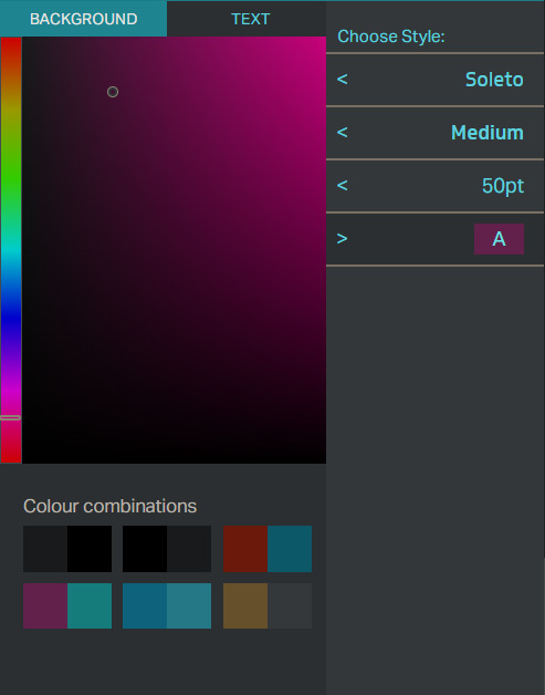
Oh, wow, would you look at that! One of their default color combinations is even basically the Eurowings scheme, though in reverse.

Well, this...doesn't look that bad, right? It's boring, but it doesn't actively make me wrinkle my nose.

So why is this such a problem? I mean, let's look at this picture of an airplane, as we do on this blog. I've chosen this picture because you can see a Finnair (post coming soon) plane in the background. Finnair has this neat spiky sci-fi looking wordmark, for which no typeface exists. This wordmark is absolutely huge, and in a very dark blue against white.
Meanwhile, Eurowings's logo is very similarly formatted to Lufthansa's. It's high up and closely spaced, making it feel a little claustrophobic. It's not...as bad as Lufthansa's proprietary Helvetica (Helvetica Neue Neue? Helvetica Ultra-Ultra-Condensed? Hellvetica?) but that's barely a compliment. Lufthansa has theirs well above the window-line all squished together, while Eurowings has the decency to use the windows as the underline you would think they're just perfect to be, but with a typeface that's medium weight, neither thick nor thin and with no italics or serifs, it becomes something of a small blob. To locate something that far up should be a stylistic choice. There should be no default choices in airline liveries. You can design a massive wordmark to cover the fuselage, or something which looks nice when localized to part of it, but you don't just get to do the equivalent of opening your text editor, typing in one word without indenting, and calling that a livery. Lufthansa doesn't get this, and neither, really, does any of the unfortunate airlines in the Lufthansa Group.
The color used doesn't blend into the white, but it also isn't like they're sharply contrasted. It just doesn't particularly draw your eye. It's a wordmark your eyes glide right over and it's not at all memorable. While grey or cyan could have been incorporated somehow to accentuate it, they weren't. For a livery that's mostly white to work, you generally need some sort of really vivid color. Kalitta Air's red and gold or Tibet Airlines' rainbow are examples of good use of a white fuselage. You could use a different background, but they stand on their own, and the white plays an active part in the color palette rather than just being a default canvas for it. Many airlines use black or dark blue for their wordmarks, and while these aren't the most creative choices they're used for a reason. Just look at Finnair. That's some contrast. It's nice and legible and distinct.
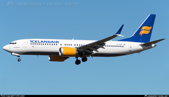

Icelandair's two most recent liveries use the same placement for their wordmark as Eurowings and Finnair respectively. Now, I actually like the wordmark on the old livery better. It has those nice trailing serifs and is in small caps, making it memorable and dynamic, and it doesn't feel closely spaced. The name 'Icelandair' teeters on the edge of being too long for this to work, but ultimately pulls it off. The modern livery dispenses with this much nicer font in favor of gigantic letters. While I like this less, it's still serviceable. It is gigantic, legible, and feels as natural as me sprawling out on a couch after work. It's simply expanded to its natural point. Adequately done on both archetypes.

Meanwhile, the lack of color contrast from the white fuselage was perhaps my main criticism of Air Astra's livery, which I otherwise quite like. It's probably the inverse of Eurowings, which is contrasted enough to be acceptable but entirely boring in design - well-designed, but please, please, please let me actually see it.

Eurowings just...well, I'm going to copy and paste exactly what I said earlier. There should be no default choices in airline liveries. You can design a massive wordmark to cover the fuselage, or something which looks nice when localized to part of it, but you don't just get to do the equivalent of opening your text editor, typing in one word without indenting, and calling that a livery.
And, as a final note, something that looks good on a webpage won't always look good on an airplane. The angles you'll see it from are completely different, it has to compete for the rest of the livery for your attention, and you can't necessarily put infinite space around it due to the very physically limited canvas you're working with. The Eurowings wordmark feels vertically cramped more than it does horizontally, because the windows are right below it and immediately above it the fuselage just...ends, from a two-dimensional view. Something looking okay in copy doesn't mean you can transfer it immediately to material.
Lindon Leader talked about this when discussing his design process for the FedEx logo in a very illuminating interview I cited heavily in my FedEx post. He looked at multiple pre-existing fonts but decided to create a custom one, and one of his reasons for this was:
[...] each had its potential limitations downstream in application to thousands of FedEx media, from waybills and embroidered courier caps to FedEx.com and massive signage for aircraft, buildings and vehicles.
Something can look acceptable or even sleek on a webpage, and that same wordmark can look downright horrible when applied to an airplane. I'll say this for FedEx - while I find their logo ugly it is absolutely good at what it needs to do. It looks no worse in any one medium or context than any other, and that's one of the reasons it's successful. It's not to my taste, but it's definitely well-designed, and I think one of the ways to improve the livery would actually be to somehow give it more real estate on the fuselage.

So the wordmark is, in my opinion, an abject failure. It's not even ugly but I mean that in the same way Wolfgang Pauli describes crackpot physics as not even wrong. Like, it's fine. It's nothing showstopping or even memorable enough to be picked out of an identity parade of default webfonts but I don't despise it. It's a common phenomenon and I'm picking on Eurowings because it's there and I know exactly what font was used and thus can mess around with it, not because it's the worst. Much like Lufthansa, it's an opportunistic victim. You know, the sort of post I'll end up hyperlinking to later, because even in its failure it's nothing exceptional.

I will say I enjoy the tiny outline of black on the letters. That's not on the wordmark proper, as rendered on their website m, but adding it was definitely the right move to help the magenta stand out from the white. Once you know about it you can notice how it makes the wordmark pop ever so slightly, turning an unmitigated catastrophe into a mitigated catastrophe. It's almost infuriating that they did this thoughtful little thing when you zoom out and remember what it's in service of. This honestly is a reoccurring thing with Eurowings.
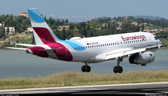
Look at that nice tail design! They could have slapped the logo on and left it at that, like so many other airlines, but they didn't. They use the same nice colors and the overlapping greys to create a design that is clearly their logo while also being abstract and dynamic. There's a lot of shapes, a lot of motion, and a lot of nice shades of cyan and magenta, and I love it!
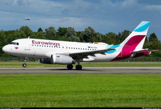
See that airplane landing in the background? Think about what airline you think it flies for, and stick a pin in that for a minute.
Hey, uh...where's the rest of it, though?
So, yes. Eurowings shares the first five letters of its name with Eurowhite. If you're not familiar with the term (I have a glossary, by the way) it just means a livery that is almost completely white save for logos. One could argue that the fact that the pattern on the tail isn't limited to strictly the tail and does form some sort of attempt at a fuselage design means that Eurowings' livery isn't 'true' Eurowhite, but I'm not going to brook that. Eurowhite is a state of mind. There is a nice, abstract design here which could easily be extended further. There is a grey shade which could be utilized (as it is on the engines, which look like they're lost and wandered onto another livery by accident) and there are infinite ideas to be had on the planet, and instead the majority of the plane is just white.
If one thing is thought of as my thesis from this post, let it be this, said for the third time: there is no such thing as default. Things like this wordmark placement, this type of font, and the primarily white fuselage are not default. The fact that they are common and boring does not make them inherent until replaced. They are still an active choice just as much as designing a livery that doesn't utilize these features is. It was proposed, iterated on, signed off on, and implemented. Airlines don't start with a template they then alter. They start with a vast world of infinite possibilities and decide they want to do the same thing as everyone else - that's a choice just how any other act of cowardice is a choice. I think the misconception that boring design is a result of inertia and lack of effort is a harmful one. It is a choice. They choose to do this.
They do not choose it because it is right for their livery, because they like it. They choose it because it is common, it is safe. It is reliable and it doesn't rock the boat. I've said this before discussing Southwest and Flair - low-cost carriers should be willing to rock the boat. If you're going to advertise yourself as the no-frills option you shouldn't try to look all composed and corporate. You have nothing to lose with being bright and pretty and interesting, so why aren't you?
And that cowardice is what makes me hate it so much. Some liveries are ugly, and some are almost ugly but stop halfway to cower in a Eurowhite bunker in an attempt to stem the bleeding, but there's nothing more tragic than a livery so afraid of being ugly that it cuts off and cauterizes something beautiful. The fear of ugliness is the death of beauty. condor is worth one billion Eurowings.
(No, Eurowings does not fail the Star Alliance Test, though.)
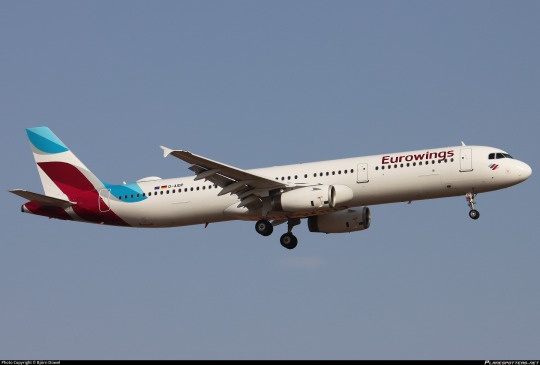
Like many of these designs that sort of just decide to stop after the tail, the longer a plane is the worse the Eurowings livery is on it. This is a very nice tail attached to a big white tube. Sure, Eurowings mostly operates somewhat short aircraft, but that wasn't the case when the livery was designed - back then they had A330s. Even now they have A321s.
Frustratingly, given how much I've ragged on this livery, I do still really like the tail. Even more frustratingly, you can see how easy it would have been to not have it be this way. The end of the cyan stripe almost begs to be held onto, weaved onto the rest of the fuselage, but it just isn't. It looks unfinished. It looks sad.


With all these shades of cyan and magenta to play with, the light heavily alters the way the colors on the tail look. They're never not pretty. It's a lovely colorscheme that's dramatically underutilized. The way it weaves together has so much potential, and it's attached to a white body. It looks like the paint job is unfinished. And that's what I hate the most about Eurowhite - good ideas left to languish, where a bit of custom letterhead does a better job of expressing your identity than an airplane livery.

The one feature Eurowings has towards the front of the plane is this little cheek decal of the Eurowings logo. Nice thought, but it almost looks actively worse when it stands out like that among an otherwise blank space. Plus, it's so small it might as well be a dot. It's cute, but in terms of overall effect on the livery it has the effect of making something mostly white look cluttered, which is just downright bizarre.

Obviously I can't endorse this. While not quite at the Lufthansa Line, with the actual bit of design happening on the tail instead of a sterile block, it doesn't cover much more fuselage than a proper exemplar of the phenomenon, and that's just always going to be a bit of a kneecap. Eurowhite is a state of mind, so much so that I almost think an unremarkable sans-serif font is as much of a codifying feature as a white body despite not being specified anywhere in the term. The same decision-making process leads both places, and the little black outline and cheek stamp and nice tail design just cant overpower that.
I'm giving Eurowings a D+.
Eurowings reminds me most of Saudia. They both have gorgeous colorschemes wasted on a design which burrows itself down as far into the substrate of artistic cowardice as physically possible. It's especially tragic and leaves me fighting myself over my final ratings. It feels wrong to grade such a gorgeous tail so harshly, but the good design features just make the bad package even more insulting. And at the end of the day I just have to put my foot down.
Sometimes I'm generous with grading because an airline is new, or because they're iterating on something that could be taken in a good direction. Eurowings isn't in the process of developing towards something nice, it's just Eurowings. It's an airline that stranded people in Cuba for 60 hours and Lufthansa seems to want it dead. I don't think we'll be getting a Eurowings livery overhaul anytime soon and I'm pessimistic about its longevity in general. Low-cost carriers and subsidiaries of large airlines are both easy come, easy go. Tears in the rain. 'Twas ever thus. Try not to get too attached.
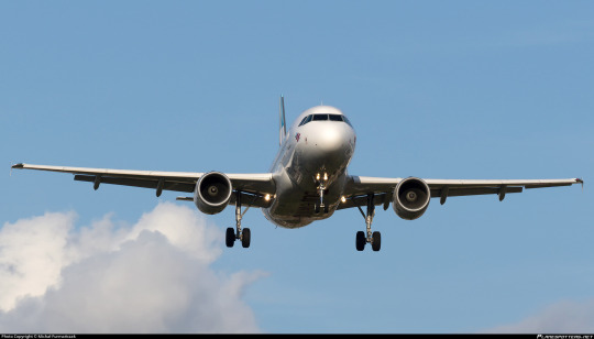
Remember that plane from earlier? Yeah, I've got no clue what airline it flies for, but I don't think I can rule out it being Eurowings. 'Twas ever thus.
#tarmac fashion week#grade: d+#era: 2010s#era: 2020s#region: west/central europe#region: germany#eurowings#low-cost carriers#lufthansa group#air astra#icelandair#lufthansa#tui#finnair
15 notes
·
View notes
Text

De Havilland Dash 8-Q400 Air Berlin operated by LGW – Luftfahrtgesellschaft Walter
Registration: D-ABQA Type: Dash 8-402Q Engines: 2 × PW PW150A Serial Number: 4223 First flight: Aug 25, 2008
Originally LGW was an independent provider of scheduled and chartered low-volume passenger flights. After years of cooperation with Air Berlin, it eventually became a subsidiary of Air Berlin in 2017. After the collapse of Air Berlin it was purchased by Lufthansa in October 2017 and became a unit of the group's low-cost carrier Eurowings. Air Berlin PLC & Co. Luftverkehrs KG, branded as airberlin or airberlin.com was a major German budget airline. It was headquartered in Berlin and had hubs at Berlin Tegel Airport and Düsseldorf Airport. It joined the Oneworld alliance in 2012.
Poster for Aviators. aviaposter.com
#BombardierAircraft#Dash8#Dash8Q400#Q400#QSeries#DeHavilland#TTail#turboprops#avgeek#aviation#airtransport
4 notes
·
View notes
Link
0 notes
Text
SWISS and Lufthansa among Europe's worst for punctuality
Swiss International Air Lines and its German parent company Lufthansa were neither punctual nor reliable this summer, according to a company that specialises in collecting compensation for customers. + Get the most important news from Switzerland in your inbox The German behemoth of the European skies is also one of the worst payers of regulatory compensation for flight delays or cancellations, according to a ranking published by the company Flightright. Only Turkish Airlines was even more reluctant to pay its dues, while Transavia France, Austrian Airlines, Air France and Discover Airlines tended to pay on time. Lufthansa's flight cancellation rate was 2.9%, compared with 2.6% for its Swiss subsidiary. The German conglomerate's subsidiaries occupy the three worst places in the ranking, with low-cost subsidiary Eurowings cancelling 3.1% of its flights. With almost 14,000 flights delayed out of a total of 32,222 scheduled, SWISS also took third place in a ranking measuring the worst ... https://www.swissinfo.ch/eng/multinational-companies/punctuality-swiss-and-lufthansa-among-europes-dunces-this-summer/87536552?utm_source=multiple&utm_campaign=swi-rss&utm_medium=rss&utm_content=o (Source of the original content)
0 notes
Text

airsLLide No. 12664: YL-BAL, Avro RJ70, Air Baltic, Geneva, March 8, 1997.
Given the small size of its home state Latvia, Air Baltic started small. It was founded in 1995 through a joint venture of the Latvian Govenrment and SAS Scandinavian Airlines. It began regional scheduled flights with three Saab 340 commuters in November 1995, and in January 1996, its first jets arrived in the form of three Avro RJ70s. The latter were also used on longer flights, such as the seasonal charter for ski tourists vacationing in the French Jura and the Swiss Alps mountains in the picture above.
Just for perspective: Since its early days, Air Baltic has grown pretty steadily: It evolved from the original six aircraft to a current fleet of roughly 50 Airbus A220-300 and a route network that not only covers all of Europe, but also spans as far as Dubai. Air Baltic furthermore offers seasonal and long-time ACMI services and flies a substantial number of its A220s on behalf of airlines such as Eurowings, SAS, or Swiss International, thereby generating quite risk-free revenue.
1 note
·
View note
Text
Manchester Airport welcomes new German route with Eurowings
Eurowings’ first flight from Manchester to Stuttgart took to the skies on the evening of 9 May 2024. The new route has been launched ahead of football’s Euro 2024 tournament in the summer and will be popular with fans heading to Germany to take in the action. Eurowings’ new service will run four times a week on Mondays, Thursdays, Fridays and Sundays using an Airbus A319. Stuttgart is the…

View On WordPress
0 notes
Text
0 notes
Text
0 notes
Text
Lufthansa Group stellt 8.000 Mitarbeitende ein

Die Lufthansa Group sucht weiterhin neue Mitarbeitende. Daher startete am 15. Mai 2023 die zweite deutschlandweite Rekrutierungs-Kampagne „flybig“. Zu sehen und zu hören ist die Kampagne in Print-, Radio- und Onlinemedien sowie auf allen Social-Media-Kanälen. Insgesamt plant das Unternehmen bis zum Jahresende noch 8.000 offene Stellen zu besetzen. Gesucht werden vor allem Fachkräfte wie Techniker:Innen, IT-Spezialist:Innen, Pilot:Innen oder Jurist:Innen an den Standorten Frankfurt, München, Zürich, Wien und Brüssel sowie bei Lufthansa Technik in Hamburg und an den Standorten der Eurowings Gruppe. Seit Anfang des Jahres wurden bereits mehr als 6.000 neue Beschäftigte in der Lufthansa Group eingestellt. Interessenten (m/w/d) finden auf lufthansagroup.careers Stellenangebote und weitere Informationen zu den Recruiting-Tagen. Auch für junge Menschen bietet die Lufthansa Group Perspektiven in vielfältigen Ausbildungsberufen und dualen Studiengängen. Die Lufthansa Group sucht neue Mitarbeitende. Bereits im laufenden Jahr hat der Konzern mehrere tausend Menschen „an Bord geholt“ - insgesamt plant die Lufthansa 20.000 Neueinstellungen. In mehr als 45 Berufen warten Aufgaben auf die künftigen Mitarbeitenden der Lufthansa Group. Gesucht werden vor allem noch Menschen in produktnahen und service-orientierten Bereichen an den Standorten Frankfurt, München, Zürich, Wien und Brüssel sowie an der Technik-Basis Hamburg und an den Standorten der Eurowings Gruppe. Insbesondere im Fokus stehen Techniker, IT-Spezialisten, Juristen, Piloten und Flugbegleiter (jeweils m/w/d). Auch für junge Menschen biete die Lufthansa Group Perspektiven in vielfältigen Ausbildungsberufen und dualen Studiengängen.

Grafik: Lufthansa Hier folgt der Stand des Beitrags vom November 2022: Die deutschlandweite Recruiting-Kampagne startete am 21. November 2022 mit insgesamt vier verschiedenen Motiven. Zu sehen und hören ist die Kampagne in Print- Radio- und Onlinemedien sowie auf allen Social-Media-Kanälen. Mit neuen Formaten ist der Bewerbungsprozess an die Bedürfnisse der Interessenten (m/w/d) angepasst worden, beispielsweise mit den bereits laufenden Bewerbertagen an den Lufthansa Drehkreuzen in Frankfurt und München. Hier kann die Zusage für den neuen Job noch am selben Tag erfolgen. „Wir zeigen deutlich: Die Lufthansa Group blickt voller Ambitionen in die Zukunft. Um an der Spitze der Branche zu stehen, brauchen wir engagierte und motivierte Mitarbeitende für vielfältige Aufgaben und Herausforderungen. Die Unternehmen der Lufthansa Group bieten Perspektiven für die Zukunft mit spannenden Jobangeboten. Menschen, Kulturen und Volkswirtschaften auf nachhaltige Weise zu verbinden ist unser Antrieb. Dafür brauchen wir Verstärkung. Wir haben noch viel vor!” Michael Niggemann, Personalvorstand und Arbeitsdirektor der Deutschen Lufthansa AG

Mitarbeiter gesucht. / Copyright Lufthansa Seit Sommer 2022 starten an der EFA nach der pandemiebedingten Pause wieder Kurse mit der zweijährigen Ausbildung zum Verkehrsflugzeugführer (m/w/d). Mit dem Neustart bekennt sich die Lufthansa Group weiterhin zur eigenen Ausbildung von Pilot:innen und sichert langfristig Nachwuchs und höchste Qualität für die Konzern-Airlines. Die ca. 24-monatige Ausbildung an der deutschen Flugschule erfolgt für den Theorieteil in Bremen und für die praktische Schulung an den Standorten in Phoenix/USA und Rostock-Laage. Mit einer Ausbildung an der European Flight Academy ist die Perspektive verbunden, in ein Cockpit der Lufthansa Group Airlines zu gelangen: Nach Abschluss der Schulung finden Absolvent:innen im Rahmen eines Campus-Modells Unterstützung bei der Bewerbung für neue Cockpitarbeitsplätze in der Lufthansa Group und werden dabei priorisiert gegenüber Bewerber:innen mit anderem Ausbildungshintergrund berücksichtigt. WERBUNG Günstig mit Lufthansa fliegen Billige Flüge in alle Welt
Wichtige Links für Bewerbungen:
Lufthansa Group Careers European Flight Academy www.career.aero/eurowings/ https://www.career.aero/sunexpress https://www.be-lufthansa.com/de Titelfoto / Ankunft erster Lufthansa Boeing 787 Dreamliner mit der Kennung D-ABPA in Frankfurt / Foto: Lufthansa / Oliver Roesler (Der Beitrag wurde erstmals 2016 veröffentlicht und wird seitdem aktualisiert.)
Auch interessant:
Read the full article
0 notes
Video
youtube
Lufthansa Eurowings Discover Business Class Flight Review (Marrakech - ...
0 notes
Text
0 notes
Text
Lufthansa IT Glitch: Germany's Air Traffic Control Diverts All Flights from Frankfurt
Lufthansa Group, which also includes subsidiaries such as Swiss International Air Lines and Eurowings, confirmed that the IT outage was caused by construction works in the Frankfurt region. source https://zeenews.india.com/aviation/lufthansa-it-glitch-germanys-air-traffic-control-diverts-all-flights-from-frankfurt-2573667.html
View On WordPress
0 notes
Text
'Undefined odor’ in cabin forces Eurowings flight to divert - AeroTime
0 notes
Text
WestJet has cancelled its flights between three Canadian cities and Europe for this summer. Previously, WestJet offered direct flights from Halifax to London Gatwick, Dublin, Glasgow, and Paris during the summer months.
WestJet's transatlantic service to Europe has also been suspended from Vancouver and Toronto. It's unclear what airports WestJet flies to in Europe from those two cities.
In a statement issued on Monday, the airline stated that the suspension was only temporary and that transatlantic service would resume in 2024.
A spokesperson for WestJet said the suspensions are due to "compounding factors such as staffing levels across the industry, inflation, and deploying our aircraft to meet the demand of our guests while enabling us to re-position our investments to better serve Canadians for years to come."
WestJet said tickets for the summer 2023 European routes from Halifax were never made available for sale.
The airline said it was planning to enhance service in Canada, including between Halifax and Western Canada.
In a statement to CBC News, Halifax Stanfield International Airport said it was "disappointed WestJet won't be back this summer… but we understand they are dealing with capacity challenges, not a lack of interest or support in serving this market."
The airport said it has year-round daily non-stop flights operated by Air Canada between Halifax and London Heathrow, the airport in the United Kingdom.
The airport said peak summer travel will be supported by additional flights between Halifax and Frankfurt offered by Condor and Eurowings Discover. The companies will each offer three non-stop, weekly flights.
The airport's statement said non-stop routes are critical for tourism and trade.
0 notes