#especially angles and anatomy I feel like I've gotten so much better with
Explore tagged Tumblr posts
Text


It's pretty fun to see how much my art has improved as of late ✨ (2019 vs 2023)
#showing the progress with t4t cuties!#especially angles and anatomy I feel like I've gotten so much better with#Mina Hakuba#Soma Cruz#Soma/Mina#Somina#Castlevania#Aria of Sorrow#art improvement#doodleboops
144 notes
·
View notes
Note
i wanna get better at art but dont know how to start ^^' whats a good way to get into studying anatomy and improving as an artist? tysm 💗 love your art soso much
more art converts 😼 yay!!
i think these asks were sent by different people but they're pretty related + a lot of my advice is the same! so i'll answer these together under the cut (it's so long oh gosh)
ok first of all i'm very flattered that people are asking me for art advice but i'm really not the most equipped person to ask TTOTT I've never been deliberately studious with my art so I feel bad offering advice when I've mostly gotten by with just drawing fanart and ocs a lot... my rate of improvement has therefore been slow, but I've still had an enjoyable learning experience so perhaps from that angle my input may help! i'll mainly refer you to external resources that have helped me
For anatomy + drawing humans:
1) I know I'm not diligent enough to sit down and study muscles, so instead I make it more enjoyable by drawing my favorite characters in a pose that targets the muscles I want to practice! (i default to drawing ppl naked because of this lol) This isn't the most efficient, but it serves as good motivation to get practice in. (honestly a lot of my general art advice has the undercurrent of becoming so obsessed with characters to drive your motivation to draw even when artblocked/ struggling with doubts!)
2) I want to refer you to Sinix's Anatomy playlist! Although Sinix focuses more on digital painting, he gives simplified anatomy breakdowns that include how muscles change shape under different movements/poses, which is crucial for natural human posing. the static anatomy diagrams from Google don't really help for that
3) What's just as important as anatomy is gestures! (especially important if you're used to drawing non-human objects I think!) Making figures look like they have flow to them will sell the "naturalness"(?) to your anatomy. If you have in person life drawing sessions accessible near you I'd recommend trying those out, or if you prefer trying it digitally there's this website!
This helps you not only get a sense of human proportions, but also natural posing! I'd limit the time taken to draw the poses from like 10 seconds to 1 minute(?) for quick gestures, and maybe 1 minute to 5mins(for now!! typically they go much longer) to study human proportions. I'd say don't spend a lot of time on them, repetition is more important!
4) I've also picked up on useful anatomy tidbits from artists online! Looking at how practiced/ professional artists stylize a body helps me focus on what the essential details are to convey a particular form (looking up "human muscles" and being hit with anatomy diagrams full of all the smallest details can be overwhelming! what do you even focus on?! so these educated simplifications really help me) Like Emilio Dekure's work! Look how simplified these figures are, and yet contain all the essential information to convey the sense of accurate form (even though it's highly exaggerated!)
(shamefully admits I've never studied from actual anatomy books so I can't recommend anything in that sense TTOTT)
For general improvement:
1) I highly recommend Sinix's Design Theory playlist and Paintover Pals! (+ his channel in general) You don't have to put them immediately into practice, but I think these are good fundamental lessons to just listen to and have them in the back of your mind to revisit another day. Plus these videos are just fun and very approachable! Design theory fundamentals are essential to creating appeal and directing a viewer's attention, and critiquing others' work/ seeing his suggestions are a good way to practice noticing areas of improvement+ solutions yourself!
2) If you prefer a more formal teaching resource, the Drawabox YouTube course covers all the basic fundamentals of drawing in short lessons. But honestly if I were starting out, this would be a little intimidating for me (and even now it still is! I haven't done all of them) But even if you don't watch them, the titles should give you an idea of the basic concepts that are valuable to pick up. I think it would be nice to keep in mind and revisit once in a while as you learn!
(One lesson I do encourage you to watch is the line control one! A confident continuous line conveys motion and flow much better compared to discontinuous frayed lines which I think is good to practice early by drawing from the wrist and shoulder)
3) As a universal piece of advice: Please please please use references! Use a reference for literally everything, observing is how we learn! You'll find that a lot of things you thought you knew what they looked like are inaccurate by memory alone. Also, trace! This is solely for your practice, tracing then freehanding has helped me grasp proportions when I was struggling! (of course don't post these online if you traced from art)
I've found that being able to compile references into easy to access boards has been very helpful in encouraging me to use references more. For PC, I think they use PureRef (free/pay what you want), and for iPad I use VizRef. VizRef is a one time purchase (which was definitely worth the $3.99 USD price imo)
4) On that note, try building up the habit to observe from media + real life and make purposeful comments about what you see! Like hey, when I bend my knee, the muscles/fat in my thighs and calves bulge outwards, I should draw that next time. Purposeful observation carries over to your overall visual library, and it's a little thing that adds up over time
5) For motivation, get into media you really enjoy, or make your own characters! The way I started art more seriously was by drawing fanart + OCs from anime that I liked ^^ For OCs it really encourages you to draw more because you're the primary creator of their art! Also you gotta see a lot of good art to make good art! Watching visually appealing media (like animation with appealing stylization/simplification) can passively help you learn just by observation.
ok wow I could go on but this is already a lot of information TTOTT my main aim for this reply is basically: don't let anything discourage you from learning to draw!! drawing is so fun and brings me a lot of joy ^^ practicing often will of course help you improve, and the way to incentivize that is by having fun with it! i hope this could help!💞
#my asks#art resources#trying to be concise n failing#i'm mainly worried that like. my art tips make me sound more skilled than my art actually is
68 notes
·
View notes
Text
ritchie’s🎃💀 ABCs of Horror Movie Marathon!! 💀🎃
Horror movie challenge prompted by @quintsmachete
Day Fifteen - O is for Old (2021)
I saw the beach that makes you old.
I don't think anyone in their right mind would go into this movie and expect anything good, unless they were completely unaware of the man behind it and hadn't even seen one of the trailers. I knew to expect stupidity, and stupidity is what I got, so I really don't have a right to complain here.
But not enough of my favourite movie critic youtubers have torn this movie a new one, so give me a minute.
This movie has some of the worst acting I've ever seen. The children were borderline jarring to witness after the performances of the child actors in Let The Right One In, but the adults really aren't much better. I'd argue the parents sounded twice as stilted with incredibly unnatural dialogue that had me both laughing and cringing. The family 'drama' also screams of a writing team where not a single member has ever met anyone who knows anyone who's gotten a divorce. As a child of divorce with two younger siblings, I always find poorly written families like this extremely funny.
The cinematography is nothing special, but there were two types of shots that were especially awful and funny. First is what I can only describe as David Cage style camera angles where nothing is really the focus, there's weird zooms and erratic camera movements, and it genuinely feels like a quick time event is about to happen. Second is extremely zoomed in shots behind the child characters' heads to obfuscate the fact that they've aged rapidly despite the fact that we can hear they sound older AND see that they're taller and their anatomy has changed (and that they're different actors now). I genuinely don't understand why Shyamalan thought the audience would find it shocking to see their faces five whole minutes after we were already told that they're older besides to drill it in for anyone not paying attention.
Speaking of aging, it makes no fucking sense. It doesn't have to make a lot of sense, but with a movie like this it's just begging you to fall into one of the numerous stupid plot holes instead of suspending your disbelief. Everyone ages rapidly but the adults barely change the entire time, particularly the black characters don't change at all, no one's hair or nails grow 'because they're dead cells', bodies decay almost instantly, a baby is born (I'll get to that.) but dies instantly from not receiving enough attention, somehow the cliffs surrounding the beach are rapidly aging everyone via magnets or some shit and trying to leave the beach makes everyone black out but they're just fine walking into it? I know there's more plot holes because I was questioning the movie at least once every five minutes but I didn't take notes and I'm not gonna rewatch it.
I should actually talk about the horror in this movie. There are a few elements that genuinely feel uncomfortable, but not all of them felt like good horror. The few elements that work are inherent to the premise; things even Shyamalan couldn't fuck up when adapting the original graphic novel. Some of the symptoms of rapid aging, like the exacerbation of disorders and impending death, were... occasionally handled well. But half the time, it just felt absurd, and absurdly dark to the point where it was just funny. Or really, really uncomfortable.
Okay. In Shyamalan's defence, two of the kids making a baby is in the source material. The girl going through all stages of pregnancy in like, an hour, is also in the source material. But that doesn't make it any less fucking weird and uncomfortable, and not even in a horror movie way. These kids were six years old about fifteen minutes of screen time ago, them even knowing that much about sex at all is kinda odd but everything that follows is just. I could've gone without ever seeing this shit if I'm being honest. And all that discomfort is almost immediately followed by the baby just, like, dying (it does not die in the novel). And it's wrapped in a blanket and just a bit later when it's moved we just hear bones rattling and ashes trickling out of the folds of the blanket, like... I feel bad, but I laughed. A lot. It's so fucking stupidly dark I couldn't even react any other way. There isn't even anything to mourn; we don't see the baby and I refuse to believe anyone watching this felt anything for any of the characters.
This movie is weird and gross and bad. And funny at times, but mostly bad. There's a twist ending that I saw coming a mile away because it feels like something Bethesda would write. What can I even say about it? It's stupid, polarizing, and as far as I can tell draws no inspiration from the source material whatsoever. It's also just the cherry on top of a fat fucking sundae of plot holes and shit that makes no fucking sense. I have more questions about the twist ending itself than the rest of the movie. I could ask them here but I don't think anyone actually reads these reviews besides one or two of my friends and it's 2:32am and I'm hungry.
I was gonna give this one dead baby out of five, but that seems a little too edgy even for me. And I don't think there's an emoji that can accurately depict a dead baby, so. Uh. This gets one age-inducing beach out of five I guess. 🏖️🗌🗌🗌🗌
Stupid fucking goddamn movie forreal. How the hell did Joe Rogan and Ben Shapiro even figure out how to get out of there by the way.
3 notes
·
View notes
Text
I am going to use this opportunity to infodump about my ideal g4 pony, but please know i mean this respectfully and im not just trying to be contrary, but this post comes back every once in a while and I've wanted to add to it for a while, especially since I've gotten more g4 toys myself
The funko pop vinyl MLP figures are accurate on a technical level... from a specific perspective, in their display poses and from their display direction.


They can't be show accurate in 3D because the animation of MLP:FIM breaks the rules of perspective a ton, especially in the face. They are "fake it til you make it"-ing the 3D perspective by making it look nice from one angle- which is my problem with like 75% of the original line of MLP:FIM toys anyways.

...and in addition to not having any poes, in my opinion most of their expressions look very blank. (maybe thats just because i hate the funko brand so much tho lol)
I really dislike the very literal interpretation of the MLP:fim style. It's best exemplified by this pinkie pie funko:

ive heard a lot of people give the original blind bag pinkie pie shit for looking "not show accurate" but to me, this is at least an actual interpretation of curly hair, not balloons:

Personally, I prefer to aim for a toy that doesn't follow a super literal interpretation of the show and because I'm more fond of the older sculpts I am interested in sculpting more detail into them, not less.


That's why I gave Twilight a more pronounced chin/separation between the chin and muzzle, a slightly larger body, and indents for the eyes-

IIRC none of the toys I could find even had indents for the eyes, which like, to me is just a sign of lazy manufacturing. If you don't have eye indents you don't have to line up the eye screening (which is why my Candace toy has messed up eyes... sigh)
Some of the later toys actually did get slightly larger muzzles and more dynamic poses, which I would have preferred, but I think their eyes look way too goofy on their perfectly round faces:

I do think the average Tempest looks better because of her large, more sculpted muzzle; I also generally prefer the Princesses because they have more detail too!
The pose in g1 MLP terms just refers to the mold, and I am particularly fond of them because the pose gave each pony more personality rather than just standing there:
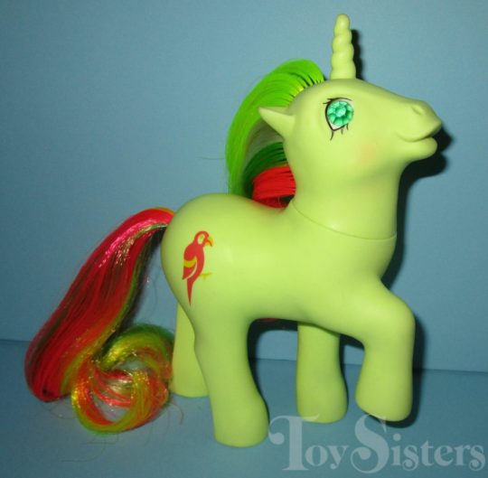
(Mimic Pose, which is what i based this Twilight off of)


I never liked the g4 poseable figures because I think their... "shoulder" and "knee" joints look way too wrong. On any other horse toy you can see why: that "shoulder" joint is technically two joints, the shoulder and elbow, while the middle one is the wrist.

Lauren faust is very good at adapting horse anatomy to a cartoon, its just the top of the shoulder doesn't appear in most 2D visuals- like in the original My Little Ponies, it blends in with the body
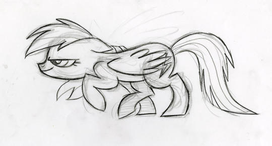
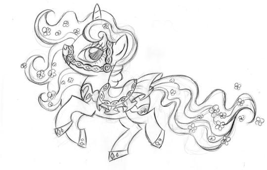
but the toy designer appears to have looked at the 2D visuals instead of considering how a horse looks, which to me produces. extremely ugly ponies. just my opinion, as someone who looks at too many horses, and horse toys. the animation and the 2D style can break the rules of physics, but breaking it too often leaves the result a jumbled mess.
now, is it presumptuous for me, a person who has been 3D modeling for a scant 2 years and has no professional experience or formal education to speak of, to say i think that a massive company full of talented designers did a poor job at interpreting this childrens toy? hm.

well in retrospect I would change the hoof and face to look more like the above (with the spiral horn, its just late and i dont feel like fixing it), and i would have the hair styled straight but i still think mines better
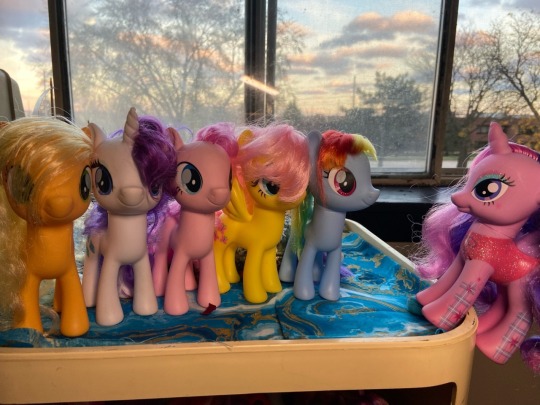
nobody tell my twilight sparkles, they'll feel worse than they already do.


My dream gen4 my little pony toy
The discourse has long since passed on this since MLP Gen 4 has been out for years, and now they have the g5 toys which are even worse, but anyways.
I think its a real shame they didn't make the g4 pony toys have like... any poses.
Lauren Faust has such a dynamic artstyle and I understand how it was hard to make into 3D but I refuse to believe this was the best they could do:
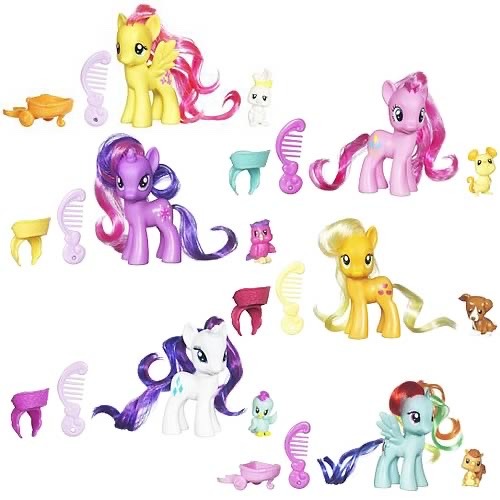
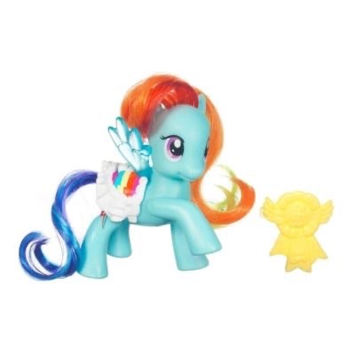
When theyre posed they have ugly little tube legs and no elbow. I think lauren fausts artstyle works with horses because she actually tool the time to look at horse anatomy and make it unique and stylized but these look so bad and not even very dynamic when they do do the poses but usually they dont do any poses at all.
#3d model#fanart#my little pony#long post#my partner went to bed an hour ago and i stayed awake doing this#hm#well#sorry i do really hate everything funko pop stands for#the devils company#i would really say that my response is “oops all caveats”#i dislike the my little pony toys with a deep and nuanced passion
563 notes
·
View notes
Text
Thumbnailing: Subject's Way
Thumbnails are an important workflow tool artists use to make creating their works more efficient. They are essentially tiny, low detail versions of the idea you may have in mind, and save time by helping you catch potential compositional errors, clashing colors in palettes(if you blob some colors on), and poses that simply might not.. work in character art as well as many other things not mentioned.
I am a very visual person and sometimes putting ideas to paper really helps me focus better on the task at hand. Organizing things into steps on the page really helps me not get overwhelmed. It might prove helpful to you as well.
In this tutorial, I'll take you through my workflow process when planning paintings and simple character illustrations.

I start off the process by doing a ton of sketches of whatever thing from many angles, poses, etc. Usually if I have a certain image in mine I simply sketch that and adjust little things like angle, placement of limbs, etc. Work teeny tiny, you can enlarge it later. I,t really depends on what the goal is for that piece what the process looks like. Here the goal was to just draw a character, so I have many options.
environment sketches look a bit different for me, as I will sketch them in literal cubes. I am still working through the technique. I just haven't gotten good enough at them yet to consider a tutorial by me would be helpful to anyone though.
Like with piece D, it's good to plan compositional elements here too. I added the moon that would go in the eventual background, swords in the hands of B and E, etc. Had I had more time, F would have gotten rough roses, but I digress.

After I have base sketches, I do very rough lines so I know what I'm looking at, and it primes me for what I could possibly have issues with in doing the final. I keep it VERY loose and don't dwell too much on details. If I'm drawing a character, I'm not even going to look up references, unless their silhouette is very complex. There is not much need for accuracy here. Just to nail down your subject's silhouette.
At this point, you can start eliminating which poses you don't want. Here I was very indecisive so I went through with sketching all of them.
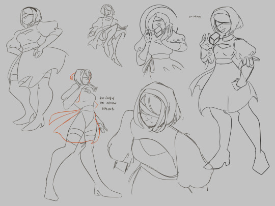
At this step ill also take the time to plan variants if I feel like I would be indecisive about them/need them for certain platforms (optional).

Here's where things start to actually take the form of thumbnails. I work large and draw most of the anatomy of the subject so that things are positioned correctly in the frame. Draw the whole of something, even if you know it's going to get cropped out. There is nothing worse than trying to draw in a way that is already cropped, it messes up your anatomy bad, and you'll spend more time trying to fix it, especially if you are just starting out as an artist.
Physically drawing a box around them to help with framing is really good to help plan the composition of the final piece. Again, you can eliminate stuff here as well if they don't make interesting compositions. Consider the rule of thirds and how much breathing room you want or need in your piece. The one not in a box was eliminated because I didn't like the pose nor would it make a very interesting piece.
I also use different colors on the boxes so I can overlap them and keep my eyes from getting confused where one "drawing" ends and one begins.

If I'm planning portraits/art in my painterly style, I'll take the time to block in some colors just to see what I should shoot for in the final. I will also do several pairings of colors in their own sets of thumbnails if the piece needs it/i want varients. I highly suggest blobbing so that you can see how potential colors will play with one another. Learning the teeniest bit of color theory will help, I promise, but for now, i'lI'lll refrain from the mini-lecture.

these three two (you'll see), I figured would make better cel-shaded/quicker pieces due to how zoomed out they are, any true details I would want to focus on don't exactly work for my current style faraway. Be sure to tailor compositions that suit your style. I will be keeping these sketch ideas for future reference.
It's important to remember that just because an idea doesn't get used in this piece, that doesn't mean it can't be used in a further piece down the road. I actually have a horrible habit of deleting my thumbnails after I'm done with them, but if I'm thumbnailing in a sketchbook? I find myself browsing back over them for future pieces to get some rough ideas of what could work later.
One last thing, you don't have to plan as many thumbnails as I did, but I do suggest at least 3 or 4 to really stretch your creativity.
Thumbnails also make for a good warm-up. If you're curious, I did the initial sketches in this order: A C E D B F. I think it helped me loosen up a bit, but you can be the judge of that.

I went back and tried another approach for a painting, but now I have the base for 3 paintings I could pursue, albeit rough, but it's good to learn how to paint like a sculptor, I digress.
That's all there is to it. the key is being clean enough to get the idea down, but rough enough to save time. work small, using basic shapes to create silhouettes. You can enlarge it later and use it as a base sketch.
Last two cents: I've also learned that sometimes if a piece is just not working, it's probably more than likely a compositional issue, anatomy, or perspective, Which is why thumbnailing can help you catch these issues early.
happy drawing :)
a/n: this is my first time really creating a tutorial. this might not be groundbreaking information for some of you and that's okay. this tutorial was initially created for someone in an art server I'm in on Discord, hence the slide-text-slide format. I have taken the images and text from that and compiled them here to make it easier to pick up the tips. I do not consider myself a pro on any of the things mentioned by any means, merely my take on it all. Get multiple sources, educate yourself, practice, and find what works for you. - Sub
#its not perfect#but i hope it helps#tutorial#composition#digital art#digital illustration#digital painting#reference#art tutorial#art#sketch#thumbnails#illustration#medibang paint#medibangpaint#digital drawing#drawing
21 notes
·
View notes