#environment deisgn
Explore tagged Tumblr posts
Text
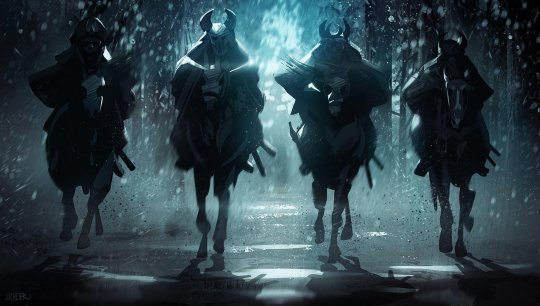
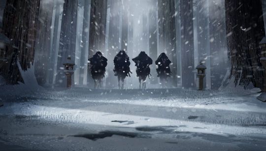




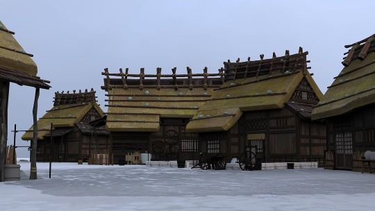

Blue Eye Samurai by Jason William Scheier
#jason william scheier#blue eye samurai#animation#action series#adventure series#concept art#keyframe#environment deisgn#artwork
307 notes
·
View notes
Text


Watched nezha reborn recently and though there were major pacing issues w the movie it was worth it bc of some kickass designs,,, or in other words decided to do pose practice and thought i cant not draw him
#new gods nezha reborn#sun wukong#nezha reborn#artings#mask#i have sooo many thoughts on how the movies pacing could be improved because as a whole the story itself works its just feels breakneck#a marathon on 2x speed where it feels more like chunks of scenes and like a bunch of video game cutscenes made into a movie#or just movie trailer footage put together#its too bad bc theres some really great scenes and fun ideas#and while some deisgns are lacking others make up for it#information is also just delivered in big chunks of exposition and noone ever really stops to just process#its just go go go go#again genuinly see so much potential and the environment deisgn is great just aughh
124 notes
·
View notes
Text
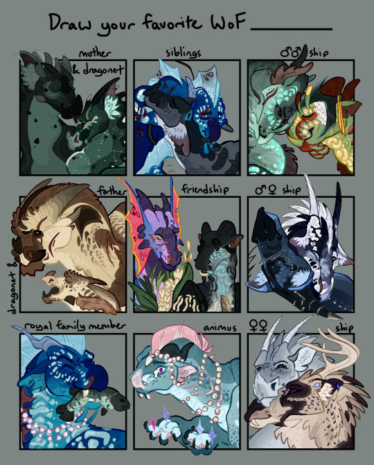
Decided to fill out a template from @/falling-skyzz I feel normal about . The dragons ! List of characters & design & dynamic thoughts under the cut <3
Also If anyone else fills out thus template feel free to send me the post,, I would love to see other people filling this out!!! I love templates !!
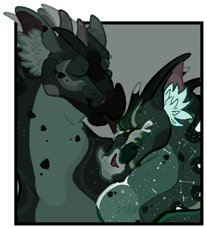
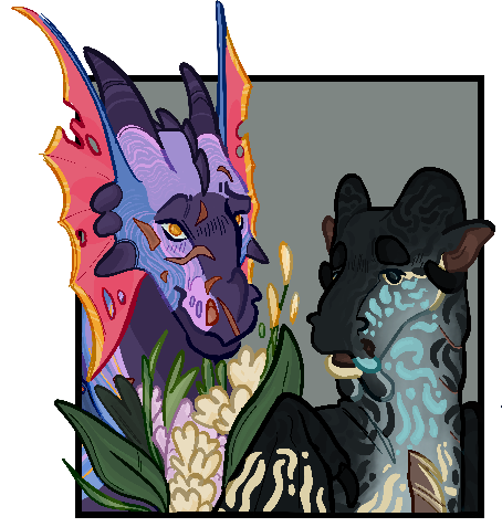
Secretkeeper & Moon • I understand theres a lot of reasonable hate for Secretkeeper but!!! I find her & moon to be a very fascinating pair! To make a long ass thought short, I think Secretkeeper is the embodiment of “product of her environment & deeply traumatize & projecting”. I think she genuinely really loves moon but obviously expresses that through being “”protective””. But I think shes genuinely a character with a capacity for change & realizing the autonomy Moon has over her own powers. Also from the perspective of Moon I think her arc around her relationship with her mom could be really interesting, especially as Secretkeepers authority becomes challenged in Moons life & she has to confront the bullshit her mother has put her through. Overall very very interesting pair I think about them a lot.
Design Note: Secretkeeper is duller in color than Moon & has less stars due to lack of moon light on the island! Also the scales around her mouth are almost completely black, making her mouth barely visible, giving her the name “Secretkeeper” as she “has no mouth to tell others secrets.”
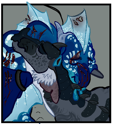
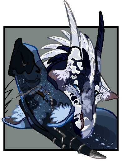
Tsunami & Starflight • Just one of my fav siblings! This specific illustration is from the Arena Scene in Dragonet Prophesy! I really really love Tsu & Starflights dynamic of looking up to eachother & their development together just. So neat!
Design Note: Starflight has very few constellation marks in this illustration as he hasnt spent much time under moonlight quite yet!
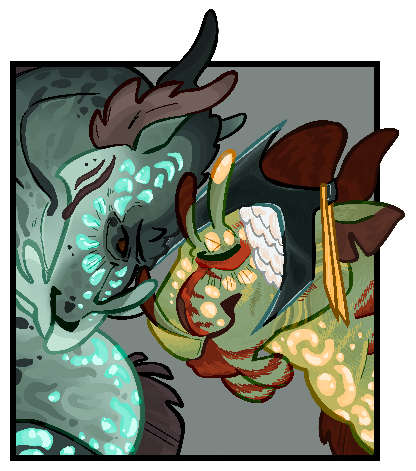
Shark & Abalone • One of my more out-there ships! I based this on the thought that Shark was once close with Abalone (cough. Husbands.) and that relates to why he was willing to give Tortoise a lunch-break from watching the eggs. He already saw someone close to him die from being overworked to watch the clutch, he didn’t want to watch another dragon die from his sisters selfishness. I could write an essay on these two I swear
Deisgn Note: Shark is based on a tiger shark & abalone is based on real abalones! hes one of my fav designs here
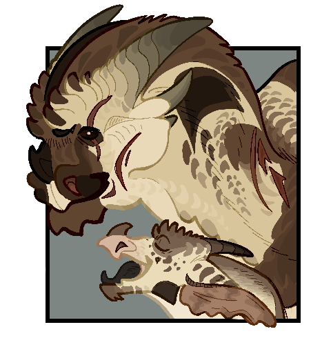
Six-Claws & Ostrich • He’s just a sweet dad! the little we see of him he seems to really love her & vice-versa <3 they’re just neat
Design Note: Six-Claws is based on a king cobra & is a specific sub-“species” of hooded Sandwings ! Burn found his hood mutation & six-claws super interesting
Tamarin & Pike • My fav background friendship! They’re just fun. I like Pike just chillin out around Tamarin & describing flower colors to her to the best of his ability (she just likes to hear him ramble about a shared interest)
Design Notes: I updated how I draw Tamarins eyes to properly resemble a blind-born dragon ! Also Pike’s deisgn got some yellow in it and I really like it <3
Whiteout & Thoughtful • I just think they’re neat!! They just seem like a sweet pair love them
Design Note: none really! Just experimenting with a rando Thoughtful design that I tossed together for my “ships tier list”
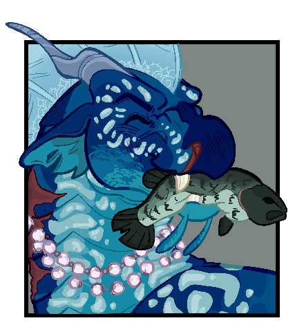
Tsunami • Its just her :) my fav dragon <3!!! I definitely dont think she upholds the “princess” title once she gets older, her only link to the throne is by Coral insisting monthly visits but Tsu otherwise wouldn’t be any interesting in royal life I would imagine
Design Note: Shes caught a waaururrghh something im going bonkers I cant remember what fish that is and my reference photo seems to have dissipated into the cosmos
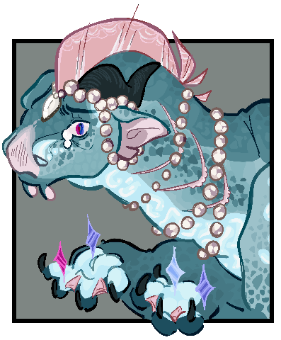
Anemone • I LOVE HER. SO MUCH ! Anemone haters BACK OFF!!!! Her relationship to her powers is so fucked man. Something you’d think would give her power & control is just a key by which others use to manipulate and abuse her like . Man :( shes literally never had any autonomy over her own identity & intermingled her powers into her identity So Much only for that aspect of herself to also be revealed to be a facade for someone else’s desires like. GUH I love her so much I hope shes having a good day I dont care what anyone says she deserves to be a brat and I support her for it
Design Note: none really! The stars in her talons are just metaphorical though
Snowflake & Snowfox • THE OGS!!!!!! MY FAVORITE PROBLEMATIC LESBIANS <3 Ahhh remember in the early days when they were considered the #1 most problematic ship because they were gay and also evil. I love the evil lesbians so much they’re so shitty sorry Darkstalker Snowfox should’ve been queen I would’ve loved to see that go down it’d be so silly
Design Notes: Snowfox is based on an arctic fox shedding into their summer coat!! I know its p . Away from canon descriptors of her but it was sm fun to illustrate so shhh <3 Snowflake is just grey & blueish per-canon but shes sooo fun. love her.
Okay thats all here are the individual illustrations now !!!!! Because why not !!! If these aren’t transparent its all over
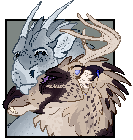
#if youre wondering why I haven’t linked the template it’s because it wont ! let me add a link for some reason! tumblr normal moments!#BUT GUH THIS BEAST IS FAINALLY BEHIND ME I dunno why this was so hard to work on#BUT IT WAS SUPER FUN <33#art#tideart#designin#WoF#Secretkeeper#Moonwatcher#Tsunami#Tsunami WoF#Starflight#Shark#Commander Shark#Abalone#Abalone wof#Six-Claws#Ostrich#Tamarin#Pike#Pike Wof#Thoughtful#Whiteout#Anemone#Snowflake#Snowfox
671 notes
·
View notes
Note
What's your alien design philosophy? What evolutionary laws do you heed?
Sorry I know I said I'd draw these but I was mostly referring to questions about the sophonts/world and not me XD I'm too boring to draw, and I'd just put this text in any drawing anyway, so here it is:
My main philosophy is make it believable enough for what you're going for.
Use suspension of disbelief, but with biology. You can spin together a hard realistic design, or make a deisgn that has enough believeable elements for someone to say yeah that thing can walk and be alive and do the things you say it does, and there's also a certain point you can cross where something just becomes impractical/not real looking. Like, there's a lot of ways you can draw a dragon, some of them more real to life than others. What way you choose to draw it depends on what dragon you want in your setting.
For me, I don't really have the knowledge to make anything crazy realistic but that's not what I'd want to do anyway because it takes some of the fun out of it for me. But I know enough that it still annoys me when something doesnt make sense or doesnt have an explanation, so instead I try and get close to something that'd "work"
This is based on the usual stuff, that you're referencing; there's limits to what's possible with nature (example, there's a lot of specific things that an animal needs to be able to fly, especially if theyre big.
I decided against true flight for Arasit because their transformation into a gliding adult stage of the Kixeli species happens after birth during their puberty.
The necessary chest, head, and limb adjustments (not to mention any internal stuff to help with their weight) that they'd have to develop basically out of nowhere would be too much in my unprofessional opinion, and it didnt make sense from anywhere else in their biology for them to just go into a cocoon and do this.
So instead I made them grow a little bit longer limbs with an altered pinky and elbow area, and keep everything else (other than a cartilagenous head fin) the same as their normal adult Kel counterparts.
Another "law" I guess is there is/should be a justification for everything a species has
(even if the justification is 'it looks cool'. If youre just keeping it at that, maybe come up with how it affects them. Adding realism from a social or cultural side can help make a setting more real even if the deisgn isn't super hard scifi. If youre giving them a crazy color scheme, what colors do they think are prettier? What colors are "masculine or feminine?" (if thats applicable), how do they think other peoples colors look like in comparison? Etc?
if you're going for more realistic, this can still be used if you want something there because a lot of weird features can be sexually selected, and you can just say that. are the colors there because theyre poisonous? Effectiveness for choosing a mate? What color spectrum can they see if these are the colors they have? Do they have different blood pigments that cause these colors or use any chemicals that we dont have to make themselves that color? Combining realistic social/culture with the physical can make for a very believable alien, but it's a spectrum.
even if you come up with a reason after the designing it part, it can retroactively lead to adding more things to their design or behavior (example with the Kixeli again, but I originally had no purpose for that opening by their eyes but kept it there because I wanted something in that space on their head. Now, it has a function as a salt removing gland that helped them in their ocean environment and as part of the hollow cavities in their beak area that keep it from being too heavy for them. )
Idk definitely look at da rules for how things work on earth but You're the one that's designing them. The possibilities are endless
#tldr knowing the rules helps especially if you want more realistic guys but you can make great things when ignoring them.#theyre aliens after all#hopefully this wasnt too long sorry
13 notes
·
View notes
Text
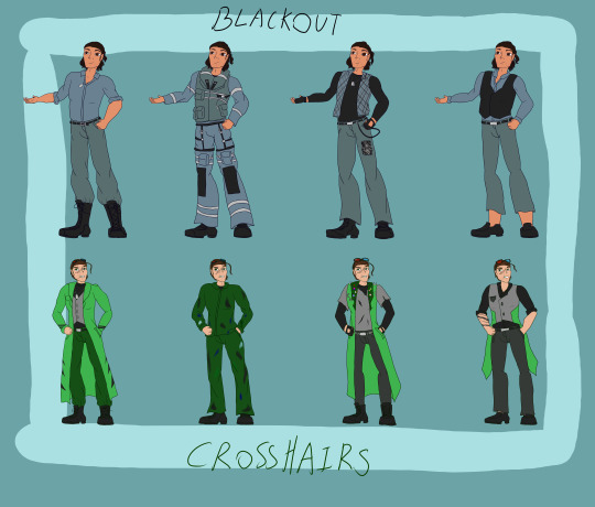
had a little fun and played with some fashion deisgn for 2 certain bois. Crosshairs and Blackout are my favorites of each faction in the bayverse. it was especially fun designing them for each occasion.
from left to right, first is their casual, then you got their human jobs (BLackout is a specilised Helicopter Pilot, Crosshairs is a weapons designer/Engineer), going out to places like a party, pub, or club, and then formal attire.
i had to take in account their culutral backgrounds and what the climate would be like and what they're use to.
My human Blackout Comes from Sparti/Sparta. so he would be use to a hotter environment. in his work uniform, he's all zipped up as he's not use to the cold of the altitude he flies to and because he usually is in hotter places. so he has less layers. also, greeks tend to dress smart casual so even in the clubbing attire he tries to aim for that ball park. he's not exactly dressed for the club or pub but still is out of that smart casual. My Crosshairs on the other hand strikes me as a punk who moved from a small town in Wales to Cardiff for work. so he's layered up as he would be more use to the cold. but his work would have him near machinery that runs hot so he's not very layered in his uniform. with the clubbing attire, he strikes me as someone who dresses in the UK punk style and embraces the culture and where it stands. he's got the flags of him, his wife (Loco Motion), and his two cousins (Fuselage and Roadbuster) as well as the autism red infinty symbol, enamle of the welsh red dragon, and the bisexuality pin. i dressed him like a guy you'd find in UK punk clubs just laughing at the bar and yapping. formal attire was a bit tricky for him because... well it's Crosshairs. but i still found a way to make it him
anyway. please enjoy
#malachite arts#maccadam#transformers#maccadams#bayformers#humanformers#tf bayverse#bayverse#bayverse crosshairs#bayverse transformers#crosshairs#tf crosshairs#tf blackout#transformers blackout
16 notes
·
View notes
Text
Research [Mars Attacks]
Mars Attacks is a movie where I go on a murderous rampage. Just kidding, I'm a pacifist. It's actually about aliens attacking earth and trying to kill everybody and it was made in 1996.

It's..certainly a movie. I can't be too harsh, this was made in the 90s. I didn't go to the cinema with the others to watch it so I'm only taking what I see from google and what I've heard about it, but it seemed kinda confusing. The alien deisgns aren't too bad though, I like the brains and how muscley/skeletal the aliens look.

I have no idea who this lady is but her hair is iconic. That's all I have to say.

The spaceship is good though, it's the most cliche spaceship saucer you could get but it's iconic in that sense. I like the claws, it's a simple way to have it land on the ground without floating. It also doesn't look really terrible compared to the environment around it.

From everything I've heard and seen, this movie seems like an alien fever dream. It would've been interesting to see, maybe I can catch it on my own some day. I heard the ending was bad though.
0 notes
Text
10 Reasons to Invest in Quality Commercial Kitchen Equipment
Do you have a food business, Catering service or restaurant owner? In the heart of all your operations to consistently deliver High-quality food to your consumers, you need to have High-quality commercial Kitchen Equipment for long-term cooking. Here are 10 reasons why you should invest in kitchen equipment.
Handles High Volume Tasks
A high-performance oven that cooks food evenly in a fraction of the time or a powerful mixer that can handle large batches of dough, the right equipment can significantly boost your kitchen's productivity." time is money," holds especially true in the fast-paced environment of a commercial kitchen. A kitchen that rinks like a well-oiled machine maximizes output and profit.
Consistency in Quality
Your customers expect the same great taste of food every time they visit our restaurant. High-quality commercial Kitchen Equipment by Shiv Shakti delivers reliable performance in cooking maintaining flame quality, and perseverance of flavour and textures which ultimately leads to a better dining experience.
Withstand Busy Kitchen Works
Cheaper, lower-quality equipment may seem like a cost-saving option at first, but it often breaks down more frequently and wears out faster, leading to higher replacement costs over time. Investing in durable, high-quality kitchen equipment means you’re getting appliances that are built to withstand the rigours of a busy kitchen. These products are designed to last, reducing the frequency of repairs and replacements.
Durable
These Kitchen appliances are designed to withstand the rigorous demands of a busy kitchen, which can include everything from high temperatures to constant use and cleaning. A well-made oven, for example, can serve you for over a decade, whereas cheaper models may fail after just a few years. This longevity not only saves you money on replacements but also reduces downtime in your kitchen. Commercial-grade appliances are designed to handle heavy loads, whether it's a large batch of baked goods or a high volume of orders.
Consumes Less Power
kitchen appliances for restaurants are often designed with energy efficiency in mind, consuming less power and water while still delivering top-notch performance. using energy-efficient appliances can also reduce your business’s environmental footprint, contributing to sustainability efforts and potentially appealing to eco-conscious customers. Over time, the savings on utility bills can add up, making the initial investment in high-quality, energy-efficient equipment a financially savvy decision for Fodd business owners.
Fewer Kitchen Hazards
30% Kitchen accidents like burns, slips, liquid haards, happen now and then , in order to avoid it high-quality fryers may include features like automatic shut-off systems to prevent overheating or fires. Similarly, well-designed ventilation systems can help reduce the risk of respiratory issues by efficiently removing smoke and fumes from the kitchen.By investing in safe, reliable equipment, you not only protect your staff but also avoid potential legal issues and insurance claims related to kitchen accidents.
Easy Cleaning
Shiv Shakti Kitchen Equipments manufactrer and supplier for commercial kitchen are deisgned in ways with features like removable parts and accessible components. This not only reduces the time and effort required to keep your kitchen running smoothly but also extends the lifespan of your equipment. Additionally, many manufacturers of premium kitchen equipment offer robust customer support and service plans, making it easier to address any issues that do arise.
Food safety
Failing to comply with regulations can result in costly fines and damage to your reputation. High-quality commercial kitchen equipment for Restaurant often comes with advanced features that help you maintain the highest standards of food safety. For instance, refrigerators and freezers with precise temperature controls ensure that perishable items are stored safely, reducing the risk of foodborne illnesses. Similarly, advanced cooking equipment can help ensure that foods are cooked to the appropriate temperatures, further safeguarding your customers’ health.
Cost Saving
As mentioned earlier, durable equipment reduces the need for frequent replacements, and energy-efficient equipment with energy stars has lower utility bills. Additionally, reliable equipment minimizes downtime, ensuring that your kitchen can operate at full capacity without costly interruptions. When you factor in these long-term savings in order to flourish your business.
Conclusion
investing in quality commercial kitchen equipment is a wise decision for any food service establishment. The benefits extend far beyond the initial cost, impacting everything from kitchen efficiency and food quality to staff morale and long-term savings. By prioritizing high-quality equipment, you set your business up for success in a competitive industry. Remember, the heart of your kitchen is its equipment, and choosing wisely will pay dividends in the years to come. Whether you're starting a new venture or upgrading your existing kitchen, consider the long-term implications of your investment, and ensure that you are equipped to meet the demands of your culinary Business.
0 notes
Text
Title: Enhancing Digital Presence: Unveiling Website Designing Services in Delhi
In the bustling and competitive landscape of the digital world, a strong online presence is crucial for businesses seeking success. One of the key elements that contribute to this presence is a well-designed and user-friendly website. In the heart of India's dynamic business environment, Delhi stands out as a hub of innovation and growth. Recognizing the importance of a captivating online presence, numerous Website Designing Services in Delhi have emerged, catering to the diverse needs of businesses.
Link: [Website Designing Services in Delhi](Website Design Services in Delhi, Web Deisgning Services in Delhi, Website Designing Services in Delhi)
In a city where innovation and technology converge, businesses are continually seeking ways to stand out. A professionally designed website is often the first interaction a potential customer has with a business, making it a critical component of the marketing strategy. With an array of Website Designing Services in Delhi, businesses can choose from a variety of solutions that align with their brand identity and goals.
Link: [Website Designing Services in Delhi](Website Design Services in Delhi, Web Deisgning Services in Delhi, Website Designing Services in Delhi)
User experience (UX) plays a pivotal role in determining the success of a website. A seamless and intuitive design can keep visitors engaged and encourage them to explore further. Website designing services in Delhi prioritize creating websites that not only look aesthetically pleasing but also provide a user-friendly experience. These services employ cutting-edge technologies and design principles to ensure that businesses leave a lasting impression on their online visitors.
Link: [Website Designing Services in Delhi](Website Design Services in Delhi, Web Deisgning Services in Delhi, Website Designing Services in Delhi)
As the digital landscape evolves, the importance of mobile responsiveness cannot be overstated. With a significant portion of internet users accessing websites through mobile devices, responsive design is a necessity. Website Designing Services in Delhi understand this shift and focus on creating websites that adapt seamlessly to various screen sizes, ensuring a consistent and enjoyable experience for all users.
Link: [Website Designing Services in Delhi](Website Design Services in Delhi, Web Deisgning Services in Delhi, Website Designing Services in Delhi)
Search Engine Optimization (SEO) is another crucial aspect that cannot be ignored in the digital age. A well-designed website should not only appeal to users but also be easily discoverable by search engines. Website designing services in Delhi often integrate SEO best practices into the design process, enhancing the visibility of businesses on search engine results pages and driving organic traffic.
Link: [Website Designing Services in Delhi](Website Design Services in Delhi, Web Deisgning Services in Delhi, Website Designing Services in Delhi)
In a city teeming with diverse businesses, customization becomes a key factor in website design. The needs of each business are unique, and Website Designing Services in Delhi recognize this diversity. Tailoring solutions to meet the specific requirements of a business ensures that the website becomes a true reflection of its brand, fostering a connection with its target audience.
Link: [Website Designing Services in Delhi](Website Design Services in Delhi, Web Deisgning Services in Delhi, Website Designing Services in Delhi)
The digital realm is ever-evolving, and staying ahead requires constant innovation. Website Designing Services in Delhi not only focus on current trends but also anticipate future developments. By adopting the latest technologies and design trends, these services ensure that businesses have websites that are not only visually appealing today but also equipped to adapt to the changing digital landscape.
Link: [Website Designing Services in Delhi](Website Design Services in Delhi, Web Deisgning Services in Delhi, Website Designing Services in Delhi)
In conclusion, the significance of professional website design in Delhi cannot be overstated. In a city that thrives on innovation and technology, businesses must invest in a strong online presence to remain competitive. Website Designing Services in Delhi play a crucial role in this journey, offering tailored solutions that elevate a business's digital identity and pave the way for success in the digital age.
Link: [Website Designing Services in Delhi](Website Design Services in Delhi, Web Deisgning Services in Delhi, Website Designing Services in Delhi)
0 notes
Text
Five Design has swiftly emerged as a leading provider of website design services in delhi. With a commitment to pushing creative boundaries, the company has gained rapid recognition for its exceptional design solutions and forward-thinking approach. At Five Design, a dedication to creativity and excellence is at the heart of its operations. The company is known for fostering an environment that encourages its creative teams to explore new ideas and push the boundaries of conventional design
0 notes
Text
Top-notch office interior designers in Ahmedabad - Officebanao
Discover your ideal office environment with an office interior designer in ahmedabad. Look no further than Officebanao! Our team is equipped with the skills and dedication to craft innovative office interior deisgn.
0 notes
Text

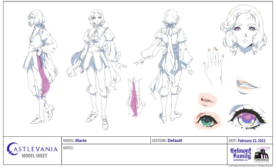
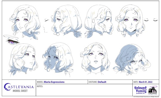


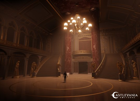
Castlevania: Nocturne
Artist: Katie S / Mark Adams
#katie s#mark adams#castlevania nocturne#castlevania#animation#concept art#character design#environment deisgn#artwork
189 notes
·
View notes
Photo
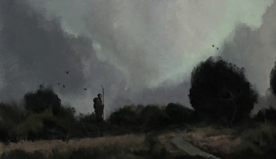
- Patreon - Deviant Art - Artstation - Twitch - Youtube -
#speed painting#illustration#digital art#fantasy art#digital painting#game deisgn#game art#fantasy#drawing#painting#art#artwork#artist on tumblr#artists on tumblr#photoshop#landscape#environment#concept#scenery#justdraw#adventure#birds#matte painting
65 notes
·
View notes
Text
Environment in human design
Caves were first communal. Cave has one entrance. Themes of fear, security are present here. People who need an office, rather than to work in open environment. Caves people control the environment- they let people in their space. They are indoor people.
4 notes
·
View notes
Text
where the heart is
a domestic syllabus [x]
"lecture on the history of the house" by claire schwartz
poem by american poet claire schwartz, published in poetry magazine and her 2022 collection civil service.
"the house. from cellar to garret. the significance of the hut" by gaston bachelard
the opening chapter to bachelard's seminal work the poetics of space. bachelard theorizes that the house's role as a site of reverie lends it a profound influence on the psyche. coining his own term, topoanalysis, to explore this influence; he surveys different poetic images of houses as representations of mind and soul.
the bedroom: an intimate history by michelle perrot, trans. by lauren elkin
french historian michelle perrot's history of the western bedroom as the site of birth, sex, illness, and death; from the ancient greek kamára to the postmodern bedrooms of today. perrot traces developments in the bedrooms of royalty, families, laborers, women, children, recluses, monks, and travelers. see also "black in bed" by art historian ella ray on the legacy of black bed art and "the bedroom of things" by caitlin blanchfield and farzin lotfi-jam for a discussion of private space through digital images.
rooms by rohan mcdonald
animated short film by illustrator rohan mcdonald featuring interviews with participants about their rooms and homes.
never home alone: from microbes to millipedes, camel crickets, and honeybees, the natural history of where we live by rob dunn
book by biologist rob dunn about the nearly 200,000 other species that live in our homes, from welcome pets to reviled pests. dunn's work researching the ecosystems of houses has illuminated the sheer scope of creatures that thrive there, often unbeknownst to both inhabitants and scientists, as well as the benefits of a biodiverse household.
"human stains" by heather havrilesky
author and "ask polly" columnist heather havrilesky on the endlessness of housework and "the strange gift that laundry brings to our lives."
the midcentury kitchen: america's favorite room from workspace to dreamscape, 1940s-1970s by sarah archer
a visual history of american kitchens, using examples of advertising and deisgn photography to show the evolution of their aesthetics, technology, and cultural ideals. see also sarah archer's episode of you're wrong about on martha stewart.
"full spectrum" and "if these walls could talk, listen, and record" by emily anthes
excerpts from the great indoors by science journalist emily anthes, which investigates the intersections of health and design in indoor spaces. "full spectrum" (republished by next city as "everyone has a basic right to good design") follows an apartment complex designed for autistic adults. "if these walls could talk, listen, and record" (republished by slate as "senior care homes are becoming high-tech medical devices") reports on the promise and limitations of smart home technology for the elderly.
"inside out, or interior space" by rebecca solnit
essay from rebecca solnit's collection of work on place, the encyclopedia of trouble and spaciousness. solnit discusses the pursuit of the "dream home" through decoration and renovation, examining our desire to craft the perfect nest.
windowswap by sonali ranjit and vaishnav balasubramaniam
a collaborative online database of user-submitted videos shot from windows around the world. conceived as a way to "travel" during early phases of the covid-19 pandemic, visitors can shuffle through videos to experience the views from homes in a plethora of different environments.
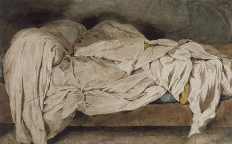
#syllabi#this is another one that could have gone on and on!#cover image is unmade bed by eugene delacroix
688 notes
·
View notes
Text
Rings of Power: Episodes 1 & 2
I honestly couldn’t find it in me to simply sit through it as if I wasn’t compiling a mental checklist of all of the offences. And the offences are many. It’s just my first watch so I’m sure I missed a lot of finer details. It’s hard comparing certain things to anything because it’s all just made up by the showrunners and the timeline is at this point irrelevant because this whole thing is some weird AU.
I also mostly don’t comment on the acting because although it’s of exceptionally inconsistent quality from actor to actor, and it’s obvious that some of them have not managed to get into character, I find more fault with the writing. Had the writing been better I’m sure that the actors’ deliveries would have felt more natural. With that said...
Episode 1:
Even the opening scenes of baby Galadriel playing with other children like a bunch of little gremlins who appear of accurate age to their physical development doesn’t sit right with me. Elves mature much slower than Humans physically, but develop much faster mentally. According to The Nature of Middle-earth they reach puberty only at over 200 years old. Which means that an Elven child that looks 7 might instead be over 100 years old and has lived for what would be for a Human a whole lifetime or more. To portray Elven children as comparable to Humans in their speech and manners is absurd.
In the first few minutes of the episode Galadriel is portrayed consecutively by two actresses whose accents are cardinally different and it stands out.
The timeline is such a disaster, that much is obvious before the first 10 minutes.
Galadriel’s history lesson in the beginning could have had a much better effect if they took any notes from the prologue to The Fellowship of the Ring. Controlling the pace and emphasis, even modifying Cate Blanchett’s voice achieved an effect that has been carved into our minds permanently. Morfydd Clark’s delivery falls face first into mud. It’s just dull, monotone and unfeeling.
Obvious makeup. Very meh.
I honestly think the use of this weird font to mark location on screen looks really cheap and like as if their graphics department couldn’t find the original font so they just used the papyrus one instead. Like what is that? (I know I’m a design snob but seriously.)
The dialogue is just stiff, awkward and unelegant.
The fight scene with the troll is just terrible. Galadriel singlehandedly takes down a massive troll with almost no help and without a hair out of place. Complete with entirely unnecessary sword flourishes. It’s embarrassing to watch honestly. Seems also like Galadriel’s entire company is purely decorative as she does all the fighting, is always right and does everything on her own while others try to keep up with her. Mary Sue down to a T.
The Harfoots are a travesty. Irish cosplay, but make it primitive. The moment you take a closer look at their setup it’s hard to believe they’re nomadic. So much seems decorative, rather than functional to them. And that’s before we get to the characters. They’re just made to look pointedly primitive.
They’ve also deisgned the Lindon set without being able to decide whether it’s fall or summer. Because it’s both at the same time. It’s seemingly fall where they walk among yellow trees (canonically there are NO mellyrn outside of Lorien; Gil-Galad had the seeds, but none grew in Lindon) and on layers of fallen, yellowed leaves. At the same time the surrounding hills are in full greenery as are all the other plants surrounding them. Like there’s no biological consistency to the living environment and the result is that Elves almost look removed from nature, rather than in utter harmony with their environment as they’re meant to be.
And what the hell is it with those Roman civic crowns everywhere.
The dialogue is... it’s to Tolkien what Aliexpress is to haute couture.
And speaking of the costumes. Aliexpress sale bin.
They’re importing present-day social issues into Middle-earth as if it didn’t have enough of to go around already. On top of that it feels forced and shoehorned, which it didn’t have to be if they had chosen to make the xenophobia contextually authentic to Middle-earth. Like fear of the unknown peoples and lands, which wouldn’t be much of a stretch. Rather than synthesising anti-Elf racism to show how one black Elf in particular is the victim of this, as if this then wouldn’t apply to all the other Elves somehow. So is it about the ears or is it about his skin color because there are no other black Elves on record and none appear in the series besides him? Make it make sense.
The short hair on Elven men is so weird. WTF is this? The Witcher?
Also the way Galadriel’s memory of her conversation with her brother is overlayed the scene feels terrible because the audio is too similar to those speaking on screen and there’s not enough of an echo or some other sound effct to distinguish it. So it sounds like director’s commentary.
They are all way too unphased by a giant fireball falling from the skies. Plus the way everything is on fire, but somehow his loincloth is unharmed. Right. There would have been so many other ways of dealing with that for the sake of modesty which would have been a lot less laughable.
Episode 2:
The Harfoots are supposed to be way more archaic than their Hobbit descendants. And they are made to look the part visually, but their dialogue has been bothering me since the beginning because it’s way more contemporary than that of Hobbits in LOTR, and it stood out since episode 1. It’s only stylized to the extent of using ‘unrefined’ language so to speak. The manner of speaking doesn’t feel authentic to bygone times. And neither does their acting, manners etc. Which again makes it feel even more like Irish cosplay.
Looking at the set decorations in Eregion reveals that apparently they just went thrift-shopping in Camden market or something. It’s more of an eclectic mix of 19th century European furniture and neo-styles with some accent decorations from Italy and Morocco than anything I’d associate with Elves of any Age. It’s not even Art Nouveau and Arts & Crafts dominant. And I swear one of those lanterns is painted plastic and not even made of metal. WTF is this Disneyland giftshop shit? I’m not seeing the millions in anything but VFX.
All of the Dwarven costumes are a massive downgrade. I feel like all of the effort was put into prosthetic noses and that’s the extent of it. Meanwhile the culture is shown to be brutish above everything else, to the point that it makes me question how they could possibly create such fine things. There’s a major disconnect there.
Plus this one sure feels like Scottish cosplay. Remember groundskeeper Willie from The Simposons. Yeah.
Also I feel like everything to do with Durin is essentially everything criticized about the Hobbit trilogy and more. Plus this domestic scenery (which is pulled out of their asses) completely breaks the decorum characteristic to Tolkien. It’s just awkward to watch.
The breaking of decorum gets its own bulltepoint. Because it’s just that big of an offence. Would Elrond really call a Dwarven princess by her first name even though they just met? Really?
With all the gold, mithril and jewels under the mountains. And they still made Disa’s jewelry out of old hubcaps.
Galadriel still remains a foot too short. She’s towered over by literally everyone and she’s supposed to be the TALLEST WOMAN IN ALL OF ARDA.
#Rings of Power#The Lord of the Rings: The Rings of Power#Game of Rings#anti Rings of Power#lotrrop#it's basically a lame parody
320 notes
·
View notes
Text
Sarah Nicollier - Interior Designer Algarve
Our home is one of the most important places in our lives. It's where we gather with family and friends and where we relax after a long day. Similarly our holiday home is a place where we go to relax when we need to get away from it all; our "home from home".
Many believe that employing the services of an interior designer to create the perfect environment for us to relax when on holiday is worth every penny.
An expert design team will work with you to create the perfect space; taking into account your lifestyle and needs, as well as the aesthetic style that will make your holiday home feel like an extension of who you are.
If your holiday home is in Portugal´s Algarve, the good news is that there is an interior designer with international experience on hand to help you achieve your deisgn goals.
If you're looking for someone who can help you create the perfect space, look no further than Sarah Nicollier Interiors Lda.; an experienced group of professionals who have been in the business of interior design for many years, and who know how important the comfort of your Algarve holiday home is to you. Whether you're looking to redesign your entire house or just one room, Sarah Nicollier can help.
Sarah´s focus is to help you transform your home by applying a personalised blend of concept drivers: functional, aesthetic and emotional. You might think that this process is all about making big changes, but just as often it can be about making small adjustments to your current space, like changing out some throw pillows or adding some plants.
Her collaborative approach to Algarve interior design will make the process of improving your holiday home easy and pleasurable. Having worked on projects across the country Sarah and her team understand that each client has different needs and preferences. Hr goal is to provide you with the highest quality service possible, so that you can rest easy knowing you will be happy with the results.
If you own a property in the Algarve region of Portugal, in the resorts of Quinta do Lago, Almancil, Vilamoura, Vale do Lobo, Albufeira or Algarve's Golden Triangle, Visit Sarah now at: https://www.sarahnicollieruk.com/
#interior design#interiordesigner#interiordesign#algarve#portugal#quinta do lago#vale do lobo#interior designer algarve#vilamoura#almancil#interiordesignalgarve#sarah nicollier
48 notes
·
View notes