#emojireviews
Explore tagged Tumblr posts
Text
🪴 Potted plant emoji review 🪴

Apple: This plant grows gracefully in this beige pot made out of terracotta. The textures of the soil are harmonizing beautifully and so are the green shades of green of the leafs! 8.5/10 Maybe they are a baby.

Google: Planted in a red round pot, this emoji shows a different type of plant, which honestly is a nice breath of fresh air. 7/10

Samsung: I think the colour scheme works fairly well in this type of plant! Could use some water to grown them more and more. The pot is shaded confusingly, like it’s going back and forth, left to right. 7/10 love the amount of leafs.

Microsoft: I won’t hate these buddies. It reminds of a Children book. Do you know the kind of books our teachers used to give for vacation? This emoji is just as nostalgic as them. I think it’s a fairly simple sprout. 5/10

WhatsApp: Curious fact: I have dumbcanes at my house. I absolutely adore this emoji. Because the details are on point and the shading is just incredible. I have heard they are slightly toxic, which creeps me a little bit. 10/10 amazing emoji.

Twitter: Frankly. I love the shades of green that are manipulated to create this emoji. The cell shading makes me feel so-so but sometimes, you got to agree that some simple emojis can look really nice. 7/10 Google’s Look-alike?

Facebook: This emoji is absolutely ADORABLE. They are shaped like hearts. I would give this plant to my SO. These are blessed and I hope they grow until they become an absolutely SHOCKING tree. 11/10 For the win.

Twitter emoji stickers: love the pot’s texture. It looks like a generic 3d model that’s been used on Nintendo switch video games. These are cute and I hope they grow amazingly. 9/10 Love the shading and the smooth feelings.

Joypixels: Sure, there were emojis with a LOT of leafs, but this one took it a little too much. Anyways what’s bad about it? I think the stem is a little gross (I don’t mean disgusting) I like the shape of the leafs as they feel smooth and classy. 7/10 Would put these on my granny’s backyard.

TossFace: A little baby sprout! This is so cute. 2/10 Everything else is a little…. Uh?
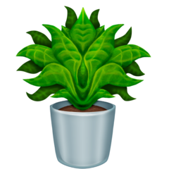
Emojipedia: I feel like I have to say a lot of Emojipedia emojis since there are so many problems about them that it sort of annoys me since a lot of them look distorted versions of apple emojis. The plant is weirdly simetrical. It’s honestly a little scary because maybe this cursed plant came from a parallel world that every plant grows differently. The details on the leaf are weird, because the lines are a bit too thick. The center bugs me A LOT. It’s disturbing and dark. It’s like a leaf monster that haunts you at your garden at midnight. The pot is looking shiny, but is weirdly placed. 4/10 the soil is ok though.

Openmoji: A tiny palm tree? 2/10 because it’s as bad as TossFace.
thank you! 💗
Save our 🌍 and 🪴🌲
#Emoji review#emoji#plant#pot#cute#emojireviews#emojis#fyp#tumblr fyp#fypシ゚viral#Love#amazing#wonderful#niche#plants#trees#flowers
49 notes
·
View notes
Text
emoji review 1 - shit
ah the shit emoji
sometimes they ask ‘’hey what about the shit?’’ consistency. lets see.
apple

a simple wankey. does not look that real. 8/10.
android

CREEPY FACE
its staring onto my soul. god dang..
take your 6/10 and quit creeping me out
samsung

looks a bit similar than apple, but worse. the eyes, the pink mouth, the shading... 7.7/10 atleast its not small
microsoft

worse than samsung. cell eyes, outline, linear shading, everything is bad.
4/10 the haircut is more meh
twitter

a classic! needs more detail, but im ok with the wide-open smile. 9/10 better simple than shaded
whatsapp

i thought google would be creepy.
BUT THIS IS A ULTIMATE CRYPTID
ITS STARING ONTO MY SOUL
????????????????????????????????????????/10
facebook

DO YOU REALLY HAVE TO CREEP IN EYES ???
TOO SHADED FOR ME 1/10
openmoji

wHAT IS TH IS???!!!!!!!!!!!!!!11111111
-759873985739857493759347593475983475983759837/10
emojidex
i think its gonna be bad

I WAS RIGHT
-4/10 SICKLY
gmail (its a gif so)

this cuts the crap by removing the face and adding insects. WTF IS WITH IT
-3/10
im gonna hit the image limit
htc, lg

read gmail, but no insects. -1/10

wtf is happening
1/10
and the winner is

TWITTER! WITH 9 POINTS
16 notes
·
View notes
Text
🌠 Shooting Star Review
Okay, starting off strong, let’s review the Shooting Star emoji.

Interesting border, makes it look kind of like a stamp. Trail looks nice, shows the motion of the star. Fits with all the other Apple stamp-like emojis. 6/10.

Barely any detail. At least it has a border and a trail and shows where it’s going, but it could have used a space background or something. You can do better than that, Google. 2/10.

Although this one doesn’t have a background, the mini star effects and black outline, plus the large color pallet (star is yellow, and the trail is 3 shades of blue plus a sort of pink color) gives it some major detail. 8/10.

This one has a space background and a nice trail, but the strange 3D effect on the general emoji along with the weird sea-star shape of the star makes it look unrealistic and ugly. 2/10.

Seems like they copied off of Apple a little, with the stamp design and general look, but it looks nice. The trail gives it an extra level of detail and the slight outline of the star makes it cute and something I would use. 8.5/10.

The blue might actually be worse than no background. The star effect doesn’t even glow or is transparent at all. The star has no detail, not even an outline. 0/10.

Space background has a nice gradient applied that centers the focus on the star. Trail adds a lot, and the shape of the trail gives it some nice depth perception and angle, showing where the star came from. 8/10.
33 notes
·
View notes
Text
Heart Emoji
Apple

This emoji has a nice shape and the gradients don’t look overdone. However, the outline is a different colour from the emoji and that’s kinda disturbing. Overall, a good emoji. 9/10
Google

I don’t like the shape and the colour is more maroon than red, but the gradient looks cool; if a little unrealistic. 6/10
Microsoft

It kinda looks like a video game heart. I appreciate the style and Microsoft black outline looks pretty good with this emoji. The shading is not working though. 7.5/10
Samsung

A lot like Apple’s but second-hand. The shading is not on point and the shape doesn’t match the style. I’m disappointed. 6/10
WhatsApp

Not the biggest fan of the shape but it’s cute. 7/10
Twitter

What is this. 1/10
Facebook

This looks like those hearts that teddy bears hold. It just looks tacky though I like that there is no border. 4/10
#emoji #emojireview #lmao #apple #android #samsung #google #tumblr #firstpost
1 note
·
View note
Text
Samsung Galaxy Note 9: an AR Emojireview
Samsung Galaxy Note 9: an AR Emojireview
Hi, I wrote a 3K word review of the new Samsung Galaxy Note 9. But you’re busy and it’s the weekend. I get it. For the sake of saving time, here’s a distilled version, narrated by the magic of the company’s deeply troubling AR Emoji version of me.
Design
Battery
Camera
Audio/Visual
Bixby
Price
Anyway, just read the damn review. I promise there’s only one of these creepy things in it.
Sourc…
View On WordPress
0 notes
Text
Samsung Galaxy Note 9: an AR Emojireview
Hi, I wrote a 3K word review of the new Samsung Galaxy Note 9. But you’re busy and it’s the weekend. I get it. For the sake of saving time, here’s a distilled version, narrated by the magic of the company’s deeply troubling AR Emoji version of me. Design Battery Camera Audio/Visual Bixby Price Anyway, …
Continue reading "Samsung Galaxy Note 9: an AR Emojireview"
from Blogger https://ift.tt/2P5Nqy6 via IFTTT
0 notes
Text
All 🤤 pro😇emoji🤠subs🙂 via /r/emojipasta
All 🤤 pro😇emoji🤠subs🙂
r/Emoji
r/emojiairforce
r/EmojiArmy
r/EmojiArtist
r/EmojiArtists
r/Emojibunker
r/emojic
r/emojicentral
r/emojicest
r/emojicopypasta
r/emojidefenders
r/emojielite
r/emojiextremists
r/Emojiglyphs
r/Emojigood
r/EmojiHangout
r/Emojiheads
r/EmojiHQ
r/emojilang
r/EmojiLiberationArmy
r/EmojiLivesMatter
r/EmojiMafia
r/EmojiMashup
r/emojinews
r/EmojiNinjas
r/Emojiops
r/Emojioverlords
r/emojipasta
r/EmojiPastaSimulator
r/emojipenis
r/EmojiPolicePolice
r/emojiresistance
r/EmojiReview
r/EmojiRiddles
r/Emojiriot
r/emojiROFL
r/emojiroleplay
r/Emojis
r/Emojisafeheaven
r/EmojiSquad
r/emojit
r/EmojiTexts
r/EmojiVote
r/EmojiWorldPeace
r/Emoji_Battles
r/Emoji_Family
r/Emoji_Mafia
Submitted May 09, 2020 at 07:47AM by anonymouthrowaway via reddit https://ift.tt/3bdbtVy
0 notes
Text
Samsung Galaxy Note 9: an AR Emojireview
Samsung Galaxy Note 9: an AR Emojireview
Hi, I wrote a 3k word review of the brand-new Samsung star system Note 9. But you’re busy and it’s the weekend. I get it. For the sake of saving moment, here’s a distilled model, narrated by the supernatural of the company’s deeply troubling AR Emoji model of me.
Design
Battery
Camera
Audio/Visual
Bixby
Price
Anyway, just read the damn review. I promise there’s only one of these creepy…
View On WordPress
0 notes
Photo

Samsung Galaxy Note 9: an AR Emojireview https://ift.tt/2nxjttX
0 notes
Link
Hi, I wrote a 3K word review of the new Samsung Galaxy Note 9. But you’re busy and it’s the weekend. I get it. For the sake of saving time, here’s a distilled version, narrated by the magic of the company’s deeply troubling AR Emoji version of me.
Design
Battery
Camera
Audio/Visual
Bixby
Price
Anyway, just read the damn review. I promise there’s only one of these creepy things in it.
from TechCrunch https://ift.tt/2MArbP3
0 notes
Text
🪐 Ringed planet emoji review 🪐
(I’m not a scientist, I just like Saturn)
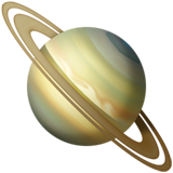
Apple: So here we have Apple’s take on a ringed planet which resembles saturn because of the hexagon. it’s tilted a little wrong. You can see the details on it’s surface and the ring is nicely distributed. 9/10 Strong.

Google: The tilt on this one is more accurate. It looks simplistic, which works fine. I see the hexagon. The color of the rings shouldn’t be that blue. 7/10 Reminds me of my first Saturn drawing.
Samsung: Again, the tilt is pleasant. it’s decently shaded. It needs more coloring as the color scheme is very repetitive and boring. The rings don’t look separated enough for me, even though I like their aesthetic. No hexagon. Pixelated 6/10 Because it’s not as bad.

Microsoft: I can see they wanted to make an adapted simple version of Saturn, which is a nice idea. The execution looks too off. Can you add more rings please? Random colors on the surface. Bad tilt. 1/10 You can see me after work.
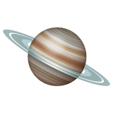
WhatsApp: now, that’s a good ring! I love the surface although the tilt should be different. It looks shiny, like a marble. 9/10 You did a good job.

Twitter: Yikes. I can be the only one who thinks this could smell like cheese. Too saturated for my tastes. The rings are lazily done. 2/10 Ok tilt though.
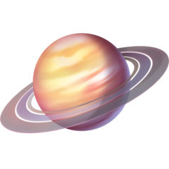
Facebook: Tries too hard to make it super detailed that it looks harsh. The surface is pretty. Doesn’t look much like Saturn, but it looks nice. The rings could be more separated. The tilt is good. 7.5/10 Could be an exoplanet similar to Saturn.

Skype: See? Another simple Saturn like Twitter and Microsoft. Please. Change. The. Colors. 3/10 Good tilt and ring though.
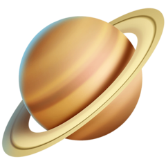
Twitter emoji stickers: It reminds me of blender renders. I like the rings and how 3d it looks. The shading and details are good and the surface is nicely done. It reminds me of my current Saturn drawing. Off tilt. 8/10 I like the shadows

Joypixels: Cutest colors. The tilt is a little off. The rings are distributed nicely and is that the hexagon? I think it could be a good idea to erase the grey space between the rings. 7/10 doesn’t look that bad actually

TossFace: You just drew a purple circle and added a lilac ring. Do better. 0/10 sorry, but no.

PS5-4: This could look decent if not too pixelated. It’s a little sad. 3/10 the tilt looks nice but please fix the graphics.

Openmoji: Actually, the cell shading makes the colors pop. Doesn’t look like Saturn though. 2/10 Adding a red ball won’t make this emoji a masterpiece.
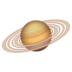
Emojipedia: I love how realistic the surface looks. I think the main purpose of this emoji is to make it classy and elegant. The planet itself lacks an hexagon though. It’s got a lot of rings, which is a nice idea but they are too close. I like the shading. I don’t mind the tilt in this one. 8/10 I see you tried.
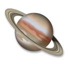
LG: It looks more like Jupiter than Saturn. The rings are good but it’s a better idea to make the surface different. 5/10 Pitty points.
Thank you!
Saturn is so aesthetic 🪐
#Emojireview#emoji#emojireviews#emojiratings#emojirating#Saturn#space#science#planets#aesthetic#tumblr fyp#emojis#ringedplanet
40 notes
·
View notes
Text
emoji reviews 2: plunger
so i decided to review plunger emojis while apple is going shopping
so
android

the ‘’red skin that i dont know the name of’’ means that bright red is good for a plunger! 8/10
samsung

at first i thought this was emojidex but why IS IT BROWN.
4/10
twitter

does this remind me of android but without shading, but its a bit glossy ik bro
7/10
joypixels

its brownish which reminds me of emojidex or samsung
3.5/10 in a disgusting situation
openmoji

seems like openmoji sure likes to plunge mini carpets. am i right? also the outline sucks. 1/10
emojipedia

DO I HAVE TO SEE THE SICKLY SHADING ALONG WITH THE GROSS ‘’YELLOWISH RED’’ CUP. THIS IS THE RESULT WHEN YOU STUCKED A STICK IN THE BOTTOM OF A BOWL. -4/10
im disappointed
the winner is google with 8 points

twitter is a runner up with 7 points

well that concludes episode 2 of emoji reviews
3 notes
·
View notes
Link
Hi, I wrote a 3K word review of the new Samsung Galaxy Note 9. But you’re busy and it’s the weekend. I get it. For the sake of saving time, here’s a distilled version, narrated by the magic of the company’s deeply troubling AR Emoji version of me.
Design
Battery
Camera
Audio/Visual
Bixby
Price
Anyway, just read the damn review. I promise there’s only one of these creepy things in it.
Source link
The post Samsung Galaxy Note 9: an AR Emojireview appeared first on Fadsmedia.
0 notes