#dr ph martins watercolor
Explore tagged Tumblr posts
Text


☆ Shops: Etsy │Ko-fi
☆ Tips: Ko-Fi - All my new art is posted here first, any tip, commission or shop orders grant you access to that art early!
☆ Commissions: Ko-fi │ Etsy [ Commissions are open on a revolving basis I tend to only accept 2 commissions at a time, when those are complete I re-open them ]
Mini Painting [Pokemon] │ Mini Sculptures │Sketch/Watercolor
Other places to find me:
Twitter(inactive) │ IG (Inactive) │ Blusky │ Cara
Craft Blog @zuccninis │ Sketch Blog @squashni
Miscellaneous info below (Mediums, Contact, etc):
Mediums: I'm a traditional artist and my main medium is watercolor.
I'm not being paid to promote any specific brand, if your looking to start out use what is accessible and affordable to you! With that said here is what I use:
Watercolor: Renesans Half pans, Holbein watercolor tubes, Winsor & Newton Professional, and Daniel Smith Extra Fine Watercolor.
Watercolor inks: Dr. Ph Martins Radiant Concentrated watercolor and Ecoline Liquid Water Colour (These are why some of my watercolor pieces are so vibrant.)
Brushes: 0.5, 1 & 2 Foldable travel watercolor brushes, and those waterfilled brushes.
Paper: Fabriano Hot Pressed Watercolor paper, I usually bind these into my own books.
Other Mediums: Microns, Prismacolor Color Pencils, Posca Wax pastels, Paint markers, Tombow water based markers, Ballpoint pens, Acryla Gouache, and Crayola crayons.
If you are looking to get into watercolor my best advice is to invest in actual watercolor paper. For watercolor the most important thing is the paper, nice paper can make even crayola look beautiful. 300 Gsm is ideal.
For Mini Paintings:
Liquitex Acrylic Gouache and Golden SoFlat Acrylics
Mini Canvases (3x3in)
Mini Easels (5in)
Clear Gesso
Small paintbrushes, brand does not matter I tend to buy whatever is tiny and is a reasonable price. I use Synthetic brushes.
It should be noted that I do scan in all my artwork, I use a epson perfection v370, I've had this scanner for years and it works pretty well, you just need to mess around with the settings. I edit all my art in Clip Studio Paint to remove any lint or dust and to fix up colors.
[Traditional art can be pretty expensive so I recommend if your looking to try any medium to buy a little bit at a time and buy things piecemeal.]
Other Info:
Business Contact: [email protected] [Don't send me unsolicited trash]
If you wish to contact me for other matters most of my DM's are closed, Best places to contact me is Etsy for order issues, or Ko-Fi. (Don't ask me for my Discord that's for friends only.)
If You see my art getting reposted/re-uploaded, report it, the only accounts I post on are included above. Anywhere else I'm being impersonated. Please don't support low quality repost accounts that steal art from actual artists. Many times these accounts screw over actual artists since they love to monetize and sell stolen work.
I schedule posts on here on all my accounts! Schedule is Mon-Wed-Friday on Zuccnini, Bonus posts/Reblogs are Tues-Thurs and Saturday-Sunday.
Dont tag my OC / Original Character art with "pokemon" or any other fandom tags, This is NOT a pokemon blog this is my illustration blog.
As for Fanart: People are free to draw and commission art of my OCs, feel free to tag me in it! I do ask no nsfw without my permission.
That's most of the info I can think to include for this.
-
Extra-Curricular art:
[18+ Obviously]
nsfw twitter │ NSFW Bluesky
246 notes
·
View notes
Text
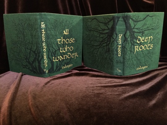


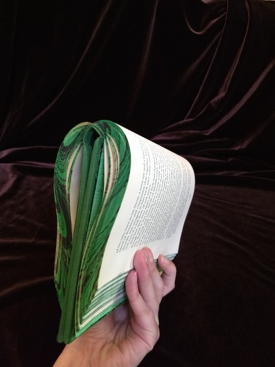
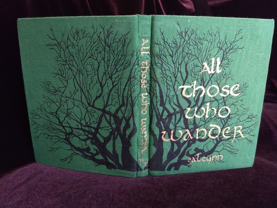
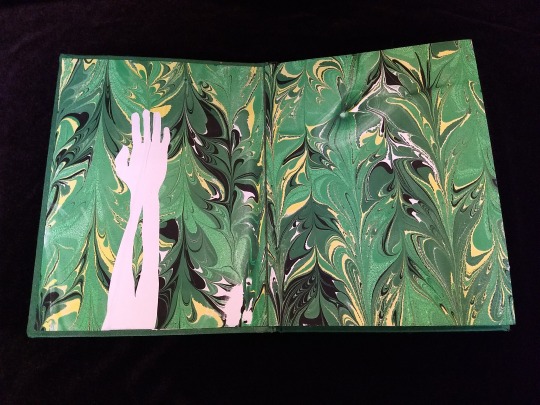
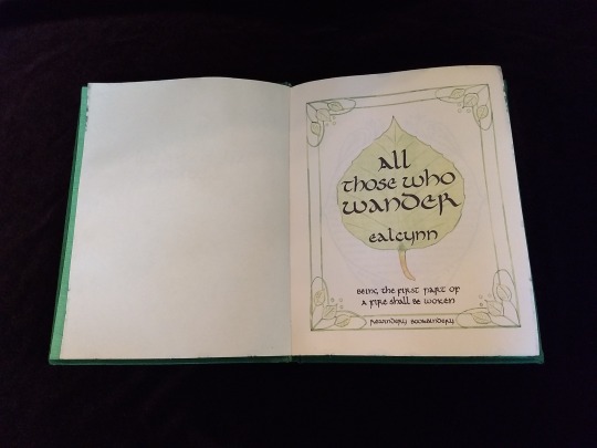
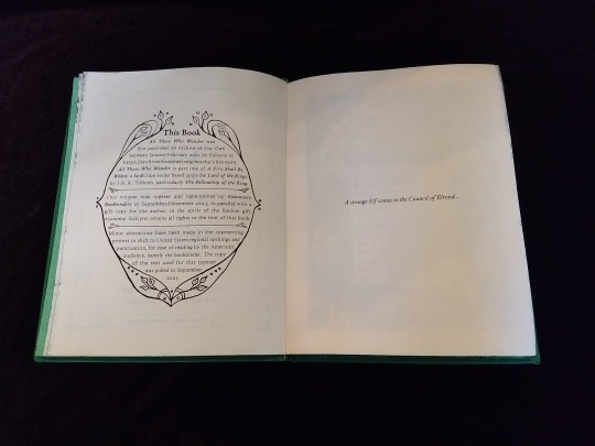

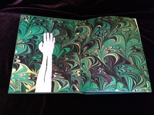
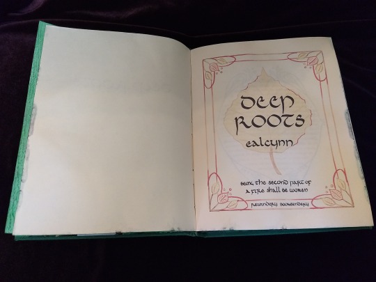
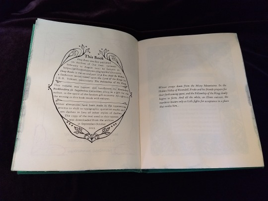
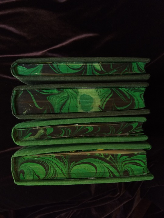


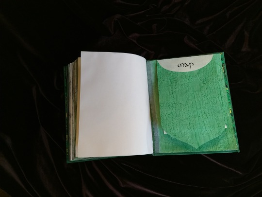

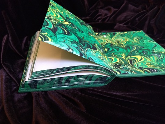

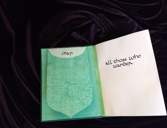

A Fire Shall Be Woken, by Ealcynn. A pair of bindings using the K118 structure, one as a gift for the author and one to keep.
Chapter page illustrations are by Alphonse Mucha, all other illustrations are hand-drawn.
I hope to make a long post later explaining the process in more depth & another to document all my mistakes, but here's the basics.
New techniques learned: Paper marbling, edge marbling, uncial calligraphy, making paste papers, drawing on bookcloth, making paste-filled cloth, fold-out maps
I began work on this project in early September and am completing the finishing touches this week.
Structures:
Binding: K118 tightback
Endpapers: Simple cloth-joined endpapers
Map fold: Turkish map fold
Materials:
Sewing supports: linen tapes
Thread: 30/3 linen thread
Spine lining: Medium weight kozo tissue bonded to linen fabric
Interior paper: Hammermill Ivory, 11x17, hand-cut to 8.5x11
Endpapers: Blick sulphite paper hand-marbled, with masked stenciled silhouettes created with freezer paper
Adhesives: Jade PVA, wheat starch paste, wheat flour paste
Covers: Davey board, laminated full thickness to half thickness
Cover fabric: Studio E shot cottons in Jungle and Emerald; filled with wheat starch paste
Cover decorations: Speedball india ink and Dr. Ph. Martin's calligraphy ink in Copperplate Gold
Inks for maps and illustrations: Speedball black india ink and a selection of watercolors thickened with gum arabic
Dip pens used for calligraphy: Combination of Brause calligraphy nibs and Leonardt tape nibs
Dip pens used for illustration: Nikko G pointed pen nib
Typesetting:
Typesetting program: Scribus 1.5.5
Body font: Coelacanth in 10 pt caption weight
Headings, titles, chapter titles, drop caps: Hand lettered uncial calligraphy, scanned
Illustrations and References:
Frames on colophon, copyright, author's notes and title page: Hand drawn, with inspiration taken from the vellucent bindings of Cedric Chivers
Frames that illustrate each chapter start: Alphonse Mucha from Cloches de Noël et de Pâques
Cover illustrations: Referenced from a photograph of an European beech tree found on iNaturalist.org
Maps of Imladris: Hand drafted with inspiration from the maps of Barbara Strachey, and Daniel Reeve
Map of Eriador: Traced from a map by Karen Wynn Fonstad, with edits made to coordinate with the geography of the fic
Frames on maps: Referenced from a drawing by Alphonse Mucha that @zhalfirin found for me
Special Thank Yous:
To the tightback council of problem-solvers in the Renegade server: Zhalfirin, Eka, @spockandawe who helped figure out many issues with the structure and technique
To the marbling experts in the Renegade server: Marissa, Aether, AGlance, Jenny, Catz, Badgertide, Rhi, and everyone else who helped me figure out beginnner marbling
To Spock for finding the K118 structure and introducing it to the server!
And to Bruce Levy, who discovered the method and shared his discoveries freely with the bookbinding and conservation world.
#bookbinding#Fanbinding#mine#bookbinding adventures#thank you to everyone i consider this a group effort#it has been 10000 years and I have loved every step#except for sanding. nasty nasty sanding. ew.#fic recs
242 notes
·
View notes
Note
ur paint set up is sick. is it one thing or is it a separate easel and table?
thx! its a cup easel & a manfrotto tripod. ive really been enjoying this set up
heres all my travel watercolor stuff laid out
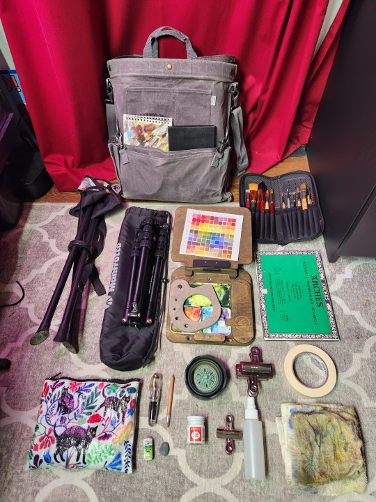
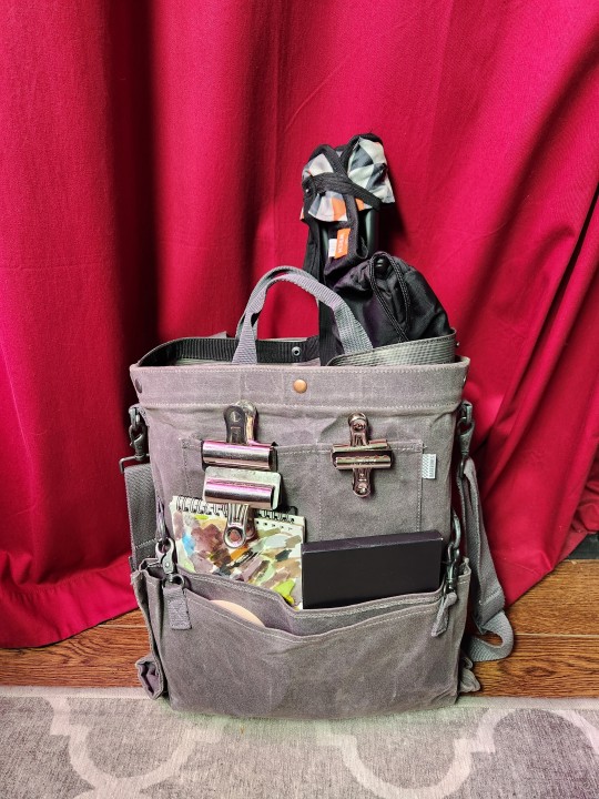
in addition to the easel & tripod i also bring a portable stool, a block of arches cold pressed 7 x 10 paper, brushes, masking tape, rags, clips, a portable water cup, a spritzer, dr. ph martins bleed proof white, a majohn q1 bent nib fountain pen, mechanical pencil, erasers, & some sketchbooks. it all goes in a barebones harvesting & gathering bag
323 notes
·
View notes
Text

Charlie's Strawberry Lemon Cocktail
You can follow me on: ♡ Facebook | ♡ Instagram | ♡ DeviantArt | ♡ Art Station | ♡ TikTok ------------------------------
Charlie Morningstar | Hazbin Hotel
If you like my artwork you can support me with a Like and a Follow 🩷 Thank You So Much 🩷 ☺️
🔹 If you like to see more go check out my Art Blog c:
Tools Used -----------------
❀ Strathmore Bristol Paper 11in x 14in ❀ Derwent Graphite Pencil ❀ GraphicGear1000 Mechanical Pencil ❀ Calligraphic Pen & Ink ❀ PrismaColor Pencils ❀ Dr. Ph. Martin Watercolor ❀ Dr. Ph. Martin Pen White

#artists on tumblr#art#fyp#fypage#fypシ#kawaii#fanart#artwork#hazbinhotel#hazbin art#charlie morningstar#illustration#illustrator#traditional illustration#color pencil#cute chibi#cute#chibi art#chibi#chibi character#watercolor#prismacolor pencils#prismacolor#viral#art gallery#artist#viral art
24 notes
·
View notes
Text

Happy Lunar New Year!
(done in Dr. Ph Martin's watercolor, Holbein colored pencils, and Photoshop for the type 'cause my Kanji writing is SLOPPY)
2 notes
·
View notes
Text
🎃InkTober Day 9🎃 Dullahan 👻
Love How this turned out ❤️


Supplies
Dr Ph Martin’s Black Star Matte. Dr Ph Martin’s Bombay India Ink Red.
Uni-Ball Signo White. Grumbacher Watercolor Paper.
#inktober#inktober 2024#drphmartins#ink#procreate#traditional art#procreate app#ink drawing#inkart#red ink#dullahan
2 notes
·
View notes
Text
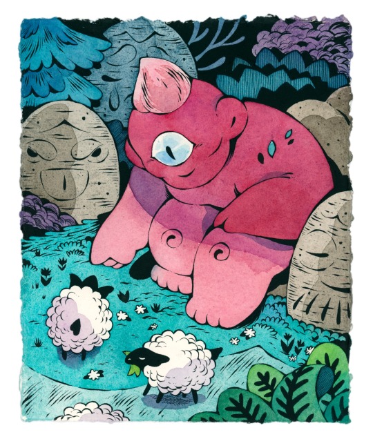
“Cyclops” for the Yokai Show: An Art Exhibition of Folklore & Fables at Giant Robot Store gallery✨
Materials:
- Schmincke watercolors
- Dr. Ph. Martin’s Black Star Matte ink
- Khadi Handmade Paper
- Kuretake Zig Brush
⭐️Available⭐️
25 notes
·
View notes
Note
Can I ask what materials you use? Like the specific brand/type of paper, colouring materials, inks, etc.?

Hiya! Sorry for the late response! And sure!
Paint: Mission Gold Watercolor. Sometimes Holbien acryla-houache
White highlights: Holbien white acryla-gouache, Jelly Roll white pen
Pen: Tachikawa with a G Nib, or Uniball Vision for sketches
Ink: Dr PH Martin Black Star India Ink Hi Carb
Paper: Arches Hot Press Watercolor Paper. Or cheap cold press paper from Amazon for sketches
"Texture": really old brushes that I use roughly with a dry amount of watercolor and or ink
3 notes
·
View notes
Text
X/1999 Volume 2 Illustration Comments
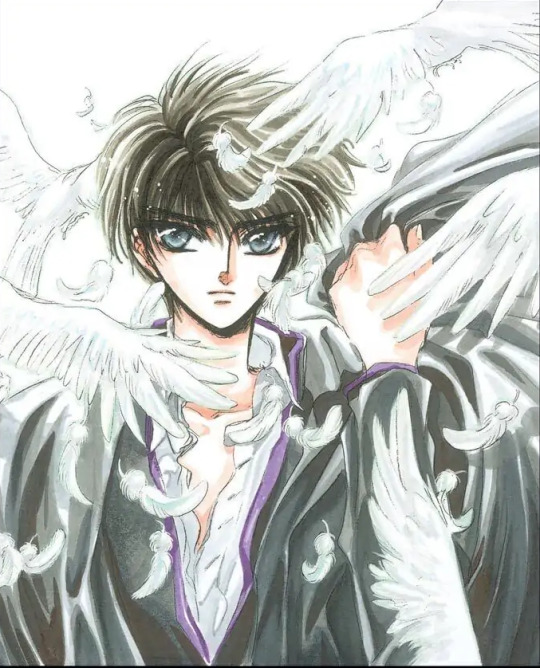
1995 Monthly Asuka March Issue, Announcement Illustration
Paper: Manuscript paper
Lines: Color pencil
Color: Colortone. whiteout Copic marker
I literally just penciled this on regular manuscript paper used for monochrome illustrations [laughs]. I've used Colortone before, but I hardly ever use it in X.
[Ed. Note: Colortone is a type of colored screentone; it's also sometimes called "overlay.”]
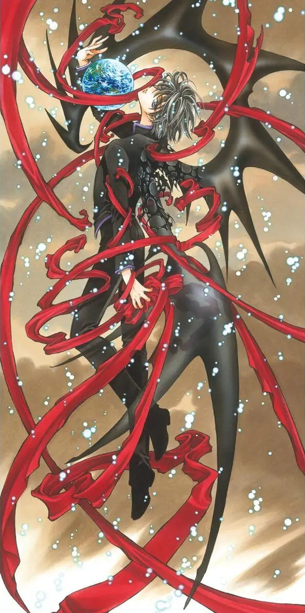
2002 X Calendar illustration
This was a uniquely long, vertical format, so I had a hard time devising the composition of the illustration. Now that I look at it, the specks of light make it look like a Magical Girl transformation scene [laughs). Although this was a large illustration, I screwed up my courage and colored the background using only Copic markers [laughs]. The uniform was inked in with Lumocolor pens, but I used Liquitex afterward for some parts of the piping. The wing was drawn with an airbrush, and the Earth with acrylic gouache.
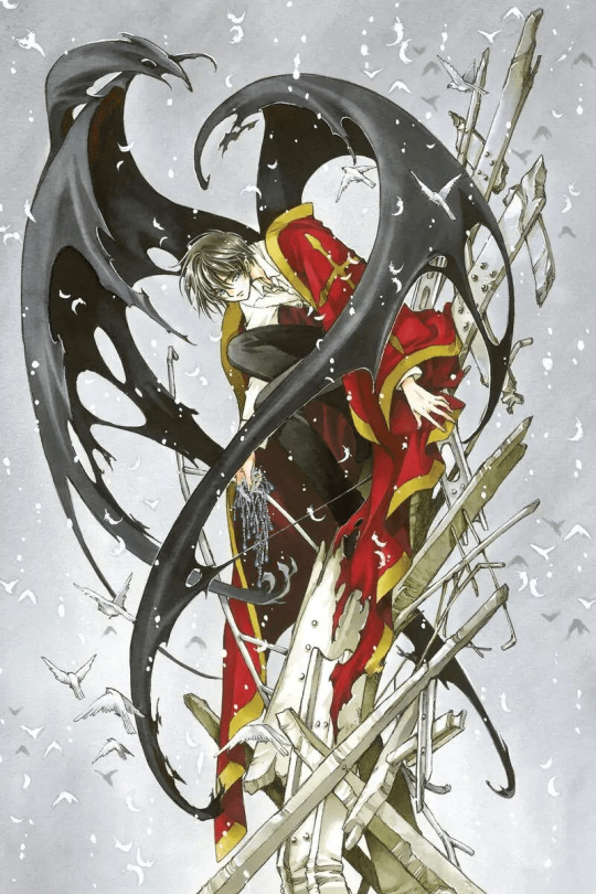
2002 Monthly Asuka April Extra Issue
X Comic Collection 04 Illustration
Ohkawa commented that there hadn't been any illustrations of Kamui being sad, so she asked me to make him cry. I drew an illustration for the cover of the X Comic Collection 03 of Kotori wearing a blue headdress. So he's holding that as if it's a memento. I used Liquitex to draw the beads. The other areas are done with Copic markers. I put down a layer of gray ground coat before doing the actual illustration.

1998 Monthly Asuka November Issue
Title Page: Illustration
Paper: BB Kent
Lines: PIGMA Graphic ink pen
Color Dr Ph Martin's Color Ink, Lumocolor ink pen, poster color, Copic marker
This is a fake Warring States Period illustration [laughs]. I drew something with a similar theme before, but I think this one looks more Warring States-like. Even though I've totally ignored the authenticity of the time period [laughs].
[Ed. Note: Poster color is also known as "poster paint" or "tempera paint."]
1996 Monthly Asuka August Issue, Title Page Illustration
Paper: Watson Paper
Lines: Winsor & Newton Drawing Ink (Nut Brown),PIGMA Graphic ink pen
Color: Acrylic Gouache, Dr. Ph. Martin's Color Ink, Lumocolor ink pen
The ink I used to draw the main outline blurs a bit when it's mixed with water. so the whole illustration has a yellowish tint to it. I wanted the uniforms to look dimensional and not just pitch-black, so I used Lumocolor for them.
[Ed. Note: Watson is a brand of Japanese paper good for watercolor use.]
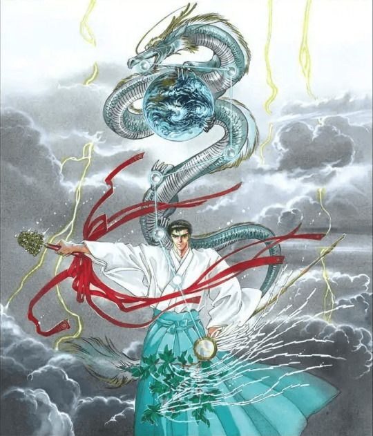
1993 June. X Volume 4, Cover Illustration
Paper: BB Kent
Lines: PIGMA Graphic ink pen
Color: Dr. Ph. Martin's Color Ink, poster color
The concept color for this illustration was gray, but his hakama would look very drab if I'd colored them gray too, so I made them light blue instead [laughs].
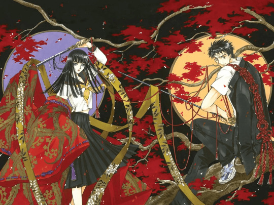
2002 X TV Anime Volume 5 DVD Box illustration
For the illustrations used on the anime DVD boxes, I had decided from the beginning to make the backgrounds black and to incorporate a round element, which in this case was a window. Both Sorata and Arashi are very "Japanese" characters, so I drew them with that idea in mind. But I still put them in their school uniforms.. (laughs]. Sorata wears his uniform only once during the entire series, and that was in a flashback scene. When you see them together like this, it seems like they're from a different story. The background is colored with poster color and acrylic gouache.
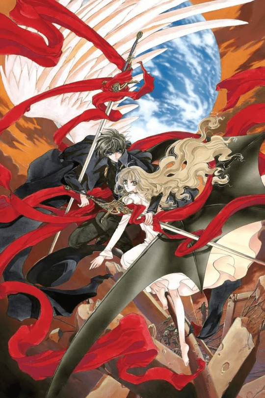
1996 X Anime Movie Advertisement Illustration
Paper: BB Kent
Lines: PIGMA Graphic ink pen
Color: Dr. Ph. Martin's color ink Liquitex
Since this illustration was for the movie, I wanted to give it a heavy atmosphere, so I used Liquitex. But it took such a long time to dry that I ended up having to pull an all-nighter to make the deadline [laughs].
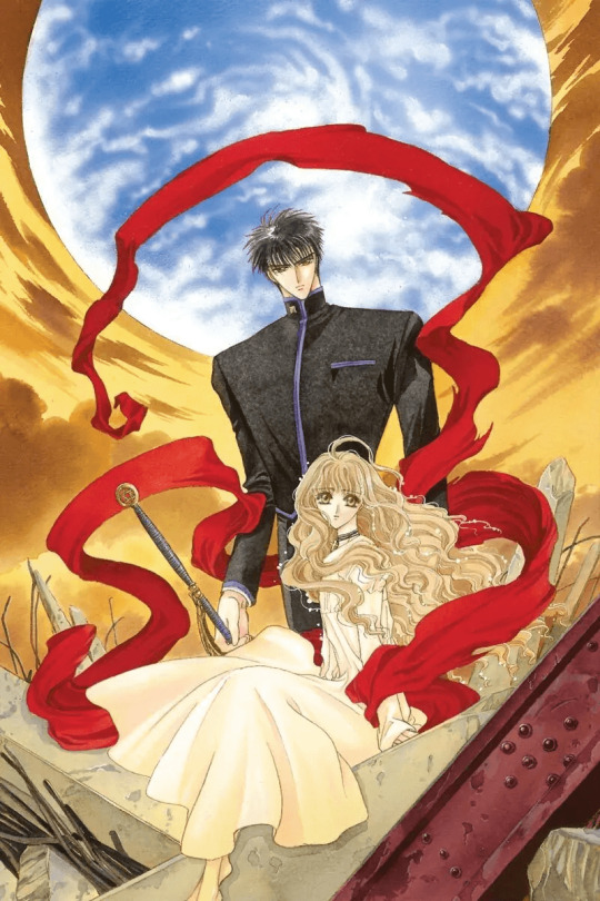
1996 X Anime Movie Flyer Illustration
The scene and color palette for this illustration were created to suit the movie, since the image was going to be used on the flyer. I think I used I Watson Paper for it and colored it mostly with ink, but I used an airbrush for the Earth. I placed a thin ground coat of brown on the paper first and colored the characters after that. It's exactly the same drawing technique as I used on the posters.
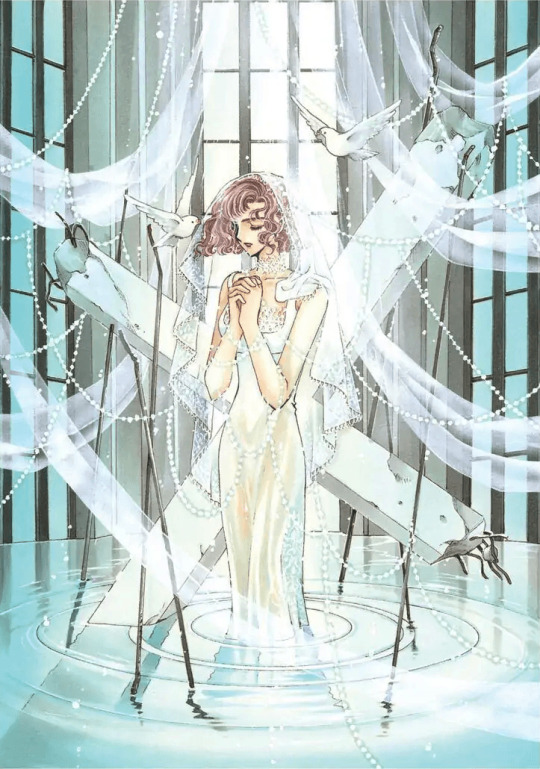
1999 Monthly Asuka May Issue, Title Page Illustration
Another illustration of Karen looking very neat and tidy. I put her in a delicate lace dress, which is a refreshing change since she's usually drawn with a bondage look. The background resembles a holy shrine of some sort. I purposely drew water in the illustration since she has the power to control fire. Originally there wasn't any lace over her cleavage, but I added it on later at Ohkawa's request.
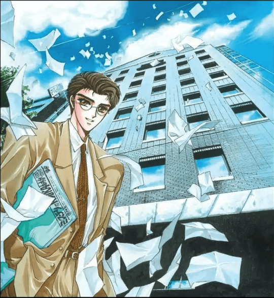
1993 November, X Volume 5, Cover illustration
Paper: BB Kent
Lines: PIGMA Graphic ink pen
Color: Dr. Ph. Martin's Color Ink
The building in the background is the offices of Kadokawa Shoten
Publishing Co., Led. Are the papers that are falling out of the sky just random documents? Or final drafts of manga? It'd be terrible if they were final drafts [laughs].
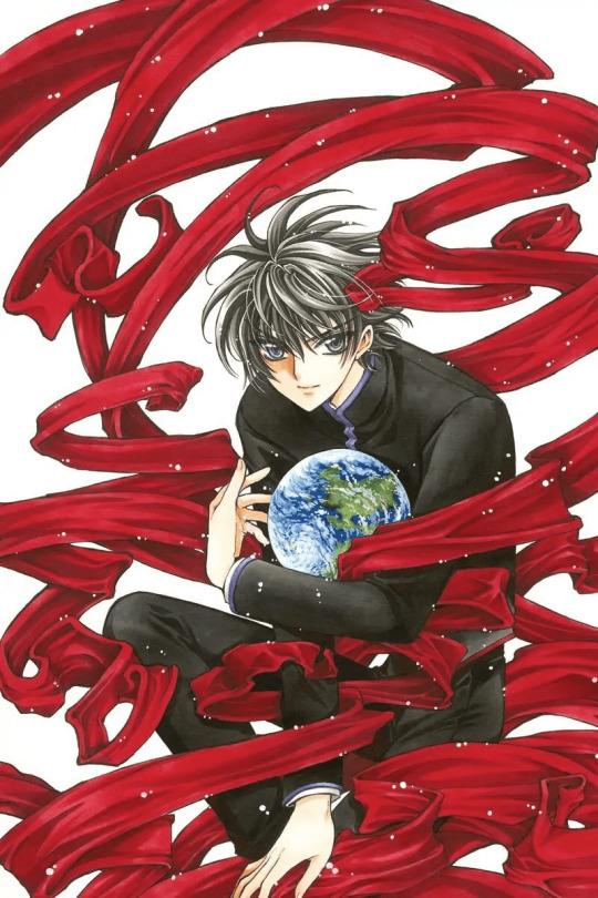
2001 Monthly Newtype November Issue, Cover Illustration
Newtype has a very large cover area, so it's fun to draw illustrations for it [laughs]. I wanted the blackness of the uniform to have a heavy look to it, more of a "woolly" texture, so I used a Lumocolor pen instead of a Copic marker. If I had used a black Copic, the color would have been much lighter. They don't make that particular hue of Lumocolor anymore, unfortunately. The other parts of the uniform were drawn using Dr. Ph. Martin's, the cloth with Copic markers, and the earth using acrylic
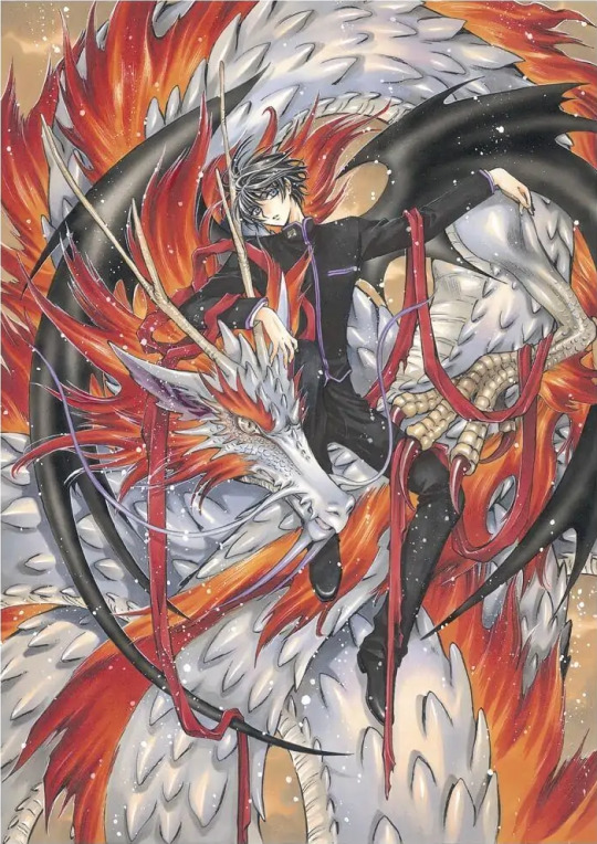
2003 X Calendar Illustration
This was for a desk calendar, so it wasn't a huge project, but I still did draw in a lot of detail. Fortunately, not many colors were used so it didn't take too much time. I spent the most time working on the dragon. Until this illustration, I had been drawing Asian dragons, but this dragon has a slightly Western touch. Its scales are very shiny (laughs].
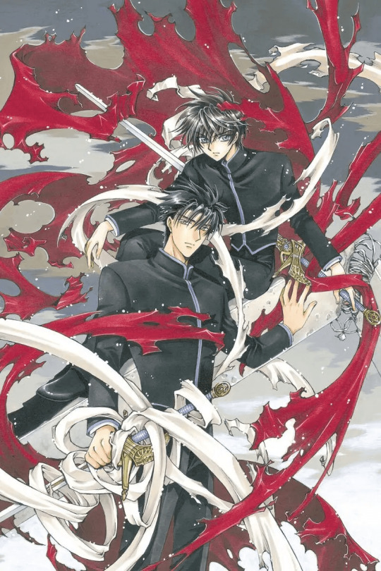
2002 X TV Anime Advertisement Poster
Fuma's head looks a little big here [laughs]. I made this when I was working on Chobits, so I had a "drawing habit" of doing things in that style. The background was colored with acrylic gouache. I wanted an ashy hue to create a tranquil, not too heavy-looking sky. The other parts were done with a Copic marker. The piping on the uniforms was too small to draw, so I added them afterwards with Liquitex
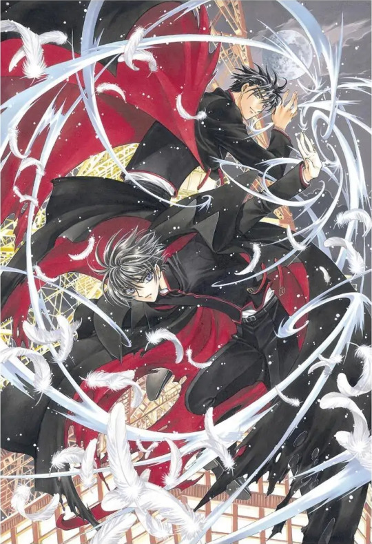
2002 X: The Choice of Fate Play Station Game Package Illustration
I remember working really hard on the Tokyo Tower for some reason. The Tower and capes were done with acrylic gouache. Since this was an illustration for a video game, I wanted to give it a battle-like, action-y feel; it's just right for an all-out fighting game! I erased the outlines of the background to make it look like it was drawn with a computer. but it actually took a lot of time and effort.
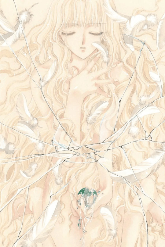
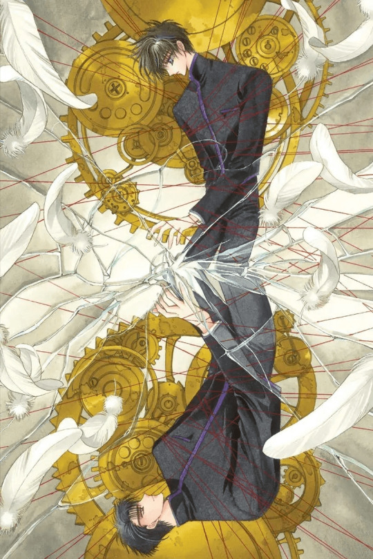
1996 Monthly Asuka August Issue, Title Page Illustration
Paper: BB Ken
Lines: Dr. Ph. Martin's Sepia Ink, PIGMA Graphic ink pen
Color: Dr. Ph. Martin's Color Ink
The illustration seems slightly yellowish since I did the outline using Dr. Ph. Martin's Sepia Ink and then blurred it with water afterward. The shattering glass over the image gives it an ominous feel

1994 December. a volume 6. cover illustration
Paper: BB Kent
Lines: PIGMA Graphic ink pen
Color: Acrylic gouache, Dr. Ph. Martin's Color Ink
I shaded the illustration with pink as a base color, and then inked in the different areas. Since Kotori’s the subject, I wanted to make it look cute, so the concept color is pink and it's got lots of flowers [Laughs]
8 notes
·
View notes
Text
2023.03.28


finally, here, is, march, monthly, painting (wheezing...)(jk) Geez, I really didn't expect this month to be busy enough for me to neglect my monthly painting, but hey! i finished!!! I used Dr. Ph Martin watercolors for the first, hence why the pinks almost neon-like which wasn't my intention, but it works! I'll definitely turn this into a postcard at some point, but definitely for sure a bookmark (hopefully in time for my April events heh)! I think it'll be really cute as a die-cut bookmark instead of a typical rectangular one ^v^
10 notes
·
View notes
Text

This is a painting I did with Dr. PH Martins watercolors, Copic markers, Dr. PH Martins Bombay ink, and Copic multiliners.


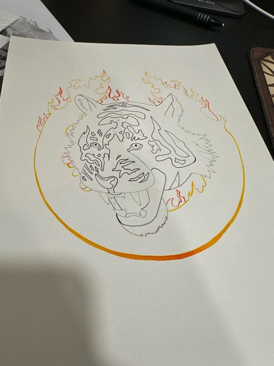
I made the mistake of using ink for the stripes first before the color. It was reactivated by the Copic markers in some areas, thankfully it was only a small amount and isn’t very noticeable. But lesson learned lol
3 notes
·
View notes
Text
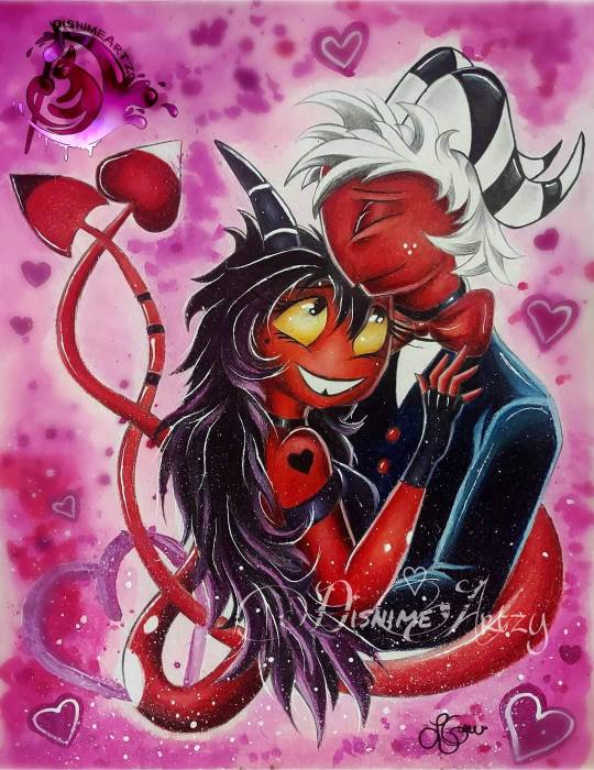
Drawing Progress
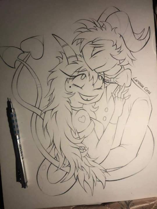

Moxxie & Millie ❤️🔥
You can follow me on: ♡ Facebook | ♡ Instagram | ♡ DeviantArt | ♡ Art Station | ♡ TikTok ------------------------------
Moxxie & Millie | Helluva Boss
If you like my artwork you can support me with a Like and a Follow 🩷 Thank You So Much 🩷 ☺️
🔹 If you like to see more go check out my Art Blog c:
Tools Used -----------------
❀ Strathmore Bristol Paper 11in x 14in ❀ Derwent Graphite Pencil ❀ PrismaColor Pencils ❀Arteza Acrylic Paint ❀ Dr. Ph. Martins WaterColor Paint ❀ Sakura Gel White Pen
#artists on tumblr#art#fanart#artwork#fyp#fypシ#fypage#kawaii#helluva boss#moxxie#helluva millie#moxxillie#illustrator#illustration#illustrative art#traditional illustration#color#colorful#colored pencil#prismacolor#prismacolor pencils#watercolor#acrylic paint#acrylic#arteza#acrylic painting#painting#viral#viralpost#viral art
20 notes
·
View notes
Text

My OC: Zo-vel (they/them) [I’m too lazy to scan this for the moment.]
Art materials used:
Strathmore watercolor paper 300 g/m² (didn’t stretch it first, oops)
India ink: Dr. Ph. Martin’s black star, matte
Speedball Hawk quill pen nib 107
Holbein pencil in smalt blue
Faber-Castell in burnt siena, permanent green olive, and pine green
Mobius + Ruppert (M+R) Brass Artists Pencil Sharpener
6 notes
·
View notes
Text
DESERT REAPER: finished pen and ink design on Arches cold press watercolor paper, using Dr PH Martins radiant watercolor. Commissions are open, Email or message me for pricing.

#pen and ink artist#illustration#ink artist#my art#artists on tumblr#skull art#artist for hire#ink drawing#original art#artwork#Spotify
1 note
·
View note
Text
🎃InkTober Day 8🎃Clown 🤡 so I decided that ladybug Web and clown are a family of performers, clown her dad and ladybug love to perform and her mom web is supporting but preferred to watch
I just love the contrast of this piece ❤️


Supplies
Dr Ph Martin’s Black Star Matte . Dr Ph Martin’s Bombay India Ink Red . Grumbacher Watercolor paper
#inktober#inktober 2024#drphmartins#procreate#ink#traditional art#procreate app#ink drawing#inkart#red ink#clown#clown art#edwardian#1920s#oc#oc art#ocs#oc family
2 notes
·
View notes
Text
New Art: Unbecoming
It’s been a while since I’ve used watercolor or let alone color in a drawing to the extent that I did with this piece, ‘UnBecoming’. I recently acquired some new art supplies, a set of watercolors and a set of Dr. Ph. Martin Bombay inks. I used both for this piece. The skin tone and some of the hair is done with ink wash and watercolor. The reds in particular are a combination of both mediums.…

View On WordPress
0 notes