#double split complementary color scheme
Explore tagged Tumblr posts
Text

Did some practice with color schemes, more expressive poses and expressions, foreshortening, and colored lineart. I like how it went, I also discovered a hat that I like a lot.
#art#digital art#artwork#illustration#clip studio paint#cool hat#double split complementary color scheme
1 note
·
View note
Text
I was watching a video on color schemes (mostly wondering if it had something I didn't already know) and then...

I was jumpscared by Nela's color scheme (or more like something very close to it) being used as an example.
#a shadow's rambles#fun fact I landed on it accidentally just testing out colors#and then later on I realized it was a double split complementary color scheme#you may argue it's a tetradic but ultimately a double split complementary is a very skinny tetradic sooo
3 notes
·
View notes
Text
Art Tip #1 - Color Theory: A Crash Course
Art isn't complete without colors, right? Unless you'd consider a blank white sheet of paper as art, then by all means...
In today's first stop at the Art Terminal, we will be learning how to use colors using Color Theory! Being knowledgeable about basic color theory can really help you develop your skills as an artist no matter what medium you'll be using - be it traditional art, digital art, or even a mix of both! It may seem confusing at first but with this guide, you'll be making well-coordinated compositions with flying colors in no time!
PART 1: How to use the Color Wheel
This infamous wheel by Isaac Newton helps you see the relationships between the colors.
Keep in mind these 3 categories:

⓵ Primary Colors: Red┃Blue┃Yellow These are the first three basic colors - all other colors can be created by mixing them in different ways. Tip: mixing all three creates the color brown! ⓶ Secondary Colors: Purple (red+blue)┃Green (blue+yellow)┃Orange (yellow+red) If you've noticed, these colors are created by mixing our primary colors. ⓷ Tertiary Colors: Red-Orange┃Red-Purple┃Blue-Purple┃Blue-Green┃Yellow-Green┃Yellow-Orange As you might have guessed, we get these colors by mixing our primary and secondary colors.
Part 2: What are the Color Properties?
Keep in mind Color has 3 primary properties:
⓵ Hue: the colors in their purest state - or in other words, a color's name.
⓶ Saturation: the brightness or dullness of a color - the intensity or purity of a hue. Tip: High Saturation/Saturated = color looks very bright ┃ Low Saturation/Desaturation = color looks washed out or greyed out

⓷ Value: the degree of lightness or darkness of a hue. Tip: There are 3 ways to change a color's value: Shade┃Tint ┃Tone

Shade/Shading: a shade is a color that is produced by adding black.
Tint: a tint is a color that is produced by adding white.
Tone: a tone is a color that is produced by adding grey.

PART 3: What is Color Harmony?┃What Color Combinations or Schemes can we use?
Go back to the Color Wheel as it is a good reference in helping you create appealing schemes. Here are 6 common combinations you can apply in your work:
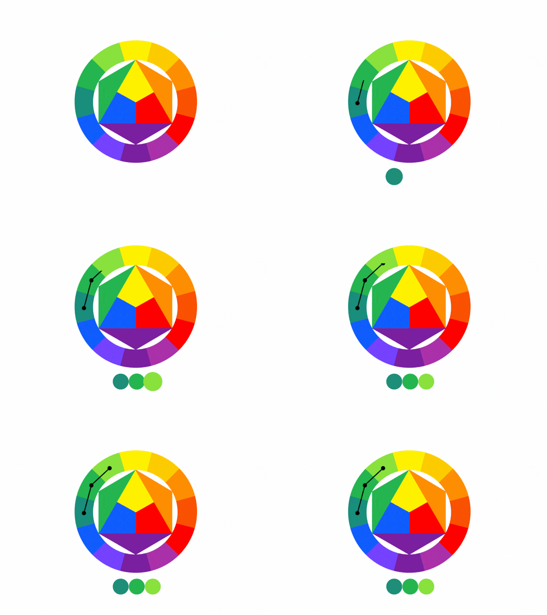
⓵ Analogous: uses colors (around 2-4) that are next to each other in the color wheel - Match them!
⓶ Complementary: uses colors that are opposite or across of each other on the color wheel - if you can't match 'em, clash 'em with their opposites! Tip: matching these colors creates great contrast and visual interest so they can overpower each other sometimes so keep that in mind.

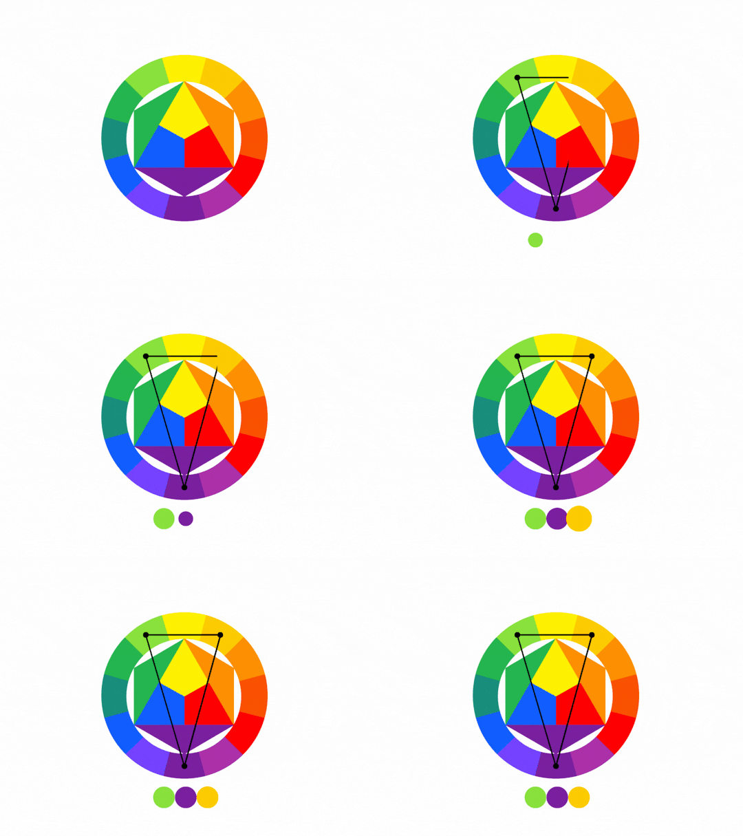
⓷ Split-Complementary: 1 base color then 2 colors adjacent to its complementary color - if the contrast too much, split them!
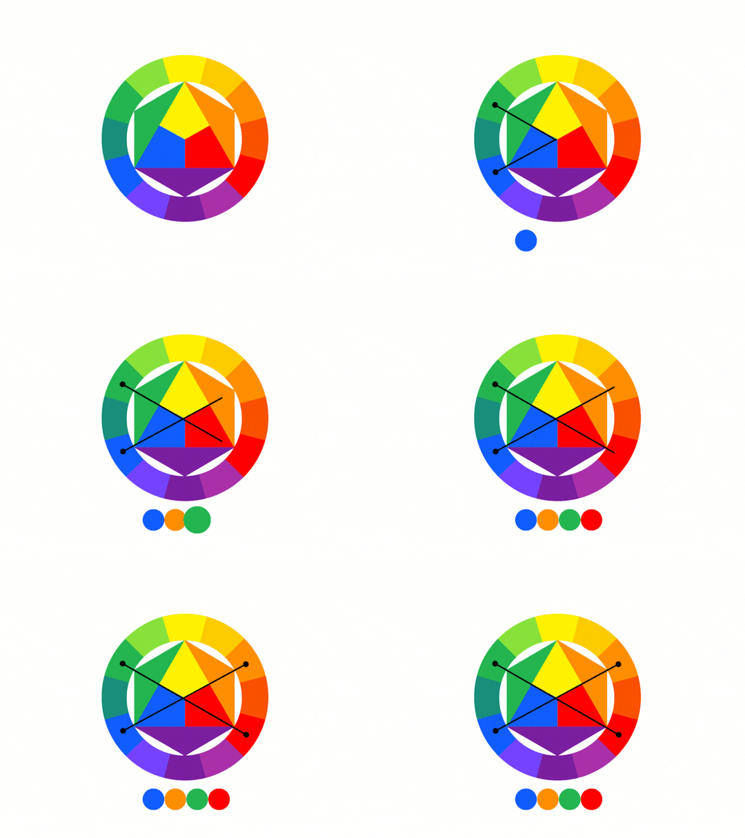
⓸ Tetradic: uses 2 complementary pairs. This forms a rectangle on the wheel - if you need more variations go double complementary!
⓹ Triadic: 3 colors that are evenly spaced out in the color wheel. You're free to choose from a variety!
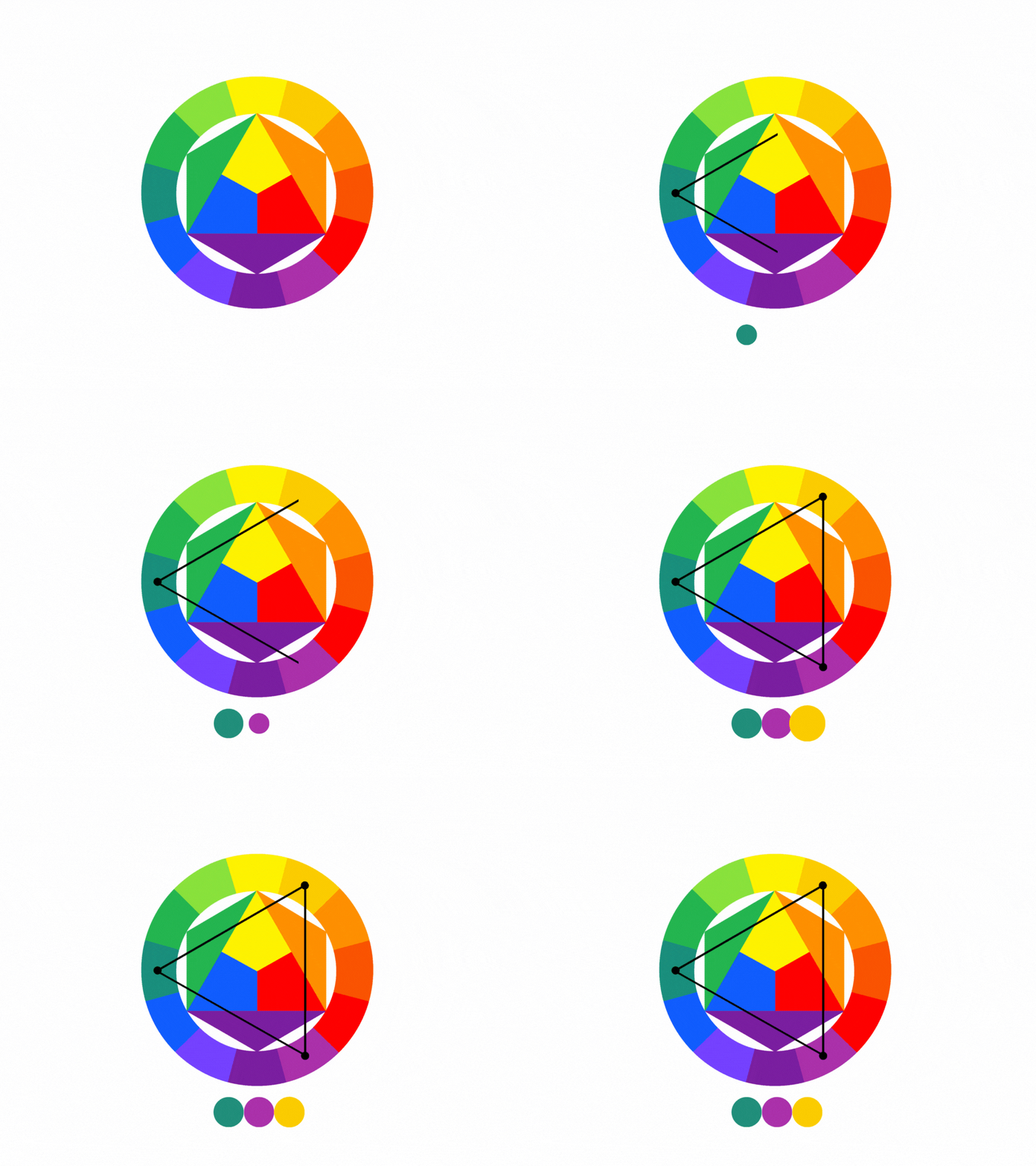
⓺ Monochromatic: uses different tones, shades, and tints of a singular color. Sometimes it just works!
PART 4: What is Color Temperature?
Ever wonder why some compositions feel cold or hot? It is a fact that color has the ability to evoke feelings or emotions. As such, color temperature is the one responsible for this - it is the "warmth" or "coolness" of a color.
Warm colors: Reds┃Oranges┃Yellows Generally seen as colors that are bright, cheerful, active, or happy
Cool Colors: Purples┃Blues┃Greens Generally seen as colors that are dark, mysterious, melancholic, or gloomy
And that concludes this stop for today! These tips are a lot to take in, we feel you, and that's alright - come back to this station when you need a quick reference. We hope you learned a lot from this and that you'll be able to apply them in your paintings or digital illustrations!
Now pack your art supplies and start creating! Safe travels~
– Post by Leonardo
#Art#Drawing#Digital Art#Traditional Art#Illustration#Art Tutorial#Art Tips#Art Reference#Art Guide#What is color theory#What are the major elements of color theory#How to use Basic Color Theory#How to Use the Color Wheel#When to use Color Combinations#Quick color theory crash course#Color Theory Guide#What color combinations or schemes can we use#Color Theory#Basic Color Theory#Art Terminal PH
55 notes
·
View notes
Text
Color Theory for Designers: Creating Harmony and Contrast
Introduction
Color theory is an essential aspect of graphic design, allowing designers to create visually appealing and effective designs. Understanding the principles of color theory helps in making informed decisions about color combinations, ensuring harmony and contrast in designs. In this article, we'll explore the fundamentals of color theory, how to achieve harmony and contrast, and practical tips for designers.

Understanding Color Theory
Color theory encompasses a set of guidelines and principles used by designers to communicate through color. It is based on the color wheel, which visually represents the relationships between colors.
The Color Wheel
The color wheel is a circular diagram of colors arranged by their chromatic relationship. It consists of primary, secondary, and tertiary colors, providing a visual representation of how colors relate to one another.
Primary Colors
Primary colors are the foundation of the color wheel. They consist of red, blue, and yellow. These colors cannot be created by mixing other colors and serve as the basis for creating all other colors.
Secondary Colors
Secondary colors are formed by mixing two primary colors. These include green (blue + yellow), orange (red + yellow), and purple (red + blue). Secondary colors play a crucial role in design, offering more options for creating diverse palettes.
Tertiary Colors
Tertiary colors are created by mixing a primary color with a secondary color. Examples include red-orange, yellow-green, and blue-purple. These colors add complexity and depth to designs, allowing for more nuanced color schemes.
Color Harmony
Color harmony refers to aesthetically pleasing combinations of colors that create a sense of order and balance. Achieving color harmony is vital for creating designs that are visually appealing and engaging.
Analogous Color Scheme
An analogous color scheme consists of colors that are next to each other on the color wheel. These colors usually match well and create serene and comfortable designs. For instance, a combination of blue, blue-green, and green can create a harmonious look. This scheme is ideal for designs that need a cohesive and smooth appearance.
Complementary Color Scheme
Complementary colors are opposite each other on the color wheel, such as red and green or blue and orange. This scheme offers high contrast and vibrant looks, making elements stand out. It's perfect for creating visual interest and drawing attention to key areas in a design.
Split-Complementary Color Scheme

The split-complementary scheme uses one base color and the two colors adjacent to its complementary color. This approach offers strong visual contrast without the tension of a direct complementary scheme. For example, using blue with yellow-orange and red-orange can create a balanced and appealing design.
Triadic Color Scheme
A triadic color scheme involves three colors that are evenly spaced around the color wheel, such as red, yellow, and blue. This scheme provides a vibrant and balanced palette, suitable for designs that require strong visual impact.
Tetradic (Double-Complementary) Color Scheme
The tetradic scheme uses two complementary pairs, creating a rich and varied palette. For instance, combining blue and orange with red and green can offer numerous possibilities for dynamic designs. This scheme works best when one color is dominant and the others are used for accents.
Color Contrast
Color contrast is the difference in lightness and darkness between colors. High contrast enhances readability and visual impact, while low contrast can create subtle and sophisticated looks. Achieving the right balance of contrast is crucial for effective design.
Psychology of Colors
Colors have a profound impact on emotions and perceptions. For example, blue can evoke feelings of calm and trust, while red can stimulate excitement and urgency. Understanding color psychology helps designers create designs that resonate with the audience on an emotional level.
Color in Branding
Color is a powerful tool in branding, influencing how a company is perceived. Brands like Coca-Cola (red) and Facebook (blue) use color to establish their identity and connect with their audience. Choosing the right colors can enhance brand recognition and loyalty.
Tips for Designers
Experiment with Color Schemes: Use tools like Adobe Color to explore different combinations.Consider the Context: The purpose and audience of the design should influence color choices.Test for Accessibility: Ensure sufficient contrast for readability, especially for users with visual impairments.Stay Updated: Trends in color usage can change, so stay informed about current design practices.Learn from Examples: Analyze successful designs to understand effective color application.
Conclusion
Color theory is a fundamental aspect of design, offering guidelines for creating harmony and contrast. the best graphic designing course institute in Delhi By understanding the principles of color combinations and the psychology of colors, designers can craft visually appealing and impactful designs. Whether you're working on branding, web design, or any other creative project, mastering color theory will enhance your work.
FAQs
What is the best way to learn color theory? The best way to learn color theory is through practice and study. Enroll in courses like those offered by Anshika Digital Media, , and use online resources and tools to experiment with color schemes.
How do colors impact user experience in design? Colors significantly impact user experience by affecting mood, readability, and overall aesthetics. The right color choices can enhance usability and engagement.
What are some tools for choosing color schemes? Tools like Adobe Color, Coolors, and Color Hunt are excellent for exploring and creating color schemes.
Can color theory be applied to web design? Absolutely. Color theory is crucial in web design for creating visually appealing and user-friendly interfaces.
Why is color contrast important in design? Color contrast is vital for readability and visual hierarchy. It helps distinguish elements and ensures accessibility for all users.
Get Access Now: https://www.anshikadigitalmedia.in/
0 notes
Text
Enhance your Home design with canvas with color matching
There isn't any aspect more essential than color, with regards to developing a mood for the room. Canvas prints generally helps to build an eye-catching color scheme for your house, making it more essential that the colors in your artwork are very carefully selected. Today we take a look at ways of guaranteeing the color structure of the canvas art images or landscapes upon canvas matches well using the rest of your own design.
Before you begin discovering your chosen schemes, you have to recognize the main colors in your canvas art, and with your room. To recognize the prominent colors inside your room, take a picture of the room in its whole. Take print out of this, then let the eyes unfocused and consider the pictures together. What color uses up the maximum amount of area in the room? Also, what color remains the most in the rest of the room?
Monochromatic color schemes
If the main color of the canvas art printing suits the principal color of the room, you are going to creating a monochromatic design. This is the tended method to apply color inside your canvas prints, particularly if a person already has a combination of other colors in the room.
Analogous color schemes
If the prominent shade of the room and the dominant color of the print are nearby on the color wheel, collectively they create a good comparable color pattern. Be certain additional room components fall in just the same scheme or they fall in the split contrasting or tetradic color structure.
Complementary color schemes
Where the main shade of the room and the main color of the canvas art printing fall entirely opposite to one another on the color matching, it creates the stunning mixture referred as a contrasting color scheme. When the colors are simply sort of contrary with one another, it isn't a real color scheme. The room winds up appearing relatively haphazard in this instance.
Split complementary color schemes
In the split complementary color scheme, you apply one principal color, and select a corresponding selection of colors from the alternative side of the color wheel, rather than the usual single shade. Considering the fact that it isn't feasible to complement item colors precisely, this is the design chosen in several interior design situations.
Double complementary color schemes
In the double complementary color design, two sets of contrasting schemes sit together with one another. However, the points are not just arbitrarily chosen - the beginning of each supporting set ought to be meticulously selected to complement the other aspect. Keeping the sets pretty close to the wheel may be beneficial.
About us:- There will usually be a deviation in tints, hues and hues of the colors of your room. If you've chosen a stunning landscape canvas printing, there definitely is going to be - nature that doesn't adjust with a color wheel. When you tend to be starting out along with the color theory, keep your shade and hue of the colors fairly steady throughout the components in the room.
0 notes
Text
After read Color_Design Principles Problems
Today I read color design principles problems, I just have some deeper understanding of color, I used to think the use of color is very simple, but in fact for artists color is rich and complex, is necessary to learn how to match comprehensively. Color is actually produced by the sun's white light through reflection and refraction to our eyes, and different colors are produced because the wavelength or frequency of refraction is different. The color wheel is a two-dimensional model that people have made of colors. colors opposite each other in the color wheel are called complementary colors, and colors adjacent to each other are called analogous. all other hues can be obtained from a combination of red yellow and blue. But in Ostwald's color theory there are four primary colors, red, yellow, blue and sea green. Value is the degree of lightness or darkness of a color, as a change in color that we can see in addition to hue. The third characteristic of color is saturation, which is a measure of the purity brightness or grayness of a color. Saturation can be obtained by mixing it with the same value of gray, or by mixing it with its complementary color, and another is that colors are affected by the surrounding colors, and in the case of having any combination of multiple colors, the adjacent colors affect our visual perception of the other color tones, value and saturation. color solids are used in black and white and different shades of gray (kind of like the value chart from last semester) to describe the relationship between color hue, saturation and value. For computer color selection, it can be said that it offers almost unlimited possibilities. Because the computer offers a choice of colors far beyond what the human eye can distinguish. Prejudices about colors, or what we commonly call stereotypes, can have an impact on our color theory findings. For example, people usually think of red as representing anger, passion or warmth, and blue as calm and cool. But in fact they can represent more variable and different meanings. And we are also influenced by the usual color combinations, for example, we always subconsciously match adjacent colors on the color wheel into the same picture, such as blue and green. But there are actually many more possibilities for color combinations. Analogous is three to five adjacent shades on the color wheel. Double complementary schemes use two adjacent colors and their opposite colors. split complementary schemes use any hue plus two complementary hues on either side of it. Triad schemes use any three shades that are equal in distance from each other on the color wheel; Tetrad schemes use any four shades that are equal in distance from each other on the color wheel. Color not only gives us a sense of the realism of the objects in the painting, but also of the mood and emotion of the picture. Subjective color labels often mislead artists, of which Monet's Poplars is an example, in which the trees are blue and red instead of the green and brown we stereotypically see in this painting. This is the true local color he saw in the painting at sunset (a specific time or condition) simultaneous contrast is when the same color appears in different shades on different backgrounds. optical color mixtures is when some artists place unmixed colors near each other and then look at them from a distance as if they were well mixed. All in all, color is very complex and diverse. Theories about color only bring some possibilities, but if you want to understand more deeply and use color well, you still have to explore it yourself.
0 notes
Text
Color Theory
Color theory creates a logical structure for color. It explains how humans perceive color; and the visual effects of how colors mix, match or contrast with each other. This activity is about identifying the different mix of colors from the color theory
Cool Colors

This is a sign from the cat cafe in yubenco tetuan this was during a random time when i was out with my girlfriend. The colors in the photo were purple and a light shade of black because i wanted this photo to be aesthetic but it didn’t really work out. but this still looks like a really cool photo. Because it signifies the audience to be in a relax mood.
Warm Colors

These are flowers from a garden at one of my friends house since during this time it was a beautiful sunset which gives this photo a very vibrant look. The colors in the photo was yellow and green. which signifies natural and the warmth environment of the photo.
Split complementary

This sunset photo was taken in the backfield of ateneo de zamboanga university a few weeks before lockdown was taken place. This view reminds me of how breath taking life can be after being stressful from reqs. slight blue, and yellow-orange can are the colors of the photo gives it that vibrant look on the picture.
Triad

Triad are 3 different colors from the same hue which is the color in this photo yellow, purple, and blue. BTS events were my favorite events here in zamboanga city. This one in particular we celebrated the birthday of kim seokjin and kim Taehyung. This particular BTS event was my last even before the pandemic became a worldwide issue.
Complementary colors

Complementary colors are colors that are opposite of the color wheel. This particular photo was one of my best photo when i was doing outdoor photography. For me this photo symbolizes the value of life because one flower can show how important the aspects of life is. Red is the color of love that why i love flowers because the have so much beauty and affection.
Double Complementary

Double complementary composes of two complementary colors which is purple, green, red, blue. In this particular photo i was at an event which was my relatives birthday. During this time i was people who i haven’t seen in a long time which was my relatives from my mother’s side.
Monochromatic

Monochromatic color uses the same color but in a different tone. Like this photo this photo represents sadness because of the color scheme which is black and white. The photo was taken during the pandemic which in this particular photo has a story. The story of being upset because things were not what they used to be like normally you see people outdoors having fun and spending time with friends. But in now we are upset because things aren’t really normal anymore for most people not just physically but mentally as well.
Analogous

Analogous colors are located next to each other on the color wheel which can give a more soothing look on photographs. This photo of a sunset which I took in the different side of the campus. Because of the angle of where i took the photo this gives the photo a different and unique perspective. Because it looks more like a pinkish color to unlike the typical sunset which is normally yellow-orange. I think this photo is more unique and more vibrant because of the color scheme.
1 note
·
View note
Photo

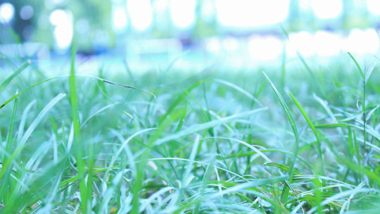
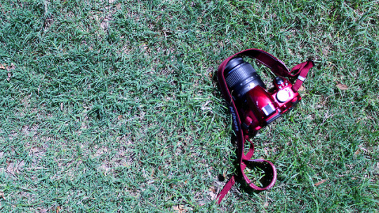


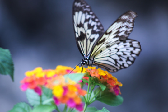

Blog 101: Color Theory – Color Wheel, Schemes and Tones
Color Theory creates a logical structure for color. According to a site called Interaction Design Foundation, Color Theory is a term used to describe the collection of rules and guidelines regarding the use color in art and design, as developed since their early days. It informs the design of color schemes, aiming at aesthetic appeal and the effective communication of a design message on both the visual level and the psychological level. For example, color crayons we can organize it by color and place them together that shows the colors in relation to each other. There are three basic categories of color theory that are logical and useful:
· The Color Wheel,
· Color Harmony,
· And the context of how colors are used
Modern color theory is based on Isaac Newton’s color wheel where it has the primary (Red, Yellow, Blue), secondary (Green, Orange, Violet), and tertiary colors that can combine and produce another color:
The Color Wheel is a color circle based on red, yellow and blue. It is tradition in the field of art. Isaac Newtown is the one who developed the first circular diagram of colors in 1666. Color wheel shows color coordination that gives life to an art or design and can make you think of emotions, feelings and the story behind it.
Color Harmony, where do you usually heard this? Paintings, photos, films. Why is it important? What do color harmony does? Well, it is an application of harmony that jives or unit with combination of the different colors. Color harmony delivers visual interest and a sense of order and it has dynamic equilibrium.
So, our first activity with Sir Ced Zabala is photography that connects to our lesson the Color Harmony and schemes. Individually should have 8 different Color Harmony; that includes Monochromatic, Analogous, Complementary, Warm & Cool Colors and three other Color Schemes that includes; Split Complementary, Double Complementary and Triad or Tetradic Complementary. After, taking photos and trying to find that harmonious combination of colors, I selected 8 photos to represent each color harmony and schemes. It was also instructed that we should give it a tile and also identify the different color harmony and schemes that are present in the phots. My photos were taken in my university at Ateneo de Zamboanga University, and the famous Butterfly Garden at the Pasonanca, Zamboanga City.
“Blue Lakers”
Monochromatic
I took this photo at the famous tunnel of ADZU at Xavier’s Hall Building, all lockers were painted in blue and I got the chance to took the photo while the sun is still present at that time and it represents Monochromatic features where it shows different shades of Blue. The colors that are present in the photo was Indigo, Blue and Light Blue. It is titled Blue Lakers, because it is obviously showing blue colors and Lakers is translated into Filipino meaning Lockers. I just love the fact of having nice photo and also a humor like for the title.
“Green Hay”
Analogous
This photo was taken at the field of ADZU, I was searching for a fitting photo for Analogous and it was hard because in Analogous it should be connected or located next to each other at the Color Wheel. It is in a shade of Green but when you check the color wheel, these colors are next to each other. I chose this photo because it gives me that kind of green and nature vibe but it is entitled Green Hay, because obviously it is green and hay because I just thought it was a food of an animal like cows or horses.
“Pulang Nikon”
Complementary
This photo was taken at the same location, backfield. I took this photo because my classmate has this beautiful glossy red camera and it really attract me plus it could be complemented with the grass at the backfield. Complementary focuses on one or more pairs of colors. Red and green are complementary to each other. It is called Pulang Nikon because the dominant color of the photo is the red camera and it is really the first think you’ll see. Nikon was the brand of the camera and don’t worry I did asked a permission to the owner when I took a photo of it.
“Street Shell”
Warm Colors
This would be the first photo that I took after our class in DIGIPUB when Sir Ced, told us to take 8 photos for the Color Harmony. We were at the gas station that time, waiting for the other car finished to gas up and saw this view, titled it Street Shell. It shows the streets light at 7:30pm and the gas station name, Shell. Warm colors focus on yellows, oranges, browns, yellowish greens, warms reds and other colors that shows warmth. The colors that is present to this photo are Red, Gold, Yellow and Brown.
“Maria Clara Lobregrat”
Cool Colors
Butterfly Garden was one of the famous place here in Zamboanga City, because of it’s scenery, the butterfly garden itself, the museums and also the Maria Clara Lobregat statue. Took this at the Pasonanca, Zamboanga City and had the chance to get this kind of color scheme, a blue like or cool colors give an impression calm and create an impression. The colors that are present in the photo are Indigo, Lavander, Blue, Light Blue. It also help the mood of the scenery because it was getting dark at that time already.
“Flower Fly”
Split Complementary
This was taken at the Butterfly Garden, Pasonanca Zamboanga City. I was with my classmates that time, we just had a street photography that time and also like doing our project activity for our DIGIPUB. Looking at the butterflies flying and moving around the area will really make an impression of beauty. I just love how this photo was taken. This represents split complementary were one hue plus two others complement, you could use the letter Y as your guide in looking for that split complementary colors. The colors that are present in this photo are Yellow Orange, Yellow Green, Purple. Tittled it as Flower Fly that is visually presented in the photo.
“Hi-school”
Double Complementary
Double Complementary is a two complementary color sets, you can use the letter X as your guide in finding the complementary colors for this color scheme. This photo is entitled as “Hi-school” that sounds like high school, it represents that the school year has just begin and new things will happen and to experience. The colors that are present in this photo are Red Orange, Yellow, Blue and Purple. Took this photo at the ADZU Cafeteria. I just had this idea combining the present colors that I have in relating to double complementary.
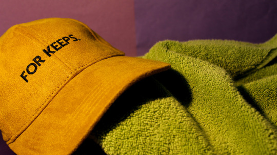
“For keeps.”
Triad Complementary
This would be one of my favorite because I just made it at home, did some strategies in making this set up just to achieve the Triad or Tetradic Complementary. Triad Complementary is three hues equally position on a color wheel. I just had my cap, my towel and colored papers to represent as my background with the help also of the lamp in my room. It is entitled as “For keeps.” Because I based it on the word that is present on the cap. This could also imply that I am a cap person. I love collecting caps because it helps me to be me and to be unique for myself. The colors that are present are Gold, Dark Purple, Light Green and Dark Yellow.
This activity gave me the chance to show my photography skills and also to learn more about color harmony and schemes and its importance in doing a design or an art. This also made me learn and appreciate of being creative in your own terms, what I refer or I like more. I also learn to adapt the learnings also learn from my mistakes, what should be the colors presented and what should be improved. Now, every time I go out I would really look at things differently because colors are just not colors the way we learn from grade school to high school but colors brings an art to life.
3 notes
·
View notes
Text
8 different color scheme.
Color theory
Color theory is a combination of art and science that used to determine what color look good together.
Monochomatic

Monochormatic color scheme is composed of only one color/hue.
Complementary

Complementary color scheme is a color in a color wheel that is oplosite to each other.
Anologous

Anologous color scheme is a color that are next to each other on the color whell.
Split-complementary

Split-complementary color scheme ia a variation of the complementary color scheme.
Double complementary

Double complementary is acomposed of two kinds of complementary color.
Triad

Triad color scheme is composed of color that are evenly spaced in the color wheel.
1 note
·
View note
Quote
Blog # 3:COLOR SCHEME
what is Color Scheme?- it is the combination/mixing of colors or arrangement of all colors that is usually use for design / decoration of the interior.
MONOCHROMATIC

- This red roses flower is a monochromatic scheme example because it only used the shades and tints of only one color.The colors used in the photo are red, and maroon
COMPLEMENTARY

- This Santan flower is a complementary scheme example because the two colors which is green and red are opposite each other on the color wheel.
ANALOGOUS

- This sour Lemon is analogous color scheme example.The colors used in the photo the yellow Green, yellow and yellow-orange.
WARM COLORS

- The colors used in the photo are red, orange, yellow, and yellow-orange.
COOL COLORS

- This sunset State of mind is a cool colors example. It gives a calm feeling.The colors used in the photo are blue, red violet, and purple.
SPLIT COMPLEMENTARY

- This colorful balloon and it is entitled, as "Aim High" is a split complementary example, because the one color plus the two colors adjacent to its complementary color.The colors used in the photo are violet, yellow-orange, and yellow-green.
DOUBLE COMPLEMENTARY

This flower of love is a Double Complementary example because the two colors that are used in the photo are opposite to each other on the color wheel.The colors used in the photo are red and red-purple with green and yellow-green.
TRIADIC COLORS

This Colorful Balloons is a triadic color example, because of the basic examples of triadic colors that are used in the photo, red, yellow, and blue.
My realizaition of this activity is that all colors have meaning or feeling that we used everyday and it is super amazing to have a colors that suits for us.
0 notes
Photo

SECRETS OF COLOR GRADING IN PHOTOGRAPHY VIDEO
BY JOANNA KUSTRA
COMMENTS
In the first part of this video, she talks about herself. How she started her career as a photographer. Her work experiences when she lived in London and how the work of the classic painter's influence her photography. She said that when she lives in London she went to the galleries and spend time observing the tones, colours and light in the painting master pieces. These observations helped her to know how to combine colours and tones in her work with photoshop projects. Her results from these experiences with photo edition were highly regarded. The influence from fine art on modern photography worked well. I was impressed with her work and how she has been able to combine classic notions of representation with representations that use modern technology.
I found Joanna Kustra’s ideas of colour psychology to be very useful with regard to how I think about how I combine colours and what colours sit well next to each other.
Kustra linked the primary and secondary colours with emotions and images that provoke primal feelings. She linked red to passion, warning, danger, and aggression as well as love. Blue she linked to trust loyalty, harmony, compassion and confidence. Kustra also noted that blue is the most liked colour of all the colours. (I personally like this to our affinity for blue skies.) The final primary colour, yellow, she linked dichotomies such as good and evil as well as understanding and betrayal.
With regard to the secondary colours she linked green to nature, health, life, freshness, and peace (but also envy). Orange she linked to warmth as well as youth and diversion. Kurstra claims that purple has a calming effect on its viewers as well as being associated with space and fantasy.
Tones such as black and white also have important meeting. Black is associated with strength and strong emotion and sometimes death. White is associated with elegance, innocence, delicacy, and purity.
Kustra also spoke of how colours affect our mood such as pastels colours offering us calmness and saturated colours being dynamic and energizing.
Colour Harmony
Here she mentioned monochromatic harmony that is graded with different tones and shades of colour. This technique is often used in the creation of cinema to find pleasing colour schemes.
There are different types of harmony such as analogous, dyadic, complimentary, split and triadic.
One type of colour harmony I found particulary useful was the creation of tiadic harmony (the use of three colours to create a sense of life and vibrancy that pops in the viewer’s eyes.
I also thought that quadratic harmony was useful. The notion of forming an X on the colour wheel that allows for contrast but blending. I had not considered that this was used in fashion before.
Kustra also talked about optical weight. This is the idea that that too much colour becomes something that is too heavy to look at, there is too much colour saturation? We need to think of this as we are deciding the saturation of our photographs.
When considering this we need to consider the size, saturation, and brightness of each photograph and the percentages of colour in each image.
There are the rations of colour ratios that she mentioned.
Dyadic and complementary 75% main 25% complimentary
Analogous complimentary and double complimentary 40% main 20% to the other three tones
Many of the photo editing programmes can help you achieve these ratios of colour saturations.
Colours have three characteristics
Hue (pure colours)
Saturation (richness of colour)
Luminosity (range of light in each colour)
Adding grey to will create tones, adding black will create shades.
Managing your colours
Use photo editing programmes to modify your colours
There is a process for creating good photos. You move from Raw photos, to colour calibrating them, to reshaping them in programmes such as photoshop and then you apply final editing touches.
Colour Management
Colour realitify and other colour phenomena
Iconic portraits
Colour grading
Colour inspiration
Tips on how to achieve harmony
Before and after example of colour
Learning to achieve a unique colour style.
Kustra also spoke about Colour relatively skin colour grading, and dominant and receding colours.
Colour relativity is how colours change in our perception of them according to the other colours around it. There is no set colour that you should use when working with skin. It will depend on context and is open to interpretation and context. This requires experimentation to get it right so that it looks natural.
Kustra taught that it is important to remember that some colours are dominant and other receding. Red will pop in our mind while light blue will generally not do so.
She also emphasized that it is important to understand that our minds process luminosity before colour, so how much light they give off is important.
Finally Kustra offered ten tips to achieve colour harmony
Plan
Improvise with thought
Use Colour Gels
Enhance the eyes
Choose the right time of day to take your pictures so that you have enough light
Add colour to the background because this will help your colour harmony
Add texture in your image through light distortion, bokeh, etc..
Use unusual makeup schemes
Keep it simple. Remember to start easy and then add in further factors as appropriate.
0 notes
Text
Joanna Kustra video
“Secrets of color-grading in photography”
colour theory -
joanna mentions the rule of thumb is less is better and that colours have connotations to them;
□ red - love, passion, danger, blood, aggression.
□ blue - confidence, trust, harmony, loyalty, compassion. also the most popular colour, in general
□ yellow - good and evil, optimism and jealousy. understanding and betrayal.
^ primary colours ^
□ green - health, nature, freshness, peace, jealousy, envy.
□ orange - reflects emotions, warm, fun, youth.
□ purple - calming effect, fantasy, fiction, mystery, & things unattainable.
^ secondary colours ^
□ black - strong, durable, elegant, regret, despair, overwhelming.
□ white - innocent, delicacy, purity, virginity, elegant colour also.
□ pastels bring calmness, saturated palette indicates dynamics and passion, colours can be divided into warm palettes and cold palettes.
□ hue and saturation greatly affect the emotional perception of the image. this must be remembered when editing.
colour harmonies -
these are colours that work well with each other making them aesthetically pleasing and eye catching;
□ monochromatic harmony is a colour scheme with different tones, shades and tints of the same hue which is pleasure to the eye due to the coercive look. used a lot in cinematography.
□ analogous harmony is the colours that sit next to each other on the colour wheel, they are related and go well together. all have a limited amount of hues and don't stand out form each other. good for family portraits that focus on the emotion rather than the actual colours.
□ analogous complementary harmony is when you combine the colours that are adjacent on the colour wheel, and a tiny hue is taken from on side and added to the other as an accent. this is used to put a cold accent on a warm picture, for example.
□ complementary harmony is the colours that are directly across from each other on the colour wheel. the contrast creates a vibrant look. must be managed well so its not jarring.
□ split complementary harmony is a variation of the complementary harmony. as well as the base colour, the colours adjacent to it’s complementary colour is also used.
□ triad harmony is using colours that are evenly paced around the colour wheel. this type of harmony tends to be vibrant.
□ double complementary harmony consists of 2 pairs of complementary colours, that form an X on the colour wheel. this is complex and provides a lot of colour contrast whilst still blending harmoniously. commonly used in the fashion industry.
□ dyad harmony is not that popular but is seen in nature images rather than portraits. this consists of 2 colours that are close to each other, separated by 1 or 2 hues.
beginners should start with the ones that have the less colour combinations and build it up after gaining confident
colour grading -
□ colour weight is when an image contains colours that are evenly spaced on the colour wheel.
□ over saturation of every colour in the image is a rookie mistake made my beginners
colour management -
if you are going to spend a lot of money on equipment to take photos then you need a high class monitor to edit the photos and see the colours properly.
https://youtu.be/mC8ol2-V7Ck
0 notes
Text
Color Harmonies
For about 4 years I have explored the creative fields of photography, videography, and even graphic design all without having much formal training, and learning from fellow colleagues and friends who are already working in the creative industry. During this time I realized that to truly create something that attracts the attention of the viewers, I have to start working on my fundamentals. This week in our Digital Publishing class, we have discussed Color Psychology and Harmony and how this affects our daily lives. As creatives, managing color in your work can make or break the creative process. For this activity, we were tasked to identify the 8 color schemes from photos we have taken. Below are shots which I have taken from a few months ago before and during quarantine and I will do my best to identify the color harmonies within these shots.
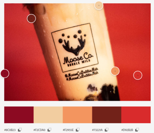
1.) Analogous
The term analogous refers to having analogy, or corresponding to something in particular.
It was awhile back after finishing work for AdZU’s Virtual Orientation Seminar, our project head decided to treat us with Moose Co Bubble Milktea, a popular Milktea brand gaining huge popularity here in Zamboanga which our instructor, sir Ced Zabala owns the establishment! Taking out some leftover cartolinas at home, I tried to do some product photography using the red cartolina as a backdrop. Little did I know I have already created an analogous color combination from the colors of this milktea and it’s backdrop. Indeed satisfying to my eyes and quenched my thirst easily!
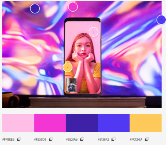
2.) Complementary
any two colors which are directly opposite each other
It has been months since the beginning of quarantine here in our area due to the COVID-19 virus, and I was finding ways to create amidst not having any physical contact. There was this particular trend online where photographers would conduct online photoshoots wherein they would make a video call and the model will pose according to the photographers’ instructions. I decided to test this out with one of my close friends, Desree Macrohon. I placed my phone behind my computer monitor emitting a bright holographic photo which complements the bright vibes from Desree’s room as I took the photo.

3.) Split Complementary
Instead of using a complementary color, two colors placed symetrically around it on the color wheel are used
Rolling the camera roll back to 2019, I had the chance to attend one of the Philippines’ most popular artists, Ben&Ben again during the Zamboanga Hermosa Festival. This time, I was just another member of the audience. Though I had no professional gear with me, I decided to take some shots using my phone. Ever since my first concert shoot with Ben&Ben it seems that their stage lighting always had this split complementary look of bright and cool colors. Recalling my color psychology lesson, the atmosphere the lighting gives us the harmonious and energetic vibes that the band gives off during their live performances.
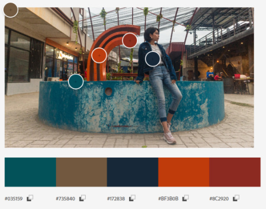
4.) Double Complementary
when two hues (colors) are next to each other on the color wheel and are paired with two adjacent hues on the opposite side.
Going further back, during our Christmas break, a couple of friends and I decided to go out and do an outdoor photoshoot. We really did not know where to go but we told our model KC to wear casual. Without any clue what she would wear, we decided to meet up at Yubenco Tetuan, the long roads and establishments there would offer good choices depending on the attire of our model. Luckily she wore denim giving us a good opportunity to shoot near some restaurants. We chose a location where there would be another cool color so it complements her outfit, we then found this pond in between some restaurants, and with the red structure in the middle of this pond, this color can catch the attention of the viewer, plus the rustic environment just fit perfectly for this shoot.

5.) Triad
A triadic color scheme is comprised of three colors evenly spaced on the color wheel
This shot was taken during the music video making for one of Zamboanga’s top rising local bands, Peregrine. After working awhile attending their gigs and taking photos of them, I was offered to take part of their creative team for their music video release for one of their songs, Half-Hearted. Looking back to this shot, it was nice to see the guitars able to stand out amidst this abandoned setting. This shot was originally in black and white, it was only during post-production did I see this triadic harmony occur from the color of the ceiling, the guitars and their outfits as well.

6.) Warm Colors
During the first week of classes for the year 2020, as I was strolling down the walkways of our school, I came across this patch of sunflowers blooming at the side of a school building. Coincidentally, my orgmates were looking for me asking to take photos of them in this sunflower patch. Again having no camera at the time, I took out my phone and took some shots of them. At this point I knew a little about utilizing colors, so I asked to borrow an orange sweater and let Sophia wear it for this shot, thus giving this warm feeling.
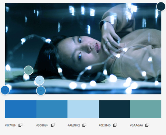
7.) Cool
On Sundays, I would head down to one of my photography mentor’s studios and would talk about photography and other parts in the field. I decided to bring along one of my colleagues, he decided to bring his sister along so we would take some photos as well. We took some fairy lights and went for this dreamy concept. Something I find very fond of doing.
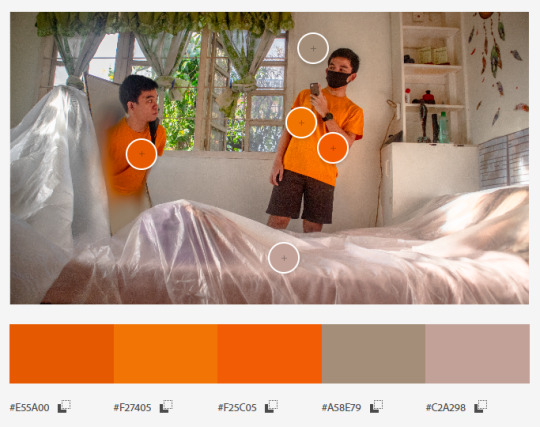
8.) Monochrome
Monochromatic color schemes are derived from a single base hue and extended using its shades, tones and tints.
After going through all my shots, the most frequent theme I notice when I shoot is having a monochromatic look. This was a self-portrait shoot I took in one of our bedrooms. During post production I decided to tweak the lightness of my yellow shirt on the left making it a little darker than my one on the right.
0 notes
Quote
COLOR THEORY
Color Theory is both the science and art of using color. It explains how humans perceive color; and the visual effects of how colors mix, match or contrast with each other. Color theory also involves the messages colors communicate; and the methods used to replicate color.
In this activity, we are tasked to make a color theory by our creativity in photography. This is my first time doing this, yet I enjoyed it and I find it too interesting. So without further a do, let’s take a look at my blog!

____________________________________________________________
MONOCHROMATIC

This is my autographed album from my idol Lee Changsub, he is one of the members of BTOB; a K-pop boy group in South Korea. I got this signature album during their the promotion of their “Hour Moment” album.
ANALOGOUS

This photo was taken last March 13, 2019 at Boulevard, Zamboanga City. This photo were very memorable for me as there’s many happenings on that day and it’s also one of my unforgettable moment I’ve ever had.
COMPLEMENTARY

This is my boy bestfriend, Christian. In that photo, we’re at Bulacan’s resort to celebrate his birthday. He is not a type of person who likes to take a picture most especially by himself, yet since the view were nice he still manage to take a photo with a nice shot.
WARM COLORS

This is just an aesthetic photo of the Monsta X album, one of the known K-pop boy group in South Korea, and this photo was taken to promote it as we also have our own online shop of K-pop merchandise.
COOL COLORS

This photo was taken during our SLA Acquaintance Party. We didn’t tend to have that lightning, yet it turns out cool. As you can see, we’re like a super top model!
SPLIT-COMPLEMENTARY

In this photo, we had our family reunion at Sta. Cruz Island here in Zamboanga City. The 3 women with a jump-shot pose is my mom and my two tita.They really enjoyed that moment as they kept on jumping to perfect that pose!
DOUBLE-COMPLEMENTARY/TETRADIC

Yes, t’s me! In that photo I was in the National Museum in Manila. I went there with my friends to have fun and explore! and yes, we really had a great time and having more additional knowledge at the same time.
TRIAD

Here we go! This photo is one of the most special moment in my life. I attended a fan meeting event of Yook Sungjae one of the members of BTOB; my favorite K-pop boy group in South Korea at Vetris North Mall in Manila.
____________________________________________________________
Yehey! Thank you for reading my blog and I hope you enjoyed it! Well, personally it is really a fun activity to do! I feel like while learning, I also reminisce the happy moments I had in my 21 years of existence.
If you don’t mind, you can try this as well! It’s not a common type of activity to do as you can also catch up more moments in your life and you’re also learning the color schemes we have. Knowing the color schemes could also help boosts up your fashion and creativity.
0 notes
Note

Hey Frank, which one of these lovely portraits do you like best?
monochromatic (purple)
complementary (blue and red)
triadic (blue-red-yellow)
analogous (green-yellow-orange)
split complementary (green-purple-yellow)
double split complementary (blue-green-red-purple)
Oh, I don't know, I don't know any of those, it's hard for me to tell. I usually read pictures like this one as "kinda boring"
Like, they don't get my attention visually, they look kind of like other stuff I'm used to, they've got a nice color scheme but it's hard to get my attention
The only one I might enjoy reading if you've seen the movie is the one from the split complementary – this one:
5 notes
·
View notes
Text
VIM学习笔记 网页开发-选择颜色(Select Color)
HTML-Editor插件
我在Christian J Robinson开发的HTML插件的基础之上,制作了HTML-Editor插件。使用:ColorSelect命令或者;#快捷键,可以在新建窗口中选取颜色。
使用Tab键,可以移动到下一个颜色;而使用Enter键,会将选中颜色的代码插入到当前光标处。
Colorizer插件
利用Colorizer插件可以直观的显示#rgb, #rgba, #rrggbb, #rrgbbaa, rgb(...), rgba(...)等等形式的颜色。如下图所示,颜色代码的背景显示一目了然:
HTML配色
关于HTML和CSS中颜色的命名和代码,您可以参考HTML Color Codes和ColorSchemer网站。
从符合标准和可访问性(WCAG)角度考虑,应在CSS中设定色彩,而不是直接设置HTML代码中的color属性。
色彩的平衡感和可读性,对于网页设计至关重要。对于配色方案(Color Schemes),有单色(Monochromatic)、近似色(Analogous)、互补色(Complementary)、补色分割(Split-Complementary)、三等分(Triadic)和矩形配色(Tetratic / Double Complementary)等多种风格。您可以在calcolor网站中寻找灵感。
即使并非专业的设计师,无法创造出令人惊艳的配色,但还是需要以恰当的对比度,来保证网页的可读性。利用tanaguru,可以检查前景和背景色搭配是否合理,并给出相应的优化建议。
题外话
以下《艺术世界》里关于颜色的文字,读来颇为有趣,也与您分享:
被法国十九世纪著名画家乔治·修拉(Georges Seurat)所大量使用的印度黄(Indian yellow)在今日已不复存在。因为这种源自印度的颜料是由仅喂食芒果树叶和水的母牛的尿液所制成。牛难以消化芒果树叶,它们的尿液在蒸发提炼之后就生成了印度黄这种颜料。但是这种制作方式无疑对动物非常残酷,因而被英国殖民政府所取缔。珍贵的群青色(Ultra Marine)颜料来源���阿富汗采石场的青金石,调制师在研磨过程中需要非常小心地控制,既要把石块磨成细小颗粒,又要保证足够大才能含有颜色。群青色被用于中世纪的画作中,因为其昂贵的价格,常常需要在制作成本里另外加以注明。1826年,人工合成的群青色颜料在一次化学竞赛中被发明出来,被认为是炼金术一样的发明,这个说法毫不夸张,因为天然的群青色真的比黄金还贵。另外一种珍稀的泰尔紫色(Tyrian Purple,或称骨螺紫)则提取自海洋里的某类食肉性海螺分泌出的黏液。因为制作成本高昂,拜占庭帝国把它作为一种社会地位的象征,禁止皇室之外的普通人使用这些颜色,使之成为一种突显高贵身份的“皇家紫色”。--《福布斯颜料收藏库》
Ver: 2.0 | YYQ<上一篇 | 目录 | 下一篇>
from Blogger https://ift.tt/3aYexFv via IFTTT
0 notes