#did you notice that i changed my mobile theme and icon??? bc if you did thank you it definitely makes the energy i invested more worthwhile
Text
˗ ˋ 9.6k (aesthetic) blogrates ˎ ˗
hey, there! this attempt at reviving my blog could be seen as sorts of a 9.6k follower celebration even though my motive is rather selfish :’) i haven’t done any type of rates in over one and a half years, but since i am searching for new blogs to follow this seems like the perfect tool to take a serious look at all you people’s blogs! i am also debating whether or not to change my url, and i could use some second opinions on the matter... i feel like this blog could profit from more change than just an updated (mobile) theme and a new icon, but at the same time i like my current url. so as you see, i am pretty indecisive.
possible fandoms/themes for my new url include a luna lovegood url, classic literature urls, soc/tgv urls, atla urls, or aftg urls
mbf me
reblog this post
send me one of the following:
💖 (+ maybe your opinion on me changing my url and what kind of url you’d prefer) for an standard blograte
or
🌟 (+ maybe your opinion on me changing my url and what kind of url you’d prefer) for an aesthetic blograte
formats can be found under the cut
(blacklist #mish does blogrates if you don’t want to see this mess on your dash!)
standard blogrates:
url: i don’t get it, sorry | /10
icon: /10
mobile theme: /10
theme: /10
post: not my fandom(s) | /10
overall: /10
following: no(t yet), sorry | f+ | yes, of course <3 | ˗ ˋ ABSOLUTE FAV!! ˎ ˗
(optional comment/compliment):
aesthetic blogrates:
colour - lilac // topaz // peach // silver // azure // burgundy // feldspar // bubblegum // celadon // navy // ivory
creature - mermaid // fairy // trickster // siren //phoenix // ghost // angel // poltergeist // succubi // valkyrie // wraith // nymph // elves
location - depths of the ocean // heart of an eerie forest // crumbling dark castle // city of skyscrapers // indie music festival// the bottom of a swimming pool // nights on a rooftop, spent stargazing // old library // floating amongst the clouds // sprawling hills of green grass // centre of a storm, safe indoors // night life city scene // vintage shop
space - stars // moon // sun // mercury // venus // earth // mars // jupiter // saturn // uranus // neptune
greek god/goddess - apollo // aphrodite // ares // artemis // athena // demeter // dionysus // eros // hades // helios // hera // hermes // hestia // iris // nike // pan // persephone // poseidon // selene // zeus
following: no(t yet), sorry | f+ | yes, of course <3 | ˗ ˋ ABSOLUTE FAV!! ˎ ˗
(optional comment/compliment):
#i'll do a poll later this week with all the urls i could imagine myself using#in this first step i simply wanna get a feel of what you guys would like to see so i can match that with what i wanna do :))#but all that's still in the future#by the by#did you notice that i changed my mobile theme and icon??? bc if you did thank you it definitely makes the energy i invested more worthwhile#i also adjusted my color scheme on my desktop theme accordingly but it's not really a major change over there#anyway enough rambling about my recent aesthetic changes#back to what this post should be about - blogrates!#i really hope some of you will participate!!#i am looking forward to finding new blogs to follow!#i am in dire need of new content on my dash#mish does blogrates
74 notes
·
View notes
Text
Custom Cursors
If you, too, are using tumblr in the year 2021 and would like to use a custom cursor, you may have noticed that the code in some other posts just doesn’t work anymore. So here is an updated tutorial on how to do that. Note that I have not tried doing this on mobile, so I’m not sure if it’s possible.
Step 1: Get an image
Basically just look for a cursor on the internet and do right click > copy image link. An important consideration for this is that the url of the site it’s on has to say https and not http or it won’t work.
This image also has to be smaller than 128 x 128 I think, but it’s recommended to be 32 x 32.
If you want to create your own image, you can just upload the image to imgur in order to get a url (you don’t need an account). I made my cursor using piskelapp.com but you can use whatever as long as it fits the size above.
(More steps under the cut)
Step 2: Find the place you put the code
Under the blog menu thing (under the profile icon in the top right), go to Edit Appearance, and then the big button that says Edit Theme. Once you’re there, scroll all the way down and click on “Advanced options”. There should be a field that says “add custom css”.
You can also put the code in the HTML of the blog theme itself, but I find this method easier.

Step 3: Put in the code
Paste this:
html, body, a, a:hover { cursor:url('URL HERE'), auto !important; }
If you’re putting this in the html of the blog theme instead of the “add custom css” thing, add <style> to the beginning and </style> to the end.
And then you just replace URL HERE (leave the apostrophes) with the url you found in step 1, and then save it.
Yay ur done
If it worked, then congrats, you now have a custom mouse cursor on your blog page!
Special thanks to the website I stole the code from. [Note: link was removed bc apparently the website is gone? Anyway here's their twitter ]
There is also a chance this did not work, and I know how frustrating that is so I will attempt to help. Here’s a test image to figure out if it’s an image problem or a code problem. This image worked when I tried it on my blog, so if the code works with this image and not yours, then it’s probably a problem with the image itself and not the actual code, so maybe just pick a different image. If it still doesn’t work then maybe the code changed again idk.
I hope this helped you nonetheless. Bye
#tutorial#cursor#custom cursor#help#tumblr#blog theme#theme#i got a random impulse to write this after i figured out how to do it on mine#so here u go
93 notes
·
View notes
Photo
1 YEAR ANNIVERSARY. ya’ll know me, i hate making things serious and sappy but i really did want to get around to writing something more for my one year on this babe because she means so much to me ( and so much more now that i’ve been writing her for a year ). ontari is such a wonderful and complex character, and it’s a shame given the show she was given she was only in there for one season it’s always an honor for me that ya’ll are willing to accomidate me into your lives, rp timelines, and plots ! i’ve honestly adored spending this last year with yall. with so much that’s happened irl in this past year it’s been such a blessing to have a steady place where i felt comfortable and identified to be able to hang out and write creativly, plus the bonus of enjoying my bbies ( that’s you lot ). and i know i’ve done some pretty shitty shit in this past year. and this is deffiently also a thank you letter to everyone that’s stuck by my side despite everything i’ve done not to deserve it. so this is my personal way of saying THANK YOU for being here, for wanting to write with ontari, for wanting to write with me, thank you for those 2AM movie nights, for the 4AM rush replies because a thread was just addicting, thank you for bringing a smile to my face for introducing me to friends new and old and freinds i wouldnt have been able to make if not for this blog. thank you so much. ya’ll don’t understand how much this means to me. and i dont think you will. so here’s a small little thank you notice for those of you that care:
if you were to LIKE & REBLOG this post ( * yes both ) you’ll be entered to win the following provided to you by YOURS TRUELY examples including ( all my rp blogs legit just look at any of the rp blogs ): a THEME BG + CODE * only if u want a custom code by me ofc it’s up to you, a PROMO SET, a DASH ICON, a MOBILE HEADER and !! an AZGEDA EDIT of your character because how tf would you not want more azgeda around !!
now that we’ve gotten that out of the way and i’ve given ya’ll a small thanks, i want to give you an even bigger thanks ! and wanted to give a big shout out to my fave babes whom have stuck by my side through a whole lot of shit that is hella undeserved ! but yet you’re still here ! despite it all and i owe you all the world so thank you. so much.
@murhys - MOON !! love of my life. cas to my dean. actual other half. salt king husband to our salt kingdom. moon you’ve been there for me since day 1 and are probably the only person on this website i’ve never had a disagreement with. you wormed ur skaidad into my baby icekids heart which i thought would be impossible and it’s magic how much i enjoy ur presence really. you’re deff like my other half babe. ultimate husband. ily
@azgona / @braverstars - HANNAH !! b to my v. actual partner in crime when it comes to like anything ! legit we write anything and theres so much perfect chemsitry between the characters that i think we were meant to b babe. like legit anything we do its magic and you really need to have more faith in this community because we need u man. we need you.
@kiingbuilt - LENEE ( STARS ) !! actual babe. positivity queen lenee. honestly ur so sweet and so perf and idk what you want me to say bc ur awesome in every way ? you put up with me who’s like the dark hole to ur sunshine but like i’m always so greatful i don’t think there could be a better person i’d want to play tari against than you, roan and her have such depth and it’s so wonderful to be able to talk at lengeth about our ice siblings and what could have been like ! ily so much thanks for legt taking care of us all better than what we deserve
@leyosgona / @saviorbuilt - SOCHIE !! my babe sochie waht to i say about you. well lets start with the fact i don’t think i’ve ever become trash for a ship quite as quickly as i became trash for catari like wtf man. i’m going to second that with sayig ur clarke is presh and i love her to death ? and top it all off with the fact hat you legit always put up with me spamming u wit random af things without ur permission and are a okay with it all the time which makes u way too cool.
@humansympathies - CHARLES !! legit one of these days im sealing u away form ur wife just u wait ( * hamilton an american musical plays in the bg ) honestly i still need to thank you for making me so goddamned comfortable with being okay to write something i had been so nervous to write before because of the context of th show. you are the reason i was able to come out of my bubble and im so fucking thankful for that sitll am going to add #actualjohnmurphy bc nothing u do can change that
@ginatcnic - LAUREN !! gg lauren ur always around to help me when i need it and i really think i dont deserve you as a friend you’re amazing and always there for me and put up with me ranting @ you about the randomest bullshit and being vauge af about it and whatnot. ilysm babe dont forget ever that you are one of the most important parts of this fandom and we’d be lost without you.
@foxofthe100 / allofthe100 - BRITT !! things i never expected i would do: ship with britt. things i’m super thankful happened: shipping with britt. not that we needed it to be friends bc w were friends beforei. but i deff think that foxtari has brought us closer and i’m so glad that it did !! you’re such a fun and acomplished person, and your view on things are always so well balanced and lovely to hear ! being who i am i love understanding things and you always put things in prespective. just in time to drop an angst ball on me but yknow.
@si02built / @rainkiing - CHUCK !! yo you. yes you. i love ya man. like i do love you so much i don’t think you understand how much you’re amazing. you’ve been there for me since day 1 and i know that it dosn’t matter if i havent spoken to you in a day or in a month we’ll jump back into things just as they’ve always been meant to be and i think there’s a sort of treasure in that tat can’t be sahken. i love you man. kisses. take care
@damnleader - NIKKI !! i dont know where to start with you man. i started off as ur biggest fan and now look at us. we’re trash and i love it and you legit need to get ur ass back onto this account so i can yell at you about how presh u are and how much i miss talking to you and ranting and bless.
@youngcst - MOO !! moo. legit i never knew whether to call you that or lois but you know what it don’t matter much now does it. waht i will say however is how thankful i am that we were bros for such a long time, and how much it means to me what nova and tari built toether and their relationship like i sob over our babies so often you don’t even know ! please always keep bringing us babe characters.
bonus shoutout - @ CONSQUAD because yall put up with my ass for 4 days and if anyone can do that i think they deserve like a gold medal or smth like pls yall are honestly some of the best people keep being you !! @banishhim ( black hole ) / @algaenotwar ( milky way ) / @stellarstolen
bonus bonus shoutout - @ icesquad because AZKRU BEST KRU - some of ya’ll are inactive and need to get ur asses back here just sayin’ @icymenace / @azhaihefa / @aznofi / @azkeyva / @azgedaechoes / @azgada / @aznontu / @komashdaun / @azenblida / @dubiousloyalty / @challengedloyalty / @shudameika / @aiopgona / @zosimekomazgeda / @wintamnontu / @deathwants / @icebuilt / @icebitxh / @leyosgona / @kiingbuilt / @haihefaroun / @firraun / @rcyalscars / @acrownofice / @youngcst
i also wanted to make a sort of like FOLLOW FOREVER ? like ? idk how you make a solid one of these but just like all the blogs ? i’m in awe of whenever they come on the dash seemed like a good idea ? like these are all so quality all the time eve if some are inactive i refuse to unfollow just because of the chance they’ll come back, they should be a shoutout bc they are my inspiration to write they make me a better writer every day ! and love the hell out of them: @wolfsouled / @rattledbybullets / @ragnarsscn / @princeubbe / @belomi / @soldiiermade / @imqetuous / @everyturnanycost / @noximperator / @lionoffrance / @praycd / @redempticnarc / @bloodshedbound / @allvanquisher / @murdocksredemption / @damnmechanic / @leaderbuilt / @casuistic / @headstrongblake / @crimiinalchemiist / @noukru / @starxbcrn / @arroworn / @survivorbuiilt
62 notes
·
View notes
Text
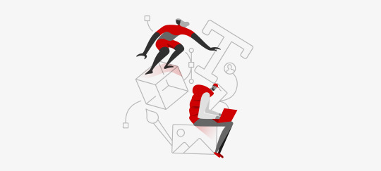
Designing Adobe’s Brand Illustration Style

The process of building an overarching graphic illustration style for Adobe products
Context
Illustrations are emerging as a vital part of the user experience, as they help express the brand directly into a product. At Adobe, we’ve had a lot of important discussions around the need for a unified brand illustration style. As our products evolve, we want to make sure we’re building better brand recognition with our users, and build deeper connections between user and product.
As you may have gathered from past articles by my teammates (such as Sonja Hernandez’s brand system article and Anny Chen’s filetype icon case study), there are a lot of considerations to take into account for a product landscape as big as ours. Adobe’s offering includes over 100 products, services, and communities, from creative tools to communication and marketing tools. How do we provide a creative and playful illustration style which can scale to a company and product lineup like Adobe’s?
A brief history of illustrations in Adobe products
Before we started exploring color illustration in our products, our Icon team had already established a more linear illustration style in 2016, which is still widely used in our products. These linear illustrations are typically used for informative contexts, in areas like empty states and user onboarding flows.

Welcome to CC assets by Marco Mueller
Initially, we wanted to integrate this linear style created by icon designer, Marco Mueller, with our new brand illustration system to make the transition between these two areas as seamless as possible. I tried adding figures interacting with the linear elements to create stories. The style of these original figures was actually inspired by the illustration used on the Acrobat 5.0 packaging way back in 2001.

Early illustration style experiment (L) Adobe Acrobat 5.0 Package Illustration (R)
Adobe Capture on-boarding illustration

CC library illustration
We had several internal discussions about this style after its first release — Khoi Vinh, principle designer at Adobe, raised some concerns regarding the visual identity. Regardless of its interesting historical origin, this approach used a combination of vector shapes and human figure, which has been widely used in the tech industry. So our team decided to revisit this project and explore other directions.
“But it is worth taking a step back to examine the way our products use illustration and trying to understand why we’ve all settled on this particular approach.” — Two Very Different Kinds of Illustration, Khoi Vinh
I was honored to collaborate with a remarkable illustrator and artist at Adobe, Kyle Webster, for this project. This time around, we set out with a few goals for the illustration style: We wanted to demonstrate Adobe’s commitment to world-class illustration through creativity and playfulness. The illustrative language needed to allow for variety within the style, so that it may be expanded over time across the system of products and messaging, and allow for additional illustrators to contribute. We also wanted it to feel unique to Adobe, and not “owned” by another company.
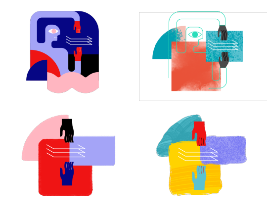
First, Kyle tried to see if we could add more visual elements to help enhance the existing illustration style. As you can see, he added more personality to the figures by including skin color, details in clothing style, and shadows to bring more depth to the characters.

“While it was fun to see how far I could push the style away from the original source material, while retaining a more traditional human form in the drawings, it became apparent that this direction would not be as flexible as we wanted, nor would it give us room to really play and experiment. I’m glad we changed direction and Emma did a wonderful, thorough exploration that set us on the right path to develop a unique and adaptable visual vocabulary.” — Kyle Webster
As Kyle stated, this initial exploration was still pretty close to the original style, and after a few more brainstorming sessions, we decided to move even further away from the standard human figure to explore a more abstract visual vocabulary.
It’s time to ditch the trend…
Adobe Spectrum Inclusive Design Mobile Banner
We exist in a software landscape where illustrations are becoming more uniformed and — for the lack of a better word — generic. Often, illustrators are removing personal, creative characteristics of people in their illustrations in order to capture a wide diversity of people. They focus a lot on figures, and don’t experiment a lot on how to express their ideas more abstractly.
In Meg Robichaud’s inspiring article, You Can’t Just Draw Purple People and Call it Diversity, she discusses the inclusive issues of in-product illustrations. I wanted to shift the focus away from trying to represent human diversity in every single illustration, and in doing so open up different possibilities for expressing the same user concepts through abstract shapes instead.
Establishing principles and exploration
Illustration is an intuitive and subjective art form, which can make it challenging to translate into a systematic language that works across multiple platforms and products.
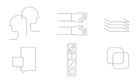
In order to experiment and define a new style, I restrained my explorations with four tenants:
Human forms and perspective
Texture
Shapes
Color
I’ll spend some time here talking about each, and guiding you through some examples.
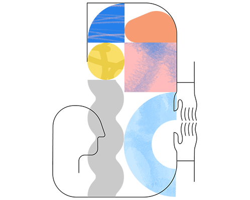
Human forms and perspective
Including human forms can build an immediate connection with users, but to what level can we abstract those forms and still connect? Do we always need to have fully concrete figures involved? Do we need to include perspective details, such as shadow and dimension?
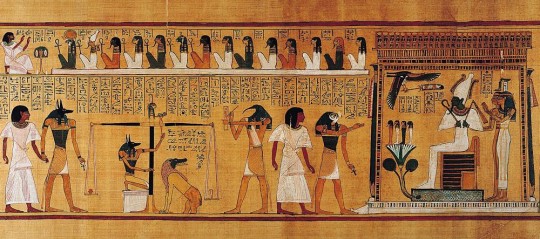
The Weighing of the Heart: In Spell 125, Anubis weighs the heart of Hunefer. This spell is first known from the reign of Hatshepsut and Tuthmose III, c. 1475 BC. Image from Beyond Hieroglyphs: The Art and Architecture of Ancient Egypt
Side profile explorations
Inspired by the style of Ancient Egyptian art , where the heads are painted in profile with little to no shading, I tried a series of side profiles and arm/hand combinations that could be assembled in different ways to tell stories.
Texture

Kyle’s explorations of textures
Texture is another great way to bring these shapes to life and give them a human touch that adds personality and a distinct style. Kyle curated a series of brushes that could generate a subtle but intriguing texture in the illustrations. We played with a range of texture styles and compositions outlined in the above study. Ultimately, we preferred the openness and airy look of Option A in terms of composition, but also liked the brush stroke effects in Option E and how it was integrated with the forms. From there, we decided to combine the two styles and keep exploring.
Shapes

Alexander Rodchenko and Varvara Stepanova’s famous Books! poster (1924) employs a stark grammar of simple geometry and flat color to promote a campaign for worker education, the image is from The easy guide to design movements: Constructivism
Shapes play a huge role in our design principles, and they also help connect this new style with the more informative illustrations that were developed earlier. Coming from a background in graphic design, I wanted to experiment with mixing geometric elements into our style to create a minimal and contemporary look. I’ve always been inspired by Suprematism and Constructivism, two significant art movements and philosophies in graphic design. Both art movements focus heavily on using basic geometric forms and the importance of composition to create an impactful visual design.

Shapes I used in the illustrations
Colors

Colors can strengthen the connection between illustrations and a product, so we generated color palettes that were based off of the product’s brand color theme and then included additional colors that would complement the main colors. We wanted to allow for more flexibility in color combinations, and so the additional colors are open to the designer to pick and choose what makes the most sense for each illustration. The only other guideline we provide around color is how they are layered, so the darkest color is only ever used for line work and figures. The medium and light colors are for solid shapes and background.
Defining the visual language
Storytelling and Abstraction Level
To find the right visual language for telling a story, I tried to assemble the elements I talked above. Below are some examples from the early exploration.
The idea was simple: use the least amount of elements to express the most out of a story.
I tried to reduce the number of figures in the illustration. The idea was simple: use the least amount of elements to express the most out of a story. The two illustrations at the bottom can clearly convey this concept while distilling the form down to its essence.
Textures and lines
At this stage, I was trying find the sweet spot of line, texture, and shape combination in each illustration that would be visually interesting enough and still feel balanced to the eye:
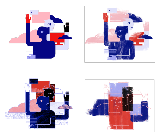
The goal was to have a clear definition between foreground and background, layers and dimension, and to create unexpected and interestingly arranged interactions between lines and shapes that would reinforce the messages.
Linear shape explorations
Showcase
Here are some illustrations that I created based on this new system. You may notice them in the most recent release of Document Cloud (Acrobat) and this week’s Creative Cloud release. Keep an eye out for these and more in upcoming releases of your favorite Adobe apps!

Acrobat DC On-boarding card


Creative Cloud Mobile on-boarding cards

Creative Cloud Mobile on-boarding cards

Adobe I/O Console XD Plugins Webpage

Adobe Illustrator CC 2019 on-boarding banner
0 notes
Note
blog rate please? it's barely the 3rd day of school and one of my teachers didn't show up so we were stuck in the hall for most of the hour 😂
Hi Nadia! Hope you had a good few first days of school :)
URL: don’t get it sorry | it’s kinda cute actually | amazing! | wowowow | how did you get this who did you kill?
ICON: ngl kinda basic | meh cute i guess? | v nice | lovelovelove | okay i’m stealing it!!
DESKTOP THEME: default | i’m confused? | not bad | how is this so cute?! | aaah I love and might accidentally steal the code oops!!
MOBILE THEME: default | i’m confused? | not bad | how is this so cute?! | aaah I love and might accidentally steal the code oops!!
ORIGINAL CONTENT: couldn’t find any | you’re getting there | so pretty?! | aesthetic af | amazing i’m reblogging everything!!
OVERALL: 1 | 2 | 3 | 4 | 5 | 6 | 7 | 8 | 9 | 10 | out of this world
FOLLOWING: no, sorry! | i am now! | yes | duh ofc
COMMENT: I noticed something is wrong with the links in your desktop theme. It’s probably bc you changed your url, and put in the wrong link when editing the theme. But I absolutely love your desktop theme!
WANT A BLOG RATE? They’re ending in two days!
3 notes
·
View notes
Text
@wonhuis replied to your post:
i think it's pretty cute!! especially the kind of explanation on your mobile about you?? that's nice!!! also omg i love coding so i'm always overly appreciative of ppl who code too lksjnf this is why i think your desktop theme is even nicer cause u did change a lot and it looks rlly nice!!!!!! it was worth it the 12hrs of work cause it looks amazing :') i'm too lazy for that so i never change my theme LMAO
i'm also u keeping your icon lskjdf that's a mood i tried to change mine but now i'm too used to it :///
oh my mobile about page has been like that forever,, i wanna make it shorter tho bc its just too much & nobody cares that much lmaoooo. i hate coding bc its not like a post, where u kno if ppl see it (i.e. likes & reblogs), and its literally a whole ‘nother language lmao, so yeah i definitely have a lot of respect for theme makers. thank u 💘!! yeah i just wanted something.....different, bc i noticed a lot of ppl had the same theme as me and I Have To Be Different lol, and this way since i altered the original theme sm it ensures no one has the same theme as me 😈 IM SO ATTACHED TO MY ICON IDK WHY. maybe its a gorgeous photo ????? ive had it since the beginning of the year, idk, its my Thing now i suppose lmao
#i wish i could be that person thats like ''name. age. sun sign. bias.'' and thats all my mobile abt page says#but noOOOO my stupid portuguese ass wants to talk !!#wonhuis#d:replies#lovely folks 💞🍰🌸#n17
0 notes
Last Seen Blogs
netflixmess
MY NAME IS ZOE & I LOB NETFLIX
a41-i-finally-caved
Don't Over Think It?

cutieswithass
CWB (cuties with bootys)

a1handyman-blog
A1 Handyman Singapore

nirjadesai
Nirja Desai