#desaturated palette
Explore tagged Tumblr posts
Visit Tumblr Blog
Explore Tumblr blogs with no restrictions, modern design and the best experience.
Last Seen Tumblr Blogs


Fun Fact
Tumblr has 411 employees.
Text
•°♡Stealing Your Heart♡°•
Happy valentines day!
Hope everyone has a good day, whether having a valentine or not! Me n the other singles can chill while watching Coraline💪😼
(Cw: Realistic Heart !)
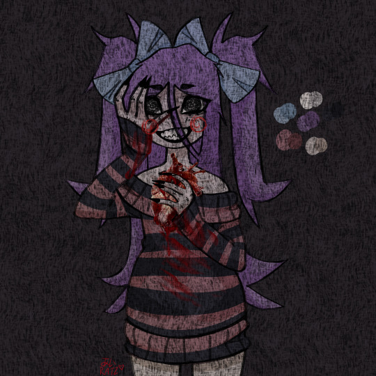


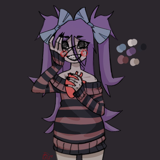
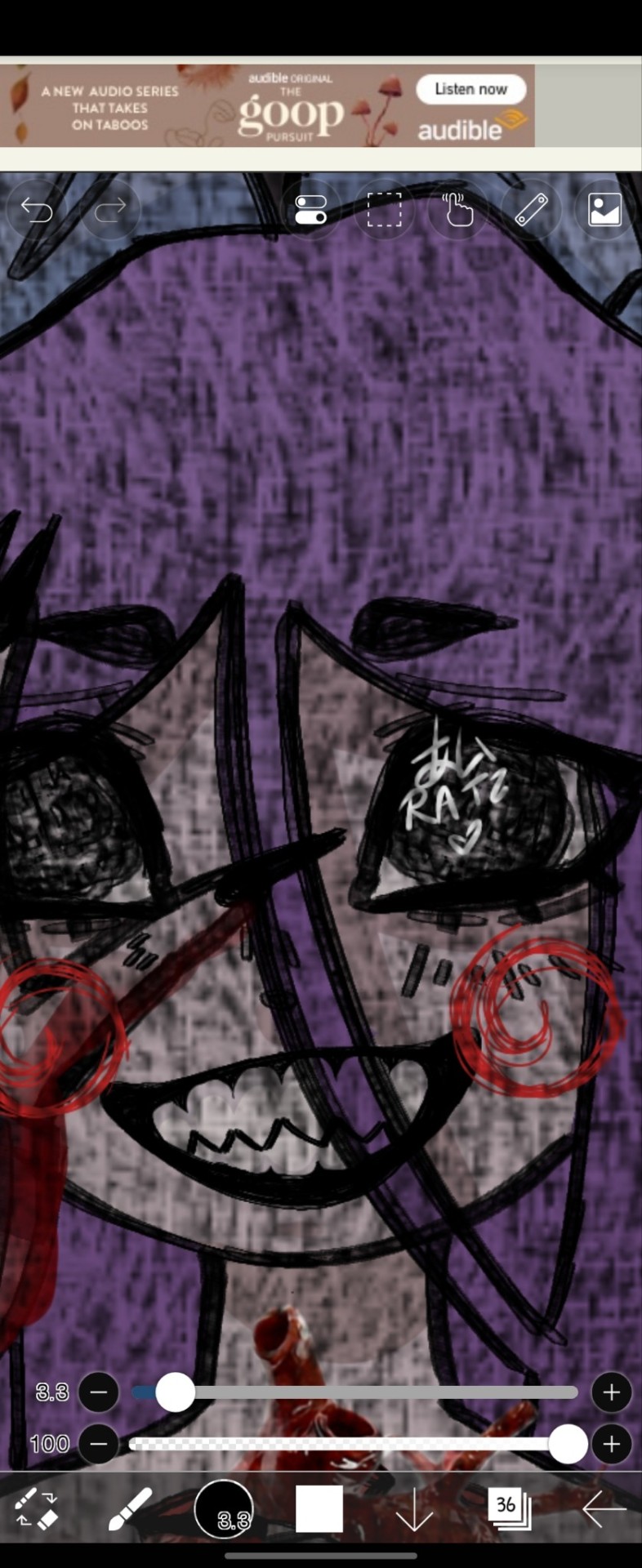
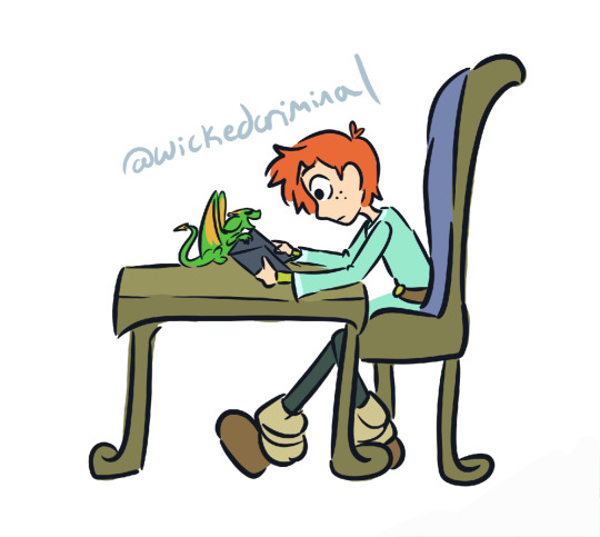
#song inspired#love#valentines day#art#original art#original character#oc#persona#horror persona#horror art#あいRatz#♡#muted palette#desaturated palette#mild gore#realistic heart#dont let them in the damn house
14 notes
·
View notes
Text
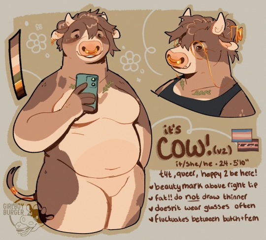
had an identity crisis, prime time for a slight sona redesign!
it's cow! (again!)
+ a closeup because i'm really proud of the eyes
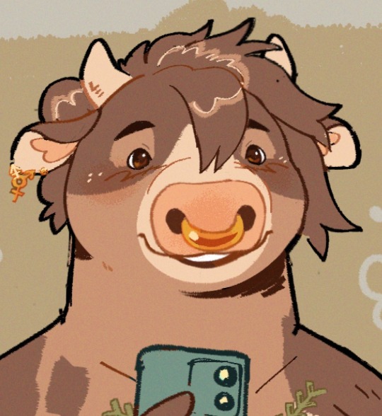
#i felt really extremely disconnected from cow and was like welp. time to make new fursonas#and made like four drafts before drawing cow with short hair and going 'oh.'#i ...... just need a hair cut. so i gave my fursona a haircut while i'm waiting to go#fucking. SADGE that im redesigning it so soon after its last ref but#shrugs#i do not control the heightened emotions about fursona and what it means to me#also there's a lot of experiments in this piece!! new brushes new coloring techniques new style of ref#loooots and lots of alts over on my ponytreon#my art#furry#fursona#anthro#oc#cow#cattle#oc: cow#bovine#ref#ref sheet#reference#i tried like...7 other palettes before just taking the old one and tweaking it and now i rllllllllly like it :03#i just needed less pastels/contrast and more soft/desaturated tones...who woulda thunk#(it's everyone. everyone wouldve thunk. i <3 desaturated tan tones)
2K notes
·
View notes
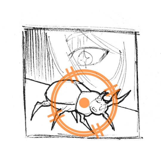
Text
Beware the Mountain's King
#chew toy of a man.#i was!!! trying to replicate ggdg's palettes bc i am obsessed with how they do colors in soulsov#i am Not good at it yet. but hey. i had fun! and i think this turned out alright....#undertale#asgore#myart#TUMBLR STOP DESATURATING MY ART CHALLANGE
2K notes
·
View notes
Text
I think 90% of my gripes with how modern anime looks comes down to flat color design/palettes.
Non-cohesive, washed-out color palettes can destroy lineart quality. I see this all the time when comparing an anime's lineart/layout to its colored/post-processed final product and it's heartbreaking. Compare this pre-color vs. final frame from Dungeon Meshi's OP.


So much sharpness and detail and weight gets washed out and flattened by 'meh' color design. I LOVE the flow and thickness and shadows in the fabrics on the left. The white against pastel really brings it out. Check out all the detail in their hair, the highlights in Rin's, the different hues to denote hair color, the blue tint in the clothes' shadows, and how all of that just gets... lost. It works, but it's not particularly good and does a disservice to the line-artist.
I'm using Dungeon Meshi as an example not because it's bad, I'm just especially disappointed because this is Studio Trigger we're talking about. The character animation is fantastic, but the color design is usually much more exciting. We're not seeing Trigger at their full potential, so I'm focusing on them.
Here's a very quick and messy color correct. Not meant to be taken seriously, just to provide comparison to see why colors can feel "washed out." Top is edit, bottom is original.
You can really see how desaturated and "white fluorescent lighting" the original color palettes are.
[Remember: the easiest way to make your colors more lively is to choose a warm or cool tint. From there, you can play around with bringing out complementary colors for a cohesive palette (I warmed Marcille's skintone and hair but made sure to bring out her deep blue clothes). Avoid using too many blend mode layers; hand-picking colors will really help you build your innate color sense and find a color style. Try using saturated colors in unexpected places! If you're coloring a night scene, try using deep blues or greens or magentas. You see these deep colors used all the time in older anime because they couldn't rely on a lightness scale to make colors darker, they had to use darker paints with specific hues. Don't overthink it, simpler is better!]
#not art#dungeon meshi#rant#i'm someone who can get obsessive over colors in my own art#will stare at the screen adjusting hues/saturation for hours#luckily i've gotten faster at color picking#but yeah modern anime's color design is saddening to me. the general trend leans towards white/grey desaturated palettes#simply because they're easier to pick digitally#this is not the colorists fault mind you. the anime industry's problems are also labor problems. artists are severely underpaid#and overworked. colorists literally aren't paid enough to do their best#there isn't a “creative drought” in the anime industry. this trend is widespread across studios purely BECAUSE it's not up to individuals#until work conditions improve anime will unfortunately continue to miss its fullest potential visually#don't even GET ME STARTED ON THE USE OF POST-PROCESSING FILTERS AND LIGHTING IN ANIME THOUGH#SOMEONE HOLD ME BACK. I HATE LENS FLARES I HATE GRADIENT SHADING I HATE CHROMATIC ABBERATION AND BLUR
2K notes
·
View notes
Text

casts spell of saturates you
#sunnysiderambles#sorry im stickerpilled FDGHD testing things out#i think ill try a more bright palette next time i make stickers#and not be seduced by the siren call of desaturated colors next time pfttt
163 notes
·
View notes
Text
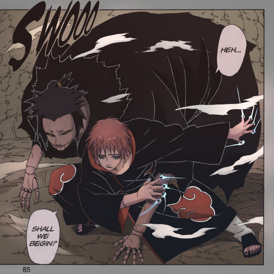
Since I don't like to wait or make people wait… I'll end this quickly.
#sasori#akatsuki#naruto akatsuki#sasori of the red sand#sasori akasuna#third kazekage#naruto manga coloring#manga coloring#i discovered a program to enlarge images and i have so much power now#in most cases you could easily set it as your wallpaper if the aspect ratio was better lol.#enjoy sasori and third in a-lil-dead vampirish but still vibrant palette#bc official colors suck#i wanted to prove to myself that desaturated colors can be used well#i have one or two more kakuzus cooking depending on how you look at this#and then i'll probably open polls again#phi colors#i'll prepare a better ID later#they say that shitty ID is better than no id#i can tell you it looks v good in b&w too. it fucks in b&w
283 notes
·
View notes
Text


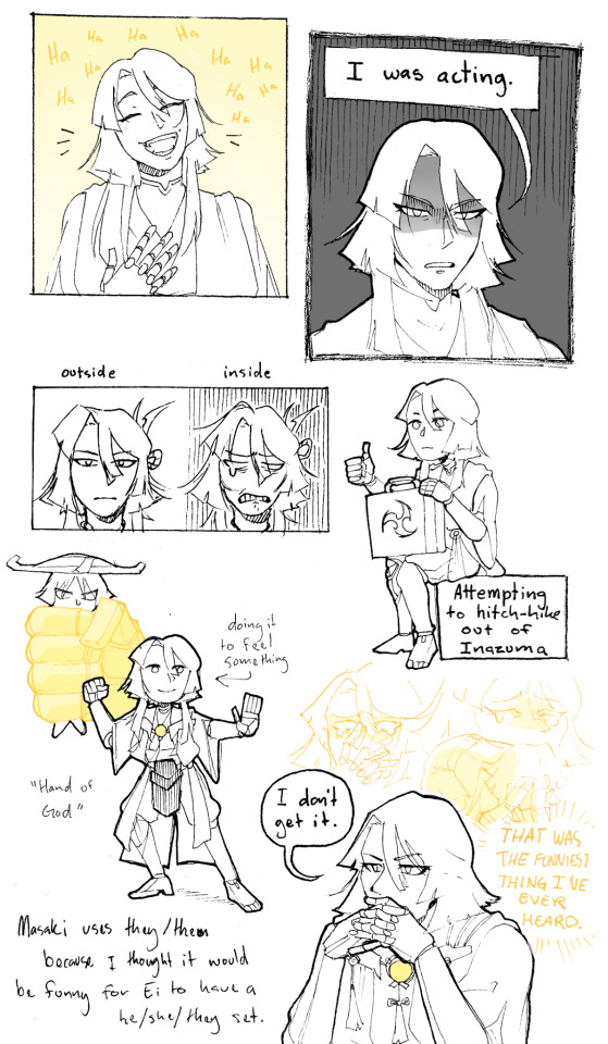
For my genshin impact enjoyers: 3rd raiden puppet because a forgotten middle child is always funny
anything and everything that happens to them is purely because to was the funniest route to me.

ZOOM ON MY DETAILS OR I'LL DIE.

#my desaturated style is at WAR with genshin color palettes#anyway heres the silly guy i made you'll never see them again <3333#genshin impact#scaramouche#my art#raiden shogun#raiden ei#genshin oc#my oc#masaki#inazuma spoilers#for safety ✌️
865 notes
·
View notes
Text

dinner is not over!
#pig does art#URGH this one isnt like. top tier jpeg art but i do really dig the color palette... saturation and desaturation will be mine to control#anyways the uhh. i said earlier i wanted to try doing just fun little doodles like those cool pieces#from chriskotiesen? yea#thats this. my attempt at it#i was hungry and then went ohh you know what's a song that fits dinnertime#jack fuckinnn stauber#shoutout to the lasso tool ill figure it out eventually
102 notes
·
View notes
Text


🏴☠️ The #1 Heron 🏴☠️
The SMP hasn't even started and I've already decided that this the Scott design of all time
#mcyt#pirates smp#scott smajor#pirate scott#craig art#i've learned to love desaturating my palette and i'm applying it to EVERYTHING
666 notes
·
View notes
Text


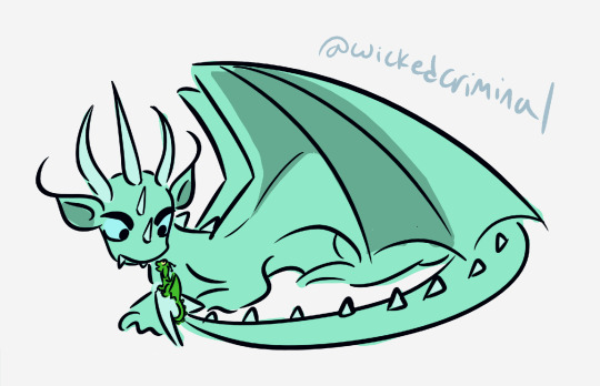
Some Last Dragon warm ups from ages ago!! I'd really like to come back to it at some point
#i wanted to give this au a desaturated blue-gray palette to capture the chilly dark fantasy vibe of the rankin bass movie#i want people to feel like they need to put on a jacket just looking at it#with hiccup's dragon form and later his tunic i decided on a ❄️frosty turquoise❄️ because forest green was too warm#i really like how it brings out his hair!!#the last dragon au#my art#httyd books#httyd book au
114 notes
·
View notes
Text

Busted and Blue.
[inspo from this twt !]
[ver with no tears here !]
#finally finished this fucker so he can lay to rest may the demon that i accidentally summoned be at peace now that im done with this amen#actually the reason why i kept drawing kylar in black and white with zero tones is cause i couldnt decide on a color palette for him#i ultimately decided on a bunch of desaturated purples with green accents :]#purple cause i genuinely thought that the complementary color for purple was green but i realized way too late that it was actually yellow#but hey happy accidents ig#degrees of lewdity#dol#dol kylar#kylar the loner#my art
774 notes
·
View notes
Text

A stunning production still from Macbeth at the Donmar Warehouse.
#david tennant#soft scottish hipster gigolo#cush jumbo#macbeth#donmar warehouse#i love this so much#he looks like a vampire#something timeless and eerie#love the desaturated color palette#beauty in grey#god he is gorgeous here#far too much attractiveness in one person#the power this man exudes on stage#i hope i'll be able to see him in the theatre for real someday#<3
191 notes
·
View notes
Text
there are a lot of parallels/lines/moments in cc that completely rely on it being in the written word (and a lot of parts that couldnt even be translated to art/animation or anything, like almost the entirety of ME) but goddddd the amount of visual parallels i could do if i ever drew it .... maybe i could fuck around for funsies anyway. get my ideas down onto the paper. i absolutely love visual storytelling man
#canary continuity#maybe one day i'll make a rise au that i plan on only depicting via comic. that would be SO fun#anyways on cc. the final fight with kitsune and its parallels to the. uh#literal foxhunt that happened at the end with CL could be illuminated way better fr#also ive been feral imagining the idea of a shot of leo stepping through the portal after killing her#visually looking extremely similar to one of him closing the closet door#but unlike when he closes the closet. this time he looks back as it shuts behind him :')#also ive been thinking about the idea of CL if it were translated to visuals starting out in full color#and then like slowly and almost unnoticeably desaturating into grayscale (with only gold staying the same) as it goes through#and maybe the final fight with raph in the lab has really eyestrainy saturated colors?#kind of to show off the vibe of him bursting back to life like. all at once in pure terror#stuff like that#maybe a limited color palette that's just really bright and intense#and it comes back whenever he freaks out afterwards. do u see my vision
35 notes
·
View notes
Text
I also saw a mod called No Parrots that took away the vibrant colors of the griffons and changed them to be muted and mostly-grayish, and out of spite, I desperately need someone to recolor the griffons to match various macaws
#I need one of these little creatures to be bright green just to spite this#DATV things#I DO NOT understand the community's obsession with removing colors from this game tbh#like 60% of the mods are to desaturate outfits or make them darker or brown or gray or all black or without color#is it thinking bright colors negates the heavier bits? a dark palette is inherently better for serious tone? that color ruins the mood?#imo that's just cowardice and lack of imagination#i am TIRED of monochromatic or mostly blacks and beige being the only acceptable color scheme for Seriousness™#go watch an Almodovar or something
29 notes
·
View notes
Text


🧲⛏️/🌼🎀
this is a remastered drawing of an old constabell art i made months back (it was for his birthday :3)
#changed her dress of course and fixed his color palette to my liking#i also initially thought he had desaturated blue eyes but (the eye colors are so inconsistent since its so hard to tell w the dark palette)#i changed it and settled for brown hehe#i hope your day is going well everyone 💖#~ art#💚 constabell#i did this in ibis hehe#dividers by cafekitsune
27 notes
·
View notes
Text
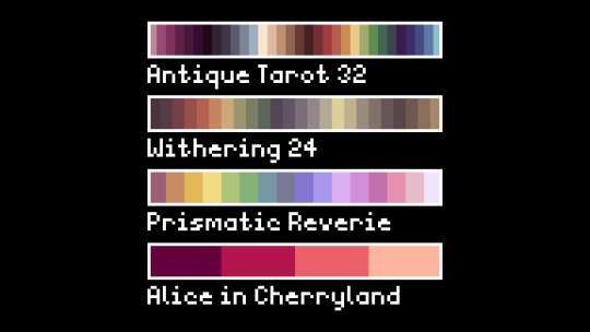
a bunch of new pixelart palettes :D enjoy
#if everything goes well they'll be out for download on lospec#pixel art#pixelart#pixel#palette#palettes#pastel#desaturated#pink
65 notes
·
View notes