#depends on which style
Explore tagged Tumblr posts
Visit Tumblr Blog
Explore Tumblr blogs with no restrictions, modern design and the best experience.
Last Seen Tumblr Blogs


Fun Fact
Women make up for the other 50% of Tumblr’s audience.
Text


To be fond of dancing was a certain step towards falling in love.
#something something dancing encourage affection#quote from pride and prejudice which I watched for the first time recently with my friend#Edwin dance style choice is ballroom while Charles dance style choice is swing#they’re both lead and follow btw depends on who knows it better#alexxuun#dead boy detectives#dbda#dead boy detectives agency#dead boy detectives fanart#dbda fanart#payneland#paynland#edwin payne#charles rowland
5K notes
·
View notes
Text
When it comes to costumes Jason and Duke really are the more practical ones. Duke especially.
Man saw everything wrong with everyone elses outfit and was like, "couldn't be me" and has armor and a helmet.
#style over safety#fuck that I can do both#duke thomas#jasons practicality depends on which costume you go with#leather jacket and t shirt#nah#armored clothing and leather jacket#you can pass
46 notes
·
View notes
Text

Accompanying picture to chapter one of my fic “Wade Wilson’s Guide to Studying Your Spider”
Since we’re getting close to the end of the story, I’m going back and doing a final edit to all the chapters so I can lay this fic to rest as soon as the last chapters posted.
Here’s a link to Chapter 1: Strange Occurrences if you’re interested 😉
#i also wanna work on my drawing so that’s why I’m adding art to it#the quality and style of said art will vary depending on my mood#this fic has been my baby for a while#we’re getting to the end#which is exciting it also sad but mostly exciting#I’ll miss it but I’m ready to lay it to rest#peter parker#spider-man#spideypool#deadpool#wade wilson#fan art#my art#otp#Fic link#Wade’s Guide
290 notes
·
View notes
Note
what brushes do you use? >.<
had to go look for specific brushes i use, but i found them ^_^ included the customizations i added because most my brushes are customized.
i draw in clip studio paint <3 the one from the dotsy set is the "effect" one i forgot to add it, sorry.
those are just the brushes i use the most for sketching, line art, coloring and rendering, i have so many downloaded...
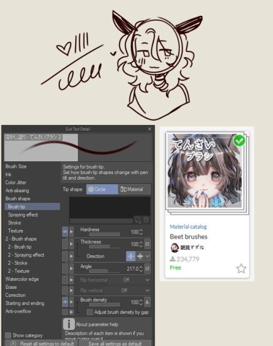
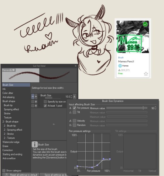
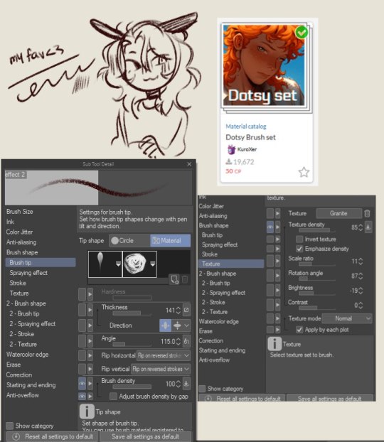
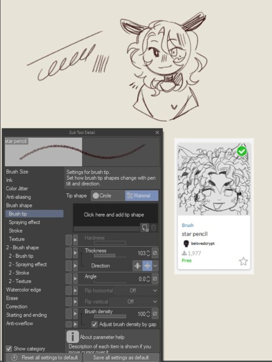
#☆ inbox .#love how u can also see the way my style differetiates with different brushes#it honestly depends on my mood which brushes i use 4 what and when#most of them are free and i got the effect one from the dotsy set when it was free btw#couldn't figure out how to put them here for a while but i think this works?#u can pretty much juet search them up by name btw that's how i found them again#let me know if u want me to specify anything or want a specific brush i used somewhere<3#also featuring my new sona design<3 ill drop a ref probably#if anyone want to see idk...
27 notes
·
View notes
Text
atp most of my red guy human design is to like. prove a point
#like i think people could bear to get a little more creative with him in particular#yes that includes his outfits. like. he doesnt have a set one like the other two and ur just gonna give him a red sweater..#AND WHILE I GET THAT AND I UNDERSTAND LIKE.#but you could get so creative with it is my point. and put him in clothes that mimic the shilouette of his original bodysuit#WHILE fitting his personality/color palette#like its a fun lil challenge!!!!#i feel the same way abt his hair i think people need to get way more creative with it#i feel like a lot of people default to like. one hair style. which is CRAAAAZYYY to me bc theres such a variety of things you could do#depending on if you want to mimic the texture the sheer volume or the color or the original materials of the costume like.....#have fun with the shilouette there too!!!!!#idk it like. doesnt really matter i guess but im like. come on.#watevarr tho im just saying i say this as his BIGGEST hater in the world
34 notes
·
View notes
Text
i can Feel myself getting to a point with my art where i want things to improve but i think for the first time in a long time i don't know how to teach myself the skills i want
bellyaching in the tags
#i want more control over the colors bc right now the great color work compliments#i feel are entirely owed to the gradient map adjustment layers i use at the end#which are great! they do create a nice sense of cohesion without the pieces feeling monochrome#but there's very little control in that it's a Lot of throwing shit at a wall to see what sticks#i don't know how people shade digitally without using multiply layers#and have things Not come out looking muddy#and i feel like ''oh use color theory'' isn't enough bc i've looked up a lot of color theory#but i'm still missing something#i also. don't know how people do digital Paintings that look like oil paintings#that shit is so impressive to me#and maybe i should understand and accept where my skills lie#and lean into my dependency on ink layers etc and lean into art nouveau styles even more#but i'm just not that kind of person#i want to be able to do more
8 notes
·
View notes
Text


One of the interesting bits of trying to resume working on the game after so long is looking back at my ancient Draft Placeholder versions of an image from 4 yrs ago trying to remember what the hell I meant back then, to hopefully interpret it into some more final (ish..) form of the same thing .. making slow progress lol
#At this point I've decided it's just a consistent design decision to have the sketchy slightly wonky sort of art ghbjj#I simply don't have the digital art skills/tools/patience (mostly that) to do 100% digital things and have a Clean Polished Professional#Neat Looking Perfect Crisp Lines sort of thing like one would see in most games. I'm drawing everything in pencil half decently (not strict#ly making sure every line is straight or that the perspective even makes sense) and then scanning it in and coloring it on the computer#and that's about it. In another world I could hire an artist or two to do professional backgrounds and charcter art or etc. - but as I am#a mere penniless peasant hermit with functioning issues who has to do every aspect of everything themselves - I'm just going to do#what is possible within the time frame/my ability/etc. and then just be like ''ah you see! actually this is intentional~ it has a homemade#crafty hand drawn sort of charm about it - yes? this was the direction all along!!'' LOL#Which for the record I'm not like complaining that it's necssarily Bad or anything - more just I suppose not the Professional Polished#style you Typically see in a lot of things - again the like - sketchy unclean lines of it all.#(like I think usually people use some sort of symmetry tool to make sure that all sides of a box are neat and clean and have that#Professional Game Art type of feel about them - rather than 'this is a scan of scraggily pencil lines in which I did not even bother to use#a ruler or try to get them all that even' lol). So it's not that it's BAD really.#just I think.. perhaps ''unconventional'' compared to the examples of other#games I've looked at. BUT. the point is to convey an idea. I think your art has failed if you do not convey a concept properly. But so#long as it meets your purposes and is not SOO cluttered/scribbly that nobody can even tell what's going on (unless that IS your intention)#then like.. I think it's fine. You can tell a house is a house even if it's not polished. No worries. (<convincing myself)#ANYWAY.. also 'Nanyevimi Market Quest' is still SUCH a placeholder name but I genuinely can never think of anything else so#I've just been going with it for now ToT... There's no distinct actual throughline story/plot so there's no 'theme' to base a title#around. Kind of like how 'The Sims' is just called the sims because naming it like 'Sims: Downfall Of Pleasantview' (one of the#towns in TS2 i think) would be a weird misname since what happens in the game totally depends on what you choose to do with it#So you can't really name it anything THAT specific (a player might not even choose to have a house in Pleasantview. what then? etc).#So it's just like..uh well...GENERALLY speaking.. everyone is uh.. on a personal quest..vaguely.. which takes place in a Market street full#of shops.. and you are mostly talking to shopkeepers... BUT it's not just a Market Quest since it's also in a fantasy world.. so we need to#give the fantasy world name.. and that's about it. I'm just at a loss for anything else. Maybe the like 2 and a half playtesters I#manage to scrounge up will have better ideas ghhh.. 'Nanyevimi Quest: Get To Know Some Shopkeepers' 'Find A Job In Fantasy World' you could#say 'Market Adventure' but some would argue just having a bunch of conversations and wandering around is not much of a real adventure.#don't want to set people up for thinking there's any drama or combat or anything. 'Do Menial Errands For Mentally Ill Elves Simulator' ghjg#(also sidenote: the '''chibi'' style versions of the characters on the menu screen....EVIL.. that style is SOOO hard for me to draw in for#some reason.. I just can't get the proportions right/have trouble fully ''simplifying'' the design.. took me HOURS lol... aUGHh)
12 notes
·
View notes
Text
for the shit I gave Andrey for not owning a single shirt. Frankly, I doubt that Eva owns any either. It's just scarfs and loose fabrics in her closet.
#Andrey 🤝 Eva -> freeing the nipple#they didn't want the herb brides to out-cunt them#Why do I feel like Peter actually only has one (1) shirt. the one he's always wearing.#he washes it by showering with it#Between all the utopians. your best bet of who to borrow clothes from is Vlad or Maria depending on your style#Bc Victor dresses in a... not gonna even dignify his minimum office-siren core by acknowledging it.#He dresses business like and professional but bc its so bare and minimalistic it comes off as slutty#Georgiy's wearing a medieval robe in p1...or a bathroom robe not sure#While in P2 he has an apron on which is hot as fuck with the cuffed sleeves shirt especially on a gilf like make it work grandaddy#but nothing youd wanna borrow bc he's tall af and buff. damn those forearms- well... unless you have his exact size#♧Andrey#♧eva#♧the utopians
19 notes
·
View notes
Text
Me, first learning kana: Wow I love how straightforward Japanese pronunciation is, it's really nice to not have to wonder how things are pronounced.
Me, learning kanji: oh what the fuck actually
Me, now learning about the types of keigo and how they affect conjugation and pronunciation:
#did you know that there's levels of formality to japanese speech?#which don't just determine the words you use and your tone of voice but also the conjugation and pronunciation!#basic words like ''eat'' dound entirely different based on who you're speaking to!#the standard formality levels are polite (keigo) - casual - rude#and keigo has four (or five depending on who you ask) subtypes! with varying levels of formality and unique pronounciations!#and those types are standard formal (what language lessons start out by teaching)#elevating the other person's status (when talking about someone who is a higher social rank than you)#humbling yourself (when talking about yourself to or in comparison to someone who is a higher social rank than you)#and humbling yourself (when there isn't really anyone who is a higher social rank than you but you want to sound polite and not braggy)#and depending on who you ask there's also a ''beautifying'' one where you add specific sounds to words to make them sound prettier#like saying お寿司 (o-sushi) instead of just 寿司#there are pronunciations and phrases that are completely unique to each kind of speaking style#and many of them are irregular and have to be memorized individually#i am going to fucking die#日本語の学生#japanese langblr#langblr
69 notes
·
View notes
Note
would you work for Taylor given the chance?
what a good question...... i've never considered it before because i feel like i'm just messing around most of the time as a designer or whatever else she would want me for lol. let me think through this.
I think i'd be crazy to say no, because that would be an amazing opportunity and i'd be so excited to work with someone i love that i'd say yes immediately and probably cry lol. but..... i don't know if ultimately it would be a good fit and not taylor as a person/employer but in terms of our design sensibilities and objectives. my main job as a designer is to provide a product based on a brief, which is a fancy process word for what the client wants in terms of the literal product (album cover, tshirt graphic, poster, etc) and also the art or design style they're looking for, however detailed or vague they might describe it, including any branding, images, or other elements already created. however a client's main job when hiring a designer is choosing someone who's style they like as it is, whether its previous work they saw that they feel fits their own style or an illustration style that conveys artistically what they want their product to convey, etc. any good designer can contort their own style into whatever any client wants in the end, but the further the client strays from the designer's personal style, the more unpleasant and teeth-pulling it is for the designer. so it's imperative that the designer feels they match with the brief and the client feels the style of the designer matches with their own artistic sensibilities.
i don't..... think that taylor and i.... align when it comes to artistic sensibilities. i'd guess that taylor is not designing her own visuals of course (other than the occasional MV), but she is still part of the concept design and look and feel of an album at most, and signs off on merch designs that cross her desk, if she has time, at least. so everything does have to align with how she wants her Taylor Swift branding, both album to album and overall, to look and feel. given all the products she's output over the past, idk 12 years of her being this dominant in the design process, she's had a very simplistic design strategy compared to my personal style. much of her artwork for albums and marketing serves the purpose of appealing to as large of an audience as possible and having a direct and approachable dialogue with that audience. so that means materials must not be too stylized artistically in one direction or the other and for active engagement, they must be simple enough that the general public understands it clearly at first glance and can personalize or replicate it. full screen photos that consume your whole screen usually of her as she is the main product that are simple in composition and styling, creating simplistic color buckets for albums that are usually one single color, easily legible and familiar fonts for the most part (lover era lol you were such a mess bbgirl), and album/era concepts that are intentionally vague and without a sense of place which makes them open to interpretation for as many people as possible. this is the general brief for any static taylor swift visual material as her brand stands right now.
in contrast, my personal style is in the complete opposite direction. i love creating visuals that instantly ping a time and place and evoke a strong, single personality or voice. i love kitsch and the specificity of ephemera and illustration and incorporating small intricate details, and i prefer bold graphic styles over homogeny. so you can see how we are not aligned at all, for the most part. i of course could work with her to water down my style until it suited her general branding, but it would strip most of my work of what I enjoy designing and i'd feel a bit stifled and it would feel like just a for-hire gig. that's fine of course, but for her, she's above just getting someone to do a for-hire gig. at this point, she wants someone who really speaks her artistic language, as simplistic as it may be, and can bring it to life visually. simple also isn't always easier, any designer will tell you. especially with big corporate, multimillion dollar pressure behind it. you can spend days swapping out seemingly identical fonts because the descenders aren't quite right. and that's also not to say that simplistic is lesser than in terms of design. folklore is one of my favorite album covers of recent memory, and it's just a photo, framed and colored in such a specific and evocative way. it's perfect for that album, emotionally impactful with taylor this big star being minimized so small on her own album cover next to the trees that were born decades before her and will outlive her. but that's just not my artistic strength or style, being so photo-forward, that's all i mean. or the tour poster, which was simple and compact in it's design most likely so that it could be iterated endlessly for tour stop specific posters, merch, and be easily identifiable even if it's being parodied. it satisfies it's objective, but it is not a final product i would enjoy making. i like the font though, i gotta say.
i will say, though, that recently she has dabbled a bit with ephemera in a way that i really love and would gel really well with my design preferences. the ttpd album itself is simplistic in nature yeah, but the package of materials you get when you order one is really cool. the patches and magnets specifically, and the envelope designs as if you got a folder full of evidence and artifacts is really tactile and interactive. i love the black dog one a lot with the white ink on the charcoal black envelope. the albatross one as well. that's right up my alley and so fun and gives the album a slight sense of tone/time and place. (although still the messaging is a bit muddled even still but whatever). also, i've seen a bunch of the VIP package eras tour posters that people got with their VIP package and there are some really cool designs there! if she wants to continue to do specific designed elements like that, i would be a great fit i think. or if she wants to go in a more design-forward high-concept direction in the future, i would also be a good fit for that. but as it stands right now, while i wouldn't ever turn it down because it would be a dream to work with her, i don't know if she wants something in my style and i don't think either of us would find each other a perfect fit. maybe for a one off, but in the long run i'm not sure she's interested in adopting my design approach or style. but i'd be thrilled if she proved me wrong!! come on taylor lets design some stylized ephemera together!!!
#basically it all depends on the brief!!! which is true of any client ever#it's also what i love most about designing for her music like#because it's so vague i can pull anything from it and craft my own style around it#and also my main job in life is working for other people so yeah i'm used to working in styles outside my own#but like in this hypothetical#this is how i'd feel about it overall i think and at the end of the day i don't want to do a BAD job like that would be worse than saying n#and if i don't think i'm a good fit and wouldn't produce work she was interested in.... the risk of doing a bad job is there#and i don't want to set myself up for letting her down and getting a bad reputation
7 notes
·
View notes
Text


Current fav OC btw... she's just eating her aunts up
#literally tt baby#oc: harmony#oc xtrass#the way her style changes depending on which aunt she's with#my way of giving yas n nani a child since they missed out gameplay wise#oc: nani#oc: yassah
25 notes
·
View notes
Text
Sometimes when I see memes about people insecure about having an "inconsistent art style" I do wonder if they've been taught to fear something they shouldn't. I understand wanting to keep the way you draw things in a certain work consistent so you can keep the flow and connection within the piece, but other times it seems like some people worry about their style differing from work to work which feels...off. When it comes down to it, "style" is just a result of a series of artistic choices- line width, texture, color palette, what you choose to emphasize, base shapes, etc. and so on. Those choices you make in representing a piece and how they contribute to what you're trying to get across is infinitely more interesting and important than trying to draw the exact same way each time imo
#I think part of it may be stemming from ''how do I find my art style'' which- I mean it's more like your art style finds/hounds you#also as someone who just kinda enjoys doing style studies from time to time I prefer switching it up#like one choice is going to be more effective than the other depending on the piece and that's going to affect perceived ''style''
8 notes
·
View notes
Note
Opinion on Batam adventure time au?
Two properties that definitely don't fit together easily I think I'd have Bruce be like the ice King (the bat king maybe?) And then have dick be in a similar situation to Marceline - Jason would be similar to finn born on founders Island and dad was just trying to save him and accidentally lost him but I think he'd also be found by Bruce and that's honestly all I've got
#ask#anon#kept going back and forth on if dick should be marceline or if cass should be marceline#either one works#idk i think you can do a lot with the adventure time setting#it just depends on how much you want bats to resemble characters from adventure time#tbh i wasn’t quite sure what this ask was asking exactly#bc everytime i see someone do#a this media but its an adventure time au#they're just drawing that media in the adventure time style#which wouldn't be an au to me#but thats just me
46 notes
·
View notes
Text
made a 16-slide presentation for gabriel jha, i spent three days back to back on this (and planning out the fic that takes place before, during, and after tdpi that's centric around his and dave's brotherly bond, alenoah, noah and dave's friendship, and alejandro and carlos's brotherly bond)
(the slideshow reads like a character wiki page 💀)
no going back now. while i finalize the slides (idek if i should post it here, it's a full-on oc form for a character only i care abt 😭 but it would be good background info), have some before/after racing accident that had dave auditioning for total drama picrews of gabriel! (so in other words, pre and post tdpi gabriel)
#im still debating whether his hair should be longer or styled up#bc like i can def see him growing it out long as a “fuck you” to his dad#but having it styled up and gelled is totally his sort of mojo#so depending on what i ultimately go for the 'before' pic may or may not change#gabriel the man that you are...you are not even a character in td yet i have sm planned for you#he and carlos are gonna be such a trip. debating on them staying as friends or a romantic pairing#bc like their lives mirror each other in many ways#both of them have younger brothers who td fucked over#both of them moved out of their houses upon being legal bc of toxic family influences#both of them feel like they should have tried harder to keep their siblings away from td#gabriel has a direct connection to that so hes gonna be feeling lots more guilt and regret#so they both can actually support each other bc they understand what the other goes through#ough i have sm planned for them omfg#and dave and gabriel's bond is gonna be so complex#which will get carlos and alejandro to realize there are a couple of things they need to discuss too#and noah's just in the middle with his bf and his family friend having their own individual crisis on either side of him#gabriel jha#never thought i'd be making a td oc but here we are. its not even an oc who goes to td or is on the island lmaoo that's the irony of it#kit's ocs#td oc#noahtally-famous#kit stuff#total drama
12 notes
·
View notes
Text
i’ve been carefully guarding a draft of an in the mood for love au with abby anderson for almost a year. would anyone be interested or is this too specific?
#not to go on a tangent in the tags but#i think wong kar-wai’s style is so dreamy and dependent on sound and image to create the landscapes he does#and the power in a subtle glance or the brush of a shoulder visually#so i feel like it’d be really hard to adapt into writing which is why im using it as inspiration and a way to challenge myself#i’m just in the mood to write angst too ngl#let me know what you think!!#and if you haven’t watched the film you definitely should#isa muses#abby anderson x reader
11 notes
·
View notes
Text
got a good grade in work today (sold $1300 worth of swimwear in a single transaction and the regional manager told my store manager to tell me she’s impressed)
#to be fair this was not so much my sales skills and moreso that this lady was just stupid wealthy and not picky#like she tried one bikini top on and then was content with just getting me to grab her the same size in everything she pointed at#despite me letting her know things might fit differently depending on the style#but still felt very good to send through the little super sale email after my my first few closes were all on days we made close to zero#which is not my fault at all it’s just because no customers are coming in at this time of year to buy eggs benny swimwear#plus the store location is just in a bit of a dead spot#anyways feeling v lucky to have nailed a super sale four weeks into being employed#especially on account of the way i’m a nepo hire with no retail sales experience and a four year gap in my resume#personal
7 notes
·
View notes