#decided to leave the lineart sketchy and I ended up liking it
Explore tagged Tumblr posts
Text
itssss Weiss hourssss
Ignore my mistakes <3
[ Commission info I Twitter I Toyhouse ]
(click for better quality! background from Balto)

#weiss schnee#rwby#my art#dragon#rwby dragon au#dragon art#decided to leave the lineart sketchy and I ended up liking it#I do think I'll continue to darken the lines of certain markings (like her spots/eye markings) later#they're kinda hard to see
16 notes
·
View notes
Text
Current digital art process!
Acting on @shkika 's request because making my redraw for this post actually ended up giving me more confidence in my digital art process! As such, I'm gonna use it as a reference. And if this walkthrough of sorts turns out nice, I might do it again as my process evolves!
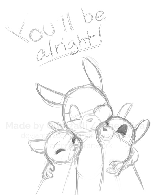
I started off with a quick sketch of sorts, trying to focus both on movement and volume, and get the general idea of where each element is located. I edit the image dimensions and placement of things a lot in this phase, as my ideas often tend to change once I actually begin drawing them. In this case, as I got it down, I decided I wanted it to look like some cheesy animal motivational poster, so that influenced where the text was.
From there, I began to clean and sometimes edit the sketch, mainly by thickening the lines to make the shapes more definite, and erasing what wasn't necessary and interfered with other parts. Volume is one of my biggest focuses in my drawings, so I try my best to get the volume of each character at least hinted at with the lines. This is something that will probably remain in my process for a while, as I quite dislike doing separate lineart and like the messy, sketchy feel anyway.

I also wanna mention, in addition to having references and such in other windows, I've recently begun having a second mini window of my current drawing off to the side so I can see what it looks like overall more easily, regardless of how much I zoom in on and flip the main window. It's quite helpful!
For reference, this is what the final sketch looked like:
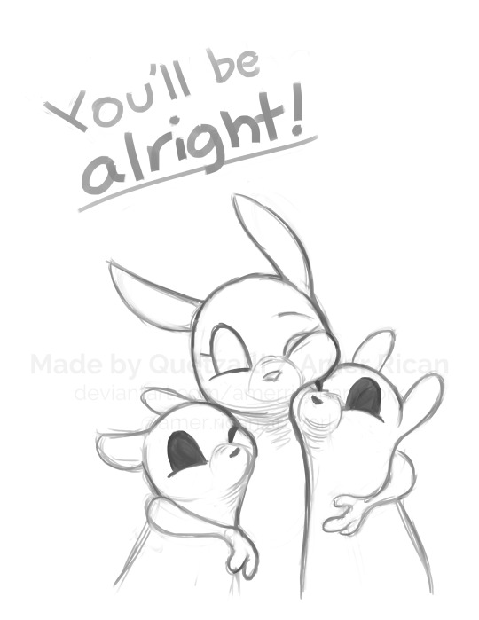
Then, I went on to add the flat colors. Another tip: I almost always set my sketch layer to "Lumi & Shade" because I think it makes the line colors a lot richer, but since it's based on what colors are underneath, it colors the lines a lot more individually than changing the sketch color as a whole. Here's some comparison to a version without the effect (left):

Then, I add some shading using a (really nice) marker brush. This is honestly one of my favorite parts of the process, just trying to carve out all the volumes, especially since I usually use a pretty blue color for shadows!
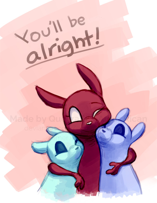
Sometimes, I honestly just leave drawings finished at this step, because I adore the sketchy look so much, and because I really don't like the tediousness of more realistic rendering in the painting process; from what I've seen/experienced, it often involves having to basically paint the entire image over again, which I've realized I find REALLY boring (and is also why I clean the sketch instead of making a new lineart layer). As such, one of my hopes is to reach a point where I could almost completely avoid having to clean up the image in a traditional painting method, instead being able to lay down lines and colors so well that they convey nearly all the volume necessary on their own, still have that sketchy appeal, yet also look finished and professional.
Alas, I did do a bit of clean up on this image, but I think it still turned out alright!

Here's the finished drawing! I'll have to practice with this process a bit more to truly solidify it as my digital go-to, but nonetheless, I think this came out adorable! Thanks again shkika for the ask, and thanks to @mintscampi for the sweet prompt! I hope you guys like it!
#art#artwork#artists on tumbr#digital#digital art#digital artwork#painting#digital painting#process#painting process#art process#tutorial#fanart#rain world#slugcat#rw slugcat#slugpup#artificer#rw artificer#quetzalli draws#quetzalli's notes
100 notes
·
View notes
Photo
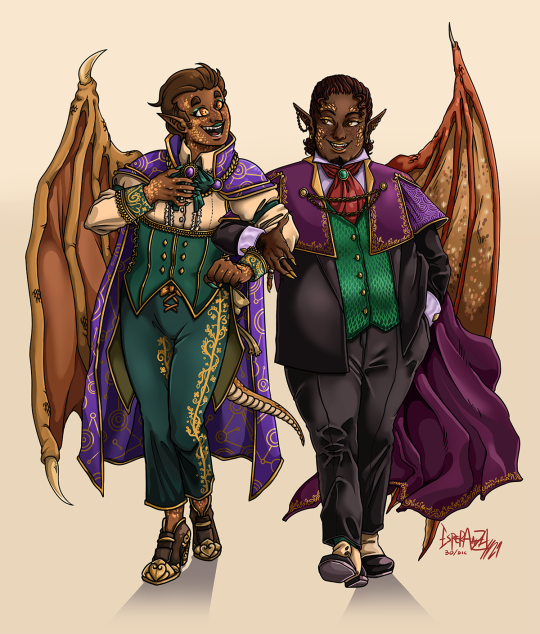
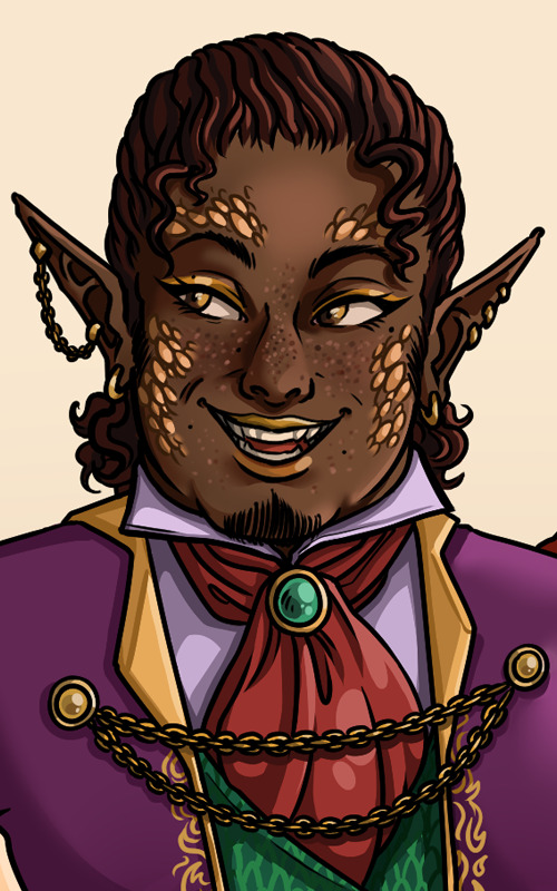


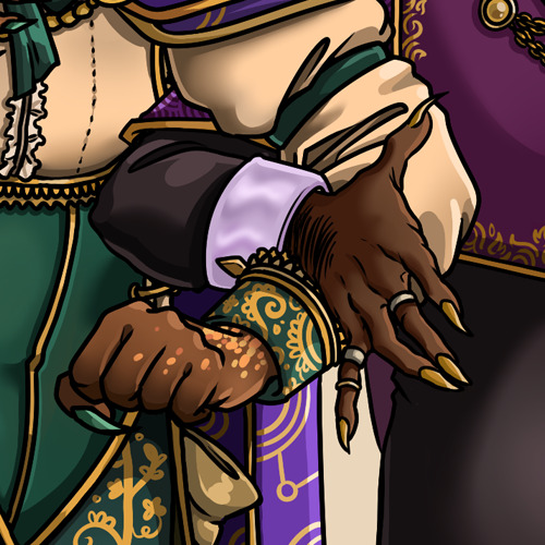

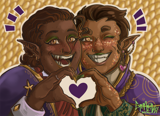
surprise! i drew @evieebun125 ′s hamid together with mine!! frankly because i decided we deserved it, and because whenever they post new art i go Hogwild about their GENIUS outfit design skills. look at these two. they’d be unbeareable together, but at least they would have a blast. i think.
anyway, i had been genuinely itching to draw eviee’s hamid because i was dying to try and follow in her design and style, and seeing both designs side by side is the coolest shit. reminds me why i love art and why i love podcast fanart specifically. hope you like our distinguished little rascals! i think these came out really nice ♥
and again, eviee, thank you so much for all the love you put into the rqg space ♥♥♥
IDs under the cut!
[ID: two digital illustrations featuring hamid from rqg as designed by evie and galaxy. the first illustration is made with clean black lineart and bright, clean coloring. it shows both hamids in full body, strolling arm in arm, chatting and smiling. both have brown skin and brown hair, pointy ears, clawed hands, elegant clothes, scales, makeup, long purple capes and each has a single dragon wing out. eviee's hamid, who's on the left side, has his face turned to the other hamid and is smiling widely, with his left arm around his and bringing his right hand to his chest. he's slender and is walking in a dainty manner. he's got green eyeshadow and green lipstick, short and smooth hair slicked back with a few strands poking out, and multiple yellow and orange colored scales dotted around his face. he's wearing a cream colored button-up with two ruffly trails along the button line, a single dark green armband around each bicep, and dark green cuff sleeves with swirling yellow patterns. on his collar is tied a matching green ribbon with an ornate purple jewel at the center. on his shoulders is a high-collared purple robe, with a golden chain keeping it in place and two short layers, the longer side falling behing him. it has a pattern of concentric circles and lines, almost like constellations. the rest of his suit is a dark green half-corset half-waistcoat tight around his middle, with golden borders and two trails of diamond-shaped buttons; its front is cut like a W and on the back it has two longer tails that reach just above his knees. the matching green trousers have a yellow line of swirling and flowery patterns on the sides. his shoes are brown and high-heeled, with golden accents. there are more scales visible on his neck, hands and ankles. his wing is a mustard yellow with smooth dark orange membranes and claw-like spikes at the ends. galaxy's hamid, on the right, is stepping casually forward with a smug-looking smile, right arm around his double as he looks back at him, and has his left hand on his pocket. he's dressed in a black suit, with a green vest that has a shining pattern on scales all over it, and black shoes with white spats. his sleeves of many garments are a shiny mauve color and have yellow diamond-shaped cufflinks. he's fatter, with full cheeks and slightly shorter legs. his skin is dark brown, his hair darker, curly and slicked back. there are two short curls loose on either side of his forehead. his eyeshadow and lipstick are gold, and has less scales on his face but they've got more volume to them. he has dark freckles, short sideburns and stubble on his chin. his mauve button-up is has a red cravat tied around the collar, with a green gem keeping it in place. his cape is a reddish-purple, with spiky and curling gold patterns around the edges, the long fall fluttering at the end behind him. the upper section reaches down to his chest and has a vertical parting towards the shoulders, leaving a second layer visible. it is held together by two slim golden chains below his collar. his wind is slimmer and dark-orange, with shining scales on the yellow membranes. the second image, which is a little more sketchy and drawn and colored with a rougher texture, shows the same hamids making a heart with their hands. galaxy's hamid is to the left and eviee's to the right, cheek to cheek and smiling. this time, galaxy's has a more wide-eyed, joyful smile, and eviee's sports a lopsided grin and a wink. his chain and dangling pink heart earrings are visible now. their hands are joined at the middle, just below their smiles. the hand to the left has gold-painted claws and the one in the right has them painted green. there is a purple heart drawn there between their hands, and the background is a blurry pattern of yellow and orange scales. end ID]
#rusty quill gaming#rqg#rqg fanart#hamid saleh haroun al tahan#rqg spoilers#just in case bc of the wings? i dunno man#trying to look at this less so i won't notice what detail i might have missed asfhasgf#digital#fanart#finished works#2021
140 notes
·
View notes