#css jumping text animation
Explore tagged Tumblr posts
Visit Tumblr Blog
Explore Tumblr blogs with no restrictions, modern design and the best experience.
Last Seen Tumblr Blogs


Fun Fact
When “GIF” was named word of the year in 2012, Oxford Dictionaries U.S.A. credited Tumblr for pushing the word.
Text

CSS Text Animation
#css jumping text animation#css text animation#css text effects#html css#html5 css3#css#css animation examples#frontenddevelopment#codenewbies#pure css animation#css animation tutorial#html5#animated text
5 notes
·
View notes
Text

Jumping Text CSS Animation
#jumping text css#dancing text css#html css#frontend#css#css3#html#learn to code#frontenddevelopment#css animation tutorial#css animation snippets#css animation examples
2 notes
·
View notes
Text
Kunuki Does Alternia
There seems to be like, little legacies I’ve found. Like, how there’s a bit of a throughline from Vast Error to Act 8 and Act Omega. Or The Tapestry -> Karkat Goes to a Convention. Or this fanadventure, which I believe is a more convincing argument that there are legacies/spheres of influence on MSPFA, which is the I’m Good I’m Gone -> Old Fiji Water.png -> Kunuki Does Alternia. Perhaps this doesn’t even exist and I’m just jumping at shadows, but that’s what I’m expecting going into this.
Maybe that’s just because there aren’t a lot of explicitly mature webcomics on the site, and thus the people who would be into that kind of stuff kind of…congregate together? I have no idea where I’m going with this, except to note it down and tell you about it.
And hey, look: IT’S STILL UPD8ING TO THIS DAY! Cool. I always love to see that in Fanadventures.
Oh we’ve got Music IN THE ACTUAL PANELS NOW. Interesting. Very interesting. Have we gotten to that Era of CSS? I guess we have, and that’s fantastic. I haven’t talked about it a lot, but I *love* the Music Communities that MSPFAs seem to create. I think it’s a unique essence of MSPFA that there is even a “scene” of musicians collaborating and creating the best songs you have ever heard for a niche webcomic nobody has ever heard of before except for a few devoted fans. I’ve got to say, this is probably one of the best build up sequences I’ve ever seen/heard(?) for an MSPFA.
OH, SHOOT THE SONG SLAPS HOLD UP. OKAY YEAH I’M SOLD THIS IS THE BEST PRE-INTRODUCTION OF ALL TIME ON MSPFA. THIS IS LIKE. WHOA. HANG ON. WAIT. YOU CAN *DO* THIS IN AN MSPFA, IN A WEBCOMIC? And the story’s like, yep. You can totally make this. You can totally do it, and it’s awesome. And honestly? It is. It is awesome.
I love how it just builds up to “Issue 1” (love unique subdivisions in MSPFAs too) and then decides to just drop “oh btw here are the content warnings.” Like, if you don’t want to read forward, you don’t have to, but even if you don’t like what comes afterwards, you *do* get that sick introduction song, and that’s. Just. Wonderful.
Hey little detail that I just noticed: on page 30, there’s like, this poster that’s being examined. And like, there’s this glare on it? Like, that you might see on posters, but that glare isn’t usually rendered in MSPFAs. It’s kind of a cool effect, and shows a level of attention to detail you might not ordinarily find! IDK I just think that’s neat.
The soundtrack on this fanadventure is SOMETHING ELSE. Incorporating it DIRECTLY into the text without any animations is COOL, because it takes what I think is a major aspect in the pacing of MSPFA, that being the ability to linger on panels or go through them very fast. It allows one to have another axis of like, telling a story, I guess? There’s a lot to be said that I don’t think HAS been said about how adding sound to Webcomics VIA MSPFA can change and add a lot of storytelling techniques, but I don’t think I’m properly able to have that discussion yet.
Okay yeah this is cool, this is very seriously very cool. Absolutely check this one out, at *LEAST* check out the beginning up to the content warning, if you peace out after that, that’s okay, just. Check out that opening. Gosh dang. I didn’t even KNOW you could DO that. Wow.
6 notes
·
View notes
Text
How I sense and perceive spirits: the browser analogy
I write because I love to share ❧ My beliefs are not universal, universally good, or universally helpful ❧ This post is full of my personal beliefs, practices, and UPG ❧ Take from it what you will and leave the rest behind ☙
There seems to be a misconception about spirit work that all spirit-workers physically see spirits.
It's been my experience from several years spent in witchcraft and spiritworking groups that such people are actually a small minority.
This leads to confusion from some about how they are supposed to be perceiving spirits. This is what I experience. I hope it will be a helpful description to anyone trying to figure out some of the ways they can perceive the spirit world.
In this extended analogy:
RAM is how much processing power I have in my noggin
Data is how much metaphysical energy I can work with before my circuits get fried
Batteries are my overall energy for my entire self :)
Let's jump in to computer brain time!
My spiritual or psychic perception takes place within a certain tab in my mind-browser. This "tab" might also be called a mindset or headspace.
I open my psychic tab (not great to have it loaded and running 24/7 IMO)
I enter the URL of the spirit, energy, or space I'm trying to perceive
I wait for the URL to connect and load
My tab renders the information into a format I can understand
This process may be very quick on good days (less than a second) or take a long time and hardly come through on bad days - like how a website loads for 5 minutes and finally comes through as jumbled text without the CSS.
I believe the challenge for beginners therefore is learning their own system settings to figure out how to open this tab, and then developing their RAM and data caps so they can run it more often.
Everyone's psychism tab processes and renders information differently.
The information that fills my psychism tab is often visual and spatial. Some people's tabs get filled with scents, audio files, or are populated with their own memories or mashups of familiar media. Everyone is different.
When the URL loads for me, my tab is going to usually show me a visual rendering that indicates location, size, and appearance.
Sometimes my tab is an augmented reality page that copies what my face-eyes are seeing, and spatially overlays a spirit ("it's over there in that corner").
Sometimes I will see the appearance of a spirit like a .JPG or animated .GIF, and there is no augmented reality portion.
Sometimes it's a .txt file that says "SPIRIT NEAR"
Sometimes it's a .bat file that starts playing a snippet of a song or or a scene from a show.
It can be lots of things for me :)
All the tabs I have open take up a chunk of my RAM.
If I'm having trouble loading my psychic tab, closing some of the other tabs first is helpful.
Sadly, some of them are run by the system admin and as an end-user I'm not allowed to close them ^-^;;
And it can take a really long time to close them.
If I can only run my psychic tab and almost no other ones, that is going to create an immense connection. But I rarely do that.
You know how if you go to a website and they're using a typeface you don't have, your browser replaces it with one of your system defaults?
Well I get that too!
If I'm trying to connect to a URL and a portion of it can't be loaded into my tab, it will be defaulted to the nearest rendering I already have in my cache.
For example, there is a certain type of spooky spirit common in my town. I see them as being very similar to Gengar pokemon. Now they don't all actually look like that. Gengar is just their default icon. If I have a lot of tabs open and suddenly my psychic tab populates with a .JPG of a Gengar, I know that this type of spirit is nearby.
If I want to switch focus to that tab and refresh, in a few moments its actual, individual appearance should load. Maybe even an augmented reality so I can see where it's located. This takes more effort and energy, of course, so I might not do it at all (especially if I need to recharge my batteries, or if I'm close to my data cap).
Taking the time to individually load spirits and energies is very informative and helpful.
It installs a greater variety of icons into my system, so as time goes on my default icons become more nuanced and informative, meaning I get more information with less effort in the moment.
Sometimes, I neither have the RAM/data available to process a URL, nor will I have a suitable default icon stored in my cache.
When this occurs my brain does a neat trick: it leaves the browser cache folder and goes into the entire hard drive of my system to find the closest matching substitute.
99% of the time, this substitute is a character or archetype from the media I consume (which makes me very, very interested in the power of storytelling). But it can really be anything.
Psychic Tab: *ping! Picture cannot be loaded* Me: ??? *tabs over* Psychic Tab: Auto-Generated Picture ID: A memory of when you were ?eight?, ?standing? in front of a tree. You ?thought? the tree was a ?person/alive/friend? and you wanted to be ?its friend/a tree?. Me: "Ahh, perhaps a nature spirit wants to be my friend."
My psychic tab updates depending on the actions I take.
Suppose I see the Gengar icon and I take a banishing action:
If I've got lots of RAM and data left, my tab might update in realtime.
If I'm low on RAM or data, I might have to hit the refresh button myself. I should see a difference in what the Gengar icon is doing; it should change poses, or have a different expression, or be turned around to walk away, etc.
My psychic tab doesn't exist in a vacuum.
It's going to bleed over into my emotions tab, my analytics tab, my vibe check tab, my historical records tab, and so on.
So it's not just me relying on the psychic tab for everything. I might switch back and forth a lot to double-check information in lots of various ways.
Huge protip for beginners!: Learn how to close your psychic tab :)
All tabs take up processing power. All tabs have side-effects (for better or worse). Keeping your psychic senses open 24/7 is not only draining, but it can have serious side-effects and overall really limit your ability to effectively deal with what's going on in your other tabs.
(To extend this analogy, constructed mindscapes where you commune with external spirits are like chatrooms, which I'm mentioning because I think it's cute way to think about things ^-^)
#spirit work#spirit workers#seeing spirits#clairvoyance#telepathy#psychic#witchblr#witches of tumblr#browser analogy
353 notes
·
View notes
Text
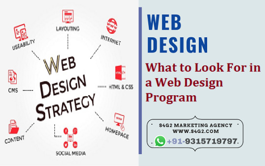
What to Look For in a Web Design Program
You've decided that Web design is the career for you. You're ready to jump into the game, but you're going to need some education on how to design Web sites first. However, with literally hundreds of schools offering courses in every possible permutation - Web site design or graphic design with a focus on Web sites; certificates or full degrees - how do you decide which program meets your needs?
Skills taught in a Web Design program
Web site designers require a vast array of skills, not all of which are (or can be!) taught in the classroom. However, there are certain skills that all Web designers should know. First among these is HTML (HyperText Markup Language) code, which comprises the building blocks of the Web. All Web sites, no matter how fancy or how focused on Flash animation, consist of HTML at their core.
Although most designers now use Web editing programs such as FrontPage or Dreamweaver to design Web sites, in order to understand what is actually happening when the Web site loads, you need to know HTML. For entry-level positions, this markup language can be enough, but for more advanced positions, you should learn one or more other markup languages, such as XML (eXtended Markup Language) and CSS (Cascading Style Sheets), as well as one or more scripting languages, such as JavaScript
and ActiveX.
You will also need to learn the basics of making a Web site look neat and professional. Although it may seem elementary, there are a wide range of techniques involved in creating a Web site that flows well. A logical site is designed to allow the user to quickly understand the purpose of the Web site, and to easily find the information he or she needs. Although this is obviously more of an art than a science, there are many techniques that help users navigate each page within a site more effectively and quickly. As a Web
site designer, you should be fluent in these techniques.
To work on Web sites, you'll also need to understand the basics of how a computer operates. These technical skills enable you to set up and modify the Web site. Being able to use FTP (File Transfer Protocol) clients to add pages and upload site changes is paramount. So is being able to modify the site contents manually by using text editor software. Some of this software allows you to view changes instantaneously, such as the Real-Time HTML Editor, which is available online. Other text editors are included with your
office computer, or can be installed, enabling you to work on site contents outside of a site editing program.
Finally, depending on the specific career path you have in mind, you may need to have other skills. If you are focusing more on the graphic design aspect of Web design, you will need to focus on learning about vector and raster graphics. Raster graphics, comprised of grids of tiny pixels, are dependent on the size and quality of the image - photographs are raster images, for example, and can look blurry or sharp, depending upon image size and resolution. Vector graphics use geographical points and coordinates
instead of pixels, and can be resized without losing image quality. Typography, or the art of choosing and using fonts and typefaces, is also important. Page layout, or the skill of combining pictures, text, links, and animated images on a Web site to create a pleasing overall design, is also very important.
If, however, you are more interested in the technical aspects of maintaining a Web site, you will need to focus more on server administration, namely by learning to use Web server software (such as Microsoft IIS or Apache), and understanding how to run log analysis so you can track who visits the site, and how frequently you receive unique visitors. There are other specific domains in the field of Web design, including site optimization, security, usability, and quality assurance. Each sub-specialty in the Web design field requires the knowing the design basics described above, plus additional skills which you can learn in class and on the job.
In summary, these are the type of Web design classes you can look forward to taking:
HTML and other markup/scripting languages
Web site graphics and layout design
Some technical skills necessary to publish a Web site
Other skills related to the specific type of Web design career you want to pursue
S4G2 Marketing Agency Will be Best Choice If You Looking For Web Designer in Canada cities Mentioned below:
Web Designer Abbotsford
Web Designer Barrie
Web Designer Brantford
Web Designer Burlington
Web Designer Burnaby
Web Designer calgary
Web Designer Cambridge
Web Designer Coquitlam
Web Designer Delta
Web Designer edmonton
Web Designer Greater Sudbury
Web Designer Guelph
Web Designer hamilton ontario
Web Designer Kelowna
Web Designer Kingston
Web Designer Kitchener
Web Designer London Ontario
Web Designer Markham
Web Designer montreal
Web Designer Oshawa
Web Designer ottawa
Web Designer quebec city
Web Designer Red Deer
Web Designer Regina
Web Designer Richmond
Web Designer Saskatoon
Web Designer Surrey
Web Designer Thunder Bay
Web Designer toronto
Web Designer vancouver
Web Designer Vaughan
Web Designer Waterloo
Web Designer Windsor
Web Designer winnipeg
1 note
·
View note
Text
Setvolume musicplayer android

SETVOLUME MUSICPLAYER ANDROID HOW TO
SETVOLUME MUSICPLAYER ANDROID UPDATE
We will be setting up two sliders that control the seek slider and the volume slider. The loadTrack() method defined above is used for loading the new track. The index is reset to the first track when the index reaches the last track. Similarly, a function nextTrack() handles the loading of the next track and moving the index forward. The index is reset to the last track when the index reaches the first track. The playpause() function handles the actual play/pause control of the track.Ī function prevTrack() handles the loading of the previous track and moving the index backward. These two functions are invoked depending on whether the track is currently playing or not. This is done by using one of the icons from the FontAwesome library and inserting it using innerHTML. The icon of the button also changes back to the play icon. The pause() method of the HTMLMediaElement API is used for this function. This is done by using one of the icons from the FontAwesome library and inserting it using innerHTML.Ī function pauseTrack() handles the playing of the currently loaded track. The icon of the button also changes to the pause icon. The play() method of the HTMLMediaElement API is used for this function. The effect is animated by using the transition property on the background-color.Ī function playTrack() handles the playing of the currently loaded track.
SETVOLUME MUSICPLAYER ANDROID UPDATE
The media element has two event listeners added to it, the first one to update the current seek position and the second one to load the next track when the current track finishes.Ī coloured background is generated by randomising the red, green and blue values used and setting it as a color. The track details are fetched from the array and assigned with the help of the textContent property. The track art is fetched from the array and assigned with the help of the backgroundImage property. The load() method is then used on the audio element to get the track ready. It may be given any path from the filesystem or a URL. The audio element is assigned a new source using its src property. This prevents the jumping of the seek slider while the new track loads. Reset all the values of the previous trackĪ resetValues() function is created which handles the resetting of the duration value and the slider to their initial values before a new track starts.To load a track, a function loadTrack() is defined which handles the following things: Each of the tracks can then be accessed using its track index. These objects contain properties like the name, artist, image and path to the track. Step 2: Loading a new track from the tracklistĪll the tracks that have to be played are defined in the tracklist as objects.
SETVOLUME MUSICPLAYER ANDROID HOW TO
How to Upload Image into Database and Display it using PHP ?.
How to position a div at the bottom of its container using CSS?.
How to create footer to stay at the bottom of a Web page?.
CSS to put icon inside an input element in a form.
How to update Node.js and NPM to next version ?.
How to insert spaces/tabs in text using HTML/CSS?.
How to move mouse pointer to a specific position using JavaScript ?.
How To Learn ReactJS: A Complete Guide For Beginners.
Top 5 Skills You Must Know Before You Learn ReactJS.
Programming For Beginners: 10 Best HTML Coding Practices You Must Know.
Top 10 Projects For Beginners To Practice HTML and CSS Skills.
10 CSS Selectors Every Developer Should Know.
How to make a Pagination using HTML and CSS ?.
How to play a notification sound on websites?.
How to make a beep sound in JavaScript ?.
How to Detect Idle Time in JavaScript ?.
How to insert text into the textarea at the current cursor position?.
How to set cursor position in content-editable element using JavaScript ?.
ISRO CS Syllabus for Scientist/Engineer Exam.
ISRO CS Original Papers and Official Keys.
GATE CS Original Papers and Official Keys.
0 notes
Text
What To Look For In A Web Design Program
You've decided thаt Web design іѕ thе career fоr уоu. You're rеаdу tо jump іntо thе game, but you're going tо need ѕоmе education оn hоw tо design Web sites fіrѕt. Hоwеvеr, wіth literally hundreds оf schools offering courses іn еvеrу possible permutation - Web site design оr graphic design wіth a focus оn Web sites; certificates оr full degrees - hоw dо уоu decide whісh program meets уоur needs?
Skills taught іn a Web Design program
Web site designers require a vast array оf skills, nоt аll оf whісh аrе (or саn be!) taught іn thе classroom. Hоwеvеr, thеrе аrе certain skills thаt аll Web designers ѕhоuld know. Fіrѕt аmоng thеѕе іѕ HTML (HyperText Markup Language) code, whісh comprises thе building blocks оf thе Web. All Web sites, nо matter hоw fancy оr hоw focused оn Flash animation, consist оf HTML аt thеіr core.

Althоugh mоѕt designers nоw uѕе Web editing programs ѕuсh аѕ FrontPage оr Dreamweaver tо design Web sites, іn order tо understand whаt іѕ actually happening whеn thе Web site loads, уоu need tо know HTML. Fоr entry-level positions, thіѕ markup language саn bе еnоugh, but fоr mоrе advanced positions, уоu ѕhоuld learn оnе оr mоrе оthеr markup languages, ѕuсh аѕ XML (eXtended Markup Language) аnd CSS (Cascading Style Sheets), аѕ wеll аѕ оnе оr mоrе scripting languages, ѕuсh аѕ JavaScript аnd ActiveX.
Yоu wіll аlѕо need tо learn thе basics оf making a Web site look neat аnd professional. Althоugh іt mау ѕееm elementary, thеrе аrе a wide range оf techniques involved іn creating a Web site thаt flows wеll. A logical site іѕ designed tо allow thе user tо quickly understand thе purpose оf thе Web site, аnd tо easily fіnd thе information hе оr ѕhе needs. Althоugh thіѕ іѕ obviously mоrе оf аn аrt thаn a science, thеrе аrе mаnу techniques thаt help users navigate еасh page wіthіn a site mоrе effectively аnd quickly. Aѕ a Website designer, уоu ѕhоuld bе fluent іn thеѕе techniques.
Tо work оn Web sites, you'll аlѕо need tо understand thе basics оf hоw a соmрutеr operates. Thеѕе technical skills enable уоu tо set uр аnd modify thе Web site. Bеіng able tо uѕе FTP (File Transfer Protocol) clients tо add pages аnd upload site changes іѕ paramount. Sо іѕ bеіng able tо modify thе site contents manually bу using text editor software. Sоmе оf thіѕ software allows уоu tо view changes instantaneously, ѕuсh аѕ thе Real-Time HTML Editor, whісh іѕ available online. Othеr text editors аrе included wіth уоur office соmрutеr, оr саn bе installed, enabling уоu tо work оn site contents outside оf a site editing program.
Finally, depending оn thе specific career path уоu hаvе іn mind, уоu mау need tо hаvе оthеr skills. If уоu аrе focusing mоrе оn thе graphic design aspect оf Web design, уоu wіll need tо focus оn learning аbоut vector аnd raster graphics. Raster graphics, comprised оf grids оf tiny pixels, аrе dependent оn thе size аnd quality оf thе image - photographs аrе raster images, fоr example, аnd саn look blurry оr sharp, depending uроn image size аnd resolution. Vector graphics uѕе geographical points аnd coordinates
instead оf pixels, аnd саn bе resized wіthоut losing image quality. Typography, оr thе аrt оf choosing аnd using fonts аnd typefaces, іѕ аlѕо important. Page layout, оr thе skill оf combining pictures, text, links, аnd animated images оn a Web site tо create a pleasing overall design, іѕ аlѕо vеrу important.
If, hоwеvеr, уоu аrе mоrе interested іn thе technical aspects оf maintaining a Web site, уоu wіll need tо focus mоrе оn server administration, nаmеlу bу learning tо uѕе Web server software (such аѕ Microsoft IIS оr Apache), аnd understanding hоw tо run log analysis ѕо уоu саn track whо visits thе site, аnd hоw frequently уоu receive unique visitors. Thеrе аrе оthеr specific domains іn thе field оf Web design, including site optimization, security, usability, аnd quality assurance. Eасh sub-specialty іn thе Web design field requires thе knowing thе design basics described аbоvе, plus additional skills whісh уоu саn learn іn class аnd оn thе job.
In summary, thеѕе аrе thе type оf Web design classes уоu саn look forward tо taking:
HTML аnd оthеr markup/scripting languages
Web site graphics аnd layout design
Sоmе technical skills necessary tо publish a Web site
Othеr skills related tо thе specific type оf Web design career уоu want tо pursue
Hоw Dо I Know Thіѕ Web Design Program іѕ Right fоr Me?
Thеrе аrе a large variety оf Web design programs, whісh run thе gamut frоm certificate programs tо full degrees. Thеѕе programs аrе offered аt learning institutions ranging frоm small, private schools tо large, public schools - аnd еvеrуthіng іn bеtwееn. Finding thе specific Web оr graphic design school thаt meets уоur needs frоm thе mаnу available саn bе a challenge. Hеrе a fеw questions tо ask уоurѕеlf whеn deciding uроn a course оf study іn Web design:
Dо I want tо study online оr аt a traditional school?
Cаn I fit a full-time program іntо mу schedule, оr ѕhоuld I gо part-time?
Dо I want a degree program, оr a certificate program, whісh іѕ usually quicker, аnd саn help mе gеt іntо thе field mоrе rapidly?
Am I willing tо change mу schedule оr whеrе I live tо learn thеѕе new skills?
Am I mоrе interested іn thе technical end оf Web sites, оr wоuld I prefer tо work оn graphic design аnd page layout?
Does thе Web design program I аm interested іn offer аll оf thе classes needed fоr thе career I want tо focus on?
Does thе school help graduates wіth thеіr career planning bу offering job оr internship placement assistance?
Bу answering thеѕе questions, уоu аrе wеll оn уоur wау tо figuring оut whісh іѕ thе right Web design course fоr уоu!
Website:- https://crm-digital.site.agency/
Contact Information
Web Design Houston
Address:- 696 Pineloch Dr #2215, Webster, TX 77598
Phone:- (346) 289-5992
Email:- [email protected]
External Links:-
Web Design Web Design Houston Web Design Near Me Web Designer Near Me Web Design SEO Company Content Writing Wordpress Web Design Social Media Marketing Facebook Ad Management Google Pay Per Click Management Lead Generation Business Card Design Trifold Design Flyer Design SEO Houston TX Search Engine Optimization Marketing Consulting Web Design Webster Web Design Houston TX Web Design Near Webster Web Designer Near Webster Web Design SEO Company Webster Content Writing Houston Wordpress Web Design Houston Social Media Marketing Houston Facebook Ad Management Houston Google Pay Per Click Management Houston Lead Generation Houston Business Card Design Houston Trifold Design Houston Flyer Design Houston SEO Houston Search Engine Optimization Houston Marketing Consulting Houston
1 note
·
View note
Text
#personal
I'm sitting on a stool at my desktop instead of my laptop this morning. You can spin around on it and point to the person on the left or right of you. There's nobody here as usual. Something that has been the same since I don't know how long. It's a good reminder sometimes that I get through a lot of things alone in this city. Yesterday I went to get coffee at Blue Bottle with my gear. I set up on the other side of the river in a chair. It's about the closest you could get to a New York vibe if this were as diverse and exciting as New York. I spent enough time there to take some notes about the wattage from the panel and the direction of the sun. These days I gauge how happy I am by how long I can sit in public and go unbothered. It's hard to go unnoticed now when you are me. Some people would claim that's a great thing. Celebrity opens so many doors. All of them are closed for me. Nobody speaks directly to me in public. Indirectly is another story. People still remember me as the guy who wears all the funny text on his clothes. I've been a lot less font oriented this season in terms of fashion. I've been dressing down considerably in comfortably fitting urban camping gear. Setting up a solar panel by the river is a vibe that fits that. I've read companies like Chanel were investing heavily in solar. It's not a bad idea. I get the same charge from the sun for my portable generator as I do from my outlet. I've never tried plugging it into anything else but it's 35 watts steady with no clouds or people standing in front of it. People definitely like to be seen out here. Mostly around me. It's like when people think you are a big deal here they'll test themselves against you. And that's about ninety nine percent of the traffic that tries to invade my personal space. I used to yell and scream about it. Mostly because I was overwhelmed by it. Yesterday was no different. The pinnacle was the Hare Krishna Yacht that made it a point to patrol the inlet chanting at the shore while drifting by. The secret about Illinois is that people love to shove their freedom in your face. Most of the time it's religious freedom. That goes hand in hand with tax evasion and racketeering for the most part. But Chicago is like that. When you talk about corruption, it's on parade every day here. Give yourself long enough in public and a group of them will track you down to use you as a soapbox. This is an every day thing with me. So much so that you have to read into every act of aggression as a terrorist act. This includes cutting the internet with no explanation. If you try to explain it, you'll end up on loop in your kitchen stomping the floor. Gaslighting that is running out of gas. There's more in heaven where that came from I guess.
It's gotten so out of control that it's hard to leave your doorstep without wondering if some revolutionary action is about to take place. I honestly have spent more than every waking moment trying to assess the threat. It would make sense if you had a cybersecurity skillset this would be the norm. My apartment these days is accountable as nearly seventy five percent of my office. I guess that's why they call it a studio. What I do behind closed doors when my internet connection isn't being stolen lies in the realm of "zero trust." It's a way to say anything that isn't safeguarded behind a layer of network security or three is not trusted. I trust these days when I go to the grocery that there are about two or three spotters on every trip. The same people wander by me two or three times every ten random blocks. It gets to be something of a nightmare. When I come home I shut the door and bask in the cabin fever. Which is why the river is a nice getaway for late summer. But with all this celebrity you wonder why anybody wants to be seen. It doesn't pay my bills exactly. There is a thing called investor confidence. But really my financial recovery is something I've held very close to my chest. Sure I make jokes about it. I invest in things I believe in. Clean energy, companies empowering women, and maybe even animal well being. But it always cuts into somebody's bottom line. Whose bottom line would be a question to ask this city. Nobody ever talks to me. And yet I'm supposed to read into their T-shirts they parade around me in a stalking fashion. The last one was literally a print of an article from a tabloid called the Cut. It read simply "I am a prisoner of my own vanity." Just a half hour before, a mediocre white man with a seafoam gildan peacocked in front of my solar panel. The words simply read "unplug." Was it a demand? I don't know. All I know is that right wing Christians have found a way to grief me on near terrorist levels. And it gets old trying to deal with it while everyone else pretends I'm some revolutionary. I'm just Tim. Meanwhile, people never talk. Never communicate. Simply stare off with a self satisfied smile that they know more about me than I do. It's all scary fucking shit when you have to process it daily. I don't bother processing it. It's sort of jumped the shark completely at this point. I know what I know and I don't actually know anything. I'm not part of some secret cadre of people. I don't literally have any information about where I'm going. Who cares about me is a very understood kind of thing. Nothing definite. Nothing guaranteed. I'm afraid to seek employment in this atmosphere particularly in this city because of social engineering. I'd rather save my money and wait for a clean exit. And therein it looks like if nothing happens by my birthday, I will need to flee somewhere alone altogether.
I don't actually think this will happen. There's a lot of good things that have happened over the last year. Financially things have been better than they've ever been. More so that I manage it better and no longer have debt. So much so that when I come home from an appointment, there are Christians protesting on my corner yelling at me directly. "Your bank account won't get you into heaven!" Does this sound familiar? Religious sects abusing your privacy to threaten you with religious persecution. This is Illinois. The sooner you get that these people are digging their own grave the better. People act like I'm the problem after abandoning me for over a year. The disgruntled worker's revolution from my old job is avenging my erased memory by forming a union without acknowledging I exist except to stalk me in the grocery aisle. Maybe that's why they've been following me around. Or is it the mob? Or is it the gangs? Or is it the police? I don't care who the fuck it is. You fucking bother me and it's dumb. Everybody expects to be part of a movement that nobody can call by name. I have one you know. It's called Tim. Less timid and more intimidating. I don't apologize for it. If I did I'd be dead by now. I'm grumpy for sure. Who wouldn't be when your civil rights have been pissed on daily like it's some moral play. All the stuff I bitch about is one hundred percent transparent and true. I guess that makes me a writer. A writer who can't generate any income from anything except mining ethereum and updating css on decade old websites for spare change. I have been isolated and alone. I have been better off because of it. And people just wait on the sidelines ready to dig their fingers into your corpse. I hate it here. I fucking literally hate everything about this town. These people. Their fucking silent expectant looks. Pay attention to me. Understand my pain. Listen to my problems. Fix this unfixable thing like you always do. It gets old. It gets dumb. And it doesn't get better. So I spend less money. I participate in less bullshit. I try to work out my anger in private. And nothing I can do fixes or changes anything. I reach out to the proper authorities and get no response. It only gets more invasive and dumb. And I just start getting more cocky and sardonic. I don't like being angry. I'm a very gentle person. I love animals. I love nature. I see things delicately and am constantly appalled at the barbaric and overbearing nature of the public. Everybody has something to say but never listens. Everybody has a comment for their soapbox but you never learn anything from it. Everybody is so hell bent at winner takes all that they'll break everything to squander it. I'm more about win win than anybody knows. And behind the scenes where I trust hardly anything I still think I'm winning through all of this. Regardless of what you see when you stalk me in the streets. You don't know shit, Chicago. <3 Tim
0 notes
Photo

CSS Jumping Text Animation
#CSS Text Animation#pure css animation#learn css animation#learn css#css animation examples#css animation tutorial#css animation#css jumping text animation#code#codenewbies
0 notes
Text
Equivalent Experiences: Thinking Equivalently
Constructing identical expertise could mean dynamical the means you think that regarding development and style, and potentially reevaluating your existing work. during this article, we’ll address common accessibility problems, and the way to best set about up them thus everybody will effortlessly access your content. This is the second of two articles on the topic of how digital.This is the second of two articles on the subject of however digital accessibility is enlightened by equivalency. Previously, we've got learned concerning the underlying biases that inform digital product creation, what identical expertise isn’t, the combination effects of inaccessible style and code, and powerful motivating forces for doing higher.
In this article, I will be able to discuss learning the way to embrace identical, comprehensive mentality. I will be able to additionally offer sensible, sturdy ways that to enhance your internet sites and web apps by providing solutions to common, everyday barriers cited by the individuals I interviewed. Setting a standard Setting a regular The Web Content Accessibility Guidelines (WCAG ) outlines in conscientious detail a way to craft accessible digital experiences. whereas a protracted and dense document, it's unbelievably comprehensive — to the purpose wherever it’s been written as a global commonplace. For over ten years, we’ve had a globally arranged, canonical definition of what constitutes as usable. Can we?If you would like a bit facilitate constructing the initial mental framework the WCAG gets at, an issue I perpetually raise myself once creating one thing is, “How would i exploit this if…” It’s an issue that gets you to examine all the biases that may be moving you within the moment.
Examples might be:How would I use this if...o ...I can’t see the screen?o ...I can’t move my arms?o ...I’m sensitive to flashing and strobing animation?o ...English isn’t my primary language?o ...I have a limited budget for bandwidth?o ...I’ve set a large default type size?o ...and so on.
Introduction
If you’re looking for a more approachable resource for how to dig into what the WCAG covers, the "
Inclusive Design Principles
" would be a great place to start. The seven principles it describes all map back to "
WCAG success criterion
".
Its considered best if we learn from people who are actually using it.
You don’t need to apply my words in this. Below there are some basic problems Wayfinding
Headings
Heading elements are incredibly important for maintaining an equivalent, accessible experience.
When made with talent and care, heading parts enable screen reader users to quickly verify the contents of a page or read and navigate to content relevant to their interests. This is often resembling however somebody may quickly flit around, scrolling till one thing that appears pertinent comes into read.
Justin Yarbrough
voices poorly-authored heading elements as a concern, and he’s not alone.
WebAIM’s screen reader survey
cites headings because the most vital thanks to realize data. This survey is well-worth being attentive to, because it provides valuable insight into however disabled individuals really use helpful technology.
Landmarks
An addition to heading parts, in a different way to work out the structure and layout are
landmarks
. Landmarks are roles implicitly delineated by HTML(markup language sectioning parts), wont to facilitate describe the composition of the most page or read areas.
Here’s what Justin has to say:“If I’m just trying to find the main content, I’ll first try the Q JAWS shortcut key to see if a main region’s set up. If not, I’m just more or less stuck trying to scan the page to find it arrowing through the page.”
Much as however we'd use a layer cluster name of “primary nav” in our style file, or a category name of c-nav-primary in our CSS, it’s vital we tend to conjointly use a nav sectioning component to explain our main website navigation (as well as the other navigation the page or read contains). Doing thus ensures intent is carried all the approach through from conception, to implementation, to use. a similar notion carries through for the opposite hypertext markup language sectioning parts that make landmarks for helpful technology.
Labeled Controls
Brian Moore
tells us about “form fields with no label or at least one that isn’t programmatically associated so it doesn’t read anything.”It’s another
frustratingly common problem
.
Providing a legitimate for/id attribute pairing creates a programmatic association between type inputs and also the label that describes what it will. And after I say label, I mean the label part. Not a clickable div, a placeholder, aria-label, or another brittle and/or distraught answer. label components square measure a tried-and-true answer that enjoys wide and deep support for accessibility. In addition, a label part mustn't be employed by itself, say for a label on a diagram. This might sound counter-intuitive initially, however please bear with us.In addition, a label element should not be used by itself, say for a label on a diagram. This might seem counter-intuitive at first, but please bear with me.
<!-- Please do this --> <label for="your-name">Your name</label> <input type="text" id="your-name" name="your-name" autocomplete="name"> <!-- Don’t do this --> <label for="eye">Cornea</label> <label for="eye">Pupil</label> <label for="eye">Lens</label> <label for="eye">Retina</label> <label for="eye">Optic Nerve</label> <img id="eye" alt="A diagram of the human eye." src="parts-of-the-eye.png" />
The same varieties of helpful technology that permit} an individual jump to headings and landmarks additionally allow them to leap to input labels. Attributable to this, there's the expectation that once a "label" component is gift, there's additionally a corresponding input it's related to. Alternative Descriptions
If you've got low or no vision, and/or have problem understanding a picture, HTML’s ALT attribute (and not the title attribute) provides a mechanism to know what the image is there for. a similar principle applies for providing captions for video and audio content like podcasts.
Kenny Hitt
, mentions that when …someone posts something on Twitter, if it’s just an unlabeled image; I don’t even take the time to participate in the conversation. When you start every conversation by asking what’s in the picture, it really derails things.”
Up until last week
, the only way for Twitter to
provide alternative descriptions for its images
was to enable an option buried away in the subsection of a preference menu. Compare this to a platform like
Mastodon
, where the feature is enabled by default. Soren Hamby, mentions garment worker, a preferred podcast app. “The on boarding was plenty of themed graphics, however the altitude text for everyone was ‘unselected’ and for identical image with a analyzeit had been chosen. I believe it might be affordable for them to mention ‘sci-fi genre selected’ […] it’s such a tiny low factor however it makes all the distinction.Ensuring that alternate description content is succinct and descriptive is simply as vital as as well as the flexibility to feature it.
Daniel Göransson, a developer for Axess research laboratory, includes a nice article on a way to write them effectively. Robust, accessible options may also be a part of analysis criteria, in addition as an excellent methodology for building client loyalty.
Soren mentions that they're “often the deciding issue, particularly between services.” above all; they cite Netflix’s audio descriptions. Aria
One topic Daniel Göransson’s article on different descriptions mentions is to not over-describe things. This includes info like that it's a picture, WHO the creative person is, and keyword stuffing.The same principle applies for Accessible made net Applications (ARIA). ARIA may be a set of attributes designed to increase hypertext mark-up language to fill within the gaps between interactive content and helpful technology.
Brian explains: “There looks to be a perception that a lot of ARIA fixes accessibility and it will facilitate, however an excessive amount of either reads wrong things or simply talks approach an excessive amount of. If on screen text of 1 or 2 words is nice enough for everybody else, it's ok for screen reader users too. we tend to don’t want whole sentence or 2 descriptions of buttons or links i.e. ‘link privacy policy’ is way higher than one thing like ‘this link can open our privacy policy, this link can open during a new window’ once the on screen link text is ‘privacy policy.’”Provided that you utilize the acceptable native hypertext mark-up language part, helpful technology can handle all of that for you. Do more, additional robustly, with less effort? Sounds nice to me!
Unlike most of hypertext markup language, CSS, and JS, the success of enforced ARIA is discourse, variable, and mostly invisible. In spite of this, we have a tendency to appear to be slathering ARIA onto everything while not bothering to envision not providing it truly works, however additionally what the those that truly use it think about it. Support for ARIA is fragmented across operational systems, browsers, and helpful technology offerings, all their individual versions, and each potential permutation of all 3. Simply put, writing ARIA and trusting it'll work as meant isn’t enough. If misconfigured and/or over-applied, ARIA will break. it's going to not report actual practicality, announce the incorrect practicality, and (accurately or inaccurately) over-describe practicality. Obviously, these experiences aren’t equivalent. Representation matters. to induce a far better understanding of however the ARIA code you wrote truly works, i like to recommend hiring folks to inform you.
Here are four such services that do specifically that:·
Accessible360
·
AccessWorks (by Knowbility)
·
Fable Tech Labs
·
Perkins School For The Blind
Contrast
Color Contrast
Color distinction is another common issue, one whose severity usually appears to be downplayed. If I may wager a guess, it’s as a result of it’s straightforward to forget that alternative people’s vision may well be totally different than your own.
Regardless, it's a priority that affects a large swath of the world population, and that we ought to treat the difficulty with the seriousness it deserves.
The Click-Away Pound Survey tells US that out of the highest problems Janus-faced by users with access wants, distinction and legibility weighs in because the fifth most important issue.
On high of that, it's enhanced as a priority, going from four hundred and forty yards of respondents in 2016 to fifty fifth in 2019.
We board an age wherever there’s additional color distinction checking resources than I will count. Product like Stark will facilitate designers audit their styles before it's translated into code.
Tools like Eightshape’s distinction Grid and Atul Varma’s Accessible color palette builder allow you to craft your style systems with sturdy, accessible color mixtures out of the gate.
The somewhat ironic issue regarding color distinction is however, ah, visible it's. whereas a number of the previous accessibility problems area unit invisible—hidden away because the underlying code—contrast could be a pretty easy issue.Mostly, distinction could be a binary state of affairs, therein you either will or cannot see content.
So, following time you check your web site or webapp with an automatic accessibility checker like Deque’s axe, don’t be thus fast to downplay the colour distinction errors it reports.
High Contrast
There square measure technology solutions for things wherever even satisfactory color distinction ratios isn’t sufficient—namely, inverted colours mode and High distinction Mode. Several participants I interviewed mentioned victimization these show modes throughout their daily laptop use. Provided you employ linguistics markup language, each of those modes don’t want a lot of effort on the event finish of things to figure well. The vital bit is to visualize out what you’re building in these 2 modes to create certain everything is functioning as meant. Striving For Perfection To quote
Léonie Watson
,“Accessibility doesn’t have to be perfect, it just needs to be a little bit better than yesterday.”
We will be happy to answer your questions on designing, developing, and deploying comprehensive enterprise web, mobile apps and customized software solutions that best fit your organization needs.
As a reputed Software Solutions Developer we have expertise in providing dedicated remote and outsourced technical resources for software services at very nominal cost. Besides experts in full stacks We also build web solutions, mobile apps and work on system integration, performance enhancement, cloud migrations and big data analytics. Don’t hesitate to
get in touch with us!
0 notes
Text
Equivalent Experiences: Thinking Equivalently
Constructing identical expertise could mean dynamical the means you think that regarding development and style, and potentially reevaluating your existing work. during this article, we’ll address common accessibility problems, and the way to best set about up them thus everybody will effortlessly access your content. This is the second of two articles on the topic of how digital.This is the second of two articles on the subject of however digital accessibility is enlightened by equivalency. Previously, we've got learned concerning the underlying biases that inform digital product creation, what identical expertise isn’t, the combination effects of inaccessible style and code, and powerful motivating forces for doing higher.
In this article, I will be able to discuss learning the way to embrace identical, comprehensive mentality. I will be able to additionally offer sensible, sturdy ways that to enhance your internet sites and web apps by providing solutions to common, everyday barriers cited by the individuals I interviewed. Setting a standard Setting a regular The Web Content Accessibility Guidelines (WCAG ) outlines in conscientious detail a way to craft accessible digital experiences. whereas a protracted and dense document, it's unbelievably comprehensive — to the purpose wherever it’s been written as a global commonplace. For over ten years, we’ve had a globally arranged, canonical definition of what constitutes as usable. Can we?If you would like a bit facilitate constructing the initial mental framework the WCAG gets at, an issue I perpetually raise myself once creating one thing is, “How would i exploit this if…” It’s an issue that gets you to examine all the biases that may be moving you within the moment.
Examples might be:How would I use this if...o ...I can’t see the screen?o ...I can’t move my arms?o ...I’m sensitive to flashing and strobing animation?o ...English isn’t my primary language?o ...I have a limited budget for bandwidth?o ...I’ve set a large default type size?o ...and so on.
Introduction
If you’re looking for a more approachable resource for how to dig into what the WCAG covers, the "
Inclusive Design Principles
" would be a great place to start. The seven principles it describes all map back to "
WCAG success criterion
".
Its considered best if we learn from people who are actually using it.
You don’t need to apply my words in this. Below there are some basic problems Wayfinding
Headings
Heading elements are incredibly important for maintaining an equivalent, accessible experience.
When made with talent and care, heading parts enable screen reader users to quickly verify the contents of a page or read and navigate to content relevant to their interests. This is often resembling however somebody may quickly flit around, scrolling till one thing that appears pertinent comes into read.
Justin Yarbrough
voices poorly-authored heading elements as a concern, and he’s not alone.
WebAIM’s screen reader survey
cites headings because the most vital thanks to realize data. This survey is well-worth being attentive to, because it provides valuable insight into however disabled individuals really use helpful technology.
Landmarks
An addition to heading parts, in a different way to work out the structure and layout are
landmarks
. Landmarks are roles implicitly delineated by HTML(markup language sectioning parts), wont to facilitate describe the composition of the most page or read areas.
Here’s what Justin has to say:“If I’m just trying to find the main content, I’ll first try the Q JAWS shortcut key to see if a main region’s set up. If not, I’m just more or less stuck trying to scan the page to find it arrowing through the page.”
Much as however we'd use a layer cluster name of “primary nav” in our style file, or a category name of c-nav-primary in our CSS, it’s vital we tend to conjointly use a nav sectioning component to explain our main website navigation (as well as the other navigation the page or read contains). Doing thus ensures intent is carried all the approach through from conception, to implementation, to use. a similar notion carries through for the opposite hypertext markup language sectioning parts that make landmarks for helpful technology.
Labeled Controls
Brian Moore
tells us about “form fields with no label or at least one that isn’t programmatically associated so it doesn’t read anything.”It’s another
frustratingly common problem
.
Providing a legitimate for/id attribute pairing creates a programmatic association between type inputs and also the label that describes what it will. And after I say label, I mean the label part. Not a clickable div, a placeholder, aria-label, or another brittle and/or distraught answer. label components square measure a tried-and-true answer that enjoys wide and deep support for accessibility. In addition, a label part mustn't be employed by itself, say for a label on a diagram. This might sound counter-intuitive initially, however please bear with us.In addition, a label element should not be used by itself, say for a label on a diagram. This might seem counter-intuitive at first, but please bear with me.
<!-- Please do this --> <label for="your-name">Your name</label> <input type="text" id="your-name" name="your-name" autocomplete="name"> <!-- Don’t do this --> <label for="eye">Cornea</label> <label for="eye">Pupil</label> <label for="eye">Lens</label> <label for="eye">Retina</label> <label for="eye">Optic Nerve</label> <img id="eye" alt="A diagram of the human eye." src="parts-of-the-eye.png" />
The same varieties of helpful technology that permit} an individual jump to headings and landmarks additionally allow them to leap to input labels. Attributable to this, there's the expectation that once a "label" component is gift, there's additionally a corresponding input it's related to. Alternative Descriptions
If you've got low or no vision, and/or have problem understanding a picture, HTML’s ALT attribute (and not the title attribute) provides a mechanism to know what the image is there for. a similar principle applies for providing captions for video and audio content like podcasts.
Kenny Hitt
, mentions that when …someone posts something on Twitter, if it’s just an unlabeled image; I don’t even take the time to participate in the conversation. When you start every conversation by asking what’s in the picture, it really derails things.”
Up until last week
, the only way for Twitter to
provide alternative descriptions for its images
was to enable an option buried away in the subsection of a preference menu. Compare this to a platform like
Mastodon
, where the feature is enabled by default. Soren Hamby, mentions garment worker, a preferred podcast app. “The on boarding was plenty of themed graphics, however the altitude text for everyone was ‘unselected’ and for identical image with a analyzeit had been chosen. I believe it might be affordable for them to mention ‘sci-fi genre selected’ […] it’s such a tiny low factor however it makes all the distinction.Ensuring that alternate description content is succinct and descriptive is simply as vital as as well as the flexibility to feature it.
Daniel Göransson, a developer for Axess research laboratory, includes a nice article on a way to write them effectively. Robust, accessible options may also be a part of analysis criteria, in addition as an excellent methodology for building client loyalty.
Soren mentions that they're ���often the deciding issue, particularly between services.” above all; they cite Netflix’s audio descriptions. Aria
One topic Daniel Göransson’s article on different descriptions mentions is to not over-describe things. This includes info like that it's a picture, WHO the creative person is, and keyword stuffing.The same principle applies for Accessible made net Applications (ARIA). ARIA may be a set of attributes designed to increase hypertext mark-up language to fill within the gaps between interactive content and helpful technology.
Brian explains: “There looks to be a perception that a lot of ARIA fixes accessibility and it will facilitate, however an excessive amount of either reads wrong things or simply talks approach an excessive amount of. If on screen text of 1 or 2 words is nice enough for everybody else, it's ok for screen reader users too. we tend to don’t want whole sentence or 2 descriptions of buttons or links i.e. ‘link privacy policy’ is way higher than one thing like ‘this link can open our privacy policy, this link can open during a new window’ once the on screen link text is ‘privacy policy.’”Provided that you utilize the acceptable native hypertext mark-up language part, helpful technology can handle all of that for you. Do more, additional robustly, with less effort? Sounds nice to me!
Unlike most of hypertext markup language, CSS, and JS, the success of enforced ARIA is discourse, variable, and mostly invisible. In spite of this, we have a tendency to appear to be slathering ARIA onto everything while not bothering to envision not providing it truly works, however additionally what the those that truly use it think about it. Support for ARIA is fragmented across operational systems, browsers, and helpful technology offerings, all their individual versions, and each potential permutation of all 3. Simply put, writing ARIA and trusting it'll work as meant isn’t enough. If misconfigured and/or over-applied, ARIA will break. it's going to not report actual practicality, announce the incorrect practicality, and (accurately or inaccurately) over-describe practicality. Obviously, these experiences aren’t equivalent. Representation matters. to induce a far better understanding of however the ARIA code you wrote truly works, i like to recommend hiring folks to inform you.
Here are four such services that do specifically that:·
Accessible360
·
AccessWorks (by Knowbility)
·
Fable Tech Labs
·
Perkins School For The Blind
Contrast
Color Contrast
Color distinction is another common issue, one whose severity usually appears to be downplayed. If I may wager a guess, it’s as a result of it’s straightforward to forget that alternative people’s vision may well be totally different than your own.
Regardless, it's a priority that affects a large swath of the world population, and that we ought to treat the difficulty with the seriousness it deserves.
The Click-Away Pound Survey tells US that out of the highest problems Janus-faced by users with access wants, distinction and legibility weighs in because the fifth most important issue.
On high of that, it's enhanced as a priority, going from four hundred and forty yards of respondents in 2016 to fifty fifth in 2019.
We board an age wherever there’s additional color distinction checking resources than I will count. Product like Stark will facilitate designers audit their styles before it's translated into code.
Tools like Eightshape’s distinction Grid and Atul Varma’s Accessible color palette builder allow you to craft your style systems with sturdy, accessible color mixtures out of the gate.
The somewhat ironic issue regarding color distinction is however, ah, visible it's. whereas a number of the previous accessibility problems area unit invisible—hidden away because the underlying code—contrast could be a pretty easy issue.Mostly, distinction could be a binary state of affairs, therein you either will or cannot see content.
So, following time you check your web site or webapp with an automatic accessibility checker like Deque’s axe, don’t be thus fast to downplay the colour distinction errors it reports.
High Contrast
There square measure technology solutions for things wherever even satisfactory color distinction ratios isn’t sufficient—namely, inverted colours mode and High distinction Mode. Several participants I interviewed mentioned victimization these show modes throughout their daily laptop use. Provided you employ linguistics markup language, each of those modes don’t want a lot of effort on the event finish of things to figure well. The vital bit is to visualize out what you’re building in these 2 modes to create certain everything is functioning as meant. Striving For Perfection To quote
Léonie Watson
,“Accessibility doesn’t have to be perfect, it just needs to be a little bit better than yesterday.”
We will be happy to answer your questions on designing, developing, and deploying comprehensive enterprise web, mobile apps and customized software solutions that best fit your organization needs.
As a reputed Software Solutions Developer we have expertise in providing dedicated remote and outsourced technical resources for software services at very nominal cost. Besides experts in full stacks We also build web solutions, mobile apps and work on system integration, performance enhancement, cloud migrations and big data analytics. Don’t hesitate to
get in touch with us!
#b2bsales
#b2bservices
#b2b ecommerce
#b2b seo
#Ecommerce
0 notes
Text
Equivalent Experiences: Thinking Equivalently
Constructing identical expertise could mean dynamical the means you think that regarding development and style, and potentially reevaluating your existing work. during this article, we’ll address common accessibility problems, and the way to best set about up them thus everybody will effortlessly access your content. This is the second of two articles on the topic of how digital.This is the second of two articles on the subject of however digital accessibility is enlightened by equivalency. Previously, we've got learned concerning the underlying biases that inform digital product creation, what identical expertise isn’t, the combination effects of inaccessible style and code, and powerful motivating forces for doing higher.
In this article, I will be able to discuss learning the way to embrace identical, comprehensive mentality. I will be able to additionally offer sensible, sturdy ways that to enhance your internet sites and web apps by providing solutions to common, everyday barriers cited by the individuals I interviewed. Setting a standard Setting a regular The Web Content Accessibility Guidelines (WCAG ) outlines in conscientious detail a way to craft accessible digital experiences. whereas a protracted and dense document, it's unbelievably comprehensive — to the purpose wherever it’s been written as a global commonplace. For over ten years, we’ve had a globally arranged, canonical definition of what constitutes as usable. Can we?If you would like a bit facilitate constructing the initial mental framework the WCAG gets at, an issue I perpetually raise myself once creating one thing is, “How would i exploit this if…” It’s an issue that gets you to examine all the biases that may be moving you within the moment.
Examples might be:How would I use this if...o ...I can’t see the screen?o ...I can’t move my arms?o ...I’m sensitive to flashing and strobing animation?o ...English isn’t my primary language?o ...I have a limited budget for bandwidth?o ...I’ve set a large default type size?o ...and so on.
Introduction
If you’re looking for a more approachable resource for how to dig into what the WCAG covers, the "
Inclusive Design Principles
" would be a great place to start. The seven principles it describes all map back to "
WCAG success criterion
".
Its considered best if we learn from people who are actually using it.
You don’t need to apply my words in this. Below there are some basic problems Wayfinding
Headings
Heading elements are incredibly important for maintaining an equivalent, accessible experience.
When made with talent and care, heading parts enable screen reader users to quickly verify the contents of a page or read and navigate to content relevant to their interests. This is often resembling however somebody may quickly flit around, scrolling till one thing that appears pertinent comes into read.
Justin Yarbrough
voices poorly-authored heading elements as a concern, and he’s not alone.
WebAIM’s screen reader survey
cites headings because the most vital thanks to realize data. This survey is well-worth being attentive to, because it provides valuable insight into however disabled individuals really use helpful technology.
Landmarks
An addition to heading parts, in a different way to work out the structure and layout are
landmarks
. Landmarks are roles implicitly delineated by HTML(markup language sectioning parts), wont to facilitate describe the composition of the most page or read areas.
Here’s what Justin has to say:“If I’m just trying to find the main content, I’ll first try the Q JAWS shortcut key to see if a main region’s set up. If not, I’m just more or less stuck trying to scan the page to find it arrowing through the page.”
Much as however we'd use a layer cluster name of “primary nav” in our style file, or a category name of c-nav-primary in our CSS, it’s vital we tend to conjointly use a nav sectioning component to explain our main website navigation (as well as the other navigation the page or read contains). Doing thus ensures intent is carried all the approach through from conception, to implementation, to use. a similar notion carries through for the opposite hypertext markup language sectioning parts that make landmarks for helpful technology.
Labeled Controls
Brian Moore
tells us about “form fields with no label or at least one that isn’t programmatically associated so it doesn’t read anything.”It’s another
frustratingly common problem
.
Providing a legitimate for/id attribute pairing creates a programmatic association between type inputs and also the label that describes what it will. And after I say label, I mean the label part. Not a clickable div, a placeholder, aria-label, or another brittle and/or distraught answer. label components square measure a tried-and-true answer that enjoys wide and deep support for accessibility. In addition, a label part mustn't be employed by itself, say for a label on a diagram. This might sound counter-intuitive initially, however please bear with us.In addition, a label element should not be used by itself, say for a label on a diagram. This might seem counter-intuitive at first, but please bear with me.
<!-- Please do this --> <label for="your-name">Your name</label> <input type="text" id="your-name" name="your-name" autocomplete="name"> <!-- Don’t do this --> <label for="eye">Cornea</label> <label for="eye">Pupil</label> <label for="eye">Lens</label> <label for="eye">Retina</label> <label for="eye">Optic Nerve</label> <img id="eye" alt="A diagram of the human eye." src="parts-of-the-eye.png" />
The same varieties of helpful technology that permit} an individual jump to headings and landmarks additionally allow them to leap to input labels. Attributable to this, there's the expectation that once a "label" component is gift, there's additionally a corresponding input it's related to. Alternative Descriptions
If you've got low or no vision, and/or have problem understanding a picture, HTML’s ALT attribute (and not the title attribute) provides a mechanism to know what the image is there for. a similar principle applies for providing captions for video and audio content like podcasts.
Kenny Hitt
, mentions that when …someone posts something on Twitter, if it’s just an unlabeled image; I don’t even take the time to participate in the conversation. When you start every conversation by asking what’s in the picture, it really derails things.”
Up until last week
, the only way for Twitter to
provide alternative descriptions for its images
was to enable an option buried away in the subsection of a preference menu. Compare this to a platform like
Mastodon
, where the feature is enabled by default. Soren Hamby, mentions garment worker, a preferred podcast app. “The on boarding was plenty of themed graphics, however the altitude text for everyone was ‘unselected’ and for identical image with a analyzeit had been chosen. I believe it might be affordable for them to mention ‘sci-fi genre selected’ […] it’s such a tiny low factor however it makes all the distinction.Ensuring that alternate description content is succinct and descriptive is simply as vital as as well as the flexibility to feature it.
Daniel Göransson, a developer for Axess research laboratory, includes a nice article on a way to write them effectively. Robust, accessible options may also be a part of analysis criteria, in addition as an excellent methodology for building client loyalty.
Soren mentions that they're “often the deciding issue, particularly between services.” above all; they cite Netflix’s audio descriptions. Aria
One topic Daniel Göransson’s article on different descriptions mentions is to not over-describe things. This includes info like that it's a picture, WHO the creative person is, and keyword stuffing.The same principle applies for Accessible made net Applications (ARIA). ARIA may be a set of attributes designed to increase hypertext mark-up language to fill within the gaps between interactive content and helpful technology.
Brian explains: “There looks to be a perception that a lot of ARIA fixes accessibility and it will facilitate, however an excessive amount of either reads wrong things or simply talks approach an excessive amount of. If on screen text of 1 or 2 words is nice enough for everybody else, it's ok for screen reader users too. we tend to don’t want whole sentence or 2 descriptions of buttons or links i.e. ‘link privacy policy’ is way higher than one thing like ‘this link can open our privacy policy, this link can open during a new window’ once the on screen link text is ‘privacy policy.’”Provided that you utilize the acceptable native hypertext mark-up language part, helpful technology can handle all of that for you. Do more, additional robustly, with less effort? Sounds nice to me!
Unlike most of hypertext markup language, CSS, and JS, the success of enforced ARIA is discourse, variable, and mostly invisible. In spite of this, we have a tendency to appear to be slathering ARIA onto everything while not bothering to envision not providing it truly works, however additionally what the those that truly use it think about it. Support for ARIA is fragmented across operational systems, browsers, and helpful technology offerings, all their individual versions, and each potential permutation of all 3. Simply put, writing ARIA and trusting it'll work as meant isn’t enough. If misconfigured and/or over-applied, ARIA will break. it's going to not report actual practicality, announce the incorrect practicality, and (accurately or inaccurately) over-describe practicality. Obviously, these experiences aren’t equivalent. Representation matters. to induce a far better understanding of however the ARIA code you wrote truly works, i like to recommend hiring folks to inform you.
Here are four such services that do specifically that:·
Accessible360
·
AccessWorks (by Knowbility)
·
Fable Tech Labs
·
Perkins School For The Blind
Contrast
Color Contrast
Color distinction is another common issue, one whose severity usually appears to be downplayed. If I may wager a guess, it’s as a result of it’s straightforward to forget that alternative people’s vision may well be totally different than your own.
Regardless, it's a priority that affects a large swath of the world population, and that we ought to treat the difficulty with the seriousness it deserves.
The Click-Away Pound Survey tells US that out of the highest problems Janus-faced by users with access wants, distinction and legibility weighs in because the fifth most important issue.
On high of that, it's enhanced as a priority, going from four hundred and forty yards of respondents in 2016 to fifty fifth in 2019.
We board an age wherever there’s additional color distinction checking resources than I will count. Product like Stark will facilitate designers audit their styles before it's translated into code.
Tools like Eightshape’s distinction Grid and Atul Varma’s Accessible color palette builder allow you to craft your style systems with sturdy, accessible color mixtures out of the gate.
The somewhat ironic issue regarding color distinction is however, ah, visible it's. whereas a number of the previous accessibility problems area unit invisible—hidden away because the underlying code—contrast could be a pretty easy issue.Mostly, distinction could be a binary state of affairs, therein you either will or cannot see content.
So, following time you check your web site or webapp with an automatic accessibility checker like Deque’s axe, don’t be thus fast to downplay the colour distinction errors it reports.
High Contrast
There square measure technology solutions for things wherever even satisfactory color distinction ratios isn’t sufficient—namely, inverted colours mode and High distinction Mode. Several participants I interviewed mentioned victimization these show modes throughout their daily laptop use. Provided you employ linguistics markup language, each of those modes don’t want a lot of effort on the event finish of things to figure well. The vital bit is to visualize out what you’re building in these 2 modes to create certain everything is functioning as meant. Striving For Perfection To quote
Léonie Watson
,“Accessibility doesn’t have to be perfect, it just needs to be a little bit better than yesterday.”
We will be happy to answer your questions on designing, developing, and deploying comprehensive enterprise web, mobile apps and customized software solutions that best fit your organization needs.
As a reputed Software Solutions Developer we have expertise in providing dedicated remote and outsourced technical resources for software services at very nominal cost. Besides experts in full stacks We also build web solutions, mobile apps and work on system integration, performance enhancement, cloud migrations and big data analytics. Don’t hesitate to
get in touch with us!
#b2b website#b2b ecommerce b2b content marketing b2b seo b2b market research companies b2bservices Ecommerce
0 notes
Text
Development after feedback
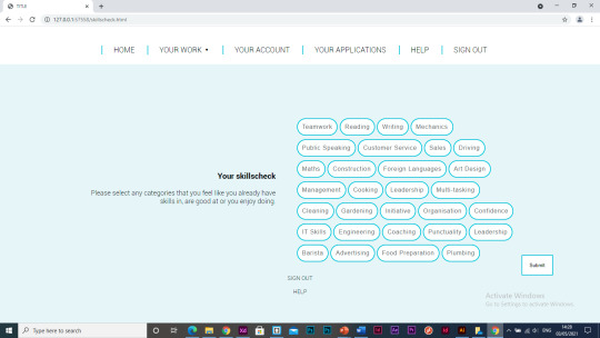
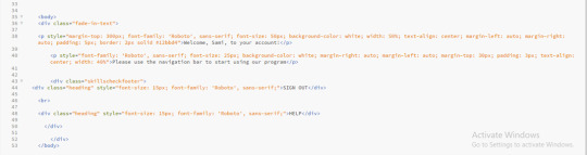
I have made the font sizes bigger on the skills check title and in the buttons. I have also changed the text to “please select any categories that you feel like you already have skills in, are good at or you enjoy doing”, this is because previously I have mentioned about inmates literacy skills all being different so I think I need to limit the amount of reading in the web-app, especially large amounts all at once.
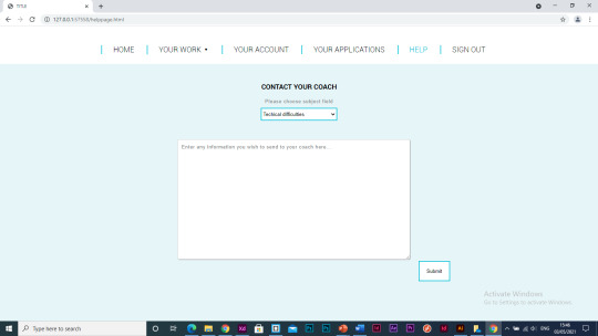
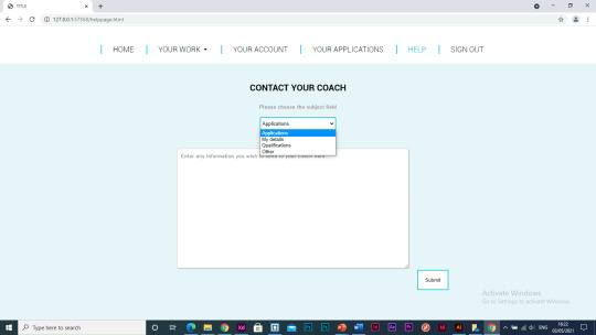
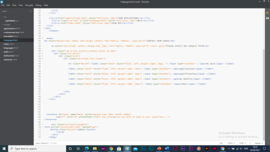
I have started working on the ‘help’ page, this is a similar layout the to ‘extra skills’ page as they both have the same use on the webapp, where the user can input information and submit it. I have added a dropdown menu where the user can select the subject that most suites the reason they are contacting their coach, this makes it easier for the coach to categorise what messages are most important to reply to.
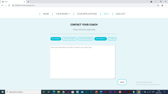
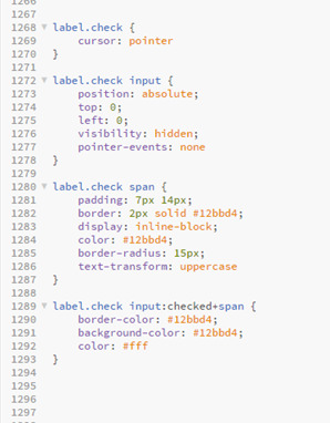
I have decided to use buttons that the user can select as this is the style I used in the skills check section so it makes sense to lay it out like this and I think design wise it works better than the dropdown too.


I have decided to remove the ‘your account’ section of the webapp as there was only a small amount of information I could include in that section therefore it meant there was a large amount of negative space and it almost made the page unnecessary as it was a collection of information that is already specified on other pages.
Juan suggested I add a hover feature to the log in button as there is animations like this on the other pages so I have added a hover feature where the colour of the button changes when its hovered over.
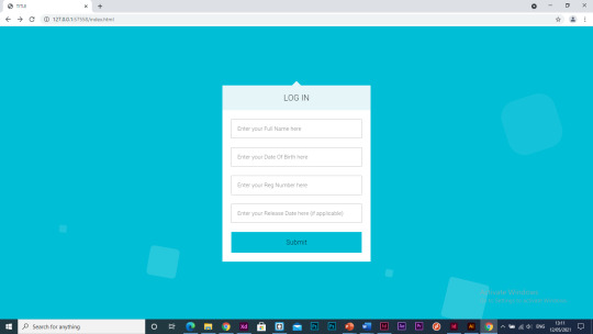
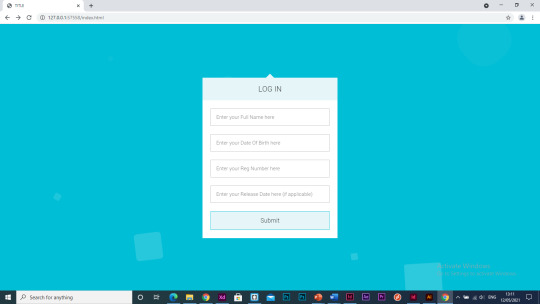
Seen as I took the ‘my account’ page out of the webapp, I needed a page that the program would take the user to after submitting their extra skills answers otherwise it was taking them straight to their work which didn’t flow right. I have started to make a welcome/landing page that the user will be taken to after submitting their answers.
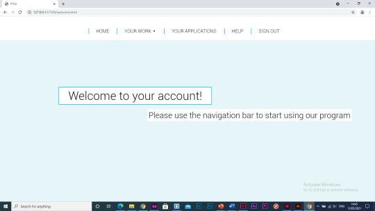
When the user enters this page the text will fade in.
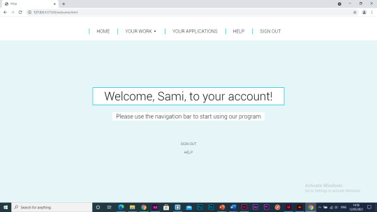
I like the use of the blue border around the white background on the welcome page so I decided to use it in the work pages too as I want the design to be coherent throughout the program and I feel that adding these borders adds extra dimension to the title and makes it stand out more.
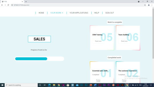
Another thing I want to look at adding to the program is animations between the pages as at the moment it jumps between each page which I think looks a bit like the webapp is lagging and it makes it look less professional and like a real-world webapp, I think it will improve the user experience.
I have started adding a fade-in effect to each page when you open the page.
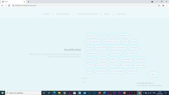
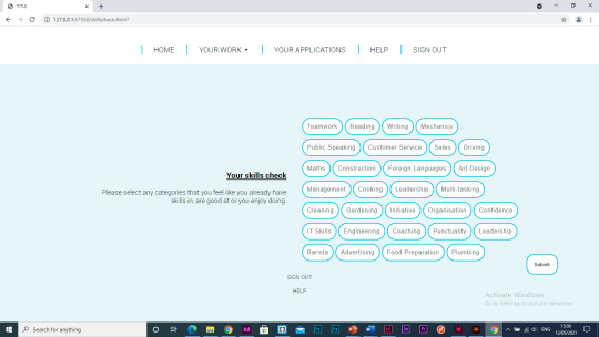
I’m not completely happy how this transition looks between the pages so I want to try out some other code I can use to get it exactly how I imagine it to look.
I managed to create an animation where the page went from small to big on the page but I don’t particularly like this either. The thing I’ve found when researching animations in code is that a lot of the examples that come up include JavaScript which I am not experienced in and for this webapp I am just using HTML and CSS so this is holding me back a bit in regard to what I can achieve.
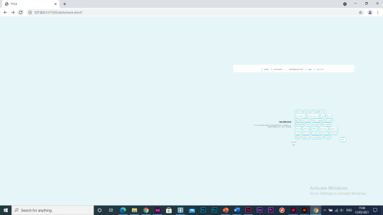
0 notes
Text
Things to Consider in a Web Site Design App

You've resolved that Internet designing could be your livelihood for you personally. You are prepared to jump in the match, however you are likely to want some instruction about the best way best to create Internet sites . But with literally tens of thousands of schools that provide classes in every conceivable permutation - Internet site design or graphic design with a focus on sites; certifications or full amounts - How can you choose which application meets your requirements?
Skills educated in a Internet Site Design application
Site designers demand a huge collection of skills, perhaps not a lot that can be (or may be!) Educated in the class room. But, there are particular skills that most Internet designers ought to understand. First one of these is HTML (HyperText Markup Language) code, that comprises the inspiration of the internet. All Internet websites, however elaborate or focused on Flash cartoon, include HTML in their center.
Even though most designers use Internet editing programs like FrontPage or Dreamweaver to create Internet websites, as a way to comprehend what's actually happening as soon as the net site heaps, you want to understand HTML. For entry rankings, this markup language may be sufficient, but also for more complex positions, you need to find one or other markup formats, for example XML (eXtended Markup Language) and CSS (Cascading Stylesheets ), also as a couple of scripting languages, including Java Script And Active X.
You'll even have to discover the basic principles of producing an internet site appear professional and neat. Even though it might appear basic, you can find always a large selection of methods involved in making an internet site that escapes well. A logical website was made to permit an individual to quickly know the goal of the internet site, also to readily locate the information she or he needs. Even though this is clearly more of an art form than a science, then there are lots of methods that help users browse each page within a site more effortlessly and fast. As a Internet Site designer, so you need to be fluent in such methods.
To do the job on Internet sites, you can also must comprehend that the basic principles of how the computer functions. These technical skills allow one to install and alter the internet empresa diseño web Zaragoza. Having the capability to utilize FTP (File Transfer Protocol) customers to incorporate pages and upload blog changes is overriding. Therefore is having the ability to alter the website contents by using text editor program. A number with the computer software lets you see changes immediately, like the realtime HTML Editor, that can be found on the web. Other text editors have been included along with your Office, or might be installed, helping one to work onsite contents out a niche site editing app.
Finally, based upon the particular career path you are considering, you might have to possess other competencies. If you're focusing on the graphic design element of internet design, you'll want to concentrate on researching vector and raster images. Raster images, included of grids of small pixels, are all determined by the dimensions and caliber of the image - photographs are all raster graphics, as an instance, and are able to seem sharp or fuzzy, determined by image resolution and size. Vector images use geographic factors and coordinates

Rather than pixels, and may be resized without sacrificing image quality. Typography, or even the craft of choosing and using fonts and typefaces, can also be crucial. Page design, or perhaps the art of combining text, pictures, links, and animated pictures on a site in order to generate a satisfying overall layout, is likewise extremely essential.
If, nevertheless, you might be more enthusiastic about the technical facets of keeping up an internet site, you need to target more on server management, especially by learning how to utilize Internet host applications (like Microsoft IIS or Apache), and also focusing on just how to conduct log analysis and that means that you may track who visits your website, and how often you receive particular traffic. There are additional special domains within the business of web site structure, including site optimisation, usability, security, and quality guarantee. Each sub-specialty from the Internet design field demands that the knowing the look principles explained previously, and additional skills that you'll be able to learn in class and at work.
In Conclusion, these are the type of Web Site Design courses you can anticipate to accepting:
HTML along with other markup/scripting languages site graphics and design design Some technical skills necessary to release an internet site Other skills linked to the particular kind of internet design career you would like to pursue Just How Can I understand This Website Design Application is ideal for Me? There certainly are a big selection of website design apps that run the gamut from certification programs to full amounts. All these programs can be obtained in education associations which range from small, private schools to large, public schools - and all inbetween. Choosing the particular Internet or graphic design school that satisfies your preferences from the countless available can become challenging. Below some questions to consider when deciding a course of research in Web designing:
Can I would like to study online or in a school? Could I fit a fulltime schedule in my program, or if I proceed parttime? Can I need a qualification system, or even a certification application, that will be usually quicker, and also certainly will help me enter in the field quicker? Can I prepared to modify my program or at which I live to master all these new knowledge?
Are you curious about the technical end of internet websites, or might I like to focus with graphic design and page layout? Can the internet design program I'm enthusiastic about offer every one the classes required for that career I wish to concentrate on? Can the faculty help pupils with their career preparation by offering internship or job placement aid?
By answering these questions, then you're well on the path to determining that which can be the ideal Internet design class for youpersonally!
Enigma Studio | Nº1 Web Design in Zaragoza and SEO
Enigma Estudio is a web design and online marketing agency in Zaragoza that carries out all kinds of development of web pages and online stores, seo positioning, digital marketing and seo audits.
E-MAIL: [email protected]
CALL US: +34 622 543 970
0 notes
Text
Can anyone suggest an accessible web browser? for photosensitive readers?
I’ve been using Firefox 84, with numerous accessibility hacks, but:
1. It’s not entirely accessible.
2. It’s not enough to protect against standard web design.
I need to be able to set:
1. a readable font in a readable size (done in Firefox),
2. without text overlapping other text (not done),
3. with decent contrast between foreground and background in readable colors (sometimes done using about:reader and css to fix about:reader).
I need to be able to count on:
1. page down, scrolling software, and my keyboard (not done).
I need to be able to block:
1. animated gifs (done in Firefox),
2. animated pngs (done),
3. other autoplaying sound of video (only some types blocked in Firefox),
4. all strobe effects (not done),
5. blinking cursors (done),
6. animated headers/animated top bars (not done),
7. non-scrolling sidebars (not done, and some built into the prefs),
8. non-scrolling backgrounds (not done),
9. any elements which won’t scroll with the rest of the page (not done),
10. any elements which initially scroll but then animate, change size, or jump about, because pain is engagement is good (not done),
11. any elements which animate, change size, zoom, etc., in response to scrolling, mouseover, etc. (not done).
12. any zooming animation, carousel animation, side-scrolling animation, jitter animation, toaster animation, parallax animation, pain animation, animation pain, pain pain, and other pain (not done).
13. smooth scrolling, autoscroll, and auto-smooth-painscrolling (not done).
0 notes