#corbel font
Explore tagged Tumblr posts
Text

stitches - frnkiero andthe cellabration
#stitches frank iero#frnkiero andthe cellabration#album: stomachaches#frank iero lyrics#Frank Iero#gif warning#glitter text#lyrics#red#corbel bold#corbel font#bloggif.com#no outline#I'll wait for you#love
26 notes
·
View notes
Text
Does anyone else kind of hear fonts? Like accents or funny voices? For me it's half auditory and half kinaesthetic and it means I can't settle down to writing or reading if the font is wrong.
(I used to not be able to read my emails if they weren't displayed in Monaco 9pt. 10pt the letter shapes changed and my brain wouldn't latch on. Then everything changed when we got Verdana)
Reblog with yours and your reasoning, if you have one!
#courier new if i'm in emacs#corbel if i'm in ms office#i prefer corbel to calibri but i don't hate calibri so sometimes i cbf'd changing it#shout out to this one cool typewriter font i had a few computers ago. must see if i can find it again#one of those poll things
8K notes
·
View notes
Text
i love to format things in a way that makes them readable to me (girl who just discovered yellow backgrounds and double spaced text)
#its SO much easier to read#when the background is yellow and the text is double spaced and theres spaces between paragraphs and the font isnt horrible#<- font in wuestion js times newnroman. IT SUCKS#my fave serif font is baskerville old face. my fave sans serif font is corbel. my fave monospace font is courier new.#kittipost
0 notes
Note
i've seen that in certain tlt comics you assign certain fonts to certain characters. do you have a list of each one? the only ones i could really guess at would be courier new for palamedes and arial for pyrrha, but i could be totally wrong. if you have any thoughts on why certain fonts were chosen i'd love to see that too!
(im assuming youre referencing this comic) i dont have a list of fonts to use for characters, sorry to disappoint </3 i used different fonts for this comic specifically to distinguish camilla and palamedes. for ooctlt i use bahnschrift semilight semicondensed because i like the way it looks in both sentence case and all caps.
just to entertain you though i used to like casual calligraphy, so heres the handwritings i would try to mimic with fonts (with transcript):


transcript:
I think necromancers have messy handwritings so Palamedes would have a doctor's scrawl that gets worse the more he is panicked/rushing.
Font: Times New Roman. I don’t want to pick fonts that match the illegibility of their handwriting, but instead something that is readable and gets the spirit across. If he would type he would choose something meant for academia. Note that this isn’t consistent with the comic I drew – it’s because I don’t think this far ahead.
Harrow's is even worse. She writes cramped and sometimes blende in cursive with her lettering for ease of writing. Sometimes she will overlay her words on top of each other
Font: Daytona condensed. Clean, but tall and squished.
Gideon’s handwriting only looks neat but she writes very loosely and doesn't join her h,n,m,ps. SOMETIMES SHE WRITES IN ALL CAPS BECAUSE IT'S EASIER.
Font: Corbel. Strange spacing but not too bad to look at.
Camilla's handwriting is clean and crisp, although she might switch how she writes her 'a's and forgets to dot her 'i's. Hold on im not good at clean handwriting okay she would write like this. [scribbled out signature] yeah i cant do this one she's too good for me
Font: Microsoft Sans Serif. The classic.
36 notes
·
View notes
Text


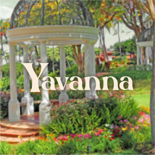


THE VALAR | AESTHETIC MOODBOARDS
like or reblog if you save ♡
YAVANNA The Queen of Earth, The Giver of Fruits, The Protector of Plants
Sources
Faceclaim: Sunmi (Heartburn MV)
Font: Silk Flower & Corbel
#valar#the valar#yavanna#queen#earth#fruit#queen of earth#tolkien#jrr tolkien#middle earth#ainur#valinor#graphic design#lotr aesthetic#lord of the rings#hobbit#silmarillion#silmarillion aesthetic#lord of the rings aesthetic#tolkien elves#tolkien aesthetic#lotr moodboard#tolkien world#sunmi#sunmi heartburn#kpop#theyoondiary graphics#theyoondiary#theyoondiary aesthetic#theyoondiary valar
38 notes
·
View notes
Text

# ROSULA. an icon ( 50x40 ) and border set designed around genshin's navia. adjustable and features editable sections, thus can be altered to fit other characters. includes a very basic psd. fonts: abril fatface + corbel. for personal use exclusively. please credit within rules or pinned.
purchase here for 5£
#icon border#icon border template#icon template#roleplay graphics#roleplay resources#rp icon template#rp border#rph resources
8 notes
·
View notes
Text

Guess who has a second Undertale OC that she just remembered? This gal!
Meet Gaster Blaster AKA Gast, a humanoid Gaster Blaster created by W.D Gaster!
Outfit by @snowflakesparklegor
Trivia:
You don't fight him in the Pacifist or Neutral Runs, but in the Genocide Run you one shot him, and his skull will likely come back in Sans fight
Gast lives with Sans and Papyrus as his adoptive brothers, he doesn't consider Gaster much of a father.
Gay and taken! (By @aertuthesavagecomedian2 OC Winslow!)
He uses Courier font (I was gonna go Corbel but I realised to late I used the wrong font in the bio sheet so WOOPS I'M AN IDIOT-)
In the Pacifist and Neutral runs, he'll give you some history about Gaster and the labs, he'll also tell you to not get on Sans' bad side.
He'll be wary of you at first, but will soften up as the Pacifist/Neutral runs go (unless you kill Papyrus)
He and Dyane are frenemies- it's never serious tho
His body and hair is made of magic
3 notes
·
View notes
Text
Pour sortir un peu de la morosité ambiante...
Quand je pense qu'il y a des gens qui osent critiquer la Science et les savants... ça me rend malade ! Alors que, à propos du covid, ils ont pu démontrer leur immense honnêteté en ne cédant jamais aux bobards des ''Big-Pharma'', et aussi leur originalité intrinsèque --chacun ressassant les mêmes inepties, en sachant parfaitement que c'est de la bouillie pour les chats... On devrait les con-gratuler (en 2 mots) pour la manière ahurissante (d'aucun disent ''macronienne'' !) dont cette fausse crise fabriquée de toutes pièces a été mal gérée...
Pour tenter de redresser un peu l'image de marque de nos ''savants'', qui est ravagée par leur comportement passé et présent (mais il faut les comprendre : ils luttent pour sauver leurs privilèges, leurs décorations et leurs prébendes), je vous propose de nous passionner pour une étude scientifique très récente qui vient de faire faire des pas de géant à la connaissance (avec un grand c tout petit) du monde (avec un grand m, tout petit aussi). Si vous lisez le célèbre magazine américain ''Science'' (même une fois tous les 2 siècles, comme moi), vous avez pu découvrir, dans le dernier numéro que j'ai lu, que (tenez-vous bien !) ''les corbeaux savent compter jusqu' à 4'' ! Pas un de plus, mais pas un de moins. Imaginez Maître Corbeau avec son corps laid, sur son arbre, croassant : ''Un... deux... trois... quatre... ''. Ah ! Quand je vous dis que la Science est utile !
Mais je vous ai prévenus, c'est du lourd : nous sommes dans l'univers de ''LA Science'', et pour en arriver à cette conclusion, il a fallu que des équipes de cerveaux ''musclés'' réunissent des budgets impressionnants, pour mettre au point des modèles hyper-compliqués. Ce qu'il faut admirer, c'est le résultat de toutes ces années de travaux acharnés : les corbeaux savent bel et bien compter jusqu'à 4 ! Quatre, comme les saisons, les ''cent coups'' ou les sous de l'Opéra éponyme, comme les vérités, les cheveux coupés en- ou, dans un autre registre, les cavaliers de l'Apocalypse et le nombre de planches de notre cercueil terminal... Je ne suis pas certain que tout le monde pige le non-dit de cette découverte, et ce que représente ce ''Sudoku'' corvidien (mais scientifique)...
La question qui saute immédiatement à l'esprit, c'est ''Pourquoi seulement quatre ?''. Il semble bien que, au dessus de quatre, il y a quelque chose qui bloque, et le tout est de savoir si c'est plutôt du côté des corbeaux qui ne voient pas pourquoi ils iraient plus loin, ou si c'est du côté des ''savants'' dont les modèles, eux, ne savent pas compter au delà de 4 en langage corbeau. Il m'est tout de suite venu en mémoire cette délicieuse vidéo qui revient épisodiquement sur le Web et qui montre une mère canard –donc une cane, en jargon féministe-- dont un policier est en train de sauver la couvée tombée dans une grille d'égout, et qui revient à la charge tant que le brave homme ne lui a pas restitué ses sept canetons.
Mais franchement, à l'aventure de la grille d'égout près (qui ne doit pas faire partie de l'héritage génétique de l'un ou de l'autre de ces animaux, on ne voit pas très bien à quoi peut servir à un oiseau de savoir qu'il sait compter jusqu'à 4 (voire jusqu'à 7) … ni à quoi peut servir à un savant de le mesurer jusqu'à arriver à 4, ou à 7 ! Il arrive sûrement très rarement à un corbeau ou à une corbelle (?) de raconter, lors d'une becquée de famille : ''Je grimpais les marches 4 à 4, lorsque soudain... '', et ''Je n'irai pas par quatre chemins...'', ou d'asséner sentencieusement ''Aussi vrai que deux et deux font quatre...''.
En fait, le seule question importante aurait dû être, me semble-t-il : en admettant qu'un corbeau soit capable de compter jusqu'à quatre, à quoi cela lui sert-il et quel avantage compétitif en retire-t-il ? Mes arrière-petits-enfants ont involontairement hérité de la plus vieille habitude du monde : dès que quelqu'un a le malheur de prononcer un chiffre devant eux, ils démarrent, comme vous et moi en notre temps, à toute vitesse et sans penser à rien : ''un deux trois quatre cinq six huit neuf quatorze...''. A combien nos savants évalueraient-ils leur performance arithmétique ? Il faudrait leur murmurer dans l'oreille que compter varie essentiellement avec ce que l'on compte : pour un champion de Sudoku, 9 est largement assez. Pour le fonctionnaire de Bercy , c'est ce qu'il peut vous voler en gardant un air légal, avec plein de zéros à la suite du premier chiffre. Pour le candidat bachelier, c'est la somme dont toutes les notes seront remontées sans raison, juste pour que l'Académie où il est soit bien placée et son recteur augmenté et promu... Et apparemment, pour tout chercheur ''ès-corbeaux'', c'est le chiffre 4...
Alors... par respect pour la Science qui a réellement besoin de redorer son blason tellement terni par les mensonges monstrueux qui ont permis à un pouvoir pathologiquement liberticide de nous imposer toutes les mesures absurdes et humiliantes que nous ne devrons jamais oublier ni lui pardonner... et dont tout le monde savait qu'aucune d'elles ne pouvait servir à quoi que ce soit --debout à la plage, pas d'enterrement, enfermer malades et non-malades dans leur appartement, condamner les enfants à rester dans des carrés à la craie, à la récré, etc... etc... Mais nous allons donc pouvoir nous réjouir bruyamment de cette grande nouvelle : un corbeau peut avoir jusqu'à quatre fromages dans son bec. Bonne nouvelle pour tous les renards !
NDLR : En revanche, je ne suis pas absolument persuadé que notre personnel politique, surtout dans les sphères les plus élevées, sache compter jusqu'à 4... A en juger par toutes leurs ''perfs'' de ces jours derniers, la question semble plutôt être ''savent-ils au moins compter jusqu'à... un'' ?
H-Cl.
2 notes
·
View notes
Text


scope: rebranding/font/slogan/strategy entity: ONMT
so it's interesting, in the sense that there is a real drive to achieve an image, at the same time basic mistake when you do that is overdoing it, also nice colors, but South Africa went there first and they have locked the colorful theme
the slogan is an important part of it, the message that ONMT wants to convey, is not it, tourism is the activity of the office, it is expected that the office is in action, what message ONMT wants to convey to the tourism industry and Morocco's visitors is more to the point
so a bit of flattening all this and we obtain the following
where at this point either I can continue playing with graphic elements, or I have a strong message to convey
how does it function, we tend to go for the red color first visually, its wired in our visual recognition, then we realize that we didn't read the message and so we go back to the message, a bit like a warranty that the message will be read not skipped on
this I think nicer font is Corbel Regular, pretty standard not too elaborate either we already have the designer font, so as not to get into the way of the message, and its not conflicting with previous slogan font since its obsolete, and its font
for the strategy, we have brushed on it before I think, 589K businesses in the travel agency industry
we want to purchase up to 5 or 6% of that, outbound from different areas in the world and implement drivers for Moroccan tourism products, not enforce them any business is good business but they have to be there, commercial drivers, interesting margins
the tourism industry like any industry is supply chain based, opening hotels and waiting for tourists is done with, buying tour operators of different sizes and travel agency chains and having them drive our tourism sector is much more like it
it cuts down on the fragmentation of the travel agency sector while it shouldn't bother anyone, 5 or 6% are not 10%, at 5% it is equivalent to 14.8BN USD annually, with a workforce of 150 thousands, globally
it's simple in terms of going upstream, maybe more elaborate to implement, and it looks like the actual ONMT venture and priority for years to come
it is a consequent investment budget, certainly is, with a goal, that is to triple the number of inbound tourist stays in Morocco within the next 8 to 10 years
interestingly, when we think we are done, Morocco is inviting 150K tourism professionals and their families for all inclusive 15 days in Morocco, not all at once but as these acquisitions progress
Because they have to know what they are selling, and because big cap ventures is not just throwing money at stuff, the people making it happen are key
Also a pragmatic aspect of owning these businesses is, commercial incentives, interesting margins, but at some point we want to see inbound business, if the numbers aren't there so be it, not past a volume retainer however because that means you are not selling the destination, others are
Now as a travel agent you want to go somewhere, okay I will still propose you Morocco, better if not excellent price quality what do you think, of course I will not force you it's your choice, next time you want to travel I will propose Morocco once again, try to find out why you're hesitating, take note of the stuff that I have to email because it needs fixing, and I will make you a onetime deal that flattens anything else, 25% off on the spot
Especially since I have a volume of those with my package, so it is a comprehensive set of marketing and commercial tools, that said it is also legitimate, if it turns out that its many agencies report sluggish sales, for them to ask ONMT for a review of these packages, and so its both ways as it should
We have just scratched the surface of what is a global tourism industry expertise pole including online, at 150K employees, even indirectly ONMT becomes one of the largest TO's worldwide, where the business is not just to sell Morocco, but to promote the tourism industry to the benefit of all
I would promote Spain or Indonesia day in day out including outbound from Morocco, providing Spain or Indonesia promotes my destination as well, and so win win partnerships are basically what tourism is made of, for its operators and clientele
The reality of the global tourism industry is that a tourist is going to come to my destination 1.5 times, hopefully 2.5 if he likes better than all of the competitive offering on the market, but after that what am I selling, and if you don't understand that fact you're not in the tourism industry, not really
Another thing is, that in the past my destination is all there is and oh look tourists are going somewhere else what can I do, nowadays you build up your destination in terms of service quality, and you buy the business where it is not where you want it to be, tourists nowadays are online waiting to snatch any cost competitive offer to anywhere, they don't even care where that is providing the quality is there
There's been countless hours countless meetings and a lot of money spent on trying to counter the attractiveness of another destination, whereas buying business in that destination to shield a drop in domestic sales made all the sense in the world not otherwise
Did you ever stumble into the hotel of a large hotel chain, and it's almost empty, they don't care, they think in terms of geographical spread, that they can boast 160 countries to their clientele is more important than any single empty hotel somewhere
They have evened the bets which is what you are supposed to do in the global tourism industry, way past your own destination
Thank you for having followed
0 notes
Text
Avvistato UFO cilindrico vicino a Baghdad: essi si avvicinano - Ufo e Alieni UFO Avvistato UFO cilindrico vicino a Baghdad: essi si avvicinano Diufoalieni AARO, Avvistamenti UFO, Baghdad, Drone, UAP, Ufo, USAF Facebook 309 Twitter 0 LinkedIn Il video mostra un oggetto volante non identificato (UFO) soprannominato “il fantasma di Baghdad” che si muove sullo schermo da sinistra a destra. Il filmato è stato acquisito da una termocamera su un drone Reaper dell’aeronautica americana (USAF) durante una missione in Iraq nel maggio 2022. Secondo una fonte a conoscenza dell’incidente, l’oggetto è stato catalogato come fenomeno aereo non identificato dalle autorità militari degli Stati Uniti a causa delle sue caratteristiche insolite. Nonostante il fatto che i velivoli in rapido movimento siano noti per generare calore attraverso motori o razzi, la termocamera ha mostrato che l’oggetto era più freddo (più scuro) dell’ambiente circostante. Inoltre, non sembrava avere ali o pinne visibili, il che rende improbabile la possibilità che fosse un missile o un aliante. Tuttavia, sembrava essere sotto il controllo di un’intelligenza. Il filmato è stato reso pubblico dal giornalista Jeremy Corbell e dal giornalista investigativo George Knapp, che lo hanno pubblicato nel loro podcast Weaponized. Corbell ha rivelato che il materiale gli è stato fornito da fonti anonime dell’USAF che sono frustrate dalla mancanza di collaborazione e trasparenza riguardo a questi incidenti. La recente legislazione statunitense ha richiesto all’Office of Anomaly Resolution of All the Domains (AARO) di raccogliere informazioni sugli incidenti UAP dal Dipartimento della Difesa e dalla comunità dell’intelligence. Tuttavia, alcuni esperti hanno criticato l’Air Force per la presunta mancata collaborazione riguardo a questi casi. In ogni caso, il video del “fantasma di Baghdad” continua a suscitare interesse e curiosità tra coloro che sono interessati alla ricerca sugli UFO. Si è verificato un errore. Prova a guardare il video su www.youtube.com oppure attiva JavaScript se è disabilitato nel browser. © Riproduzione riservata A cura di Ufoalieni.it Seguici su Telegram | Instagram | Facebook Facebook 309 Twitter 0 LinkedIn
youtube
0 notes
Text
Raise your hand if you’re a writer, and picking out the right font is important to you - even if it means wasting an hour (or more) finding the right one before you even start.
Put your fave writing font(s) in the tags! Also do you use different fonts for different stories or genres?
#writing#fonts#for a very long time i used calibri but i guess i tired of it?#and then i got a new pc that didnt have all my old fonts#so i had to find a new one#i was using ebrima recently for a while#but i just switched to corbel 13pt and i love it#it has a fantasy feel without coming on too strong#and it reminds me of the font used in octopath traveler#so it's perfect for that fic#it also works well for my original story#but for sci-fi like ME i might need something different#eta: i just discovered carlito for sci-fi#fantastic :D
9 notes
·
View notes
Text

Prom Song (Gone Wrong) - Lana Del Rey
#prom song (gone wrong)#lana lyrics#lana unreleased#lana del rey#gif warning#glitter text#lyrics#pink#bloggif.com#corbel bold italic#corbel font#love#I'm in love
12 notes
·
View notes
Photo


#waverly earp#nicole haught#wearp#wynonna earp#wynonnaearpedit#wearpedit#dailywearp#mywearp#wynonna x waverly x nicole#font; corbel#i love them sm
830 notes
·
View notes
Text
for someone who can code and draw im comically bad at designing
#my default: border 1px solid purple border radius 1em corbel font padding 1.5em#it does not look good#does not help that i cannot be fucked to learn how to code on websites#a fresh laravel project? yeah sure why not#like 2 variables that tumblr uses? eurgh.... ahehmnnnnmmmm
0 notes
Photo


ANA, a character graphic template.

FONTS USED: Meiland Gorgeous & Corbel
please don’t redistribute.
only a little bit of photoshop knowledge is needed for this template
you can edit it however you’d like but please don’t make it unrecognizable.
PSD and textures included
and most importantly, i hope you enjoy!
PURCHASE HERE FOR $3.50.
#mine: templates.#template#character psd#indie rp psd#rp psd#indie promo psd#roleplay psd#character template#YAY i rly like this one
96 notes
·
View notes
Text


GX Finalized-Subs!90 (WIP): The State of GeneX Medal Play [UPDATE!]
Spent the past week getting work on finalized 89 and 90 going, and since I only had one quick animation fix to work on for 89, I'm onto prepping 90--as part of that, I'm getting to redo one of my first on-screen translation edits, done way back in 2012-ish when I first subbed 90 using only Sony Vegas and Aegisub, iirc. It's neat to take another crack at it using Photoshop, though I also necessarily had to redo it due to the differences in video quality (I did also use a DVDRip back then, but it was a more manual encode from a different source, iirc, hence the black bars on the side) and the fact that somehow I thought to encode a hardsub into the raw clip... which I wouldn't have done now, lol.
So, this is Samejima's computer screen as he looks over GeneX's progression with our main crew early into the episode; in Photoshop, I first stitched together the screen he scrolls through (on the left), then worked to blank it, painting over the Japanese for most of it. When it came to the DA circle in the middle with the dorm names, I tried to apply a render off DeviantArt, but between the border on each letter and the text not quite matching up, I opted to instead redo some of the letters (mainly the "ISK" in "Obelisk," done with Times New Roman, and painting over the bottom of the "B" in Blue, while I copy/pasted part of the "R" in "Ra" over the "R" in "Osiris" to cover up the end of the "count" kanji). Got it fully blank by about Wednesday night.
Then, yesterday, I started adding in the English text and got that knocked out easily (final product on the right, with my last go at it in the middle for comparison); I don't have the original sub file I used for the text here way back (thanks, failing drive in October), but I did remember using the Corbel font for the header there, then also used it for the "Duel Count," "Medals Won," and "Primary Cards Used" text, while I used Arial here for the names. I also lengthened the boxes under the latter to fit "Monster/Magic/Trap Cards" to match the original text. Applied a light blur and some noise on the text, as well as a light drop shadow, and voila. Overall, I think it looks much cleaner than the 2012 attempt, though I wish I could figure out how to make the drop shadow a smidge less blurry, but it'll do.
So, next steps for this is to throw it into Sony Vegas and redo the scrolling, while applying a light screen flicker (which I'll do using a solid blue every couple frames with a screen blend).
The kicker is trying to make this work in the follow-up scene after the OP with Samejima on top as he scrolls from Misawa to Saiou (which I managed to; see the update reblog linked above!]:
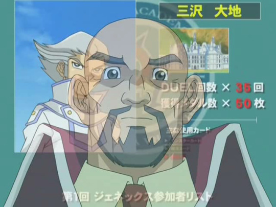

I was originally thinking of also stitching together the scrolling here, then redrawing Samejima as needed on top of the text I'm covering up, and I did stitch it together, but I'm realizing I'll have to make the edits frame-by-frame to account for him and three of his lip-flap frames that I can just loop as needed once it stops on Saiou.
So--and thinking out loud--I'm thinking I'd redraw more of Samejima and then save and mask him out to use later and keep him looking consistent, while I use that stitch I've done to redraw the screen to just leave the text, recycling the text edits for the Duel Count/Medals Won/Primary Cards sections from earlier on Saiou's side; once I redo the text, I'll put Samejima back and make him more transparent where he's on top of the new text. Then, when I throw the frames back into Sony Vegas, I'll take the original video and mask Samejima back on to the parts without text in each. I think... that'd work... Hmm. (EDIT: Funny, that's exactly how it went; see the update link above to my reblog, lol.)
Seems I did go frame-by-frame in my last try too, though not as clean as I'd have liked now:
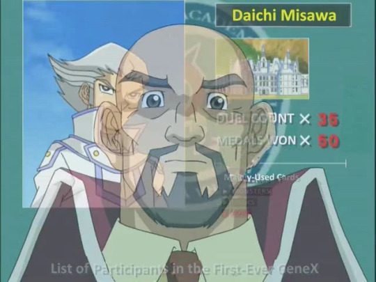
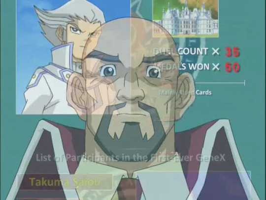
I can see why 4Kids opted to just cut the Misawa-scrolling part of this scene and just keep the Saiou part for the dub (though I would've thought they'd have access to the files used for this at least lol)
#subbing rambling#yugioh gx#GX#yugioh#ygo#ygo gx#we'll see how that last strategy plays out i suppose lol
12 notes
·
View notes