#comic scan copy
Explore tagged Tumblr posts
Visit Tumblr Blog
Explore Tumblr blogs with no restrictions, modern design and the best experience.
Last Seen Tumblr Blogs


Fun Fact
Premium Tumblr themes are available from anywhere between $9 to $49.
Text
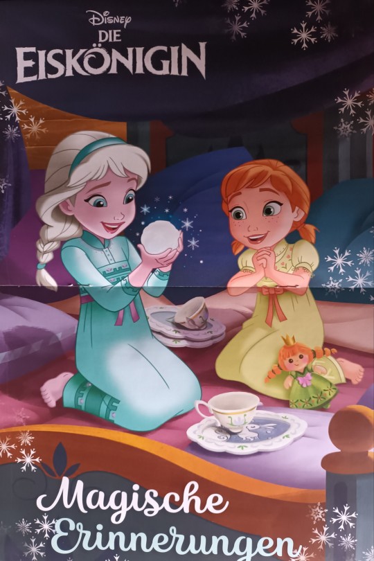
Magical memories
I got this poster just yesterday (in the german magazine). I love that picture so much... it´s like a perfect match to my recent fic "My home is with you" on AO3 for @fluffbruary 2023
17 notes
·
View notes
Text


Gotham County Line (2006) #3
#this issue had me in tears#dead jason coming to help bruce fight an army of the dead…#‘thanks for thinking of me!’#GAAHHHHH.#batman#bruce wayne#jason todd#cricket reads comics#batman: gotham county line#gotham county line#I had to physically scan the splash reveal page myself from a library copy#because none of the online scans have it?? what???
27 notes
·
View notes
Text

Despite everything, I was able to get a copy 😭
#sleepless comic#official#i talked about how i wasnt able to get a copy because i wasnt aware there was a kickstarter going on#so i bit the bullet and emailed sarah vaughn and she and leila del luca were able to get me one of rhe extra copies from cancelled orders 😭#so grateful that i was able to get a copy and tell them both how much this comic meant to me ❤️#ill work on getting some of the pages scanned because theres some bts commentary at the end!
15 notes
·
View notes
Text

soooo excited for my ubu bubu volume comic to arrive. now i wont feel like a fake fan after so seeing so much concept art and a few panels for so long
#🌈squee.exe🎸#usually read comics online so i wont feel bad after getting a physical copy becuz of the fear of ruining it#but there are no scans online of ubu bubu or bear
3 notes
·
View notes
Text
The Lara-Su Chronicles: Beginnings review

The day has finally come. Many, understandably, thought we'd never get here. Maybe we shouldn't have gotten here. We've been through so much. Lawsuits, reboots, redesigns, unreleased NFTs, empty legal threats over the fact that movie Knuckles has a dad, an attempt to license out Scourge the Hedgehog to fans that immediately got canceled (in both meanings of the term), and many, MANY idiotic Twitter controversies. But now, here we are.
Thirteen years after first announcing it in the middle of his legal battles with Archie and Sega that changed the American Sonic comics forever, former writer Ken Penders has released the first part of his new series: The Lara-Su Chronicles.
Yes. I had to buy the book. I had to take one for the team. Look at the fucking URL of this blog, a blog I've been using to talk about the American Sonic comics for nearly a decade while the specter of this book loomed in the distance. The one time I've actually been paid to write an article about anything in any professional capacity, it was an article about the Penders lawsuits. I'm cited on his Wikipedia page. There was no way I was going to skip reviewing this, and there was no guarantee that scans would ever turn up online given the incredibly small audience for this trash. (Only 166 people preordered this, and even that number feels way higher than it should be.) No, I had to preorder it to ensure I could get a copy and cover it for the blog... even if that meant my name would be forever immortalized in the list of "supporters" in the back of the book. These are the sacrifices I must make as a woman who stumbled ass backwards into being an amateur Archie Sonic historian.
So, what exactly is in this book? How much of it is new? How bad is it? How did we even get here in the first place? How can this exist without Sega pursuing legal action? What happens next? And, most importantly... why are there multiple depictions of an Archie Sonic character breastfeeding in this book?

I'm here to answer those questions as best I can, and in agonizing detail.
First, for those just tuning in to this decades-long saga or those who maybe don't know the full story, here's a refresher on the background info.
"What the hell is this?"
The Lara-Su Chronicles is Ken Penders' long-dreaded long-awaited continuation of his 1994-2006 run on Archie Sonic, ignoring everything written after he left by other writers like Ian Flynn. In particular, it picks up from the cliffhanger ending of the 2003-2004 arc "Mobius: 25 Years Later," which was set in what Ken considers the definitive canonical future of the series. It stars Knuckles' daughter from that future era, Lara-Su, among other new and returning characters. The project was first announced near the start of Ken's legal battle with Archie in 2011, and he's been posting WIP previews online for about a decade. Now, after all this time, a Lara-Su Chronicles book finally exists.
We'll get to the actual contents of that book in a bit.
"He can do that without getting in trouble with Sega?"
Believe it or not, yes, he can.
Thanks to the outcome of Archie Comics' woefully mismanaged lawsuits against Ken (yes, they sued him after he started filing for copyrights, not the other way around), he now has full legal ownership of every story he wrote for Archie Sonic and every character he created for the series. This was explicitly granted to him in the terms of the settlement between him and Archie (acting on behalf of Sega). He can even reprint his old Sonic material as-is to his heart's content. The main catch is just that he can't write new stories featuring Sega characters or trademarks, and his new stories also have to be distinct from Sonic at a glance to avoid confusing readers. As such, reprints can't use Sonic iconography on the cover, a few Sega characters (mainly Knuckles) have been renamed and slightly redesigned in the new stories, and the art style has been changed to less closely resemble Sonic. But otherwise, he can do whatever he wants with his own characters.
All of this is because Archie lost the original copy of Ken's work-for-hire contract that signed over the rights to his work. Without that (or any alternative that was considered permissible in court), his comics and characters are the property of their creator by default. Yes, those old comics are full of Sega stuff, but Sega doesn't automatically own the copyright for every drawing of Sonic in existence. And Sega put their stamp of approval all over those comics and let them get sold at retail for decades, even though (in the eyes of the court) there was no legal paperwork granting them ownership of any of it. It's almost like they were unwittingly distributing a fan comic for years and declaring it a fair use of their property, and now there's no takesies backsies. It's a strange and unique copyright situation. Again, they worked all this out in the settlement. And, yes, fans have long speculated that Ken stole and destroyed his own contract to regain the rights to his work, but frankly Archie was so incompetent throughout the lawsuit (it went so bad that they had to fire and replace their lawyers midway through) that I completely buy the idea of them just losing important legal documents.
Also, in case it needs to be spelled out: while Ken's a weirdo, it's ultimately a good thing for creatives everywhere that Archie lost their lawsuit against Ken. We do not want to live in a world where corporations can claim ownership of peoples' work without the contracts to back it up. That would be an incredibly dangerous legal precedent to set. And more comic creators, and artists in general, should own their own work! Corporations are not your friend! They'll delete your work for a tax write-off in a heartbeat! It's just bewildering that this guy, of all people, was the creator who ended up successfully getting his shit back, and that this is what he's doing with it.
"What about his old collaborators? Are they involved? Is he paying them?"
Ken is mostly doing The Lara-Su Chronicles solo, though he has, in fact, talked about compensating the artists involved in any material he's reprinting. The ones who give enough of a shit to get paid for a small scale reprint of something they did 20 years ago, anyway.
On the subject of his collaborators, it's also worth pointing out that Ken's wasn't the only contract that was lost. Most of the early Archie Sonic writers from before Ian Flynn's time seem to be in the same boat as Ken, with the ownership of their stories and characters defaulting back to them. Again, Archie fucked up big time. But like I said, most of them don't really seem to give a shit. For most of them, Sonic was just a random temporary gig they took to pay the bills while Marvel was busy going bankrupt in the '90s, not the thing that defined their entire careers.
The only other Archie Sonic contributor who's tried to do anything on the level of what Ken is doing was writer and editor Scott Fulop. In 2016 he attempted to sue Archie for the unauthorized use of what are now retroactively considered his copyrighted characters and stories, and he even announced a standalone comic about his most famous Sonic character, the recurring villain Mammoth Mogul (sort of a pastiche of DC's Vandal Savage and Marvel's Kingpin, with wizard powers added for spice). However, Fulop lost his lawsuit because he didn't put together a particularly compelling case. Since then he seems to have wiped all traces of his ill-advised Mammoth Mogul comic and his company, Narrative Ark Entertainment, from the internet. For now, this leaves The Lara-Su Chronicles the only project of its kind.
"What about those other Archie Sonic reprints he just announced?"
At the time of writing, Ken is once again claiming that he's trying to get the band back together to reprint all of Archie Sonic, now under the bad new banner "Floating Island Productions: MOBIAN LINE" that I can't imagine he consulted literally anyone else on.
So, like, look. As we've established, Ken can reprint his own stories. And if he can work something out with the other contributors whose contracts were lost, he can print their work, too. But there is no fucking way he's getting his hands on Ian Flynn's run, which Sega undoubtedly holds the copyright for. Even if they don't, Ian needs to maintain a good working relationship with both Sega and IDW if he's to keep his job, so he'd never go for this. Not to mention that Ian and Ken just... don't get along! Ken's whole plan here seems to be predicated on IDW going out of business (a thing he REALLY wants to happen) and freeing up the Sonic comic license, after which he knocks on Sega's door and goes "hey I've still got dirt on you guys," blackmailing them into giving him the Sonic license back so that he can reprint the later comics. Every step of this plan is ludicrous. It's never gonna happen.
He's been saying he wants to reprint the whole series for a few years now, though. This isn't really anything new. And despite his lofty plans that set Sonic Twitter ablaze, he quickly backpedaled. The only specific things in the works right now are a "two-volume omnibus" of all of his Knuckles stories and a collection of artist Scott Shaw's work on the very early Archie Sonic issues, since they're on good terms with each other. I have no idea how Ken plans on packaging these when he can't put any Sega characters or the Freedom Fighters on the covers, but these projects are small enough in scale that there's a decent chance they'll see the light of day. Scott Shaw only did like five issues. But anything beyond that? I'll believe it when I see it.
Or, y'know, this could've all just been a publicity stunt for his new book. I wouldn't put it past him. Let's just focus on the book that actually exists.
"So he finally did it? He made a whole Lara-Su book? It's out? He finished it??"
Yes and no.
The book that's out now is The Lara-Su Chronicles: Beginnings, a prologue for the series of seven graphic novels Ken somehow plans on making, even though it's taken him 13 years to put out literally anything new. I don't know whether or not this counts as book one of seven, because it only features 30 pages of new comics. 30.5 if I'm being generous.
Most of the book is actually just a reprint of his infamous Archie Sonic storyline "Mobius: 25 Years Later", which ran from issue #131 to #144 in 2003-2004. (Again, yes, he can reprint this, he just can't put Sonic on the cover.) Why's it infamous? Well, Ken had been building anticipation for this future era of the series for basically his entire run. We kept seeing King Sonic and Queen Sally from the future. Knuckles' entire backstory hinges on his dad having a vision of this future. Several years before Silver the Hedgehog was created, it was Lara-Su who was Sonic's equivalent to Future Trunks, the cool-looking child of one of the main characters who traveled back in time to try and prevent a dark future. Believe it or not, yes, there was hype for Lara-Su. And then we finally got M25YL, and none of that cool stuff happened. Instead it really ended up being about how unbearably boring the middle aged Sonic, Knuckles, Sally, and co. are in this peaceful future where Robotnik is dead and they're all married with kids, forced into traditional nuclear family gender roles. Lara-Su is present, but she mostly just does generic teen girl stuff and complains about how Knuckles won't let her do anything even though she REALLY wants to be the new Guardian of Angel Island, like, super bad! Come on, dad!!!
In its original printing, this meandering arc ended on an abrupt time travel cliffhanger that Ken was never able to follow up on before he left Archie in 2006. This new printing slightly changes that ending, using the unresolved timey-wimey shenanigans as a convenient excuse to alter the entire timeline. This creates the slightly different world of The Lara-Su Chronicles, where the few relevant Sega-owned characters have been replaced and everyone is ten times uglier.
After this, we finally get two short new stories picking up where M25YL left off: "The Storm," starring Acorn Kingdom super-spy and known creep Geoffrey St. John, and an early release of the first chapter of The Lara-Su Chronicles: Shattered Tomorrows, the first full TLSC graphic novel.
And now that we're all on the same page about what we're looking at, let's actually talk about the book!
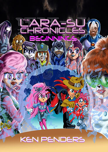
The cover
Let's start by beating a dead horse. The cover art: it's still bad! But why is it bad?
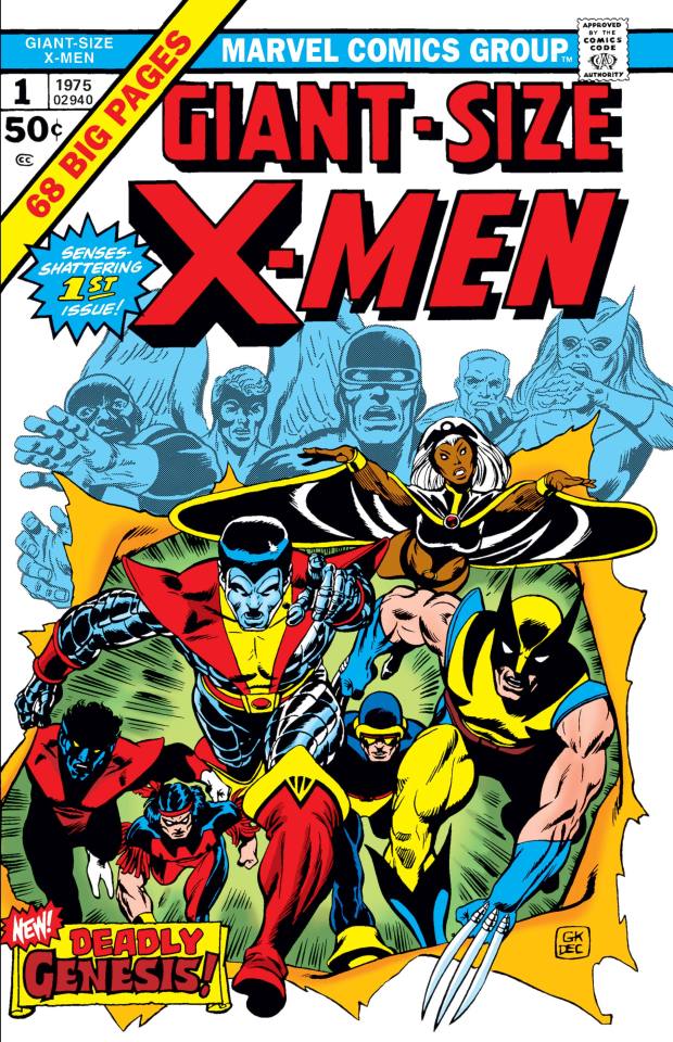
The cover is, of course, based on Patrick Spaziante's cover from Archie Sonic #131, the start of the "Mobius: 25 Years Later" arc. (Ken did the layout for that cover, though, so in the eyes of the law he's the original creator who owns that cover.) That cover was, itself, a tribute to the iconic cover of Giant-Size X-Men #1 by Gil Kane and Dave Cockrum, the issue that introduced the version of the team with Wolverine, Storm, Nightcrawler, etc.

Ken seems to have forgotten that the point of both these covers was to hype up the arrival of a new cast of characters. The new guys are supposed to make a dramatic entrance front and center. That's the focal point. Meanwhile, the cover for Beginnings has the old timeline versions of the cast from Archie Sonic dramatically bursting out of a shattered crystal ball, while their new counterparts look on in mild bemusement - if they're even bothering to look at all, since most of the characters here are just copied and pasted from their profile pages. That's just not how you do this particular homage! The point is supposed to be "out with the old, in with the new." And why are they using a crystal ball to view the past? Hell, why are they even using a crystal ball at all? The original arc was presented as a magical vision of the future courtesy of Tails' uncle Merlin (don't ask), but the new story leans all the way into being futuristic sci-fi.
Of course, there is no real artistic intent at play here. The old versions of the characters are placed front and center in the crystal ball simply because Ken traced over Spaziante's original art of Lara-Su and Julie-Su (the only two characters on the Sonic cover he owns) and threw out the rest, ruining the composition in the process. Look at the awkward empty space where Sonic, Sally, and Rotor once were, and the new drawing of The Character Formerly Known As Knuckles who's no longer properly centered between his wife and daughter. Even if Ken can claim ownership of the cover because he did the original layout, this all just feels scummy and lame.
And, yeah, if it needs to be said, the new characters and Ken's new rendering style look like absolute fucking dogshit. Putting new Lara-Su directly next to old Lara-Su does her no favors. The shattered glass effect looks absolutely atrocious. I could go on, but we'll have plenty of time to talk about the art style when we see how bad the stories inside look.
Changes to "Mobius: 25 Years Later"
Overall, 99% of M25YL is presented identically to its original printing. Sonic, Sally, Knuckles, et al. are still present with no changes to their names and no tweaks to the art. Even the original cover for issue #131 is included only a few pages into this book with its Archie, Sonic, and Sega logos still intact and everything. Again, because of the weird copyright situation described above, these preexisting comics can be released without any changes.
There is exactly one bizarre change to the art, though, where a hand drawn shot of Angel Island is replaced with an unfitting photo background and the ugly Floating Island photobash that Ken has been using as his personal logo for decades. I think he only did this as part of a test for his motion comic app that nobody asked for. I don't know why this had to make it into the print version. It's like the book is firing a warning shot for what's to come if you keep reading.

The new content begins on the final page of M25YL. In the original wet fart of a cliffhanger ending, Sonic and co. accidentally alter the timeline with an old time machine of Robotnik's and Lara-Su begins to fade away. Then, after everything goes white, we just cut to the present day heroes going "gee, you ever think about the future?" In this new printing, that last bit has been cut, and the rest of the page has been awkwardly shrunk down so that Ken can fit in a new panel. We now see the hands of an off-screen villain, seemingly named "Override," proclaiming that "the Praetorian" (Knuckles) has messed up the timeline again and that they'll finally get their revenge.

Who is this Override? I have no fucking clue. The new stories in this book make no mention of them. You have to buy the next book to find out.
My confusion over the identity of this villain overlaps with another big problem: name changes. So many names and nouns have been arbitrarily changed in The Lara-Su Chronicles, even ones Ken didn't have to change for copyright reasons, and I only know what half of them are replacing because Ken's been tweeting about this shit for years.
The echidnas are now a totally original alien race called "the Echyd'nya." Even in flashbacks to events from M25YL attempting to mimic the old art style, if it's on a new comic page, they're gonna call themselves "Echyd'nya." Evil echidna faction the Dark Legion is now the "Cyberdark Dominion," hailing from the "Cyberdark Colony." The Brotherhood of Guardians is still the Brotherhood of Guardians, but now the main guardian is called "The Praetorian." Angel Island is still called "The Floating Island," like it was in the older Archie comics, but it's ALSO sometimes called "Avion"? When I read this I wasn't sure if he had randomly renamed Albion, the other echidna city from the Archie comics. But no. Now we have an Albion AND an Avion. Sally is mentioned simply as "Princess Acorn," while Sonic is referenced once as an unnamed "blue-spined Erinaceinae," using the scientific name for hedgehog to make it sound more sci-fi. In an incredibly ballsy move, Ken even mentions Robotnik as "the Insurrectionist Kintobor," retaining his original surname from the Archie comics that's just "Robotnik" backwards. Guess Sega never trademarked that one.
Aside from every name change being a downgrade, this leads to confusion when you're not sure if something is supposed to be new, or if it's just an Archie thing you're supposed to recognize despite having a new name and design. Is "Override" someone I'm supposed to know already? Am I just supposed to have read a fucking tweet from Ken where he said he changed the name of some existing villain to "Override"? The answer is no, but I had to term search his Twitter just to verify this.
Moving on!
New story #1: "The Storm"
If you've been following the WIPs, this is that story about Geoffrey St. John that Ken's been posting previews of for almost a decade. The title page copyright dates it to 2015, and that absurdly long gestation is probably why the art is so inconsistent here. Even the style of speech bubbles and the font change between pages two and three.
This is a problem when there's supposed to be a deliberate and noticeable change in art style here signaling the moment where the time travel stuff alters the timeline, replacing the Archie Sonic world with the Lara-Su Chronicles world. If you don't already know that's what's going on, the idea isn't conveyed clearly at all. It just goes from one hideous art style to a slightly different one with no explanation.

The main problem here is that Ken has hitched his wagon to a franchise about anthropomorphic animals when he can't draw furries to save his life. (Though a bit later in the book we'll also begin to wonder if he can even still draw humans.) He's shifted away from the cartooniness of the original designs and given them more human proportions and facial features, but this just ends up making them look incredibly uncanny and lumpy and gross. With some designs he's trying to lean into more of a Star Trek alien vibe, but then he still insists upon retaining the giant Sonic eyes on most characters even though he has no idea how to make them emote.
The rendering of these godawful designs doesn't do them any favors, either. Ken's going for more of a painterly look now, but it almost seems as though he's shading everything with Photoshop's burn and dodge tools that are designed to darken and lighten select areas of a photo. The result is a muddy, smudgy look that makes it feel like the color layer has been smeared in vaseline. And it only looks worse after coming off of 14 chapters of M25YL that have way more palatable art.

The backgrounds, too, are a complete mess, a jumble of low res jpeg photo elements (sometimes with extremely noticeable pixelation), stock textures, and smooth digital gradients. There's no real sense of place here, and it gives everything a surreal, dreamlike quality when you can't really tell where anything is supposed to take place. This first story is seemingly set in a high-tech stronghold below Castle Acorn called "the Bunker," but it could just as easily be confused for the bridge of a spaceship. This whole story features characters speaking to each other over floating video displays and hologram projectors from three different locations, but without a hologram effect and without a clear sense of where the characters are it often feels like they're just in the same room as each other. Characters will be in one location on one photo background, and then the camera angle changes and they're in a completely different place, because Ken just uses mismatched photos off of the internet. It's been like 25 years since he first tried using photo backgrounds in the Archie comics and he hasn't gotten any better at it.
When I had my boyfriend read the book to see if it made literally any sense to him (it didn't), Anthony said this: "This is the kind of shit I'd see linked on a Second Life world that hasn't been touched since 2004." I think he really hit the nail on the head. Now, there's actually a contrarian part of me that thinks that might theoretically almost be kind of cool, in sort of a messy counterculture way. I love weird indie shit. I was a Homestuck reader! But this isn't a scrappy mixed media zine, or experimental outsider art from someone just messing around with Photoshop, or a loving throwback to weird old internet art, or even something intentionally bizarre and offputting like Xavier: Renegade Angel or a PilotRedSun video or whatever where the fact that it's weird and ugly is part of the humor. This is supposed to be a sincere sci-fi epic drawing on Star Trek and Jack Kirby comics, made by a guy who's been drawing comics professionally since the '80s. This is supposed to look good. This is supposed to compete with mainstream comics that are on sale right now. He thinks any day now IDW's gonna go out of business and Sega will come crawling back to him so that he can stamp the Sonic logo on shit like this. It just doesn't work.

But, okay. It's ugly. We knew it would be ugly. But that ugliness would be much easier to accept if it was in service of an otherwise genuinely good story. So what about the writing? After all this time, how does Ken choose to kick off this new saga? Well, credit where credit's due. "The Storm" feels like a proper continuation of Ken's writing style from M25YL.
Because it's eleven pages of characters standing around and talking while nothing fucking happens.
Here's the synopsis: A dog woman named Brownie, an ensign in the Royal Secret Service fresh out of training and the only character who's almost cute, walks up to Geoffrey to deliver a report. He's immediately suspicious of her, asking who let her in and if she's a spy for Elias (Sally's brother, if you're new here) or Alicia (Sally's mom). The art style suddenly shifts when the timeline is altered, but the scene continues uninterrupted. Geoffrey points a gun at Brownie when she won't say whose spy she is. Geoffrey is distracted by a call and proceeds to have a conversation via a mix of holograms and video screens with Remington (head of Echidnaopolis security), Spectre (Knuckles' great great great great great grandpa, the one with the helmet who always looks evil), and a new scientist character named Dr. Zephyr/Zephur. (The spelling of this character's name changes multiple times throughout the 11-page story, because I guess nine years wasn't enough time to spellcheck this shit.) They say a bunch of made up technobabble nonsense about how it looks like the timeline was just altered and Knuckles and co. seem to be involved. It's complete drivel that I'm not even going to try to make sense of. Everyone decides to investigate further, and the conversation ends. Brownie tells Geoffrey she's his spy, then walks out and implies she's actually Alicia's spy in her inner monologue.
To be continued!!!
Yes, that's it. It's really just a bunch of technobabble where some characters talk about how it seems like the timeline has been fucked with. That's it. The whole time Geoffrey doesn't even get up out of his damn chair, which he's of course sitting in backwards to show how cool he is. It's just 11 pages of Geoffrey sitting in a chair and talking to people and looking uglier than he's ever looked. Nothing happens. Nine years for this.
I'm also struck by how meaningless all of this is to anyone who hasn't read Archie Sonic. The added context from M25YL may help a little, but "The Storm" focuses on characters who weren't in that arc, and the story does very little to introduce who any of them are. Brownie could've been super useful as an inexperienced point of view character who's only meeting the others for the first time here, but instead she's really just a passive observer who's here as part of some kind of 4D chess game between Geoffrey and Alicia, an off-screen character whose motivations in this era of the story are completely unknown to even returning readers. Who are the good guys and bad guys here? What are the conflicts and the stakes of the story moving forward? What do these characters want? Basic questions like this aren't really answered. I can't imagine a new reader being able to make heads or tails of this. Hell, I can't really imagine a returning reader who hasn't been following the last decade's worth of Ken's tweets about this story making heads or tails of it, either.
...Maybe more will happen in the next story?
New story #2: Shattered Tomorrows preview chapter
After another message from Ken, the story of The Lara-Su Chronicles proper begins with the redesigned Lara-Su walking along a jpeg photograph beach at sunset and crying while thinking about how Knuckles - sorry, his name is K'Nox now - is dead.
Yep! Straight into the dad stuff!

Look, I'm the last person to complain about writers getting super personal and drawing from their own baggage in their writing, but Ken's just no fucking good at it. There's no nuance, nothing interesting to say. He just keeps writing mediocre-to-horrible dads whose misdeeds are always justified by their "good intentions," and then sometimes they die and their kids are like "we may have fought but actually you were the bestest dad ever and I'll miss you forever, I'll never be able to fill your shoes!"
This is the only part of the new material here that feels like it has any heart behind it, because I know how much his complex relationship with his late deadbeat father means to Ken (there's an author's note in this outright saying as much). But the guy died 42 years ago, and it doesn't feel like Ken has had any new thoughts about this part of his life in those four decades. He's just not an introspective or self-aware enough artist to actually mine his personal baggage for anything beyond "father knows best."
Anyway, so then it jumps forward in time(?) and now we're following this human guy who looks like this.

Previously, Ken got a lot of shit for literally just using the likeness of Anthony Mackie for this guy, based on his IMDB profile photo. Ken has thus redesigned the character... and by that I mean I think he looks more like Ernie Hudson now? Ken's clearly just working off of photo references (if not straight up tracing), given his face is the most detailed and realistic-looking thing on any page where he's present.
But you may be wondering: who is this, and why is he here? Well, for one, he's here to run around in front of some low res space photos while making trite references to things like Planet of the Apes and Star Trek. Haha, he makes a joke about red shirts! Original!! But beyond that, Commander Mykhal Taelor (yes, that's really how he chose to spell it) is a human... from Earth! Archie Sonic readers are probably confused, because in those comics Mobius is Earth in the distant post-apocalyptic future. Well, despite being a Planet of the Apes fan, Ken always hated that particular worldbuilding decision from Karl Bollers, always preferring to think of Mobius as a separate alien planet. And now he gets to make that canon in his own stories and throw out Karl's ideas. So Mobius is basically just, like, a Star Trek planet now, with its own alien creatures that sometimes just so happen to look like anthropomorphic Earth animals.
Also, at one point Taelor wonders if the inhabitants of the dead Mobius might have been human, and the alien ally he's talking to over the radio says it's unlikely. "I don't understand why your kind has a problem understanding you're a minority within a minority." Perhaps poor wording for a line said to the only Black character in the story.
Anyway, Commander Taelor here seems to have discovered the uninhabited husk of Mobius after the vague time-space cataclysm everyone was worried about in M25YL has come to pass, and he finds an audio log from Lara-Su that I presume will explain what happened. I guess those are the titular Lara-Su Chronicles. In theory this flash forward establishes some sense of pressing danger, but when the threat to the planet is so unclear and technobabble-y it just kind of lands with a thud.
It doesn't take long before we get back to Lara-Su being sad about her dad. A good little chunk of the chapter is spent with this new timeline's Lara-Su recalling moments in her life, including echoes of the original Lara-Su's memories from M25YL, which feels redundant coming hot off the heels of a straight reprint of that entire arc. And boy, for anyone who read the later Archie Sonic comics, the protagonist having vague memories of the old version of the series from before a lawsuit-related timeline reboot sure does sound familiar, huh?
The art inconsistency somehow becomes even worse in this story, with Ken flip-flopping on whether or not he wants to use outlines, with the no-outline art managing to look even worse by relying entirely on Ken's awful rendering. By this point in the book, readers are also likely to start noticing how often Ken reuses art from previous panels. This is a shortcut that tons of comic artists use, of course. Invincible famously did a joke about this. It's often understandable. But, again... it sure does stand out in a book that took 13 years to make with only 30 pages of new art. Amusingly, Ken even manages to combine his inconsistency and recycling problems by reusing the same art with and without outlines. And, of course, any time Ken tries to draw the Archie era designs it's just... the worst.

And, yes, it's in this dreamlike montage sequence of Lara-Su's life that we get...
The uncomfortable family nudity scene, followed by the dual timeline Julie-Su breastfeeding scene.

Yeah, you might have heard about this one already. If this incredibly eerie presentation of Lara-Su's hazy memories of the two different timelines make it hard to tell what's going on, don't worry. There's another, clearer version later in the book as part of Julie-Su's character profile, because I guess Ken was just so proud of it.

(I censored these myself because I'm not playing Russian roulette with Tumblr's inconsistent nudity rules and risking getting banned lmao)
Like, okay. Is a mother breastfeeding her child really that shocking of a thing to see in a story? No, not at all. But, like... when it's two characters who you previously created for an officially licensed Sonic the Hedgehog comic for 7-year-olds... and some of those officially licensed Sonic the Hedgehog comics for 7-year-olds are reprinted in the same book... and when it's drawn like this... yeah, it's kind of a shocker.
It just looks so unnatural. Julie-Su is posed very deliberately so that you'll see both of her breasts, and in the new timeline version she's barely even holding Lara-Su so you can really get a good look at her supermodel body, showing zero physical signs that she just gave birth. Most people will immediately jump to this being Ken putting his fetishes in his work (a type of criticism that I'm incredibly tired of - it's 2024, all the cool artists are blatantly putting their fetishes in their work now). And my immediate response is that, no, this is probably just Ken trying to come off as really mature on a surface level, a thing he's been obsessed with since the Archie days. Free from the shackles of writing a licensed children's comic, of course he's going to jump immediately into depicting some nonsexual, artistic nudity to try and prove he's A Real Mature Artist For Grown-Ups who just thinks the human body is beautiful and breastfeeding shouldn't be a taboo etc. etc.
But then, like. You look at some of the other character designs. Like Espio's daughter Salma, who's now this horrifying alien lizard person who's always nude, and her scale pattern puts scales exactly where her nipples should be. Or you look at his comments about the Echyd'nya age of consent. Or you look at how he keeps drawing Lara-Su in this. Like, does the shuttle really need this, like... reverse chaise lounge thing in the cockpit? So that we can keep getting these shots of the 16-year-old Lara-Su lying on her stomach and posing with one of her legs kicked up, her naked ass in plain view?

The vibe isn't great, is what I'm saying!
I'm not going to try to ascribe authorial intent here. I don't know. I'm not a psychic. Given his very blatant reliance on photo references elsewhere in the book, it's entirely possible he just referenced some figure drawing photos that were maybe just a little too sexy. And also, he's an American comic book artist, and a boomer one at that. Those guys tend to draw women a certain way, even when it's not supposed to be sexual. I don't fucking know. It just sucks. I'm not gonna make some hyperbolic statement about how this makes him a literal pedophile who should be in jail, but it is deeply offputting and objectifying.
But if you already knew about the nursing scenes and were hoping there was some other really shocking stuff in there for me to talk about in this review, sorry to disappoint, but nope. That's the only shockingly weird new thing in here. Once again, not a lot happens in this story, and what does happen is pretty boring.
Once we get past the recap stuff and the human guy, the plot developments boil down to this: The timeline was altered at the end of M25YL... but not as much as you might think. In the new timeline, Knuckles ("K'Nox"), Cobar (now looking significantly younger), and Rotor (now a rhino just called "The Emissary") still traveled via shuttle to go find a time machine in the Badlands and fix the time-space continuum, like in the climax of the original arc. This time, though, Sonic wasn't there, and Lara-Su came along without having to stow away. Lara-Su watches the ship while the grown ups go deal with the time machine, and then after a couple panels Not Rotor comes back with Cobar and is like "Hey, Cobar got hurt, we gotta leave. Dunno what happened to your dad." And then they just, like. Presume that Knuckles must have died. Even though we have no idea what happened to him. And then they just fly away. And then Lara-Su is sad that her dad died.
And that's pretty much it!
This is supposed to be a really emotional sequence - it's literally the scene where Lara-Su learns that Knuckles is dead - but instead it comes off as unintentionally funny because of how poorly it's portrayed. Not showing Knuckles' actual disappearance is a huge misstep, for one, making his uncertain fate more confusing and anticlimactic than dramatic. But also, Ken keeps just using the same two drawings of Rotor for two pages, so he doesn't really seem to be emoting at all, and he's in this spacey hazmat suit that honestly just makes him look like fucking Moltar from Space Ghost. So the whole time I'm just reading his dialogue in Moltar's deadpan voice as he's like "I dunno. We did what we could. Anyway, let's leave."

After this, we get a two-page spread previewing the rest of the story from Shattered Tomorrows. It's basically like a trailer in comic form. It has one of the most mystifying layouts I've ever seen in a comic book. I have no idea what order I'm supposed to read this in.

Yeah, I kinda have a feeling this is the full extent of what Ken has drawn for the rest of that book. I'd love to be wrong, but I fear that I'm right.
Bonus material: Data files
These are mostly very dull, recapping a lot of events shared between Ken's Archie run and the new Lara-Su Chronicles timeline. It seems like almost his entire run is still considered canon to the backstory of the new timeline, just with some names changed, and things only really diverge at the climax of M25YL. But I'll share the interesting stuff here.
Lara-Su
The main thing you'll notice in Lara-Su's profile is the massive, unreadable wall of text where Ken felt the need to list the entire Knuckles family tree, split across both pages.

This is literally so long that Lara-Su's personal history has to awkwardly cut off mid-sentence and be continued on the final page of the book, after the rest of the data files.
Also, please note that this list gives Julie-Su's mom's full name as Mari-Su of the House of Atrades. Incredible on all levels.
There's also a reference to the dark timeline Lara-Su was originally supposed to come from. You know, the one where Julie-Su is the leader of a rebel movement fighting against a Knuckles who had gone mad with power? The timeline that would have been way more interesting than the one in M25YL? Here it seems to have been written off as the result of another "timeline disruption." Lara-Su allegedly has vague memories of this timeline, in the same way that she has vague memories of the M25YL timeline.
Geoffrey
Geoffrey's bio mostly recaps events from the Archie comics, which means the Sonic/Sally/Geoffrey love triangle has to be alluded to. His rivalry with Sonic is described like this:
"He would later resurface when Kintobor was transporting his latest hi-tech weapon, the Dynamac-3000. It was during that mission he discovered a rival for the Princess' affections. Whereas the Princess would be one of a line of conquests where St. John was concerned, the blue-spined Erinaceinae who protested doth a bit too much regarding his affections for the Princess for St. John's taste would prove to be a source of great sport and amusement."
Yes. It's gross. Saying that Geoffrey saw Sally as "one of a line of conquests" is gross. Ken writing this and then still treating Geoffrey as the coolest badass ever is gross. The "Princess Acorn" is also first on the list of Geoffrey's "female relationships" elsewhere in his bio, though I suppose how much of a "relationship" they had is left vague. Honestly, at this point the fact that Ken didn't explicitly confirm that Geoffrey took the underage Sally's virginity in the book comes off as a display of restraint. The bar couldn't be any lower, I know.
Remington
His bio is, frankly, shockingly long for such a minor character, though I guess he does get a large portion of the word salad dialogue in "The Storm." There's a lot of stuff here about how the identities of his biological parents are shrouded in mystery, a plot point that fans have long speculated Ken just straight up forgot about in his time at Archie. (Ian confirmed that Kragok from the Dark Legion was Remington's dad, though, so this isn't really much of a mystery.)
Lien-Da
She gets a bio even though she's not present in the two new stories, just so we get to look at her awful new design and compare it to how Steven Butler drew her earlier in the book:

Commander Taelor
We get to see two drawings of him with the same exact Ernie Hudson face side by side! That's fun.

Julie-Su
She gets a list of "known friends," but the only character listed is Knuckles' mom. Poor Julie-Su.
Also, Ken feels the need to reiterate that Knuckles and Julie-Su are still distant cousins. He made a whole new timeline where he can change whatever details he wants, but THAT had to remain canon. Thanks, Ken.
And then after the data files we get the special thanks page, listing everyone who preordered the book and/or bought TLSC merch from Ken.
With my name on the list. Because I had to buy a copy to cover it for the blog.
My name is on the very next page right after the breastfeeding panel in Julie-Su's data file.
Yep. He got me.
Is it at least a well put together book? Like, in terms of manufacturing quality?
Its physical quality is... fine. It's a nice, sturdy hardcover. The print quality seems fine, though mine does have a bit of smudging from some sort of printing error on one page. The pages don't seem like they'll fall out on me. The image quality is crisp. The colors are vibrant. This is a low bar, but this is one of the few places where I'm able to give this book anything resembling praise.
The formatting and graphic design work, on the other hand...

(I didn't crumple those page corners, it came like that.)
For one, the placement and sizes of the M25YL pages is inconsistent, largely due to the fact that the book doesn't actually match the proportions of a comic. A lot of pages aren't properly centered vertically. Some pages go all the way up to the top edge of the paper, while others leave a visible gap of about half a centimeter. Every page has a 1cm gap to its left and right, which is sometimes filled in with a solid color or gradient that doesn't quite match the page it's surrounding. I have to assume Ken didn't have any sort of source files or original artwork to work off of, as those ideally would've had more generous bleed to account for slight shifts in printing. It kind of seems like he just got the highest resolution versions he could find of the digital releases online and printed those. The colors are a dead ringer for the digital versions, which have always looked slightly more saturated and pastel than they did in print.
I can't say this bodes well for his further plans for Archie Sonic reprints - sorry, Mobian Line reprints. If they ever come out, please, for the love of god, do not buy those. I don't care how much you love Archie Sonic, they aren't going to be good reprints. For comparison, IDW's similarly priced hardcover Sonic collections have none of these formatting problems, because they're made by people who know what they're doing with access to the actual source files.
The book also has its fair share of text-focused pages, split between the data files and messages directly from Ken about the history of his career and this project, and these are formatted in the most amateurish way possible. Just massive walls of Arial text over either plain white backgrounds, simple gradients, or faded photos. I've seen school yearbooks with better graphic design. Even ignoring my subjective feelings about the art and stories within, this book does not feel like it's worth $36 USD.
It's frankly shocking how shabby he let this thing look considering it's supposed to be his baby. And doesn't that really sum it all up?
Closing thoughts
Obviously, I did not expect this to be any good. But I'm still left kind of dumbfounded by it.
I think what really strikes me about it is that Ken had a blank check to do whatever he wanted here. He got an opportunity many writers would kill for when he gained complete ownership of his most famous work. He's free from the limitations of a monthly licensed comic book for children, free to make whatever creative decisions he wants without editors or other writers or Sega to worry about, free to completely reinvent the series to his heart's content and finally tell the story of his dreams. And with that opportunity and 13 years of his time, he made... this. A direct continuation of "Mobius: 25 Years Later" that barely changes anything about the characters or world beyond their awful new designs, even though much of the word count is spent rambling about how the timeline has changed. A story that makes zero concessions for new readers, or even returning readers who don't already have the last decade's worth of Ken's tweets explaining his creative decisions burned into their memory. 30 pages where nothing really happens and the story barely moves forward an inch despite the decades-long wait - but maybe something will happen if you buy the next book!
Who is this for? Maybe this really is a project for no one but Ken. Maybe he just really, really wants to finish the story he started, a story that's personal to him due to the family history it evokes, and the number of people who enjoy it or buy it beyond that is irrelevant. I think that many of the best artists are incredibly self-indulgent ones working with that exact mindset, artists whose enthusiasm for their own work jumps off the page or screen. So, if that's the case, then why the fuck isn't he telling the damn story? What's stopping him? Why is he still spinning his wheels? Where is that passion for his own work? Because it sure as hell isn't there on the page. There's a huge part of me that really wishes I could say "Man, what a weirdo, but you do you, Ken. You tell your weird little story." But there's barely any story here. It's like he loves styling himself as a storyteller, but he's terrified of finally having to actually tell a story after all this time. He's still stuck in the exact same mode of writing he was in almost 30 years ago when he was doing 6-page backup stories about Knuckles, just killing time and stringing readers along until he's eventually able to truly realize his vision. If not now, then when, Ken?
Even the back cover blurb is mostly just a dry recap of the history of this thing. It was a Sonic comic, the original arc was published in these issues, it went unfinished, Ken left Archie, the lawsuits happened, now he's continuing the story. There's nothing about why anyone should give a shit about this as its own story, even though Ken has spent years trying in vain to convince people TLSC is its own beast that shouldn't be judged as a Sonic story. I think deep down he knows that there's no pitch for this beyond the novelty of it originating from Sonic. And that's why, despite declaring that he'd leave the site, he's still on Twitter riling up Sonic fans. It's the only attention he gets at this point.
Maybe this is too harsh when those 30 pages of new comics are just intended as a preview for the "real" book. But the elephant in the room is that we have no idea if that "real" book will ever actually come out, let alone the entire series of seven graphic novels that will supposedly complete this saga.
Ken is undeniably a complete jackass and all around unpleasant, vindictive person who's rightly become an industry pariah. He's a self-proclaimed paragon of progressive values who'll send Comicsgaters after his successors for the crime of not worshiping the ground he walks on, and then turn around and announce he's going to reprint their work without even consulting them. He's a sore winner who already won his copyright battle on a level most comic writers would never dare to dream of, and yet still won't truly be satisfied until he sees an entire major comic publisher go out of business, putting god knows how many people out of work, because he thinks this would get him back the license to a video game franchise he doesn't even like.
But I still have to pity him.
As an artist, the trajectory of his life is my nightmare. I think all of us fear dying before we can tell all the stories we want to tell. There's simply never enough time to do everything. And here's Ken in his 60s, talking about how he's still planning on making his magnum opus all by himself out of stubbornness and pride, despite demonstrably proving he can't handle the workload, and also talking about how if he dies before the project can be finished he'll have to pass the torch on to his kids and get them to finish it for him. It's so grim. Even just typing that sends a shiver down my spine. It took nine years of his limited time on Earth to finish and release an 11-page comic about Geoffrey St. John sitting backwards in a chair.
This is a purgatory of his own creation. And yet... I'm not sure he's ever been prouder. One must imagine Sisyphus happy.
I guess if I want people to take anything away from this review, it's this:
Lesson one: If you're an artist or writer of some kind, or an aspiring creator, don't wait around. No one else is going to tell your story for you. Start writing that novel. Start drawing that webcomic. Start making that game. If Penders can put out this damn book that no one asked for after 13 years of work, then proudly proclaim that he's still going to make six or seven more books and also reprint hundreds of comics he doesn't have all of the rights to, then show up to cons with that foul Lara-Su Chronicles: Shattered Tomorrows banner and sit in front of it beaming with pride, fully aware of his critics but saying "fuck 'em, I know I'm hot shit," then you can do fucking anything. Tell the weird, sincere, cringe story of your dreams. If Ken Penders doesn't have imposter syndrome, then nobody should.
And lesson two: Don't buy Ken's books.
6K notes
·
View notes
Text
old(ish) scans & translations of manga can be so funny. like sure girl. write a white text over a white backgroung. or straight up write the new text over half the panel. no readable words nor images. just vibes
#no real hate i know for a fact what a pain it can be to scan & edit comics#and you can tell these are actual scans/photos of a physical copy#but also jesus. dear lord. put some darker borders on those beasts (the words)#i could find a better scan probs but well. too lazy#olaya speaks
1 note
·
View note
Text
Another great comparison between Bruce and Babs in this series is when Cass fights those agents out of costume and Babs is horrified that Cass will never get to live a normal life potentially and won’t be able to stay with her but Bruce says he’s happy about it cause it makes her a better weapon or fighter or something before leaving her a fucking cave.
Absolutely iconic shit from Batman tbh.

there’s so much here right because it does show that babs and bruce have completely different philosophies when it comes to their moral code (tm), and—especially in this part of her life—cass was so heavily influenced by both of them i can’t imagine what it did to her when she was still trying to figure out who she was
#Everyone else’s first reaction: *intense discourse about batfam characterizations*#Me: whoa this snip looks way better than the shit pic I took of this panel with my phone#like maybe it’s a scrub move to just take pics of the actual comic but I’m honestly never gonna dig up a scan or digital copy#comic panels#dc comics#barbara gordon#bruce wayne#batman#batgirl (2000)#cass cain#cassandra cain#batfam#batgirl 2000#reblog additions
142 notes
·
View notes
Text

AF Attack for @jayrockin!
My headcannon is that Talita was taught how to read Portuguese in homeschooling, before choosing to switch to on-campus schooling and subsequently becoming very rusty in it. Here she's reading a reprint gibi* of Turma da Monica (featuring a scan of my own copy of the gibi I've had since childhood). I think Cebolinha would've been her favorite from the turma because she's interested in his meticulous "infallible plans".
*gibi means comic!
#selkra scribbles#art fight 2024#art fight#fanart#speculative biology#spec bio#alien#xenofiction#astrobiology#worldbuilding#sci fi#science fiction#turma da monica#turma da mônica#cebolinha#rtts#runaway to the stars
1K notes
·
View notes
Text
Good Omens graphic novel update: June 2024
Welcome to the June update. A lot of behind the scenes work at the moment but we're grabbing the travel sweets, popping in the Bentley and hitting the road. More on that below.
Admin
Ongoing reminder that the project FAQ can be found here.
I pledged using my Apple ID, or no longer use the address my pledge is attached to, or I cannot work out what email address my pledge is connected to. What should I do? Please contact us via your Kickstarter account where the pledge is connected; we will be able to see on our system which address it is. If it's one you have access to, great! The FAQ has information on how to resend your invite link to access the PledgeManager. If it's one you are not able to access, then you can let us know which email is preferred and we can update this on the system, which will automatically send a new invite.
Events
We've had a lot of queries about when the Good Omens team will be attending events more formally, after some Aziraphale and Crowley spotting at conventions we'd been to previously. Well, we're excited to confirm the first: Good Omens HQ will be at ACME Comic Con in Glasgow, Scotland this September.

We'll be bringing the actual-real-life-home-to-Crowley-and-his-plants Bentley from Season 2 of Good Omens, the first time the car has been made available publicly for fans to come see and get photos with, ahead of its journey back to the set and the start of Season 3 filming.
We also see Quelin Sepulveda, aka Muriel, has been announced for the event for some additional ineffable joy.
You can get your tickets for ACME Comic Con here. We hope to see some of you there.

While we won't be rocking up with the Bentley to this next one, we want to let you know about Ineffable Con which, though sold out in person, is also taking place virtually in July. The fan-run event hosts great panels, auctions and more, with money raised going to Alzheimer’s Research UK, in memory of Sir Terry Pratchett.
Where next? We have - not an exaggeration - a list of about 200 events somewhere from when we asked fans this on Instagram and while we can't promise quite that amount of convention attendance, we're certainly looking to do some more things in future with Good Omens at large. Watch this space.
Good Omens items...
This month has largely seen prototypes and samples for the wider Good Omens merch store arriving, and while we can't share those yet, we are certainly excited to see more fan product suggestions coming to life. That does, however, leave our public item updates a little slim on the ground.
To make up for that, here's some new panels from Colleen:

Also known as, "What could possibly go wrong?" And:

Also known as, "Well why don't you ▇▇▇ ▇▇▇▇▇▇ ▇▇▇ ▇▇!@#▇" or words to that effect, we'd imagine.
Update from Colleen
Following such a positive response to Colleen's piece last month, bringing you behind the scenes into making the Good Omens graphic novel, we are delighted to say that she has agreed to write something for our updates going forward! For June, she's going more in depth into the process of flatting and the technicalities of colouring on screen vs print. Over to you, Colleen.
---
I mentioned the other month that I use a flatter to help me with technical work on GOOD OMENS, and here is a great example.
This is my original, hand drawn line art.

And this is the flatting file which was created using the MultiFill computer program.

It will put your eyes out.
The raw image above demonstrates how the color art lines up solidly under the line art. If it doesn't do that, you get a weird phenomenon in print called ghosting, a tiny little line of white around each segment of color. I had this issue on one major project and ended up redoing every single color file after I got a look at the first printing. Nearly two weeks of work.
The same image with the line art on top.

The layer order looks like this.

Background copy is the clean, line art layer.
I scan the art at 600 dpi, then make the blacks pure black, the whites pure white. Then I convert back to greyscale, then RGB, then duplicate the layer. Then I delete the white on the upper layer so the line art layer is transparent but the blacks on that layer are not.
If you have blacks on a layer that has been multiplied, you can see slight color through those blacks. You want pure black.
The lower layer is where I use the MultiFill program to create the digital flats. First you use MultiFill to drop in the random colors, then the companion plug-in Flatter Pro to make those colors seal under the black lines.
This probably sounds like a silly thing to worry about, but if the flat colors don’t line up perfectly under the black line art, you get the dreaded ghosting I mentioned. You can see it below in this image. It’s a tiny little white line that will appear around the black lines and color areas.

This drives me nuts and is an absolute nightmare to fix.
It’s a very common problem, especially for people who work for web and don’t anticipate the problems going from web to print.
What looks great on your computer can cause big problems in print.
From here, my flatter Jul Mae Kristoffer, who is way over in the Philippines, does flatting that is more in keeping with the areas of color I want to isolate. As you see on Layer 1.

But again, this is still pretty ugly, and not what I would use for final color. Flatting is a technical issue, not a creative one, though in some cases a flatter will make choices you may use. Most of the time they don't.
Here is my final color page.

Sometimes my MultiFill flats are so wonky I have a hard time getting my brain to snap out of what I see before me. If I get stuck, it's a good idea to just pick at it and come back to it later.
If it really, really bothers me, I’ll take the MultiFill flatter layer and desaturate the color so it doesn’t poke my eyes out.
Here’s an example. The digital flat file.

The desaturated flat file that doesn’t make me want to poke my eyes out.

And the final color.

Sometimes I just put in a solid white layer so I don’t see the flats at all. Flatting is there to allow you to easily pick spots to color in, and doesn’t usually appear in the final work.
Sometimes I want to create my colors using transparent color over a white ground, which is more delicate in the final.
Here’s an example from Neil Gaiman’s American Gods. I also selected all black line art here and converted it to sepia to give it a vintage look. Except for the fairies. They’re green.

A colorist must also consider color settings.
Different clients can have different requirements. I find these color settings, which I got from the Hi-Fi Studio, to be pretty solid. I use them as my default for all my projects unless otherwise requested. If your publisher has other settings, they’ll usually send you a csf file which you can upload to Photoshop. The program will save your files and you can just switch between them as you need them.

This tells the printer things about the paper and the spread of the ink you will use. That’s what dot gain means - it makes printed color look darker than intended, so you set up your files to account for it.
When you hover your pointer over each box, it will tell you what each setting is supposed to accomplish.
Another really important thing to consider when coloring comics is color range.
I’m coloring this book in RGB range, but for print you use CMYK.
I’m about to confuse the heck out of some people with this post, I’m afraid. But here we go.
Here is this shot in RGB color setting.

And here is the same page calibrated for print in CMYK.

The biggest shift is in the reds. Print cannot match those reds.
You may not see much difference here, but it’s the sort of thing that drives artists crazy.
A computer should be perfect for conveying exactly what you want, right? It's all just 0's and 1's, binary information, and that information should be the same from one computer to the next?
Nope. Not even close.
First off, computer monitors must be calibrated. You can use a computer program or a tool that measures the color on your computer screen and then adjusts the color to an industry standard.
Have you ever been in an electronics shop where a bunch of TV shows were on display, all of them playing the same show, and have you noticed how different the color was from one TV to the next?
It's like that.
I freely admit I don't pay a whole lot of attention to calibration, but if I were a professional photographer I would. I'd have a little spectrometer attached to my screen and software would adjust my monitor to the best possible standard range. As it is, I just use the default setting on my computer and hope for the best.
If your monitor is properly calibrated and your art is shown on another monitor that is properly calibrated, the art will look almost identical from one monitor to the next.
YAY!
But from one monitor to the next, that's about where the resemblance ends.
Colors are calibrated to something called RGB, or Red, Green, Blue.
All colors come from a mix of red green and blue. At their greatest intensity, all the colors in the spectrum together become pure white light.
This is why RGB is called ADDITIVE color, because you ADD colors from the spectrum to get ALL colors, and all colors create the entirety of the rainbow, and pure white light.
Your computer monitor, your phone, your television, all images are created via light using RGB, a gamut that covers all possible colors that can be created.
That's a lot.
And that's why some of the colors you see on your TV or phone are so deep and intense.
For the widest possible range of color and intensity, you use RGB.
Unfortunately, there is what you can create with light, and then there is what you can create with pigment or ink. And that is why printing what you see on your computer almost never looks exactly like what you see in a book.

For printing, you must use a color setting known as CMYK. This stands for Cyan, Magenta, Yellow and Key/Black.
In printing, the pure blue is actually Cyan and the pure red is actually Magenta.
CMYK color range is not created by addition, but by SUBTRACTION. In order to get the color you want, you reduce the percentage of one of the four colors for ink mixing. Mixing all colors, instead of giving you white, gives you black.
The gamut of CMYK is limited to what can be created with ink.
You've probably heard the term four color press? This is what that means. Four colors, with each color of ink run over the paper on rollers which, combined in varying layers of opacity, create all the printing colors you see.
But remember, what you see on your computer monitor and what CMYK gamut can handle are two different things.
Now, I’ve been really careful with the color settings on Good Omens, so there haven’t been any big surprises, but let me show you a snippet of a project I did for the French fashion house Balmain.
The RGB version:

And then this shot after it was converted to a CMYK file for print.

That's a pretty big difference.
Now, you see this shift mostly with vibrant colors, such as that pink there. But other colors hardly changed at all, right?
That's because this issue is about range of color. CMYK and RGB occupy a shared range which you can see demonstrated by this graphic I got from Wikipedia.

The graphic shows the RGB ranges supported by various digital formats. SWOP CMYK is the most common range my publishers use. Note that the bounding box line shared by the RGB and SWOP CMYK formats shares about half the range space. So whatever RGB colors you use that are outside that range will be digitally converted to the smaller SWOP CMYK range.
And you may not like what you end up with.
As you can see, some of the most ethereal and intense colors get lost outside of the SWOP CMYK boundary.
A look at the Dark Horse Comics color settings in Photoshop. Theoretically, this information should prevent your art from looking like mud on publication.

Now, after I just told you the dangers of coloring in RGB then converting to CMYK for print, I tell you I am coloring Good Omens in RGB anyway. There’s a couple of reasons for this.
Remember, RGB give you a greater range of color, so it can be to your advantage to preserve your original files using a format that gives you the greatest range.
Again, here is the unaltered file.

You can see what the CMYK result will be simply by clicking the Proof Colors button here. This will show you how the art will convert.

And the Gamut Warning will show you which colors are out of gamut range for print.

The intensity of that magenta and that purple in the top right are not going to print true.
This is how it will look in final.

So even if you do what you think is perfect color on screen, there is no way it can perfectly convert to print. Almost everything will involve a little bit of compromise.
Even though you have to consider the color shift issues, preserving your files in RGB gives you greater wiggle room, especially if you get lucky someday and get to work with a printer who can print in 6 colors. Or maybe some technology you don’t know about will pop up and make printing super glorious. Who knows.
Regardless, you should keep an eye on that gamut and color for CMYK print, while preserving your master files in RGB.
Until next time.
848 notes
·
View notes
Text
It´s been so long since I have copy scanned a comic and translated it. Time to get into the mood of fall season!

19 notes
·
View notes
Text
"Eeny, meeny, miny... YOU."
Redraw of a comic I drew all the way back in 2014 (weirdly enough, around the time The Golf War aired, so this was weeks before Sock Opera came out!)
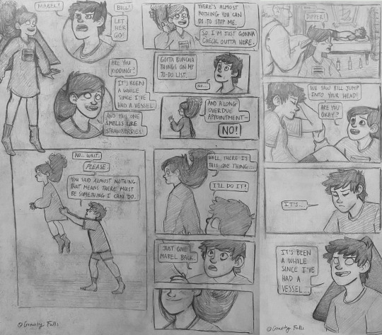
[Image Description: Comic of Bill Cipher, Dipper and Mabel Pines from "Gravity Falls." Alt text provided and copied below the cut. Scan of original comic below the cut. End ID]
Original Comic:
Copied Alt Text:
Page One:
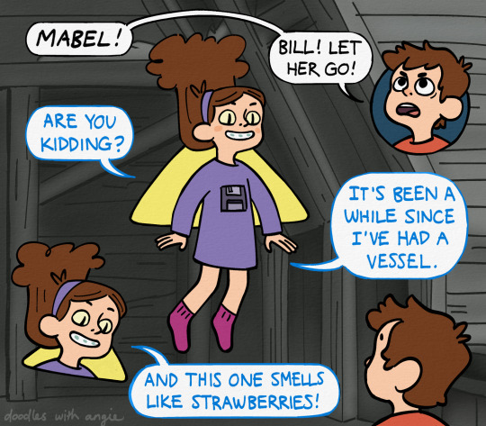
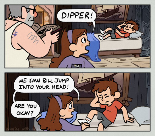
Inside the grayed out attic, Bill possessing Mabel floats over Dipper, who shouts, "Mabel! Bill! Let her go!"
Bill taunts him, "Are you kidding? It's been a while since I've had a vessel. And this one smells like strawberries."
Page two:
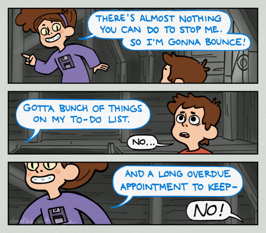
Bill says, "There's almost nothing you can do to stop me. So I'm gonna bounce! Gotta bunch of things on my to-do list."
A stricken Dipper whispers, "No."
Bill turns and continues, "And a long overdue appointment to keep-"
"NO!" Dipper shouts.
Page three:
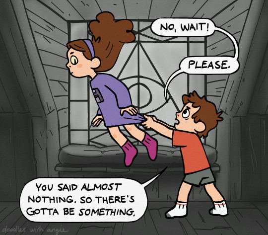
Dipper holds onto Mabel's shirt to keep Bill from leaving. "No wait!" he says. "Please. You said almost nothing. So there's gotta be something."
Page four:
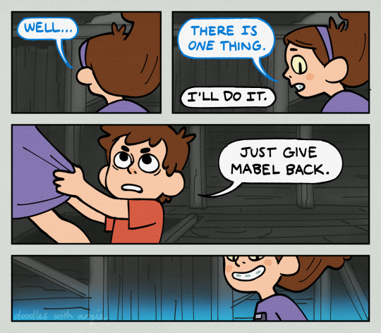
Bill says, "Well... there is one thing."
Dipper says, "I'll do it. Just give Mabel back."
Bill grins as the room lights up in blue flame.
Page five:
In Dipper and Mabel's room, Stan is scanning Bill's page in the Journal. Mabel sees Dipper stir awake and runs to him, saying, "Dipper! We saw Bill jump into your head! Are you okay?"
Page six:
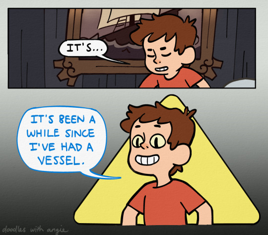
Dipper slowly opens his eyes, revealing yellow eyes with slit pupils, and says, "It's... It's been a while since I've had a vessel."
End Copied Alt Text
#gravity falls#mabel pines#dipper pines#bill cipher#bipper#digital art#artists on tumblr#doodleswithangie#i wanted to finish this before book of bill came out but that came and went (at least i got the book!)#in my redraw i added things like bill's eyes and the rooms to adhere to the canon ep#before that my idea of possession was more based on gideon's bolo
455 notes
·
View notes
Note
okay close enough
do you like scott pilgrim because i think you would
hell yeah
(only knows it from memes and fanart ☹️)
#ANY OF THEM TBH#the mobie is marked on letterboxd as my second favourite movie#im (re)watching the anime RIGHT FWEAKING NOW (for the millionth time)#and i haven’t got a physical copy of any of the comics unfortunately but i have read scans#but ye spto is the anime#maybe you already knew that#gee i wonder what that other sp you have tagged is
6 notes
·
View notes
Text
Next !
syp ; the school’s popular pretty girl is also an otaku

Countless questions were asked the day you began hanging around with the four eyed otaku boy who sat by himself and got thrown paper balls at, but why?
At the comic book shop you wanted to get your hands on the newest edition of the super mystery magazine MU, or also known as a conspiracy book. You always made sure to go to the comic shop a safe distance away from your school so no one could catch you here and have your image ruined.
So why is it that you and the four eyed otaku from class C are reaching for the same book? He makes eye contact with you scanning over your appearance
“I saw it first.” He says as he grabs the book off the shelf, checking out and then leaving.
You look at the cashier with desperation in your eyes “You guys wouldn’t happen to have another copy of that?” And much to your dismay he shakes his head no.
‘The nerve of him!’ You scowl as you walk back home ‘I saw it first’ you mock in your head then stop in your tracks ‘Someone from school.. saw me.. at. the. comic. shop.’ That’s when you began to run home.
The next day you managed to get him by himself at the end of the day purposely bumping into him
“Oh I’m sorry!” You say as you carese the arm that came in contact with your bag “I’m the one who should be sorry..” oh wow his personality compared to the comic shop is a whole 360!
“I have a thick conspiracy book in my bag, hope that didn’t hurt ya!” You whisper to him with a glint in your eye “You!” He says accusingly while you drag him to a more private hallway
“Do you want the book that bad that you stalked me at school for it?!” “Forget that! My popularity’s at stake! I don’t need you goin’ around saying how you saw me at ya know!” He smirks “What’s in it for me?” You bow down “I’ll do whatever if you just keep my interest a secret!”
“Anything?” You nod
“I want you to be my friend.”

This occurred to me in a dream, not sure what to make of it so just leaving this here!
187 notes
·
View notes
Text
Persona Tribute Illustrations scans

Hello! I finished scanning my copy of "Persona Tribute Illustrations", a collection of full color Persona 1 and 2 artwork made for various anthologies! It's 100 pages long with special color comics at the end! I hope everyone enjoys checking it out!
#persona 1#persona 2#persona#shin megami tensei persona#myscans#guys this came out to like 5 gb . crazy.#but yeah i mean thers a good chance you've seen some of these or even a lot of them they are out there but I wanted to do this still so the#can be seen in 1 place so you can be certain of all the artist credits and also as a bonus. its got those little comics in the back. hey.#how about that.#but yea its got some of my fav artists so i was excited to scan it anyhow#i feel like a lot of the artworks i see form this are low quality or have blurry scans or are just photos from the book so#yep#yea
276 notes
·
View notes
Note
Omg! This is so awesome. I've been finding random panels of it on pinterest, but I haven't had the chance yet to read it all in order until now! You've really brought everything to life just how I imagined it and your art is so good! Just a question or two... How long does it take you to get these done? And what is your process for the comic? ❤❤❤❤
Thank you so much!!! Not all artists do, but I always love seeing my art on Pinterest. Reading the comments over there is a lot of fun! I also like saving it to my folders whenever I find it hahaha
It takes around 1.5 to 2 days per page (not including sketches, research, etc, just the final draft), depending on the complexity. Some pages (like ch 2 pg 35) took a lot less time just because it's a full black background and not many figures. Basically, the more backgrounds, panels, and figures there are, the longer a page takes.
I work traditionally for most of my process. I start off annotating the chapter I'm working on in a secondhand copy. Then I thumbnail out all the pages, which takes a lot longer than you'd think! It's where I do a lot of my thinking. I start the final drafts mostly in order. It goes pencils then inks. Once I'm done with inks, I scan the pages to finish them. I correct any mistakes or blemishes before toning the page. The tones are made from layers of ink wash cut and pasted into the right spots. Lettering comes last, which I do through my art program, Clip Studio Paint.
Nina expression doodles for your kindness ♥️


129 notes
·
View notes
Text
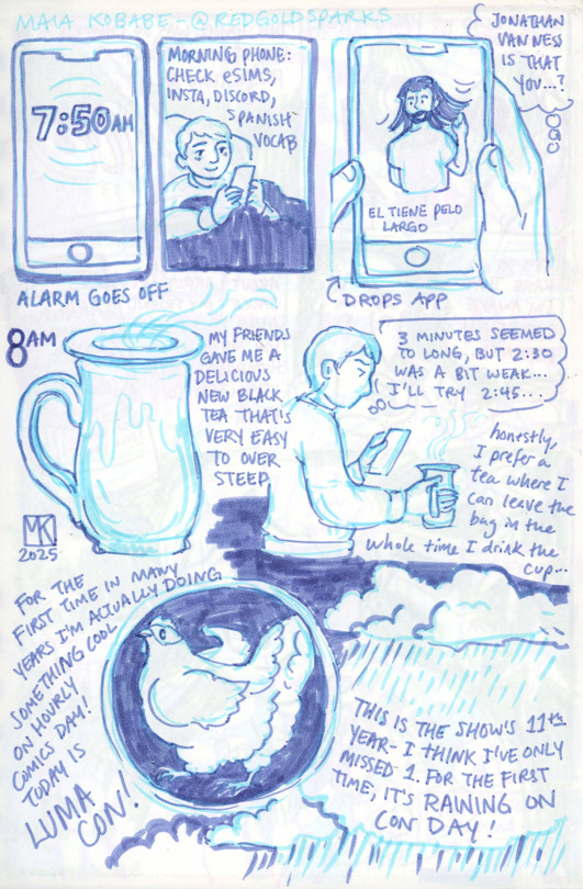
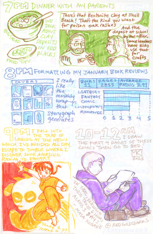
I went all out for Hourly Comics Day 2025! These took between 6-7 hours to draw across three days, and then another at least hour to scan and edit which I wasn't in the mood to do which is why they are a week late lol. Had a wonderful time at Lumacon though and I'm glad I was able to document it! Transcript below the cut :)
insta / patreon / portfolio / etsy / my books / print store / bluesky
Page 1
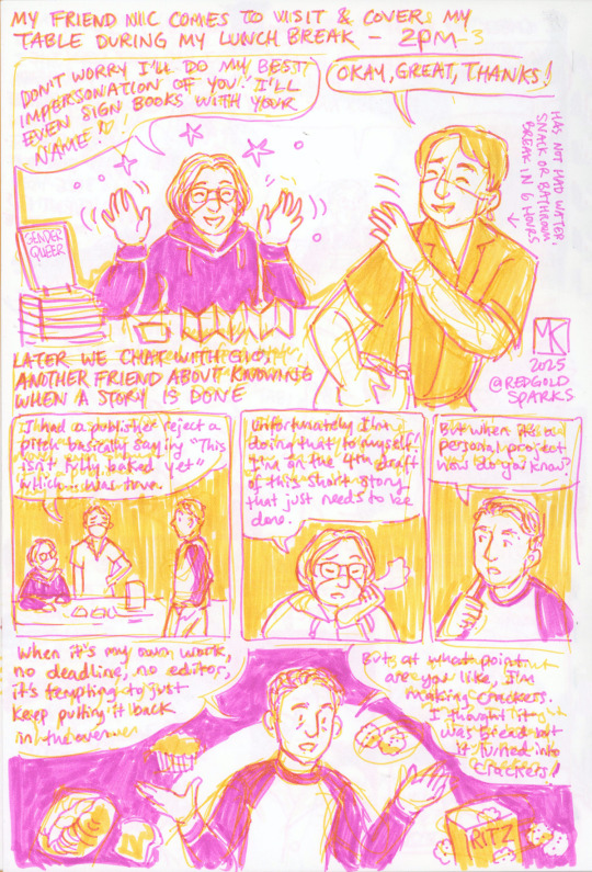
7:50am: Alarm goes off
Morning phone: check eSIMs, insta, discord, Spanish vocab
El tiene pelo largo
Jonathan Van Ness, is that you…?
Drops App
8am: My friends gave me a delicious new black tea that’s very easy to over steep
3 minutes seemed too long, but 2:30 was a bit weak… I’ll try 2:45…
Honestly, I prefer a tea where I can leave the bag in the whole time I drink the cup…
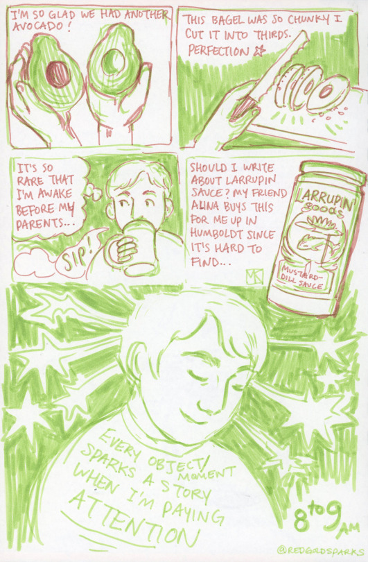
For the first time in many years I’m actually doing something cool on hourly comics day! Today is Lumacon! This is the show’s 11th year- I think I’ve only missed 1. For the first time, it’s raining on con day!
Page 2
I’m so glad we had another avocado!
This bagel was so chunky I cut it into perfect thirds. Perfection
It’s so rare that I’m awake before my parents… SIP
Should I write about Larrupin sauce? My friend Alina buys this for me up in Humboldt since it’s hard to find…
Every object/moment suggests a story when I’m paying attention!
8 to 9am
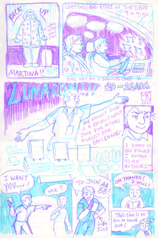
Page 3
Pick up Martina! Very cute raincoat (@martinamonster-art )
Chatting and Ateez on the drive 9 to 9:30
OMG why am I drawing cars :(
LUMACON! 10-11AM
My newest zine is a recruitment zine for Authors Against Book Bans (AABB).
I zero in on folks I know to be authors–
Maia: I want you–
Author: Me?
Maia: To join AABB! (info zine)
Author: Oh thanks! I will!
Maia: This zine is so fun to hand out!
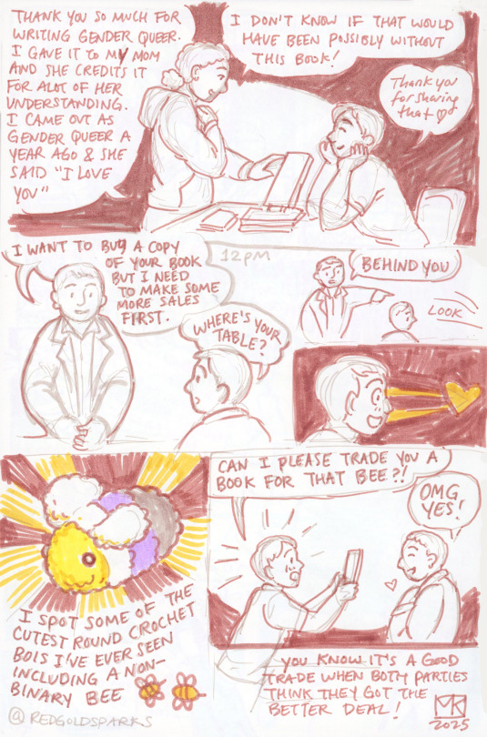
Page 4
Teen: Thank you so much for writing Gender Queen. I gave it to my mom and she credits it for a lot of her understanding. I came out as gender queer a year ago and she said “I love you.” I don’t know if that would have been possible without the book!
Maia: Thank you for saying that!
Different teen: I want to buy a copy of your book but I need to make more sales first.
Maia: Where’s your table?
Teen: Behind you
Look.
I spot some of the cutest round crochet bois I’ve ever seen including a nonbinary bee
Maia: Can I please trade you a book for that bee?!
Teen: OMG yes!
You know it’s a good trade when both parties think they got the better deal!
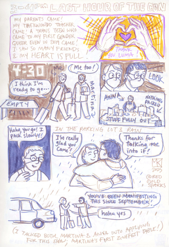
12pm
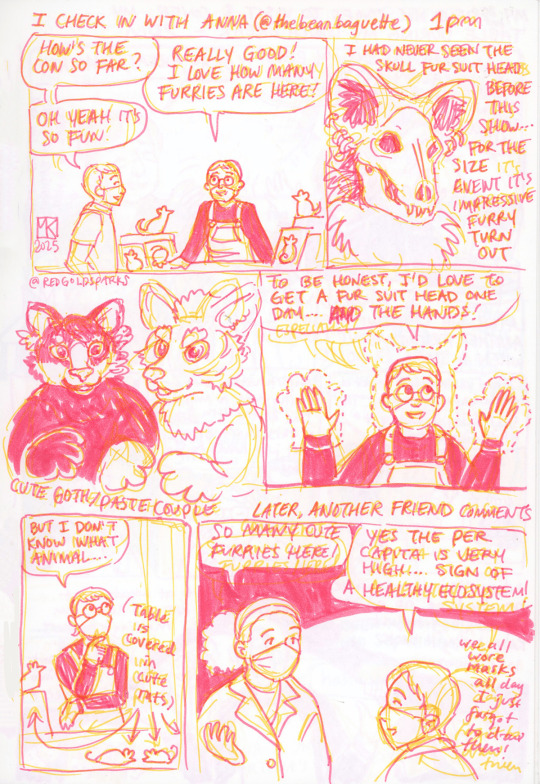
Page 5
I check in with Anna (@thebeanbaguette) 1pm
Maia: How’s the con so far?
Anna: Really good! I love how many furries are here!
Maia: Oh yeah it’s fun
Maia: I had never seen the skull fursuit head before this show… for the size event it’s impressive furry turn out
Cute goth/pastel couple
Anna: To be honest, I’d love to get a fursuit head one day… and the hands!
Anna: But I don’t know what animal…
(Table is covered in cute rats)
Later, another friend comments
Cynthia: So many furries here!
Maia: Yes, the per capita is very high… sign of a healthy ecosystem!
(we all wore masks all day I just forgot to draw them)
Page 6
My friend Nic comes to visit & cover my table during my lunch break- 2pm
Nic: Don’t worry I’ll do my best impersonation of you! I’ll even sign books with your name!
Maia: Okay, great, thanks!
Maia: (Has not had water, snack or bathroom break in 6 hours)
Later we chat with Gio, another friend about knowing when a story is done
Maia: I had a publisher reject a pitch basically saying “this isn’t fully baked yet” which… was true.
Nic: Unfortunately I’m doing that to myself! I’m on the 4th draft of this short story that just needs to be done.
Gio: But when it’s a personal project how do you know?
Gio: When it’s my own work, no deadline, no editor, it’s tempting to just keep putting it back in the oven. But at what point are you like, I’m making crackers. I thought it was bread but it turned into crackers!
Page 7
3-4pm last hour of the con
My parents came! My Taekwondo teacher came! A trans teen who came to my first Gender Queer event in 2019 came! I saw so many friends & my heart is full! Thank you Luma!
4:30
Maia: I think I’m ready to go…
Table: EMPTY
Martina: Me too!
Maia & Martina: LOOK
Anna- nothing packed, stuff fully out
Anna: Haha, you go! I pack slowly!
In the parking lot & rain
Maia: I’m really glad you came!
Martina: Thanks for talking me into it!
Martina: You’ve been manifesting this since September!
Maia: Haha yes,
(I talked both Martina & Anna into applying for this show; Martina’s first zinefest table!
Page 8
5pm I drive home
after all the rain, the ditches & fields are flooded
Maia (texting): I just got home
Anna (texting): I haven’t left the venue yet
Page 9
6pm I should be unpacking but I’m lying in bed looking at my phone!
Maia: Wow so many hourlies! I haven’t even started! I’d rather read them on tumblr & patreon later. How is my finch doing?
Nic incepted our entire friend group into the finch app back in January. I’m pretty hooked. In the finch app you make a little bird persona who travels the world & gains experiences. You give it energy & earn points by crossing items off your to do list & completing self care tasks like stretching or drinking water.
Maia: To be honest, I don’t really need an app to help me do tasks. But look how cute my bird is!!! Also! You can get pets for your bird! I have five! Owl, seal, caribou, ball of fluff, cow
Later, I pet my real cat.
Maia: Don’t worry you are my actual favorite pet.
Page 10
7pm: Dinner with my parents. Big salad, fried tofu. We talk about clay deposits in odd places.
My dad: There’s that Bentonite clay at Shell Beach! That’s the kind you want for poison oak rashes.
My mom: And the deposit at school by the office, some teachers have kids use that for crafts.
8pm: Formatting my January book reviews
I really like the monthly wrap-ups that Storygraph generates.
Books: 11 Pages: 2855 Average Rating: 3.91
LGBTQIA: 5 Fantasy: 4 Comic: 4 Contemporary: 3 Romance: 3
9pm: I fall into the trap of looking at the news which I’ve avoided all day. Escape to tumblr where I discover some amazing Ranma ½ fanart. Should I reread it?
10-12am: I draw the first 4 pages of these comics then go to bed!
In total, drawing these takes 6 or 7 hours across 3 days. -Maia Kobabe 2025
151 notes
·
View notes