#colourfu
Explore tagged Tumblr posts
Text

I wanted to share this little guy my husband and I made while on vacation! Apparently my MIL knows how to needle felt, and she threw together a little needle felting workshop for me, my husband, and our niblings at the dining room table. I had loads of fun, and am very interested in doing more needle felting.
Our little ramen bowl boi needs a name, so throw me some suggestions!
#art#lil guy#ramen#ramen noodles#ramen bowl#anthro#something new#needle felting#felt#crafts#craft#crafting#analog art#handmade#arts and crafts#vacation#handmade crafts#colourfu#oc#oc art
7 notes
·
View notes
Text


internet finds
If you want this project to continue, you can use the Paypal donation button on the web page of the blog. Any donation is welcome.
#overalls#dungarees#shortalls#tanktop#tank top#sneakers#socks#white socks#cute#cute guy#colourful#colourfu loveralls#foco#foco overalls
0 notes
Text
Colourful Wallpaper Patterns for Your Room Wall
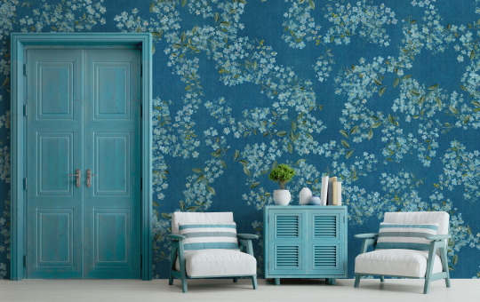
Creating a vibrant and inviting space in your home begins with the walls. Colourful wallpaper patterns are a simple yet impactful way to inject personality and warmth into any room. Whether you prefer the boldness of black wallpaper or the softness of pink wallpaper, there's a design out there to suit every taste. This article delves into various wallpaper colours and patterns, including blue, yellow, and white wallpapers, as well as multicolour options. We'll also explore how wall murals and colour wall designs can redefine your space.
Black Wallpaper: A Bold Statement
Black wallpaper offers a dramatic flair, making it an ideal choice for those looking to create a focal point in their room. Paired with the right accessories and lighting, black wallpaper can make other colours pop, providing a dynamic contrast that is both striking and sophisticated. Consider geometric patterns or floral designs in black to add depth and interest to your walls.

Red Wallpaper: Warmth and Energy
Red wallpaper adds warmth and energy to any room, making it a perfect choice for living rooms or dining areas where conversation and interaction are encouraged. From deep, rich hues to brighter tones, red wallpaper can complement a variety of decor styles. Opt for patterns that balance the boldness of red to ensure your space feels comfortable and inviting.

Pink Wallpaper: Soft and Serene
For a softer touch, pink wallpaper is a fantastic option. It lends a serene and calming atmosphere to bedrooms and bathrooms, creating a retreat-like feel. Choose from pastel shades for a subtle look or brighter pinks for a more playful vibe. Floral and abstract patterns in pink can add a feminine touch without overwhelming the space.

Blue Wallpaper: Serenity and Calm
Blue wallpaper is synonymous with serenity and calm, making it an excellent choice for bedrooms and study areas. Light blues can enlarge a space and give it an airy feel, while darker shades create depth and focus. Nautical, stripe, and sky-inspired patterns in blue can transform your room into a peaceful haven.

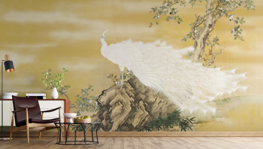
Yellow Wallpaper: Cheerful and Inviting
Yellow wallpaper brings cheerfulness and light into any room. Its ability to reflect light can make small spaces appear larger and more welcoming. Whether you opt for a soft buttery hue or a vibrant lemon shade, yellow wallpaper works well in kitchens, bathrooms, and children's rooms. Pair it with simple furniture and decor to let the wallpaper truly shine.

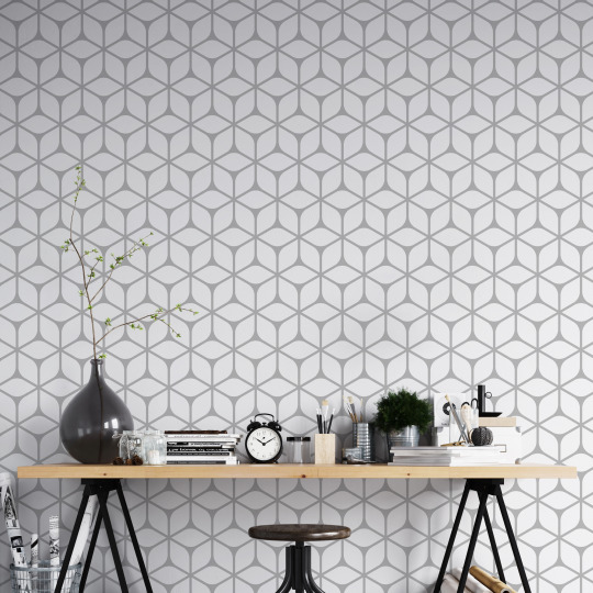
White Wallpaper: Clean and Versatile
White wallpaper is the epitome of versatility, offering a clean and crisp backdrop that allows other elements of your decor to stand out. It's particularly effective in rooms that receive a lot of natural light, enhancing the brightness and sense of space. Textured white wallpapers can add interest and sophistication to your walls without overpowering your room's aesthetic.

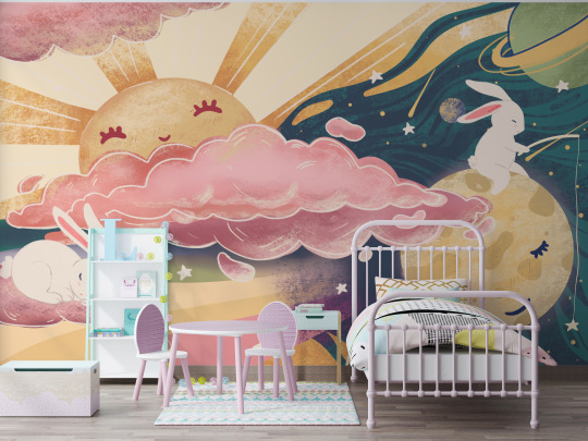
Multicolour Wallpaper: A Splash of Joy
For those who can't settle on one colour, multicolour wallpaper offers a joyful blend of hues. It's a fantastic way to incorporate multiple colours into your decor without having to choose just one. Floral, abstract, and geometric patterns in multicolour can act as art pieces, adding vibrancy and interest to any room.

Wall Murals and Colour Wall Design
Wall murals are an excellent way to introduce colour and design into your space. They can depict scenic landscapes, abstract art, or even personalized designs that reflect your interests and passions. Colour wall design, on the other hand, involves using blocks of colour or patterns to create a unique feature wall. Both techniques offer a creative way to personalize your space and make it truly your own.
Conclusion
Choosing the right colourful wallpaper pattern for your room wall can completely redefine your space. Whether you're drawn to the boldness of black or the tranquillity of blue, there's a wallpaper design out there to match your style. By incorporating wall murals and colour wall designs, you can further personalize your space, making it a reflection of your personality and taste. Remember, the best decor choice is one that makes you feel happy and comfortable in your home.
0 notes
Text
2 notes
·
View notes
Text

DON'T USE BLACK OR WHITE IN YOUR WORKS vol.1
Generally what I'm trying to say is that you shouldn't use black or white in your artworks, only for outlines. While you can use a bit of white, like I did in example B, it's not recommended to go overboard, instead make the tone more gray, yellow, red or green - anything that works.
Let's break down each pieces, now.
A.
While it doesn't look bad, the colours are a bit plain and makes the work more boring. The shadows ruin everything too - from what I've learned, NEVER use black shadows. They take away colour which already lacks in the example.
Notes:
black and white tones on the shirt
black shadows
B.
This one isn't the best piece either, but at least it has some colour, some personality to it - it's a bit yellowish, and while the light parts are white, it doesn't seem to take anything from the work, accents it in a nice way I could even dare to say. The choice of shadowing is done accurately top - tone of the shadow will always depend on the lighting, this time I've decided to go for a mid-day look, hence the shades look like that.
work has a bit of personality in it, a bit of colours.
the shadows are colourfu
That's generally it, hope that got the right idea across.
7 notes
·
View notes
Text


Critical Appraisal
What is my final outcome?
My final outcome is a 2D digital iteration, animation and 3D model of an imagined character I have made as part of a DLC for the 2000 Sega game, Jet Set Radio. My character is a young male, playable ally, who would be a part of the main existing group of friendly characters within the game, called the GGs. My character features the iconic roller skates worn by characters in the game, and has the same bold, pop-art quality used by Sega in this release. I have created an array of concept artwork for the character, including expressions, different poses, as well as the frame-by-frame animation I have made using Photoshop. My reference model, made in Z-Brush helped facilitate my design process and gave 3-dimensional life to my idea, which helped me during creation.
What went well?
In this project, I feel that I excelled in the designing and concept art aspect of the process and was able to come up with a dynamic overall look for my character. I enjoyed coming up with ideas for what I was going to create and collaborating with my team at the beginning of the project – ideally I would like to go on to become a 2D artist who will collaborate with other artists to come up with initial character designs, so I was in my element with this part of the brief. As the project progressed, I ended up running into quite a few problems with my 3D asset(s) – I feel that I was eventually able to overcome this successfully, and push through some mental barriers to create a well-rounded outcome by the end of the allotted time.
What did I struggle with?
During the 3D creation that was essential to the progression of my outcome, I struggled greatly with topology issues, and being unable to export my model. While I was modelling my character in Z-Brush I felt that the appearance was successful, and I was making good progress – however it was clear that I had made some mistakes throughout the modelling, which by the end of the task, proved un-fixable. My initial plan was to base the paint-over frames on my (auto-)rigged model, to give me a good drawing base, which would provide crucial consistency to my animation. As I was unable to use this as a resource, I had to improvise and use the basic pre-set model in Mixamo as my model. This led to me feeling unsatisfied with my outcome as I continued to work on it and reduced my confidence.
What would I do differently next time?
If I were to complete this outcome again, I would take more care when creating my Z-Brush model. I would do this by first of all doing more research before starting to create in Z-Brush, as I was not hugely confident with using this software beforehand. I would have also continuously checked if I had topology errors and cover myself in terms of not running into issues with a corrupted model. This would have meant I could have correctly exported my model, textured it properly, and used it for my 2D animation, making for a significantly less painful process overall. In terms of the 2D side of my outcome, this was my first attempt at making a smooth frame-by-frame animation. I feel that if I were to do this again it would be a lot more visually successful, and I would have maybe made more frames to improve the quality of movement even further, as well as choosing a more dynamic action.
What did I learn from this project?
This project taught me a great deal about perseverance – I was able to overcome serious doubt about what I was creating and push to the finish line, at which I ended up creating a decent character profile and animation. I learnt more about what not to do when working in Z-Brush, and that I should always be checking my work rigorously to ensure that I don't run into trouble with my model. I learnt a whole new skill, that being how to create frame-by-frame animations in Photoshop, how to alter the position of a character gradually to simulate movement over a series of slides, and build on the movement using colourful effects. Finally, I have continued to learn more about how to design an impactful character and make creative choices that serve my final outcomes in the right way that is personal to myself as a developing artist.
0 notes
Text
#Cottage kitchen#cute homes#tiny house#beach houses#interior design blog#the Caribbean#beach shack#cottage kitchen
0 notes
Text
#andaman tourism#travel#port blair#tourism#honeymoon#water sports#seafood restaurants#andaman trip#cab service#andaman tour package#andaman island#andaman tour#seafood#andaman honeymoon packages
0 notes
Text
Syrian chicken and bulgur wheat
#tea#middle eastern#chicken#chicken thighs#white wine vinegar#cumin#cardamom#cinnamon#cloves#tomatoes#raisins#bulgur wheat#parsley#sumac#main
0 notes
Photo

#city#cityscape#cityphotography#photographers on tumblr#sunset#city and colour#original#fotografía original#mood#colourfu#city vibes
2 notes
·
View notes
Photo

Studying in Cologne
May 2019
#köln#cologne#keulen 2019#dom zu köln#studying abroad#personal#mine#cute#buildings#city#trip#colourfu#pretty colours#germany
2 notes
·
View notes
Photo

When I’m feeling blue... by cezar44 Source: http://bit.ly/2VW0tFh
#purple#blooming#violet#floral#bloom#vibrant#spring#crimson#colourful sky#fiery#after sunset#colourfu
2 notes
·
View notes
Photo

Rock in Soft Space by Brett_G // Long exposure of rocks at high tide.
2 notes
·
View notes
Photo

Autumn by @edithnero
25 notes
·
View notes
Text
0 notes