#colourcasting
Explore tagged Tumblr posts
Photo
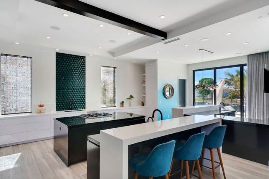
Real Estate Photo Editing Services. #realestate #hdrphotography #usa #norway #sweden #denmark #finland #switzerland #holland #netherlands #commercialrealestate #commercialrealestatephoto #realestatephotoeditingservice #krishtechindia #colourcasting #hdrimage #imageretouching #hdrblend #realestatephotoediting #imageediting #realestatephoto #realestateUSA #realestatephotoretouching #canada https://www.instagram.com/p/BnJGBrLnG6F/?utm_source=ig_tumblr_share&igshid=1x7elip3cjqt
#realestate#hdrphotography#usa#norway#sweden#denmark#finland#switzerland#holland#netherlands#commercialrealestate#commercialrealestatephoto#realestatephotoeditingservice#krishtechindia#colourcasting#hdrimage#imageretouching#hdrblend#realestatephotoediting#imageediting#realestatephoto#realestateusa#realestatephotoretouching#canada
2 notes
·
View notes
Text
Colourcaster Album Release!
Mosaic Mausoleum is here! Check out the album wherever you can stream music! I’ve included the spotify link below.
I am not sure how to categorize this album, the genre or Colourcaster as a band. I’ve played bass in the band for 7 years now and we finally were able to get an album produced amongst many hardships. This is a labor of love, a feat of collective creativity and a monument to persistence. With songs about zombies and the apocalypse, we managed to time the release close to Halloween & Samhain as possible. Enjoy!
https://open.spotify.com/album/4hgFHpUNlhAsDRKdZpCs5M?si=8AehjUs6Rh6GDMLseGF9RA
#music#musicians#spooky#newmusic#new album#Colourcaster#Misha Louise#emo#post emo#punk#punk rock#rocknroll#hard rock#indie#minnesota#saintpaulsound
1 note
·
View note
Photo
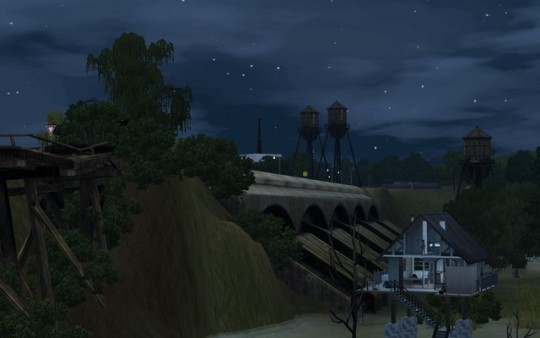
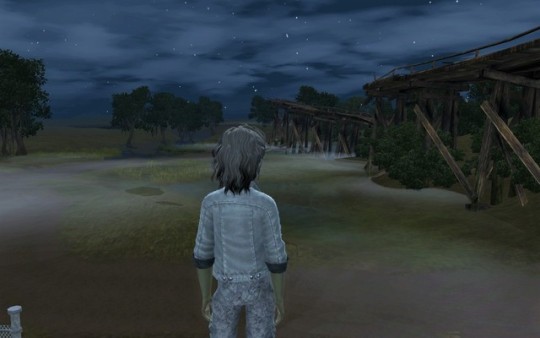
Anyhow - my graphics look waaaay better and Colourcaste is my emotional aesthetic rn.
12 notes
·
View notes
Photo
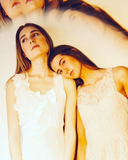
Fractals. They add another dimension. . . . . . #alternativefashion #fractal #vintagewardrobe #fresnel #naturalmakeup #duomodels #colourcast #portraitphotography #makeportraitsnotwar #makeimages #dailyhive #photooftheday (at Vancouver, British Columbia) https://www.instagram.com/p/BwHeJYWAGwA/?utm_source=ig_tumblr_share&igshid=lq944ugjg1dh
#alternativefashion#fractal#vintagewardrobe#fresnel#naturalmakeup#duomodels#colourcast#portraitphotography#makeportraitsnotwar#makeimages#dailyhive#photooftheday
0 notes
Text
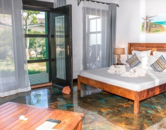
Top Three Wildlife Experience To Never Miss In Madagascar
The entire African continent has been the first love of animal lovers and those wishing to experience raw nature and wildlife to its best. This is something that we can associate with Madagascar, a country located on the eastern coast of the African Continent because this land too has been blessed by a huge variety of wild life. To experience it to its best, two things are required and one of them is an accommodation in Diego Suarez or Madagascar itself and second is information on the kind of wildlife found in this country. Here in this blog post, we will focus on the second one and make an attempt to familiarise you with some of the most unique animals found on this land.
Fossa
After an accommodation in Madagascar, if you will witness this animal, the first thing you will notice is its car like appearance. However, the face is that this is the largest of the mongoose family present on this land and they are very sleek predators. They can weigh up to 26 pounds and grow up to six feet. They dominate the forests of this country with their retractable claws and sharp teeth and lemur is the favourite prey.
Malagasy Leaf-Nosed Snakes
Experts of hotel accommodation Madagascar say that these snakes can be easily identified by their flat, leaf-shaped heads and their maximum length is 3 feet. They are not harmful for humans, but yes, they are intimidating and they are mostly found consuming lizards and other similar animals in their prey.
Tomato Frogs
According to those offering an accommodation in Diego Suarez, these frogs are either of red colour or very dark orange that look very similar to red. Female tomato frogs have brighter colourcast as compared to males and they are also not harmful for humans at all. These tomato frogs fend off predators by secreting poisonous mucus through its pores.
#Accommodation in Madagascar#Hotel Accommodation Madagascar#Hotel Accommodation Diego Suarez#Accommodation in Diego Suarez#Accommodation in Antisiranana#Double Room Madagascar#Superior Room Hotel Madagascar#Madagascar Beach Bungalows
0 notes
Photo
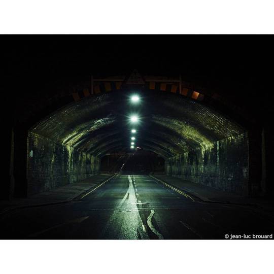
Tunnel of love....? No. Tunnel of green colourcast. #night #colourcast #coldtone #tunnel #road #handheld #35mm #photography #jeanlucbrouard
1 note
·
View note
Photo

COLOURCASTE: CHAPTER 1 – DESPAIR VS. DETERMINATION
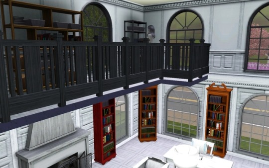
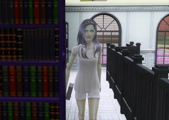
The lower castes were my next stop, two books here, scrappily wrapped in a dark corner, far from the leather bound tomes of red. I took one on repairing household problems, Grey-bound and lonely on a dusty shelf and another, Brown, on growing food crops. Two books with the absolute basics for survival, and even these were separated. It made no sense.
Swallowing my confusion, bag held close, I left the library, heading back to the outskirts of town, dodging the main roads and pausing only to pluck an apple overhanging the white fence of the community garden.
#ts3#ts3 story#simblr#berry sweet sims#sims 3#cc1#new pics for this set and the last couple#the old ones were so low res and dark
3 notes
·
View notes
Link
Subjects of interests, Related Categories and Tags watching TV, Special programme, Special Show, broadcast, colourcast, docudrama, documentary, documentary film, docusoap, infotainment, pilot, pilot film, pilot program, reality television, sitcom,…
0 notes
Text
Packshot
5/2/20
ContactSheets and experimenting with lighting
Contact sheets
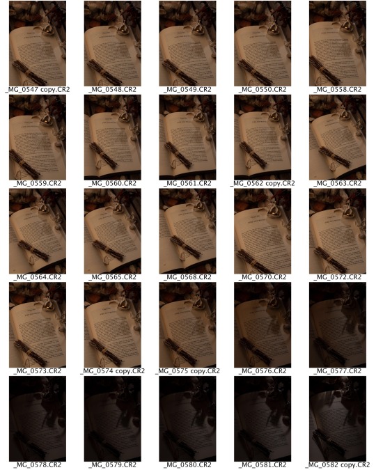
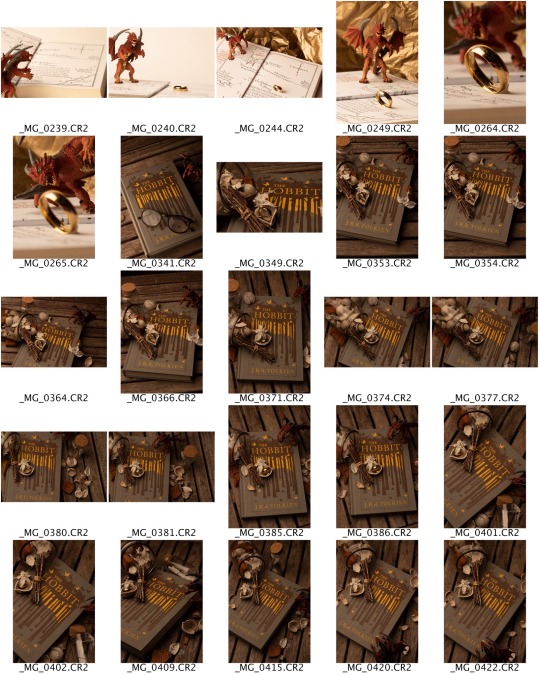
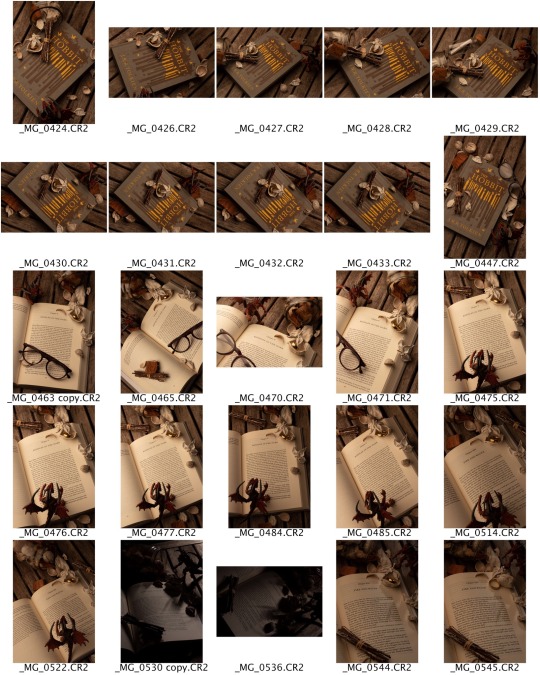
Adjustment layers in photoshop

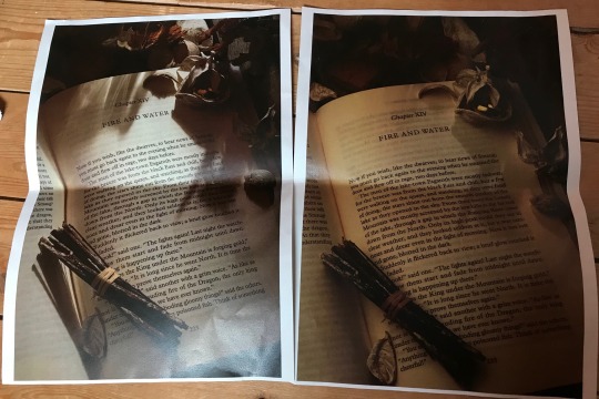
Two edited and proof printed final images to choose between
Left- taken using the modelling lamp with barn doors to mimic daylight, edited with adjustment layers and added a daylight colourcast. Enhanced red tones. Reduced yellow tones.
Shot with a soft box, increased contrast and reduced red tones. This is a warmer, fire-like atmosphere.
Experimenting with light
When shooting, I had a soft box and a modelling lamp on a stand with barn doors set up. These images show the effect of leaving on the modelling lamp and turning down the light intensity of the soft box. Then keeping the soft box on and turning up the modelling lamp log he intensity. By doing this we could see how the light interacts with the subjects and casts stronger shadows creating more contrast.

0 notes
Text
PRESENTATION NOTES
ETHOS/REASONING BEHIND OUR IDEA(S) - KATIE
We were initially inspired by 60’s/70’s horror and Hitchcock’s “Master of Suspense”. Use of lighting and the vulnerability of female characters. A lot of involvement around children within this era of horror, which ultimately has transferred through to the present day and we wanted to utilise that. We decided to base our shoot around the film “When a Stranger Calls” directed by Fred Walton 1979, in particular, the scene were the stranger calls and asks “Have you checked the children?” Using the phone and subject as the focal point within the image; capturing the fearful gaze.
We created mood boards to support our aesthetic in which we were trying to portray; the use of red light creating that uneasy tension between the image and the audience, presence of the unknown.
Cinematic approach - letter box framing, enhancing the essence of tableau photography; every element within the image is arranged for dramatic effect and the subject appears absorbed and completely unaware of the existence of the viewer.
Pass on to Alix.
Process - ALIX
Location.
From our research we decided on certain stills from the film
We all thought about where we could shoot
Emma had an idea and sent us images of her in-laws house
We all agreed that the location was amazing and we’d love to shoot there
Emma went and scouted out the location and fed back to us about the lighting and potential difficulties
Outfit.
Decided on outfit through looking back at our research
Chose katie as our model because of patients and convenience
Decided white high neck wasn't a good idea as easy to over expose so went with brown instead. Still fitting of the era
Went with all red as that is similar to the film stills
Planning of shoot.
Emma took location shots on her scouting trip
From that we created our diagrams
Laid over on tracing paper
Once we got there we knew where everything was going and just got on with it.
Kit.
During the lighting workshop we started to get a list together of things we would need
Used Emma's camera as we know how it works
I booked out only kit I had used before or someone in our group had used before so once on location we wouldn't have issues
LIST KIT if asked
SHOOT DAY - LOTTIE
Overall our shoot day was filled with trials and errors that we managed to overcome with teamwork and quick thinking. The challenges we faced were mostly around lighting and focussing of our images however we came up with ways of getting through those and producing some images that we are all proud of because we were shooting with low lighting we were having trouble getting our images on the lowest ISO but so they were still light enough to see. We didn’t want to have very pixelated and blurry images that show how high the ISO was, but because of this we ended up struggling to focus all of the critical points of the image. We agreed to shoot around 4pm to begin with however ended up starting a lot earlier as the weather was bad so the inside lighting was darker than we anticipated. We spent about 4 hours all together shooting not including set ups or test shots. We also used tethering straight into Lightroom on my laptop so we could see exactly what the shots were looking like on a bigger screen as supposed to the small camera back screen. This really was such an important part as we were able to pick up that we needed to refocus the model’s face each time we shot to ensure that it was in focus for every shot. We also had to play around with the placement of the lights we used, we used a snoot which worked perfectly to light her face but we picked up it was either casting an unwanted shadow or was showing a white spot on the wall behind her where the light was hitting it. Because of this we were having to move it around a lot and make sure those problems were as fixed as possible to ensure that when it came to post production we didn’t have too much to do. Overall it was a very successful shoot and we ended up with three prints we are all extremely proud of because of how hard we worked when it came to actually shooting and all the planning beforehand really paid off for us.
Pass on to Emma.
POST PRODUCTION - EMMA
Our goal for post-production work was to remove as many as possible of the unwanted reflected highlights created by the lights and to make sure that the colourcast of each imaged compared well with the other two. We worked very much as a team, using two side-by-side screens to maximise productivity, each of us making suggestions, troubleshooting and editing to the best of our ability. One idea that I had, which was then implemented by the others was to lighted the whites of Katie’s eyes – pixel by pixel – as they had been turned red by the gels. This had to be done in a subtle way so that it has an unnoticed effect, whilst still making a difference. What went wrong. Having done a lot of hard work removing highlights on the second image, using the healing tool and clone stamp, we then looked at the issue of toning down the blown out area where the light had been closest to the bannister on the landing. Unable to make a sufficient difference using any of the tools available, we had the idea to try making an adjustment on the ‘highlights’ scale when the Raw file is first opened. This worked, but meant that we redo all the now lost corrections. In image 3 we made a small, sinister twist to be discovered by any eagle-eyed viewers… Working in such close proximity, I think we all learnt from each other something new about how to teak images in Photoshop.
0 notes
Photo
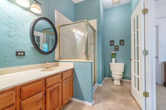
USA (Real Estate Photo Editing) #realestate #hdrphotography #usa #norway #sweden #denmark #finland #switzerland #holland #netherlands #commercialrealestate #commercialrealestatephoto #realestatephotoeditingservice #krishtechindia #colourcasting #hdrimage #imageretouching #hdrblend #realestatephotoediting #imageediting #realestatephoto #realestateUSA #realestatephotoretouching https://www.instagram.com/p/BnP2eLHno3b/?utm_source=ig_tumblr_share&igshid=6qoxe5o1uq02
#realestate#hdrphotography#usa#norway#sweden#denmark#finland#switzerland#holland#netherlands#commercialrealestate#commercialrealestatephoto#realestatephotoeditingservice#krishtechindia#colourcasting#hdrimage#imageretouching#hdrblend#realestatephotoediting#imageediting#realestatephoto#realestateusa#realestatephotoretouching
2 notes
·
View notes
Photo
This set is one of my faves :)
9 notes
·
View notes
Text
Developing
Following the previously mentioned routine of correcting colour and exposure, I set out to create my own prints. Unfortunately, I didnt get any successful prints on the first day of printing and continued the next.
I found the colourcast to be very hit and miss, as the next day I pretty much got the colour correct within half an hour. Here, I will show some of the problems that I encountered while printing and some of the process.

Here, I have demonstrated how I find the correct exposure time, covering the print, and exposing in three-second increments each time, the lightest being three, then six seconds and so on. I found between six and nine was the best exposure for this print.

Here, we see a problem that occurs when we leave the filter up, I just had to make sure it was down every time I was printing (the filter should be up when trying to find the focus of the print)

This is the problem that consfused me the most, I found the image was mirrored, and the colours were faded. Turns out this is what happens when you print on the wrong side of the paper, emulsion side down. I found it quite interesting that the print still shows up.
Other problems I faced were just basic colour correctness, which again were sorted out by using the colour chart provided, which I found no problem with. Since I have already explained this once, I don't feel it is necessary to do so with all of my prints, and go into detail with what I had to do with them.
0 notes
Text
Film Poster Analysis
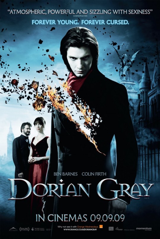
The film poster for Dorian Gray has used a central portrait to fill the main portion of the screen, clearly indicating the main character in play. Two lesser characters are seen to his left which fill some of the empty space formed. All of these portraits have been positioned over a background shoot of gothic London it appears, and would have been shot independently and edited together. I think this poster if effective because it maintains consistency in light and colour balance as if it was shot as one image. Firstly, a bright highlight is seen to the left of the frame, probably the location of where the sun was at the time of shooting the background. In the studio, the lighting would have been set up to match this source. This can be seen as the left side of Gray’s face is lit, and the right in relative shadow. The building to the right of the frame is also lit from the side, as well as the two characters on the left. Interestingly, the source of light appears to be backlit slightly, diffused by clouds, but the photographer has still chosen to light half of the characters face, but still appears constant. Similarly, the cold colour temperature of the image is consistent throughout. I would imagine that the photographs would have been shot using flash colour temperature and then adjusted in raw as there are no apparent colour casts from any source of light (as in – no gels would have been used). I did note that there is a significant area of bright highlights on the top right of the hair of Gray and the woman, where no apparent light source is coming from, or illuminating anywhere else (for example his left shoulder) It does give separation form the background which is desirable but perhaps a light break in the consistency?
Perhaps the strongest element of this film poster is the ‘decay’ effect occurring in Gray’s jacket. This not only adds significant interest to the poster but connotes a critical part of the story. Not only by the layering effect, the background is visible through the foreground, but also the burning canvas effect apparently flying into the background. This gives a real sense of depth that links foreground and background, creating a final image that appears it has been taken as one exposure.
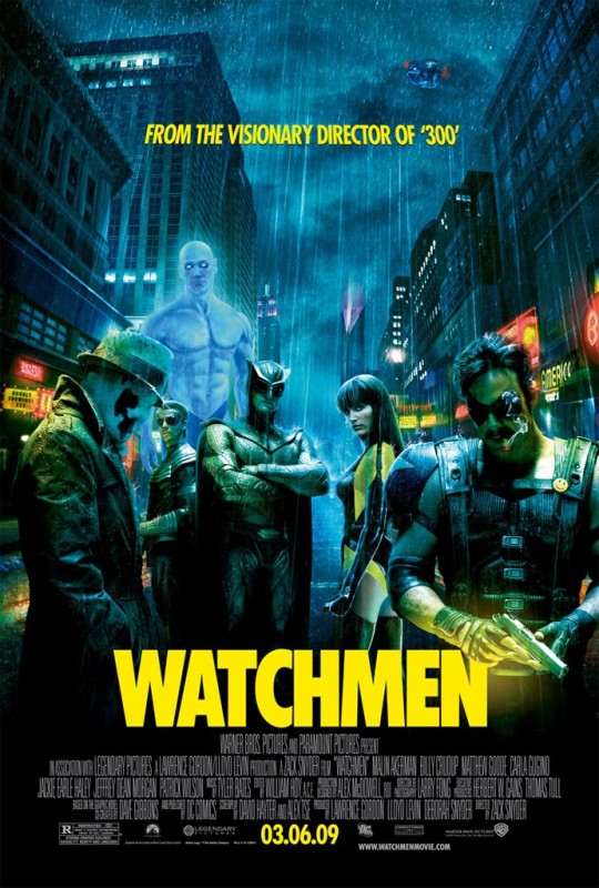
This Watchmen film poster uses many technical components that make it appear to be taken in one exposure. Firstly, there is a clear consistency in the portraits. All would have been taken at a similar angle of view, low to the ground facing up, which is matched in the background image. Also, the focal length would have been similar as well, not changing the amount of distortion or angle of view maintains a consistent balance throughout. It is difficult to tell, but I would image all the separate portraits here would have been taken with a small aperture. No areas at the back of each portrait are out of focus, which would have looked very odd on the same canvas, as if taken on the same photo.
Lighting and colour casts are also very well controlled here. The neon street lights would have cast various colour casts onto the characters if they stood there. So in the studio, coloured gels (yellow) would have been used to artificially create this light source. This can be seen to the far left on the characters shoulder, on the right, down the characters neck line and the woman’s hair, and interestingly, the photographer has chosen to make a significant colour cast on the man’s hand and gun, embedding the title to the main photograph which I think it surprisingly effective. Even further consistencies in light can be seen as all the characters have a blue cast behind them, caused by the mad blue character behind them. This would have only been possible which much planning and envisaging the final outcome.
The photographer has decided to fade the bottom of this poster to black, allowing the title and production details to be more visible. This assists the photo as the legs and thus shadows of the people aren’t visible, making a full length shot seem more realistic. Finally, the rain effect overlays the whole image which binds all the components together into one canvas which is effective.
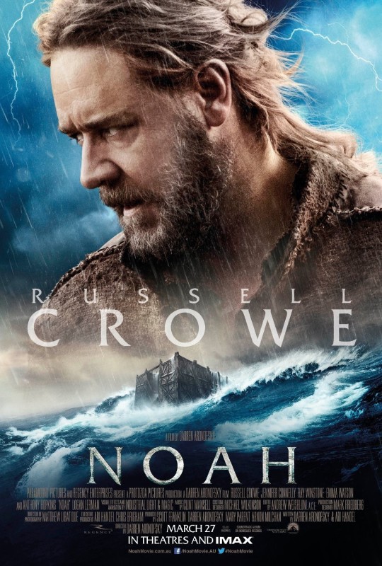
This film poster for the film Noah takes a very different approach to merging the portrait and background. Crowe has been enlarged massively and dominates the main portion of the screen while the location element is placed at the bottom of the canvas, forming a border. As this composition is clearly not realistic, it allows for more creative leeway for the photographer. Firstly the portrait looks to have been shot with a standard portrait lens and the location with a wider focal length. Additionally, the portrait seems to be taken at a very slight downwards facing angle, as the tops of his shoulders can be seen but below his chin cant. The location element is certainly taken with a lower angle. This creates a further sense of separation for the canvas. However, lighting has still carefully been controlled to create consistency in the frame. For example, a lightning bolt is found at the top right of the frame, and a very strong highlight. This has been mirrored in the studio by using a slight backlight causing highlights in his hair giving separation, and a band of light cast just over his neck. Additionally, the main key light is positioned somewhere off frame to the left, exposing much of the portrait. But consistency is maintained as on the arc, where the exposed side is left facing.
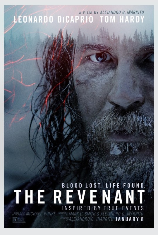
This Revenant film poster uses a main portrait of Hardy but overlays a location background in the top of the image. This sets the location of the film without the character clearly being placed within in. the rest of the image to the left is completely indiscernible being so out of focus. This overlay technique is effective as it not only creates a boarder for the poster, but adds interest. One particular area of detail which is very well done is how his hair seamlessly links into the treeline. Interestingly, there is no significant area of highlights in the portrait and no apparent light source which creates quite a flat image. In this case I think it works well and connotes the theme and genre effectively, but perhaps not something to replicate in my poster. Oddly there is a catch light which indicates a light source from somewhere but isn’t consistent anywhere else in the photo. In this example, the photographer has chosen to blur out the rear of the photo using a shallow DOF to narrow the viewers gaze towards the portrait of Hardy. I think in this case it is works well, as there is no apparent background present, which again would have looked inconsistent.
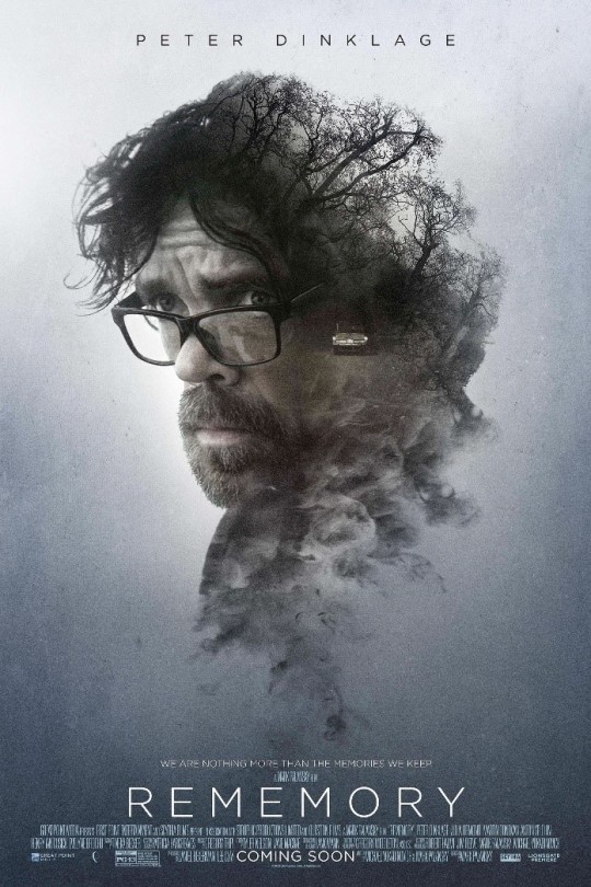
The final film poster I am reviewing is Rememory. I really like this poster as takes elements from all the other film posters reviewed and combines them creating a very effective dramatic image. It is clearly not designed in a way to be realistic. This allows for much creativity and experimentation with lighting, but particularly in overlaying images and again this ‘decay’ effect using smoke brushes. I imagine this image was a composite of perhaps of 4 images. One of the main portrait, shot on a totally white background, one of a white background with an area of highlight in the top and middle of the frame, one of a treeline which has been merged into a continuations of the mans hairline and finally the image of the car on the road which has been positioned into the shadow areas of his face and neck. I did note significant grain has been added to the image, more so than other film posters, this could have perhaps made the merging process easier between the separate images. Another area of interest is where the tree lines end. There appears to be quite a bit of fade prior where the treeline was supposed to send. This looks slights artificial and perhaps would have looked better if the area was extended slightly – or cloned in a more detailed way. I realty like how the smoke effect fades the composite down into the title of the film, almost creating a tear drop effect what allows the portrait to hover in the canvas, making it appear more a painting that a photographic portrait. I really like how the background image, a canvas with bright and shadow region’s, creates a vignette effect which focus the viewers attention.
As there is no background being layered behind, lighting consistencies don’t have to be as controlled. For example, certain colourcasts or direct light. However, this portrait has been lit with a slight backlight, exposing the right side of the mans face. This leaves much of the cheek and further of the left side in shadow. This would have been set up to ensure that the dark low key image of the car on the road would merge into the shadow regions of his face – as a very bright highlight and low key image would have been impossible to merge effectively.
0 notes
Photo
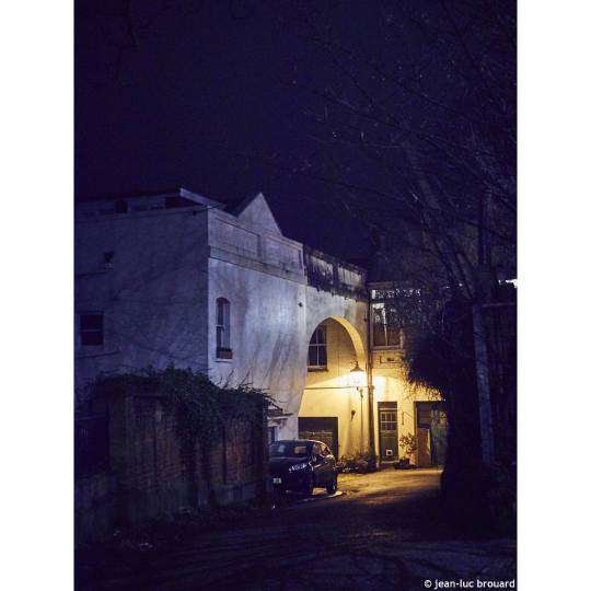
More colourcast night fun. Moonlight, tungsten & arch. #night #quickshot #handheld #colourcast #streets #35mm #photography #jeanlucbrouard
1 note
·
View note
Photo
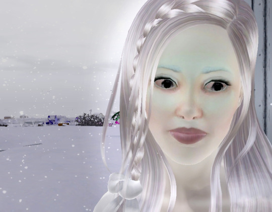

COLOURCASTE: CHAPTER 1 – DESPAIR VS. DETERMINATION
He shook his head mutely and returned to the car as I stood watching, glancing back once as if to check that he hadn’t imagined the whole exchange. I stood motionless, stony in my refusal to offer him or anyone else any sign of need or weakness.
Eventually the car pulled away, leaving me alone again, back to normal. But I knew that the visit had changed everything. I hadn’t done as I was supposed to. I was still alive and I wasn’t supposed to be.
And now they knew. Now I was a concern again and I was sure I’d be receiving many more visitors than I had in last few months. They would be watching me.
I would be ready
2 notes
·
View notes