#colorchart
Explore tagged Tumblr posts
Text

Finished Love the winter pattern by Emily Dormier! It was my first time knitting in the round and I loved it! Was also my first time using DPNs and honestly I was intimidated by them for nothing they are quite easy to work with!
This will be given to my little sister as I did the average size but it doesn’t quite fit me.
Edit: and I remembered color dominance this time!
#aviformknits#colorwork#fiber crafts#knitting#fiber art#knitblr#yarn crafts#yarnblr#hat#dpns#knitting in the round#knitters of tumblr#hand knitted#colorchart#peculiar knits#heartknit#beanie#valentineknits
153 notes
·
View notes
Text

Color Pencil Triad: Red-Yellow-Blue 🔹🔻🔸
0 notes
Text
Pantone Formula Guide
Buy Now Pantone Formula Guide Solid Coated and Uncoated. The Pantone Formula Guide is a universal color matching tool that includes 1800+ market-driven spot colors in two compact fan decks. Buy Now.

#PantoneFormulaGuide#PrintingIndustries#ColorMatching#GraphicDesign#Printers#ColorSwatches#CMYK#PMS#ColorAccuracy#ColorConsistency#PrintedMaterials#ColorPalette#Designers#ColorTheory#ColorPrinting#InkColors#ColorCharts#ColorInspiration#ColorCommunication#ColorPerfection
1 note
·
View note
Text
GADZOOKA
#contemporaryart #digitalart #capitalistneoexpressionism #techspressionism #neopop #digitalgrunge #digitalcollage #popart #contemporaryexpressionism #colorchart
instagram
2 notes
·
View notes
Text


Excited to share the latest addition to my #etsy shop: Kids Heavy Cotton Tee. https://etsy.me/4hRmpL7 #cotton #streetwear #oekotexcertified #bigsistershirt #straykidsshirt #ecofriendlyshirt #colorchart #unisexdeluxetshirt #coolstuff
0 notes
Text
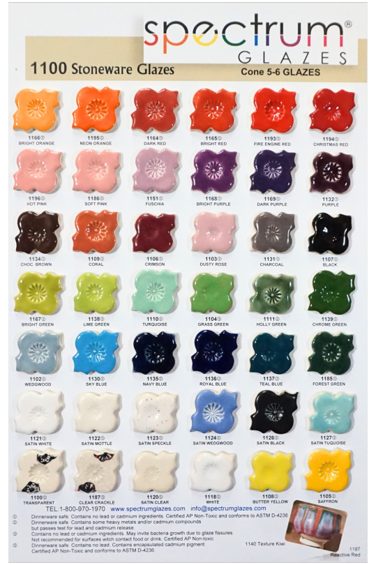
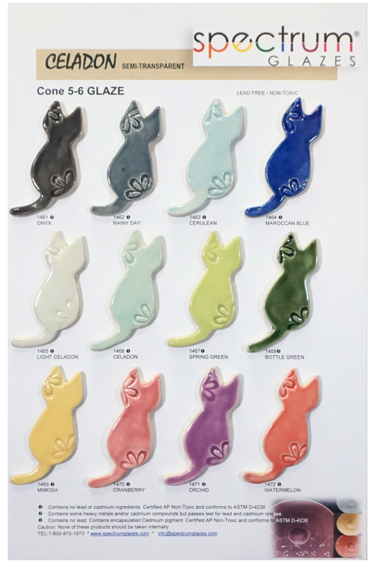
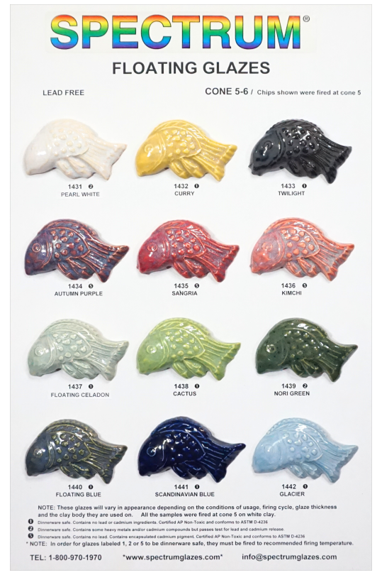
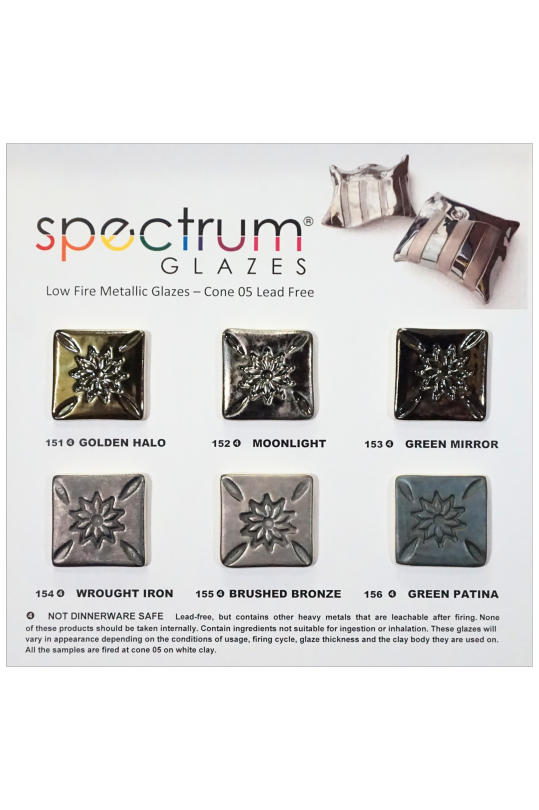
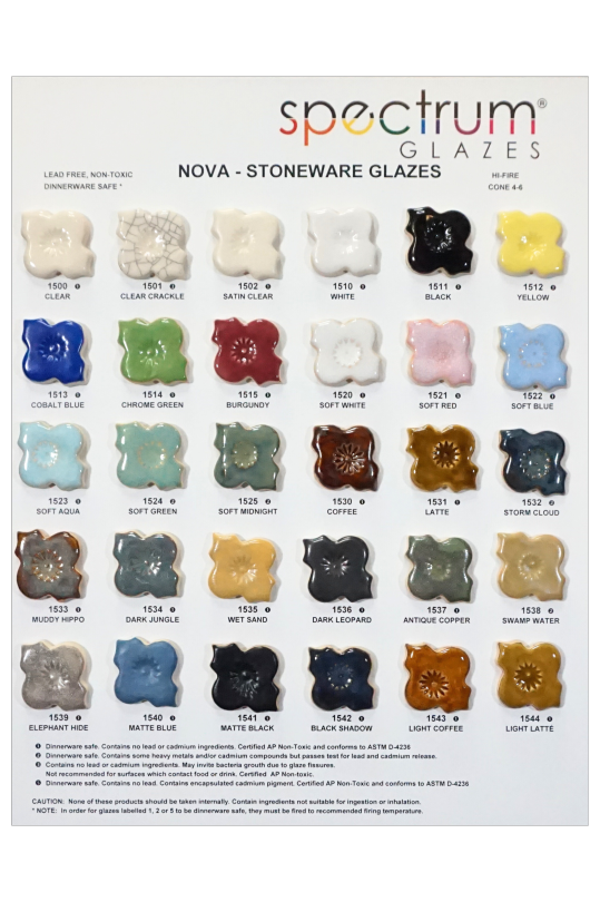
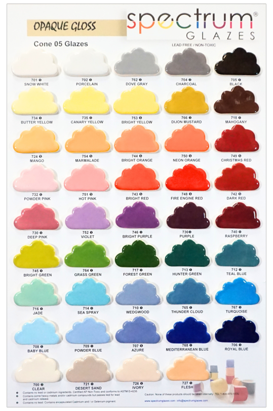
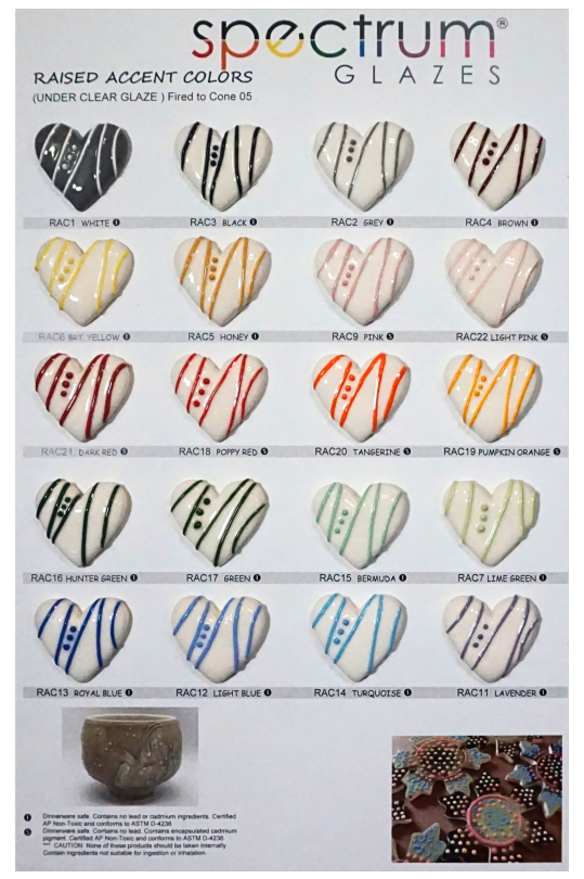
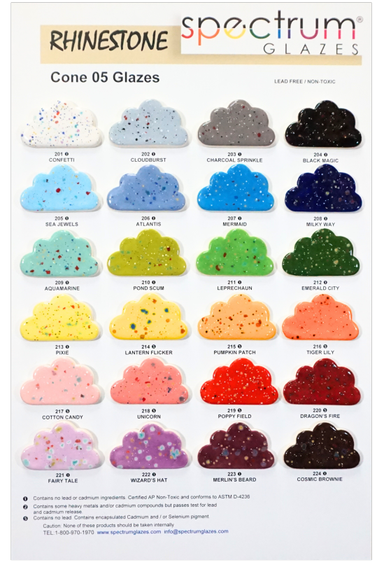
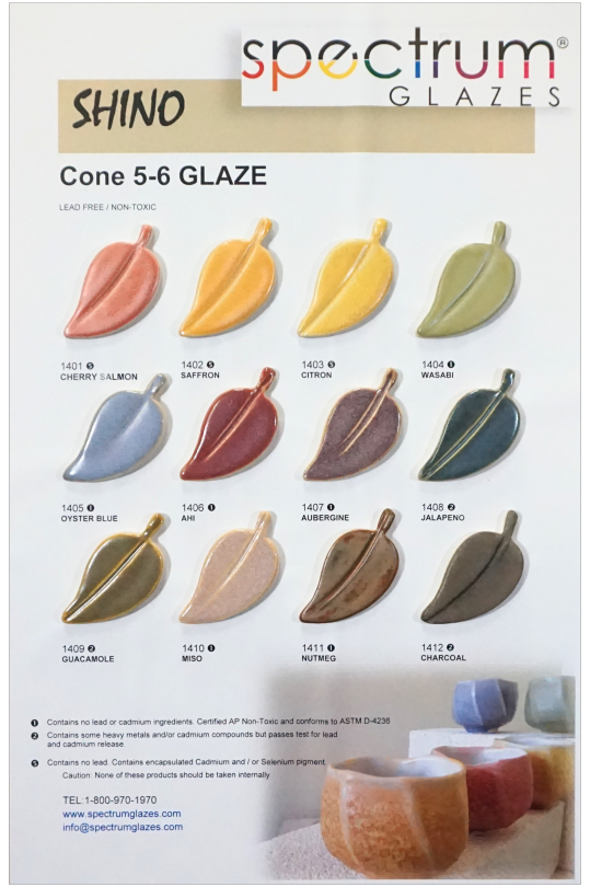
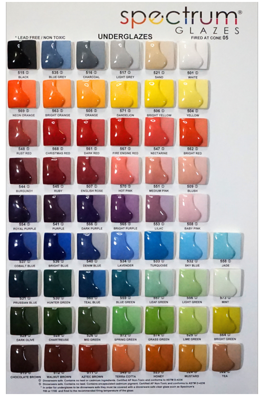
#hey #spectrumglazes is working on their #new #colorchart #colourchart #ceramic #potteryglazes #cone6 #lowfiring #shino #floatinglazes #celadon #engobe #rasiedaccent # underglaze #rhinstoneglazes #beautifulcolour #potters
0 notes
Text
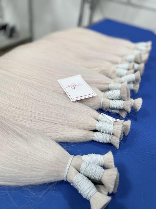
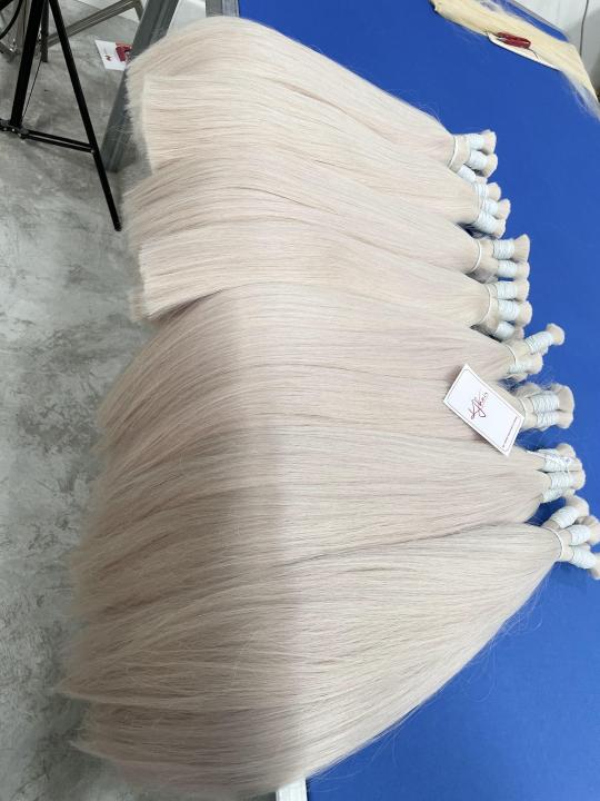
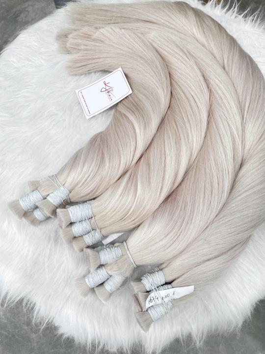
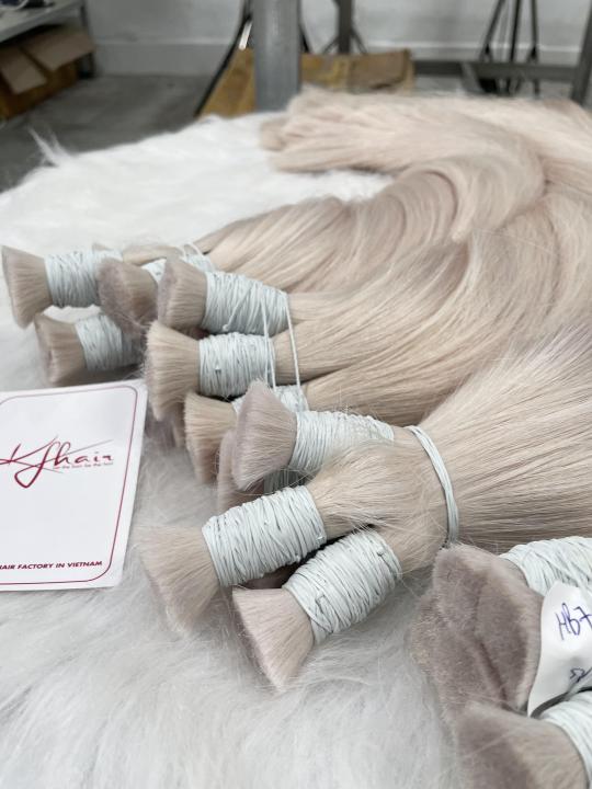
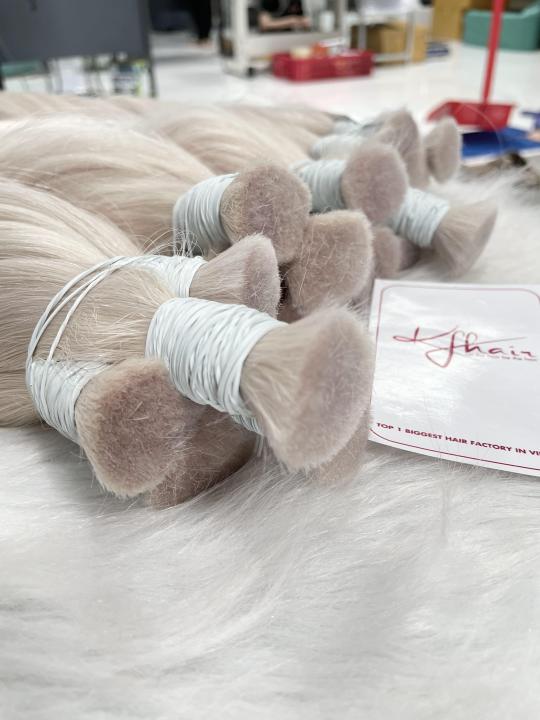
𝐕𝐄𝐑𝐘 𝐍𝐈𝐂𝐄 𝐁𝐔𝐍𝐃𝐋𝐄𝐒 𝐇𝐀𝐈𝐑 𝐂𝐎𝐋𝐎𝐑 #𝟏𝟎.𝟏 💯 -------- ✍️Please don’t hesitate to contact us for more details!!! 𝗪𝗵𝗮𝘁𝘀𝗮𝗽𝗽 𝗺𝗲 𝘁𝗼 𝗼𝗿𝗱𝗲𝗿 : Ms. Linney: +84 899 511 295 ☎ wa.me/84899511295 𝗜𝗻𝘀𝘁𝗮𝗴𝗿𝗮𝗺: @linney_kfhair_factory
#KF04#humanhair#haircolors#bulkhairextensions#haircolorchart#hairchart#colorchart#haircoloring#coloredhairgirls#bulkcolorhair#inspirationhair#colorcharts#vietnamesehair#vietnamhair#hairwholesale#hairsupplier#hairbundles#hairretail#naturalhair#humanhair#hairbeauty#longhair#hairsuppler#hairvendor#realhair#hairbusiness#colorhair#straighthairstyles#hairextensions
0 notes
Video
tumblr
IDEABOND New Color Chart Can Show You Our High Quality #ACP #AluminumCompositePanel 🌟 Discover the world of vibrant possibilities with IDEABOND's new Color Chart! 🎨🤩 Unveiling our impeccable range of high-quality ACP Aluminum Composite Panels, guaranteed to captivate your senses! Don't miss out on this visual delight! 😍🔥 #IDEABOND #ColorChart #AluminumCompositePanel
0 notes
Photo

Sorry to say I have only about 20 tabloid sized ‘My Flavors’ Riso charts left in my shop. I made these at the @risolab in New York when I was just starting to become familiar with Riso value and color mixing and it’s helped me choose (and not choose) color palettes ever since. I won’t be able to reprint these for a while, not until its safe to travel for a vacation to New York again, so they’ll be out of stock for a while. I’m planning a new color chart with the drums I have at home, though! Right now that chart will be made up of 7 colors: blue, federal blue, fluorescent orange, yellow, fluorescent pink, Kelly green, and orchid. Hopefully I can share it soon! For now, au revoir ‘My Flavors’ riso chart! #riso #risograph #colorchart #risoprint #colorpalette https://www.instagram.com/p/CLmyoz3hWSe/?igshid=1pp7r5lso1tiw
112 notes
·
View notes
Photo

It’s been a long time since I posted a new Swatch Chart. Let’s fix that! 🎨
Did you know there are 242—EDIT: It’s actually 363 now!—colors of Ohuhu’s Honolulu [brush-tip] markers? No? Well now you do, & this chart is perfect for tracking which ones you do & don’t have! That’s why I made it. 😊
You can find the chart for free on my DeviantArt or Ko-fi Shop, but if you'd like to send a little monetary support my way I do have the Ko-fi listing set as "pay what you want.” ✨ The links have been updated to the latest version of the Chart as of December 2023. This post continues to exist for archival purposes only. ———-
⭐️ Like My Art and Want to see more of it? Here’s All My Links! ⭐️
———-
Whew, it's been quite a while since I've released a new Swatch Chart, after making so many originally! What exactly prompted this one? Well, aside from just wanting to make more, it was function: This Swatch Chart is for the entire* range of Ohuhu's Brush Markers ["Honolulu" as the company calls them]—Not just the 216 set, but also the colors only available in their 36 Skin- and Grey-tone sets, *plus* one color that for reasons unbeknownst to me was only ever released in the old version of the 24 Skintone set, which Ohuhu doesn't sell anymore. In total, that brings us to 242 colors + the colorless blender, which is on the unusual side in art supplies. You may also notice this chart looks a little different from my usual swatch charts. This is because I based this chart design on one I've been using to keep track of my Copic Sketch markers as I slowly build up my collection. This chart exists in a few different variations online, but as far as I can tell, they're all based on the Copic company's own guide to the markers. I simply borrowed what elements I felt were the most useful and used the charts I could find to figure out what size to make the boxes here so they would both all fit on the page and have at least a little size to them for color reference. Really, that's my only problem with any Swatch Chart over 50-70 or so colors (including my own): It gets difficult to have so many colors on the page while also still being useful, so I often have a "tracker" page like this, and then a multi-page set of charts that are a more comfortable size. The single tracker page gets filled in with solid color as I see fit, and then the multiple pages are gradients in some way, since that's what I find most useful. You can fill in the chart however you like, but I thought knowing how I handle mine might be helpful for anyone concerned about how small the boxes might print. Also worth noting: I know there's a lot of tiny text up here, and from an accessibility standpoint, I do apologize for that. I've done my best to balance legibility with functionality, but that's just the downside of squeezing so many swatches onto one page. The Copic charts I was taking notes from all have the same problem. I will also point out that the Color Family names and the diagram showing what the letters and numbers assigned to each marker "mean" are only my best guesses/what I could figure out from looking at the markers themselves. Ohuhu doesn't really have a clear-cut system in the same way that Copic does. There is some logic to how the markers are ordered, especially with colors that were released more recently, but there are just too many "exceptions" to pin down what the proper "rules" for the system might be. At the very least, when I had to separate a color family into two columns for space, I tried to make sure the cut-off wasn't in the middle of colors that actually made sense together. And finally, before I go, Ohuhu is one of few companies that updates their products fairly regularly. I'll do my best to keep this chart up to date alongside the markers [and I've tried to future-proof it a little behind-the-scenes] but just try to be patient if I fall behind at some point—As long as I'm physically able, an update will come, but I'm only human and have other responsibilities outside of swatch charts, y'know?
———-
Swatch Chart Design © me, MysticSparklewings
I do not own Ohuhu, Copic, and/or any associated logos/trademarks/etc.
———-
⭐️ Like My Art and Want to see more of it? Here’s All My Links! ⭐️
#swatching#swatch chart#ohuhu#ohuhumarkers#honolulu#brushmarkers#alcoholmarkers#colorchart#printable#free resource#coloringtools#template#resource#artsupplies#getorganized#organization#freetouse#kofi#digitalart#graphicdesign#xxmysticwingsxx#mysticsparklewings
3 notes
·
View notes
Photo
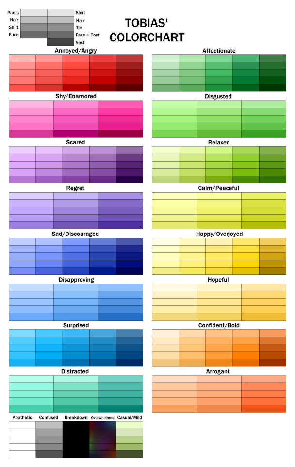
throws this here and runs off but yeah I redid Tobias’ colorchart so it’s easier to look at so here for y’all :’-)))
39 notes
·
View notes
Photo

There's a website called 'Coolors' that generates colour charts. I used one to help make a character and oh no she's cute.
13 notes
·
View notes
Photo

Made a color chart for these buggers, it doesn't include shades and highlights though. Eyecolors displayed in front of their names.
Bæleverket = Cumbersome
13 notes
·
View notes
Text


supervision granulating watercolor set
3 in 1 watercolor paint!
#watercolor#watercolour art#supervision#illustration#drawing#artwork#colorchart#tradionalart#watercolor painting#walmart
1 note
·
View note
Photo

S-tones Color Chart
Hi, here is S-tones Printing color chart. This color chart presents the 6 different forms and effects like gradients, overlays, halftones and how to set up the file, etc. It’s easy to get started and provides a good reference for Riso lover and beginner.
Paper: Munken Paper Lynx 240gsm Printing: S-tones Printing Design: @chenghsiaoo, 2018 Beijing
1 note
·
View note
Photo

Procrasti... PLANNING! A visual color chart is very useful for finding good combos. I usually do it in my head, but this time I need to plan beforehand. #color #paint #createx #pearlescent #metallic #colorchart #iridescent https://www.instagram.com/p/B9nIRceJ7rX/?igshid=4d6w7cfowqd7
8 notes
·
View notes