#cohesive colour palette? I don't know her
Explore tagged Tumblr posts
Text


✨ and nothing bad or sad happened in the episode ✨
#pluto the series#namtan tipnaree#film rachanun#namtanfilm#earn preeyaphat#kapookearn#ciize rutricha#girlslovenet#gledit#khaotunq#userlinnea#uservix#userrlana#tuserrowan#thaidrama#thaidramedit#*#*gifs#gifs#*annie#cohesive colour palette? I don't know her
100 notes
·
View notes
Text
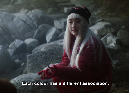
Very true, Niko! And you would know all about that, wouldn't you.
Niko's wardrobe (just like her entire character) is very - strange. Usually, you want your characters to be recognizable, especially early in a story. Characters will have their colour palettes and silhouettes, their statement pieces, their individual style that fist their role in the narrative and who they are as a person. For the most part, the costume design in dbd adheres to this standard; almost every character has a very cohesive wardrobe.
Except for Niko. There's nothing that unifies her costumes, that allows us to get a sense of her style. Even her hair is constantly changing, despite the hair&make-up department clearly struggling to do anything with that horrible wig.
The most recognizable thing about Niko is her monochromatic outfits, but even those are so inconsistent, the colours vary so widely, that they don't tell us anything about her as a person - but they do reflect the stories she finds herself in and that unfold around her.
So let's look at the associations of the colours, because I don't actually know anything about fashion, but I do love colour theory.
03
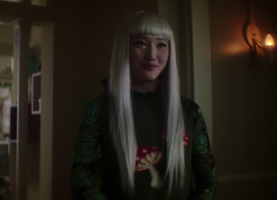
Green is for emotional stability, thinks Niko, but that's not quite true. Green is more commonly associated with growth, life, new beginnings, rebirth, hope.
This episode, Niko comes out of her shell for the first time. She makes friends. She leaves her room to go on an adventure, even though she gets scared by her own courage, at first, and retreats (she will not make that mistake again).
A home is not always a safe space, is it? Sometimes it is a trap that you're caught in. Niko leaves hers at the end, running out into the streets to save her friends: growth. New beginnings. And her friends, meanwhile, freed those poor Devlin girls and their mother from their horrible prison. An end, but also, rebirth in death: they finally get to move on to the next step, leave the stasis they have been for almost three decades. And the older girl's name is Hope, which is probably a coincidence, but nonetheless extremely satisfying to my conspiracy-prone brain.
04
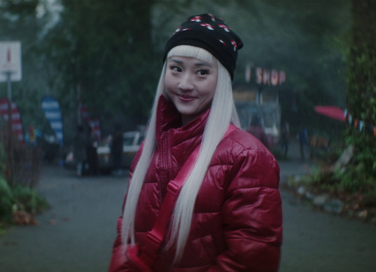
Red. Courage, as she herself says: Niko is quite literally leaving her comfort zone, going on her first case, and needs all the courage she can get. It is a bold, decisive colour, fearless, strong. The colour of firefighters and ambulances, a colour that tells you you're about to be rescued, and she does save Crystal's life in this one.
But, of course, that easily tips over. Red is a colour of aggression, of anger and pain and violence. We have the Night Nurse, who goes around dredging up trauma, making people relive their worst moments. We have our monster of the week, we have raw meat and blood to bait it. We have, of course, the washer woman. And we have an outbreak of violence at the end.
(And also, red light is the most affected by absorbance. It is hardly visible underwater and disappears completely after about 10m. Maybe that is why Niko wasn't affected at all by Angie; maybe she just couldn't see her.)
05
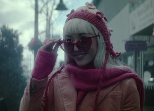
What does the pink mean then? Romance, of course, the central theme of this episode, but her outfit is uncharacteristically mismatched, even for her, and so are the romances in this episode. Nothing works out as it's supposed to, does it? Maxine and Jenny, the jocks and their girlfriends, even Edwin and Monty: everything shoved haphazardly together, held together by force of will alone, no harmony at all.
Well. It's not Niko's fault nothing works out in the end. But man, she really did need to take off the rose-tinted glasses (metaphorically, not literally. The literal glasses are great.)
06
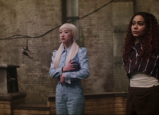
Oh, feeling blue, are we? A colour of melancholy and regrets. Niko is trying so hard to leave behind the whimsy, to be mature and disillusioned, but even at her lowest, this bright, powdery shade doesn't really bring the mood down. Niko is too much herself to give up on the things she loves that easily.
Blue is also the colour of dreams. Hidden things, the subconscious. And this is what this episode is all about, not for Niko, but for Crystal. She unlocks that which sleeps within her. And it is Niko (unwillingly, through her own special kind of luck) who hands her the key.
07
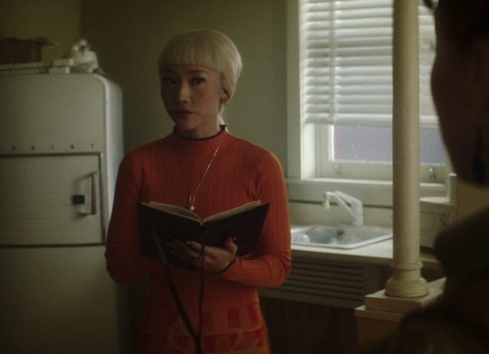
Bright orange! That is an - unusual colour choice for symbolism. Orange has few strong associations. Most often, I think, orange is a signal. Not quite a warning, but close - watch out, it says, pay attention. And Niko does, and saves the day.
(And what else does orange remind you of? A highly visible sign, something that shows you the right way? The warm glow of a flame, contained in a lantern or spreading uncontrollably in an explosion? Yes, this is an orange episode.)
08
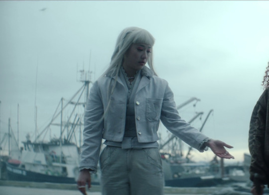
White.
Death.
Obviously. White is the colour of the dead and dying: bones, and bloodless skin, and flowers on a grave. Of course Niko would know to dress in a shroud for her last day on earth. You cannot wear an all-white outfit and expect it to not be bloodstained at the end of the day, and Niko knows it's scary and the odds are bad and we might die horrifically.
But she has found bravery, and will not run away, will face the danger head on. Dressed like an offering, pure and untouched, off to sacrifice herself she goes.
It's not the end though. Death is not the end, not in this story, and white is the colour of purity, of a blank slate, of transformation. Death is only here to guide you on your way forward. Niko's story does not end here. It is her kindness and pure heart that saves her; and although she dies, she is not gone. She changes.
Into what remains to be seen.
#i need season 2 SO BAD yall#netflix please. please.#youre better than davis zaslav aren't you????? c'mon.#anyway!#hope that was interesting cheers#dead boy detectives#niko sasaki#thoughts
71 notes
·
View notes
Note
I love the different hairstyles and outfits you give Velvette! How do you come up with them?
I tend to do a lot of research into things cause I have far too much free time LOL(I also just generally love learning about stuff like this for character designing it feels very fruitful both in terms of knowledge, results and helps to strengthen a design). Queer history, fashion dolls, protective hairstyles, current & past fashion trends etc, all of these sorts of things I look into and consider how Velvette as a character would approach them. I know we know legit nothing about her yet and I'm worried we won't be knowing much in the program either, but I have my own headcannons as to how she approaches her appearance, fashion and the importance those aspects hold in her life. I see her as someone who's flexible and able to adapt as the time moves, given why she's stayed on top of the social media empire as the Overlord of it(Assuming she even is the Overlord of that anymore) and someone who isn't afraid to be their pure, unadulterated self. She's queer, trans, black, highly feminine and completely proud of those aspects about herself hence why she takes the extra time to make herself put together in cohesive & trendy outfits, show her culture through her hairstyle and decorate it accordingly to match her love for femininity with her charms, purses, hair accessories and makeup. I know some people would read that as vain or stereotypical, but given the hardships any openly queer, trans or black women go through in their life, Velvette has made it on top and has full right to be herself no matter how much that angers people. As a little side note, I also like to headcannon that she grew up in ballroom culture during the 80s and 90s where she was silenced a lot as many people were back then, yet another reason why she's proud to be herself and why she ended up as a doll in Hell because the term doll has often been used by trans people to refer to one another. I've taken inspiration from the lives of those who came out on top of adversaries, but given it the kind of twisted Hazbin spin to make her feel at home with her two evil bffs Val & Vox hence the hint of edge in her design with her sharp eye makeup, insistency to always wear platform shoes and the more gothic colour palettes she tends to lean towards. At this point it's basically an OC with how far she is from cannon, but I'd just love to see her be her own person in the program and get to explore these kind of aspects about her life rather than be third wheel to Val and Vox(Don't get me wrong I love them both, but she deserves time to shine). TLDR: I love pretty women and she's gorgeous so I draw her looking cute
2 notes
·
View notes
Text
alex you really had to go and do this again, didn't you? (which is wonderful because i cut a few gifs from this set and now i get to share them!)
well damn i wasn't planning on another ao3-style comment but nooooo, you had to go make another beautiful gifset (lmao i love both you and your gifset so much!!) literally saved this until i can fully appreciate it, i feel like a little kid wanting to open a present slowly to keep the suspense longer, like i'm trying not to look at the gifs first (impossible) because i want to give you my FRESH response. i adore colour palettes (to no one's surprise)!! so excited for the ep2 gifs!!
obsessed with the fact that you waited to look at these!
gif 1: NIKO MY BELOVEDDDD. i love love love the green-pink contrast, i feel like that is just very niko!! we see her in other colours, sure, but in my mind they're her main two. obviously the pink is the sprites (and the lesbianism of course lmao) but the colour palette just really draws attention to it which is soooo pretty. and the yellow and greens!! the way her school clothes actually look green makes the whole thing SO cohesive and satisfying. also also the different shades of pink, like if i didn't look closely i would've thought it was one shade of pink except the colour palette made me look! *heart eyes motherfucker*
the main connecting colors that make this episode cohesive were pink and yellow, with a hint of green. and it's so perfect for niko! because you're so right, niko and pink is just... meant to be :) the whole flashback/memory sequence has those pink/red floating shapes and my brain definitely edited them out the first couple times i saw the episode, so i can totally relate. only really noticed the pink when i made my first gifset of the scene (all the way back in may, holy shit i've been at this for a while)
gif 2: ohhhhhhh my god turquoise+gold my beloved!!!!! sooooo in love with this palette it's not even funny. everything is so turquoise and kinda monotone with the funky lighting, and then you just have a few gold lights to give the whole thing life ough. (also a fun callback to the ep1 cat leash, aka the conflict they're headed towards??)
love the connection to the cat leash, definitely didn't think about it but now it's all i'm thinking about!
gif 3: HI LESBIAN NIKO HI! i love how the animations reflect in her eyes omg, i wonder how they did that? the purple that's the reflection of the light on her hair :o i never noticed it!!! and the other non-pink colours, the sort of pastel-y light green and yellow is so perfect for this scene WOW, actually all of the animations seem to be all pastel-y! and the green coming from the background (window?) is SO COOL
funny you mention lesbian. because. um. i title all these gifs "palette-[keyword].gif" and the keyword for this gif?

oooh so i also never noticed how the animations reflected in her eyes but now looking at it (and this is kind of a technical answer) it looks like the reflections in both eyes are the exact same and they don't reflect on her sclera, just her irises and pupils. i suspect that they just added the reflections as an overlay, and then masked around her irises, and it's not too hard to have those masks shift with her slight movement using keyframes for that short scene. so... probably added in post.
also the green!! i eyedropped that from the animations actually, i totally missed that it also matches the background window!
gif 4: hhhhhhhh SUCH a fun base shot but not one that i think is usually giffed? at least i haven't seen it around. it's really lovely to get those scenes like little treasures! and the greens!!! god i love a good green and these are the BEST. the monotone? *chef's kiss* (also i think i said something about it in the ep1 reaction and i know there's an aesthetic reason for it BUT it really does make the boys feel more ghostly since the only colour on them that's represented is the greenness of the forest reflecting on them. it looks amazing, basically)
funny that you mention this one as not usually giffed. because i have made soooooo many gifs of this exact shot, it's one of my ultimate favorites in the whole show actually, but i almost never publish them. i think this is the only gifset i've published with this scene. and the only other time i've used it was for the cover of the cinematography post:

little secret: it's not actually a monotone scene at all, i totally fudged it for this set. the ground is all yellows and reds, and there's a ton of blue and magenta lighting around it too. i didn't like the blues and magentas in this shot anyways, so i adjusted them to be more green and desaturated, and then ended up changing the rest to be more monotone.
gif 5: oooooh neutrals + gold? did not expect it, but i LOVE. also very fitting for the bathroom as this sort of very mundane place. nothing supernatural's going on in here, no sirree. also also very fun camera angle! something something about the light itself being white, but the light it casts being this warm gold? also the reflection of the light in the water, never noticed that!! i know the water is for crystal to splash her face with, but it just gives off scrying vibes and i am such a big fan. they should let the gang explore more supernatural methods in s2! but i digress. (oh and crystal being much more present, the dark colour picking up in her hair as well as the tiles, and the beige and white in her rings, just like the taps! crystal is so alive)
i barely noticed this shot before making this set actually! ended up being my favorite gif in this set though. something about those neutrals and the pop of yellow and the texture of the tiles. it's all so very satisfying :) love the thought of scrying vibes!
gif 6: another green with some red this time!! lmao it's like an optical illusion, my brain refused to see the reds until i actually stopped and looked for it. so nice and autumn-y <3 again the accent colour being the most prominent example of that colour is SUCH a vibe. also. they are so teeny-tiny omg who let them out to solve cases T-T
yep this one definitely is way easier to see the colors if you zoom really far out. i can see the red better in the little icons on my desktop than i can in the full size gif. had a few iterations for this one, including a version with a more muted color palette and another with the same palette but a slightly different yellow.


this was anther shot i didn't ever really pay attention to until making this set, but it's sooo cool. definitely love the autumn vibes and the scale!! yes!!! they look so small!!
gif 7: PIIIIIIIIIIIINK (god i love a good monotone) plus the (weird) perception we have of pink as this innocent colour vs this horror that niko's going through?? the good sauce man! also i love how the pink shifts until the middle colour basically fades against the background, that's really fun
oh yeah this one is really interesting because of that color shift. i initially made the palette eyedropping from one of the first frames but when i played the whole gif, they looked out of place by the final frames. ended up pulling colors from vastly different frames across the gif to get more balance.
gif 8: sprites sprites sprites! lmao i love them, they're terrible but at least they're funny about it <3 the colours?? obviously the greens, the gold in the coins and litty's dress, the white in their hats and clothing (and litty's highlights, damn girl), but that blue?? iconic. i probably wouldn't have seen it if not for the colour palette omgggg
i was actually thinking of you when i made this one and picked that blue. reminded me a bunch of the palette gif on the tube from episode one and the blue in the lights. i was having a hard time picking out a fifth color for this and was deciding between a few but ultimately picked the blue (probably subconciously for you).
overall: i didn't expect you to be able to surpass the ep1 colour palettes but i should never have doubted, oh my godddd olly!!!! just. WOW. loved all the nikos! loved the bright colours! loved the monotones! loved the greens! loved the pinks! loved the golds! (honestly it might be faster to mention everything i don't love, which is..... nothing) THANK YOU FOR GIFTING US MERELY MORTALS WITH YOUR DIVINE GIFSETS <3
to be totally honest, i wasn't sure if this series would work for the rest of the episodes. episode one has such a cohesive look in a way the others don't, and does way more things with lighting and colors than the rest. so i was anticipating the rest of the episodes to be more of a challenge. it ended up being a bit more difficult to find shots, but not nearly as hard as i expected! loveee that you picked up on the green/pink/gold colors here, which make so much sense thematically (niko=pink, green/gold=dandelions)
i ended up cutting four gifs for this set. the first two since they didn't totally fit the green/yellow/pink colors that i think make this set work


and with these next two, the first was cut because i already had 3 forest scenes. the second because i didn't love how the colors cover up esther's face


thanks a bunch for doing this alex!!! i adore hearing your thoughts on these and the little bits of meta you drop are such brainworms. going to be thinking about the connotations of pink as well as crystal and water scrying for a while <3


Dead Boy Detectives (2024) 1.02 — The Case of the Dandelion Shrine (insp)
429 notes
·
View notes
Video
youtube
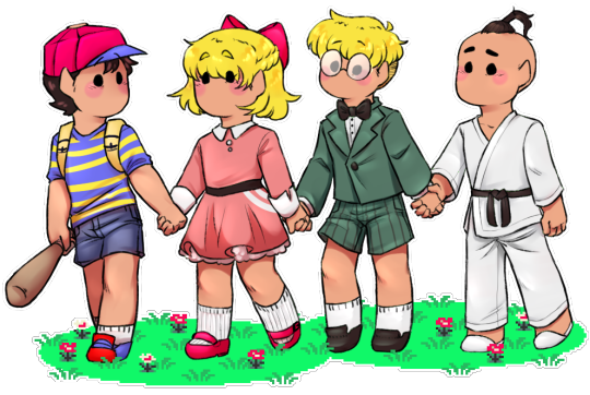
Hand in hand in hand in hand (Patreon)
#My art#Earthbound#Ness#Paula#Jeff#Poo#It wasn't the best art day but I am happy with the final product so it all worked out lol#They all have such a weird subdued colour palette lol#Like I love subdued colours! But the Choices of some of these are uhhhhhh Interesting#They're desaturated but also like Just Off y'know? Like just a little too green or a little too blue or a little too dusty#I dunno I've only just started working with it and I tweaked some of them a little bit so I have yet to fall in love with its strangeness#They are all cute kids tho ♥ I made some assumptions and intentional ignorings for their outfits lol but it was fun#I do really like how Ness' colour palette is the most complex - it makes sense for his Main Character status#Paula's is very cohesive and cute - I gave her an almost Pokemon clothing pattern?? I don't know how to interpret those white pixels lol#I also headcanon her as having an ever-so-slightly asymmetrical hairstyle haha just a teensy bit longer on her left side#Jeff has a bow tie! Love that for him#Also no shock here but his hair was the easiest to draw lol wonder why#His glasses were just an added bonus#Poo's outfit is so simple palette-wise which again reflects his character type ♪ Very nice#I do wonder why he has a white gi if he's a black belt tho? That might've just been a my dojo thing tho lol#I'm pretty sure I've mentioned it before but I love that they all have rosy cheeks that is So Cute#Good group! They're good kids 💕
13 notes
·
View notes
Text
Just to preface this little rant but I am not a Jane Austin fan. I haven't read her books nor do I know why I decided to watch Netflix's Persuasion 2022. But I did. And I have never been so offended on an author's behalf than when i was watching it.
Now, I'm not opposed to modern iterations. I have enjoyed some modern interpretations of shakespeare when the RSC comes to town. But theres a difference between a modern interpretation and trying to modernise a period of history that doesn't need to be.
The fact they tried to slip modern dialogue into this film is offensive. Not only to the intelligence of the audience but the characters they're portraying. The reasons things like Austin and Shakespeares works are timeless is because to this day we can understand it. We might need a bit of context every now and then, but is Romeo and Juliet Romeo and Juliet if you don't get the flowery language professing their love for each other? The fact they slipped modern sayings into this film brings you out of the story so much its impossible to sink bacn in.
Not that you want to.
I feel kind of bad for Dakota Johnson. Whoever thought this would make a good film lied to her. like I said, I've not read persuasion, but the fourth wall breaks were completely unnecessary for a character like her. Ignoring the book, a fourth wall break is primarily used by quiet characters. Anne is not a quiet character in this. In Fleabag, our main character is repressing her emotions so much we need these fourth wall breaks. Sure, she has her outbursts, but they're clever and have purpose. Another character I could pick from would be Jim from the Office. Jim is, for all his pranks, a quiet character. He's very subdued and not as emotional as Dwight. His fourth wall breaks are usually looking to the camera in a way that speaks 'are you seeing this?'
Anne is not like this. Her breaks add nothing. Her dialogue is pointless too. Why lament for an hour then talk with your ex anyway? The pining was nonexistent. The chemistry wasn't there and I blame the script more than the characters.
Speaking of bad things, those costumes. What were they thinking? Those costumes were awful. The background characters were okay. But they were boring. There was no cohesiveness. I know in ye olde times that people wouldn't be cohesive. But this is a film, there is symbolism in it. Like in Bridgerton (I stopped watching after 2 episodes it wasn't for me) but they used colours to band characters together. Families had specific colour palettes so we could recognise them and their importance in the scene.
In this film, there was nothing. They were all mismatched and while it was okay, it wasn't anything to brag about. Now Anne. shame on who did Anne. I don't know what angers me more her hair or her clothes.
We'll start with the clothes. Why the black? Black is for mourning. If anything, Anne should have worn black in the beginning to symbol the death of her relationship. But no shes wearing it in the middle of the movie for no reason. All of her clothes are dark or bright and they too lack a colour journey.
Worse, they're modern inspired. Anne looks SO out of place its painful to watch. Her trousers? Her coat? Why is she wearing that? Why do we have the need to force these characters into clothes we find acceptable for a protagonist and not accept what they would have worn as okay? Dresses are okay. This is a regency piece it is more than okay for her to look like a freaking girl.
She didn't need to be modernised and its offensive that they thought she did.
Moving onto her hair. Why the side bangs? I know people had bangs back then but not like that. Her hair being down too? Or just tied back like it is? Its disgraceful to the time period and the character.
So, for context, Anne is seen as a disappointment to her family. Why, if you are a disappointment, are you going outside looking like that when your family depends on their reputation to survive? Who is allowing her to leave the house like that? Any self respecting woman back then would pin their hair back. They wouldn't wear it down, especially when a formidable ex is on the scene. Anne would not wear her hair like that. The only people who wear their hair like that would be children, poor children at the very least. Maybe some of the poorest commoners.
But not a rich lady like Anne.
This movie was painful. I hope it flops and netflix realises that masterpieces like Emma which I watched after this are the way to go.
24 notes
·
View notes