#changed the background to a gradient because i didn't like how it looked on my phone
Explore tagged Tumblr posts
Text
My Favorite Cheap Art Trick: Gradient Maps and Blending Modes
i get questions on occasion regarding my coloring process, so i thought i would do a bit of a write up on my "secret technique." i don't think it really is that much of a secret, but i hope it can be helpful to someone. to that end:

this is one of my favorite tags ive ever gotten on my art. i think of it often. the pieces in question are all monochrome - sort of.
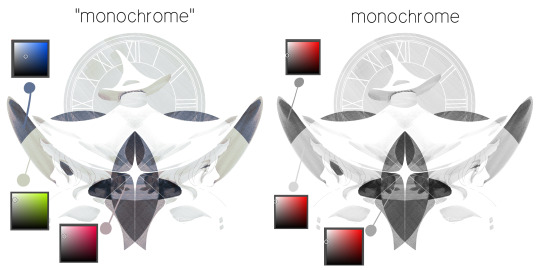
the left version is the final version, the right version is technically the original. in the final version, to me, the blues are pretty stark, while the greens and magentas are less so. there is some color theory thing going on here that i dont have a good cerebral understanding of and i wont pretend otherwise. i think i watched a youtube video on it once but it went in one ear and out the other. i just pick whatever colors look nicest based on whatever vibe im going for.

this one is more subtle, i think. can you tell the difference? there's nothing wrong with 100% greyscale art, but i like the depth that adding just a hint of color can bring.
i'll note that the examples i'll be using in this post all began as purely greyscale, but this is a process i use for just about every piece of art i make, including the full color ones. i'll use the recent mithrun art i made to demonstrate. additionally, i use clip studio paint, but the general concept should be transferable to other art programs.

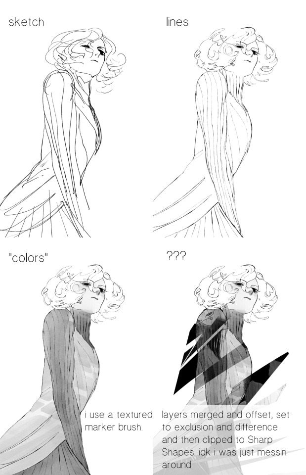
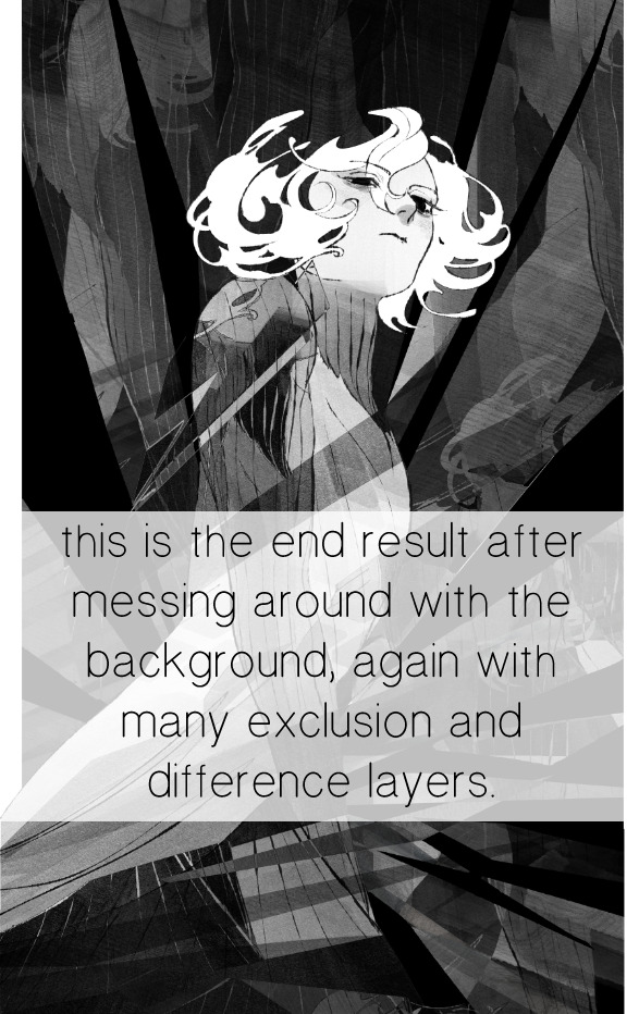
for fun let's just start with Making The Picture. i've been thinking of making this writeup for a while and had it in mind while drawing this piece. beyond that, i didn't really have much of a plan for this outside of "mithrun looks down and hair goes woosh." i also really like all of the vertical lines in the canary uniform so i wanted to include those too but like. gone a little hog wild. that is the extent of my "concept." i do not remember why i had the thought of integrating a shattered mirror type of theme. i think i wanted to distract a bit from the awkward pose and cover it up some LOL but anyway. this lack of planning or thought will come into play later.
note 1: the textured marker brush i specifically use is the "bordered light marker" from daub. it is one of my favorite brushes in the history of forever and the daub mega brush pack is one of the best purchases ive ever made. highly recommend!!!
note 2: "what do you mean by exclusion and difference?" they are layer blending modes and not important to the overall lesson of this post but for transparency i wanted to say how i got these "effects." anyway!
with the background figured out, this is the point at which i generally merge all of my layers, duplicate said merged layer, and Then i begin experimenting with gradient maps. what are gradient maps?
the basic gist is that gradient maps replace the colors of an image based on their value.

so, with this particular gradient map, black will be replaced with that orangey red tone, white will be replaced with the seafoamy green tone, etc. this particular gradient map i'm using as an example is very bright and saturated, but the colors can be literally anything.
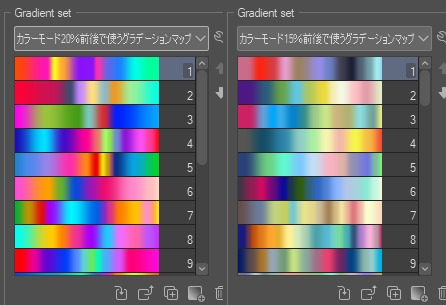
these two sets are the ones i use most. they can be downloaded for free here and here if you have csp. there are many gradient map sets out there. and you can make your own!
you can apply a gradient map directly onto a specific layer in csp by going to edit>tonal correction>gradient map. to apply one indirectly, you can use a correction layer through layer>new correction layer>gradient map. honestly, correction layers are probably the better way to go, because you can adjust your gradient map whenever you want after creating the layer, whereas if you directly apply a gradient map to a layer thats like. it. it's done. if you want to make changes to the applied gradient map, you have to undo it and then reapply it. i don't use correction layers because i am old and stuck in my ways, but it's good to know what your options are.

this is what a correction layer looks like. it sits on top and applies the gradient map to the layers underneath it, so you can also change the layers beneath however and whenever you want. you can adjust the gradient map by double clicking the layer. there are also correction layers for tone curves, brightness/contrast, etc. many such useful things in this program.
let's see how mithrun looks when we apply that first gradient map we looked at.

gadzooks. apologies for eyestrain. we have turned mithrun into a neon hellscape, which might work for some pieces, but not this one. we can fix that by changing the layer blending mode, aka this laundry list of words:

some of them are self explanatory, like darken and lighten, while some of them i genuinely don't understand how they are meant to work and couldn't explain them to you, even if i do use them. i'm sure someone out there has written out an explanation for each and every one of them, but i've learned primarily by clicking on them to see what they do.
for the topic of this post, the blending mode of interest is soft light. so let's take hotline miamithrun and change the layer blending mode to soft light.

here it is at 100% opacity. this is the point at which i'd like to explain why i like using textured brushes so much - it makes it very easy to get subtle color variation when i use this Secret Technique. look at the striation in the upper right background! so tasty. however, to me, these colors are still a bit "much." so let's lower the opacity.
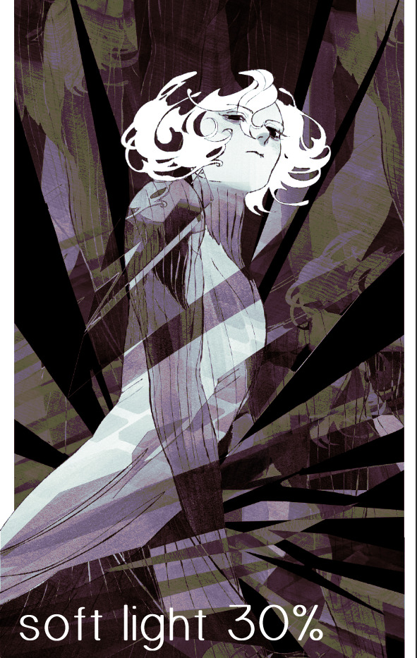
i think thats a lot nicer to look at, personally, but i dont really like these colors together. how about we try some other ones?
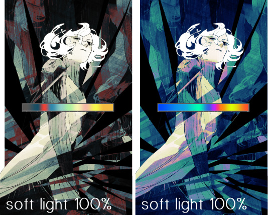
i like both of these a lot more. the palettes give the piece different vibes, at which point i have to ask myself: What Are The Vibes, Actually? well, to be honest i didn't really have a great answer because again, i didn't plan this out very much at all. however. i knew in my heart that there was too much color contrast going on and it was detracting from the two other contrasts in here: the light and dark values and the sharp and soft shapes. i wanted mithrun's head to be the main focal point. for a different illustration, colors like this might work great, but this is not that hypothetical illustration, so let's bring the opacity down again.
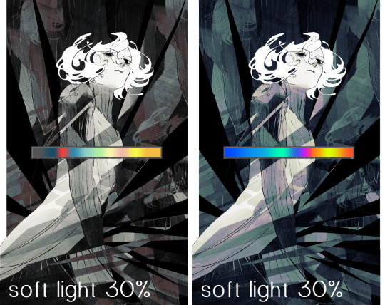
yippee!! that's getting closer to what my heart wants. for fun, let's see what this looks like if we change the blending mode to color.
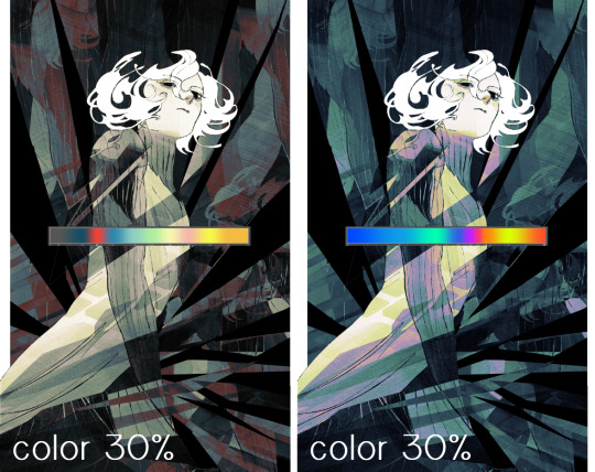
i do like how these look but in the end they do not align with my heart. oh well. fun to experiment with though! good to keep in mind for a different piece, maybe! i often change blending modes just to see what happens, and sometimes it works, sometimes it doesn't. i very much cannot stress enough that much of my artistic process is clicking buttons i only sort of understand. for fun.
i ended up choosing the gradient map on the right because i liked that it was close to the actual canary uniform colors (sorta). it's at an even lower opacity though because there was Still too much color for my dear heart.
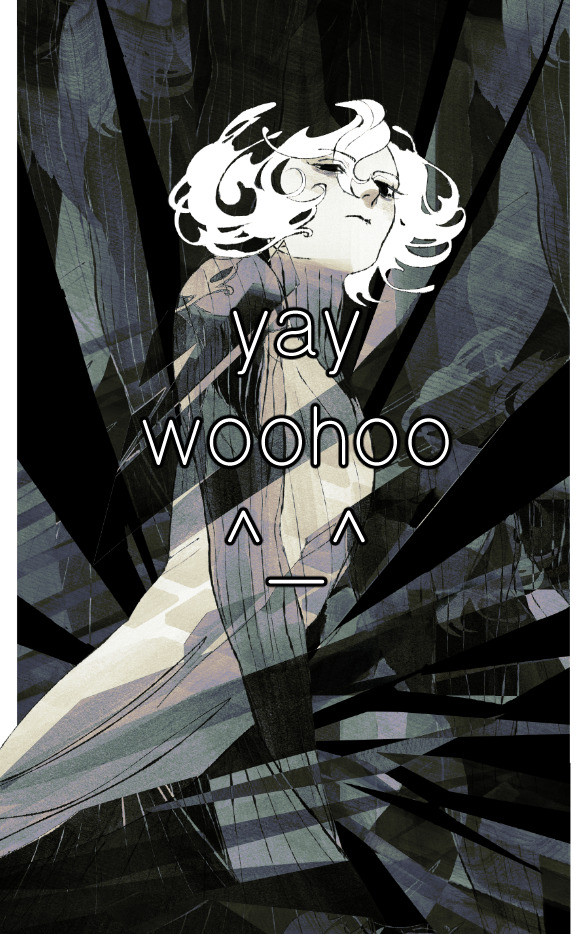
the actual process for this looks like me setting my merged layer to soft light at around 20% opacity and then clicking every single gradient map in my collection and seeing which one Works. sometimes i will do this multiple times and have multiple soft light and/or color layers combined.
typically at this point i merge everything again and do minor contrast adjustments using tone curves, which is another tool i find very fun to play around with. then for this piece in particular i did some finishing touches and decided that the white border was distracting so i cropped it. and then it's done!!! yay!!!!!
this process is a very simple and "fast" way to add more depth and visual interest to a piece without being overbearing. well, it's fast if you aren't indecisive like me, or if you are better at planning.

let's do another comparison. personally i feel that the hint of color on the left version makes mithrun look just a bit more unwell (this is a positive thing) and it makes the contrast on his arm a lot more pleasing to look at. someone who understands color theory better than i do might have more to say on the specifics, but that's honestly all i got.
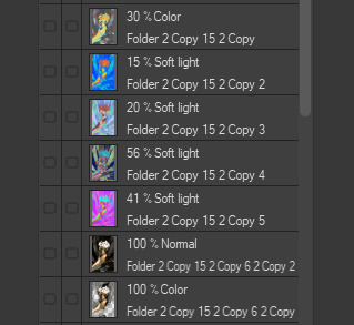
just dont look at my layers too hard. ok?
2K notes
·
View notes
Text
Texting it out down here cause in video would go by to fast. Also the video for the sketch layer didn't save so it picks up at me starting on Cross's face. Not too much missed, I only rough out some shapes and copy/paste them where I want them from frame to frame.
It takes me about 2 hours or so to make one of these. I'm using a mouse rather than a tablet so you'll notice my style is more like carving with lines rather than drawing.
I fill my background and put down a very rough sketch. I keep it rough mostly do to impatience. The line work does turn out better if I do a more detailed sketch but that doesn't matter. None of this matters.
Things I always do that I know to correct in my line work as I go: "That head too big! Always too big! Eyes too! Shrink erything."
I do the line art in a free program called ProMotion. It's for animation but I don't care, I'm looking for clean sharp lines and tools that let me copy/paste and instantly make brushes of pieces that I highlight. Its a pixel based program and I would normally use it to make sprites for my RPG maker games.
IMPORTANT STEP: ZOOM IN AND OUT OVER AND OVER AND OVER TILL YOU DONT CARE IF IT LOOKS RIGHT ANYMORE.
Then we take that line art and shove it into Photopea for coloring. This is another free program that's a clone of Adobe because I like photoshop tools but hate Adobe as a company with a fiery passion.
Yes I just kind of choose whatever color. I could make a reference sheet with saved colors but TRUST ME. I wont use it. I almost never use references, i forget, okay. Mostly drawing from memory.
Each color gets a layer essentially and then I "paint" them with the burn tool. (Midtones 20%) Cross's armor gets highlights on the ridges with the dodge tool. (Also Midtones 20%)
Add Blush to the skin! Thin points like face, shoulders, finger tips. Blur Blur Blur till it looks right.
Also, remember how I said I was looking for clean clean lines with no blur? That's cause I just clean up the "paint" by selecting with the magic wand and deleting it.
I make my backgrounds out of stock textures mostly. Though this usually takes a little bit more collage work this strip is simple so I just used the gritty/tech wall texture. Blur that bitch. (Gaussian Blur under the filter tab, whatever looks right but the default 7 pixels is usually good for the BG)
To add motion I copy the bits I want to seem like they're moving and use the "Motion Blur" filter, then I put that copied color over the background line art.
Add shadows! Under the coloring layers, that handy gaussian blur again.
Add Lighting! I usually have the overlayer set to "Soft Light" and then I use the gradient tool to filter everything to look cohesive. (You might notice I keep their skin tone pretty dark but it might look different when I change the lighting.)
Warp the action words... just...whatever feels appropriate at the time and set that layer to "Color Burn"
I just use the Oval select tool with the feather set between 3-5 pixels to make word bubbles. Paint it in voila. Add Text. All done!
Cross x Tahny: +A Summary+

My philosophy : Style matters more than skill and you should cheat and cut corners as much as possible. Peace and Love.
-++-++-++-++-++-++-++-++-++-++-++-++-++-++-++-++-++-++-++-
Tags:
@feral-ferrule @eobe @ghostymarni
#Time lapse#drawing time lapse#art time lapse#the bad batch#sw oc: tah'nyem ra#sw oc#tbb#crosshair x f!oc#drawing comics
34 notes
·
View notes
Text
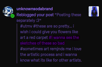
@unknownsodabrand Well Lucky you, I also love the artistic process and I keep all my sketches!! (seriously this is the most self indulgent question I could ever answer, thank you sm I'm gonna ramble a while sorry)
First I was only planning on doing the one Geno Illustration, I mostly wanted to experiment with the long 1000x2000 format bc I thought It could make for an appealing composition and it ended up being pretty challenging to get right.
So. I started with some rough planning of where I wanted everything:
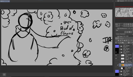
Since this was gonna be a full Illustration I planned the colors earlier than I usually would (I have a love/hate relationship with coloring):
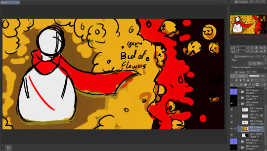

Didn't really like how it came out the first time so I just put a color mask over it, I wanted something a little warmer+brighter cause the flowers looked kinda green to me (Geno's was the one that gave me the most trouble and I liked it the least at first, by the time I finished It was my favourite XD)
Then I decided to make the three parts:
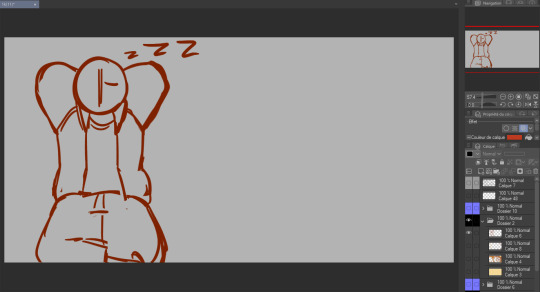
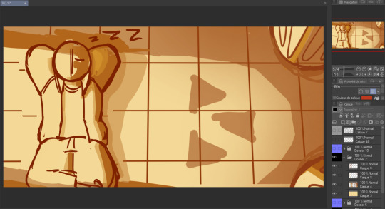
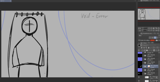
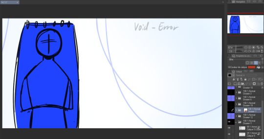
again used the same planning, rough sketch then color.
Then onto actually starting the Illustrations. I worked on these one by one but I'll show the process for all three by the steps rather than saying the same thing thrice.
as much as I wanted to keep the best for last I couldn't help myself and did the characters first.
Lineart:
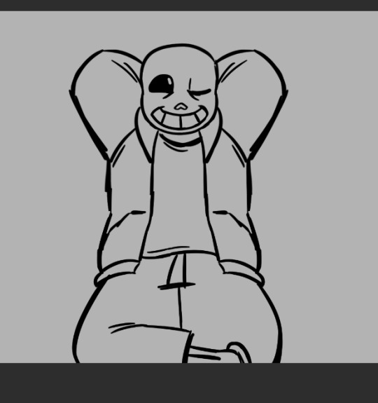
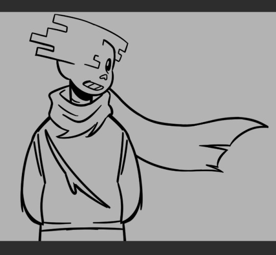
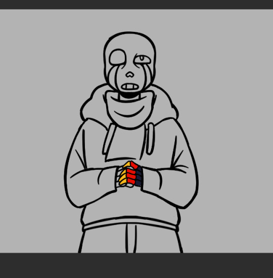
(Error was supposed to be holding a golden flower so I made his hand's lineart and color layers it's own folder so I wuldn't mess it up trying to draw the flower. I looked a bit stupid so I scrapped the idea)
Flat color:


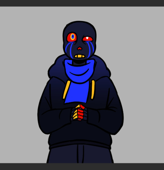
(I think I did Error's coloring after his background?)
In terms of backgrounds:
for Sans I started with the grid pattern, so I used a ruler tool and went in with color directly (the gradients are changes I did at the very end but I'm not editting out) Then I added the columns and the flowers were a last minute addition because the piece just felt a bit... naked. (also! I say columnS cause I planned on putting two, couldn't make it work the angle and space so I scrapped the bottom one)
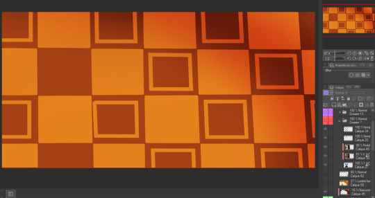
The light is a yellowish white with gaussian blur of orange, it's an 'add' layer? ("ajouter(éclat)" because my app is in french) It's about 50% opacity.
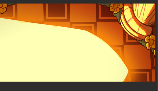
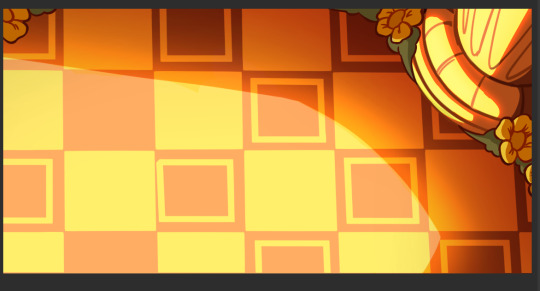
I also shaded Sans at the same time as this with a multiply layer with a dark and light color (reddish brown and like light yellow) I'm not showing it bc I do have a 30 image limit I think
Then for Error's background it's just a case of making the lineart for the hammock, haing a layer underneath for the color, a white bg with blue gradient and the strings
For geno I have underneath the black to grey of the save screen, then I have the moss and the flowers
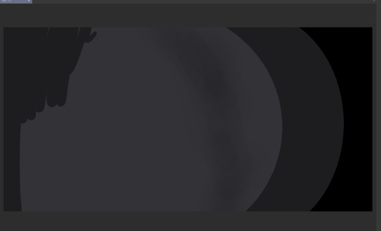
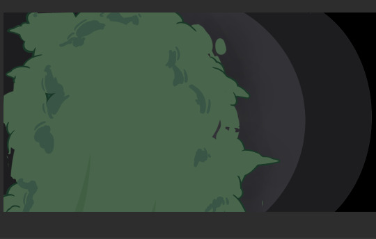

(The flowers were very fun to make I think I only copy pasted one?)
The lighting is a multiply layer over the whole image made the exact same way as Sans' coloring, I thought it was maybe a bit too dark so I dupplicated geno's lineart and colors folder to overlay over the lighting so he would pop more (seeing this now I think either would have been good. The first one might be better actually)
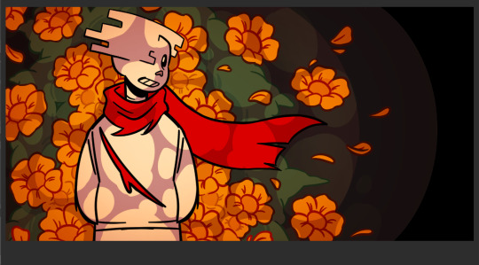

and that's it I think! If you read all of this, well first of all thank you but don't you have anything better to do?
also revised Geno's sketch once but it didn't fit in any where:
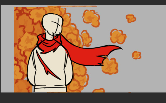
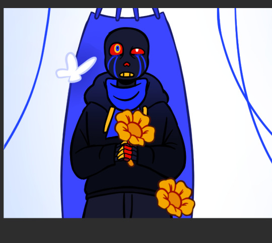
Error with my attemps of making the flowers work
#my art#undertale au#undertale#sans au#pigeon's art stuff#art process#digital art#digital illustration#I hope this is clear#If someone wants me to explain anything in more detail (which I doubt) send an ask
53 notes
·
View notes
Note
Hiii your icons are so pretty, would you have a tutorial on them or tips on how to do it?
hello lovely and thank you so much!! i have been making icons for a long time, but have also just started with this style of icon, so i don't know how much of a help i can be but i'll try my best! i make all my icons in photoshop, but when i first started i used gimp, it works similar and i'd recommend it if you dont want to commit to ps just yet. this ended up getting kinda long because i went step by step on how i make my icons like the ones from this post, with a bunch of tips and tutorials linked, so i put it under a read more. i specifically go deeper into how to change the colours of his hoodie depending on your background/preferences. i hope i could help even a little bit!

1. the base
one of the first steps is deciding what you want the base to look like. you can do just a solid colour, gradients, patterns, etc. you can use the solid colours and gradients that are already a feature in photoshop, but there are also a lot of amazing resources and bases by other talented people either on here or on deviantart. just look up icon textures on deviantart, you'll be able to find a bunch of textures and pre-set gradients you can use as your base. this is a really great pack you can find on deviantart that offers a bunch of bases. if you'd like to make gradients yourself, here's a really good tutorial! i am not really an expert on explaining how to use textures because i've only really just started with headers.
2. the picture/png
onto the star of the show - the person you want to have in your icon. i usually get those from screencaps from whatever show/movie i am making icons of. you can get screencaps of most shows and movies from screencaped.net. i then isolate the person i want to be in my icon so that the background is removed and transparent. you can do that yourself, here is a very good tutorial on how to do that in photoshop, or you can use other platforms like canva or adobe express, that have features to remove the background for you. you usually cannot adjust those, so if they dont cut out things the correct way you have to adjust in photoshop afterwards. when chosing a screencap you should make sure that the person and silhupette are clear and delinated from the background, without any obstruction in the foreground, so that you can cut out the entire figure easily without parts of their body missing. i usually also look for screencaps where the head and the sites aren't cut off, so that i can freely adjust the sizing and move the figure around. i also try my best to get a scene where the lighting is alright so that i don't have to fight for my life colouring it, but sometimes it can't be helped.
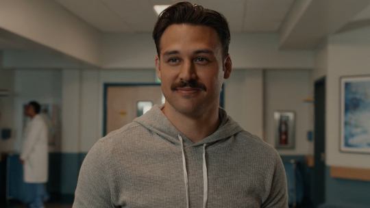
this is one of the screencaps i used for my recent eddie icons and it's a good example: his upper body is clearly seperated from the background, nothing is cut off, etc.
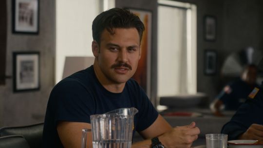
this screenshot is an example that i personally wouldnt use because there is a jug in the foreground in front of eddie that would be in the icon as well.
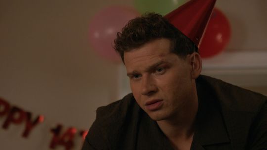
buck looks very cute in his lil hat but the shot is cut off on the right and on top, so i didn't end up using it either. you just kinda go through the screencaps you have (or take your own) and figure out which frames fit for the type of icon you'd like to make.
if you'd like to make screencaps yourself, here is an easy tutorial to follow!
3. basic colouring
when i make icons like these, i usually dont go too crazy with the editing, i mostly just adjust the lighting and colouring the create a well-lit base. here you can see the unedited png (first picture) and then once ive used a basic colouring (second picture).


this is a very good tutorial on basic colouring using curves, hues, etc, as i've done as well. it is for gif-making but those same editing steps can be applied to still pictures as well.
4. colour isolation
the icons i am currently making are in a style that you can see a lot around tumblr - where parts of the person in the icon, usually their clothes and other accessories, are edited to be a certain colour that matches the background, and that colour can be changed to match different bases. you can see that the hoodie eddie is wearing has a different colour to match the different colours of the background.

i desperately tried to find the tutorial that i used to learn how to do this but i can't, so i'll try my best to explain it myself (brace yourself). i have seen people do this by drawing onto the png, but i use a different method. for this you'll need to have some basic knowledge on layer masks.
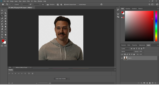
we're gonna start with our png image that already has the colouring applied to it (1).

now, click on the layer and add a solid color layer (2). you do that by clicking the symbol i've marked on the bottom and then selecting "solid color...".
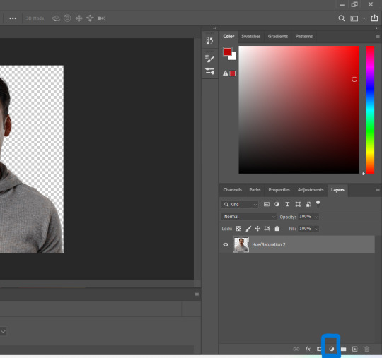
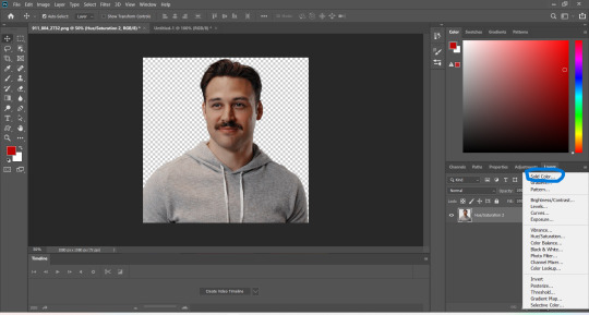
in the screen that pops up now you can select the colour you would like the accents to have (3). choose the colour you want and then click "OK".

your entire image should be in the colour you chose. now right-click on the solid colour layer in the layers panel on the right and select "create clipping mask" (4). this will apply the solid colour layer only to the cut out of your lil guy. it should looks like this now (5).


now we're going to adjust the blend mode. right now it should be set to "normal" (6). click onto the drop down arrow and select the blend mode "colour"(7).
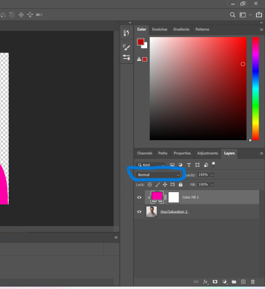

now we can see eddies features again! now we want to edit it so that the pink is only on the parts that we want to be colourful. for this left-click on the white box in your solid color layer (8) so that it's selected. after that select the brush tool (9) and make sure it's set to black. we use black to take colour away and white to add colour back in.
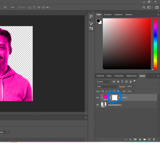
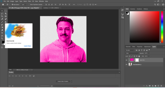
now go over all the parts that you don't want to be colourful. if you accidently take too much away don't worry, just switch the brush colour to white and go over what you want to add in again. it looks like this (10) for me afterwards.
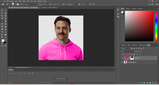
you can change your colour if you double click on the little pink box of your colour layer and adjust it however you want.
5. adjustments
after i've done everything listed above i usually group the two layers (your cutout and the solid colour layer) together so i can move them as one (11). after that i pull the group over onto my base and adjust it so that fits properly (12).

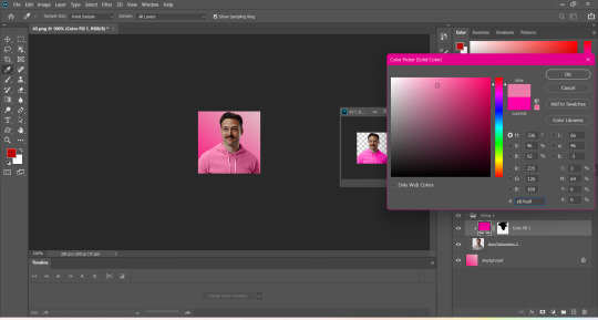
now that the cutout is on the base layer i usually go in to properly adjust the colours and make sure the colours on the cutout match well with the background. you can do that by changing the colour manually or using the eyedropper tool. and voilá! i know it sounds like a lot right now reading this, but once you've gotten the hang of it, it really isnt that hard.
i hope this was at least somewhat understandable and that i could help a bit! there are a ton of amazing tutorials out there for all parts of editing and photoshop in general that go deep into details in case there is a specific part you want to learn more about. for now i hope this gives you at least a small overview.
21 notes
·
View notes
Note
I love your headers!! Would you be willing to show your previous ones? I like how they evolve as you find new interests :D
THANK YOU SO MUCH FOR ASKING OH MY GOD.
For a bit of context, for a few fucking YEARS my tumblr header was a userbox that just read "This user's special interest is Steven Universe". I kept wanting to change it, but I didn't have anything else to change it to, and I was always hesitant because it was always still too accurate. So I pulled this psychological experiment on myself and I succeeded and I got SUUUUUUPER hyperfixated on Good Omens and decided to make THIS!!!!!!

I still love this!! It's my second favorite iteration of the header because look at these colors they're so damn nice! I made this header with the express purpose of changing it as I get new super big hyperfixations, also I just felt the need to add a disclaimer to my blog LMAO I was reblogging SO DAMN MUCH FANART. That's basically all I reblogged 😭 The plan was always to watch the header have leftovers of whatever other interests I got. Along the way new things will come and occupy most of the space in my head, but there will still be remnants of the other things I love and have loved. This header is and will continue to be a visual representation of that and it's beautiful

Now here comes S\herlock & Co., which at the time was actually maybe my most intense hyperfixation ever. Like I mean I was thinking about this shit all day. I haven't shared as much art in AGES. I thought it'd be really fun to just cover up Good Omens with cardboard, but it really didn't look like cardboard, and the tape would be like disproportionately huge lmao. My fave part about this then was how the tape had little air bubbles. My favorite part about it now is probably that you can still see the "G" from the original header, and that the L in Sherlock is capital by accident. I have this real habit of accidentally writing uppercase letters at random when I get too excited. Usually it's in the start of words though lmao :P Also you can see how I specifically didn't plan out the spacing because of the large gap after "Co." that I filled with a smiley. During this time I also had my FIRST EVER profile picture change on tumblr. I'd had the same profile picture since I JOINED. My discord friends, especially those who see me using PK, know damn well we're indicisive with our PFPs lmao so changing a pfp we'd had for a long time was a big thing for us
I also changed the background color on this. In my head this is in like 5 different layers. The unaffected arch around my PFP, the color changing background (that still remains in the same kind of gradient, though), the color changing "I just have AuDHD", the permanent "This isn't a Good Omens themed blog I swear", and then everything else I can put on top. This totally isn't how it works, but I'm imagining the background as like an LED kind of thing hehehe :3c

Oh boy. Iden part 2. I was NOT in a good space during this time. I didn't know what to do with myself, what kind of fandoms to turn to instead and whatnot, and I wasn't ready to let go of this thing that had been so good to me before. That's why I just scribbled red marker over the "& Co." part and changed the smiley to a frowny. Because I was NOT feeling :). I also really liked how the marker went onto the background. It was an accident but I kept it.

Aaaaand away with Sherlock!! I. Got. So. Fucking. Hyperfixated. On. Paper Mario Origami King. Oh my god. I played it so much it hurt. That's the first Mario game I ever finished, as far as I remember as well omg asgsjghaf
Mario has been a special interest before, and it made a grand return!!! My faves are Peach and Bowser and they always will be. And I LOVE Mario Kart ok?
I also started to listen to Find Us Alive here :D I was working over summer and it took me an hour to take the bus home, so I'd listen to FUA as I played Paper Mario :P it was BEAUTIFUL ✨
I also changed my pfp back to the one I had for years at that point I couldn't stand having the previous one anymore
Oh and look at Super Mario. It says SuPer Mario. With a capital P. I did NOT do that on purpose ashgsajask

Derpy Hooves. Derpy Hooves. DERPY HOOOOOVES!!!!
I've loved My Little Pony for AGES and Derpy's always been one of my faves. This is when I tipped over the edge though heahgshdjsf
I drew the hearts because this is when I changed to my Derpy Hooves pfp :D
Oh and see how the "E" in Derpy is capital?? Told you I had a thing lmao
This wasn't all that intense of a hyperfixation, so I knew it wouldn't last long. I didn't have anything to replace it with, though. UNTIIIIIIIIL...

Oh my GOD, look at this beauty. It's my favorite so far. I'm trying to make the gradients match the colors I associate my current Biggest Thing with, and right now it's a beautiful black white and red combo. I didn't make it all black though, because the header would be entirely unreadable. Look at this, it's a mess. It's painted over all willy nilly. There's marker still visible. That one piece of tape is STILL there. There's HOLES in it for heaven's sake! And... Is that the spray paint from the Mario iteration?!!! Good fucking lord this is a mess. Look at how horribly spaced all that text is. Did I even plan for this?! Those flowers look so silly! Dumptruck is here...? He's not even IN this podcast!!! I fucking love it so much you have no idea. "Glass explodes ok?" is one of my fave references. Glass explosion chamber 2024
I'M SO EXCITED TO SEE HOW IT WILL CHANGE EVEN FURTHER I LOVE MY HEADER SO MUCH THANK YOU SO SO MUCH FOR THIS ASK!!
If anyone wants to do something like this, go ahead!! ^w^
18 notes
·
View notes
Text
okay don't mind me just gonna ramble for a second haha-
(this was originally going to be under the drawing, but it got too long, and i can't add it in a reblog because both things are on queue, so separate post it is)
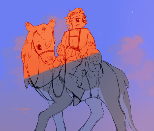
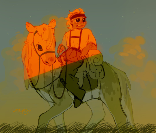
i just love how every time i start a drawing im like "well alright, just a quick sketch yea? no color, maybe some gray to white gradient and that's it, okay?". and then i start drawing (and obviously it takes longer than i thought because duh) and i go "okay but- i gotta at least do the flat colors, right? just the flats- maybe even some random colors to not spend too much time on it--". and then. of course. i do the flats, and im pretty happy with the result yeah? looks simple but not too simple, like it has some color some personality to it, but its not over the top so. so, i leave the drawing i go to get some water and start on an actual piece, and when i come back and take a look at what i drew its like, "well. listen. listen-- yeah im still pretty happy with how it looks but, but. it could be a little better, yea?" and then i sit down, put my water down, put my other drawing to the side, and i sit there making this quick sketch look better. "oh i don't like the colors anymore! but its all on one layer now so i can't exactly change them, plus i still like the idea, so maybe some filters? yeaj some filters on top will do!" (and of course its a yellow shade filter, because im original like that and 90% of my drawings don't also have it on). and then i add them filters and i think" well maybe some bounce light now? surely it already looks better with the filter but its kinda flat, and i want to bring *a little bit* of the original color in" so i add the bounce light, but now it looks out of place! shocker! so i decide that surely i can maybe add some grass at the bottom to hide the edge of the drawing a little. and well, alright, grass looks good, but its too dark, brings a lot of attention to it! and i can't exactly make it lighter, so, the logical choice would be to make the characters darker too, bring some contrast into the thing! and lets just do all the values while we're at it, why not! patterns to the horse, make the pants and skin darker, yes yes. and, oh- but now the eyes are lost because there's more dark hues! gotta make a new layer on top and make them eyes a little bit darker, maybe also color the bandana red and not brown so it looks special, hm? oh and! while we're on this top layer, lets also fix up the hair a little, maybe add some blush... oh and the straps of the saddle look weird, gotta fix those too! oh man and not that i look at it-- the head is too big! lets merge all the layers together and start that same thing over again! yes yes make the head a little smaller, yeah looks much better now! oh, better add some fading as well, to make it fit in the background a little, oh and some glow, suuure sure, and some lights in the eyes, and-
(and now that im looking at it, i realize that i somehow didn't save the final version????? like, i did a lot more to the thing, fixed up the saddle and that awkward shade oh his knee, and the grass-- i wont fix it now because NOW im too lazy to do it for some reason, but yeah, a bit unfortunate u_u)
anyways, point being, love art, art is pog, wish i cared a little less about it sometimes, but it also turnes this into this (imagine me pointing at the drawings as i say that, overly dramatic and sounding a little annoyed with myself)
274 notes
·
View notes
Note
If you're comfortable with sharing... What pen and color do you use for the lineart on your 80s cartoon style? 👀
Well I say if you're trying to replicate an 80s cartoon style then I would say firstly find what kind of style you're looking to replicate. For example I take inspiration from Don Bluth's style
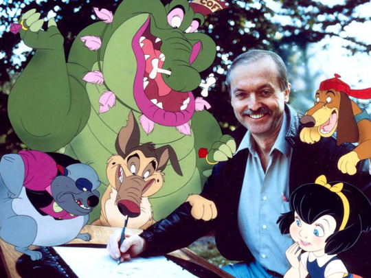
His art doesn't really use a lot of line weight, in fact the lines are pretty light. Shape is also very prominent with his artwork as every character can stand out from each other and doesn't end up getting repetitive. I would say try to study different artists styles to help develop you're own style, see what they do to make their art stand out.
I use firealpaca as my drawing program, and in the brush shop there is a pen called pencil(leather) I use this pen but I alter it to the settings seen below
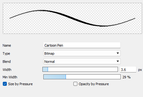
This allows for thin linework and for it to have a somewhat grainy feel giving it that more older feeling. As for color I don't use full on black, I use a sorta black but with a greyish pink tint. (As seen below)
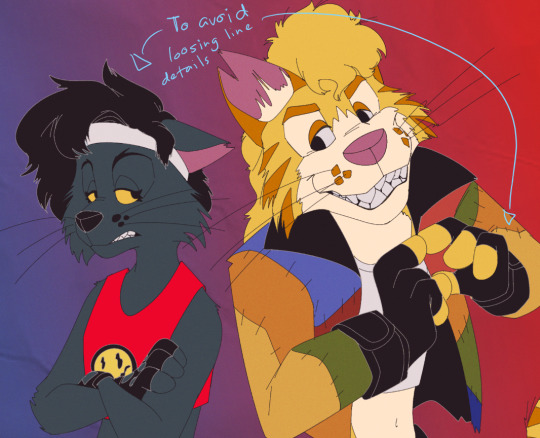
And I also use a grey color for when I color using the same black as the main linework, I just recolor the original lines into the grey to keep it from becoming indistinguishable. I'll put an example so you have an idea.
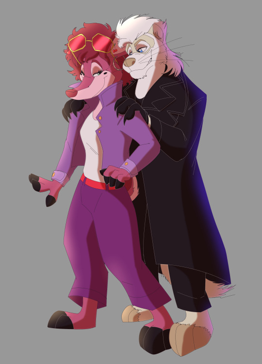
Of course if you wanna alter these choices that's up to you! Experiment with whatever works for you.
I'll do a little demo to you can get an idea of how you can approach doing this process.
First I start with completing my linework, I may even leave a few blemishes just to make it look a little more "natural" cuz nothing is perfect

Then I color the lines outlines of any part of the characters that are black into grey so it'll look something like this (I colored the background white so you can better see the change)

Then next I colored the drawing accordingly and shaded it, shading just involves me using certain colors like a dark low saturated red and using the darken layer. But that can of course vary, I also as a slight gaussian blur to the shading as a stylistic choice.
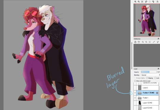
Then through putting everything into a folder or merging the layers together, I duplicate the entire thing and on the top layer use the gaussian blur once again, and put it at a value of 5
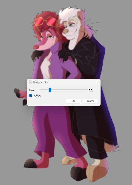
On that same layer I lower the opacity down to around 50% so it makes the drawing look more like an old animation feel.
Then I add the finshing touches like the background, which is a color gradient and a texture overlay. A noise filter just to make it that much more retro. and a drop shadow beneath the characters because I think it looks neat. And after adding my signature, it's finished.

I hope this my advice and this lil demo helps with developing an old cartoon style. Sorry with how long this shit is, I just didn't know how to keep this simple and concise without confusion. If you have any questions then feel free to ask.
16 notes
·
View notes
Note
Do you have any coloring tips? I'm trying to get better at coloring but it's hard :/ everything looks so out of place and I lose motivation fast
Of course!
By no means am I an expert on this (I still forget to choose a light source 90% of the time) but here's a few things that I do when I'm colouring something digitally. Remember these are all individual to the way I make art so they may not all be applicable to yours and are simply me explaining how I do colours, not a tutorial for all colouring styles.
Buckle up folks, this one's a long one (sorry in advance!!)
Here goes nothing.
Losing motivation is totally normal and okay, take a break if you need it, maybe send it to some friends for some hyping up (art servers full of other artists are great for this!). Colours ain't gonna look perfect first time you try to do them, I never put down a colour that I like first time, it takes some messing around and asking friends for me to get them down.
So don't feel pressured to get them perfect in the beginning, that rarely happens!
Here's a mini explanation of how I do my colours, hope it will help a little :)
1) GET THOSE BASE COLOURS IN!!
It doesn't matter if they're not exactly what you're going for rn, go with roughly the colour you want and start there! Personally, I do big blotches of colour just to get something down on the page as this helps me want to actually finish it. Then you clean up those edges so they're all in their correct spaces.
I've found that working on a neutral mid-tine grey background helps you see the colours best at the start so all of my 'paper' starts off grey when working digitally.
Here's the example I'm going to be using (this is from the ghost files fanart I'm working on)

2) ADJUST THOSE COLOURS!!
So, now you've got those colours down, you can adjust them to be roughly how you want them to look. If you're unsure on what colours look best together, you can either take some time out, find some YouTube channels and learn a little about colour theory... OR you could grab some colour pallettes from online and have a play around with gradient maps or simply placing the colours in yourself. There's no shame in using resources like those, that's literally what they're there for.
I didn't need to do this on this drawing as I was happy with the colour selection. This is because I chose the background colour and simply adjusted the hue and saturation slightly until I got the colours I wanted. This is my general technique for choosing colours as my work tends to be fairly similarly coloured (browns, oranges, reds, yellows with hints of purple)
3) ✨SHADING✨
Right, well done! You've got your base colours in.
...but oh god, what now?? They look so flat and lifeless, what shall you do?!
This, my friend, is where shading comes in. It's both a way of telling the viewers where the light and shadows are, can change the mood of the drawing, can change what we feel about a character or it can just look real pretty but shading and lighting does all sorts of fun things to a drawing.
If your style is more simple and doesn't require shading/has minimal shading: apply this tip to any shading you do have and don't forget the importance of rim lighting in simpler styles.
For shading both skin and clothes, I use the original colour, shift it down into a darker shade and on the colour wheel I shift it down too (eg. shading green with blue, red with purple) sometimes you can shift that even further to create similar shading to the one above, where I shaded orange/brown with pinks/purple's.
The principle is the same with highlights but like,,, opposite. Shift everything up, shade browns with yellows, blues with greens, etc.
SIDENOTE ON HOW I COLOUR SKIN:
Okay so, these next two paragraphs are based entirely from what I've learnt during studies and aren't rules, just simply how I do it.
For lighter skin tones, I tend to start from one of the lightest colours and shade darker, like you would if you were working with something like watercolours. This allows you to build up shadows in areas of darkness. Once you've done the shadows, you can then go in and add highlights and lighter sections where necessary.
For darker skin tones, I tend to start at one of the darkest values, as dark skin tends to reflect light differently to light skin. Then I add lighter shades in sections that the light would reflect. You can add shadows too, I tend to add them if the drawing still feels flat after doing the highlights.
3) OVERLAY + MULTIPLY LAYERS ARE YOUR BEST FRIEND
These things are literally lifesavers for me, I love an overlay layer.
I can't really explain what they actually do so I'm not even gonna try, just play around with them. But using a purple/blue multiply layer and erasing where the light hits, that makes the illusion of full shading without the same effort of painting in the shades.
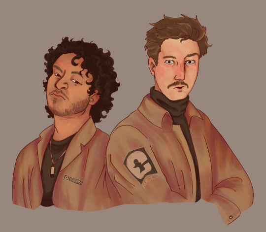
Overlay layers are 100% a 'fuck around and find out' resource, I tend to use red and pink overlay layers as my colours tend to be more desaturated and this helps with brightening them up. However they can also be used to change the genre/mood of the drawing, like this:
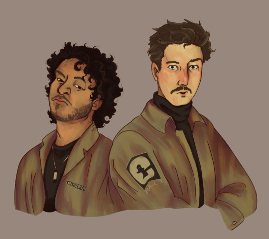
These two drawings are the exact same. There's no difference between them other than an overlay gradient map layer in green or sepia. (These gradient maps are built into clip studio paint, I'm not sure about other programs)
But the whole vibe is completely different. So yeah, fuck around with different colour schemes and overlay layers (the bi flag colours are a great choice for experimenting with overlays as the colours are naturally very harmonious so maybe start there.)
You can also try a noise later for a bit of texture, it's my go-to fix it for any drawing ngl
Uhhhhh, yeah. That was lengthier than I expected, hope it helps even in the slightest. As I said at the top, I am by no means an expert and am still figuring things out myself, so just fuck around and find out.
Bye now!
#artists on tumblr#art#artwork#digital artist#fanart#ghost files#art tutorial#colouring#art tips#deathian answers#digital painting#digital art#colour tutorial
21 notes
·
View notes
Note
sending this w love but it's really hard to read ur comments if they're purple *and* tiny
First and foremost, thank you. That is good to know, that is a great example of constructive criticism, and I appreciate you helping me make what I write more user-friendly for readers.
Second, this has stirred something in me that I cannot tamp down, and so here goes a well-meaning rant. Sorry in advance (especially if this is one of my moots on anon).
There are several reasons I do the tiny, purple text; among them are personal esthetics, good conditioning, and bad conditioning.
I don't know why I've sorta chosen purple/lavender/etc as a theme for a while, but meh, I like it, and to have purple text show up works with the theme. Speaking of themes, Tumblr has various ways you can see your dash, called 'palettes' I think, and mine is set to idk 'goth rave' or something which has purple text on black as the default. It's easier on my eyes and makes the tiny, purple text stand out nicely in my draft posts. Because that's how I see them when formatting, I didn't notice it might be much harder on a white background or any of the other palettes. Thank you for pointing it out! I hadn't thought of that.
This might also be me as a distracted person, but the visual of a divider such as this:

...doesn't seem like enough of an end-cap to the actual story portion of the post, so I change the way the A/N looks afterward to really separate the two. (Special shoutout to the fact that the divider's message seems utterly useless in encouraging/reminding readers to leave comments or reblog. You've all heard that tirade. Let's just say I know the reminder is ignored, so I gotta try something else as a transition.)
Writing/posting on this platform, as you may have heard, is a bit of a crapshoot mixed bag. Readers feel limited both in number and in time, so we creators tend to try various things to make our posts stand out, to make them appealing. Color or text variation is one of those ways. Now, I have no flippin' idea how to get rainbow or gradient text; I barely figured out how to put hyperlinks into my bio, bless my heart, so there's little chance of my blog looking super unique or fancy. Instead I vary the look between actual prose and my notes/warnings/summaries, which leads me to the sad bit.
I am conditioned by this site and others to understand that you are here to consume content. That content is the writing that I have curated and edited into a story which doesn't involve me, just the character of 'you' and other OCs or canon IP, so my thoughts and opinions are not and never have been the reason anyone follows me. Those are quite literally small compared to the actual work I generate.
I still think of comment reblogs as flooding your dash with stuff most of you have already seen. I think I'm being annoying--even though I know it's the only way to have my writing go farther on this site--and because I will do so very, very much IRL to *not* annoy anyone, I put opinion and random side comments and little thoughts in small text that is color-coded so you can ignore it as "not-story bits."
It is taking everything in me to NOT make this small text or purple. Honestly, my palms are sweating so badly, I've wiped my computer keyboard four times.
No, I don't want anything to be hard for you to see or read. Yes, I am really grateful you pointed this out. *Do* please remember that we are all doing the best we can to get the experience we want from Tumblr by customizing what we can.
*
The comment I posted in tiny, purple text immediately before this was sent to me has been changed to regular, default color. Hopefully that helps, and I will try to keep in mind how things will look in the future.
**
I did purposefully choose to not put a readmore in this post fwiw.
#ro answers#ro rants#thank you for reading but remember to share#not this post#like this is not the post you need to share#it's just fyi stuff
3 notes
·
View notes
Text

100 Palettes Challenge // Palette #15 // Greetings From the Pine Barrens
Today's color palette comes from a German Red Cross poster from 1914.

Are you excited? I'm excited.
It's less to do with the palette, though something about it does really appeal to me somehow.
But so let me bring you on a bit of a journey.
The other day, I was playing some classic Disney shorts for my toddler, one of them being Paul Bunyan. If you've never watched Disney's Paul Bunyan animated short, or if you haven't watched it in a while, I highly recommend it for the backgrounds alone. They're a classic example of that sort of classic painted, textured minimalist mid-century style. And as I was really looking at them, they reminded me so much of the travel posters from the 1930's and '40s. And as I was thinking about those, I just really wanted to try out the style.
So I did!
It didn't even take me that long to decide on a subject. I grew up in New Jersey and lived there for most of my life, and the thing that really pains me about cryptid fandom in the lack of love for the Jersey Devil.
Jersey Devil lore under the cut.
For those who don't know, the Jersey Devil (not to be confused with the hockey team of the same name, which was named after it!) is a cryptid alleged to live in the NJ Pine Barrens, an area that takes up about a third of the state. One of the several stories goes that, back in the colonial era, a woman either by the name of Mother Leeds or who lived at Leeds Point, NJ, discovered she was pregnant with her thirteenth child. Devastated — possibly because her husband was terrible, possibly because it was just hard giving birth to and supporting that many children — the woman hiked to the top of a hill nearby and shouted to the sky, "Let this one be a devil!"
Months later, possibly on a dark and stormy night, the woman gives birth to her thirteenth child. It might have been a rough birth, but both the mother and child survived. However, while the midwife was tending to the baby, the mother heard her scream. The baby changed — transformed — right in front of her eyes, its face and body lengthening, its hands twisting and hardening into hooves, a tail sprouting from its hips, and leathery wings stretching out of its back.
The next scream the mother heard was the inhuman screech of her devil child right before it killed the midwife and took flight. It might have then flown through the house, killing the entire family; it might have flown up the chimney in a burst of strength that blew the house from its foundations. But either way it flew into the depths of the pine barrens where it's rumored to have been terrorizing the residents of New Jersey ever since.
They say that anyone who's spent a night in the pine barrens has a story about encountering the Jersey Devil.
So when I thought about what location I wanted to make a travel poster for, obviously my first and only answer was the NJ pine barrens, and I needed to include the Jersey Devil on the poster somewhere.
And damn I had so much fun with this! Which you can probably tell, I think this is the most detailed piece I've ever made, and I'm so proud of it. I originally planned to have the Jersey Devil be lurking amongst the trees in a more prominent position, but with the limited palette I wasn't sure I'd be able to make it look right. And I really liked the idea of it kind of photo bombing the poster.
There was a little bit of frustration trying to figure out how I wanted to do the pine needles and the texture on the ground. But it was so satisfying when I finally hit on the look I wanted that the frustration barely even registered after that. And the tree textures, damn, I was expecting to be way more frustrated by that, but it worked out so well.
I loved the gradient around the moon so much that I added another one to the ground. I meant to play around with some gradients on the text but I forgot. I probably could've added some gradients to the trees too. When I do this again (because I'm definitely doing this again), I'm absolutely going to spend more time with gradients.
But god I'm so happy with how this came out, I might just print it out for myself to hang up.
10 notes
·
View notes
Text
WOOO! New pfp update!
If u don't know, every now and then I update my profile picture to better match my improved digital art skills/style, and today is a HUGE leap forward. I've had 3 different versions now, so here's the one I made 5 years ago

And here's the last one, which I wanna say was made 2 years ago?

So, this is a big leap. In the last pfp update, I pretty much just traced over the first one, made the clouds better, a tiny bit of changes, as well as adding a Technoblade cloud later on, which is when I decided that the internet things that effect how I interact with this place the most will be added to my profile picture in the clouds.
This time! I did... A lot.
The scarf actually looks like a scarf and not an awkward mask
The eyes are ovular, and have some shine rather than just being semi-circles
✨Shading💫 just a lil tho
NEW UNUS ANUS CLOUD! I don't know why I didn't add this before. Possibly because it came before I decided I wanted an update every now and then, while TB died as I was making v.II
Less vibrant scarf colours
Background sky has gradient
Shell looks different, but I'm not sure how to put it into words
Clouds have been updated to look less bumpy and more puffy and the big cloud still looks like a couch but better lol
Slight difference in cloud highlight colour
And some line style changes
And I think that's all! So, without further ado, Cotton Turtle III

3 notes
·
View notes
Text
HOW I CREATE MY ILLUSTRATIONS
I get a lot of people that think that digital art is just pointing at the screen and PLOP! a fully formed image appears. They are surprised when I tell them that "digital art" is not the same as "computer graphics" (and even computer graphics takes more than just point and click skills). I used to get the same reaction in my graphic design world, where someone thought that just cause something is on a computer that it was easier than using traditional art supplies. I thought I'd show you my process as I create one of my pieces.

THUMBNAIL
I start with a really messy and basic sketch at small scale, called a "thumbnail". This helps me get the layout and composition of what I want to make. Usually this part doesn't require any research, it's just an exploration of poses or how I can get the figures in the image to fit.
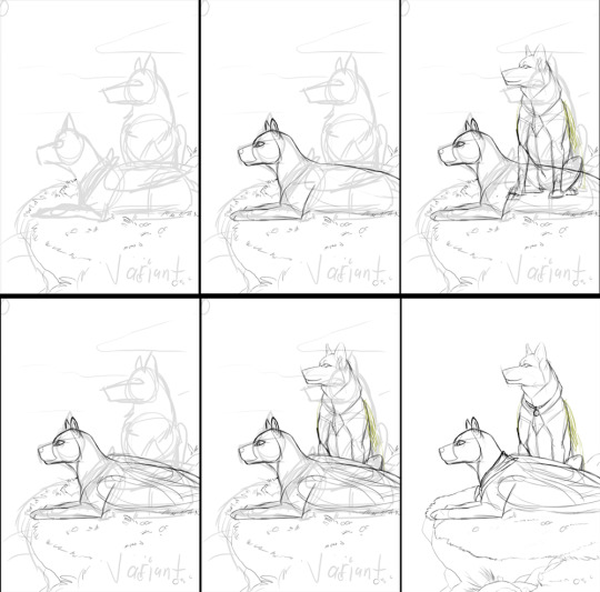
SKETCHING
When sketching it depends on the image in what I start with. Here, I started with the cliff they are sitting on, so I had something to anchor the figures to. This helped a lot with sizing and perspective. Next I did the front character (Bex, my persona). I used a reference of a jaguar to get some of the shapes of the shoulders and back right, then I adjusted because of her different anatomy (she's part dog among other things). Ell, the character in back was next. I drew all of her, including what was hidden to get the right height. For Ell, I used a german shepherd as reference. Bex's wings were next, and I didn't erase parts of her back, in order to get her spots in place later, but I did hide Ell's feet in the next one. Lastly, I added their accessories.

BACKGROUND
I like to start the background with the sky, much like Bob Ross. It helps to have those colors figured out for later when I go to do the shading. For this sky I wanted a sort of sunset or sunrise so I used soft blues, pink, and yellows. The gradient tool in photoshop is very helpful for this part of the process, but I like to add in colors between them to give it that color changing look. The clouds were done with a normal brush but I set the layer on low opacity to let the colors come through. Lastly I blocked in the cliffside and worked on the rocks and how the light hit them.

LINES AND BASE COLORS
Next I do the lineart by reducing the sketch layers' opacity. This process takes a while cause I like to be precise. When I'm done I hide the sketch layer and color in the lines with each character's base color. Before I do anything else I add a new layer and color in the "extras"--eyes, nose, paw pads, or small piercings if they have them.

CHARACTER COLORS
I like to start off with a soft brush for coats that change color and work from dark to light and for Bex's blue points. I use a harder brush for Ell's sable marking, which shows over her pangare/countershading and the same brush for her white points and belly. I have specific colors I use on 40% brush opacity for shading each character, and each marking has two to three shades. Here, because it's a strong light coming from below, they get a sharper shadow.

CHARACTER SHADING
Ell's wings and tail are blocked in, as is Bex's wingtips. Then using a reference of Bex's spots from previous images, I use the same brush from Ell's sable, and start putting them in. She has a specific style of spots so I don't just add them wherever, but I do follow the direction of her fur and body placement. After each character's coats are finished, I color any accessories they have--Bex's bandana and Ell's necklace.

GROUND
I left the harder part for after the characters--the grass. I realized here that the color needed to be lighter (even if I wanted to work from dark to light, I had trouble figuring out the contour of the land). This is the same brush as the sable and shading from before. I work slowly here and in this case I started with a light color and medium tone to shade in the contour of the cliff. Then I added the darkest shade, especially under the characters. Next I used progressively lighter shades to complete the detail in the grass, until I could add highlights and hints of flowers.

EFFECTS
The final part is the effects of lighting. In sunsets the light changes to gold so I used a color similar to the sky to add a soft light from the bottom left. The same color I used to highlight the characters where they faced the sun. Their backs got a desaturated red shadow, and lastly some darker shadows coming off of them to give it that nastolgic anime feeling:

0 notes
Text
Session [Maya: Can]
Today we learnt about UV mapping and to practise it, we created a can of drink.
First I started off simple by extending the cylinder and pulling the top and bottom parts in so it looked like a can.


For extra detail I added the rim to the top part. This wasn't required but I think it's a staple part of cans so I cut a small edge with the multi cut tool and extruded it up. I also did the same for the bottom.

I tried to work out a way to curve the object in like a can but I am not experienced enough in this program to work that out so I left it flat for now.

Then we learnt how to access the UV map. It's basically the shape but 2d on a page. It was kinda cool to see it laid out like this because it really broke the shape down into steps and sections.

We then ported the outline of the UV map to Photoshop to create our design. I wanted a simple design but I took the time to colour it all grey myself for more consistancy. It was hard to see the lines but I duplicated the layer and it made it more visible.

Here's my first result. I wanted a simple design that spread around the outside of the can fluidly but this kind of backfired as one of the large flat parts was actually upside down. I didn't get a screenshot but it was clearly upside down which meant I had to fix it.

Here I removed the background and flipped the one part upside down. I also changed the bottom parts to grey because they showed up as blue on the original one and since they're on the bottom it didn't make much sense.

Here is it without the lines. I decided to make this design simple because I didn't want to spend longer designing it than modelling it, I wanted to spend more of my time actually learning the program. In the future I might expand on my designs when I learn Maya better but for now I wanted a simple design.

Here is the design on the can. I liked the gradient look but it was a little inconsistant with the edges as it wasn't perfectly in the lines. It looked a little odd but could be passed off as a seam so I left it.

Here is the final outcome. Once again I used Arnold to render the image and I added a bright sky to show the shine on the can. The seam is still obvious here, but sometimes labels have seams so it could be excused.
It was interesting to work with the UV mapping and while it was a little awkward to work out what piece fit where, it definitely helped me understand how things are broken down and the best way to paint things. While others are probably dreading their spaceship, I'm actually looking forward to creating our spaceships after Christmas. It seems like it will be fun.
0 notes
Text
talking about design choices/inspos + linking some assets below the cut!
i got really into poster making over the last month for my freelance work and i kept saving really cool reference posters on pinterest and i was super excited to make stuff like that but the client didn't like any of the ones i saved and i got sad but then i remembered i have free wil so. weewoo poster time
assets i used for all the posters:
i used paper + scanned texture + film burn sample packs from wave index
i made these 9-1-1 and fox logos and distressed them


1. Hen Begins
i decided to follow the chronological order of the show so hen begins was up first.
pros: i knew the exact kind of poster i wanted to model all of them after and i had a clear vision - i wanted them to look like those noisy brutalist/grunge movie/musician posters, like these:


breakfast club by hozergovia on ig | lady bird by jempg on pinterest | aftersun by justbychris on ig
cons: i was teaching myself how to achieve those effects + i went through many variations because it wasn't looking the way i wanted it to. here are some half-finished variants:


i think the issue w doing this ep first - much like the show - was that i was still experimenting so it ended up being the most basic poster of the lot. i really like where i ended up even though it wasn't looking super grunge; i kinda gave up on the monotone look at that point bc it wasn't working for me (i love colour too much)
also i realised what the colour scheme reminded me of lol
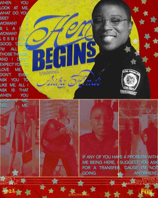

the yellow circle behind hen is a sticker png i picked up from @thepngpixie (x) and the stars are from @pngblog (x)
2. Chimney Begins
gonna #tbh i think this is my favourite one of the lot haha. this is the best begins episode and the second i saw the opening frame i knew what i wanted to look like
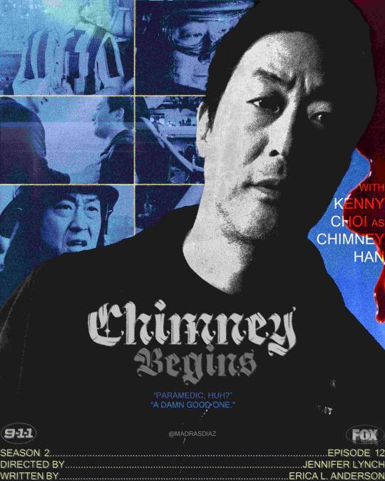
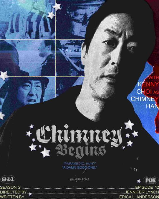
i made a version without stars bc i thought it might've been overkill. i went super heavy w the textures for the background and it turned out well, i also love the untextured drip of blood as a nod to him bleeding out (also hello red theory)
overall a solid ass poster i'd say.
the stars are from @pngblog (x)
3. Bobby Begins Again

i wanted this poster to be really be blended more than anything, so i picked screencaps and played with the colouring and gradients till it looked like it was smooth. i'd say this style is much more "classic" in the sense that this is what i'd do for making gifs and it's not necessarily the contemporary poster style i was going for. it felt more timeless than the rest. i liked the idea of keeping the fonts minimal and letting the imagery stand out. this had the most number of usable quotes i could find in the episode and i ended up using them all.
4. Athena Begins
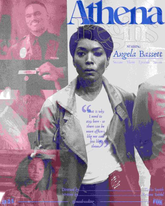
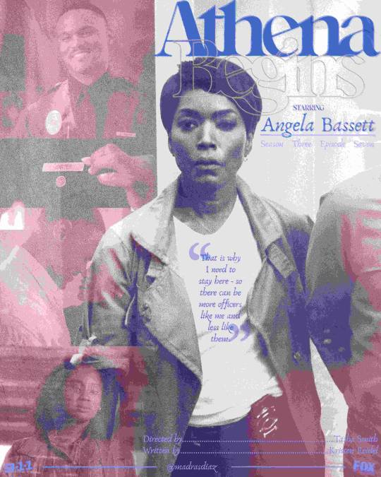
this kind of looks like a magazine cover?? which i don't hate but it doesn't necessarily fit athena's character. i was going for a refined feel so ig i was naturally drawn to what i find fancy (architectural digest, seemingly)
anyways. angela bassett front and centre as she should be. i like this but it's not my fav
5. Eddie Begins

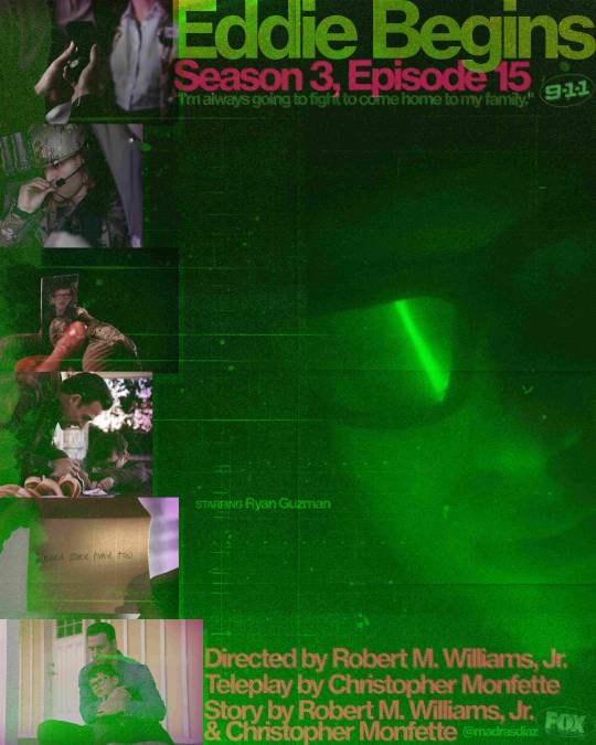
i had made 2 variants (4 actually bc when i saved these the first time i forgot to add ryan guzman's name) bc i wasn't sure i liked how small the strip of photos was in the first one. changing that meant changing the text hierarchy tho which i didn't like
i think this also feels very magazine-esque - i think the fonts are what's throwing me off. they look cool as hell tho.
6. Buck Begins

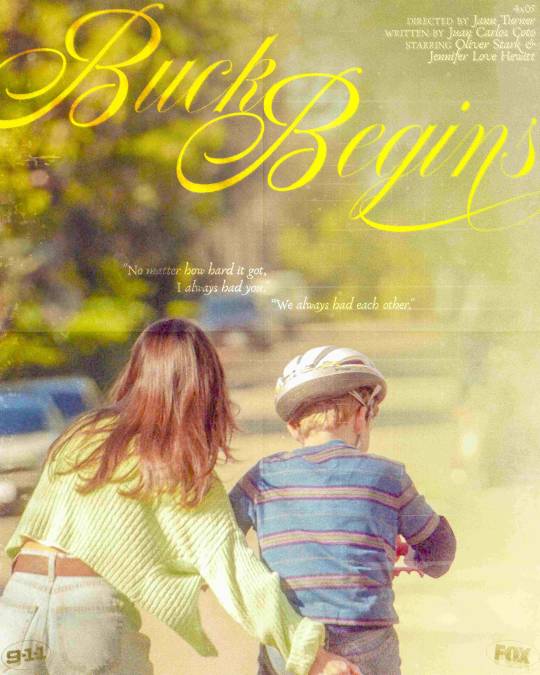
i intended to make it look like postcards were taped to the bottom of this poster but this specific screencap really reminded me of this poster for the movie one fine morning

i think it's the colours. i got super attached to this concept lol so i modeled the poster after this. i think it's very soft and pretty and i like it a lot :)
star png from @liltingaway (x)
ramble over! <3


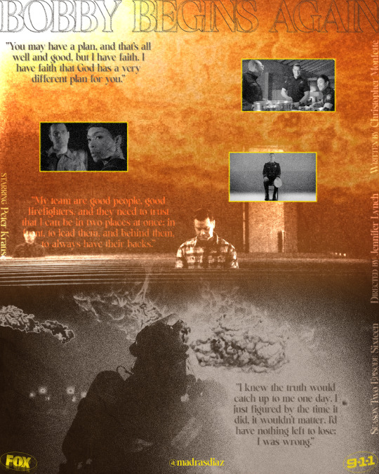
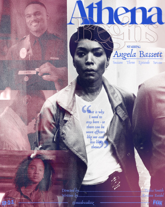
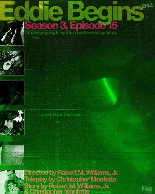
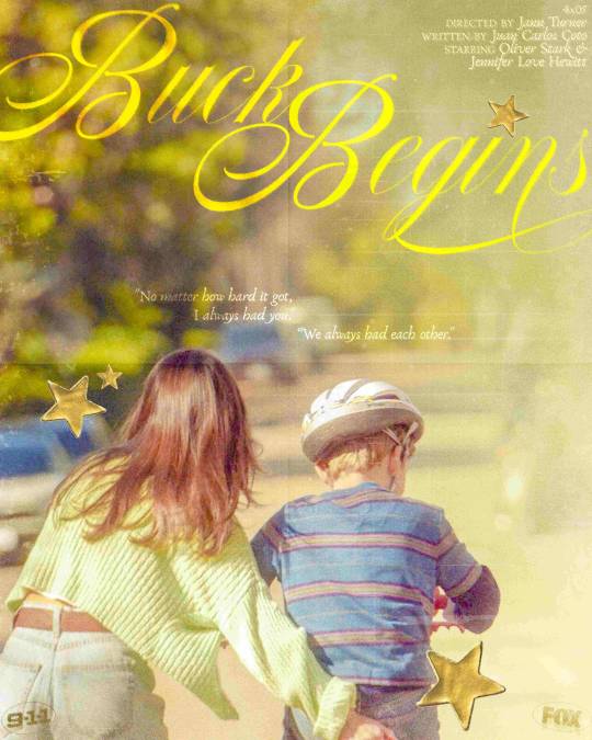
9-1-1 Begins episodes as grunge(ish) posters
(I'm @madrasdiaz over on twt)
396 notes
·
View notes
Text
Customisation and Settings
After having Reece and Louis playtest my game [apparently funny sounds and flashing lights make them happy], it was suggested that I add customisation - maybe integrate it into a start screen. I wasn't convinced until they stated I could add a skin that's just the flag of Finland so now I feel I need to do this.

This is my start menu. Why yes it is stupid, but it won't stay like this. clicking on the middle button opens the first level, but I needed the player to not be able to control anything in the background so I made the default level a copy of the previous ones, but empty. I then ran into my next issue - what would load the start screen?
This is fred

No, really.


And this is what fred does. Because fred [he prefers you don't capitalise the F] is always in the placeholder level, as soon as the game starts he can cause the GI to make a start screen widget. This is removed when the game starts of course

This prevents the player from interacting with the camera and is reset in the game instance. I learnt about this via the post below

I had a problem where the bat would only move if the left mouse button was being held down, but when i changed Set Input Mode Game And UI to just Game Only, this fixed it - i don't know why, but i won't complain.
Next up is customisation. oh god.

this is how i control what skin is displayed in the little display thing - it's controlled by the game instance so it is universal and persists between levels.


This will be how I have my displays slide - I will also need to spawn another one in, but that's a problem for when this works. I just need to implement this into the actual customisation screen.

I came to the conclusion that what I was doing was far too complicated - instead, everything would be in the widget.

This is how I changed the material,

and this is how I set it in the ball. This actually did work, but adding a texture [such as the Finnish flag] makes the ball's jerky rotation extremely apparent, which may need to be fixed. At any rate, I actually have a customisation system now somehow.
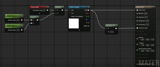
This is how Louis got my map textures to map properly onto a sphere, so now I can have a ball with the Finnish flag instead of a quarter of the sphere being blue lol

Unfortunately due to how the texture is stretched, the materials themselves look kinda weird lol
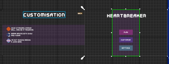
This is the slightly more polished version. I've added the appropriate font, colours and text. The buttons still work but they're just invisible so I'll need to implement an audio cue when clicked. I also finally reintroduced the transparent purple block HUD from the tutorial in a way I like, and different colour backgrounds for play, settings etc to help visibility. I also added little notes at the skins and sprites corresponding to the texture, I also have space for 3 more so I can have 6 skins total. i just don't know what they will be.
Next, I added a similar animation to the slide left to show the settings screen. This exists for those who may want a lower sensetivity, audio controller or colourblind mode.
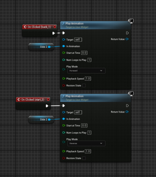
The next thing I added was a [placeholder] slider for mouse sensitivity since I already had a system for it. However, it didn't move. This could be due to it being unable to actually change the variable, or the mouse not being able to do anything.
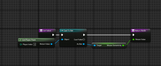
However, using the below tutorial, I got it working. I figured that, since I couldn't do anything in the slider, I could set the sensetivity outside of the slider from it's value
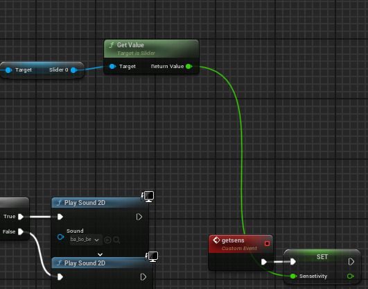
This is in the game instance - it is called when the back animation plays in the widget

And I added this to my bat to utilise the sensetivity. I'm really happy this works, I just need to make the slider look better now.
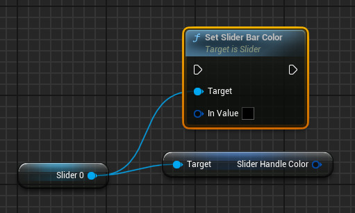
I CAN MAKE THE SLIDER'S HANDLE GRADIENT HAHAHAHAAAAA Y E S
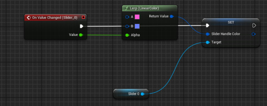
oh
is it actually that easy?
like this works, i just expected it to be harder. i suppose its just one of those days :D yippee

As the scale is from 0.01 to 2 not 0 to 1 [as with lerps], I had to divide the scale by 2 to make the colours properly fit the scale but I love how this looks.
I tried making a volume slider but despite using the above tutorial, nothing was going in and I just didn't understand. Besides, the volume can be turned down outside of the game.
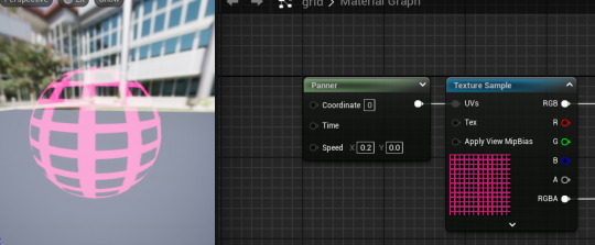
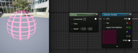
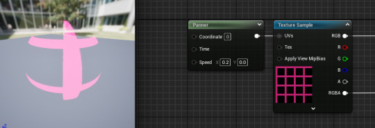
These are some of the grid sizes I tried for the last material, finally reusing my panner material. However, as they were on a far smaller object, the sizes needed to be different

The one I selected was 4x4 squares on 30x30 grid, this gave the sphere enough shape whilst keeping the grid fairly visible
I still don't like the TF2's texture
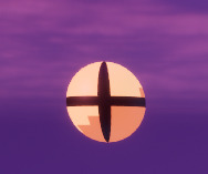
it just looks like an eye. Even moreso than the actual eye itself

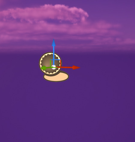
Behold. Yugoslavia. I chose the Yugoslav flag soley because Yugoslav history interests me, and because if I ask people what the flag is, I'll likely hear, Dutch, French, Russian and Paraguyan which amuses me :3
0 notes
Text
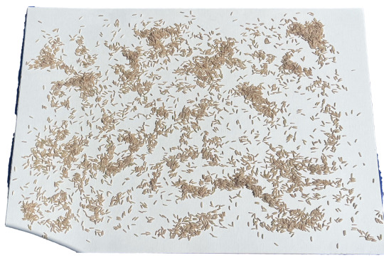
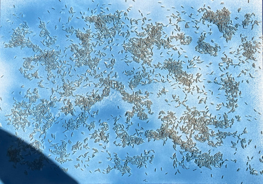
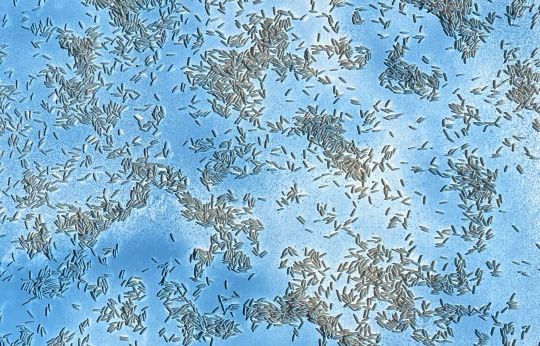
after the recieving feedback for my work with the lego figure and stamps i decided to recreate or rather create a new work using the same elements ? or even new ones ? i kind of just felt that if i used the lego figure it should be enough especially after the most recent experiment with the stamps and lego figure combined
i opted to use this new background that i made for another work earlier this semester
i thought about how i could merge this with the lego figure to create a new work, i found the process again enjoyable and informing
i again didn't bother to glue or secure the rice grains when applying the spray-paint, i still followed along the process of the first one where i let the rice move around and interact with the canvas as like their own being, using their own movement from reacting with the can, it kinda reminds me of like a field of crops
with this work i actually didn't make like a mock up in photoshop, i just cut out the stencil and placed it on the canvas, this is a first i kinda of just trusted my judgement but also i felt that the stencil was so large that it didn't really matter as to where it should be placed i think
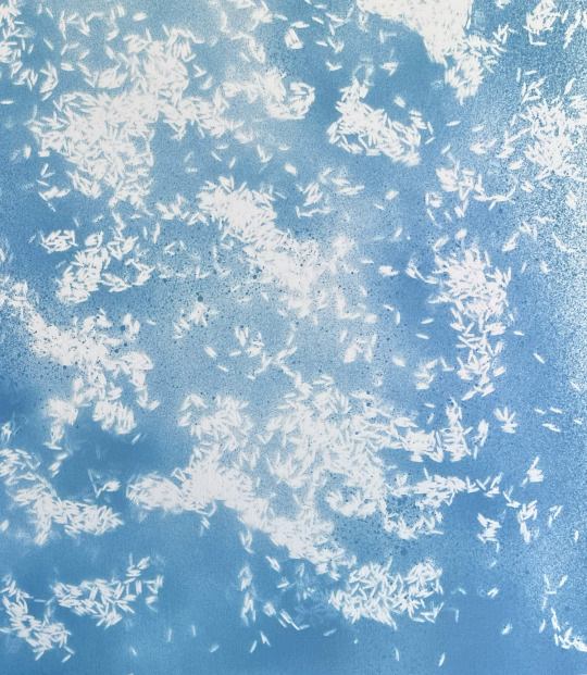
i am happy with the outcome of the rice stencil
looking at it in person is making me think of clouds, like the gradient change throughout the stencil, where some areas are lighter than the other its kind of like a blob of ink on white paper spreading
yeah i would say it is very strong in evoking a sense of being in the clouds
the rice sort of guides your eyes like your looking at a map of these rivers and streams flowing
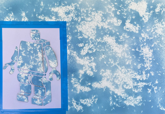
i actually tried this new way of applying the stencil, itried sticky taping it down, i was worried that it would not come off the paper and in turn ruin the work
the stencil was also not paper, well it is paper just a thicker one
i also made like a make shift box with two pieces of cardboard to map of the two edges that were directly in line with the background
i did debate what colours to use but i thought i would keep it plain and simple in case i added more which i am sure i will to what that might look like, i am not aware yet
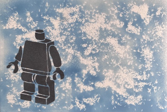
i am pleased with the finished result, i do still feel like it is incomplete though, i have debated spray painting on bits of the figure like an arm or a leg/legs however it is not achieving the look that i would like for this work
i have thought about other potential figures like a cartoon bird or even snoopy but i don't know what i want to achieve with this work so i am stuck as to how i should progress this work
in saying that, the process of creating was still fun and enjoyable, it is getting tiring cutting out the stencils as they take a while, especially since i try to manage how much i actually take away, as well as managing enough paper is left between two cuts to ensure that the legibility of this line cane be seen and contrasted well against the background
i just thought that because i'm using this detailed backgrounds it might be stopping me or potentially halting my process of creating because of adding too much to the canvas which could result in a composition that feels cramped, which is something i don't want to achieve
i don't know if i can express or rather state a theme or context for this work because i am unsure myself, i don't know, i do feel like the background though is like this zen rice field, that looks like clouds, kinda of like howl's moving castle like that type of sky
i have debated just going all out with stencils in this work and have a mixture of mediums however i am unsure still and have decided to leave this work for the time being and come back to it later on
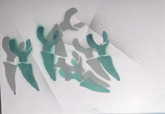
i trialled out using the arms of the lego figure to try and create like bones lying around the floor or something
i was going to try and implement this into the work however i felt that it wouldn't go or maybe its a scaling issue however in saying that i will get back to the work later on
0 notes