#can make lineart literally any image without using other programs
Explore tagged Tumblr posts
Note
What if you drew Flower
But the lineart is colourful and the colours are just black
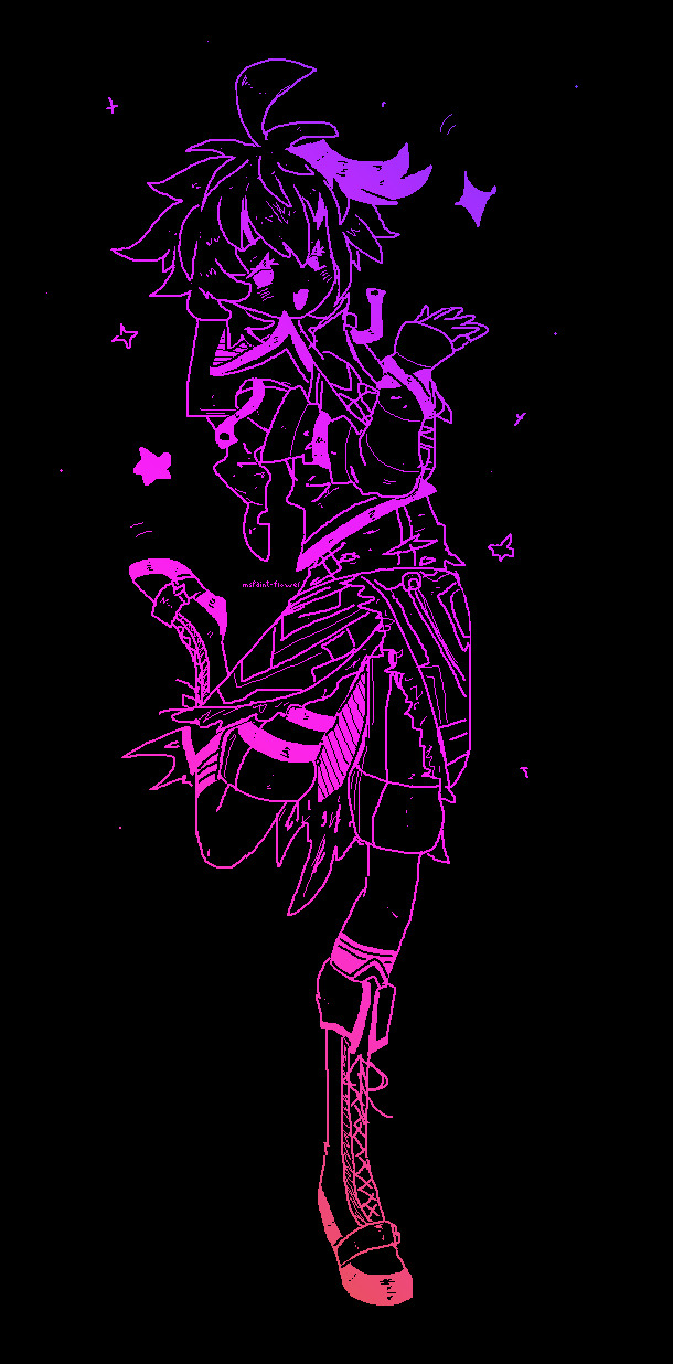
🌠
#vflower#v4 flower#v4flower#vocaloid#vocaloid flower#my art#ms paint#discovering that ms paint trick was useful after all#can make lineart literally any image without using other programs#just by using transparency#also choosing the gradients was so hard............there were too many i loved
326 notes
·
View notes
Note
Hiii!!! So, I watched your Dead Man animatic and was IN LOVE with the art. Do you have any tips on how to draw like you? (sorry if it seems like I'm trying to copy you, I just really love it and want to improve my art >< )
i cant really give a 1:1 guide but i can try. most of this is only gonna be applicable to digital art, but in the case of that animatic (and a lot of my other art) i dont do lineart and i think that's a big part of the style. i just do a sketch and then refine the details usually & thats what i did for that whole video. i assume thats part of the appeal anyway. using black for shadows (IN MODERATION) is another one. i dont use a soft brush very often nowadays, but if you like the animatic art specifically then just using a soft round brush without much pressure sensitivity will get you a similar look. not NO pressure sensitivity, but just a lil
the program i use is autodesk sketchbook, specifically on pc, but the mobile version has all the same stuff pretty much. i also remember using HUGE canvas sizes for that whole video, which you wouldnt really think makes a big difference but it increases the quality of the image since its literally a higher resolution and makes all the smaller details a lot sharper
i use lots of reference and i tend to trace the shapes of poses so i can get them down easier (with stock photos or free to use pose reference like adorkastock's stuff, not other people's art)
idk if the blood is of any particular appeal to you but i remember a lot of people saying they liked how i did it, and its a lot of just putting down big chunks of red and then erasing at random (usually in one big stroke) until i get something i like and then repeating that until i get a bunch of splatters
its been a while since i made that vid so i cant remember my process super clearly but i hope some of that is helpful at least. my styles changed a bit since then
11 notes
·
View notes
Text
Colouring/ Shading/ Lighting for Digital art
HI! Hello~ I’m here and I have a teeny tiny tutorial for you today (courtesy of dear Melito who actually wants my help??? I’m??? Blessed??? I realise that there’s a lot of you who have no clue who the fuck this person I’m referring to is, oh well, not my problem — ur missing out on hella great cake.)
So I have a timelapse of everything (below, duh, in case you can’t scroll) and I’m also gonna make comments on it cus ya know, these vids are only a minute long and thirty fucking megabytes like Jesus Christ.
So without further ado-do!
Should I have added music? Probably??? Ehhh the deathly silence can comfort you. (Wow what a mood.)
The Run Down:
Is rundown one word or two??
When colouring, I break it up into three main steps: base, line and “Hiding All My Fuck Ups”
(First) Base
I’ve never made it to first base... or any base
When colouring, use a non translucent brush to colour in everything. As in, so it’s completely solid??? Where’s my English today?
For every different colour, put it on another layer! I tend to do the skin colour first. You can go over lines that will be covered with another colour... did that make sense?
That’s it, I just felt the need to have three steps at least.
Line
As in... line art.
What I do is I lock my layer — that means when I try to add colour, colour will only be applied to the area that’s been drawn on.
I usually colour pick the colour I used for the base, and the line looks very pale when done (I do this with a non translucent brush too)
I then adjust the layer with lineart so the colour looks darker and more saturated. For my program (Medibang) I go Filter > Hue > Max out the saturation and lower the brightness > save. Sometimes I may do it again if it’s not dark enough.
If you can’t edit the colour then there’s another way! Duplicate your lineart > select the layer on top > change blending/ layer type to “Multiply” (it multiples the colour... duh)
If THAT doesn’t work I have one last suggestion before I sadly admit idk — duplicate line art > select top layer > colour the entire think a dark colour or black > lower the opacity
Line art done! (This time I wanted six steps — 6 is my fav number)
“Hiding All My Fuck Ups”
I rely on this too much okay?
I can actually further split this into two; shading and “I’m Kidding Myself” — let’s begin!
Shading
To shade, I work from bottom layer up!
What you’re gonna do, is select your bottom colour, (or any really but ORDER HELPS) and lock the layer.
Why? That way it’s easier to colour without going over the lines! (Your building on the foundation you set essentially)
With a semi translucent brush (FYI, translucent brushes are thinks like “blur” or “smudge” that purely affect what’s there and do not add anything) I use the watercolour brush set at 15-20% opacity.
I’ll eyedrop the base colour that I’m shading, and with the colour wheel, tru and find a darker version of that. NOTE: when looking for a darker colour, I don’t go to the black, I try and find a more saturated colour OR a darker HUE — black is a curse, I don’t ever use pure black or pure white — give your work the colour it deserves UwU
With the watercolour brush, I literally run the darker colour over all lines that indicate a shade (imagine a light somewhere and what that light touches is what you mainly focus on)
For clothes, I follow the creases I’ve drawn
For hair, I tru to imagine the hair in three main shapes and run the colour over the perimeters of those
Then it’s time to blend! I usually just eye drop the base colour again for this, and trace (lightly, our tablets have pressure sensitivity — same going for steps 1-8) the line that divides the light from the dark, adding a middle ground since the watercolour brush is only semi transparent.
For adding blush to skin: create new layer above skin layer > set to multiply, again, if you can’t do this then you follow same steps as before with line art) > using an Airbrush like brush (soft, no sharp edges, kind blurred), colour the skin areas that need blush.
Skin areas that need blush; areas with LOTS of blood vessels (head... the OTHER head...) areas with thinner skin (elbows, knuckles, knees)
If your skin layer was on the bottom, your blush will only appear on top of the skin and not the other layers!
Just be careful about the areas outside the drawing — you may need to do some tiny erasing
Finally, merge all the colours together. Sometimes different layer types don’t like to merge together without screwing up your other layers, to avoid simply merge them one at a time from bottom up.
As in, second last one and last one merged together, then the one above that merged with the last one — merge everything with the last one... AM I MAKING SENSE?!
I’ll usually merge the lineart with the colour too — I just didn’t here for some reason
“I’m Kidding Myself”
Here we add stuff that hides flaws and merges the character with a background if you have one!
I use three types of layers for this, if your program doesn’t use these then see if they have similar functioning ones (I’m always experimenting so this isn’t set in stone) if your program has nothing then... this will be a little harder, you’re gonna have to do this by hand somehow.
I use these kinds of blending layers; Multiply, Overlay and Add
First I prevent getting the colour on anything BUT the character; magic wand tool > select the empty space > hold ctrl/shift and keep tapping to add or remove areas > invert if you need in order for the art piece to be selected
You can see this when my background when blue, I’m basically highlighting my art of Yuri
Colour this entire space on a new layer. The colour I use doesn’t change here on out (except in the video I do cus I lose the colour but that’s aside the point). When choosing a colour, consider the colour of light — I use human colours??? Colours you find on a person essentially.
As a general rule of thumb; for every new thing, new layer, it gets a little harder here. I also use a semi translucent (watercolour) brush again for everything!
Now we have a silhouette of Yuri — I set this to multiply, it’s essentially like a highlighter marker pen but darker?? This is so that I may adjust the entire colour to fit the lighting colour
New layer (NL), I set to Overlay. Overlay is like multiply except bright! Remember what I did when shading? Yep, rinse and repeat! Afterwards, adjust the layer’s opacity setting so that it fits better with the image.
I’ll also make the brush really tiny and go over hey areas to highlight such as the edge of the nose, chin and jaw — I’ll also add shine to the eyes.
NL, set to Add. I only ever use this layer if I want to achieve “blinding lights” sort of looks. So when the lighting is immense, I have a white background, or the background is incredibly bright.
I use add layer scarcely, to blemish any lines and make it look more refined. I’ll also adjust opacity if need be.
NL, I’ll use the airbrush set too REALLY BIG (1000 usually) and if I have a background, will try and add light to it by making this layer multiply too. I’ll add darkness in the side or corner of the background etc.
NL do the same thing with Add except also make a point for where the light is coming from.
NL, I’ll use a mix of Add and Overlay to add sparkles, fragments, light spots etc depending on image type of need be
Using a Fluffy pastel brush (it’s textured) I also use pure white. This is the only time I ever do.
I’ll add reflection to eyes, jaw and nose. For hair, I’ll pick out a few strands of hair where it’s darker and throw in some loose lines. Clothes are rarely outlined and only where light touch. I use this limitedly.
Ctrl + D ;) to deselect the lasso tool — I don’t usually merge the layers after this because it’s usually too messy and I’m done anyway so I save it, however you CAN put them all in a FOLDER if need be. (I have a few in my vid, the entire thing is in a folder tbh)
Voila! That’s it!
I hope this has been of some help or use! And that this makes SOME sense... I’m absolute shit at explaining everything...
This was incredibly fun to do tho and I spent two hours typing this all! Wow!
Okay thanks for reading! (Hope this helped Melitooooooo, don’t forget the wedding cake ~ v/ important part of marriage you know)
#art#digital art#yoi#yuri plisetsky#art tutorial#tutorial#colouring tutorial#how to colour#colour and shading#how to draw
47 notes
·
View notes
Text
A BASIC GUIDE TO DIGITAL ART ON PROCREATE
okay so i joined the digital art scene about a year or so ago and it has been a total whirl! there’s so much stuff that’s so confusing and hard to understand at first. And that’s okay! A stupid amount of what constitutes as “good” or “complex” art is to do with layers, patience and experience.
and because literally every tutorial on here is for Paint Tool Sai i thought it might be useful for those of us using Procreate! because i don’t have sai and i have a relatively shit laptop by comparison to my Ipad.
so without further ado - here is how to make a KICKASS piece of art on procreate
1. REFERENCE + SKETCH
the first thing you're gonna wanna do is collect any references you need for thing youre tryna make. you can collect references by finding stock images, using other artists work (i use these mostly for colour refs cause i SUCK at finding good colours). however when i make art nowdays i usually just snap a selfie and use that. for this work i did the last option (see below)
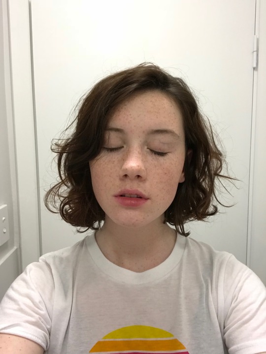
after grabbing my reference i decide on the style i wanna use. for beginer artists what i suggest doing is just pasting the image onto your canvas, opening layers and adjust the opacity to around 20% by clicking on the little N on your layer with the photo. then once thats done add a new layer by clicking the + and work over that
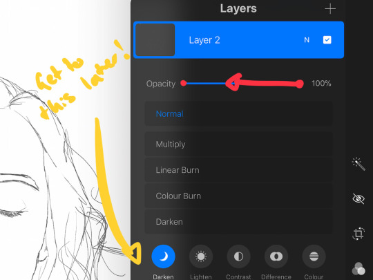
for more experienced artists experimenting with style just stick that bad bitch reference in the corner, then open a new layer and sketch in your own style.
when it comes to sketching i usually do little flicky lines. i do this with a mid grey (like 50% white 50% black) i recommend the “Narinder pencil” which you can find by clicking the little brush at the top, selecting sketching and then selecting that bad boy. you can adjust size and opacity using the sliders to the side of the screen.
when sketching you just wanna get a rough idea of where you’re gonna do your eventual lines - don’t worry about it being smooth or anything just get down where everything goes
once you’re done you might have something like this:
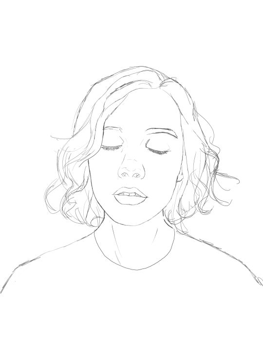
this brings us too...
2. LINE ART
for beginners - lineart is just a sexy word that means a clean drawing with hard lines so you can colour it easier and it looks prettier. you want to do this on a new layer so you can delete the sketch one later.
your goal with lineart is to make it three things: 1) its gotta be seamless so you can select the insides, don’t leave little gaps between lines 2) its gotta be smooth! jagged lineart isn’t NEARLY as sexy as smooth curvy lines 3) this one is more of a tip - but lineart generally looks better if you do thinner lines inside your shape with a slightly thicker border line. again this isn’t essential but i find it looks cuter
the way i get my lineart all cute is by using the monoline brush (found in calligraphy). sometimes i use my own modified version of the Technical Pen (found in Inking) but mostly monoline is pretty neat. You can use whatever brush you want but mostly you just wanna ensure that its nice and smoooooth. you can do this by selecting the brush and then clicking it again. this will bring up a popup menu like this:
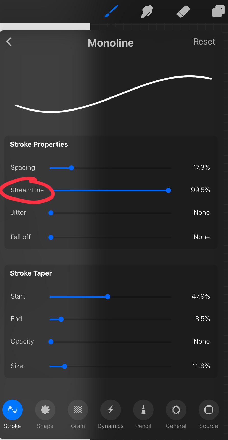
most of these brush settings are complicated and stupid and i’ll do a big post about it later. the only one that really matters here is streamline. if you wanna use a different brush for lineart just wack that slider up between 80-100% and you’re set.
once your lineart is finished on a seperate layer go to your layer menu and unselect the little tick on your sketch layer. you should be left with something like this.

3. ADDITIONAL DETAIL LINEART + MONOCHROME BASES.
once your focus lineart is done you can add detailed lineart by repeating the same process with sketching and lineart i described above. i like to do details separate because if i dont like it i can just delete the whole layer without destroying my focus.
what i find important in these now is using my favourite fuckin tool in this whole program. you can find it here:
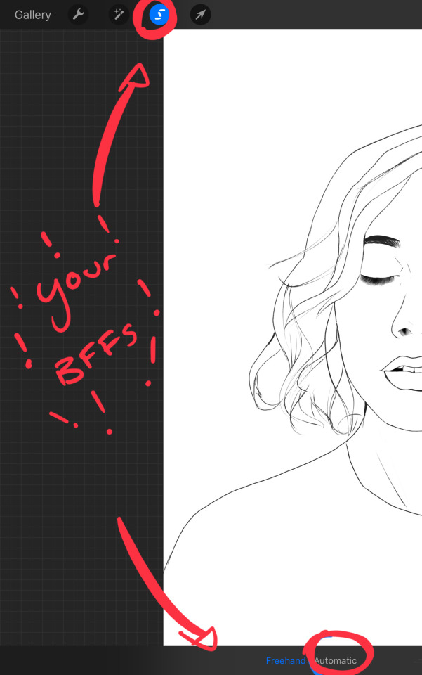
Only start using this once youre 100% done with your lineart. once thats done - make sure youre on the lineart layer and click that weird little s at the top of the screen. go to the bottom and click automatic. then select somewhere INSIDE your lineart. it should do something like this:
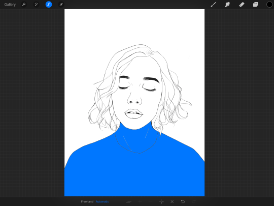
don’t freak out! what that blue stuff means is that you've just selected the inside bit of your lineart. continue selecting until your subject is 100% coloured in.
MAKE SURE THE BACKGROUND/STUFF OUTSIDE YOUR LINEART ISN’T SELECTED. ALSO MAKE SURE YOU’VE SELECTED THE LINES THEMSELVES. THEY WILL TURN WHITE ONCE THEYRE SELECTED. if u fuck up and select something by accident that’s all g, theres a little undo button on the bottom. if you click on the paint brush or another tool and you cant add stuff to your selection you can reload the mask by holding down on the weird s and the selection will reload. If there are certain bits of your work that you’re struggling to select with automatic selection that’s also not an issue. just click the “freehand” setting next to the automatic setting on the bottom and you can now use your stylus to draw around what you want to select.
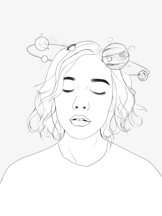
once you’ve selected your foreground in its entirety - THEN click the layer button. insert a new layer underneath your lineart layer. Using literally any brush (works best if you get one from the painting section) colour EVERYTHING white. just get round brush and colour all of it. you wanna keep your line art layer separate over the top.
once all of it is coloured hold down on the weird s tool until it reloads the selection. then look along the bottom of the screen and click the little button that looks like 2 arrows pointing at each other. THIS INVERTS YOUR SELECTION. Open a new layer and make this entire thing a grey. THIS IS WHOLE STEP IS OPTIONAL BUT ITS SUPER USEFUL AND THE SELECTION TOOL IS SUPER HELPFUL FOR GOOD ART. DOING THIS WILL BE SUPER USEFUL WHEN YOU COLOUR STUFF LATER.
once you’re done it should look something like this:
4. BASE COLOURS
okay so this is where shit starts to get real. The goal of putting down base colours is to make is easier to add eventual shading to your piece and decide your colour scheme. This is where the white layer you just used is gonna become your BITCH.
you wanna start by duplicating your white layer you just made. You do that by opening your layer menu and swiping that thot to the left. this is what should happen:
click duplicate. Select the top duplicate you just made and select our favourite weird s tool. click inside your shape and the whole white shape should go blue (become selected). next, open a new layer on top of the white layer. colour in your base colours and now none of it can go outside the lines. you didn’t even have to do a billion selections. you just select inside the white blob on the layer we made the step before, opened a new layer and started colouring. fucking superb. so much time saved. DO YOU KNOW HOW MUCH I USED TO SUFFER BEFORE I THOUGHT OF THIS. HOW LONG I SPENT SELECTING AND RESELECTING I CANNOT
A TIP FOR PEEPS NEW TO THIS PROGRAM - if you use your finger and hold down on a colour you’ve just used it acts like an eyedropper tool so you can pick up any colour you want. like this:

once you got your base colours done you can either: 1) go to your grey layer you made in the last step and select the tick next to it. once you’ve done that scroll to the bottom of your layers and select background. it will open a colour wheel. pick your background colour. 2) you can use my second favourite tool from this program! go to your grey layer you made in the previous step. click on it, then click on it again. (not the little n just click the whole layer) this menu should pop up:

oh MAN okay so. “alpha lock” pretty much means that it locks whatever is on the layer. when you get another brush and go over a layer with alpha lock turned on you can only paint over what you have previously put on the layer before turning on alpha lock. Its like automatically selecting everything on the layer. its fucking brilliant. anyway. scribble over your grey layer (once alpha lock is on) and boom you have a base for your background.
NOW YOU KNOW ABOUT ALPHA LOCK YOU GO BACK TO YOUR LINEART LAYER. SELECT ALPHA LOCK. COLOUR IN YOUR LINES ROUGHLY 2 OR SO ISH SHADES DEEPER THEN YOUR BASE COLOURS
(minus eyes i like to keep the lines around them black.) this will make your art like 100000000 times nicer (majority of the time)
once you’re done you should get something like this:
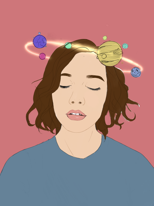
this brings up to...
5. SHADING!!!!!!! this is my favourite step tbh.
what you wanna do is chuck on a new layer over the top of your base colours. and go into your brushes. pick up your basic bitch “round brush.” this is (in my opinion) the best painting brush in the program. Its the thing you can do the most with. so what you wanna do it get a slightly deeper colour from your colour wheel by yeeting your colour selection slightly more saturated and slightly more dark. dont just make it blacker move your colour selector on a diagonal to get a nicer colour. (i’ll eventually do a colour theory ref but today is NOT that day.)
i like to do colouring in short, light strokes. DON’T PRESS TOO HARD. you wanna get that cute little gradient.
A THING FOR BABY ARTISTS: on every art program i have ever used, the blending tool SUCKS. it makes paintings UGLY AF. (wow another tutorial i have to do at some point. i HATE the blending tool. SO HERE IS HOW I COLOUR MY ART TO MAKE IT LOOK, YKNOW, GOOD:
Unless you’re drawing something SUPER freaking smooth like a bubble or some shit. when you wanna blend colours what you gotta do is: 1) put in your darker colour. 2) use your finger to bring up the eyedropper tool to select a mid colour of the colours your blending together - a mix between your lighter and darker colour. (remember that tool? it looks like this)

3) Paint the colour you just made in the middle of your lighter and darker shades. REPEAT THIS PROCESS ON EITHER SIDE OF THE COLOUR YOU JUST PUT DOWN TILL IT LOOKS GOOD. The result is an WAY sexier piece of art.
once you’ve put in all your shadows repeat the same process with highlights.
FUN TIP: if you decide you dislike a colour or want to change the colour you already did all the shading for you can change the colour without any major drama. You can do this by select ing the colour on your colour wheel you would like to change your already shaded work too. (make sure you’re on the right layer.) then hold down on the colour dot on the top bar (next to your layer settings) and drag it to whatever you want recoloured. let go of the dot and it should recolour your work (including all the shading you’ve done granted that its on the same layer) like this:
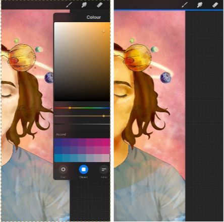
once you’ve got all your shading done it should look something like this:

6. background and pretty bits
so! youve got this kickass work but nothing surrounding it. lets fix that.
In procreate there is SO MUCH you can use to spice up a work. a SCARY amount even. this is when layer settings are gonna start to come in handy.
ill do a masterpost on procreate brushes for backgrounds later, but for this piece what im gonna do it head over to the Luminescence section and pick up a “nebula brush”. this makes a complex galaxy kinda design in a randomised stamping pattern that is frankly SEXY AS ALL HELL. Select a layer below your base colours but above your background colour. IMPORTANT NOTE: this brush’s blend mode is autimatically set to “add” (ILL DO ANOTHER POST ON THAT LATER)which means if you go over the same spot heaps of times it will eventually go a bright white. This can be nice, but its not really what i want cause its kinda intense. to make this thing go glowy but not ~too~ glowy im gonna lower the brush opacity (the bottom slider) to around half way. i set my colour to a light yellow and a darkish pink and put in some nebulas!!!! once that was done I wantd to add some more colour variation so i popped open a new layer - selected the lightleak tool and lowered the brush opacity using the slider to around 20% just to spice some shit up
you can kinda do whatever you want for your background. sometimes its nicer just to go into artistic, select a random brush and draw a square underneath what you were doing. backgrounds can be super detailed or super easy it doesn’t really matter to be 100% honest.
THE PART 2 OF THIS STEP WILL ADD HEAPS OF DIMENSION TO YOUR WORK AND MAKE IT SUPER PRETTY: adding light effects over the TOP of your main subject often creates a more realistic sense of depth. In simple terms it just makes the thing look more 3D and nice. to do this, get a random brush with a nice (preferably light) colour. i picked up a “bokeh brush” from the Luminescence section. make this pretty big. sprinkle your brush across the page on a NEW LAYER above all of your work so far, including line art! Then open your layer menu and click that little n in the corner again. Remember this one:
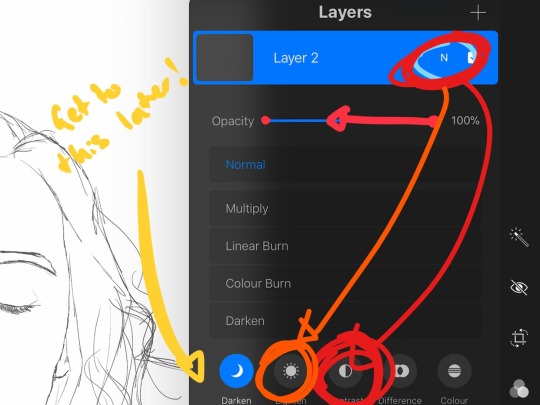
click the little n. then go down to the bottom and select a layer setting from either of the 2 groups circled (i normally like overlay for this type of thing) you can mess around with layer settings and opacity till you find something that looks super nice. My piece now looks like this:

pretty cool right. now we’re gonna make it EVEN COOLER.
7. LIGHT FILTERS
this is something i picked up from artists like softmushie and cryptidw00rm. (not gonna @ them here cause they probs dont wanna get tagged in my shitty tutorial thing but yeah i owe so much to those two especially)
for those unsure of what im talking about: light filters are layers you add over work to make the lighting on it seem more natural and pretty. you do this by colouring over your natural highlights and shadows with different colours and then messing with the layer settings to make it seem like its being hit by sunlight. these layers go BELOW your foreground stuff (the bokeh lights from step 6) but ABOVE your lineart.
start by opening a new layer. select a colour similar to where the green outlines are here:
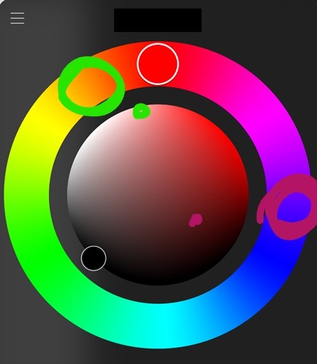
now on this layer paint over anywhere where the sun or other light source would be normally hitting (like cheekbones hair etc.) this can be kind of like shading. dont worry if it looks shit at first we’re gonna change it.
open a new layer beneath the one you just made. Using a colour similar to one circled in purple above colour over all the shadows in a piece. it should now look like this:
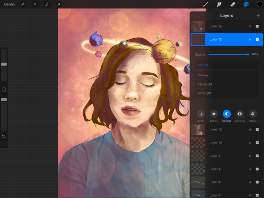
now open your layer settings on the purple/darker layer by selecting the N like we did with the foreground layer before. you can play around from here by setting the layer mode to anything from the “darken” or “contrast” menu. For this work i chose overlay. I then lowered the opacity until it looked nice.
Repeat the step above with the lighter highlight layer. when adjusting this one make sure you set the layer mode to anything from the “lighten” or “contrast” menu. For this work i did hard light.
your peice should now look kind of like this:

AND YOU’RE DONE!!!!!!!!
look at that sexy thing you just did. Congrats on creating an awesome peice of art!!!!!!
if you guys are interested in more tutorials like these or have any reqs for similar stuff send me a question or a dm to my blog @plasticbattleaxe
if you create anything by following tutorial that you want me to see don’t hesitate to tag me or submit it to my blog!!! i love seeing y’all make art
also - i know it’s annoying - but reblogs > likes. thanks for your support
i hope someone finds this useful!!!!!
#reference sheet#art reference#reference#art ref#procreate#procreate ref#zoeyeets#plasticbattleaxe#plasticbattleart#layer ref#art tutorial#art studyblr#art tips#ref artist#tutorial
1K notes
·
View notes
Text
AMA Transcript: A Lack of Armor
Last week, we held our first AMA in the discord chat with @amberlehcar, @peregr1ne and @thesockswhowearsfox, where lots of people stopped in to ask about their work on A Lack of Armor! Here’s some of what went down:
Q: Amber, could you take me through your process of conceiving/planning out this fic? What inspired it originally?
AmberLehcar: Oh man okay, so there was a post floating around that was like "I headcanon Soul as trans and here's why" and I just really dug it.
Peregrine: Wait, was it mine?
AmberLehcar: I don't remember who it was, but they said things like him being hypermasculine to appear more "manly."
Peregrine: I did say that in mine. That's crazy.
AmberLehcar: This was supposed to be for last year's Resbang, so I've kinda forgotten exactly what was all there, but it probably was yours.
Q: So what you are saying is that you and Pere were destined to work together?
AmberLehcar: Pere claimed me last year too! I had to back out after fic claims because life was becoming too much.
Peregrine: I mean you did come to me before that.
AmberLehcar: I did ask Pere a lot of questions. I'm cis/het, so I had a lot to learn and was really lucky that Pere was open and willing to teach me along with being an overall great partner.
Peregrine: I tried my best ^^; It's not like it was hard, just talking about myself pfft.
AmberLehcar: It was helpful though!
Peregrine: I'm glad it was. Was there more you wanted to say about the process?
AmberLehcar: I did a ton of research and was really invested in it. I see a lot of posts about the lack of representation for the LGBT+ community and really felt like I wanted to add.
Peregrine: Yeah, lack of representation really gets to me, especially because what representation there is is highly fetishized and honestly i'd rather have no rep than fetish rep.
Q: For all parties involved, where/how do you feel like you grew the most during this Resbang?
Peregrine: This was my first event where I did more than one fic, so working through that was hard, but I'm glad I did because I really wanted both.
AmberLehcar: I think when I've written in the past, I've been really "this happened then this happened" etc. It was a lot more introspective this time around, so I focused a lot more on the feelings of the characters and evoking feelings in the reader. When I tried to enter this last year, I got to like 6k words but really struggled to get there. With a new direction, I got to 30k fairly easily.
Sox: Well, it was my first Resbang and the first song I'd written since I was....18 I think. Just managing to write and record the song was a lot of growth for me.
Q: Amber, I am always interested in fic titles. Did you come up with the title of your fic beforehand, or did it develop as the story was created?
AmberLehcar: Okay, so I take all my chapter and fic titles from songs or lyrics. But A Lack of Armor made perfect sense to me because of my therapy. A few times in therapy we'd talked about putting on armor that was representative of support and good things in my life. The song "A Lack of Armor" has a line that says "like a knight without his armor I don't know who I am" and this all kinda spoke to me and fit really well with Soul and his depression/anxiety. I came up with the idea pretty much from the start and it's been with me since.
Q: You said it was a Motion City Soundtrack song, right?
AmberLehcar: All the chapter titles are from MCS songs, because I am trash lol. But they sorta go with the mood of each chapter if you go back and look at them.
Sox: Can confirm Amber is MCS trash.
Q: There's a sick playlist somewhere right?
AmberLehcar: I do have a playlist! https://open.spotify.com/user/1266385830/playlist/3xN37XwvUGsVqZNuhpRtng
Q: Most of the time it seems the usual characterization for the Evans fam is for Soul's father to be the 'worse' parent, either that or both of them being equally bad. (At least that's my view.) So I am wondering: was your decision to make Soul's dad the more accepting one an intentional subversion or did it just happen?
AmberLehcar: It just sorta happened? I am not a Mama Albarn fan. Aside from Marie, there are no good mamas in the series, so I just kinda went with that.
Sox: Blair begs your pardon.
[insert chorus of screaming about everyone's love for Blair]
AmberLehcar: Blair takes such good care of her kittens. Okay I lied, Blair and Marie are good. But yeah, I didn't want him to have absolutely no support from parents, and someone had to have taught Wes to be a good person. So Papa Evans eventually came around.
Q: For Pere: was there a scene that you knew immediately you wanted to illustrate and/or was it difficult to choose scenes to draw?
Peregrine: I definitely wanted to draw the first hug scene when I read it, when Maka was accepting, because the feelies. And then later Amber had mentioned how there was going to be a scene where soul plays his song for Maka, and I knew I really wanted to draw that too, but it wasn't written yet, so I asked her to describe the scene more for me in advance so i could draw it. She didn't have a solid idea though, so some stuff I made up, and she wrote the scene to fit my picture later actually ^^;
AmberLehcar: Your art definitely helped flesh out the scene there, thank you.
Sox: I love when Pete draws things.
Sox: *Pere
[Lots of people yelling about Pete]
Sox: God damn it.
Peregrine: The first pic with the hair I also just thought would be cute to draw, and then just for visual concepts, I wanted to draw the different stages of Soul as a bonus even if they didn't actually ever appear in the story ^^;
AmberLehcar: That first pic with the hair cutting is probably my favorite. I love them all, but that just made my heart flutter.
Q: Sox I have sort of the same question for you, did certain scenes inspire certain lyrics?
Sox: Uhhhh no not so much. I tried to write around the Mood of the fic and I talked to a local Atlanta musician about her experiences being trans with a bad family as a kid and tried to fit those to where Amber had Soul coming from. (Originally I was trying to write a SoMa Romance song but then... it came out as a Self Love Fuck you Mom song).
AmberLehcar: I'm glad it changed. At some point when writing I realized the fic was more focused on their relationship than him, so I tried to change it up. I'm glad the song evolved that way too. After I got one of the last drafts of the song, I included it in chapter 8 in case people were wondering.
Q: For Amber: what made you want to put Kim as Soul's neighbor out of any other character? What made you want to do the neighbor sub plot in the first place?
AmberLehcar: Representation mostly. I love me some JacKim and thought that having a grump next door that Soul ends up kinda befriending and/or helping would be interesting. Kim was kinda a weird facet for me to write through. As someone who feels everything 110%, being in love can be kinda scary sometimes, so her thoughts on love are pretty darn close to my own: wanting to love someone wholeheartedly but being afraid of exactly how deeply you can really love someone.
Sox: I FEEL.
Q: There's a scene where they're watching a Youtube video. Is that video significant to you in some way, Amber? (https://www.youtube.com/watch?v=5wWBLbQInqk)
AmberLehcar: Not at all. I was talking with Brian about assignments for the first day of class, and he mentioned he had to do that exact assignment and chose that exact video. The song's not bad and the video is... interesting?
Q: For Pere: What program do you use and whats your general process for art?
Peregrine: I use FireAlpaca because it's free lol. I usually do like, a base sketch that's really scribbly and focuses on like motion lines, if that makes sense. And then i decrease the opacity of that one and draw the actual lineart on a different layer on top, and then colour. Very rarely I'll keep drawing on the base sketch and just clean it a little but that's mostly for more actiony gestural stuff, or highly detailed things where I'm not bothered about solid lineart.
Q: How long-ish did each of your drawings take? Do you tend to draw faster when you're feeling inspired, do you have a creative process or anything?
Peregrine: Ah, I never know what to say when someone asks how long it takes, because it varies so much. But yeah, usually a drawing will take a few days if it's something average and not like the fricking Pacific Rim art I did way back when, which took like a month. I can do most pieces in a day if i'm properly inspired but it's like: yes, I can get this done in only a few hours, but those are completely straight drawing hours - no food or bathroom breaks or chit chats to be had. Honestly the longest part of the drawing process is actually the sketchy first part because I need to plan it out perfectly until i can see the end product in my head and then i can start actually working, and that can take weeks.
[insert group yelling about how great Pere's art is]
AmberLehcar: The boys brought me to literal tears every time they updated me.
Sox: Lies.
AmberLehcar: EVERY TIME.
Peregrine: I spent 5 hours drawing Soul's hair even though I finished the entire rest of the picture in 2.
Sox: I just had a mental image of Pere screaming the lyrics to Maroon 5's "Misery" while drawing.
Peregrine: That's me.
Q: For Amber: what were your easiest/hardest scenes to write & why?? Were there any that were easier/trickier to write than you expected? Bonus: favorite scene to write?
AmberLehcar: All of chapter 4 is crap and I'll fight anyone who disagrees with me. For some reason writing just general happy, normal life was really hard. The pain though, that was kiddy stuff. The first full scene I wrote was Soul's accidental confession. The idea just messed me up and I couldn't stop writing until it was all done. It's probably my favorite scene too, followed closely by Maka's acceptance.
Q: You super did not write linearly. That's so cool, I have to go in order.
AmberLehcar: No, I rarely do.
Peregrine: Man it was kind of tough reading your drafts, tbh.
Sox: SAME PERE
AmberLehcar: I'm so sorry!!
Sox: "How am I gonna write a song none of this is in order" XD
AmberLehcar: I need to give people an instruction manual for how to read my WIPs.
Peregrine: There were so many scenes that were like, great scenes on their own, but then I'm like wait, how did we get from point A to point ? Also, reading updates was hard because everyone else I've fic'd with was like 'oh just scroll down to wear you last read' but in this fic it was like... I know something was added... but where tho...
Sox: Slide to the left
Sox: Slide to the right
AmberLehcar: Never beta for me, it's a nightmare.
AmberLehcar: (That's a lie, please always beta for me, I need all the help I can get.)
Sox: Yeah but working with you is a dream tbh.
AmberLehcar: The nice thing about not writing linearly is that I could really easily work with my partners to add in ideas they had. I don't know that it was easy for them, but making it more of a collab that way was really neat for me.
Q: Do you outline everything out beforehand?
AmberLehcar: As much as I can. I derail if I don't.
Q: AmberLehcar, how did you decided where to put scenes/order them?
AmberLehcar: I have an outline template I wrote up based on a youtuber's outlining method! https://docs.google.com/document/d/1eP73LMnphqEUn20mKd78_EB_qPlbXjklvkXLknxl5R0/edit?usp=sharing. This is the outline that I've been using recently, it's been really helpful. You guys are welcome to use it!
Q: Amber, would you say this outlining method helped? Just in comparison to past fics etc.
AmberLehcar: Definitely. I have so many incomplete fics simply because I didn't outline or didn't outline enough.
Q: So was the end planned? That is the hardest part for me.
AmberLehcar: More or less. It definitely changed a lot. I don't have any versions of the original ending, and there's still stuff from the finished product I don't remember because I literally finished at 3 a.m. the day of posting. I always have a very clear image of how the opening to any chapter or fic goes, but the end is always weird.
Q: Do you remember anything from the first version? How'd they differ?
AmberLehcar: I know the first half was a little different at the start of Resbang last year, but I have the worst memory... There was definitely supposed to be more NB Crona. Crona was supposed to be kinda the comic relief, making comments about their computer sciences classes that Soul does not understand. They named their laptop Nora and talk about it like it's a person. "Sometimes when Nora doesn't do what I want, I have to hit her" or something like that, make Soul concerned for this poor child. The "octagonal day" joke made it to the final cut. I think there was a scene at the end where Crona and Soul were supposed to be good friends after the "there's 10 kinds of people in this world, those who understand binary and those who don't." Because it's a math joke and a binary joke.
Sox: Amber Sox: Is Sox: A Sox: NERD
Q: What was the funnest part of the fic for you to write, Amber? Or the part you were looking forward to the most?
AmberLehcar: Writing Black Star was fun. There's a few one liners that I love. My favorite bit is when Maka asks for his name and the next bit is "Nervous. Stupid. Sweating." I needed that smooch like life itself. I played with them kissing when Maka apologizes and they made up, but it didn't feel right. So I saved a sweet normal smooch for the end scene.
Sox: I literally cackled out loud on a train reading "no party like a floor meeting party because a floor meeting party is MANDATORY."
AmberLehcar: That was one of my other fave lines. My goals for the fic were representation, make it as realistic as possible, and make people feel things. I like to think I did a good job?
Sox: You accomplished all.
Peregrine: Man the parents thing hit me so hard, you did a good job.
Q: I'd love to hear about your process/writing rituals?
AmberLehcar: When it was a scene I was particularly excited to write or just suddenly inspired, I can just sit and write. But most of the time it's me sitting at the computer with tea asking myself why I do this to myself and then I just make myself write.
Q: Is there anything else you wanted to add other than more NB Crona, Amber?
AmberLehcar: When Pere showed me art of Soul's physical progression, I kinda wanted an epilogue of Soul post surgery, but time and lack of confidence in writing it well... I don't think anyone understands exactly how nervous I was to write this. I waffled a while with "you have no business writing this, you are cis, please stop."
Peregrine: Nooo it's cool because you asked. I definitely didn't think I could write trans Soul but I hoped someone would, if they asked and did it right. Which you did.
Sox: One of my close friends is trans, and when I sent him Eden, I thought he was going to tell me he hated me. And then he didn't and I was v relieved.
AmberLehcar: I definitely wanted to be as respectful and real as possible. Again, representation matters, and I wanted to help create a thing I hadn't seen done in our fandom.
Sox: You did good.
AmberLehcar: I'm really glad. I stalked the boys' tags on their work along with my own, and someone had reblogged Pere's art and was really grateful for trans Soul. I was glad to be a part of that.
Q: Did you make any playlists or anything like that to get into the writing mood? Or headspace of a character?
AmberLehcar: For headspace, Soul and I are very similar. I too am a bag of anxiety and depression trying to pass as a human. A lot of my college and therapy experience went into the fic. There's little bits of me in pretty much everyone.
Peregrine: I have my trans boy song i listened to a lot pfft. It's from Treasure Planet.
Q: Ooo which song Pere?
Peregrine: I'm Still Here. If you look at it through a trans lens its super fitting. It's like my fave song ever.
Some additional post-AMA discussion:
Q: Amber, I think that's a sign of a good writer, to take from one's own experiences and such.
AmberLehcar: Write what you know, right? And what you don't know, you find out. The whole experience definitely gave me a new appreciation for the LGBT+ community, that's for sure. I knew some stuff, but I learned so much.
AmberLehcar: To go back and slightly change my answer for difficult scene to write, while all of ch4 was like swimming in syrup to get written, Mama Evans outburst was so difficult to write. There was just so much anger and I felt icky writing a lot of that chapter in general. Writing Maka having to purposely misgender him hurt.
Peregrine: I really liked the parents thing actually even though i hated it. It felt raw and real.
AmberLehcar: So much pain, the whole time I'm just like "why would I hurt my son like this???"
Q: Noticed you guys were still talking and guh I loved your collective art/story!!! I now know the gap between dimensions can't be breached because if it could I'd have reached through the screen and force-choked Mama Evans. I was kind of mad at Maka too though like... I can understand that Soul needed some time to himself, away from her, to really figure things out, but ;-;
AmberLehcar: Yes! Maka was an interesting situation to figure out.
Peregrine: Yeah I loved what you did there actually, because as much as I wanted her to be perfect, she wasn't perfect.
AmberLehcar: I didn't want her to just immediately come back like "sorry you startled me, let's get married."
Peregrine: As much as I want people to immediately accept me, they don't, even if they do eventually. It wasn't fantasy perfect world, it was real world.
Q: I think... that's good. At first I thought Maka would be more likely to start off rough around the edges and then end the story gracefully. But the more I thought about it, the more I realized that if you're going to relate realistic stories about trans people/anyone in a similar situation, you probably have to... I don't want to say "break the reader's heart" because that would imply that those stories can't have happy endings, which they can and should at least as often as any other kind of story, but it put me in Soul's shoes and made me accept how likely it is that someone who is trans/lgbt/otherwise oppressed will be badly hurt by someone they think the world of, someone who's hard to leave behind. I dunno if I spoke out of turn there, but i think it was an empathically-written story. In my inexperienced opinion.
AmberLehcar: That's definitely what I was going for. I wanted Maka to be his closest friend, for his sake and for my shipping heart's sake. But she was just too good to be true when I was writing her, so her running away happened. I was so stuck after I wrote his confession, I didn't know how to have her react. But when I thought about some of the internalized transphobia I know I've been guilty of, it made sense to add for her. It felt real.
Look out for some more transcripts, coming soon!! Thanks again to Amber, Pere and Sox for their awesome AMA <3
6 notes
·
View notes