#button because it shows a picture of the pdf but without any of the stuff you wrote on it and i wanted to check if it was still on there.
Explore tagged Tumblr posts
Visit Tumblr Blog
Explore Tumblr blogs with no restrictions, modern design and the best experience.
Last Seen Tumblr Blogs


Fun Fact
Total funding amounts to $125.3M.
Text
what really adds insult to injury about being repeatedly turned down for a higher position by my employer is that the online application process they use sucks so bad that it makes me want to kill myself every time
#missingno.exe#you have to use an online application to fill out a pdf for the job application#instead of just downloading a pdf and filling it out however you want and re-uploading it#so i have to fill out the ENTIRE THING every time and you can't save it and go back and apparently if you finish it and then hit the back#button because it shows a picture of the pdf but without any of the stuff you wrote on it and i wanted to check if it was still on there.#but i guess you shouldnt do that but it was like oopsy woopsy you can't go back to the pdf but also can't go forward to the page where yo#u upload your resume and cover letter#so now i have to start the fucking thing over again whatever i'm not mad about it!!!!!!
9 notes
·
View notes
Text
Merry Pitchmas!!
@chloebeale , Merry Pitchmas! I’m so glad I get to be your secret Santa!! :)
I hope you like this and have a great holiday:)
Everything I Need is Standing in Front of Me
Read on Ao3
“World tour!? Posen! Are you fucking kidding me?” Beca Mitchell shouts as she looks at the blonde across the room, who just gave her the news.
“Yeah, I mean a small one, but you’ll be doing a couple of shows in Japan, then some places in North America, and then go to Europe. This’ll be your last bang before your ‘hiatus’ right?” She air quotes the word ‘hiatus’ jokingly as she sits down on the couch in front of Beca’s desk.
“Hey! Don’t fucking make fun of my planned hiatus. I need a fucking break, and last time it didn’t happen was because a sudden idea hit me and wrote this album, and the rule is, release an album, go on tour. I had to get it over with anyways.“ The short brunette had been planning to announce her break from being in the media every single day when she had finished touring for her last album,
“Okay okay, I’m sorry.” The blonde chuckles. “But it’s a shorter tour. Besides, the company said you can take the private jet. And, my friend Chloe is in Japan teaching English and we can go see her.”
“They better fucking let me.” She groans, getting up from her chair and leaving her office, shaking her head. “I need more coffee. Your friend has to be super fucking awesome if I’m gonna have to meet her. I don’t want to meet any of your super boring friends again Posen.” She chuckles.
“Get me a cup! Thanks!” Aubrey shouts turning her neck.
“Fuck you! You’re supposed to be doing this for me!” She shouts back. Her voice echoes through the office, and the employees look up at her. “What the fuck are you guys looking at?” Beca snaps at them. She usually wasn’t this mean. All the album press shit was getting to the musician, they could cut her some slack on her.
The brunette gets a cup of coffee for herself, and the blonde, walks back and hands her the mug before sitting back down in her chair.
“Thank you Beca-boo.” Aubrey giggles before she takes a sip. “Hmm… You know me so well.”
“Yeah, and you’d kill me if I gave you the wrong kind.” Beca scoffs as she moves her computer mouse, turning her desktop screen on and looking through her emails. “Ugh..” She groans at the number of emails that she has.
“I have most of them read through. I just need you to go through them and check them. They’re basically all brand deals and all the other stuff you’ll be doing during the tour. I’ll send you a pdf of the itinerary and the schedule of the other shit you have to do.”
“God, I don’t know what I’d do without you Posen.” She says as she sips her coffee. “I have to post something on my instagram today right?”
“Yeah, right. And you still need me to list everything you do in the beginning of the day.” She rolls her eyes. “Yeah, and you better make it something entertaining. A picture of a pile of pop tarts wrappers is not quality content.” She once again rolls her eyes and looks at the brunette with a death glare.
Last time Beca had to post, she posted a picture of a pile of the breakfast pastry wrappers and a simple #adulting, and her manager was not happy with it. She had said quality content, wasn’t that some? Aubrey tells her to be relatable, and not too glamorous. Her marketing tactic was for her to be down-to-earth as she could be, so that her fanbase could feel closer to ‘Beca Mitchell’. Wasn’t pop tarts relatable? The only reason that the blonde had let her get off the hook was because Kellogg’s had offered them a brand deal. And still, she got shit for it from the manager.
“You literally live with me! You could’ve taken a picture of me devouring the pop tarts. Would that be enough for you?” She says as she finishes her coffee. “I don’t know, or whatever.” She raises her hands in the air in defeat.
“Then it’ll look like a PR thing! We want fans to think you’re actually putting effort into it.” She says as she gets up from the couch. “Last one to the car has to cook dinner tonight!” Laughing as she dashes out of Beca’s office to the car.
“Hey! Thats not fair!! DUDE! NOT COOL!!” Beca gets up from her seat and grabs her bag, stubbing her toe on her desk before she can exit the office. “FUCK!!”
When she gets to the car, Beca already knows she’s cooking dinner tonight. “So what are you cooking?” Aubrey grins as she asks the brunette. She starts the car and drives out of the basement parking lot of the record.
“Fuck you!” The shorter woman says and then realizes that her mug is still in her hand. “Fuck! Now I’m gonna have to remember to take the mug back to the office for the 1000th time.” She groans.
“Beca, can you stop cursing every single time you open your damn mouth? Maybe you should leave the cursing for the bedroom. Or do you just not need that anymore?” Aubrey casually, and cruelly says to her with a smirk.
This leaves Beca speechless.
They discovered their growing sexual tension for each other about a couple of months ago, a couple of weeks after Aubrey had officially moved into Beca’s too-large ‘bachelorette pad’.
The blonde had been staying over in the brunettes spare bedroom for more than a couple of weeks, since she had started to grow tired of having to go to the apartment every single day in the morning to wake her up, and take her to work. Beca had just told the blonde, “You can move into the other room if you want.” In which the blonde replied with a “I can move in!? You mean you want me to move in so I can take care of you every single fucking morning!?” Which was true, and the blonde did not accept until Beca gave in and asked (aka begged) Aubrey to move in.
One particularly stressful night before finalizing Beca’s album track list, the manager had been up all night with her, both sipping on a glass (= multiple shots) of tequila. Usually, the blonde was long asleep before the brunette was, but on this particular night, she had decided to stay up with her, and keep her company until she was finished.
It was around 3am and more than half the bottle of tequila when Beca was finally satisfied with her track order and songs. The time of night mixed with the over the top amount of alcohol consumed had led them to start making out, then Beca leading them both to her bed and eventually leading to them having sex. It was the pent up frustration between them that made all hell break loose.
They woke up the next morning confused and wrapped around each other’s naked bodies, promising to never speak of this and never do this again. This promise which surprisingly didn’t last long, led to them sleeping with each other once again that following night. Since then, they had a non-discussed friends with benefits thing going on whenever was convenient for each other. They surprisingly did not grow feelings for each other, Beca having commitment issues, and Aubrey having abandonment issues from her father. Beca also felt that it was beneficial for her because this fuck buddies thing with her manager meant that she would have less gossip in the public.
It also seemed to even out the work relationship, since all the pent up frustration could be resolved in the bedroom.
Aubrey drives into the basement parking garage of their apartment and turns the engine off. While she was doing that, Beca was dashing out of the car. “Last one up cooks!” She dashes up and presses the up button of the elevator, and waits for it impatiently. Aubrey sighs and gets out of the car, and locks it, walking over to the elevator as it arrives. “I guess you’re still cooking tonight midget.” She scoffs as she gets in and presses the 21 button inside. Beca pouts as she sits on the corner stool. “Thats not fair!” She says as she waits for the elevator to get to their floor.
“Life isn’t always fair Beca.” The brunette laughs.
The elevator dings on their floor and opens, both getting off and going into their apartment. “Could I convince you to a different kind of meal?” Beca smirks and asks as she pushes the blonde on to the door after they get inside and places a bruising kiss on her lips.
“Maybe, we can see.” Aubrey says as she lets herself relax and get led into the bedroom. “I know we’re gonna get hungry and eat something later on.” She chuckles.
“Maybe, we can see.” Beca mocks her as she kisses down the blonde’s neck.
As soon as Beca gets to the blonde’s collarbone, she gets turned around by the taller woman and pushed onto the bed. “If you’re gonna be bratty, I’m gonna treat you like a brat.” She smirks and grabs the brunettes chin, and then let’s go, starting tp unbutton her striped shirt. “You know I don’t like it when you’re bratty Bec.” She calls her in her ‘sex only’ nickname.
“Fuck..” Beca mutters as she sits up a bit to take her jacket and the shirt off. Before she can lay back down, her bra is removed as well, and then a puff of the blonde’s breath hits her nipples. “Bree, I want more,” She tells her.
”If you were less bratty, we could’ve gotten straight to the point sweetie.” She chuckles as she teases Beca’s nipples with her fingers. She squirms under the blonde’s touch and lifts her hips, her hands reaching her back and holds on to the blonde. “Don’t you dare leave marks Beca.” Aubrey says at the nails trying to claw into her back. She lowers her hands down the brunette’s navel and then singlehandedly unbuttons her jeans before letting her fingers explore. “God damn it Bec…” She feels the pool of moisture between the shorter girl’s legs.
“I need you… fuck… please…” The brunette shivers at the contact. “Please Bree…”
“Well, since you asked so nicely..” Two digits enter the brunette, and a moan escapes her mouth.
“Fuck…. Bree..” It seems like ‘Fuck’ is the only thing that is able to be released from her right now. Her head is blank, and she feels the blonde’s fingers hitting just the right spot. She’s definitely gonna leave marks. She can’t resist but to dig her nails into the blonde’s back.
“I told you Bec. Don’t leave marks…” Aubrey says as she takes her finger out of the brunette and grabs her wrists. She grabs the handcuffs from the nightstand and puts one of the cuffs on the brunette’s wrist. “Hands up Bec.” She says and the brunette obeys, allowing the taller girl to cuddle her hands. “This is what you get for not following instructions when asked nicely.” She smirks.
“I’m sorry….” The brunette knows tonight is going to be a long one.
“If you’re sorry, why don’t you follow when I asked you nicely?” The blonde says as she enters the short brunette with two fingers and lays her thumb over her clit. “Huh Beca?…”
All the brunette can make out are moans and curses at this point, and she’s a whimpering mess, coming up to her release. “Bree… I’m gonna…. Fuck…” She shrieks when the blonde stops all movements and removes her fingers again.
“I never said you could come Bec.” She smirks again. “Do you want to Bec?”
“Yes… Please Bree….” Beca whimpers as she squirms. “Please…. let me come… Please…” She blushes.
“Since you asked so nicely…” The blonde says as she fingers the brunette once again, and kisses Beca for the first time since getting back into the house. “Come for me Bec…”She whispers in her ear just the way the brunette likes, and kisses her. The brunette shakes under her and reaches her climax.
“Holy shit… that was hot.” Aubrey snickers as she lays on top of Beca out of breath, just as much as Beca is.
“Damn…that was amazing.” The brunette breathes out and then her handcuffs clink. “Uhh.. Bree?…” She lifts her arms.
“Oh. Sorry. “ Aubrey giggles and gets the key from the nightstand and frees the brunette’s wrists. “Here ya go.” She chuckles.
“Thank youuuu.” The short girl says as she wraps her arms around the blonde. “Lemme make you feel good Bree.” She smiles and kisses her as she lifts her neck up.
She twists her body and turns and lays on top of the blonde. “There we go.” She smirks and kisses her. “You’re wearing too much clothes.” She unbuttons her pants and pulls her pants down along with her thong and throws it somewhere in the room. She unhooks the blonde’s bra and she flings it away as well. “This needs to go too.” She giggles and kisses the blonde.
They both fall asleep together, exhausted, and Beca wrapped in Aubrey’s warm embrace.
-A Month Later-
“You ready?” Aubrey asks her as she closes her last suit case. “You have the ear plugs you always bitch about needing on the plane. Right?”
“Yes General Posen. I have it in my bag. I just need to fit all this in.” Beca says as she tries to zip the suitcase up.
“You know you’re not going to college right?” The blonde chuckles as she rolls the two suitcases to the door. “We’re gonna go to Japan for a few days and then we go to New York, Detroit and Chicago. We’ll be home in two weeks Beca.”
“I know, I have to make sure I have everything, just in case.” She says as she zips the suitcase up eventually. “Plus, we might get homesick. I have some macaroni and cheese and some other stuff.”
“You’re hilarious.” Aubrey laughs as she rolls the suitcases to the door and checks her phone. “The car will be coming in 5 minutes.” She goes around the pad checking all of the lights and the plugs.
-Hours Later-
“OH MY GOD WE’RE LANDING!!! HELP ME!!! OH MY FUCKING GOD POSEN!” Beca panics as she feels the plane depends.
“Beca, chill the fuck out. You’re fine.” Aubrey grabs her hand and rubs her back. “We’re almost there.” She says to her as she gets up and sits in the seat right next to her. “You’re okay. Shh…”
The plane lands safely and Beca relaxes, letting herself lean on the blonde. “Thank god…” She sighs.
“I told you. It’s alright baby.” She lets the name slip.
They both don’t seem to notice.
“Now we’re here. Let’s go have some fun.” Beca gets off the plane and heads down to the car waiting for them.
“It’s like she wasn’t just freaking out abut landing.” The blonde chuckles to herself.
A few hours later, they’re settled in their hotel room and it’s the weird hours getting to them, and they’re getting hungry at 3pm.
“Dude isn’t there like a sushi place we can go to?” Beca whines as she sprays out on the huge bed,
“I bet there is, dude.” Aubrey rolls her eyes as she texts Chloe, asking for food recommendations in the area.
They were in the Ritz-Carlton hotel in Tokyo because of Beca’s sponsorship with major hotels one of them being Mariott, scoring her the best room at the hotel. Aubrey even got a connecting room which was a smaller suite but very nice nonetheless. Aubrey hoped her friend would know a good place to eat at in the tourist city, although the ginger worked in an area bit away from the city.
She gets a text back from Chloe, with a link of the location of the restaurant. ‘It should be super close to where ur staying!!’ She adds on to the link and also starts texting something again. ‘I could head over to Akasaka tonight, if ur free and not babysitting your celeb singer:)’
Aubrey chuckles and sends back a quick ’thank u Chlo’ and puts her phone in her pocket. “Hey Beca, if you want to go eat some sushi, we can go now.”
At that, Beca shoots out of bed and gets her stuff. “Okay! I’m ready!! I can go now!!” She says like a kid ready to go to Disneyland.
“Okay dude, let’s go.” Aubrey chuckles as she grabs the card key and leaves the room, following the brunette. They weren’t really supposed to go around that much without the group of bodyguards Beca had, but people probably wouldn’t really notice her as much as people in the US would, so Aubrey wished for the best as she entered the elevator.
They eat the sushi as they come down the conveyor belt.
“Hey Beca, my friend Chloe wants to come hang out with me tonight. Do you wanna go get some drinks with us tonight? I know you have no friends so I’m guessing you’ll come with?” Aubrey jokes as she eats her last sushi on her plate.
“Yeah. I guess I’ll go with you guys.”
“I know you want to. Just admit it Beca.” The blonde chuckles as she gets up grab another plate.
“Whatever Posen.” Beca grabs the cake that comes from the top part of the belt. “I could eat a million of these cakes and desserts.” She says as she takes a bite.
“Yeah. We can come back again soon. As long as you pay Mitchell.”
“Fine. But its like so nice, its like a dollar per plate, right? Thats pretty awesome.” She says as she finishes the cake. “I’m full now. You good now?” The brunette asks the blonde.
“Wait I want to have one of those cakes too! Go get a coffee or something.” Aubrey says as she orders a cake on the tablet on the table.
“Me too!” Beca says as she orders herself another cake.
A few hours later, they’ve gotten back to the hotel and now getting ready to go out again to see Chloe.
“Beca, you ready slowpoke?” “Just a minute!!” “Your eyeliner still looks horrible if you take 5 seconds or 3 hours to do!” Aubrey shouts back as she checks her phone. They’re supposed to be at some station nearby in 30 minutes. She knows that Tokyo is small but she needs to get there and its gonna take at least 20 minutes. “C’mon Becaaaaaaaa!”
“Okay! OKay!! I’m ready!” Beca comes out from the bathroom in some skinny jeans and the tank top. She grabs her blue flannel from her suitcase and pockets her phone and wallet.
“You look normal. I don’t know why it took how long for you to get ready.” The blonde rolls her eyes and grabs her hotel key.
They get to Roppongi station and then takes the train, they don’t know how they managed to, but makes it to Akasaka station. Aubrey sees her best friend in the exit and she starts running towards her, and she leaves Beca behind running towards the ginger as well. “Aubreyyyyy!! Oh my goshhhh! I missed you so much!!” The ginger hugs the blonde and picks her up with her enthusiasm.
“Chloe! I’m so happy to see you!!” Aubrey says as she hugs her back.
“You’re just gonna leave me in this huge station?” Beca follows behind and catches up to the two friends.
“Hi Beca!! Oh my goshhhh! Hi! It’s so nice to meet you!!” Chloe hugs the brunette excitedly.
“Chill tiger.. It’s nice to meet you….?”
“Oh… I’m sorry. I’m Chloe Beale! I love all your songs, I especially like Curious.” She smiles.
“Th-Thanks I guess…”Beca mutters.
“Are you guys ready to go get some food, and go get some drinks after that?” Chloe says as she grabs her phone from her bag and starts walking.
“Yeah. Let’s go. I’m starving. “ Beca says as she follows the ginger.
“You had food like 2 hours ago!” Aubrey chuckles as they all walk towards the exit of the station.
“Whatever, are you hungry Chloe?” Beca asks awkwardly.
“Yeah, the tiny humans were a bit crazy today.” She chuckles, “And I’m also always up for good food. But what kind of food would you guys like to eat? Like Japanese food, or Mexican, American? I don’t know, you name it, I’ll try to find a place.”
“Umm.. I don’t know.. Beca?” Aubrey answers and looks at the brunette.
“Uh… Are there tacos around here?” Aubrey laughs as Beca answers.
“Well, tacos it it I guess! Theres a really good place called Taco Rico in one of the buildings and I honestly cannot tell you how obsessed with it I am!” Chloe says as she starts walking.
“I’m so excited!” Beca says as she grabs her phone and takes a selfie video of her walking the streets of Tokyo. “Hey guys! I’m in Japan right now! Look at this! Isn’t this amazing??” She makes sure the whole view around can be seen and cuts off the video. “Happy now Posen? I’ll post it with dinner pics later when we get back to the hotel.”
“Yeah. Better than pop tart wrappers.” The blonde says as she grabs her phon snapping a few pictures of the city.
“I think the pop tart wrappers post was pretty cool. I think it’s an art form and also made me want some.” She chuckles.
“Don’t let her do this Chloe.” Aubrey groans.
“Thank you! I thought so too. It even got me a brand deal. So shut up Posen.” She sticks her tongue out at her. “I have some in my suitcase. Want some?” A small “Oh my god. What do you not have in your suitcase?” Can be heard from the blonde but the ginger doesn’t seem to mind.
“Oh my gosh! That would be amazing!!” Chloe says as she makes a turn. “Is it true that you have the biggest room in the Ritz-Carlton?” She asks curiously.
Beca looks at the ginger who seems to be excited as a kid in a candy shop. “Yeah. You wanna come see it? We can get drinks and stuff up in the room.”
“That would be amazing Beca!”
“You never invite anyone to your hotel room.” The blonde chuckles.
Making a turn and entering a building, Chloe cheerfully says, “We’re almost here!”
“Why can’t I just invite your friend over to my room?” Beca mumbles.
“I didn’t say that.“ Aubrey rolls here eyes as they enter the building.
“So, you basically check the menu and order your choice, subway style.” Chloe shows her smile. “They speak English so its also super nice.”
“Um… Do you have a favorite??” Beca asks the ginger.
“Umm…. I think I like the grilled chicken and avocado tacos. Basically anything is pretty good.” She smiles and gets in the queue to order some food.
“I’m gonna try one of the burritos.” Beca says as she looks at the burrito menu. She orders after Chloe and then waits for everyone else to order so that she can pay. “I got it.” She says quietly as she gives the cashier her card. They make small conversation, as it turns out, the cashier is a fan of the brunette’s music.
“Thank you.” Chloe smiles as she looks at Aubrey. “She’s cute.” She says to her best friend. The blonde makes a face. “What?” She chuckles. “I wonder if she’s good in bed.” Chloe jokingly says and winks, making the blonde choke on particularly nothing. “Oh my god Bree! Youre…” The red head says eyes wide with realization.
“You okay Posen? I can’t have a dead manager.” Beca chuckles, not having heard what Chloe had said earlier. “Where are we eating?” Beca asks the ginger.
“I dunno… we can eat here, or go outside and eat there.”
“We can just sit here and eat I guess.” Beca says as she sits at one of the tables.
“Okay. Sounds good to me. “ The ginger smiles as she sits down right next to the girl.
They eat their food and then leave the place to head back to the suite, buying some alcohol on the way back at a nearby convenience store. Beca has the best time there, spending almost $80 with snacks and drinks.
The trio head inside the hotel and into Beca’s suite. “Oh my god. This room is gigantic!!” Chloe exclaims as she walks around the room like a little kid. “Where are you sleeping Bree? On the couch??” She laughs as she sits on the couch.
“Oh I have a connecting room next door, away from this annoying one.” Aubrey says as she opens the door to her room. “See? I even have a room all to myself.” At that, Chloe jumps off the couch and rushes into Aubrey’s suite room, excitedly screaming as she explores the room. Beca laughs as she heard the redhead cheer excitedly at all the fancy things in her room.
“You know, there’s a tv in my bathroom.” Beca laughs and Chloe comes back into the room and runs to the bathroom and makes another screech of joy. “OH my GOSH!!” She says like an excited child. “This is amazing!” She takes another spin around the room. “Wow….” Now she’s left speechless.
“You can stay here tonight if you want.” Beca says to the ginger. “I can have them roll in another bed.”
“Or you can stay in my room.” Aubrey says quickly. “If you don’t want to stay with Beca. I’ll even let you sleep on my bed.” Aubrey says.
Chloes just stuck in awe, not even saying a thing at the offer from the two.
“I would let you stay in my bed, but I’m pretty sure Aubrey is about to kill me, so….” Beca gets a jab on the side from Aubrey. “Ow! You don’t have tp be so mean Posen!” She pushes her back, but Aubrey not even budging a bit. “Should we open some drinks and hang out for a bit?” She tries to change the subject.
“Oh, yeah. Let’s do that.” Aubrey says as she grabs one of the colorful cans from the plastic bags. “You want one Chlo?” She asks the ginger.
“…uh! Yeah! I’ll take one!” Chloe says as she grabs a can from the blonde’s hand. “You want one too Bec?” She hands the brunette a can. The brunette blushes as she takes the can from her.
“Thanks.” She says as she opens it. “Cheers I guess…” She says and the three clink their drinks together, taking a sip. “Wow.. this is pretty good.”
A few hours and a few drinks in, they all start tiring out. The blonde being the first one to retreat back to her bed at around 12am, simply telling the ginger to come stay in her bed if she needs to, and says goodnight to the group.
Chloe and Beca are still awake, sipping on their drinks.
Beca’s the first one to speak up after the blonde leaves. “So, how do you know Posen?”
“We met in college. Bree and I were in the Barden Bellas, an acapella group. We were co-leaders of the group and best friends. But tell me, how did she become your manager? I know she worked at capitol as a public relations assistant, but I was so surprised to hear that she became your manager.” She asks the younger girl.
“Umm… I don’t know. I got the chance to work with Capitol somehow, and she just became my manager. I think they wanted the public relations aspect to play in with my managing? I honestly don’t know.” She chuckles.
“I really like your music Beca.” Chloe says as she grabs a potato chip and pops it in her mouth. “Especially the mashups you make, BMCoda.” She winks.
It wasn’t a well known thing that Beca made mashups before her debut. Only some people knew her as BMCoda, her SoundCloud username. Some fans had figured it out, but not a lot, and the fact that Beca has never confirmed it publicly except the few hints she drops sometimes on instagram.
“How… how did you know that? Did Posen tell you about it?”She asks.
“Oh so it’s really true.” She says. “No. I figured it out. Your coda necklace, and your voice.” She points to the coda on beca’s neck. “I thought it sounded familiar. And you also stopped posting mashups a few months before your first single. I especially liked the one with Titanium and Bulletproof. That song is my jam. My lady jam….” She chuckles.
“Uh….oh… okay… that’s cool… thanks I guess…..” Beca replies awkwardly as she looks back into the ginger’s eyes.“Yeah. I just couldn’t find the time anymore.” She plays with the hem of her shirt. “My life was suddenly just so busy with all the press and shit… It drains you, you know… all the flashes, all the questions..” "I’m sorry…”
“No, it’s fine. I knew what I was getting myself into. It’s not like I’m gonna be here forever. I’m gonna go to the producing side. I mean, not right away, but soon. After this tour, I’m gonna take a break.” She sighs.
“What are you gonna do then?” The blonde asks taking a sip of her drink.
“I don’t know. Live schedule-less for a while. See where that brings me. Maybe travel? Who knows?” She shrugs as she pulls on the loose string of her shirt.
“Am I allowed to know this secret?” Chloe chuckles. “Aren’t these like top secret plans?”
“I guess I’ll have to kill you now.” Beca jokes. “Or make you sign an NDA.” She says as she grabs her drink.
“I’d rather sign that NDA if you have one. I still kinda wanna live.” She chuckles, putting her drink down. “So, what are you and Bree? I’ve never seen her that visibly jealous at me talking with you.” She says to the brunette.
“W-what!? What do you mean?” Beca stutters.
“Oh, even a blind man could feel see the chemistry and sexual tension between you. You know she likes you, right? She’s never told me, but I know.” The red head says to her.
“We’re not… We aren’t a thing. We’re just friends with benefits or fuck buddies, or whatever you wanna call it.” Beca says aloud for the first time.
“Bullshit. I know you have feelings for her too. You’re just trying to act like they’re not there. You two act like you hate each other, but it’s just you two protecting yourselves from letting feelings actually happen.” She says to the brunette. “You both are just to scared to say it.”
“I-I can’t tell her I have feelings for her, she’s my manager!” Beca says.
Chloe tries to shush her, but it’s too late. The door opens, and the blonde, in her pajama pants and a matching top comes into the room. “Feelings for who?….” She asks.
“Nothing! It’s nothing Posen! J-just go back to bed! I’m sorry I woke you up!” Beca exclaims as she gets up in a panic. “I-i gotta go to bed! Good night guys!” She runs to her room and slams the door shut in embarrassment.
“Beca! Wait….”Before Aubrey can say anything, the brunette runs to her room and doesn’t even hear a thing she says.
“Go, go tell her how you feel. I know you’re in love with her.” Chloe says to her best friend as she just stands between the door and the couch.
“I-I’m not….” Aubrey begins.
“Bullshit. Bree, that’s bullshit. Stop trying to protect yourself. I saw how jealous you were acting today when I was talking to Beca. When you love someone, you tell them. Even if you’re scared it’s not the right thing. Even if you’re scared that it will burn your life to the ground, you say it, and you say it loud and clear. And you go from there. Thats what you do. Now go. Go and tell her. I’m taking your bed tonight. Good night.” Chloe says as she leaves the room. Aubrey hears the lock click from the other side, meaning she had no choice but to go tell Beca.
She knocks on the door of the bedroom, takes a deep breath and walks in when she hears Beca say, “Come in.”
“I’m sorry I woke you up. I really am.” Beca says to her.
“I love you. I’m in love with you. I didn’t want to accept the fact that It was true because I was too scared. I’m your manager and I couldn’t risk anything.”She says in a calm tone.
“And I think you love me too. And if you do, tell me. Tell me and we can stop pretending like we’re always on each other’s nerves. And if you don’t, I don’t know, but…”
Beca’s never seen Aubrey ramble like that. “Bree… stop. I love you too.” She says calmly. “I’m scared. But I love you, I just do.”
Aubrey walks towards Beca, Beca gets up and off the bed.
“We’ll figure it out together. I promise. I’m freaking out too.” The blonde says as she kisses the brunette.
For the first time, it’s not just a kiss during sex. It’s a gentle, loving kiss. Beca melts into it and it feels like home. She lets her arm wrap around Aubrey’s neck and pulls them closer.
“I love you.” “I love you too.” The brunette hugs her a bit tighter, and it feels right.
“I know everything is in the wrong order and it’s crazy, but be my girlfriend? ” Beca asks the older woman.
It’s just then, Aubrey’s stomach growls. The two burst into laughter as the blonde opens her mouth. “Yes. I’ll be your girlfriend. But can we have some room service? I’m super hungry.” She chuckles.
Beca nods, going to the phone and picking it up as well as the menu and gives it to the blonde. “You pick.”
Thank god for 24 hour room service, because at 3:37am, the two have two full plates of warm breakfast foods, right in front of them. They quickly eat the food on their bed, and eventually fall asleep on the bed, talking to each other, catching up on all the things they’ve wanted to talk to each other about.
Chloe wakes up at around 10am in her best friend’s bed, without her in it. She gets out of bed and walks out of the room and into the living room area of Beca’s room to see that the bedroom door is in fact, open, and sees the blonde and the brunette, asleep, in each others arms. She goes back to the other room and sits in front of the TV snd turns it on, watching it until about 11:30, when the blonde comes into the room.
“Morning.” She says to the ginger as she sits next to her.
“Morning. How was it?” She asks her as she looks at her friend up and down.
“What? We didn’t do anything last night…” She mumbles as she turns red.
“Ew! I don’t need to know anything about you two’s sex life! I’m just asking how it went.”
“I told her. Thank you Chloe.”
“No need to thank me, just invite me to your wedding as your maid of honor.” She jokes. “I’m hungry. Can I order something?” She asks her friend.
“Yeah. Of corse. Whatever you need. I’ll just have my girlfriend pay for it.” Aubrey says naturally.
“Oh my god! Girlfriend!? Oh my god! I’m so proud of you!!” Chloe excitedly gives her a hug.
“T-thanks. I-I’m gonna go. Text me if you need anything.” The blonde says as she leaves the room.
“mm... Where were you?…” Beca mumbles as Aubrey comes back into the room.
“I was just talking to Chloe. You know, about last night.”
“Come back to bed.. I miss you..” Beca says as she looks at the blonde. “What did she say?” “She was very excited for us.” Aubrey gets back into bed with Beca. “Hmm… you’re warm…” She mutters as she kisses her head. “Tell me you love me again?”
“I love you Bree.” Beca kisses the blonde, twisting her neck.
“I love you too baby.”
36 notes
·
View notes
Text
MIDI MP3 Converter, MIDI WAV Converter, MIDI WMA Converter, MIDI OGG Converter Software program
MIDI to MP3 Maker can convert MIDI to MP3 format. AS far as freeware, I haven't got plenty of experience with stuff like zamzar, however they are supposed to be able to convert MIDI to mp3. I think about the software accommodates tacky devices that may play back the file, however maybe that is all you want. > I simply downloaded iTune earlier this evening, and was in a position to convert music that was ALREADY in the iTunes Library, however I do not know find out how to drag a Sibelius file to iTunes. Navigate to your WAV file that you need to convert to MP3 and press the Open button. That video made my point better than any of us could: mp3 to MIDI is mainly a pipe dream. Even with simple monophonic audio, the outcomes had been near useless. Convert to a thousand+ codecs, like AVI, MKV, MOV, MP4, and so forth. We hope you get pleasure from all the features we've put into our fast Direct MIDI to MP3 Converter. Go to and click on on Formats positioned on the upper proper window, go down to find Music Conversion codecs > MIDI. Then you can be relocated to a new window, here on your proper aspect, select MIDI to MP3. Free MIDI to MP3 Converter is a free utility to transform all your MIDI recordsdata to high-high quality MP3 music. Как скорость работы сети все быс��рее и быстрее, первый сайт помещен в музыке MIDI, давно высококачественных MP3 и WAV музыкальные файлы на замену. Textual content To Speech opens up a whole new world of vocal samples for your tracks. Kind in text or lyrics you wrote. Then export the audio file in MP3 for free. Cucusoft Final DVD + Video Converter Suite converts DVD's and movies to play on virtually any portable gadget. Midi Sheet Music is a transportable program (you don't have to put in it) that can play MIDI information, too, and midi to mp3 converter download for android it even exhibits you the sheet music in actual time because the audio performs. It additionally permits you to convert the MIDI file to sheet music which you could print or save to your laptop as either a PDF or in multiple PNG picture information. SolMiRe is a Free MIDI to Mp3 On-line Converter and Editor with superior midi to mp3 converter download for android options: no upload limits, 15 top quality instrument sets, backing monitor creation, karaoke assist, audio effects, tempo and pitch control. SolMiRe Midi Database consists of about 60.000 midis uploaded and transformed by our users. An MP3 file is an audio file format, so contains physical recordings of sounds that when played again on all units will sound pretty much an identical (relying on speaker high quality), like the way you retailer a music in your music library on your PC or www.magicaudiotools.com cellphone. Tip: If you discover that an software on your LAPTOP does try to open the MIDI file however it's the wrong application or in the event you would relatively have one other installed program open MIDI recordsdata, see our The best way to Change the Default Program for a Specific File Extension guide for making that change in Home windows. Delete: this may physically delete this file from inside storage or sdcard. You can not undo this action! Use this for cleansing up disk house by deleting unused samples for instance. Note you can delete any file, not simply audio files, so be warned. But picture codecs such asAI andEPS, or sound codecs such asMID andMUS, do not contain precise picture or sound info, however fairly the commands wanted to generate them. AnEPS of a sketch of the Mona Lisa would have the actual curves of the sketch in a format that the pc understands and can show to the user. The computer can manipulate every curve independently, even the place it overlaps different curves, with out disturbing them. Likewise, a MIDI file of the Fifth Symphony has tracks or channels for every of the instruments, and the notes and velocities and different instructions for each of these in a means the computer understands and may manipulate. You could possibly change the individual notes of a person instrument without affecting the opposite sounds that occur throughout the same time. You possibly can't try this with aWAV orMP3. Most probably, this topic is the results of each the audio or video format not being appropriate with Chromecast. Remember that the audio converter is trial-ware which permits mp42wma converter home windows you modify half of each audio file. Step 3: Copy the URL of the WMA file you must get hold of and paste it to the URL box. Then select the file inside the File Guidelines, drag it to the Drop Zone and drop it there. The sheet music is often a more difficult model than you expect. You could possibly quantize the MIDI file to make it more readable. I'm using the newest model of Winamp and am attempting to transform a few MIDI information to MP3. To get essentially the most from the converter we recommend making an attempt small recordsdata with only one or two instruments. If the sound of your information is too low or excessive, you can use the software to increase or lower sound volume. Helps remove vocals from most WAV or MP3 information or CD music for singing karaoke. Cucusoft PSP Video Converter Suite is an all-in-one PSP video conversion solution. Axiom is a GUI for FFmpeg , a command line software to transform multimedia files between formats.
1 note
·
View note
Text
Whatsapp [WORKING] Unblock trick for 2018
WhatsApp Tricks are the most searched term over the internet. It is the most popular messenger at present. Whatsapp provides fast delivery of messages and easy to use interface. But to be honest there is other site of this story too. If you want to read who is better hike or whatsapp then read the full ongoing battle on hike vs whatsapp. It will be good for you to understand these best whatsapp tricks then.

I will also tell whatsapp hack how to know someone block you i.e known as whatsapp blocking tricks among tech geeks. This trick will also help you to know how to unblock yourself on whatsapp latest version. Answer for “If someone blocked me on whatsapp how to unblock in new version?” Whatsapp messenger is available for almost all platform like android, iOS, symbian, Blackberry etc. It is also the first smartphone messenger which is also available for the non-smartphone platform i.e. Nokia Asha Platform. Currently GBWhatsapp is going very popular. You can also download GB Whatsapp App. Whatsapp has a large active user base which even beats the facebook record for most active users.
gbwhatsapp apkreal
This article whatsapp tricks will answer your queries like
whatsapp tricks and cheats whatsapp tricks whatsapp tricks and tips whatsapp tricks 2016 It also contains whatsapp tricks for how to unblock yourself on latest version of whatsapp without anybody knowing.
Awesome Whatsapp status Over the past few years whatsapp has grown exponentially. There are many whatsapp tricks which are not well known. These whatsapp tricks provides additional functionality over the traditional whatsapp messenger. Sometimes these tricks even provide you some functionality which whatsapp restricts in its whatsapp bundle.
Directly Go To [hide]
1 Best Whatsapp tricks collection 2 1. Prevent Double Blue Tick in Whatsapp Messenger-Whatsapp tricks 2.0.1 Concept behind Hide Stats App 3 2. How to Send files of different format like .apk & .exe, .pdf 4 3. Know How Many Member in a Group Have Seen Your Messages 4.1 For android users 4.2 For iOS device users 5 4. How to Unblock Yourself in WhatsApp tricks 5.1 The below trick is no longer working. I will update whatsapp unblocking trick if there is any in future. 5.2 How to unblock yourself on whatsapp new version?[Working in OCT 2016] 5.3 Thing you need to do to get this whatsapp trick ( Only 1 things.) 5.4 Like us on facebook 6 5. How to Prevent Your WhatsApp Media from Appearing on Media Gallery. 7 6. Try WhatStat for whatsapp 8 7. How to Hack the Conversation of Your Friend- Whatsapp Tricks 8.0.1 Steps for hacking your friend’s whatsapp conversation 9 8. How to Lock your whatsapp conversation 10 9. How To Create a Fake Conversation in whatsapp- Whatsapp tricks 11 10. How to use whatsapp without number? 12 11. How to make whatsapp free for lifetime? 12.0.1 Follow theseSteps for using this cool whatsapp tricks 13 12. How to hide sent image with other image ? Best whatsapp tricks 14 13. How to change your friends profile picture through your phone? 15 14. Use multiple whatsapp account in a single phone 16 15. Send Bold, Italics Or Strikethrough Text In Whatsapp Best Whatsapp tricks collection Here we have collected some of the best collection of whatsapp tips & tricks you might not aware of. I bet many of these whatsapp hacks and tricks will be rarely known to you. Try these on your smartphone you will certainly look stunned :). Many users are searching for cool whatsapp tricks 2016. So we have updated this list of working whatsapp tricks to enjoy all these cool whatsapp tricks.
Just go through this article. It will hardly take 5 minutes to know all these whatsapp hacking tricks.
I will reveal all whatsapp codes and tricks in the coming tricks.
how to hide chat on whatsapp ? If you want to know about famous tricks to know whatsapp group names then you can follow the link.you might have whatsapp query like
if someone blocked me on whatsapp how to unblock in new version?
or if someone blocked me on whatsapp can I see their profiles pictures?
or if someone has blocked me on whatsapp can they see my messages/ status?
or how do I know if someone has blocked me on whatsapp?
Then this post is for you. Because in this post you will get answer of all these questions. 🙂
So here we go
1. Prevent Double Blue Tick in Whatsapp Messenger-Whatsapp tricks Do you want to know how you can prevent blue stick in whatsapp messenger? If yes then you are at the right place. Just follow this whatsapp tricks and prevent blue stick on whatsapp. This is one of the best whatsapp hidden tricks. In last year WhatsApp has launched new version of whatsapp messenger in which user can also know whether the recipient has read his/her message or not. Although this is quite cool feature but it can ruin your relationship if you don’t want to reply. isn’t it 🙂 This feature was loved by some users but quite frustrating for others.
Many relationships has been ruined because of this feature.
disable blue ticks- whatsapp tricks So your wait is over friends.
In this trick I will tell you a way to get away from this problem.
For it Download the Hide Stats App from the official google play store. This application helps you to preserve your relationship with sender. It hides the read status of messages to sender.
Concept behind Hide Stats App What this app does is, it actually closes your internet connection when you open the popular whatsapp app. So in this way sender doesn’t get a double blue tick on its message. There are other app available in the market but I found this app much cooler.
you might want to check these cool whatsapp tricks too
How to Install Whatsapp on Your PC Step by Step
2. How to Send files of different format like .apk & .exe, .pdf In current whatsapp messenger, whatsapp doesn’t let you send files of different format. Although many other popular messenger has provided this option in their app. You can only send file of selected format. You can not share file having format like .exe,.zip,.pdf,.rar and etc.
But wait, here is the top whatsapp tricks Use a application called Cloud Send. CloudSend will send RAR, ZIP, PDFs, .EXE, APKs, etc, Word files and much more using WhatsApp.
This is really a treasure in whatsapp hack tricks collection. So just follow the steps and enjoy this whatsapp tricks.
You might want to read for detail guide about how to send files of different formats through whatsapp. Really amazing guide.
How to share files of different formats by whatsapp(ZIP, PDF, APK) 3. Know How Many Member in a Group Have Seen Your Messages This is known as whatsapp group tricks in the geek’s world. Only few people are aware of it currently. The reason why this whatsapp tricks is so secret, because of it doesn’t have any direct visible option. So you can not access this whatsapp group facility direct.
Just follow the steps to know whatsapp group trics.
For android users When you send messages to your friend in whatsapp you get blue tick after reading by friend. But the same facility is not available for a group message. Although the read status is not directly visible after message but actually this is hidden behind it. For this follow below steps and you will know who has seen your message and who has not:
Press and hold the messages for knowing its read status by member. A popup button on top will show. Choose this option. Here you can see which member of your message have read your message and which has not. For iOS device users iOS whatsapp application also provides this facility. Just Follow below steps and know who has seen your message.
Simply swipe from right to left on the message for knowing its status. Here you will see all details about your sent message. The member list who have read your message and list of member whom message has been delivered. This is the best available whatsapp group tricks. Try this on your whatsapp group. It works everytime because it’s the inbuilt facility of whatsapp.
Awesome Whatsapp status 4. How to Unblock Yourself in WhatsApp tricks Are you blocked from your friends in whatsapp latest version?. When we are connected with someone in whatsapp then surely we want to know their profile picture, whatsapp status, last seen and some other stuff. But if you are blocked by that person in whatsapp then surely you will not able to get so.
Many of you might want to know the whatsapp hack how to know someone block you? As in the new version of whatsapp its difficult to unblock yourself. So this whatsapp tricks will be life saver for you.
[sociallocker]For checking if someone has blocked you on whatsapp just send them a message if their last seen is greater than your sent messages then surely they have blocked you on whatsapp. Whatsapp messages are not delivered to the person who has blocked you on whatsapp. Top trending articles on android. Find your dating partner on bumble dating app android , Watch latest movies for free megabox hd, droid4x android emulator guide on techgeekers droid4x . Let me tell you droid4x is the perfect alternative for bluestacks.
It will reveal the trick how to unblock yourself from someone’s whatsapp? One of the user also asked me changing the name will it unblock myself from whats app? Well answer is very simple. Just follow below mentioned steps to know how to get unblocked on whatsapp latest version, whatsapp unblock tricks.
whatsapp unblock tricks for allFriends, have you faced a situation when someone has blocked you on whatsapp. Blocking in whatsapp doesn’t let you send message to that number. But one hole in their policy will let you able to unblock yourself. This whatsapp secret tricks will let you know how to unblock yourself on whatsapp latest version.
Many users have asked “someone blocked me on whatsapp how to unblock“?
When you remove or delete your account from whatsapp the whatsapp policy says it will:
Delete your account info and profile photo. Delete you from all whatsapp groups Delete your message history. No need to download any external application for implementing this whatsapp tricks.
The second policy for this will also remove you from any blacklist in whatsapp.
So delete your account. Again register and verify your mobile number in official whatsapp application. In this way you get unblocked from all of contacts which has you blocked in whatsapp. Boys’ Whatsapp status So friends, enjoy. Now you can send message to them as much as you want (But please don’t spoil their life). Y
Your friend will certainly shocked to see your whatsapp message and certainly going to blame whatsapp for this, lol. This is applicable for both android and iOS platform.
So this is the trick for How to unblock yourself on Whatsapp latest version. Just Follow above mentioned tricks to unblock whatsapp account by following this simple whatsapp tricks tutorial.
Whatsapp is changing its policy day by day. Please do share your opinions if this tutorial to unblock whatsapp account helped you. If you have found this tutorial useful please share this trick for unblock whatsapp account. This whatsapp unblock hack will surely help others.
1 note
·
View note
Text
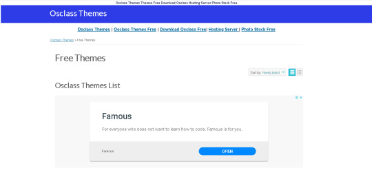
Osclass Free Themes
If you are looking for a good Theme for Osclass, and the important thing for you is that the template is free, here we show you topics where you can download Themes with a correct design.
Download themes Osclass free will not cause your Classifieds website to be worse than one developed with a commercial theme, on the contrary, it is possible that in addition to reducing the investment, especially when you start your project, you end up creating a very desirable Web Classifieds , responsive and seduce the visitors.
Realos Real Estate Theme
Realos is Multi-purpose osclass theme to create realestate classified website. Realos is clean responsive theme comes with easy theme settings. Features
Bootstrap 3 framework
Nice, clean and modern design
Fully responsive layout
Easy theme settings
Built With Html5 And Css3
675 Fontawesome supported
160+ Linearicons supported
Cross Browser Compatible
Adsense ready
Translation ready
Compatibility v3.6.0 — v3.8.0
Letgo Osclass Theme Free
It’s time to let go with LETGO, a simple and clean responsive Osclass theme for your classified ads site. LETGO is a premium osclass theme for Lucky people who wants to make effective classifieds websites. Letgo comes with a very high responsive design, which makes the theme compatible with all modern devices. Support google adsense, and other options can be applied to the theme from admin area. We pay attention to your request if you need some customization, by offering custom theme design. Coming soon and other templates for this theme. Compatibility v3.0 — v3.8.0 Version1.0.0 (2019–04–27) By proiulia Author Since : July, 2015
Sakela Responsive Free Osclass Theme
Sakela is a clean and beautiful theme designed for Osclass. This responsive theme is powered with Bootstrap and has a powerful admin panel that let’s you customize the theme with mouse clicks. Download if for free and fuel up your website design with this amazing theme. Main Features — 5 predefined color schemes — Based on powerful Bootstrap framework — Clean & responsive design — Multi language support — Compatible with latest version of Osclass — Cross browser compatible — Advanced theme setting options — Header and footer background images — Category Icon Control (Font Awesome) — Search field country select — Supports 3rd parties plugins — Homepage options — Modified dashboard and users page — Social links page — Custom CSS editor in admin — RTL support — Number of listing control via admin
Minimalist Free Osclass Theme Responsive
Minimalist is so clean, super flexible and has a fully responsive design! This theme sets the new standard! Minimalist is very intuitive to use and completely ready to operate out of the box. Built with HTML5 & CSS3, a lot of thought and care went into Minimalist making it a pleasure to use. Tired of cluttered website design? Then Minimalist will clean up unnecessary data, images and colors focusing on pure content without any distractions. 100% Fully Responsive — Minimalist is 100% responsive, each and every element including widgets are fully responsive. Super Easy Installation & Setup — Quickly install the theme via FTP. Upload theme contents to themes folder and activate it from Osclass admin panel. Translation Support — Minimalist is translation ready and uses same terms as Osclass script. So you do not have to worry about translating any theme specific terms. Light or Dark design presets can be selected from theme settings area. Both designs stay clean and emphasize main content. Custom CSS support- now you can add custom CSS to theme directly from admin panel. Navigate to “Appearance” -> “Theme settings” to add custom CSS code and no more code editing for simple modifications. Also this will allow you keep your customization after theme updates, so that you do not have to repeat your changes on every theme update. 2 widget locations — you can add related widgets to your pages before and after main content. Built-In SEO — Minimalist is ready to help you get higher rankings because we have built it with SEO best practices in mind. Outstanding Customer Support — We care about your site as much as you do, which is why we back up our script and themes with 100% support. We have a support forum set up for users and we quickly answer your questions.
Bigio Free Osclass Theme
A simple and easy to use theme built for all types of ads. Build your style ads in minutes and start to sell and shop stuff. Bigio has a clean and powerful product page design, weel thought product-centric design with unique features and configurable options. If you want additional expensive, know that the theme is compatible with all types of osclass plugins. Display your promotions and all the ads with styke and sell with confidence. Bigio gives you built in unlimited time deals functionality.
Elena Free Osclass Theme
Elena Free Osclass Theme OLX-style osclass theme with very interesting homepage, interactive map, fast load speed and many plugins delivered with theme. Osclass Premium Responsive Elena theme is developed to be very easy to use by users and has modern view. Theme is prepared to use many modules and can be easy customized. Elena theme features Theme features and functionalityHome page sliderMultilingualHeaders structure (h1, h2, …)Grid or List viewScroll to top buttonHorizontal menuPhoto gallery Post listing/Edit listing > Enter Price or select: Free / Check with seller Post listing/Edit listing > New Category Select — you can now alternatively choose category when posting/editing listing Search List > Advanced Search Sidebar Search List > Smarty Category List (Menu) Item Page, Header > Integrated Profile Picture Plugin (Avatar) Search List can be switched to show All listings, listing posted by Companies or listing posted by Individuals Rollover maps delivered with theme Romania Portugal Malaysia Ukraine Hungaria Indonesia Morocco Belgium France Japan Angola Switzerland
Sofia Osclass Theme Free
Very simple and easy theme that match to any kind of classifieds, especially for car selling. Provides unique design and fast load that defines good theme.Sofia Responsive Osclass theme is design to look very easy and unique, providing perfect functionality to users. Theme is delivered with plenty of plugins to increase it’s funcionality.Sofia theme features easy to translate only with PO Edit (free program for translations) Related Ads customized to theme shown in gallery view included fully working Facebook connect plugin, check on demo site ;) switch to grid/list view on search result page Seller Post plugin included Jquery Menu plugin included — only install attached version, nicely customized for Sofia theme design Watchlist to allow users save favorite listings Social Bookmarks plugin with modified css to see it corectly Cookies plugin to fit EU cookie laws Print PDF plugin to allow users to download PDF sheet of listing Print Ad plugin for Safe-printing contact seller button brings pop up with contact form jQuery slider rotating premium listings on homepage — more users will promote their listings to premium you can change background and buttons styles / colors from admin site! lifetime support & updates this Osclass theme FULL RESPONSIVE Brand new User Dashboard that was converted to real dashboard! Search parameters saving user’s search properties are now saved to browser cookies when user leave your site and then return back (can also close browser), search parameters are saved and is not required to fill them again Category, Country, Region, City, Type of view (Gallery / List), Listings by user Type view (All / Personal / Company), Minimum price and Maximum price are saved Saved preferences are visible on search page in search sidebar and can be cleaned anytime Select boxes & inputs has pre-filled value from cookie Responsive, mobile ready no horizontal scroll in any web browser theme adjust to every browser width starting on 180px perfect usage on mobile devices and tablets follow modern standards in website design
Azzurro Theme Free
AZZURRO Theme for Osclass — 100% Respònsive and Adaptive It is a classic design theme, responsive and adaptive with España Rollover Map. Your CSS structure fits perfectly on mobile devices screens from 360 px and up to 1200px max. Includes Bootstrap 3 font awesome, Best SEO optimized code load fast. Compatibility with Osclass Version v3.5.0 — v3.7.4 Version1.1.4 (2016–04–02)
Osclasswizards Free Responsive Theme
A responsive Osclass theme featuring service listing and a minimal design powered with bootstrap and HTML5. Current Version Version 2.0.4 Supports Latest Osclass Version 3.6.1 Responsive & Retina Ready Compatible with all the mobile and desktop version Bootstrap Framework Powered with latest bootstrap framework and html5/Css3 Compatible Browsers IE8, IE9, IE10, Firefox, Safari, Opera, Chrome. A clean and responsive theme that can adapts to any kind of screen smoothly. Works with the latest version of Osclass and is powered by the popular Bootstrap framework. Simple and flat design that can be pleasing to users and easy to customize. Focused to provide high level of user friendly experience. Supports all the default features of Osclass as well as third party plugins. Download and try our free theme today. Changelog/2.0.4 | Feb 17, 2016 City select in Search fixed. Optimized theme codes. Minor PHP bugs fixed. Changelog/2.0.3 | Jan 19, 2016 Supports Latest Osclass Version 3.6.1 Bootstrap version v3.3.6 Font Awesome Version 4.5.0 Bugs Fixed Multi Currency Plugin compatible Changelog/2.0.2 | Aug 9, 2015 JQuery version v1.11.3 Bootstrap version v3.3.4 Font Awesome Version 4.4.0 FancyBox version v2.1.5 Premium Slider added — homepage and category page Country based search added (Homepage) Advanced search field replaced to dropdown select with country search (Search/Category Page) Minor css bugs fixed User listings link added on item page RTL view issue fixed 5 new theme color added Google Recaptcha design issue fixed User description mutli languages issue fixed. Changelog/2.0.1 | June 26, 2015 Popular regions, city, sorting. Under “Popular In OsclassWizards” above the footer in Homepage. Select option scroll bar bug fixed Categories parent child select ( Parent category visible now in item post page ) Cars attributes plugin compatible Rich editor plugin compatible Price disable on category bug fixed in item post page. Locations required bug fixed (item post page) Item without photos displays default photo Facebook script only on item and search pages to optimize the performance “Login/Register for a free account” buttons compact display CSS problem fixed Categories on homepage overlapping when more than 8 problem fixed Category multiple selects enable/disable (item post page) Dutch, German, Russian Language pack added Changelog/2.0.0 | June 3, 2015 Themes bugs and issues fixed. Theme design and layout changed. Premium listing added in homepage. Language support: English (default), Spanish, Portuguese, Indonesian, Lithuanian, Swedish, Turkish. Multiple color support [ 5 pre-defined color added for theme]. Popular Searches, Region and Cities added in homepage. Font Awesome icon added for the categories. Facebook like box added. Social sharing for item page. Advanced admin panel control. Changelog/1.0.7 | May 10, 2015 ‘Theme update URI’ changed. Language support: English (default), Spanish, Portuguese, Indonesian. Changelog/1.0.6 | May 3, 2015 Fixed installation problem of the theme’s zip file from admin panel. Fixed minor PHP notice bugs. Updated language ‘theme.po’ file. Changelog/1.0.5 | April 19, 2015 ‘Watchlist’ plugin compatible. Changelog/1.0.4 | April 13, 2015 Minor css and javascript issues fixed. Changelog/1.0.3 | April 12, 2015 Language Translation fixed. Updated “theme.po” file. PHP notices debugged. RTL view option added in theme options. Minor CSS issues fixed. Category and Location select dropdown menus render issue fixed. Footer links separator added. 404 page css fixed. SEO plugin added for items custom title and meta tags. OsclassWizards Theme Setting added.
FLUX Osclass Theme
Flux is a clean and responsive theme that can adapts to any kind of screen smoothly. Works with the latest version of Osclass and is powered by the popular Bootstrap framework. Simple and flat design that can be pleasing to users and easy to customize. Current Version Version 1.0.0 Supports Latest Osclass Version 3.7.4 Responsive & Retina Ready Compatible with all the mobile and desktop version RTL View Compatible Browsers IE8, IE9, IE10, Firefox, Safari, Opera, Chrome Focused to provide high level of user friendly experience. Supports all the default features of Osclass as well as third party plugins. Download and try our free theme today.
Symnel Osclass Theme
Responsive Symnel Theme. Simple, professional, clean-looking and modern theme for Osclass. Symnel Osclass Theme is a simple, professional, clean-looking and modern theme for Osclass, properly constructed to maximize the potential sale of the seller and neatly display all important details of seller post. If you like using this theme and find it useful, please hit our donate button on the sidebar. If you have any questions related to this plugin, please check our Support Forum === Theme Info === Requires at least: 3.3.2 Tested up to: 3.6.2 Stable tag: 1.0.5 == Installation == 1. Upload `symnel/` to the `/oc-content/themes/` directory 2. Activate the theme through the ‘Themes’ menu in Osclass 3. Enjoy == Changelog == = 1.0.5 = * Changed default Symnel logo * Added language file (en_US) * Fixed price issue * Fixed minor CSS issues * Minor CSS cleanup prefix = 1.0.4 = * Minor tweaks and fix on enqueue * Added missing page forgot password * Added Lazyload on images * Improved SEO on search and single item — To avoid duplicate content and lots of false 404 error * Resources optimized and enhance theme performance * Fixed reCaptcha * Support item post/edit custom fields * Added hooks on item post/edit page * Item post/edit form field order reconstructed * Added price on description tab * Remove ini_set of charset on functions.php due to some server warnings — You may just add ini_set( ‘default_charset’, ‘utf-8’ ); on your config.php * Added expiration date column on table user all listings * Added tfoot on table user all listings * Lowercase ‘Symnel’ text domain * Added hooks on side widgets * Lots of improvement and bug fixes = 1.0.1 = * Minor code cleanup * Minor layout adjustment * Logo dimension increase * Added thumbnail pagination on top left * Added 404 page * Added custom meta title * Added schema microdata on loop * Added theme settings (basic only) * Added advanced search options dropdown on main search form (basic only, desktop version and small screen) * Remove breadcrumb on some pages in mobile view * Fixed public profile pagination layout issue * Correct some text label * Change some heading ontag (SEO purposes) * Meta title improvement (consistency) * Lots of improvement and bug fixes :: basic only = preparation for future development and updates = 1.0.0 = * Initial release == Language Support == — English
Bender Red Theme
Compatibilityv3.5.0 — v3.7.4 Version3.2.0 (2017–05–17) By Osclass Team Author Since : May, 2012 Free, fully responsive and mobile-friendly theme. Smoothly adapted to any screen resolution and device. Red touch. Do you need to customize it? All our themes allow you to add widgets both on the header and the footer section. Besides, this theme allows ad display, e.g., Google Adsense, so you can earn money with your Osclass website! *NEW* right-to-left / rtl support for languages that use a non-western character set.
Bender Theme
Compatibility v3.5.0 — v3.7.4 Version3.2.0 (2017–05–17) By Osclass Team Author Since : May, 2012 Free, fully responsive and mobile-friendly theme. Smoothly adapted to any screen resolution and device. This themes comes in blue colour, but you can also download it in red, purple and black col-ours. Do you need to customize it? All our themes allow you to add widgets both on the header and the footer section. Besides, this theme allows ad display, e.g., Google Adsense, so you can earn money with your Osclass website! *NEW* right-to-left / rtl support for languages that use a non-western character set
Osclass Themes FREE DOWNLOAD
If you are looking for a good Theme for Osclass, and the important thing for you is that the template is free, here we show you topics where you can download Themes with a correct design. Download themes Osclass free will not cause your Classifieds website to be worse than one developed with a commercial theme, on the contrary, it is possible that in addition to reducing the investment, especially when you start your project, you end up creating a very desirable Web Classifieds , responsive and seduce the visitors.
0 notes
Text
iOS 11 is about to arrive—and here's what's in it
yahoo
If Apple’s (AAPL) usual annual schedule is any guide, then Tuesday, September 12 won’t just be the day we get new iPhone models. It will also be the day —or at least the countdown to the day—we get a new version of the iPhone system software, which will run on several years’ worth of older iPhone models. This year, it’s going to be called iOS 11.
It won’t bring you any one big-ticket feature. Instead, you’ll get a wholllllle lot of tiny nips and tucks. They seem to fall into five categories: Nice Tweaks, Storage Help, iPad Exclusives, Playing Catch-Up, Fixing Bad Design.
Here’s what you have to look forward to!
Nice Tweaks
Expectations set? OK—here’s what’s new.
A new voice for Siri. The new male and female voices sound much more like actual people.
One-handed typing. There’s a new keyboard that scoots closer to one side, for easier one-handed typing. (You can now zoom in Maps one-handed, too.)
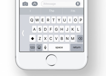
The new one-handed keyboard.
Quicker transfer. When you get a new iPhone, you can import all your settings from the old one just by focusing the camera on the new phone on the old one’s screen.
Do not disturb while driving. This optional feature sounds like a really good one. When the phone detects that you’re driving—because it’s connected to your phone’s Bluetooth, or because the phone detects motion—it prevents any notifications (alert messages from your apps) from showing up to distract you. If someone texts you, they get an auto-response like, “I’m driving. I’ll see your message when I get where I’m going.” (You can designate certain people as VIPs; if they text the word “urgent” to you, their messages break through the blockade.)
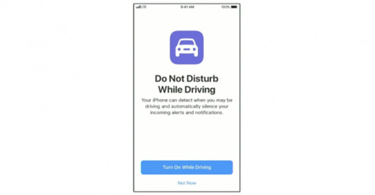
No more distracting notifications while you’re on the road.
Improvements to Photos. The Photos app offers smarter auto-slideshows (called Memories). Among other improvements, they now play well even when you’re holding the phone upright.
Improvements to Live Photos. Live Photos are weird, three-second video clips, which Apple (AAPL) introduced in iOS 9. In iOS 11, you can now shorten one, or mute its audio, or extract a single frame from that clip to use as a still photo. The phone can also suggest a “boomerang” segment (bounces back and forth) or a loop (repeats over and over). And it has a new Slow Shutter filter, which (for example) blurs a babbling brook or stars moving across the sky, as though taken with a long exposure.
Swipe the Lock screen back down. You can now get back to your Lock screen without actually locking your iPhone—to have another look at a notification you missed, for example.
Smarter Siri. Siri does better an anticipating your next move (location, news, calendar appointments). When you’re typing, the auto-suggestions above the keyboard now offer movie names, song names, or place names that you’ve recently viewed in other apps. Auto-suggestions in Siri, too, include terms you’ve recently read. And if you book a flight or buy a ticket online, iOS offers to add it to your calendar.
AirPlay 2. If you buy speakers from Bose, Marantz, and a few other manufactures (unfortunately, not Sonos), you can use your phone to control multi-room audio. You can start the same song playing everywhere, or play different songs in different rooms.
Shared “Up Next” playlist. If you’re an Apple Music subscriber, your party guests or buddies can throw their own “what song to play next” ideas into the ring.
Screen recording. Now you can do more than just take a screenshot of what’s on your screen. You can make a video of it! Man, will that be helpful for people who teach or review phone software! (Apple didn’t say how you start the screen recording, though.)
Storage Help
Running out of room on the iPhone is a chronic problem. Apple has a few features designed to help:
Camera app. Apple is adopting new file formats for photos (HEIF, or High Efficiency Image Format) and videos (H265 or High Efficiency Video Codec), which look the same as they did before but consume only the half the space. (When you export to someone else, they convert to standard formats.)
Messages in iCloud. When you sign into any new Mac, iPhone, or iPad with your iCloud credentials, your entire texting history gets downloaded automatically. (As it is now, when you sign in on a new machine, you can’t see the Message transcript histories.) Saving the Messages history online also saves disk space on your Mac.
Storage optimization. The idea: As your phone begins to run out of space, your oldest files are quietly and automatically stored online, leaving Download icons in their places on your phone, so that you can retrieve them if you need them.
iPad Exclusives
Many of the biggest changes in iOS 11 are available only on the iPad.
Mac features. In general, the big news here is the iPad behaves much more like a Mac. For example, you can drag-and-drop pictures and text between apps. The Dock is now extensible, available from within any app, and perfect for switching apps, just as on the Mac. There’s a new Mission Control-type feature, too, for seeing what’s in your open apps—even when you’ve split the screen between pairs of apps.
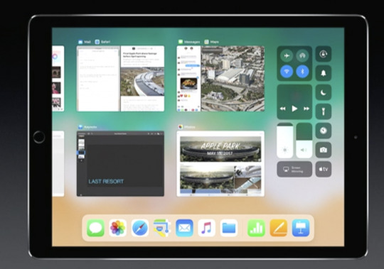
The iPad now offers a “Mission Control,” showing what’s going on in all your apps.
Punctuation and letters on the same keyboard. Now, punctuation symbols appear above the letter keys. You flick down on the key to “type” the punctuation—no more having to switch keyboard layouts.

No more switching keyboards just to type punctuation.
A file manager! A new app called Files lets you work with (and search) files and folders, just as you do on the Mac or PC. It even shows your Box and Dropbox files.

A Finder–a desktop–comes at last to iOS.
Pencil features. If you’ve bought Apple’s stylus, you can tap the Lock screen and start taking notes right away. You can mark up PDFs just by starting to write on them. A new feature lets you snap a document with the iPad’s camera, which straightens and crops the page so that you can sign it or annotate it. Handwriting in the Notes app is now searchable, and you can make drawings within any Note or email message.
The iPad grows ever closer to becoming a legal pad.
Playing Catch-Up
With every new OS from Google (GOOG, GOOGL), Microsoft (MSFT), or Apple, there’s a set of “us, too!” features that keeps them all competitive. This time around, it’s:
Lane guidance. When you’re driving, Maps now lets you know which lane to be in for your next turn, just as Google Maps does.
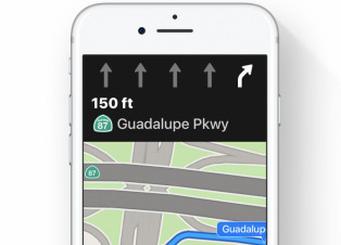
Lane guidance. At last.
Indoor Maps. The Maps app can now show you floor plans for a few malls and 30 airports, just as Google Maps does.
Siri translates languages. Siri is trying to catch up to Google Assistant. For example, it can now translate phrases from English into Chinese, French, German, Italian, or Spanish. For example, you can say, “How do you say ‘Where’s the bathroom?’ in French?”
Siri understands followup questions. Siri now does better at understanding followup questions. (“Who won the World Series in 1980?” “The “Phillies.” “Who was their coach?”)
Person-to-Person payment within the Messages app. Now, you can send payments directly to your friends—your share of the pizza bill, for example—right from within the Messages app, much as people do now with Venmo, PayPal, and their its ilk. (Of course, this works only if your friends have iPhones, too.) When money comes to you, it accrues to a new, virtual Apple Pay Cash Card; from there, you can send it to your bank, buy things with it, or send it on to other people.
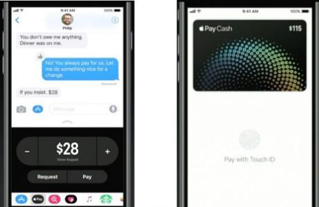
Send payments directly to your friends.
iCloud file sharing. Finally, you can share files you’ve stored on your iCloud Drive with other people, just as you’ve been able to do with Dropbox for years.
Fixing Bad Design
Some of the changes repair the damage Apple made to itself in iOS 10. For example:
Redesigned apps drawer in Messages. All the stuff they added to Messages last year (stickers, apps, live drawing) cluttered up the design and wound up getting ignored by lots of people. The new design is cleaner.
Redesigned Control Center. In iOS 10, Apple split up the iPhone’s quick-settings panel, called the Control Center, into two or three panels. You had to swipe sideways to find the control you wanted—taking care not to swipe sideways on one of the controls, thereby triggering it. Now it’s all on one screen again, although some of the buttons open up secondary screens of options. And it’s customizable! You can, for example, add a “Record voice memo” button to it.
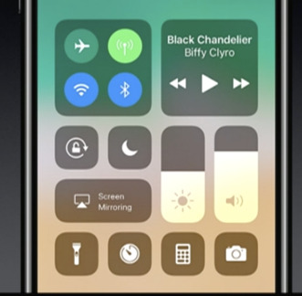
The new, customizable, somewhat ugly Control Center.
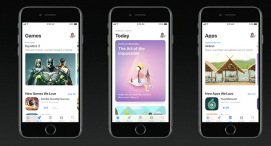
App Store. The App store gets a big redesign. One chief fix is breaking out Games into its own tab, so that game and non-game bestseller lists are kept separate.
After nine years, the App Store gets a new look.
Coming very soon
There are also dozens of improvements to the features for overseas iPhones (China, Russia, India, for example). And many, many enhancements to features for the disabled (spoken captions for videos and pictures, for example).
So what’s the overarching theme of the iOS 11 upgrade?
There isn’t one. It’s just a couple hundred little fine-tunings. All of them welcome—and all of them aimed to keep you trapped within Apple’s growing ecosystem.
More from David Pogue:
MacOS High Sierra comes this fall—and brings these 23 features
T-Mobile COO: Why we make investments like free Netflix that ‘seem crazy’
How Apple’s iPhone has improved since its 2007 debut
Gulliver’s Gate is a $40 million world of miniatures in Times Square
The 5 best new features of this week’s YouTube redesign
Samsung’s Bixby voice assistant is ambitious, powerful, and half-baked
Is through-the-air charging a hoax?
David Pogue, tech columnist for Yahoo Finance, is the author of “iPhone: The Missing Manual.” He welcomes nontoxic comments in the comments section below. On the web, he’s davidpogue.com. On Twitter, he’s @pogue. On email, he’s [email protected]. You can read all his articles here, or you can sign up to get his columns by email.
#_lmsid:a077000000BAh3wAAD#_revsp:yahoofinance.com#$AAPL#_author:David Pogue#_uuid:9b33dcbf-7f4e-343c-b5f9-271cfdf12842
11 notes
·
View notes
Text
Evergreen SaaS Landing Pages You Should Have Running at All Times [Examples]
It’s a vicious cycle that many SaaS marketers fall into—you’re trying to hit your lead-gen targets, but your budget and resources are tight. So you turn to a quick, one-off campaign to generate some leads.
Then, once that campaign runs its course, you start planning the next one.
And so on. (And so on.)
While this cycle can be effective in the short term, it’s just not sustainable. Running campaigns in this way create spikes in traffic that can quickly die out if you don’t invest in ongoing promotion. They also take a lot of effort to execute (and don’t guarantee returns).
Cue the infomercial voiceover: “There has to be a better way!”
Pictured: A typical SaaS marketer workin’ the lead-gen funnel.
Turns out, there is a better way.
If instead, you invest some time developing ‘always-on’ campaigns, you can drive consistent growth in a much more efficient, scalable way. For instance, if you have core assets (like a webinar, newsletter, or demo page) that you routinely drive prospects to, you can make these work year-round by creating some landing pages that run on auto-pilot.
There are tons of evergreen landing page campaign possibilities, but we’ve rounded up five that we think every SaaS marketer should have in their arsenal. Keep these ones running 24/7/365 for steady lead generation all year long.
1. The “We Solve Your Problem” Long-Form Landing Page
Do your prospects tend to do a lot of research before they start a new trial or demo your product?
This is where an evergreen, long-form landing page shines. Evaluation-stage prospects are hungry for details, proof of results, examples, and info tailored to their experience. They need to be persuaded to choose your offering over the alternatives.
So, for paid search ads targeting transactional keywords, you may want to create a standard SaaS long-form landing page explaining your offer.
Like this one:
Image courtesy of Pitchbook. Click it to see the whole thing.
The SaaS sales page above from Pitchbook has a preview video, a customer testimonial, and a logo bar of social proof to build credibility. It does a great job giving visitors a comprehensive rundown of the product’s features and benefits. All in support of that awesome ‘request a free trial’ call to action.
Why should you build one?
Long-form landing pages help your audience make more informed decisions by providing in-depth information about your software. With more sections on the page, you have room to expand about what sets your offering apart from competitors and the value you deliver.
As a bonus, these pages aren’t just effective for middle-of-the-funnel prospects. They can also help folks at earlier stages of awareness. For instance, people in the discovery stage may not know they have a problem, but they’re likely experiencing the symptoms. The extra length lets you conduct a thorough investigation and lead visitors down the path from the symptoms to the problem to (hopefully, your) solution.
With a long-form landing page that runs 24/7/365, you can show potential customers how their current situation is costing them money, time, resources—or any other problem you’ve helped them identify. You can also anticipate the objections your target customer might have about your software and address them with compelling, long-form storytelling.
2. The “Weekly How To” Webinar Landing Page
You can raise awareness of your webinar through your email and social media channels, and you’ll definitely see some engagement for your effort. (After all, how hard is it to click a little icon?) But without a dedicated landing page, it can be tough as old leather to convert interested people into actual registrants.
It’s easy to forget that once you finalize your content and secure your speakers, you still have to convince your visitors to register to attend.
This webinar landing page that Thinkific built with Unbounce gets it right:
Image courtesy of Thinkific. Click it to see the whole thing.
Promoting an entire digital summit, this page has a large, eye-catching header section that tells the viewer exactly what they’re going to get out of this online event. It also has strong calls-to-action placed above the fold and below the body copy, plus detailed descriptions of the speakers.
Thinkific even includes an FAQ section to help potential registrants get as much information as possible before they make the decision to sign up.
Why build your own webinar page?
If you’re asking prospects to give you their email details and an hour or more of their time, you need to make it clear what they’re getting in return. With a landing page, you can communicate the value of registering for an online or offline event using persuasive elements like benefit-oriented headlines, social proof, and testimonials.
You can also use these pages as an entry point for visitors to explore other relevant content. For example, the bottom of the Thinkific webinar landing page features a short value statement that highlights the benefits of their product in a call-to-action to start a free trial.
Editor’s note. Looking for some advice on how to run a webinar for your SaaS brand? We’ve got you covered: How to Build a Great Webinar from the Ground Up + 8 Examples That Don’t Suck.
3. The Interactive Lead Magnet Page
Let’s face it: the traditional lead magnet is losing its pull. Years ago, you could offer a simple downloadable piece of content like an ebook or a PDF resource and watch your conversions soar.
Today, it’s often a different story. Fewer visitors are willing to part with their email addresses—and if they are, you better have something truly valuable to offer in exchange. To address this, SaaS businesses are upping their lead magnet game by trying out quizzes and other types of personalized, interactive, or tool-based marketing elements.
Here at Unbounce, for example, we developed a free analyzer tool that offers insights on how you can optimize your landing pages:
While an ebook or downloadable PDF can also help to educate visitors, what happens once they finish with that static piece of content? It’s up to each individual to figure out how to apply the learnings, and they’re not always motivated to follow through. That means it’s often the end of the road. They close the book, and they’re done. That’s not great for engagement.
People also have to set aside some time to actually read through your material. In comparison, a quick tool like the analyzer provides each visitor with a personalized report on their specific pages—instantly. No pain, all gain.
And we serve this tool up on an Unbounce-built landing page that converts almost 30% of all visitors. It’s a great way to offer value, all the while serving as an evergreen awareness campaign that’s directly plugged into what we do.
Why should you consider a tool on a landing page like this?
Calculators, quizzes, and other tools are a great way to inject a little fun and—ideally—high value into your lead-gen or awareness strategy. They empower your visitors with insights on their specific situation. And they give you more info about your audience than you could get from a piece of static content.
Interactive lead magnets can also reduce the time your business spends on sales queries and save you time by automatically sending someone’s contact information through your funnel via integrations with your CRM or email marketing platform.
Finally, an interactive lead magnet can help instill loyalty in your visitors. If you’ve helped someone solve a problem, they’re much more likely to bookmark your page and remember you for next time. Plus, you get more credibility because you’ve proven that you know your stuff and understand your audience’s needs
4. The “Newsletter Audience-Builder” Landing Page
These days, you’d be hard-pressed to find a company without an email newsletter. It’s one of the most efficient, cost-effective ways to stay top-of-mind with your audience.
But people also find these newsletters increasingly easy to ignore, easy to tag as spam, and easy to unsubscribe from. That’s why it’s imperative that you keep your list fresh by adding new subscribers.
It’s easier than ever for someone to unsubscribe from your newsletter. (Source: AndroidPolice)
Sure, you can put a newsletter sign-up button on your website and call it a day. But if you really want to grow your mailing list, you should consider adding a dedicated landing page into the mix. With a landing page, you can experiment with copy and compelling visuals to ensure your newsletter’s differentiating value really comes across.
For instance, Pitchbook’s newsletter sign-up (which is another hit landing page from their team) checks all the boxes. It has a clear headline, uses visuals to show what the newsletter looks like in different formats, and has a short-but-sweet form:
Image courtesy of Pitchbook.
If you prefer to keep things simple, though, you could follow this example from Later. There’s not a lot of text on this page, but each piece of copy serves a purpose. The headline (“Never miss an Instagram trend again”) drives home the key benefit of signing up for their newsletter. And the subheading acts as social proof. (After all, a million-marketer-strong email list is nothing to scoff at.)
Image courtesy of Later.
The last section sets expectations around frequency, so potential subscribers can feel confident knowing Later won’t spam their inbox with multiple messages a week. And by only asking for an email, they make signing up even more enticing to their audience of marketers (who are usually wary about giving up their personal info, but often do so when it’s in exchange for more data).
5. The “Sign Up For a 1:1 Demo” Landing Page
While you can give your website visitors a small taste of what you offer through videos and webinars, this often can’t compare to leading someone through your product personally—where your guest can ask questions live. This is why offering a free demo is a common step in the SaaS buyer journey and a key landing page you’ll want to have available evergreen.
Visitors at this stage can be pretty close to making a purchasing decision, so your number one priority should be to make this process as frictionless as possible. Fortunately, a landing page is one of the easiest ways to do this:
Image courtesy of Skillshare.
The most effective demo landing pages are pretty straightforward. They typically have a clean and simple look, a form, a phone number field for an alternative form of contact, social proof, a video, bullet points, or another short message that outlines what users can expect from the demo.
While the “request a demo page” from Skillshare above is missing some social proof in the form of testimonials, all the other important elements are present. It’s easy to follow and the lead-gen form is a reasonable length to help the Skillshare team understand how to tailor the demo.
Conversion tip. You can take things a step further for your always-on demo landing pages by adding a pop-up. For example, you could use this calendar notification pop-up template and have it appear after someone converts. This would prompt your visitor to add a calendar reminder to join the session and ensure your live demo attendance is high.
Evergreen Your SaaS Landing Pages
If you set up these evergreen landing pages as a first step, you can generate a ton of leads for your software without developing campaigns on a typical one-by-one cadence.
As with any other type of campaign though, it’s a great idea to optimize these pages to ensure you’re getting the best results possible. Experiment with on-page elements, the copy on the page, or adding social proof. Even tiny tweaks can have a big impact.
The work of a SaaS marketer is never done, but by building pages for the long term you can create conditions that help you generate leads and conversions—without climbing on the campaign hamster wheel.
Evergreen SaaS Landing Pages You Should Have Running at All Times [Examples] published first on https://nickpontemrktg.wordpress.com/
0 notes
Text
Evergreen SaaS Landing Pages You Should Have Running at All Times [Examples]
It’s a vicious cycle that many SaaS marketers fall into—you’re trying to hit your lead-gen targets, but your budget and resources are tight. So you turn to a quick, one-off campaign to generate some leads.
Then, once that campaign runs its course, you start planning the next one.
And so on. (And so on.)
While this cycle can be effective in the short term, it’s just not sustainable. Running campaigns in this way create spikes in traffic that can quickly die out if you don’t invest in ongoing promotion. They also take a lot of effort to execute (and don’t guarantee returns).
Cue the infomercial voiceover: “There has to be a better way!”
Pictured: A typical SaaS marketer workin’ the lead-gen funnel.
Turns out, there is a better way.
If instead, you invest some time developing ‘always-on’ campaigns, you can drive consistent growth in a much more efficient, scalable way. For instance, if you have core assets (like a webinar, newsletter, or demo page) that you routinely drive prospects to, you can make these work year-round by creating some landing pages that run on auto-pilot.
There are tons of evergreen landing page campaign possibilities, but we’ve rounded up five that we think every SaaS marketer should have in their arsenal. Keep these ones running 24/7/365 for steady lead generation all year long.
1. The “We Solve Your Problem” Long-Form Landing Page
Do your prospects tend to do a lot of research before they start a new trial or demo your product?
This is where an evergreen, long-form landing page shines. Evaluation-stage prospects are hungry for details, proof of results, examples, and info tailored to their experience. They need to be persuaded to choose your offering over the alternatives.
So, for paid search ads targeting transactional keywords, you may want to create a standard SaaS long-form landing page explaining your offer.
Like this one:
Image courtesy of Pitchbook. Click it to see the whole thing.
The SaaS sales page above from Pitchbook has a preview video, a customer testimonial, and a logo bar of social proof to build credibility. It does a great job giving visitors a comprehensive rundown of the product’s features and benefits. All in support of that awesome ‘request a free trial’ call to action.
Why should you build one?
Long-form landing pages help your audience make more informed decisions by providing in-depth information about your software. With more sections on the page, you have room to expand about what sets your offering apart from competitors and the value you deliver.
As a bonus, these pages aren’t just effective for middle-of-the-funnel prospects. They can also help folks at earlier stages of awareness. For instance, people in the discovery stage may not know they have a problem, but they’re likely experiencing the symptoms. The extra length lets you conduct a thorough investigation and lead visitors down the path from the symptoms to the problem to (hopefully, your) solution.
With a long-form landing page that runs 24/7/365, you can show potential customers how their current situation is costing them money, time, resources—or any other problem you’ve helped them identify. You can also anticipate the objections your target customer might have about your software and address them with compelling, long-form storytelling.
2. The “Weekly How To” Webinar Landing Page
You can raise awareness of your webinar through your email and social media channels, and you’ll definitely see some engagement for your effort. (After all, how hard is it to click a little icon?) But without a dedicated landing page, it can be tough as old leather to convert interested people into actual registrants.
It’s easy to forget that once you finalize your content and secure your speakers, you still have to convince your visitors to register to attend.
This webinar landing page that Thinkific built with Unbounce gets it right:
Image courtesy of Thinkific. Click it to see the whole thing.
Promoting an entire digital summit, this page has a large, eye-catching header section that tells the viewer exactly what they’re going to get out of this online event. It also has strong calls-to-action placed above the fold and below the body copy, plus detailed descriptions of the speakers.
Thinkific even includes an FAQ section to help potential registrants get as much information as possible before they make the decision to sign up.
Why build your own webinar page?
If you’re asking prospects to give you their email details and an hour or more of their time, you need to make it clear what they’re getting in return. With a landing page, you can communicate the value of registering for an online or offline event using persuasive elements like benefit-oriented headlines, social proof, and testimonials.
You can also use these pages as an entry point for visitors to explore other relevant content. For example, the bottom of the Thinkific webinar landing page features a short value statement that highlights the benefits of their product in a call-to-action to start a free trial.
Editor’s note. Looking for some advice on how to run a webinar for your SaaS brand? We’ve got you covered: How to Build a Great Webinar from the Ground Up + 8 Examples That Don’t Suck.
3. The Interactive Lead Magnet Page
Let’s face it: the traditional lead magnet is losing its pull. Years ago, you could offer a simple downloadable piece of content like an ebook or a PDF resource and watch your conversions soar.
Today, it’s often a different story. Fewer visitors are willing to part with their email addresses—and if they are, you better have something truly valuable to offer in exchange. To address this, SaaS businesses are upping their lead magnet game by trying out quizzes and other types of personalized, interactive, or tool-based marketing elements.
Here at Unbounce, for example, we developed a free analyzer tool that offers insights on how you can optimize your landing pages:
While an ebook or downloadable PDF can also help to educate visitors, what happens once they finish with that static piece of content? It’s up to each individual to figure out how to apply the learnings, and they’re not always motivated to follow through. That means it’s often the end of the road. They close the book, and they’re done. That’s not great for engagement.
People also have to set aside some time to actually read through your material. In comparison, a quick tool like the analyzer provides each visitor with a personalized report on their specific pages—instantly. No pain, all gain.
And we serve this tool up on an Unbounce-built landing page that converts almost 30% of all visitors. It’s a great way to offer value, all the while serving as an evergreen awareness campaign that’s directly plugged into what we do.
Why should you consider a tool on a landing page like this?
Calculators, quizzes, and other tools are a great way to inject a little fun and—ideally—high value into your lead-gen or awareness strategy. They empower your visitors with insights on their specific situation. And they give you more info about your audience than you could get from a piece of static content.
Interactive lead magnets can also reduce the time your business spends on sales queries and save you time by automatically sending someone’s contact information through your funnel via integrations with your CRM or email marketing platform.
Finally, an interactive lead magnet can help instill loyalty in your visitors. If you’ve helped someone solve a problem, they’re much more likely to bookmark your page and remember you for next time. Plus, you get more credibility because you’ve proven that you know your stuff and understand your audience’s needs
4. The “Newsletter Audience-Builder” Landing Page
These days, you’d be hard-pressed to find a company without an email newsletter. It’s one of the most efficient, cost-effective ways to stay top-of-mind with your audience.
But people also find these newsletters increasingly easy to ignore, easy to tag as spam, and easy to unsubscribe from. That’s why it’s imperative that you keep your list fresh by adding new subscribers.
It’s easier than ever for someone to unsubscribe from your newsletter. (Source: AndroidPolice)
Sure, you can put a newsletter sign-up button on your website and call it a day. But if you really want to grow your mailing list, you should consider adding a dedicated landing page into the mix. With a landing page, you can experiment with copy and compelling visuals to ensure your newsletter’s differentiating value really comes across.
For instance, Pitchbook’s newsletter sign-up (which is another hit landing page from their team) checks all the boxes. It has a clear headline, uses visuals to show what the newsletter looks like in different formats, and has a short-but-sweet form:
Image courtesy of Pitchbook.
If you prefer to keep things simple, though, you could follow this example from Later. There’s not a lot of text on this page, but each piece of copy serves a purpose. The headline (“Never miss an Instagram trend again”) drives home the key benefit of signing up for their newsletter. And the subheading acts as social proof. (After all, a million-marketer-strong email list is nothing to scoff at.)
Image courtesy of Later.
The last section sets expectations around frequency, so potential subscribers can feel confident knowing Later won’t spam their inbox with multiple messages a week. And by only asking for an email, they make signing up even more enticing to their audience of marketers (who are usually wary about giving up their personal info, but often do so when it’s in exchange for more data).
5. The “Sign Up For a 1:1 Demo” Landing Page
While you can give your website visitors a small taste of what you offer through videos and webinars, this often can’t compare to leading someone through your product personally—where your guest can ask questions live. This is why offering a free demo is a common step in the SaaS buyer journey and a key landing page you’ll want to have available evergreen.
Visitors at this stage can be pretty close to making a purchasing decision, so your number one priority should be to make this process as frictionless as possible. Fortunately, a landing page is one of the easiest ways to do this:
Image courtesy of Skillshare.
The most effective demo landing pages are pretty straightforward. They typically have a clean and simple look, a form, a phone number field for an alternative form of contact, social proof, a video, bullet points, or another short message that outlines what users can expect from the demo.
While the “request a demo page” from Skillshare above is missing some social proof in the form of testimonials, all the other important elements are present. It’s easy to follow and the lead-gen form is a reasonable length to help the Skillshare team understand how to tailor the demo.
Conversion tip. You can take things a step further for your always-on demo landing pages by adding a pop-up. For example, you could use this calendar notification pop-up template and have it appear after someone converts. This would prompt your visitor to add a calendar reminder to join the session and ensure your live demo attendance is high.
Evergreen Your SaaS Landing Pages
If you set up these evergreen landing pages as a first step, you can generate a ton of leads for your software without developing campaigns on a typical one-by-one cadence.
As with any other type of campaign though, it’s a great idea to optimize these pages to ensure you’re getting the best results possible. Experiment with on-page elements, the copy on the page, or adding social proof. Even tiny tweaks can have a big impact.
The work of a SaaS marketer is never done, but by building pages for the long term you can create conditions that help you generate leads and conversions—without climbing on the campaign hamster wheel.
from Marketing https://unbounce.com/landing-pages/evergreen-saas-landing-pages-you-should-have-running-at-all-times-examples/ via http://www.rssmix.com/
0 notes
Text
Evergreen SaaS Landing Pages You Should Have Running at All Times [Examples]
It’s a vicious cycle that many SaaS marketers fall into—you’re trying to hit your lead-gen targets, but your budget and resources are tight. So you turn to a quick, one-off campaign to generate some leads.
Then, once that campaign runs its course, you start planning the next one.
And so on. (And so on.)
While this cycle can be effective in the short term, it’s just not sustainable. Running campaigns in this way create spikes in traffic that can quickly die out if you don’t invest in ongoing promotion. They also take a lot of effort to execute (and don’t guarantee returns).
Cue the infomercial voiceover: “There has to be a better way!”
Pictured: A typical SaaS marketer workin’ the lead-gen funnel.
Turns out, there is a better way.
If instead, you invest some time developing ‘always-on’ campaigns, you can drive consistent growth in a much more efficient, scalable way. For instance, if you have core assets (like a webinar, newsletter, or demo page) that you routinely drive prospects to, you can make these work year-round by creating some landing pages that run on auto-pilot.
There are tons of evergreen landing page campaign possibilities, but we’ve rounded up five that we think every SaaS marketer should have in their arsenal. Keep these ones running 24/7/365 for steady lead generation all year long.
1. The “We Solve Your Problem” Long-Form Landing Page
Do your prospects tend to do a lot of research before they start a new trial or demo your product?
This is where an evergreen, long-form landing page shines. Evaluation-stage prospects are hungry for details, proof of results, examples, and info tailored to their experience. They need to be persuaded to choose your offering over the alternatives.
So, for paid search ads targeting transactional keywords, you may want to create a standard SaaS long-form landing page explaining your offer.
Like this one:
Image courtesy of Pitchbook. Click it to see the whole thing.
The SaaS sales page above from Pitchbook has a preview video, a customer testimonial, and a logo bar of social proof to build credibility. It does a great job giving visitors a comprehensive rundown of the product’s features and benefits. All in support of that awesome ‘request a free trial’ call to action.
Why should you build one?
Long-form landing pages help your audience make more informed decisions by providing in-depth information about your software. With more sections on the page, you have room to expand about what sets your offering apart from competitors and the value you deliver.
As a bonus, these pages aren’t just effective for middle-of-the-funnel prospects. They can also help folks at earlier stages of awareness. For instance, people in the discovery stage may not know they have a problem, but they’re likely experiencing the symptoms. The extra length lets you conduct a thorough investigation and lead visitors down the path from the symptoms to the problem to (hopefully, your) solution.
With a long-form landing page that runs 24/7/365, you can show potential customers how their current situation is costing them money, time, resources—or any other problem you’ve helped them identify. You can also anticipate the objections your target customer might have about your software and address them with compelling, long-form storytelling.
2. The “Weekly How To” Webinar Landing Page
You can raise awareness of your webinar through your email and social media channels, and you’ll definitely see some engagement for your effort. (After all, how hard is it to click a little icon?) But without a dedicated landing page, it can be tough as old leather to convert interested people into actual registrants.
It’s easy to forget that once you finalize your content and secure your speakers, you still have to convince your visitors to register to attend.
This webinar landing page that Thinkific built with Unbounce gets it right:
Image courtesy of Thinkific. Click it to see the whole thing.
Promoting an entire digital summit, this page has a large, eye-catching header section that tells the viewer exactly what they’re going to get out of this online event. It also has strong calls-to-action placed above the fold and below the body copy, plus detailed descriptions of the speakers.
Thinkific even includes an FAQ section to help potential registrants get as much information as possible before they make the decision to sign up.
Why build your own webinar page?
If you’re asking prospects to give you their email details and an hour or more of their time, you need to make it clear what they’re getting in return. With a landing page, you can communicate the value of registering for an online or offline event using persuasive elements like benefit-oriented headlines, social proof, and testimonials.
You can also use these pages as an entry point for visitors to explore other relevant content. For example, the bottom of the Thinkific webinar landing page features a short value statement that highlights the benefits of their product in a call-to-action to start a free trial.
Editor’s note. Looking for some advice on how to run a webinar for your SaaS brand? We’ve got you covered: How to Build a Great Webinar from the Ground Up + 8 Examples That Don’t Suck.
3. The Interactive Lead Magnet Page
Let’s face it: the traditional lead magnet is losing its pull. Years ago, you could offer a simple downloadable piece of content like an ebook or a PDF resource and watch your conversions soar.
Today, it’s often a different story. Fewer visitors are willing to part with their email addresses—and if they are, you better have something truly valuable to offer in exchange. To address this, SaaS businesses are upping their lead magnet game by trying out quizzes and other types of personalized, interactive, or tool-based marketing elements.
Here at Unbounce, for example, we developed a free analyzer tool that offers insights on how you can optimize your landing pages:
While an ebook or downloadable PDF can also help to educate visitors, what happens once they finish with that static piece of content? It’s up to each individual to figure out how to apply the learnings, and they’re not always motivated to follow through. That means it’s often the end of the road. They close the book, and they’re done. That’s not great for engagement.
People also have to set aside some time to actually read through your material. In comparison, a quick tool like the analyzer provides each visitor with a personalized report on their specific pages—instantly. No pain, all gain.
And we serve this tool up on an Unbounce-built landing page that converts almost 30% of all visitors. It’s a great way to offer value, all the while serving as an evergreen awareness campaign that’s directly plugged into what we do.
Why should you consider a tool on a landing page like this?
Calculators, quizzes, and other tools are a great way to inject a little fun and—ideally—high value into your lead-gen or awareness strategy. They empower your visitors with insights on their specific situation. And they give you more info about your audience than you could get from a piece of static content.
Interactive lead magnets can also reduce the time your business spends on sales queries and save you time by automatically sending someone’s contact information through your funnel via integrations with your CRM or email marketing platform.
Finally, an interactive lead magnet can help instill loyalty in your visitors. If you’ve helped someone solve a problem, they’re much more likely to bookmark your page and remember you for next time. Plus, you get more credibility because you’ve proven that you know your stuff and understand your audience’s needs
4. The “Newsletter Audience-Builder” Landing Page
These days, you’d be hard-pressed to find a company without an email newsletter. It’s one of the most efficient, cost-effective ways to stay top-of-mind with your audience.
But people also find these newsletters increasingly easy to ignore, easy to tag as spam, and easy to unsubscribe from. That’s why it’s imperative that you keep your list fresh by adding new subscribers.
It’s easier than ever for someone to unsubscribe from your newsletter. (Source: AndroidPolice)
Sure, you can put a newsletter sign-up button on your website and call it a day. But if you really want to grow your mailing list, you should consider adding a dedicated landing page into the mix. With a landing page, you can experiment with copy and compelling visuals to ensure your newsletter’s differentiating value really comes across.
For instance, Pitchbook’s newsletter sign-up (which is another hit landing page from their team) checks all the boxes. It has a clear headline, uses visuals to show what the newsletter looks like in different formats, and has a short-but-sweet form:
Image courtesy of Pitchbook.
If you prefer to keep things simple, though, you could follow this example from Later. There’s not a lot of text on this page, but each piece of copy serves a purpose. The headline (“Never miss an Instagram trend again”) drives home the key benefit of signing up for their newsletter. And the subheading acts as social proof. (After all, a million-marketer-strong email list is nothing to scoff at.)
Image courtesy of Later.
The last section sets expectations around frequency, so potential subscribers can feel confident knowing Later won’t spam their inbox with multiple messages a week. And by only asking for an email, they make signing up even more enticing to their audience of marketers (who are usually wary about giving up their personal info, but often do so when it’s in exchange for more data).
5. The “Sign Up For a 1:1 Demo” Landing Page
While you can give your website visitors a small taste of what you offer through videos and webinars, this often can’t compare to leading someone through your product personally—where your guest can ask questions live. This is why offering a free demo is a common step in the SaaS buyer journey and a key landing page you’ll want to have available evergreen.
Visitors at this stage can be pretty close to making a purchasing decision, so your number one priority should be to make this process as frictionless as possible. Fortunately, a landing page is one of the easiest ways to do this:
Image courtesy of Skillshare.
The most effective demo landing pages are pretty straightforward. They typically have a clean and simple look, a form, a phone number field for an alternative form of contact, social proof, a video, bullet points, or another short message that outlines what users can expect from the demo.
While the “request a demo page” from Skillshare above is missing some social proof in the form of testimonials, all the other important elements are present. It’s easy to follow and the lead-gen form is a reasonable length to help the Skillshare team understand how to tailor the demo.
Conversion tip. You can take things a step further for your always-on demo landing pages by adding a pop-up. For example, you could use this calendar notification pop-up template and have it appear after someone converts. This would prompt your visitor to add a calendar reminder to join the session and ensure your live demo attendance is high.
Evergreen Your SaaS Landing Pages
If you set up these evergreen landing pages as a first step, you can generate a ton of leads for your software without developing campaigns on a typical one-by-one cadence.
As with any other type of campaign though, it’s a great idea to optimize these pages to ensure you’re getting the best results possible. Experiment with on-page elements, the copy on the page, or adding social proof. Even tiny tweaks can have a big impact.
The work of a SaaS marketer is never done, but by building pages for the long term you can create conditions that help you generate leads and conversions—without climbing on the campaign hamster wheel.
Evergreen SaaS Landing Pages You Should Have Running at All Times [Examples] published first on http://nickpontemktg.blogspot.com/
0 notes
Text
Evergreen SaaS Landing Pages You Should Have Running at All Times [Examples]
It’s a vicious cycle that many SaaS marketers fall into—you’re trying to hit your lead-gen targets, but your budget and resources are tight. So you turn to a quick, one-off campaign to generate some leads.
Then, once that campaign runs its course, you start planning the next one.
And so on. (And so on.)
While this cycle can be effective in the short term, it’s just not sustainable. Running campaigns in this way create spikes in traffic that can quickly die out if you don’t invest in ongoing promotion. They also take a lot of effort to execute (and don’t guarantee returns).
Cue the infomercial voiceover: “There has to be a better way!”
Pictured: A typical SaaS marketer workin�� the lead-gen funnel.
Turns out, there is a better way.
If instead, you invest some time developing ‘always-on’ campaigns, you can drive consistent growth in a much more efficient, scalable way. For instance, if you have core assets (like a webinar, newsletter, or demo page) that you routinely drive prospects to, you can make these work year-round by creating some landing pages that run on auto-pilot.
There are tons of evergreen landing page campaign possibilities, but we’ve rounded up five that we think every SaaS marketer should have in their arsenal. Keep these ones running 24/7/365 for steady lead generation all year long.
1. The “We Solve Your Problem” Long-Form Landing Page
Do your prospects tend to do a lot of research before they start a new trial or demo your product?
This is where an evergreen, long-form landing page shines. Evaluation-stage prospects are hungry for details, proof of results, examples, and info tailored to their experience. They need to be persuaded to choose your offering over the alternatives.
So, for paid search ads targeting transactional keywords, you may want to create a standard SaaS long-form landing page explaining your offer.
Like this one:
Image courtesy of Pitchbook. Click it to see the whole thing.
The SaaS sales page above from Pitchbook has a preview video, a customer testimonial, and a logo bar of social proof to build credibility. It does a great job giving visitors a comprehensive rundown of the product’s features and benefits. All in support of that awesome ‘request a free trial’ call to action.
Why should you build one?
Long-form landing pages help your audience make more informed decisions by providing in-depth information about your software. With more sections on the page, you have room to expand about what sets your offering apart from competitors and the value you deliver.
As a bonus, these pages aren’t just effective for middle-of-the-funnel prospects. They can also help folks at earlier stages of awareness. For instance, people in the discovery stage may not know they have a problem, but they’re likely experiencing the symptoms. The extra length lets you conduct a thorough investigation and lead visitors down the path from the symptoms to the problem to (hopefully, your) solution.
With a long-form landing page that runs 24/7/365, you can show potential customers how their current situation is costing them money, time, resources—or any other problem you’ve helped them identify. You can also anticipate the objections your target customer might have about your software and address them with compelling, long-form storytelling.
2. The “Weekly How To” Webinar Landing Page
You can raise awareness of your webinar through your email and social media channels, and you’ll definitely see some engagement for your effort. (After all, how hard is it to click a little icon?) But without a dedicated landing page, it can be tough as old leather to convert interested people into actual registrants.
It’s easy to forget that once you finalize your content and secure your speakers, you still have to convince your visitors to register to attend.
This webinar landing page that Thinkific built with Unbounce gets it right:
Image courtesy of Thinkific. Click it to see the whole thing.
Promoting an entire digital summit, this page has a large, eye-catching header section that tells the viewer exactly what they’re going to get out of this online event. It also has strong calls-to-action placed above the fold and below the body copy, plus detailed descriptions of the speakers.
Thinkific even includes an FAQ section to help potential registrants get as much information as possible before they make the decision to sign up.
Why build your own webinar page?
If you’re asking prospects to give you their email details and an hour or more of their time, you need to make it clear what they’re getting in return. With a landing page, you can communicate the value of registering for an online or offline event using persuasive elements like benefit-oriented headlines, social proof, and testimonials.
You can also use these pages as an entry point for visitors to explore other relevant content. For example, the bottom of the Thinkific webinar landing page features a short value statement that highlights the benefits of their product in a call-to-action to start a free trial.
Editor’s note. Looking for some advice on how to run a webinar for your SaaS brand? We’ve got you covered: How to Build a Great Webinar from the Ground Up + 8 Examples That Don’t Suck.
3. The Interactive Lead Magnet Page
Let’s face it: the traditional lead magnet is losing its pull. Years ago, you could offer a simple downloadable piece of content like an ebook or a PDF resource and watch your conversions soar.
Today, it’s often a different story. Fewer visitors are willing to part with their email addresses—and if they are, you better have something truly valuable to offer in exchange. To address this, SaaS businesses are upping their lead magnet game by trying out quizzes and other types of personalized, interactive, or tool-based marketing elements.
Here at Unbounce, for example, we developed a free analyzer tool that offers insights on how you can optimize your landing pages:
While an ebook or downloadable PDF can also help to educate visitors, what happens once they finish with that static piece of content? It’s up to each individual to figure out how to apply the learnings, and they’re not always motivated to follow through. That means it’s often the end of the road. They close the book, and they’re done. That’s not great for engagement.
People also have to set aside some time to actually read through your material. In comparison, a quick tool like the analyzer provides each visitor with a personalized report on their specific pages—instantly. No pain, all gain.
And we serve this tool up on an Unbounce-built landing page that converts almost 30% of all visitors. It’s a great way to offer value, all the while serving as an evergreen awareness campaign that’s directly plugged into what we do.
Why should you consider a tool on a landing page like this?
Calculators, quizzes, and other tools are a great way to inject a little fun and—ideally—high value into your lead-gen or awareness strategy. They empower your visitors with insights on their specific situation. And they give you more info about your audience than you could get from a piece of static content.
Interactive lead magnets can also reduce the time your business spends on sales queries and save you time by automatically sending someone’s contact information through your funnel via integrations with your CRM or email marketing platform.
Finally, an interactive lead magnet can help instill loyalty in your visitors. If you’ve helped someone solve a problem, they’re much more likely to bookmark your page and remember you for next time. Plus, you get more credibility because you’ve proven that you know your stuff and understand your audience’s needs
4. The “Newsletter Audience-Builder” Landing Page
These days, you’d be hard-pressed to find a company without an email newsletter. It’s one of the most efficient, cost-effective ways to stay top-of-mind with your audience.
But people also find these newsletters increasingly easy to ignore, easy to tag as spam, and easy to unsubscribe from. That’s why it’s imperative that you keep your list fresh by adding new subscribers.
It’s easier than ever for someone to unsubscribe from your newsletter. (Source: AndroidPolice)
Sure, you can put a newsletter sign-up button on your website and call it a day. But if you really want to grow your mailing list, you should consider adding a dedicated landing page into the mix. With a landing page, you can experiment with copy and compelling visuals to ensure your newsletter’s differentiating value really comes across.
For instance, Pitchbook’s newsletter sign-up (which is another hit landing page from their team) checks all the boxes. It has a clear headline, uses visuals to show what the newsletter looks like in different formats, and has a short-but-sweet form:
Image courtesy of Pitchbook.
If you prefer to keep things simple, though, you could follow this example from Later. There’s not a lot of text on this page, but each piece of copy serves a purpose. The headline (“Never miss an Instagram trend again”) drives home the key benefit of signing up for their newsletter. And the subheading acts as social proof. (After all, a million-marketer-strong email list is nothing to scoff at.)
Image courtesy of Later.
The last section sets expectations around frequency, so potential subscribers can feel confident knowing Later won’t spam their inbox with multiple messages a week. And by only asking for an email, they make signing up even more enticing to their audience of marketers (who are usually wary about giving up their personal info, but often do so when it’s in exchange for more data).
5. The “Sign Up For a 1:1 Demo” Landing Page
While you can give your website visitors a small taste of what you offer through videos and webinars, this often can’t compare to leading someone through your product personally—where your guest can ask questions live. This is why offering a free demo is a common step in the SaaS buyer journey and a key landing page you’ll want to have available evergreen.
Visitors at this stage can be pretty close to making a purchasing decision, so your number one priority should be to make this process as frictionless as possible. Fortunately, a landing page is one of the easiest ways to do this:
Image courtesy of Skillshare.
The most effective demo landing pages are pretty straightforward. They typically have a clean and simple look, a form, a phone number field for an alternative form of contact, social proof, a video, bullet points, or another short message that outlines what users can expect from the demo.
While the “request a demo page” from Skillshare above is missing some social proof in the form of testimonials, all the other important elements are present. It’s easy to follow and the lead-gen form is a reasonable length to help the Skillshare team understand how to tailor the demo.
Conversion tip. You can take things a step further for your always-on demo landing pages by adding a pop-up. For example, you could use this calendar notification pop-up template and have it appear after someone converts. This would prompt your visitor to add a calendar reminder to join the session and ensure your live demo attendance is high.
Evergreen Your SaaS Landing Pages
If you set up these evergreen landing pages as a first step, you can generate a ton of leads for your software without developing campaigns on a typical one-by-one cadence.
As with any other type of campaign though, it’s a great idea to optimize these pages to ensure you’re getting the best results possible. Experiment with on-page elements, the copy on the page, or adding social proof. Even tiny tweaks can have a big impact.
The work of a SaaS marketer is never done, but by building pages for the long term you can create conditions that help you generate leads and conversions—without climbing on the campaign hamster wheel.
0 notes
Text
Evergreen SaaS Landing Pages You Should Have Running at All Times [Examples]
It’s a vicious cycle that many SaaS marketers fall into—you’re trying to hit your lead-gen targets, but your budget and resources are tight. So you turn to a quick, one-off campaign to generate some leads.
Then, once that campaign runs its course, you start planning the next one.
And so on. (And so on.)
While this cycle can be effective in the short term, it’s just not sustainable. Running campaigns in this way create spikes in traffic that can quickly die out if you don’t invest in ongoing promotion. They also take a lot of effort to execute (and don’t guarantee returns).
Cue the infomercial voiceover: “There has to be a better way!”
Pictured: A typical SaaS marketer workin’ the lead-gen funnel.
Turns out, there is a better way.
If instead, you invest some time developing ‘always-on’ campaigns, you can drive consistent growth in a much more efficient, scalable way. For instance, if you have core assets (like a webinar, newsletter, or demo page) that you routinely drive prospects to, you can make these work year-round by creating some landing pages that run on auto-pilot.
There are tons of evergreen landing page campaign possibilities, but we’ve rounded up five that we think every SaaS marketer should have in their arsenal. Keep these ones running 24/7/365 for steady lead generation all year long.
1. The “We Solve Your Problem” Long-Form Landing Page
Do your prospects tend to do a lot of research before they start a new trial or demo your product?
This is where an evergreen, long-form landing page shines. Evaluation-stage prospects are hungry for details, proof of results, examples, and info tailored to their experience. They need to be persuaded to choose your offering over the alternatives.
So, for paid search ads targeting transactional keywords, you may want to create a standard SaaS long-form landing page explaining your offer.
Like this one:
Image courtesy of Pitchbook. Click it to see the whole thing.
The SaaS sales page above from Pitchbook has a preview video, a customer testimonial, and a logo bar of social proof to build credibility. It does a great job giving visitors a comprehensive rundown of the product’s features and benefits. All in support of that awesome ‘request a free trial’ call to action.
Why should you build one?
Long-form landing pages help your audience make more informed decisions by providing in-depth information about your software. With more sections on the page, you have room to expand about what sets your offering apart from competitors and the value you deliver.
As a bonus, these pages aren’t just effective for middle-of-the-funnel prospects. They can also help folks at earlier stages of awareness. For instance, people in the discovery stage may not know they have a problem, but they’re likely experiencing the symptoms. The extra length lets you conduct a thorough investigation and lead visitors down the path from the symptoms to the problem to (hopefully, your) solution.
With a long-form landing page that runs 24/7/365, you can show potential customers how their current situation is costing them money, time, resources—or any other problem you’ve helped them identify. You can also anticipate the objections your target customer might have about your software and address them with compelling, long-form storytelling.
2. The “Weekly How To” Webinar Landing Page
You can raise awareness of your webinar through your email and social media channels, and you’ll definitely see some engagement for your effort. (After all, how hard is it to click a little icon?) But without a dedicated landing page, it can be tough as old leather to convert interested people into actual registrants.
It’s easy to forget that once you finalize your content and secure your speakers, you still have to convince your visitors to register to attend.
This webinar landing page that Thinkific built with Unbounce gets it right:
Image courtesy of Thinkific. Click it to see the whole thing.
Promoting an entire digital summit, this page has a large, eye-catching header section that tells the viewer exactly what they’re going to get out of this online event. It also has strong calls-to-action placed above the fold and below the body copy, plus detailed descriptions of the speakers.
Thinkific even includes an FAQ section to help potential registrants get as much information as possible before they make the decision to sign up.
Why build your own webinar page?
If you’re asking prospects to give you their email details and an hour or more of their time, you need to make it clear what they’re getting in return. With a landing page, you can communicate the value of registering for an online or offline event using persuasive elements like benefit-oriented headlines, social proof, and testimonials.
You can also use these pages as an entry point for visitors to explore other relevant content. For example, the bottom of the Thinkific webinar landing page features a short value statement that highlights the benefits of their product in a call-to-action to start a free trial.
Editor’s note. Looking for some advice on how to run a webinar for your SaaS brand? We’ve got you covered: How to Build a Great Webinar from the Ground Up + 8 Examples That Don’t Suck.
3. The Interactive Lead Magnet Page
Let’s face it: the traditional lead magnet is losing its pull. Years ago, you could offer a simple downloadable piece of content like an ebook or a PDF resource and watch your conversions soar.
Today, it’s often a different story. Fewer visitors are willing to part with their email addresses—and if they are, you better have something truly valuable to offer in exchange. To address this, SaaS businesses are upping their lead magnet game by trying out quizzes and other types of personalized, interactive, or tool-based marketing elements.
Here at Unbounce, for example, we developed a free analyzer tool that offers insights on how you can optimize your landing pages:
While an ebook or downloadable PDF can also help to educate visitors, what happens once they finish with that static piece of content? It’s up to each individual to figure out how to apply the learnings, and they’re not always motivated to follow through. That means it’s often the end of the road. They close the book, and they’re done. That’s not great for engagement.
People also have to set aside some time to actually read through your material. In comparison, a quick tool like the analyzer provides each visitor with a personalized report on their specific pages—instantly. No pain, all gain.
And we serve this tool up on an Unbounce-built landing page that converts almost 30% of all visitors. It’s a great way to offer value, all the while serving as an evergreen awareness campaign that’s directly plugged into what we do.
Why should you consider a tool on a landing page like this?
Calculators, quizzes, and other tools are a great way to inject a little fun and—ideally—high value into your lead-gen or awareness strategy. They empower your visitors with insights on their specific situation. And they give you more info about your audience than you could get from a piece of static content.
Interactive lead magnets can also reduce the time your business spends on sales queries and save you time by automatically sending someone’s contact information through your funnel via integrations with your CRM or email marketing platform.
Finally, an interactive lead magnet can help instill loyalty in your visitors. If you’ve helped someone solve a problem, they’re much more likely to bookmark your page and remember you for next time. Plus, you get more credibility because you’ve proven that you know your stuff and understand your audience’s needs
4. The “Newsletter Audience-Builder” Landing Page
These days, you’d be hard-pressed to find a company without an email newsletter. It’s one of the most efficient, cost-effective ways to stay top-of-mind with your audience.
But people also find these newsletters increasingly easy to ignore, easy to tag as spam, and easy to unsubscribe from. That’s why it’s imperative that you keep your list fresh by adding new subscribers.
It’s easier than ever for someone to unsubscribe from your newsletter. (Source: AndroidPolice)
Sure, you can put a newsletter sign-up button on your website and call it a day. But if you really want to grow your mailing list, you should consider adding a dedicated landing page into the mix. With a landing page, you can experiment with copy and compelling visuals to ensure your newsletter’s differentiating value really comes across.
For instance, Pitchbook’s newsletter sign-up (which is another hit landing page from their team) checks all the boxes. It has a clear headline, uses visuals to show what the newsletter looks like in different formats, and has a short-but-sweet form:
Image courtesy of Pitchbook.
If you prefer to keep things simple, though, you could follow this example from Later. There’s not a lot of text on this page, but each piece of copy serves a purpose. The headline (“Never miss an Instagram trend again”) drives home the key benefit of signing up for their newsletter. And the subheading acts as social proof. (After all, a million-marketer-strong email list is nothing to scoff at.)
Image courtesy of Later.
The last section sets expectations around frequency, so potential subscribers can feel confident knowing Later won’t spam their inbox with multiple messages a week. And by only asking for an email, they make signing up even more enticing to their audience of marketers (who are usually wary about giving up their personal info, but often do so when it’s in exchange for more data).
5. The “Sign Up For a 1:1 Demo” Landing Page
While you can give your website visitors a small taste of what you offer through videos and webinars, this often can’t compare to leading someone through your product personally—where your guest can ask questions live. This is why offering a free demo is a common step in the SaaS buyer journey and a key landing page you’ll want to have available evergreen.
Visitors at this stage can be pretty close to making a purchasing decision, so your number one priority should be to make this process as frictionless as possible. Fortunately, a landing page is one of the easiest ways to do this:
Image courtesy of Skillshare.
The most effective demo landing pages are pretty straightforward. They typically have a clean and simple look, a form, a phone number field for an alternative form of contact, social proof, a video, bullet points, or another short message that outlines what users can expect from the demo.
While the “request a demo page” from Skillshare above is missing some social proof in the form of testimonials, all the other important elements are present. It’s easy to follow and the lead-gen form is a reasonable length to help the Skillshare team understand how to tailor the demo.
Conversion tip. You can take things a step further for your always-on demo landing pages by adding a pop-up. For example, you could use this calendar notification pop-up template and have it appear after someone converts. This would prompt your visitor to add a calendar reminder to join the session and ensure your live demo attendance is high.
Evergreen Your SaaS Landing Pages
If you set up these evergreen landing pages as a first step, you can generate a ton of leads for your software without developing campaigns on a typical one-by-one cadence.
As with any other type of campaign though, it’s a great idea to optimize these pages to ensure you’re getting the best results possible. Experiment with on-page elements, the copy on the page, or adding social proof. Even tiny tweaks can have a big impact.
The work of a SaaS marketer is never done, but by building pages for the long term you can create conditions that help you generate leads and conversions—without climbing on the campaign hamster wheel.
from Marketing https://unbounce.com/landing-pages/evergreen-saas-landing-pages-you-should-have-running-at-all-times-examples/ via http://www.rssmix.com/
0 notes
Text
Evergreen SaaS Landing Pages You Should Have Running at All Times [Examples]
It’s a vicious cycle that many SaaS marketers fall into—you’re trying to hit your lead-gen targets, but your budget and resources are tight. So you turn to a quick, one-off campaign to generate some leads.
Then, once that campaign runs its course, you start planning the next one.
And so on. (And so on.)
While this cycle can be effective in the short term, it’s just not sustainable. Running campaigns in this way create spikes in traffic that can quickly die out if you don’t invest in ongoing promotion. They also take a lot of effort to execute (and don’t guarantee returns).
Cue the infomercial voiceover: “There has to be a better way!”
Pictured: A typical SaaS marketer workin’ the lead-gen funnel.
Turns out, there is a better way.
If instead, you invest some time developing ‘always-on’ campaigns, you can drive consistent growth in a much more efficient, scalable way. For instance, if you have core assets (like a webinar, newsletter, or demo page) that you routinely drive prospects to, you can make these work year-round by creating some landing pages that run on auto-pilot.
There are tons of evergreen landing page campaign possibilities, but we’ve rounded up five that we think every SaaS marketer should have in their arsenal. Keep these ones running 24/7/365 for steady lead generation all year long.
1. The “We Solve Your Problem” Long-Form Landing Page
Do your prospects tend to do a lot of research before they start a new trial or demo your product?
This is where an evergreen, long-form landing page shines. Evaluation-stage prospects are hungry for details, proof of results, examples, and info tailored to their experience. They need to be persuaded to choose your offering over the alternatives.
So, for paid search ads targeting transactional keywords, you may want to create a standard SaaS long-form landing page explaining your offer.
Like this one:
Image courtesy of Pitchbook. Click it to see the whole thing.
The SaaS sales page above from Pitchbook has a preview video, a customer testimonial, and a logo bar of social proof to build credibility. It does a great job giving visitors a comprehensive rundown of the product’s features and benefits. All in support of that awesome ‘request a free trial’ call to action.
Why should you build one?
Long-form landing pages help your audience make more informed decisions by providing in-depth information about your software. With more sections on the page, you have room to expand about what sets your offering apart from competitors and the value you deliver.
As a bonus, these pages aren’t just effective for middle-of-the-funnel prospects. They can also help folks at earlier stages of awareness. For instance, people in the discovery stage may not know they have a problem, but they’re likely experiencing the symptoms. The extra length lets you conduct a thorough investigation and lead visitors down the path from the symptoms to the problem to (hopefully, your) solution.
With a long-form landing page that runs 24/7/365, you can show potential customers how their current situation is costing them money, time, resources—or any other problem you’ve helped them identify. You can also anticipate the objections your target customer might have about your software and address them with compelling, long-form storytelling.
2. The “Weekly How To” Webinar Landing Page
You can raise awareness of your webinar through your email and social media channels, and you’ll definitely see some engagement for your effort. (After all, how hard is it to click a little icon?) But without a dedicated landing page, it can be tough as old leather to convert interested people into actual registrants.
It’s easy to forget that once you finalize your content and secure your speakers, you still have to convince your visitors to register to attend.
This webinar landing page that Thinkific built with Unbounce gets it right:
Image courtesy of Thinkific. Click it to see the whole thing.
Promoting an entire digital summit, this page has a large, eye-catching header section that tells the viewer exactly what they’re going to get out of this online event. It also has strong calls-to-action placed above the fold and below the body copy, plus detailed descriptions of the speakers.
Thinkific even includes an FAQ section to help potential registrants get as much information as possible before they make the decision to sign up.
Why build your own webinar page?
If you’re asking prospects to give you their email details and an hour or more of their time, you need to make it clear what they’re getting in return. With a landing page, you can communicate the value of registering for an online or offline event using persuasive elements like benefit-oriented headlines, social proof, and testimonials.
You can also use these pages as an entry point for visitors to explore other relevant content. For example, the bottom of the Thinkific webinar landing page features a short value statement that highlights the benefits of their product in a call-to-action to start a free trial.
Editor’s note. Looking for some advice on how to run a webinar for your SaaS brand? We’ve got you covered: How to Build a Great Webinar from the Ground Up + 8 Examples That Don’t Suck.
3. The Interactive Lead Magnet Page
Let’s face it: the traditional lead magnet is losing its pull. Years ago, you could offer a simple downloadable piece of content like an ebook or a PDF resource and watch your conversions soar.
Today, it’s often a different story. Fewer visitors are willing to part with their email addresses—and if they are, you better have something truly valuable to offer in exchange. To address this, SaaS businesses are upping their lead magnet game by trying out quizzes and other types of personalized, interactive, or tool-based marketing elements.
Here at Unbounce, for example, we developed a free analyzer tool that offers insights on how you can optimize your landing pages:
While an ebook or downloadable PDF can also help to educate visitors, what happens once they finish with that static piece of content? It’s up to each individual to figure out how to apply the learnings, and they’re not always motivated to follow through. That means it’s often the end of the road. They close the book, and they’re done. That’s not great for engagement.
People also have to set aside some time to actually read through your material. In comparison, a quick tool like the analyzer provides each visitor with a personalized report on their specific pages—instantly. No pain, all gain.
And we serve this tool up on an Unbounce-built landing page that converts almost 30% of all visitors. It’s a great way to offer value, all the while serving as an evergreen awareness campaign that’s directly plugged into what we do.
Why should you consider a tool on a landing page like this?
Calculators, quizzes, and other tools are a great way to inject a little fun and—ideally—high value into your lead-gen or awareness strategy. They empower your visitors with insights on their specific situation. And they give you more info about your audience than you could get from a piece of static content.
Interactive lead magnets can also reduce the time your business spends on sales queries and save you time by automatically sending someone’s contact information through your funnel via integrations with your CRM or email marketing platform.
Finally, an interactive lead magnet can help instill loyalty in your visitors. If you’ve helped someone solve a problem, they’re much more likely to bookmark your page and remember you for next time. Plus, you get more credibility because you’ve proven that you know your stuff and understand your audience’s needs
4. The “Newsletter Audience-Builder” Landing Page
These days, you’d be hard-pressed to find a company without an email newsletter. It’s one of the most efficient, cost-effective ways to stay top-of-mind with your audience.
But people also find these newsletters increasingly easy to ignore, easy to tag as spam, and easy to unsubscribe from. That’s why it’s imperative that you keep your list fresh by adding new subscribers.
It’s easier than ever for someone to unsubscribe from your newsletter. (Source: AndroidPolice)
Sure, you can put a newsletter sign-up button on your website and call it a day. But if you really want to grow your mailing list, you should consider adding a dedicated landing page into the mix. With a landing page, you can experiment with copy and compelling visuals to ensure your newsletter’s differentiating value really comes across.
For instance, Pitchbook’s newsletter sign-up (which is another hit landing page from their team) checks all the boxes. It has a clear headline, uses visuals to show what the newsletter looks like in different formats, and has a short-but-sweet form:
Image courtesy of Pitchbook.
If you prefer to keep things simple, though, you could follow this example from Later. There’s not a lot of text on this page, but each piece of copy serves a purpose. The headline (“Never miss an Instagram trend again”) drives home the key benefit of signing up for their newsletter. And the subheading acts as social proof. (After all, a million-marketer-strong email list is nothing to scoff at.)
Image courtesy of Later.
The last section sets expectations around frequency, so potential subscribers can feel confident knowing Later won’t spam their inbox with multiple messages a week. And by only asking for an email, they make signing up even more enticing to their audience of marketers (who are usually wary about giving up their personal info, but often do so when it’s in exchange for more data).
5. The “Sign Up For a 1:1 Demo” Landing Page
While you can give your website visitors a small taste of what you offer through videos and webinars, this often can’t compare to leading someone through your product personally—where your guest can ask questions live. This is why offering a free demo is a common step in the SaaS buyer journey and a key landing page you’ll want to have available evergreen.
Visitors at this stage can be pretty close to making a purchasing decision, so your number one priority should be to make this process as frictionless as possible. Fortunately, a landing page is one of the easiest ways to do this:
Image courtesy of Skillshare.
The most effective demo landing pages are pretty straightforward. They typically have a clean and simple look, a form, a phone number field for an alternative form of contact, social proof, a video, bullet points, or another short message that outlines what users can expect from the demo.
While the “request a demo page” from Skillshare above is missing some social proof in the form of testimonials, all the other important elements are present. It’s easy to follow and the lead-gen form is a reasonable length to help the Skillshare team understand how to tailor the demo.
Conversion tip. You can take things a step further for your always-on demo landing pages by adding a pop-up. For example, you could use this calendar notification pop-up template and have it appear after someone converts. This would prompt your visitor to add a calendar reminder to join the session and ensure your live demo attendance is high.
Evergreen Your SaaS Landing Pages
If you set up these evergreen landing pages as a first step, you can generate a ton of leads for your software without developing campaigns on a typical one-by-one cadence.
As with any other type of campaign though, it’s a great idea to optimize these pages to ensure you’re getting the best results possible. Experiment with on-page elements, the copy on the page, or adding social proof. Even tiny tweaks can have a big impact.
The work of a SaaS marketer is never done, but by building pages for the long term you can create conditions that help you generate leads and conversions—without climbing on the campaign hamster wheel.
from Digital https://unbounce.com/landing-pages/evergreen-saas-landing-pages-you-should-have-running-at-all-times-examples/ via http://www.rssmix.com/
0 notes
Text
Evergreen SaaS Landing Pages You Should Have Running at All Times [Examples]
It’s a vicious cycle that many SaaS marketers fall into—you’re trying to hit your lead-gen targets, but your budget and resources are tight. So you turn to a quick, one-off campaign to generate some leads.
Then, once that campaign runs its course, you start planning the next one.
And so on. (And so on.)
While this cycle can be effective in the short term, it’s just not sustainable. Running campaigns in this way create spikes in traffic that can quickly die out if you don’t invest in ongoing promotion. They also take a lot of effort to execute (and don’t guarantee returns).
Cue the infomercial voiceover: “There has to be a better way!”
Pictured: A typical SaaS marketer workin’ the lead-gen funnel.
Turns out, there is a better way.
If instead, you invest some time developing ‘always-on’ campaigns, you can drive consistent growth in a much more efficient, scalable way. For instance, if you have core assets (like a webinar, newsletter, or demo page) that you routinely drive prospects to, you can make these work year-round by creating some landing pages that run on auto-pilot.
There are tons of evergreen landing page campaign possibilities, but we’ve rounded up five that we think every SaaS marketer should have in their arsenal. Keep these ones running 24/7/365 for steady lead generation all year long.
1. The “We Solve Your Problem” Long-Form Landing Page
Do your prospects tend to do a lot of research before they start a new trial or demo your product?
This is where an evergreen, long-form landing page shines. Evaluation-stage prospects are hungry for details, proof of results, examples, and info tailored to their experience. They need to be persuaded to choose your offering over the alternatives.
So, for paid search ads targeting transactional keywords, you may want to create a standard SaaS long-form landing page explaining your offer.
Like this one:
Image courtesy of Pitchbook. Click it to see the whole thing.
The SaaS sales page above from Pitchbook has a preview video, a customer testimonial, and a logo bar of social proof to build credibility. It does a great job giving visitors a comprehensive rundown of the product’s features and benefits. All in support of that awesome ‘request a free trial’ call to action.
Why should you build one?
Long-form landing pages help your audience make more informed decisions by providing in-depth information about your software. With more sections on the page, you have room to expand about what sets your offering apart from competitors and the value you deliver.
As a bonus, these pages aren’t just effective for middle-of-the-funnel prospects. They can also help folks at earlier stages of awareness. For instance, people in the discovery stage may not know they have a problem, but they’re likely experiencing the symptoms. The extra length lets you conduct a thorough investigation and lead visitors down the path from the symptoms to the problem to (hopefully, your) solution.
With a long-form landing page that runs 24/7/365, you can show potential customers how their current situation is costing them money, time, resources—or any other problem you’ve helped them identify. You can also anticipate the objections your target customer might have about your software and address them with compelling, long-form storytelling.
2. The “Weekly How To” Webinar Landing Page
You can raise awareness of your webinar through your email and social media channels, and you’ll definitely see some engagement for your effort. (After all, how hard is it to click a little icon?) But without a dedicated landing page, it can be tough as old leather to convert interested people into actual registrants.
It’s easy to forget that once you finalize your content and secure your speakers, you still have to convince your visitors to register to attend.
This webinar landing page that Thinkific built with Unbounce gets it right:
Image courtesy of Thinkific. Click it to see the whole thing.
Promoting an entire digital summit, this page has a large, eye-catching header section that tells the viewer exactly what they’re going to get out of this online event. It also has strong calls-to-action placed above the fold and below the body copy, plus detailed descriptions of the speakers.
Thinkific even includes an FAQ section to help potential registrants get as much information as possible before they make the decision to sign up.
Why build your own webinar page?
If you’re asking prospects to give you their email details and an hour or more of their time, you need to make it clear what they’re getting in return. With a landing page, you can communicate the value of registering for an online or offline event using persuasive elements like benefit-oriented headlines, social proof, and testimonials.
You can also use these pages as an entry point for visitors to explore other relevant content. For example, the bottom of the Thinkific webinar landing page features a short value statement that highlights the benefits of their product in a call-to-action to start a free trial.
Editor’s note. Looking for some advice on how to run a webinar for your SaaS brand? We’ve got you covered: How to Build a Great Webinar from the Ground Up + 8 Examples That Don’t Suck.
3. The Interactive Lead Magnet Page
Let’s face it: the traditional lead magnet is losing its pull. Years ago, you could offer a simple downloadable piece of content like an ebook or a PDF resource and watch your conversions soar.
Today, it’s often a different story. Fewer visitors are willing to part with their email addresses—and if they are, you better have something truly valuable to offer in exchange. To address this, SaaS businesses are upping their lead magnet game by trying out quizzes and other types of personalized, interactive, or tool-based marketing elements.
Here at Unbounce, for example, we developed a free analyzer tool that offers insights on how you can optimize your landing pages:
While an ebook or downloadable PDF can also help to educate visitors, what happens once they finish with that static piece of content? It’s up to each individual to figure out how to apply the learnings, and they’re not always motivated to follow through. That means it’s often the end of the road. They close the book, and they’re done. That’s not great for engagement.
People also have to set aside some time to actually read through your material. In comparison, a quick tool like the analyzer provides each visitor with a personalized report on their specific pages—instantly. No pain, all gain.
And we serve this tool up on an Unbounce-built landing page that converts almost 30% of all visitors. It’s a great way to offer value, all the while serving as an evergreen awareness campaign that’s directly plugged into what we do.
Why should you consider a tool on a landing page like this?
Calculators, quizzes, and other tools are a great way to inject a little fun and—ideally—high value into your lead-gen or awareness strategy. They empower your visitors with insights on their specific situation. And they give you more info about your audience than you could get from a piece of static content.
Interactive lead magnets can also reduce the time your business spends on sales queries and save you time by automatically sending someone’s contact information through your funnel via integrations with your CRM or email marketing platform.
Finally, an interactive lead magnet can help instill loyalty in your visitors. If you’ve helped someone solve a problem, they’re much more likely to bookmark your page and remember you for next time. Plus, you get more credibility because you’ve proven that you know your stuff and understand your audience’s needs
4. The “Newsletter Audience-Builder” Landing Page
These days, you’d be hard-pressed to find a company without an email newsletter. It’s one of the most efficient, cost-effective ways to stay top-of-mind with your audience.
But people also find these newsletters increasingly easy to ignore, easy to tag as spam, and easy to unsubscribe from. That’s why it’s imperative that you keep your list fresh by adding new subscribers.
It’s easier than ever for someone to unsubscribe from your newsletter. (Source: AndroidPolice)
Sure, you can put a newsletter sign-up button on your website and call it a day. But if you really want to grow your mailing list, you should consider adding a dedicated landing page into the mix. With a landing page, you can experiment with copy and compelling visuals to ensure your newsletter’s differentiating value really comes across.
For instance, Pitchbook’s newsletter sign-up (which is another hit landing page from their team) checks all the boxes. It has a clear headline, uses visuals to show what the newsletter looks like in different formats, and has a short-but-sweet form:
Image courtesy of Pitchbook.
If you prefer to keep things simple, though, you could follow this example from Later. There’s not a lot of text on this page, but each piece of copy serves a purpose. The headline (“Never miss an Instagram trend again”) drives home the key benefit of signing up for their newsletter. And the subheading acts as social proof. (After all, a million-marketer-strong email list is nothing to scoff at.)
Image courtesy of Later.
The last section sets expectations around frequency, so potential subscribers can feel confident knowing Later won’t spam their inbox with multiple messages a week. And by only asking for an email, they make signing up even more enticing to their audience of marketers (who are usually wary about giving up their personal info, but often do so when it’s in exchange for more data).
5. The “Sign Up For a 1:1 Demo” Landing Page
While you can give your website visitors a small taste of what you offer through videos and webinars, this often can’t compare to leading someone through your product personally—where your guest can ask questions live. This is why offering a free demo is a common step in the SaaS buyer journey and a key landing page you’ll want to have available evergreen.
Visitors at this stage can be pretty close to making a purchasing decision, so your number one priority should be to make this process as frictionless as possible. Fortunately, a landing page is one of the easiest ways to do this:
Image courtesy of Skillshare.
The most effective demo landing pages are pretty straightforward. They typically have a clean and simple look, a form, a phone number field for an alternative form of contact, social proof, a video, bullet points, or another short message that outlines what users can expect from the demo.
While the “request a demo page” from Skillshare above is missing some social proof in the form of testimonials, all the other important elements are present. It’s easy to follow and the lead-gen form is a reasonable length to help the Skillshare team understand how to tailor the demo.
Conversion tip. You can take things a step further for your always-on demo landing pages by adding a pop-up. For example, you could use this calendar notification pop-up template and have it appear after someone converts. This would prompt your visitor to add a calendar reminder to join the session and ensure your live demo attendance is high.
Evergreen Your SaaS Landing Pages
If you set up these evergreen landing pages as a first step, you can generate a ton of leads for your software without developing campaigns on a typical one-by-one cadence.
As with any other type of campaign though, it’s a great idea to optimize these pages to ensure you’re getting the best results possible. Experiment with on-page elements, the copy on the page, or adding social proof. Even tiny tweaks can have a big impact.
The work of a SaaS marketer is never done, but by building pages for the long term you can create conditions that help you generate leads and conversions—without climbing on the campaign hamster wheel.
https://unbounce.com/landing-pages/evergreen-saas-landing-pages-you-should-have-running-at-all-times-examples/
0 notes
Text
Vanabode happily camp, travel and live forever on $20 a day
https://www.reviewape.com/?p=5396 Vanabode happily camp, travel and live forever on $20 a day - Product Name: Vanabode happily camp, travel and live forever on $20 a day Click here to get Vanabode happily camp, travel and live forever on $20 a day at discounted price while it’s still available… All orders are protected by SSL encryption – the highest industry standard for online security from trusted vendors. Vanabode happily camp, travel and live forever on $20 a day is backed with a 60 Day No Questions Asked Money Back Guarantee. If within the first 60 days of receipt you are not satisfied with Wake Up Lean™, you can request a refund by sending an email to the address given inside the product and we will immediately refund your entire purchase price, with no questions asked. Description: To sum up: I will show every single person how to get out of their current situation and on to the road trip of a lifetime by using the strategies and equipment my wife and I have used for 18+ years. With this book you get the complete plan all in one place saving you hundreds of hours of research. There is no need to scour the Internet in search of answers only to find very questionable solutions from people you don’t know. Every single chapter in this book will save you hundreds of dollars a year in travel and living costs. Bookmark this page using this button so you can find this site again later. You may not have the time to read it all right now. I have perfected the road trip by making it possible to do it forever, and do it cheaply. You can too. When you Vanabode you can stay for weeks at a time in astonishing places. I show folks how we afford both the time and the money to camp and explore for months at a time. This makes a huge difference in your romantic life too. Image above is where we played for a while on the coast of Washington. Here you find surreal landscapes of lush forest, fresh water streams and rivers flowing right into the ocean with a full range of beachside sealife. My friends and family have asked us for over 10 years now “How do you guys get to travel so much when you are only 38 years old? (we are in our mid 40’s now) How do you pay for it when you don’t have jobs or savings? Can you help us do it too?” Sure! Honestly, I would have done it sooner but it was hard for me to get motivated to write a 120+ page book and stuff it full of pictures, when we were out surfing Malibu Beach one week and biking San Francisco or catching a world class show in Vegas the next. “Mr. Odom really gets you to take a look at your life, and then just when you think you are going to be depressed, he shows you how to have it all. . . even on a budget that seems impossible” Charlie Stevens born in Huntsville Alabama Click to order your own copy of “Vanabode” otherwise more reviews and information follow. The book includes a link to lists of free places to spend the night or the month from over 50,000 locations in the United States. If you want to stay put in one location for 3 – 6 months at a time, like in a national park like Yellowstone or Glacier, I will show you how two people can live happily on even less and get paid to be there! If you want to get started right now click to order your own copy of “Vanabode” otherwise read on for a more detailed list of what I reveal in this newest travel book. Other peoples comments also follow everywhere on this page. Picture: Glacier is only open about 3 months a year. This is why it is important to Vanabode, because you have the time to go and do, when the going and doing is good, not when your boss says you can. You will learn how and where to apply for thousands of jobs that you can do without experience while camping all over the United States in some of the most exciting destinations you have ever imagined. I have personally worked this way since 1994 and exclusively this way since 2005. You will learn how to get the time and money for a temporary retirement, sabbatical, or extended vacation. You will find this work invaluable if you want more time to yourself: to write a book, compose music, create a movie script, or get back on your feet after a divorce, financial disaster, or family tragedy. You will learn how to live super cheaply off the grid even if you don’t want to travel. You will learn how to get great sleep, how to maintain proper personal hygiene with hot showers and toilet strategies, how to eat and afford delicious exotic meals, all while living a life of adventure; safely, easily, and cheaply. You will learn how to cook hot meals anywhere without electricity, fire or fuel, made from the freshest ingredients including organic fruits, vegetables, meats, artisan breads, and cheeses purchased from thousands of farmers markets and roadside produce stands across the country. You will learn how to get rid of all your debt and stay debt free from now on. Image shows a wild sea turtle photographed off the coast of Florida at a secret secluded clothing optional beach. My wife and I go Adam and Eve for days here in pristine delicious privacy whenever we are in Florida. The location is revealed in the book along with special must follow parking strategies. You will learn how to happily live a complete and fulfilled life without home ownership hassles, mortgage payments, electricity bills, water bills, tax bills, homeowners association payments, real estate taxes, sewage or trash bills, house insurance payments, pest control expenses, and more. I will show anyone that thinks they cannot afford to travel, how to do so. “Vanabode takes the biggest expenses incurred in a long vacation (airfare, lodging and ground transportation costs) and throws them out the window. Unbelievable but true
well done. If I could hug the author I would.” Lucille currently hitting northern California I show poker players who want to travel in America to exciting places like Las Vegas and California, how to live the professional poker players dream while preserving and growing their bankroll. I show displaced workers, and those struggling financially, how to cut costs and survive with their integrity and dignity intact. I show those who don’t want a house to keep up with, like young surfers or college students, how to live a fun life without a mortgage payment or the responsibility of a house. I show RV owners how to happily downsize from their massive motor homes and fifth wheels, all the while saving money and expanding the places they can travel to. I show retirees the best way to keep their house if they want to, but still travel cheaply and easily. I show short term casual campers and normal families with young school age children, how to travel and camp cheap and hassle free. “How many books have you ever bought that showed you how to get out of debt, travel AND find a job while doing it? This is crazy, but I’m on board now baby and loving it” Eileen Mathews in Detroit “The only book that you need to travel the entire United States. Period.” Matt in Raleigh Survivalists or those being stalked can learn how to disappear, leave their past behind, and become invisible to creditors, government agencies, credit bureaus, and anyone else they wish to avoid. I show anyone that wants to run a mobile business like a website, hot dog cart, or consulting company for example, how to do so with very little overhead, freeing up their time and money. I show those with a chronic fatal disease how to enjoy life to the fullest before dying. To Vanabode is to live: NOW. Come with me and you will discover why this revolutionary lifestyle is so unique and sustainable. I am not talking about a tiny little one-week-a-year trip to a distant place surrounded by tourists where you hope the weather is good and pray you don’t get sick and for a few hours you can almost forget your tired stress filled life back home. Then you board the plane or ship and head back to your old life; tired, sad and wanting so much more. NO! I am talking about a method of traveling and living that is so much bigger, so much more sustainable, so much more fun and enriching, that once you start you will never
ever
view your life the same way again. Unplug your television, shut out the world, curl up in a warm bed behind a closed door with this ebook loaded on your laptop and travel to new destinations: forever. Or you can print out a copy and take it with you anywhere and read at your leisure. You will have a friend on the road for life. All Customers Get FREE Direct Email Support FROM THE AUTHOR FOREVER! Vanabode is delivered electronically as a PDF format eBook within 24 hours by email. This way you can enjoy the benefits of active links to 100’s of pages of additional content including job opportunities for campers, pictures, and email help desk. You can read this 120+ page book on any computer or device using the free Adobe Reader software already loaded on your computer. You may print out your own copy of the book so you can read off-line anytime. “I know it sounds corny but I think you may have saved my marriage with this book. When I bought Vanabode I was very depressed and I thought my wife was leaving me for sure. When I showed her the plans you outline she changed her mind and broke down in tears and said “Lets go together, please, please, don’t you see I just want to spend time with you. I am sick of all the stress that is tearing us apart. I wanted to leave THIS LIFE that has become such a grind, not leave YOU!”, anonymous from Toledo “Intelligent insight coupled with a lot of one-of-a-kind information. . .” pro book reviewer “I don’t care what kind of vehicle you use to see America, get this book. He contrasts all kinds of living and traveling strategies from being homeless to being rich, from tractor trailers to backpacking, from houseboats to van camping. You will get the compete picture and when you’re done you may be as convinced as I am (and as he is) that this Vanaboding is by far the greatest way to do it all” Sam Stout in Baja Mexico “If you want to go anywhere for more than 2 weeks at a time, then you should certainly buy this book” Peter Arkins, Washington National parks represent a treasure that we were astonished to find were frequented by foreigners more often than by U.S. citizens. When I asked my friends why they never went they all said the same thing. They were too far away and they could never get enough time off work to go. Vanabode solves these problems first. The book demonstrates how to make both the time and the money to visit these extraordinary national gems for months at a time. Half Dome reflection at Yosemite National Park image © Starletdarlene – Dreamstime.com “Edward Hasbrouck is considered by most to be the top authority on world travel having worked his way slowly through some 35+ countries in 35+ years. He is the author of the worlds most complete work on travel around the world titled “the Practical Nomad”. He has this to say (quote) “No other country is more geographically diverse than the United States.” (unquote) So what is stopping you? With this masterful book and proposed new way of life that the author calls Vanabode you can actually experience the greatest sights in the world from the safest country, cheaply and easily by van. No planes, trains, or buses needed.” Charles Saunders “I had a lot of legitimate “excuses” why I could not travel. He covers all of them in this book. I put his solutions to work and we have been camping in Utah for 6 weeks now. The kids are fine, the bills are paid, and we are eating better than ever. Fantastic!” Anthony & Margaret Thomason – Miami Wikipedia’s definition of a “disruptive technology” or “disruptive innovation” describes Vanabode precisely; innovations that improve a product or service in ways that the market does not expect, typically by being lower priced or making something for everyone that was previously only available to the rich. Goat Rock State Park offers a rugged far out landscape to enjoy. Far from the crowds you can find peace and a lot of things to do. Can you see the beach? Can you see the rocky cliffs? Can you see the hiking trails? Whales, seals, fish, deer, birds and more abound here. You just need the time to take it all in. We spent a full week for free in this misty spellbinding place. “I don’t care if you think it will be a year or even 5 years before you can leave on your trip of a lifetime. Get this book NOW so you can plan correctly! I did. It’s only been 4 months and I have already tested my van and equipment with three 4 day remote camping trips. It is a lot of fun!”. . . Tamara in Maine “Vanabode helped me realize that it is not money I am short of, but time. This book showed me exactly how to fix that” Randy in Maui “WOW! I am actually putting more money away while having the time of my life cruising the country than did while at my boring job back in Nebraska. Thanks for showing me how to do it” Steve Allistair Click to order your own copy of “Vanabode” otherwise more reviews follow. “The first book I have ever bought that totally delivered. The chapter where you showed people how and where to find work while they are traveling was worth the price of the book just by itself” Todd in Oregon “I have been van camping for years but this book really helped me. I thought I had it down pat but his helpful chapters on time management, staying in big cities undetected, and saving money were worth the price of the book times ten!” Andy Brewster camping all over Canada “Astonishing book” Robert from Wisconsin “I’m not that creative. Really I’m just a workaholic. This book has shown me how to spend more time with my little boys and wife. He makes it easy with his simple step by step plans” Art from Trenton “Jason offers slap your face wake up calls with a sense of humility” Robert, Valley Times “He really makes travel possible for everyone. . .” Peggy March living in Arizona “When I read your line ‘Vanaboding is about spending time living a fun life rather than spending money trying to buy a fun life’ I was stunned. This is exactly what I have been doing for 20 years, trying to earn enough money to buy our family a fun life. Thank you so much for clarifying this and helping me on my way to finally living a fun life. The resources and advice you provide in your book are priceless, at least for me they are.” Name withheld Right: Our rabbit bunny Bugsy traveled over 50,000 miles with us over 8 years and has seen a lot of action for such a little guy. He draws crowds like a magnet and for those purchasing Vanabode hundreds of pictures of him all over the US are available for viewing. “I’ve wasted many hours, sometimes days at time, reading over rv websites trying to figure out how to pull this off with a motorhome. He, on the other hand, gets right to the point with this travel book. Problem solved and I’m on the road and debt free now” Cindy from the Outer Banks Images above include fine art galleries we have visited, gorgeous beaches in California, museums, Zion National Park, and my lovely wife Kelly sliding down a snowy mountain on Mount Charleston 45 minutes outside Las Vegas. My point is simple. If you Vanabode the way I lay it out for you in the book you will have time to do whatever YOU want to do, and you will have the money to do it FOREVER! “I was very skeptical. For example, how do you take a bath while traveling and living out of a van? (he calls his hybrid version Vanaboding) How do you cook? How do you use the bathroom? I bought the book and I have to admit, he does show you numerous, I repeat numerous, simple practical ways to do all of these and more. He tackles the hard stuff head on. I am very satisfied with my purchase of this book. Permission granted to print this” Abigail and Steve from Albany “In this age of scams it is really refreshing to have someone honest helping you. He showed me how to avoid unnecessary debt while getting on the road” Mary Ann from Timberton “Vanabode shows you how to find work while camping out, and how to get out and see America now before you are too old to do much of anything” name withheld from California “Vanabode isn’t just practical get it done information, it is quite inspiring as well” Atlanta Rigors “This book should be given to every teenager. Instead of wasting their first year of life after school in some by the book college, they could get a real education traveling America” anonymous for obvious reasons Understanding how to pack, what to bring, what you will need and what you can leave at home, this is really important information to have when planning a long trip like I am. Thanks” Catherine McKinley in Biloxi Photo above: One of our favorite pictures we have taken in 18+ years of cruising around. “Anybody can make use of this information whether traveling or planning to travel, or just dreaming about it” Cubey May “Your philosophy on living in America is second to none” Abigail in San Francisco “Vanabode explains quite simply hundreds of ways to preserve your wallet while really enjoying the world” Michael Barton, Amarillo “This book pays for itself on the first camping trip you take” Ken from Baltimore Right: My wife and I pose at the top of a mountain in Montana. Please believe me when I say YOU TOO CAN TRAVEL and do whatever you want cheaply. Check out the book and if you need help contact me. “The references and resources listed in this book are worth the cover price alone” Candice Milroy “This is a top notch travel resource. It is completely original. I don’t believe there is anything like it anywhere” seriously grateful in Burlington When was the last time you spent a month enjoying the beach? When you Vanabode you can choose to spend your time on the calm snow white beaches on Florida’s west coast, or the small wave surfer happy capital of the United States on Florida’s east coast, or the rugged shoreline of northern California with abundant wildlife watching and nighttime driftwood fires, or southern California’s famous beaches where celebrities and big wave surfers share the ocean with whales, sea lions, harbor seals and other abundant wildlife. I encourage you to get a copy of Vanabode today and start planning your new life. I make it easier than you think. I promise. If for any reason you are hesitating please email me and tell me what it is that’s stopping you. I want to hear from you. I will help you find your way. You will have a friend on the road for life. All Customers Get FREE Direct Email Support FROM THE AUTHOR FOREVER! Vanabode is delivered electronically as a PDF format eBook within 24 hours by email. This way you can enjoy the benefits of active links to 100’s of pages of additional content including job opportunities for campers, pictures, and email help desk. You can read this 120+ page book on any computer or device using the free Adobe Reader software already loaded on your computer. You may print out your own copy of the book so you can read off-line anytime. var addthis_pub = ‘tedison’; Order BookHow will this book help Me?Do I need this Book?Readers Opinions of BookExcerpts from BookHere’s Why They Hate MeBook Answers QuestionsBook ChaptersContact us, Get Help “I’ve been motorhome traveling for 14 years and I’ve never seen anything like this” Brandon in Florida “If you believe life is more than a 2 week vacation once a year then this book is your ticket out, at least it was for me” Michelle from LA “I love the way this author gets right to the point. He simplifies complicated problems and literally shows you how to make each step happen. If you want to travel a lot, and do it cheaply, this is the only way I see to do it”, Percy Parker – Louisiana “His English and writing skills are far from perfect. Still, this is absolutely the best money I have ever spent on a practical show me how to do it book” Maggie, professor at a Florida Community College Image shows a super cool motorcycle we shot while in Sturgis at the worlds largest motorcycle rally. We camped here for nearly a month enjoying the incredible South Dakota outdoors and the crazy fun biker scene. When Vanaboding you will have plenty of time to take in these bigger events that require more than a weekend to experience. “If enough people get a grasp on this book the housing recovery will really be far off. I mean after reading Vanabode who needs a house?” Donald Wynkoopie in Virginia “I was stunned when I saw his list of all the places I could work, without experience, while camping. This book literally got me the first job I have ever really liked and I am 50 years old!” Sandra in Tennessee “Who knows? I just might do this till I am 80. Thanks for the help” Jennifer Straus in Ohio “I like the fact that he promises to answer any question you have after buying the book about travel in the US. He gives you access to a blog too so you can read all the other issues people have asked for clarification on. It’s like a support group for a secret network of frugal travelers” Arnold Hamburg America is the most geographically diverse country in the world. When traveling for a long time Vanaboding lets you see extraordinary details. “Lots of pictures that show you exactly what he is talking about. Love it!” Wayne Brooks from Chicago “I can’t travel but I do live off the grid so I bought this book, this guy is something else, let me tell you. I mean he actually shows you how to cook without electricity, fire, or fuel” impressed in New York State “First class. Straight to the point. Perfect as far as real travel guides go” anonymous travel writer “Vanabode demonstrates that possessions are not a sign of wealth, but of poverty of time, of slavery to a thousand unrewarding pursuits. Check this book out. It’s like a breath of fresh air that you can breathe every day for the rest of your life. . .” Peter Eastern in Temecula “His insights into what one can do on such a small budget are priceless. Beg, borrow or steal the money to buy this book and get your life back today!” Steve I’ve never had so much fun so cheaply in all my life. I sure wish I had started sooner! Terence in Albany I love spending time in the cooler seasons at Florida’s beaches. Vanabode shows many secret and lesser known hot spots on the water for enjoying kayaking, swimming, dog walking, surfing, boating, fishing and wildlife photography. Better still I show you how to stay on the water for a month for what others pay to say a weekend. “You asked me to provide my feelings on your book so here they are. If any of you out there have ever felt like you could not afford to travel then buy this book. I had some very specific questions after I bought the book so I took advantage of his promise to help anyone that asked. He showed me how to travel comfortably and safely all over the US. I’m a single 41 year old woman and I’ve never had this much help, confidence and fun” Samantha The best thing with the lifestyle the author is proposing here is it is sustainable: you can happily, safely and affordably do it for the rest of your life if you wanted to. . .” Andrew from New Hampshire California beaches are astonishing though they are much colder than Florida. In Vanabode I explore and explain the differences and how you can enjoy the beaches on both coasts for next to nothing for months at a time. “I had a former lover stalking me viciously, seriously. I bought the book because the author promised to show me how to disappear into America. I wasn’t disappointed. He showed me how to register my vehicle in a trusts name so the tags could not be run against my name. I was able to comfortably leave my old life behind while raising my standard of living. Thank you, thank you, thank you” Mandy from New York City “Get Vanabode before Oprah has it on her show and the price goes up!” for real Aprilla in Nevada “I’ve been dreaming of quitting my job and traveling for a year or more but I didn’t know where to start. Thanks to your list of legitimate “work while traveling” jobs, your advice on debt reduction, and your enthusiasm, I am enjoying my first stint in Glacier National park. It is incredible here and now that I see what I have been missing I can’t imagine dying without seeing more” Benjamin from Knoxville “He shows you 20 different ways to make money while camping anywhere in America. Cool resource”Sandy from Ohio “This book takes living off the grid to another level, and it’s a lot of fun too!” Arthur from New Mexico Vanabode traveling is not all outdoor camping in remote rugged places. We spend nearly half our time exploring museums, art galleries, festivals, zoos, botanical gardens, and national monuments. Above shows the incredible architecture of Balboa Park in California. “This book does not disappoint. The author has thought everything through and obviously he and his wife are living it. There is just no way he could include this much detail if they weren’t” anonymous “I love this book man!” Mark now playing poker in Las Vegas “Timely, inspiring, and very, very interesting. My wife and I are already putting some of your advice to work” John and Trish in Georgia “His comments in Vanabode, where he states and proves that being “time” rich is a thousand times more important than being “money” rich, are so true. He has helped me change my entire mindset and see that real life is not made up of what you buy but what you do. I have never been happier. Now I am traveling all over South Dakota and all the way down into Texas. If you are discouraged or depressed try this book before spending thousands on a therapist. You won’t be disappointed.” Tom Roberts in Charlottesville When you Vanabode you will see incredible wildlife because you have the TIME to be there which makes for great photos. “The best little travel book I have ever read” Gertrude Anniston from Brooklyn “We are already getting rid of our junk and have made immediate plans to camp Northern California. Thanks for the battle plan, without this book we would have never been motivated enough to do anything”Tonya and Louis in LA “Your short chapter entitled “We Never Own Anything” was revolutionary for me. It was like someone slapped me in the face, and after I got up off the floor I saw a new, more colorful world open up in front of me, a world with so many more possibilities. Now I am halfway through my first of many 6 month holiday vacations using your book” Marketa in Singapore “I got 15 years worth of HIS experience for a few dollars. I was able to make a HUGE change in my life for next to nothing. Now that is smart shopping” Abigail Sinclair the “coupon clipper” from Wellington “I was skeptical at first. I mean can you really travel the US year after year living in exciting new places of your own choosing, pay your way and live comfortably? Well that’s exactly what he showed me how to do, and I’m doing it” Stanley Gootney in Atlanta “This book is worth every penny”Jack Worst, Hamilton Beach “I love how he gives you the total picture realizing that not everyone wants to hike the Grand Canyon for a year. Instead he shows you how to camp off the grid for a month in a beautiful place of your choosing, then spend a month living it up big city like in Las Vegas and San Francisco. Now that’s variety!”Tammy out of Branson “This book is a perfect balance as it provides both practical “how to get it done” information alongside dreamy romantic tales of pleasures for the modern man (use this if you want to)” the Artist in Taos: not THAT artist
ha “Vanabode is for all of us who want to travel more but cannot seem to make it happen” Greg in Viera “Forget Fodors, Lonely Planet and Frommers. All they do is show you pretty staged pictures of places you don’t have the time or money to get to. Buy Vanabode and you’ll have both the time and the money to go anywhere you want in the United States for months or years at a time” Lee from Nebraska “I’ve got your book. I’ve got your plan. This time next year I’ll be writing you from Yellowstone” Sammy in Tucson “I follow Edward Hasbrouk’s work as one of the most celebrated around the world travel writers of our time. He has been in 40+ countries and all 50 states. When Hasbrouk says the United States has a greater geographic diversity than any other country he knows what he’s talking about. And now you can see the United States on a super small budget thanks to this new ebook Vanabode. What “The Practical Nomad” is to travel around the world “Vanabode” is to travel in the United States. What a Godsend!” Italian columnist “Filled with information, this is a serious book, worth studying and putting to use” Anna from the Daily “It might sound crazy but this author even tells you how to have great sex when you are in the great outdoors. My husband always wants to when we are camping but it ends up being a mess. I gave him the sex chapter from this book and he is so excited, and now . . . so am I” anonymous in Temecula Home Contact Us Copyright © 2007-2010 Affiliate Click here to get Vanabode happily camp, travel and live forever on $20 a day at discounted price while it’s still available… All orders are protected by SSL encryption – the highest industry standard for online security from trusted vendors. Vanabode happily camp, travel and live forever on $20 a day is backed with a 60 Day No Questions Asked Money Back Guarantee. If within the first 60 days of receipt you are not satisfied with Wake Up Lean™, you can request a refund by sending an email to the address given inside the product and we will immediately refund your entire purchase price, with no questions asked. - ReviewApe - https://www.reviewape.com/?p=5396
0 notes
Text
Emperor De Affiliates by Craig Crawford Bonus
Emperor De Affiliates by Craig Crawford Bonus
Emperor De Affiliates Review and Bonus by Craig Crawford – How He Easily Ranks His Product Review Sites In The Top 3 Of Google Fast, For Free
Emperor De Affiliates by Craig Crawford bonus
Emperor De Affiliates by Craig Crawford Make Money Online is the best, it will save your time and money.
I really believe that anyone can succeed in affiliate marketing, when you have the twin roadblocks of paying for traffic and learning complicated SEO completely eliminated. And you have my 30 day cast iron money-back guarantee. In fact, the only way you can lose is by doing nothing. Remember, I can only make this offer because I’m so confident that you can easily replicate Amir’s phenomenal success! To take advantage of my exclusive invite, click the Buy button now…
Let’s be honest, you could pass on this offer today and continue trying to make affiliate marketing work, by spending money on doing lots of trial and error on paid traffic, or spending months trying to get your head around intricate, high-level SEO tactics. OR you can let Amir show you how he selects ‘perfect’ can’t-fail affiliate offers, places them onto a review site, and then gets it to rank in the top 3 of Google search. Just ‘marry’ the two up for instant $100-1000+ pay days can it get any simpler??
If I can hand you a covert way of making lucrative affiliate commissions, WITHOUT needing to take the time to learn complicated SEO techniques, or spending money on paid advertising…that means more people who will promote my products and build my business…just like Amir! I dream of having an army of ‘Amirs’ all out there promoting my products (and other people’s products), helping me build my business, whilst also making an awesome 6 figure income for themselves! It’s a true win-win situation. I genuinely want to see you succeed online, and this is the only strategy I’ve ever come across where you can make a killing as an affiliate, without spending a dime, or spending months learning SEO.
Emperor De Affiliates Review and Bonus by Craig Crawford – How He Easily Ranks His Product Review Sites In The Top 3 Of Google Fast, For Free is the best. You will be like a professional.
Get Now Emperor De Affiliates :
Emperor De Affiliates Review and Bonus by Craig Crawford – How He Easily Ranks His Product Review Sites In The Top 3 Of Google Fast, For Free
Whether you’re a complete wet-behind-the-ears newbie, or an established affiliate marketer, this is essential viewing.
You do NOT need any technical expertise
You do NOT need to work long hours
You do NOT need to create your own products
You do NOT need to learn overly complicated SEO techniques
You do NOT have to go through a long, convoluted course
You do NOT need to spend a fortune on paid traffic
You do NOT have to wait weeks or months to see the results
And you will NEVER feel confused and frustrated again – now, Amir can show you exactly how he uses completely free traffic to make a 6 figure income online.
Imagine not spending months learning how to optimize a website for Google, only for Google to change their algorithms once again, and you’re back to square one.
Imagine not risking your hard earned money on all the trial and error needed to learn about paid advertising.
Imagine learning how to rank any product review site into the top 3 positions on Google, creating a flood of traffic to your promotions, and making an autopilot income of $100-1000+ per day (just absorb the information in this to-the-point, no fluff, no hype, actionable course).
Imagine being able to ‘rinse and repeat’ with as many product review sites as you like, and building a scalable, lucrative, long-term affiliate business.
Imagine having all the time in the world for family, hobbies, travel (Amir has recently had a son, and he feels completely blessed that he can watch his son grow up, unlike most overworked dads!)
This Is How Affiliate Marketing Should Be!
Here’s what you’ll get inside Emperor De Affiliates:
How to rank on Page 1 of Google, every time Who wants to spend time learning technical stuff? Amir shows you exactly how he can make any site soar to Page 1, without possessing any prior SEO skills, or paying for traffic.
No money wasted. No time wasted. THIS is the only method of finding FREE traffic that’s also laser-targeted to your offers, so you can make thousands per day in commissions.
How to find the best affiliate products to promote with amazing conversions It’s all very well showing you how to rank on Page 1 of Google, but if you’re picking terrible affiliate offers, you’ll never make a lot of money. Amir has already thought of this, and will show you EXACTLY how he goes about picking offers to promote. Offers that are evergreen, so that you can create a true ‘autopilot business’ and live your life, instead of staring at a screen for hours a day – just copy what he does, and then rinse and repeat!
Competition research template This is how you spy on all your competition, find out exactly what they are doing to rank on Google, and then use their own methods against them. Amir will show you how to easily see what your competition is up to, so you can outrank them and legally ‘steal’ their affiliate commissions!
Over-the-shoulder video training, with a PDF reference book Amir is aware how the VAST majority of affiliate courses out there never give you the full picture, and leave you in the dark with many unanswered questions. He knows exactly what this feels like, and he has decided to create a complete course where you can literally copy and paste what he does, no stone unturned. This isn’t a boring, packed-full-of-theory course. Watch Amir set up his campaigns in real time, rank his sites on Google, and then watch as his commissions roll in. Just copy and paste…and then rinse and repeat!
PLUS…
Amir’s exact arsenal of tools & resources Amir wants to make sure that there is nothing standing in the way of you and success. So he has put together a package of everything he uses to pull $100-1000+ per day in commissions, so you have them all at your fingertips to deploy instantly.
Emperor De Affiliates Bonuses :
BONUS 1: EMAIL MARKETING EXCELLENCE There are some successful affiliate marketers that never build an email list. But they are few and far between…Most successful affiliate marketers know the power of using other people’s products to build their own email lists, so they can then send even more product offers to the same people. It’s up to you whether you build an email list using the techniques Amir shows you in Emperor De Affiliates, but I certainly recommend that you do! So, because I want you to make as much money as possible, I’ve put together a complete ‘email marketing 101’ course. Email Marketing Excellence is a short (under 60 pages) course which explains, in layman’s terms, how to go from a complete standing still position to an email marketing pro. Trust me, there is nothing more exciting than checking your emails to find that you have made a ton of sales overnight.
BONUS 2: PRE-WRITTEN AUTORESPONDER SALES EMAIL SWIPES Perhaps you are a seasoned marketer, and you know exactly how to write emails to a list that makes subscribers want to buy your offers again and again. But, if you’re a newbie, you’re probably thinking, “This is just beyond me!” To help you with your email campaigns, you’ll get 300+ PROVEN email marketing sequences that you can simply load into your auto responder and make sales ALL YEAR long. Just add in your promotion details and links to the pre-written copy, and fire them off! The added bonus here is that, as you are getting email sequences that are proven to convert on a sky-high level, you’re also learning, the proper structure of writing converting sales emails as you deploy them. Soon, you’ll be writing your own profit making sales emails like a pro!
BONUS 3: PRE-WRITTEN AUTORESPONDER RELATIONSHIP EMAIL SWIPES Here’s a secret. Real email marketing success does not come from bombarding your email list with one offer after another. In fact, some of the most successful affiliate marketers out there, making at least 6 figures online, may only promote 2-5 products in a whole year! How? They have an amazing relationship with their email subscribers. In other words, many of their emails to their lists are not selling anything at all. Instead, they are giving away valuable content for free, which in turn makes their subscribers feel warmth, rapport and trust towards them. Smart affiliate marketers know that relationship building emails can actually be more important than sales emails. However, if you’re new to affiliate marketing, just like sales emails, writing content-based relationship building emails can be daunting. To remove all the stress, here’s 150+ PROVEN content emails, in valuable, sought after topics such as list building, finding profitable niches, time management etc. This is hot, current content that really positions you as an authority in the eyes of your subscribers. And it’s all ready for you to plug into your auto responder and send out!
You’re totally protected by my 30 day money-back guarantee : 30 Day, 100% No-Questions-Asked “Cannot Lose” Guarantee
Download Now and Risk $0.00 If you apply what we teach in Emperor De Affiliates and you still can’t make more than your investment back, simply contact our support team, with proof that you applied the training, within 30 days of purchase and you will receive a full refund. If you’re not happy, we’re not happy. In fact, we’d be too embarrassed to keep your money! PLUS you get to keep the video course, PDF reference book and all the resources. No strings attached. No hard feelings. No risk whatsoever – You either get results with Emperor De Affiliates or you get your money back.
youtube
forget about wasted time end payment high price,. Emperor De Affiliates is something I’ve been waiting for, I had seen these kinds on many sites before but didn’t now of any tool that could create like Emperor De Affiliates. My advice don’t wait around, jump in! Emperor De Affiliates will pay for itself as soon as you start using it.
Emperor De Affiliates is the best software on the market right now (as far as I know). Emperor De Affiliates comes with easy to follow instructions. You don’t need any technical experience to make these improvements. is good news for online bussiness. Emperor De Affiliates by Craig Crawford Bonus
Get Now Emperor De Affiliates :
related Emperor De Affiliates
Emperor De Affiliates review bonus, Emperor De Affiliates bonus review, Emperor De Affiliates bonuses, Emperor De Affiliates discount, Emperor De Affiliates discount coupon, Emperor De Affiliates huge discount, Emperor De Affiliates
Emperor De Affiliates by Craig Crawford Bonus
#Emperor De Affiliates by Craig Crawford Bonus downsell#Emperor De Affiliates by Craig Crawford Bonu
0 notes