#but the idea was to have the font color(s) be similar to the photo used
Text


1989 singles, but they're midnights instead (polaroid versions)
#taylor swift#tswiftedit#1989#1989 era#edits#kinda mad the font color(s) for style and blank space are really similar#but the idea was to have the font color(s) be similar to the photo used#which i mean in that regard i think i slayed the most with shake it off and new romantics#bad blood is also Okay but i just kinda bullshitted that dark blue
16 notes
·
View notes
Text
Pietro, no Fietro could still possibly be Peter from X-Men Universe… Maybe?
So as revealed in Episode 9 of WandaVision, the identity of Fietro is none other than Ralph Bohner, the husband Agness always mention, and a possible real resident of Westview. WV director Matt Shakman already clarified that the “Bohner” is actually a reference to his 80’s sitcom Growing Pains. But for many fans of Evan Peters, this “Bohner” joke didn’t play well and at the same time, let us breakdown everything that is wrong with this identity of Ralph Bohner and why he’s suspicious despite the claim of WandaVision writers/director that Evan Peters has nothing to do with the mutants or X-Men Universe, after all they always deny everything. They even mentioned that they had no idea that Evan Peters appearance will cause so many theories and everything, which I highly doubt, I mean come on, they made him play QuickSilver in WandaVision when he is QuickSilver himself only of another universe. I don’t dissed ATJ, I love this guy too from his Kickass, Godzilla movie (this is where I first encounter ATJ before his QS role in Avengers), but as a QS, Evan Peters top him, on my opinion at least, he even has his own QS commercials. Also, Evan Peters have more cool QS moments, the Kitchen scene VS the Age of Ultron overall, at least for me, I prefer the kitchen scene and the whiplash part. Anyhow, let us begin:
Note: I edited this post to make this article more easier to read and added additional info.
1. Speculations roaming around that Ralph Bohner could be an aspiring actor because the picture is actually his headshot (which actually looks like his earlier AHS photos). I’m not going to debunk this possibility, but I do not believe it’s a headshot nor he’s an aspiring actor. Although true enough, the image does looks like of Evan Peters early AHS photos (kind of like Tate Langdon) – which is probably a reference to that, who knows.
2. The pile of papers on the side table. It is questionable why would your papers, a bill (a very old bill even - not folded or inside one of those envelopes) and your photos in plain sight where Monica – an outsider can see it? Almost as if you planned it all along and he wanted Monica to see it.
3. Necromancy vs Crystallum Possession. Necromancy is a dark arts of when the person (the Necromancer) can manipulate the dead body of the person, or summoning their spirit. Crystallum Possession however is also part of the dark arts but this time you are using an object (like crystals, gems, stones etc) that is embodied with the user’s spells to manipulate the wearer.
Agatha had told Wanda that what she does is a crystallum possession since necromancy is a no-no due to his brother’s body is on another continent, and since this Pietro died in 2014, it should now be bones, I think the “full of holes” remark is nothing more than a mocking remark, because if it’s not, then Marvel will probably have their own interpretation of Necromancy and Crystallum Possession, and this could probably go darker. And Ralph is wearing a bead necklace that is embedded with Agatha’s power. But is Agatha really in full control of Ralph? Honestly, I don’t think so. Why? Because in Episode 6, Peter said about Wanda’s costume “Worse than the costume mom made us the year we got typhus”, then she reminisced “that year”, and told him “That’s not exactly how I remember it.” because in her universe, she isn’t wearing Halloween costume she thinks is worse and she didn’t deny about them getting typhus, so what are the odds of Agatha/Fietro getting that info if he is not Peter? Also, we don’t know how MARVEL will tell the story multiverse/alternate timelines (the Russo Brothers already claimed that they have their own way of telling this story), but if we are looking for a one generic rule, major life events will occur but will be told uniquely as per their universe, on this case Peter and Wanda did had a typhus, but in Peter’s world, his Wanda and him are probably wearing whatever cosplay outfit their mom made and in Wanda and Pietro are just wearing something simple, or it could be that Peter really just have a weird sense of style.
4. The WATER BILL. Now, this is a real bill, it is not part of Wanda’s illusion, this is Ralph’s actual water bill, because Ralph’s house was under Agatha’s spell, which makes it exempted from Wanda’s spell. Also, if you go frame by frame, you can actually see the word “Water”, “PAST DUE” on the right column part of the bill, before it totally goes out of focus and you can only read the left side part, that also says “YOUR MONTHLY USAGE (1,000 GAL INCREMENTS)”, which further validates it’s a water bill, not a phone bill nor electricity bill as others actually claim. And here is the tricky part, the bill’s date. On the right side under the STATEMENT is the Account Information (using Arial font), it’s a bit hard to make out of it, but it’s actually an old bill. Before it becomes totally blurry, you can read the right part of the bill that says:
STATEMENT
ACCOUNT INFORMATION
ACCOUNT: 09-3476-12
SERVICE ADDRESS: 2804 SHERWOOD DRIVE
BILL DATE: 10/01/2020
DUE DATE: 10/31/2020
If we go back to Infinity War, it takes place in June 2018. So that means that this Ralph Bohner survived the SNAP, but what could happen to him in year 2019-2020? Who knows, I don’t even know if I should care or not.
If we check on the usage chart – which is “not blurred” (it’s also in increments of 12 – 12/24/36/48/60), and I’ll just speculate on the numbers on the meter chart, so don’t take my word for it. Also, I don’t know what Marvel is planning or hinting by showing this insignificant 2020 bill, which also has confusing usage. (I’ll just use term like pcm – per cubic meter, so that it won’t just be plain numbers beside the month).
January - 6 pcm
February – 18 pcm
March – 6 pcm
April – 6 pcm
June – 6 pcm
July – 9 pcm
August – 13 pcm
September – 22 pcm
October – 34 pcm
(November and December have gray shade - similar to the one in month of Jan-May).
Again, I don’t know what’s the significance of not blurring this part of the bill while the right side column is properly blurred. And the confusing part of this bill, is the bill date is of 10/01/2020 – meaning Ralph had received this bill during the first week of October, but why is there already a usage for the full month of October, when usage should be only show up to the month of September? After the Account Information, there’s the
METER INFORMATION (WATER)
USAGE PREVIOUS DATE CURRENT DATE
4 1963 (?) 09/01/20 *- - - -* *- - - -*
The PREVIOUS actually looks like either 1063 or 1963, and oddly enough the first Avengers Comics was published on September 1, 1963, I don’t know if that’s a reference to that, but from my pov, it shouldn’t be because this series is inspired of House of M and a bit touch of West Coast Avengers, which was already reference by the SUV plate number in Episode 7. The CURRENT and DATE are both unreadable, I can only identify _ _ _ 2 in CURRENT and 0_/_ _/20 for the DATE after.
And let’s also not forget that outside the HEX, it is August 2023 and as per Episode 8, inside the HEX is currently year 2013 as shown in the auditorium behind the lighting after it explained how Wanda created Vision. I don’t know if this is a reference to something from the past MCU projects (X-Men even) or future franchise like Falcon and Winter Soldier, who knows, really. I just find it weird why they didn’t blurry the meter chart while the rest are. But why year 2020? Why isn’t this bill thrown out yet? Didn’t Monica notice that billing date of the bill?
5. The man-cave. The staff really transformed Fietro’s man-cave into very, very Peter-like (if he really is not Peter). I will list thing that are present and similar to what Peter of X-Men Universe room have. I’ll reference * (single asterisk) for Days of Future Past, ** (double asterisk) for Apocalypse, and *** (triple asterisk) for both films.
❀ comfortable couch***
❀ guitar***
❀ headphones***
❀ balls*
❀ lots of posters***
❀ bike***
❀ a bar**
❀ shoes on the floor**
❀ different types of drinks (non alcoholic)***
Also, lots of silver/metallic items such as:
❀ silver lamp**
❀ silver TV
❀ silver house ventilation tubes
❀ silver pillowcases (looks gray on other angles)
❀ silver mini fridge
❀ silver microwave oven
❀ silver rack (where TV and speaker stands)
❀ silver wristwatch*
❀ video games*** (both PS & XBox)
and even something that looks like a stolen goods like the Tiki Bar plaque, Tiger head.
This Fietro is basically just missing the goggles, I did my best to look for it (like on those detective games that instructs you to find this and that *lol*), but there’s really none *laugh*. Also, I just noticed the arrangement of his man-cave – single-seat couch** > small side table with a lamp** > 3-seater couch (the Apocalypse has an L-shape couch though) > a middle coffee table**, this arrangement is similar to Peter’s man-cave in Apocalypse which can be slightly seen when his mom came down saying “Just checking on you” (you can watch it at starting point 1:02:55, at least on my copy), you just need to look for proper timing because a few of those shots are out of focus probably due to her obviously looking somewhere reading her lines that are raised besides the camera, which became even more obvious when she did a close up shot when she told him “But trust me, this won’t end well. Nothing does with him.”
Also, in Episode 5, when Peter first made an appearance, the leather jacket he’s wearing is eerily similar to the one he’s wearing in his cameo appearance in Deadpool 2 (we only got the glimpse of the front of the jacket in Deadpool but the front side of his jacket in WandaVision is identical). Though I find it weird too that his hair color switch from silver to light ash blonde.
6. Ralph is the guy under witness protection? I doubt it, although honestly at first I considered maybe he is, but after a few thinking, it doesn’t lead to it, because if he’s in witness protection, and the person who is managing him forgets him because of Wanda, FBI database should still at least have a photo of him to be able to identify him, and Jimmy in episode 7 saw Peter and never commented about him being their missing guy. As we all know, the house is under the name Ralph Bohner, who we can assume survived the SNAP and possibly left that house in September 2020. If he had left the house way back in 2020, why does Agent Woo or FBI rather only checked it now? Also, if Ralph Boner is indeed the guy under witness protection, it is the FBI that pays off their bill, on this case, the Water Bill was past due even if it was an old bill, so I don’t think he is.
7. Does Ralph Boner really exist? This is actually something that I have given some thought. Because if we think of QuickSilver, one of his abilities as per comics is his Quick Intelligence. His mind process a lot of things much faster than an average person. Peter spying on everyone and pretending to be someone else in an unknown world is not surprising, let alone using everything he can take advantage of. It can be that the bill is fake and there is really no Ralph Bohner, or just like what I mentioned in #7, he could’ve possibly left in September 2020 and hasn’t returned yet, and Peter assumes this identity to avoid suspicion.
If we are to assume he really is Peter Maximoff of X-Men Universe (Earth-TRN414) and crossed over to Earth-616, I did consider this could also be the house where he lives as per his universe and just so happens that Ralph Bohner is the current owner of the house in this MCU. Also, Xavier Institute is located in NY and in Days of Future Past, they only drove from NY to his house via rental car, which we can assume that he doesn’t live that far from NY, after all NY and NJ are neighbors.
8. Also this has nothing to do with Ralph/Fietro, but something I noticed, that the outside anomaly or outside of Westview – about the selective amnesia has yet to be answered. It only explained that Wanda is manipulating the people INSIDE, but not the ones outside the HEX. What actually come to mind when I think about it is that it can be a work by a TELEPATH which can be either Charles Xavier or Emma Frost (no Jean Grey? Yes I excluded her). What I am actually thinking is that the person under witness protection is a spy sent by Charles or possibly working with him. He could have implanted false memory to the so called “family and friends”, so when the HEX was established, the strings got cut off hence no one could remember this “missing person” anymore, and Jimmy who has nothing to do with this “missing person” is not affected by the selective amnesia and assumes the responsibility of looking for him. And assuming Charles is the telepath who altered their memories of the people outside of Westview, he probably has done it as a precaution since he couldn’t contact his spy or “missing person” and wouldn’t take the risk of endangering the resident who were happened to be outside the HEX when Wanda establishes it.
These are just some of the things I find that doesn’t make sense with Ralph’s identity. But we’ll just leave it at that. I still really want James McAvoy back as Charles Xavier and Michael Fassbender as Magneto, since both Sir Ian McKKellen and Sir Patrick Stewart did mention they’re done with their role. And I feel that it’s too risky to use them since they are in their 80’s now, I don’t know them personally but it gives me some sorts of paranoia *laughs* thinking they might get injured.
14 notes
·
View notes
Text
The Slim Difference between Propaganda and Persuasion
Persuasion and propaganda may seem similar, but though it’s very slim, they have their differences.
Both concepts have a similar goal-- they want to mold or change someone’s choices, decisions, thoughts, and ideas about a specific subject. How they are performed are where the differences lie.
As Paul Martin Lester states in the textbook, persuasion is a form of communication made to influence the audience’s choices. Writing persuasion is similar to visual persuasion, both are to appeal to a certain audience about a specific topic. Aristotle confirmed that there were three main types: logos, ethos, and pathos. Logos refers to the logistics of the argument. Ethos is referring to the author's credibility. And pathos refers to the emotional appeal that is given to arguments (Lester). I feel that pathos is used quite frequently in the visual aspects of persuasion.
Additionally, there are other principles attached to persuasion-- such as reciprocity, scarcity, authority, commitment, consensus, and likability.
Reciprocity: This type refers to how when people do us favors, we feel obligated to return them.
Scarcity: There is a value in scarce material rather than an abundance of it.
Authority: Same as ethos, people are attracted to authoritative made resources.
Commitment: Things that have been done in the past are most likely going to continue.
Consensus: People follow with what is popular.
Likeability: When people see someone they like say something, they will most likely end up following it as well(Wylie). For example, someone’s favorite celebrity advertising Coca-Cola will probably buy many packs of the drink.
But, that could also be used as an argument that any kind of media advertisements are essentially propaganda. Propaganda is a way for an idea to get the attention of a larger audience. However, although the art may be appealing, it tends to lack factual information (Lester). Back to the Coca-Cola celebrity advertisement example, how can we be exactly sure that the famous person’s favorite drink is a crisp, ice-cold cup of Coke? We can’t. However, when the ad is produced, corporations make sure that the celebrity is only seen with the product they advertised in order to persuade the public even more. This is because persuasion only works when it has factual evidence. So, if the product is seen consistently by the celebrity, people will be convinced that it is their legitimate favorite product.

An example of celebrity endorsement advertising is the popular Kpop group BTS X Samsung. With celebrity endorsements, they use the appeal of likable people to up the sales of their product. The band is seen using the product casually as well through selfies and their livestreams. This kind of persuading promotion is effective as the unit shipments went up about 30 million from quarter two to three in 2020 (O'Dea and 25)-- BTS announced their collaboration with Samsung on March 10, 2020.
However, persuasion is a lot more than celebrity endorsements. As I have mentioned before, pathos, the emotional appeal of persuasion, can be seen a lot through visual advertisements. For instance, this advertisement about poverty showcases a person laying on a bench with a small amount of old, dirty clothes. Under the depressing photo were the words ‘Poverty’s Real’ in red, bold letters as well as ‘what are YOU doing to help?’. The emphasis on the ‘YOU’ is to influence the on-looker about what they are doing to contribute. This is a major example of pathos in advertising persuasion.

Another example is the ad for donating to Saint Jude’s Children’s Research Hospital. They used a picture of a little girl with a black and white dramatic filter over her to indicate the seriousness of the situation. The text above the girl goes ‘Madelyn is fighting cancer.’ The word ‘cancer’ is in a different color and moved slightly to put emphasis on it. A little kid battling cancer could make anyone’s heart ache, which is exactly what they were going for with the ad. Above the words ‘Donate Now’ was the company’s name to show where one could donate. Pathos is extremely apparent when working with visual images because of how it impacts or influences an individual’s feelings about a specific topic.

As mentioned previously, propaganda is a way to persuade the unknowing audience without any real factual information with it. Another way to explain the difference between propaganda and persuasion is that propaganda is a one-way conversation while persuasion is two-way(Jenkins). Persuasion sparks a conversation in which a person can decide whether or not it’s something that will provoke or influence them to buy or participate in something. On the other hand, propaganda is just a straightforward depiction of an opinion or event of a biased artist/writer.
A great example of propaganda are political cartoons. They are full of propaganda techniques that are eye catching and hard to look away from.
Take for example this propaganda poster against communism. The poster dramatically showcases what would happen if America were to fall under communism. It shows what appears to be soldiers fighting citizens as the American flag is burning in a wild fire in the back. The words at the top ‘IS THIS TOMORROW’ are in bold, black font. At the bottom there are words that say ‘America under communism!’ indicating what the picture is depicting. This is a fear tactic that propaganda sometimes deploys. Will America actually go up in flames if it were to go under communism? Most likely not. But, this is an example of how propaganda creates content that isn’t necessarily true to provoke and dupe the public. This poster will certainly create panic over the “threat” of communism.

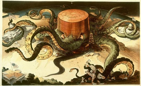
One last example that I wanted to use that showcases the differences between propaganda and persuasion is a political cartoon of Rockefeller's company Standard Oil. The poster depicts Standard Oil as an octopus whose tentacles are latched onto the buildings of the capitol, congress, and the white house. The tentacles can also be seen attached to trading ships and wealthy businessmen. The purpose of this cartoon was to dramatize the issue of monopolies such as Standard Oil having major control over society and the economy.
As you can see, although propaganda and persuasion both want to influence a general public, how they go about it has major differences. Propaganda’s purpose is to propagate a larger audience with a major biased influence. Persuasion works hard to persuade the public through major emotional, authoritative, and logistic appeals. Persuasion wants to be factual while also convincing. They want you to buy a product, donate, contribute, but for reasonable reasons. Propaganda wants you to change and challenge your entire opinion about something whether the depiction is accurate or not; it doesn’t matter to them because they believe their depiction is right.
------------------------------------------------------------------------------
References
Lester, Paul Martin. Visual Communication: Images with Messages . Sixth ed., Michael Rosenberg, 2014.
O'Dea, Published by S., and Nov 25. Samsung Smartphone Sales 2020. 25 Nov. 2020, www.statista.com/statistics/299144/samsung-smartphone-shipments-worldwide/.
Jenkins, Ryan. The Thin Line between Propaganda and Persuasion. 2013.
Wylie, Phil. “6 Principles of Persuasion 1).” SlideShare, 6 Mar. 2009, www.slideshare.net/jahroy13/the-power-of-persuasion/40-6_principles_of_persuasion_1.
2 notes
·
View notes
Text
SHIELD ID CARD REQUEST FORM
Alright, ya weirdos. So I used to run an ID making thing where people could message me and get an ID card for their SHIELD character made. Then I stopped doing it because I got really overwhelmed and didn’t feel like doing it. Then I vanished for like 5 years, my personal blip, and now I’m back. SOOOO, I dug out the old files.
Only I don’t have photoshop anymore. I am using Photopea and Photopea doesn’t like the original fonts I was using for these cards. So it’s taken me a while but I finally got this card design up and running to my satisfaction again.
Please follow the rules I have laid out for each design and I will try to get to these card requests in an orderly fashion. OR you could use this site I found which makes remarkably similar cards to the AoS design instantly and includes the clearance level. It’s really nice and also has a Hydra version.
DESIGN 1

This design is based on the Agents of SHIELD tv series ID cards. It's all their design. I just reproduced it as best I could.
What I will need to get this card made:
Design number
Your Name
Gender
Hair Color
Height [When it doubt, look up the height of the FC]
Date you joined SHIELD (I imagine the cards expire and need to be renewed every 4 years or so. The date you JOINED will not be on the card, but it will be used to figure out when the card was last renewed and when it will again expire) If your character blipped, please tell me and I will put their issue date as 2023 which is the year everyone was blipped back. If your character is no longer with SHIELD and you just want something from before they left, let me know the year they left and I will make one with dates before then so you can pretend its their old ID. Or request specific years if you want. Would make it easier on me. lol
Title (Possibly having to do with your division. Examples from the show are: Administrator, field officer, Bio-Chem, Engineer, and Specialist) I will literally put anything you want.
Your Birthday
And a photo with a plain background [light or dark but preferably dark to match the ones from the show], preferably from the shoulders up. [They don't have to be looking at the camera but treat it as though they were literally getting their photo taken for their ID card. So no crazy poses or wacky outfits or weird angles. Straight up school picture day photo.]
The numbers and letters in the Card DNC No. section are totally random or based on my mood as I have no idea what a Card DNC No. is or what it's supposed to do... So... There's that.
The QR Codes are ACTUAL WORKING QR CODES and if you would like a specific message [Please keep them short. Longer ones are harder for you to scan and read] please let me know. Otherwise it will be a random surprise you can scan when you get it or I will just link it to your tumblr.
Send all of the above information through the tumblr chat and I will send the card to you through there as well. I will also post it on my tumblr with the tag ‘idcards’ which is where I keep all the ones I previously made. If I don’t hear from you after that I will assume there are no errors to be fixed.
DESIGN 2

This is based off of several designs I have seen online that I mooshed into one so this is not my ORIGINAL design. It looked neat so I recreated it and modified it to my liking.
What I will need to get this card made:
Design number
Your Name
Clearance Level (from 1 to 8)
Date you joined SHIELD (I imagine the cards expire and need to be renewed every 4 years or so. The date you JOINED will not be on the card, but it will be used to figure out when the card was last renewed and when it will again expire) If your character blipped, please tell me and I will put their issue date as 2023 which is the year everyone was blipped back. If your character is no longer with SHIELD and you just want something from before they left, let me know the year they left and I will make one with dates before then so you can pretend its their old ID. Or request specific years if you want. Would make it easier on me. lol
Title (Example, Agent, Head of _____, Administrator, ect)
And a photo with a plain light background, preferably from the shoulders up and showing the entire head. [They don’t have to be looking at the camera but treat it as though they were literally getting their photo taken for their ID card. So no crazy poses or wacky outfits or weird angles. Straight up school picture day photo.]
Send all of the above information through the tumblr chat and I will send the card to you through there as well. I will also post it on my tumblr with the tag ‘idcards’ which is where I keep all the ones I previously made. If I don’t hear from you after that I will assume there are no errors to be fixed.
DESIGN 3

This design is based on an image of Tony Stark’s ID badge I saw online. Design not my creation.
What I will need to get this card made:
Your Name
And a Letter designating your reason for being at SI [V for Visitor, S for Security, on the design I took it from Tony was an A I assume meaning Administrator or A class. Whatever. Give me a letter to work with.
And a photo with a plain background, preferably from the shoulders up. [They don’t have to be looking at the camera but treat it as though they were literally getting their photo taken for their ID card. So no crazy poses or wacky outfits or weird angles. Straight up school picture day photo.]
Your username is under the barcode at the bottom.
Send all of the above information through the tumblr chat and I will send the card to you through there as well. I will also post it on my tumblr with the tag ‘idcards’ which is where I keep all the ones I previously made. If I don’t hear from you after that I will assume there are no errors to be fixed.
If you have any questions or concerns please message me. This is just for fun. I don’t take payment or whatever.
7 notes
·
View notes
Text
Reading ‘Publishing as an Artistic Toolbox’ in the Digital Age
Publishing infiltrated the art world as an art in and of itself in magazines, on the Internet, in libraries, artistic collections to notions of the bookshop and round table discussions on and off-site in Publishing as an Artistic Toolbox at Kunsthalle Wien from November 2017 to January 2018.
Nowadays, we even consume the analog as a digital experience. This lens i.e. “But is it instagramable?” or "Can I look it up online?” might at first, seem like a basic method but was a means to navigate the books on display.
Red tiled rooftops shape bookcases, replicated in three rows, symbolizing “home is where the books are” . Explanatory meta text is written on the walls, setting its timeline from 1989 to the present, marking the fall of the Berlin Wall and the beginning of the world wide web. This transformation from analog to digital shapes the perception of the show, spanning and panning the many mutations since publishing became an artistic practice.
Exhibition view: Publishing as an Artistic Toolbox: 1989-2017: Foto: Jorit Aust

Experience digitally
Similar to the world wide web the show is vast in scope but mostly material. Rather than walk each red-roofed aisle like the wet dream of bibliophile, surf it like the Internet. Each publication opens up its own vortex in your hands or via clicks. A large screen hovers over a pedestal, displaying The Post-Digital Publishing Archive, a section in its own right. This project itself is an infinite exhibition. Worth clicking your way through from the comfort of your MacBook for the museum struggles to display post-internet art in interesting ways. The cultural value of this piece gets lost here. So take a look here, on your browser: http://p-dpa.net. Expand your resources of published data online wider by following up your search with the revolutionary UbuWeb, a platform from 1996 that opened up another galaxy to share avant-garde fine art.
What catches your eye? This is the mantra for the impatient digital reader.
Fixated like a junkie, insatiable like a foodie; the viewer is blinded by bibliophilia. All the curators or rather collectors, headed by Luca Lo Pinto, and the authors, artists, publishers, binders, and coders involved are bibliophiles. Therefore, visiting this show feels like a crash course in library studies or creating an annotated bibliography for your Ph.D. in art. You have to be a true bibliophile —A minor fetishist to the endless textures, multiple formats and content of artist books—to appreciate this interactive index. Listicles are cool here. It’s paper on paper, on paper and on the Internet.
Upon entry you receive a booklet, the #toolbox17 index. Next to your iPhone camera, this proves just as important a device to roam and browse the exhibition. Another tool is an oversized newspaper —with no pictures— dryly explaining in small, tight paragraphs the background stories to the individual books in detail. You might have to meticulously read these manuals from front to back before you can even fathom understanding the deep contextual underpinnings of what your vision discloses.
The tricky almost virtual method to reading this show is to cross-reference between numbered and titled paragraphs on the wall, corresponding to a red-roofed shelf pew in Real Life. Then match the lists of typed book titles in your booklet with the real book or magazine. Eleven sections in total. On the sensory bright side, you may, however, touch the books individually, smell them, rifle through them, take a picture of a picture or text, and enhance your social media. This system compares to an encyclopedic video game. The reader has been shrunk to a mouse cursor, and is now stuck in a very colorful version of Wikipedia, doomed to forever roam, browse and cross-reference. After reading on reading, a tiredness sets in similar to the affect after scrolling through your news feed or after reading this article.

Tabs
Though the show sets up clear sections, there is an algorithmic randomness to what jumps out at the viewer. Each book is click-bait. You will come across dick picks such as the cover of Schism-zine as well as news on news and printed landmarks of sub and high culture. In the section Artist-run Magazines, The Magazine as Medium, you can find radical pieces of paper such as the fanzine Heyt Be! Created by Denis Beser, Sedef Karakas, and Bari’s Sinsi, it represents the Austrian local underground zine scene as well as the alternative and political printing culture in Turkey. These red roofs house a global village in their breath of artistic periodicals. Heyt Be! and the Swiss, Austrian and Berlin-ese art periodical Ztscrpt — each issue is named after a different Word Font— can also be purchased in the actual museum gift shop.
Heyt be!, Photo Credit: Nina Prader

Don’t confuse the gift shop with the art bookstore, you enter the show through. The latter is art, curated by Motto distribution and Gregorio Magnani, usually found in Berlin on Skalitzer Strasse as a shop. On display are meta books such as The Book on Books on Artist Books, exemplary of eternal and viral mirroring effects that suck a reader in to open another book tab. The museum guard mentions that he sometimes has to act as the bookkeeper here. On the wall, a text proclaims the relevance of the distributor and the bookshop to the art world. Aptly titled The Bookshop as a Medium (section 11), the implication uncovers one example from the spectrum of art book distributor practices. From a circulating gift economy, not-for-profit structures, non-profit, not-enough-for-profit to veritable art book gangsters, they all operate and advertise under the ideological belief that the notion of the book is the purest symbol for freedom of speech on the dog-eat-dog art market.
Filters
Artists that read and make books is the overarching theme to the show’s theoretical filters. Each book has its own set of filters in turn. In the section Artist’s Library, the canonical artist chose inspiring works, relating to artistic publishing. Paul Chan’s choices: Self-Publishing for Dummies, H.P. Lovecraft’s Grimoire, a textbook of magic: Necronomicon and the University of Chicago’s A Manual of Style prove ironically helpful to understanding the show.
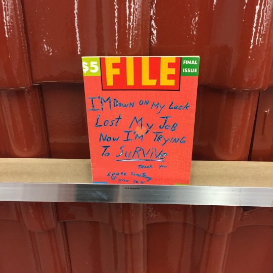
To the book nerd, all the pretty books are markers of printed matter history. Celebrating icons of the printed matter magazine renaissances from the early 80s such as General Idea’s FILE Magazine’s final issues and Starship and Index from the turn of the Millennium. A contemporary response on the timeline is the New York-based independent online-culture, post-internet Sex Magazine, paying tribute to digital-natives and the unregulated Internet.
File Magazine, Photo Credit: Nina Prader
Also worth a skim to get that friction between analog versus Instagram photography vibe, SKULPI, annually published by Roman Schramm, is mostly matt technicolor photography, exploring different ways to express sculpture. Follow that up, with the 3-D materialization of the magazine THE THING Quarterly, a periodical that literally is an object edition. It takes the shape as 1 of 1000 hand-crafted numbered ceramic lottery balls. Does the one on display contain a diamond at its center or just a zirconia like the other 999? The message is the medium, worth a snapshot.
2.THE THING Quarterly Issue 28, 2015 THE THING Quarterly Issue 28, 2015, Foto: Kunsthalle Wien 2017

This is Not a Newspaper
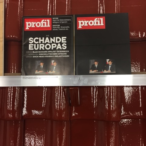
Artistic publishing is a collection of glitches —illy camouflaged— with which artists hack the public. The section The Message as Medium contains artists masking their message in newspapers and periodicals. Pop-culture activist and rabble-rousers like the Yes-Men, Steve Lambert, and Andy Bichlbaum, made a special edition of The New York Times with visions of a better America on July 4, 2009, with the headline piece: “Iraq War Ends”. This section juxtaposes well with the takeaway meta-newspaper NEW YORK POST flag profile by Michalis Pichler at the entrance of the exhibition. On its mostly white pages, this compilation counts flags from newspapers like The New York Times, New York Post, Village Voice around 9/11. Sometimes the absence of text acts self-explanatory like an emoji. In a similiar vein, the Profil magazine facsimile from 2000 by Hans-Peter Feldmann (Austria’s equivalent of the German Spiegel) has a blackened cover. The original rests next to it, Austria’s political mess best described in imagery as an emptied cover of political mourning. These alternative forms of mediating news resonate as artistic fake news with substance.
On the whole, the show is a haptic google image search. How much you will actually see in full remains a mystery. A heap of book culture from a very specific time frame crystallizes in the shape of an index. There is much room to read or not read in between the lines. The publishing toolbox is obtuse. What is still legible in the age of digitization? Though a feeling of over-saturation, paired with attention deficit disorder sets in, the book remains a monumental signifier for knowledge and freedom of speech, everyone can subscribe, maybe even read one.
Profil by Andy Bichlbaum, Photo Credit: Nina Prader
Written as an Online Review for SLEEK Magazine January 2018
Exhibition Publishing as an Artistic Toolbox: 1989-2017 8/11 2017 - 28/1 2018 at Kunsthalle Wien
7 notes
·
View notes
Text
InVideo Review: How to make $1000 in 2021
Have you ever utilized Canva and admired how it aided non-designers in creating eye-catching images? If you answered yes, you would undoubtedly like InVideo. It performs the same thing but with an emphasis on assisting you in the creation of videos. I'll go through the following topics in this InVideo review:
What is InVideo, what are its features, and how much does it cost?
Should you go through with it or not?
How to make $1000.
How to Use InVideo Even if You're Not a Freelancer.
Sounds interesting. So let's start with an overview of the platform, particularly if you've never heard of it before.
What is InVideo?
InVideo, which is hosted on invideo.io, is a newcomer to the video editing business. It also allows you to use templates to produce various eye-catching videos, similar to how Canva allows you to create pictures.
You may also turn your blog entries and articles into videos with the assistance of InVideo, And I think it's a fantastic concept, particularly if you're a blogger who likes the notion of reusing your material. And what distinguishes InVideo from the competition?
“With little to no technological experience, almost anybody can make videos.”
That's correct, even though I am not a specialist in video content creation. Despite this, I've made several movies using InVideo over.
So, if I can make it, you certainly can as well. But, do you still not trust me? Then, allow me to take you through the steps of making videos using InVideo.
InVideo Review: How Does It Work?
The site of InVideo describes how the platform's video production works. Why? Because the team understands that it is the platform's most important feature. So all you have to do is “Sign Up” for an InVideo account, and you'll be able to get started right away.
To get started, choose a template that reflects your brand's narrative or concept. Following that, take advantage of InVideo's free stock of music, pictures, and videos. Colors, timings, typefaces, and other details may all be changed. You may also begin with a blank design and add components of your choosing.
After you've finished editing your video, export it. Within site, InVideo also allows you to post it on social media.
But first, let's learn a little bit more about the platform's features.
What Makes InVideo So Special?
For non-professional video producers like you and me, InVideo has a ton of features. Please have a closer look at them!
Audio equipment
Overlay of text
The media library
Aesthetic effects
Merge at high speed
Reseller privileges
Shareable link
High Definition Resolution
Fonts in a Variety
There are many stickers.
Changing the speed
Templates for font quotes
Templates that are already created
Video splicing and merging
From a blog post/article to a video
Character length is unrestricted.
Video Production and Stabilization
Shapes, text boxes, and other elements are available.
Uploading pictures and videos is possible.
Collage, masks, and other enhancements
And so forth. All of this comes with a 60-day money-back guarantee and support. But you're probably thinking that it's going to be too costly. Wrong. Let me now take you through InVideo's price structure.
Pricing for InVideo
InVideo operates on a freemium basis. Therefore, you may also start utilizing it for nothing. As a result, it has certain restrictions, such as the InVideo watermark.
Free Plan from InVideo
Let's see what you can obtain for free.
InVideo Watermark
4500+ Video Templates by InVideo
3 million+ standard media library
Text-to-Speech Automation
Each video lasts 15 minutes.
You get a lot more than you anticipate for free, in my opinion. And, if you're just getting started, I suggest enrolling for free at first and then upgrading later. Other options available include ‘Business' and ‘Unlimited.' Now let's look at them.
Business Plan from InVideo
If you pay for a year in advance, the business plan is $15 per month. If you don't want to commit to a full year, it's $30 per month. Without a doubt, you will appreciate the abundance of materials provided by InVideo. You may also export 60 videos each month.
I suggest the ‘Business' plan only if your video production business has grown significantly. Also, if you think it's worth it, you may pay for a full year and get a 50% discount. The information was accurate at the time of authoring this article. You should, however, go to InVideo's price page for confirmation.
Unlimited Plan from InVideo
The ‘Unlimited' plan from InVideo is really unlimited. You may also export an infinite number of videos, view 120 iStock images, and access 1 million. If you pay for a year, the ‘Unlimited' option costs $30 per month. If you don't want to commit to a year, it costs $60 each month.
Again, I think you should purchase the ‘Unlimited' package for a full year to take advantage of the 50% discount. After that, you only go for it if it's worthwhile. That leads me to a review of the platform.
InVideo Review: Worth the Money?
You probably already know how much I like InVideo, so I'll give it a good review. It does, however, have certain drawbacks. So, I'll discuss both the advantages and disadvantages. Does it seem reasonable?
Pros of InVideo
You may customize everything.
Detailed lessons are available on the YouTube channel and the blog.
You'll find a plethora of sticker options, text effects, and filters
Highlight the terms to search for related video footage.
Because you have complete control over them, you can sell and share videos easily.
Millions of stock photos, video clips, and audio are available to you.
Without question, there are many advantages to utilizing InVideo to produce your videos. But it leads us to the disadvantages.
Cons of InVideo
These are not the main drawbacks of utilizing the InVideo platform. However, the squad could improve on the following points:
First, only 50 scenes are allowed (you'll notice the recurrence after a while).
Second, it takes a long time to preview and export.
Third, your layout selections will be lost if your mind is changed.
All of these disadvantages aren't game-changers, but they are unpleasant. And, without a doubt, InVideo is an excellent video editing online tool.
How to Make $1000 with InVideo
InVideo enables you to produce many kinds of videos for several platforms. Among these platforms are:
Facebook
LinkedIn
Snapchat
YouTube and Other Resources
You may also select from the following kinds of videos to make your work easier:
Coupons / Promotions
Advertisements for Branded Products
Invitations to Presentations
Motivational sayings
Promotions for webinars
Bite-sized ads
Testimonial videos
Videos suitable for snacking
Listicles and other resources
Without a doubt, creating movies based on all of these categories is a breeze with InVideo. I provided freelance video ad creation, Instagram postings, and YouTube intros and outros. And in this manner, I have earned about $1000. Let me show you how to earn even more.
InVideo Review: Freelance Service Suggestions
By using InVideo, you may provide a wide range of services. Let me offer three service concepts that I've tested.
Intros and Outros for YouTube
As the world's second-largest search engine, YouTube is also the world's most popular video platform. As a result, you may find every kind of video maker there.
You can imagine how many prospective customers there are for you. Ask them to consider having you create intro and outro films for their YouTube channel. Make a Fiverr Gig out of it. And, like a pro, advertise your gigs or services.
Video Ads
Every once in a while, millions of entrepreneurs emerge. And, to be honest, every one of them should run video advertisements since they work so well.
Instagram Posts
Instagram is full of influencers. And they must all publish excellent material on Instagram. Videos are now worth their weight in gold on Instagram. Inform Instagrammers that you may assist them in creating amazing videos right now.
How Can You Market Your InVideo Services?
So you've made a fantastic video portfolio using InVideo. So, what now? You can't simply sit back and wait for the money to come into your account. You must get the word out about your freelancing services.
Here's how to do it:
First, make some video advertisements for InVideo, Distribute them as samples of your work and pitch them to prospective customers.
Second, create and advertise freelancing jobs on sites like Fiverr and Upwork.
Third, Cold emailing may help you sell your services.
Fourth, If you have any of these services, include them on your website.
And there are many things you may do to develop and market your freelancing services. Because it's not only the InVideo review, let me provide a way for you to become motivated for your company.
Go to InVideo's price plan and choose the ‘Free' plan. And consider it a game to go from ‘Free' to ‘Unlimited.' It will undoubtedly keep you motivated.
If you're new to freelancing, put these practical ideas to use.
Not a Freelancer?
Or maybe you do not want to provide freelancing services. If you operate an online company, InVideo may still be useful to you. Instead of offering services, make films to help you grow your company. For instance, if you own an e-commerce site, you might make product films.
Also, use video advertisements on social media. Videos are becoming more popular. You may also make similar videos if you have a blog on any subject. Everything is as simple as putting a link to your blog article into the InVideo.
Final Thoughts: InVideo Review
There is no reason not to make money online nowadays since the possibilities are limitless. You may make a full-time income by writing web content or creating videos with InVideo. InVideo is a potent tool for creating videos without any technical knowledge.
Here's a brief rundown of your options:
Begin experimenting with InVideo for free.
Make YouTube intros, video advertisements, and other services available.
Promote your freelancing opportunities.
Slowly expand your company.
This article is more than simply an InVideo review; it is a comprehensive introduction to the subject. Thank you for reading, and please share your views in the comments section below.
0 notes
Text
Polytechnic | Powerful Education, Courses & Events
New Post has been published on https://click.atak.co/polytechnic-powerful-education-courses-events/
Polytechnic | Powerful Education, Courses & Events
Polytechnic is an responsive, education and student focused WordPress Theme. It’s beautiful, clean, and professional. We built this theme specifically for educational institutions and include easy to use live customizes and drag & drop builders. It’s capable of handling a ton – including a new faculty member role, extended user profiles and pages, customizable “white label” login, courses, catalogs, faculty grid, store, blogs, filterable post grid, and almost anything that you can think up! We pride ourselves on how well this theme works out of the box, so if you run into any issues, please don’t hesitate to let us know at our dedicated support forum. Check out our feature list below!
Latest Update: March, 2018
Version 1.3.7 Now Available
With new updates and feature requests!
See update log below for full details
The Idea Behind This Theme
We believe that school is hard enough as it is, and wanted to build something awesome that helps schools, faculty members, and students. Something that would enhance the school experience for students, increase engagement and retention, decrease confusion, and that focused on the details of how this could work for that majority of educational institutions out there.
With all of that in mind, we built Polytechnic
Teachers can add/update their own courses and provide students with up to date information regarding homework, study guides, notes, and a tentative schedule based on a specific course section. Students can get course specific information if they missed class, check to see what time the pre-game rally is on Friday, get course catalog information online, and purchase required reading materials with a click of a button. And admins can oversee it all, monitor the flow of information, and have the ability to add, edit, assign, and delete course information and users.
The Best of the Features
Polytechnic comes with tons of features and the ability to support loads of different plugins that’ll make it just right for your project… here’s an overview of what’s included:
The New Faculty Role & Extended User Profiles
Polytechnic comes fully integrated with a new user role specifically built for educational institutions. We’re calling this new WordPress user/role “Faculty”. This Faculty role provides faculty members with the ability to add, edit, and update their own courses and course information. This role is similar to the “Author” role native to WordPress, with a few added tools and abilities to provide your faculty members with the right amount of rights. This role also allows users assigned to this role to edit their own personal information (ie. bio, photo, contact info, etc.).
Custom User Login
Because your faculty should feel proud to login to your schools site! Customize the login for your users to match your school with easy to use options. Go ahead, check it out. Choose or upload your login logo, position the login form location, add a background image, set a color fallback, and add custom html!
Courses & Catalogs
Adding a new course is easy, and can be assigned to any user. If that user has been assigned the role of Faculty, they will have their own login and dedicated WordPress dashboard. This dashboard will only include the necessary information for this user role (ie. courses). Next, this user can navigate to Courses to see all of the courses currently assigned to them. They can open any one of these to begin updating/editing the course information and course content (ie. homework, study guides, etc.)
Mega Menu
We’ve included a drag and drop mega menu to provide a compelling way of displaying menu items and additional content on your site. Now you can choose to use a flyout menu or mega menu for each parent item.
Sticky Header
We’ve built a sticky header right into the theme and gave it it’s own options panel. Setup is easy and will extend the usability of your site for your users. Add your own custom logo, menu, and customize away with our theme options.
Tophat Dropdown
This section is triggered with the (top left) tophat tagline trigger and reveals a new section of widgets. These widgets are easliy managed in Appearance > Widgets and we’ve even included a custom options panel to customize this section further.
Page Templates
We’ve built some powerful templates for you to use. These templates are customizable and can be used as many times as you like and include: Post Grid, Blog, Course Catalog, and Faculty Grid (yes, it actually filters users). Each of these templates offer custom options to help building with these templates a breeze. Oh, and did we mention that you can also use Visual Composer on any of these pages to add even more content. The combinations are endless.
Sensei Learning Management Support
Sensei is a Learning Management System that makes teaching coursework easier than it’s ever been, all within WordPress. With the Sensei plugin you can create courses, write lessons, and add quizzes. Set lesson and course pre-requisites, allow user registration and even charge for your course content if you want. Simply put, we’ve included “out of the box” support for the “Sensei” plugin by Woo Themes for extended features and functionality for schools that want to take their courses and lessons to the next level. This plugin is not included with the theme, and users who want to utilize these extended features will need to purchase a license through Woo Themes. This plugin is not associated with the Polytechnic Courses provided with the theme.
WooCommerce Ready
Yep. WooCommerce is enabled on this theme, which means you can use it to sell stuff like shirts, gift cards, or anything else you can dream up. This theme isn’t focused on custom shop design, but WooCommerce does a TON of amazing stuff out of the box and this theme will work seamlessly with it.
Built on the Mythology Engine
Mythology Engine has been developed with the sole purpose of creating an efficient method of publishing themes with a streamlined development process… Key features include white-label options panels, “in-dashboard” documentation, and a no-nonsense approach to content management & theme options.
Visual Composer 4
Create your own custom layouts using over 30 different content modules ranging from image-sliders to text blocks to videos and maps. Visual Composer is the most popular visual editor available to WordPress and it’s bundled in the theme. Updates are be included for free with each theme-version update.
Visual Composer Extension (Polytechnic Exclusive): Custom Hover Images
User interaction has many benefits. One is that it can create focus and increase audience retention. Use Visual Composer to add these exclusive custom hover modules to your content. Don’t forget to add links and calls to action with these Custom Hover Modules to increase internal traffic and interactions. Choose a custom image, background color, add custom content, and select a start height and end height for the modules on that page.
Visual Composer Parallax Rows
We’ve extended this plugin to handle parallax backgrounds for full-width rows. This makes it even easier to add in your content and break it up visually with this custom feature.
Live Front-End Customizer: Unlimited Colors and 1,000’s of Fonts
Customize your theme’s typography easily with instant Live-Previews as you select your options and see how your site looks with any font, color, or size before you hit “Publish”. Integrated with color pickers and the Google Fonts library, so you’ll have 1,000s of fonts to choose from. If Google Fonts aren’t enough, we integrate seamlessly with Typekit, Fonts.com, and other popular services.
Revolution Slider 4
The most popular & easy to use “mega slider” plugin to ever exist!!! OK, that’s hyperbole, but it’s honestly pretty great and we’re thrilled to announce that we are now including Revolution Slider 4. This latest version includes: brand new admin interface, more options, more conveniences, custom caption animation builder, full slider import/export, and much more! You can also include Revolution Slider as your ad space slider, pre-content slider, sidebar slider and within individual posts/pages. Sweet!
Contact Forms
We are fully including Contact Form 7 to provide users with a quick and easy way to build and manage contact forms. It can manage multiple contact forms, plus you can customize the form and the mail contents flexibly with simple markup. The form supports Ajax-powered submitting, CAPTCHA, Akismet spam filtering and so on.
Ajax Live Search
Try typing in the search-bar (in the sidebar or on the “tophat”). The Live Search feature allows users to instantly skim your site for relevant material without every loading another page.
HTML5 Fueled SEO
We re-wrote our entire theme-base from scratch to include the latest, most relevant HTML elements and tags to allow for the best possible search engine results.
Multi-Language Support
The entire theme has been fully internationalized and prepped for your language translation. Just follow the usual translation process and the theme will do the rest.
Custom CSS & Script Injection
Got something custom that you want to drop in? Simple. Just drop them into our theme control panel and the theme will do the rest of the work for you.
Built with Ordinary People in Mind
Our goal is to deliver a theme that anyone can use & customize, without any need for 24/7 customer support or long-winded documentation manuals. We recommend uploading the theme demo if you want a head start, but the theme has truly been designed to be answer any of your questions as you use it, so don’t fret if you don’t know how to code.
Helpful Support
If you need some more information on something included with the theme, we’ve put together a dedicated information site for this theme. If you still need some help or have a question, feel free to ask us at our dedicated support forum. Just make sure to include your endgoal to help us understand how we can help.
Built with Developers in Mind, too!
Our code is clean, organized, and well commented. Everything has it’s rightful place in this theme, and making advanced customizations to templates, stylesheets, and functions has never been easier.
Beyond Responsive
We were one of the first theme crews to dabble in ‘responsive design’ way back in the day, so we know a thing or two about how to do this properly. Fluid grids are used at larger breakpoints, and fixed widths are used on smaller devices to ensure ideal spacing. The type size shifts on smaller devices to be larger and easier to read, and images and other media are sandboxed to prevent anything from breaking the layout.
REM Typography & Layouts
The problem with Pixels are, they absolutely do-not-scale in Internet Explorer. Furthermore, with the onset of Responsive Web Design, having fonts that scale (in relation to the screen width) has become paramount. Percentages (%) and EM’s are better, but they’re tricky and compound. Still not an answer. A real solution? Use the REM. (Source – Greg Rickaby)
JetPack Share, Comments, Carousel, and Extra Widgets
Nearly all of JetPack should work well with this theme (the Tiled Galleries are the only exception since those aren’t responsive); if you want to start using the next level of WordPress functionality, you’ll get it here.
The Theme Control Panels
This theme has been built on the Mythology Engine, a foundation theme from MDNW that has the primary goal of creating the fastest site launch process possible. It does this in a few ways:
Back-End Theme Options, Re-envisioned
Functionality meets organization. We’ve re-done all skinning options from our primary theme control panel in order to create a swift, responsive, uncluttered way to manage the key aspects of the theme. This is what the admin panel looks like:
In addition to the Theme Options panel (which manages the global theme options), this theme also integrates Page & Post options that allow you to override any global rules for that one page or post. These panels will show up on any Page or Post editor, underneath the basic content editor. In the event that they do not appear, make sure that you have enabled them from the top-right “Screen Options” panel. These panels will allow you to override theme-level options on individual pages and posts.
To take this even further, we added custom options that show up depending on the page template used. This includes page template specific options for theBlog Page & Post Grid (Portfolio) page templates. These panels will show up on any page with the Blog Page template or Post Grid template selected.
Front End Theme Skinning with Live-Preview
Eliminate the guesswork from customizing the theme. Built on the WP Theme Customizer API with some special tricks blended in, you can change just about every typographic or color across the entire theme; there’s no need to reload the page on the front-end though; the Theme Customizer will show you an instant preview of what your changes look like right there on the same screen.
Here’s what the panel looks like:
The full library of Google Fonts is included in the Theme Customizer (and yes, live-preview works on the font-faces too). Just open up the customize panel and start playing!
Quick Links
Standard Troubleshooting Steps
Support Policy | Articles | File a Support Request
How to UPDATE The Theme | How to UPDATE Premium Plugins
Change Log
/* ========== - UPDATE LOG : Polytechnic - ==========*/ Version 1.3.6 08/12/17 - UPDATED: Plugin - WPBakery Visual Composer 5.2 - UPDATED: Plugin - Revolution Slider 5.4.5.1 - UPDATED: element-sticky-header.php, element-secondary-navigation.php, and theme-register-menus.php - REMOVED: Mythology_Walker class - ADDED: Author sidebar styles updated. - UPDATED: theme-4-plugins.css styles for The Events Calendar update. Version 1.3.5 03/12/17 - UPDATED: WPBakery Visual Composer 5.1 - UPDATED: Revolution Slider 5.4.1 - Fixed: SSL for GoogleFonts Version 1.3.4 01/14/17 - UPDATED: WPBakery Visual Composer 5.0.1 - UPDATED: Revolution Slider 5.3.1.5 - UPDATED: Polytechnic Courses 2.0 - REMOVED: Mythology_Walker for QTranslateX Support - UPDATED: Author.php for translation of <p></p> string - UPDATED: .pot file - UPDATED: Style for sticky header menu items (with children) Version 1.3.3 09/08/2016 - UPDATED: WPBakery Visual Composer 4.12.1 - UPDATED: Revolution Slider 5.2.6 - UPDATED: Ajaxy Search Form registered via included zip - UPDATED: Translation - Tophat Account/WooCommerce Links - Post in loop (the_content(Read More...)) - Template-Course-Catalog.php - _x to __ - Author Sidebar now includes 's - UPDATED: WooCommerce Support - FIXED: Page Layout options - UPDATED: Course Catalog template - ADDED: Sensei support - UPDATED: Polytechnic Courses 1.9 - ADDED: Sensei support - UPDATED: ot-meta-boxes - ADDED: Sensei support - UPDATED: Documentation 0.7 Version 1.3.2 07/12/2016 - UPDATED: Template Blog - UPDATED: Now uses WP_Query - ADDED: Conditional for pagination when is_front_page() - FIXED: Pagination when assigned to Static Front Page (Settings > Reading) - ADDED: RTL Support - ADDED: RTL Stylesheet - ADDED: Option to turn on RTL Stylesheet - UPDATED: hAtom microformats - NOTES: - CHECK/TEST: https://search.google.com/structured-data/testing-tool - CHECK/TEST HELP: https://developers.google.com/search/docs/guides/prototype - RESEARCH: Aggregate from articles and user feedback (Thanks @Tim) - UPDATED: hAtom microformat for author across the theme - UPDATED: vcard & fn - UPDATED: hAtom microformat for date across the theme - ADDED: Additional recommended markup to meet standards for microformats - ADDED: To post, post loop, default page, faculty page, post grid page, blog page, etc.) - UPDATED: Now supports new Responsive Menu plugin (v.3.0) - ADDED: Base styles to support the new markup/styles added by the plugin - ADDED: Starter skin for the menu (included in WP Polytechnic/Resources/Demo-Data/Demo-Menu-Skin.json). This allows users to use their panel to customize this further. - NOTE: This has become a "Freemium" plugin, which allows you to extend it by purchasing a "Pro" license. This is not necessary unless you want access to some of their more advanced functions. Again, this is not necessary. - Further, with so many pre-existing users, I felt it appropriate to support this update v. moving away from it. I am still considering other options, but this is a necessary step to maintain existing sites that using this functionality. - UPDATED: Modified styles for notifications on the backend, red to gray (red is a bit misleading). - UPDATED: Hover Image Module, module-content font-weight for @media-queries fallback updated - UPDATED: Child Theme - v.2.0 - ADDED: Support for Main/Large hover-image replacement with video (4:3) in hover-grid - UPDATED: Support for Dynamic To Top - ADDED: Option/Toggle to manage theme styles (Appearance > Theme Options > Sticky Header Options > Use Theme Styles for Dynamic To Top) - NOTES: Toggling the option off will remove theme styles for this element, and the Appearance > To Top panel will take precedent. Default is on, and will pull styles from the theme.Reason - This is for users who want to modify this element further using the native/included options. These option are limited, though, which is why the theme has custom styles for this. - UPDATED: Documentation to v.0.6 - UPDATED: Responsive Menu steps for importing the Responsive-Menu-Skin - UPDATED: Responsive Menu notes for setting up and customizing - UPDATED: Dynamic To Top section with notes on new option - UPDATED: Faculty Grid Template & Options - ADDED: All users of all roles selection option (Manual User Selection v. Manual Faculty User Selection) - ADDED: Query and output for new option key/value set - ADDED: Toogle ON/Off to turn user email into a mailto link - UPDATED: Theme Options > Faculty Options - UPDATED: Sectioned into tabs - ADDED: Toogle ON/Off to turn user email into a mailto link for Author page - ADDED: Toogle ON/Off to turn user email into a mailto link for Sidebar instances - UPDATED: the_time() has been updated to the_modified_date() - UPDATED: Styles for WooCommerce page title Version 1.3.1 06/08/2016 - UPDATED: WPBakery Visual Composer 4.12 - UPDATED: Revolution Slider 5.2.5.3 - ADDED: Image Hover - Tablet(Portrait) options for start & end height - FIXED: Image Hover - Tablet(Portrait) display Version 1.3.0 05/24/2016 - UPDATED: Responsive Menu icon - UPDATED: Conditional that checks if title is set to off - now includes search results in conditional to maintain consistency - FIXED: Responsive Menu "Open State" for browsers not opening on first/second click (ie. Chrome, Edge, etc.) - UPDATED: Packaged version of VC in Resources folder Version 1.2.9 04/28/2016 - UPDATED: WPBakery Visual Composer 4.11.2.1 - UPDATED: Revolution Slider 5.2.5 Version 1.2.8 04/14/2016 - UPDATED: WPBakery Visual Composer 4.11.2 - UPDATED: Revolution Slider 5.2.4.1 Version 1.2.7 04/05/2016 - UPDATED: Revolution Slider 5.2.4 - FIXED: Grayscale header image - FIXED: Hover Image module custom start/stop hover height options (Thanks @tcward) - FIXED: Footer 1 column senario (removed added padding) Version 1.2.6 03/21/2016 - UPDATED: WPBakery Visual Composer 4.11.1 - UPDATED: Revolution Slider 5.2.3.5 - FIXED: Faculty Grid page template manual user selection (user link/image) (Thanks @NirmalRaman) - FIXED: Theme Options - Skin Builder: - FIXED: Primary & Secondary Color Z-Index (Thanks @Boukjee) - FIXED: Sub Menu Highlight Border (Thanks @benjaminbis) FEATURE REQUEST(S) - ADDED: Title attribute for Social Links. Gives tooltip on hover (Thanks @chaddng) - ADDED: Theme Options > Post Options > Show the Featured Image (Thanks @advanceitmn) - ADDED: Hover Image > Alt Tag (Thanks #netterm) Version 1.2.5 03/1/2015 - UPDATED: WPBakery Visual Composer 4.10 - UPDATED: Pageable Content module styles - UPDATED: Styles - UPDATED: Tophat Elements for Safari (Thanks @Naomi) - UPDATED: List styles for Essential Grid Plugin - UPDATED: List styles for Shortcodes Ultimate Plugin - ADDED: ADMIN STYLES FOR OPTIONTREE TABS - FEATURE REQUEST(S): - ADDED: Faculty Grid page template now includes an option to build manually (with user selection) - ADDED: Faculty Grid page template still supports filter by course category - ADDED: Image Link option for Hover Image module - ADDED: Course Featured Image Options On/Off - ADDED: Course Featured Image Custom Width - ADDED: Course Featured Image Custom Height - ADDED: Course Description On/Off - ADDED: Course Listing - Link Number On/Off - ADDED: Course Listing - Link Name On/Off - ADDED: Course Listing - Link User On/Off - ADDED: Visual Composer Quick Styles Controls (Theme Options > Skin Builder) - ADDED: VC Tab BG Color - ADDED: VC Tab:Hover BG Color - ADDED: VC Tab:Active BG Color - ADDED: VC Tab Panel BG Color - ADDED: VC Tab Panel Border Color - ADDED: Course Output Panel - ADDED: Change Course "Course Name"? - ADDED: Change Course "Course Number"? - ADDED: Change Course "Course ID"? - ADDED: Change Course "Course Time"? - ADDED: Change Course "Instructor"? - ADDED: Change Course "Room Number"? - ADDED: Change Course "Course Days"? - ADDED: Change Course "Prerequisite(s)"? - ADDED: Change Course "Component(s)"? - ADDED: Change Course "Credit(s)"? - ADDED: Change Course "Location"? - ADDED: Change Course "Notes"? - UPDATED: Author Course listings - UPDATED: Course Catalog page template - UPDATED: Single Course instance - UPDATED: Polytechnic Courses plugin v.1.7 Version 1.2.4 01/11/2015 - UPDATED: WPBakery Visual Composer 4.9.1 - UPDATED: Revolution Slider 5.1.6 - UPDATED: VC 4.9.1 Support - Course styles - UPDATED: Removed vc_set_as_theme - UPDATED: Theme Documentation v.0.5 - UPDATED: Easy Theme & Plugin Upgrades plugin removed from Recommended Plugin list - ADDED: Credits and Prerequisites to Course-Catalog & List & Search Version 1.2.3 12/18/2015 - UPDATED: WPBakery Visual Composer 4.9 - ADDED: VC 4.9 support - wpb_map() to vc_map() - Hover Image module and hover-grid styles - Custom parallax bg + content - UPDATED: Revolution Slider 5.1.5 - ADDED: Rev_Slider 5.1.5 support - first-child + cover-header styles updated - FIXED: Ken Burns Affect for Revolution Slider - UPDATED: Theme Styles for new version(s) of The Events Calendar plugin - Tophat Dropdown area widget usage - Content widget usage - Two column list template - UPDATED: Primary & Sticky Menu Z-Index - UPDATED: Demo-Content.xml for users with media issues - reflects new vc builds/modules - ADDED: New "Revolution Slider Home Page" demo_slider.zip - UPDATED: Marketing - 80x80.png - Theme Preview Version 1.2.2 12/01/2015 - UPDATED: WPBakery Visual Composer 4.8.1 - UPDATED: Revolution Slider 5.1.4 - UDPATED: Buy VC nag removed (not needed) - FIXED: Faculty Contact Form option - UPDATED: Styles-Polytechnic plugin to version 1.4 Version 1.2.1 11/02/2015 - FIXED: Undefined function cascade for menu doc.helper plugin check Version 1.2.0 11/01/2015 - UPDATED: WPBakery Visual Composer 4.8.0.1 - UPDATED: Separator styles for consistency - UPDATED: Revolution Slider 5.1 - UPDATED: Width for single events in month view updated - FIXED: Sticky Header menu option - FIXED: Revolution Slider v. Mega Menu dropdown z-index - FIXED: "Search Courses" for translation(s) - UPDATED: Descriptions for option sets - UPDATED: languages pot file - UPDATED: Mythology Core 1.1.8 - UPDATED: Load Text Domain function updated to check both original and standard locations - UPDATED: Doc Helper for setting menus updated Version 1.1.9 10/18/2015 - UPDATED: Demo-Content.xml - Uses latest VC module versions - UPDATED: Styles for new VC markup - FIXED: Menu dropdown v. hover-image z-index - UPDATED: Styles-Polytechnic plugin to version 1.3 - UPDATED: Polytechnic-Courses plugin to version 1.6 Version 1.1.8 10/08/2015 - FIXED - XSS Vulnerabilities: - UPDATED: WPBakery Visual Composer 4.7.4 - UPDATED: Revolution Slider 5.0.9 Version 1.1.7 09/22/15 - UPDATED: Tophat Dropdown Trigger and Pre Footer Blurb options now allow for HTML content. Note, these are now using htmlspecialchars() and htmlspecialchars_decode() to neutralize HTML. - UPDATED: Sub Footer Left and Sub Footer Right text areas updated with the htmlspecialchars() and htmlspecialchars_decode() to neutralize HTML. - UPDATED: Rev_Slider header overlap z-index support (structure 181, plugins 42 & 944) - UPDATED: New VC Tab styles for courses - UPDATED: The Events Calendar Pro widget(s) styles Version 1.1.6 09/20/15 - FIXED: Conditional using is_plugin_active fixed Version 1.1.5 09/18/2015 - UPDATED: Mythology Core 1.1.7 - UPDATED: WPBakery Visual Composer 4.7.1.1 - UPDATED: Revolution Slider 5.0.8.5 - UPDATED: All included plugins are now "Recommended" and not "Required". This opens the theme up to users who want additional control. - Note: you can still access all included plugins via Appearance > Install Plugins panel and the standard Plugins panel. - UPDATED: Documenation file to v.0.4 - ADDED: New Doc.Helper files (These will serve to assist in the admin area) - ADDED: Responsive menu doc helpers for updated/new assignment - UPDATED: Responsive menu styles - FIXED: Custom social icon options, fixes the loop so you can generate as many custom icons as you like (element-getsocial.php) - FIXED: Archive.php pagination and query - FIXED: Capitalization for localization - UPDATED: Mobile table(s) bottom margin and native scroll - ADDED: Mobile div "Touch to Scroll Content Below" added for is_handheld for table description (author.php and template-course-catalog.php) - UPDATED: Support for Visual Composer FrontEnd Editor - module controls (new and old tab controls) - UPDATED: Styles for The Events Calendar & The Events Calendar Pro - UPDATED: Styles for Section-Super-Header - UPDATED: Tab styles for new VC markup - UPDATED: Tour styles for new VC markup - UPDATED: Accordion styles for new VC markup Version 1.1.4 08/01/2015 - UPDATED: Theme helperclass jquery 'parallax-vertical' updated - UPDATED: Better support for VC parallax - UPDATED: Visual Composer Admin Helper Functions for Backend Editor - Adjusts linkage and styles Version 1.1.3 07/23/2015 - UPDATED: Mythology Core 1.1.6 - UPDATED: WPBakery Visual Composer 4.6.2 - UPDATED: Support for Visual Composer FrontEnd Editor - module controls - ADDED: Visual Composer Admin Helper Functions - Backend Editor - NOTES: These functions are focused on helping users get a better visual of their row background image/color(s) in the page editor. This was added to help/fix when the text within a row is the same color as default bg (ie. white on white). We found this to be super helpful, so we wanted to roll it out to you guys. - ADDED: GET BG-COLOR FROM ROW CONTROLS - ADD BG-COLOR TO THE ROW - ADDED: GET BG-IMAGE FROM ROW CONTROLS - ADD BG-IMAGE TO THE ROW - ADDED: Custom Hover Image module icon - backend recognition, and VC map - ADDED: Ordering options added to Course Catalog template - ADDED: Order_By - Can now order by Course ID, Course Number, Course Name, Author, Course Room Number, Course Days, and Course Time - ADDED: Order - Can now order by ASC and DESC for all included order_by parameter values - FIXED: Social > Skype option updated from esc_url to esc_attr to fix the href strip - UPDATED: Demo-Content.XML reflects the text color updates (span) used in latest VC version. Only Courses affected Version 1.1.2 06/30/2015 - UPDATED: Mythology Core 1.1.5 - UPDATED: WPBakery Visual Composer 4.5.3 - UPDATED: Mega menu sub-menu children styles for parent hover state (ot-user-styles.php) - UPDATED: Author.php course list post_per_page to "-1" (aka all) - ADDED: Now Supporting Custom Layouts for Courses - ADDED: Course > Course Layout Options - image radio buttons (this will override the fallback set in Theme Options > Layout Options for each page, if set) - ADDED: This added feature also adds support for the Custom Sidebars plugin for Courses - FIXED: Appearance > Theme Options > "Show the Post Meta?"" option fixed (content-single.php 149) - ADDED: Fallback for VC Separators on Mobile (media-queries.css 269) Version 1.1.1 06/15/2015 - UPDATED: PrettyPhoto js script to 3.1.6 - prettyPhoto XSS fix - UPDATED: Mythology Core 1.1.4 - UPDATED: WPBakery Visual Composer 4.5.2 - UPDATED: Faculty-Grid template name v. email columns - UPDATED: Custom user profile photo enqueue (functions folder 51-52) - UPDATED: new conditionals set in mythology-key.jS and register-scripts.php for isotope - UPDATED: Layout variables text-domain updated to mythology (theme-layout-variables.php) - UPDATED: Plugin support - get_custom_field conditioned (mythology-core-functions.php) - ADDED: Feature Request - Contact Form option for Author pages (Beta) - ADDED: Feature Request - Translation Support (Beta) - ADDED: Feature Request - WPML Translation Support! (Beta) We are working closely with WPML to officially support their plugin - wpml-config.xml (Beta) - ADDED: Translation support for Theme Options panel (ot-theme-options.php) - ADDED: Translation support for Page, Page Template, and Post options (ot-meta-boxes.php) - ADDED: Translation support for theme-files (directory > languages, polytechnic.pot, and (Beta) es_ES.po and es_ES.mo translation files) - UPDATED: Polytechnic Courses plugin to v.1.5 - ADDED: Feature Request - Translation Support! (Beta) - ADDED: Translation support for plugin files (directory > languages, polytechnic-courses.pot, and (Beta) polytechnic-courses-es_ES.po and polytechnic-courses-es_ES.mo translation files) - ADDED: Feature Request - WPML Translation Support! (Beta) We are working closely with WPML to officially support their plugin - wpml-config.xml (Beta) - ADDED: Comments support - NOTES: Beta additions are supported, but we want to be clear that these might include some additional steps or limitations at this time. If you have any questions or issues, please provide any feedback at our dedicated support forum: https://themeisland.ticksy.com/ Version 1.1.0 05/15/2015 - FIXED: Markup and fallback styles for Tophat Search option Version 1.0.9 05/12/2015 - FIXED - Theme Options > Skin Builder - Tophat BG option - FIXED: polytechnic-styles plugin - Tophat Section expanded and patched - ADDED: polytechnic-styles plugin - Tophat Dropdown Section now included - UPDAETD: Demo-Content.xml - UPDATED: Optiontree-loader.php updated - UPDATED: OptionTree import panel(s) - candy-admin-simple.css - UPDATED: Event widget .duration adjustment - UPDATED: Mythology Core 1.1.3 - UPDATED: WPBakery Visual Composer 4.5.1 - UPDATED: Revolution Slider 4.6.93 - UPDATED: OptionTree 2.5.5 Version 1.0.8 04/28/2015 - ADDED: Pagination for Course Catalog page template (template-course-catalog.php and mythology-functions.php) - ADDED: Fallback menu list item styles for sticky menu - ADDED: Feature Request - Tophat Login Links option (On/Off) - even when WooCommerce is active - ADDED: Feature Request - Tophat Search option (On/Off) - uses ajaxy if active - ADDED: Feature Request - Tophat Custom Text/HTML option - UPDATED: Resouces > Widgets.wie - UPDATED: Resouces > Demo-Content.xml - UPDATED: Hover-grid cross browser support - vc_extend css lines 16-32 added - UPDATED: Styles for rpwe menu widgets updated to use widget image sizes - UPDATED: Recommended plugin source(s) updated to use "latest-stable" - UPDATED: Small style tweeks to maintain consistency - FIXED - XSS Vulnerability: - UPDATED: Mythology Core 1.1.2: - WPBakery Visual Composer 4.5 - Revolution Slider 4.6.9 - OptionTree 2.5.4 - TGM-Plugin-Activation 2.4.1 - Plugin-loader.php sources updated from http to https - Plugin-loader.php sources updated to use "latest-stable" Version 1.0.7 03/11/2015 - UPDATED: Polytechnic-courses plugin updated to 1.1 - ADDED: Polytechnic-courses plugin text domain declaration - FIXED: Padding for featured image when Meta section is off - FIXED: Content-fullwidth template (used in Blog template and Single) - FIXED: Post Options > Show Post Footer, when off now turn all sub-options off - ADDED: Post Options > Post Comments On/Off - ADDED: New scrolling table function for overflow content on mobile devices for course catalog page template (http://polytechnic.themeisland.net/colleges-schools/course-catalog/) - FIXED: Remove hardcoded link in plugins.css - FIXED: Sub-footer on/off toggle - UPDATED: Conditionals added/updated for Footer Options (show_footer) Version 1.0.6 02/26/2015 - UPDATED: OptionTree Loader - this fixes the ot-meta-boxes.php error WPML users were seeing - UPDATED: OptionTree 2.5.0 - UPDATED: NiceScroll 3.6.0 - UPDATED: Polytechnic-courses plugin updated to 1.1 - UPDATED: Table data titles internationalized in polytechnic-courses plugin - UPDATED: Styles-polytechnic plugin updated - UPDATED: Events Calendar styles for mobile devices - FIXED: Appearance > Customize > Header Menu Options - FIXED: Scrolling on touch devices - FIXED: Breadcrumbs for custom page tempaltes - FIXED: List styles for Sensei Quizes - ADDED: Base list styles for bbPress - FIXED: Dropdown menu v. Tribe events z-index issue - FIXED: Sticky header menu list spacing for non-mega-menu Version 1.0.5 02/05/2015 - UPDATED: WPBakery Visual Composer - Version 4.3.5 - 4.4.2 - UPDATED: OptionTree - Version 2.4.3 - 2.4.6 - FIXED: Display of menu list item hover and sub-mega-menu. - ADDED: Default Styles for WooCommerce & The Events Calendar Tickets - ADDED: Menu Hover Color option in Skin Builder - ADDED: Sub Menu Highlight Color option in Skin Builder - ADDED: Sub Menu BG Color option in Skin Builder - ADDED: Sub Menu BG Image option in Skin Builder - ADDED: Header BG Grayscale On/Off toggle in Skin Builder - ADDED: Header BG Color Opacity numeric slider in Skin Builder Version 1.0.4 01/15/2015 - FIXED: Display of Faculty Directory for Safari and mobile users - FIXED: Author page course query now supports usernames with underscores - FIXED: Now supporting The Events Calendar 3.9 - this fixes the new events saving issue - UPDATED: Mythology-core/optiontree files updated to 2.4.6 - UPDATED: Documentation now covers hover grid, helper class, and demo-homepage.xml file (12.2.1) - UPDATED: Small tweaks to styles for author sidebar Version 1.0.3 01/05/2015 - FIXED: Custom faculty profile image uploader - FIXED: Blog template v. sidbar when posts have meta turned off - FIXED: Revolution Slider added back into plugin installation prompt - UPDATED: WPBakery Visual Composer - Version 4.3.4 - 4.3.5 - UPDATED: Theme-plugin.css stylesheet update for Sensei login - UPDATED: Mythology-key updated for Sensei sidebar - UPDATED: Styles for Visual Composer Teaser Grid/Post Grid module Version 1.0.2 12/22/2014 - FIXED: Android device scrolling - FIXED: Sticky header on desktop viewport sizes - FIXED: Course & faculty meta widths/spacing/borders - FIXED: Widgets.WIE footer widgets updated for new Custom Menu Wizard version - FIXED: Responsive Menu plugin now included in prompt - ADDED: Option toggles (On/Off) for Faculty Meta - ADDED: Option toggles (On/Off) for Faculty Sidebar - ADDED: Faculty meta alignment/adjustment for overflow & removal - ADDED: Responsive Mode Toggle (On/Off) - ADDED: Check function for handheld devices. - FIXED: Dropdown Header on handheld devices. VERSION 1.0.1 12.15.2014 General Changes/Fixes Done: - Mythology Core Updated - VERSION 1.1.1 (By ThemeIsland) - Plugin Update: WPBakery Visual Composer - Version 4.3.3 - 4.3.4 - Plugin Update: WP Revolution Slider - Version 4.6.0 - 4.6.5 - Documentation Updated - Removed blank author description fallback - FIXED: Generation of vc_custom_ now isolated to rows. - FIXED: Jquery no conflict for skeleton-key.js - FIXED: Custom CSS and Custom Script panels in Theme Options - FIXED: Remove Required/Forced Activation of Non-Essential Plugins - ADDED: Option toggle (On/Off) for NiceScroll custom scrolling. - ADDED: Option toggles (On/Off) for Course Meta - ADDED: Option toggles (On/Off) for Course Listings - ADDED: Course meta alignment/adjustment for overflow & removal VERSION 1.0 -- - First Release /* ========== - Feature Requests & Roadmap - ==========*/ ** Have a feature request? Let us know! - Revolution Slider included with demo example
BUY From ENVATO Marketplace
#catalog#classes#college#course management#Courses#customizable#education#events#events calendar#faculty#polytechnic#powerful#School#skeleton#University
1 note
·
View note
Link
This summer, when Apple detailed iOS 14 and the Home screen changes it would bring, the company highlighted personalization as one of the key features of the new widget-populated Home screen. Rather than just containing an assortment of apps, iOS 14 Home screens can feature the information that matters most to you. Whether that’s your Activity rings so you can stay on top of your health, the current weather forecast, your task list, a memory from the Photos app – there are an abundance of options for personalizing your Home screens now.
I’ve tried a ton of Home screen widgets from third parties over the summer, and developers are doing lots of creative things with their apps’ widgets. One of the most exciting trends I’ve seen is the emergence of a new category of apps entirely centered around widgets. While most widgets will come built in to the apps you already know and love, some developers have built brand new apps for the sole purpose of enabling users to create and customize widgets in a hyper-personalized way. The best widgets I’ve tried offer configuration settings so you can tailor them to your exact needs, and these new apps take that idea even further, offering widget creation tools relating to a variety of traditional app categories – like weather, photos, health and fitness, productivity, and more – but in a single centralized app.
Leading the pack in this regard is Widgetsmith from David Smith, which not only covers one of the widest array of different widget types, but also features a power user-friendly scheduling option that sets it apart. The App Store hosts a growing number of other widget creation tools too, such as Widgeridoo, Widget Wizard, Glimpse, and Health Auto Export.
Because each app specializes in providing its own custom set of options, there’s no limit to the number of apps worth trying. Widget needs can be highly personalized, so it’s no surprise that the apps designed for creating widgets all offer their own takes too.
Get ready to upgrade your Home screens.
Widgetsmith
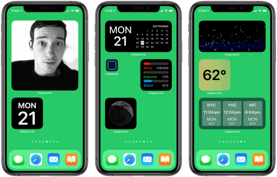
Widgets built with Widgetsmith.
Widgetsmith needs to be the starting point here, both because it arguably offers the most comprehensive suite of widget creation tools I’ve seen and also because the core concept of the app was birthed even before Apple unveiled iOS 14’s new widget system at WWDC. Widgetsmith directly builds upon the foundation laid by Watchsmith, the app David Smith launched in April for building custom Apple Watch complications. As I wrote in my review at the time, Watchsmith took customization on the watch face to a whole new level.
Now, half a year later, Widgetsmith is essentially Watchsmith but for iPhone and iPad widgets rather than Watch complications. Since Apple’s new widget system is directly based on the company’s work with complications, Smith was able to build Widgetsmith from a great starting place due to his very timely efforts with Watchsmith.
Widgetsmith enables building custom widgets across eight different categories:
Weather
Calendar
World Time
Reminders
Health
Astronomy
Tides
Photos
These categories each hold multiple widget options spanning small, medium, and large sizes. The widget creation process in the app is really simple, but offers lots of customization. On the main Widgets tab of the app you’ll see sections for configuring small, medium, and large widgets. You can add new widgets in each size, or simply modify the pre-built widgets by tapping on them, after which you’ll see the option to rename your widget, and you can choose to modify the default widget or set up a timed widget, which I’ll cover in detail shortly.

Creating multiple widgets of each size.
After tapping the widget preview, you’ll enter the setup screen. From here, you’ll find a myriad of widget styles matching the eight categories named above or some variation of them. If you’re configuring a small widget, for example, you’ll see four styles for Time, six for Date, one for Calendar, two for Reminders, six for Weather, and so on. Each style offers either different utility, or a different design for holding the same data. There aren’t near as many style options for the app’s large widgets as for small and medium, but I expect smaller widgets are by far the more popular options, so it makes sense that Smith prioritized those.
Depending on the widget you choose, you may see additional options at the bottom of the screen to modify the widget’s font, tint color, background color, time format, photo album, location, or whatever else is appropriate to that widget type. I can’t even begin to count the number of different possible widgets you could create with all of these options.

A sampling of Widgetsmith’s widget customization tools.
Once you’ve chosen all the right customization options and built your ideal widget, going back to the previous view (via the top-left back button) shows a preview of your new widget. Hit Save and you’re ready to add it to your Home screen.
You can create as many different small, medium, and large widgets as you’d like. Installing them is as easy as choosing the correct size from the Home screen widget installer, then tapping the widget while in jiggle mode to see its configuration options. This is where you choose which exact widget you want displayed. Since Widgetsmith enables building multiple widgets in each size class, this last step is necessary for selecting which specific widget you want.
No matter how many different widgets you’ve created, in the installation process you’ll always just see a single small, medium, or large option, but then after choosing the widget size and adding it to your Home screen or Today view, you’ll be able to select which of your created widgets you actually want displayed. This is why the ability to name your widgets in the app’s setup screen is so important.
Widgets built with Widgetsmith not only display the data you configured for them, such as your reminders due in the next day, but you can also tap them to view that data inside the full Widgetsmith app. The functionality inside the app is limited, so you won’t want to use Widgetsmith as a replacement for your full task manager, or calendar or weather app, but it’s nice being able to see related data to what a widget displays with a single tap.
Tapping a widget takes you into one of these views, which are fully-functioning features of the app.
The wide array of widget categories, styles, and customization options make Widgetsmith stand in a class of its own. However, there’s one other unique strength of the app that must be mentioned, and that’s the widget scheduling system.
If you’ve played around with Apple’s built-in widget options in iOS 14, you might be familiar with the Smart Stack. Apple has applied machine learning to widgets such that a stack of widgets can show the right widget from your stack at the right time – or so goes the promise. In iOS 14 when browsing all of your widget options, the Smart Stack is a stack of widgets the system has assembled featuring widgets from a variety of apps it thinks you’ll value; those widgets will then automatically cycle throughout the day based on your normal use behaviors. You can also, optionally, apply Smart Rotate to any widget stack that you created yourself. If they work well, these ‘Smart’ features can make each stack of widgets more powerful by showing you the most relevant widget at just the right time, that way you shouldn’t ever need to manually flip through a widget stack.
For the average user, maybe the Smart Stack and Smart Rotate features can be a nice way to get more out of widgets. But for power users who want a little more control of their widgets rather than trusting machine learning to understand their use patterns, there’s Widgetsmith’s scheduling system.
Scheduling widget setups for different times of day.
Like I mentioned earlier, after tapping on a widget from the app’s Widgets tab, you’ll see an option at the bottom of the screen to ‘Add a Timed Widget.’ This lets you create additional widgets that are scheduled to appear within a single widget slot at the exact times of day you choose. What this means is that rather than needing to create a stack of different widgets and cycle through them manually, or rely on Smart Rotate to do that for you, Widgetsmith enables having a single widget that changes automatically throughout the day per the schedule you give it.
With Widgetsmith I could, for example, build a single widget that shows the following data on this schedule:
My Activity ring progress from 6:00am-8:00am while I exercise
A reminders list from 8:00am-5:00pm while I work
Activity rings again from 5:00pm-6:00pm to ensure I’m close to completing my rings
Some of my favorite photos from 6:00pm-9:00pm
The next day’s weather forecast from 9:00-10:00pm
With Widgetsmith, you can program a custom schedule like this for any of your individual widgets. No need to stack widgets, or rely on Apple’s machine learning smarts to learn your habits – you know your habits, so you can program them right into one of your Widgetsmith creations. Then, whether you add that widget to your Home screen or Today view, it will automatically update throughout the day per your instructions.
This scheduling feature is built into Smith’s Watchsmith app too, for scheduling Watch complications, and I’m thrilled that it’s come to Widgetsmith. Stacks and Smart Rotate are nice options to have, but I’ve never liked relying on a computer to figure out what I want, when I want it – I’d much rather explicitly program it to do what I want. I hope Widgetsmith’s scheduling feature is adopted by other apps’ widgets in the future.
Widgeridoo

Widgets made with Widgeridoo.
Widgeridoo, similar to Widgetsmith, offers support for a variety of different widget categories. You can build widgets that display:
Static text
Photos
A specific album, playlist, or song from your music library
Battery level for your device
A countdown to a specific date
Upcoming birthdays for your contacts
Steps, distance, or flights traveled today
And much more
As this list makes clear, even though Widgetsmith offered its own diverse set of widget types to build, because of the vast possibilities for different widgets, an app like Widgeridoo can have a similarly impressive list of supported widget types yet with very little overlap between the two apps. With most of these widget creation apps, the question isn’t which one app you should download, as though you were picking a single task manager or notes app; rather, the more widget creation apps the better, because they all offer different options.

Widget configuration in Widgeridoo.
Aside from its distinct list of available data types to build widgets with, one of the things that makes Widgeridoo unique is its use of special layouts for building widgets that offer multiple data types in a single widget.
When creating a widget in Widgeridoo, you can have multiple content blocks laid out in a single widget. You might want one content block to take up the left half of the widget, for example, while two blocks occupy the right half, one in the widget’s top-right corner and one in its bottom-right. You could then select three different sources of data for that widget to display at all times.
Something that makes the widget building experience really easy in Widgeridoo is that you don’t have to specify a size for your widget. Every widget you build in the app will automatically have small, medium, and large versions available for your Home screen. If you use too many content blocks, the small version of that widget would ultimately be too truncated to be useful, but it’s nice being able to seamlessly preview small, medium, and large versions of the same widget without needing to manually re-build it several times. In Widgeridoo you just build once, then all three sizes are available to you.
Widget layouts offer multiple content blocks in a single widget.
I love the layout feature of Widgeridoo because it makes the app’s widgets extra powerful. It’s interesting how different apps have taken their own approaches to supercharging your Home screen: Widgetsmith does so with its scheduling feature, making a single widget display hyper-relevant data at different times of day; Widgeridoo, on the other hand, makes a single widget more powerful by letting it contain multiple content blocks.
The flexibility provided by Widgeridoo’s content block feature, combined with its extensive customization options, means the app is nearly guaranteed to offer enough value to earn one or more of your precious Home screen or Today view slots.
Widget Wizard
Widget Wizard offers simple widget setup.
If you want some powerful new widgets but without the work of manually configuring those widgets in an app like Widgetsmith or Widgeridoo, Widget Wizard may be what you’re looking for. Widget Wizard doesn’t support near as many data types as the apps I’ve covered so far, but like Widgeridoo it supports having multiple content blocks in a single widget; additionally, it removes the need for manually building widgets inside the full app.
Once you’ve opened Widget Wizard and granted it access to data like your calendars, reminders, and health data, you’ll no longer need to use the full app. Rather, you can go straight to iOS 14’s widget picker (by entering jiggle mode on your device then hitting the plus button in the top-left corner) and build your Widget Wizard widgets from there, choosing from three main types:
The One Widget - This comes in small, medium, and large varieties and can display a single type of data.
The Double Widget - This comes in medium and large, and can display two data types at once.
The Triple Widget - Available only in a large size, this displays three data types of your choosing.

The three main widget types of Widget Wizard.
After you’ve selected one of these widgets, its data can be configured by tapping the widget when your Home screen’s in jiggle mode, or by long-pressing the widget and hitting Edit Widget. This configuration screen is where all of Widget Wizard’s customization tools lie.
For each content block in your widget, you can choose from data sources like Calendar, Health Stats, General Reminders, Countdown, Agenda, and Clock. After making a selection, you’ll see additional options for customizing the data you see. For example, if you choose Health Stats you’ll see options to select which stats are displayed – there are lots of stat options available, and you can choose three or more different stats to display in a single content block. Since all of the widget configuration happens from the widget itself, rather than inside the full Widget Wizard app, it’s much easier to get up and running with the widgets you want.
Glimpse
Websites on your Home screen with Glimpse.
Unlike the apps I’ve detailed so far, Glimpse doesn’t aim to offer a variety of widget types, but rather it’s singularly focused on providing widgets that display web views. That’s right, you can have Home screen widgets that preview the latest content on your favorite websites.
Creating widgets with Glimpse is extremely simple. Open the app, hit the plus button to add a website, then type the site’s name and URL, and you’ll see a preview of the page. One of the most valuable features of Glimpse is that when you see this preview of the site, you can scroll it to your desired starting point. This means if you want to create a widget for MacStories, for example, you can avoid wasting valuable widget real estate on our site header and featured stories at the top of the page; rather, your widget can start displaying content at the exact point where our most recent article lives.
After saving the newly configured website in the app, you can add either a medium or large Glimpse widget to your Home screen, and from that widget’s configuration mode you can choose which site to display, how often the widget refreshes (as often as every 15 minutes), and toggle the widget’s bottom bar on and off. The bottom bar tells you the site’s name and how long ago the displayed page was refreshed, but if you’d prefer to devote the entire widget space to the site’s content, you can toggle it off. When you tap the displayed page, as you might expect, Glimpse launches it in your default browser.
I really hope iPadOS 15 adds the ability to place widgets anywhere on the iPad’s Home screen, because if so, I’ll absolutely create a full Home screen page dedicated to Glimpse widgets for my favorite websites. The 12.9-inch iPad Pro’s large display would serve as a fantastic dashboard for my most visited sites.
Health Auto Export
Widgets made with Health Auto Export.
The last app I’ll highlight in this story, Health Auto Export, is similarly focused on providing a single type of widget. I’ll give you one guess what that type is.
Like Widget Wizard, Health Auto Export offers a large selection of health data types to display in widgets. Why mention yet another widget app that supports health data? Because these widgets are so nice looking that I couldn’t resist.
There’s not much to say about Health Auto Export besides what I’ve already said. It offers customizable health widgets, and they look great. Maybe I’ll just let the screenshots speak for themselves.
I still wish Apple would build its own first-party Health app widgets, but Health Auto Export does a fine job filling the gap.
Widgets in iOS and iPadOS 14 are a big deal. At MacStories we’ve tested and written about so many excellent widgets from our favorite third-party apps, but this new category of apps centered entirely on widget creation makes iOS 14’s biggest new feature even more exciting.
Apps like Widgetsmith, Widgeridoo, Widget Wizard, Glimpse 2, and Health Auto Export show not only how powerful widgets can be, but also how personal they can be. We all have our own computing needs and design preferences, and tools like these widget builders ensure that everyone can have access to widgets customized just for them.
As exciting as these five apps are, what’s perhaps even more exciting is that they’re just the start. Many other widget creation apps are available on the App Store, with more to come that I’ve been beta testing. Who knows what developers will enable users to build in the future?
It’s always hard to tell so shortly after an OS release which software trends will stick around, but if my time with widget creation tools, or browsing the App Store’s top charts or Twitter trends serve as any indication, this new app category is here to stay.
Support MacStories Directly
Club MacStories offers exclusive access to extra MacStories content, delivered every week; it’s also a way to support us directly.
Club MacStories will help you discover the best apps for your devices and get the most out of your iPhone, iPad, and Mac. Plus, it’s made in Italy.
Join Now
Source: Mac Stories
0 notes
Text
7 Types of Lead Generation Content to Boost Your Landing Page Conversions

With the rapid expansion of the digital ecosystem, getting yourself noticed out there is a real challenge. Ever heard of the 15-second rule? Yep, that’s how much time people spend on your website.
That’s exactly why many marketers that spend significant resources on organic traffic and quality content turn to email list building.
They encourage users to sign up for their email list so they can build relationships with them and send them important updates, latest deals, and fresh content organically. The idea is to gradually turn leads into sales and brand advocates.
However, customers want to have a good reason to give you their email addresses. That’s where lead magnets shine. These are incentives you offer to your customers in exchange for their email addresses.
Lead magnets are often in the form of downloadable content, audio content, or video content. They need to be paired with a well-optimized landing page that includes a user-friendly newsletter form and a persuasive CTA.
Lead Generation with Ebooks
Ebooks educate your audience about certain industry trends and expand your email list. At the same time, you will gain credibility in your industry. When creating a landing page for your ebook, you need to highlight the value it delivers, provide a table of contents, and insert a prominent and catchy call-to-action.
This is how a Content Marketing Institute does. In this example, you can see that their landing page focuses on the major benefits of their ebook for a reader, as well as provides a CTA button and a sign-up form above the fold.

To resonate with your audiences, your ebook needs to be highly valuable. Provide informative statistics, insights, and tips. Make it detailed and insightful.
The minimum size of an ebook is 10,000 words.
Boost its value with quality visual content, such as original images, photos, charts, graphs, and illustrations. Content needs to be properly formatted, easy to read, and visually appealing.
Ready to start your ebook? Here are some amazing ebook guides to get you started:
6 Attention-Grabbing Tips to Promote an Ebook Online
How to Design an Ebook Landing Page According to Industry Leaders
The Ebook Design Kit for Marketers who Can't Design for S**t
Lead Generation with Gated infographics
Infographics are one of the most powerful content forms that let you pack lots of data in an engaging and easily digestible content format.
As such, they improve your traffic and boost your shares and backlinks. By creating gated infographics, you can turn them into powerful lead magnets.
Simply put, instead of publishing an entire infographic on your site, you will hide it. You will provide only the introductory paragraph to intrigue users and inspire them to fill out a form to access the rest of the infographic.
Sure, to give you their email address, your audiences expect your infographic to be fresh, data-backed, insightful, and informative. Pay special attention to its design. Colors should be pleasant to the eye, typography legible, and sentences short and clear.
Avoid the unnecessary part, focus on the key information, and make sure the information flows logically logical. Use lots of white space to make the content easier to follow.
If you look at this infographic created by Infostarters for Domain.ME, you will see how harmonizing fonts, colors, shapes, custom-design icons, and rich illustrations can make your infographic more appealing and easier to absorb.

Lead Generation with Case Studies
Customers at the bottom of the sales funnel have already researched your brand and products and they’re ready to purchase. But, before they make their purchasing decision, they will want to compare you to your competitors. That’s where case studies step in.
Case studies help to explain your specific problems customers might need to resolve. They include specific results, statistics, metrics, charts, clients’ testimonials, and examples. Their purpose is to show how you helped customers/clients overcome problems and achieve certain goals.
Now, while it’s always a good idea to include case studies and testimonials on your website, you can also consider offering downloadable case studies. For example, you could focus on a single client and explain how you contributed to their bottom line and improvement.
Take a look at Wishpond’s case studies and success stories:

Lead Generation with Webinars
A webinar is a powerful content format that informs the audience about a certain topic and provides them with the right tips and examples.
This is a great opportunity to establish yourself as the industry thought leader and boost your traffic and conversions.
Sure, planning a successful webinar requires a hefty amount of work, but the effort pays off. For starters, you will need to promote your webinar extensively, via blog posts and social media content.
You could even create dedicated hashtags to build buzz. Check your sound and always consider audiences from other countries and continents to adapt your webinar to their time zones, as well.
Above all, people will gladly fill out your form, when explained the benefits of the webinar. That’s why you need to create an informative landing page.
This HubSpot’s landing page promoting their GDPR webinar informs users what GDPR is and explains why it is important. It informs users about the webinar agenda, speakers, and even lets users improve the agenda. The registration form is simple and it is followed by a large and catchy CTA button.

Lead Generation with Guides
There are different forms of guides you could create. For example, comprehensive, or ultimate, guides are in-depth, long, and contain step-by-step descriptions, lots of images and screenshots, and illustrations. There are also simple, pocket guides, as well as beginner guides, advanced guides, and so forth.
Irrespective of their length or format, one thing remains the same – guides are valuable types of content that will increase your niche authority and build trust with your target audiences.
These are the benefits your landing page should emphasize. It should address the customer, informing them what they will get out of the download.
Here is an example from HubSpot:

Lead Generation with Podcasts
Podcasts have become extremely popular over the past few years. Statistics say that there are over 700,000 podcasts and 51% of the population have already listened to them. People love them because they are highly interactive.
Instead of reading a 5000-word how-to guide, online users can now listen to their favorite podcasts on their mobile phones, irrespective of their location.
Marketers love podcasts, too.
They’re relatively low-budget. All you need is a good internet connection and a decent microphone. A host needs to be highly knowledgeable, as well as fun. Your goal is to bring value to your listeners and inspire them to come back again and again.
As for seeking contact information, let users listen to the podcast without filling out the form and ask them to subscribe to your email list to start receiving updates about your podcast.
If they consider it valuable, they will want to receive the latest news and sneak previews of future episodes from you. This is a subtler way to generate leads. Many popular digital marketers, including ProBlogger’s Darren Rowse, rely on this tactic:

Lead Generation with Whitepapers
Whitepapers are more professional, strict, and persuasive than ebooks and ultimate guides. By creating industry reports, you demonstrate a particular problem in the industry then provide a solution to it.
Similar to ebooks or guides, whitepapers need to be visually appealing. Break the text up into logical sections. Use everyday language and shorten your sentences.
Write smaller paragraphs, write informative headlines and subheadlines, and leave lots of white space. Choose appealing colors, legible fonts, and original images.
Over to You
From case studies to gated infographics, each type of lead magnets has a specific purpose. While some content forms help you increase industry authority and educate your target audiences, others will engage your audience and build stronger relationships with them.
By experimenting with different content formats and testing their effectiveness, you will create content that resonates with your prospects and turn them into profitable leads.
What content do you use to generate leads?
About the Author

Elaine Bennett is a digital marketing specialist focused on helping startups and small businesses grow. Besides that, she's a regular contributor for Bizzmark Blog and writes hands-on articles about business and marketing, as it allows her to reach even more entrepreneurs and help them on their business journey.
Related Articles
Local Lead Generation: The Complete Beginner's Guide
B2B Lead Generation: 33 Strategies, Ideas & Examples
25 B2B Lead Generation Ideas to Try in Your Marketing Funnels
from RSSMix.com Mix ID 8230801 https://ift.tt/3biFRPG
via IFTTT
0 notes
Text
Week Five: Photo Series at the Tate
American Surfaces by Stephen Shore

· What is the artist trying to do/show/say with this work?
Shore uses snap shots on a road trip of the USA to construct a narrative of the culture he is experiencing. He photographs people, food, streets, buildings and interiors which collectively portray the United States in the 70’s.
· What techniques is s/he using to convey this message?
He is using color photography and most likely a film camera. His choices reflect the overall casual tone in each photo. Each photo captures something different, colourful and seemingly insignificant. However, as the photos are presented together the 70’s theme above is clear.
· Do you consider these “good” photographs? Why / why not and what are your criteria?
Some are, others don’t appear to be. My criteria are based on the idea that if one of these photos was selected and presented on its own it would be completely insignificant, such as the photo of French fries and steak on the table. Each individual photo seems to lack effort on the photographer’s part when thought of as a standalone.
· Do they convey the artist’s intended message? (How does your answer to this question relate to your answer to the previous question?)
Yes. Most photos contain some sense of the place and time, especially looking at these photos with an idea what the 70’s was like in America. Simple components like the font on signs or the (now old) television on a shelf all represent the theme of this series.
· What is the effect of seeing a lot of her/his images together (as a series)?
As mentioned previously, the photos on their own don’t say much, but together they completely create a narrative. They all tell the story of Shore’s road trip through the United States during the 70’s
· How does the written information change your understanding of the photographs?
The information about the photographer’s road trip gives context to a lot of these photos, such as hotels and laundromats. Viewers can follow Shore through his journey while looking through all 68 photographs. The information also explains the lack of repeating subjects/ similar photos.
Travel Photos by Walead Beshty

· What is the artist trying to do/show/say with this work?
Walead Beshty was photographing the Iraqi Embassy in East Berlin. The building was abandoned and looted after the cold war when Germany reunited. The building is still protected by international law and teens could party in the building since no government official can legally enter the building to stop them.
· What techniques is s/he using to convey this message?
The photos of the building were marred by the X-ray machines they passed through on their way back to America. Beshty said the photos resembled the same destruction and neglect as the embassy itself. The bands and flares of color from the X-rays make it difficult to see what techniques were originally used. The phots do appear to be taken in the dark without flash.
· Do you consider these “good” photographs? Why / why not and what are your criteria?
No based on the criteria that these are quite literally damaged photos. The photos themselves are unextraordinary but the damage makes them interesting. However, interesting is not the same as good.
· Do they convey the artist’s intended message? (How does your answer to this question relate to your answer to the previous question?)
Yes. The photos capture the subject literally. They display the ruins of the Embassy and therefor represent the aftermath of the cold war. The damage furthers this message of neglect and destruction specifically through politics. After all, X-ray machines began to be used in Airports as a result of terrorism
· What is the effect of seeing a lot of her/his images together (as a series)?
By seeing the photos together, I more than just one point of view of the abandoned embassy. I see the loss of knowledge in the books piled on the floor and the chaos from the stacked old furniture. I see that this place represents a different time then when the photo was taken by the abandoned typewriter. All of these components add value to the photographer’s message.
· How does the written information change your understanding of the photographs?
The title ‘Travel Photos’ represents not only Beshty’s travel to Germany to take these photos but also the journey these photos were a part of while returning to the U.S. The information presented explains why these photos look the way they do and tells me that these photographs really are photos that have traveled and bear the marks of this.
0 notes
Text
Is Your Website Stressing Out Visitors?
About The Author
Suzanne Scacca is a former WordPress implementer, trainer and agency manager who now works as a freelance copywriter. She specializes in crafting marketing agency, web …
More about
Suzanne
Scacca
…
Stress isn’t just something that makes people feel uncomfortable. It stimulates the urge to “fight” or “flight”. The very last thing you want is to design a website that stresses visitors out, leading them to dread the experience or abandon it entirely. There are many things that might invoke this response from your visitors, including the design. In the following guide, we’re going to look at some ways to de-stress your design.
Stress is a nasty thing and many of us deal with it on a regular basis. Our jobs, school, homes, relationships, and even things going on around the world can trigger feelings of panic, unease, and depression. And those are just chronic stressors. Think about the small things that send your body into instant fight-or-flight mode on a daily basis (e.g. traffic jams, unhelpful customer service reps, getting sick when you have a big project due).
The last thing you want is for someone to visit one of the websites you’ve built, only to feel like they:
Need to battle their way through it, or
Leave immediately and never come back.
There are a variety of ways a website can cause stress and leave visitors wondering if their response should be to fight or flight. Slow loading times. Overwhelming navigations. Excessive 404 errors. You get the point. But the design itself could be a problem, too.
If your bounce rates are really high and performance isn’t an issue, then this is something you need to look into. Today, we’re going to look at some ways for web designers to take traditional stress-busting tips and apply them to websites.
How To De-stress Your Web Design
Most stress relief guides provide a similar set of tips. But how exactly do you apply something like “Get outside for fresh air” to a website?
Here are some ideas:
1. Draw from Nature
There’s a reason why stress relief articles always suggest that people get outside. There’s something about nature that’s very calming.
If you think about the way we live our lives today — always on, always connected, always trying to make a better life for ourselves — it’s the exact opposite of nature. That’s probably why we’re so attracted to its simplicity and healing qualities in times of stress.
Companies with “natural” initiatives (think REI or CLIF) can get away with using imagery containing nature scenes and drawing on the feel-good vibes associated with them.
A snapshot from the CLIF website with nature images. (Source: CLIF) (Large preview)
For other companies, however, you’re going to have to think outside the box as nature photographs won’t make sense for most.
Something I’d recommend instead is to look at your color palette.
One of the great things about spending time in nature is the abundance of color you’ll find. Look at any travel blog or social media account and you’ll find proof of this immediately. For example, this is a snapshot of recent photos shared by @adventurefervor:
The @adventurefervor Instagram account shares nature content from all around the world. (Source: Instagram) (Large preview)
There is such a vast array of colors in nature that you could draw from.
That said, nature’s colors aren’t always peaceful or safe. Take, for instance, aposematism. This is the ability animals have to signal that there’s danger here — and they do it with color.
“The function of aposematism is to prevent attack, by warning potential predators that the prey animal has defenses such as being unpalatable or poisonous.”
The most commonly seen colors in aposematism are:
Red,
Yellow,
Black,
White.
Generally, when these colors are used, it’s in high contrast to the surrounding colors and scenery, so it’s not like the actual appearance of red or black is alarming. It has to do with the context.
What I’d recommend is that you take a look at your website and note if there are any colors sending the wrong signals.
Does a dark mode-like design seem too ominous for the lighter personality of the brand? Are red accents reminiscent of blood against the stark white background? Does the bright yellow coloring feel out of place?
Bear Grylls’s website, for example, feels a bit edgy and unnerving:
Adventurist Bear Grylls uses a combination of nature imagery and danger-evoking colors on his site. (Source: Bear Grylls) (Large preview)
I suspect the web designer went out of their way to imbue the website with the sharp black and red accent colors that appear here. Bear Grylls doesn’t run some feel-good travel show. He’s always putting himself (and others) in life-or-death situations. So, in this case, the aposematism-inspired color palette is a good choice.
For your website, though, I highly doubt you want your visitors to associate the brand with danger or death. So, spend some time studying nature photography (the stuff that makes you feel good) as well as reading up on color psychology to fix the signals your website is sending to visitors.
2. Create a Predictable Rhythm
Yoga is one of those activities often recommended for people experiencing stress. As the Mayo Clinic explains:
“Yoga brings together physical and mental disciplines that may help you achieve peacefulness of body and mind. This can help you relax and manage stress and anxiety.”
At the core of yoga, is a composite of physical poses and steady breathing. If you’ve ever practiced it before, you know how good it feels when you get into the rhythm of it. Breathing in… and breathing out.
Yoga isn’t the only mindfulness practice that draws on steady breathing to calm the nerves.
If you’ve ever used a meditation app like Calm before, you’re familiar with breath exercises:
[embedded content]
As you focus on breathing in, holding that breath and releasing, your body and mind relax. Breathing exercises also help people calm hyperventilation and other erratic breathing patterns that get the heart rate up and send the mind racing.
So, how does this correlate to your website? Well, what we need to do is identify elements and interactions that feel unpredictable and shocking — ones that make visitors feel as if they have no control over the experience, like they can’t slow down and take it one bit at a time.
Rhythm and repetition play an important role in this, but you know this already. That’s why button shapes and colors are designed consistently site-wide. That’s why you choose no more than two or three fonts to establish a rhythm and dictate hierarchy in your content. That’s why you build mobile-first websites within a grid (even if the design sometimes appears asymmetrical).
The thing is, when new design patterns or elements become popular, it’s easy for these good and calming practices to go out the window.
Take, for instance, websites that use scroll-triggered animations like Unleashed.
The Unleashed website uses a variety of scroll-triggered animations. (Source: Unleashed) (Large preview)
While it’s certainly an attractive website and one that’s going to stand out from the competition, it presents an uneven experience from start to finish. Visitors are more likely to focus on the surprises that wait for them around the corner instead of on reading the content on the site (which is difficult with the way it’s presented).
This website is all about building anticipation; not value.
If you look at the Smashing Magazine, for example, the design still has the opportunity to “surprise” visitors every now and again:
Smashing Magazine’s design goes light on the surprise factor, using it to call attention when it makes sense. (Source: Smashing Magazine) (Large preview)
The big difference here is that hover-triggered animations don’t have to come at the expense of the predictability of the design or your visitors’ comfort levels.
Just be mindful of this. While it might seem like trying something new is what your site needs to stand out, don’t forget that you’re designing primarily for the user experience. And if users aren’t responding well to the creative choices you’ve made, it’s time to bring back a more stable rhythm to it.
3. Remove the Excess Noise
For a long time now, researchers have studied and reported on the damaging and stress-inducing effects environmental noise can have on people.
“Babisch established the modern noise reaction model, postulating an ‘indirect pathway,’ in which disturbance of sleep, communication and activity by low-level noise exposure causes changes of emotional and cognitive parameters and annoyance, followed by chronic stress reactions and adverse health effects.”
That’s no surprise to anyone who’s lived in a major city or visited one before. They’re polluted with sounds of people honking and shouting, loud buses or trains passing by, construction workers chipping away at the streets and buildings. At a certain point, it eventually gets to be too much.
This is one of the reasons why white noise machines, nature sounds and classical music are a popular means of drowning out the excess noise in our environments. They take all of the harshness and overwhelming nature of our surroundings and mute it or, at the very least, turn it down to a minimum.
When a website is designed with too much “noise”, a similar solution is needed.
But how do we define noise on websites? It’s not as though we all have auto-playing music on them anymore (at least, I hope not).
The big thing is to look for things that don’t belong there. If your design is overcrowded, remove the elements that contribute little to the user experience and conversion rate.
For example, how frequently do people engage with your live chat window? If it’s not happening frequently or the interactions aren’t meaningful, just get rid of it. The same goes for other non-essential elements. Banner ads. Auto-play on videos. Exit-intent pop-ups.
Is the interruption to the user’s experience really worth it?
Let’s use Neil Patel’s website as an example:
Neil Patel’s website asks the question, ‘Do you want more traffic?’. (Source: Neil Patel) (Large preview)
When visitors enter the home page, they’re asked: “Do you want more traffic?”
Let’s say the answer to that is “no” because the visitor has come here to read more about marketing agency and SEO Company on the blog. However, the top of the blog page again asks them the same question:
The top of Neil Patel’s blog asks the question, ‘Do you want more traffic?’. (Source: Neil Patel) (Large preview)
Logic would dictate that clicking “No, I have enough traffic” would remove the banner from view since no “X” is available to dismiss it. Instead, visitors who click it are taken away from the blog and returned to the home page to start the loop all over again.
This type of website friction is no different than an environmental noise or irritant — kind of like a child asking “But why?” over and over again until you give them the answer they want. Eventually, visitors are going to get fed up with the pressure to convert and leave for good (maybe not in Patel’s case, but definitely on a website for lesser-known brands).
If you notice your visitors ignoring the noise you’ve placed before them on the website, don’t try and jam it down their throats even further. Just get rid of it.
Wrapping Up
Unlike the real world where people take time to identify their stressors, identify solutions to beat them and work through their issues, that’s not going to happen on a website.
They’re either going to suffer through the experience and be left with a sour taste in their mouth… or they’re going to immediately bounce off the site and be left with a sour taste in their mouth.
If you want to remove the stress from your web design, look to traditional stress relief activities to iron out the issues. If you can turn your website into a relaxing and welcoming environment — while still pushing all the right buttons to drive visitors to conversion — you’ll lower your bounce rates as well as visitors’ stress levels.
(ra, yk, il)
Website Design & SEO Delray Beach by DBL07.co
Delray Beach SEO
Via http://www.scpie.org/is-your-website-stressing-out-visitors/
source https://scpie.weebly.com/blog/is-your-website-stressing-out-visitors
0 notes
Text
Is Your Website Stressing Out Visitors?
About The Author
Suzanne Scacca is a former WordPress implementer, trainer and agency manager who now works as a freelance copywriter. She specializes in crafting marketing agency, web …
More about
Suzanne
Scacca
…
Stress isn’t just something that makes people feel uncomfortable. It stimulates the urge to “fight” or “flight”. The very last thing you want is to design a website that stresses visitors out, leading them to dread the experience or abandon it entirely. There are many things that might invoke this response from your visitors, including the design. In the following guide, we’re going to look at some ways to de-stress your design.
Stress is a nasty thing and many of us deal with it on a regular basis. Our jobs, school, homes, relationships, and even things going on around the world can trigger feelings of panic, unease, and depression. And those are just chronic stressors. Think about the small things that send your body into instant fight-or-flight mode on a daily basis (e.g. traffic jams, unhelpful customer service reps, getting sick when you have a big project due).
The last thing you want is for someone to visit one of the websites you’ve built, only to feel like they:
Need to battle their way through it, or
Leave immediately and never come back.
There are a variety of ways a website can cause stress and leave visitors wondering if their response should be to fight or flight. Slow loading times. Overwhelming navigations. Excessive 404 errors. You get the point. But the design itself could be a problem, too.
If your bounce rates are really high and performance isn’t an issue, then this is something you need to look into. Today, we’re going to look at some ways for web designers to take traditional stress-busting tips and apply them to websites.
How To De-stress Your Web Design
Most stress relief guides provide a similar set of tips. But how exactly do you apply something like “Get outside for fresh air” to a website?
Here are some ideas:
1. Draw from Nature
There’s a reason why stress relief articles always suggest that people get outside. There’s something about nature that’s very calming.
If you think about the way we live our lives today — always on, always connected, always trying to make a better life for ourselves — it’s the exact opposite of nature. That’s probably why we’re so attracted to its simplicity and healing qualities in times of stress.
Companies with “natural” initiatives (think REI or CLIF) can get away with using imagery containing nature scenes and drawing on the feel-good vibes associated with them.
A snapshot from the CLIF website with nature images. (Source: CLIF) (Large preview)
For other companies, however, you’re going to have to think outside the box as nature photographs won’t make sense for most.
Something I’d recommend instead is to look at your color palette.
One of the great things about spending time in nature is the abundance of color you’ll find. Look at any travel blog or social media account and you’ll find proof of this immediately. For example, this is a snapshot of recent photos shared by @adventurefervor:
The @adventurefervor Instagram account shares nature content from all around the world. (Source: Instagram) (Large preview)
There is such a vast array of colors in nature that you could draw from.
That said, nature’s colors aren’t always peaceful or safe. Take, for instance, aposematism. This is the ability animals have to signal that there’s danger here — and they do it with color.
“The function of aposematism is to prevent attack, by warning potential predators that the prey animal has defenses such as being unpalatable or poisonous.”
The most commonly seen colors in aposematism are:
Red,
Yellow,
Black,
White.
Generally, when these colors are used, it’s in high contrast to the surrounding colors and scenery, so it’s not like the actual appearance of red or black is alarming. It has to do with the context.
What I’d recommend is that you take a look at your website and note if there are any colors sending the wrong signals.
Does a dark mode-like design seem too ominous for the lighter personality of the brand? Are red accents reminiscent of blood against the stark white background? Does the bright yellow coloring feel out of place?
Bear Grylls’s website, for example, feels a bit edgy and unnerving:
Adventurist Bear Grylls uses a combination of nature imagery and danger-evoking colors on his site. (Source: Bear Grylls) (Large preview)
I suspect the web designer went out of their way to imbue the website with the sharp black and red accent colors that appear here. Bear Grylls doesn’t run some feel-good travel show. He’s always putting himself (and others) in life-or-death situations. So, in this case, the aposematism-inspired color palette is a good choice.
For your website, though, I highly doubt you want your visitors to associate the brand with danger or death. So, spend some time studying nature photography (the stuff that makes you feel good) as well as reading up on color psychology to fix the signals your website is sending to visitors.
2. Create a Predictable Rhythm
Yoga is one of those activities often recommended for people experiencing stress. As the Mayo Clinic explains:
“Yoga brings together physical and mental disciplines that may help you achieve peacefulness of body and mind. This can help you relax and manage stress and anxiety.”
At the core of yoga, is a composite of physical poses and steady breathing. If you’ve ever practiced it before, you know how good it feels when you get into the rhythm of it. Breathing in… and breathing out.
Yoga isn’t the only mindfulness practice that draws on steady breathing to calm the nerves.
If you’ve ever used a meditation app like Calm before, you’re familiar with breath exercises:
[embedded content]
As you focus on breathing in, holding that breath and releasing, your body and mind relax. Breathing exercises also help people calm hyperventilation and other erratic breathing patterns that get the heart rate up and send the mind racing.
So, how does this correlate to your website? Well, what we need to do is identify elements and interactions that feel unpredictable and shocking — ones that make visitors feel as if they have no control over the experience, like they can’t slow down and take it one bit at a time.
Rhythm and repetition play an important role in this, but you know this already. That’s why button shapes and colors are designed consistently site-wide. That’s why you choose no more than two or three fonts to establish a rhythm and dictate hierarchy in your content. That’s why you build mobile-first websites within a grid (even if the design sometimes appears asymmetrical).
The thing is, when new design patterns or elements become popular, it’s easy for these good and calming practices to go out the window.
Take, for instance, websites that use scroll-triggered animations like Unleashed.
The Unleashed website uses a variety of scroll-triggered animations. (Source: Unleashed) (Large preview)
While it’s certainly an attractive website and one that’s going to stand out from the competition, it presents an uneven experience from start to finish. Visitors are more likely to focus on the surprises that wait for them around the corner instead of on reading the content on the site (which is difficult with the way it’s presented).
This website is all about building anticipation; not value.
If you look at the Smashing Magazine, for example, the design still has the opportunity to “surprise” visitors every now and again:
Smashing Magazine’s design goes light on the surprise factor, using it to call attention when it makes sense. (Source: Smashing Magazine) (Large preview)
The big difference here is that hover-triggered animations don’t have to come at the expense of the predictability of the design or your visitors’ comfort levels.
Just be mindful of this. While it might seem like trying something new is what your site needs to stand out, don’t forget that you’re designing primarily for the user experience. And if users aren’t responding well to the creative choices you’ve made, it’s time to bring back a more stable rhythm to it.
3. Remove the Excess Noise
For a long time now, researchers have studied and reported on the damaging and stress-inducing effects environmental noise can have on people.
“Babisch established the modern noise reaction model, postulating an ‘indirect pathway,’ in which disturbance of sleep, communication and activity by low-level noise exposure causes changes of emotional and cognitive parameters and annoyance, followed by chronic stress reactions and adverse health effects.”
That’s no surprise to anyone who’s lived in a major city or visited one before. They’re polluted with sounds of people honking and shouting, loud buses or trains passing by, construction workers chipping away at the streets and buildings. At a certain point, it eventually gets to be too much.
This is one of the reasons why white noise machines, nature sounds and classical music are a popular means of drowning out the excess noise in our environments. They take all of the harshness and overwhelming nature of our surroundings and mute it or, at the very least, turn it down to a minimum.
When a website is designed with too much “noise”, a similar solution is needed.
But how do we define noise on websites? It’s not as though we all have auto-playing music on them anymore (at least, I hope not).
The big thing is to look for things that don’t belong there. If your design is overcrowded, remove the elements that contribute little to the user experience and conversion rate.
For example, how frequently do people engage with your live chat window? If it’s not happening frequently or the interactions aren’t meaningful, just get rid of it. The same goes for other non-essential elements. Banner ads. Auto-play on videos. Exit-intent pop-ups.
Is the interruption to the user’s experience really worth it?
Let’s use Neil Patel’s website as an example:
Neil Patel’s website asks the question, ‘Do you want more traffic?’. (Source: Neil Patel) (Large preview)
When visitors enter the home page, they’re asked: “Do you want more traffic?”
Let’s say the answer to that is “no” because the visitor has come here to read more about marketing agency and SEO Company on the blog. However, the top of the blog page again asks them the same question:
The top of Neil Patel’s blog asks the question, ‘Do you want more traffic?’. (Source: Neil Patel) (Large preview)
Logic would dictate that clicking “No, I have enough traffic” would remove the banner from view since no “X” is available to dismiss it. Instead, visitors who click it are taken away from the blog and returned to the home page to start the loop all over again.
This type of website friction is no different than an environmental noise or irritant — kind of like a child asking “But why?” over and over again until you give them the answer they want. Eventually, visitors are going to get fed up with the pressure to convert and leave for good (maybe not in Patel’s case, but definitely on a website for lesser-known brands).
If you notice your visitors ignoring the noise you’ve placed before them on the website, don’t try and jam it down their throats even further. Just get rid of it.
Wrapping Up
Unlike the real world where people take time to identify their stressors, identify solutions to beat them and work through their issues, that’s not going to happen on a website.
They’re either going to suffer through the experience and be left with a sour taste in their mouth… or they’re going to immediately bounce off the site and be left with a sour taste in their mouth.
If you want to remove the stress from your web design, look to traditional stress relief activities to iron out the issues. If you can turn your website into a relaxing and welcoming environment — while still pushing all the right buttons to drive visitors to conversion — you’ll lower your bounce rates as well as visitors’ stress levels.
(ra, yk, il)
Website Design & SEO Delray Beach by DBL07.co
Delray Beach SEO
source http://www.scpie.org/is-your-website-stressing-out-visitors/
source https://scpie.tumblr.com/post/620606246922452992
0 notes
Text
Is Your Website Stressing Out Visitors?
About The Author
Suzanne Scacca is a former WordPress implementer, trainer and agency manager who now works as a freelance copywriter. She specializes in crafting marketing agency, web …
More about
Suzanne
Scacca
…
Stress isn’t just something that makes people feel uncomfortable. It stimulates the urge to “fight” or “flight”. The very last thing you want is to design a website that stresses visitors out, leading them to dread the experience or abandon it entirely. There are many things that might invoke this response from your visitors, including the design. In the following guide, we’re going to look at some ways to de-stress your design.
Stress is a nasty thing and many of us deal with it on a regular basis. Our jobs, school, homes, relationships, and even things going on around the world can trigger feelings of panic, unease, and depression. And those are just chronic stressors. Think about the small things that send your body into instant fight-or-flight mode on a daily basis (e.g. traffic jams, unhelpful customer service reps, getting sick when you have a big project due).
The last thing you want is for someone to visit one of the websites you’ve built, only to feel like they:
Need to battle their way through it, or
Leave immediately and never come back.
There are a variety of ways a website can cause stress and leave visitors wondering if their response should be to fight or flight. Slow loading times. Overwhelming navigations. Excessive 404 errors. You get the point. But the design itself could be a problem, too.
If your bounce rates are really high and performance isn’t an issue, then this is something you need to look into. Today, we’re going to look at some ways for web designers to take traditional stress-busting tips and apply them to websites.
How To De-stress Your Web Design
Most stress relief guides provide a similar set of tips. But how exactly do you apply something like “Get outside for fresh air” to a website?
Here are some ideas:
1. Draw from Nature
There’s a reason why stress relief articles always suggest that people get outside. There’s something about nature that’s very calming.
If you think about the way we live our lives today — always on, always connected, always trying to make a better life for ourselves — it’s the exact opposite of nature. That’s probably why we’re so attracted to its simplicity and healing qualities in times of stress.
Companies with “natural” initiatives (think REI or CLIF) can get away with using imagery containing nature scenes and drawing on the feel-good vibes associated with them.
A snapshot from the CLIF website with nature images. (Source: CLIF) (Large preview)
For other companies, however, you’re going to have to think outside the box as nature photographs won’t make sense for most.
Something I’d recommend instead is to look at your color palette.
One of the great things about spending time in nature is the abundance of color you’ll find. Look at any travel blog or social media account and you’ll find proof of this immediately. For example, this is a snapshot of recent photos shared by @adventurefervor:
The @adventurefervor Instagram account shares nature content from all around the world. (Source: Instagram) (Large preview)
There is such a vast array of colors in nature that you could draw from.
That said, nature’s colors aren’t always peaceful or safe. Take, for instance, aposematism. This is the ability animals have to signal that there’s danger here — and they do it with color.
“The function of aposematism is to prevent attack, by warning potential predators that the prey animal has defenses such as being unpalatable or poisonous.”
The most commonly seen colors in aposematism are:
Red,
Yellow,
Black,
White.
Generally, when these colors are used, it’s in high contrast to the surrounding colors and scenery, so it’s not like the actual appearance of red or black is alarming. It has to do with the context.
What I’d recommend is that you take a look at your website and note if there are any colors sending the wrong signals.
Does a dark mode-like design seem too ominous for the lighter personality of the brand? Are red accents reminiscent of blood against the stark white background? Does the bright yellow coloring feel out of place?
Bear Grylls’s website, for example, feels a bit edgy and unnerving:
Adventurist Bear Grylls uses a combination of nature imagery and danger-evoking colors on his site. (Source: Bear Grylls) (Large preview)
I suspect the web designer went out of their way to imbue the website with the sharp black and red accent colors that appear here. Bear Grylls doesn’t run some feel-good travel show. He’s always putting himself (and others) in life-or-death situations. So, in this case, the aposematism-inspired color palette is a good choice.
For your website, though, I highly doubt you want your visitors to associate the brand with danger or death. So, spend some time studying nature photography (the stuff that makes you feel good) as well as reading up on color psychology to fix the signals your website is sending to visitors.
2. Create a Predictable Rhythm
Yoga is one of those activities often recommended for people experiencing stress. As the Mayo Clinic explains:
“Yoga brings together physical and mental disciplines that may help you achieve peacefulness of body and mind. This can help you relax and manage stress and anxiety.”
At the core of yoga, is a composite of physical poses and steady breathing. If you’ve ever practiced it before, you know how good it feels when you get into the rhythm of it. Breathing in… and breathing out.
Yoga isn’t the only mindfulness practice that draws on steady breathing to calm the nerves.
If you’ve ever used a meditation app like Calm before, you’re familiar with breath exercises:
[embedded content]
As you focus on breathing in, holding that breath and releasing, your body and mind relax. Breathing exercises also help people calm hyperventilation and other erratic breathing patterns that get the heart rate up and send the mind racing.
So, how does this correlate to your website? Well, what we need to do is identify elements and interactions that feel unpredictable and shocking — ones that make visitors feel as if they have no control over the experience, like they can’t slow down and take it one bit at a time.
Rhythm and repetition play an important role in this, but you know this already. That’s why button shapes and colors are designed consistently site-wide. That’s why you choose no more than two or three fonts to establish a rhythm and dictate hierarchy in your content. That’s why you build mobile-first websites within a grid (even if the design sometimes appears asymmetrical).
The thing is, when new design patterns or elements become popular, it’s easy for these good and calming practices to go out the window.
Take, for instance, websites that use scroll-triggered animations like Unleashed.
The Unleashed website uses a variety of scroll-triggered animations. (Source: Unleashed) (Large preview)
While it’s certainly an attractive website and one that’s going to stand out from the competition, it presents an uneven experience from start to finish. Visitors are more likely to focus on the surprises that wait for them around the corner instead of on reading the content on the site (which is difficult with the way it’s presented).
This website is all about building anticipation; not value.
If you look at the Smashing Magazine, for example, the design still has the opportunity to “surprise” visitors every now and again:
Smashing Magazine’s design goes light on the surprise factor, using it to call attention when it makes sense. (Source: Smashing Magazine) (Large preview)
The big difference here is that hover-triggered animations don’t have to come at the expense of the predictability of the design or your visitors’ comfort levels.
Just be mindful of this. While it might seem like trying something new is what your site needs to stand out, don’t forget that you’re designing primarily for the user experience. And if users aren’t responding well to the creative choices you’ve made, it’s time to bring back a more stable rhythm to it.
3. Remove the Excess Noise
For a long time now, researchers have studied and reported on the damaging and stress-inducing effects environmental noise can have on people.
“Babisch established the modern noise reaction model, postulating an ‘indirect pathway,’ in which disturbance of sleep, communication and activity by low-level noise exposure causes changes of emotional and cognitive parameters and annoyance, followed by chronic stress reactions and adverse health effects.”
That’s no surprise to anyone who’s lived in a major city or visited one before. They’re polluted with sounds of people honking and shouting, loud buses or trains passing by, construction workers chipping away at the streets and buildings. At a certain point, it eventually gets to be too much.
This is one of the reasons why white noise machines, nature sounds and classical music are a popular means of drowning out the excess noise in our environments. They take all of the harshness and overwhelming nature of our surroundings and mute it or, at the very least, turn it down to a minimum.
When a website is designed with too much “noise”, a similar solution is needed.
But how do we define noise on websites? It’s not as though we all have auto-playing music on them anymore (at least, I hope not).
The big thing is to look for things that don’t belong there. If your design is overcrowded, remove the elements that contribute little to the user experience and conversion rate.
For example, how frequently do people engage with your live chat window? If it’s not happening frequently or the interactions aren’t meaningful, just get rid of it. The same goes for other non-essential elements. Banner ads. Auto-play on videos. Exit-intent pop-ups.
Is the interruption to the user’s experience really worth it?
Let’s use Neil Patel’s website as an example:
Neil Patel’s website asks the question, ‘Do you want more traffic?’. (Source: Neil Patel) (Large preview)
When visitors enter the home page, they’re asked: “Do you want more traffic?”
Let’s say the answer to that is “no” because the visitor has come here to read more about marketing agency and SEO Company on the blog. However, the top of the blog page again asks them the same question:
The top of Neil Patel’s blog asks the question, ‘Do you want more traffic?’. (Source: Neil Patel) (Large preview)
Logic would dictate that clicking “No, I have enough traffic” would remove the banner from view since no “X” is available to dismiss it. Instead, visitors who click it are taken away from the blog and returned to the home page to start the loop all over again.
This type of website friction is no different than an environmental noise or irritant — kind of like a child asking “But why?” over and over again until you give them the answer they want. Eventually, visitors are going to get fed up with the pressure to convert and leave for good (maybe not in Patel’s case, but definitely on a website for lesser-known brands).
If you notice your visitors ignoring the noise you’ve placed before them on the website, don’t try and jam it down their throats even further. Just get rid of it.
Wrapping Up
Unlike the real world where people take time to identify their stressors, identify solutions to beat them and work through their issues, that’s not going to happen on a website.
They’re either going to suffer through the experience and be left with a sour taste in their mouth… or they’re going to immediately bounce off the site and be left with a sour taste in their mouth.
If you want to remove the stress from your web design, look to traditional stress relief activities to iron out the issues. If you can turn your website into a relaxing and welcoming environment — while still pushing all the right buttons to drive visitors to conversion — you’ll lower your bounce rates as well as visitors’ stress levels.
(ra, yk, il)
Website Design & SEO Delray Beach by DBL07.co
Delray Beach SEO
source http://www.scpie.org/is-your-website-stressing-out-visitors/
source https://scpie1.blogspot.com/2020/06/is-your-website-stressing-out-visitors.html
0 notes
Text
Xiaomi will announce MIUI 12 alongside a new Mi 10 variant on April 27th
try { window._mNHandle.queue.push(function (){ window._mNDetails.loadTag("173377332", "300x250", "173377332"); }); } catch (error) {}
Xiaomi’s MIUI is among the many hottest Android skins for 2 main causes. The primary and the extra apparent purpose of the 2 is the standard budget-friendly pricing of telephones below Xiaomi, Redmi, or spin-off model POCO; the second is the horde of options in MIUI that Xiaomi builds over inventory Android to make the expertise extra person pleasant. For a few months now, we’ve been on the lookout for any details about MIUI 12, the subsequent incremental replace to MIUI 11. Our wait may finish quickly as Xiaomi has introduced it will announce MIUI 12 alongside their new mid-range 5G cellphone – the Mi 10 Youth Version – on April 27th.
MIUI 12
Xiaomi has been dropping hints about a few of MIUI 12’s upcoming options via AMA periods on Weibo. Within the latest episode, the MIUI workforce revealed MIUI 12 will include uniform font types, optimizations when it comes to iconography and design language all through the UI, a extra minimal outlook, and a few digital camera options like the flexibility to take away passers-by from photos.
Whereas Xiaomi is reserving the main points of the new optimizations or options until the launch on the 27th of this month, the MIUI 12 teaser says the upcoming Android pores and skin will unite creativeness and actuality and the tagline used for endorsing MIUI 12 interprets to, “Contact the creativeness, really feel the reality.”
We hope to be taught extra in regards to the options forward of and on the launch occasion.
Xiaomi Mi 10 Youth Version a la Mi 10 Lite 5G
Whereas MIUI 12 is likely to be the extra thrilling product on the launch for many present Xiaomi customers, the corporate will even be launching the Mi 10 Youth Version for doubtlessly new ones. This smartphone is prone to be a rebranded Mi 10 Lite 5G, which has already been launched in Europe final month.
Amongst its options teased formally, the Mi 10 Youth Version smartphone will characteristic quadruple cameras together with a telephoto setup with as much as 50x zoom. Notably, the Lite variant doesn’t characteristic a telephoto digital camera, in order that might be distinctive to the Youth Version.
The form of the telephoto digital camera module suggests Xiaomi might be utilizing a periscopic telephoto setup that was first launched commercially by Huawei on the P30 Professional (overview) after which by OPPO on the Reno 10X Zoom Version (overview). It’s believable that the Mi 10 Youth Version makes use of periscopic digital camera modules for 5X optical zoom that Samsung began mass producing in 2019. We’ll have extra confidence as soon as Xiaomi formally confirms the capabilities of the digital camera.
Official render shared by Xiaomi
In the meantime, in one other render, Xiaomi has additionally revealed the 4 coloration variants of the Mi 10 Youth Version. Two of those coloration variants resemble the Coral Inexperienced of the Mi 10 and the Arctic White of the Mi 10 Professional whereas the opposite two a light copper variant and a tender moss inexperienced.
Apart from this, the cellphone might also get a grey coloration, just like the Mi 10 Lite 5G. Not like the Redmi Word 9S/9 Professional and the alleged Redmi Word 9, the digital camera module is on the highest left nook. The Mi 10 Lite comes with a U-shaped notch and never a hole-punch as we see on the Mi 10 sequence and the identical may be anticipated of the Youth Version cellphone, given the similarities of their designs.
Mi 10 Lite 5G
Whereas the Mi 10 Lite is powered by a Qualcomm Snapdragon 765G cell platform, the identical can’t be stated in regards to the Youth Version with surety simply but. We’ll await a whereas till Xiaomi confirms these itself and will replace you following the identical.
Share your ideas on the cellphone within the feedback beneath!
Supply: Weibo (1)(2)(3)
XDA » Information Transient » Xiaomi will announce MIUI 12 alongside a new Mi 10 variant on April 27th
Need extra posts like this delivered to your inbox? Enter your electronic mail to be subscribed to our publication.
try { window._mNHandle.queue.push(function (){ window._mNDetails.loadTag("379748484", "160x600", "379748484"); }); } catch (error) {}
Source link
The post Xiaomi will announce MIUI 12 alongside a new Mi 10 variant on April 27th appeared first on Bharats Guide.
from WordPress https://ift.tt/34W82B4
via IFTTT
0 notes
Text
PPD
March holiday
I completed my homework in this holiday, I started to think about my project, the main concept of my project is lost, and I want to show the process of someone lost in her growth process. And when I travel and back to china, i took some photo about some small items in our daily life. In addition, I took some photo of nature views. Such as when I in the plane, I look out the window and when I went to the beach, I saw the sea, it will give me some feeling about my life. Moreover, I started to make this kind of photo as my primary research, and also as my mood of this project. I want to create this project more like spiritual aspect, so it is really hard to shoot a real item, so it is the biggest problem of my primary research. And I should think about how to develop my project and make the meaning deeper. About my competition, I choose one photographer, and two magazines, and I think I should look and find more magazine or photo which have similar style with me, make the research more plentiful.
4.16
Today’s class, we discuss our project with Suzanne and our group mates, when I finished listen others work, I find their primary research is really useful and interesting, and relative to them, the primary research of my work is more about mood, it is really hard to explain others my project’s meaning. In addition, I talked to Suzanne about my project, she thinks I shout add some positive ideas of my project, and find more information, also needs to take more photo about it.
So, the next step I should do is think about my project more clearer and took more photo when I walk in the street.
4.18
Today’ s class we learn to create our brand target market board and band identity, at first, I didn’t really understand what I want to show my brand, so I didn’t complete my board in the class, after that, i am little confuse about the theme and customer, so I should think more about what I want to show the real meaning behind my project, it is the most important things I should do. Moreover, i feel confuse about the homework, so the all problem is because I didn’t make my project clear, and I don’t know what I should show in the finally.
When I walk on the street, I should take more photos about people’s daily life, and think then maybe took some photo about the environment, which can show the negative and positive part in the daily, than develop my research.
4.23
In today’s class, we divided into groups, and discus our work together, we all gave some advice to each other.
I showed my work to my teammate, and I got some advices from them. The biggest problem of my work is about the color and meaning. Because at first, I decided to make all my work like black and white, but if I want to make my project more positive, I think I should add some color then it can have some compared with black and white. But I really confuse about which is more important, colorful or black and white. Then my teammates suggest me that maybe I should add some colorful things on it, it can make the project more interesting and looks more positive.
So, after that, I am thinking about if I use black and white to represent the real me, and the light color to represent the society, it might works.
4.24
In today’s class, my depend our course and divided into different group, and development our work.
And in these class, I didn’t do lots of work, because I think I still have lots of problem about my work, and I really confuse about my work, my outcome, I don’t know what I should do next. And in this afternoon, I have a tutorial, and Fiona told me I should make the theme clearer and maybe I should write the main meaning about my project.
And I think maybe I should add more information on my project, like maybe I can add some word in my primary researches, and maybe I gave too much information about my concept, I should choose the mainly part.
4.30
In today’s class we learn to study how to write press release, and learn about which is good press release, and which is bad press release.
And in today’s class, I feel really upset, because I didn’t find any example of good or bad press release, all I found is already in power point. And at first, I waste lots of time to understand what is press release, because I don’t understand the meaning of press release, so I find lots of news about a band, but not the real press release. So, after that, I find it is really hard to me, so I didn’t complete it on the time.
And after class, I still don’t understand, so I asked my classmate about it, and finally, I thought I know what’s the meaning of that. And I think the most important things I should do first is to find the example of press release, the good one and the bad one, than I can start to think about how to write my brand press release.
4.30 afternoon
In today’s class, we talk about our future timetable, and talk to Fiona about our work. Because I want to take my final shoot in this weekend, so I asked for advice.
Because I think I project is too abstract,so I am very worried that people who read my portfolio will not understand my theme. At first, I had my own thoughts and ideas about my final photo, but I later thought that this way could not express my theme very well, and it was difficult to find a suitable place to take my photos. So, after my communication with Fiona, she gave me two places to shoot. I think I should go to these two places this week.
Because of my theme, I want to add some colored things up. I think that if it is all black and white, it may be a bit monotonous, so my current idea is to use color to represent social prejudice and white to represent the purity of the soul. I also got a lot of advice from the teacher, and I think my focus should be more on the clothing, I should look for more clothes and jewelry to make the shape.
5.1
Today's it course does not teach any new knowledge, but focuses on the typesetting of our personal work. I asked the teacher about my final typesetting problem.
Because I finally want to make a lookbook, but my main color is black and white, the teacher suggested that I add some colored background, etc., otherwise it will look very boring.
And she showed me the format of a lot of different lookbooks, and suggested that I don't have more than three different ways of typing a lookbook, otherwise it would be very messy. I think that when I finally arranged my typesetting, I should search for some good typography and try a lot of different solutions to make my lookbook more interesting.
5.2
In today's class, we divided into groups of seven different angles in three different places to find the feeling of taking pictures in different places. I finished my homework in class. I mainly have three road intersections and a street sign with the h mark. I want to use the point of fork to express people's confusion about the future because of social prejudice. There are many ways to choose, depending on whether you will choose the road that really belongs to you.
In this class, I feel that the places I am looking for are more conservative. The light problems of some photos still need to be adjusted later, but the professional I want to apply is styling, so maybe I should put more emphasis on the details and environment of the clothes. In the fusion, I think this is the point that I should pay special attention to in the final shooting.
And before the end of the class, I didn't have time to ask the teacher's advice. I think I should hurry and ask in the next week's class.
5.7
In the first 20 minutes of class today, we divided several groups according to the majors to be selected, and then shared our recent learning results with each other.
In the second half of the class, we can do our own homework and communicate with the teacher to get advice. I took my homework last week. During my discussion with the teacher, I found that I got a lot of useful suggestions. For example, my various layouts are not very connected, which makes the entire portfolio look less coherent, so I should incorporate the previous concepts into the final photographic work, making some changes to the photos I took, making the entire typography and style more interesting and coherent.
5.8
Today, when we were in class, we asked our typography questions and suggestions, and learned to use different forms of fonts to make our portfolios look more interesting and in line with our theme.
I couldn't get my account at the beginning, so I didn't finish the homework that the teacher arranged in class. I wrote too few words on the typesetting. The teacher suggested that I can add more fonts to make the whole page look. It won't be too empty.
I think I learned a lot in this class, and when I was in class, I also got a lot of skills in using ps, so that I can make my final work more innovative.
I think the first thing I should do after class is to improve my homework photos in different styles and ways, then show them to the teacher in the next lesson and get new suggestions.
5.9
Today's class requires the use of previous photo photos to develop the cover. I didn't finish it during class, because I was doing my previous assignments during class.
I didn't have time to ask the teacher for advice when I was in class today. I think the layout of my final output was a bit problematic, so I made a lot of improvements. And I changed a lot of the previous layout, and I finished a few sheets that I didn't change before.
I think the most important thing in the next tomorrow's lesson is to show my work like a teacher and get advice from it.
5.10
In today's class, I talked to the teacher and I know how I can improve the 1000 words personal pose I wrote, and in the conversation with the teacher, I showed my typesetting work like Fiona, she gave me a lot suggestions, make my layout more concise, I think the next most important thing is to conceive how to shoot my weekend homework, and because I am applying for a styling profession, I think I should take more detailed photos of clothes. And pay more attention to different costumes, make these clothes more interesting.
5.16
When I was in class today, the teacher mainly talked about the different forms of the final exit. I chose to make zine under the teacher's suggestion, and I showed my typesetting like a teacher. The most important thing I learned was not to put a lot of things. The photo is on the same page, and I think I should write more text.
After class, I feel that I should go to other magazines and learn about their typesetting. I can add some words I have written or draw on them and add some text pages.
5.17
Today’s class I have an individual tutorial with Carlyn, I show her all my work, and I print a lookbook after the class.
After talked to Carlyn, I change almost all my final outcome layout. Because she told my if I want to choose styling, I should put more detail of the garment and the accessories rather than whole look, so I chose more final picture as detail photo. Then put more full body look into test shoot.
The most important things I need to change is the form of my text in the outcome work. The form of my text now is not fit my modern project, so I should try lots of different form and change it.
5.20
Today’s class we learn how to write the ppd and evaluation, I finished the evaluation in the class.
About my evaluation, I write a lot, and I think about this term, I find there still has lots of things I can improve, but I think I do more styling work than last term, I did lots of styling work and lots of test shoot photo.
And after I finished all my work, I find that the weakest part of my work is layout.
So, the most important things I should do next is to read more magazine and lookbook, that might be help. And also when I make my layout, I should care more about the text form, it is really important.
0 notes
Last Seen Blogs
sweetpeaanna
Silvermist

pascaltrichettrading-blog
Pascaltrichettrading

equipmentindustry-blog
Equipment Industry

chanceuchiha
Dancing_King
