#but now that i'm thinking about it i could probably go with pixel art and sprites
Explore tagged Tumblr posts
Text
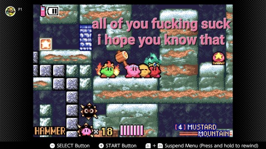
the button is right there guys
i called you over because it's literally impossible to do this on my own
for fuck's sake, someone press it
#kirby#kirby and the amazing mirror#amazing mirror's ai SUCKS#fun fact when i was in high school i had an idea for a comic taking place some time after the end of amazing mirror#i did nothing with it though because i can't draw for shit and can't write believable character dialogue or stories#i'd probably be better at dialogue now if i tried it again but the stories might still be crap#and i still can't draw for shit#but now that i'm thinking about it i could probably go with pixel art and sprites#i'd have to attempt making some new sets/backgrounds in a similar style on my own but it could work#and if i keep it to like 4 to 6 panels max i wouldn't have to worry about coming up with complex stories#i could focus on comedy and jokes#maybe make some one panel jokes like The Far Side since I've always loved and felt kinda inspired by that comic#okay wow i think i'm actually gonna finally try to make that idea something real#who knew that 15 minutes of writing tags for a post could affect my creative motivation so much#posts fully endorsed by cobweb
4 notes
·
View notes
Text

Hello and welcome to "Icon Making With Killian: An Intro to the 'Lost' Art of LiveJournal Icons"
aka, I'm still making them and I'd like to teach you how to do it, too!
This tutorial was written in Photoshop 2020, but you can probably recreate it in as far back as CS2-ish (since I still use the same sort of techniques I've been using since then, lmao). It also assumes basic understanding of the software, though I've tried to be as clear as possible throughout.
With that out of the way, let's get this tutorial on the road!!!!!!
I started with the bloomed art of Hiiro from the White Lilies scout box (image courtesy of the Ensemble Stars!! English Wiki).

I basically always start with a blank 100x100 canvas and paste the image into it. I try to go into icon making with a vague idea of what I want to do, and I knew from the beginning that my vision for this icon would have the top 1/4-1/3 of the image covered by a solid band of color. To make positioning the image of Hiiro easier, I made a rough version of the band with temporary colors (though they're pretty close to what I ended up using in the end).

With that in place, I could start working with the actual image for the icon. After pasting it in and adjusting the layers so it was under the band, I resized it and moved it around a bunch until I was happy with the position. Once I liked how it looked, I used an Unsharp Mask on the base.

Next up, I used a texture from lookslikerain. However, purple is all wrong for the color scheme I had in mind, so I went to Image > Adjustments > Hue/Saturation... to change it up to better suit my needs. Never be afraid to mess around with textures!

Here's how I adjusted this specific texture, but each one is unique- both the texture and the icon you're creating, so it's best to play with it until you get good results.

I then pasted this into the icon, making sure it was under the layers making up the top bands of color (because I was only trying to affect the base for now), and set this layer to Darken.

Now it's time to mess with the colors of the top band. They sorta matched before I did anything to the base, but now...not quite. I used a layer style for each part of it, but using the paint bucket tool would work just as well. I went to Layer > Layer Styles > Color Overlay... for each, changing the colors as necessary. The thickest band is #85d0bf, the middle band is #086371, and the thinnest, lightest one is #fcfcd8.

Time to start putting stuff on top of everything!! I took this light texture from ianthinae, rotated it, and set it to Lighten. I decided I wanted it to be a little bit brighter, so I duplicated the layer, set it to Screen, and dropped the Opacity to 20%.

I then used a texture from Sarah-Dipity and set it to Lighten as well.

Okay, now that's what I'm talkin' about!!! It's time to throw some text on this~ I went for something simple to go with the theme of the story this card is from: Princely. The font is Georgia, 10pt, in #086371, set to all caps. I decided it didn't stand out enough, so I duplicated it, changed the color to #8b4235, dragged it under the first text layer, and moved it 1 pixel to the right.

I wanted a bit more embellishment around it, so I used this simple tiny text brush from colorfilter in #06444d. I also erased part of it to make it fit the space better.

Finally, I used a texture from shiruji, set to Darken to get a bit more color variation in it, and called it done! :D

If you have any questions, please feel free to ask, and I'll answer as best I can- as long as it's not about making icons in other software D: I only know Photoshop (and Paint Shop Pro, but I don't think anyone uses that anymore). If there are any other icons of mine you're interested in seeing tutorials for - or even just specific techniques! - just lemme know. I love helping :D
Also, I'm happy to share where I get icon resources from. I have a whole post dedicated to that on my DW graphics journal, though tbh that's the best place to talk to me about making graphics in general. But I will absolutely answer asks/replies/etc about icons here on tumblr, don't worry!!!!
#livejournal#icons#icon tutorial#graphics#graphic tutorial#photoshop#LJ icons#100x100 icons#100x100#tutorial#tutorials#reference#what do I even tag this as XD
90 notes
·
View notes
Text
Bio? Something like that.
How did I start modding? Literally no one has asked this, but here's my story, don't worry it's not long... I guess that depends on what your definition of “long” is, haha! Hang on, here we go.
On a random day in January, 2024, a few days before my birthday, I might add... I woke up to stars in my right eye. A few days later, I was told I had a very rare injury and it would never heal. Those are not words an artist/gamer wants to hear! Long story short, I am now legally blind in my right eye. If you think, oh that's not a huge deal, you can still see. Humor me, get a cheap pirate eyepatch, put that on, then pour yourself a cup of coffee. Not as easy as you thought, right? Depth perception. It’s a thing. Anyway, on with the story. Suffice it to say, I was depressed. Majorly. Then, through some random conversation somewhere, I found Stardew Valley.
Perfect! 2D animation, cute pixel art, story that's not sugar-coated anime, I love it! Got to year 3, TBH I've never played past year 3 because ADHD, and realized the dialogue was quite lacking. Then I discovered mods. What the-, it's a freakin' goldmine! Downloaded a lot of things, mostly dialogue, and tossed half of them. While playing through a Sebastian run, I saw it. Oh. My. God. It's a coding error glaring at me in my dialogue box. This is NOT acceptable. I tried to ignore it, but then it happened again. Okay, time for some investigation. I opened the folder and found... json files. Interesting, I wasn't entirely clueless since I do know HTML code from back when the internet was a baby, Facebook had no ads, and dinosaurs roamed the earth. Okay, okay, the internet was more like a spoiled toddler. Yes, I'm old. Shut up. But I digress. It didn't take long to discover the misplaced punctuation and go on my merry reality-avoiding way. Until I got bored again.
I looked for more Seb mods, but there were like seven. Three were yandere, not my jam, and only 2 were updated for 1.6 and were dialogue-only. Solution? Make my own mod for myself. I spent six weeks downloading mods, learning code, Googling to very little effect, writing dialogue, learning how to make an event, discovering I knew nothing, and on and on. The perfect distraction from the whole eye thing. I finished a decent draft, loaded it up, and praise Yoba, it worked! And on we play. At some point, I saw a comment complaining about the lack of Sebastian dialogue mods. Huh, yep, they're right. Too bad. Oh. Well, I guess I could load this thing I made, it's really just my own internal story monologue while playing the game, I'm NOT a writer, and most people probably won't get it. But I did spend a lot of time on this, and maybe someone out there will like it. Heck, no skin off my nose since it's free. So I took a deep breath, made peace with my inner demons, and threw it out into the void of Nexus, expecting it to be swallowed up and ignored. That... didn't happen.
In the first few hours, several people downloaded it. Huh, Nexus must have a decent search algorithm. That was literally all I thought about it. The next day, 300 downloads. And comments! Mostly positive with the exception of one wild demand I subsequently ignored. At one week, it had 3,000 unique downloads. I was floored, 3,000 weirdos downloaded my mod. Add to that, people seemed to actually like it! I've never gotten so much positive feedback for anything in my life. Seriously. Apparently, my oddball internal monologue, thanks ADHD, is quite entertaining. Heck, might as well make another one... and here we are. Yes, I've gotten negative comments and unreasonable demands, but I do my best to ignore them and practice staying positive. Trolls be damned! It's a lot harder to do that for yourself than for other people, turns out.
So, bottom line, found something interesting? Try it! Does it make you happy? Keep doing it! Even if it's only for yourself, do the thing and let it make you smile. Share it with the world if you're so inclined. Get out there and kick ass!!
#maggs immersive sebastian#maggs immersive sam#stardew valley#stardew mods#stardew sebastian#creative process#creative writing
30 notes
·
View notes
Text
I was tagged by @tisorridalamor for tag game backlog check-up and I haven't done one of these tag games in a while, so sure, why not?
Fire Emblem Radiant Dawn: this one I'm getting to next! But I still need to finish up Path of Radiance first, where I'm right at the final chapter. And since I wanna stream me playing that for a friend, I gotta wait until we both have time for that.
Persona 5 Royal: this one's I bought about two years ago, so. Uh. It has been sitting in my backlog for a while now. Also not sure when I'll get to it.
Nier Automata: Bought this one along with Persona 5. Same as before applies, but I think I wanna get to it before P5, cause I think it's shorter.
Shovel Knight: I bought this one years ago and played until the lategame boss rush, which I just couldn't get past. And since then, I haven't really touched it.
Code Name S.T.E.A.M.: Got this one a while ago for like 2€ since it was sitting at that game shop for ages. Not a high priority, but when I do I can use the Fire Emblem amiibo for it, which is nice.
Professor Layton x Ace Attorney: Got this one as a gift (for lack of a better term) years ago. But before I touch it, I wanna play more of the Professor Layton series, where I only played the first game ages ago.
Pikmin 2: got the Wii version years and years ago, played it for a bit and then dropped it. But, one day. One day.
Final Fantasy IX: bought it a few years ago, played it a bit, and then kept meaning to come back to it.
Final Fantasy VII: bought it on a sale where it was 50% off, but haven't touched it yet.
Now some other games I don't have right now but wanna maybe get if they don't slip through the cracks for me:
Another Code Recollection: I know that if I don't get it soon this game will be rare later down the road, so I better get to that soon.
Blasphemous 1 + 2: this one has a friend's seal of approval, and I like the pixel art, so it's got my interest at least. But whether and when I'll get to it, that's another question.
Elden Ring: I got a PC that could probably run it pretty well now, but I kinda wanna wait and see if it ends up on the Switch's successor.
Xenoblade Chronicles X Definitive Edition: IT'S NOT OUT YET BUT IT HAS GOT TO BE HERE
That's all that come to mind right now - and I guess I gotta tag people for this? So uhhhh @bigboobshaunt @baevi @sleepy-crows @you-didnt @lunanilla @metalempire You know how these things go, don't have to do this, yadda yadda yadda and so on
9 notes
·
View notes
Note
Why do newer pokemon look so offputting? Older games had tons of diverse designs but newer ones look unfinished/not well thought out.
They might be. I dunno. There's a lot people have said about Game Freak's competency at handling the Pokemon franchise and how they've added too many new Pokemon to some of these games and are basically running the well dry on good ideas.
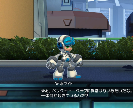
But I also just see it as, like, an extension of the Mighty No. 9 problem. I remember when we were still all starry-eyed and hopeful about Mighty No. 9, Inafune revealed the design and mentioned it had "increased detail to suit HD displays."
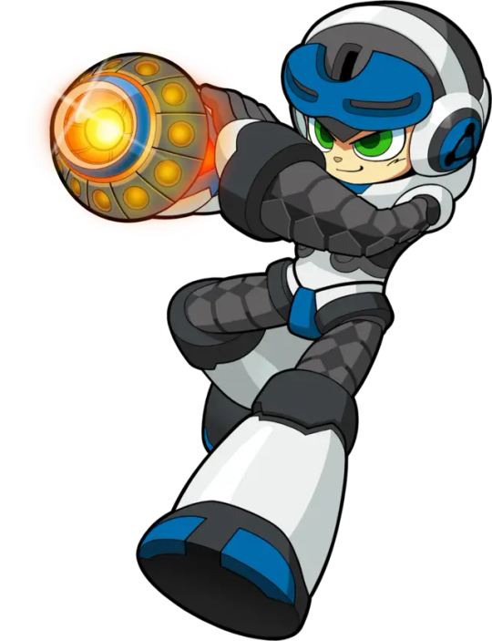
So he's got all these colors and patterns and grooves and slots, when Mega Man was basically just a kid in his pajamas and three solid colors:
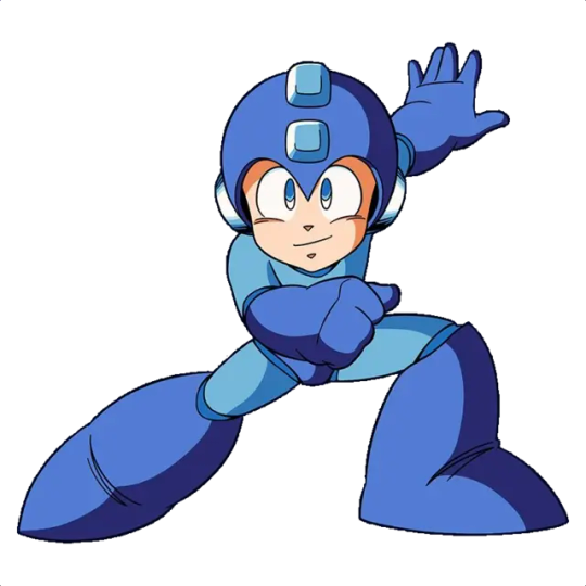
Light blue, dark blue, and skin tone. That's it. That's all you needed.
And Inafune further explained that was because Mega Man had to be this tiny little 24x24 NES sprite. I'd have to look it up, but it wouldn't surprise me if the sprite came first. I know it definitely did with Mario.

So this is like designing a character with the rawest, most basic building blocks you can get. You are not adapting the above character art into this sprite. Instead, you are making a character that has arms that are a separate color from his body, you are giving him pants to denote where his waist is, and you give him the biggest eyes on earth just so people can tell that's his face.
You have the smallest canvas imaginable and have to make sure people can understand they are not only looking at the shape of a human, but watching it animate in various different poses, all when it's run through somebody's crusty old RF patch cable on their 12" CRT TV:
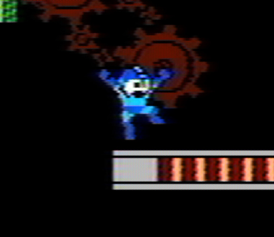
Whereas, in theory, Mighty No. 9 is going to be played at its native resolution in crystal clarity on a 40" flat panel display, potentially allowing you to see and understand a lot more detail.
So now we circle back to Pokemon, and a lot of those first Pokemon look like this:

They had a box, 56x56 pixels wide, just over double the size of NES Mega Man, and four colors of grey to work with. When viewed on a Gameboy screen, these monsters weren't even two inches tall. Those limitations meant they still had to keep things simple.
Whereas now, increased resolutions and screen clarity allows designs like these:

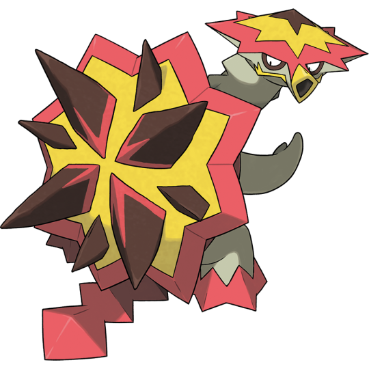
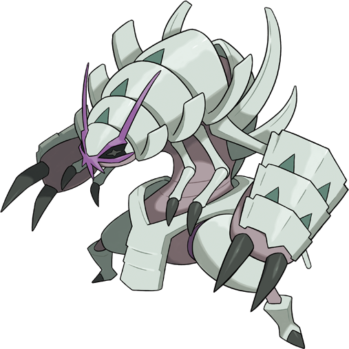
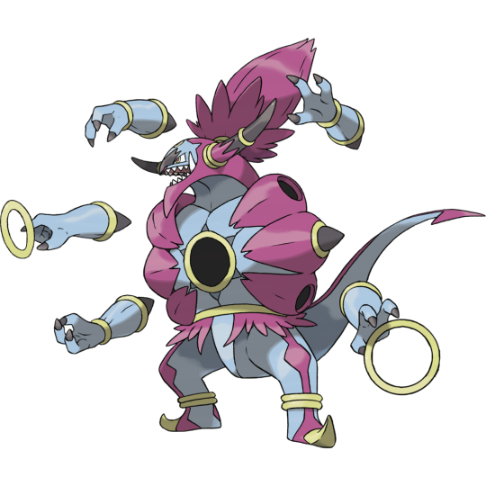


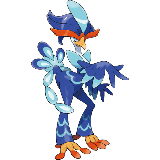

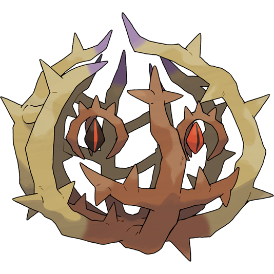
Now the point I'm trying to make here is that simplicity and limitations give birth to clear, highly focused designs created to be instantly identifiable and recognizable at any distance or resolution. More detail does not necessarily make for a stronger character. You can absolutely get caught up in adding detail to compensate for a bad character design.
...At the same time, let's play devil's advocate here. Pokemon is a very different creature now than it was 25 years ago. A single new Pokemon design probably goes through this huge insane iteration process where all kinds of departments touch and approve the design so it can appear in the anime, it can appear in spinoffs, it can appear in merchandise, so on and so forth. We're miles away from the days where one guy comes up with all the Pokemon just because he thinks it would be funny to have a fat duck with a headache.
Maybe as much as anything, you could blame the increasingly complex production machine on why these Pokemon look like this. After all, even by the second generation of Pokemon games, they were constantly chasing the dragon of trying to find "the next Pikachu."
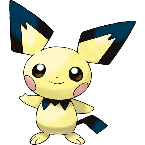
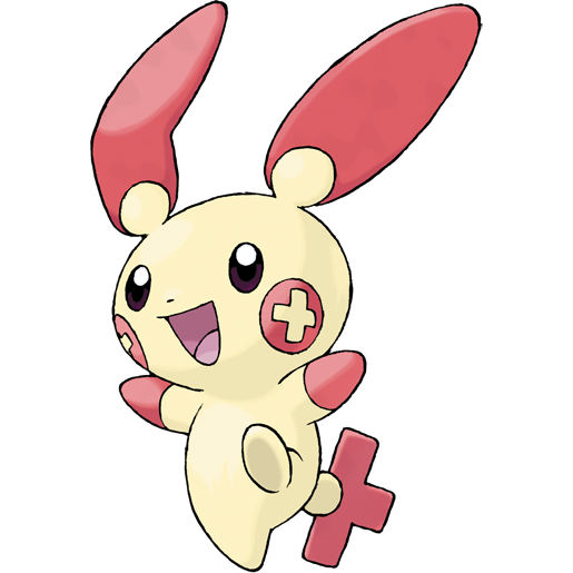

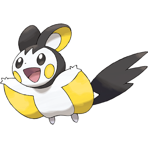
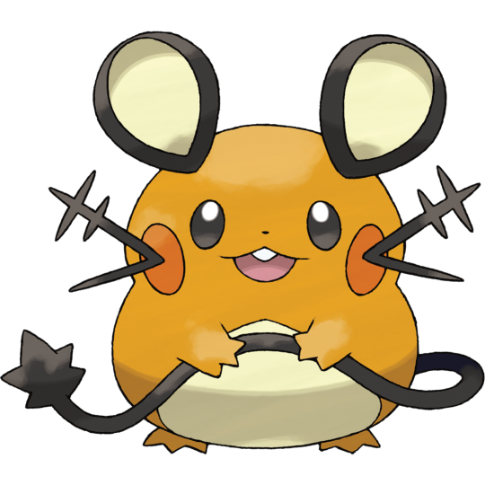
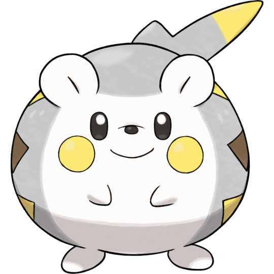
Everything has to be polished and smoothed down, while also showing the increased capabilities of the hardware, while also staying appealing to Pokemon's core demographics (there are multiples), while also being something they can sell toys and shirts and hats of, while also being noticeably new and different from existing Pokemon, so on and so forth, on and on and on again.
Having so many Pokemon in each new game probably gives them some leeway to experiment, but I'm sure some of these characters get beaten with creative hammers in the search of their next superstar.
On top of whatever qualms people might have with the state of Game Freak as it stands today.
#questions#Anonymous#pokemon#nintendo#game freak#mega man#mighty no. 9#character design#limitations#I am not insulting your favorite pokemon#I don't even know a lot of these pokemon
13 notes
·
View notes
Note
Hello it is I, random anon who does not know you and has never interacted with you before, what is your opinion of your mutuals?
Oh hi @bixell-pixell I'll include you even if we're not mutuals I think you're pretty chill all things considered
That's kinda it idk you that well
Anyways
You didn't specify so I'm going to list all my mutuals in the order of oldest to newest on my following page that I remember sorry of I missed anyone and for the @ s
*inhales*
@e-the-village-cryptid (I don't have a tag for e yet but it would probably just be E)
Not only the first person who I became friends with here but also the first one I ever started sharing my stories with, even if we don't talk too much I'm glad Every time we do and I see them on my dash, (they bring some of my favorite posts and when I do send posts sometimes I mix up and send them their own reblogs) I'm so glad we're still friends, thanks for letting me ramble about stuff for 6 hours hehe
@jaqofallgenders (no tag for jaq yet either)
my in person friend and the longest friendship I've ever had with someone, love you 🫶. I'll be more specific on Monday if our ADHD doesn't kick in and make us both forget
@strawberry-seal77 (seal-berry!!!)
Hi hi hi yellows my friend 👋 the person I consider to be the second ever friend I made on here, a lovely person as well and wait waaa and an amazing artist too 👀??? Love you silly goofball and the amazing posts and jokes you have we should chat more often I thinkith.
@rabid-mercenary16 (Rabid jumpscare)
Hey hey hey .... BWAMP! Hope you feel better soon
I probably have the most to say about Rabid but all try to make it a bit shorter. besides being the first artist to do art jokes and include me, with we also became mutuals and interacting around a time when my life started to get a lot better. Even if she's not the only factor in that I definitely associate her with stuff improving, and she did play a big factor in it (I already explained a lot on my Valentine's Day gift to her and the others). Also she's just an awesome person to spend time with and be goofy, amazing sense of humor and I just love being friends with such an awesome person and artist.
@dia-smthidk (Dia fren)
I'm assuming you don't want a bowl of soup
I also said a lot about them in my Valentine's Day gift, but we've become closer friends sense then even if we don't get to chat as much as I'd like to. I relate a lot and am surprised how we have so much in common. Amazing artist and person as well and I wish we could hang out more, idc if they think they're bringing down the mood when/if they bring stuff up about irl, and maybe I won't figure out their timezone but oh well, please take care of yourself gender sibling.
@bunnybunnsowo (BUN BUN BROTHER!!)
little brother 🫶🫶💝💞🫶✨👋❤️!!!
(I could have sworn we became mutuals before Dia?)
another person I shared a lot about with the Valentine's Day gift, I love you my little brother! Seriously one of the kindest people I've met and I'm so glad they have bug in his life. Bun deserves the world and they keep sending me opposum images!!! Gona die from cuteness and his kindness one of these days istg
@spookykittyzzz (greaah why don't I have a tag for you???)
A very kind person and artist I don't know too much sense we're not that close yet but love the few chats we have had so far. Hope we get to hang out more even if I'm awful at reaching out to others and saying hi.
@glitchyk (goop buddies)!!
Nooo the parallels
One of the first people who was interested to deep dive into my creations and ask about my stories and worlds They're probably competing with Rabid with how much I have to say about her/silly. Seriously it's incredible how much we have in common and now I get to share and collaborate our sonas stories together it's amazing. And as someone once said "you can yap for hours". I love how creative and clever they are, I just wish they would be kinder to herself. One day I'll make glichy see how awesome she is.
@unfunnyaceartist (Floridian disadvantage) I feel like I should change that
When I say I was shookith when ace asked to be friends I mean I was shookith first person so show up and ask that (the others kinda just happened). Amazing artist and don't believe her lies she is funny. I'm so heckn glad we're friends., love the goofy and silly idc if she's a bit of a simp they've helped me a lot start to understand slang and references I'm supposed to understand shhshsh (such is the curse of how I grew up) we need to make our mafia sonas interact at some point I can already imagine the chaos /silly
@neptunestoast (plushy slime)
Hugs hugs hugs*
Trying my best not to baby talk I swear. amazing person first person to show up and be like "hey I Wana do something for you and your friends". Love their humor and another gender sibling!!! Hugs for ever for as long as they're ok with it. I love their creativity as well and Noodle is so adorable. I just want to pick them up in a hug so much. Kibbity/silly
@ner5y (no tag woops ill figure something out)
What are you doing here??? How are we friends???
I was absolutely confused and startled when they followed me especially since it was during a spoons argument . Amazing artist like holy heck I wish I was allowed to curse on this blog. Their humor also took me by surprise when I got invited to the discord, and even if they doubt how well they're running it I think they're doing amazing. And I love our silly interactions like this one
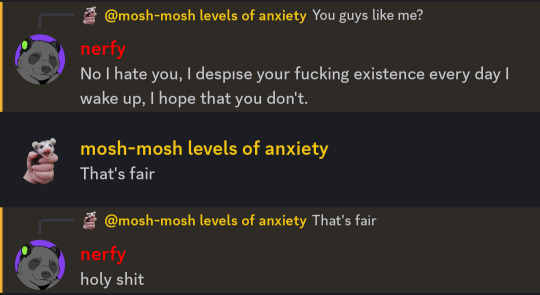
@vexation-816 (chaotic ADHD buddy!!!)
Why did it take me so long to follow you istg
ADHD ADHD ADHD my buddy oh pal we both got that and it's driving us insane/silly. Love how creative he is and the ideas for his sona and character lore. Also one of the first people who shared a character they added to my nightlight au. This is getting twords the end and I'm tired of whiting so much and am on a timer oh no. But your amazing dude don't ever forget thag
@butlerbugbunny (anxiety bunny buddy)
This is why I didn't respond to the DM yet hshsh
New friend who I feel anxious talking to sometimes but a wonderful kind bunny who I'm also incredibly happy to be friends with. Love his art so much it's amazing (shoot shoot timer is going off) I'm glad he's their for bun and wish them the best I possibly can 🫶.
@lilithloves-you (lillith my be-loathed?) need to change that
Don't you dare bring up grilled cheese
Glitchys friendo who I'm also friends with now. We don't interact too much but I've sent her on missions to go hug glitchy (to help both of them feel better but shhh). I hope we become closer friends in the future.
#god this is a lot anyways im off to the store now#mutuals#E#seal-berry#Rabid jumpscare#bun bun brother#dia fren#goop buddies#Floridian disadvantage#plushy slime#anxiety bunny buddy#Lilith my be-loathed?
25 notes
·
View notes
Note
Hey
Sorry if this comes off as insensitive, and no pressure to answer if it’s uncomfortable. I’m pretty new to the whole “yume” thing but I really love your blog! I just had a question and wanted to make sure I’m getting it right.
You mentioned being non-sharing but I noticed you post some Sebek x reader fics which seem like they’re for others too. Does that go against the idea of being non-sharing or do fics not count in that?
Sorry if this is an awkward question I’m just trying to understand better and wanted to know your take on it.
No worries if you’d rather skip it! Hugs!
....oh my.....
Hi hello!
It's ok, but I'm afraid I might not be much help here. I only use the term "yume" because it makes navigating things easier for me. I don't really have deep knowledge about the etiquette or "rules" of this field, honestly. I'm too exhausted and busy to pay much attention to it😓 I just love pixel guys because it's fun and good for my mental health!💞
If you ask me, I actually prefer terms like muse haha. But honestly, whatever works for you is fine!😊
As for the "non-sharing" part.
Yeah, I don't 100% like the term, but using it helps me curate and navigate my online experience better, I think. I try to do it quietly and as unnoticeably as possible, though some people still seem to have issues with it🙂
It's probably context-dependent too - like who's depicting certain characters and how they do it. It's all about interpretations, you know? I don't really get why people get mad about this so much.
It's normal to have different opinions about how a trope or a character is portrayed. I mean...just look at something like Jesus - there are so many different branches of religion. If that's the case, what can we even say about anime guys?
So yeah, I don't understand why some people act confused or upset when they learn that someone has specific preferences. We all have different lives and experiences, and those inevitably shape how we perceive the world, including media.
I don't have any problems with people in general. Well, except for one specific person whose actions caused me a lot of pain earlier this year (and still do to some extent). But that's just one case.
In fact, in most cases, it's quite the opposite! I love some certain character x prefect ships and could even recommend a few - they're adorable😊 If I hadn't come across other people's SbKn art, I probably wouldn’t have dared to create my own. So I'm actually really grateful to those JP artists who shared their work. Their art inspired me and ignited my love and interest when I was still unsure about how to play with my pixel dolls.
That's actually one of the reasons I post, too. Fics including. I just want to share love and make people's lives maybe a little bit brighter. We live in dark times, anon.
I hope that maybe someone will see my work and feel the same kind of inspiration and confidence I did. Just like how others' creations helped me, I want to pass on this warm, blissful feeling - the courage to love what you love no matter what others say or how they treat you.
I don't know if this was helpful, but that's all I can offer for now.
Take care, and don't forget to have fun! 💚
7 notes
·
View notes
Note
If you could make your own video game (think of an idea l and it just snaps into existence somehow) what would it be about and what mechanics would it consist of? What platforms would it be available for? Who's the target demographic? Or anything else you want to ramble about... I like to think of creating my own games sometimes.
haha they dont know i have a joke rpg game i made in a day to test my abilities.
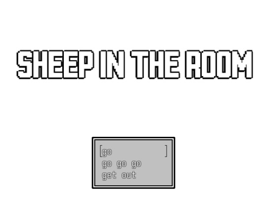
in all seriousness though, i actually did have bigger projects that i never finished... so, just gonna drop that i'm a big fan of RPG maker games, horror ones, PSYCHOLOGICAL horror ones for even better score. and i am kind of a liiiittle experienced with rpg maker.
warning!!
this answer ended up containing a lot of sensitive topics(in my opinion??) and i tried my best to make sure to include them in tags AND before each idea's explanation, please check the tags and not proceed if those topics are sensitive to you personally!!
i had a project that i started making as a vent. that's the closest i had to actually making something. it was called zepphire's lair. zepphire is my sona from 2015 that had very bright neon colours that were probably UNBEARABLE to look at, then i tried redesigning her years later into something pastel. and then, umm... in 2022 i had issues with my style because i used to be VERY caught in 'oh,,,this one line is weird,,,how do people even like my art there's a stray pixel there...god.' and decided to do something about it. this 'something about it' was changing my art style to PURPOSEFULLY unpleasant to look at, messy and annoying. it was bright, i didnt care, and honestly i think it helped with being that critical to myself. anyways. sorry im rambling but it is important
so in 2022, when i had a giant relief of drawing in the most unbearable(and stunning at the same time) art style, i reused zepphire. FUCK PASTEL said me. NEONS ARE GOOD. it was a great decision.
so zepphire's lair was meant to be an rpg game where you play as zepphire. who in her head is still her young self that doesn't have to think about what happened. but in reality, her magical world she was meant to become a god of was destroyed and ruined because she wasn't responsible enough with powers granted to her. she is now the only resident of the Forbidden Location, an alternative world that people could get into by just clipping randomly. like you know when you find a spot in a videogame that doesn't have an invisible wall and you go OH. that. i wasn't sure how to continue working on it because it lacked story to tell as present. it had a past story to unfold, but i had no idea what would happen now. i had a thought of someone getting into FL somehow after long time and zepphire trying to solve this because they're clearly not meant to be there while in her head she's still stuck struggling with herself.
i want to put a little bit of assets i made for zepphire's lair, but since it's all very bright toxic neon i think i'm gonna place them at the veeeery end so you don't have to look at them if you can't stand it.
CW: cartoon blood!! a little bit of it!!
next up is my cool idea of a fangame! so, purrfect apawcalypse is one of my favourite game series. and i've been following it since first one and i have a LARGE fanmade setting set in the same universe! (in fact, two! i also made a reference for kitsune high which is set to be in an agricultural town inhabitated by foxes! it was a cool project)
the game idea was to make an rpg (because, again, that's all i know, lmao) that follows the Chatting club - a school interest club literally dedicated to rumors and just having a good time - as they unveil the secrets their school holds. cats and dogs disappearance cases? rumors of ghost around? who the heck lives in the garden and what're they up to? what is up with the Detective club's president Seraphima? there are many mysteries. it would have an overall vibe of the original novellas' series - a cutesy game about very cute furries and weird magic stuff happening, while also having a little bit...darker tone. like i was actually going to explore a very dark topic with this one but honestly? right now i really don't like the way i wrote it back then. if i were to pick up the idea again i deffo would try to rewrite it and make more sense into it. i like the detective vibe it had going though!
here are some references of the characters that are important to the plot! a lot of twists were planned for this story and i'm not going to tell them all because it's a secret tee-hee.

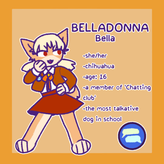
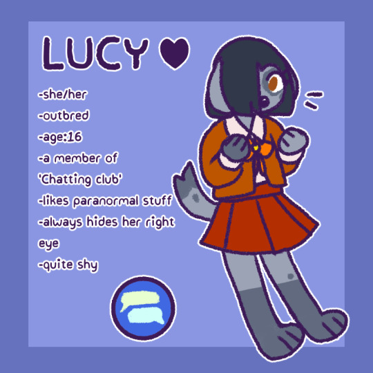
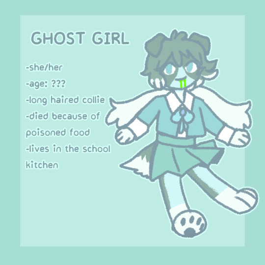
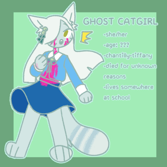

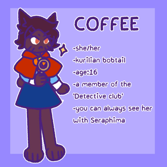
also as i searched for the refs i found that the working title of the game was 'purrfect meowting'
another concept for a game i had...which is a lot.
CW: contains themes of child neglect, probably abuse, general cat mistreatment, probably a bit of ableism(im unsure about this one) and maybe a bit of weird racism because one of mc's character's parent is weird and very stupid and we are allowed to hate her for that...i hope i mentioned it all.
i have a little ocs setting with three main characters that i refer as 'kitty girls' this story is tragic and is based on idea i had about making a story...about girls...but put them into life situations that would reflect what cats sometimes have to go through bc some humans are trash, but put it through a human lens, although not exactly. it also ended up a story that portrays children who've lost their childhoods for various reasons. idk how to explain.
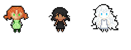
these are Snowwhite, Rouge and Patches. their names were meant to be reflecting what another one's kitty sona is, but i fucked up, lol.
Showwhite is a picture perfect girl for her parents who's mostly been treated as a prize all her life, making her feel sick of herself. Rouge was neglected by her mom because 'she wasn't born red'(as in orange...like a cat...i used cat allegories every time i explained it but i think the implications are clear enough - her mother wanted her to look different.) and she lived a happy life with her grandparents. and Patches...is a deaf girl whose parents just couldn't take care of her properly so she ended up in an orphanage. she has awful attachment issues.
i won't explain the whole plot but their stories were meant to be kind of a portrayal of how some people treat animals as just objects, things they can just get rid of. a cat of specific breed, bred for specific traits which may be hurtful to it, a cat whose owner just threw it away after it not meeting the expectations, and a general theme of people not wanting to take in cats with injuries that make them 'not pretty' for them. i don't know why im tearing up right now but these make me so upset and i smh wanted to portray these issues though human characters, and while adapting them i realized that those awful stories ended up overlapping with how neglectful parents end up treating their children.
in the end they end up in cat heaven, where they all meet and get to be happy and be themselves. snowwhite learns to love herself for who she is and find out hobbies there, rouge just finally gets friends she lacked. also patches doesn't magically start hearing in cat heaven, she was given an option to but she felt overwhelmed a lot and ended up sticking to being deaf but not treating it as a bad thing, just a different thing.
.
.
.
.
.
.
.
BONUS SECTION
i also have this unused character and concept art that i just made bc i finally felt like i could do something back in the day
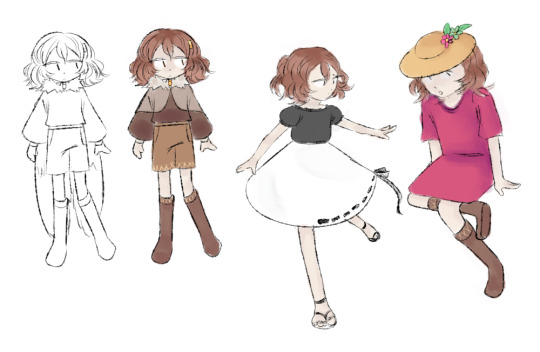

her working name was 'vogel'
so. returning to zepphire's lair. one thing i forgot to mention earlier is that i also even made OST for it (didn't feel like it would fit the text above). this one is just the theme that plays in the first playable area
main menu theme...is too heavy for tumblr apparently. huh. it's a very simple tune it just goes on for very long (bc there's an easter egg if you listen to it for too long!!!)
next section contains bright images that im gonna put even deeper below!!
.
.
.
.
.
.
.
.
.
.
.
.
.
.
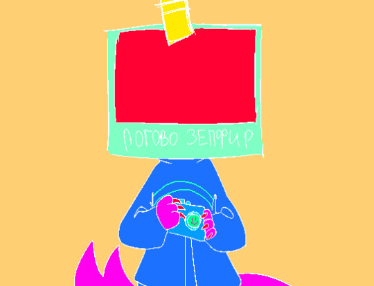
title screen!


intro cutscene! small baby zepphire, and then zepphire acquiring her godmode key, and then ending up becoming a photoshooter!! the camera is important .
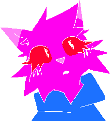
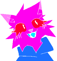
here she is!!! the cat herself!!!
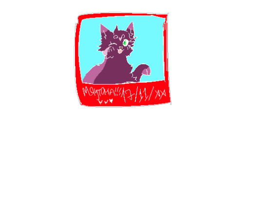
a photo that she has in her inventory!! it's mewtona, her sister!
gameplay-wise i was gonna make it so you can collect random photos zepphire made and have to learn the implications of that and what it has to do with 'the photoshooting incident'. it would be somewhat close to omori - part of story is in reality and parts of it in headspace that explains the story.
I THINK that's all. sorry this took so long that was a lot of yapping!!!
#tw cartoon blood#tw bright colors#tw abuse#cw cartoon blood#cw bright colors#cw abuse#cw child neglect#tw child neglect#cw eyestrain#tw eyestrain#cw animal abuse#tw animal abuse
9 notes
·
View notes
Note
You're so right. Just today, I was literally growing sick from lack of feedback. Heck, the only comment I got was a negative one. It just made me not wanna write anymore. I kinda gave up, which is sad because writing is my hobby. If more people gave another person feedback, the world would be a sweeter place. We should be doing this in general for others too in any place.

You know what? This wasn't going to be nothing else but me shaking my head like Abe Simpson about how fandom used to be more supportive in my youth, but I've gotten SO MANY MESSAGES LIKE YOURS. That you're unseen, unsupported, treated at the best like some human AI program to bring content, more and more and more and more, which can then be brainlessly consumed like some big budget Marvel movie.
I'm so sorry for all of you! I wish we could make an event or a something where we would gather together and go read each others fics, see arts, see gifs, plushies, patterns, watch Youtube videos and metas and animations, see pixel art, pottery etc. and then we would just comment. Say nice things about these creations other people out there have made.
Such a think used to exist during Livejournal, but the past 10-5 years - and I'm blaming now more Tiktok and IG for this - has made fandom inactive in a way it has never been before. Well, it was a bit harder in the 60's, 70's and 80's, before internet brought us closer together globally, but seriously? I don't recall fandom ever being like this, like hungry little baby birds with their mouth open toward other people like "feed me feed me feed me". It's really sad to witness, especially when I've gotten to live the more active times in my youth and how much the support I got mattered to me, and now I think nowadays kids, teens and young adults who don't have such support.
It's super disheartening. Not for me, but for others. For fandoms. Is it the endless amount of content which has made people so carefree? That no matter what, more stuff will come, even if I didn't even blink towards small creators? If this fandom person stops, then others will continue?
The online support I see the best at these times seems to be in the small fandoms, and because there's so little content. You're so happy and grateful for all small nuggets you get.
If I was still studying, I'd probably make a thesis out of this topic. It feels so multilayered and sadly, increasing.
Or then I'm just an old fart.
38 notes
·
View notes
Text
Realizing I may actually have some real mental trauma about my art.
huh.
So I've been thinking about why I have so many mixed feelings about my art again...and just realized one more thing that reminds me to be "humble" about my art.
I had a friend that once showed her boyfriend my art and his response was "you know there are better artists out there"...and I think she responded with something along the lines of how many she or he knew personally, which is fine but beside the point. Because she was proud to be my friend and I was proud of the art piece at the time and it was So uncalled for. Not just because he basically called my art bad, he also kinda shamed her for liking my art? Who does that? She broke up with him withing that year because they were not an ideal match in the end, but like. Wow.
I've always felt cut down the moment I think I'm a good artist. Something always happens. I have no idea why, and it always comes from different places, but like. The only reason I still draw is because it brings me joy, and I have a few people that comment on it, different people for different fandoms, but they all make it worth while, even if it is just one person in a specific fandom.
When I was a teen and just starting to think maybe I could be an artist as a job, a friend told me a different friend of their would for sure become an amazing artists, and brushed off my art and that I didn't have anywhere near the same skill. Which implied I should not try to get into the industry. Which is fine, it really was not what I should do for work, but still hurt.
The friend's BF was a few years later and I had not yet figured out proper anatomy and was working on shading, but I was getting there.
Soon as I felt like I was good enough to take commissions for money instead of online pixel image trades etc, I got someone from a forum basically bashing my art as not worth anything until I could paint/draw at a professional level, (which I was probably a bit away from, but I had all basic anatomy and clothing folds/shading down at that point). So I backed off from trying to make any money from it and felt like I was a beginner again....after over 10 years of drawing, and over 5 of primarily self taught photoshop.
I'm not sure I ever recovered from that one. I think I have tried to do emergency colored sketch commissions twice, but that never got any responses, and I had to go do my real job for more hours and deal with physical and mental fatigue instead.
So I have stepped back from every trying to make money, and at this point I rarely take requests, other than from my sister. I have not drawn anything in months because of a collection of things happening at once, but I was talking with someone the other day about never being confident in my skills/dealing with imposter syndrome in all my life skills (Including my primary income that is booked solid for months out and some people will not see anyone other than me so I must know what I am doing) and the post I just reblogged reminded me of that shaming my friend for liking my art because "there are better artists".
So now I draw when I have the energy and motivation, and try not to worry about if more than one or two people other than me will enjoy it. (making it worth posting for those one or two people)
#About me#IDK man#I like to draw and I miss drawing#but I also don't feel great about my art#I really want to#but I have RSD and a history of being put down#so I only draw when I really have motivation and energy#and try to keep my expectations low
2 notes
·
View notes
Text
Thanks @lenorelovesmax for tagging me 🤍
1. How many works do you have on AO3? 2, currently. Well, more like one and a half baked scene that has no context, to be more accurate.
2. What's your total AO3 word count? 194.036 words.
4. What are your top 5 fics by kudos? I have like the one fic, the other thing has 2 kudos. So... - A Walk in Chiaroscuro (354)
5. Do you respond to comments? Why or why not? Yes, absolutely. It's pretty rare when I don't. I like to tell people that I appreciate their support and comments or to answer questions they might have about the story or the choice I made.
6. What's the fic you wrote with the angstiest ending? I don't do angsty endings. I'm too old and too jaded by life to appreciate them anymore. I'm at a point in my life where I need to know there's hope and happiness at the end of the line.
7. What's the fic you wrote with the happiest ending? I'm guessing there will be some kind of repetition since I've only published Awic... Soooo, it's a Walk in Chiaroscuro! ...but if you want to know about the ones that I keep in my drawer never to see the light of AO3, the happiest ending goes to Let's Write a Love Story (it's a Homestuck fanfic)
8. Do you get hate on fics? No. I'm writing in a mostly dead fandom so far and for kind of a rare pair so, people have been starved of content. They were so nice and sweet to me in the comments.
9. Do you write smut? I wish! I don't have the chops for it but I so wish I could write good smut! Honestly it's something I really want to push myself into exploring. Unfortunately your girl is a bit too vanilla in her taste which makes for poor reading. I don't fear being bad... I fear being boring, you know?
10. Do you write crossovers? What's the craziest one you've ever written? I've never done that, no. But who knows what future will lead me to write.
11. Have you ever had a fic stolen? No. I don't have enough reach to be the target of theft.
12. Have you ever had a fic translated? Nope. And tbh I don't have the patience to translate it myself in my native language.
13. Have you ever co-written a fic before? Could have... but no. There was an attempt at a joined project for Dragon Age but, unfortunately, it didn't work out in the end. I'm not abandoning the idea of writing for Dragon Age but I'll probably go in a very different direction since it would be a solo project.
14. What's your all time favorite ship? I... don't have one... Yeah, I'm not much of a shipper at the core. I mean I did write for Caulscott but I practically ship Max with everybody in LIS so... I was more interested by Nathan's potential as a love interest more than the ship itself. Outside of LIS... I can't think of any ship rn, I'm afraid.
15. What's a WIP you want to finish, but doubt you ever will? Tough question. If I abandoned a project I don't consider it a WIP. It's a dropped thing that goes in the reusable idea bin... and if I'm still working on it, I don't go into thinking I won't finish it. So, it's hard to say really. To not leave you with such a vague answer, I'll give you this: the fic I planned to write about the Hidden Object Games series Dark Parable, that never took off and never will (for I have better/much more attractive projects to work on). It's a dropped thing. But now you can see I have weird and obscure taste.
As for original projects: I have a Horror RPG project that probably won't ever see the light of day, called: The Clockmaker. (because I realized I'm shit at pixel art, tragic)
18. Thoughts on writing dialogue in another language for a fic? Hum... No. I don't mind people doing it but I tried it myself in my pirate epic and, let me tell you, I'm not that good a multilingual as to be witty in more than 2 languages. I found what I wrote cringe af when I read back my text in the editing phase and scrapped it all out.
19. First fandom you wrote for? Homestuck. I started writing fics very late in my life. (I wrote original stuff before that)
20. Favourite fic you've ever written? A Walk in Chiaroscuro. Because it's the only fic I went into unafraid to write what I wanted without thinking about who might read it. And to this day it's the truer work I've put out. Not the most personal by any stretch but the one I indulged in the most. And I'm so proud of it. Flaws and all.
I tag @sourrind and @momochizoey if you feel like doing it. And everybody who'd want to as well, consider yourself tagged, friend!
9 notes
·
View notes
Text
On "you have to learn the rules so you can break them"
Being an artist of various stripes (mostly writing and pixel art, but also game design, a brief stint in theatre, and recently I've been dabbling in music composition) one of the statements I have always hated the most is "you have to learn the rules so you can break them."
Of course, there are multiple reasons for this. Number one being that I have always had a problem with any authority that appears to be totally arbitrary. Number two is that this phrase absolutely gets abused by elitist dickweeds who think that taking creative risks is a privilege that has to be earned via a period of rigid devotion to The Rules(TM). But I think the biggest problem of all is that the sentence is HOPELESSLY vague.
Naturally, this pointed to the phrase being a watered-down version of advice that actually makes sense, so I decided to look it up and see if I could find its origin. In doing so, I found a couple of different versions of the phrase - one dubiously attributed to Pablo Picasso, the other very falsely attributed to the Dalai Lama - but the oldest version I was able to find is from the 1920s, in a magazine called The Bookman.
The quote appears in an article in the July 1921 issue, written by one J.P. Collins. In the article he describes a conversation he'd recently had with Edward German, and... uh. Well.
I was wrong. I mean, I was right in one respect, but I was so wrong.
You see, the original advice isn't any more useful than the popular version of the phrase - in fact, it is exactly the same. But it is given in the blatant spirit of elitism and aversion to counterculture, as seen in the quote's context:
He could not see anything but Nemesis awaiting the present fashion of hostility to tonality and form, a pose on which some mistaken moderns seemed to pride themselves. ... "The only music that can live," he said, "is the music that has the elements of beauty and health in it, and observes some kind of structure and shapeliness. ... You must put in close application and study of the best models, and you must learn the rules before you break them.(")
Or, as Chris Fleming summarized it: "Be original, but run it by us first."
So yeah! This isn't just some simplified, but ultimately well-meaning adage about the benefit of understanding why a rule exists so that you understand how it can be broken. It's just saying that "good" art follows traditional standards, and if you don't first memorize and learn to adhere to those standards, your art will have no lasting impact or purpose beyond simple contrarianism. That's such great advice! /s
So now that we've established that this advice came from a colossal douchebag who meant nothing good by it, I'm going to declare "death of the author" and take a look at a couple other versions of this quote, and the difference in the philosophies they're espousing.
First is a version popularly attributed to Picasso:
"Learn the rules like a pro so you can break them like an artist."
This is basically the same as German's philosophy, except that it was allegedly said by a cool cubist who would definitely be down with you doing whatever you wanted after you finished your anatomy classes. So that's an improvement of sorts.
And while Picasso probably didn't say this, I can understand the sentiment: If you have a certain effect you want to achieve, but you don't know how to craft your art in a way that actually leads to that goal, the only thing you're going to make is a mess. And the bigger the risk you're taking - which is actually what you're doing when you "break the rules" - the bigger a mess you can end up making if things don't go the way you intended, and the less likely it is that you'll understand how to fix the problem.
For this reason, novice artists are often advised to stick to following the rules (actually a set of guidelines designed to reduce your risk of fucking up) until they gain a stronger understanding of how to translate ideas and intention into a satisfying result.
To be clear, there are contexts in which this is extremely good advice. Not every form of art is 100% safe to experiment with; some, such as architecture, have both soft artistic rules that can be played with and much firmer technical rules that should only be altered if you're sure you can safely do so - which does require you to remember and understand the initial ruleset. Plus, even "safe" media, like writing, have technical rules that serve useful purposes like "making your work legible and coherent".
This can also be helpful advice for total beginners, who may not even know where to start with the medium in question, much less what they want to do with it - and for whom a big artistic failure would be less of a learning experience and more of an incomprehensible, confidence-crushing blow. In this context, following a ruleset is actually pretty great, because it helps them to build familiarity and confidence with the medium of their choice.
When it comes to other contexts, however, I find this advice to be misguided. One reason is because of how easy it is for an amateur artist to pick up "rules" that are dramatically overapplied at best, or pure opinion at worst - either from their teachers, artists they look up to, or even random weirdos with just enough confidence to make themselves sound authoritative. Advice is cheap, especially on the Internet; good advice is much rarer.
The other issue is that, on a practical level, learning to follow the rules does not teach you how to break them - it just teaches you not to break them, or that when you do, you need to stay as close to the rules as possible or else risk ruining your whole piece. Which is great advice in theory, but in practice, it's abstinence-only art education. People don't just need to learn risk avoidance; they need to learn how to recognize and navigate risks, or they're gonna hit a wall that they're not going to know how to work around.
On that note, let's have a look at the other version I found of this quote. This one's just completely misattributed to the Dalai Lama, its actual source being a revised version of the "Instructions for Life" chain letter. It goes thus:
"Know the rules well, so you can break them effectively."
In my opinion, this is a much more useful interpretation of the phrase. It is instructing you not simply to learn the rules, e.g. through rote memorization and practice, but to understand them, to know how and why they are used - and not because breaking them is a privilege to be earned, but because one day you're gonna have to break 'em, and forewarned is forearmed.
Of course, it still has limited applications when it comes to art. It's a good piece of advice, to be sure, but it leaves off a fact more particular to art than almost any other field - that one of the most effective ways to understand a rule, after you've got the basics down, is to break it and see what happens.
So in the end, while it's got a lot more staying power, I still wouldn't treat it as a universal rule. And that, I think, is the core of my issue with the way people repeat this line - not this version in specific, but any of them.
Because for some reason, people have a nigh obsessive fascination with pithy little phrases. We love to bandy them about as if their brevity and catchiness is a proven indication of some fundamental truth. And that's fucking ridiculous. We need to stop that.
But yeah. I definitely don't think this sentence is completely without merit. But I think that, like most catchy sayings, it's helpful to examine what it means, why we believe in it, and and what its functions and limitations are.
You might say that we need to understand the rule so we can break it.
18 notes
·
View notes
Note
hey sarurun
been a fan for a while and i was wondering if you could give advice on your pixel art journey
Hello!
First of all, thank you for following and supporting me! It means a lot!
Advice, hmm, I'm not really a good teacher or anything but I'll try to give you a sense of how I got to where I am now.
I grew up with old SNES-era games; think Yoshi's Island, Link to the Past, etc, and eventually got a DS where I mainly played Pokemon, and developed a fondness for the sprite-art, especially the animated ones featured in the fifth generation.
My first computer wasn't too powerful and I couldn't play too many games, so I settled for a few sprite-based flash games that had small communities online. After a while I saw others editing the sprites to 'customize' their characters further, and I gave a shot at it myself to try to trick my friends into thinking I had cool items that didn't actually exist in the game (it didn't work, but I found myself having fun doing it), but this was probably my first real experience with the medium.
After that I mainly focused on non-pixel art for a while, really trying to get better at anatomy and rendering.
In 2018 I realized I had to get serious with my art. I'm a really scattered person and bouncing between illustration, painting, 3d stuff and other mediums wasn't helping so I decided I have to choose one thing to really go all-in on, for some reason that was pixel art.
Though before then I didn't really look up any tutorials or actually read anything about pixel art, so I was somewhat new to all the concepts and techniques. I started with a free browser editor called Piskel and started to do mainly small avatars and sprites in it. It's a very limited program but was a good starting point to see if I really wanted to commit to it.
At some point I got sick of Piskel always crashing on me, caved and bought Aesprite, at that point there was no turning back and I decided to go a bit further and also buy a book called 'Pixel Logic' (there's a free preview of it here), I read through it and honestly learning about pixel art, and seeing examples of terms and such really helped me understand what makes pixel art... pixel art. (There's a bunch of free tutorials out there if the book isn't for you, and for Youtube tutorials I'd suggest Brandon James Greer and AdamCYounis )
From there it was really a lot of experimentation and trial and error of what worked and what didn't, and believe me there was a lot that didn't. (Pixel Daily prompts really helped me in keeping a somewhat consistent practice going).
If you're just starting out, don't be afraid to make mistakes and don't save cool concepts for 'when you'll get better'. That time will never come as, while you're getting better, you'll always want to get *even better* and the goalposts will just keep moving. Just do what you want now, have fun and experiment with it.
You don't need fancy programs or equipment to make pixel art either, as long as you've got a mouse, a basic image editor, paint, piskel, librepsrite, etc, and the will to go through with it, you can make it happen. It will just take time.
Good luck on your journey!

16 notes
·
View notes
Note
Hehe, no need to apologize for getting excited! I love being your Doll and am so happy to see how excited you got when I called you my bon <3
All of the inverts take care of themselves most of the time, other than making sure they have enough food and water; And we've almost always had cats and dogs so it would be more of a chore to not take care of them! The chickens are the ones that feel out of the way in my daily life, but they are great, so I don't mind!
Most people think the feeling of someone watching them is unsettling; but when I know it's just you, it's so nice and cozy!
Bon really knows how to fluster it's Doll (⁄ ⁄>⁄ ⁄ ⁄ ⁄<⁄ ⁄)
You enjoy such a variety of games! Doll also love loves pixel art, so pretty! I've always been interested in Stardew Valley because of the graphics, I'm honestly happy I haven't gotten it already after hearing about Fields of Mistria!!! It looks so pretty! Doll wouldn't be able to keep up playing so many different games at once, how does Bon do it!!! That issue with steam sounds so annoying,,, I used to share a Spotify account with a friend and it'd do the same!!! Ooo, I've watched see my brothers play red dead redemption 2 before, usually I don't like games like that but I've actually been quite interested in it, I may give red dead 2 a try one day! Doll would probably accidentally abuse their horse too, Doll doesn't game much so wouldn't be used to the controls (╥﹏╥)
Recently ive played Minecraft, Sims 4, fallguys, and a few games on roblox if I play with friends,,, but I also a few on my list to play once I get a computer, which should hopefully be soon ^^ league of legends, stardew valley, and now Fields of Mistria, sweet pool, slow damage, and I'm sure I'm forgetting some-
Sorry this response has taken so so long!!! Doll keeps on getting busy, I hate it I just wanna spend time with My Bon~
-Your Dolly 🎀💕
You really love being my doll? Yay!!◝(ᵔᗜᵔ)◜ I'm glad that I can make you happy, my doll deserves to be.
Ah, that's really cool!! How come you keep so many different animals? I wish I could have a pet, but the others who live here are very against having anything besides people living in the house. I once got close to convincing them to let me keep rats, though. Did not happen in the end </3
Stardew Valley is definitely worth a try, even if you get Fields of Mistria. It has a lot more content, and if you get it on PC, there are tons of mods that you can use to add even more content and make it look the way you want it to! As for me playing so many games, I have a lot of free time on my hands. I don't have much else to do... most of my time is just spent waiting for someone to come talk to me. Everyone else is busy with their own things, so I gotta kill time somehow while waiting for them. I find RDR2 interesting so far; it's definitely not something I'd usually play either. Someone I know seems to really like it, and I also used to watch my brothers play, so I decided to finally pick it up. Ehehe, I'm sure you'd get the hang of it eventually!! The controls are pretty confusing, though..
Ah, I've played all of those before! What do you enjoy doing in Minecraft and the Sims? What games do you like playing on Roblox? I hope that you're able to get a computer soon to play all the games that you want to play!! I've heard of LoL but never played it myself. You'll have to let me know if it's fun. I only know of Slow Damage after looking through your blog, but not what it's about. I've never heard of Sweet Pool. What are those two games?
That's totally okay, Dolly. No need to apologize; I understand you might be busy, and I don't mind waiting. It's not like I'm going anywhere, so take all the time you need to reply!! (≧◡≦) ♡
4 notes
·
View notes
Note
hi anne <3 i'm not sure if anyone has asked you this yet, but do you have any concrete plans for any particular cross stitches in 2024? is there a 'holy grail' cross stitch that you aspire to complete (either this year or in general)? what do you find the hardest ting to cross stitch?
Thank you for asking, Lola! I love a chance to talk about my cross stitch! And oh, I have LOTS of plans!
I have 3 patterns completed and ready to be stitched after the one I'm currently working on. I have my Season 4 Tarlos, which will be the final (for now) installment in my Tarlos series. I have one ready to go that's going to be simply the text of every quote in which TK calls Carlos "babe" or "baby"--that one will take a while. And I have a smaller soulmates scene one that I recently talked a bit about here.
I also have a few patterns that I have started working on, like my Carlos Tomás Reyes project that will be the companion to Tyler Kennedy Strand. But that one still needs a lot of work before it's ready to be stitched.
And then I have about a million little half-formed ideas that I'll start to develop more once I get through the above.
As far as a 'holy grail' cross stitch, probably the only thing that might come close to meeting that definition is my Loft Series. I love the loft so much and I also love celebrating it in stitch form!
The first time I stitched the loft was this one, but I actually don't count it as part of my official Loft Series because it was one of my first attempts at creating a pattern--I still love it but it's not as elaborate as later attempts.
The first true installment in the Loft Series was the dining area, right now I'm working on the loft entrance, and I think I'll do at least one more and possibly two. I want to do a more elaborate version of their bedroom. And I'd like to attempt the kitchen. I might have exhausted all angles of the loft by that point. Though now that I think of it, maybe I could also do one facing the wall from the couch featuring Lou II's tank? So maybe 3 more.
The hardest thing, at least when it comes to creating patterns, is making detailed and recognizable objects. I don't think I'm all that good at drawing, and pattern making is sort of related to drawing, though it's more akin to creating pixel art. I have to sit there filling in boxes with different colors to create a recognizable object. However, I think I'm getting better. For example, on a recent project, I think I managed a passable dog and flamingo:


But I have a LONG way to go. I mean, there are people who can do things like this:

I am NOWHERE NEAR this level!
But maybe someday!
7 notes
·
View notes
Note
Where do you find inspiration and motivation to make art? Is there a process to the whole mental prep for creating?
(Love your art so I thought I would ask :D)
You want me to make a TED Talk about art? Because that is what this will be coff
Inspiration comes from everywhere for me! I think it helps to have not only an open mind but also the spirit of an infant: get awestruck by what nature, science, history, culture, etc. offers. Even between my everyday activities, I find myself asking about how it felt for the first human to discover they could cook their food, or experimenting with so many shapes for pasta to get sauce stuck to it! I'm that silly.
Because most if not all things were already thought of if not invented by someone: we have so much heritage. We are blessed to have access to all this information and tools. Don't feel afraid to reference them! To dig critically into the work of someone else you feel it vibes with you and make it yours, too. Is healthy. Is good!
That ties in with one of the processes that helps me yank the abstract clay from my head to the canvas: making MOOD BOARDS!* I use them mostly to nail the visual style I want for illustrations (almost all my zine pics started with a mood board):

I use a similar method but call them MUSE BOARDS when working with character's archetypes, mannerisms, behaviors, etc I want to portray both accurately and with personal twists:

*Some prefer to call them aesthetic boards because of how the internet bastardized the use of the word for gif sets but ask a graphic or fashion designer, architect, etc; the term for a collage of visual references that are usually static IS mood board.
Tho, lately, during these weeks dealing with the burnout and gnawing art block, another thing became my motivation to keep doing art... and I'll put it under the cut because it can be quite dark for some (CW mention of death/mortality themes):
Probably I'll sound cynical and/or edgy for saying this but it's the truth:
One of these days, I could die (not by my own hand but this world is bigger and powerful than me, I can't control everything in it) and all those ideas and visions I never put on paper, will die with me.
And so, when I'm struggling with a part of the process during a piece and find myself wanting to quit, I say: If I give up now, I'm letting the idea die before I step into the graveyard.
When I'm killing my ideas, I'm killing myself, slowly. And I don't want that.
I go back to the canvas and try, TRY and T R Y. Until the idea comes out.
Probably incomplete. For sure imperfect. Still a work in progress.
But out of my mortal brain.
Flesh of paper, blood of ink. Colors of pixels, layers upon layer of illusory ligh and shadows.
Mine and at the same time, for the world. It's free now to be welcomed by other minds, to be wanted and played by other hearts.
It's immortal, it can inspire people beyond my reach. Even after I'm not here in constant presence.
Isn't that enough motivation?
I got overboard with this but I hope it doesn't sound too overdramatic orz I needed this out of my chest too haha
THANK YOU for your interest! Is always welcomed ✨✨✨✨✨
#windy replies#and a bit of#windy squeals#not but THIS DID SO GOOD TO PUT on words orz#im so dense bear with me HAHAHA coff#in my defense it was the full moon ritual of tonight#it left me quite emotional and all spongy soft#but im still pretty hopeful!!!#the idea is not to be so bittersweet but ohwelp#hope is a good read anyways!#marauder lockdown
4 notes
·
View notes