#but i think it’s neat and iirc you have dragon designs for some of these ? idk!!
Explore tagged Tumblr posts
Text
@dragondawdles i think you might like these :3
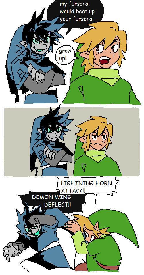


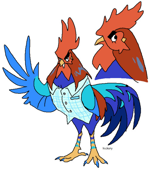
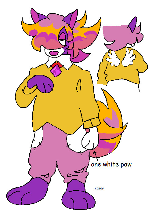


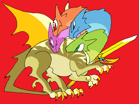
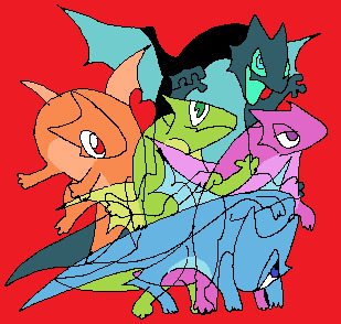
hey links! nice fursonas!
#i don’t know much about other zelda games or like any of these guys ..#but i think it’s neat and iirc you have dragon designs for some of these ? idk!!#but i saw it and thought of you :3#loz
6K notes
·
View notes
Text
Not quite tired enough to fall asleep, so I’ma write down some Pokémon I want in Gen 9.
First and foremost, I OBVIOUSLY want a new form of Wooper. Maybe it would be more appropriate in a region based on Mexico, but axolotls were first introduced to Japan by Portuguese traders, so mayyybe…? Konpeito was also brought over by them, IIRC, and remains extremely popular in Japan, so maybe that’ll be the new version of pokeblocks/poffins/whatever?
There are so many animals that are very obvious choices for Pokémon that we haven’t seen yet. Dolphins, narwhals (that’s an evolution line, right there), marlins, flamingos… and no, Aromatisse absolutely does not count. Almost as crazy as no dolphin, how have we never had a hummingbird Pokemon? No houseflies, grasshoppers, earthworms? What about a nautilus, a Komodo dragon, a peacock? I want to see cranes, capybaras, cuttlefish!
There are so many good options for fossil Pokémon. A wooly mammoth, a smilodon, a giant land sloth, a giant flightless bird… or hey, a dodo, that could be fun. I’d love to see some Cambrian-inspired ones, we haven’t gotten anything like that since Gen 3.
There’s also the topic of Pokémon based on inanimate objects… generally my least favorite Pokémon, and the last one, Milcery, may be one of the worst concepts of all time in my opinion. So, what do I think would work for an inanimate object Pokémon? Honestly, the best ones are ones where the inspiration is obvious, but it still works as a creature… like Chimecho. So, on that same concept, I think a hand fan would be a good basis for a Pokémon. Maybe just as a living biological fan, or maybe make it more like a butterfly? An umbrella would also be a good one, not sure how we’ve yet to see a karakasa Pokémon.
Speaking of butterflies, I’d love to see more that aren’t Bug/Flying. Being a fan of Bug (and particularly butterfly) Pokemon is rough. Like, love Frosmoth’s design… but as bad a type combination as Bug/Flying is, Bug/Ice may just be the worst in the entire game. On the topic of types, regional forms. If we’re not getting a completely new bull Pokémon, then we’re absolutely getting a new Tauros form… and while they’re at it, hey, howsabout a calf that evolves into both Tauros and Miltank? We’ve only ever gotten this kind of thing once, I believe, with Tyrogue… Minior didn’t went up being a baby form of Solrock and Lunatone, so we’re overdue for something like this. Also hey, why not a new Tyrogue evolution?
Back to regional forms, Sunflora could definitely use one, as could Chatot, maybe Arbok. A Fairy-type Breloom would be neat. That would also been a good type to give a new Wooper form…
Man, a new generation of Pokémon is always so interesting, you never know what they’re going to do. Here’s hoping that at least a couple of these things come true.
14 notes
·
View notes
Text
my completely biased and official rating of every keyblade ever:
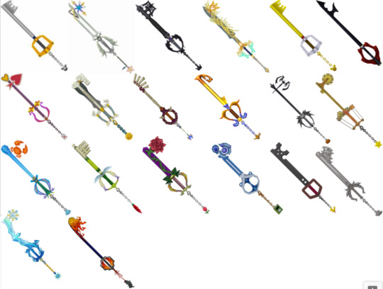
Kingdom Key: absolute classic. excellent design for the like, mascot keyblade. very simple, vaguely key shaped. i hate the mouse head though it's so stupid and makes no sense. and i hate mickey. 9/10 minus a point for the weird mickey keychain
Oathkeeper: wonderful. amazing. never boring. excellent design love the heart and wings and all the significance. and that the keychain is kairi's charm? terrific. 10/10
Oblivion: brilliant. awesome. phenomenal. again excellent design the wings and chains and purple crystal are absolutely perfect. love the crown keychain. 10/10
Ultima Weapon 1: literally just a sword with some filigree on it. nice. too much yellow and i don't like the weird cyan gradient on the guard. 7/10
Kingdom Key D: d for disgusting. i don't have any other comments i just hate it. 2/10
Keyblade of Hearts: yeah that sure is an anti-keyblade. love the simplicity and the heart in the negative space of the teeth. and that it doesn't have a keychain, that fueled a lot of theories for 12yo me 8/10
Lady Luck: i think i don't like this one bc to get it u need to use a white trinity but you can't do that until near the end and i have way cooler blades to use. the design is pretty ok, don't really get the card keychain tho. 5/10
Olympia: oh the sight of this one makes me irritated because the kh1 strategy guide uses this in one of the pictures for the fight against possessed riku. it did not help me win. and i hate short keyblades. love the clouds and columns though 7/10
Jungle King: kinda ugly but i appreciate that it looks kinda handmade. also like the butterfly keychain bc it doesn't look like it fits but it Does. also the first good alternate blade u get in the game so. 8/10
Three Wishes: not bad but it doesn't stick out to me either. also doesn't scream agrabah to me but also it does? 6/10
Pumpkinhead: NICE. very long and very cool. the teeth looks like bat wings and a pumpkin so very epic. 9/10
Wishing Star: so pointless i already have pumpkinhead. also short. cute design though i like the gears. 5/10
Crab Claw: i never used this one because it stuck out so ugly in Halloween Town </3 i love blue and crabs though so 8/10
Fairy Harp: I HATE YOU DIE. short and stupid. does NOT remind me of neverland at all. 1/10
Divine Rose: pretty nice but short and lategame. always thought its existence was kinda weird?? like thanks belle but why. i have oblivion. 7/10
Spellbinder: for some reason i really don't like it. i like blue and the circles are neat. the handle looks really painful though. 4/10
Metal Chocobo: kinda ugly lol. love the holes and chocobo keychain. 8/10
Lionheart: oh i am so biased by recoded. absolutely excellent keyblade. design's kind of weird tho where are those lions going. 9/10
Diamond Dust: so i was really confused because i thought this was khux-only or maybe bbs keyblade but apparently it's kh1 final mix only. you know what i got as a reward for fighting the ice titan? sephiroth. you know what i got for fighting sephiroth? NOTHING. it was my favorite khux blade though so grrrr 7/10
One-Winged Angel: grr bark bark final mix again fuck you. kinda weird design though like what is the teeth? a meteor? should've been a wing. nice guard though there's not enough hand room. excellent keychain obviously. 8/10
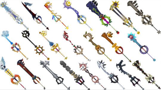
Ultima Weapon 2: very similar to the first but blue and symmetrical. very good learn from your mistakes. 9/10
Way to Dawn: YEAAAHHHHHHH BOY HERE IT IS PERFECT EXCELLENT GREAT DESIGN WONDERFUL LORE. HAS WINGS. THE EVOLUTION FROM SOUL EATER. THE LACK OF THORNS ON THE HEART. 10/10
Destiny's Embrace: very cute!! my favorite part is the name. i wish it wasn't so like. stereotypically girly though. like you look at the destiny trio's keyblades and can immediately pick out which one is The Girl's. 9/10
Star Seeker: i wanna hate it because it's mickey's/yen sid's but honestly it's so nice. the stars and moons and comets and gradients and colors... wonderful 9/10
Rumbling Rose: oof. weird and ugly and gross. keychain looks like a ladybug from far away. 3/10
Hero's Crest: bring the clouds back. i don't really get the design but i like columns. 5/10
Monochrome: super cute!! i don't like Timeless River but this fits it so well and has cute hit effect. 8/10
Mysterious Abyss: i always get this one way late in the game so it's always pretty pointless oops lol. also the design doesn't really say atlantica?? 3/10
Follow the Wind: another weird miss but i like this one more. nice wheel shaped guard, and that the keychain is a cursed coin. 6/10
Wishing Lamp: now THIS is the agrabah keyblade. very nice and elegant. looks like the palace! 7/10
Decisive Pumpkin: THIS ONE 😭😭 it's so ugly but it's so strong so i have to use it but it's so ugly. it does look like jack's idea of christmas so points i guess 😭 4/10
Circle of Life: also pretty ugly. and short. sorry simba. 3/10
Sweet Memories: shrek voice it doesn't even have attack. i don't like winnie the pooh so that's definitely influencing me. makes cute noises iirc and looks pretty cute. 4/10
Photon Debugger: this one should look pretty cool but my brain is saying it's bad. i think the giant red ball by the teeth are throwing me off. love the neon blue tho 5/10
Gull Wing: why the weird space in the name. anyway. i really want to love this keyblade bc i love X2 but it's really bad. i'm so sorry YRP kh did you so wrong. excellent keychain choice though. 2/10
Guardian's Soul: MUCH better thank you. auron my beloved <3 the lines are very appealing and i like how simple it appears. also looks like auron's swords. 8/10
Sleeping Lion: wayyy better than lionheart. looks kinda like a gunblade! again though what are those lions doing. 8/10
Fenrir: my car key got in a fight. 1/10
Bond of Flame: looks like a bad first draft of axel's keyblade. either the teeth or the guard should look like a chakram, pick one. love it though. 7/10
Two Become One: MY BELOVED <3 excellent design, so so so roxas i think he should use it. very excellent i love the little twist at the top. checkered handle is a little weird. 10/10
Fatal Crest: lol i was so mad when i first saw this because it looked like one of my oc's keyblades. i like it now though, it's a dragon!! pretty neat bro 8/10
Winner's Proof: oh this one is so cute. if it wasn't a reward it would be really weird and bad. surprisingly elegant! and there's even 13 mushrooms on it! 9/10
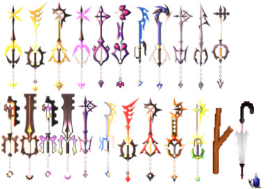
(shoutout to portadorx on deviantart for the 358 keyblade refs)
Missing Ache: YOU. interesting design, though it says roxas more than ventus to me. great first alt keyblade. 7/10
Ominous Blight: very edgy names in this game <3 looks like guardian's soul, which is interesting. i don't like yellow but it works bc blight 6/10
Abaddon Plasma: what a cool fucking name. so many yellow keyblades. but very cool looking i love roxas' aesthetic 8/10
Pain of Solitude: this is just pink missing ache. 8/10
Sign of Innocence: SO COOL. idk what's going on in most of these blades but i love it. 9/10
Crown of Guilt: come on. it doesn't look like a crown. big disappointment. very cool though 6/10
Abyssal Tide: so cool!! i love blue and fighting in midair <3 the teeth kinda looks like waves 8/10
Leviathan: weirdly furry looking. very cool guard 6/10
True Light's Flight: looks like two become one if it was only one. the top kinda looks like the nobody sigil 9/10
Rejection of Fate: SPEAR. epic name too, but i think it should swap names with true light's flight. very cool but i don't remember seeing it in name. kinda awkward bc it looks like it should be a spear 7/10
Midnight Roar: sooo cool. the orange handle pops without looking wrong... nice. also the teeth kinda look like a bat. 9/10
Glimpse of Darkness: ugly. weirdly bulky and hollow. short. 3/10
Total Eclipse: weirdly bumpy sword. i like how the orange looks like it glows. 5/10
Silent Dirge: GoD but purple. 2/10
Lunar Eclipse: TE but purple. 4/10
Darker than Dark: Hello 😳TLF but purple 10/10
Astral Blast: Abyssal Tide but yellow. interesting choice, but kinda clashes with the blue accents 7/10
Maverick Flare: Ominous Blight but red... excellent. very nice. 8/10
Twilight Blaze: Abaddon Plasma but red... also excellent. very epic. 9/10
Omega Weapon: props for not looking like any of the ultima weapons. very interesting and spiky but i kinda don't like it. 6/10
Aubade: kinda weird. "draws forth its wielder's personality"... ok. looks light elemented. 7/10
Wooden Stick: lol 10/10
Umbrella: not what i would've chosen but lol 10/10
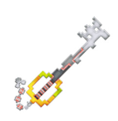
Zero/One: WONDERFUL, EXCELLENT, AMAZING. i can't really explain why i love this one so much it's just very good. 10/10

Earthshaker: very solid design. not much to say it's just nice. love the colored guard. 7/10
Ends of the Earth: love that it is so clearly an earthshake upgrade. makes u realize how incomplete the first one is. 9/10
Dreadgnaw: kinda silly looking lol those are teeth. love the red bit in the center. looks very similar to earthshaker in a good way. 8/10
Chaos Ripper: looks like EotE but in a bad way. i don't like the weird teeth. it's also almost impractically long but i'm here for that. ALSO THE EYE. NICE. 7/10
Rainfell: oooo i love this it's so simple but so nice. very elegant 9/10
Stormfall: less nice. looks like a rainfell upgrade though. also kinda looks like master's defender which makes sense but i don't like it. 6/10
Brightcrest: GORGEOUS. PERFECT AND WONDERFUL. SO PRETTY. i wish it was kairi's. kinda looks to ornamental for aqua? but good for her. 10/10
Wayward Wind: none of ventus' blades look very ventusy to me. this one looks like an extra training one they had sitting around. cool shape though 5/10
Frolic Flame: NICE. looks like lea's frisbees! i like fire and fire designs so but it's a little awkward looking 8/10
Lost Memory: ok so first off WINGS. EXCELLENT. love that the only color is the heart. very cool and epic but i don't understand why it doesn't have a reverse grip handle. or the pointy bit at the tip. but still 10/10
Void Gear: hiii vanitas :) so anyway in my totally unbiased opinion this is the best keyblade ever obviously. love the gears and red accents and it's just super cool. the eyes and chains... vanitas character development keyblade when <3 10/10
Void Gear (White?): still very cool, love the simple contrast going on. 10/10
No Name: i didn't know this one was also called no name which is kinda lame. but i love the keyblade it's very cool. super glowy and i love the time design. 9/10
Crown Unlimit: I almost really like this one. very neat design, love the crowns and twists and glow. 7/10
Master's Defender: literally so plain and boring. i don't care if that's the point give it some frills. nice design though :/ 7/10
Broken Xblade: love the broken bits and the weird rust color. wish one of the kingdom keys was more broken and i think the top bit should be broken too. 7/10
Wooden Keyblade: sobbing and crying and tears. this is literally so cute and good and i love that it looks like Ends of the earth. or the kingdom key i guess. 10/10
Treasure Trove: i never expect to like this one but it's actually pretty nice :) wish the gems looked like they were spilling from the top and not leaking from the bottom. 8/10
Stroke of Midnight: also surprisingly nice! the guard kinda looks like a pumpkin which is cute. just a very cute design. 8/10
Fairy Stars: rad as hell. absolutely love this design very appealing. like how point the stars are. 9/10
Victory Line: i hate this one. maybe bc i don't like the world. kinda ugly and the teeth look awkward. 3/10
Mark of a Hero: ok we brought the clouds back but the weirdly buff trophy arm fucks this up. the blade is also just kind of a column, nothing going on there. 4/10
Hyperdrive: super cute!! love how the blade looks like laser fire and engine streams. the teeth are weird again though, and the handle looks like a bee 8/10
Pixie Petal: SO much better than fairy harp. this one is very cute and these teeth actually fit with the rest of the design. kinda short though >:/ 7/10
Sweetstack: oh this is so cute. a bunch of ice cream scoops!! why are the teeth oranges and what are some of those flavors. why are cones on the guard soft serve. 8/10
Ultima Weapon bbs: NICE. A SWORD WITH SOME FILIGREE BUT ALL IN BLUE. LOVE the wayfinders on it, very good for them. wish it wasn't just blue since it seems so aqua-centric but it looks nice soo 10/10
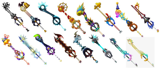
Skull Noise: LITERALLY SO PERFECT. THAT'S SO TWEWY. INCREDIBLE. the headphones and mr mew keychain... wonderful. only thing is that the name is kinda weird. like it makes sense but sounds weird. 10/10
Guardian Bell: i like it more than i think i would. elegant looking, and i love the gargoyles on it. hate the sentient gargoyles tho. 8/10
Dual Disk: VERY cool! looks like it has a reverse grip. the teeth are really cool and i love the bright blue. 9/10
Ferris Gear: eh. pretty cute but i think my pinocchio bias is acting up. the gears are nice, reminds me of wishing star. 5/10
Knockout Punch: SO COOL. really love the spikiness and colors and that the guard looks like the monkey. unfortunately for it, i don't like monkey. 8/10
All for One: the design's nice and it matches the world... but eh. 5/10
Counterpoint: so fun!! the violin guard is great, and the blade looks so cool. the teeth are a little awkward looking, it goes up too much. 9/10
Divewing: RAD!. just a sword with a heart on it and i love it. just so fucking cool. and the guard looks like a wing so 10/10
Sweet Dreams: so cute :) in love with the meow wow on top, but the teeth go up too much again. and i think there should be some komory wings on it. 7/10
Ultima Weapon DDD: NICE. almost identical to the kh1 blade, but blue and BETTER. the wings above the guard and the crown coming out of dream eater sigil... brilliant. 10/10
Unbound: not a hit 💔 just kinda weird and unfinished looking? and the lime green bit is off-putting. the hear at the top is nice. 2/10
End of Pain: ok mood shift hello. looks like it should be one of terra's evil blades. at first i was thrown off but looking closer it's so cool. the wings and eye at the top... the horns above the guard... the butterfly and gazing eye (buttereye) keychain... magnificent. the blade reminds me of x2 dark knight paine's sword. 10/10
Ocean Rage: looks pretty cool at first but the monstro mouth guard is literally horrifying i don't want to look at it anymore 1/10
YMX's keyblade: apparently has no name and is different than the one in bbs. nothing new really to say since it looks pretty similar but the goat head on top is super interesting. how much did No Name (luxu) influence young xehanort... 9/10
Mirage Split: absolutely perfect. i can't think of anything that isn't positive to say. the stained glass, the heart by the teeth, the thin lines, the gradient, wings, pointy, the keychain, literally all perfect. 10/10
Nightmare's End: also utterly perfect. i don't like yellow but it works here and looks great. the cyan gradient is startling but matches MS so i love it. all the colors in the stained glass are wonderful. 10/10
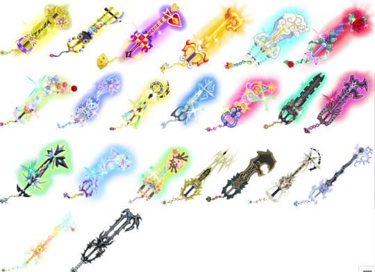
Starlight+: a little guady. but i love how the stars look like comets. the twisted blade looks neat too, but what's the point of the pointy bit on top. 7/10
Treasure Trove+: love that it looks golden and gem encrusted. very rich looking, but the cart is still leaking gems. 8/10
Lady Luck+: NOW the card thing makes more sense, i love how its incorporated throughout the design. more more interesting than the original. 9/10
Three Wishes+: looks like fire?? which is way cooler but why??? i like it more but where's the agrabah. 8/10
Olympia+: CLOUDS. like that zeus is in the clouds, but they took my columns. and the cyan handles are really weird. 7/10
Divine Rose+: excellent. what it should've been all along. the iridescenty guard is suuuper pretty and all the leaves and vines are great. 10/10
Moogle o' Glory: a lot happening here but i love smacking shit with a moogle head. there's so much happening and i don't really get it. 7/10
Fairy Stars+: i didn't know it could get better, the teeth is super cool looking but i wish the twisty blade was more visible. 9/10
Sleeping Lion+: love that it turns that metallic light blue color, very pretty. and the handle looks more like the gunblade! very nice looking and i used it a lot but the top is very weird. 9/10
Counterpoint+: let's take all the fun and exciting bits from the original and crANK IT UP TO ELEVEN. wait. stop. go back it's too much. very pretty still i love colors. 8/10
Fenrir+: my car key recovered from that fight. looks wayyy cooler and looks like ff7. hate the cyan glow though it feels weird. 6/10
Darkgnaw+: took me forever to find an image bc i keep calling it dreadgnaw. much cooler than the original, it looks like it's gonna bite you. the purple is also very nice. 9/10
Missing Ache+: POINTY. super cool but how does ventus twirl it around without poking himself. the colors are fun and it looks rad. 10/10
Diamond Dust+: i used this one the most <3 very pretty i love shades of blue and purple :) looks kinda icy but the top is weirdly flat. 9/10
Bad Guy Breaker: there's so much happening calm down 😭kinda nice but there's a lot to look at. also this world irritated me. 4/10
Gula's Keyblade: #leopardus4ever. as you can see, this keyblade is perfection. fun and spiky and lightningy. i think the whole blade should be lightning tho. 10/10
Aced's Keyblade: do any of these have names. anyway what a dreadgnaw ripoff 🙄 it suits him but guess what. i don't like him. 5/10
Ira's Keyblade: i don't like ira either but his blade is fucking great. love the teeth so much, and the colors. very pretty and cool 8/10
Invi's Keyblade: absolutely gorgeous. i love the flowing lines and little vines. love the colors and also it's super long. 9/10
Ava's Keyblade: girl this hurts to look at on a white background. very pretty though, i love how wispy and cloud-like it is. looks delicate which is great considering she'll kick anyone's ass. 8/10
No Name: unfortunately, this is absolutely wicked. look at it. it's wonderful. the goat head looks so much cooler than the other animal heads somehow, and i love the hollow center of the blade. and the teeth look like a claw, a little. just so fucking cool but i hate everyone who uses this. 10/10
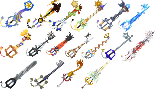
Shooting Star: super pretty, i love how this one flows. i wish the blade went down to wrap around the guard though, instead of cutting off. 8/10
Hero's Origin: they took away my clouds again. i like that half of it is just. zeus. the lightning bolts are cool, but the handle and guard don't really match. 6/10
Favorite Deputy: you are not my favorite deputy fuck you. i don't like toy story but i do like cactuses. 3/10
Ever After: this one's nice :) the guard is super pretty, but i wish there was more going on with the blade. 7/10
Happy Gear: this one's kinda ugly but i like it soo. the energy canister guard is cute. 7/10
Crystal Snow: i hate it so much. it's boring and the keychain is olaf and i don't like frozen. 1/10
Hunny Spout: pretty cute :) the honey jars remind me of sweetstack. i like the wooden handle. 7/10
Wheel of Fate: cool as hell that's my boat. love that the blade looks like a mast that's so cool. wish it wasn't so gray though. 8/10
Nano Gear: ah, here's the color. i like everything except how the nanobots look at the top. it's just kinda gross. 7/10
Grand Chef: oh this is so cute. but why is remy the teeth. poor rat :( but it looks very nice i like how the Tower goes into the guard 8/10
Classic Tone: fuckyoufuckyoufuc. i hate this one. pretty ugly and i don't like it. 2/10
Starlight: SO GOOD. very simple but i like that. looks mysteriously similar to the kingdom key? i love it but it needs a little more going on. 9/10
Ultima Weapon 3: LOOK AT IT. ABSOLUTELY INCREDIBLE THEY CAN'T MAKE A BETTER ULTIMA WEAPON. the silver and red look so good and it's spiky and cool. and the red is glittery!!! why? i don't care it's phenomenal. the spiky heart teeth. that it looks like it's moving. i wish i could break my rating scale. 10/10
Braveheart: riku kingdomhearts stole my fucking car key. we've all heard the complaints i'm not repeating them 1/10
Star Cluster: it's really nice >:( mickey switch with riku pleaase. the star theme is really cute and the colors are nice but why does it look so similar to the kingdom key. 8/10
Flame Liberator: i don't like the name but ok i guess. the keyblade is so fucking cool though. it's what bond of flame wanted to be. i love fire and it looks like it moves so hell yeah. 9/10
Xblade: still can't decide if i like this or not. How do you hold it comfortably. Love the glistening spiky bits. 8/10
#that's all of them holy shit#you are required to read this#might make another list with all of them in order if i feel insane enough#kingdom hearts#pere's bullshit#kh#keyblades
38 notes
·
View notes
Photo


🔍 Peering at the cool Dark Fortress cover arts side-by-side and speculating with the synopses in mind, wondering if anything can be gleaned.. 👀 I know the covers aren’t usually 100% literal, it’s just that they’re so neat and I can’t help but be excited and I just rly enjoy speculating!!
Also iirc the cover for #2 emerged around Jan 22nd, maybe the cover for #3 will emerge in the next couple weeks?
(More generally speaking, who is the person whose path crossed Fenris’ and whose past we will get a glimpse of? I’m looking forward to the flashbacks to some characters’ backstories. I also wonder if like.. the comics are their own self-contained stories, complimentary media, but I wonder if there may be a hint or lil story-strand or two [story strand is prob a better word for it than hint] that could potentially tie-in to DA4 / the overarching plot - like how Gaius was an Agent of Fen’Harel, and how Meredith’s statue showed up in the comics, something like that. In any event I’m super excited for this latest look into what’s going on in the World of Thedas and for people who are associated with the [shadow] Inquisition!!)
But back to the covers: We know the person on the left is a new villain. I assume he is a mage, and possibly part of the Venatori or a remaining Old God cult. Could he be a son or other younger relative/associate of the late Magister Danarius? An apprentice or protégé perhaps? I wonder if he’s the heir of House Danarius and that seat in the Magisterium? Did he know Fenris or Varania from the time before Fenris escaped? This character’s song lyrics and grasping hands imply an expansive desire for power.
With the red eyes, does he want to be infused with red lyrium like the plan for Shirallas is - that’s why they tested it on humans? Or maybe he wants a [red] lyrium-infused warrior (Shirallas) the way Magister Danarius had a blue one before? Will he and Shirallas team up? Maybe rather than red lyrium or a stylistic choice it’s a nod towards something blood magic-related instead.
Is he maybe the mastermind or part of the masterminding behind the attempted unleashing of the dangerous power? What does said unleashing involve, some kind of ritual they’re going to try and complete? Is the dragon (or dragon-shaped entity may be more accurate) the ‘power’ at risk of being unleashed, or is it more like.. a representation of it? Its wings look a bit damaged or corrupted, and what’s going on with the fire or what does the fire signify? The shackles on its forelegs remind me a bit of Ataashi from Trespasser and how she’d been captured and confined. It also reminds me of the dragon that was bound and forced to serve as the possessed vessel of Hakkon Wintersbreath in Jaws of Hakkon. Fire is associated with Rage demons and Toth, and the remains of a broken collar [?] around its neck imply it has broken free of its bonds or what it is that keeps it ‘caged’. Its design reminds me a bit of the strange dragon on the right here for some reason, maybe it’s the strange wings. Perhaps this is all too literal tho and the dragon is more like a symbolic representation of the power at risk of being unleashed. 🐉
(I also like how he and the mage on the right in that DA4 concept art have a similar collar design, Tevinter fashion babey..[?])
When you look at them side by side, it’s interesting how the white line pattern on the cover of #1 creates the impression of shackles on the wrists of and a collar around the neck of the person. His and the dragon’s head and eyes are also in the same rough place on their respective pages. And there’s their red or glowing eyes and open mouths, and a circle of weaponry in both, as well as sharp draconic ‘talons’ on the person’s metal gauntlet. I don’t know if it implies a connection between the two or if it’s more like, cool cover design choices as in visual similarity/cohesion as it’s for the same comic ofc - either way I just think it’s really cool.
(๑˃ᴗ˂)ﻭ ...
#dragon age 4#the dread wolf rises#dragon age#bioware#fenris#the Fenaissance#video games#[excited intrigued burbling.txt]#[rampant speculation]#[excitement intensifies]#i cant wait to obsess over every panel :D
54 notes
·
View notes
Note
...fine
The story has great potential, the concept is great, the writing isnt good enough to live up to it imo, Im glad some other people can read this without issues, but when i read them i kept wanting to shake the pages and edit them into smth better myself
Im not the biggest fan of school type stories anymore, but I could gloss over that if it wouldve been done well. But it didnt rly feel well done for me, the pacing was off, we kept being made promises about/told what these characters were supposed to be - and then....the characters didnt live up to the potential.
The "mysterious and dangerous morally grey" character rarely acted in any way that wouldve made him dangerous (rn i remember exactly one scene, and that was mostly justified because it was a response to an assassination attempt?? yes he didnt hestitate, a normal person might have, but theyre in a college where less than half of the students graduate, the rest DIE)
The mc is supposed to be "super smart" its her one strength she has above the others (since she has a physical disability (hypermobilty iirc, correct me if im wrong, that makes surviving in a school thats focused on fighting and dragon riding quite hard! (that part was acutally pretty nicely written and good rep, i think so the one thing thats rly well done in this story is diversity, i dont have any complaints about that) but , despite being supposedly super smart, the foreshadowing wasnt done well, since there were some VERY OBVIOUS hints that only "we" as the readers were supposed to realize but they were written in a way that SHOULD have the MC realize it too
the one nice character got killed of for shock value, it gets brought up again later but it feels awkward the way it was dealt with, I was shocked but couldnt rly feel the long-lasting pain of this loss later on, emotionally it didnt hit me enough to move on (i know it hit other people more, so its again a me thing)
it both carries over to book 2 too, where things also kind of get worse?
The romance (it is romantacy, admittedly not my main genre because i dont tend to like romance main plots,....esp straight ones, written like this...) developed in a really awkward way considering its supposed to be enemies to lovers, but then the characters have so much sexual tension because of their....dragons?
then theres this whole conflict about "pls tell me your deep dark secret! id never shy away from you!!!!" ..... so he gives in after her begging finially and guess wHAT she hates him for it, dispises him and refuses to properly talk to him for ALMOST A WHOLE BOOK
MISCOMMUNICATION AND PETTY IMMATURITY IRK ME
another thing is that these characters are supposed to be in their mid twenties but they act like theyre in their teens, awkward.
(kind of the opposite from six of crows ngl lmao, there they act like theyre in their mid 20s and then you learn theyre 17, one of the bigger things that bugged me about SoC but it was still...better) Anyway, so what else was there
...so many things i could go on about this for another fifeteen pages or smth idek, the story had a lot of potential, esp the Male love interest character design as well as the main character have rly nice concepts but both fail to live up to it, and largely to blame on the romance. The mmc ends up too obssessed with the mc and that becomes his only purpose and reason and its BORING i know some people like it, thats fine, i get it, but it couldve been written so much better
the fmc could also be really neat! the disabled youngest child of a war general surviving at a brutal dragon riding college against the odds and balancing her physical disadvantages through her wit and maybe friendships
but
it
just
doesnt
get
executed
right
I'll give the author some grace because shes been a romance writer for so long and it was her first fantasy story, but even then I feel like all of these stories would've needed more...editng? so much more editing
and i know theres stuff getting published that are so...sigh badly written in the sense that the writing isnt rly effective and immersive as much as it COULD be, and i know these books still have a lot of fans and thats good, and I know that publishes dont want to spend a lot of time on editing but i dont like where the publishing industry is going, its falling victim to wanting to push out stories as fast as possible and going for tiktok trends (gotta publish them fast before the trends move on to the next) but it just makes the quality of those suffer SO MUCH and they focus so much on tropes (like in fourth wing there are so many tropes that people love mixed with some spice and dragons and its basically garanteed to be a success because thats whats popular BUT THE QUALITY SUFFERS and i hate that
there you go @lorethebookworm
EDIT: another thing was the story kept managing to build up nice tension and then the resolution of these conflicts were really anti-climatic, disappointing too
What is a famous book that , in your opinion, did not live up to the hype ?
*ahem*
Fourth Wing
*leaves before i go on a tirade*
7 notes
·
View notes
Text
Ah, Daein! Its snowy lands, its flooded towns, its soldiers, its vengeful citizens, its dragons…
dragons?
(no I’m not sorry for referencing the excalibur movie in 2020, it was funny)
You know what, realistically i’m never going to use Calill enough to get her supports, so Reyson+Tormod is okay.


We’ll build our village there.


On the one hand, yeah that was rude. Manners, Reyson.
(”Kind-looking eyes” ffdsh Tormod have you looked at him, even his neutral portrait looks like he’s angry, Reyson thinks of murder all day-)
On the other hand… it is absurd. It’s a desert. I don’t think it’s going to work. :s
On the third hand, the restoration of Serenes forest really looked miraculous, and Tormod is young and enthusiastic, and they do need a place to live, so yeah, I can understand how it doesn’t sound that far-fetched to him. But he’s probably better off hitching a ride to Gallia? (ah but of course, our ship captain doesn’t get supports because he’s an unplayable traitor-) Iirc, his friends are all beast laguz, and there is precedent for beorc living there too so Tormod staying with them shouldn’t be a problem...
-----
Emulator did something weird with how it stored screencaps and I had to move some, and looking at them again made me realize that the candles on the walls of Daein keep were animated? which is neat! but i took screencaps too small and now i can’t get a picture where it will show well in a text post. orz
-----


And this! Children! Is what we call! A trap!

Thank you Elincia.

It would, especially in the snow, wouldn’t it? But that would probably take too long to work in a video game with one battle per chapter. For an in-universe justification, they definitely know Elincia’s army is gaining support, thanks to Nasir, so I guess it could seem more important to crush them quickly before Gallia or Begnion can send reinforcements than to do it “safely”?


/throws hands up/ YOU ARE SO LUCKY YOU’RE THE HEROES


I’m reacting to this like a mature adult and definitely not making faces at the screen right now. Really. Or I would be if they didn’t rub it in my face. Yes it’s a bad plan! Shut up!

Ena, I love you and I’m grateful for your… optimistic interpretation, but he sort of has a point there, unfortunately.
(Okay, it’s probably not that bad a plan, I’m sure I’ve seen the “if we know there’s a trap and there’s nothing else to do, might as well spring it” reasoning elsewhere, and it’s kinda legit, but. But.)

Close the gate and seal off their escape route. This contest will be decided here.

What could possibly allow us to destroy an army in one fell swoop...provided we can herd them here?
Considering Ena’s (probable) nature and this choice of words, I’m assuming a big old fire? Classic, but it would do the job.


I could almost appreciate this.


HENSHIN YO

QUICK, ACT SURPRISED (though i’m honestly relieved that I don’t have to feel dumb for assuming this was what she was even though she has beast face marks)
(and I didn’t see the magical girl transformation effect coming either. Or that she would be?? Pink?? I should have, she has pink hair and she’s a girl, but apparently pink hair → pink scales was too big a leap for me. Oh, this is stupid, Awakening even had a pink dragon. I think.
That said, even though the first and only female dragon so far being pink is a cliché, I do like that her design isn’t super girly apart from that? I thiiink the ones who moved the ship that one time might have been more muscular, but not that much either? And even if they are, she’s still buff. Which isn’t my kind of design, aesthetically, if I got to pick i’d pick awakening’s leafy seadragon look for everyone, but at least there’s some consistency here.)


...yeah, this wasn’t going to go any other way, huh.

“No matter what I show you”, she said! And you said yes! Face up!


HAHAHAHAHA
WHAT A FUCKING HYPOCRITE
So once one of the ~evil and treacherous sub-humans~ is on your side, she’s good ! Legendary ! A powerful omen ! Coward.
(Unless it’s some kind of double standard for beasts vs dragons, but frankly I don’t care, it wouldn’t make much of a difference since they never gave any hint that they didn’t mean all laguz when they said « sub-human ».)
I’m aware that if he wasn’t hypocritical and called for his men to kill her right now, I’d still call him a fucking coward, so maybe it’s unfair, but again, I don’t care.

So that’s really how this goes. I did think it would, but there was the possibility that they might turn on Ena, and she’d be forced to endure without killing any Daein soldiers in return, as a yellow unit trying to fight us independently? Or as a green unit that could be recruited, but she’s been consistent about wanting to stay there and do what she’s told so she’ll be allowed to go back to Ashnard, so I doubt it. Shame. ;;
-----


DON’T PANIC, OH MY GOD, BEGNION, USELESS ALL OF YOU (except you Tanith, I respect you)

Speaking of which, that would have been a good time to have her speak.
But yes! don’t panic! We’re just trapped in the enemy castle haha no big deal


A VALID CONCERN, tbh if no one attemps to take her hostage until we’re out of Daein we’ll have been really lucky.


...what else could it be, Soren? Why did the doors close if it’s not a trap, un courant d’air?


Whatever they are planning, it appears that they want us all to experience it at the same time.
odds of (dragon) fire intensify

Yeah, it kills everyone but you need laguz lives to power it, and then the legendary-

Ashnard, in Crimea: read at 4pm

We can spare no efforts to protect the princess. We should put together an elite team and head for the throne room.
Soren understands me. (Well, on the tactical part. Elincia could be snatched by Daein and thrown in jail and he would just find it inconvenient.)


I like the effort to justify that the gameplay battle will only involve like a dozen people on our side. (Though I’m going to feel silly putting Ilyana on an elite team.)
-----

...I’d like to speak to your architect.

YEP, r.i.p. my hopes of Other unit Ena, she’s on the objective tile, she’s screwed unless the plot says otherwise, this is fine, this is fine /screams
(The cursor is on the mercenary because he stood out so I thought he might be a miniboss? But no, that’s just the class design.)

Dragon! 44 weight, look, she really is buff. (But why all the stat penalties)

[Breath]
CALLED IT, FIRE
(Pink red dragon :p)
(1 range, though? And she has way more strength than magic, why not have her hit people instead? wait no, it uses strength? wha- this makes no sense at all)

I see, I see… This raises interesting questions (staying shifted all the time takes a toll on laguz? Are they meant to shift regularly? Is one form more “natural” to them than the other?), but it’s probably a pure gameplay thing that doesn’t mean much canonically…? (At least, on a gameplay level, it’s consistent I suppose? Everyone has biorhythm, yeah that’s not what actually regulates laguz transformation but it’s similar, and this goes against it, so you avoid the low points at the cost of also avoiding the times when you’re at your best? Idk)

Obviously, no one here can Talk to Ena (THIS WOULD BE A GREAT TIME TO HAVE NASIR BE PLAYABLE), because fuck you. But...
Tauroneo?

Tauroneo. Okay, sure!
#chouris plays PoR#very slowly when it comes to the actually playable part#i'm still not done dragging everyone through that keep
3 notes
·
View notes
Text
Spyro Reignited Countdown - The Legend of Spyro: Dawn of the Dragon (Console)
I can’t help but have mixed feelings about this game. One one hand, I love it. Of the Legend of Spyro games, this is, by far, the one I’ve put the most playtime into. I legitimately have fun with this game, well beyond the fun I have with the first two games in the series.
But on the other hand, it doesn’t close the story in a satisfactory way. It’s like reading the first two books of a trilogy by one author, and then reading the last as bad fanfiction but illustrated by a talented artist. It’s good, but it’s not the end you were hoping for.
And I also have to keep in mind the way I play: with infinite health and mana cheats on, and the game language set to one I don’t understand very well. This way, it’s a great stress-relief game, and the sub-par voice acting doesn’t bother me.
Gameplay
With the game developer swap, the gameplay changed drastically. It’s still an action game, and you still have a similar moveset, but the way the game plays is completely different. I’ve never played God of War, but I’ve heard this is what this game is most similar to.
The camera is now a lot less movable, enemies act very different, and I haven’t played enough Action games to really describe the differences. Melee feels a lot less powerful, but at the same time, the elemental abilities don’t feel very powerful either. You have all sorts of melee combos, but honestly I hardly used more than the basic attacking and grab attacks depending on the enemy. Like, grab if you can, and if you can’t get behind it and attack.
The default difficulty is between A New Beginning and The Eternal Night, meaning it hits a good medium. I think, anyway. As stated before, I don’t really play it the way it’s supposed to be played.
I also can’t judge the control differences, because I switched consoles from PS2 to Wii for this game. Motion controls make this really good for stress-relief, as instead of button-mashing, you punch the air really quickly. And there’s a lot of button-mashing in this game.
Oh yeah, and this game has cutscenes where you have to press certain buttons at specific times to move on. I really don’t understand the appeal of this type of gameplay. This is the only game I own to have that feature, iirc.
Additional Playable Character
You actually get one this time: Cynder! She plays exactly like Spyro except with different elements, though. Still, it does essentially add a second health bar, mana meter, and set of abilities if you’re playing single-player, and really shines when playing two-player.
Collectables
Health and mana upgrades return, and are much easier to find this time around. This time, they’re fairly similar looking to gem clusters, but are more hidden. Each does not give a straight upgrade, rather requiring you to find multiples of them, and Spyro and Cynder each take a different amount to upgrade their abilities: with Spyro upgrading health more often, and Cynder upgrading Mana.
The game also considers Spirit Gems, the upgrade-based gem-cluster, to be collectables. These are the easiest to find and they’re fairly numerous. Not as numerous as gems in the Classic titles for sure, but more numerous than any other collectable.
Armor is a new feature in this game. Each piece is fit to a specific dragon and gives a unique bonus to them. Collect all three pieces in a set, and you get a special ability, some of which are very powerful. These tend to be in their own unique paths and secret areas, but aren’t as difficult to find as the health and mana upgrades.
And unlike The Eternal Night, you can return to levels you completed at any point. Overall, collectables are very well-done in this game. They’re fun to find, rewarding if you do, but still aren’t the game’s focus. And that’s okay.
Breath Abilities
Spyro and Cynder both have four abilities each, all available from the very beginning. They’re all used not only in combat but also for various small puzzles.
Spyro’s Fire breath is as staightforward as it gets. Upgrades do, like previous games, send enemies running, though. The secondary is Comet Dash again, establishing it as a standard. It can burn down vines to reveal new paths.
Spyro’s Lightning Breath will chain between multiple enemies if they’re close enough to one another, and will also paralyze them. It doesn’t do much damage, though. The secondary creates a large ball of electricity that I hardly ever used. For puzzles, it powers up gates, keeping doors open for a limited amount of time.
Spyro’s Ice Breath has a icicle shard attack that slows down opponents. I literally don’t remember using the secondary at all, nor if there are any puzzles that require it.
Spyro’s Earth Breath I only remember the attack where you essentially turn into a boulder. I don’t think I ever used it in combat, and that boulder attack is used a couple of times to smash down walls and through a floor.
Cynder’s Poison attack is the most straightforward, sending globs of acid at opponents and causing lasting damage. I don’t recall the secondary attack It’s used on the same vines as Spyro’s Fire breath.
Cynders’s Wind is hardly useful in combat, moving opponents around rather than directly damaging them. The secondary whirlwind will knock enemies into one another, though, causing damage and racking up huge hit combos. It’s used to blow open some doors.
Cynder’s Fear is my favorite. It does a pulsing attack that stuns opponents. The secondary throws out balls of energy that do massive damage and stun opponents. For puzzles, there’s a couple of times you need to scream at some tuning forks to activate some bridges for some reason.
Cynder’s Shadow is also neat. Its secondary is a cloud of darkness that makes opponents target one another. The primary is the Shadow Dash, where you melt into a shadow and attack opponents when you come back up. It’s used for puzzles a lot, where you turn into a shadow to go underneath gates then activate a switch on the other side to let Spyro in.
Overall, some pretty neat variety, but the fact that mana drains so quickly when not using cheats makes them much less useful and hard to fully explore. I honestly just use Fire and Fear 90% of the time.
Bosses
Have some neat gimmicks. Generally, you’re just fighting something a lot bigger than you, going through the stage while it attacks you, or in the case of the Destroyer, the whole level is the boss.
Then there’s Malefor, where you need to dodge attacks and slowly move towards him to get your own attacks in before he runs off.
These bosses have a very different feel from previous games, but it’s not a bad thing. They’re generally legitimately fun to fight.
Levels
They’re beautiful. Okay, maybe I’m just referring to Twilight Woods, Valley of Avalar, Burning Lands, and Floating Islands. Still, that’s a good number of them. I just love flying around them.
Every level has various secrets, and the main level is easy to follow. Sometimes the camera does tell you exactly what to do, but it’s generally necessary since something that was not interactable before becomes interactable.
The only one I dislike is Dragon City, but that’s pretty much because it’s all combat. Different levels have different focuses, and it does mean that there’s a lot of variety, as far as the core gameplay can have variety.
Since you can fly freely now, there’s really not much in the way of platforming. There’s a little, and in general it’s forced by you carrying something heavy, invisible walls, and strong gusts of wind. It works well enough, but is a little strange at times because why can’t you just fly higher?
Story
Malefor has returned while Spyro, Cynder, and Sparx were frozen in time. Under orders, some Grublins come and break them out, attempting to feed them to the Golem. This fails, and Hunter shows them the way out. The rest of the game involves learning about how Malefor intends to destroy the world (Awakening the Destroyer who walks around the world and breaks it apart at the end), trying to intercept and stop it, and eventually facing Malefor himself. Along the way, Sparx gets abandoned and Ignitus dies, both to the stupidest of reasons.
The voice acting is horrible in this game as well. I don’t even know how they messed it up, since it’s the same actors for the most part. But a lot of the time it’s just so lifeless and emotionless, especially on the part of Cynder. And even if, in the case of Ignitus, the acting is fine, the movements of the characters just don’t work.
And then there’s the tragedy of Volteer being super silent. What’s with walking dictionaries in the Spyro series going dumb?
Overall, this is not the finale The Legend of Spyro deserved. At least on the story side of things. And since that’s my favorite part of The Legend of Spyro, it’s a big shame.
Unique in the Series?
Oh boy is it. It’s the only Spyro game with free-flight and focus on two-character gameplay. These two things alone define this game’s gameplay, so it makes this game completely unique from the rest.
The artstyle is also unique to this game, with these character designs never returning. Which isn’t that bad, since they were weird. Especially Ignitus. The only character that improved from previous (Legend, anyway) titles is Sparx. The cheetahs weren’t bad, either. But the dragons are just no.
So yes, but it’s not too bad that it’s unique. Spyro’s so much about gliding, so yeah.
Conclusion
I have mixed feelings about this game. It’s good on its own, but it isn’t a satisfactory conclusion to The Legend of Spyro, and of course it’s still extremely different from the Classics.
Still, I love the game itself. I might be playing it completely wrong, but the way I play it, I love it. I’m glad it exists, even though I’m sad at the nonexistance of The Darkest Hour (Krome’s name for the third Legend of Spyro title).
1 note
·
View note